2019
Web Almanac
HTTP Archive’s annual
state of the web report

Table of Contents
Introduction
Part I. Page Content
Part II. User Experience
Part III. Content Publishing
Part IV. Content Distribution
Appendices
Foreword
The open web is an amazingly complex, evolving network of technologies. Entire industries and careers are built on the web and depend on its vibrant ecosystem to succeed. As critical as the web is, understanding how it’s doing has been surprisingly elusive. Since 2010, the mission of the HTTP Archive project has been to track how the web is built, and it’s been doing an amazing job of it. However, there has been one gap that has been especially challenging to close: bringing meaning to the data that the HTTP Archive project has been collecting and enabling the community to easily understand how the web is performing. That’s where the Web Almanac comes in.
The mission of the Web Almanac is to take the treasure trove of insights that would otherwise be accessible only to intrepid data miners, and package it up in a way that’s easy to understand. This is made possible with the help of industry experts who can make sense of the data and tell us what it means. Each of the 20 chapters in the Web Almanac focuses on a specific aspect of the web, and each one has been authored and peer reviewed by experts in their field. The strength of the Web Almanac flows directly from the expertise of the people who write it.
Many of the findings in the Web Almanac are worthy of celebration, but it’s also an important reminder of the work still required to deliver high-quality user experiences. The data-driven analyses in each chapter are a form of accountability we all share for developing a better web. It’s not about shaming those that are getting it wrong, but about shining a guiding light on the path of best practices so there is a clear, right way to do things. With the continued help of the web community, we hope to make this an annual tradition, so each year we can track our progress and make course corrections as needed.
There is so much to learn in this report, so start exploring and share your takeaways with the community so we can collectively advance our understanding of the state of the web.
— Rick Viscomi, Web Almanac Editor-in-Chief
JavaScript

Introduction
JavaScript is a scripting language that makes it possible to build interactive and complex experiences on the web. This includes responding to user interactions, updating dynamic content on a page, and so forth. Anything involving how a web page should behave when an event occurs is what JavaScript is used for.
The language specification itself, along with many community-built libraries and frameworks used by developers around the world, has changed and evolved ever since the language was created in 1995. JavaScript implementations and interpreters have also continued to progress, making the language usable in many environments, not only web browsers.
The HTTP Archivehttps://httparchive.org/ crawls millions of pageshttps://httparchive.org/reports/state-of-the-web#numUrls every month and runs them through a private instance of WebPageTesthttps://webpagetest.org/ to store key information of every page. (You can learn more about this in our methodology). In the context of JavaScript, HTTP Archive provides extensive information on the usage of the language for the entire web. This chapter consolidates and analyzes many of these trends.
How much JavaScript do we use?
JavaScript is the most costly resource we send to browsers; having to be downloaded, parsed, compiled, and finally executed. Although browsers have significantly decreased the time it takes to parse and compile scripts, download and execution have become the most expensive stageshttps://v8.dev/blog/cost-of-javascript-2019 when JavaScript is processed by a web page.
Sending smaller JavaScript bundles to the browser is the best way to reduce download times, and in turn improve page performance. But how much JavaScript do we really use?
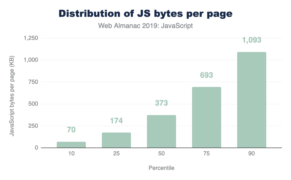
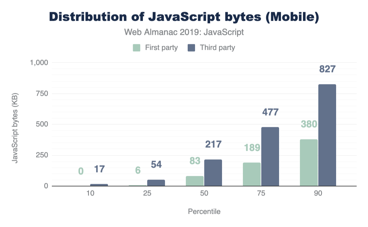
Figure 1.1 above shows that we use 373 KB of JavaScript at the 50th percentile, or median. In other words, 50% of all sites ship more than this much JavaScript to their users.
Looking at these numbers, it’s only natural to wonder if this is too much JavaScript. However in terms of page performance, the impact entirely depends on network connections and devices used. Which brings us to our next question: how much JavaScript do we ship when we compare mobile and desktop clients?
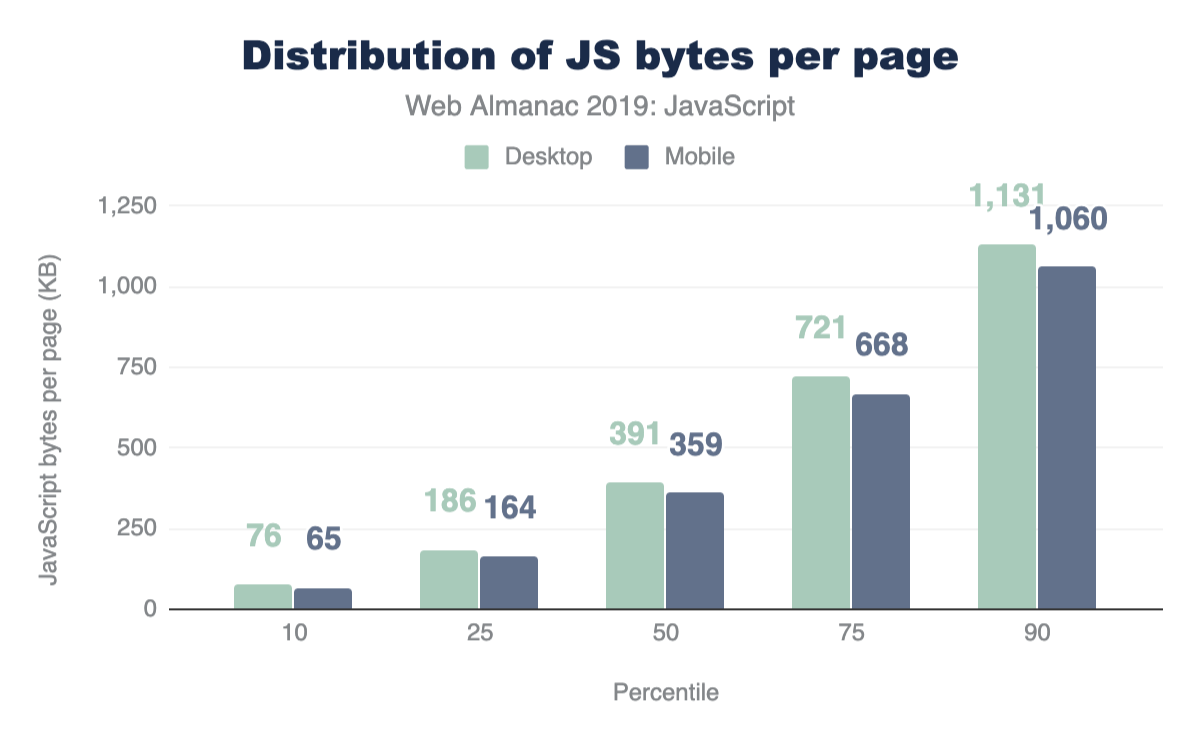
At every percentile, we’re sending slightly more JavaScript to desktop devices than we are to mobile.
Processing time
After being parsed and compiled, JavaScript fetched by the browser needs to processed (or executed) before it can be utilized. Devices vary, and their computing power can significantly affect how fast JavaScript can be processed on a page. What are the current processing times on the web?
We can get an idea by analyzing main thread processing times for V8 at different percentiles:
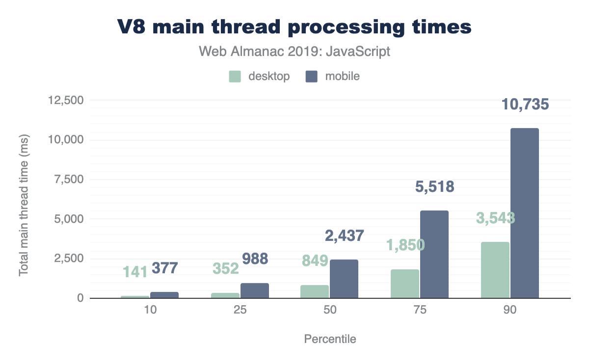
At every percentile, processing times are longer for mobile web pages than on desktop. The median total main thread time on desktop is 849 ms, while mobile is at a larger number: 2,437 ms.
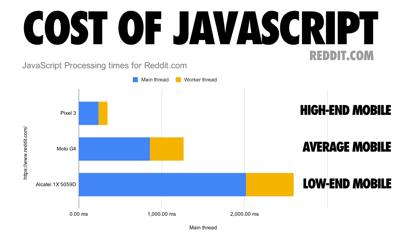
Although this data shows how much longer it can take for a mobile device to process JavaScript compared to a more powerful desktop machine, mobile devices also vary in terms of computing power. The following chart shows how processing times on a single web page can vary significantly depending on the mobile device class.
Number of requests
One avenue worth exploring when trying to analyze the amount of JavaScript used by web pages is the number of requests shipped. With HTTP/2, sending multiple smaller chunks can improve page load over sending a larger, monolithic bundle. If we also break it down by device client, how many requests are being fetched?
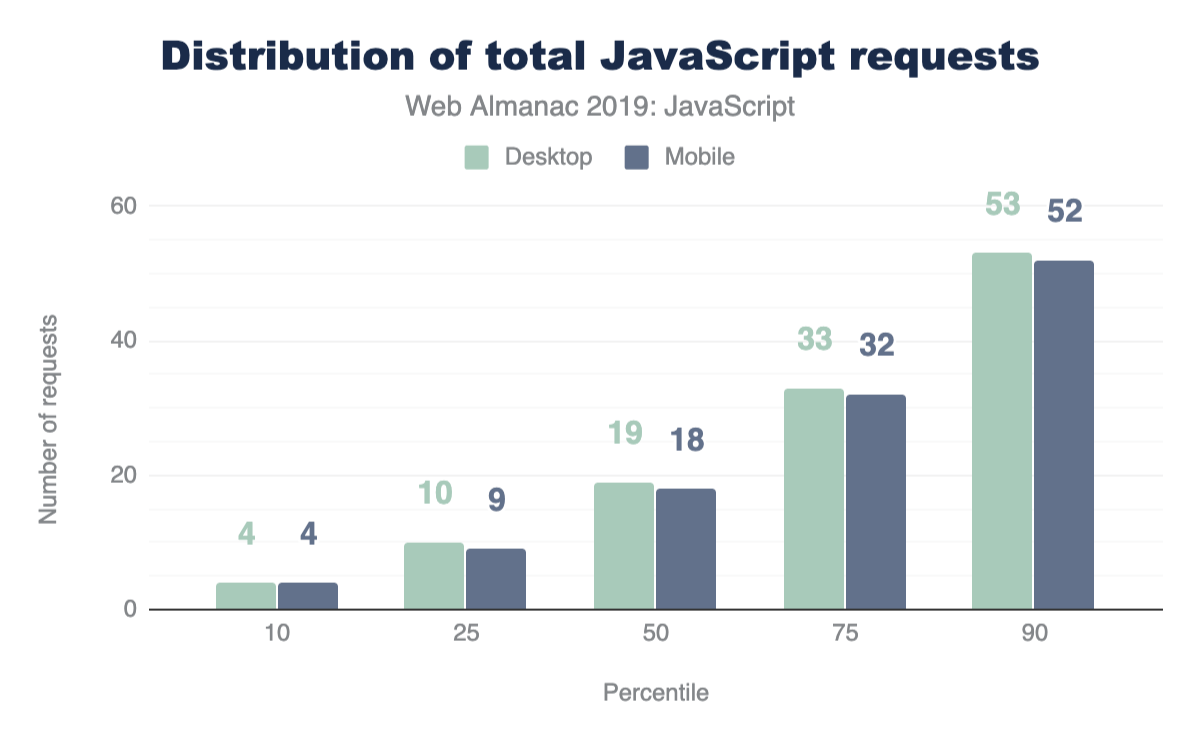
At the median, 19 requests are sent for desktop and 18 for mobile.
First-party vs. third-party
Of the results analyzed so far, the entire size and number of requests were being considered. In a majority of websites however, a significant portion of the JavaScript code fetched and used comes from third-party sources.
Third-party JavaScript can come from any external, third-party source. Ads, analytics and social media embeds are all common use-cases for fetching third-party scripts. So naturally, this brings us to our next question: how many requests sent are third-party instead of first-party?
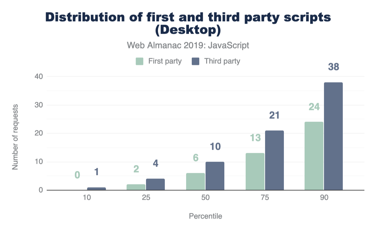
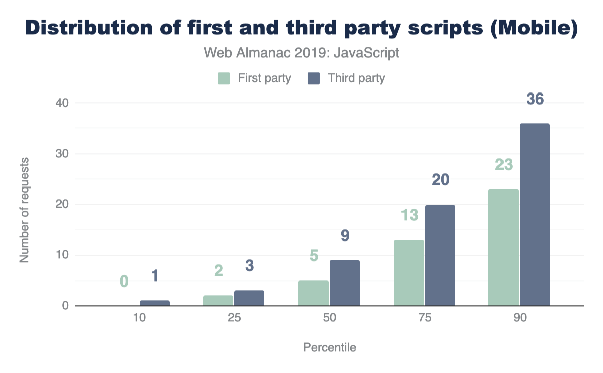
For both mobile and desktop clients, more third-party requests are sent than first-party at every percentile. If this seems surprising, let’s find out how much actual code shipped comes from third-party vendors.
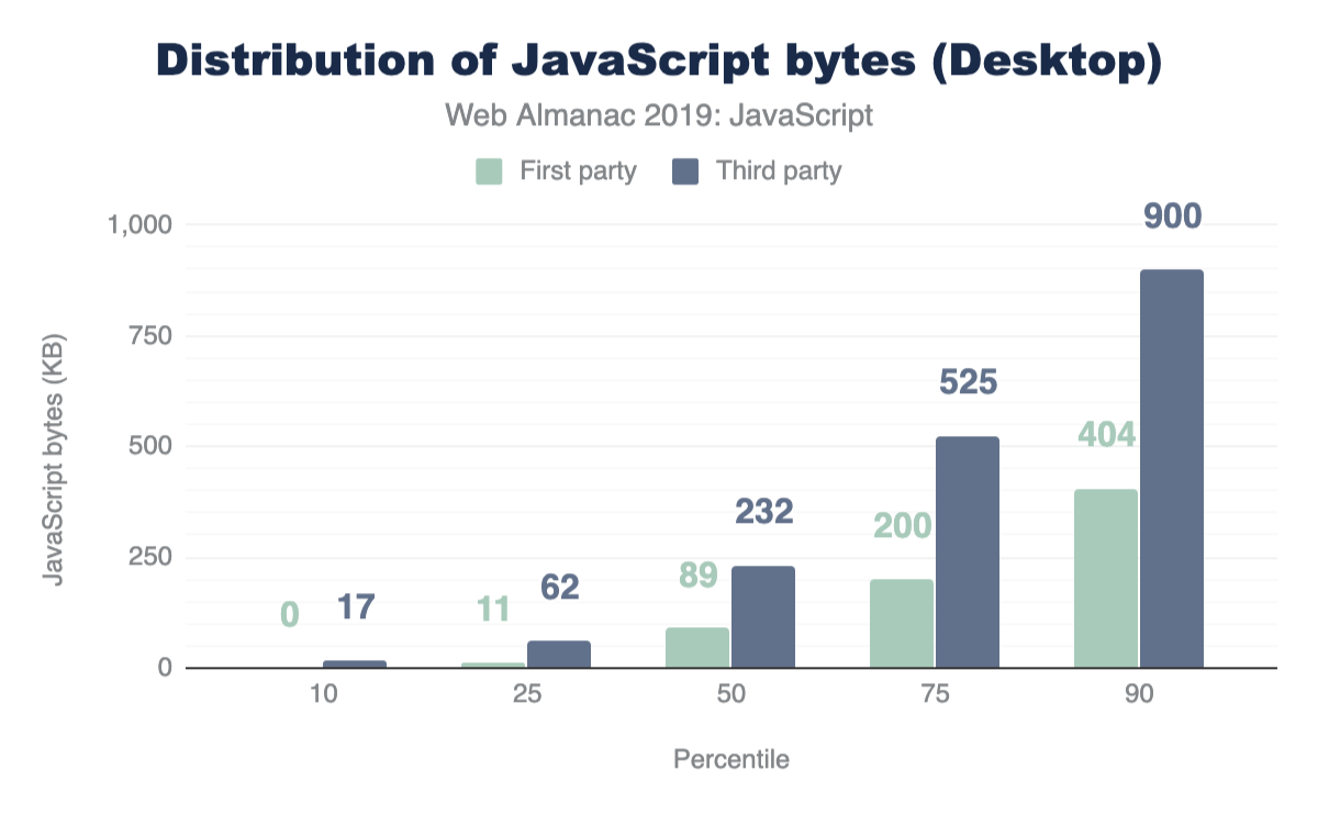
At the median, 89% more third-party code is used than first-party code authored by the developer for both mobile and desktop. This clearly shows that third-party code can be one of the biggest contributors to bloat. For more information on the impact of third parties, refer to the “Third Parties” chapter.
Resource compression
In the context of browser-server interactions, resource compression refers to code that has been modified using a data compression algorithm. Resources can be compressed statically ahead of time or on-the-fly as they are requested by the browser, and for either approach the transferred resource size is significantly reduced which improves page performance.
There are multiple text-compression algorithms, but only two are mostly used for the compression (and decompression) of HTTP network requests:
- Gziphttps://www.gzip.org/ (
gzip): The most widely used compression format for server and client interactions - Brotlihttps://github.com/google/brotli (
br): A newer compression algorithm aiming to further improve compression ratios. 90% of browsershttps://caniuse.com/#feat=brotli support Brotli encoding.
Compressed scripts will always need to be uncompressed by the browser once transferred. This means its content remains the same and execution times are not optimized whatsoever. Resource compression, however, will always improve download times which also is one of the most expensive stages of JavaScript processing. Ensuring JavaScript files are compressed correctly can be one of the most significant factors in improving site performance.
How many sites are compressing their JavaScript resources?
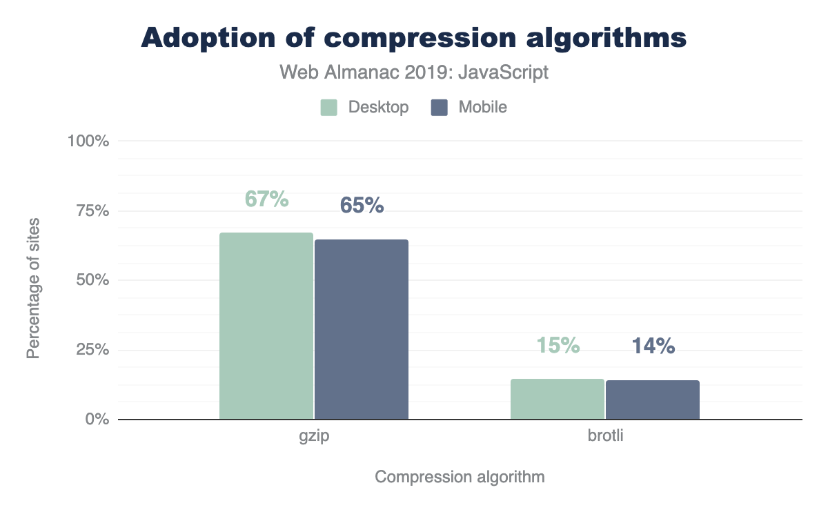
The majority of sites are compressing their JavaScript resources. Gzip encoding is used on ~64-67% of sites and Brotli on ~14%. Compression ratios are similar for both desktop and mobile.
For a deeper analysis on compression, refer to the “Compression” chapter.
Open source libraries and frameworks
Open source code, or code with a permissive license that can be accessed, viewed and modified by anyone. From tiny libraries to entire browsers, such as Chromiumhttps://www.chromium.org/Home and Firefoxhttps://www.openhub.net/p/firefox, open source code plays a crucial role in the world of web development. In the context of JavaScript, developers rely on open source tooling to include all types of functionality into their web page. Regardless of whether a developer decides to use a small utility library or a massive framework that dictates the architecture of their entire application, relying on open-source packages can make feature development easier and faster. So which JavaScript open-source libraries are used the most?
| Library | Desktop | Mobile |
|---|---|---|
| jQuery | 85.03% | 83.46% |
| jQuery Migrate | 31.26% | 31.68% |
| jQuery UI | 23.60% | 21.75% |
| Modernizr | 17.80% | 16.76% |
| FancyBox | 7.04% | 6.61% |
| Lightbox | 6.02% | 5.93% |
| Slick | 5.53% | 5.24% |
| Moment.js | 4.92% | 4.29% |
| Underscore.js | 4.20% | 3.82% |
| prettyPhoto | 2.89% | 3.09% |
| Select2 | 2.78% | 2.48% |
| Lodash | 2.65% | 2.68% |
| Hammer.js | 2.28% | 2.70% |
| YUI | 1.84% | 1.50% |
| Lazy.js | 1.26% | 1.56% |
| Fingerprintjs | 1.21% | 1.32% |
| script.aculo.us | 0.98% | 0.85% |
| Polyfill | 0.97% | 1.00% |
| Flickity | 0.83% | 0.92% |
| Zepto | 0.78% | 1.17% |
| Dojo | 0.70% | 0.62% |
Figure 1.11. Top JavaScript libraries on desktop and mobile.
jQueryhttps://jquery.com/, the most popular JavaScript library ever created, is used in 85.03% of desktop pages and 83.46% of mobile pages. The advent of many Browser APIs and methods, such as Fetchhttps://developer.mozilla.org/docs/Web/API/Fetch_API and querySelectorhttps://developer.mozilla.org/docs/Web/API/Document/querySelector, standardized much of the functionality provided by the library into a native form. Although the popularity of jQuery may seem to be declining, why is it still used in the vast majority of the web?
There are a number of possible reasons:
- WordPresshttps://wordpress.org/, which is used in more than 30% of sites, includes jQuery by default.
- Switching from jQuery to a newer client-side library can take time depending on how large an application is, and many sites may consist of jQuery in addition to newer client-side libraries.
Other top used JavaScript libraries include jQuery variants (jQuery migrate, jQuery UI), Modernizrhttps://modernizr.com/, Moment.jshttps://momentjs.com/, Underscore.jshttps://underscorejs.org/ and so on.
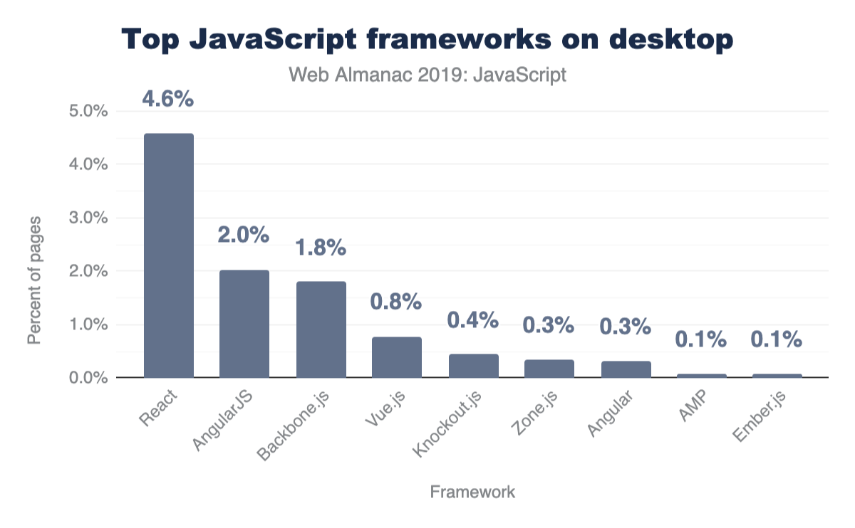
Frameworks and UI libraries
In the past number of years, the JavaScript ecosystem has seen a rise in open-source libraries and frameworks to make building single-page applications (SPAs) easier. A single-page application is characterized as a web page that loads a single HTML page and uses JavaScript to modify the page on user interaction instead of fetching new pages from the server. Although this remains to be the main premise of single-page applications, different server-rendering approaches can still be used to improve the experience of such sites. How many sites use these types of frameworks?
Only a subset of popular frameworks are being analyzed here, but it’s important to note that all of them either follow one of these two approaches:
- A model-view-controllerhttps://developer.chrome.com/apps/app_frameworks (or model-view-viewmodel) architecture
- A component-based architecture
Although there has been a shift towards a component-based model, many older frameworks that follow the MVC paradigm (AngularJShttps://angularjs.org/, Backbone.jshttps://backbonejs.org/, Emberhttps://emberjs.com/) are still being used in thousands of pages. However, Reacthttps://reactjs.org/, Vuehttps://vuejs.org/ and Angularhttps://angular.io/ are the most popular component-based frameworks (Zone.jshttps://github.com/angular/zone.js is a package that is now part of Angular core).
Differential loading
JavaScript moduleshttps://v8.dev/features/modules, or ES modules, are supported in all major browsershttps://caniuse.com/#feat=es6-module. Modules provide the capability to create scripts that can import and export from other modules. This allows anyone to build their applications architected in a module pattern, importing and exporting wherever necessary, without relying on third-party module loaders.
To declare a script as a module, the script tag must get the type="module" attribute:
How many sites use type="module" for scripts on their page?
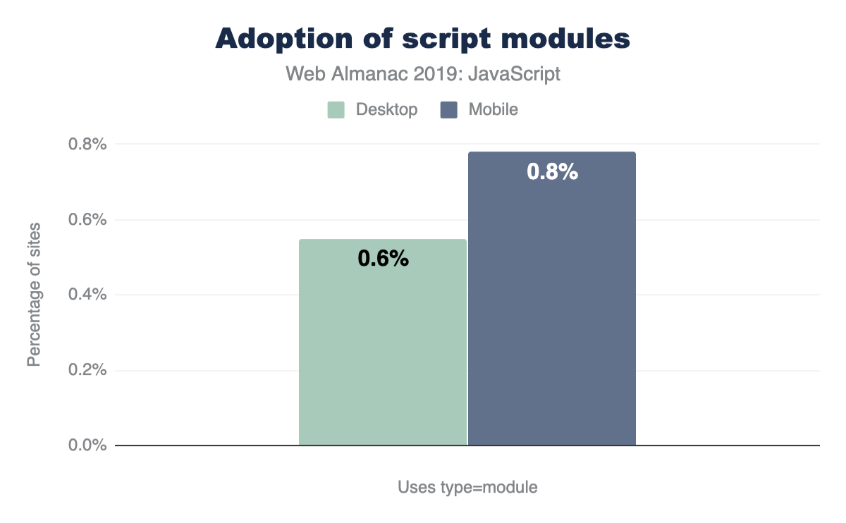
Browser-level support for modules is still relatively new, and the numbers here show that very few sites currently use type="module" for their scripts. Many sites are still relying on module loaders (2.37% of all desktop sites use RequireJShttps://github.com/requirejs/requirejs for example) and bundlers (webpackhttps://webpack.js.org/ for example) to define modules within their codebase.
If native modules are used, it’s important to ensure that an appropriate fallback script is used for browsers that do not yet support modules. This can be done by including an additional script with a nomodule attribute.
When used together, browsers that support modules will completely ignore any scripts containing the nomodule attribute. On the other hand, browsers that do not yet support modules will not download any scripts with type="module". Since they do not recognize nomodule either, they will download scripts with the attribute normally. Using this approach can allow developers to send modern code to modern browsers for faster page loadshttps://web.dev/serve-modern-code-to-modern-browsers/. So, how many sites use nomodule for scripts on their page?
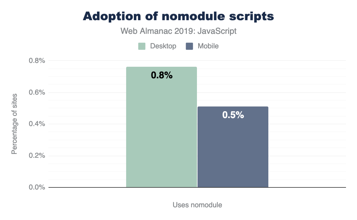
Similarly, very few sites (0.50%-0.80%) use the nomodule attribute for any scripts.
Preload and prefetch
Preloadhttps://developer.mozilla.org/docs/Web/HTML/Link_types/preload and prefetchhttps://developer.mozilla.org/docs/Web/HTTP/Link_prefetching_FAQ are resource hints which enable you to aid the browser in determining what resources need to be downloaded.
- Preloading a resource with
<link rel="preload">tells the browser to download this resource as soon as possible. This is especially helpful for critical resources which are discovered late in the page loading process (e.g., JavaScript located at the bottom of your HTML) and are otherwise downloaded last. - Using
<link rel="prefetch">tells the browser to take advantage of any idle time it has to fetch these resources needed for future navigations
So, how many sites use preload and prefetch directives?
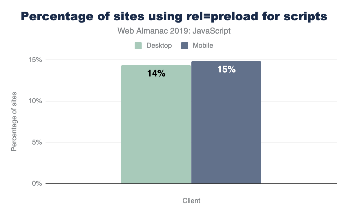
For all sites measured in HTTP Archive, 14.33% of desktop sites and 14.84% of mobile sites use <link rel="preload"> for scripts on their page.
For prefetch, we have the following:
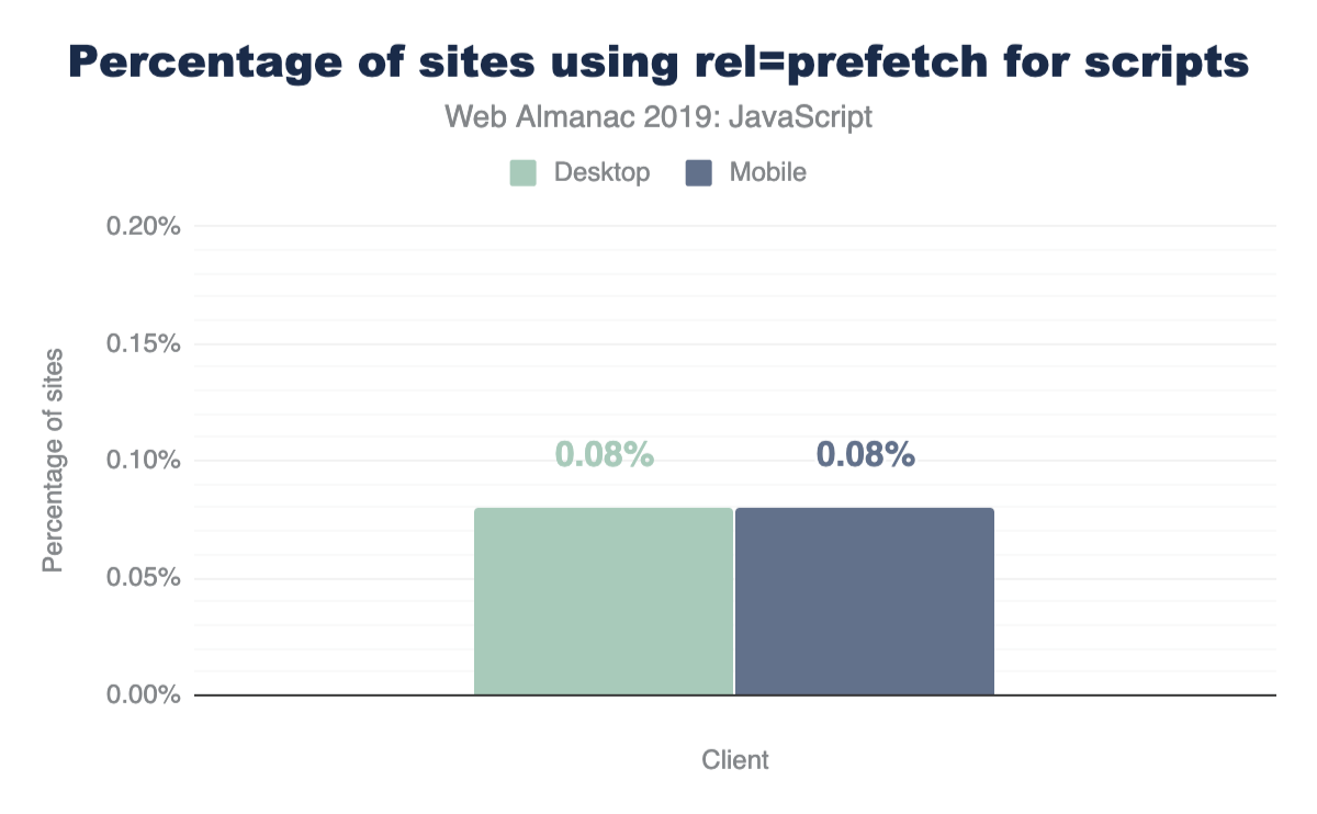
For both mobile and desktop, 0.08% of pages leverage prefetch for any of their scripts.
Newer APIs
JavaScript continues to evolve as a language. A new version of the language standard itself, known as ECMAScript, is released every year with new APIs and features passing proposal stages to become a part of the language itself.
With HTTP Archive, we can take a look at any newer API that is supported (or is about to be) and see how widespread its usage is. These APIs may already be used in browsers that support them or with an accompanying polyfill to make sure they still work for every user.
How many sites use the following APIs?
- Atomicshttps://developer.mozilla.org/docs/Web/JavaScript/Reference/Global_Objects/Atomics
- Intlhttps://developer.mozilla.org/docs/Web/JavaScript/Reference/Global_Objects/Intl
- Proxyhttps://developer.mozilla.org/docs/Web/JavaScript/Reference/Global_Objects/Proxy
- SharedArrayBufferhttps://developer.mozilla.org/docs/Web/JavaScript/Reference/Global_Objects/SharedArrayBuffer
- WeakMaphttps://developer.mozilla.org/docs/Web/JavaScript/Reference/Global_Objects/WeakMap
- WeakSethttps://developer.mozilla.org/docs/Web/JavaScript/Reference/Global_Objects/WeakSet
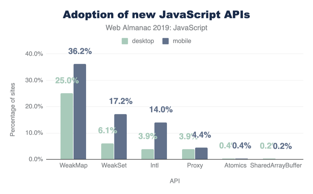
Atomics (0.38%) and SharedArrayBuffer (0.20%) are barely visible on this chart since they are used on such few pages.
It is important to note that the numbers here are approximations and they do not leverage UseCounterhttps://chromium.googlesource.com/chromium/src.git/+/master/docs/use_counter_wiki.md to measure feature usage.
Source maps
In many build systems, JavaScript files undergo minification to minimize its size and transpilation for newer language features that are not yet supported in many browsers. Moreover, language supersets like TypeScripthttps://www.typescriptlang.org/ compile to an output that can look noticeably different from the original source code. For all these reasons, the final code served to the browser can be unreadable and hard to decipher.
A source map is an additional file accompanying a JavaScript file that allows a browser to map the final output to its original source. This can make debugging and analyzing production bundles much simpler.
Although useful, there are a number of reasons why many sites may not want to include source maps in their final production site, such as choosing not to expose complete source code to the public. So how many sites actually include sourcemaps?

For both desktop and mobile pages, the results are about the same. 17-18% include a source map for at least one script on the page (detected as a first-party script with sourceMappingURL).
Conclusion
The JavaScript ecosystem continues to change and evolve every year. Newer APIs, improved browser engines, and fresh libraries and frameworks are all things we can expect to happen indefinitely. HTTP Archive provides us with valuable insight on how sites in the wild use the language.
Without JavaScript, the web would not be where it is today, and all the data gathered for this article only proves this.
Author
-
Houssein DjirdehHoussein is a Developer Advocate at Google working on speed, performance and the web framework ecosystem. He tweets at @hdjirdeh and blogs at https://houssein.me/.

CSS

Introduction
Cascading Style Sheets (CSS) are used to paint, format, and layout web pages. Their capabilities span concepts as simple as text color to 3D perspective. It also has hooks to empower developers to handle varying screen sizes, viewing contexts, and printing. CSS helps developers wrangle content and ensure it’s adapting properly to the user.
When describing CSS to those not familiar with web technology, it can be helpful to think of it as the language to paint the walls of the house; describing the size and position of windows and doors, as well as flourishing decorations such as wallpaper or plant life. The fun twist to that story is that depending on the user walking through the house, a developer can adapt the house to that specific user’s preferences or contexts!
In this chapter, we’ll be inspecting, tallying, and extracting data about how CSS is used across the web. Our goal is to holistically understand what features are being used, how they’re used, and how CSS is growing and being adopted.
Ready to dig into the fascinating data?! Many of the following numbers may be small, but don’t mistake them as insignificant! It can take many years for new things to saturate the web.
Color
Color is an integral part of theming and styling on the web. Let’s take a look at how websites tend to use color.
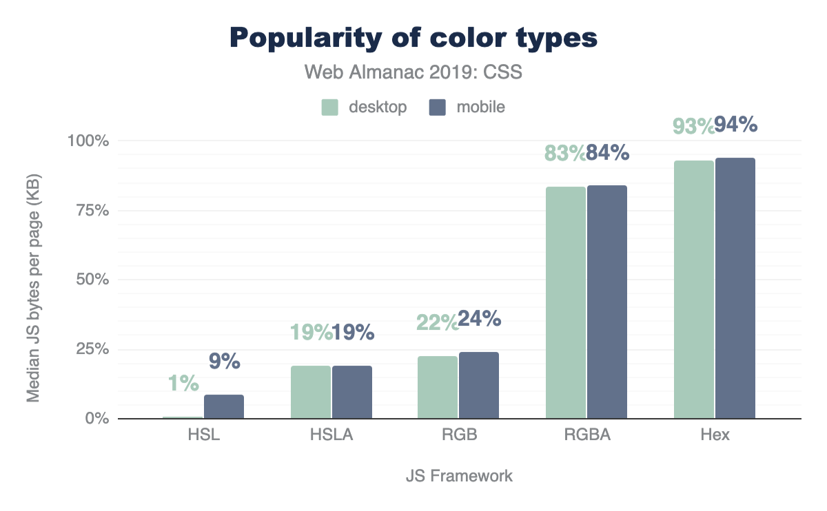
Color types
Hex is the most popular way to describe color by far, with 93% usage, followed by RGB, and then HSL. Interestingly, developers are taking full advantage of the alpha-transparency argument when it comes to these color types: HSLA and RGBA are far more popular than HSL and RGB, with almost double the usage! Even though the alpha-transparency was added later to the web spec, HSLA and RGBA are supported as far back as IE9https://caniuse.com/#feat=css3-colors, so you can go ahead and use them, too!
Color selection
There are 148 named CSS colorshttps://www.w3.org/TR/css-color-4/#named-colors, not including the special values transparent and currentcolor. You can use these by their string name for more readable styling. The most popular named colors are black and white, unsurprisingly, followed by red and blue.
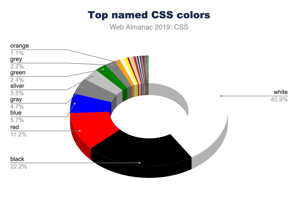
Language is interestingly inferred via color as well. There are more instances of the American-style “gray” than the British-style “grey”. Almost every instance of gray colorshttps://www.rapidtables.com/web/color/gray-color.html (gray, lightgray, darkgray, slategray, etc.) had nearly double the usage when spelled with an “a” instead of an “e”. If gr[a/e]ys were combined, they would rank higher than blue, solidifying themselves in the #4 spot. This could be why silver is ranked higher than grey with an “e” in the charts!
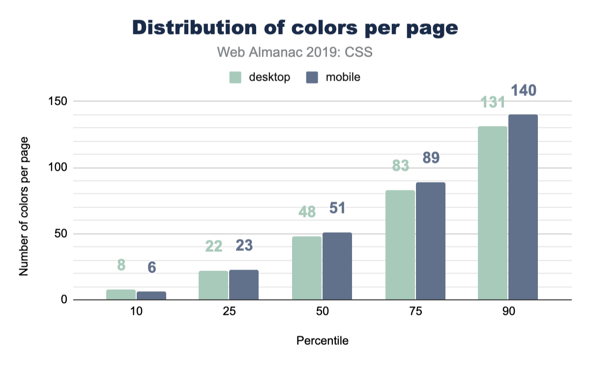
Color count
How many different font colors are used across the web? So this isn’t the total number of unique colors; rather, it’s how many different colors are used just for text. The numbers in this chart are quite high, and from experience, we know that without CSS variables, spacing, sizes and colors can quickly get away from you and fragment into lots of tiny values across your styles. These numbers reflect a difficulty of style management, and we hope this helps create some perspective for you to bring back to your teams or projects. How can you reduce this number into a manageable and reasonable amount?
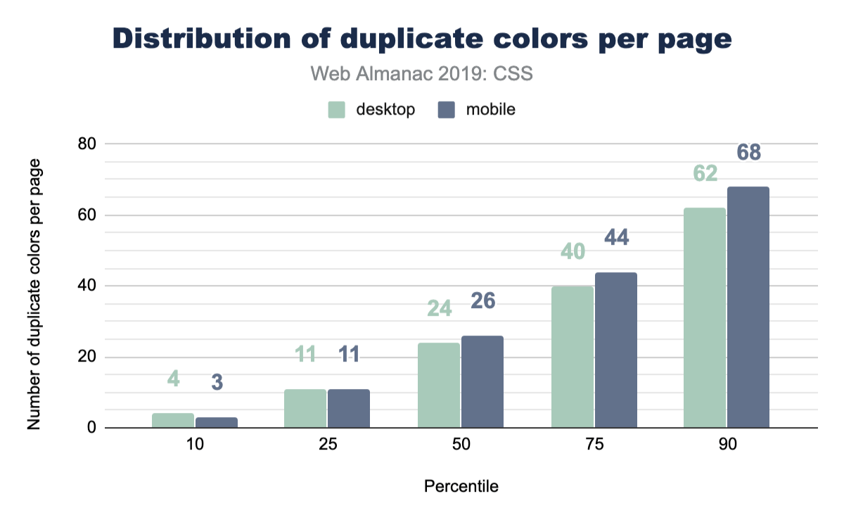
Color duplication
Well, we got curious here and wanted to inspect how many duplicate colors are present on a page. Without a tightly managed reusable class CSS system, duplicates are quite easy to create. It turns out that the median has enough duplicates that it could be worth doing a pass to unify them with custom properties.
Units
In CSS, there are many different ways to achieve the same visual result using different unit types: rem, px, em, ch, or even cm! So which unit types are most popular?
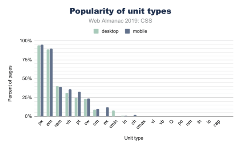
Length and sizing
Unsurprisingly, in Figure 2.5 above, px is the most used unit type, with about 95% of web pages using pixels in some form or another (this could be element sizing, font size, and so on). However, the em unit is almost as popular, with about 90% usage. This is over 2x more popular than the rem unit, which has only 40% frequency in web pages. If you’re wondering what the difference is, em is based on the parent font size, while rem is based on the base font size set to the page. It doesn’t change per-component like em could, and thus allows for adjustment of all spacing evenly.
When it comes to units based on physical space, the cm (or centimeter) unit is the most popular by far, followed by in (inches), and then Q. We know these types of units are specifically useful for print stylesheets, but we didn’t even know the Q unit existed until this survey! Did you?
Viewport-based units
We saw larger differences in unit types when it comes to mobile and desktop usage for viewport-based units. 36.8% of mobile sites use vh (viewport height), while only 31% of desktop sites do. We also found that vh is more common than vw (viewport width) by about 11%. vmin (viewport minimum) is more popular than vmax (viewport maximum), with about 8% usage of vmin on mobile while vmax is only used by 1% of websites.
Custom properties
Custom properties are what many call CSS variables. They’re more dynamic than a typical static variable though! They’re very powerful and as a community we’re still discovering their potential.
We felt like this was exciting information, since it shows healthy growth of one of our favorite CSS additions. They were available in all major browsers since 2016 or 2017, so it’s fair to say they’re fairly new. Many folks are still transitioning from their CSS preprocessor variables to CSS custom properties. We estimate it’ll be a few more years until custom properties are the norm.
Selectors
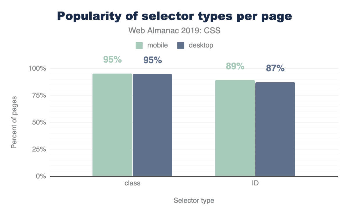
ID vs class selectors
CSS has a few ways to find elements on the page for styling, so let’s put IDs and classes against each other to see which is more prevalent! The results shouldn’t be too surprising: classes are more popular!
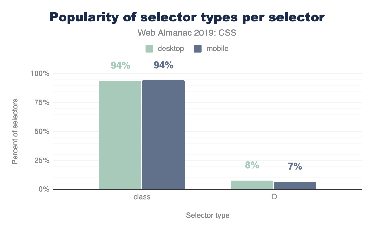
A nice follow up chart is this one, showing that classes take up 93% of the selectors found in a stylesheet.
Attribute selectors
CSS has some very powerful comparison selectors. These are selectors like [target="_blank"], [attribute^="value"], [title~="rad"], [attribute$="-rad"] or [attribute*="value"]. Do you use them? Think they’re used a lot? Let’s compare how those are used with IDs and classes across the web.
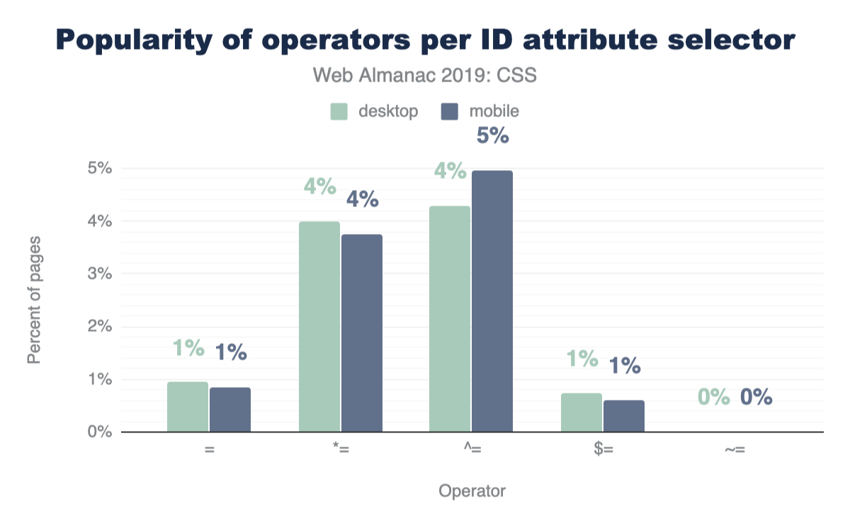
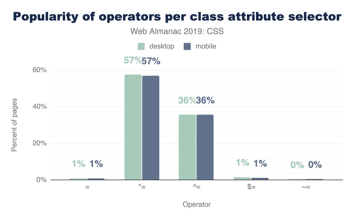
These operators are much more popular with class selectors than IDs, which feels natural since a stylesheet usually has fewer ID selectors than class selectors, but still neat to see the uses of all these combinations.
Classes per element
With the rise of OOCSS, atomic, and functional CSS strategies which can compose 10 or more classes on an element to achieve a design look, perhaps we’d see some interesting results. The query came back quite unexciting, with the median on mobile and desktop being 1 class per element.
Layout
Flexbox
Flexboxhttps://developer.mozilla.org/docs/Web/CSS/CSS_Flexible_Box_Layout/Basic_Concepts_of_Flexbox is a container style that directs and aligns its children; that is, it helps with layout in a constraint-based way. It had a quite rocky beginning on the web, as its specification went through two or three quite drastic changes between 2010 and 2013. Fortunately, it settled and was implemented across all browsers by 2014. Given that history, it had a slow adoption rate, but it’s been a few years since then! It’s quite popular now and has many articles about it and how to leverage it, but it’s still new in comparison to other layout tactics.
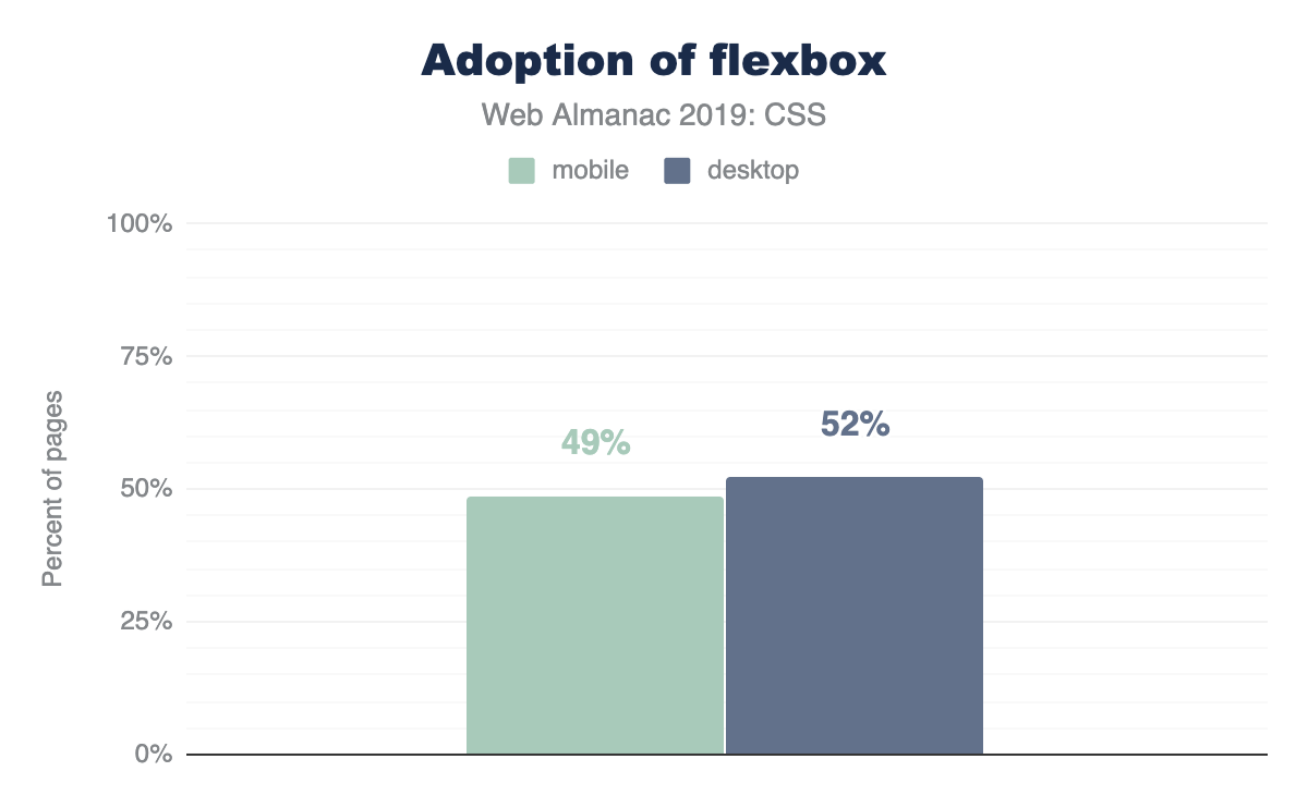
Quite the success story shown here, as nearly 50% of the web has flexbox usage in its stylesheets.
Grid
Like flexbox, gridhttps://developer.mozilla.org/docs/Web/CSS/CSS_Grid_Layout too went through a few spec alternations early on in its lifespan, but without changing implementations in publicly-deployed browsers. Microsoft had grid in the first versions of Windows 8, as the primary layout engine for its horizontally scrolling design style. It was vetted there first, transitioned to the web, and then hardened by the other browsers until its final release in 2017. It had a very successful launch in that nearly all browsers released their implementations at the same time, so web developers just woke up one day to superb grid support. Today, at the end of 2019, grid still feels like a new kid on the block, as folks are still awakening to its power and capabilities.
This shows just how little the web development community has exercised and explored their latest layout tool. We look forward to the eventual takeover of grid as the primary layout engine folks lean on when building a site. For us authors, we love writing grid: we typically reach for it first, then dial our complexity back as we realize and iterate on layout. It remains to be seen what the rest of the world will do with this powerful CSS feature over the next few years.
Writing modes
The web and CSS are international platform features, and writing modes offer a way for HTML and CSS to indicate a user’s preferred reading and writing direction within our elements.
Typography
Web fonts per page
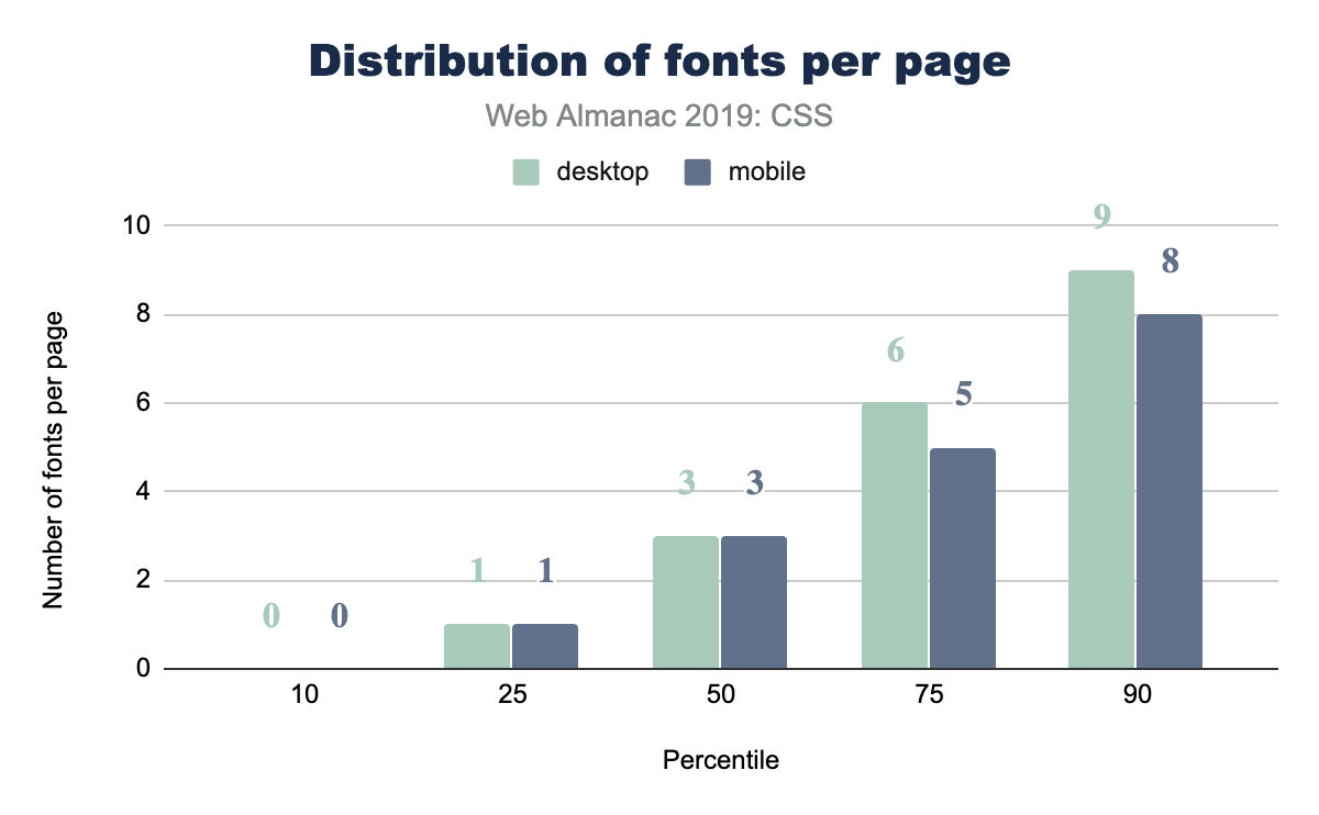
How many web fonts are you loading on your web page: 0? 10? The median number of web fonts per page is 3!
Popular font families
A natural follow up to the inquiry of total number of fonts per page, is: what fonts are they?! Designers, tune in, because you’ll now get to see if your choices are in line with what’s popular or not.
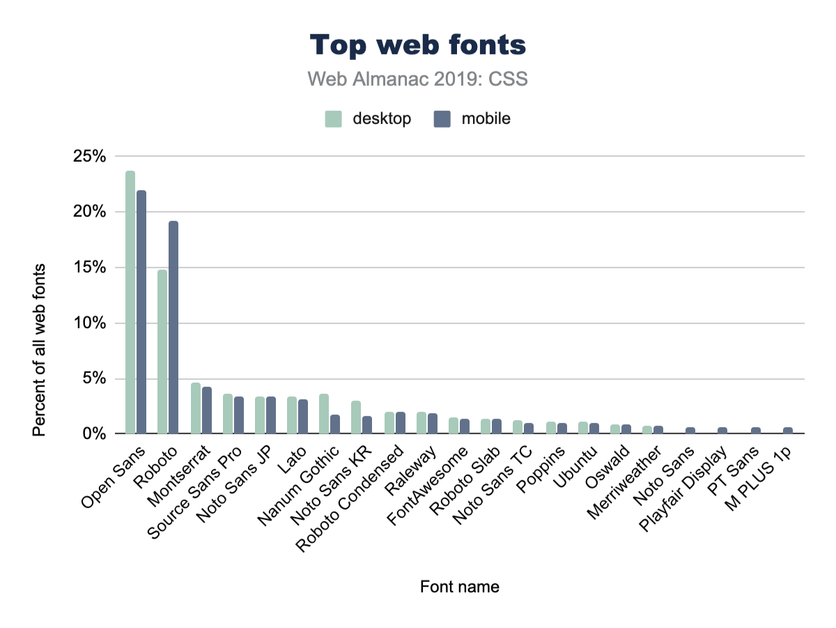
Open Sans is a huge winner here, with nearly 1 in 4 CSS @font-family declarations specifying it. We’ve definitely used Open Sans in projects at agencies.
It’s also interesting to note the differences between desktop and mobile adoption. For example, mobile pages use Open Sans slightly less often than desktop. Meanwhile, they also use Roboto slightly more often.
Font sizes
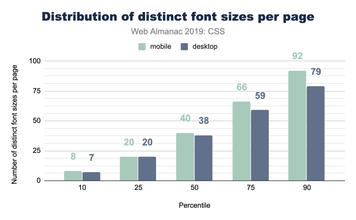
This is a fun one, because if you asked a user how many font sizes they feel are on a page, they’d generally return a number of 5 or definitely less than 10. Is that reality though? Even in a design system, how many font sizes are there? We queried the web and found the median to be 40 on mobile and 38 on desktop. Might be time to really think hard about custom properties or creating some reusable classes to help you distribute your type ramp.
Spacing
Margins
A margin is the space outside of elements, like the space you demand when you push your arms out from yourself. This often looks like the spacing between elements, but is not limited to that effect. In a website or app, spacing plays a huge role in UX and design. Let’s see how much margin spacing code goes into a stylesheet, shall we?

Quite a lot, it seems! The median desktop page has 96 distinct margin values and 104 on mobile. That makes for a lot of unique spacing moments in your design. Curious how many margins you have in your site? How can we make all this whitespace more manageable?
Logical properties
We estimate that the hegemony of margin-left and padding-top is of limited duration, soon to be supplemented by their writing direction agnostic, successive, logical property syntax. While we’re optimistic, current usage is quite low at 0.67% usage on desktop pages. To us, this feels like a habit change we’ll need to develop as an industry, while hopefully training new developers to use the new syntax.
z-index
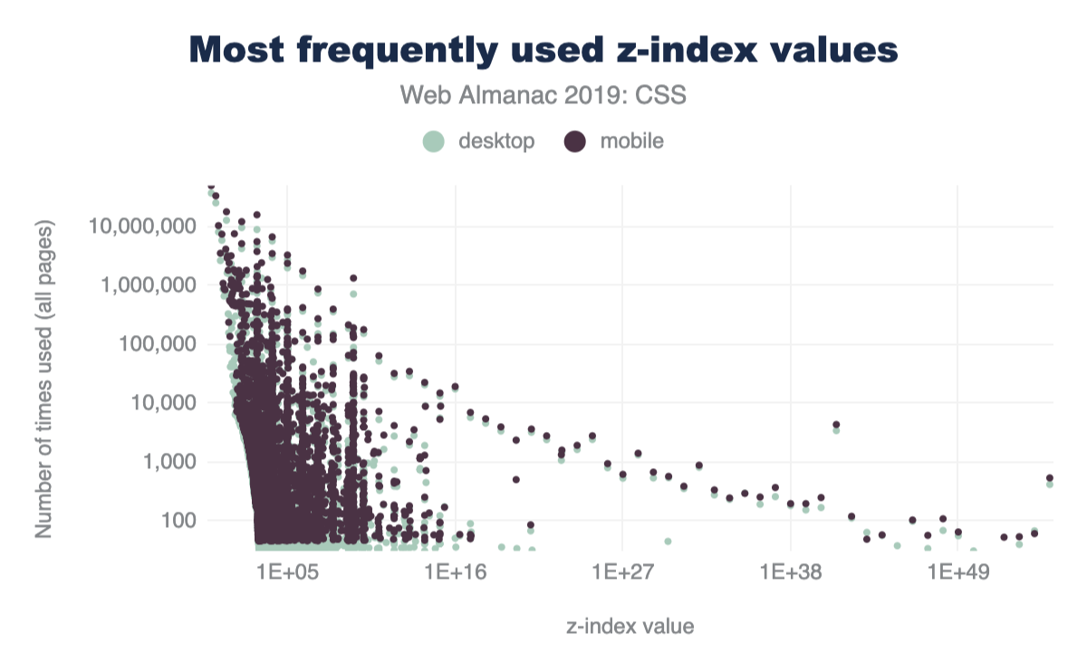
Vertical layering, or stacking, can be managed with z-index in CSS. We were curious how many different values folks use in their sites. The range of what z-index accepts is theoretically infinite, bounded only by a browser’s variable size limitations. Are all those stack positions used? Let’s see!

z-index values per page.
Popular z-index values
From our work experience, any number of 9’s seemed to be the most popular choice. Even though we taught ourselves to use the lowest number possible, that’s not the communal norm. So what is then?! If folks need things on top, what are the most popular z-index numbers to pass in? Put your drink down; this one is funny enough you might lose it.
z-index values.
z-index value.
Decoration
Filters
Filters are a fun and great way to modify the pixels the browser intends to draw to the screen. It’s a post-processing effect that is done against a flat version of the element, node, or layer that it’s being applied to. Photoshop made them easy to use, then Instagram made them accessible to the masses through bespoke, stylized combinations. They’ve been around since about 2012, there are 10 of them, and they can be combined to create unique effects.
filter property.
We were excited to see that 78% of stylesheets contain the filter property! That number was also so high it seemed a little fishy, so we dug in and sought to explain the high number. Because let’s be honest, filters are neat, but they don’t make it into all of our applications and projects. Unless!
Upon further investigation, we discovered FontAwesomehttps://fontawesome.com’s stylesheet comes with some filter usage, as well as a YouTubehttps://youtube.com embed. Therefore, we believe filter snuck in the back door by piggybacking onto a couple very popular stylesheets. We also believe that -ms-filter presence could have been included as well, contributing to the high percent of use.
Blend modes
Blend modes are similar to filters in that they are a post-processing effect that are run against a flat version of their target elements, but are unique in that they are concerned with pixel convergence. Said another way, blend modes are how 2 pixels should impact each other when they overlap. Whichever element is on the top or the bottom will affect the way that the blend mode manipulates the pixels. There are 16 blend modes -- let’s see which ones are the most popular.
*-blend-mode property.
Overall, usage of blend modes is much lower than of filters, but is still enough to be considered moderately used.
In a future edition of the Web Almanac, it would be great to drill down into blend mode usage to get an idea of the exact modes developers are using, like multiply, screen, color-burn, lighten, etc.
Animation
Transitions
CSS has this awesome interpolation power that can be simply used by just writing a single rule on how to transition those values. If you’re using CSS to manage states in your app, how often are you employing transitions to do the task? Let’s query the web!
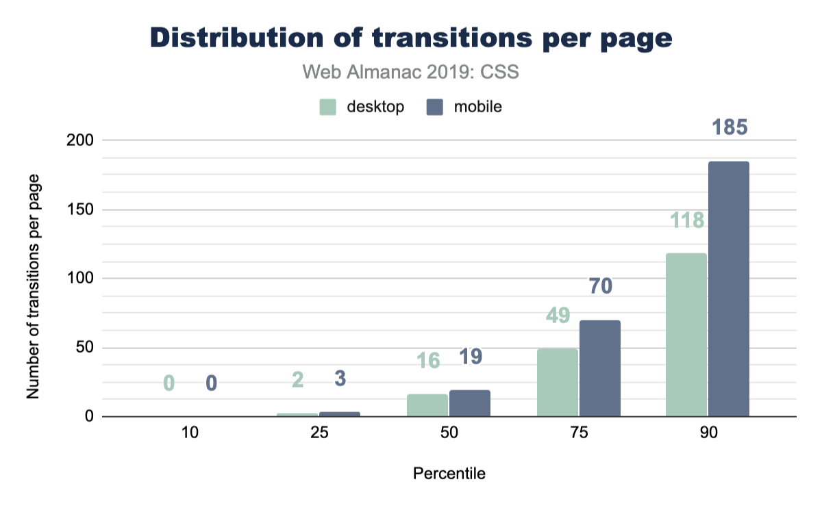
That’s pretty good! We did see animate.css as a popular library to include, which brings in a ton of transition animations, but it’s still nice to see folks are considering transitioning their UIs.
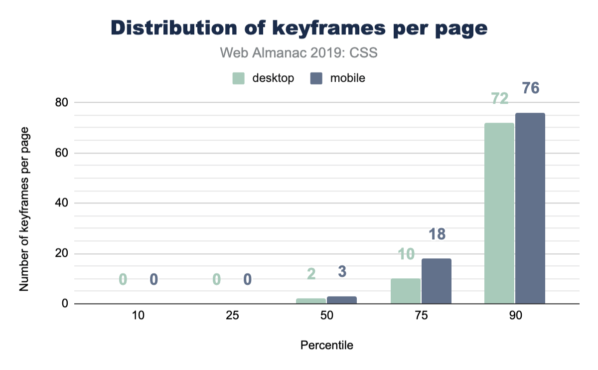
Keyframe animations
CSS keyframe animations are a great solution for your more complex animations or transitions. They allow you to be more explicit which provides higher control over the effects. They can be small, like one keyframe effect, or be large with many many keyframe effects composed into a robust animation. The median number of keyframe animations per page is much lower than CSS transitions.
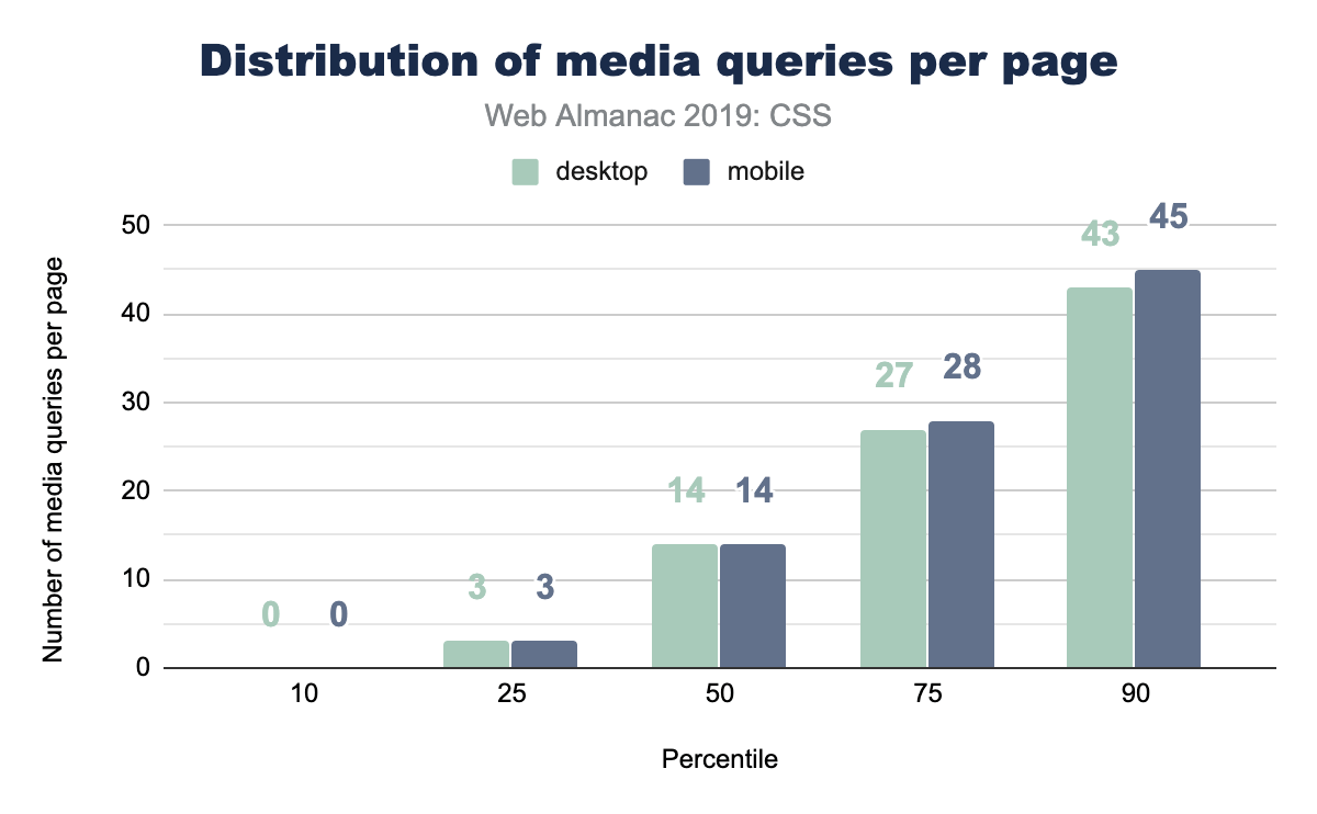
Media queries
Media queries let CSS hook into various system-level variables in order to adapt appropriately for the visiting user. Some of these queries could handle print styles, projector screen styles, and viewport/screen size. For a long time, media queries were primarily leveraged for their viewport knowledge. Designers and developers could adapt their layouts for small screens, large screens, and so forth. Later, the web started bringing more and more capabilities and queries, meaning media queries can now manage accessibility features on top of viewport features.
A good place to start with media queries, is just about how many are used per page? How many different moments or contexts does the typical page feel they want to respond to?
Popular media query breakpoint sizes
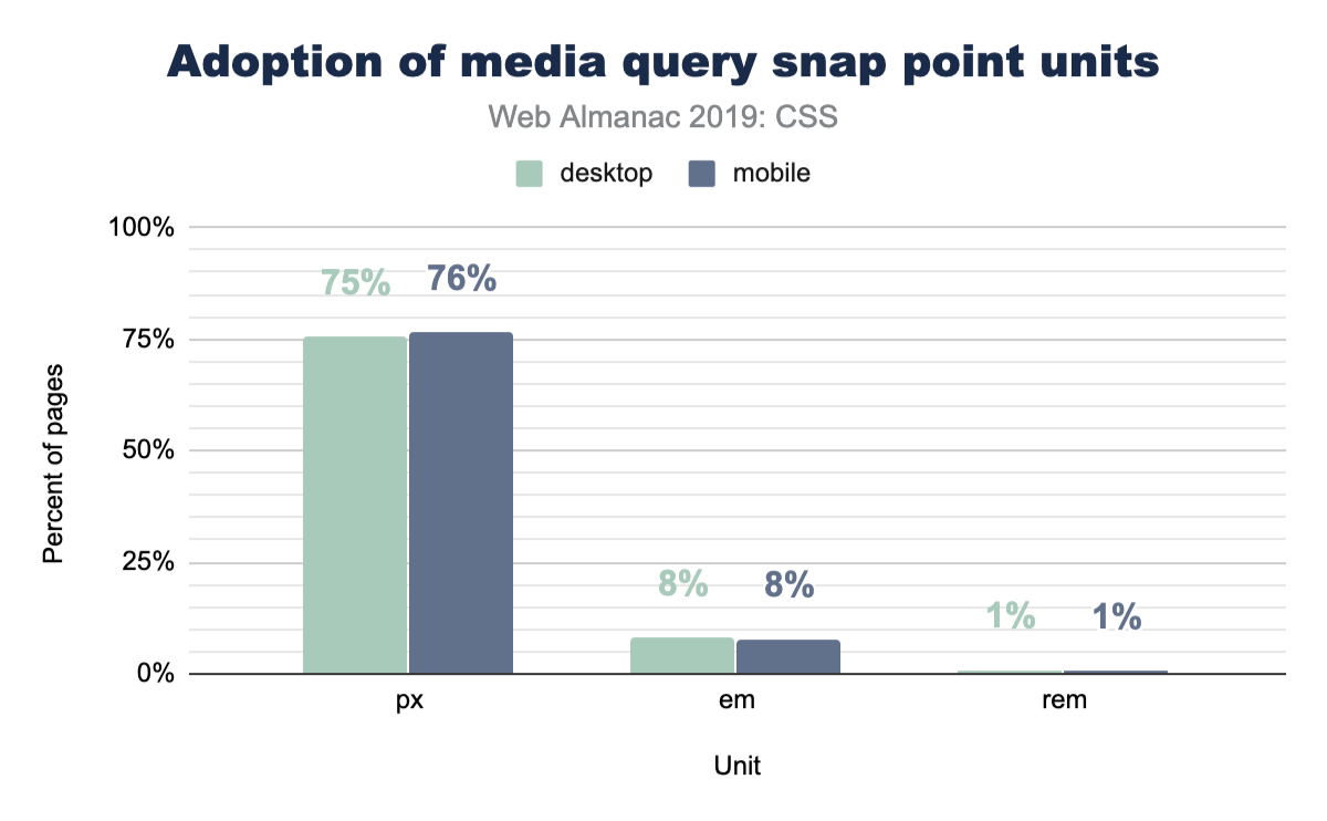
For viewport media queries, any type of CSS unit can be passed into the query expression for evaluation. In earlier days, folks would pass em and px into the query, but more units were added over time, making us very curious about what types of sizes were commonly found across the web. We assume most media queries will follow popular device sizes, but instead of assuming, let’s look at the data!

Figure 2.28 above shows that part of our assumptions were correct: there’s certainly a high amount of phone specific sizes in there, but there’s also some that aren’t. It’s interesting also how it’s very pixel dominant, with a few trickling entries using em beyond the scope of this chart.
Portrait vs landscape usage
The most popular query value from the popular breakpoint sizes looks to be 768px, which made us curious. Was this value primarily used to switch to a portrait layout, since it could be based on an assumption that 768px represents the typical mobile portrait viewport? So we ran a follow up query to see the popularity of using the portrait and landscape modes:
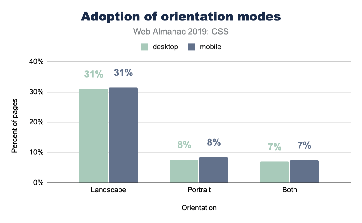
Interestingly, portrait isn’t used very much, whereas landscape is used much more. We can only assume that 768px has been reliable enough as the portrait layout case that it’s reached for much less. We also assume that folks on a desktop computer, testing their work, can’t trigger portrait to see their mobile layout as easily as they can just squish the browser. Hard to tell, but the data is fascinating.
Most popular unit types
In the width and height media queries we’ve seen so far, pixels look like the dominant unit of choice for developers looking to adapt their UI to viewports. We wanted to exclusively query this though, and really take a look at the types of units folks use. Here’s what we found.
min-width vs max-width
When folks write a media query, are they typically checking for a viewport that’s over or under a specific range, or both, checking if it’s between a range of sizes? Let’s ask the web!
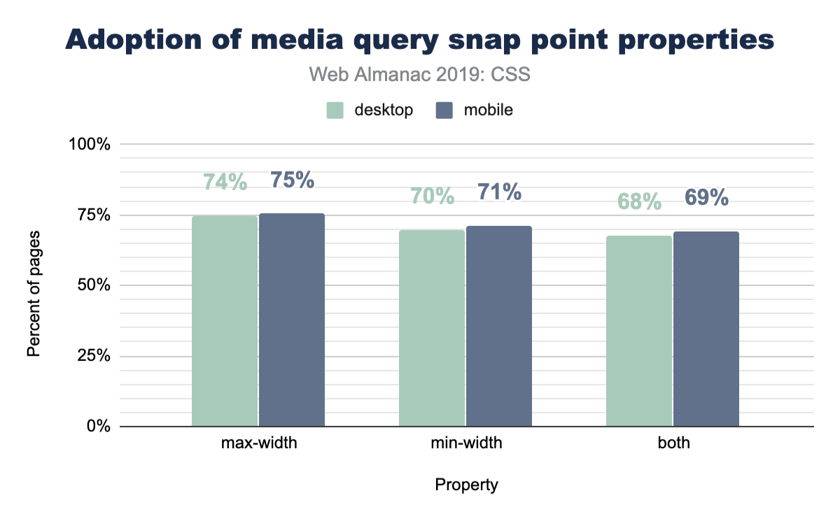
No clear winners here; max-width and min-width are nearly equally used.
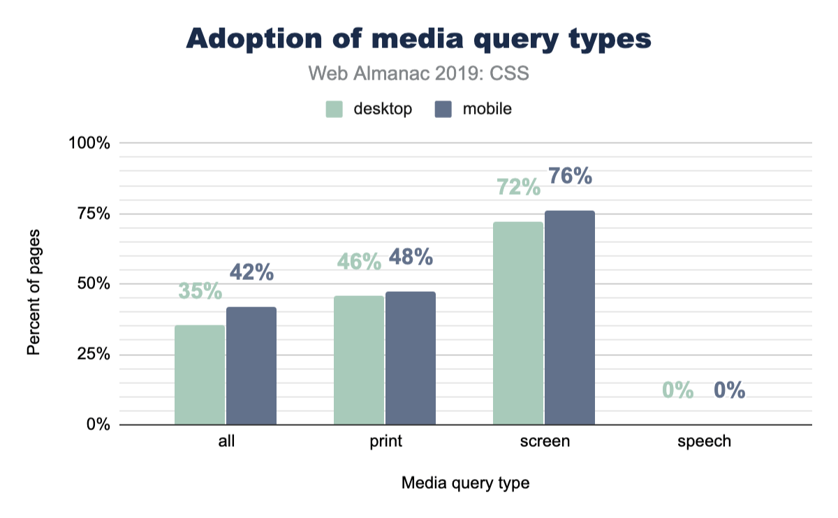
Print and speech
Websites feel like digital paper, right? As users, it’s generally known that you can just hit print from your browser and turn that digital content into physical content. A website isn’t required to change itself for that use case, but it can if it wants to! Lesser known is the ability to adjust your website in the use case of it being read by a tool or robot. So just how often are these features taken advantage of?
Page-level stats
Stylesheets
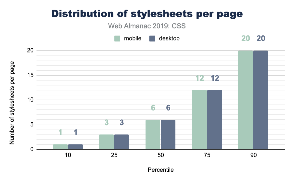
How many stylesheets do you reference from your home page? How many from your apps? Do you serve more or less to mobile vs desktop? Here’s a chart of everyone else!
Stylesheet names
What do you name your stylesheets? Have you been consistent throughout your career? Have you slowly converged or consistently diverged? This chart shows a small glimpse into library popularity, but also a large glimpse into popular names of CSS files.
| Stylesheet name | Desktop | Mobile |
|---|---|---|
| style.css | 2.43% | 2.55% |
| font-awesome.min.css | 1.86% | 1.92% |
| bootstrap.min.css | 1.09% | 1.11% |
| BfWyFJ2Rl5s.css | 0.67% | 0.66% |
| style.min.css?ver=5.2.2 | 0.64% | 0.67% |
| styles.css | 0.54% | 0.55% |
| style.css?ver=5.2.2 | 0.41% | 0.43% |
| main.css | 0.43% | 0.39% |
| bootstrap.css | 0.40% | 0.42% |
| font-awesome.css | 0.37% | 0.38% |
| style.min.css | 0.37% | 0.37% |
| styles__ltr.css | 0.38% | 0.35% |
| default.css | 0.36% | 0.36% |
| reset.css | 0.33% | 0.37% |
| styles.css?ver=5.1.3 | 0.32% | 0.35% |
| custom.css | 0.32% | 0.33% |
| print.css | 0.32% | 0.28% |
| responsive.css | 0.28% | 0.31% |
Figure 2.34. Most frequently used stylesheet names.
Look at all those creative file names! style, styles, main, default, all. One stood out though, do you see it? BfWyFJ2Rl5s.css takes the number four spot for most popular. We went researching it a bit and our best guess is that it’s related to Facebook “like” buttons. Do you know what that file is? Leave a comment, because we’d love to hear the story.
Stylesheet size
How big are these stylesheets? Is our CSS size something to worry about? Judging by this data, our CSS is not a main offender for page bloat.
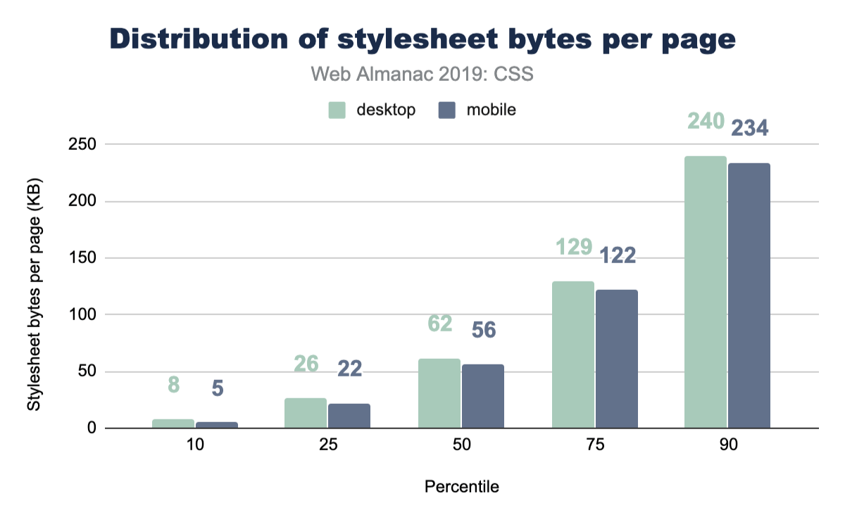
See the Page Weight chapter for a more in-depth look at the number of bytes websites are loading for each content type.
Libraries
It’s common, popular, convenient, and powerful to reach for a CSS library to kick start a new project. While you may not be one to reach for a library, we’ve queried the web in 2019 to see which are leading the pack. If the results astound you, like they did us, I think it’s an interesting clue to just how small of a developer bubble we can live in. Things can feel massively popular, but when the web is inquired, reality is a bit different.
| Library | Desktop | Mobile |
|---|---|---|
| Bootstrap | 27.8% | 26.9% |
| animate.css | 6.1% | 6.4% |
| ZURB Foundation | 2.5% | 2.6% |
| UIKit | 0.5% | 0.6% |
| Material Design Lite | 0.3% | 0.3% |
| Materialize CSS | 0.2% | 0.2% |
| Pure CSS | 0.1% | 0.1% |
| Angular Material | 0.1% | 0.1% |
| Semantic-ui | 0.1% | 0.1% |
| Bulma | 0.0% | 0.0% |
| Ant Design | 0.0% | 0.0% |
| tailwindcss | 0.0% | 0.0% |
| Milligram | 0.0% | 0.0% |
| Clarity | 0.0% | 0.0% |
Figure 2.36. Percent of pages that include a given CSS library.
This chart suggests that Bootstraphttps://getbootstrap.com/ is a valuable library to know to assist with getting a job. Look at all the opportunity there is to help! It’s also worth noting that this is a positive signal chart only: the math doesn’t add up to 100% because not all sites are using a CSS framework. A little bit over half of all sites are not using a known CSS framework. Very interesting, no?!
Reset utilities
CSS reset utilities intend to normalize or create a baseline for native web elements. In case you didn’t know, each browser serves its own stylesheet for all HTML elements, and each browser gets to make their own unique decisions about how those elements look or behave. Reset utilities have looked at these files, found their common ground (or not), and ironed out any differences so you as a developer can style in one browser and have reasonable confidence it will look the same in another.
So let’s take a peek at how many sites are using one! Their existence seems quite reasonable, so how many folks agree with their tactics and use them in their sites?
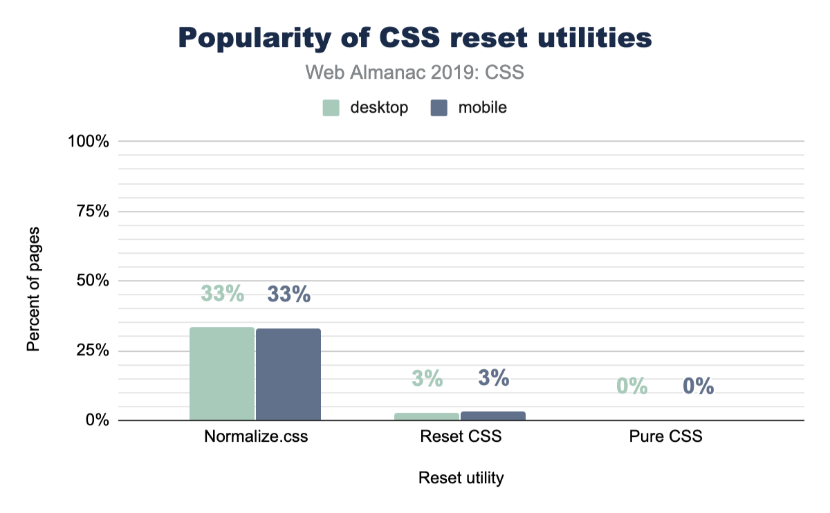
Turns out that about one-third of the web is using normalize.css, which could be considered a more gentle approach to the task then a reset is. We looked a little deeper, and it turns out that Bootstrap includes normalize.css, which likely accounts for a massive amount of its usage. It’s worth noting as well that normalize.css has more adoption than Bootstrap, so there are plenty of folks using it on its own.
@supports and @import
CSS @supports is a way for the browser to check whether a particular property-value combination is parsed as valid, and then apply styles if the check returns as true.
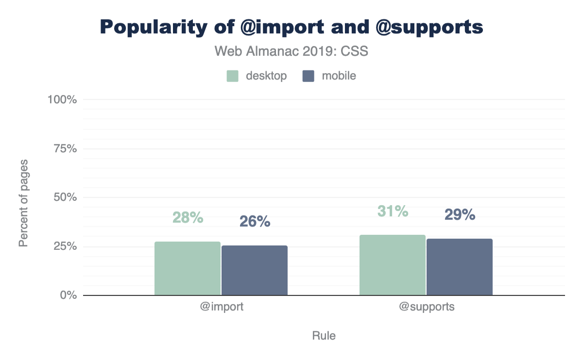
Considering @supports was implemented across most browsers in 2013, it’s not too surprising to see a high amount of usage and adoption. We’re impressed at the mindfulness of developers here. This is considerate coding! 30% of all websites are checking for some display related support before using it.
An interesting follow up to this is that there’s more usage of @supports than @imports! We did not expect that! @import has been in browsers since 1994.
Conclusion
There is so much more here to datamine! Many of the results surprised us, and we can only hope that they’ve surprised you as well. This surprising data set made the summarizing very fun, and left us with lots of clues and trails to investigate if we want to hunt down the reasons why some of the results are the way they are.
Which results did you find the most alarming? Which results make you head to your codebase for a quick query?
We felt the biggest takeaway from these results is that custom properties offer the most bang for your buck in terms of performance, DRYness, and scalability of your stylesheets. We look forward to scrubbing the internet’s stylesheets again, hunting for new datums and provocative chart treats. Reach out to @una or @argyleink in the comments with your queries, questions, and assertions. We’d love to hear them!
Authors
-
Una KravetsUna Kravets is a Brooklyn-based international public speaker, technical writer, and Developer Advocate for Material Design at Google. Una hosts the Designing the Browserhttps://www.youtube.com/watch?v=YK8GZBx3hpg web series and the Toolsdayhttps://spec.fm/podcasts/toolsday developer podcast. Follow her on Twitterhttps://x.com/una to find her musings on creative CSS, user experiences, and web development best practices.
-
Adam ArgyleAdam Argyle is a Google Chrome developer relations member focused on CSS; He’s a web addict with an insatiable lust for great UX & UI; Find him on the web @argyleink or checkout his website https://nerdy.dev.


Markup
Introduction
In 2005, Ian “Hixie” Hickson posted some analysis of markup datahttps://web.archive.org/web/20060203035414/http://code.google.com/webstats/index.html building upon various previous work. Much of this work aimed to investigate class names to see if there were common informal semantics that were being adopted by developers which it might make sense to standardize upon. Some of this research helped inform new elements in HTML5.
14 years later, it’s time to take a fresh look. Since then, we’ve also had the introduction of Custom Elementshttps://developer.mozilla.org/docs/Web/Web_Components/Using_custom_elements and the Extensible Web Manifestohttps://extensiblewebmanifesto.org/ encouraging that we find better ways to pave the cowpaths by allowing developers to explore the space of elements themselves and allow standards bodies to act more like dictionary editorshttps://bkardell.com/blog/Dropping-The-F-Bomb-On-Standards.html. Unlike CSS class names, which might be used for anything, we can be far more certain that authors who used a non-standard element really intended this to be an element.
As of July 2019, the HTTP Archive has begun collecting all used element names in the DOM for about 4.4 million desktop home pages, and about 5.3 million mobile home pages which we can now begin to research and dissect. (Learn more about our Methodology.)
This crawl encountered over 5,000 distinct non-standard element names in these pages, so we capped the total distinct number of elements that we count to the ’top’ (explained below) 5,048.
Methodology
Names of elements on each page were collected from the DOM itself, after the initial run of JavaScript.
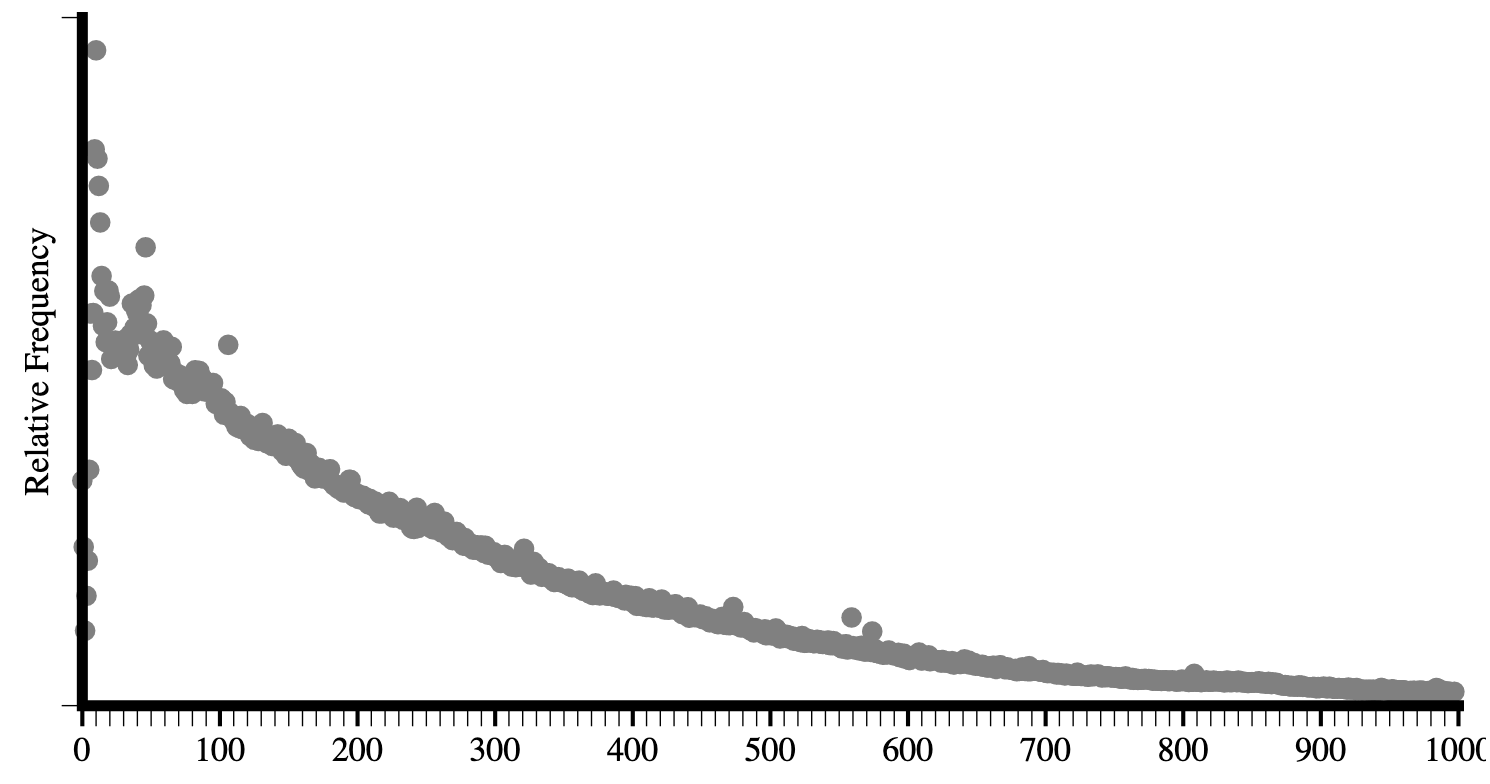
Looking at a raw frequency count isn’t especially helpful, even for standard elements: About 25% of all elements encountered are <div>. About 17% are <a>, about 11% are <span> -- and those are the only elements that account for more than 10% of occurrences. Languages are generally like thishttps://www.youtube.com/watch?v=fCn8zs912OE; a small number of terms are astoundingly used by comparison. Further, when we start looking at non-standard elements for uptake, this would be very misleading as one site could use a certain element a thousand times and thus make it look artificially very popular.
Instead, as in Hixie’s original study, what we will look at is how many sites include each element at least once in their home page.
Top elements and general info
In 2005, Hixie’s survey listed the top few most commonly used elements on pages. The top 3 were html, head and body which he noted as interesting because they are optional and created by the parser if omitted. Given that we use the post-parsed DOM, they’ll show up universally in our data. Thus, we’ll begin with the 4th most used element. Below is a comparison of the data from then to now (I’ve included the frequency comparison here as well just for fun).
| 2005 (per site) | 2019 (per site) | 2019 (frequency) |
|---|---|---|
| title | title | div |
| a | meta | a |
| img | a | span |
| meta | div | li |
| br | link | img |
| table | script | script |
| td | img | p |
| tr | span | option |
Figure 3.1. Comparison of the top elements from 2005 to 2019.
Elements per page
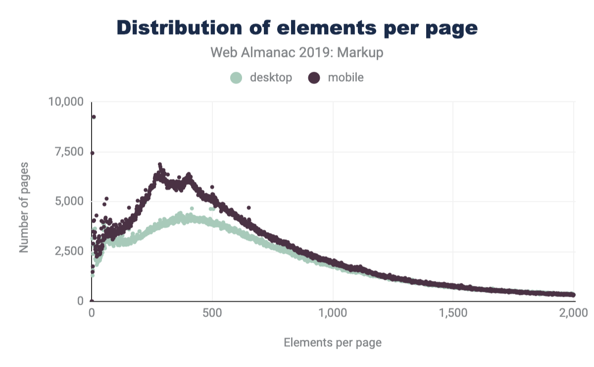
Comparing the latest data in Figure 3.3 to that of Hixie’s report from 2005 in Figure 3.2, we can see that the average size of DOM trees has gotten bigger.

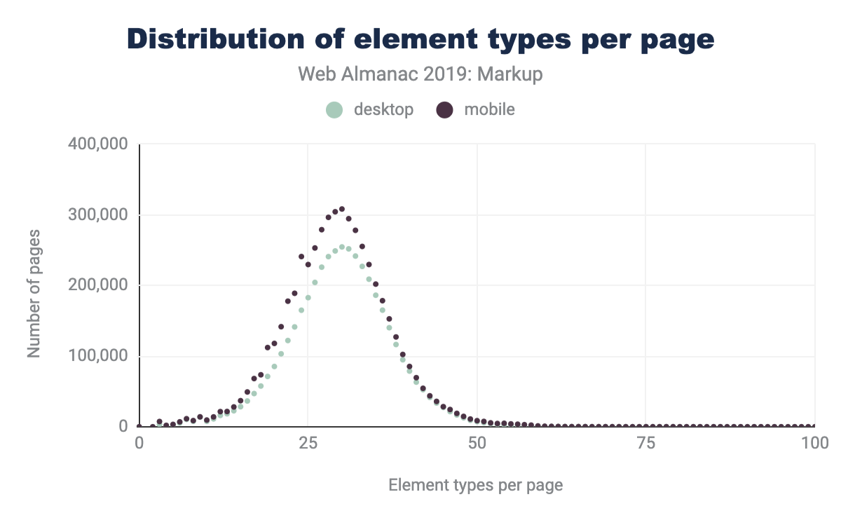
We can see that both the average number of types of elements per page has increased, as well as the maximum numbers of unique elements that we encounter.
Custom elements
Most of the elements we recorded are custom (as in simply ’not standard’), but discussing which elements are and are not custom can get a little challenging. Written down in some spec or proposal somewhere are, actually, quite a few elements. For purposes here, we considered 244 elements as standard (though, some of them are deprecated or unsupported):
- 145 Elements from HTML
- 68 Elements from SVG
- 31 Elements from MathML
In practice, we encountered only 214 of these:
- 137 from HTML
- 54 from SVG
- 23 from MathML
In the desktop dataset we collected data for the top 4,834 non-standard elements that we encountered. Of these:
- 155 (3%) are identifiable as very probable markup or escaping errors (they contain characters in the parsed tag name which imply that the markup is broken)
- 341 (7%) use XML-style colon namespacing (though, as HTML, they don’t use actual XML namespaces)
- 3,207 (66%) are valid custom element names
- 1,211 (25%) are in the global namespace (non-standard, having neither dash, nor colon)
- 216 of these we have flagged as possible typos as they are longer than 2 characters and have a Levenshtein distance of 1 from some standard element name like
<cript>,<spsn>or<artice>. Some of these (like<jdiv>), however, are certainly intentional.
Additionally, 15% of desktop pages and 16% of mobile pages contain deprecated elements.
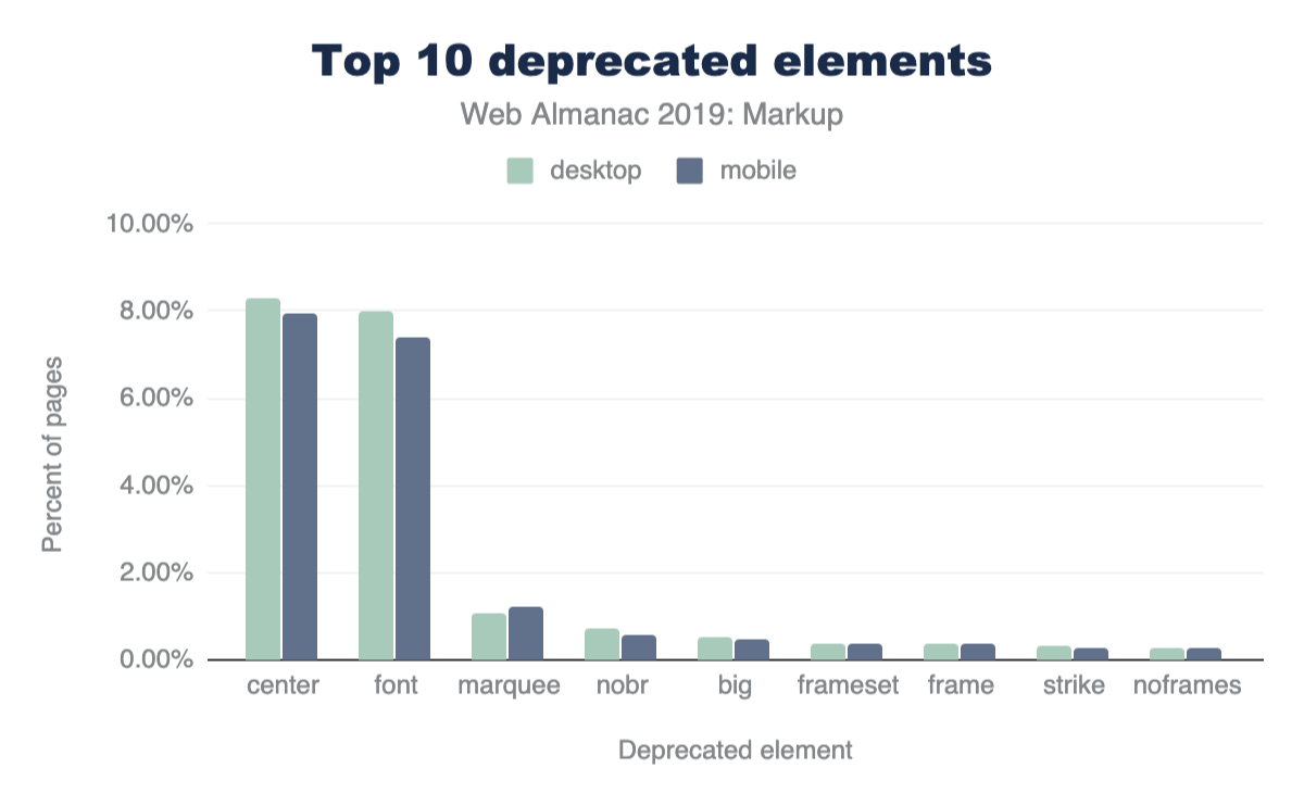
Figure 3.6 above shows the top 10 most frequently used deprecated elements. Most of these can seem like very small numbers, but perspective matters.
Perspective on value and usage
In order to discuss numbers about the use of elements (standard, deprecated or custom), we first need to establish some perspective.
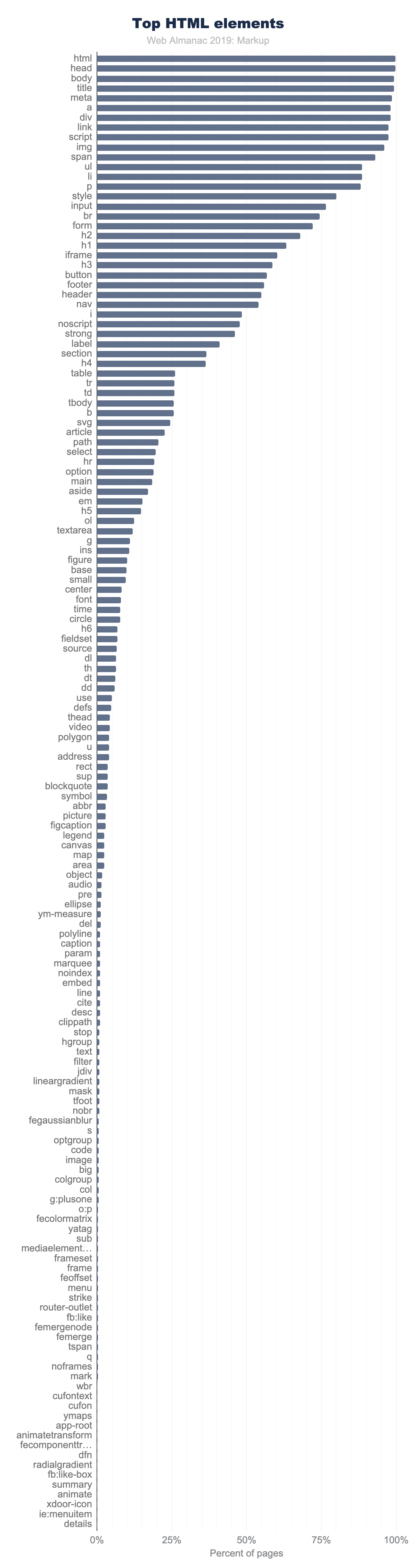
In Figure 3.7 above, the top 150 element names, counting the number of pages where they appear, are shown. Note how quickly use drops off.
Only 11 elements are used on more than 90% of pages:
<html><head><body><title><meta><a><div><link><script><img><span>
There are only 15 other elements that occur on more than 50% of pages:
<ul><li><p><style><input><br><form><h2><h1><iframe><h3><button><footer><header><nav>
And there are only 40 other elements that occur on more than 5% of pages.
Even <video>, for example, doesn’t make that cut. It appears on only 4% of desktop pages in the dataset (3% on mobile). While these numbers sound very low, 4% is actually quite popular by comparison. In fact, only 98 elements occur on more than 1% of pages.
It’s interesting, then, to see what the distribution of these elements looks like and which ones have more than 1% use.
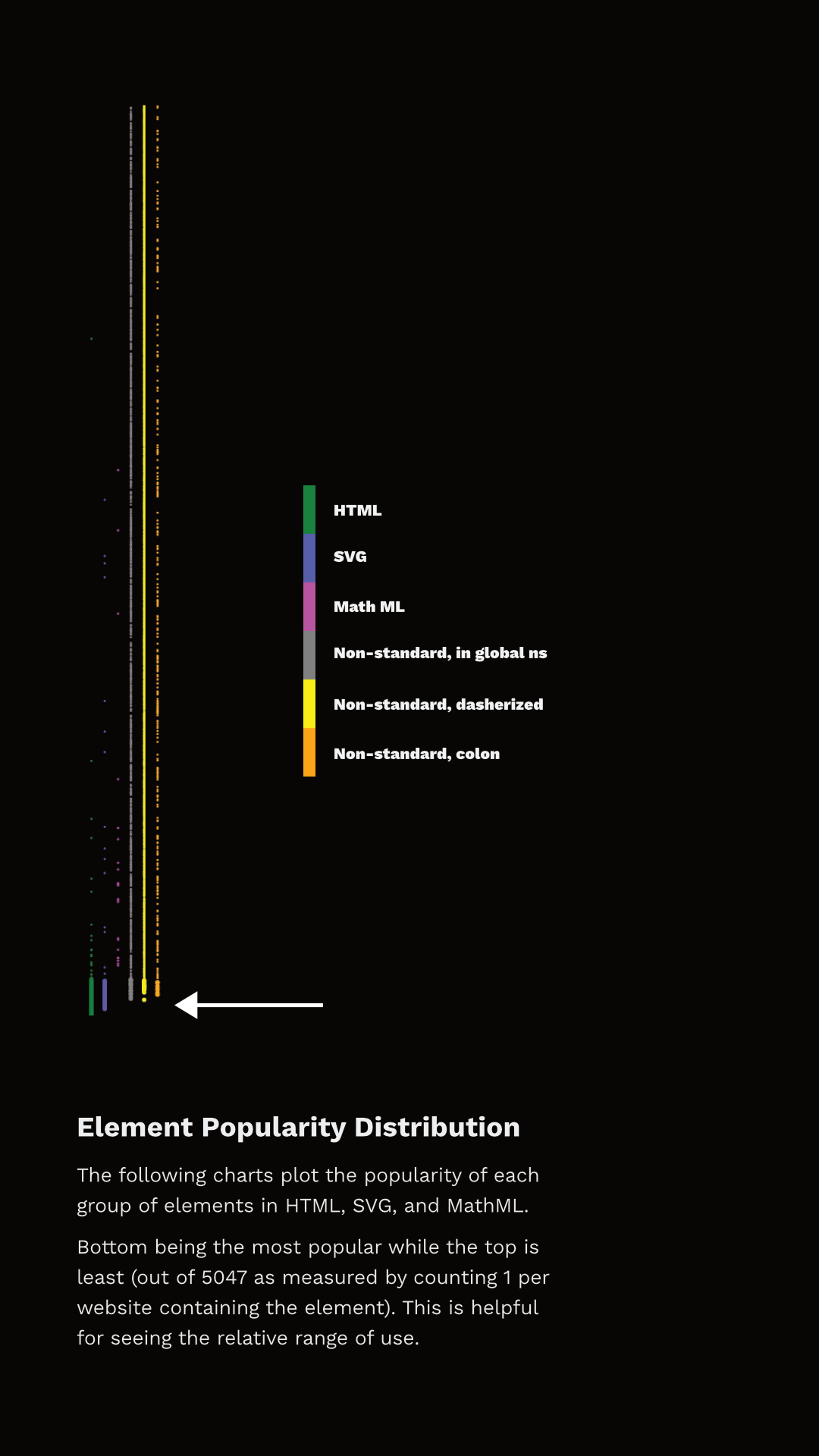
Figure 3.8 shows the rank of each element and which category they fall into. I’ve separated the data points into discrete sets simply so that they can be viewed (otherwise there just aren’t enough pixels to capture all that data), but they represent a single ’line’ of popularity; the bottom-most being the most common, the top-most being the least common. The arrow points to the end of elements that appear in more than 1% of the pages.
You can observe two things here. First, the set of elements that have more than 1% use are not exclusively HTML. In fact, 27 of the most popular 100 elements aren’t even HTML - they are SVG! And there are non-standard tags at or very near that cutoff too! Second, note that a whole lot of HTML elements are used by less than 1% of pages.
So, are all of those elements used by less than 1% of pages “useless”? Definitely not. This is why establishing perspective matters. There are around two billion web sites on the webhttps://www.websitehostingrating.com/internet-statistics-facts/. If something appears on 0.1% of all websites in our dataset, we can extrapolate that this represents perhaps two million web sites in the whole web. Even 0.01% extrapolates to two hundred thousand sites. This is also why removing support for elements, even very old ones which we think aren’t great ideas, is a very rare occurrence. Breaking hundreds of thousands or millions of sites just isn’t a thing that browser vendors can do lightly.
Many elements, even the native ones, appear on fewer than 1% of pages and are still very important and successful. <code>, for example, is an element that I both use and encounter a lot. It’s definitely useful and important, and yet it is used on only 0.57% of these pages. Part of this is skewed based on what we are measuring; home pages are generally less likely to include certain kinds of things (like <code> for example). Home pages serve a less general purpose than, for example, headings, paragraphs, links and lists. However, the data is generally useful.
We also collected information about which pages contained an author-defined (not native) .shadowRoot. About 0.22% of desktop pages and 0.15% of mobile pages had a shadow root. This might not sound like a lot, but it is roughly 6.5k sites in the mobile dataset and 10k sites on the desktop and is more than several HTML elements. <summary> for example, has about equivalent use on the desktop and it is the 146th most popular element. <datalist> appears on 0.04% of home pages and it’s the 201st most popular element.
In fact, over 15% of elements we’re counting as defined by HTML are outside the top 200 in the desktop dataset . <meter> is the least popular “HTML5 era” element, which we can define as 2004-2011, before HTML moved to a Living Standard model. It is around the 1,000th most popular element. <slot>, the most recently introduced element (April 2016), is only around the 1,400th most popular element.
Lots of data: real DOM on the real web
With this perspective in mind about what use of native/standard features looks like in the dataset, let’s talk about the non-standard stuff.
You might expect that many of the elements we measured are used only on a single web page, but in fact all of the 5,048 elements appear on more than one page. The fewest pages an element in our dataset appears on is 15. About a fifth of them occur on more than 100 pages. About 7% occur on more than 1,000 pages.
To help analyze the data, I hacked together a little tool with Glitchhttps://rainy-periwinkle.glitch.me. You can use this tool yourself, and please share a permalink back with the @HTTPArchive along with your observations. (Tommy Hodgins has also built a similar CLI toolhttps://github.com/tomhodgins/hade which you can use to explore.)
Let’s look at some data.
Products (and libraries) and their custom markup
For several non-standard elements, their prevalence may have more to do with their inclusion in popular third-party tools than first-party adoption. For example, the <fb:like> element is found on 0.3% of pages not because site owners are explicitly writing it out but because they include the Facebook widget. Many of the elements Hixie mentioned 14 years agohttps://web.archive.org/web/20060203031245/http://code.google.com/webstats/2005-12/editors.html seem to have dwindled, but others are still pretty huge:
- Popular elements created by Claris Home Pagehttps://en.wikipedia.org/wiki/Claris_Home_Page (whose last stable release was 21 years ago) still appear on over 100 pages.
<x-claris-window>, for example, appears on 130 pages. - Some of the
<actinic:*>elements from British ecommerce provider Oxatishttps://www.oxatis.co.uk appear on even more pages. For example,<actinic:basehref>still shows up on 154 pages in the desktop data. - Macromedia’s elements seem to have largely disappeared. Only one element,
<mm:endlock>, appears on our list and on only 22 pages. - Adobe Go-Live’s
<csscriptdict>still appears on 640 pages in the desktop dataset. - Microsoft Office’s
<o:p>element still appears on 0.5% of desktop pages, over 20k pages.
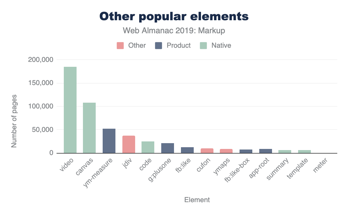
But there are plenty of newcomers that weren’t in Hixie’s original report too, and with even bigger numbers.
<ym-measure>is a tag injected by Yandex’s Metrica analytics packagehttps://www.npmjs.com/package/yandex-metrica-watch. It’s used on more than 1% of desktop and mobile pages, solidifying its place in the top 100 most used elements. That’s huge!<g:plusone>from the now-defunct Google Plus occurs on over 21k pages.- Facebook’s
<fb:like>occurs on 14k mobile pages. - Similarly,
<fb:like-box>occurs on 7.8k mobile pages. <app-root>, which is generally included in frameworks like Angular, appears on 8.2k mobile pages.
Let’s compare these to a few of the native HTML elements that are below the 5% bar, for perspective.

You could discover interesting insights like these all day long.
Here’s one that’s a little different: popular elements could be caused by outright errors in products. For example, <pclass="ddc-font-size-large"> occurs on over 1,000 sites. This was thanks to a missing space in a popular “as-a-service” kind of product. Happily, we reported this error during our research and it was quickly fixed.
In his original paper, Hixie mentions that:
The good thing, if we can be forgiven for trying to remain optimistic in the face of all this non-standard markup, is that at least these elements are all clearly using vendor-specific names. This massively reduces the likelihood that standards bodies will invent elements and attributes that clash with any of them.
However, as mentioned above, this is not universal. Over 25% of the non-standard elements that we captured don’t use any kind of namespacing strategy to avoid polluting the global namespace. For example, here is a list of 1157 elements like that from the mobile datasethttps://rainy-periwinkle.glitch.me/permalink/53567ec94b328de965eb821010b8b5935b0e0ba316e833267dc04f1fb3b53bd5.html. Many of those, as you can see, are likely to be non-problematic as they have obscure names, misspellings and so on. But at least a few probably present some challenges. You’ll note, for example, that <toast> (which Googlers recently tried to propose as <std-toast>) appears in this list.
There are some popular elements that are probably not so challenging:
<ymaps>from Yahoo Maps appears on ~12.5k mobile pages.<cufon>and<cufontext>from a font replacement library from 2008, appear on ~10.5k mobile pages.- The
<jdiv>element, which appears to be injected by the Jivo chat product, appears on ~40.3k mobile pages,
Placing these into our same chart as above for perspective looks something like this (again, it varies slightly based on the dataset)
The interesting thing about these results is that they also introduce a few other ways that our tool can come in very handy. If we’re interested in exploring the space of the data, a very specific tag name is just one possible measure. It’s definitely the strongest indicator if we can find good “slang” developing. However, what if that’s not all we’re interested in?
Common use cases and solutions
What if, for example, we were interested in people solving common use cases? This could be because we’re looking for solutions to use cases that we currently have ourselves, or for researching more broadly what common use cases people are solving with an eye toward incubating some standardization effort. Let’s take a common example: tabs. Over the years there have been a lot of requests for things like tabs. We can use a fuzzy search here and find that there are many variants of tabshttps://rainy-periwinkle.glitch.me/permalink/c6d39f24d61d811b55fc032806cade9f0be437dcb2f5735a4291adb04aa7a0ea.html. It’s a little harder to count usage here since we can’t as easily distinguish if two elements appear on the same page, so the count provided there conservatively simply takes the one with the largest count. In most cases the real number of pages is probably significantly larger.
There are also lots of accordionshttps://rainy-periwinkle.glitch.me/permalink/e573cf279bf1d2f0f98a90f0d7e507ac8dbd3e570336b20c6befc9370146220b.html, dialogshttps://rainy-periwinkle.glitch.me/permalink/0bb74b808e7850a441fc9b93b61abf053efc28f05e0a1bc2382937e3b78695d9.html, at least 65 variants of carouselshttps://rainy-periwinkle.glitch.me/permalink/651e592cb2957c14cdb43d6610b6acf696272b2fbd0d58a74c283e5ad4c79a12.html, lots of stuff about popupshttps://rainy-periwinkle.glitch.me/permalink/981967b19a9346ac466482c51b35c49fc1c1cc66177ede440ab3ee51a7912187.html, at least 27 variants of toggles and switcheshttps://rainy-periwinkle.glitch.me/permalink/2e6827af7c9d2530cb3d2f39a3f904091c523c2ead14daccd4a41428f34da5e8.html, and so on.
Perhaps we could research why we need 92 variants of button related elements that aren’t a native buttonhttps://rainy-periwinkle.glitch.me/permalink/5ae67c941395ca3125e42909c2c3881e27cb49cfa9aaf1cf59471e3779435339.html, for example, and try to fill the native gap.
If we notice popular things pop up (like <jdiv>, solving chat) we can take knowledge of things we know (like, that is what <jdiv> is about, or <olark>) and try to look at at least 43 things we’ve built for tackling thathttps://rainy-periwinkle.glitch.me/permalink/db8fc0e58d2d46d2e2a251ed13e3daab39eba864e46d14d69cc114ab5d684b00.html and follow connections to survey the space.
Conclusion
So, there’s lots of data here, but to summarize:
- Pages have more elements than they did 14 years ago, both on average and max.
- The lifetime of things on home pages is very long. Deprecating or discontinuing things doesn’t make them go away, and it might never.
- There is a lot of broken markup out there in the wild (misspelled tags, missing spaces, bad escaping, misunderstandings).
- Measuring what “useful” means is tricky. Lots of native elements don’t pass the 5% bar, or even the 1% bar, but lots of custom ones do, and for lots of reasons. Passing 1% should definitely grab our attention at least, but perhaps so should 0.5% because that is, according to the data, comparatively very successful.
- There is already a ton of custom markup out there. It comes in a lot of forms, but elements containing a dash definitely seem to have taken off.
- We need to increasingly study this data and come up with good observations to help find and pave the cowpaths.
That last one is where you come in. We’d love to tap into the creativity and curiosity of the larger community to help explore this data using some of the tools (like https://rainy-periwinkle.glitch.me/). Please share your interesting observations and help build our commons of knowledge and understanding.
Author
-
Brian KardellBrian Kardell is developer advocate at Igaliahttps://igalia.com, standards contributor, bloggerhttps://bkardell.com, and is currently the W3C Advisory Committee Representative for the Open JS Foundationhttps://openjsf.org/. He was a founder of the Extensible Web Community Group and co-author of The Extensible Web Manifestohttps://extensiblewebmanifesto.org.

Media

Introduction
Images, animations, and videos are an important part of the web experience. They are important for many reasons: they help tell stories, engage audiences, and provide artistic expression in ways that often cannot be easily produced with other web technologies. The importance of these media resources can be demonstrated in two ways: by the sheer volume of bytes required to download for a page, and also the volume of pixels painted with media.
From a pure bytes perspective, HTTP Archive has historically reportedhttps://legacy.httparchive.org/interesting.php#bytesperpage an average of two-thirds of resource bytes associated from media. From a distribution perspective, we can see that virtually every web page depends on images and videos. Even at the tenth percentile, we see that 44% of the bytes are from media and can rise to 91% of the total bytes at the 90th percentile of pages.

While media are critical for the visual experience, the impact of this high volume of bytes has two side effects.
First, the network overhead required to download these bytes can be large and in cellular or slow network environments (like coffee shops or tethering when in an Uber) can dramatically slow down the page performance. Images are a lower priority request by the browser but can easily block CSS and JavaScript in the download. This by itself can delay the page rendering. Yet at other times, the image content is the visual cue to the user that the page is ready. Slow transfers of visual content, therefore, can give the perception of a slow web page.
The second impact is on the financial cost to the user. This is often an ignored aspect since it is not a burden on the website owner but a burden to the end-user. Anecdotally, it has been shared that some markets, like Japanhttps://x.com/yoavweiss/status/1195036487538003968?s=20, see a drop in purchases by students near the end of the month when data caps are reached, and users cannot see the visual content.
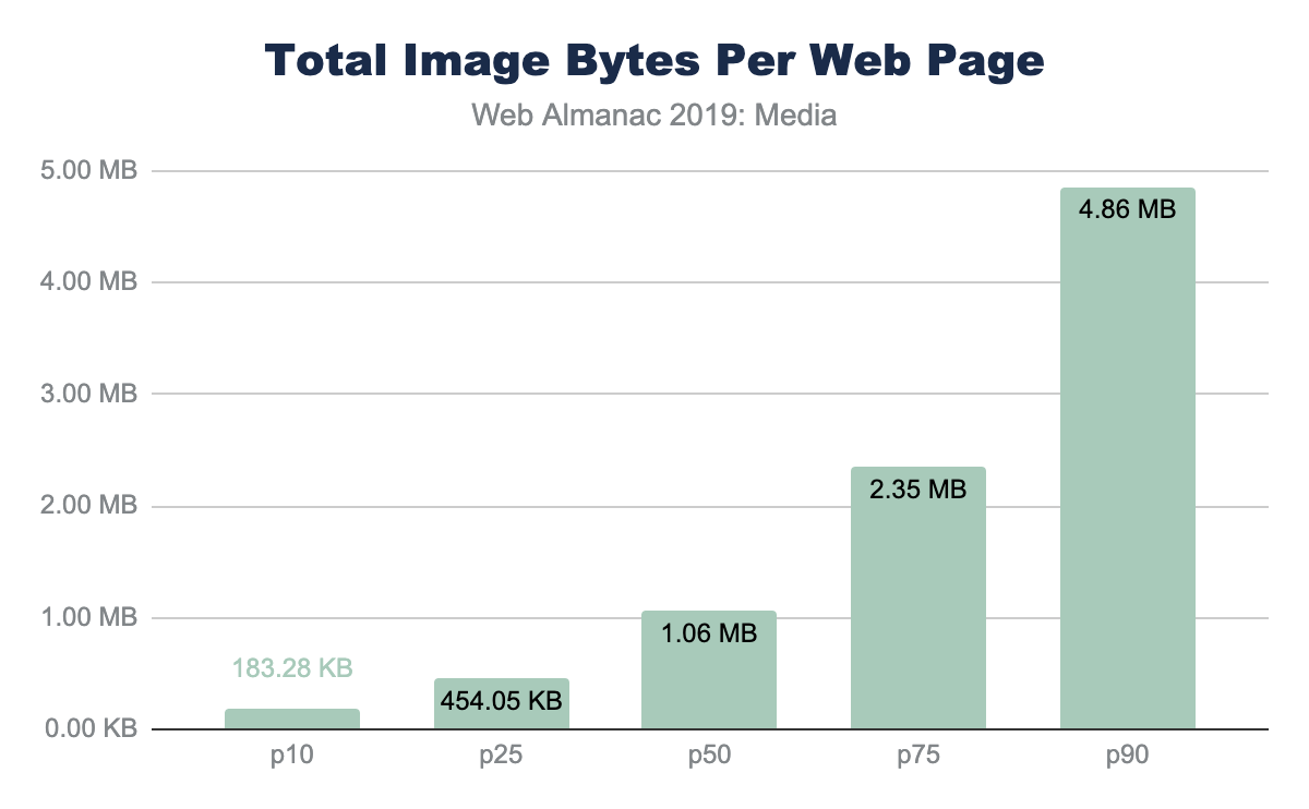
Further, the financial cost of visiting these websites in different parts of the world is disproportionate. At the median and 90th percentile, the volume of image bytes is 1 MB and 1.9 MB respectively. Using WhatDoesMySiteCost.comhttps://whatdoesmysitecost.com/#gniCost we can see that the gross national income (GNI) per capita cost to a user in Madagascar a single web page load at the 90th percentile would cost 2.6% of the daily gross income. By contrast, in Germany this would be 0.3% of the daily gross income.
Looking at bytes per page results in just looking at the costs—to page performance and the user—but it overlooks the benefits. These bytes are important to render pixels on the screen. As such, we can see the importance of the images and video resources by also looking at the number of media pixels used per page.
There are three metrics to consider when looking at pixel volume: CSS pixels, natural pixels, and screen pixels:
- CSS pixel volume is from the CSS perspective of layout. This measure focuses on the bounding boxes for which an image or video could be stretched or squeezed into. It also does not take into the actual file pixels nor the screen display pixels
- Natural pixels refer to the logical pixels represented in a file. If you were to load this image in GIMP or Photoshop, the pixel file dimensions would be the natural pixels.
- Screen pixels refer to the physical electronics on the display. Prior to mobile phones and modern high-resolution displays, there was a 1:1 relationship between CSS pixels and LED points on a screen. However, because mobile devices are held closer to the eye, and laptop screens are closer than the old mainframe terminals, modern screens have a higher ratio of physical pixels to traditional CSS pixels. This ratio is referred to as Device-Pixel-Ratio or colloquially referred to as Retina™ displays.
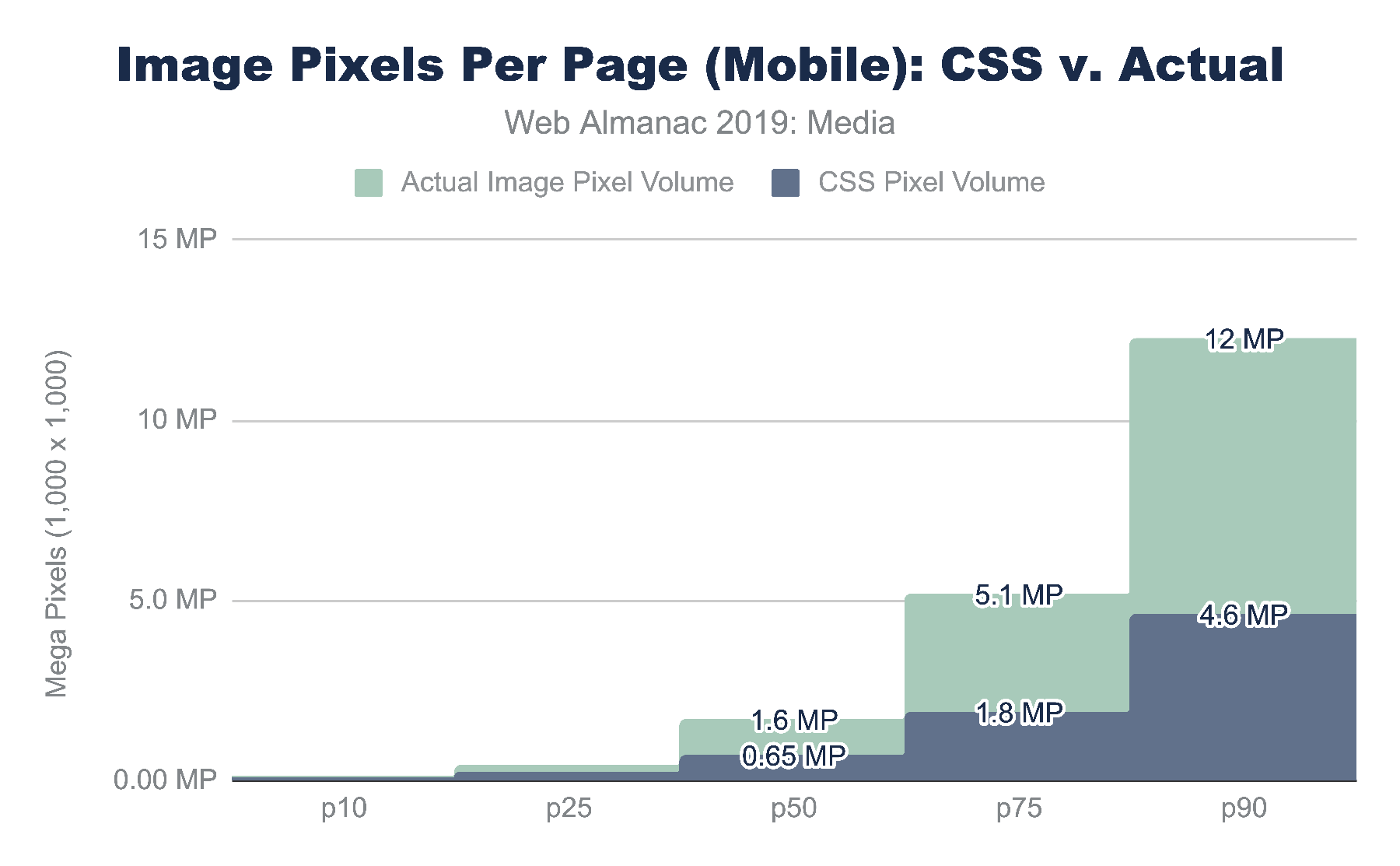
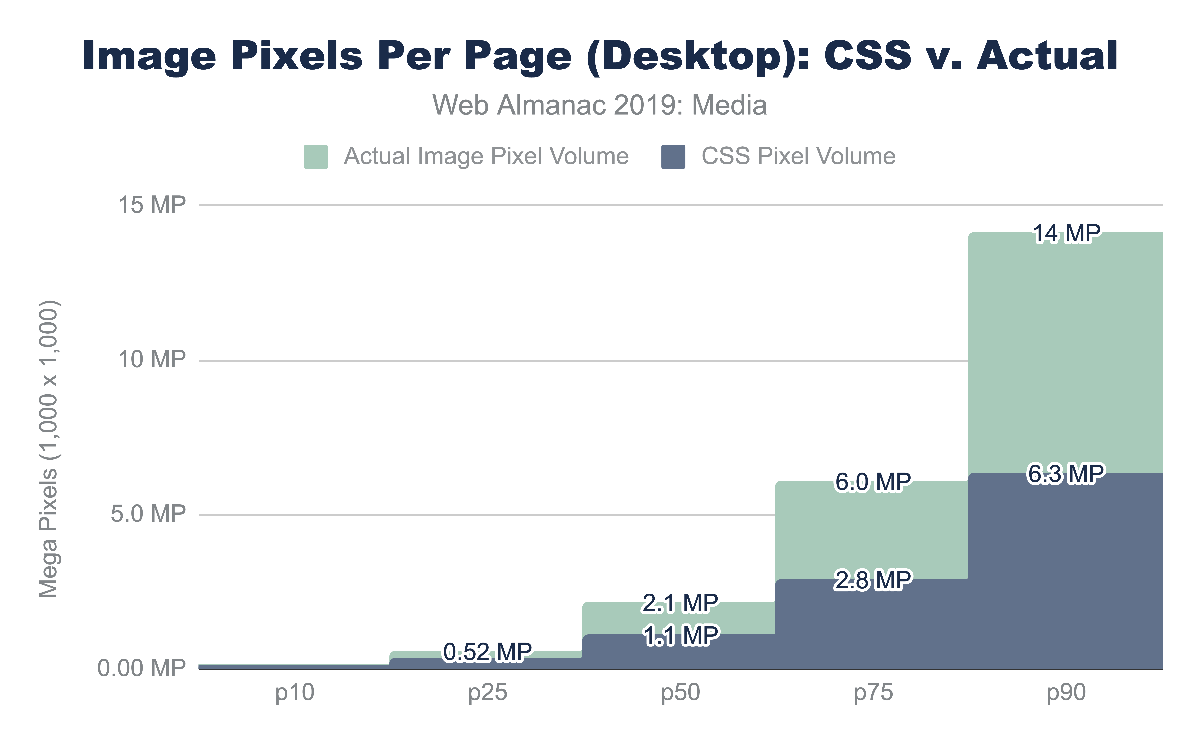
Looking at the CSS pixel and the natural pixel volume we can see that the median website has a layout that displays one megapixel (MP) of media content. At the 90th percentile, the CSS layout pixel volume grows to 4.6 MP and 6.3 MP mobile and desktop respectively. This is interesting not only because the responsive layout is likely different, but also because the form factor is different. In short, the mobile layout has less space allocated for media compared to the desktop.
In contrast, the natural, or file, pixel volume is between 2 and 2.6 times the layout volume. The median desktop web page sends 2.1MP of pixel content that is displayed in 1.1 MP of layout space. At the 90th percentile for mobile we see 12 MP squeezed into 4.6 MP.
Of course, the form factor for a mobile device is different than a desktop. A mobile device is smaller and usually held in portrait mode while the desktop is larger and used predominantly in landscape mode. As mentioned earlier, a mobile device also typically has a higher device pixel ratio (DPR) because it is held much closer to the eye, requiring more pixels per inch compared to what you would need on a billboard in Times Square. These differences force layout changes and users on mobile more commonly scroll through a site to consume the entirety of content.
Megapixels are a challenging metric because it is a largely abstract metric. A useful way to express this volume of pixels being used on a web page is to represent it as a ratio relative to the display size.
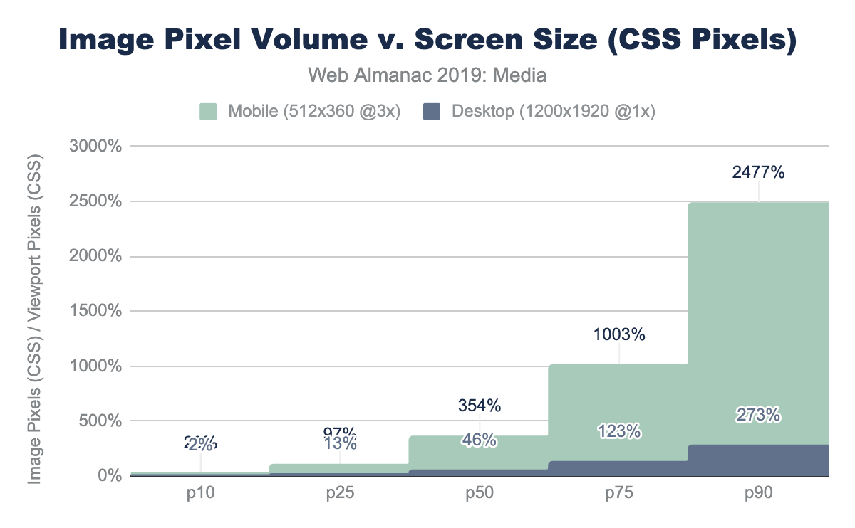
For the mobile device used in the web page crawl, we have a display of 512 x 360 which is 0.18 MP of CSS content. (Not to be confused with the physical screen which is 3x or 3^2 more pixels, which is 1.7MP). Dividing this viewer pixel volume by the number of CSS pixels allocated to images we get a relative pixel volume.
If we had one image that filled the entire screen perfectly, this would be a 1x pixel fill rate. Of course, rarely does a website fill the entire canvas with a single image. Media content tends to be mixed in with the design and other content. A value greater than 1x implies that the layout requires the user to scroll to see the additional image content.
For the median web page on desktop, only 46% of the display would have layout containing images and video. In contrast, on mobile, the volume of media pixels fills 3.5 times the actual viewport size. The layout has more content than can be filled in a single screen, requiring the user to scroll. At a minimum, there is 3.5 scrolling pages of content per site (assuming 100% saturation). At the 90th percentile for mobile, this grows substantially to 25x the viewport size!
Media resources are critical for the user experience.
Images
Much has already been written on the subject of managing and optimizing images to help reduce the bytes and optimize the user experience. It is an important and critical topic for many because it is the creative media that define a brand experience. Therefore, optimizing image and video content is a balancing act between applying best practices that can help reduce the bytes transferred over the network while preserving the fidelity of the intended experience.
While the strategies that are utilized for images, videos, and animations are—in broad strokes—similar, the specific approaches can be very different. In general, these strategies boil down to:
- File formats - utilizing the optimal file format
- Responsive - applying responsive images techniques to transfer only the pixels that will be shown on screen
- Lazy loading - to transfer content only when a human will see it
- Accessibility - ensuring a consistent experience for all humans
It is rare to find a web page that does not utilize images. Over the years, many different file formats have emerged to help present content on the web, each addressing a different problem. Predominantly, there are 4 main universal image formats: JPEG, PNG, GIF, and SVG. In addition, Chrome has enhanced the media pipeline and added support for a fifth image format: WebP. Other browsers have likewise added support for JPEG2000 (Safari), JPEG-XL (IE and Edge) and HEIC (WebView only in Safari).
Each format has its own merits and has ideal uses for the web. A very simplified summary would break down as:
| Format | Highlights | Drawbacks |
|---|---|---|
| JPEG |
|
|
| PNG |
|
|
| GIF |
|
|
| SVG |
|
|
| WebP |
|
|
Figure 4.6. Explanation of the mainstream file formats.
Image formats
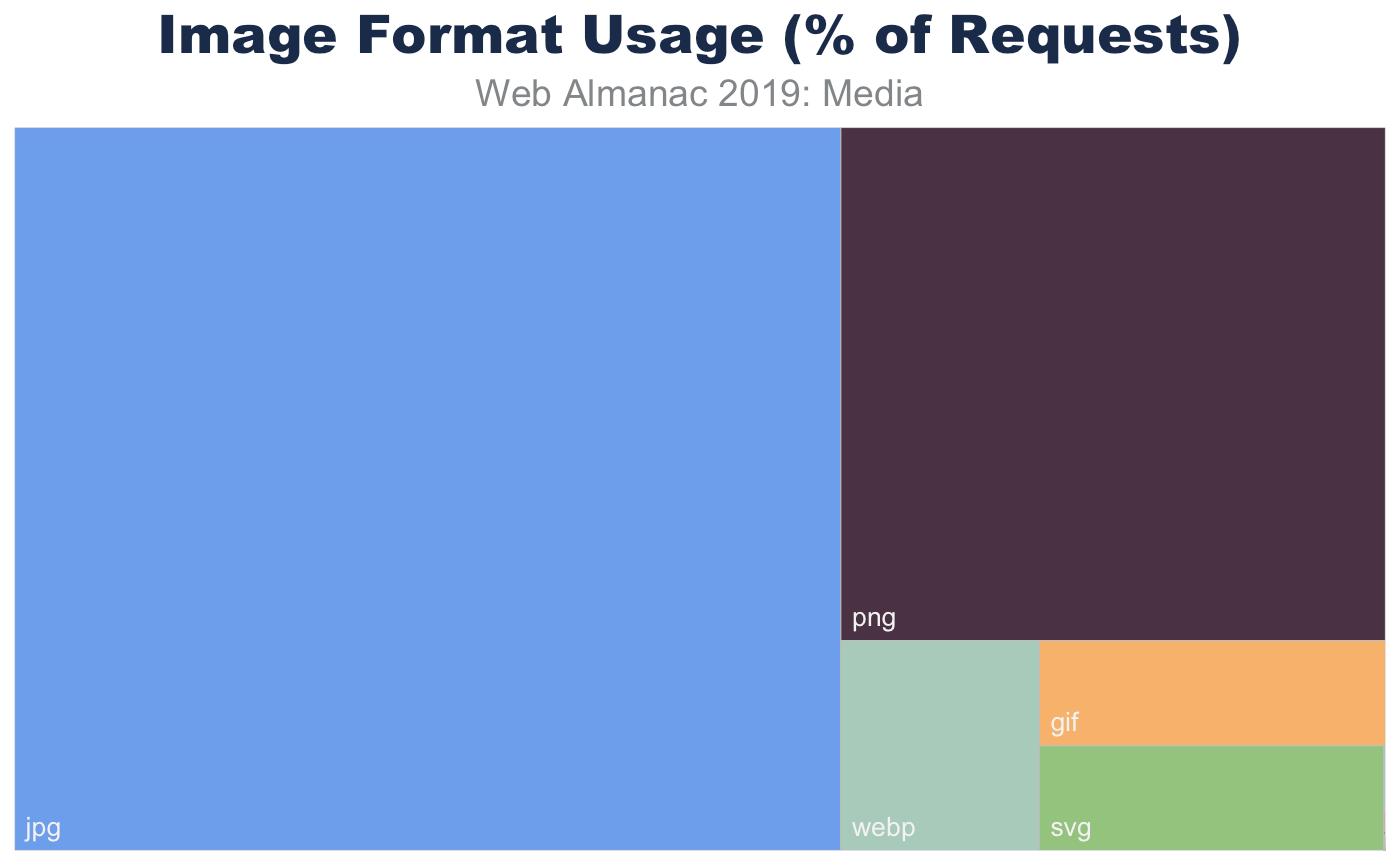
In aggregate, across all page, we indeed see the prevalence of these formats. JPEG, one of the oldest formats on the web, is by far the most commonly used image formats at 60% of the image requests and 65% of all image bytes. Interestingly, PNG is the second most commonly used image format 28% of image requests and bytes. The ubiquity of support along with the precision of color and creative content are likely explanations for its wide use. In contrast SVG, GIF, and WebP share nearly the same usage at 4%.
Of course, web pages are not uniform in their use of image content. Some depend on images more than others. Look no further than the home page of google.com and you will see very little imagery compared to a typical news website. Indeed, the median website has 13 images, 61 images at the 90th percentile, and a whopping 229 images at the 99th percentile.
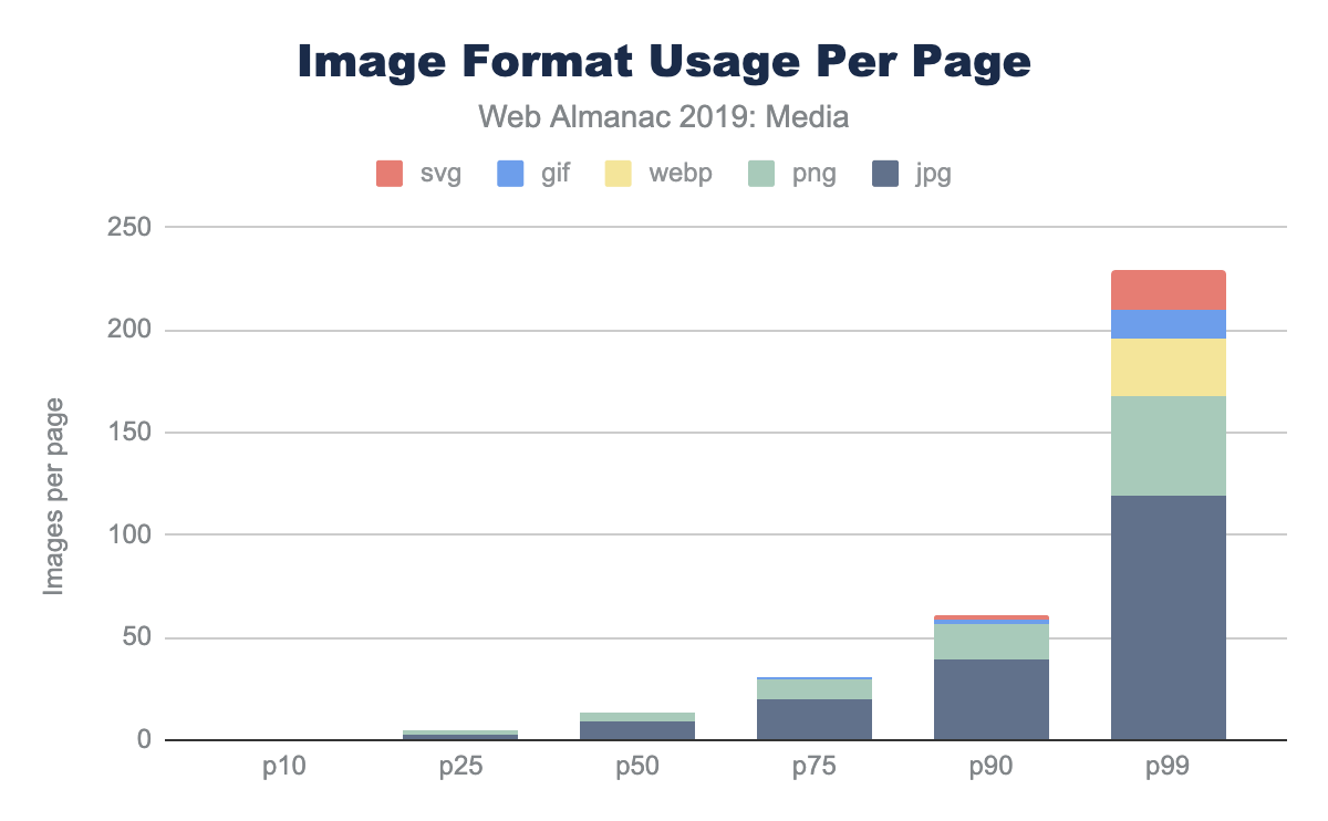
While the median page has nine JPEGs and four PNGs, and only in the top 25% pages GIFs were used, this doesn’t report the adoption rate. The use and frequency of each format per page doesn’t provide insight into the adoption of the more modern formats. Specifically, what percent of pages include at least one image in each format?
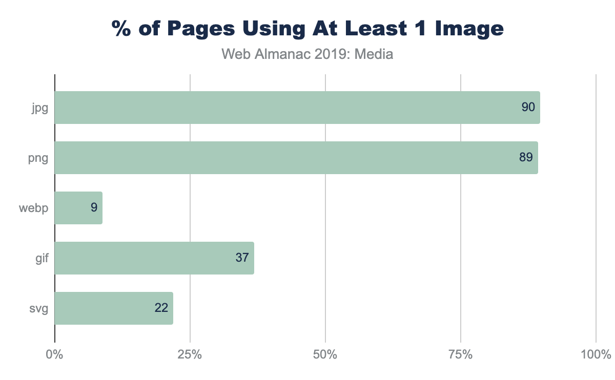
This helps explain why—even at the 90th percentile of pages—the frequency of WebP is still zero; only 9% of web pages have even one resource. There are many reasons that WebP might not be the right choice for an image, but adoption of media best practices, like adoption of WebP itself, still remain nascent.
Image file sizes
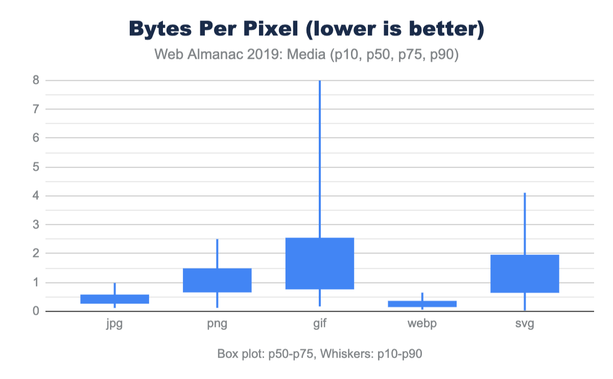
There are two ways to look at image file sizes: absolute bytes per resource and bytes-per-pixel.
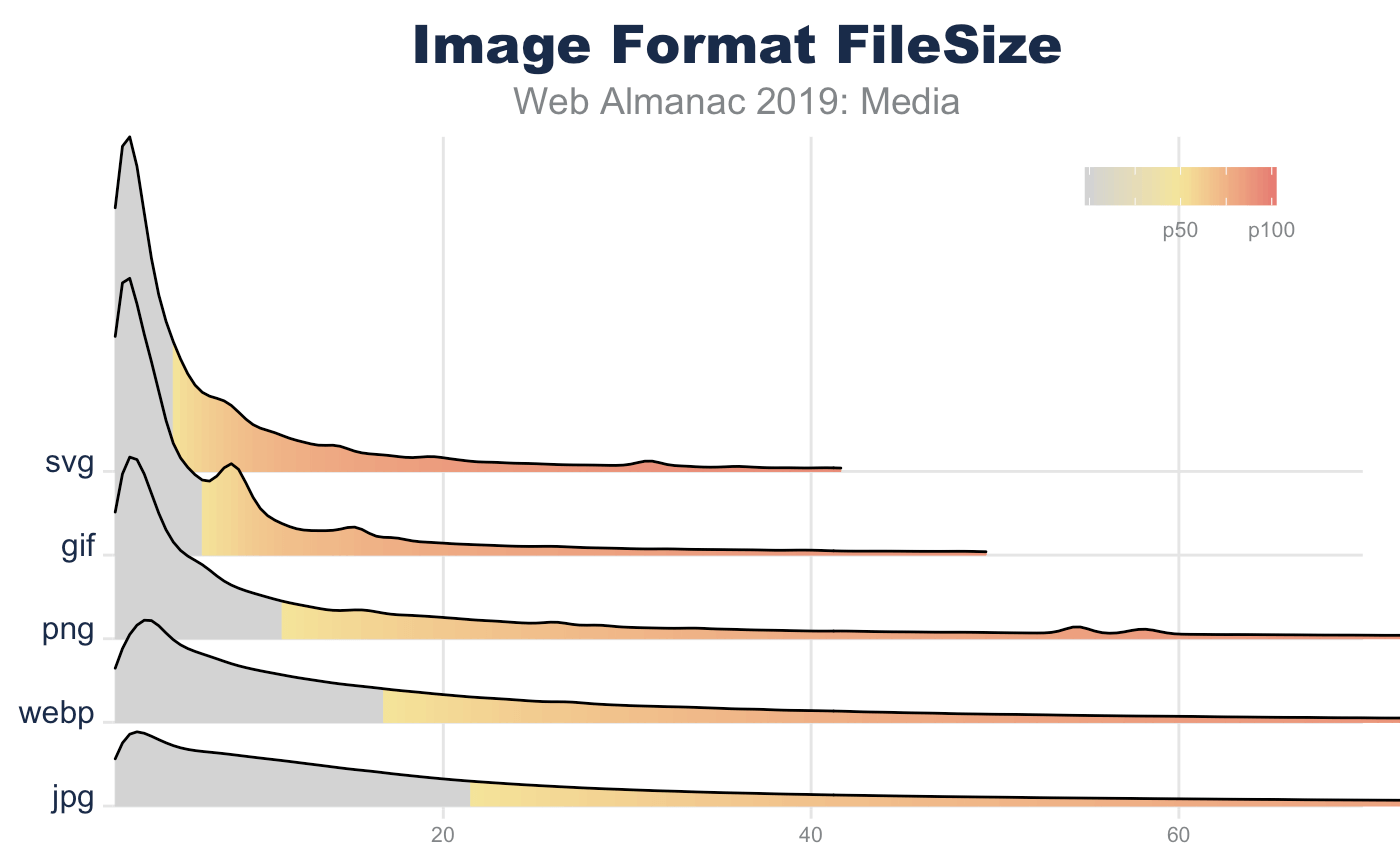
From this we can start to get a sense of how large or small a typical resource is on the web. However, this doesn’t give us a sense of the volume of pixels represented on screen for these file distributions. To do this we can divide each resource bytes by the natural pixel volume of the image. A lower bytes-per-pixel indicates a more efficient transmission of visual content.
While previously it appeared that GIF files were smaller than JPEG, we can now clearly see that the cause of the larger JPEG resources is due to the pixel volume. It is probably not a surprise that GIF shows a very low pixel density compared to the other formats. Additionally, while PNG can handle high bit depth and doesn’t suffer from chroma subsampling blurriness, it is about twice the size of JPG or WebP for the same pixel volume.
Of note, the pixel volume used for SVG is the size of the DOM element on screen (in CSS pixels). While considerably smaller for file sizes, this hints that SVGs are generally used in smaller portions of the layout. This is why the bytes-per-pixel appears worse than PNG.
Again, it is worth emphasizing, this comparison of pixel density is not comparing equivalent images. Rather it is reporting typical user experience. As we will discuss next, even in each of these formats there are techniques that can be used to further optimize and reduce the bytes-per-pixel.
Image format optimization
Selecting the best format for an experience is an art of balancing capabilities of the format and reducing the total bytes. For web pages one goal is to help improve web performance through optimizing images. Yet within each format there are additional features that can help reduce bytes.
Some features can impact the total experience. For example, JPEG and WebP can utilize quantization (commonly referred to as quality levels) and chroma subsampling, which can reduce the bits stored in the image without impacting the visual experience. Like MP3s for music, this technique depends on a bug in the human eye and allows for the same experience despite the loss of color data. However, not all images are good candidates for these techniques since this can create blocky or blurry images and may distort colors or make text overlays become unreadable.
Other format features simply organize the content and sometimes require contextual knowledge. For example, applying progressive encoding of a JPEG reorganizes the pixels into scan layers that allows the browser to complete layout sooner and coincidently reduces pixel volume.
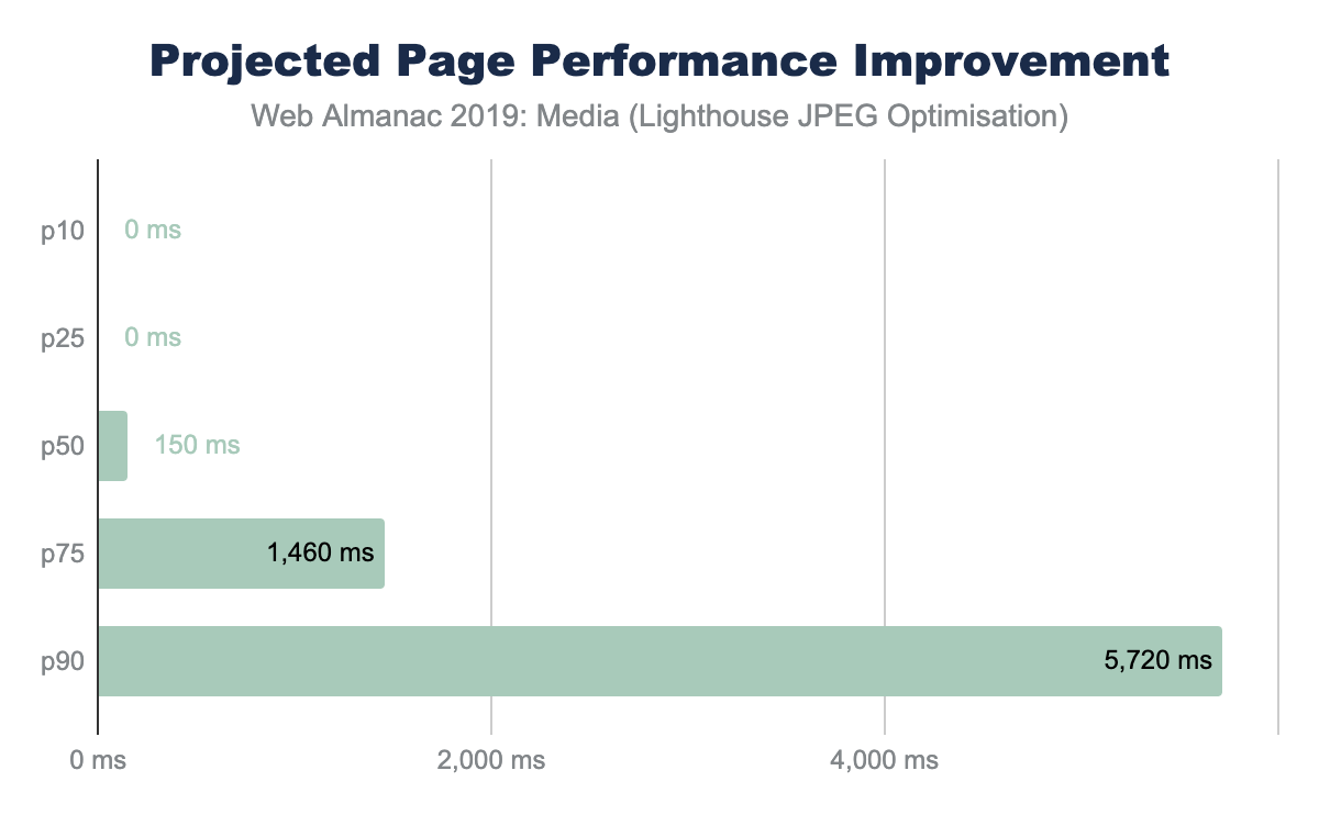
One Lighthouse test is an A/B comparing baseline with a progressively encoded JPEG. This provides a smell to indicate whether the images overall can be further optimized with lossless techniques and potentially with lossy techniques like using different quality levels.
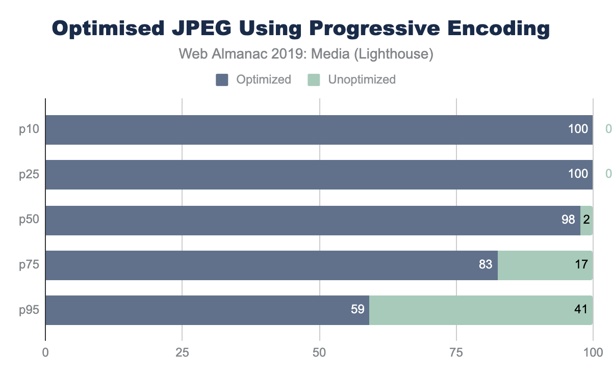
The savings in this AB Lighthouse test is not just about potential byte savings, which can accrue to several MBs at the 95th percentile, it also demonstrates the page performance improvement.
Responsive images
Another axis for improving page performance is to apply responsive images. This technique focuses on reducing image bytes by reducing the extra pixels that are not shown on the display because of image shrinking. At the beginning of this chapter, you saw that the median web page on desktop used one MP of image placeholders yet transferred 2.1 MP of actual pixel volume. Since this was a 1x DPR test, 1.1 MP of pixels were transferred over the network, but not displayed. To reduce this overhead, we can use one of two (possibly three) techniques:
- HTML markup - using a combination of the
<picture>and<source>elements along with thesrcsetandsizesattributes allows the browser to select the best image based on the dimensions of the viewport and the density of the display. - Client Hints - this moves the selection of possible resized images to HTTP content negotiation.
- BONUS: JavaScript libraries to delay image loading until the JavaScript can execute and inspect the Browser DOM and inject the correct image based on the container.
Use of HTML markup
The most common method to implement responsive images is to build a list of alternative images using either <img srcset> or <source srcset>. If the srcset is based on DPR, the browser can select the correct image from the list without additional information. However, most implementations also use <img sizes> to help instruct the browser how to perform the necessary layout calculation to select the correct image in the srcset based on pixel dimensions.
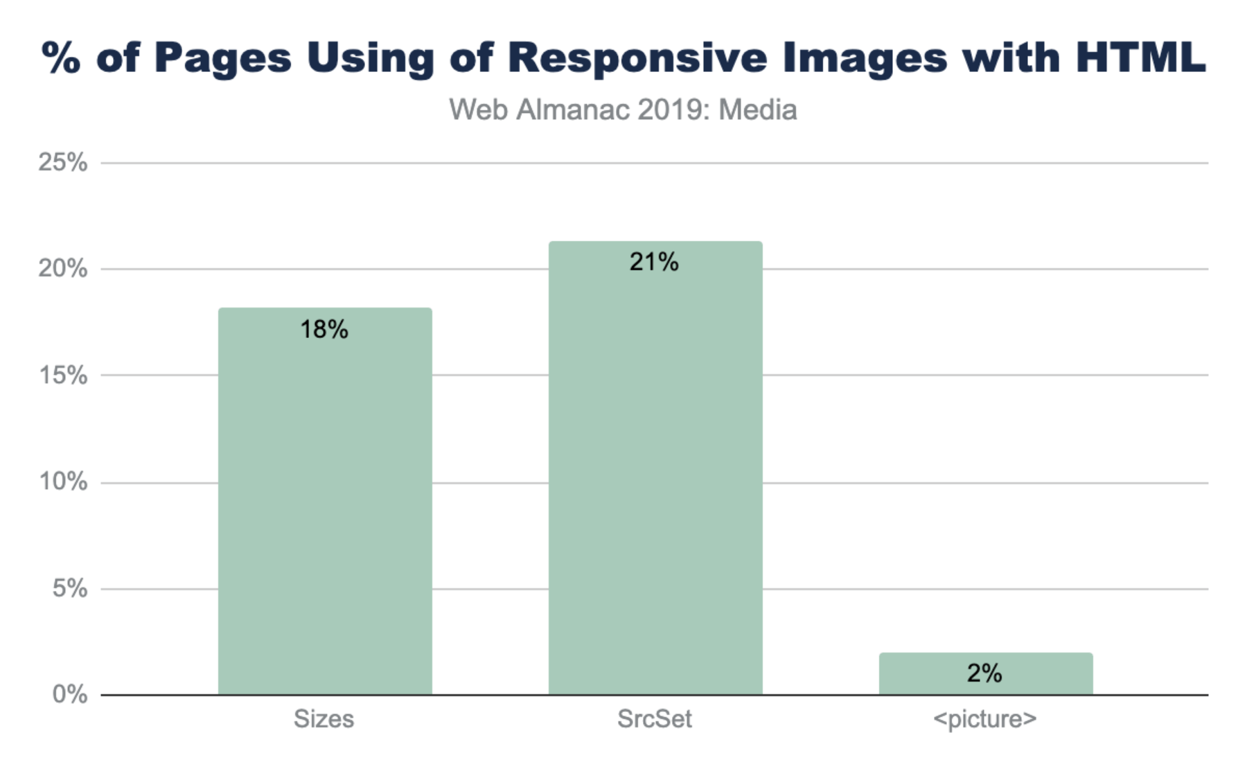
The notably lower use of <picture> is not surprising given that it is used most often for advanced responsive web design (RWD) layouts like art directionhttps://developer.mozilla.org/docs/Learn/HTML/Multimedia_and_embedding/Responsive_images#Art_direction.
Use of sizes
The utility of srcset is usually dependent on the precision of the sizes media query. Without sizes the browser will assume the <img> tag will fill the entire viewport instead of smaller component. Interestingly, there are five common patterns that web developers have adopted for <img sizes>:
<img sizes="100vw">- this indicates that the image will fill the width of the viewport (also the default).<img sizes="200px">- this is helpful for browsers selecting based on DPR.<img sizes="(max-width: 300px) 100vw, 300px">- this is the second most popular design pattern. It is the one auto generated by WordPress and likely a few other platforms. It appears auto generated based on the original image size (in this case 300px).<img sizes="(max-width: 767px) 89vw, (max-width: 1000px) 54vw, ...">- this pattern is the custom built design pattern that is aligned with the CSS responsive layout. Each breakpoint has a different calculation for sizes to use.
<img sizes> |
Frequency (millions) | % |
|---|---|---|
(max-width: 300px) 100vw, 300px |
1.47 | 5% |
(max-width: 150px) 100vw, 150px |
0.63 | 2% |
(max-width: 100px) 100vw, 100px |
0.37 | 1% |
(max-width: 400px) 100vw, 400px |
0.32 | 1% |
(max-width: 80px) 100vw, 80px |
0.28 | 1% |
Figure 4.15. Percent of pages using the most popular sizes patterns.
<img sizes="auto">- this is the most popular use, which is actually non-standard and is an artifact of the use of thelazy_sizesJavaScript library. This uses client-side code to inject a bettersizescalculation for the browser. The downside of this is that it depends on the JavaScript loading and DOM to be fully ready, delaying image loading substantially.
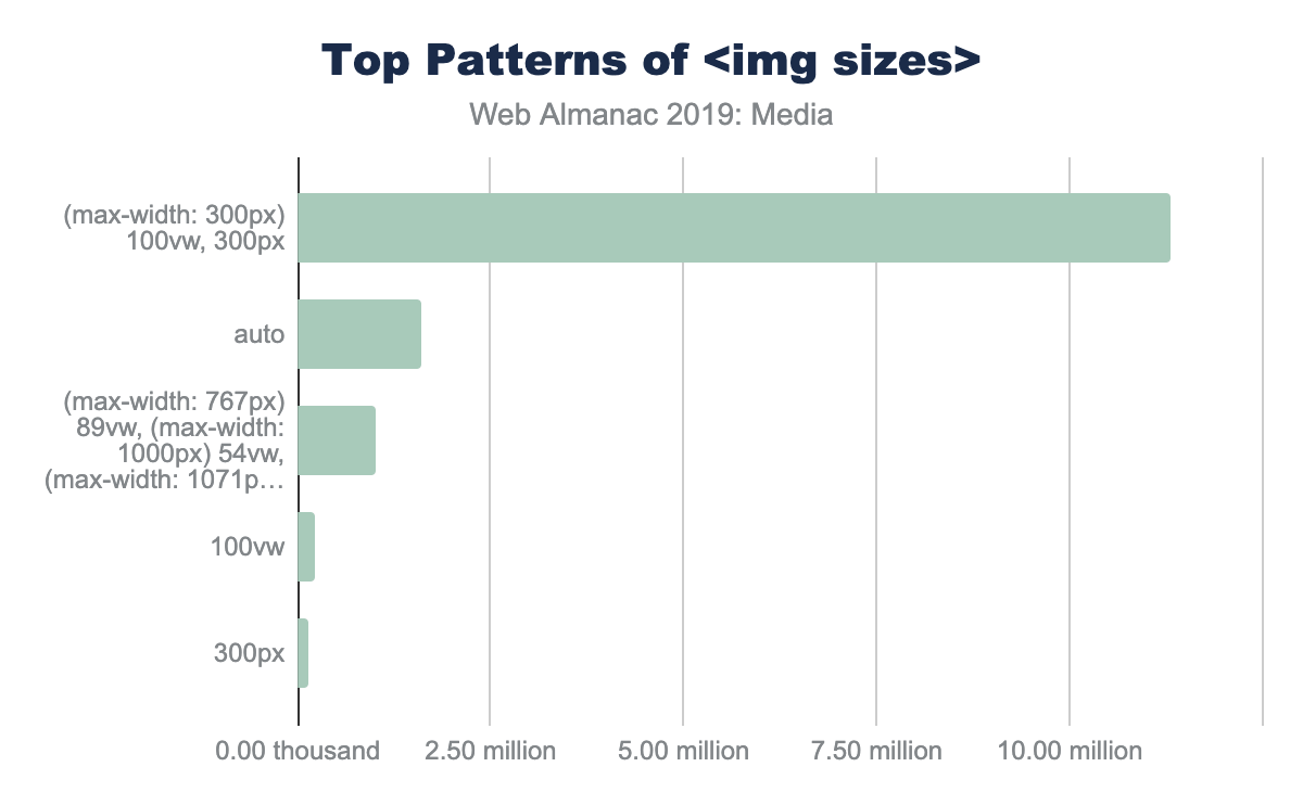
(max-width: 300px) 100vw, 300px’, 1.60 million use ’auto’, 1.00 million use ’img sizes=(max-width: 767px) 89vw...etc.’, 0.23 million use ’100vw’ and 0.13 million use ’300px’<img sizes>.
Client Hints
Client Hintshttps://web.dev/user-agent-client-hints/ allow content creators to move the resizing of images to HTTP content negotiation. In this way, the HTML does not need additional <img srcset> to clutter the markup, and instead can depend on a server or image CDN to select an optimal imagehttps://cloudinary.com/blog/client_hints_and_responsive_images_what_changed_in_chrome_67 for the context. This allows simplifying of HTML and enables origin servers to adapt overtime and disconnect the content and presentation layers.
To enable Client Hints, the web page must signal to the browser using either an extra HTTP header Accept-CH: DPR, Width, Viewport-Width or by adding the HTML <meta http-equiv="Accept-CH" content="DPR, Width, Viewport-Width">. The convenience of one or the other technique depends on the team implementing and both are offered for convenience.
Accept-CH header versus the equivalent <meta> tag.
The use of the <meta> tag in HTML to invoke Client Hints is far more common compared with the HTTP header. This is likely a reflection of the convenience to modify markup templates compared to adding HTTP headers in middle boxes. However, looking at the usage of the HTTP header, over 50% of these cases are from a single SaaS platform (Mercado).
Of the Client Hints invoked, the majority of pages use it for the original three use-cases of DPR, ViewportWidth and Width. Of course, the Width Client Hint that requires the use <img sizes> for the browser to have enough context about the layout.
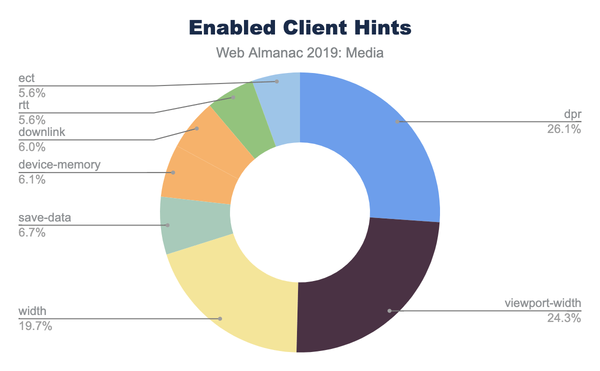
The network-related Client Hints, downlink, rtt, and ect, are only available on Android Chrome.
Lazy loading
Improving web page performance can be partially characterized as a game of illusions; moving slow things out of band and out of site of the user. In this way, lazy loading images is one of these illusions where the image and media content is only loaded when the user scrolls on the page. This improves perceived performance, even on slow networks, and saves the user from downloading bytes that are not otherwise viewed.
Earlier, in Figure 4.5, we showed that the volume of image content at the 75th percentile is far more than could theoretically be shown in a single desktop or mobile viewport. The offscreen imageshttps://developers.google.com/web/tools/lighthouse/audits/offscreen-images Lighthouse audit confirms this suspicion. The median web page has 27% of image content significantly below the fold. This grows to 84% at the 90th percentile.
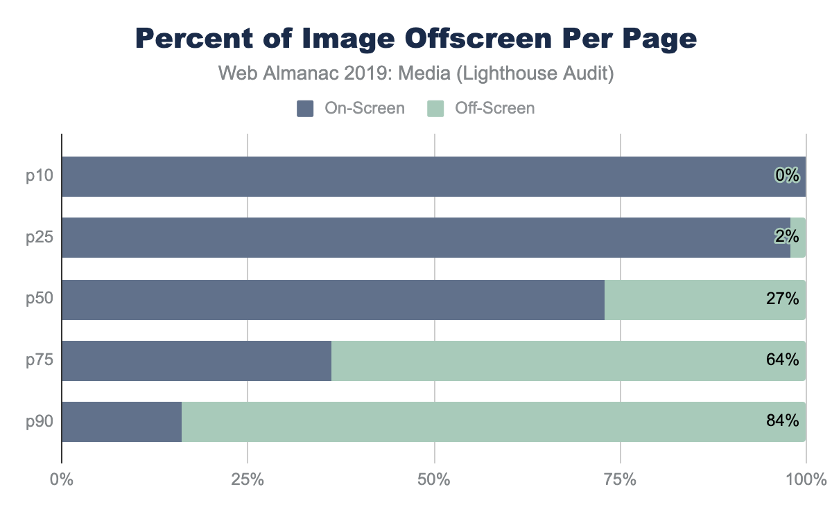
The Lighthouse audit provides us a smell as there are a number of situations that can provide tricky to detect such as the use of quality placeholders.
Lazy loading can be implementedhttps://developers.google.com/web/fundamentals/performance/lazy-loading-guidance/images-and-video in many different ways including using a combination of Intersection Observers, Resize Observers, or using JavaScript libraries like lazySizeshttps://github.com/aFarkas/lazysizes, lozadhttps://github.com/ApoorvSaxena/lozad.js, and a host of others.
In August 2019, Chrome 76 launched with the support for markup-based lazy loading using <img>. While the snapshot of websites used for the 2019 Web Almanac used July 2019 data, over 2,509 websites already utilized this feature.
Accessibility
At the heart of image accessibility is the alt tag. When the alt tag is added to an image, this text can be used to describe the image to a user who is unable to view the images (either due to a disability, or a poor internet connection).
We can detect all of the image tags in the HTML files of the dataset. Of 13 million image tags on desktop and 15 million on mobile, 91.6% of images have an alt tag present. At initial glance, it appears that image accessibility is in very good shape on the web. However, upon deeper inspection, the outlook is not as good. If we examine the length of the alt tags present in the dataset, we find that the median length of the alt tag is six characters. This maps to an empty alt tag (appearing as alt=""). Only 39% of images use alt text that is longer than six characters. The median value of “real” alt text is 31 characters, of which 25 actually describe the image.
Video
While images dominate the media being served on web pages, videos are beginning to have a major role in content delivery on the web. According to HTTP Archive, we find that 4.06% of desktop and 2.99% of mobile sites are self-hosting video files. In other words, the video files are not hosted by websites like YouTube or Facebook.
Video formats
Video can be delivered with many different formats and players. The dominant formats for mobile and desktop are .ts (segments of HLS streaming) and .mp4 (the H264 MPEG):
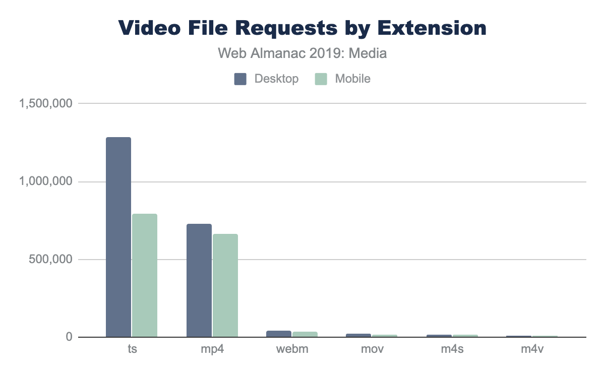
Other formats that are seen include webm, mov, m4s, and m4v (MPEG-DASH streaming segments). It is clear that the majority of streaming on the web is HLS, and that the major format for static videos is the mp4.
The median video size for each format is shown below:
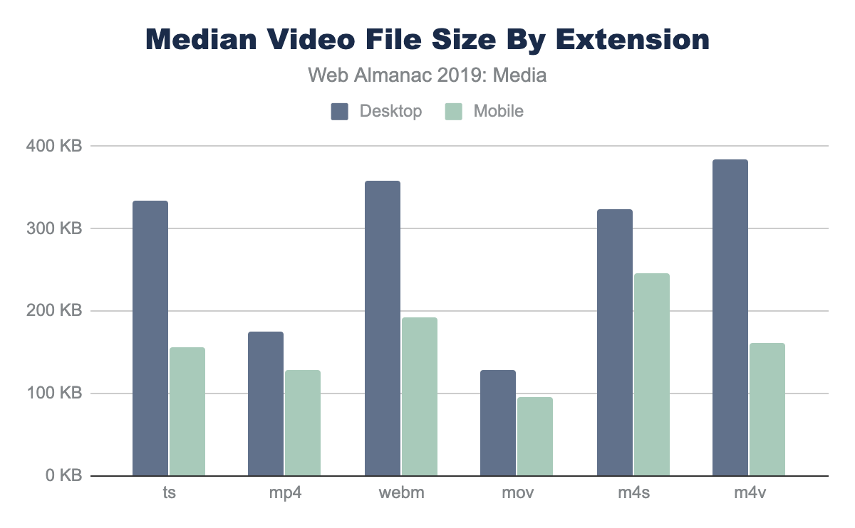
The median values are smaller on mobile, which probably just means that some sites that have very large videos on the desktop disable them for mobile, and that video streams serve smaller versions of videos to smaller screens.
Video file sizes
When delivering video on the web, most videos are delivered with the HTML5 video player. The HTML video player is extremely customizable to deliver video for many different purposes. For example, to autoplay a video, the parameters autoplay and muted would be added. The controls attribute allows the user to start/stop and scan through the video. By parsing the video tags in the HTTP Archive, we’re able to see the usage of each of these attributes:
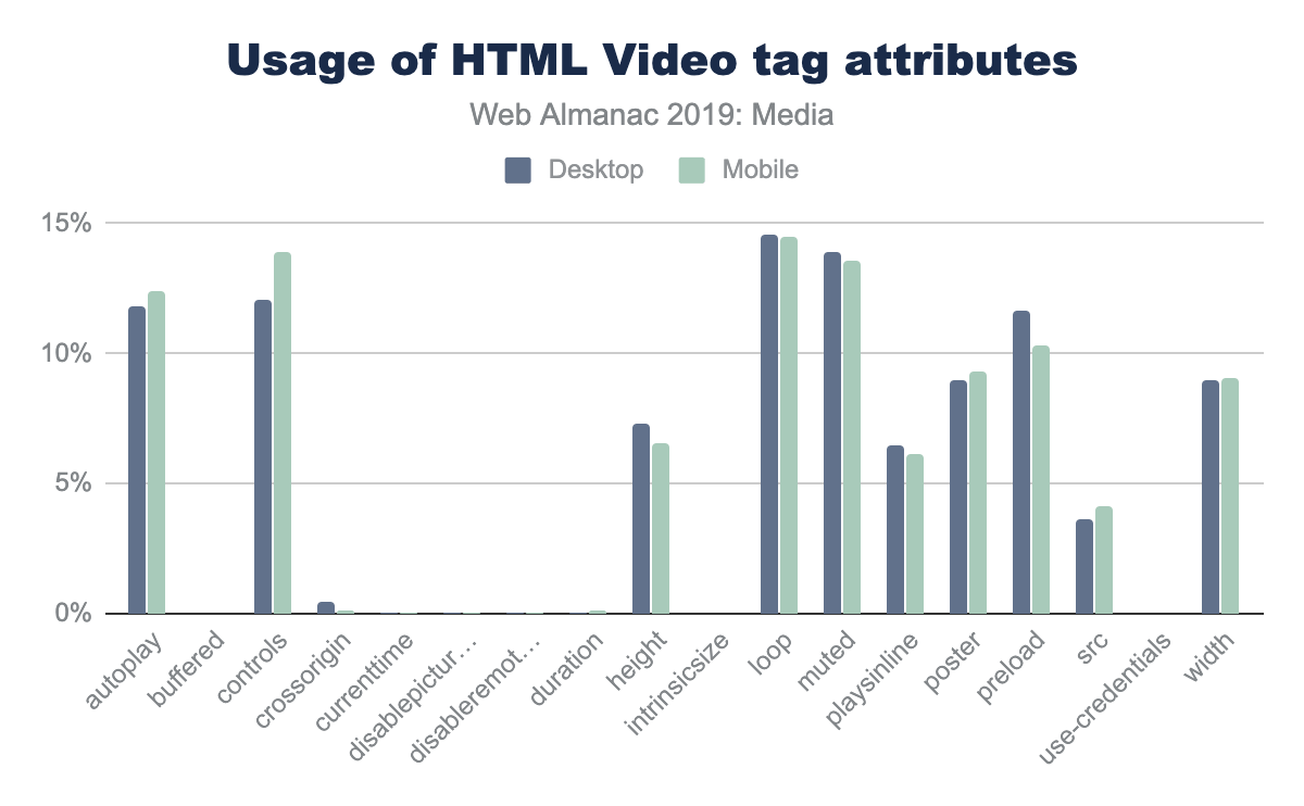
The most common attributes are autoplay, muted and loop, followed by the preload tag and width and height. The use of the loop attribute is used in background videos, and also when videos are used to replace animated GIFs, so it is not surprising to see that it is often used on website home pages.
While most of the attributes have similar usage on desktop and mobile, there are a few that have significant differences. The two attributes with the largest difference between mobile and desktop are width and height, with 4% fewer sites using these attributes on mobile. Interestingly, there is a small increase of the poster attribute (placing an image over the video window before playback) on mobile.
From an accessibility point of view, the <track> tag can be used to add captions or subtitles. There is data in the HTTP Archive on how often the <track> tag is used, but on investigation, most of the instances in the dataset were commented out or pointed to an asset returning a 404 error. It appears that many sites use boilerplate JavaScript or HTML and do not remove the track, even when it is not in use.
Video players
For more advanced playback (and to play video streams), the HTML5 native video player will not work. There are a few popular video libraries that are used to playback the video:
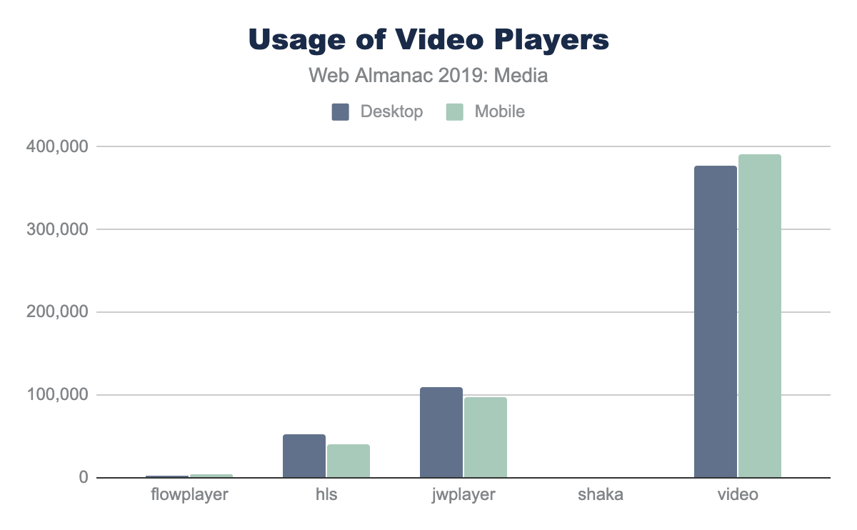
The most popular (by far) is video.js, followed by JWPLayer and HLS.js. The authors do admit that it is possible that there are other files with the name “video.js” that may not be the same video playback library.
Conclusion
Nearly all web pages use images and video to some degree to enhance the user experience and create meaning. These media files utilize a large amount of resources and are a large percentage of the tonnage of websites (and they are not going away!) Utilization of alternative formats, lazy loading, responsive images, and image optimization can go a long way to lower the size of media on the web.
Authors
-
Colin BendellColin is part of the CTO Office at Cloudinaryhttps://cloudinary.com/ and co-author of the O’Reilly book High Performance Imageshttps://www.oreilly.com/library/view/high-performance-images/9781491925799/. He spends much of his time at the intersection of high volume data, media, browsers and standards. You can find him on tweeting @colinbendell and at blogging at https://bendell.ca.
-
Doug SillarsDoug Sillars is a freelance digital nomad working on the intersection of performance and media. He tweets @dougsillars, and blogs regularly at dougsillars.comhttps://dougsillars.com.


Third Parties

Introduction
The open web is vast, linkable, and interoperable by design. The ability to grab someone else’s complex library and use it on your site with a single <link> or <script> element has supercharged developers’ productivity and enabled awesome new web experiences. On the flip side, the immense popularity of a select few third-party providers raises important performance, privacy, and security concerns. This chapter examines the prevalence and impact of third-party code on the web in 2019, the usage patterns that lead to the popularity of third-party solutions, and potential repercussions for the future of web experiences.
Definitions
“Third Party”
A third party is an entity outside the primary site-user relationship, i.e. the aspects of the site not directly within the control of the site owner but present with their approval. For example, the Google Analytics script is an example of a common third-party resource.
Third-party resources are:
- Hosted on a shared and public origin
- Widely used by a variety of sites
- Uninfluenced by an individual site owner
To match these goals as closely as possible, the formal definition used throughout this chapter of a third-party resource is a resource that originates from a domain whose resources can be found on at least 50 unique pages in the HTTP Archive dataset.
Note that using these definitions, third-party content served from a first-party domain is counted as first-party content. For example, self-hosting Google Fonts or bootstrap.css is counted as first-party content. Similarly, first-party content served from a third-party domain is counted as third-party content. For example, first-party images served over a CDN on a third-party domain are considered third-party content.
Provider categories
This chapter divides third-party providers into one of these broad categories. A brief description is included below and the mapping of domain to category can be found in the third-party-web repositoryhttps://github.com/patrickhulce/third-party-web/blob/8afa2d8cadddec8f0db39e7d715c07e85fb0f8ec/data/entities.json5.
- Ad - display and measurement of advertisements
- Analytics - tracking site visitor behavior
- CDN - providers that host public shared utilities or private content of their users
- Content - providers that facilitate publishers and host syndicated content
- Customer Success - support and customer relationship management functionality
- Hosting - providers that host the arbitrary content of their users
- Marketing - sales, lead generation, and email marketing functionality
- Social - social networks and their affiliated integrations
- Tag Manager - provider whose sole role is to manage the inclusion of other third parties
- Utility - code that aids the development objectives of the site owner
- Video - providers that host the arbitrary video content of their users
- Other - uncategorized or non-conforming activity
Caveats
- All data presented here is based on a non-interactive, cold load. These values could start to look quite different after user interaction.
- Roughly 84% of all third-party domains by request volume have been identified and categorized. The remaining 16% fall into the “Other” category.
Data
Third-party code is everywhere. 93% of pages include at least one third-party resource, 76% of pages issue a request to an analytics domain, the median page requests content from at least 9 unique third-party domains that represent 35% of their total network activity, and the most active 10% of pages issue a whopping 175 third-party requests or more. It’s not a stretch to say that third parties are an integral part of the web.
Categories
If the ubiquity of third-party content is unsurprising, perhaps more interesting is the breakdown of third-party content by provider type.
While advertising might be the most user-visible example of third-party presence on the web, analytics providers are the most common third-party category with 76% of sites including at least one analytics request. CDNs at 63%, ads at 57%, and developer utilities like Sentry, Stripe, and Google Maps SDK at 56% follow up as a close second, third, and fourth for appearing on the most web properties. The popularity of these categories forms the foundation of our web usage patterns identified later in the chapter.
Providers
A relatively small set of providers dominate the third-party landscape: the top 100 domains account for 30% of network requests across the web. Powerhouses like Google, Facebook, and YouTube make the headlines here with full percentage points of share each, but smaller entities like Wix and Shopify command a substantial portion of third-party popularity as well.
While much could be said about every individual provider’s popularity and performance impact, this more opinionated analysis is left as an exercise for the reader and other purpose-built tools such as third-party-webhttps://thirdpartyweb.today.
| Rank | Third party domain | Percent of requests |
|---|---|---|
| 1 | fonts.gstatic.com |
2.53% |
| 2 | www.facebook.com |
2.38% |
| 3 | www.google-analytics.com |
1.71% |
| 4 | www.google.com |
1.17% |
| 5 | fonts.googleapis.com |
1.05% |
| 6 | www.youtube.com |
0.99% |
| 7 | connect.facebook.net |
0.97% |
| 8 | googleads.g.doubleclick.net |
0.93% |
| 9 | cdn.shopify.com |
0.76% |
| 10 | maps.googleapis.com |
0.75% |
Figure 5.3. Top 10 most popular third-party domains.
| Rank | Third party URL | Percent of requests |
|---|---|---|
| 1 | https://www.google-analytics.com/analytics.js |
0.64% |
| 2 | https://connect.facebook.net/en_US/fbevents.js |
0.20% |
| 3 | https://connect.facebook.net/signals/plugins/inferredEvents.js?v=2.8.51 |
0.19% |
| 4 | https://staticxx.facebook.com/connect/xd_arbiter.php?version=44 |
0.16% |
| 5 | https://fonts.gstatic.com/s/opensans/v16/mem8YaGs126MiZpBA-UFVZ0b.woff2 |
0.13% |
| 6 | https://www.googletagservices.com/activeview/js/current/osd.js?cb=%2Fr20100101 |
0.12% |
| 7 | https://fonts.gstatic.com/s/roboto/v18/KFOmCnqEu92Fr1Mu4mxK.woff2 |
0.11% |
| 8 | https://googleads.g.doubleclick.net/pagead/id |
0.11% |
| 9 | https://fonts.gstatic.com/s/roboto/v19/KFOmCnqEu92Fr1Mu4mxK.woff2 |
0.10% |
| 10 | https://www.googleadservices.com/pagead/conversion_async.js |
0.10% |
Figure 5.4. Top 10 most popular third-party requests.
Resource types
The resource type breakdown of third-party content also lends insight into how third-party code is used across the web. While first-party requests are 56% images, 23% script, 14% CSS, and only 4% HTML, third-party requests skew more heavily toward script and HTML at 32% script, 34% images, 12% HTML, and only 6% CSS. While this suggests that third-party code is less frequently used to aid the design and instead used more frequently to facilitate or observe interactions than first-party code, a breakdown of resource types by party status tells a more nuanced story. While CSS and images are dominantly first-party at 70% and 64% respectively, fonts are largely served by third-party providers with only 28% being served from first-party sources. This concept of usage patterns is explored in more depth later in this chapter.
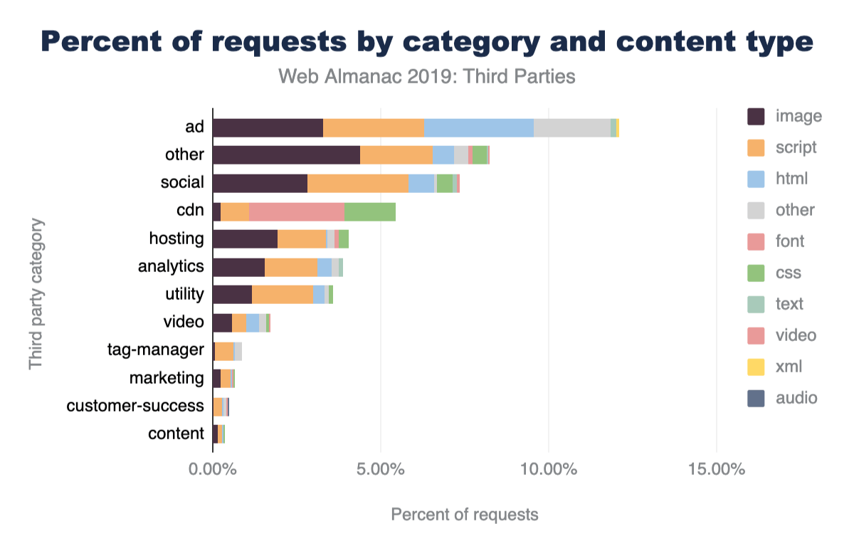
Several other amusing factoids jump out from this data. Tracking pixels (image requests to analytics domains) make up 1.6% of all network requests, six times as many video requests are to social networks like Facebook and Twitter than dedicated video providers like YouTube and Vimeo (presumably because the default YouTube embed consists of HTML and a preview thumbnail but not an autoplaying video), and there are still more requests for first-party images than all scripts combined.
Request count
49% of all requests are third-party. At 51%, first-party can still narrowly hold on to the crown in 2019 of comprising the majority of the web resources. Given that just under half of all the requests are third-party yet a small set of pages do not include any at all, the most active third-party users must be doing quite a bit more than their fair share. Indeed, at the 75th, 90th, and 99th percentiles we see nearly all of the page being comprised of third-party content. In fact, for some sites heavily relying on distributed WYSIWYG platforms like Wix and SquareSpace, the root document might be the sole first-party request!
The number of requests issued by each third-party provider also varies considerably by category. While analytics are the most widespread third-party category across websites, they account for only 7% of all third-party network requests. Ads, on the other hand, are found on nearly 20% fewer sites yet make up 25% of all third-party network requests. Their outsized resource impact compared to their popularity will be a theme we continue to uncover in the remaining data.
Byte weight
While 49% of requests are third-party, their share of the web in terms of bytes is quite a bit lower at only 28%. The same goes for the breakdown by multiple resource types. Third-party fonts make up 72% of all fonts, but they’re only 53% of font bytes; 74% of HTML requests, but only 39% of HTML bytes; 68% of video requests, but only 31% of video bytes. All this seems to suggest third-party providers are responsible stewards who keep their response sizes low, and, for the most part, that is in fact the case until you look at scripts.
Despite serving 57% of scripts, third parties comprise 64% of script bytes. meaning their scripts are larger on average than first-party scripts. This is an early warning sign for their performance impact to come in the next few sections.
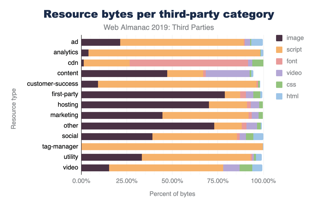
As for specific third-party providers, the same juggernauts topping the request count leaderboards make their appearance in byte weight as well. The only few notable movements are the large, media-heavy providers such as YouTube, Shopify, and Twitter which climb to the top of the byte impact charts.
Script execution
57% of script execution time is from third-party scripts, and the top 100 domains already account for 48% of all script execution time on the web. This underscores just how large an impact a select few entities really have on web performance. This topic is explored more in depth in the Repercussions > Performance section.
The category breakdowns among script execution largely follow that of resource counts. Here too advertising looms largest. Ad scripts comprise 25% of third-party script execution time with hosting and social providers in a distant tie for second at 12%.
While much could be said about every individual provider’s popularity and performance impact, this more opinionated analysis is left as an exercise for the reader and other purpose-built tools such as the previously mentioned third-party-webhttps://thirdpartyweb.today.
Usage patterns
Why do site owners use third-party code? How did third-party content grow to be nearly half of all network requests? What are all these requests doing? Answers to these questions lie in the three primary usage patterns of third-party resources. Broadly, site owners reach for third parties to generate and consume data from their users, monetize their site experiences, and simplify web development.
Generate and consume data
Analytics is the most popular third-party category found across the web and yet is minimally user-visible. Consider the volume of information at play in the lifetime of a web visit; there’s user context, device, browser, connection quality, location, page interactions, session length, return visitor status, and more being generated continuously. It’s difficult, cumbersome, and expensive to maintain tools that warehouse, normalize, and analyze time series data of this magnitude. While nothing categorically necessitates that analytics fall into the domain of third-party providers, the widespread attractiveness of understanding your users, deep complexity of the problem space, and increasing emphasis on managing data respectfully and responsibly naturally surfaces analytics as a popular third-party usage pattern.
There’s also a flip side to user data though: consumption. While analytics is about generating data from your site’s visitors, other third-party resources focus on consuming data about your visitors that is known only by others. Social providers fall squarely into this usage pattern. A site owner must use Facebook resources if they wish to integrate information from a visitor’s Facebook profile into their site. As long as site owners are interested in personalizing their experience with widgets from social networks and leveraging the social networks of their visitors to increase their reach, social integrations are likely to remain the domain of third-party entities for the foreseeable future.
Monetize web traffic
The open model of the web does not always serve the financial interests of content creators to their liking and many site owners resort to monetizing their sites with advertising. Because building direct relationships with advertisers and negotiating pricing contracts is a relatively difficult and time-consuming process, this concern is largely handled by third-party providers performing targeted advertising and real-time bidding. Widespread negative public opinion, the popularity of ad blocking technology, and regulatory action in major global markets such as Europe pose the largest threat to the continued use of third-party providers for monetization. While it’s unlikely that site owners suddenly strike their own advertising deals or build bespoke ad networks, alternative monetization models like paywalls and experiments like Brave’s Basic Attention Tokenhttps://basicattentiontoken.org/ have a real chance of shaking up the third-party ad landscape of the future.
Simplify development
Above all, third-party resources are used to simplify the web development experience. Even previous usage patterns could arguably fall into this pattern as well. Whether analyzing user behavior, communicating with advertisers, or personalizing the user experience, third-party resources are used to make first-party development easier.
Hosting providers are the most extreme example of this pattern. Some of these providers even enable anyone on Earth to become a site owner with no technical expertise necessary. They provide hosting of assets, tools to build sites without coding experience, and domain registration services.
The remainder of third-party providers also tend to fall into this usage pattern. Whether it’s hosting of a utility library such as jQuery for usage by front-end developers cached on Cloudflare’s edge servers or a vast library of common fonts served from a popular Google CDN, third-party content is another way to give the site owner one fewer thing to worry about and, maybe, just maybe, make the job of delivering a great experience a little bit easier.
Repercussions
Performance
The performance impact of third-party content is neither categorically good nor bad. There are good and bad actors across the spectrum and different category types have varying levels of influence.
The good: shared third-party font and stylesheet utilities are, on average, delivered more efficiently than their first-party counterparts.
Utilities, CDNs, and Content categories are the brightest spots on the third-party performance landscape. They offer optimized versions of the same sort of content that would otherwise be served from first-party sources. Google Fonts and Typekit serve optimized fonts that are smaller on average than first-party fonts, Cloudflare CDN serves a minified version of open source libraries that might be accidentally served in development mode by some site owners, Google Maps SDK efficiently delivers complex maps that might otherwise be naively shipped as large images.
The bad: a very small set of entities represent a very large chunk of JavaScript execution time carrying out narrow set of functionality on pages.
Ads, social, hosting, and certain analytics providers represent the largest negative impact on web performance. While hosting providers deliver a majority of a site’s content and will understandably have a larger performance impact than other third-party categories, they also serve almost entirely static sites that demand very little JavaScript in most cases that should not justify the volume of script execution time. The other categories hurting performance though have even less of an excuse. They fill very narrow roles on each page they appear on and yet quickly take over a majority of resources. For example, the Facebook “Like” button and associated social widgets take up extraordinarily little screen real estate and are a fraction of most web experiences, and yet the median impact on pages with social third parties is nearly 20% of their total JavaScript execution time. The situation is similar for analytics - tracking libraries do not directly contribute to the perceived user experience, and yet the 90th percentile impact on pages with analytics third parties is 44% of their total JavaScript execution time.
The silver lining of such a small number of entities enjoying such large market share is that a very limited and concentrated effort can have an enormous impact on the web as a whole. Performance improvements at just the top few hosting providers can improve 2-3% of all web requests.
Privacy
The abundance of analytics providers and top-heavy concentration of script execution raises two primary privacy concerns for site visitors: the largest use case of third-parties is for site owners to track their users and a handful of companies receive information on a large swath of web traffic.
The interest of site owners in understanding and analyzing user behavior is not malicious on its own, but the widespread and relatively behind-the-scenes nature of web analytics raises valid concerns, and users, companies, and lawmakers have taken notice in recent years with privacy regulation such as GDPRhttps://en.wikipedia.org/wiki/General_Data_Protection_Regulation in Europe and the CCPAhttps://en.wikipedia.org/wiki/California_Consumer_Privacy_Act in California. Ensuring that developers handle user data responsibly, treat the user respectfully, and are transparent with what data is collected is key to keeping analytics the most popular third-party category and maintaining the symbiotic nature of analyzing user behavior to deliver future user value.
The top-heavy concentration of script execution is great for the potential impact of performance improvements, but less exciting for the privacy ramifications. 29% of all script execution time across the web is just from scripts on domains owned by Google or Facebook. That’s a very large percentage of CPU time that is controlled by just two entities. It’s critical to ensure that the same privacy protections held to analytics providers be applied in these other ad, social, and developer utility categories as well.
Security
While the topic of security is covered more in-depth in the Security chapter, the security implications of introducing external dependencies to your site go hand-in-hand with privacy concerns. Allowing third parties to execute arbitrary JavaScript effectively provides them with complete control over your page. When a script can control the DOM and window, it can do everything. Even if code has no security concerns, it can introduce a single point of failure, which has been recognized as a potential problem for some time nowhttps://www.stevesouders.com/blog/2010/06/01/frontend-spof/.
Self-hosting third-party contenthttps://csswizardry.com/2019/05/self-host-your-static-assets/ addresses some of the concerns mentioned here - and others. Additionally with browsers increasingly partitioning HTTP cacheshttps://chromestatus.com/feature/5730772021411840 the benefits of loading directly from the third-party are increasingly questionable. Perhaps this is a better way to consume third-party content for many use cases, even if it makes measuring its impact more difficult.
Conclusion
Third-party content is everywhere. This is hardly surprising; the entire basis of the web is to allow interconnectedness and linking. In this chapter we have examined third-party content in terms of assets hosted away from the main domain. If we had included self-hosted third-party content (e.g. common open source libraries hosted on the main domain), third-party usage would have been even larger!
While reuse in computer technologieshttps://en.wikipedia.org/wiki/Code_reuse is generally a best practice, third parties on the web introduce dependencies that have a considerable impact on the performance, privacy, and security of a page. Self-hosting and careful provider selection can go a long way to mitigate these effects
Regardless of the important question of how third-party content is added to a page, the conclusion is the same: third parties are an integral part of the web!
Author
-
Patrick HulcePatrick Hulce is an ex-Chrome engineer, founder of Eris Ventureshttps://eris.ventures/, core team member of Lighthousehttps://github.com/GoogleChrome/lighthouse and Lighthouse CIhttps://github.com/GoogleChrome/lighthouse-ci, co-organizer of the DallasJShttps://www.meetup.com/DallasJS/ meetup, and author of the third-party-webhttps://github.com/patrickhulce/third-party-web project.

Fonts
Introduction
Web fonts enable beautiful and functional typography on the web. Using web fonts not only empowers design, but it democratizes a subset of design, as it allows easier access to those who might not have particularly strong design skills. However, for all the good they can do, web fonts can also do great harm to your site’s performance if they are not loaded properly.
Are they a net positive for the web? Do they provide more benefit than harm? Are the web standards cowpaths sufficiently paved to encourage web font loading best practices by default? And if not, what needs to change? Let’s take a data-driven peek at whether or not we can answer those questions by inspecting how web fonts are used on the web today.
Where did you get those web fonts?
The first and most prominent question: performance. There is a whole chapter dedicated to performance but we will delve a little into font-specific performance issues here.
Using hosted web fonts enables ease of implementation and maintenance, but self-hosting offers the best performance. Given that web fonts by default make text invisible while the web font is loading (also known as the Flash of Invisible Texthttps://css-tricks.com/fout-foit-foft/, or FOIT), the performance of web fonts can be more critical than non-blocking assets like images.
Are fonts being hosted on the same host or by a different host?
Differentiating self-hosting against third-party hosting is increasingly relevant in an HTTP/2 world, where the performance gap between a same-host and different-host connection can be wider. Same-host requests have the huge benefit of a better potential for prioritization against other same-host requests in the waterfall.
Recommendations to mitigate the performance costs of loading web fonts from another host include using the preconnect, dns-prefetch, and preload resource hints, but high priority web fonts should be same-host requests to minimize the performance impact of web fonts. This is especially important for fonts used by very visually prominent content or body copy occupying the majority of a page.
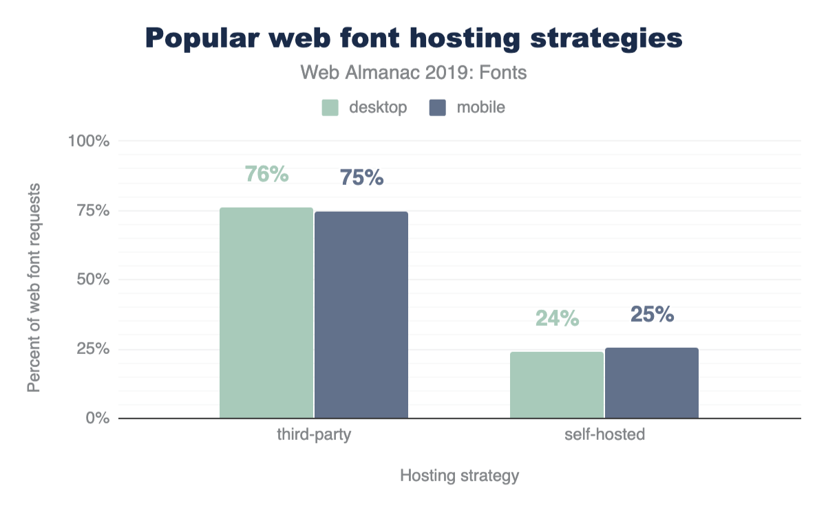
The fact that three quarters are hosted is perhaps unsurprising given Google Fonts dominance that we will discuss below.
Google serves fonts using third-party CSS files hosted on https://fonts.googleapis.com. Developers add requests to these stylesheets using <link> tags in their markup. While these stylesheets are render blocking, they are very small. However, the font files are hosted on yet another domain, https://fonts.gstatic.com. The model of requiring two separate hops to two different domains makes preconnect a great option here for the second request that will not be discovered until the CSS is downloaded.
Note that while preload would be a nice addition to load the font files higher in the request waterfall (remember that preconnect sets up the connection, it doesn’t request the file content), preload is not yet available with Google Fonts. Google Fonts generates unique URLs for their font files which are subject to changehttps://github.com/google/fonts/issues/1067.
What are the most popular third-party hosts?
| Host | Desktop | Mobile |
|---|---|---|
| fonts.gstatic.com | 75.4% | 74.9% |
| use.typekit.net | 7.2% | 6.6% |
| maxcdn.bootstrapcdn.com | 1.8% | 2.0% |
| use.fontawesome.com | 1.1% | 1.2% |
| static.parastorage.com | 0.8% | 1.2% |
| fonts.shopifycdn.com | 0.6% | 0.6% |
| cdn.shopify.com | 0.5% | 0.5% |
| cdnjs.cloudflare.com | 0.4% | 0.5% |
| use.typekit.com | 0.4% | 0.4% |
| netdna.bootstrapcdn.com | 0.3% | 0.4% |
| fast.fonts.net | 0.3% | 0.3% |
| static.dealer.com | 0.2% | 0.2% |
| themes.googleusercontent.com | 0.2% | 0.2% |
| static-v.tawk.to | 0.1% | 0.3% |
| stc.utdstc.com | 0.1% | 0.2% |
| cdn.jsdelivr.net | 0.2% | 0.2% |
| kit-free.fontawesome.com | 0.2% | 0.2% |
| open.scdn.co | 0.1% | 0.1% |
| assets.squarespace.com | 0.1% | 0.1% |
| fonts.jimstatic.com | 0.1% | 0.2% |
Figure 6.2. Top 20 font hosts by percent of requests.
The dominance of Google Fonts here was simultaneously surprising and unsurprising at the same time. It was unsurprising in that I expected the service to be the most popular and surprising in the sheer dominance of its popularity. 75% of font requests is astounding. TypeKit was a distant single-digit second place, with the Bootstrap library accounting for an even more distant third place.
<head>.
While the high usage of Google Fonts here is very impressive, it is also noteworthy that only 29% of pages included a Google Fonts <link> element. This could mean a few things:
- When pages uses Google Fonts, they use a lot of Google Fonts. They are provided without monetary cost, after all. Perhaps they’re being used in a popular WYSIWYG editor? This seems like a very likely explanation.
- Or a more unlikely story is that it could mean that a lot of people are using Google Fonts with
@importinstead of<link>. - Or if we want to go off the deep end into super unlikely scenarios, it could mean that many people are using Google Fonts with an HTTP
Link:header instead.
<head>.
Google Fonts documentation encourages the <link> for the Google Fonts CSS to be placed as the first child in the <head> of a page. This is a big ask! In practice, this is not common as only half a percent of all pages (about 20,000 pages) took this advice.
More so, if a page is using preconnect or dns-prefetch as <link> elements, these would come before the Google Fonts CSS anyway. Read on for more about these resource hints.
Speeding up third-party hosting
As mentioned above, a super easy way to speed up web font requests to a third-party host is to use the preconnect resource hint.
Wow! Less than 2% of pages are using preconnect! Given that Google Fonts is at 75%, this should be higher! Developers: if you use Google Fonts, use preconnect! Google Fonts: proselytize preconnect more!
In fact, if you’re using Google Fonts go ahead and add this to your <head> if it’s not there already:
<link rel="preconnect" href="https://fonts.gstatic.com/">Most popular typefaces
| Rank | Font family | Desktop | Mobile |
|---|---|---|---|
| 1 | Open Sans | 24% | 22% |
| 2 | Roboto | 15% | 19% |
| 3 | Montserrat | 5% | 4% |
| 4 | Source Sans Pro | 4% | 3% |
| 5 | Noto Sans JP | 3% | 3% |
| 6 | Lato | 3% | 3% |
| 7 | Nanum Gothic | 4% | 2% |
| 8 | Noto Sans KR | 3% | 2% |
| 9 | Roboto Condensed | 2% | 2% |
| 10 | Raleway | 2% | 2% |
| 11 | FontAwesome | 1% | 1% |
| 12 | Roboto Slab | 1% | 1% |
| 13 | Noto Sans TC | 1% | 1% |
| 14 | Poppins | 1% | 1% |
| 15 | Ubuntu | 1% | 1% |
| 16 | Oswald | 1% | 1% |
| 17 | Merriweather | 1% | 1% |
| 18 | PT Sans | 1% | 1% |
| 19 | Playfair Display | 1% | 1% |
| 20 | Noto Sans | 1% | 1% |
Figure 6.6. Top 20 font families as a percent of all font declarations.
It is unsurprising that the top entries here seem to match up very similarly to Google Fonts’ list of fonts sorted by popularityhttps://fonts.google.com/?sort=popularity.
What font formats are being used?
WOFF2 is pretty well supportedhttps://caniuse.com/#feat=woff2 in web browsers today. Google Fonts serves WOFF2, a format that offers improved compression over its predecessor WOFF, which was itself already an improvement over other existing font formats.
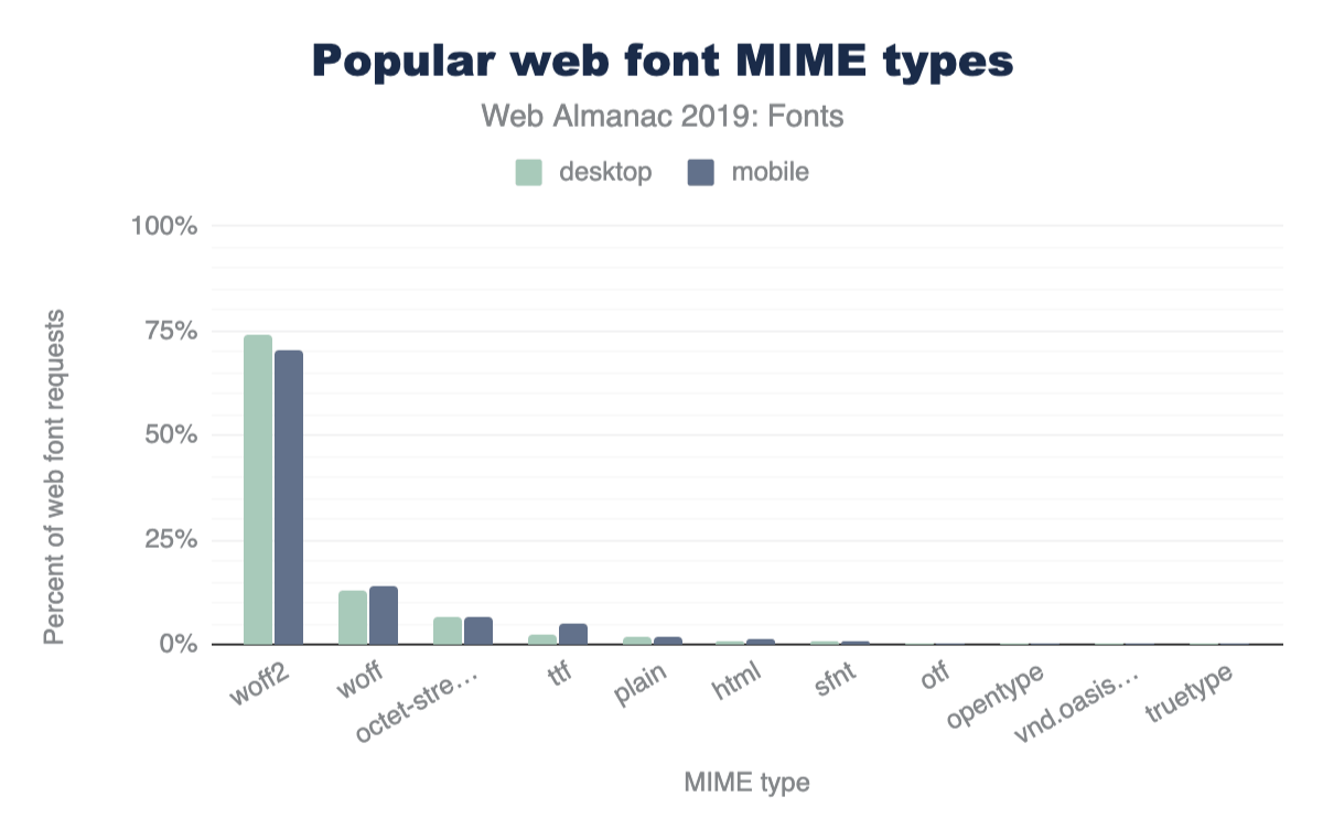
From my perspective, an argument could be made to go WOFF2-only for web fonts after seeing the results here. I wonder where the double-digit WOFF usage is coming from? Perhaps developers still serving web fonts to Internet Explorer?
Third place octet-stream (and plain a little further down) would seem to suggest that a lot of web servers are configured improperly, sending an incorrect MIME type with web font file requests.
Let’s dig a bit deeper and look at the format() values used in the src: property of @font-face declarations:
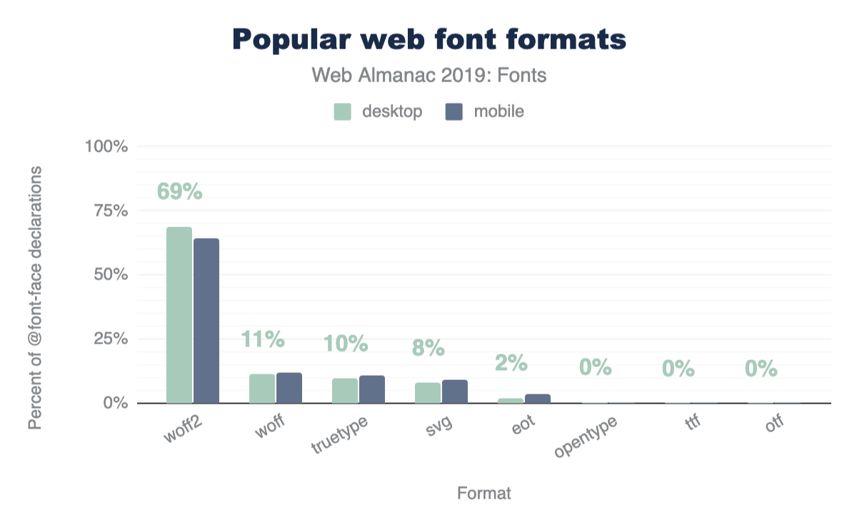
@font-face declarations.
I was hoping to see SVG fontshttps://caniuse.com/#feat=svg-fonts on the decline. They’re buggy and implementations have been removed from every browser except Safari. Time to drop these, y’all.
The SVG data point here also makes me wonder what MIME type y’all are serving these SVG fonts with. I don’t see image/svg+xml anywhere in Figure 6.7. Anyway, don’t worry about fixing that, just get rid of them!
WOFF2-only
| Rank | Format combinations | Desktop | Mobile |
|---|---|---|---|
| 1 | woff2 | 84.0% | 81.9% |
| 2 | svg, truetype, woff | 4.3% | 4.0% |
| 3 | svg, truetype, woff, woff2 | 3.5% | 3.2% |
| 4 | eot, svg, truetype, woff | 1.3% | 2.9% |
| 5 | woff, woff2 | 1.8% | 1.8% |
| 6 | eot, svg, truetype, woff, woff2 | 1.2% | 2.1% |
| 7 | truetype, woff | 0.9% | 1.1% |
| 8 | woff | 0.7% | 0.8% |
| 9 | truetype | 0.6% | 0.7% |
| 10 | truetype, woff, woff2 | 0.6% | 0.6% |
| 11 | opentype, woff, woff2 | 0.3% | 0.2% |
| 12 | svg | 0.2% | 0.2% |
| 13 | eot, truetype, woff | 0.1% | 0.2% |
| 14 | opentype, woff | 0.1% | 0.1% |
| 15 | opentype | 0.1% | 0.1% |
| 16 | eot | 0.1% | 0.1% |
| 17 | opentype, svg, truetype, woff | 0.1% | 0.0% |
| 18 | opentype, truetype, woff, woff2 | 0.0% | 0.0% |
| 19 | eot, truetype, woff, woff2 | 0.0% | 0.0% |
| 20 | svg, woff | 0.0% | 0.0% |
Figure 6.9. Top 20 font format combinations.
This dataset seems to suggest that the majority of people are already using WOFF2-only in their @font-face blocks. But this is misleading of course, per our earlier discussion on the dominance of Google Fonts in the data set. Google Fonts does some sniffing methods to serve a streamlined CSS file and only includes the most modern format(). Unsurprisingly, WOFF2 dominates the results here for that reason, as browser support for WOFF2 has been pretty broad for some time now.
Importantly, this particular data doesn’t really support or detract from the case to go WOFF2-only yet, but it remains a tempting idea.
Fighting against invisible text
The number one tool we have to fight the default web font loading behavior of “invisible while loading” (also known as FOIT), is font-display. Adding font-display: swap to your @font-face block is an easy way to tell the browser to show fallback text while the web font is loading.
Browser supporthttps://caniuse.com/#feat=mdn-css_at-rules_font-face_font-display is great too. Internet Explorer and pre-Chromium Edge don’t have support but they also render fallback text by default when a web font loads (no FOITs allowed here). For our Chrome tests, how commonly is font-display used?
font-display style.
I assume this will be creeping up over time, especially now that Google Fonts is adding font-display to all new code snippets copied from their site.
If you’re using Google Fonts, update your snippets! If you’re not using Google Fonts, use font-display! Read more about font-display on MDNhttps://developer.mozilla.org/docs/Web/CSS/@font-face/font-display.
Let’s have a look at what font-display values are popular:
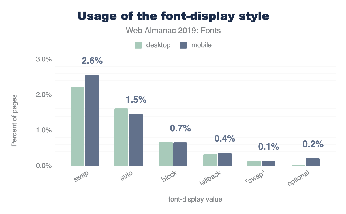
swap, 1.5% to auto, 0.7% to block, 0.4% to fallback, 0.2% to optional, and 0.1% to swap enclosed in quotes, which is invalid. The desktop distribution is similar except swap usage is lower by 0.4 percentage points and auto usage is higher by 0.1 percentage points.font-display values.
As an easy way to show fallback text while a web font is loading, font-display: swap reigns supreme and is the most common value. swap is also the default value used by new Google Fonts code snippets too. I would have expected optional (only render if cached) to have a bit more usage here as a few prominent developer evangelists lobbied for it a bit, but no dice.
How many web fonts are too many?
This is a question that requires some measure of nuance. How are the fonts being used? For how much content on the page? Where does this content live in the layout? How are the fonts being rendered? In lieu of nuance however let’s dive right into some broad and heavy handed analysis specifically centered on request counts.
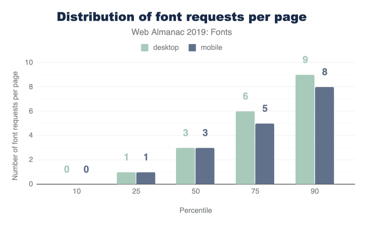
The median web page makes three web font requests. At the 90th percentile, requested six and nine web fonts on mobile and desktop, respectively.
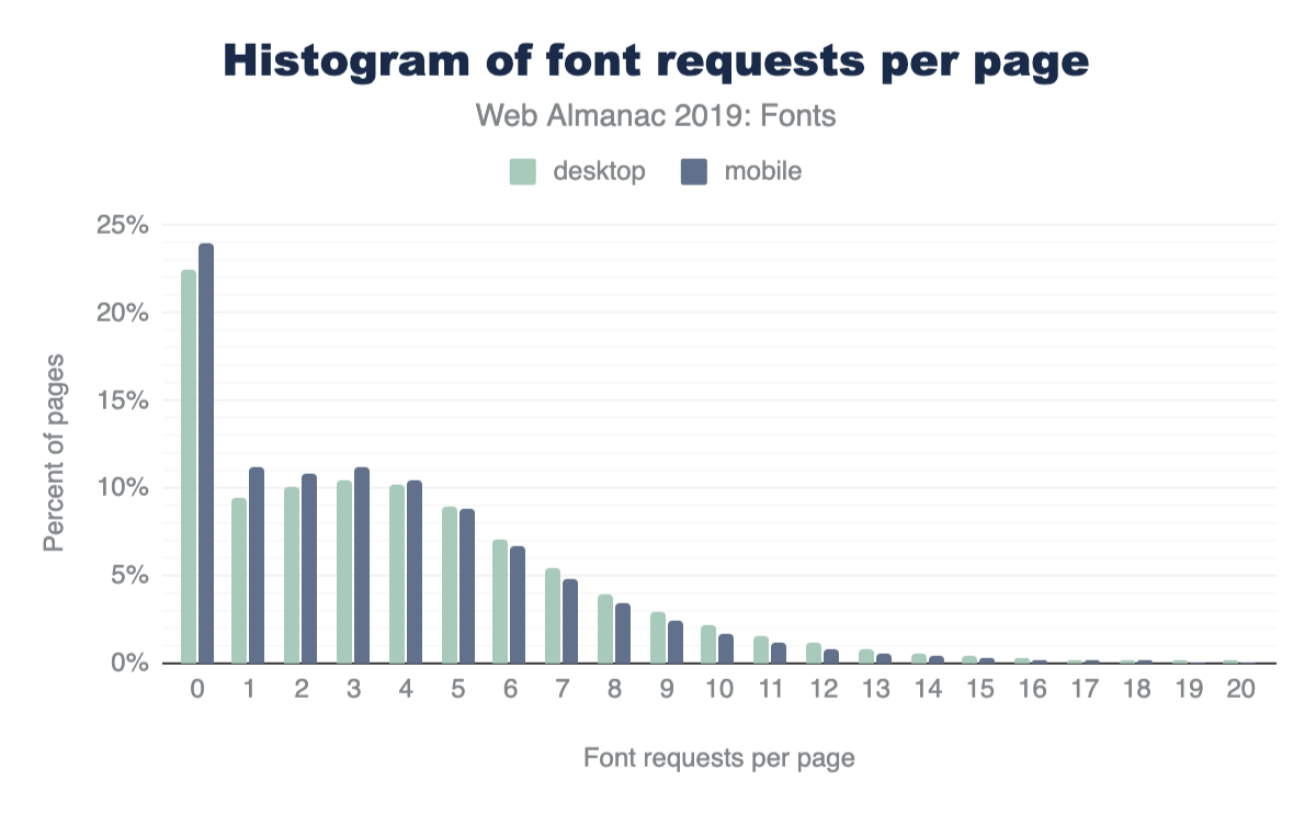
It does seem quite interesting that web font requests seem to be pretty steady across desktop and mobile. I’m glad to see the recommendation to hide @font-face blocks inside of a @media queries didn’t catch on (don’t get any ideas).
That said there are marginally more requests for fonts made on mobile devices. My hunch here is that fewer typefaces are available on mobile devices, which in turn means fewer local() hits in Google Fonts CSS, falling back to network requests for these.
You don’t want to win this award
The award for the page that requests the most web fonts goes to a site that made 718 web font requests!
After diving into the code, all of those 718 requests are going to Google Fonts! It looks like a malfunctioning “Above the Page fold” optimization plugin for WordPress has gone rogue on this site and is requesting (DDoS-ing?) all the Google Fonts—oops!
Ironic that a performance optimization plugin can make your performance much worse!
More accurate matching with unicode-range
unicode-range property.
unicode-range is a great CSS property to let the browser know specifically which code points the page would like to use in the font file. If the @font-face declaration has a unicode-range, content on the page must match one of the code points in the range before the font is requested. It is a very good thing.
This is another metric that I expect was skewed by Google Fonts usage, as Google Fonts uses unicode-range in most (if not all) of its CSS. I’d expect this to be less common in user land, but perhaps filtering out Google Fonts requests in the next edition of the Almanac may be possible.
Don’t request web fonts if a system font exists
local() property.
local() is a nice way to reference a system font in your @font-face src. If the local() font exists, it doesn’t need to make a request for a web font at all. This is used both extensively and controversially by Google Fonts, so it is likely another example of skewed data if we’re trying to glean patterns from user land.
It should also be noted here that it has been said by smarter people than I (Bram Stein of TypeKit) that using local() can be unpredictable as installed versions of fonts can be outdated and unreliable.
Condensed fonts and font-stretch
font-stretch property.
Historically, font-stretch has suffered from poor browser support and was not a well-known @font-face property. Read more about font-stretch on MDN. But browser supporthttps://caniuse.com/#feat=css-font-stretch has broadened.
It has been suggested that using condensed fonts on smaller viewports allows more text to be viewable, but this approach isn’t commonly used. That being said, that this property is used half a percentage point more on desktop than mobile is unexpected, and 7% seems much higher than I would have predicted.
Variable fonts are the future
Variable fontshttps://developer.mozilla.org/docs/Web/CSS/CSS_Fonts/Variable_Fonts_Guide allow several font weights and styles to be included in the one font file.
Even at 1.8% this was higher than expected, although I am excited to see this take off. Google Fonts v2https://developers.google.com/fonts/docs/css2 does include some support for variable fonts.
opsz value, 32% to wght, 16% to wdth, 2% or fewer to roun, crsb, slnt, inln, and more. The most notable differences between desktop and mobile pages are 26% usage of opsz, 38% of wght, and 23% of wdth.font-variation-settings axes.
Through the lens of this large data set, these are very low sample sizes-take these results with a grain of salt. However, opsz as the most common axis on desktop pages is notable, with wght and wdth trailing. In my experience, the introductory demos for variable fonts are usually weight-based.
Color fonts might also be the future?
Usage here of these is basically nonexistent but you can check out the excellent resource Color Fonts! WTF?https://www.colorfonts.wtf/ for more information. Similar (but not at all) to the SVG format for fonts (which is bad and going away), this allows you to embed SVG inside of OpenType files, which is awesome and cool.
Conclusion
The biggest takeaway here is that Google Fonts dominates the web font discussion. Approaches they’ve taken weigh heavily on the data we’ve recorded here. The positives here are easy access to web fonts, good font formats (WOFF2), and for-free unicode-range configurations. The downsides here are performance drawbacks associated with third-party hosting, different-host requests, and no access to preload.
I fully expect that in the future we’ll see the “Rise of the Variable Font”. This should be paired with a decline in web font requests, as Variable Fonts combine multiple individual font files into a single composite font file. But history has shown us that what usually happens here is that we optimize a thing and then add more things to fill the vacancy.
It will be very interesting to see if color fonts increase in popularity. I expect these to be far more niche than variable fonts but may see a lifeline in the icon font space.
Keep those fonts frosty, y’all.
Author
-
Zach LeathermanZach is a Web Developer with Filament Grouphttps://www.filamentgroup.com/. He’s currently fixated on web fontshttps://www.zachleat.com/web/fonts/ and static site generatorshttps://www.zachleat.com/web/introducing-eleventy/. His public speaking résuméhttps://www.zachleat.com/web/speaking/ includes talks in eight different countries at events like JAMstack_conf, Beyond Tellerrand, Smashing Conference, CSSConf, and The White Househttps://www.zachleat.com/web/whitehouse/. He also helps herd NEJS CONFhttp://nejsconf.com/ and the NebraskaJShttp://nebraskajs.com meetup.

Performance

Introduction
Performance is a visceral part of the user experience. For many websiteshttps://wpostats.com/, an improvement to the user experience by speeding up the page load time aligns with an improvement to conversion rates. Conversely, when performance is poor, users don’t convert as often and have even been observed to be rage clickinghttps://blog.fullstory.com/rage-clicks-turn-analytics-into-actionable-insights/ on the page in frustration.
There are many ways to quantify web performance. The most important thing is to measure what actually matters to users. However, events like onload or DOMContentLoaded may not necessarily reflect what users experience visually. For example, when loading an email client, it might show an interstitial progress bar while the inbox contents load asynchronously. The problem is that the onload event doesn’t wait for the inbox to asynchronously load. In this example, the loading metric that matters most to users is the “time to inbox”, and focusing on the onload event may be misleading. For that reason, this chapter will look at more modern and universally applicable paint, load, and interactivity metrics to try to capture how users are actually experiencing the page.
There are two kinds of performance data: lab and field. You may have heard these referred to as synthetic testing and real-user measurement (or RUM). Measuring performance in the lab ensures that each website is tested under common conditions and variables like browser, connection speed, physical location, cache state, etc. remain the same. This guarantee of consistency makes each website comparable with one another. On the other hand, measuring performance in the field represents how users actually experience the web in all of the infinite combinations of conditions that we could never capture in the lab. For the purposes of this chapter and understanding real-world user experiences, we’ll look at field data.
The state of performance
Almost all of the other chapters in the Web Almanac are based on data from the HTTP Archivehttps://httparchive.org/. However, in order to capture how real users experience the web, we need a different dataset. In this section, we’re using the Chrome UX Reporthttp://bit.ly/chrome-ux-report (CrUX), a public dataset from Google that consists of all the same websites as the HTTP Archive, and aggregates how Chrome users actually experience them. Experiences are categorized by:
- The form factor of the users’ devices
- Desktop
- Phone
- Tablet
- Users’ effective connection type (ECT) in mobile terms
- Offline
- Slow 2G
- 2G
- 3G
- 4G
- Users’ geographic locations
Experiences are measured monthly, including paint, load, and interactivity metrics. The first metric we’ll look at is First Contentful Painthttps://developers.google.com/web/fundamentals/performance/user-centric-performance-metrics#first_paint_and_first_contentful_paint (FCP). This is the time users spend waiting for the page to display something useful to the screen, like an image or text. Then, we’ll look at look at a loading metric, Time to First Bytehttps://developer.mozilla.org/docs/Glossary/time_to_first_byte (TTFB). This is a measure of how long the web page took from the time of the user’s navigation until they received the first byte of the response. And, finally, the last field metric we’ll look at is First Input Delayhttps://developers.google.com/web/updates/2018/05/first-input-delay (FID). This is a relatively new metric and one that represents parts of the UX other than loading performance. It measures the time from a user’s first interaction with a page’s UI until the time the browser’s main thread is ready to process the event.
So let’s dive in and see what insights we can find.
First Contentful Paint
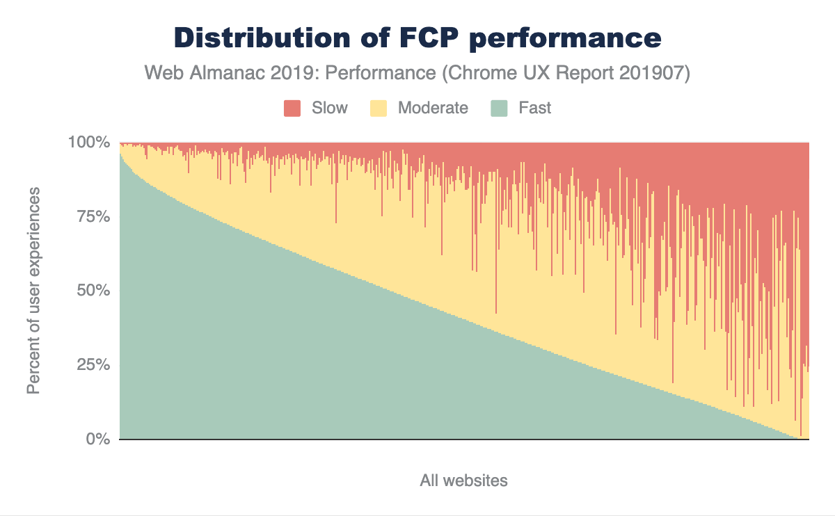
In Figure 7.1 above, you can see how FCP experiences are distributed across the web. Out of the millions of websites in the CrUX dataset, this chart compresses the distribution down to 1,000 websites, where each vertical slice represents a single website. The chart is sorted by the percent of fast FCP experiences, which are those occurring in less than 1 second. Slow experiences occur in 3 seconds or more, and moderate (formerly known as “average”) experiences are everything in between. At the extremes of the chart, there are some websites with almost 100% fast experiences and some websites with almost 100% slow experiences. In between that, websites that have a combination of fast, moderate, and slow performance seem to lean more towards fast or moderate than slow, which is good.
In order to categorize whether a website is sufficiently fast we will use the new PageSpeed Insightshttps://developers.google.com/speed/docs/insights/v5/about#categories (PSI) methodology, where at least 75% of the website’s FCP experiences must be faster than 1 second. Similarly, a sufficiently slow website has 25% or more FCP experiences slower than 3 seconds. We say a website has moderate performance when it doesn’t meet either of these conditions.
The results in Figure 7.2 show that only 13% of websites are considered fast. This is a sign that there is still a lot of room for improvement, but many websites are painting meaningful content quickly and consistently. Two thirds of websites have moderate FCP experiences.
To help us understand how users experience FCP across different devices, let’s segment by form factor.
FCP by device
In Figures 7.3 and 7.4 above, the FCP distributions are broken down by desktop and phone. It’s subtle, but the torso of the desktop fast FCP distribution appears to be more convex than the distribution for phone users. This visual approximation suggests that desktop users experience a higher overall proportion of fast FCP. To verify this, we can apply the PSI methodology to each distribution.
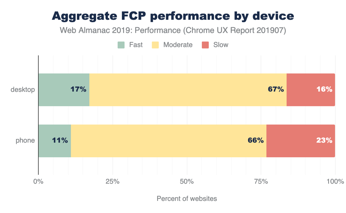
According to PSI’s classification, 17% of websites have fast FCP experiences overall for desktop users, compared to 11% for mobile users. The entire distribution is skewed to being slightly faster for desktop experiences, with fewer slow websites and more in the fast and moderate category.
Why might desktop users experience fast FCP on a higher proportion of websites than phone users? We can only speculate, after all, this dataset is meant to answer how the web is performing and not necessarily why it’s performing that way. But one guess could be that desktop users are connected to the internet on faster, more reliable networks like WiFi rather than cell towers. To help answer this question, we can also explore how user experiences vary by ECT.
FCP by effective connection type
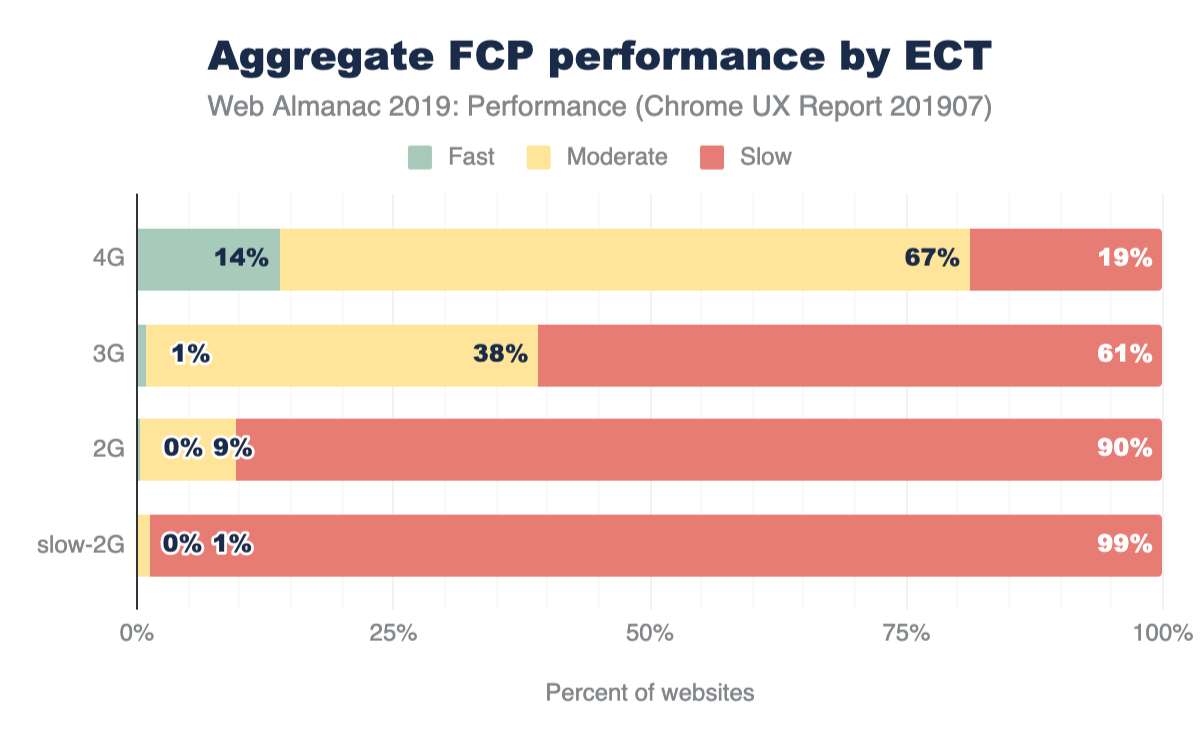
In Figure 7.6 above, FCP experiences are grouped by the ECT of the user experience. Interestingly, there is a correlation between ECT speed and the percent of websites serving fast FCP. As the ECT speeds decrease, the proportion of fast experiences approaches zero. 14% of websites that serve users with 4G ECT have fast FCP experiences, while 19% of those websites have slow experiences. 61% of websites serve slow FCP to users with 3G ECT, 90% to 2G ECT, and 99% to slow-2G ECT. These results suggest that websites seldom serve fast FCP consistently to users on connections effectively slower than 4G.
FCP by geography
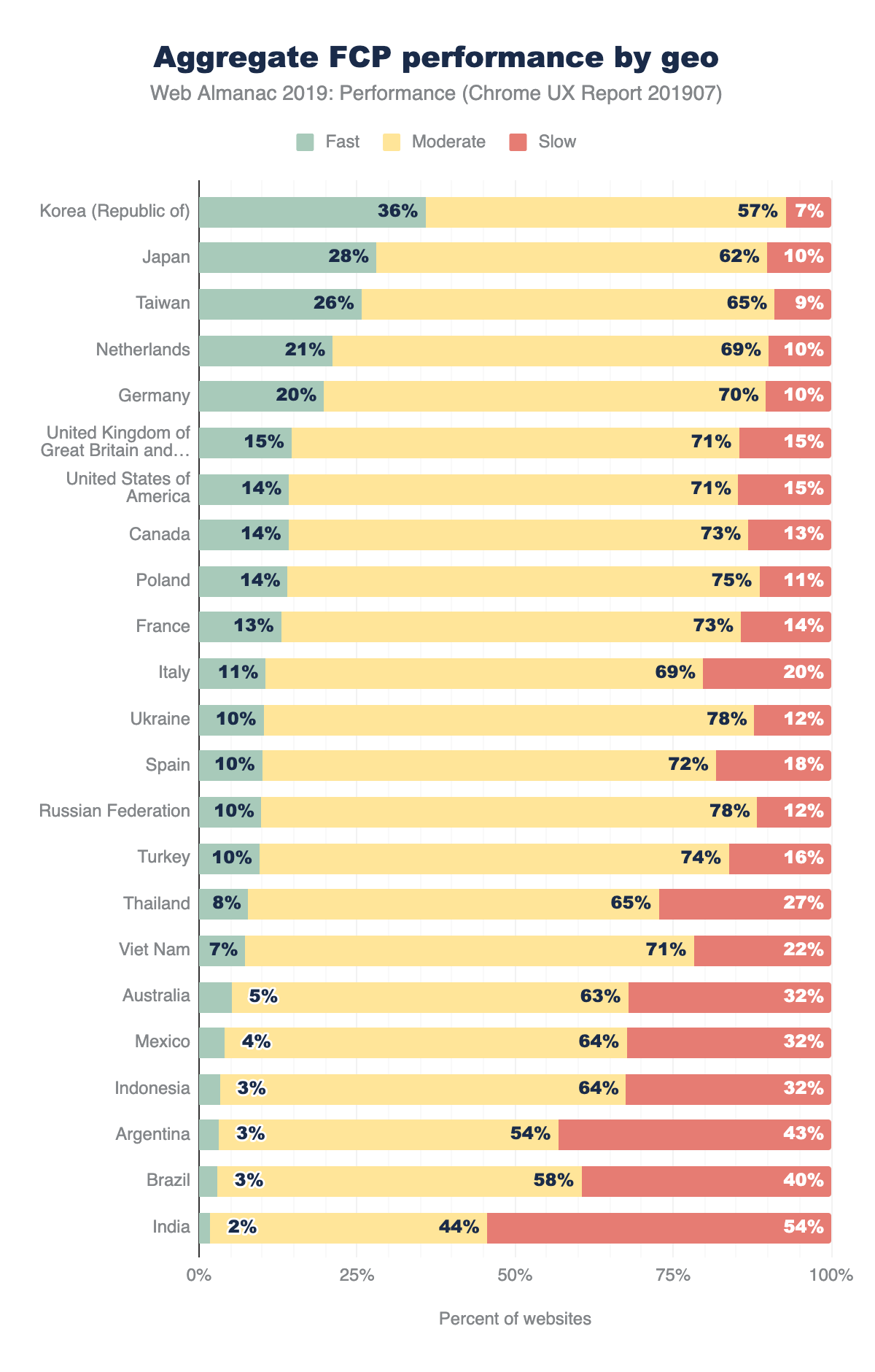
Finally, we can slice FCP by users’ geography (geo). The chart above shows the top 23 geos having the highest number of distinct websites, an indicator of overall popularity of the open web. Web users in the United States visit the most distinct websites at 1,211,002. The geos are sorted by the percent of websites having sufficiently fast FCP experiences. At the top of the list are three Asia-Pacifichttps://en.wikipedia.org/wiki/Asia-Pacific (APAC) geos: Korea, Taiwan, and Japan. This could be explained by the availability of extremely fast network connection speeds in these regionshttps://en.wikipedia.org/wiki/List_of_countries_by_Internet_connection_speeds. Korea has 36% of websites meeting the fast FCP bar, and only 7% rated as slow FCP. Recall that the global distribution of fast/moderate/slow websites is approximately 13/66/20, making Korea a significantly positive outlier.
Other APAC geos tell a different story. Thailand, Vietnam, Indonesia, and India all have fewer than 10% of fast websites. These geos also have more than triple the proportion of slow websites than Korea.
Time to First Byte (TTFB)
Time to First Bytehttps://web.dev/articles/ttfb (TTFB) is a measure of how long the web page took from the time of the user’s navigation until they received the first byte of the response.
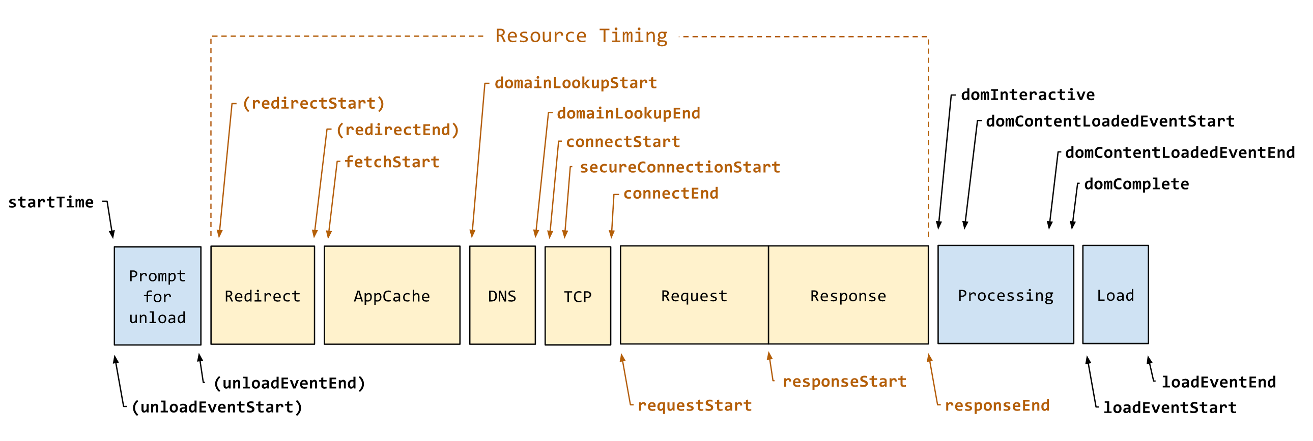
To help explain TTFB and the many factors that affect it, let’s borrow a diagram from the Navigation Timing API spechttps://developer.mozilla.org/docs/Web/API/Navigation_timing_API. In Figure 7.8 above, TTFB is the duration from startTime to responseStart, including everything in between: unload, redirects, AppCache, DNS, SSL, TCP, and the time the server spends handling the request. Given that context, let’s see how users are experiencing this metric.
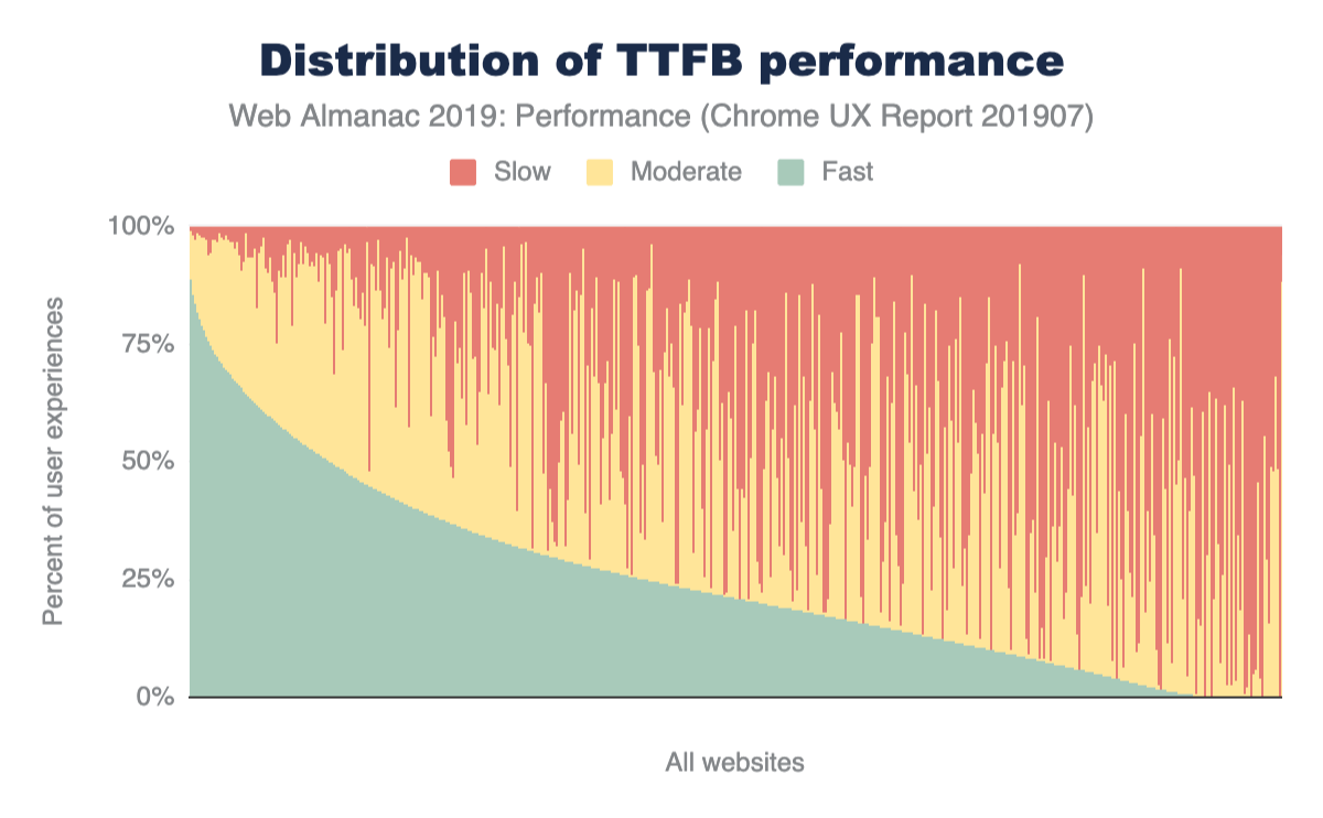
Similar to the FCP chart in Figure 7.1, this is a view of 1,000 representative samples ordered by fast TTFB. A fast TTFBhttps://developers.google.com/speed/docs/insights/Server#recommendations is one that happens in under 0.2 seconds (200 ms), a slow TTFB happens in 1 second or more, and everything in between is moderate.
Looking at the curve of the fast proportions, the shape is quite different from that of FCP. There are very few websites that have a fast TTFB greater than 75%, while more than half are below 25%.
Let’s apply a TTFB speed label to each website, taking inspiration from the PSI methodology used above for FCP. If a website serves fast TTFB to 75% or more user experiences, it’s labeled as fast. Otherwise, if it serves slow TTFB to 25% or more user experiences, it’s slow. If neither of those conditions apply, it’s moderate.
42% of websites have slow TTFB experiences. This is significant because TTFB is a blocker for all other performance metrics to follow. By definition, a user cannot possibly experience a fast FCP if the TTFB takes more than 1 second.
TTFB by geo
Now let’s look at the percent of websites serving fast TTFB to users in different geos. APAC geos like Korea, Taiwan, and Japan are still outperforming users from the rest of the world. But no geo has more than 15% of websites with fast TTFB. India, for example, has fewer than 1% of websites with fast TTFB and 79% with slow TTFB.
First Input Delay
The last field metric we’ll look at is First Input Delayhttps://developers.google.com/web/updates/2018/05/first-input-delay (FID). This metric represents the time from a user’s first interaction with a page’s UI until the time the browser’s main thread is ready to process the event. Note that this doesn’t include the time applications spend actually handling the input. At worst, slow FID results in a page that appears unresponsive and a frustrating user experience.
Let’s start by defining some thresholds. According to the new PSI methodology, a fast FID is one that happens in less than 100 ms. This gives the application enough time to handle the input event and provide feedback to the user in a time that feels instantaneous. A slow FID is one that happens in 300 ms or more. Everything in between is moderate.
You know the drill by now. This chart shows the distribution of websites’ fast, moderate, and slow FID experiences. This is a dramatically different chart from the previous charts for FCP and TTFB. (See Figure 7.1 and Figure 7.9, respectively). The curve of fast FID very slowly descends from 100% to 75%, then takes a nosedive. The overwhelming majority of FID experiences are fast for most websites.
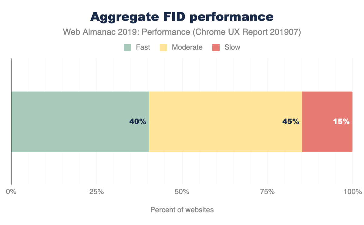
The PSI methodology for labeling a website as having sufficiently fast or slow FID is slightly different than that of FCP. For a site to be fast, 95% of its FID experiences must be fast. A site is slow if 5% of its FID experiences are slow. All other experiences are moderate.
Compared to the previous metrics, the distribution of aggregate FID performance is much more skewed towards fast and moderate experiences than slow. 40% of websites have fast FID and only 15% have slow FID. The nature of FID being an interactivity metric -- as opposed to a loading metric bound by network speeds -- makes for an entirely different way to characterize performance.
FID by device
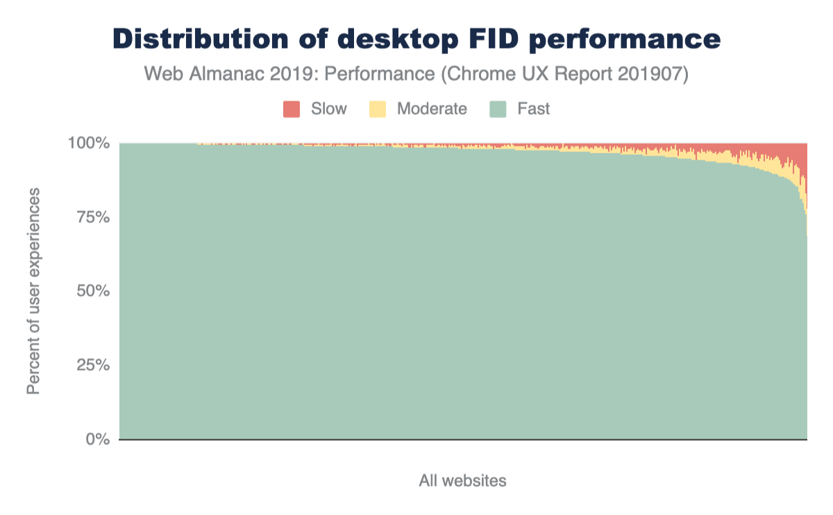
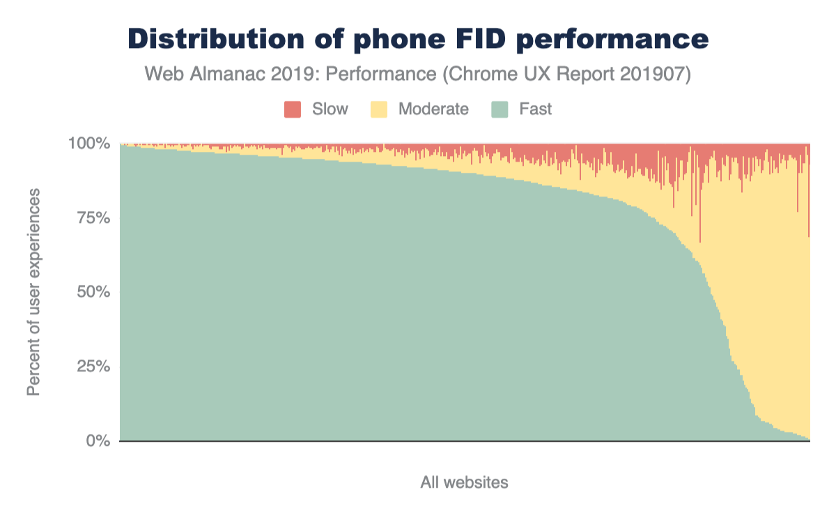
By breaking FID down by device, it becomes clear that there are two very different stories. Desktop users enjoy fast FID almost all the time. Sure, there are some websites that throw out a slow experience now and then, but the results are predominantly fast. Mobile users, on the other hand, have what seem to be one of two experiences: pretty fast (but not quite as often as desktop) and almost never fast. The latter is experienced by users on only the tail 10% of websites, but this is still a substantial difference.
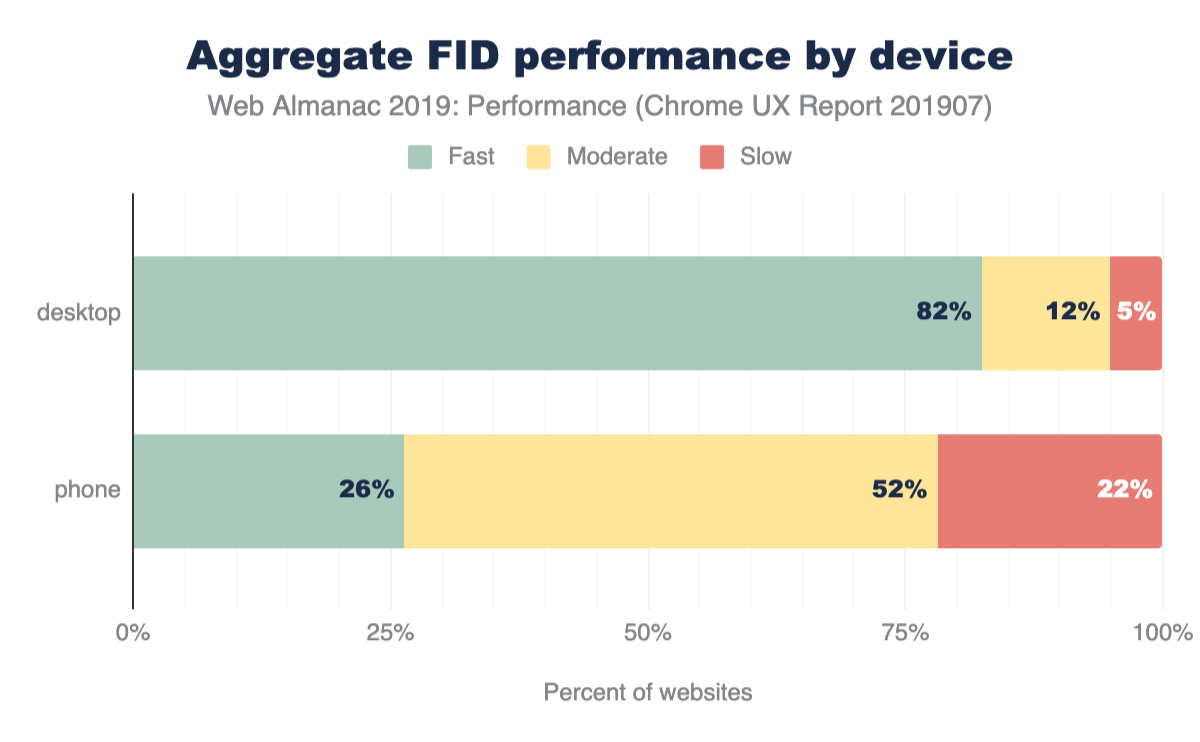
When we apply the PSI labeling to desktop and phone experiences, the distinction becomes crystal clear. 82% of websites’ FID experienced by desktop users are fast compared to 5% slow. For mobile experiences, 26% of websites are fast while 22% are slow. Form factor plays a major role in the performance of interactivity metrics like FID.
FID by effective connection type
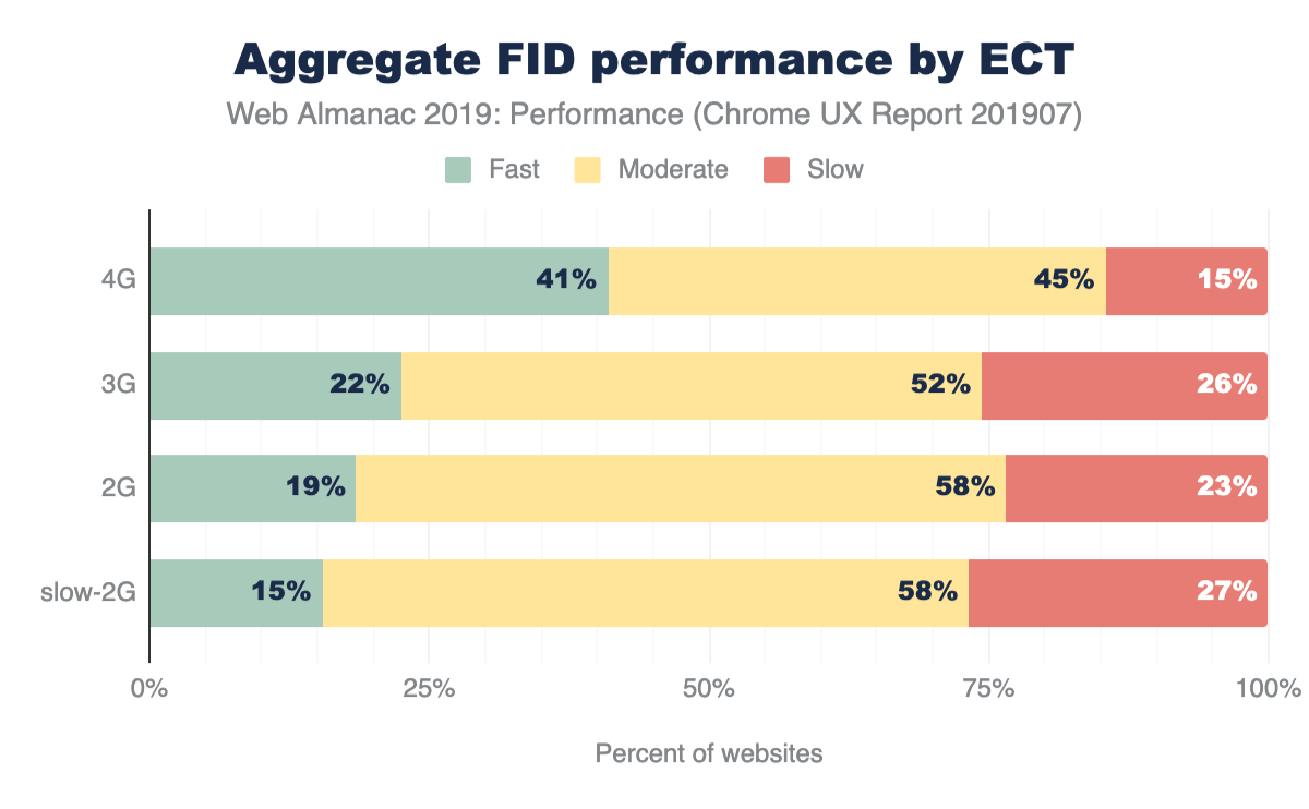
On its face, FID seems like it would be driven primarily by CPU speed. It’d be reasonable to assume that the slower the device itself is, the higher the likelihood that it will be busy when the user attempts to interact with a web page, right?
The ECT results above seem to suggest that there is a correlation between connection speed and FID performance. As users’ effective connection speed decreases, the percent of websites on which they experience fast FID also decreases: 41% of websites visited by users with a 4G ECT have fast FID, 22% with 3G, 19% with 2G, and 15% with slow 2G.
FID by geo
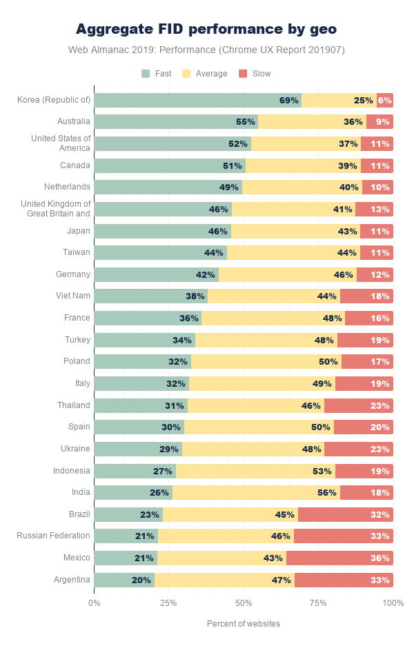
In this breakdown of FID by geographic location, Korea is out in front of everyone else again. But the top geos have some new faces: Australia, the United States, and Canada are next with more than 50% of websites having fast FID.
As with the other geo-specific results, there are so many possible factors that could be contributing to the user experience. For example, perhaps wealthier geos that are more privileged can afford faster network infrastructure also have residents with more money to spend on desktops and/or high-end mobile phones.
Conclusion
Quantifying how fast a web page loads is an imperfect science that can’t be represented by a single metric. Conventional metrics like onload can miss the mark entirely by measuring irrelevant or imperceptible parts of the user experience. User-perceived metrics like FCP and FID more faithfully convey what users see and feel. Even still, neither metric can be looked at in isolation to draw conclusions about whether the overall page load experience was fast or slow. Only by looking at many metrics holistically, can we start to understand the performance for an individual website and the state of the web.
The data presented in this chapter showed that there is still a lot of work to do to meet the goals set for fast websites. Certain form factors, effective connection types, and geos do correlate with better user experiences, but we can’t forget about the combinations of demographics with poor performance. In many cases, the web platform is used for business; making more money from improving conversion rates can be a huge motivator for speeding up a website. Ultimately, for all websites, performance is about delivering positive experiences to users in a way that doesn’t impede, frustrate, or enrage them.
As the web gets another year older and our ability to measure how users experience it improves incrementally, I’m looking forward to developers having access to metrics that capture more of the holistic user experience. FCP is very early on the timeline of showing useful content to users, and newer metrics like Largest Contentful Painthttps://web.dev/articles/lcp (LCP) are emerging to improve our visibility into how page loads are perceived. The Layout Instability APIhttps://web.dev/articles/cls has also given us a novel glimpse into the frustration users experience beyond page load.
Equipped with these new metrics, the web in 2020 will become even more transparent, better understood, and give developers an advantage to make more meaningful progress to improve performance and contribute to positive user experiences.
Author
-
Rick ViscomiRick Viscomi is a Senior Developer Programs Engineer at Google, working on web transparency projects like the HTTP Archive and Chrome UX Report, and studying the intersection of how websites are built and experienced. Rick is the host of The State of the Webhttps://www.youtube.com/playlist?list=PLNYkxOF6rcIBGvYSYO-VxOsaYQDw5rifJ in which experts discuss how the web is trending. Rick is the coauthor of Using WebPageTesthttps://usingwpt.com, a guide for testing web performance, and writes frequently about the web on dev.tohttps://dev.to/rick_viscomi and on Twitter at @rick_viscomi.

Security
Introduction
This chapter of the Web Almanac looks at the current status of security on the web. With security and privacy becoming increasingly more important online there has been an increase in the availability of features to protect site operators and users. We’re going to look at the adoption of these new features across the web.
Transport Layer Security
Perhaps the largest push to increasing security and privacy online we’re seeing at present is the widespread adoption of Transport Layer Security (TLS). TLS (or the older version, SSL) is the protocol that gives us the ’S’ in HTTPS and allows secure and private browsing of websites. Not only are we seeing a great increase in the use of HTTPS across the webhttps://httparchive.org/reports/state-of-the-web#pctHttps, but also an increase in more modern versions of TLS like TLSv1.2 and TLSv1.3, which is also important.
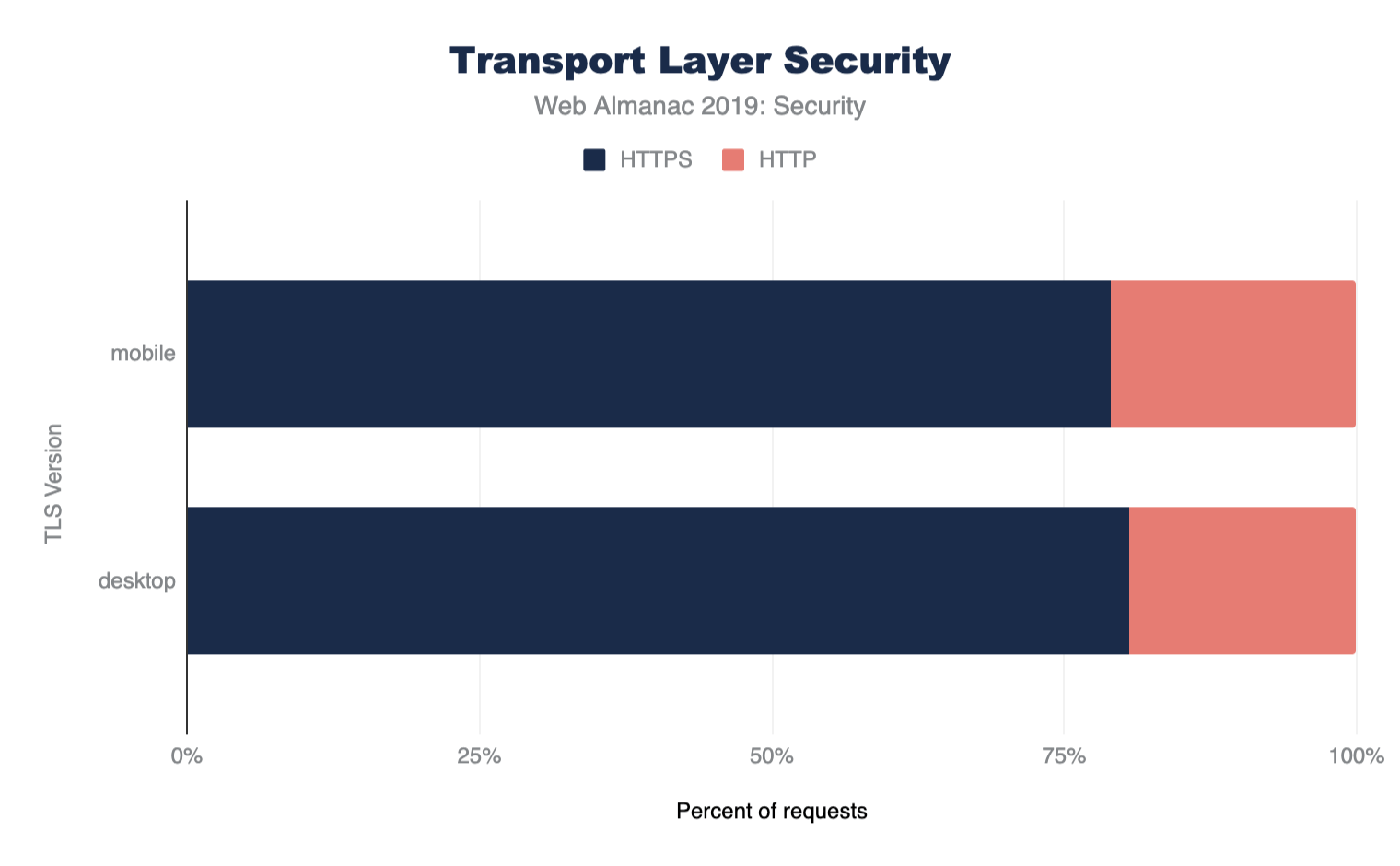
Protocol versions
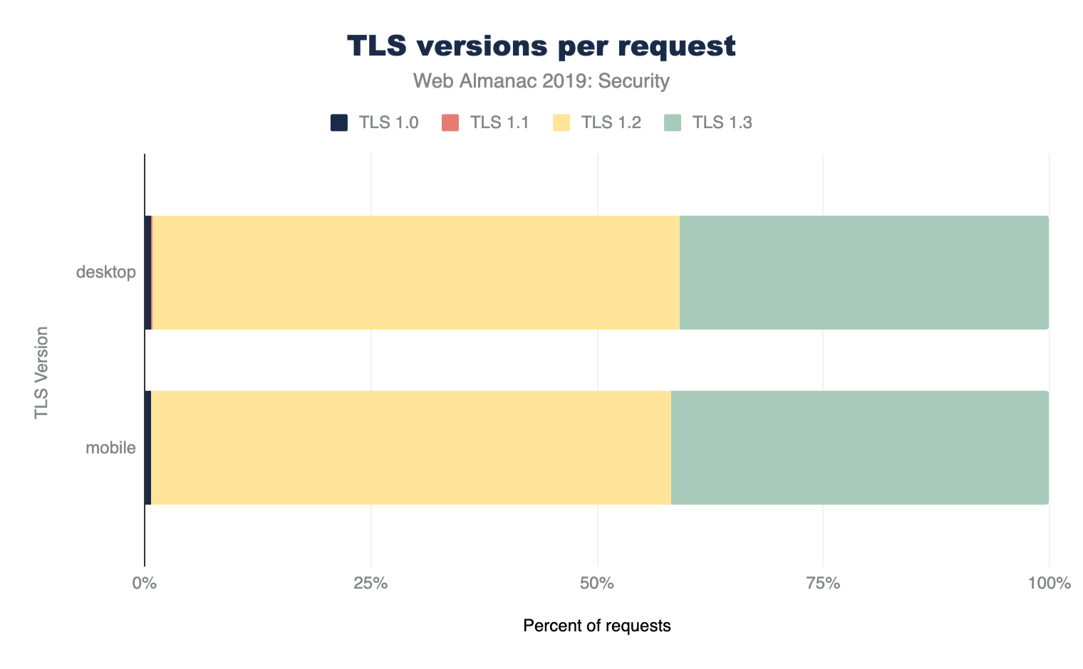
Figure 8.2 shows the support for various protocol versions. Use of legacy TLS versions like TLSv1.0 and TLSv1.1 is minimal and almost all support is for the newer TLSv1.2 and TLSv1.3 versions of the protocol. Even though TLSv1.3 is still very young as a standard (TLSv1.3 was only formally approved in August 2018https://tools.ietf.org/html/rfc8446), over 40% of requests using TLS are using the latest version!
This is likely due to many sites using requests from the larger players for third-party content. For example, any sites load Google Analytics, Google AdWords, or Google Fonts and these large players like Google are typically early adopters for new protocols.
If we look at just home pages, and not all the other requests made on sites, then the usage of TLS is considerably as expected, though still quite high which is likely due to CMS sites like Wordpress and CDNs:
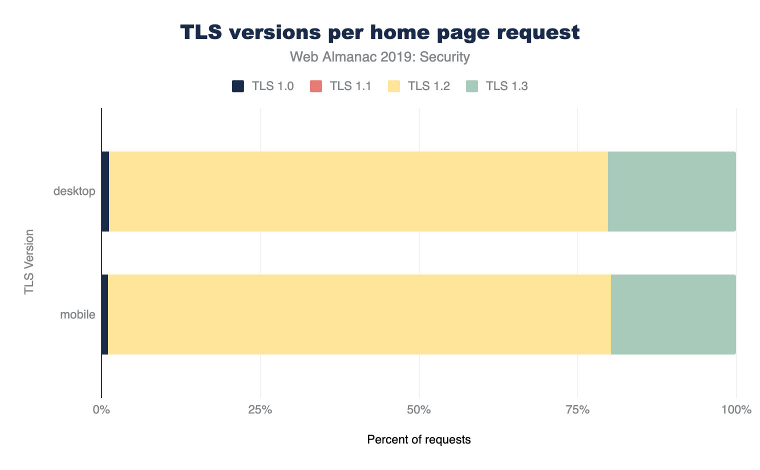
On the other hand, the methodology used by the Web Almanac will also under-report usage from large sites, as their sites themselves will likely form a larger volume of internet traffic in the real world, yet are crawled only once for these statistics.
Certificate Authorities
Of course, if we want to use HTTPS on our website then we need a certificate from a Certificate Authority (CA). With the increase in the use of HTTPS comes the increase in use of CAs and their products/services. Here are the top ten certificate issuers based on the volume of TLS requests that use their certificate.
| Issuing Certificate Authority | Desktop | Mobile |
|---|---|---|
| Google Internet Authority G3 | 19.26% | 19.68% |
| Let’s Encrypt Authority X3 | 10.20% | 9.19% |
| DigiCert SHA2 High Assurance Server CA | 9.83% | 9.26% |
| DigiCert SHA2 Secure Server CA | 7.55% | 8.72% |
| GTS CA 1O1 | 7.87% | 8.43% |
| DigiCert SHA2 Secure Server CA | 7.55% | 8.72% |
| COMODO RSA Domain Validation Secure Server CA | 6.29% | 5.79% |
| Go Daddy Secure Certificate Authority - G2 | 4.84% | 5.10% |
| Amazon | 4.71% | 4.45% |
| COMODO ECC Domain Validation Secure Server CA 2 | 3.22% | 2.75% |
Figure 8.4. Top ten Certificate Authority used.
As previously discussed, the volume for Google likely reflects repeated use of Google Analytics, Google Adwords, or Google Fonts on other sites.
The rise of Let’s Encrypthttps://letsencrypt.org/ has been meteoric after their launch in early 2016, since then they’ve become one of the top certificate issuers in the world. The availability of free certificates and the automated tooling has been critically important to the adoption of HTTPS on the web. Let’s Encrypt certainly had a significant part to play in both of those.
The reduced cost has removed the barrier to entry for HTTPS, but the automation Let’s Encrypt uses is perhaps more important in the long run as it allows shorter certificate lifetimes which has many security benefitshttps://scotthelme.co.uk/why-we-need-to-do-more-to-reduce-certificate-lifetimes/.
Authentication key type
Alongside the important requirement to use HTTPS is the requirement to also use a good configuration. With so many configuration options and choices to make, this is a careful balance.
First of all, we’ll look at the keys used for authentication purposes. Traditionally certificates have been issued based on keys using the RSA algorithm, however a newer and better algorithm uses ECDSA (Elliptic Curve Digital Signature Algorithm) which allows the use of smaller keys that demonstrate better performance than their RSA counterparts. Looking at the results of our crawl we still see a large % of the web using RSA.
| Key Type | Desktop | Mobile |
|---|---|---|
| RSA Keys | 48.67% | 58.8% |
| ECDA Keys | 21.47% | 26.41% |
Figure 8.5. Authentication key types used.
Whilst ECDSA keys are stronger, which allows the use of smaller keys and demonstrate better performance than their RSA counterparts, concerns around backwards compatibility, and complications in supporting both in the meantime, do prevent some website operators from migrating.
Forward secrecy
Forward secrecyhttps://en.wikipedia.org/wiki/Forward_secrecy is a property of some key exchange mechanisms that secures the connection in such a way that it prevents each connection to a server from being exposed even in case of a future compromise of the server’s private key. This is well understood within the security community as desirable on all TLS connections to safeguard the security of those connections. It was introduced as an optional configuration in 2008 with TLSv1.2 and has become mandatory in 2018 with TLSv1.3 requiring the use of Forward Secrecy.
Looking at the % of TLS requests that provide Forward Secrecy, we can see that support is tremendous. 96.92% of Desktop and 96.49% of mobile requests use Forward secrecy. We’d expect that the continuing increase in the adoption of TLSv1.3 will further increase these numbers.
Cipher suites
TLS allows the use of various cipher suites - some newer and more secure, and some older and insecure. Traditionally newer TLS versions have added cipher suites but have been reluctant to remove older cipher suites. TLSv1.3 aims to simplify this by offering a reduced set of ciphers suites and will not permit the older, insecure, cipher suites to be used. Tools like SSL Labshttps://www.ssllabs.com/ allow the TLS setup of a website (including the cipher suites supported and their preferred order) to be easily seen, which helps drive better configurations. We can see that the majority of cipher suites negotiated for TLS requests were indeed excellent:
| Cipher Suite | Desktop | Mobile |
|---|---|---|
AES_128_GCM |
75.87% | 76.71% |
AES_256_GCM |
19.73% | 18.49% |
AES_256_CBC |
2.22% | 2.26% |
AES_128_CBC |
1.43% | 1.72% |
CHACHA20_POLY1305 |
0.69% | 0.79% |
3DES_EDE_CBC |
0.06% | 0.04% |
Figure 8.6. Cipher suite usage used.
It is positive to see such wide stream use of GCM ciphers since the older CBC ciphers are less secure. CHACHA20_POLY1305https://blog.cloudflare.com/it-takes-two-to-chacha-poly/ is still an niche cipher suite, and we even still have a very small use of the insecure 3DES ciphershttps://en.wikipedia.org/wiki/Triple_DES#Security.
It should be noticed that these were the cipher suites used for the crawl using Chrome, but sites will likely also support other cipher suites as well for older browsers. Other sources, for example SSL Pulsehttps://www.ssllabs.com/ssl-pulse/, can provide more detail on the range of all cipher suites and protocols supported.
Mixed content
Most sites on the web originally existed as HTTP websites and have had to migrate their site to HTTPS. This ’lift and shift’ operation can be difficult and sometimes things get missed or left behind. This results in sites having mixed content, where their pages load over HTTPS but something on the page, perhaps an image or a style, is loaded over HTTP. Mixed content is bad for security and privacy and can be difficult to find and fix.
| Mixed Content Type | Desktop | Mobile |
|---|---|---|
| Pages with Any Mixed Content | 16.27% | 15.37% |
| Pages with Active Mixed Content | 3.99% | 4.13% |
Figure 8.7. Mixed content usage.
We can see that around 20% of sites across mobile (645,485 sites) and desktop (594,072 sites) present some form of mixed content. Whilst passive mixed content, something like an image, is less dangerous, we can still see that almost a quarter of sites with mixed content have active mixed content. Active mixed content, like JavaScript, is more dangerous as an attacker can insert their own hostile code into a page easily.
In the past web browsers have allowed passive mixed content and flagged it with a warning but blocked active mixed content. More recently however, Chrome announcedhttps://blog.chromium.org/2019/10/no-more-mixed-messages-about-https.html it intends to improve here and as HTTPS becomes the norm it will block all mixed content instead.
Security headers
Many new and recent features for site operators to better protect their users have come in the form of new HTTP response headers that can configure and control security protections built into the browser. Some of these features are easy to enable and provide a huge level of protection whilst others require a little more work from site operators. If you wish to check if a site is using these headers and has them correctly configured, you can use the Security Headershttps://securityheaders.com/ tool to scan it.
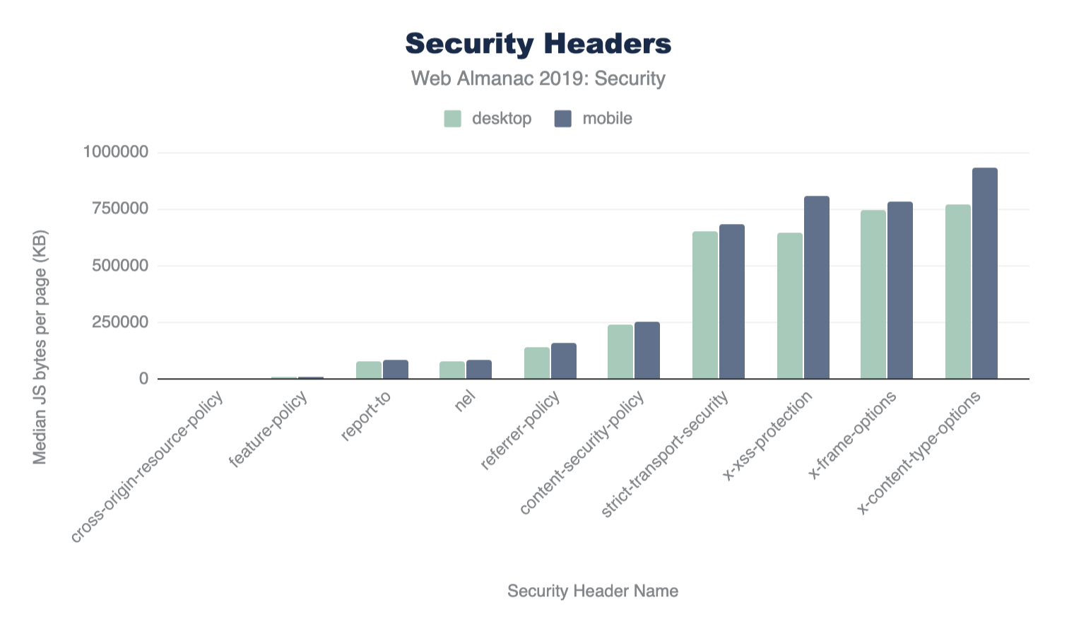
HTTP Strict Transport Security
The HSTShttps://tools.ietf.org/html/rfc6797 header allows a website to instruct a browser that it should only ever communicate with the site over a secure HTTPS connection. This means that any attempts to use a http:// URL will automatically be converted to https:// before a request is made. Given that over 40% of requests were capable of using TLS, we see a much lower % of requests instructing the browser to require it.
| HSTS Directive | Desktop | Mobile |
|---|---|---|
max-age |
14.80% | 12.81% |
includeSubDomains |
3.86% | 3.29% |
preload |
2.27% | 1.99% |
Figure 8.9. HSTS directive usage.
Less than 15% of mobile and desktop pages are issuing a HSTS with a max-age directive. This is a minimum requirement for a valid policy. Fewer still are including subdomains in their policy with the includeSubDomains directive and even fewer still are HSTS preloading. Looking at the median value for a HSTS max-age, for those that do use this, we can see that on both desktop and mobile it is 15768000, a strong configuration representing half a year (60 x 60 x 24 x 365/2).
| Client | ||
|---|---|---|
| Percentile | Desktop | Mobile |
| 10 | 300 | 300 |
| 25 | 7889238 | 7889238 |
| 50 | 15768000 | 15768000 |
| 75 | 31536000 | 31536000 |
| 90 | 63072000 | 63072000 |
Figure 8.10. Medium values of HSTS max-age policy by percentile.
HSTS preloading
With the HSTS policy delivered via an HTTP response Header, when visiting a site for the first time a browser will not know whether a policy is configured. To avoid this Trust On First Usehttps://en.wikipedia.org/wiki/Trust_on_first_use problem, a site operator can have the policy preloaded into the browser (or other user agents) meaning you are protected even before you visit the site for the first time.
There are a number of requirements for preloading, which are outlined on the HSTS preloadhttps://hstspreload.org/ site. We can see that only a small number of sites, 0.31% on desktop and 0.26% on mobile, are eligible according to current criteria. Sites should ensure they have fully transitions all sites under their domain to HTTPS before submitting to preload the domain or they risk blocking access to HTTP-only sites.
Content Security Policy
Web applications face frequent attacks where hostile content finds its way into a page. The most worrisome form of content is JavaScript and when an attacker finds a way to insert JavaScript into a page, they can launch damaging attacks. These attacks are known as Cross-Site Scripting (XSS)https://en.wikipedia.org/wiki/Cross-site_scripting and Content Security Policy (CSP)https://www.w3.org/TR/CSP2/ provides an effective defense against these attacks.
CSP is an HTTP header (Content-Security-Policy) published by a website which tells the browser rules around content allowed on a site. If additional content is injected into the site due to a security flaw, and it is not allowed by the policy, the browser will block it from being used. Alongside XSS protection, CSP also offers several other key benefits such as making migration to HTTPS easier.
Despite the many benefits of CSP, it can be complicated to implement on websites since its very purpose is to limit what is acceptable on a page. The policy must allow all content and resources you need and can easily get large and complex. Tools like Report URIhttps://report-uri.com/ can help you analyze and build the appropriate policy.
We find that only 5.51% of desktop pages include a CSP and only 4.73% of mobile pages include a CSP, likely due to the complexity of deployment.
Hash/nonce
A common approach to CSP is to create an allowlist of 3rd party domains that are permitted to load content, such as JavaScript, into your pages. Creating and managing these lists can be difficult so hasheshttps://www.w3.org/TR/CSP2/#source-list-valid-hashes and nonceshttps://www.w3.org/TR/CSP2/#source-list-valid-nonces were introduced as an alternative approach. A hash is calculated based on contents of the script so if this is published by the website operator and the script is changed, or another script is added, then it will not match the hash and will be blocked. A nonce is a one-time code (which should be changed each time the page is loaded to prevent it being guessed) which is allowed by the CSP and which the script is tagged with. You can see an example of a nonce on this page by viewing the source to see how Google Tag Manager is loaded.
Of the sites surveyed only 0.09% of desktop pages use a nonce source and only 0.02% of desktop pages use a hash source. The number of mobile pages use a nonce source is slightly higher at 0.13% but the use of hash sources is lower on mobile pages at 0.01%.
strict-dynamic
The proposal of strict-dynamic in the next iteration of CSPhttps://www.w3.org/TR/CSP3/ further reduces the burden on site operators for using CSP by allowing an approved script to load further script dependencies. Despite the introduction of this feature, which already has support in some modern browsershttps://caniuse.com/#feat=mdn-http_headers_csp_content-security-policy_strict-dynamic, only 0.03% of desktop pages and 0.1% of mobile pages include it in their policy.
trusted-types
XSS attacks come in various forms and Trusted-Typeshttps://github.com/w3c/webappsec-trusted-types was created to help specifically with DOM-XSS. Despite being an effective mechanism, our data shows that only 2 mobile and desktop pages use the Trusted-Types directive.
unsafe inline and unsafe-eval
When a CSP is deployed on a page, certain unsafe features like inline scripts or the use of eval() are disabled. A page can depend on these features and enable them in a safe fashion, perhaps with a nonce or hash source. Site operators can also re-enable these unsafe features with unsafe-inline or unsafe-eval in their CSP though, as their names suggest, doing so does lose much of the protections that CSP gives you. Of the 5.51% of desktop pages that include a CSP, 33.94% of them include unsafe-inline and 31.03% of them include unsafe-eval. On mobile pages we find that of the 4.73% that contain a CSP, 34.04% use unsafe-inline and 31.71% use unsafe-eval.
upgrade-insecure-requests
We mentioned earlier that a common problem that site operators face in their migration from HTTP to HTTPS is that some content can still be accidentally loaded over HTTP on their HTTPS page. This problem is known as mixed content and CSP provides an effective way to solve this problem. The upgrade-insecure-requests directive instructs a browser to load all subresources on a page over a secure connection, automatically upgrading HTTP requests to HTTPS requests as an example. Think of it like HSTS for subresources on a page.
We showed earlier in Figure 8.7 that, of the HTTPS pages surveyed on the desktop, 16.27% of them loaded mixed-content with 3.99% of pages loading active mixed-content like JS/CSS/fonts. On mobile pages we see 15.37% of HTTPS pages loading mixed-content with 4.13% loading active mixed-content. By loading active content such as JavaScript over HTTP an attacker can easily inject hostile code into the page to launch an attack. This is what the upgrade-insecure-requests directive in CSP protects against.
The upgrade-insecure-requests directive is found in the CSP of 3.24% of desktop pages and 2.84% of mobile pages, indicating that an increase in adoption would provide substantial benefits. It could be introduced with relative ease, without requiring a fully locked-down CSP and the complexity that would entail, by allowing broad categories with a policy like below, or even including unsafe-inline and unsafe-eval:
Content-Security-Policy: upgrade-insecure-requests; default-src https:frame-ancestors
Another common attack known as clickjackinghttps://en.wikipedia.org/wiki/Clickjacking is conducted by an attacker who will place a target website inside an iframe on a hostile website, and then overlay hidden controls and buttons that they are in control of. Whilst the X-Frame-Options header (discussed below) originally set out to control framing, it wasn’t flexible and frame-ancestors in CSP stepped in to provide a more flexible solution. Site operators can now specify a list of hosts that are permitted to frame them and any other hosts attempting to frame them will be prevented.
Of the pages surveyed, 2.85% of desktop pages include the frame-ancestors directive in CSP with 0.74% of desktop pages setting Frame-Ancestors to 'none', preventing any framing, and 0.47% of pages setting frame-ancestors to 'self', allowing only their own site to frame itself. On mobile we see 2.52% of pages using frame-ancestors with 0.71% setting the value of 'none' and 0.41% setting the value to 'self'.
Referrer Policy
The Referrer-Policy header allows a site to control what information will be sent in the Referer header when a user navigates away from the current page. This can be the source of information leakage if there is sensitive data in the URL, such as search queries or other user-dependent information included in URL parameters. By controlling what information is sent in the Referer header, ideally limiting it, a site can protect the privacy of their visitors by reducing the information sent to 3rd parties.
Note the Referrer Policy does not follow the Referer header’s misspelling which has become a well-known errorhttps://stackoverflow.com/questions/3087626/was-the-misspelling-of-the-http-field-name-referer-intentional.
A total of 3.25% of desktop pages and 2.95% of mobile pages issue a Referrer-Policy header and below we can see the configurations those pages used.
| Configuration | Desktop | Mobile |
|---|---|---|
no-referrer-when-downgrade |
39.16% | 41.52% |
strict-origin-when-cross-origin |
39.16% | 22.17% |
unsafe-url |
22.17% | 22.17% |
same-origin |
7.97% | 7.97% |
origin-when-cross-origin |
6.76% | 6.44% |
no-referrer |
5.65% | 5.38% |
strict-origin |
4.35% | 4.14% |
origin |
3.63% | 3.23% |
Figure 8.11. Referrer-Policy configuration option usage.
This table shows the valid values set by pages and that, of the pages which use this header, 99.75% of them on desktop and 96.55% of them on mobile are setting a valid policy. The most popular choice of configuration is no-referrer-when-downgrade which will prevent the Referer header being sent when a user navigates from a HTTPS page to a HTTP page. The second most popular choice is strict-origin-when-cross-origin which prevents any information being sent on a scheme downgrade (HTTPS to HTTP navigation) and when information is sent in the Referer it will only contain the origin of the source and not the full URL (for example https://www.example.com rather than https://www.example.com/page/). Details on the other valid configurations can be found in the Referrer Policy specificationhttps://www.w3.org/TR/referrer-policy/#referrer-policies, though such a high usage of unsafe-url warrants further investigation but is likely to be a third-party component like analytics or advertisement libraries.
Feature Policy
As the web platform becomes more powerful and feature rich, attackers can abuse these new APIs in interesting ways. In order to limit misuse of powerful APIs, a site operator can issue a Feature-Policy header to disable features that are not required, preventing them from being abused.
Here are the 5 most popular features that are controlled with a Feature Policy.
| Feature | Desktop | Mobile |
|---|---|---|
microphone |
10.78% | 10.98% |
camera |
9.95% | 10.19% |
payment |
9.54% | 9.54% |
geolocation |
9.38% | 9.41% |
gyroscope |
7.92% | 7.90% |
Figure 8.12. Top 5 Feature-Policy options used.
We can see that the most popular feature to take control of is the microphone, with almost 11% of desktop and mobile pages issuing a policy that includes it. Delving deeper into the data we can look at what those pages are allowing or blocking.
| Feature | Configuration | Usage |
|---|---|---|
microphone |
none |
9.09% |
microphone |
none |
8.97% |
microphone |
self |
0.86% |
microphone |
self |
0.85% |
microphone |
* |
0.64% |
microphone |
* |
0.53% |
Figure 8.13. Settings used for microphone feature.
By far the most common approach here is to block use of the microphone altogether, with about 9% of pages taking that approach. A small number of pages do allow the use of the microphone by their own origin and interestingly, a small selection of pages intentionally allow use of the microphone by any origin loading content in their page.
X-Frame-Options
The X-Frame-Options header allows a page to control whether or not it can be placed in an iframe by another page. Whilst lacking the flexibility of frame-ancestors in CSP, mentioned above, it was effective if you didn’t require fine grained control of framing.
We see that the usage of the X-Frame-Options header is quite high on both desktop (16.99%) and mobile (14.77%) and can also look more closely at the specific configurations used.
| Configuration | Desktop | Mobile |
|---|---|---|
sameorigin |
84.92% | 83.86% |
deny |
13.54% | 14.50% |
allow-from |
1.53% | 1.64% |
Figure 8.14. X-Frame-Options configuration used.
It seems that the vast majority of pages restrict framing to only their own origin and the next significant approach is to prevent framing altogether. This is similar to frame-ancestors in CSP where these 2 approaches are also the most common. It should also be noted that the allow-from option, which in theory allow site owners to list the third-party domains allowed to frame was never well supportedhttps://developer.mozilla.org/docs/Web/HTTP/Headers/X-Frame-Options#Browser_compatibility and has been deprecated.
X-Content-Type-Options
The X-Content-Type-Options header is the most widely deployed Security Header and is also the most simple, with only one possible configuration value nosniff. When this header is issued a browser must treat a piece of content as the MIME Type declared in the Content-Type header and not try to change the advertised value when it infers a file is of a different type. Various security flaws can be introduced if a browser is persuaded to incorrectly sniff the type..
We find that an identical 17.61% of pages on both mobile and desktop issue the X-Content-Type-Options header.
X-XSS-Protection
The X-XSS-Protection header allows a site to control the XSS Auditor or XSS Filter built into a browser, which should in theory provide some XSS protection.
14.69% of Desktop requests, and 15.2% of mobile requests used the X-XSS-Protection header. Digging into the data we can see what the intention for most site operators was in Figure 8.13.
| Configuration | Desktop | Mobile |
|---|---|---|
1;mode=block |
91.77% | 91.46% |
1 |
5.54% | 5.35% |
0 |
2.58% | 3.11% |
1;report= |
0.12% | 0.09% |
Figure 8.15. X-XSS-Protection configuration usage.
The value 1 enables the filter/auditor and mode=block sets the protection to the strongest setting (in theory) where any suspected XSS attack would cause the page to not be rendered. The second most common configuration was to simply ensure the auditor/filter was turned on, by presenting a value of 1 and then the 3rd most popular configuration is quite interesting.
Setting a value of 0 in the header instructs the browser to disable any XSS auditor/filter that it may have. Some historic attacks demonstrated how the auditor or filter could be tricked into assisting an attacker rather than protecting the user so some site operators could disable it if they were confident they have adequate protection against XSS in place.
Due to these attacks, Edge retired their XSS Filter, Chrome deprecated their XSS Auditor and Firefox never implemented support for the feature. We still see widespread use of the header at approximately 15% of all sites, despite it being largely useless now.
Report-To
The Reporting APIhttps://www.w3.org/TR/reporting/ was introduced to allow site operators to gather various pieces of telemetry from the browserhttps://scotthelme.co.uk/introducing-the-reporting-api-nel-other-major-changes-to-report-uri/. Many errors or problems on a site can result in a poor experience for the user yet a site operator can only find out if the user contacts them. The Reporting API provides a mechanism for a browser to automatically report these problems without any user interaction or interruption. The Reporting API is configured by delivering the Report-To header.
By specifying the header, which contains a location where the telemetry should be sent, a browser will automatically begin sending the data and you can use a 3rd party service like Report URIhttps://report-uri.com/ to collect the reports or collect them yourself. Given the ease of deployment and configuration, we can see that only a small fraction of desktop (1.70%) and mobile (1.57%) sites currently enable this feature. To see the kind of telemetry you can collect, refer to the Reporting API specificationhttps://www.w3.org/TR/reporting/.
Network Error Logging
Network Error Logging (NEL)https://www.w3.org/TR/network-error-logging/ provides detailed information about various failures in the browser that can result in a site being inoperative. Whereas the Report-To is used to report problems with a page that is loaded, the NEL header allows sites to inform the browser to cache this policy and then to report future connection problems when they happen via the endpoint configured in the Reporting-To header above. NEL can therefore be seen as an extension of the Reporting API.
Of course, with NEL depending on the Reporting API, we shouldn’t see the usage of NEL exceed that of the Reporting API, so we see similarly low numbers here too at 1.70% for desktop requests and 1.57% for mobile. The fact these numbers are identical suggest they are being deployed together.
NEL provides incredibly valuable information and you can read more about the type of information in the Network Error Logging specificationhttps://w3c.github.io/network-error-logging/#predefined-network-error-types.
Clear Site Data
With the increasing ability to store data locally on a user’s device, via cookies, caches and local storage to name but a few, site operators needed a reliable way to manage this data. The Clear Site Data header provides a means to ensure that all data of a particular type is removed from the device, though it is not yet supported in all browsershttps://caniuse.com/#feat=mdn-http_headers_clear-site-data.
Given the nature of the header, it is unsurprising to see almost no usage reported - just 9 desktop requests and 7 mobile requests. With our data only looking at the home page of a site, we’re unlikely to see the most common use of the header which would be on a logout endpoint. Upon logging out of a site, the site operator would return the Clear Site Data header and the browser would remove all data of the indicated types. This is unlikely to take place on the home page of a site.
Cookies
Cookies have many security protections available and whilst some of those are long standing, and have been available for years, some of them are really quite new have been introduced only in the last couple of years.
Secure
The Secure flag on a cookie instructs a browser to only send the cookie over a secure (HTTPS) connection and we find only a small % of sites (4.22% on desktop and 3.68% on mobile) issuing a cookie with the Secure flag set on their home page. This is depressing considering the relative ease with which this feature can be used. Again, the high usage of analytics and advertisement third-party requests, which wish to collect data over both HTTP and HTTPS is likely skewing these numbers and it would be interesting research to see the usage on other cookies, like authentication cookies.
HttpOnly
The HttpOnly flag on a cookie instructs the browser to prevent JavaScript on the page from accessing the cookie. Many cookies are only used by the server so are not needed by the JavaScript on the page, so restricting access to a cookie is a great protection against XSS attacks from stealing the cookie. We find that a much larger % of sites issuing a cookie with this flag on their home page at 24.24% on desktop and 22.23% on mobile.
SameSite
As a much more recent addition to cookie protections, the SameSite flag is a powerful protection against Cross-Site Request Forgery (CSRF)https://en.wikipedia.org/wiki/Cross-site_request_forgery attacks (often also known as XSRF).
These attacks work by using the fact that browsers will typically include relevant cookies in all requests. Therefore, if you are logged in, and so have cookies set, and then visit a malicious site, it can make a call for an API and the browser will “helpfully” send the cookies. Adding the SameSite attribute to a Cookie, allows a website to inform the browser not to send the cookies when calls are issued from third-party sites and hence the attack fails.
Being a recently introduced mechanism, the usage of Same-Site cookies is much lower as we would expect at 0.1% of requests on both desktop and mobile. There are use cases when a cookie should be sent cross-site. For example, single sign-on sites implicitly work by setting the cookie along with an authentication token.
| Configuration | Desktop | Mobile |
|---|---|---|
strict |
53.14% | 50.64% |
lax |
45.85% | 47.42% |
none |
0.51% | 0.41% |
Figure 8.16. SameSite configuration usage.
We can see that of those pages already using Same-Site cookies, more than half of them are using it in strict mode. This is closely followed by sites using Same-Site in lax mode and then a small selection of sites using the value none. This last value is used to opt-out of the upcoming change where browser vendors may implement lax mode by default.
Because it provides much needed protection against a dangerous attack, there are currently indications that leading browsers could implement this feature by defaulthttps://blog.chromium.org/2019/10/developers-get-ready-for-new.html and enable it on cookies even though the value is not set. If this were to happen the SameSite protection would be enabled, though in its weaker setting of lax mode and not strict mode, as that would likely cause more breakage.
Prefixes
Another recent addition to cookies are Cookie Prefixes. These use the name of your cookie to add one of two further protections to those already covered. While the above flags can be accidentally unset on cookies, the name will not change so using the name to define security attributes can more reliably enforce them.
Currently the name of your cookie can be prefixed with either __Secure- or __Host-, with both offering additional security to the cookie.
| No. of Home Pages | % of Home Pages | |||
|---|---|---|---|---|
| Prefix value | Desktop | Mobile | Desktop | Mobile |
__Secure- |
640 | 628 | 0.01% | 0.01% |
__Host- |
154 | 157 | 0.00% | 0.00% |
Figure 8.17. Cookie prefix usage.
As the figures show, the use of either prefix is incredibly low but as the more relaxed of the two, the __Secure- prefix does see more utilization already.
Subresource Integrity
Another problem that has been on the rise recently is the security of 3rd party dependencies. When loading a script file from a 3rd party, we hope that the script file is always the library that we wanted, perhaps a particular version of jQuery. If a CDN or 3rd party hosting service is compromised, the script files they are hosting could be altered. In this scenario your application would now be loading malicious JavaScript that could harm your visitors. This is what subresource integrity protects against.
By adding an integrity attribute to a script or link tag, a browser can integrity check the 3rd party resource and reject it if it has been altered, in a similar manner that CSP hashes described above are used.
<script
  src="https://code.jquery.com/jquery-3.4.1.min.js"
  integrity="sha256-CSXorXvZcTkaix6Yvo6HppcZGetbYMGWSFlBw8HfCJo="
  crossorigin="anonymous"></script>
With only 0.06% (247,604) of desktop pages and 0.05% (272,167) of mobile pages containing link or script tags with the integrity attribute set, there’s room for a lot of improvement in the use of SRI. With many CDNs now providing code samples that include the SRI integrity attribute we should see a steady increase in the use of SRI.
Conclusion
As the web grows in capabilities and allows access to more and more sensitive data, it becomes increasingly important for developers to adopt web security features to protect their applications. The security features reviewed in this chapter are defenses built into the web platform itself, available to every web author. However, as a review of the study results in this chapter shows, the coverage of several important security mechanisms extends only to a subset of the web, leaving a significant part of the ecosystem exposed to security or privacy bugs.
Encryption
In the recent years, the web has made the most progress on the encryption of data in transit. As described in the TLS section section, thanks to a range of efforts from browser vendors, developers and Certificate Authorities such as Let’s Encrypt, the fraction of the web using HTTPS has steadily grown. At the time of writing, the majority of sites are available over HTTPS, ensuring confidentiality and integrity of traffic. Importantly, over 99% of websites which enable HTTPS use newer, more secure versions of the TLS protocol (TLSv1.2 and TLSv1.3). The use of strong cipher suites such as AES in GCM mode is also high, accounting for over 95% of requests on all platforms.
At the same time, gaps in TLS configurations are still fairly common. Over 15% of pages suffer from mixed content issues, resulting in browser warnings, and 4% of sites contain active mixed content, blocked by modern browsers for security reasons. Similarly, the benefits of HTTP Strict Transport Security only extend to a small subset of major sites, and the majority of websites don’t enable the most secure HSTS configurations and are not eligible for HSTS preloading. Despite progress in HTTPS adoption, a large number of cookies is still set without the Secure flag; only 4% of home pages that set cookies prevent them from being sent over unencrypted HTTP.
Defending against common web vulnerabilities
Web developers working on sites with sensitive data often enable opt-in web security features to protect their applications from XSShttps://en.wikipedia.org/wiki/Cross-site_scripting, CSRFhttps://en.wikipedia.org/wiki/Cross-site_request_forgery, clickjackinghttps://en.wikipedia.org/wiki/Clickjacking, and other common web bugs. These issues can be mitigated by setting a number of standard, broadly supported HTTP response headers, including X-Frame-Options, X-Content-Type-Options, and Content-Security-Policy.
In large part due to the complexity of both the security features and web applications, only a minority of websites currently use these defenses, and often enable only those mechanisms which do not require significant refactoring efforts. The most common opt-in application security features are X-Content-Type-Options (enabled by 17% of pages), X-Frame-Options (16%), and the deprecated X-XSS-Protection header (15%). The most powerful web security mechanism—Content Security Policy—is only enabled by 5% of websites, and only a small subset of them (about 0.1% of all sites) use the safer configurations based on CSP nonces and hashes. The related Referrer-Policy, aiming to reduce the amount of information sent to third parties in the Referer headers is similarly only used by 3% of websites.
Modern web platform defenses
In the recent years, web browsers have implemented powerful new mechanisms which offer protections from major classes of vulnerabilities and new web threats; this includes Subresource Integrity, SameSite cookies, and cookie prefixes.
These features have seen adoption only by a relatively small number of websites; their total coverage is generally well below 1%. The even more recent security mechanisms such as Trusted Typeshttps://w3c.github.io/webappsec-trusted-types/dist/spec/, Cross-Origin Resource Policyhttps://developer.mozilla.org/docs/Web/HTTP/Cross-Origin_Resource_Policy_(CORP) or Cross-Origin-Opener Policyhttps://www.chromestatus.com/feature/5432089535053824 have not seen any widespread adoption as of yet.
Similarly, convenience features such as the Reporting API, Network Error Logging and the Clear-Site-Data header are also still in their infancy and are currently being used by a small number of sites.
Tying it all together
At web scale, the total coverage of opt-in platform security features is currently relatively low. Even the most broadly adopted protections are enabled by less than a quarter of websites, leaving the majority of the web without platform safeguards against common security issues; more recent security mechanisms, such as Content Security Policy or Referrer Policy, are enabled by less than 5% of websites.
It is important to note, however, that the adoption of these mechanisms is skewed towards larger web applications which frequently handle more sensitive user data. The developers of these sites more frequently invest in improving their web defenses, including enabling a range of protections against common vulnerabilities; tools such as Mozilla Observatoryhttps://observatory.mozilla.org/ and Security Headershttps://securityheaders.com/ can provide a useful checklist of web available security features.
If your web application handles sensitive user data, consider enabling the security mechanisms outlined in this section to protect your users and make the web safer.
Authors
-
Scott HelmeScott Helme is a Security Researcher and founder of report-uri.comhttps://report-uri.com and securityheaders.comhttps://securityheaders.com. You can find him talking about security on Twitter @Scott_Helme and blogging at scotthelme.co.ukhttps://scotthelme.co.uk.
-
Artur JancArtur Janc is an Information Security Engineer at Google, working on designing and adopting web platform security mechanisms across Google and the web at large. He argues with people on the internet as @arturjanc on Twitter.


Accessibility

Introduction
Accessibility on the web is essential for an inclusive and equitable society. As more of our social and work lives move to the online world, it becomes even more important for people with disabilities to be able to participate in all online interactions without barriers. Just as building architects can create or omit accessibility features such as wheelchair ramps, web developers can help or hinder the assistive technology users rely on.
When thinking about users with disabilities, we should remember that their user journeys are often the same—they just use different tools. These popular tools include but are not limited to: screen readers, screen magnifiers, browser or text size zooming, and voice controls.
Often, improving the accessibility of your site has benefits for everyone. While we typically think of people with disabilities as people with a permanent disability, anybody can have a temporary or situational disability. For example, someone might be permanently blind, have a temporary eye infection, or, situationally, be outside under a glaring sun. All of these might explain why someone is unable to see their screen. Everyone has situational disabilities, and so improving the accessibility of your web page will improve the experience of all users in any situation.
The Web Content Accessibility Guidelineshttps://www.w3.org/WAI/WCAG21/quickref/ (WCAG) advise on how to make a website accessible. These guidelines were used as the basis for our analysis. However, in many cases it is difficult to programmatically analyze the accessibility of a website. For instance, the web platform provides several ways of achieving similar functional results, but the underlying code powering them may be completely different. Therefore, our analysis is just an approximation of overall web accessibility.
We’ve split up our most interesting insights into four categories: ease of reading, media on the web, ease of page navigation, and compatibility with assistive technologies.
No significant difference in accessibility was found between desktop and mobile during testing. As a result, all of our presented metrics are the result of our desktop analysis unless otherwise stated.
Ease of reading
The primary goal of a web page is to deliver content users want to engage with. This content might be a video or an assortment of images, but many times, it’s simply the text on the page. It’s extremely important that our textual content is legible to our readers. If visitors can’t read a web page, they can’t engage with it, which ends up with them leaving. In this section we’ll look at three areas in which sites struggled.
Color contrast
There are many cases where visitors to your site may not be able see it perfectly. Visitors may be colorblind and unable to distinguish between the font and background color (1 in every 12 men and 1 in 200 womenhttp://www.cvrl.org/people/stockman/pubs/1999%20Genetics%20chapter%20SSJN.pdf of European descent). Perhaps they’re simply reading while the sun is out and creating tons of glare on their screen—significantly impairing their vision. Or maybe they’ve just grown older and their eyes can’t distinguish colors as well as they used to.
In order to make sure your website is readable under these conditions, making sure your text has sufficient color contrast with its background is critical. It is also important to consider what contrasts will be shown when the colors are converted to grayscale.

#FCA469. The right column says Recommended and the brown background color is written as #BD5B0E. The top box in each column has an brown background with white text #FFFFFF and the bottom box has a gray background with white text #FFFFFF. The grayscale equivalents are #B8B8B8 and #707070 respectively. Courtesy of LookZookOnly 22.04% of sites gave all of their text sufficient color contrast. Or in other words: 4 out of every 5 sites have text which easily blends into the background, making it unreadable.
Zooming and scaling pages
Using a legible font sizehttps://accessibleweb.com/question-answer/minimum-font-size/ and target sizehttps://www.w3.org/WAI/WCAG21/quickref/#target-size helps users read and interact with your website. But even websites perfectly following all of these guidelines can’t meet the specific needs of each visitor. This is why device features like pinch-to-zoom and scaling are so important: they allow users to tweak your pages so their needs are met. Or in the case of particularly inaccessible sites using tiny fonts and buttons, it gives users the chance to even use the site.
There are rare cases when disabling scaling is acceptable, like when the page in question is a web-based game using touch controls. If left enabled in this case, players’ phones will zoom in and out every time the player taps twice on the game, ironically making it inaccessible.
Because of this, developers are given the ability to disable this feature by setting one of the following two properties in the meta viewport taghttps://developer.mozilla.org/docs/Web/HTML/Viewport_meta_tag:
user-scalableset to0ornomaximum-scaleset to1,1.0, etc
Sadly, developers have misused this so much that almost one out of every three sites on mobile (32.21%) disable this feature, and Apple (as of iOS 10) no longer allows web-developers to disable zooming. Mobile Safari simply ignores the taghttps://archive.org/details/ios-10-beta-release-notes. All sites, no matter what, can be zoomed and scaled on newer iOS devices.
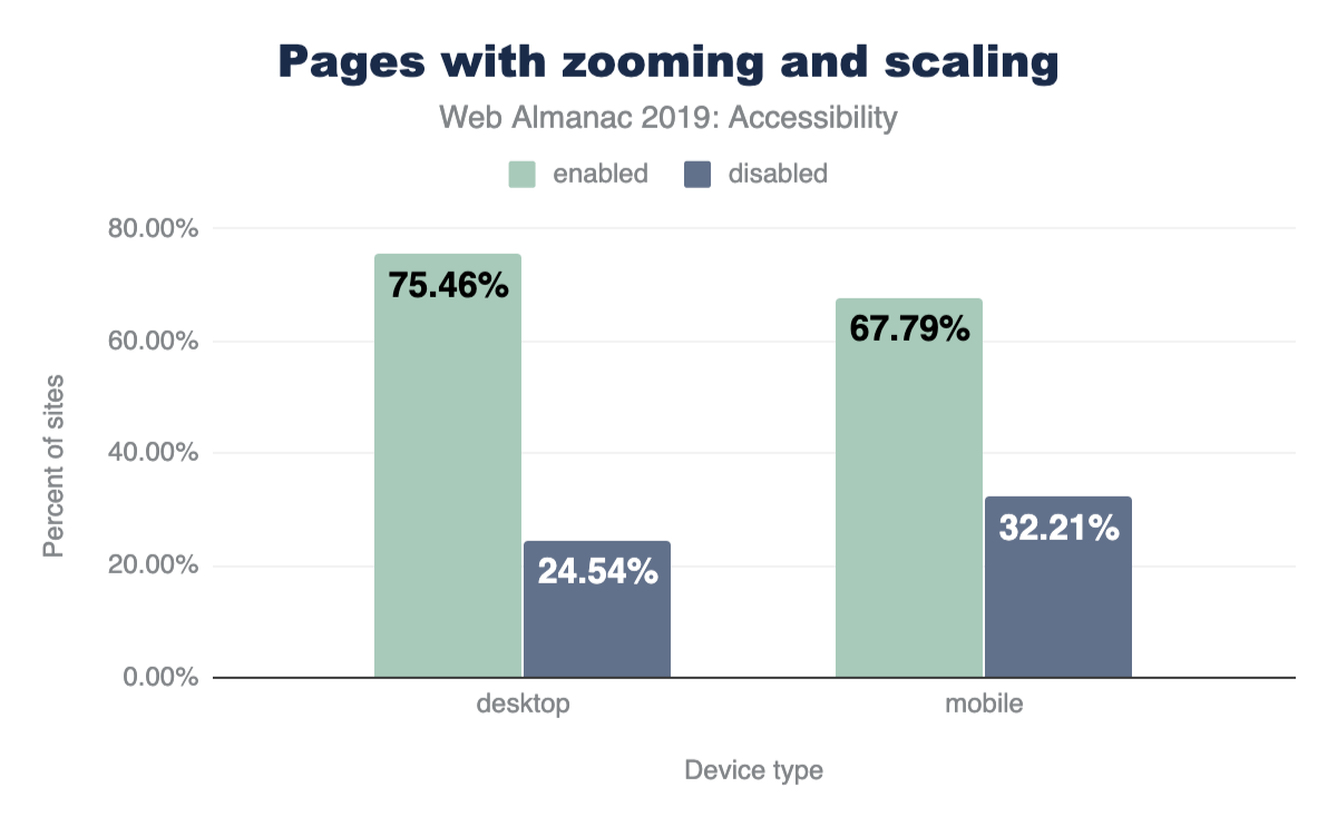
Language identification
The web is full of wondrous amounts of content. However, there’s a catch: over 1,000 different languages exist in the world, and the content you’re looking for may not be written in one you are fluent in. In recent years, we’ve made great strides in translation technologies and you probably have used one of them on the web (e.g., Google translate).
In order to facilitate this feature, the translation engines need to know what language your pages are written in. This is done by using the lang attribute. Without this, computers must guess what language your page is written in. As you might imagine, this leads to many errors, especially when pages use multiple languages (e.g., your page navigation is in English, but the post content is in Japanese).
This problem is even more pronounced on text-to-speech assistive technologies like screen readers, where if no language has been specified, they tend to read the text in the default user language.
Of the pages analyzed, 26.13% do not specify a language with the lang attribute. This leaves over a quarter of pages susceptible to all of the problems described above. The good news? Of sites using the lang attribute, they specify a valid language code correctly 99.68% of the time.
Distracting content
Some users, such as those with cognitive disabilities, have difficulties concentrating on the same task for long periods of time. These users don’t want to deal with pages that include lots of motion and animations, especially when these effects are purely cosmetic and not related to the task at hand. At a minimum, these users need a way to turn all distracting animations off.
Unfortunately, our findings indicate that infinitely looping animations are quite common on the web, with 21.04% of pages using them through infinite CSS animations or <marquee> and <blink> elements.
It is interesting to note however, that the bulk of this problem appears to be a few popular third-party stylesheets which include infinitely looping CSS animations by default. We were unable to determine how many pages actually used these animation styles.
Media on the web
Alternative text on images
Images are an essential part of the web experience. They can tell powerful stories, grab attention, and elicit emotion. But not everyone can see these images that we rely on to tell parts of our stories. Thankfully, in 1995, HTML 2.0 provided a solution to this problem: the alt attributehttps://webaim.org/techniques/alttext/. The alt attribute provides web developers with the capability of adding a textual description to the images we use, so that when someone is unable to see our images (or the images are unable to load), they can read the alt text for a description. The alt text fills them in on the part of the story they would have otherwise missed.
Even though alt attributes have been around for 25 years, 49.91% of pages still fail to provide alt attributes for some of their images, and 8.68% of pages never use them at all.
Captions for audio and video
Just as images are powerful storytellers, so too are audio and video in grabbing attention and expressing ideas. When audio and video content is not captioned, users who cannot hear this content miss out on large portions of the web. One of the most common things we hear from users who are Deaf or hard of hearing is the need to include captions for all audio and video content.
Of sites using <audio> or <video> elements, only 0.54% provide captions (as measured by those that include the <track> element). Note that some websites have custom solutions for providing video and audio captions to users. We were unable to detect these and thus the true percentage of sites utilizing captions is slightly higher.
Ease of page navigation
When you open the menu in a restaurant, the first thing you probably do is read all of the section headers: appetizers, salads, main course, and dessert. This allows you to scan a menu for all of the options and jump quickly to the dishes most interesting to you. Similarly, when a visitor opens a web page, their goal is to find the information they are most interested in—the reason they came to the page in the first place. In order to help users find their desired content as fast as possible (and prevent them from hitting the back button), we try to separate the contents of our pages into several visually distinct sections, for example: a site header for navigation, various headings in our articles so users can quickly scan them, a footer for other extraneous resources, and more.
While this is exceptionally important, we need to take care to mark up our pages so our visitors’ computers can perceive these distinct sections as well. Why? While most readers use a mouse to navigate pages, many others rely on keyboards and screen readers. These technologies rely heavily on how well their computers understand your page.
Headings
Headings are not only helpful visually, but to screen readers as well. They allow screen readers to quickly jump from section to section and help indicate where one section ends and another begins.
In order to avoid confusing screen reader users, make sure you never skip a heading level. For example, don’t go straight from an H1 to an H3, skipping the H2. Why is this a big deal? Because this is an unexpected change that will cause a screen reader user to think they’ve missed a piece of content. This might cause them to start looking all over for what they may have missed, even if there isn’t anything missing. Plus, you’ll help all of your readers by keeping a more consistent design.
With that being said, here are our results:
- 89.36% of pages use headings in some fashion. Awesome.
- 38.6% of pages do skip heading levels.
- Strangely, H2s are found on more sites than H1s.
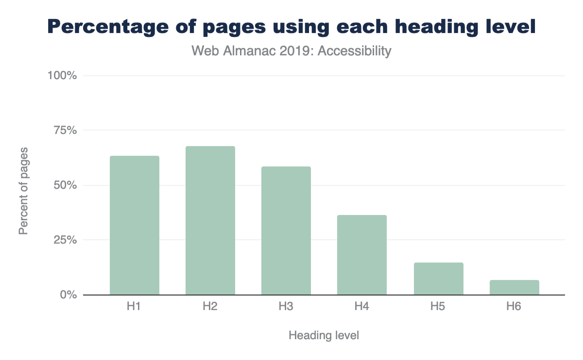
Main landmark
A main landmarkhttps://developer.mozilla.org/docs/Web/Accessibility/ARIA/Roles/Main_role indicates to screen readers where the main content of a web page starts so users can jump right to it. Without this, screen reader users have to manually skip over your navigation every single time they go to a new page within your site. Obviously, this is rather frustrating.
We found only one in every four pages (26.03%) include a main landmark. And surprisingly, 8.06% of pages erroneously contained more than one main landmark, leaving these users guessing which landmark contains the actual main content.
HTML section elements
Since HTML5 was released in 2008, and made the official standard in 2014, there are many HTML elements to aid computers and screen readers in understanding our page layout and structure.
Elements like <header>, <footer>, <navigation>, and <main> indicate where specific types of content live and allow users to quickly jump around your page. These are being used widely across the web, with most of them being used on over 50% of pages (<main> being the outlier).
Others like <article>, <hr>, and <aside> aid readers in understanding a page’s main content. For example, <article> says where one article ends and another begins. These elements are not used nearly as much, with each sitting at around 20% usage. Not all of these belong on every web page, so this isn’t necessarily an alarming statistic.
All of these elements are primarily designed for accessibility support and have no visual effect, which means you can safely replace existing elements with them and suffer no unintended consequences.
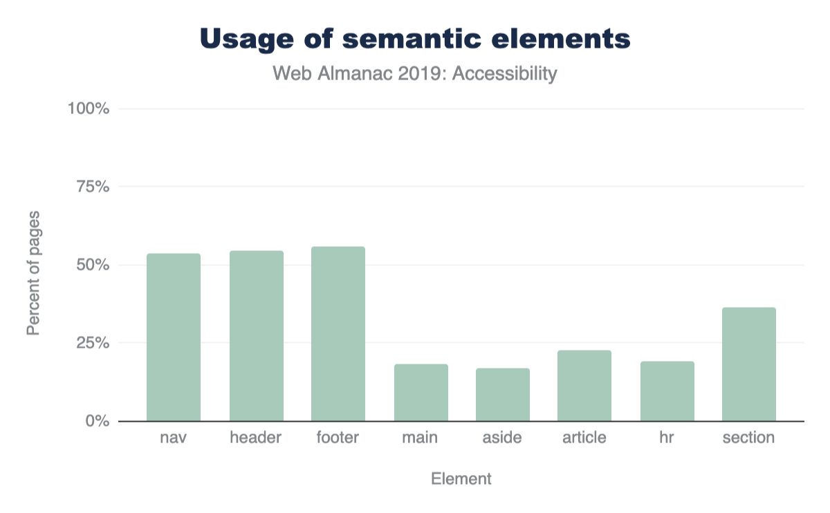
Other HTML elements used for navigation
Many popular screen readers also allow users to navigate by quickly jumping through links, lists, list items, iframes, and form fields like edit fields, buttons, and list boxes. Figure 9.6 details how often we saw pages using these elements.
Skip Links
A skip linkhttps://webaim.org/techniques/skipnav/ is a link placed at the top of a page which allows screen readers or keyboard-only users to jump straight to the main content. It effectively “skips” over all navigational links and menus at the top of the page. Skip links are especially useful to keyboard users who don’t use a screen reader, as these users don’t usually have access to other modes of quick navigation (like landmarks and headings). 14.19% of the pages in our sample were found to have skip links.
If you’d like to see a skip link in action for yourself, you can! Just do a quick Google search and hit tab as soon as you land on the search result pages. You’ll be greeted with a previously hidden link just like the one in Figure 9.7.
In fact you don’t need to even leave this site as we use them here toohttps://github.com/HTTPArchive/almanac.httparchive.org/pull/645!
It’s hard to accurately determine what a skip link is when analyzing sites. For this analysis, if we found an anchor link (href=#heading1) within the first 3 links on the page, we defined this as a page with a skip link. So 14.19% is a strict upper bound.
Shortcuts
Shortcut keys set via the aria-keyshortcuts or accesskey attributes can be used in one of two ways:
Activating an element on the page, like a link or button.
Giving a certain element on the page focus. For example, shifting focus to a certain input on the page, allowing a user to then start typing into it.
Adoption of aria-keyshortcuts was almost absent from our sample, with it only being used on 159 sites out of over 4 million analyzed. The accesskey attribute was used more frequently, being found on 2.47% of web pages (1.74% on mobile). We believe the higher usage of shortcuts on desktop is due to developers expecting mobile sites to only be accessed via a touch screen and not a keyboard.
What is especially surprising here is 15.56% of mobile and 13.03% of desktop sites which use shortcut keys assign the same shortcut to multiple different elements. This means browsers have to guess which element should own this shortcut key.
Tables
Tables are one of the primary ways we organize and express large amounts of data. Many assistive technologies like screen readers and switches (which may be used by users with motor disabilities) might have special features allowing them to navigate this tabular data more efficiently.
Headings
Depending on the way a particular table is structured, the use of table headers makes it easier to read across columns or rows without losing context on what data that particular column or row refers to. Having to navigate a table lacking in header rows or columns is a subpar experience for a screen reader user. This is because it’s hard for a screen reader user to keep track of their place in a table absent of headers, especially when the table is quite large.
To mark up table headers, simply use the <th> tag (instead of <td>), or either of the ARIA columnheader or rowheader roles. Only 24.5% of pages with tables were found to markup their tables with either of these methods. So the three quarters of pages choosing to include tables without headers are creating serious challenges for screen reader users.
Using <th> and <td> was by far the most commonly used method for marking up table headers. The use of columnheader and rowheader roles was almost non-existent with only 677 total sites using them (0.058%).
Captions
Table captions via the <caption> element are helpful in providing more context for readers of all kinds. A caption can prepare a reader to take in the information your table is sharing, and it can be especially useful for people who may get distracted or interrupted easily. They are also useful for people who may lose their place within a large table, such as a screen reader user or someone with a learning or intellectual disability. The easier you can make it for readers to understand what they’re analyzing, the better.
Despite this, only 4.32% of pages with tables provide captions.
Compatibility with assistive technologies
The use of ARIA
One of the most popular and widely used specifications for accessibility on the web is the Accessible Rich Internet Applicationshttps://www.w3.org/WAI/standards-guidelines/aria/ (ARIA) standard. This standard offers a large array of additional HTML attributes to help convey the purpose behind visual elements (i.e., their semantic meaning), and what kinds of actions they’re capable of.
Using ARIA correctly and appropriately can be challenging. For example, of pages making use of ARIA attributes, we found 12.31% have invalid values assigned to their attributes. This is problematic because any mistake in the use of an ARIA attribute has no visual effect on the page. Some of these errors can be detected by using an automated validation tool, but generally they require hands-on use of real assistive software (like a screen reader). This section will examine how ARIA is used on the web, and specifically which parts of the standard are most prevalent.
aria-hidden: 23.46%, aria-label: 17.67%, aria-expanded: 8.68%, aria-current: 7.76%, aria-labelledby: 6.85%, aria-controls: 3.56%, aria-haspopup: 2.62%, aria-invalid: 2.68%, aria-describedby: 1.69%, aria-live: 1.04%, aria-required: 1%The role attribute
The “role” attribute is the most important attribute in the entire ARIA specification. It’s used to inform the browser what the purpose of a given HTML element is (i.e., the semantic meaning). For example, a <div> element, visually styled as a button using CSS, should be given the ARIA role of button.
Currently, 46.91% of pages use at least one ARIA role attribute. In Figure 9.9 below, we’ve compiled a list of the top ten most widely used ARIA role values.
Looking at the results in Figure 9.9, we found two interesting insights: updating UI frameworks may have a profound impact on accessibility across the web, and the impressive number of sites attempting to make dialogs accessible.
Updating UI frameworks could be the way forward for accessibility across the web
The top 5 roles, all appearing on 11% of pages or more, are landmark roles. These are used to aid navigation, not to describe the functionality of a widget, such as a combo box. This is a surprising result because the main motivator behind the development of ARIA was to give web developers the capability to describe the functionality of widgets made of generic HTML elements (like a <div>).
We suspect that some of the most popular web UI frameworks include navigation roles in their templates. This would explain the prevalence of landmark attributes. If this theory is correct, updating popular UI frameworks to include more accessibility support may have a huge impact on the accessibility of the web.
Another result pointing towards this conclusion is the fact that more “advanced” but equally important ARIA attributes don’t appear to be used at all. Such attributes cannot easily be deployed through a UI framework because they might need to be customized based on the structure and the visual appearance of every site individually. For example, we found that the posinset and setsize attributes were only used on 0.01% of pages. These attributes convey to a screen reader user how many items are in a list or menu and which item is currently selected. So, if a visually impaired user is trying to navigate through a menu, they might hear index announcements like: “Home, 1 of 5”, “Products, 2 of 5”, “Downloads, 3 of 5”, etc.
Many sites attempt to make dialogs accessible
The relative popularity of the dialog rolehttps://developer.mozilla.org/docs/Web/Accessibility/ARIA/Roles/dialog_role stands out because making dialogs accessible for screen reader users is very challenging. It is therefore exciting to see around 8% of the analyzed pages stepping up to the challenge. Again, we suspect this might be due to the use of some UI frameworks.
Labels on interactive elements
The most common way that a user interacts with a website is through its controls, such as links or buttons to navigate the website. However, many times screen reader users are unable to tell what action a control will perform once activated. Often the reason this confusion occurs is due to the lack of a textual label. For example, a button displaying a left-pointing arrow icon to signify it’s the “Back” button, but containing no actual text.
Only about a quarter (24.39%) of pages that use buttons or links include textual labels with these controls. If a control is not labeled, a screen reader user might read something generic, such as the word “button” instead of a meaningful word like “Search”.
Buttons and links are almost always included in the tab order and thus have extremely high visibility. Navigating through a website using the tab key is one of the primary ways through which users who use only the keyboard explore your website. So a user is sure to encounter your unlabeled buttons and links if they are moving through your website using the tab key.
Accessibility of Form Controls
Filling out forms is a task many of us do every single day. Whether we’re shopping, booking travel, or applying for a job, forms are the main way users share information with web pages. Because of this, ensuring your forms are accessible is incredibly important. The simplest means of accomplishing this is by providing labels (via the <label> element, aria-label or aria-labelledby) for each of your inputs. Sadly, only 22.33% of pages provide labels for all their form inputs, meaning 4 out of every 5 pages have forms that may be very difficult to fill out.
Indicators of required and invalid fields
When we come across a field with a big red asterisk next to it, we know it’s a required field. Or when we hit submit and are informed there were invalid inputs, anything highlighted in a different color needs to be corrected and then resubmitted. However, people with low or no vision cannot rely on these visual cues, which is why the HTML input attributes required, aria-required, and aria-invalid are so important. They provide screen readers with the equivalent of red asterisks and red highlighted fields. As a nice bonus, when you inform browsers what fields are required, they’ll validate parts of your formshttps://developer.mozilla.org/docs/Learn/HTML/Forms/Form_validation for you. No JavaScript required.
Of pages using forms, 21.73% use required or aria-required when marking up required fields. Only one in every five sites make use of this. This is a simple step to make your site accessible, and unlocks helpful browser features for all users.
We also found 3.52% of sites with forms make use of aria-invalid. However, since many forms only make use of this field once incorrect information is submitted, we could not ascertain the true percentage of sites using this markup.
Duplicate IDs
IDs can be used in HTML to link two elements together. For example, the <label> element works this way. You specify the ID of the input field this label is describing and the browser links them together. The result? Users can now click on this label to focus on the input field, and screen readers will use this label as the description.
Unfortunately, 34.62% of sites have duplicate IDs, which means on many sites the ID specified by the user could refer to multiple different inputs. So when a user clicks on the label to select a field, they may end up selecting something differenthttps://www.deque.com/blog/unique-id-attributes-matter/ than they intended. As you might imagine, this could have negative consequences in something like a shopping cart.
This issue is even more pronounced for screen readers because their users may not be able to visually double check what is selected. Plus, many ARIA attributes, such as aria-describedby and aria-labelledby, work similarly to the label element detailed above. So to make your site accessible, removing all duplicate IDs is a good first step.
Conclusion
People with disabilities are not the only ones with accessibility needs. For example, anyone who has suffered a temporary wrist injury has experienced the difficulty of tapping small tap targets. Eyesight often diminishes with age, making text written in small fonts challenging to read. Finger dexterity is not the same across age demographics, making tapping interactive controls or swiping through content on mobile websites more difficult for a sizable percentage of users.
Similarly, assistive software is not only geared towards people with disabilities but for improving the day to day experience of everyone:
- The recent popularity of voice assistance, both on mobile devices and in the home, has demonstrated that controlling a computing device using voice commands is both desirable and essential for many users. Voice commands like these used to only be an accessibility feature but are now turning into a mainstream product.
- Drivers would benefit from a screen reading feature that, while they keep their eyes on the road, reads long pieces of text like news stories aloud.
- Captions are enjoyed not only by people who cannot hear a video but also by people who want to watch a video in a loud restaurant or in a library.
Once a website is built, it’s often hard to retrofit accessibility on top of existing site structures and widgets. Accessibility isn’t something that can be easily sprinkled on afterwards, rather it needs to be part of the design and implementation process. Unfortunately, either through a lack of awareness or easy-to-use testing tools, many developers are not familiar with the needs of all their users and the requirements of the assistive software they use.
While not conclusive, our results indicate that the use of accessibility standards like ARIA and accessibility best practices (e.g., using alt text) are found on a sizable, but not substantial portion of the web. On the surface this is encouraging, but we suspect many of these positive trends are due to the popularity of certain UI frameworks. On one hand, this is disappointing because web developers cannot simply rely on UI frameworks to inject their sites with accessibility support. On the other hand though, it’s encouraging to see how large of an effect UI frameworks could have on the accessibility of the web.
The next frontier, in our opinion, is making widgets which are available through UI frameworks more accessible. Since many complex widgets used in the wild (e.g., calendar pickers) are sourced from a UI library, it would be great for these widgets to be accessible out of the box. We hope that when we collect our results next time, the usage of more properly implemented complex ARIA roles is on the rise—signifying more complex widgets have also been made accessible. In addition, we hope to see more accessible media, like images and video, so all users can enjoy the richness of the web.
Authors
-
 Nektarios PaisiosNektarios Paisios is a software engineer working on Chrome accessibility for the last 5 years. He primarily focuses on making Chrome compatible with third party assistive software such as screen readers and screen magnifiers. Before working on Chrome accessibility, Nektarios worked in various other roles at the company, such as GSuite accessibility and display ads. Nektarios holds a Ph.D. in Computer Science from New York University.
 -
David FoxDavid Fox is the lead usability researcher and founder of LookZook, a company obsessed with finding out everything there is to know about building web experiences that meet user expectations. He is a website psychologist who digs into sites to learn not just what users are struggling with, but why, and how to best improve their experience. He is also a Google Chromium contributor, speaker, and provider of webinars and UX training.
-
Abigail KleinAbigail Klein is a Google software engineer. She worked on Google Docs, Sheets, and Slides web accessibility where she added automatic captions to Google Slideshttps://www.blog.google/outreach-initiatives/accessibility/whats-you-say-present-captions-google-slides/, as well as improving screen reader, braille, screen magnifier, and high contrast support. She currently works on Google Chrome and ChromeOS accessibility. She has a bachelor’s and master’s degree in computer science from MIT, where she co-founded an assistive technology hackathon and was a lab assistant and guest lecturer of the assistive technology class.


SEO

Introduction
Search Engine Optimization (SEO) isn’t just a hobby or a side project for digital marketers, it is crucial for the success of a website. The primary goal of SEO is to make sure that a website is optimized for the search engine bots that need to crawl and index its pages, as well as for the users that will be navigating the website and consuming its content. SEO impacts everyone working on a website, from the developer who is building it, through to the digital marketer who will need to promote it to new potential customers.
Let’s put the importance of SEO into perspective. Earlier this year, the SEO industry looked on in horror (and fascination) as ASOS reported an 87% decrease in profitshttps://www.bbc.co.uk/news/business-47877688 after a “difficult year”. The brand attributed their issues to a drop in search engine rankings which occurred after they launched over 200 microsites and significant changes to their website’s navigation, among other technical changes. Yikes.
The purpose of the SEO chapter of the Web Almanac is to analyze on-site elements of the web that impact the crawling and indexing of content for search engines, and ultimately, website performance. In this chapter, we’ll take a look at how well-equipped the top websites are to provide a great experience for users and search engines, and which ones still have work to do.
Our analysis includes data from Lighthouse, the Chrome UX Report, and HTML element analysis. We focused on SEO fundamentals like <title> elements, the different types of on-page links, content, and loading speed, but also the more technical aspects of SEO, including indexability, structured data, internationalization, and AMP across over 5 million websites.
Our custom metrics provide insights that, up until now, have not been exposed before. We are now able to make claims about the adoption and implementation of elements such as the hreflang tag, rich results eligibility, heading tag usage, and even anchor-based navigation for single page apps.
Read on to find out more about the current state of the web and its search engine friendliness.
Fundamentals
Search engines have a three-step process: crawling, indexing, and ranking. To be search engine-friendly, a page needs to be discoverable, understandable, and contain quality content that would provide value to a user who is browsing the search engine results pages (SERPs).
We wanted to analyze how much of the web is meeting the basic standards of SEO best practices, so we assessed on-page elements such as body content, meta tags, and internal linking. Let’s take a look at the results.
Content
To be able to understand what a page is about and decide for which search queries it provides the most relevant answers, a search engine must be able to discover and access its content. What content are search engines currently finding, however? To help answer this, we created two custom metrics: word count and headings.
Word count
We assessed the content on the pages by looking for groups of at least 3 words and counting how many were found in total. We found 2.73% of desktop pages that didn’t have any word groups, meaning that they have no body content to help search engines understand what the website is about.
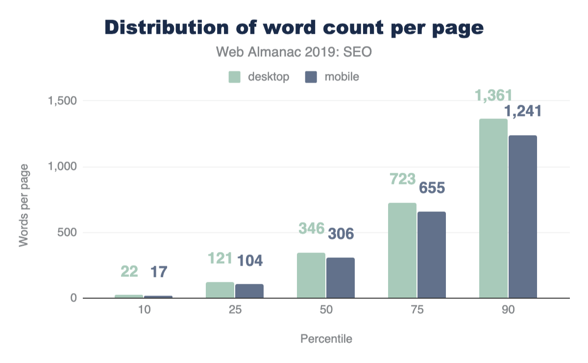
The median desktop home page has 346 words, and the median mobile home page has a slightly lower word count at 306 words. This shows that mobile sites do serve a bit less content to their users, but at over 300 words, this is still a reasonable amount to read. This is especially true for home pages which will naturally contain less content than article pages, for example. Overall the distribution of words is broad, with between 22 words at the 10th percentile and up to 1,361 at the 90th percentile.
Headings
We also looked at whether pages are structured in a way that provides the right context for the content they contain. Headings (H1, H2, H3, etc.) are used to format and structure a page and make content easier to read and parse. Despite the importance of headings, 10.67% of pages have no heading tags at all.
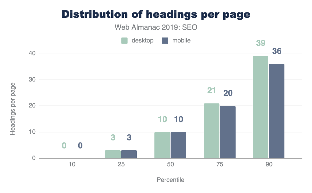
The median number of heading elements per page is 10. Headings contain 30 words on mobile pages and 32 words on desktop pages. This implies that the websites that utilize headings put significant effort in making sure that their pages are readable, descriptive, and clearly outline the page structure and context to search engine bots.
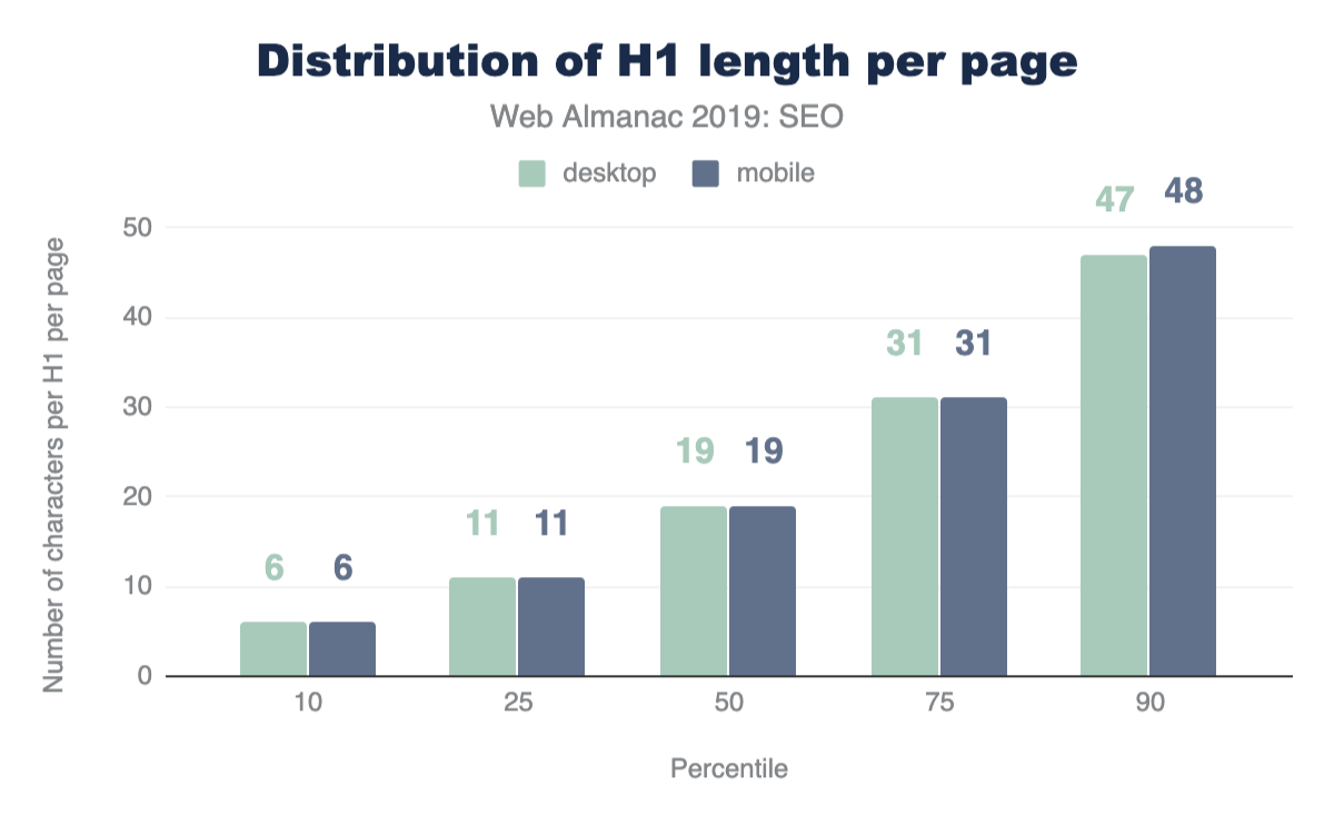
In terms of specific heading length, the median length of the first H1 element found on desktop is 19 characters.
For advice on how to handle H1s and headings for SEO and accessibility, take a look at this video response by John Muellerhttps://www.youtube.com/watch?v=zyqJJXWk0gk in the Ask Google Webmasters series.
Meta tags
Meta tags allow us to give specific instructions and information to search engine bots about the different elements and content on a page. Certain meta tags can convey things like the topical focus of a page, as well as how the page should be crawled and indexed. We wanted to assess whether or not websites were making the most of these opportunities that meta tags provide.
Page titles
<title> tag.
Page titles are an important way of communicating the purpose of a page to a user or search engine. <title> tags are also used as headings in the SERPS and as the title for the browser tab when visiting a page, so it’s no surprise to see that 97.1% of mobile pages have a document title.

Even though Google usually displays the first 50-60 characters of a page titlehttps://moz.com/learn/seo/title-tag within a SERP, the median length of the <title> tag was only 21 characters for mobile pages and 20 characters for desktop pages. Even the 75th percentile is still below the cutoff length. This suggests that some SEOs and content writers aren’t making the most of the space allocated to them by search engines for describing their home pages in the SERPs.
Meta descriptions
Compared to the <title> tag, fewer pages were detected to have a meta description, as only 64.02% of mobile home pages have a meta description. Considering that Google often rewrites meta descriptions in the SERPs in response to the searcher’s query, perhaps website owners place less importance on including a meta description at all.
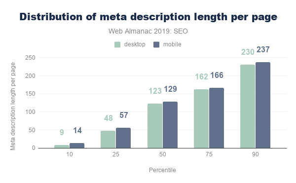
The median meta description length was also lower than the recommended length of 155-160 charactershttps://moz.com/learn/seo/meta-description, with desktop pages having descriptions of 123 characters. Interestingly, meta descriptions were consistently longer on mobile than on desktop, despite mobile SERPs traditionally having a shorter pixel limit. This limit has only been extended recently, so perhaps more website owners have been testing the impact of having longer, more descriptive meta descriptions for mobile results.
Image alt tags
Considering the importance of alt text for SEO and accessibility, it is far from ideal to see that only 46.71% of mobile pages use alt attributes on all of their images. This means that there are still improvements to be made with regard to making images across the web more accessible to users and understandable for search engines. Learn more about issues like these in the Accessibility chapter.
Indexability
To show a page’s content to users in the SERPs, search engine crawlers must first be permitted to access and index that page. Some of the factors that impact a search engine’s ability to crawl and index pages include:
- Status codes
noindextags- Canonical tags
- The
robots.txtfile
Status codes
It is recommended to maintain a 200 OK status code for any important pages that you want search engines to index. The majority of pages tested were available for search engines to access, with 87.03% of initial HTML requests on desktop returning a 200 status code. The results were slightly lower for mobile pages, with only 82.95% of pages returning a 200 status code.
The next most commonly found status code on mobile was 302, a temporary redirect, which was found on 10.45% of mobile pages. This was higher than on desktop, with only 6.71% desktop home pages returning a 302 status code. This could be due to the fact that the mobile home pages were alternateshttps://developers.google.com/search/mobile-sites/mobile-seo/separate-urls to an equivalent desktop page, such as on non-responsive sites that have separate versions of the website for each device.
noindex
A noindex directive can be served in the HTML <head> or in the HTTP headers as an X-Robots directive. A noindex directive basically tells a search engine not to include that page in its SERPs, but the page will still be accessible for users when they are navigating through the website. noindex directives are usually added to duplicate versions of pages that serve the same content, or low quality pages that provide no value to users coming to a website from organic search, such as filtered, faceted, or internal search pages.
96.93% of mobile pages passed the Lighthouse indexing audithttps://developers.google.com/web/tools/lighthouse/audits/indexing, meaning that these pages didn’t contain a noindex directive. However, this means that 3.07% of mobile home pages did have a noindex directive, which is cause for concern, meaning that Google was prevented from indexing these pages.
Canonicalization
Canonical tags are used to specify duplicate pages and their preferred alternates, so that search engines can consolidate authority which might be spread across multiple pages within the group onto one main page for improved rankings.
48.34% of mobile home pages were detectedhttps://developers.google.com/web/tools/lighthouse/audits/canonical to have a canonical tag. Self-referencing canonical tags aren’t essential, and canonical tags are usually required for duplicate pages. Home pages are rarely duplicated anywhere else across the site so seeing that less than half of pages have a canonical tag isn’t surprising.
robots.txt
One of the most effective methods for controlling search engine crawling is the robots.txt file. This is a file that sits on the root domain of a website and specifies which URLs and URL paths should be disallowed from being crawled by search engines.
It was interesting to observe that only 72.16% of mobile sites have a valid robots.txt, according to Lighthousehttps://developers.google.com/web/tools/lighthouse/audits/robots. The key issues we found are split between 22% of sites having no robots.txt file at all, and ~6% serving an invalid robots.txt file, and thus failing the audit. While there are many valid reasons to not have a robots.txt file, such as having a small website that doesn’t struggle with crawl budget issueshttps://webmasters.googleblog.com/2017/01/what-crawl-budget-means-for-googlebot.html, having an invalid robots.txt is cause for concern.
Linking
One of the most important attributes of a web page is links. Links help search engines discover new, relevant pages to add to their index and navigate through websites. 96% of the web pages in our dataset contain at least one internal link, and 93% contain at least one external link to another domain. The small minority of pages that don’t have any internal or external links will be missing out on the immense value that links pass through to target pages.
The number of internal and external links included on desktop pages were consistently higher than the number found on mobile pages. Often a limited space on a smaller viewport causes fewer links to be included in the design of a mobile page compared to desktop.
It’s important to bear in mind that fewer internal links on the mobile version of a page might cause an issuehttps://moz.com/blog/internal-linking-mobile-first-crawl-paths for your website. With mobile-first indexinghttps://www.deepcrawl.com/knowledge/white-papers/mobile-first-index-guide/, which for new websites is the default for Google, if a page is only linked from the desktop version and not present on the mobile version, search engines will have a much harder time discovering and ranking it.
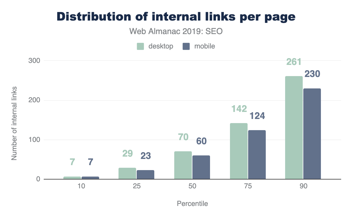
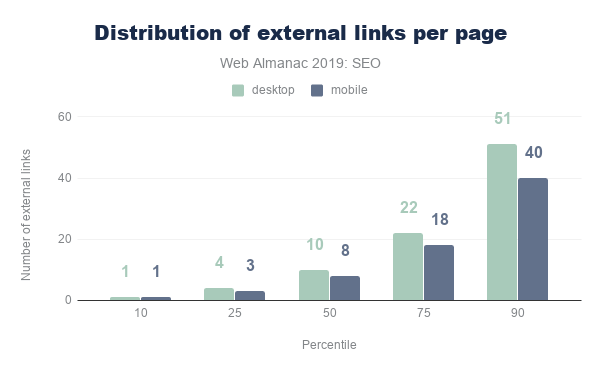
The median desktop page includes 70 internal (same-site) links, whereas the median mobile page has 60 internal links. The median number of external links per page follows a similar trend, with desktop pages including 10 external links, and mobile pages including 8.
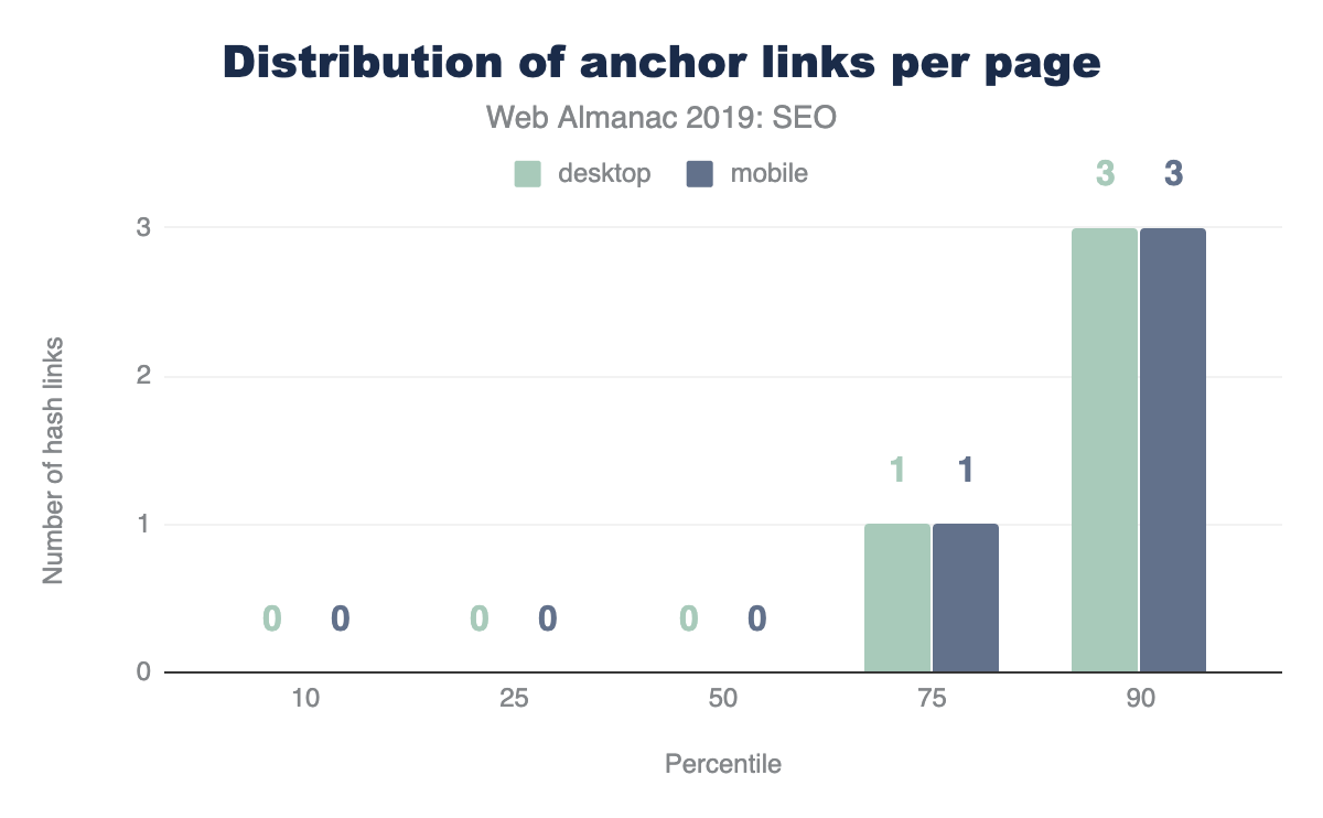
Anchor links, which link to a certain scroll position on the same page, are not very popular. Over 65% of home pages have no anchor links. This is probably due to the fact that home pages don’t usually contain any long-form content.
There is good news from our analysis of the descriptive link text metric. 89.94% of mobile pages pass Lighthouse’s descriptive link text audithttps://developers.google.com/web/tools/lighthouse/audits/descriptive-link-text. This means that these pages don’t have generic “click here”, “go”, “here” or “learn more” links, but use more meaningful link text which helps users and search engines better understand the context of pages and how they connect with one another.
Advanced
Having descriptive, useful content on a page that isn’t being blocked from search engines with a noindex or Disallow directive isn’t enough for a website to succeed in organic search. Those are just the basics. There is a lot more than can be done to enhance the performance of a website and its appearance in SERPs.
Some of the more technically complex aspects that have been gaining importance in successfully indexing and ranking websites include speed, structured data, internationalization, security, and mobile friendliness.
Speed
Mobile loading speed was first announced as a ranking factorhttps://webmasters.googleblog.com/2018/01/using-page-speed-in-mobile-search.html by Google in 2018. Speed isn’t a new focus for Google though. Back in 2010 it was revealed that speed had been introduced as a ranking signalhttps://webmasters.googleblog.com/2010/04/using-site-speed-in-web-search-ranking.html.
A fast-loading website is also crucial for a good user experience. Users that have to wait even a few seconds for a site to load have the tendency to bounce and try another result from one of your SERP competitors that loads quickly and meets their expectations of website performance.
The metrics we used for our analysis of load speed across the web is based on the Chrome UX Report (CrUX), which collects data from real-world Chrome users. This data shows that an astonishing 48% of websites are labeled as slow. A website is labeled slow if it more than 25% of FCP experiences slower than 3 seconds or 5% of FID experiences slower than 300 ms.
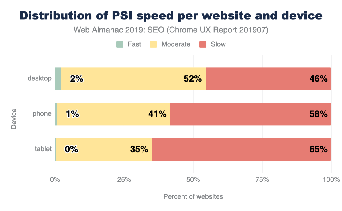
Split by device, this picture is even bleaker for tablet (65%) and phone (58%).
Although the numbers are bleak for the speed of the web, the good news is that SEO experts and tools have been focusing more and more on the technical challenges of speeding up websites. You can learn more about the state of web performance in the Performance chapter.
Structured data
Structured data allows website owners to add additional semantic data to their web pages, by adding JSON-LDhttps://en.wikipedia.org/wiki/JSON-LD snippets or Microdatahttps://developer.mozilla.org/docs/Web/HTML/Microdata, for example. Search engines parse this data to better understand these pages and sometimes use the markup to display additional relevant information in the search results. Some of the useful types of structured data are:
- reviewshttps://developers.google.com/search/docs/data-types/review-snippet
- productshttps://developers.google.com/search/docs/data-types/product
- businesseshttps://developers.google.com/search/docs/data-types/local-business
- movieshttps://developers.google.com/search/docs/data-types/movie
- and you can search for more types of supported structured data typeshttps://developers.google.com/search/docs/guides/search-gallery
The extra visibilityhttps://developers.google.com/search/docs/guides/enhance-site that structured data can provide for websites is interesting for site owners, given that it can help to create more opportunities for traffic. For example, the relatively new FAQ schemahttps://developers.google.com/search/docs/data-types/faqpage will double the size of your snippet and the real estate of your site in the SERP.
During our research, we found that only 14.67% of sites are eligible for rich results on mobile. Interestingly, desktop site eligibility is slightly lower at 12.46%. This suggests that there is a lot more that site owners can be doing to optimize the way their home pages are appearing in search.
Among the sites with structured data markup, the five most prevalent types are:
WebSite(16.02%)SearchAction(14.35%)Organization(12.89%)WebPage(11.58%)ImageObject(5.35%)
Interestingly, one of the most popular data types that triggers a search engine feature is SearchAction, which powers the sitelinks searchboxhttps://developers.google.com/search/docs/data-types/sitelinks-searchbox.
The top five markup types all lead to more visibility in Google’s search results, which might be the fuel for more widespread adoption of these types of structured data.
Seeing as we only looked at home pages within this analysis, the results might look very different if we were to consider interior pages, too.
Review stars are only found on 1.09% of the web’s home pages (via AggregateRatinghttps://schema.org/AggregateRating). Also, the newly introduced QAPagehttps://schema.org/QAPage appeared only in 48 instances, and the FAQPagehttps://schema.org/FAQPage at a slightly higher frequency of 218 times. These last two counts are expected to increase in the future as we run more crawls and dive deeper into Web Almanac analysis.
Internationalization
Internationalization is one of the most complex aspects of SEO, even according to some Google search employeeshttps://x.com/JohnMu/status/965507331369984002. Internationalization in SEO focuses on serving the right content from a website with multiple language or country versions and making sure that content is being targeted towards the specific language and location of the user.
While 38.40% of desktop sites (33.79% on mobile) have the HTML lang attribute set to English, only 7.43% (6.79% on mobile) of the sites also contain an hreflang link to another language version. This suggests that the vast majority of websites that we analyzed don’t offer separate versions of their home page that would require language targeting -- unless these separate versions do exist but haven’t been configured correctly.
hreflang |
Desktop | Mobile |
|---|---|---|
| en | 12.19% | 2.80% |
| x-default | 5.58% | 1.44% |
| fr | 5.23% | 1.28% |
| es | 5.08% | 1.25% |
| de | 4.91% | 1.24% |
| en-us | 4.22% | 2.95% |
| it | 3.58% | 0.92% |
| ru | 3.13% | 0.80% |
| en-gb | 3.04% | 2.79% |
| de-de | 2.34% | 2.58% |
| nl | 2.28% | 0.55% |
| fr-fr | 2.28% | 2.56% |
| es-es | 2.08% | 2.51% |
| pt | 2.07% | 0.48% |
| pl | 2.01% | 0.50% |
| ja | 2.00% | 0.43% |
| tr | 1.78% | 0.49% |
| it-it | 1.62% | 2.40% |
| ar | 1.59% | 0.43% |
| pt-br | 1.52% | 2.38% |
| th | 1.40% | 0.42% |
| ko | 1.33% | 0.28% |
| zh | 1.30% | 0.27% |
| sv | 1.22% | 0.30% |
| en-au | 1.20% | 2.31% |
Figure 10.11. Top 25 most popular hreflang values.
Next to English, the most common languages are French, Spanish, and German. These are followed by languages targeted towards specific geographies like English for Americans (en-us) or more obscure combinations like Spanish for the Irish (es-ie).
The analysis did not check for correct implementation, such as whether or not the different language versions properly link to each other. However, from looking at the low adoption of having an x-default version (only 3.77% on desktop and 1.30% on mobile), as is recommendedhttps://www.google.com/url?q=https://support.google.com/webmasters/answer/189077?hl%3Den&sa=D&ust=1570627963630000&usg=AFQjCNFwzwglsbysT9au_I-7ZQkwa-QvrA, this is an indicator that this element is complex and not always easy to get right.
SPA crawlability
Single-page applications (SPAs) built with frameworks like React and Vue.js come with their own SEO complexity. Websites using a hash-based navigation, make it especially hard for search engines to properly crawl and index them. For example, Google had an “AJAX crawling scheme” workaround that turned out to be complex for search engines as well as developers, so it was deprecated in 2015https://webmasters.googleblog.com/2015/10/deprecating-our-ajax-crawling-scheme.html.
The number of SPAs that were tested had a relatively low number of links served via hash URLs, with 13.08% of React mobile pages using hash URLs for navigation, 8.15% of mobile Vue.js pages using them, and 2.37% of mobile Angular pages using them. These results were very similar for desktop pages too. This is positive to see from an SEO perspective, considering the impact that hash URLs can have on content discovery.
The higher number of hash URLs in React pages is surprising, especially in contrast to the lower number of hash URLs found on Angular pages. Both frameworks promote the adoption of routing packages where the History APIhttps://developer.mozilla.org/docs/Web/API/History is the default for links, instead of relying on hash URLs. Vue.js is considering moving to using the History API as the defaulthttps://github.com/vuejs/rfcs/pull/40 as well in version 3 of their vue-router package.
AMP
AMP (formerly known as “Accelerated Mobile Pages”) was first introduced in 2015 by Google as an open source HTML framework. It provides components and infrastructure for websites to provide a faster experience for users, by using optimizations such as caching, lazy loading, and optimized images. Notably, Google adopted this for their search engine, where AMP pages are also served from their own CDN. This feature later became a standards proposal under the name Signed HTTP Exchangeshttps://wicg.github.io/webpackage/draft-yasskin-http-origin-signed-responses.html.
Despite this, only 0.62% of mobile home pages contain a link to an AMP version. Given the visibility this project has had, this suggests that it has had a relatively low adoption. However, AMP can be more useful for serving article pages, so our home page-focused analysis won’t reflect adoption across other page types.
Security
A strong online shift in recent years has been for the web to move to HTTPS by default. HTTPS prevents website traffic from being intercepted on public Wi-Fi networks, for example, where user input data is then transmitted unsecurely. Google have been pushing for sites to adopt HTTPS, and even made HTTPS as a ranking signalhttps://webmasters.googleblog.com/2014/08/https-as-ranking-signal.html. Chrome also supported the move to secure pages by labeling non-HTTPS pages as not securehttps://www.blog.google/products/chrome/milestone-chrome-security-marking-http-not-secure/ in the browser.
For more information and guidance from Google on the importance of HTTPS and how to adopt it, please see Why HTTPS Mattershttps://developers.google.com/web/fundamentals/security/encrypt-in-transit/why-https.
We found that 67.06% of websites on desktop are now served over HTTPS. Just under half of websites still haven’t migrated to HTTPS and are serving non-secure pages to their users. This is a significant number. Migrations can be hard work, so this could be a reason why the adoption rate isn’t higher, but an HTTPS migration usually require an SSL certificate and a simple change to the .htaccess file. There’s no real reason not to switch to HTTPS.
Google’s HTTPS Transparency Reporthttps://transparencyreport.google.com/https/overview reports a 90% adoption of HTTPS for the top 100 non-Google domains (representing 25% of all website traffic worldwide). The difference between this number and ours could be explained by the fact that relatively smaller sites are adopting HTTPS at a slower rate.
Learn more about the state of security in the Security chapter.
Conclusion
Through our analysis, we observed that the majority of websites are getting the fundamentals right, in that their home pages are crawlable, indexable, and include the key content required to rank well in search engines’ results pages. Not every person who owns a website will be aware of SEO at all, let alone its best practice guidelines, so it is promising to see that so many sites have got the basics covered.
However, more sites are missing the mark than expected when it comes to some of the more advanced aspects of SEO and accessibility. Site speed is one of these factors that many websites are struggling with, especially on mobile. This is a significant problem, as speed is one of the biggest contributors to UX, which is something that can impact rankings. The number of websites that aren’t yet served over HTTPS is also problematic to see, considering the importance of security and keeping user data safe.
There is a lot more that we can all be doing to learn about SEO best practices and industry developments. This is essential due to the evolving nature of the search industry and the rate at which changes happen. Search engines make thousands of improvements to their algorithms each year, and we need to keep up if we want our websites to reach more visitors in organic search.
Authors
-
Yvo SchaapFounder at technical SEO consultancy build.amsterdamhttps://build.amsterdam/. Previously founded several web companies that reached over 1 billions users. Blogging about his latest (ad)ventures since 2005 on yvoschaap.comhttps://yvoschaap.com/.
-
Rachel CostelloRachel Costello is a Technical SEO & Content Manager at DeepCrawlhttps://www.deepcrawl.com/ and an international conference speaker who spends her time researching and communicating the latest developments in search. Rachel currently manages the production of technical SEO white papershttps://www.deepcrawl.com/knowledge/white-papers/ and research pieces for DeepCrawl, and is a regular columnist for Search Engine Journalhttps://www.searchenginejournal.com/author/rachel-costello/.
-
Martin SplittMartin Splitt is a developer advocate on the web ecosystem team at Google where he works on keeping the web discoverable.


PWA
Introduction
Progressive Web Apps (PWAs) are a new class of web applications, building on top of platform primitives like the Service Worker APIshttps://developer.mozilla.org/docs/Web/API/Service_Worker_API. Service workers allow apps to support network-independent loading by acting as a network proxy, intercepting your web app’s outgoing requests, and replying with programmatic or cached responses. Service workers can receive push notifications and synchronize data in the background even when the corresponding app is not running. Additionally, service workers, together with Web App Manifestshttps://developer.mozilla.org/docs/Web/Manifest, allow users to install PWAs to their devices’ home screens.
Service workers were first implemented in Chrome 40https://blog.chromium.org/2014/12/chrome-40-beta-powerful-offline-and.html, back in December 2014, and the term Progressive Web Apps was coined by Frances Berriman and Alex Russellhttps://infrequently.org/2015/06/progressive-apps-escaping-tabs-without-losing-our-soul/ in 2015. As service workers are now finally implemented in all major browsershttps://jakearchibald.github.io/isserviceworkerready/, the goal for this chapter is to determine how many PWAs are actually out there, and how they make use of these new technologies. Certain advanced APIs like Background Synchttps://developers.google.com/web/updates/2015/12/background-sync are currently still only available on Chromium-based browsershttps://caniuse.com/#feat=background-sync, so as an additional question, we looked into which features these PWAs actually use.
Service workers
Service worker registrations and installability
The first metric we explore are service worker installations. Looking at the data exposed through feature counters in the HTTP Archive, we find that 0.44% of all desktop and 0.37% of all mobile pages register a service worker, and both curves over time are steeply growing.
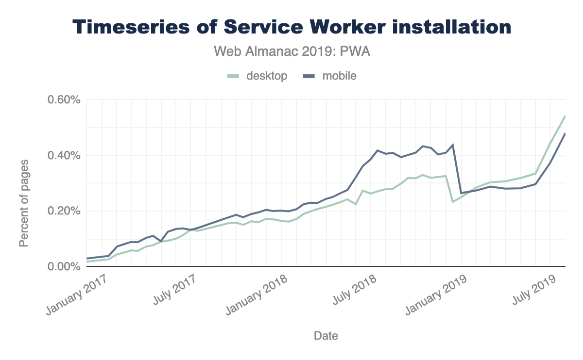
Now this might not look overly impressive, but taking traffic data from Chrome Platform Status into account, we can see that a service worker controls about 15% of all page loadshttps://www.chromestatus.com/metrics/feature/timeline/popularity/990, which can be interpreted as popular, high-traffic sites increasingly having started to embrace service workers.
Lighthouse checks whether a page is eligible for an install prompthttps://developers.google.com/web/tools/lighthouse/audits/install-prompt. 1.56% of mobile pages have an installable manifesthttps://web.dev/installable-manifest/.
To control the install experience, 0.82% of all desktop and 0.94% of all mobile pages use the OnBeforeInstallPrompt interface. At present support is limited to Chromium-based browsershttps://caniuse.com/#feat=web-app-manifest.
Service worker events
In a service worker one can listen for a number of eventshttps://developers.google.com/web/fundamentals/primers/service-workers/lifecycle:
install, which occurs upon service worker installation.activate, which occurs upon service worker activation.fetch, which occurs whenever a resource is fetched.push, which occurs when a push notification arrives.notificationclick, which occurs when a notification is being clicked.notificationclose, which occurs when a notification is being closed.message, which occurs when a message sent viapostMessage()arrives.sync, which occurs when a background sync event occurs.
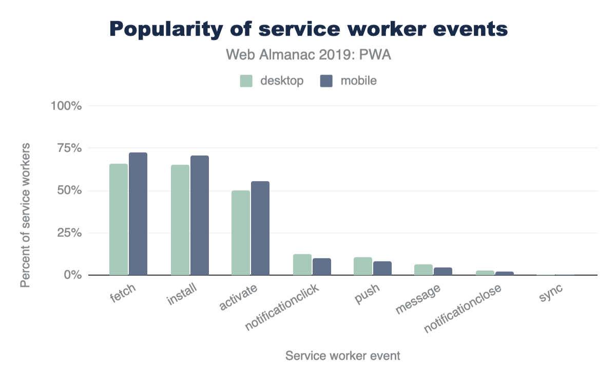
We have examined which of these events are being listened to by service workers we could find in the HTTP Archive. The results for mobile and desktop are very similar with fetch, install, and activate being the three most popular events, followed by notificationclick and push. If we interpret these results, offline use cases that service workers enable are the most attractive feature for app developers, far ahead of push notifications. Due to its limited availability, and less common use case, background sync doesn’t play a significant role at the moment.
Service worker file sizes
File size or lines of code are generally a bad proxy for the complexity of the task at hand. In this case, however, it is definitely interesting to compare (compressed) file sizes of service workers for mobile and desktop.
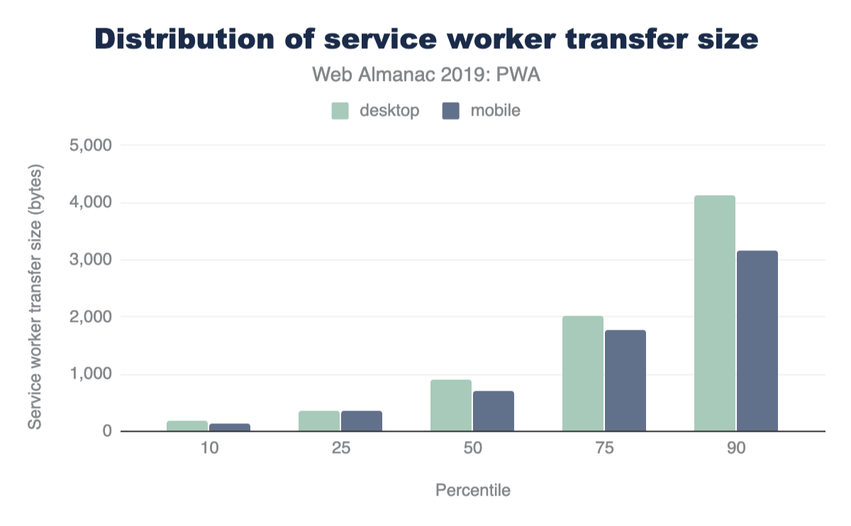
The median service worker file on desktop is 895 bytes, whereas on mobile it’s 694 bytes. Throughout all percentiles desktop service workers are larger than mobile service workers. We note that these stats don’t account for dynamically imported scripts through the importScripts() method, which likely skews the results higher.
Web app manifests
Web app manifest properties
The web app manifest is a simple JSON file that tells the browser about a web application and how it should behave when installed on the user’s mobile device or desktop. A typical manifest file includes information about the app name, icons it should use, the start URL it should open at when launched, and more. Only 1.54% of all encountered manifests were invalid JSON, and the rest parsed correctly.
We looked at the different properties defined by the Web App Manifest specificationhttps://w3c.github.io/manifest/#webappmanifest-dictionary, and also considered non-standard proprietary properties. According to the spec, the following properties are allowed:
dirlangnameshort_namedescriptioniconsscreenshotscategoriesiarc_rating_idstart_urldisplayorientationtheme_colorbackground_colorscopeserviceworkerrelated_applicationsprefer_related_applications
The only property that we didn’t observe in the wild was iarc_rating_id, which is a string that represents the International Age Rating Coalition (IARC) certification code of the web application. It is intended to be used to determine which ages the web application is appropriate for.
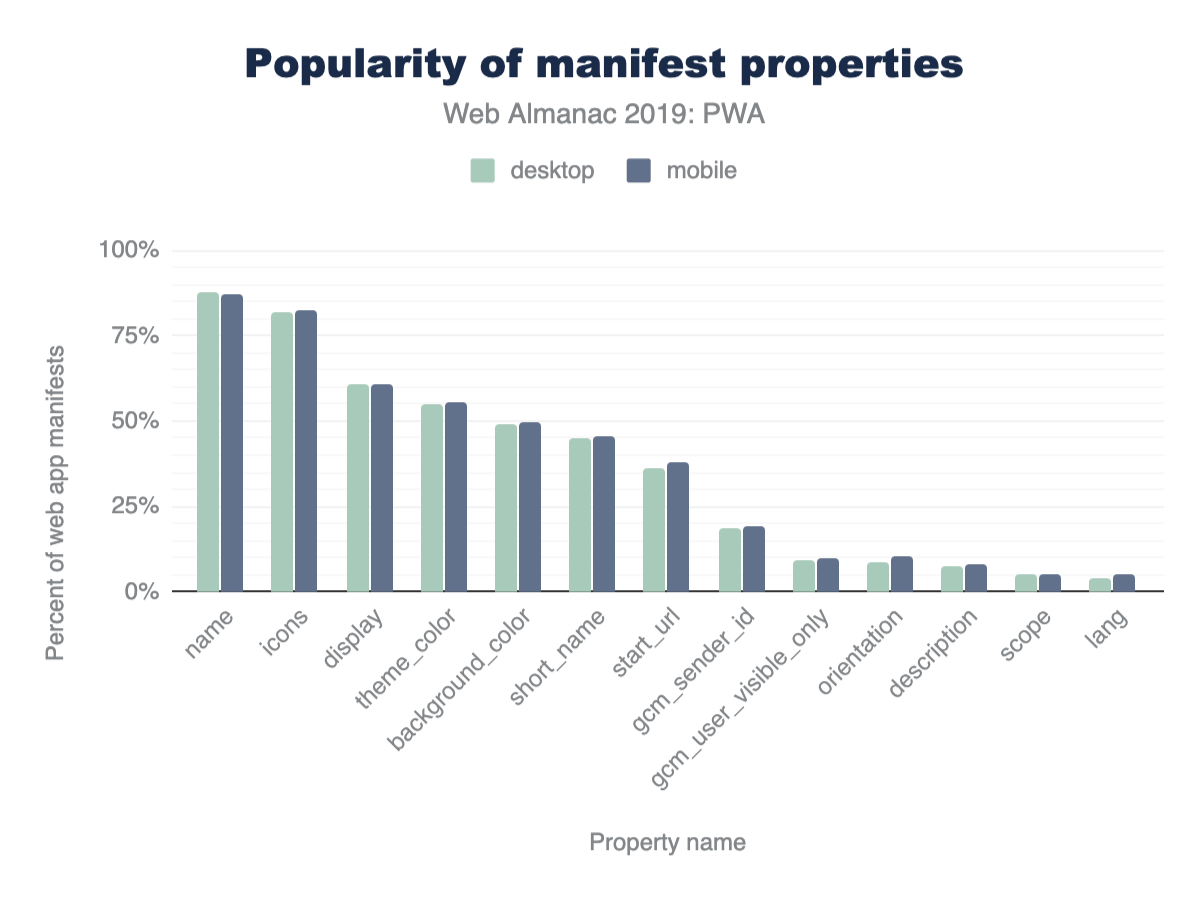
The proprietary properties we encountered frequently were gcm_sender_id and gcm_user_visible_only from the legacy Google Cloud Messaging (GCM) service. Interestingly there are almost no differences between mobile and desktop. On both platforms, however, there’s a long tail of properties that are not interpreted by browsers yet contain potentially useful metadata like author or version. We also found a non-trivial amount of mistyped properties; our favorite being shot_name, as opposed to short_name. An interesting outlier is the serviceworker property, which is standard but not implemented by any browser vendor. Nevertheless, it was found on 0.09% of all web app manifests used by mobile and desktop pages.
Display values
Looking at the values developers set for the display property, it becomes immediately clear that they want PWAs to be perceived as “proper” apps that don’t reveal their web technology origins.
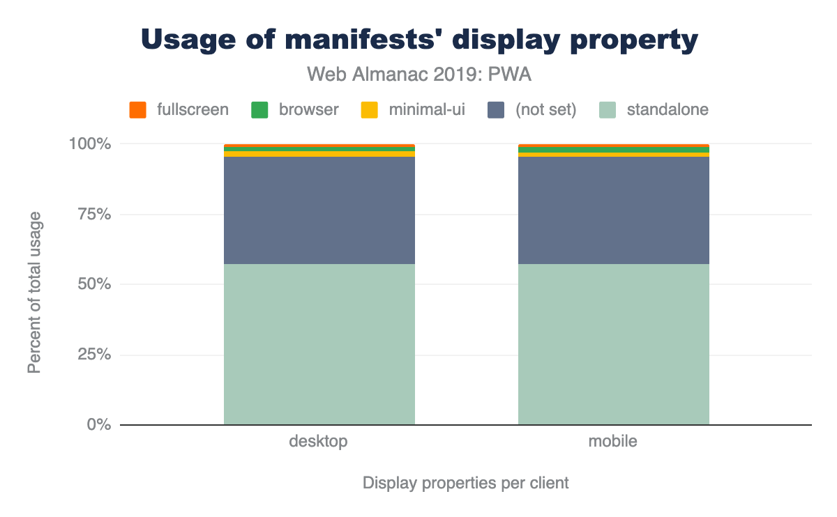
display properties.
By choosing standalone, they make sure no browser UI is shown to the end-user. This is reflected by the majority of apps that make use of the prefers_related_applications property: more that 97% of both mobile and desktop applications do not prefer native applications.
Category values
The categories property describes the expected application categories to which the web application belongs. It is only meant as a hint to catalogs or app stores listing web applications, and it is expected that websites will make a best effort to list themselves in one or more appropriate categories.
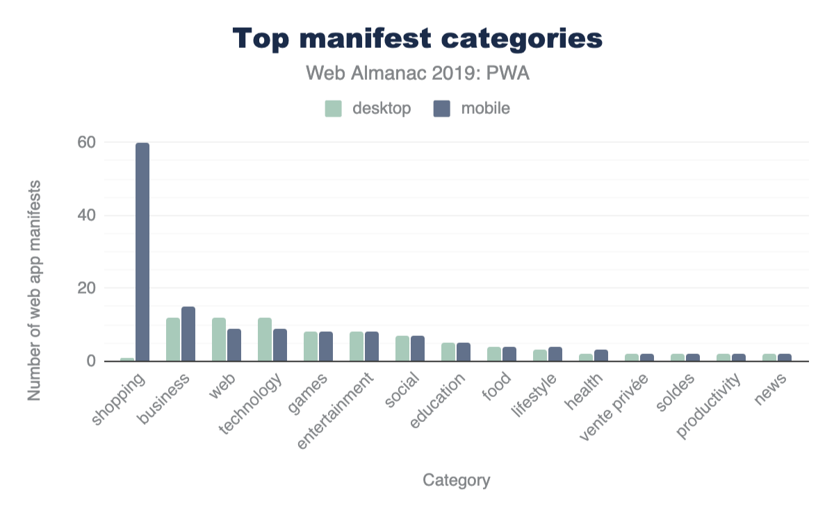
There were not too many manifests that made use of the property, but it is interesting to see the shift from “shopping” being the most popular category on mobile to “business”, “technology”, and “web” (whatever may be meant with that) on desktop that share the first place evenly.
Icon sizes
Lighthouse requireshttps://developers.google.com/web/tools/lighthouse/audits/manifest-contains-192px-icon at least an icon sized 192x192 pixels, but common favicon generation tools create a plethora of other sizes, too.
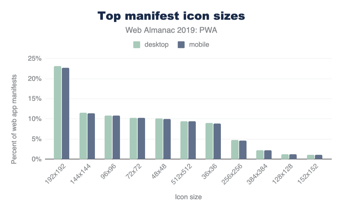
Lighthouse’s rule is probably the culprit for 192 pixels being the most popular choice of icon size on both desktop and mobile, despite Google’s documentationhttps://developers.google.com/web/fundamentals/web-app-manifest#icons explicitly recommending 512x512, which doesn’t show as a particularly prominent option.
Orientation values
The valid values for the orientation property are defined in the Screen Orientation API specificationhttps://www.w3.org/TR/screen-orientation/#dom-orientationlocktype. Currently, they are:
"any""natural""landscape""portrait""portrait-primary""portrait-secondary""landscape-primary""landscape-secondary"
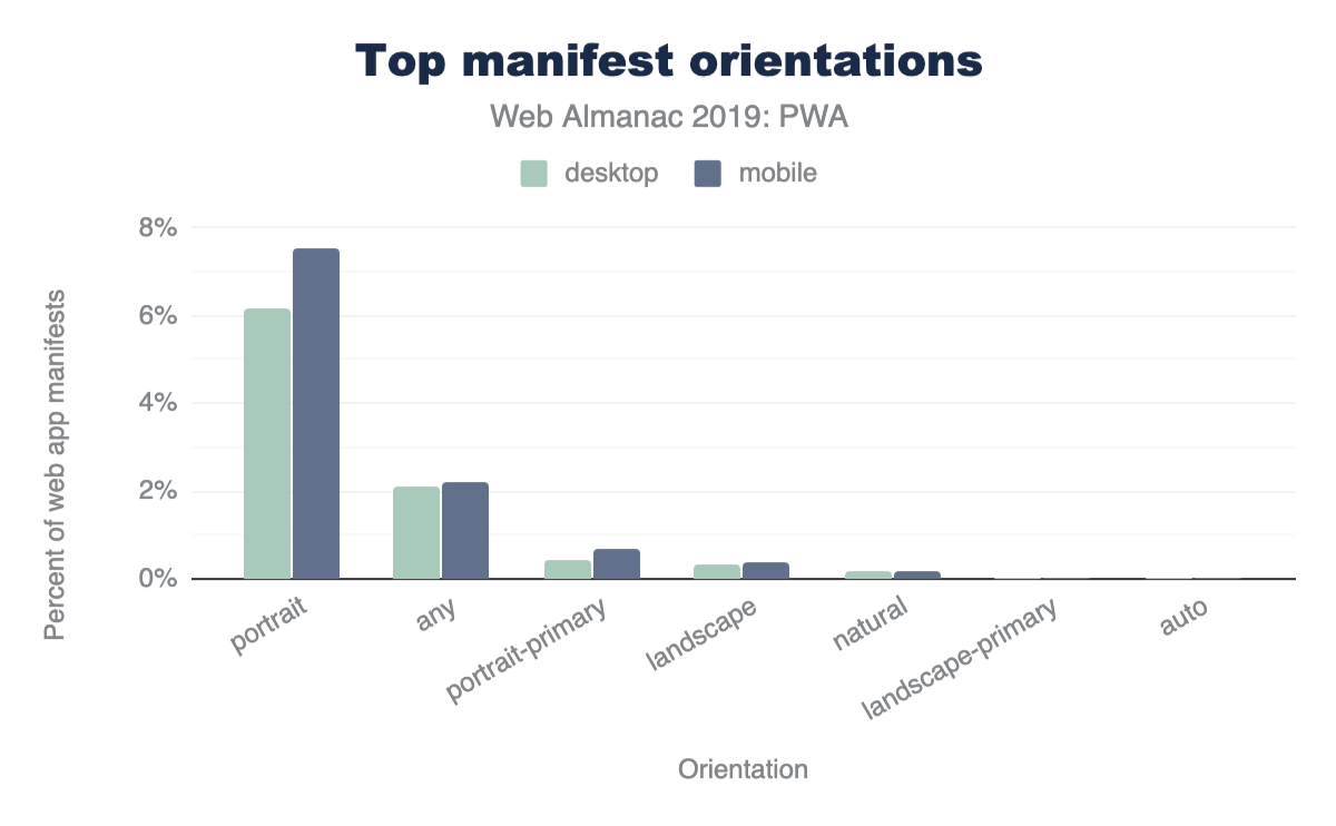
"portrait" orientation is the clear winner on both platforms, followed by "any" orientation.
Workbox
Workboxhttps://developers.google.com/web/tools/workbox is a set of libraries that help with common service worker use cases. For instance, Workbox has tools that can plug in to your build process and generate a manifest of files, which are then precached by your service worker. Workbox includes libraries to handle runtime caching, request routing, cache expiration, background sync, and more.
Given the low-level nature of the service worker APIs, many developers have turned to Workbox as a way of structuring their service worker logic into higher-level, reusable chunks of code. Workbox adoption is also driven by its inclusion as a feature in a number of popular JavaScript framework starter kits, like create-react-app and Vue’s PWA pluginhttps://www.npmjs.com/package/@vue/cli-plugin-pwa.
The HTTP Archive shows that 12.71% of websites that register a service worker are using at least one of the Workbox libraries. This percentage is roughly consistent across desktop and mobile, with a slightly lower percentage (11.46%) on mobile compared to desktop (14.36%).
Conclusion
The stats in this chapter show that PWAs are still only used by a small percentage of sites. However, this relatively small usage is driven by the more popular sites which have a much larger share of traffic, and pages beyond the home page may use this more: we showed that 15% of page loads use a service workers. The advantages they give for performance and greater control over caching particularly for mobile should mean that usage will continue to grow.
PWAs have often been seen as Chrome-driven technology. Other browsers have made great strides recently to implement most of the underlying technologies, although first-class installability lags on some platforms. It’s positive to see support becoming more widespread. Maximiliano Firtmanhttps://x.com/firt does a great job of tracking this on iOS, including explaining Safari PWA supporthttps://medium.com/@firt/iphone-11-ipados-and-ios-13-for-pwas-and-web-development-5d5d9071cc49. Apple doesn’t use the term PWA much, and has explicitly stated that these HTML5 apps are best delivered outside of the App Storehttps://developer.apple.com/news/?id=09062019b. Microsoft went the opposite direction, not only encouraging PWAs in its app store, but even automatically shortlisting PWAs to be added that were found via the Bing web crawlerhttps://web.archive.org/web/20190711051508/https://docs.microsoft.com/en-us/microsoft-edge/progressive-web-apps/microsoft-store. Google has also provided a method for listing web apps in the Google Play Store, via Trusted Web Activitieshttps://developers.google.com/web/updates/2019/02/using-twa.
PWAs provide a path forward for developers who would prefer to build and release on the web instead of on native platforms and app stores. Not every operating system and browser offers full parity with native software, but improvements continue, and perhaps 2020 is the year where we see an explosion in deployments?
Authors
-
Thomas SteinerThomas Steiner is a Web Developer Advocate at Google Hamburg, focused on making the Web a better place through standardization, creating and sharing best practices, and doing research. He blogs at blog.tomayac.comhttps://blog.tomayac.com/ and tweets as @tomayac.
-
Jeff PosnickJeff Posnick is a member of Google’s Web Developer Relations team, based in New York. His focus is on Workboxhttps://developers.google.com/web/tools/workbox/, a set of service worker libraries for Progressive Web Apps. He blogs at https://jeffy.info and tweets as @jeffposnick.


Mobile Web

Introduction
Let’s step back for a moment, to the year 2007. The “mobile web” is currently just a blip on the radar, and for good reason too. Why? Mobile browsers have little to no CSS support, meaning sites look nothing like they do on desktop — some browsers can only display text. Screens are incredibly small and can only display a few lines of text at a time. And the replacements for a mouse are these tiny little arrow keys you use to “tab around”. Needless to say, browsing the web on a phone is truly a labor of love. However, all of this is just about to change.
In the middle of his presentation, Steve Jobs takes the newly unveiled iPhone, sits down, and begins to surf the web in a way we had only previously dreamed of. A large screen and fully featured browser displaying websites in their full glory. And most importantly, surfing the web using the most intuitive pointer device known to man: our fingers. No more tabbing around with tiny little arrow keys.
Since 2007, the mobile web has grown at an explosive rate. And now, 13 years later, mobile accounts for 59% of all searcheshttps://www.merkleinc.com/thought-leadership/digital-marketing-report and 58.7% of all web traffic, according to Akamai mPulsehttps://developer.akamai.com/akamai-mpulse-real-user-monitoring-solution data in July 2019. It’s no longer an afterthought, but the primary way people experience the web. So given how significant mobile is, what kind of experience are we providing our visitors? Where are we falling short? Let’s find out.
The page loading experience
The first part of the mobile web experience we analyzed is the one we’re all most intimately familiar with: the page loading experience. But before we start diving into our findings, let’s make sure we’re all on the same page regarding what the typical mobile user really looks like. Because this will not only help you reproduce these results, but understand these users better.
Let’s start with what phone the typical mobile user has. The average Android phone is ~$250https://web.archive.org/web/20190921115844/https://www.idc.com/getdoc.jsp?containerId=prUS45115119, and one of the most popular phoneshttps://web.archive.org/web/20190812221233/https://deviceatlas.com/blog/most-popular-android-smartphones in that range is a Samsung Galaxy S6. So this is likely the kind of phone they use, which is actually 4x slower than an iPhone 8. This user doesn’t have access to a fast 4G connection, but rather a 2G connection (29%https://www.gsma.com/r/mobileeconomy/ of the time) or 3G connection (28%https://www.gsma.com/r/mobileeconomy/ of the time). And this is what it all adds up to:
| Connection type | 2G or 3Ghttps://www.gsma.com/r/mobileeconomy/ |
|---|---|
| Latency | 300 - 400 ms |
| Bandwidth | 0.4 - 1.6 Mbps |
| Phone | Galaxy S6https://www.gsmarena.com/samsung_galaxy_s6-6849.php — 4x slowerhttps://www.notebookcheck.net/A11-Bionic-vs-7420-Octa_9250_6662.247596.0.html than iPhone 8 (Octane V2 score) |
Figure 12.1. Technical profile of a typical mobile user.
I imagine some of you are surprised by these results. They may be far worse conditions than you’ve ever tested your site with. But now that we’re all on the same page with what a mobile user truly looks like, let’s get started.
Pages bloated with JavaScript
The state of JavaScript on the mobile web is terrifying. According to HTTP Archive’s JavaScript reporthttps://httparchive.org/reports/state-of-javascript?start=2016_05_15&end=2019_07_01&view=list#bytesJs, the median mobile site requires phones to download 375 KB of JavaScript. Assuming a 70% compression ratio, this means that phones have to parse, compile, and execute 1.25 MB of JavaScript at the median.
Why is this a problem? Because sites loading this much JS take upwards of 10 secondshttps://httparchive.org/reports/loading-speed?start=earliest&end=2019_07_01&view=list#ttci to become consistently interactive. Or in other words, your page may appear fully loaded, but when a user clicks any of your buttons or menus, the user may experience some slowdown because the JavaScript hasn’t finished executing. In the worst case scenario, users may be forced to keep clicking the button for upwards of 10 seconds, just waiting for that magical moment where something actually happens. Think about how confusing and frustrating that can be.
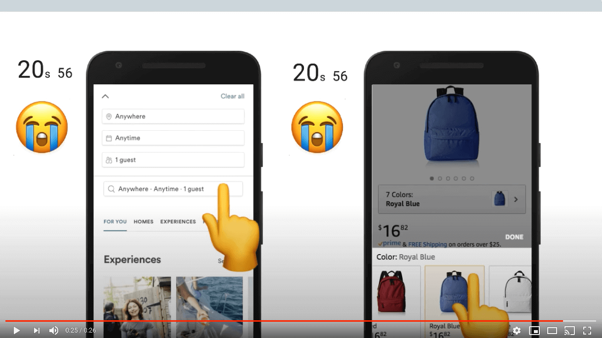
Let’s delve deeper and look at another metric that focuses more on how well each page utilizes JavaScript. For example, does it really need as much JavaScript as it’s loading? We call this metric the JavaScript Bloat Score, based on the web bloat scorehttps://www.webbloatscore.com/. The idea behind it is this:
- JavaScript is often used to both generate and change the page as it loads.
- It’s also delivered as text to the browser. So it compresses well, and should be delivered faster than just a screenshot of the page.
- So if the total amount of JavaScript a page downloads alone (not including images, css, etc) is larger than a PNG screenshot of the viewport, we are using far too much JavaScript. At this point, it’d be faster just to send that screenshot to get the initial page state!
The results of this? Of the 5+ million websites analyzed, 75.52% were bloated with JavaScript. We have a long way to go.
Note that we were not able to capture and measure the screenshots of all 5 million+ sites we analyzed. Instead, we took a random sampling of 1000 sites to find what the median viewport screenshot size is (140 KB), and then compared each site’s JavaScript download size to this number.
For a more in-depth breakdown of the effects of JavaScript, check out The Cost of JavaScript in 2018https://medium.com/@addyosmani/the-cost-of-javascript-in-2018-7d8950fbb5d4 by Addy Osmani.
Service Worker usage
Browsers typically load all pages the same. They prioritize the download of some resources above others, follow the same caching rules, etc. Thanks to Service Workershttps://developers.google.com/web/fundamentals/primers/service-workers though, we now have a way to directly control how our resources are handled by the network layer, often times resulting in quite significant improvements to our page load times.
Despite being available since 2016 and implemented on every major browser, only 0.64% of sites utilize them!
Shifting content while loading
One of the most beautiful parts of the web is how web pages load progressively by nature. Browsers download and display content as soon as they are able, so users can engage with your content as soon as possible. However, this can have a detrimental effect if you don’t design your site with this in mind. Specifically, content can shift position as resources load and impede the user experience.

Imagine you’re reading an article when all of a sudden, an image loads and pushes the text you’re reading way down the screen. You now have to hunt for where you were or just give up on reading the article. Or, perhaps even worse, you begin to click a link right before an ad loads in the same spot, resulting in an accidental click on the ad instead.
So, how do we measure how much our sites shift? In the past it was quite difficult (if not impossible), but thanks to the new Layout Instability APIhttps://web.dev/articles/cls we can do this in two steps:
Via the Layout Instability API, track each shift’s impact on the page. This is reported to you as a percentage of how much content in the viewport has shifted.
Take all the shifts you’ve tracked and add them together. The result is what we call the Cumulative Layout Shifthttps://web.dev/articles/cls#a-cumulative-layout-shift-score (CLS) score.
Because every visitor can have a different CLS, in order to analyze this metric across the web with the Chrome UX Report (CrUX), we combine every experience into three different buckets:
- Small CLS: Experiences having CLS under 5%. That is, the page is mostly stable and does not shift very much at all. For perspective, the page in the video above has a CLS of 42.59%.
- Large CLS: Experiences having CLS 100% or greater. These may consist of many small individual shifts or a few large and noticeable shifts.
- Medium CLS: Anything in between small and large.
So what do we see when we look at CLS across the web?
Nearly two out of every three sites (65.32%) have medium or large CLS for 50% or more of all user experiences.
20.52% of sites have large CLS for at least half of all user experiences. That’s about one of every five websites. Remember, the video in Figure 12.3 only has a CLS of 42.59% — these experiences are even worse than that!
We suspect much of this may be caused by websites not providing an explicit width and height for resources like ads and images that load after text has been painted to the screen. Before browsers can display a resource on the screen, they need to know how much room the resource will take up. So unless an explicit size is provided via CSS or HTML attributes, browsers have no way to know how how large the resource actually is and display it with a width and height of 0px until loaded. When the resource loads and browsers finally know how big it is, it shifts the page’s contents, creating an unstable layout.
Permission requests
Over the last few years, the line between websites and “app store” apps has continued to blur. Even now, you have the ability to request access to a user’s microphone, video camera, geolocation, ability to display notifications, and more.
While this has opened up even more capabilities for developers, needlessly requesting these permissions may leave users feeling wary of your web page, and can build mistrust. This is why we recommend to always tie a permission request to a user gesture, like tapping a “Find theaters near me” button.
Right now 1.52% of sites request permissions without a user interaction. Seeing such a low number is encouraging. However, it’s important to note that we were only able to analyze home pages. So for example, sites requesting permissions only on their content pages (e.g., their blog posts) were not accounted for. See our Methodology page for more info.
Textual content
The primary goal of a web page is to deliver content users want to engage with. This content might be a YouTube video or an assortment of images, but often times, it’s simply the text on the page. It goes without saying that ensuring our textual content is legible to our visitors is extremely important. Because if visitors can’t read it, there’s nothing left to engage with, and they’ll leave. There are two key things to check when ensuring your text is legible to readers: color contrast and font sizes.
Color contrast
When designing our sites we tend to be in more optimal conditions, and have far better eyes than many of our visitors. Visitors may be colorblind and unable to distinguish between the text and background color. 1 in every 12 men and 1 in 200 womenhttp://www.cvrl.org/people/stockman/pubs/1999%20Genetics%20chapter%20SSJN.pdf of European descent are colorblind. Or perhaps visitors are reading the page while the sun is creating glare on their screen, which may similarly impair legibility.
To help us mitigate this problem, there are accessibility guidelineshttps://dequeuniversity.com/rules/axe/2.2/color-contrast we can follow when choosing our text and background colors. So how are we doing in meeting these baselines? Only 22.04% of sites give all their text sufficient color contrast. This value is actually a lower limit, as we could only analyze text with solid backgrounds. Image and gradient backgrounds were unable to be analyzed.

#FFFFFF, the light shade of brown background is #FCA469, and the recommended shade of brown background is #BD5B0E. The grayscale equivalents are #B8B8B8 and #707070 respectively. Image courtesy of LookZookFor colorblindness stats for other demographics, see this paperhttps://web.archive.org/web/20180304115406/http://www.allpsych.uni-giessen.de/karl/colbook/sharpe.pdf.
Font size
The second part of legibility is ensuring that text is large enough to read easily. This is important for all users, but especially so for older age demographics. Font sizes under 12px tend to be harder to read.
Across the web we found 80.66% of web pages meet this baseline.
Zooming, scaling, and rotating pages
Zooming and scaling
Designing your site to work perfectly across the tens of thousands of screen sizes and devices is incredibly difficult. Some users need larger font sizes to read, zoom in on your product images, or need a button to be larger because it’s too small and slipped past your quality assurance team. Reasons like these are why device features like pinch-to-zoom and scaling are so important; they allow users to tweak our pages so their needs are met.
There do exist very rare cases when disabling this is acceptable, like when the page in question is a web-based game using touch controls. If left enabled in this case, players’ phones will zoom in and out every time the player taps twice on the game, resulting in an unusable experience.
Because of this, developers are given the ability to disable this feature by setting one of the following two properties in the meta viewport tag:
user-scalableset to0ornomaximum-scaleset to1,1.0, etc
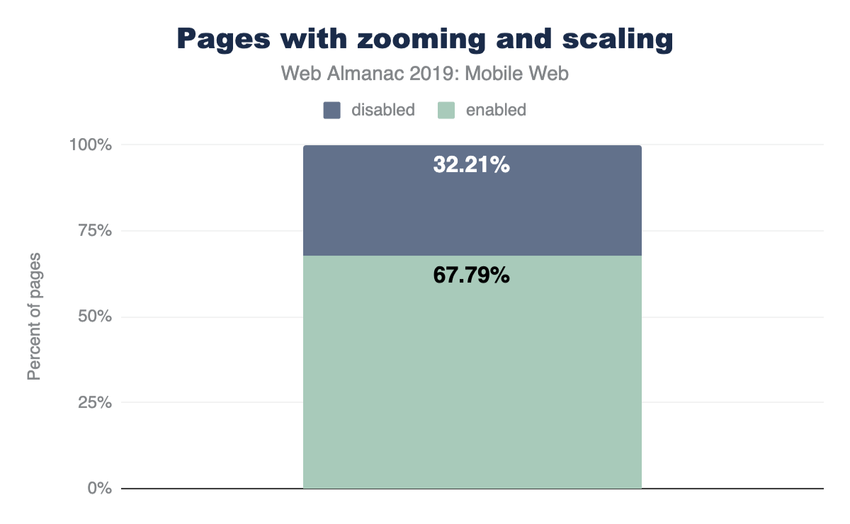
However, developers have misused this so much that almost one out of every three sites (32.21%) disable this feature, and Apple (as of iOS 10) no longer allows web developers to disable zooming. Mobile Safari simply ignores the taghttps://archive.org/details/ios-10-beta-release-notes. All sites, no matter what, can be zoomed and scaled on newer Apple devices, which account for over 11%https://gs.statcounter.com/ of all web traffic worldwide!
Rotating pages
Mobile devices allow users to rotate them so your website can be viewed in the format users prefer. Users do not always keep the same orientation throughout a session however. When filling out forms, users may rotate to landscape mode to use the larger keyboard. Or while browsing products, some may prefer the larger product images landscape mode gives them. Because of these types of use cases, it’s very important not to rob the user of this built-in ability of mobile devices. And the good news is that we found virtually no sites that disable this. Only 87 total sites (or 0.0016%) disable this feature. This is fantastic.
Buttons and links
Tap targets
We’re used to having precise devices like mice while on desktop, but the story is quite different on mobile. On mobile we engage with sites through these large and imprecise tools we call fingers. Because of how imprecise they can be, we constantly “fat finger” links and buttons, tapping on things we never intended.
Designing tap targets appropriately to mitigate this issue can be difficult because of how widely fingers vary in size. However, lots of research has now been done and there are safe standardshttps://developers.google.com/web/tools/lighthouse/audits/tap-targets for how large buttons should be and how far apart they need to be separated.
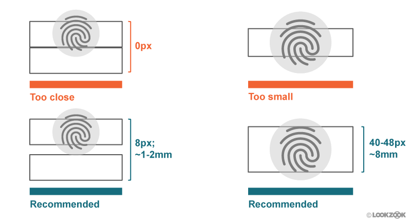
As of now, 34.43% of sites have sufficiently sized tap targets. So we have quite a ways to go until “fat fingering” is a thing of the past.
Labeling buttons
Some designers love to use icons in place of text — they can make our sites look cleaner and more elegant. But while you and everyone on your team may know what these icons mean, many of your users will not. This is even the case with the infamous hamburger icon! If you don’t believe us, do some user testing and see how often users get confused. You’ll be astounded.
This is why it’s important to avoid any confusion and add supporting text and labels to your buttons. As of now, at least 28.59% of sites include a button with only a single icon with no supporting text.
Semantic form fields
From signing up for a new service, buying something online, or even to receive notifications of new posts from a blog, form fields are an essential part of the web and something we use daily. Unfortunately, these fields are infamous for how much of a pain they are to fill out on mobile. Thankfully, in recent years browsers have given developers new tools to help ease the pain of completing these fields we know all too well. So let’s take a look at how much they’ve been getting used.
New input types
In the past, text and password were some of the only input types available to developers as it met almost all of our needs on desktop. This is not the case for mobile devices. Mobile keyboards are incredibly small, and a simple task, like entering an email address, may require users to switch between multiple keyboards: the standard keyboard and the special character keyboard for the “@” symbol. Simply entering a phone number can be difficult using the default keyboard’s tiny numbers.
Many new input typeshttps://developer.mozilla.org/docs/Web/HTML/Element/input#Form_%3Cinput%3E_types have since been introduced, allowing developers to inform browsers what kind of data is expected, and enable browsers to provide customized keyboards specifically for these input types. For example, a type of email provides users with an alphanumeric keyboard including the “@” symbol, and a type of tel will display a numeric keypad.
When analyzing sites containing an email input, 56.42% use type="email". Similarly, for phone inputs, type="tel" is used 36.7% of the time. Other new input types have an even lower adoption rate.
| Type | Frequency (pages) |
|---|---|
| phone | 1,917 |
| name | 1,348 |
| textbox | 833 |
Figure 12.7. Most commonly used invalid input types.
Make sure to educate yourself and others on the large amount of input types available and double-check that you don’t have any typos like the most common ones in Figure 12.7 above.
Enabling autocomplete for inputs
The autocomplete input attribute enables users to fill out form fields in a single click. Users fill out tons of forms, often with the exact same information each time. Realizing this, browsers have begun to securely store this information so it can be used on future pages. All developers need to do is use this autocomplete attribute to tell browsers what exact piece of information needs to be filled in, and the browser does the rest.
autocomplete.
Currently, only 29.62% of pages with input fields utilize this feature.
Pasting into password fields
Enabling users to copy and paste their passwords into your page is one way that allows them to use password managers. Password managers help users generate (and remember) strong passwords and fill them out automatically on web pages. Only 0.02% of web pages tested disable this functionality.
Conclusion
For over 13 years we’ve been treating the mobile web as an afterthought, like a mere exception to desktop. But it’s time for this to change. The mobile web is now the web, and desktop is becoming the legacy one. There are now 4 billion active smartphones in the world, covering 70% of all potential users. What about desktops? They currently sit at 1.6 billion, and account for less and less of web usage every month.
How well are we doing catering to mobile users? According to our research, even though 71% of sites make some kind of effort to adjust their site for mobile, they’re falling well below the mark. Pages take forever to load and become unusable thanks to an abuse of JavaScript, text is often impossible to read, engaging with sites via clicking links or buttons is error-prone and infuriating, and tons of great technologies invented to mitigate these problems (Service Workers, autocomplete, zooming, new image formats, etc) are barely being used at all.
The mobile web has now been around long enough for there to be an entire generation of kids where this is the only internet they’ve ever known. And what kind of experience are we giving them? We’re essentially taking them back to the dial-up era. (Good thing I hear AOL still sells those CDs providing 1000 hours of free internet access!)

Author
-
David FoxDavid Fox is the lead usability researcher and founder of LookZook, a company obsessed with finding out everything there is to know about building web experiences that meet user expectations. He is a website psychologist who digs into sites to learn not just what users are struggling with, but why, and how to best improve their experience. He is also a Google Chromium contributor, speaker, and provider of webinars and UX training.
Ecommerce
Introduction
Nearly 10% of the home pages in this study were found to be on an ecommerce platform. An “ecommerce platform” is a set of software or services that enables you to create and operate an online store. There are several types of ecommerce platforms, for example:
- Paid-for services such as Shopifyhttps://www.shopify.com/ that host your store and help you get started. They provide website hosting, site and page templates, product-data management, shopping carts and payments.
- Software platforms such as Magento Open Sourcehttps://magento.com/products/magento-open-source which you set up, host and manage yourself. These platforms can be powerful and flexible, but may be more complex to set up and run than services such as Shopify.
- Hosted platforms such as Magento Commercehttps://magento.com/products/magento-commerce that offer the same features as their self-hosted counterparts, except that hosting is managed as a service by a third-party.
This analysis could only detect sites built on an ecommerce platform. This means that most large online stores and marketplaces—such as Amazon, JD, and eBay—are not included here. Also note that the data here is for home pages only: not category, product or other pages. Learn more about our methodology.
Platform detection
How do we check if a page is on an ecommerce platform?
Detection is done through Wappalyzer. Wappalyzer is a cross-platform utility that uncovers the technologies used on websites. It detects content management systems, ecommerce platforms, web servers, JavaScript frameworks, analytics tools, and many more.
Page detection is not always reliable, and some sites explicitly block detection to protect against automated attacks. We might not be able to catch all websites that use a particular ecommerce platform, but we’re confident that the ones we do detect are actually on that platform.
| Mobile | Desktop | |
|---|---|---|
| Ecommerce pages | 500,595 | 424,441 |
| Total pages | 5,297,442 | 4,371,973 |
| Adoption rate | 9.45% | 9.70% |
Figure 13.2. Percent of ecommerce platforms detected.
Ecommerce platforms
| Platform | Mobile | Desktop |
|---|---|---|
| WooCommerce | 3.98 | 3.90 |
| Shopify | 1.59 | 1.72 |
| Magento | 1.10 | 1.24 |
| PrestaShop | 0.91 | 0.87 |
| Bigcommerce | 0.19 | 0.22 |
| Shopware | 0.12 | 0.11 |
Figure 13.3. Adoption of the top six ecommerce platforms.
Out of the 116 ecommerce platforms that were detected, only six are found on more than 0.1% of desktop or mobile websites. Note that these results do not show variation by country, by size of site, or other similar metrics.
Figure 13.3 above shows that WooCommerce has the largest adoption at around 4% of desktop and mobile websites. Shopify is second with about 1.6% adoption. Magento, PrestaShop, Bigcommerce, and Shopware follow with smaller and smaller adoption, approaching 0.1%.
Long tail
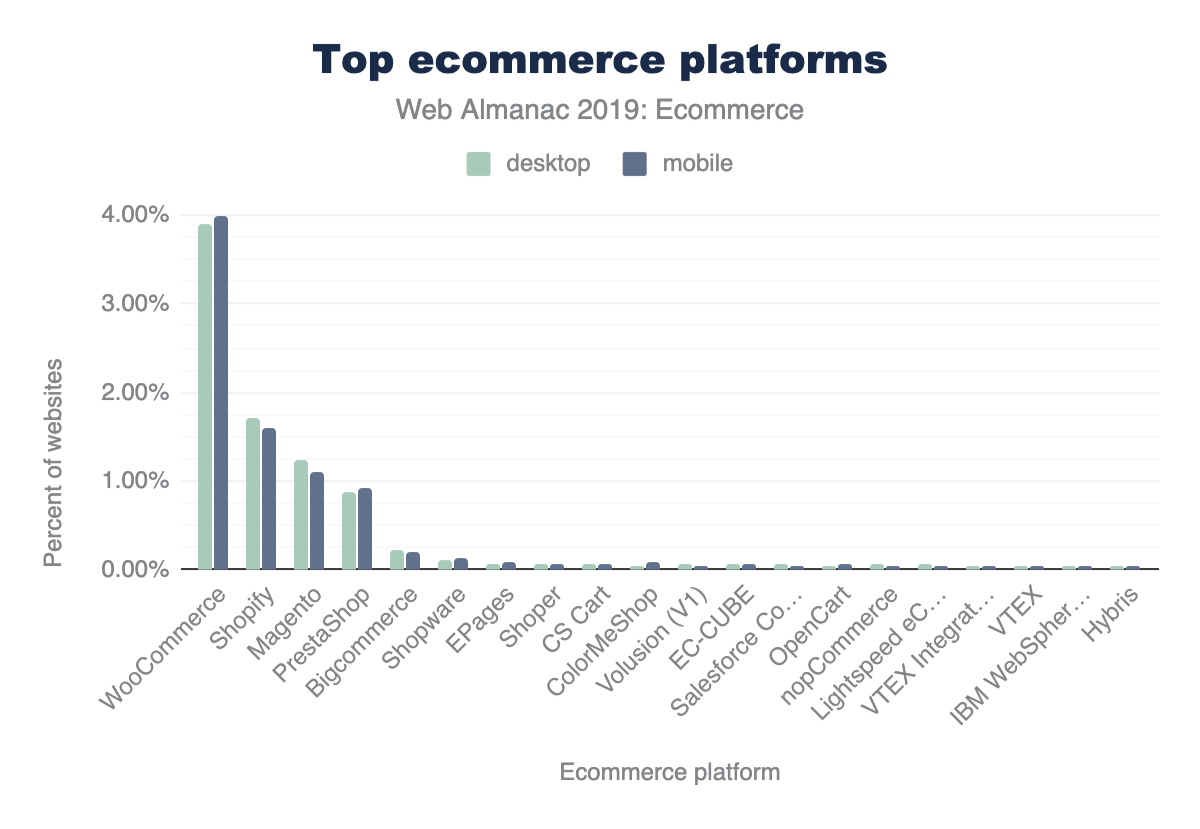
There are 110 ecommerce platforms that each have fewer than 0.1% of desktop or mobile websites. Around 60 of these have fewer than 0.01% of mobile or desktop websites.
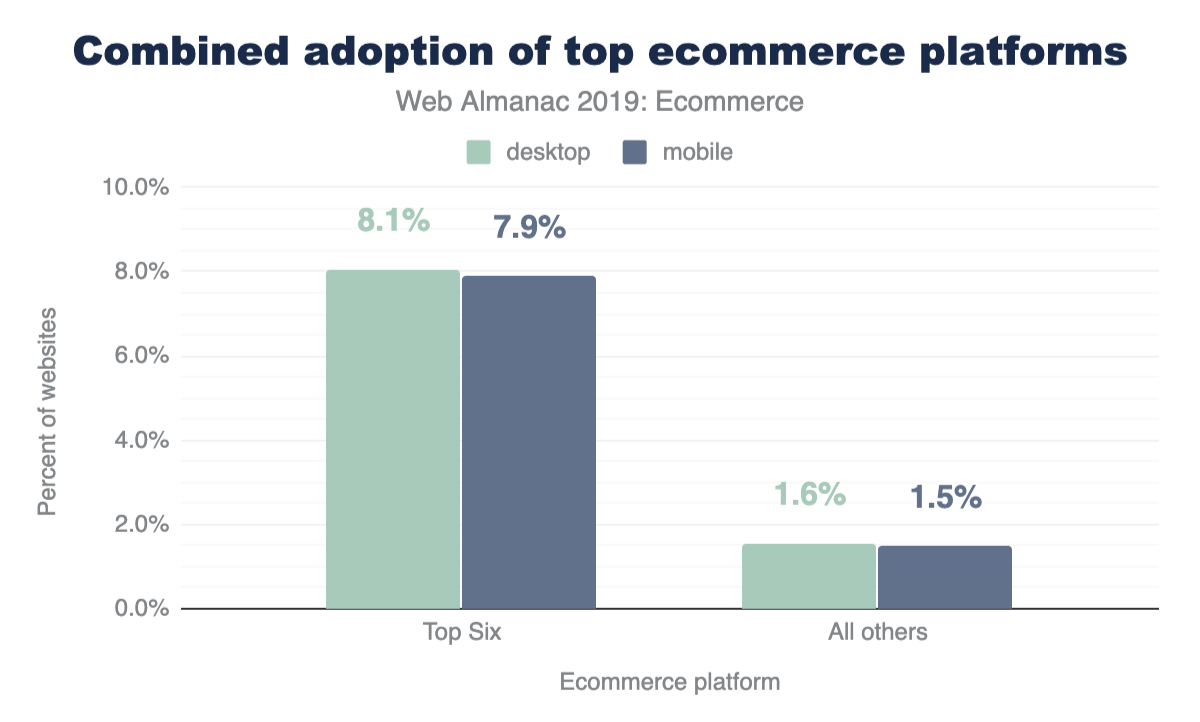
7.87% of all requests on mobile and 8.06% on desktop are for home pages on one of the top six ecommerce platforms. A further 1.52% of requests on mobile and 1.59% on desktop are for home pages on the 110 other ecommerce platforms.
Ecommerce (all platforms)
In total, 9.7% of desktop pages and 9.5% of mobile pages used an ecommerce platform.
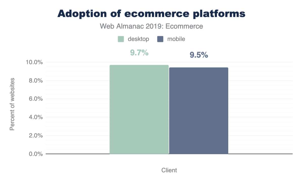
Although the desktop proportion of websites was slightly higher overall, some popular platforms (including WooCommerce, PrestaShop and Shopware) actually have more mobile than desktop websites.
Page weight and requests
The page weight of an ecommerce platform includes all HTML, CSS, JavaScript, JSON, XML, images, audio, and video.
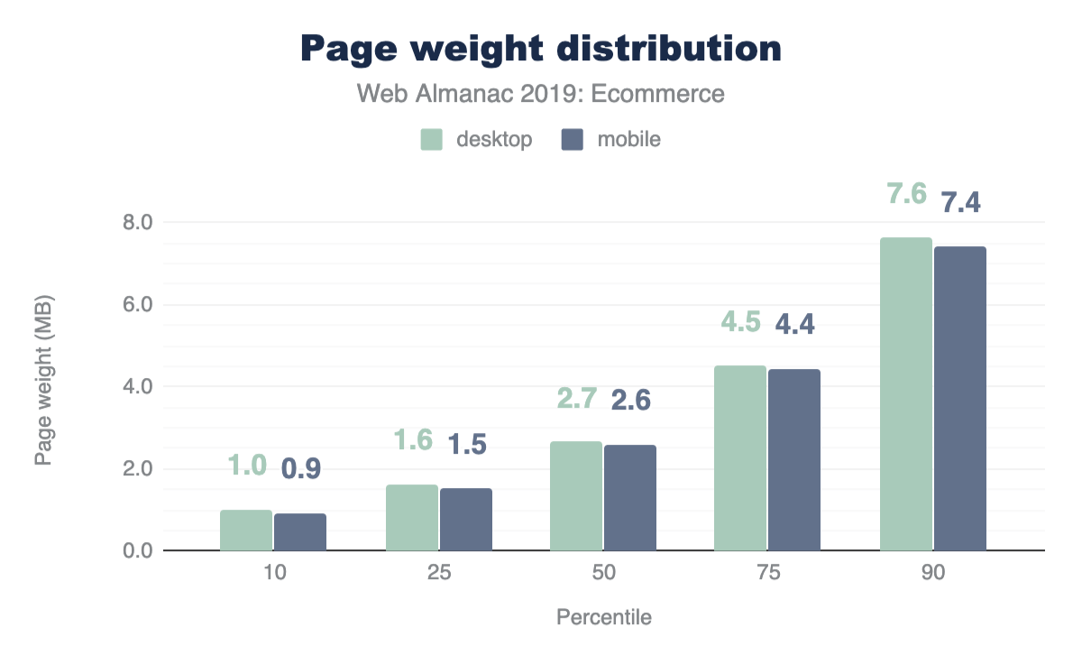
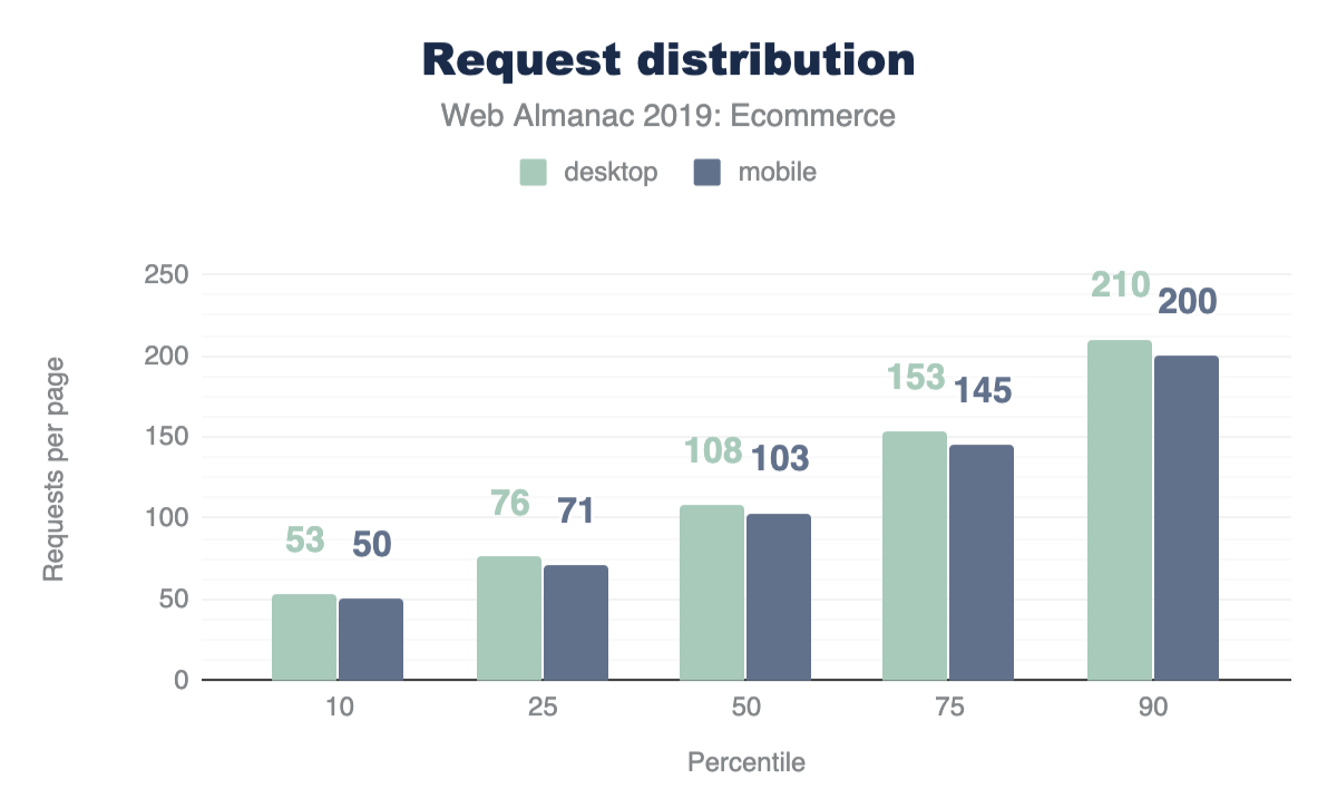
The median desktop ecommerce platform page loads 108 requests and 2.7 MB. The median weight for all desktop pages is 74 requests and 1.9 MB. In other words, ecommerce pages make nearly 50% more requests than other web pages, with payloads around 35% larger. By comparison, the amazon.comhttps://amazon.com home page makes around 300 requests on first load, for a page weight of around 5 MB, and ebay.comhttps://ebay.com makes around 150 requests for a page weight of approximately 3 MB. The page weight and number of requests for home pages on ecommerce platforms is slightly smaller on mobile at every percentile, but around 10% of all ecommerce home pages load more than 7 MB and make over 200 requests.
This data accounts for home page payload and requests without scrolling. Clearly there are a significant proportion of sites that appear to be retrieving more files (the median is over 100), with a larger total payload, than should be necessary for first load. See also: Third-party requests and bytes below.
We need to do further research to better understand why so many home pages on ecommerce platforms make so many requests and have such large payloads. The authors regularly see home pages on ecommerce platforms that make hundreds of requests on first load, with multi-megabyte payloads. If the number of requests and payload are a problem for performance, then how can they be reduced?
Requests and payload by type
The charts below are for desktop requests:
| Type | 10 | 25 | 50 | 75 | 90 |
|---|---|---|---|---|---|
| image | 353 | 728 | 1,514 | 3,104 | 6,010 |
| video | 156 | 453 | 1,325 | 2,935 | 5,965 |
| script | 199 | 330 | 572 | 915 | 1,331 |
| font | 47 | 85 | 144 | 226 | 339 |
| css | 36 | 59 | 102 | 180 | 306 |
| html | 12 | 20 | 36 | 66 | 119 |
| audio | 7 | 7 | 11 | 17 | 140 |
| xml | 0 | 0 | 0 | 1 | 3 |
| other | 0 | 0 | 0 | 0 | 3 |
| text | 0 | 0 | 0 | 0 | 0 |
Figure 13.9. Percentiles of the distribution of page weight (in KB) by resource type.
| Type | 10 | 25 | 50 | 75 | 90 |
|---|---|---|---|---|---|
| image | 16 | 25 | 39 | 62 | 97 |
| script | 11 | 21 | 35 | 53 | 75 |
| css | 3 | 6 | 11 | 22 | 32 |
| font | 2 | 3 | 5 | 8 | 11 |
| html | 1 | 2 | 4 | 7 | 12 |
| video | 1 | 1 | 2 | 5 | 9 |
| other | 1 | 1 | 2 | 4 | 9 |
| text | 1 | 1 | 1 | 2 | 3 |
| xml | 1 | 1 | 1 | 2 | 2 |
| audio | 1 | 1 | 1 | 1 | 3 |
Figure 13.10. Percentiles of the distribution of requests per page by resource type.
Images constitute the largest number of requests and the highest proportion of bytes for ecommerce pages. The median desktop ecommerce page includes 39 images weighing 1,514 KB (1.5 MB).
The number of JavaScript requests indicates that better bundling (and/or HTTP/2 multiplexing) could improve performance. JavaScript files are not significantly large in terms of total bytes, but many separate requests are made. According to the HTTP/2 chapter, more than 40% of requests are not via HTTP/2. Similarly, CSS files have the third highest number of requests but are generally small. Merging CSS files (and/or HTTP/2) could improve performance of such sites. In the authors’ experience, many ecommerce pages have a high proportion of unused CSS and JavaScript. Videos may require a small number of requests, but (not surprisingly) consume a high proportion of the page weight, particularly on sites with heavy payloads.
HTML payload size
Note that HTML payloads may include other code such as inline JSON, JavaScript, or CSS directly in the markup itself, rather than referenced as external links. The median HTML payload size for ecommerce pages is 34 KB on mobile and 36 KB on desktop. However, 10% of ecommerce pages have an HTML payload of more than 115 KB.
Mobile HTML payload sizes are not very different from desktop. In other words, it appears that sites are not delivering significantly different HTML files for different devices or viewport sizes. On many ecommerce sites, home page HTML payloads are large. We don’t know whether this is because of bloated HTML, or from other code (such as JSON) within HTML files.
Image stats
Figures 13.12 and 13.13 above show that the median ecommerce page has 37 images and an image payload of 1,517 KB on mobile, 40 images and 1,524 KB on desktop. 10% of home pages have 90 or more images and an image payload of nearly 6 MB!
A significant proportion of ecommerce pages have sizable image payloads and make a large number of image requests on first load. See HTTP Archive’s State of Imageshttps://httparchive.org/reports/state-of-images report and the media and page weight chapters for more context.
Website owners want their sites to look good on modern devices. As a result, many sites deliver the same high resolution product images to every user without regard for screen resolution or size. Developers may not be aware of (or not want to use) responsive techniques that enable efficient delivery of the best possible image to different users. It’s worth remembering that high-resolution images may not necessarily increase conversion rates. Conversely, overuse of heavy images is likely to impact page speed and can thereby reduce conversion rates. In the authors’ experience from site reviews and events, some developers and other stakeholders have SEO or other concerns about using lazy loading for images.
We need to do more analysis to better understand why some sites are not using responsive image techniques or lazy loading. We also need to provide guidance that helps ecommerce platforms to reliably deliver beautiful images to those with high end devices and good connectivity, while simultaneously providing a best-possible experience to lower-end devices and those with poor connectivity.
Popular image formats
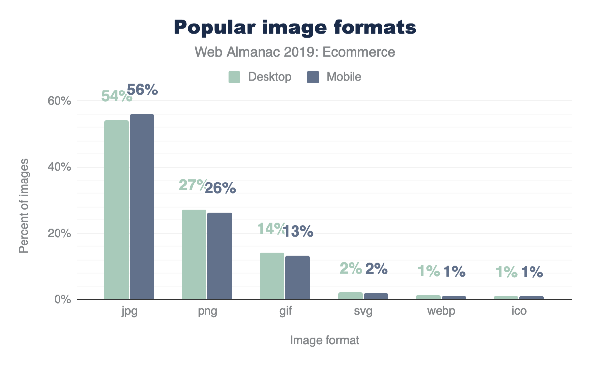
PNG
One in four images on ecommerce pages are PNG. The high number of PNG requests from pages on ecommerce platforms is probably for product images. Many commerce sites use PNG with photographic images to enable transparency.
Using WebP with a PNG fallback can be a far more efficient alternative, either via a picture elementhttp://simpl.info/picturetype or by using user agent capability detection via an image service such as Cloudinaryhttps://res.cloudinary.com/webdotdev/f_auto/w_500/IMG_20190113_113201.jpg.
WebP
Only 1% of images on ecommerce platforms are WebP, which tallies with the authors’ experience of site reviews and partner work. WebP is supported by all modern browsers other than Safarihttps://caniuse.com/#feat=webp and has good fallback mechanisms available. WebP supports transparency and is a far more efficient format than PNG for photographic images (see PNG section above).
We as a web community can provide better guidance/advocacy for enabling transparency using WebP with a PNG fallback and/or using WebP/JPEG with a solid color background. WebP appears to be rarely used on ecommerce platforms, despite the availability of guideshttps://web.dev/serve-images-webp and tools (e.g. Squooshhttps://squoosh.app/ and cwebphttps://developers.google.com/speed/webp/docs/cwebp). We need to do further research into why there hasn’t been more take-up of WebP, which is now nearly 10 years oldhttps://blog.chromium.org/2010/09/webp-new-image-format-for-web.html.
Image dimensions
| Mobile | Desktop | |||
|---|---|---|---|---|
| Percentile | Width (px) | Height (px) | Width (px) | Height (px) |
| 10 | 16 | 16 | 16 | 16 |
| 25 | 100 | 64 | 100 | 60 |
| 50 | 247 | 196 | 240 | 192 |
| 75 | 364 | 320 | 400 | 331 |
| 90 | 693 | 512 | 800 | 546 |
Figure 13.16. Distribution of intrinsic image dimensions (in pixels) per ecommerce page.
The median (’mid-range’) dimensions for images requested by ecommerce pages is 247x196 px on mobile and 240x192 px on desktop. 10% of images requested by ecommerce pages are at least 693x512 px on mobile and 800x546 px on desktop. Note that these dimensions are the intrinsic sizes of images, not their display size.
Given that image dimensions at each percentile up to the median are similar on mobile and desktop, or even slightly larger on mobile in some cases, it would seem that many sites are not delivering different image dimensions for different viewports, or in other words, not using responsive image techniques. The delivery of larger images to mobile in some cases may (or may not!) be explained by sites using device or screen detection.
We need to do more research into why many sites are (apparently) not delivering different image sizes to different viewports.
Third-party requests and bytes
Many websites—especially online stores—load a significant amount of code and content from third-parties: for analytics, A/B testing, customer behavior tracking, advertising, and social media support. Third-party content can have a significant impact on performancehttps://developers.google.com/web/fundamentals/performance/optimizing-content-efficiency/loading-third-party-javascript. Patrick Hulcehttps://x.com/patrickhulce’s third-party-web toolhttps://github.com/patrickhulce/third-party-web is used to determine third-party requests for this report, and this is discussed more in the Third Parties chapter.
The median (’mid-range’) home page on an ecommerce platform makes 17 requests for third-party content on mobile and 19 on desktop. 10% of all home pages on ecommerce platforms make over 50 requests for third-party content, with a total payload of over 1 MB.
Other studieshttps://developers.google.com/web/fundamentals/performance/optimizing-content-efficiency/loading-third-party-javascript/ have indicated that third-party content can be a major performance bottleneck. This study shows that 17 or more requests (50 or more for the top 10%) is the norm for ecommerce pages.
Third-party requests and payload per platform
Note the charts and tables below show data for mobile only.
Platforms such as Shopify may extend their services using client-side JavaScript, whereas other platforms such as Magento use more server side extensions. This difference in architecture affects the figures seen here.
Clearly, pages on some ecommerce platforms make more requests for third-party content and incur a larger payload of third-party content. Further analysis could be done on why pages from some platforms make more requests and have larger third-party payloads than others.
First Contentful Paint (FCP)
First Contentful Paint measures the time it takes from navigation until content such as text or an image is first displayed. In this context, fast means FCP in under one second, slow means FCP in 3 seconds or more, and moderate is everything in between. Note that third-party content and code may have a significant impact on FCP.
All top-six ecommerce platforms have worse FCP on mobile than desktop: less fast and more slow. Note that FCP is affected by device capability (processing power, memory, etc.) as well as connectivity.
We need to establish why FCP is worse on mobile than desktop. What are the causes: connectivity and/or device capability, or something else?
Progressive Web App (PWA) scores
See also the PWA chapter for more information on this topic beyond just ecommerce sites.
More than 60% of home pages on ecommerce platforms get a Lighthouse PWA scorehttps://developers.google.com/web/ilt/pwa/lighthouse-pwa-analysis-tool between 0.25 and 0.35. Less than 20% of home pages on ecommerce platforms get a score of more than 0.5 and less than 1% of home pages score more than 0.6.
Lighthouse returns a Progressive Web App (PWA) score between 0 and 1. 0 is the worst possible score, and 1 is the best. The PWA audits are based on the Baseline PWA Checklisthttps://developers.google.com/web/progressive-web-apps/checklist, which lists 14 requirements. Lighthouse has automated audits for 11 of the 14 requirements. The remaining 3 can only be tested manually. Each of the 11 automated PWA audits are weighted equally, so each one contributes approximately 9 points to your PWA score.
If at least one of the PWA audits got a null score, Lighthouse nulls out the score for the entire PWA category. This was the case for 2.32% of mobile pages.
Clearly, the majority of ecommerce pages are failing most PWA checklist auditshttps://developers.google.com/web/progressive-web-apps/checklist. We need to do further analysis to better understand which audits are failing and why.
Conclusion
This comprehensive study of ecommerce usage shows some interesting data and also the wide variations in ecommerce sites, even among those built on the same ecommerce platform. Even though we have gone into a lot of detail here, there is much more analysis we could do in this space. For example, we didn’t get accessibility scores this year (checkout the accessibility chapter for more on that). Likewise, it would be interesting to segment these metrics by geography. This study detected 246 ad providers on home pages on ecommerce platforms. Further studies (perhaps in next year’s Web Almanac?) could calculate what proportion of sites on ecommerce platforms shows ads. WooCommerce got very high numbers in this study so another interesting statistic we could look at next year is if some hosting providers are installing WooCommerce but not enabling it, thereby causing inflated figures.
Authors
-
Sam DuttonSam Dutton has worked with the Google Chrome team as a Developer Advocate since 2011. He has organized and presented at a number of events, created and taught several web development courses, and worked on a range of videos, codelabs and written guidance covering PWA, performance, media, image and ‘Next Billion Users’ initiatives. He maintains simpl.infohttps://simpl.info, which provides simplest possible examples of HTML, CSS and JavaScript. Sam grew up in South Australia, went to university in Sydney, and has lived since 1986 in London.
-
Alan KentAlan Kent is a Developer Advocate at Google focusing on e-commerce and content ecosystems. He blogs at alankent.mehttps://alankent.me and tweets as @akent99.


CMS

Introduction
The general term Content Management System (CMS) refers to systems enabling individuals and organizations to create, manage, and publish content. A CMS for web content, specifically, is a system aimed at creating, managing, and publishing content to be consumed and experienced via the open web.
Each CMS implements some subset of a wide range of content management capabilities and the corresponding mechanisms for users to build websites easily and effectively around their content. Such content is often stored in some type of database, providing users with the flexibility to reuse it wherever needed for their content strategy. CMSs also provide admin capabilities aimed at making it easy for users to upload and manage content as needed.
There is great variability on the type and scope of the support CMSs provide for building sites; some provide ready-to-use templates which are “hydrated” with user content, and others require much more user involvement for designing and constructing the site structure.
When we think about CMSs, we need to account for all the components that play a role in the viability of such a system for providing a platform for publishing content on the web. All of these components form an ecosystem surrounding the CMS platform, and they include hosting providers, extension developers, development agencies, site builders, etc. Thus, when we talk about a CMS, we usually refer to both the platform itself and its surrounding ecosystem.
Why do content creators use a CMS?
At the beginning of (web evolution) time, the web ecosystem was powered by a simple growth loop, where users could become creators just by viewing the source of a web page, copy-pasting according to their needs, and tailoring the new version with individual elements like images.
As the web evolved, it became more powerful, but also more complicated. As a consequence, that simple growth loop was broken and it was not the case anymore that any user could become a creator. For those who could pursue the content creation path, the road became arduous and hard to achieve. The usage-capability gaphttps://medinathoughts.com/2018/05/17/progressive-wordpress/, that is, the difference between what can be done in the web and what is actually done, grew steadily.
Here is where a CMS plays the very important role of making it easy for users with different degrees of technical expertise to enter the web ecosystem loop as content creators. By lowering the barrier of entry for content creation, CMSs activate the growth loop of the web by turning users into creators. Hence their popularity.
The goal of this chapter
There are many interesting and important aspects to analyze and questions to answer in our quest to understand the CMS space and its role in the present and the future of the web. While we acknowledge the vastness and complexity of the CMS platforms space, and don’t claim omniscient knowledge fully covering all aspects involved on all platforms out there, we do claim our fascination for this space and we bring deep expertise on some of the major players in the space.
In this chapter, we seek to scratch the surface area of the vast CMS space, trying to shed a beam of light on our collective understanding of the status quo of CMS ecosystems, and the role they play in shaping users’ perception of how content can be consumed and experienced on the web. Our goal is not to provide an exhaustive view of the CMS landscape; instead, we will discuss a few aspects related to the CMS landscape in general, and the characteristics of web pages generated by these systems. This first edition of the Web Almanac establishes a baseline, and in the future we’ll have the benefit of comparing data against this version for trend analysis.
CMS adoption
Today, we can observe that more than 40% of the web pages are powered by some CMS platform; 40.01% for mobile and 39.61% for desktop more precisely.
There are other datasets tracking market share of CMS platforms, such as W3Techshttps://w3techs.com/technologies/history_overview/content_management, and they reflect higher percentages of more than 50% of web pages powered by CMS platforms. Furthermore, they observe also that CMS platforms are growing, as fast as 12% year-over-year growth in some cases! The deviation between our analysis and W3Tech’s analysis could be explained by a difference in research methodologies. You can read more about ours on the Methodology page.
In essence, this means that there are many CMS platforms available out there. The following picture shows a reduced view of the CMS landscape.

Some of them are open source (e.g. WordPress, Drupal, others) and some of them are proprietary (e.g. AEM, others). Some CMS platforms can be used on “free” hosted or self-hosted plans, and there are also advanced options for using these platforms on higher-tiered plans even at the enterprise level. The CMS space as a whole is a complex, federated universe of CMS ecosystems, all separated and at the same time intertwined in the vast fabric of the web.
It also means that there are hundreds of millions of websites powered by CMS platforms, and an order of magnitude more of users accessing the web and consuming content through these platforms. Thus, these platforms play a key role for us to succeed in our collective quest for an evergreen, healthy, and vibrant web.
The CMS landscape
A large swath of the web today is powered by one kind of CMS platform or another. There are statistics collected by different organizations that reflect this reality. Looking at the Chrome UX Report (CrUX) and HTTP Archive datasets, we get a picture that is consistent with stats published elsewhere, although quantitatively the proportions described may be different as a reflection of the specificity of the datasets.
Looking at web pages served on desktop and mobile devices, we observe an approximate 60-40 split in the percentage of such pages which were generated by some kind of CMS platform, and those that aren’t.
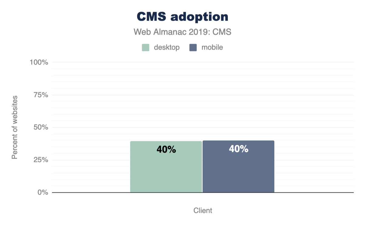
CMS-powered web pages are generated by a large set of available CMS platforms. There are many such platforms to choose from, and many factors that can be considered when deciding to use one vs. another, including things like:
- Core functionality
- Creation/editing workflows and experience
- Barrier of entry
- Customizability
- Community
- And many others.
The CrUX and HTTP Archive datasets contain web pages powered by a mix of around 103 CMS platforms. Most of those platforms are very small in terms of relative market share. For the sake of our analysis, we will be focusing on the top CMS platforms in terms of their footprint on the web as reflected by the data. For a full analysis, see this chapter’s results spreadsheethttps://docs.google.com/spreadsheets/d/1FDYe6QdoY3UtXodE2estTdwMsTG-hHNrOe9wEYLlwAw/edit#gid=0.
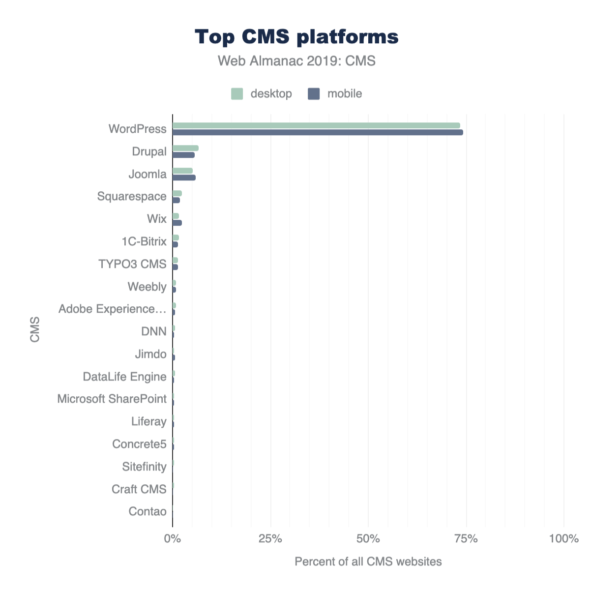
The most salient CMS platforms present in the datasets are shown above in Figure 14.5. WordPress comprises 74.19% of mobile and 73.47% of desktop CMS websites. Its dominance in the CMS landscape can be attributed to a number of factors that we’ll discuss later, but it’s a major player. Open source platforms like Drupal and Joomla, and closed SaaS offerings like Squarespace and Wix, round out the top 5 CMSs. The diversity of these platforms speak to the CMS ecosystem consisting of many platforms where user demographics and the website creation journey vary. What’s also interesting is the long tail of small scale CMS platforms in the top 20. From enterprise offerings to proprietary applications developed in-house for industry specific use, content management systems provide the customizable infrastructure for groups to manage, publish, and do business on the web.
The WordPress projecthttps://wordpress.org/about/ defines its mission as “democratizing publishing”. Some of its main goals are ease of use and to make the software free and available for everyone to create content on the web. Another big component is the inclusive community the project fosters. In almost any major city in the world, one can find a group of people who gather regularly to connect, share, and code in an effort to understand and build on the WordPress platform. Attending local meetups and annual events as well as participating in web-based channels are some of the ways WordPress contributors, experts, businesses, and enthusiasts participate in its global community.
The low barrier of entry and resources to support users (online and in-person) with publishing on the platform and to develop extensions (plugins) and themes contribute to its popularity. There is also a thriving availability of and economy around WordPress plugins and themes that reduce the complexity of implementing sought after web design and functionality. Not only do these aspects drive its reach and adoption by newcomers, but also maintains its long-standing use over time.
The open source WordPress platform is powered and supported by volunteers, the WordPress Foundation, and major players in the web ecosystem. With these factors in mind, WordPress as the leading CMS makes sense.
How are CMS-powered sites built
Independent of the specific nuances and idiosyncrasies of different CMS platforms, the end goal for all of them is to output web pages to be served to users via the vast reach of the open web. The difference between CMS-powered and non-CMS-powered web pages is that in the former, the CMS platform makes most of the decisions of how the end result is built, while in the latter there are not such layers of abstraction and decisions are all made by developers either directly or via library configurations.
In this section we take a brief look at the status quo of the CMS space in terms of the characteristics of their output (e.g. total resources used, image statistics, etc.), and how they compare with the web ecosystem as a whole.
Total resource usage
The building blocks of any website also make a CMS website: HTML, CSS, JavaScript, and media (images and video). CMS platforms give users powerfully streamlined administrative capabilities to integrate these resources to create web experiences. While this is one of the most inclusive aspects of these applications, it could have some adverse effects on the wider web.
In Figures 14.6 and 14.7 above, we see the median desktop CMS page loads 86 resources and weighs 2.29 MB. Mobile page resource usage is not too far behind with 83 resources and 2.25 MB.
The median indicates the halfway point that all CMS pages either fall above or below. In short, half of all CMS pages load fewer requests and weigh less, while half load more requests and weigh more. At the 10th percentile, mobile and desktop pages have under 40 requests and 1 MB in weight, but at the 90th percentile we see pages with over 170 requests and at 7 MB, almost tripling in weight from the median.
How do CMS pages compare to pages on the web as a whole? In the Page Weight chapter, we find some telling data about resource usage. At the median, desktop pages load 74 requests and weigh 1.9 MB, and mobile pages on the web load 69 requests and weigh 1.7 MB. The median CMS page exceeds this. CMS pages also exceed resources on the web at the 90th percentile, but by a smaller margin. In short: CMS pages could be considered as some of the heaviest.
| percentile | image | video | script | font | css | audio | html |
|---|---|---|---|---|---|---|---|
| 50 | 1,233 | 1,342 | 456 | 140 | 93 | 14 | 33 |
| 75 | 2,766 | 2,735 | 784 | 223 | 174 | 97 | 66 |
| 90 | 5,699 | 5,098 | 1,199 | 342 | 310 | 287 | 120 |
Figure 14.8. Distribution of desktop CMS page kilobytes per resource type.
| percentile | image | video | script | css | font | audio | html |
|---|---|---|---|---|---|---|---|
| 50 | 1,264 | 1,056 | 438 | 89 | 109 | 14 | 32 |
| 75 | 2,812 | 2,191 | 756 | 171 | 177 | 38 | 67 |
| 90 | 5,531 | 4,593 | 1,178 | 317 | 286 | 473 | 123 |
Figure 14.9. Distribution of mobile CMS page kilobytes per resource type.
When we look closer at the types of resources that load on mobile or desktop CMS pages, images and video immediately stand out as primary contributors to their weight.
The impact doesn’t necessarily correlate with the number of requests, but rather how much data is associated with those individual requests. For example, in the case of video resources with only two requests made at the median, they carry more than 1 MB of associated load. Multimedia experiences also come with the use of scripts to integrate interactivity, deliver functionality and data to name a few use cases. In both mobile and desktop pages, those are the 3rd heaviest resource.
With our CMS experiences saturated with these resources, we must consider the impact this has on website visitors on the frontend- is their experience fast or slow? Additionally, when comparing mobile and desktop resource usage, the amount of requests and weight show little difference. This means that the same amount and weight of resources are powering both mobile and desktop CMS experiences. Variation in connection speed and mobile device quality adds another layer of complexityhttps://medinathoughts.com/2017/12/03/the-perils-of-mobile-web-performance-part-iii/. Later in this chapter, we’ll use data from CrUX to assess user experience in the CMS space.
Third-party resources
Let’s highlight a particular subset of resources to assess their impact in the CMS landscape. Third-party resources are those from origins not belonging to the destination site’s domain name or servers. They can be images, videos, scripts, or other resource types. Sometimes these resources are packaged in combination such as with embedding an iframe for example. Our data reveals that the median amount of 3rd party resources for both desktop and mobile are close.
The median amount of 3rd party requests on mobile CMS pages is 15 and weigh 264.72 KB, while the median for these requests on desktop CMS pages is 16 and weigh 271.56 KB. (Note that this excludes 3P resources considered part of “hosting”).
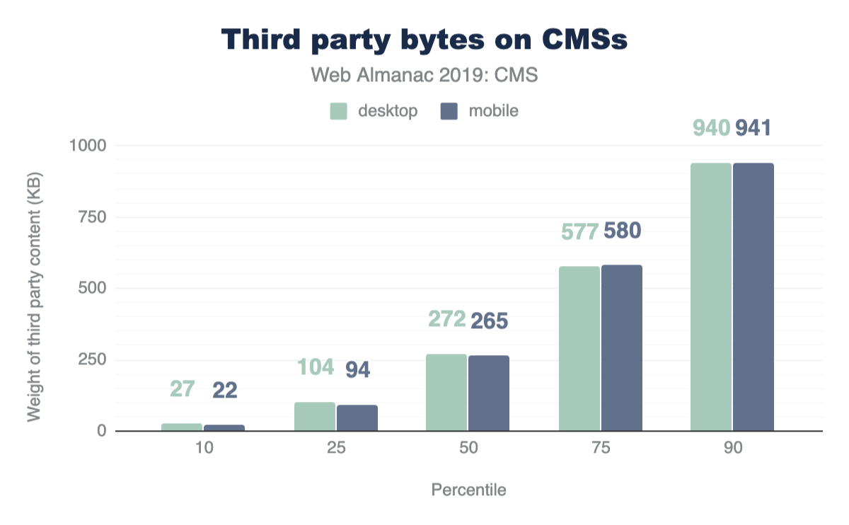
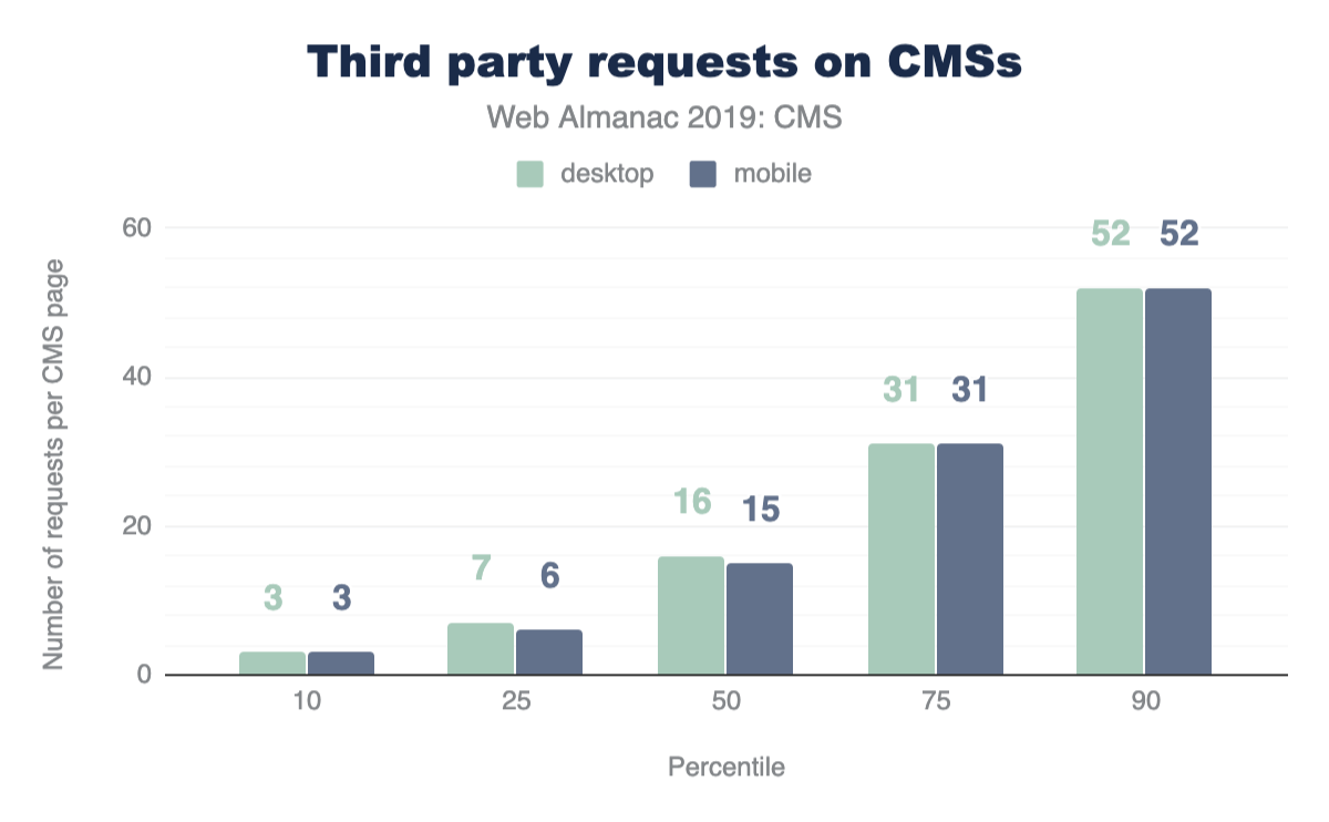
We know the median value indicates at least half of CMS web pages are shipping with more 3rd party resources than what we report here. At the 90th percentile, CMS pages can deliver up to 52 resources at approximately 940 KB, a considerable increase.
Given that third-party resources originate from remote domains and servers, the destination site has little control over the quality and impact these resources have on its performance. This unpredictability could lead to fluctuations in speed and affect the user experience, which we’ll soon explore.
Image stats
Recall from Figures 14.8 and 14.9 earlier, images are a big contributor to the total weight of CMS pages. Figures 14.12 and 14.13 above show that the median desktop CMS page has 31 images and payload of 1,232 KB, while the median mobile CMS page has 29 images and payload of 1,263 KB. Again we have very close margins for the weight of these resources for both desktop and mobile experiences. The Page Weight chapter additionally shows that image resources well exceed the median weight of pages with the same amount of images on the web as a whole, which is 983 KB and 893 KB for desktop and mobile respectively. The verdict: CMS pages ship heavy images.
Which are the common formats found on mobile and desktop CMS pages? From our data JPG images on average are the most popular image format. PNG and GIF formats follow, while formats like SVG, ICO, and WebP trail significantly comprising approximately a little over 2% and 1%.
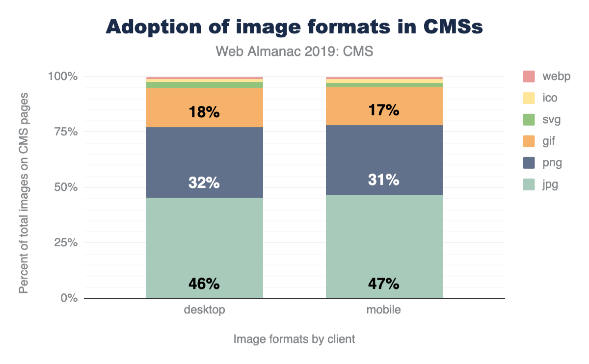
Perhaps this segmentation isn’t surprising given the common use cases for these image types. SVGs for logos and icons are common as are JPEGs ubiquitous. WebP is still a relatively new optimized format with growing browser adoptionhttps://caniuse.com/#search=webp. It will be interesting to see how this impacts its use in the CMS space in the years to come.
User experience on CMS-powered websites
Success as a web content creator is all about user experience. Factors such as resource usage and other statistics regarding how web pages are composed are important indicators of the quality of a given site in terms of the best practices followed while building it. However, we are ultimately interested in shedding some light on how are users actually experiencing the web when consuming and engaging with content generated by these platforms.
To achieve this, we turn our analysis towards some user-perceived performance metricshttps://developers.google.com/web/fundamentals/performance/user-centric-performance-metrics, which are captured in the CrUX dataset. These metrics relate in some ways to how we, as humans, perceive timehttps://paulbakaus.com/tutorials/performance/the-illusion-of-speed/.
| Duration | Perception |
|---|---|
| < 0.1 seconds | Instant |
| 0.5-1 second | Immediate |
| 2-5 seconds | Point of abandonment |
Figure 14.15. How humans perceive short durations of time.
If things happen within 0.1 seconds (100 milliseconds), for all of us they are happening virtually instantly. And when things take longer than a few seconds, the likelihood we go on with our lives without waiting any longer is very high. This is very important for content creators seeking sustainable success in the web, because it tells us how fast our sites must load if we want to acquire, engage, and retain our user base.
In this section we take a look at three important dimensions which can shed light on our understanding of how users are experiencing CMS-powered web pages in the wild:
- First Contentful Paint (FCP)
- First Input Delay (FID)
- Lighthouse scores
First Contentful Paint
First Contentful Painthttps://developers.google.com/web/tools/lighthouse/audits/first-contentful-paint measures the time it takes from navigation until content such as text or an image is first displayed. A successful FCP experience, or one that can be qualified as “fast,” entails how quickly elements in the DOM are loaded to assure the user that the website is loading successfully. Although a good FCP score is not a guarantee that the corresponding site offers a good UX, a bad FCP almost certainly does guarantee the opposite.
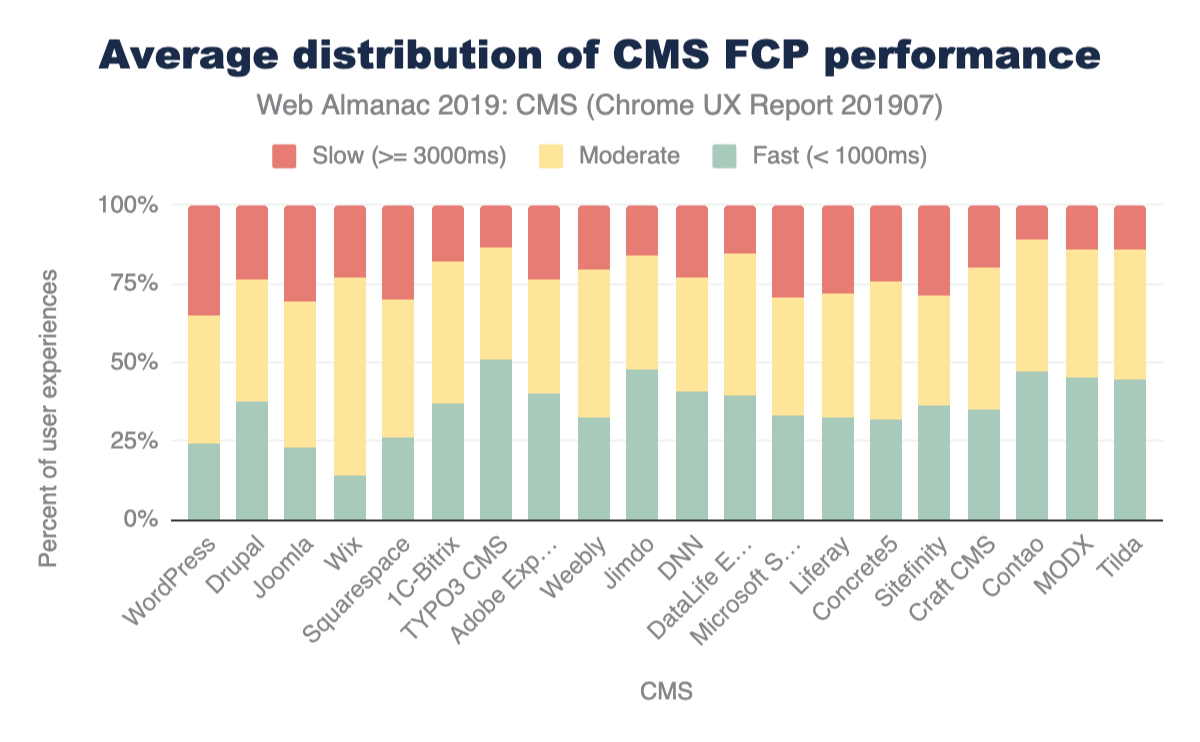
| CMS | Fast (< 1000ms) |
Moderate | Slow (>= 3000ms) |
|---|---|---|---|
| WordPress | 24.33% | 40.24% | 35.42% |
| Drupal | 37.25% | 39.39% | 23.35% |
| Joomla | 22.66% | 46.48% | 30.86% |
| Wix | 14.25% | 62.84% | 22.91% |
| Squarespace | 26.23% | 43.79% | 29.98% |
Figure 14.17. Average distribution of FCP experiences for the top 5 CMSs.
FCP in the CMS landscape trends mostly in the moderate range. The need for CMS platforms to query content from a database, send, and subsequently render it in the browser, could be a contributing factor to the delay that users experience. The resource loads we discussed in the previous sections could also play a role. In addition, some of these instances are on shared hosting or in environments that may not be optimized for performance, which could also impact the experience in the browser.
WordPress shows notably moderate and slow FCP experiences on mobile and desktop. Wix sits strongly in moderate FCP experiences on its closed platform. TYPO3, an enterprise open-source CMS platform, has consistently fast experiences on both mobile and desktop. TYPO3 advertises built-in performance and scalability features that may have a positive impact for website visitors on the frontend.
First Input Delay
First Input Delayhttps://developers.google.com/web/updates/2018/05/first-input-delay (FID) measures the time from when a user first interacts with your site (i.e. when they click a link, tap on a button, or use a custom, JavaScript-powered control) to the time when the browser is actually able to respond to that interaction. A “fast” FID from a user’s perspective would be immediate feedback from their actions on a site rather than a stalled experience. This delay (a pain point) could correlate with interference from other aspects of the site loading when the user tries to interact with the site.
FID in the CMS space generally trends on fast experiences for both desktop and mobile on average. However, what’s notable is the significant difference between mobile and desktop experiences.
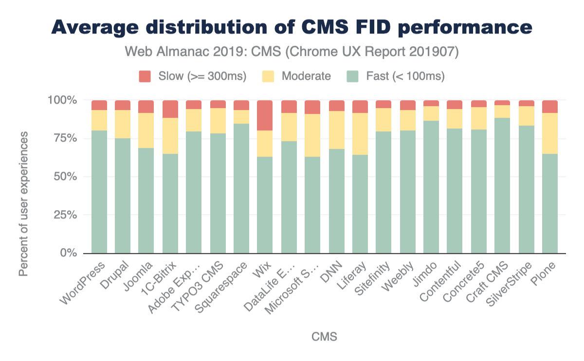
| CMS | Fast (< 100ms) |
Moderate | Slow (>= 300ms) |
|---|---|---|---|
| WordPress | 80.25% | 13.55% | 6.20% |
| Drupal | 74.88% | 18.64% | 6.48% |
| Joomla | 68.82% | 22.61% | 8.57% |
| Squarespace | 84.55% | 9.13% | 6.31% |
| Wix | 63.06% | 16.99% | 19.95% |
Figure 14.19. Average distribution of FID experiences for the top 5 CMSs.
While this difference is present in FCP data, FID sees bigger gaps in performance. For example, the difference between mobile and desktop fast FCP experiences for Joomla is around 12.78%, for FID experiences the difference is significant: 27.76%. Mobile device and connection quality could play a role in the performance gaps that we see here. As we highlighted previously, there is a small margin of difference between the resources shipped to desktop and mobile versions of a website. Optimizing for the mobile (interactive) experience becomes more apparent with these results.
Lighthouse scores
Lighthouse is an open-source, automated tool designed to help developers assess and improve the quality of their websites. One key aspect of the tool is that it provides a set of audits to assess the status of a website in terms of performance, accessibility, progressive web apps, and more. For the purposes of this chapter, we are interested in two specific audits categories: PWA and accessibility.
PWA
The term Progressive Web App (PWA) refers to web-based user experiences that are considered as being reliablehttps://developers.google.com/web/progressive-web-apps#reliable, fasthttps://developers.google.com/web/progressive-web-apps#fast, and engaginghttps://developers.google.com/web/progressive-web-apps#engaging. Lighthouse provides a set of audits which returns a PWA score between 0 (worst) and 1 (best). These audits are based on the Baseline PWA Checklisthttps://developers.google.com/web/progressive-web-apps/checklist#baseline, which lists 14 requirements. Lighthouse has automated audits for 11 of the 14 requirements. The remaining 3 can only be tested manually. Each of the 11 automated PWA audits are weighted equally, so each one contributes approximately 9 points to your PWA score.
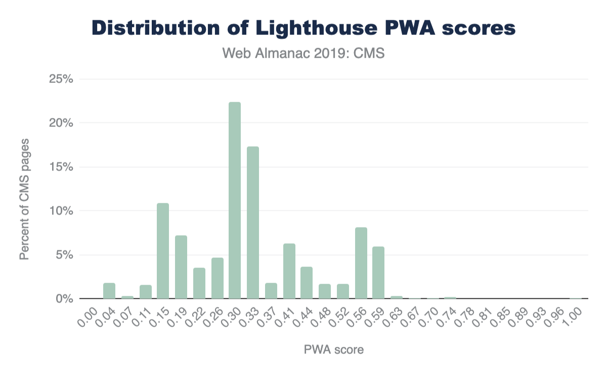
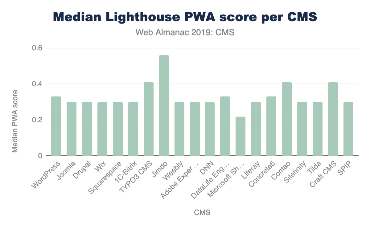
Accessibility
An accessible website is a site designed and developed so that people with disabilities can use them. Lighthouse provides a set of accessibility audits and it returns a weighted average of all of them (see Scoring Detailshttps://docs.google.com/spreadsheets/d/1Cxzhy5ecqJCucdf1M0iOzM8mIxNc7mmx107o5nj38Eo/edit#gid=1567011065 for a full list of how each audit is weighted).
Each accessibility audit is pass or fail, but unlike other Lighthouse audits, a page doesn’t get points for partially passing an accessibility audit. For example, if some elements have screenreader-friendly names, but others don’t, that page gets a 0 for the screenreader-friendly-names audit.
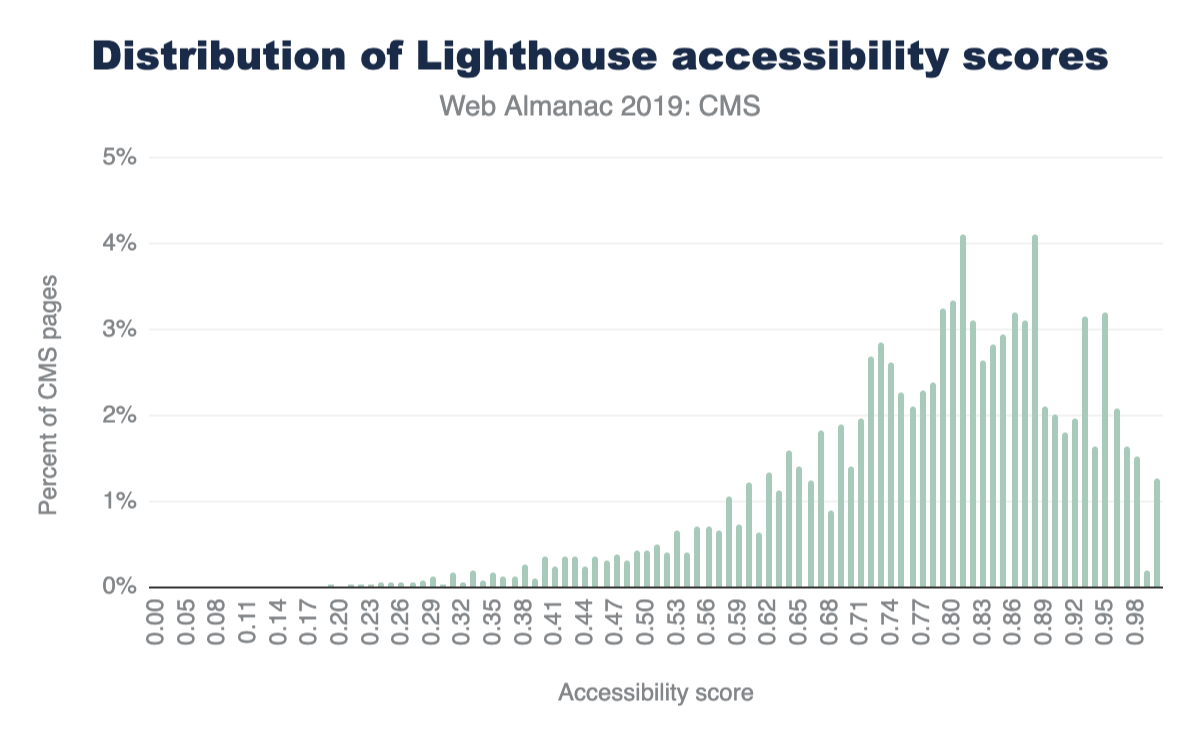
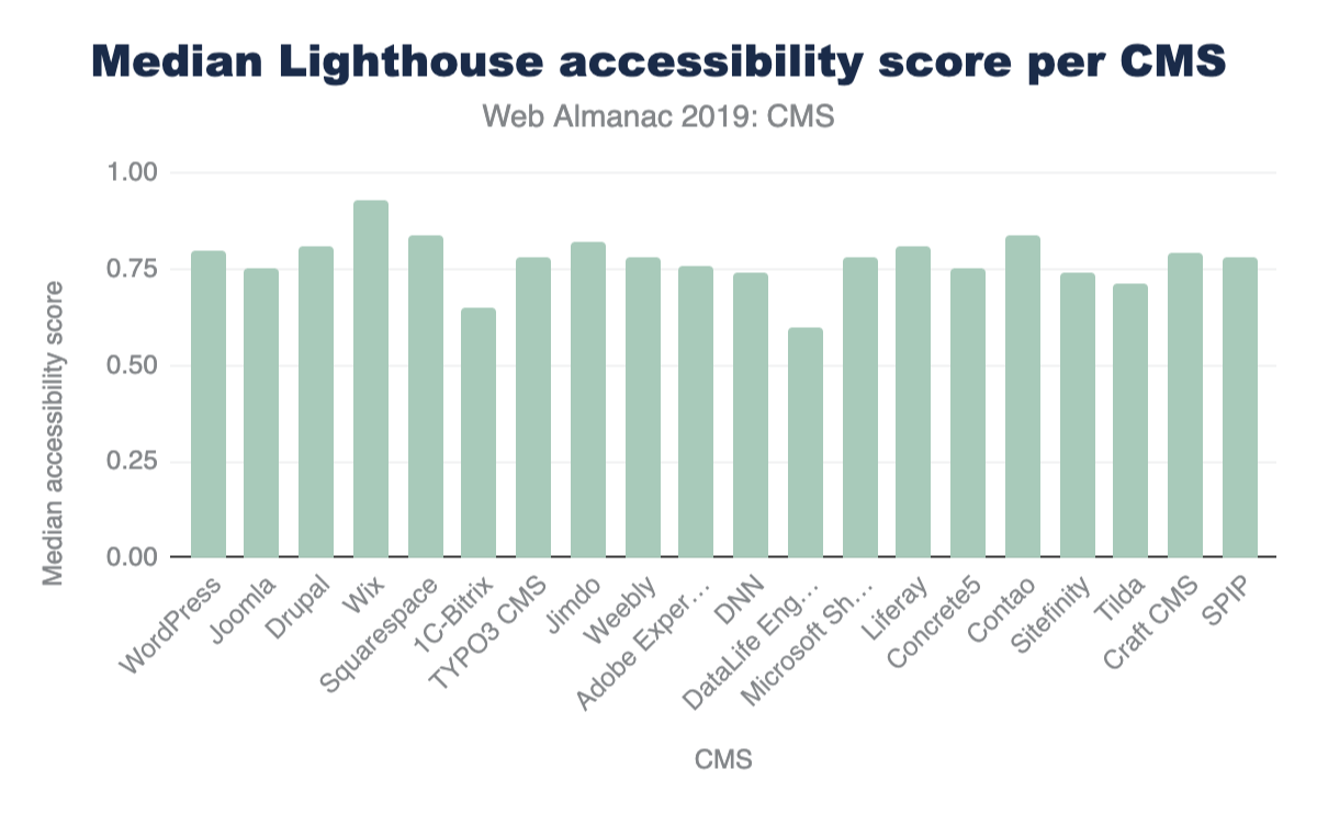
As it stands now, only 1.27% of mobile CMS home pages get a perfect score of 100%. Of the top CMSs, Wix takes the lead by having the highest median accessibility score on its mobile pages. Overall, these figures are dismal when you consider how many websites (how much of the web that is powered by CMSs) are inaccessible to a significant segment of our population. As much as digital experiences impact so many aspects of our lives, this should be a mandate to encourage us to build accessible web experiences from the start, and to continue the work of making the web an inclusive space.
CMS innovation
While we’ve taken a snapshot of the current landscape of the CMS ecosystem, the space is evolving. In efforts to address performance and user experience shortcomings, we’re seeing experimental frameworks being integrated with the CMS infrastructure in both coupled and decoupled/ headless instances. Libraries and frameworks such as React.js, its derivatives like Gatsby.js and Next.js, and Vue.js derivative Nuxt.js are making slight marks of adoption.
| CMS | React | Nuxt.js, React |
Nuxt.js | Next.js, React |
Gatsby, React |
|---|---|---|---|---|---|
| WordPress | 131,507 | 21 | 18 | ||
| Wix | 50,247 | ||||
| Joomla | 3,457 | ||||
| Drupal | 2,940 | 8 | 15 | 1 | |
| DataLife Engine | 1,137 | ||||
| Adobe Experience Manager | 723 | 7 | |||
| Contentful | 492 | 7 | 114 | 909 | 394 |
| Squarespace | 385 | ||||
| 1C-Bitrix | 340 | ||||
| TYPO3 CMS | 265 | 1 | |||
| Weebly | 263 | 1 | |||
| Jimdo | 248 | 2 | |||
| PrestaShop | 223 | 1 | |||
| SDL Tridion | 152 | ||||
| Craft CMS | 123 |
Figure 14.24. Adoption (number of mobile websites) of React and companion frameworks per CMS.
We also see hosting providers and agencies offering Digital Experience Platforms (DXP) as holistic solutions using CMSs and other integrated technologies as a toolbox for enterprise customer-focused strategies. These innovations show an effort to create turn-key, CMS-based solutions that make it possible, simple, and easy by default for the users (and their end users) to get the best UX when creating and consuming the content of these platforms. The aim: good performance by default, feature richness, and excellent hosting environments.
Conclusions
The CMS space is of paramount importance. The large portion of the web these applications power and the critical mass of users both creating and encountering its pages on a variety of devices and connections should not be trivialized. We hope this chapter and the others found here in the Web Almanac inspire more research and innovation to help make the space better. Deep investigations would provide us better context about the strengths, weaknesses, and opportunities these platforms provide the web as a whole. Content management systems can make an impact on preserving the integrity of the open web. Let’s keep moving them forward!
Authors
-
Renee JohnsonRenee Johnson is a web and product consultant, a WordPress enthusiast, and frequent WordCamp organizer and volunteer. She’s currently working with the Content Management System Developer Relations team at Google as a Product Support Specialist.
-
Alberto MedinaAlberto Medina is a Developer Advocate in the Web Content Ecosystems Team at Google, focusing on advancing the proliferation of quality content on the web via progressive technologies such as Amp, and the use of modern Web APIs. Alberto’s work currently has a strong focus on Content Management Systems as he leads an area of Content Ecosystem called CMS Developer Relations.


Compression

Introduction
HTTP compression is a technique that allows you to encode information using fewer bits than the original representation. When used for delivering web content, it enables web servers to reduce the amount of data transmitted to clients. This increases the efficiency of the client’s available bandwidth, reduces page weight, and improves web performance.
Compression algorithms are often categorized as lossy or lossless:
- When a lossy compression algorithm is used, the process is irreversible, and the original file cannot be restored via decompression. This is commonly used to compress media resources, such as image and video content where losing some data will not materially affect the resource.
- Lossless compression is a completely reversible process, and is commonly used to compress text based resources, such as HTML, JavaScript, CSS, etc.
In this chapter, we are going to explore how text-based content is compressed on the web. Analysis of non-text-based content forms part of the Media chapter.
How HTTP compression works
When a client makes an HTTP request, it often includes an Accept-Encoding header to advertise the compression algorithms it is capable of decoding. The server can then select from one of the advertised encodings it supports and serve a compressed response. The compressed response would include a Content-Encoding header so that the client is aware of which compression was used. Additionally, a Content-Type header is often used to indicate the MIME typehttps://developer.mozilla.org/docs/Web/HTTP/Basics_of_HTTP/MIME_types of the resource being served.
In the example below, the client advertised support for Gzip, Brotli, and Deflate compression. The server decided to return a Gzip compressed response containing a text/html document.
    > GET / HTTP/1.1
    > Host: httparchive.org
    > Accept-Encoding: gzip, deflate, br

    < HTTP/1.1 200
    < Content-type: text/html; charset=utf-8
    < Content-encoding: gzip
The HTTP Archive contains measurements for 5.3 million web sites, and each site loaded at least 1 compressed text resource on their home page. Additionally, resources were compressed on the primary domain on 81% of web sites.
Compression algorithms
IANA maintains a list of valid HTTP content encodingshttps://www.iana.org/assignments/http-parameters/http-parameters.xml#content-coding that can be used with the Accept-Encoding and Content-Encoding headers. These include gzip, deflate, br (Brotli), as well as a few others. Brief descriptions of these algorithms are given below:
- Gziphttps://tools.ietf.org/html/rfc1952 uses the LZ77https://en.wikipedia.org/wiki/LZ77_and_LZ78#LZ77 and Huffman codinghttps://en.wikipedia.org/wiki/Huffman_coding compression techniques, and is older than the web itself. It was originally developed for the UNIX
gzipprogram in 1992. An implementation for web delivery has existed since HTTP/1.1, and most web browsers and clients support it. - Deflatehttps://tools.ietf.org/html/rfc1951 uses the same algorithm as Gzip, just with a different container. Its use was not widely adopted for the web because of compatibility issueshttps://en.wikipedia.org/wiki/HTTP_compression#Problems_preventing_the_use_of_HTTP_compression with some servers and browsers.
- Brotlihttps://tools.ietf.org/html/rfc7932 is a newer compression algorithm that was invented by Googlehttps://github.com/google/brotli. It uses the combination of a modern variant of the LZ77 algorithm, Huffman coding, and second order context modeling. Compression via Brotli is more computationally expensive compared to Gzip, but the algorithm is able to reduce files by 15-25%https://cran.r-project.org/web/packages/brotli/vignettes/brotli-2015-09-22.pdf more than Gzip compression. Brotli was first used for compressing web content in 2015 and is supported by all modern web browsershttps://caniuse.com/#feat=brotli.
Approximately 38% of HTTP responses are delivered with text-based compression. This may seem like a surprising statistic, but keep in mind that it is based on all HTTP requests in the dataset. Some content, such as images, will not benefit from these compression algorithms. The table below summarizes the percentage of requests served with each content encoding.
| Percent of Requests | Requests | |||
|---|---|---|---|---|
| Content Encoding | Desktop | Mobile | Desktop | Mobile |
| No Text Compression | 62.87% | 61.47% | 260,245,106 | 285,158,644 |
gzip |
29.66% | 30.95% | 122,789,094 | 143,549,122 |
br |
7.43% | 7.55% | 30,750,681 | 35,012,368 |
deflate |
0.02% | 0.02% | 68,802 | 70,679 |
| Other / Invalid | 0.02% | 0.01% | 67,527 | 68,352 |
identity |
0.000709% | 0.000563% | 2,935 | 2,611 |
x-gzip |
0.000193% | 0.000179% | 800 | 829 |
compress |
0.000008% | 0.000007% | 33 | 32 |
x-compress |
0.000002% | 0.000006% | 8 | 29 |
Figure 15.1. Adoption of compression algorithms.
Of the resources that are served compressed, the majority are using either Gzip (80%) or Brotli (20%). The other compression algorithms are infrequently used.
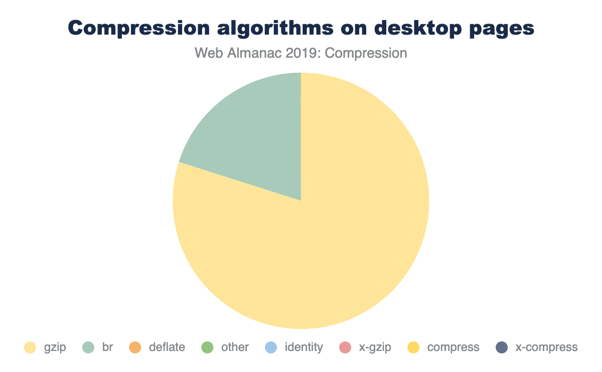
Additionally, there are 67k requests that return an invalid Content-Encoding, such as “none”, “UTF-8”, “base64”, “text”, etc. These resources are likely served uncompressed.
We can’t determine the compression levels from any of the diagnostics collected by the HTTP Archive, but the best practice for compressing content is:
- At a minimum, enable Gzip compression level 6 for text based assets. This provides a fair trade-off between computational cost and compression ratio and is the default for many web servershttps://paulcalvano.com/index.php/2018/07/25/brotli-compression-how-much-will-it-reduce-your-content/—though Nginx still defaults to the, often too low, level 1http://nginx.org/en/docs/http/ngx_http_gzip_module.html#gzip_comp_level.
- If you can support Brotli and precompress resources, then compress to Brotli level 11. This is more computationally expensive than Gzip - so precompression is an absolute must to avoid delays.
- If you can support Brotli and are unable to precompress, then compress to Brotli level 5. This level will result in smaller payloads compared to Gzip, with a similar computational overhead.
What types of content are we compressing?
Most text based resources (such as HTML, CSS, and JavaScript) can benefit from Gzip or Brotli compression. However, it’s often not necessary to use these compression techniques on binary resources, such as images, video, and some web fonts because their file formats are already compressed.
In the graph below, the top 25 content types are displayed with box sizes representing the relative number of requests. The color of each box represents how many of these resources were served compressed. Most of the media content is shaded orange, which is expected since Gzip and Brotli would have little to no benefit for them. Most of the text content is shaded blue to indicate that they are being compressed. However, the light blue shading for some content types indicate that they are not compressed as consistently as the others.
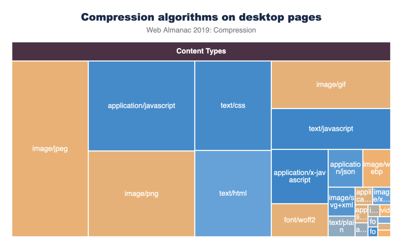
Filtering out the eight most popular content types allows us to see the compression stats for the rest of these content types more clearly.
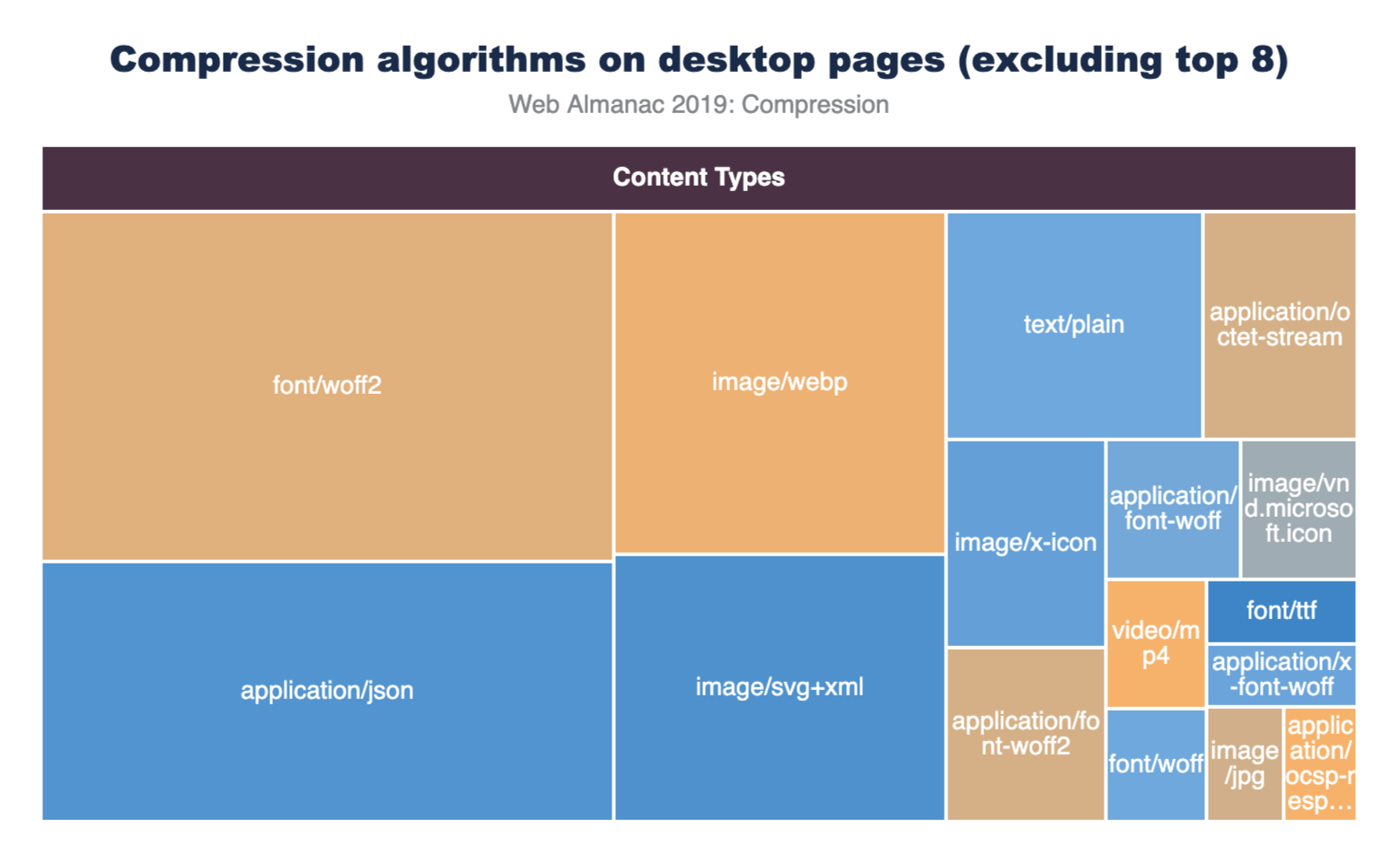
The application/json and image/svg+xml content types are compressed less than 65% of the time.
Most of the custom web fonts are served without compression, since they are already in a compressed format. However, font/ttf is compressible, but only 84% of TTF font requests are being served with compression so there is still room for improvement here.
The graphs below illustrate the breakdown of compression techniques used for each content type. Looking at the top three content types, we can see that across both desktop and mobile there are major gaps in compressing some of the most frequently requested content types. 56% of text/html as well as 18% of application/javascript and text/css resources are not being compressed. This presents a significant performance opportunity.
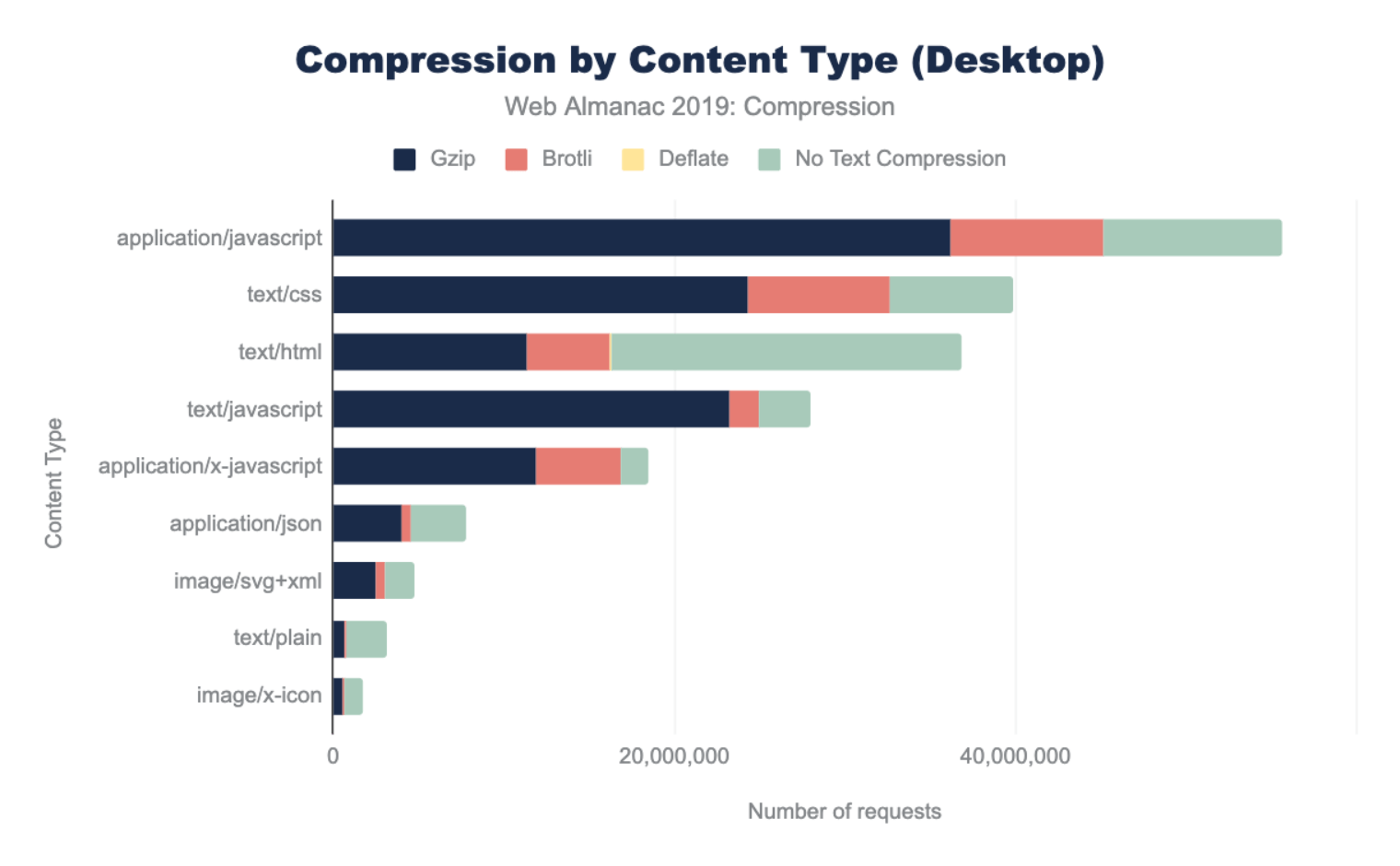
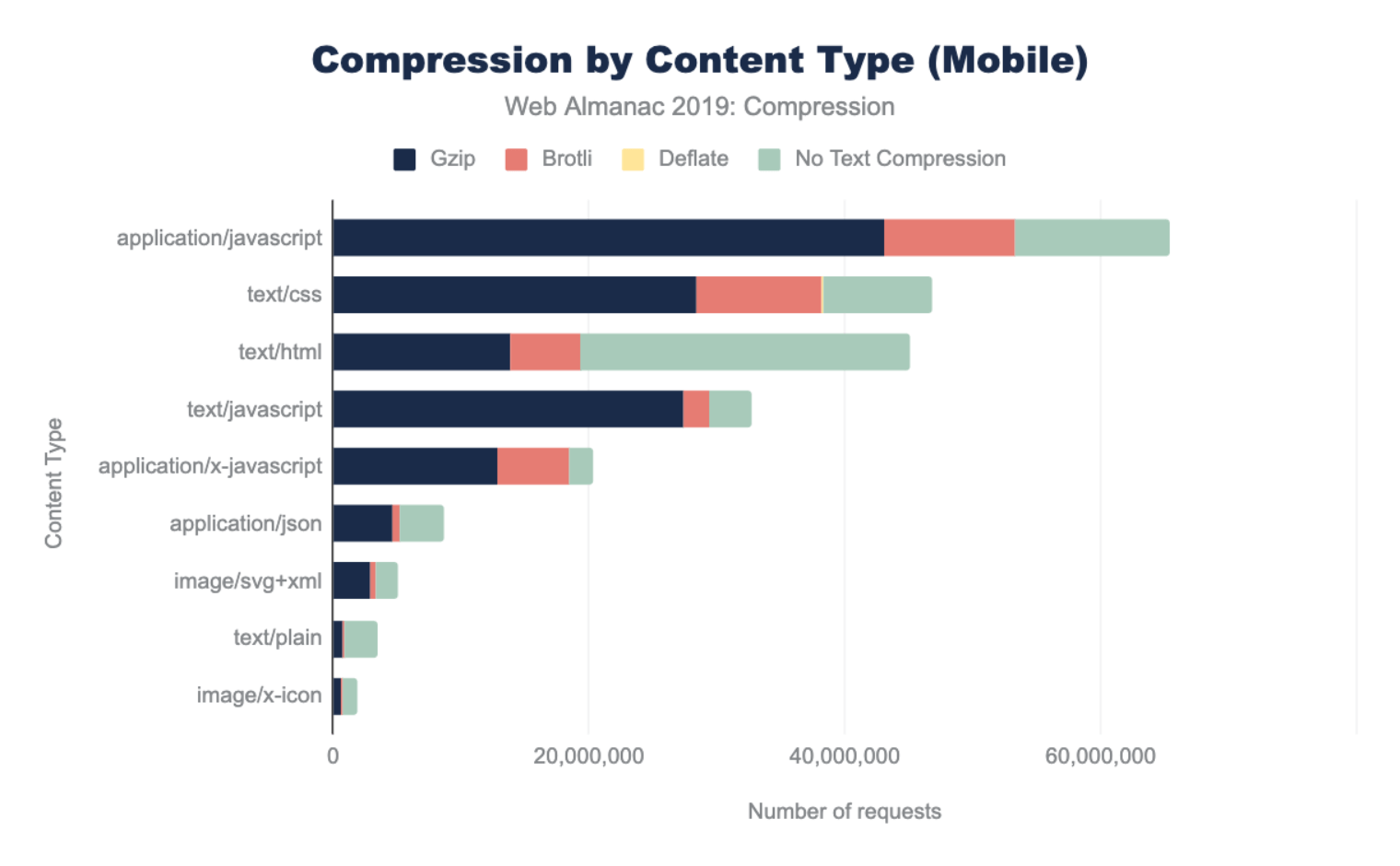
The content types with the lowest compression rates include application/json, text/xml, and text/plain. These resources are commonly used for XHR requests to provide data that web applications can use to create rich experiences. Compressing them will likely improve user experience. Vector graphics such as image/svg+xml, and image/x-icon are not often thought of as text based, but they are and sites that use them would benefit from compression.
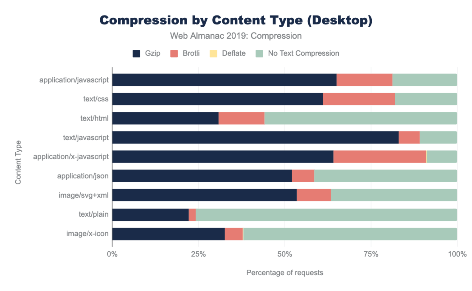
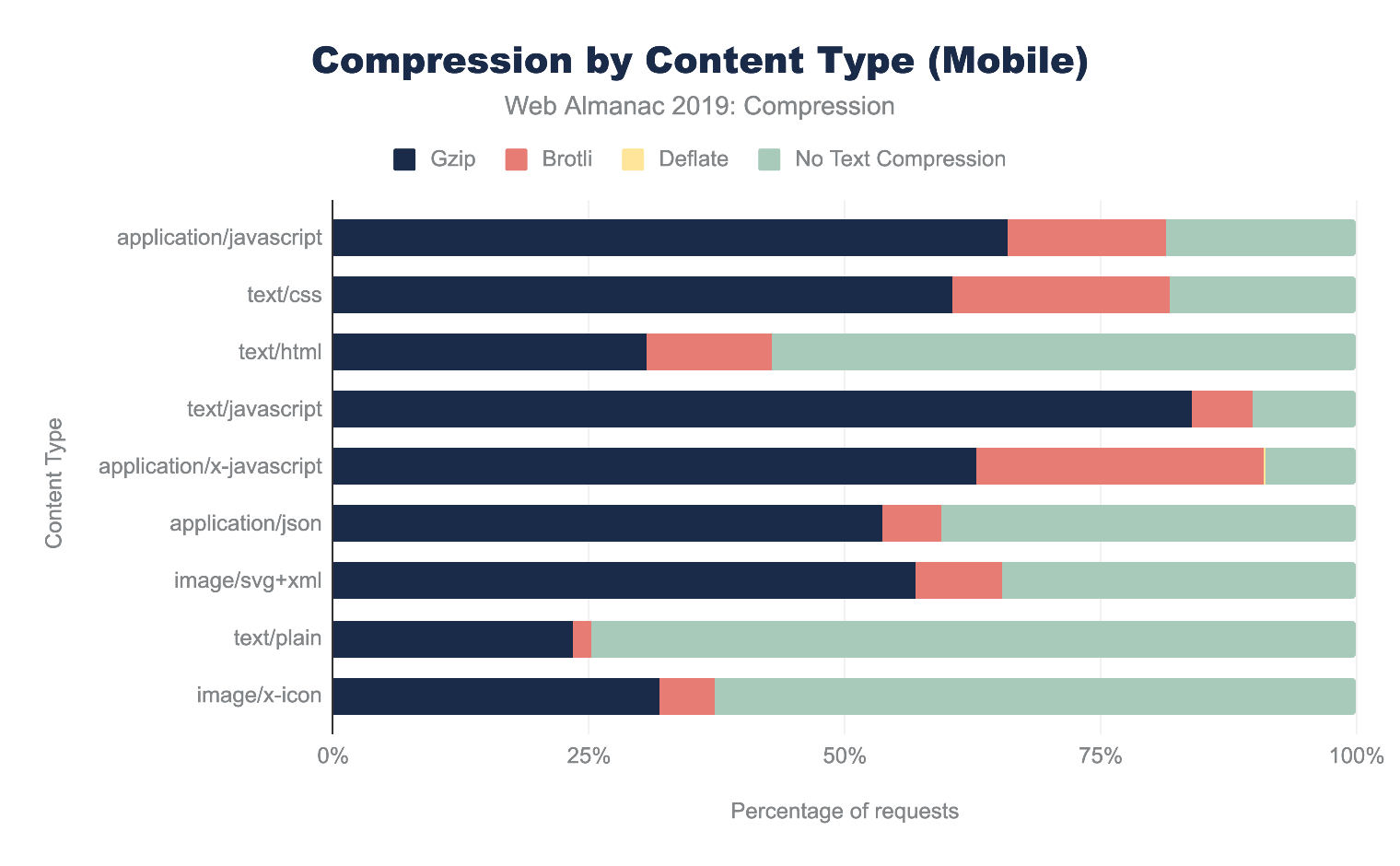
Across all content types, Gzip is the most popular compression algorithm. The newer Brotli compression is used less frequently, and the content types where it appears most are application/javascript, text/css and application/x-javascript. This is likely due to CDNs that automatically apply Brotli compression for traffic that passes through them.
First-party vs third-party compression
In the Third Parties chapter, we learned about third parties and their impact on performance. When we compare compression techniques between first and third parties, we can see that third-party content tends to be compressed more than first-party content.
Additionally, the percentage of Brotli compression is higher for third-party content. This is likely due to the number of resources served from the larger third parties that typically support Brotli, such as Google and Facebook.
| Desktop | Mobile | |||
|---|---|---|---|---|
| Content Encoding | First-Party | Third-Party | First-Party | Third-Party |
| No Text Compression | 66.23% | 59.28% | 64.54% | 58.26% |
gzip |
29.33% | 30.20% | 30.87% | 31.22% |
br |
4.41% | 10.49% | 4.56% | 10.49% |
deflate |
0.02% | 0.01% | 0.02% | 0.01% |
| Other / Invalid | 0.01% | 0.02% | 0.01% | 0.02% |
Figure 15.9. First-party versus third-party compression by device type.
Identifying compression opportunities
Google’s Lighthousehttps://developers.google.com/web/tools/lighthouse tool enables users to run a series of audits against web pages. The text compression audithttps://developers.google.com/web/tools/lighthouse/audits/text-compression evaluates whether a site can benefit from additional text-based compression. It does this by attempting to compress resources and evaluate whether an object’s size can be reduced by at least 10% and 1,400 bytes. Depending on the score, you may see a compression recommendation in the results, with a list of specific resources that could be compressed.
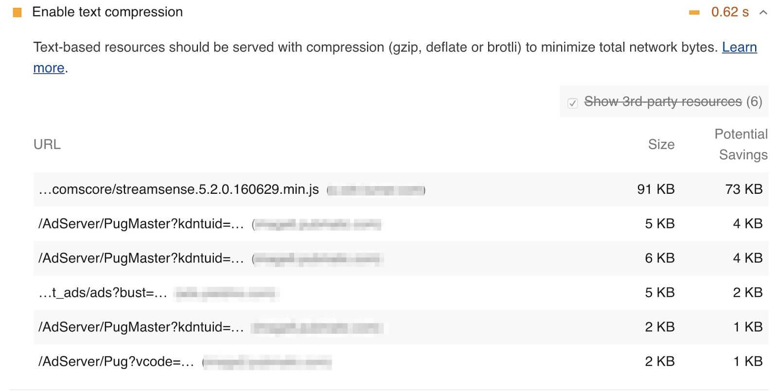
Because the HTTP Archive runs Lighthouse audits for each mobile page, we can aggregate the scores across all sites to learn how much opportunity there is to compress more content. Overall, 62% of websites are passing this audit and almost 23% of websites have scored below a 40. This means that over 1.2 million websites could benefit from enabling additional text based compression.
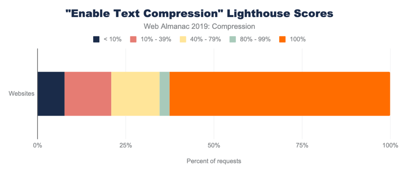
Lighthouse also indicates how many bytes could be saved by enabling text-based compression. Of the sites that could benefit from text compression, 82% of them can reduce their page weight by up to 1 MB!
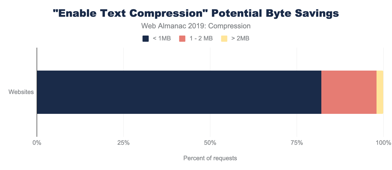
Conclusion
HTTP compression is a widely used and highly valuable feature for reducing the size of web content. Both Gzip and Brotli compression are the dominant algorithms used, and the amount of compressed content varies by content type. Tools like Lighthouse can help uncover opportunities to compress content.
While many sites are making good use of HTTP compression, there is still room for improvement, particularly for the text/html format that the web is built upon! Similarly, lesser-understood text formats like font/ttf, application/json, text/xml, text/plain, image/svg+xml, and image/x-icon may take extra configuration that many websites miss.
At a minimum, websites should use Gzip compression for all text-based resources, since it is widely supported, easily implemented, and has a low processing overhead. Additional savings can be found with Brotli compression, although compression levels should be chosen carefully based on whether a resource can be precompressed.
Author
-
Paul CalvanoPaul Calvano is a Web Performance Architect at Akamaihttps://www.akamai.com/, where he helps businesses improve the performance of their websites. He’s also a co-maintainer of the HTTP Archive project. You can find him tweeting at @paulcalvano, blogging at http://paulcalvano.com and sharing HTTP Archive research at https://discuss.httparchive.org.

Caching
Introduction
Caching is a technique that enables the reuse of previously downloaded content. It provides a significant performance benefit by avoiding costly network requests and it also helps scale an application by reducing the traffic to a website’s origin infrastructure. There’s an old saying, “the fastest request is the one that you don’t have to make,” and caching is one of the key ways to avoid having to make requests.
There are three guiding principles to caching web content: cache as much as you can, for as long as you can, as close as you can to end users.
Cache as much as you can. When considering how much can be cached, it is important to understand whether a response is static or dynamic. Requests that are served as a static response are typically cacheable, as they have a one-to-many relationship between the resource and the users requesting it. Dynamically generated content can be more nuanced and require careful consideration.
Cache for as long as you can. The length of time you would cache a resource is highly dependent on the sensitivity of the content being cached. A versioned JavaScript resource could be cached for a very long time, while a non-versioned resource may need a shorter cache duration to ensure users get a fresh version.
Cache as close to end users as you can. Caching content close to the end user reduces download times by removing latency. For example, if a resource is cached on an end user’s browser, then the request never goes out to the network and the download time is as fast as the machine’s I/O. For first time visitors, or visitors that don’t have entries in their cache, a CDN would typically be the next place a cached resource is returned from. In most cases, it will be faster to fetch a resource from a local cache or a CDN compared to an origin server.
Web architectures typically involve multiple tiers of cachinghttps://blog.yoav.ws/tale-of-four-caches/. For example, an HTTP request may have the opportunity to be cached in:
- An end user’s browser
- A service worker cache in the user’s browser
- A shared gateway
- CDNs, which offer the ability to cache at the edge, close to end users
- A caching proxy in front of the application, to reduce the backend workload
- The application and database layers
This chapter will explore how resources are cached within web browsers.
Overview of HTTP caching
For an HTTP client to cache a resource, it needs to understand two pieces of information:
- “How long am I allowed to cache this for?”
- “How do I validate that the content is still fresh?”
When a web browser sends a response to a client, it typically includes headers that indicate whether the resource is cacheable, how long to cache it for, and how old the resource is. RFC 7234 covers this in more detail in section 4.2 (Freshness)https://tools.ietf.org/html/rfc7234#section-4.2 and 4.3 (Validation)https://tools.ietf.org/html/rfc7234#section-4.3.
The HTTP response headers typically used for conveying freshness lifetime are:
Cache-Controlallows you to configure a cache lifetime duration (i.e. how long this is valid for).Expiresprovides an expiration date or time (i.e. when exactly this expires).
Cache-Control takes priority if both are present. These are discussed in more detail below.
The HTTP response headers for validating the responses stored within the cache, i.e. giving conditional requests something to compare to on the server side, are:
Last-Modifiedindicates when the object was last changed.- Entity Tag (
ETag) provides a unique identifier for the content.
ETag takes priority if both are present. These are discussed in more detail below.
The example below contains an excerpt of a request/response header from HTTP Archive’s main.js file. These headers indicate that the resource can be cached for 43,200 seconds (12 hours), and it was last modified more than two months ago (difference between the Last-Modified and Date headers).
> GET /static/js/main.js HTTP/1.1
> Host: httparchive.org
> User-agent: curl/7.54.0
> Accept: */*

< HTTP/1.1 200
< Date: Sun, 13 Oct 2019 19:36:57 GMT
< Content-Type: application/javascript; charset=utf-8
< Content-Length: 3052
< Vary: Accept-Encoding
< Server: gunicorn/19.7.1
< Last-Modified: Sun, 25 Aug 2019 16:00:30 GMT
< Cache-Control: public, max-age=43200
< Expires: Mon, 14 Oct 2019 07:36:57 GMT
< ETag: "1566748830.0-3052-3932359948"
The tool RedBot.orghttps://redbot.org/ allows you to input a URL and see a detailed explanation of how the response would be cached based on these headers. For example, a test for the URL abovehttps://redbot.org/?uri=https%3A%2F%2Fhttparchive.org%2Fstatic%2Fjs%2Fmain.js would output the following:
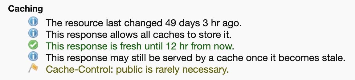
Cache-Control information from RedBot.
If no caching headers are present in a response, then the client is permitted to heuristically cache the responsehttps://paulcalvano.com/index.php/2018/03/14/http-heuristic-caching-missing-cache-control-and-expires-headers-explained/. Most clients implement a variation of the RFC’s suggested heuristic, which is 10% of the time since Last-Modified. However, some may cache the response indefinitely. So, it is important to set specific caching rules to ensure that you are in control of the cacheability.
72% of responses are served with a Cache-Control header, and 56% of responses are served with an Expires header. However, 27% of responses did not use either header, and therefore are subject to heuristic caching. This is consistent across both desktop and mobile sites.
Cache-Control and Expires headers.
What type of content are we caching?
A cacheable resource is stored by the client for a period of time and available for reuse on a subsequent request. Across all HTTP requests, 80% of responses are considered cacheable, meaning that a cache is permitted to store them. Out of these,
- 6% of requests have a time to live (TTL) of 0 seconds, which immediately invalidates a cached entry.
- 27% are cached heuristically because of a missing
Cache-Controlheader. - 47% are cached for more than 0 seconds.
The remaining responses are not permitted to be stored in browser caches.
The table below details the cache TTL values for desktop requests by type. Most content types are being cached however CSS resources appear to be consistently cached at high TTLs.
| Desktop Cache TTL Percentiles (Hours) | |||||
|---|---|---|---|---|---|
| 10 | 25 | 50 | 75 | 90 | |
| Audio | 12 | 24 | 720 | 8,760 | 8,760 |
| CSS | 720 | 8,760 | 8,760 | 8,760 | 8,760 |
| Font | < 1 | 3 | 336 | 8,760 | 87,600 |
| HTML | < 1 | 168 | 720 | 8,760 | 8,766 |
| Image | < 1 | 1 | 28 | 48 | 8,760 |
| Other | < 1 | 2 | 336 | 8,760 | 8,760 |
| Script | < 1 | < 1 | 1 | 6 | 720 |
| Text | 21 | 336 | 7,902 | 8,357 | 8,740 |
| Video | < 1 | 4 | 24 | 24 | 336 |
| XML | < 1 | < 1 | < 1 | < 1 | < 1 |
Figure 16.4. Desktop cache TTL percentiles by resource type.
While most of the median TTLs are high, the lower percentiles highlight some of the missed caching opportunities. For example, the median TTL for images is 28 hours, however the 25th percentile is just one-two hours and the 10th percentile indicates that 10% of cacheable image content is cached for less than one hour.
By exploring the cacheability by content type in more detail in Figure 16.5 below, we can see that approximately half of all HTML responses are considered non-cacheable. Additionally, 16% of images and scripts are non-cacheable.
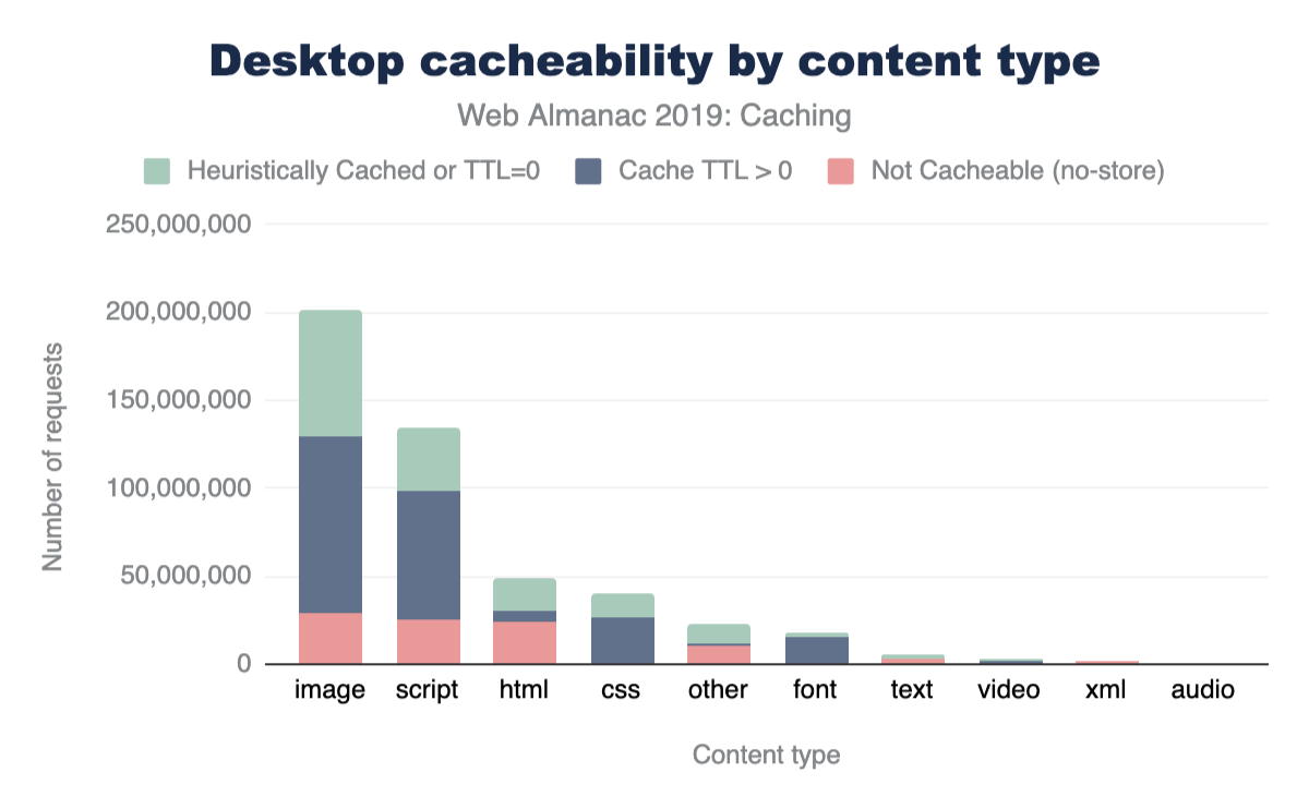
The same data for mobile is shown below. As can be seen, the cacheability of content types is consistent between desktop and mobile.
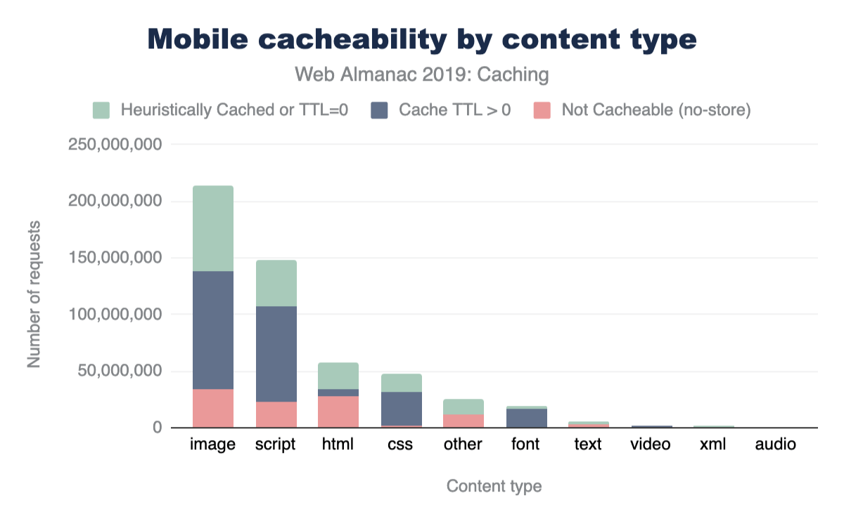
Cache-Control vs Expires
In HTTP/1.0, the Expires header was used to indicate the date/time after which the response is considered stale. Its value is a date timestamp, such as:
Expires: Thu, 01 Dec 1994 16:00:00 GMT
HTTP/1.1 introduced the Cache-Control header, and most modern clients support both headers. This header provides much more extensibility via caching directives. For example:
no-storecan be used to indicate that a resource should not be cached.max-agecan be used to indicate a freshness lifetime.must-revalidatetells the client a cached entry must be validated with a conditional request prior to its use.privateindicates a response should only be cached by a browser, and not by an intermediary that would serve multiple clients.
53% of HTTP responses include a Cache-Control header with the max-age directive, and 54% include the Expires header. However, only 41% of these responses use both headers, which means that 13% of responses are caching solely based on the older Expires header.
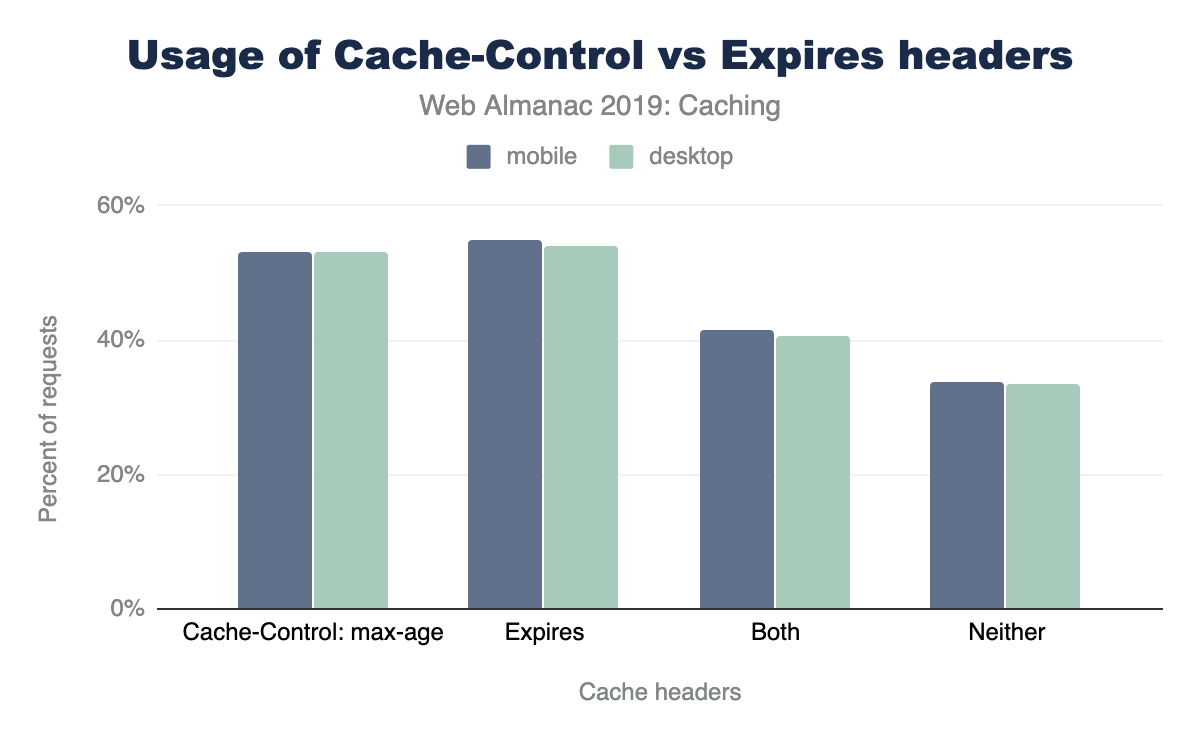
Cache-Control: max-age, 54%-55% use Expires, 41%-42% use both, and 34% use neither. The figures are given for both desktop and mobile but the figures are near identical with mobile having a percentage point higher in use of expires.Cache-Control versus Expires headers.
Cache-Control directives
The HTTP/1.1 specificationhttps://tools.ietf.org/html/rfc7234#section-5.2.1 includes multiple directives that can be used in the Cache-Control response header and are detailed below. Note that multiple can be used in a single response.
| Directive | Description |
|---|---|
| max-age | Indicates the number of seconds that a resource can be cached for. |
| public | Any cache may store the response. |
| no-cache | A cached entry must be revalidated prior to its use. |
| must-revalidate | A stale cached entry must be revalidated prior to its use. |
| no-store | Indicates that a response is not cacheable. |
| private | The response is intended for a specific user and should not be stored by shared caches. |
| no-transform | No transformations or conversions should be made to this resource. |
| proxy-revalidate | Same as must-revalidate but applies to shared caches. |
| s-maxage | Same as max age but applies to shared caches only. |
| immutable | Indicates that the cached entry will never change, and that revalidation is not necessary. |
| stale-while-revalidate | Indicates that the client is willing to accept a stale response while asynchronously checking in the background for a fresh one. |
| stale-if-error | Indicates that the client is willing to accept a stale response if the check for a fresh one fails. |
Figure 16.8. Cache-Control directives.
For example, cache-control: public, max-age=43200 indicates that a cached entry should be stored for 43,200 seconds and it can be stored by all caches.
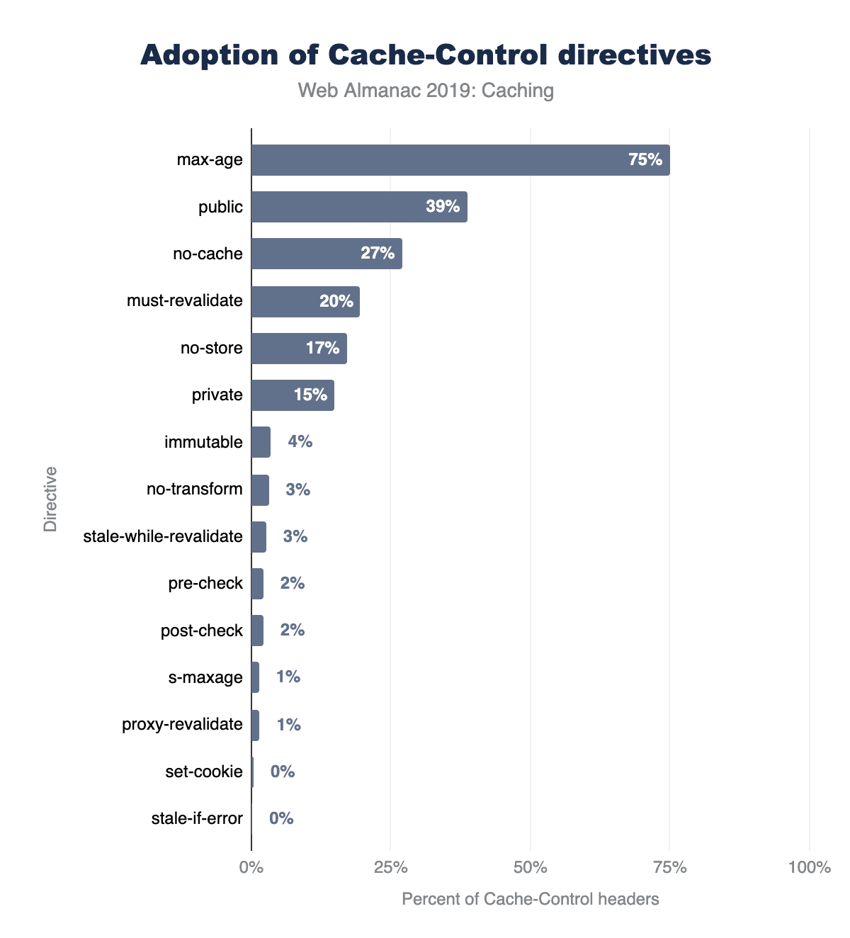
Cache-Control directives on mobile.
Figure 16.9 above illustrates the top 15 Cache-Control directives in use on mobile websites. The results for desktop and mobile are very similar. There are a few interesting observations about the popularity of these cache directives:
max-ageis used by almost 75% ofCache-Controlheaders, andno-storeis used by 18%.publicis rarely necessary since cached entries are assumedpublicunlessprivateis specified. Approximately 38% of responses includepublic.- The
immutabledirective is relatively new, introduced in 2017https://code.facebook.com/posts/557147474482256/this-browser-tweak-saved-60-of-requests-to-facebook and is supported on Firefox and Safarihttps://developer.mozilla.org/docs/Web/HTTP/Headers/Cache-Control#Browser_compatibility. Its usage has grown to 3.4%, and it is widely used in Facebook and Google third-party responseshttps://discuss.httparchive.org/t/cache-control-immutable-a-year-later/1195.
Another interesting set of directives to show up in this list are pre-check and post-check, which are used in 2.2% of Cache-Control response headers (approximately 7.8 million responses). This pair of headers was introduced in Internet Explorer 5 to provide a background validationhttps://blogs.msdn.microsoft.com/ieinternals/2009/07/20/internet-explorers-cache-control-extensions/ and was rarely implemented correctly by websites. 99.2% of responses using these headers had used the combination of pre-check=0 and post-check=0. When both of these directives are set to 0, then both directives are ignored. So, it seems these directives were never used correctly!
In the long tail, there are more than 1,500 erroneous directives in use across 0.28% of responses. These are ignored by clients, and include misspellings such as “nocache”, “s-max-age”, “smax-age”, and “maxage”. There are also numerous non-existent directives such as “max-stale”, “proxy-public”, “surrogate-control”, etc.
Cache-Control: no-store, no-cache and max-age=0
When a response is not cacheable, the Cache-Control no-store directive should be used. If this directive is not used, then the response is cacheable.
There are a few common errors that are made when attempting to configure a response to be non-cacheable:
- Setting
Cache-Control: no-cachemay sound like the resource will not be cacheable. However, theno-cachedirective requires the cached entry to be revalidated prior to use and is not the same as being non-cacheable. - Setting
Cache-Control: max-age=0sets the TTL to 0 seconds, but that is not the same as being non-cacheable. Whenmax-ageis set to 0, the resource is stored in the browser cache and immediately invalidated. This results in the browser having to perform a conditional request to validate the resource’s freshness.
Functionally, no-cache and max-age=0 are similar, since they both require revalidation of a cached resource. The no-cache directive can also be used alongside a max-age directive that is greater than 0.
Over 3 million responses include the combination of no-store, no-cache, and max-age=0. Of these directives no-store takes precedence and the other directives are merely redundant
18% of responses include no-store and 16.6% of responses include both no-store and no-cache. Since no-store takes precedence, the resource is ultimately non-cacheable.
The max-age=0 directive is present on 1.1% of responses (more than four million responses) where no-store is not present. These resources will be cached in the browser but will require revalidation as they are immediately expired.
How do cache TTLs compare to resource age?
So far we’ve talked about how web servers tell a client what is cacheable, and how long it has been cached for. When designing cache rules, it is also important to understand how old the content you are serving is.
When you are selecting a cache TTL, ask yourself: “how often are you updating these assets?” and “what is their content sensitivity?”. For example, if a hero image is going to be modified infrequently, then cache it with a very long TTL. If you expect a JavaScript resource to change frequently, then version it and cache it with a long TTL or cache it with a shorter TTL.
The graph below illustrates the relative age of resources by content type, and you can read a more detailed analysis herehttps://discuss.httparchive.org/t/analyzing-resource-age-by-content-type/1659. HTML tends to be the content type with the shortest age, and a very large % of traditionally cacheable resources (scripts, CSS, and fonts) are older than one year!
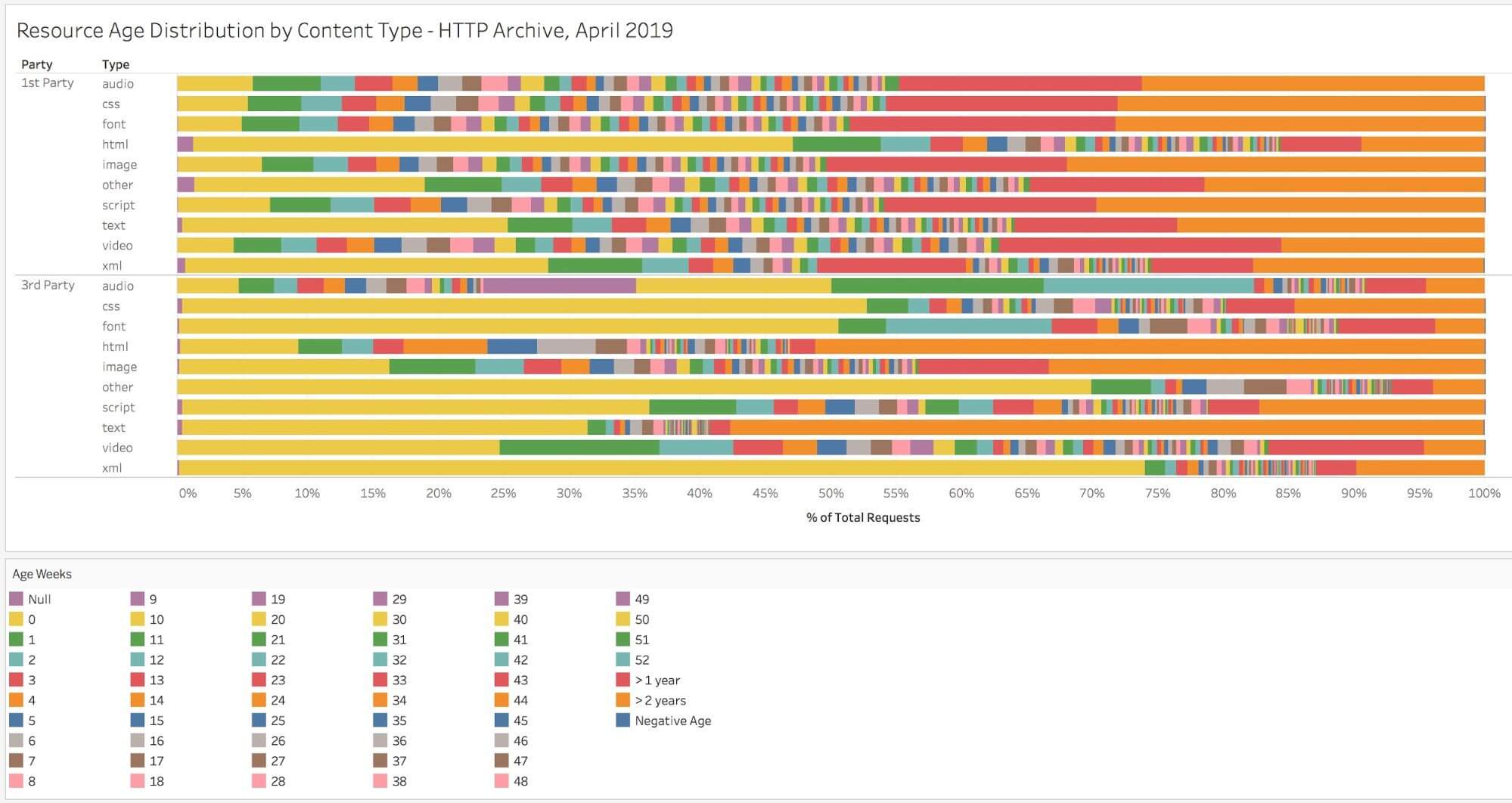
By comparing a resources cacheability to its age, we can determine if the TTL is appropriate or too low. For example, the resource served by the response below was last modified on 25 Aug 2019, which means that it was 49 days old at the time of delivery. The Cache-Control header says that we can cache it for 43,200 seconds, which is 12 hours. It is definitely old enough to merit investigating whether a longer TTL would be appropriate.
< HTTP/1.1 200
< Date: Sun, 13 Oct 2019 19:36:57 GMT
< Content-Type: application/javascript; charset=utf-8
< Content-Length: 3052
< Vary: Accept-Encoding
< Server: gunicorn/19.7.1
< Last-Modified: Sun, 25 Aug 2019 16:00:30 GMT
< Cache-Control: public, max-age=43200
< Expires: Mon, 14 Oct 2019 07:36:57 GMT
< ETag: "1566748830.0-3052-3932359948"
Overall, 59% of resources served on the web have a cache TTL that is too short compared to its content age. Furthermore, the median delta between the TTL and age is 25 days.
When we break this out by first vs third-party, we can also see that 70% of first-party resources can benefit from a longer TTL. This clearly highlights a need to spend extra attention focusing on what is cacheable, and then ensuring caching is configured correctly.
| Client | 1st Party | 3rd Party | Overall |
|---|---|---|---|
| Desktop | 70.7% | 47.9% | 59.2% |
| Mobile | 71.4% | 46.8% | 59.6% |
Figure 16.11. Percent of requests with short TTLs.
Validating freshness
The HTTP response headers used for validating the responses stored within a cache are Last-Modified and ETag. The Last-Modified header does exactly what its name implies and provides the time that the object was last modified. The ETag header provides a unique identifier for the content.
For example, the response below was last modified on 25 Aug 2019 and it has an ETag value of "1566748830.0-3052-3932359948"
< HTTP/1.1 200
< Date: Sun, 13 Oct 2019 19:36:57 GMT
< Content-Type: application/javascript; charset=utf-8
< Content-Length: 3052
< Vary: Accept-Encoding
< Server: gunicorn/19.7.1
< Last-Modified: Sun, 25 Aug 2019 16:00:30 GMT
< Cache-Control: public, max-age=43200
< Expires: Mon, 14 Oct 2019 07:36:57 GMT
< ETag: "1566748830.0-3052-3932359948"
A client could send a conditional request to validate a cached entry by using the Last-Modified value in a request header named If-Modified-Since. Similarly, it could also validate the resource with an If-None-Match request header, which validates against the ETag value the client has for the resource in its cache.
In the example below, the cache entry is still valid, and an HTTP 304 was returned with no content. This saves the download of the resource itself. If the cache entry was no longer fresh, then the server would have responded with a 200 and the updated resource which would have to be downloaded again.
> GET /static/js/main.js HTTP/1.1
> Host: www.httparchive.org
> User-Agent: curl/7.54.0
> Accept: */*
> If-Modified-Since: Sun, 25 Aug 2019 16:00:30 GMT

< HTTP/1.1 304
< Date: Thu, 17 Oct 2019 02:31:08 GMT
< Server: gunicorn/19.7.1
< Cache-Control: public, max-age=43200
< Expires: Thu, 17 Oct 2019 14:31:08 GMT
< ETag: "1566748830.0-3052-3932359948"
< Accept-Ranges: bytes
Overall, 65% of responses are served with a Last-Modified header, 42% are served with an ETag, and 38% use both. However, 30% of responses include neither a Last-Modified or ETag header.
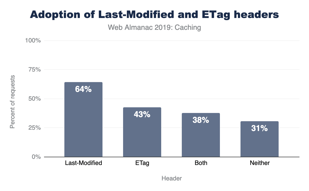
Last-Modified and ETag headers for desktop websites.
Validity of date strings
There are a few HTTP headers used to convey timestamps, and the format for these are very important. The Date response header indicates when the resource was served to a client. The Last-Modified response header indicates when a resource was last changed on the server. And the Expires header is used to indicate how long a resource is cacheable until (unless a Cache-Control header is present).
All three of these HTTP headers use a date formatted string to represent timestamps.
For example:
> GET /static/js/main.js HTTP/1.1
> Host: httparchive.org
> User-Agent: curl/7.54.0
> Accept: */*

< HTTP/1.1 200
< Date: Sun, 13 Oct 2019 19:36:57 GMT
< Content-Type: application/javascript; charset=utf-8
< Content-Length: 3052
< Vary: Accept-Encoding
< Server: gunicorn/19.7.1
< Last-modified: Sun, 25 Aug 2019 16:00:30 GMT
< Cache-Control: public, max-age=43200
< Expires: Mon, 14 Oct 2019 07:36:57 GMT
< ETag: "1566748830.0-3052-3932359948"
Most clients will ignore invalid date strings, which render them ineffective for the response they are served on. This can have consequences on cacheability, since an erroneous Last-Modified header will be cached without a Last-Modified timestamp resulting in the inability to perform a conditional request.
The Date HTTP response header is usually generated by the web server or CDN serving the response to a client. Because the header is typically generated automatically by the server, it tends to be less prone to error, which is reflected by the very low percentage of invalid Date headers. Last-Modified headers were very similar, with only 0.67% of them being invalid. What was very surprising to see though, was that 3.64% Expires headers used an invalid date format!
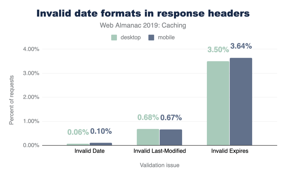
Examples of some of the invalid uses of the Expires header are:
- Valid date formats, but using a time zone other than GMT
- Numerical values such as 0 or -1
- Values that would be valid in a
Cache-Controlheader
The largest source of invalid Expires headers is from assets served from a popular third-party, in which a date/time uses the EST time zone, for example Expires: Tue, 27 Apr 1971 19:44:06 EST.
Vary header
One of the most important steps in caching is determining if the resource being requested is cached or not. While this may seem simple, many times the URL alone is not enough to determine this. For example, requests with the same URL could vary in what compression they used (Gzip, Brotli, etc.) or be modified and tailored for mobile visitors.
To solve this problem, clients give each cached resource a unique identifier (a cache key). By default, this cache key is simply the URL of the resource, but developers can add other elements (like compression method) by using the Vary header.
A Vary header instructs a client to add the value of one or more request header values to the cache key. The most common example of this is Vary: Accept-Encoding, which will result in different cached entries for Accept-Encoding request header values (i.e. gzip, br, deflate).
Another common value is Vary: Accept-Encoding, User-Agent, which instructs the client to vary the cached entry by both the Accept-Encoding values and the User-Agent string. When dealing with shared proxies and CDNs, using values other than Accept-Encoding can be problematic as it dilutes the cache keys and can reduce the amount of traffic served from cache.
In general, you should only vary the cache if you are serving alternate content to clients based on that header.
The Vary header is used on 39% of HTTP responses, and 45% of responses that include a Cache-Control header.
The graph below details the popularity for the top 10 Vary header values. Accept-Encoding accounts for 90% of Vary’s use, with User-Agent (11%), Origin (9%), and Accept (3%) making up much of the rest.
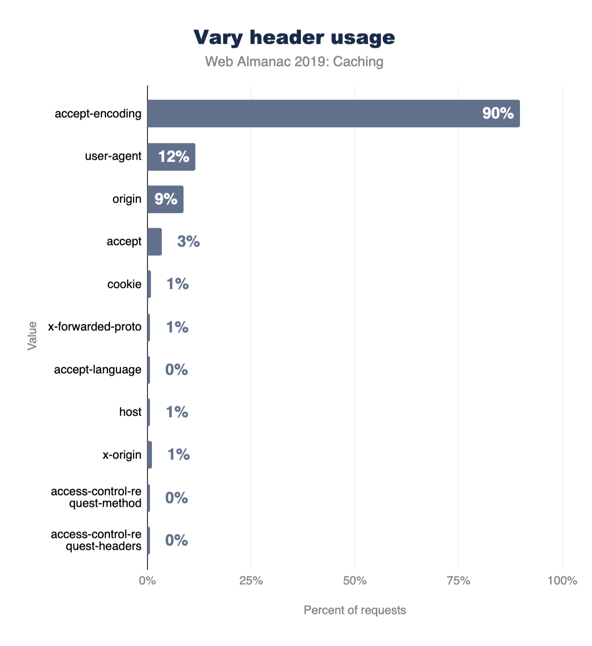
Setting cookies on cacheable responses
When a response is cached, its entire headers are swapped into the cache as well. This is why you can see the response headers when inspecting a cached response via DevTools.
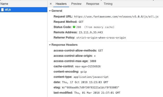
But what happens if you have a Set-Cookie on a response? According to RFC 7234 Section 8https://tools.ietf.org/html/rfc7234#section-8, the presence of a Set-Cookie response header does not inhibit caching. This means that a cached entry might contain a Set-Cookie if it was cached with one. The RFC goes on to recommend that you should configure appropriate Cache-Control headers to control how responses are cached.
One of the risks of caching responses with Set-Cookie is that the cookie values can be stored and served to subsequent requests. Depending on the cookie’s purpose, this could have worrying results. For example, if a login cookie or a session cookie is present in a shared cache, then that cookie might be reused by another client. One way to avoid this is to use the Cache-Control private directive, which only permits the response to be cached by the client browser.
3% of cacheable responses contain a Set-Cookie header. Of those responses, only 18% use the private directive. The remaining 82% include 5.3 million HTTP responses that include a Set-Cookie which can be cached by public and private cache servers.
Set-Cookie responses.
AppCache and service workers
The Application Cache or AppCache is a feature of HTML5 that allows developers to specify resources the browser should cache and make available to offline users. This feature was deprecated and removed from web standardshttps://web.archive.org/web/20191115024726/https://html.spec.whatwg.org/multipage/offline.html, and browser support has been diminishing. In fact, when its use is detected, Firefox v44+ recommends that developers should use service workers insteadhttps://developer.mozilla.org/docs/Web/API/Service_Worker_API/Using_Service_Workers. Chrome 70 restricts the Application Cache to secure context onlyhttps://www.chromestatus.com/feature/5714236168732672. The industry has moved more towards implementing this type of functionality with service workers - and browser supporthttps://caniuse.com/#feat=serviceworkers has been rapidly growing for it.
In fact, one of the HTTP Archive trend reports shows the adoption of service workershttps://httparchive.org/reports/progressive-web-apps#swControlledPages shown below:
Adoption is still below 1% of websites, but it has been steadily increasing since January 2017. The Progressive Web App chapter discusses this more, including the fact that it is used a lot more than this graph suggests due to its usage on popular sites, which are only counted once in above graph.
In the table below, you can see a summary of AppCache vs service worker usage. 32,292 websites have implemented a service worker, while 1,867 sites are still utilizing the deprecated AppCache feature.
| Does Not Use Server Worker | Uses Service Worker | Total | |
|---|---|---|---|
| Does Not Use AppCache | 5,045,337 | 32,241 | 5,077,578 |
| Uses AppCache | 1,816 | 51 | 1,867 |
| Total | 5,047,153 | 32,292 | 5,079,445 |
Figure 16.18. Number of websites using AppCache versus service worker.
If we break this out by HTTP vs HTTPS, then this gets even more interesting. 581 of the AppCache enabled sites are served over HTTP, which means that Chrome is likely disabling the feature. HTTPS is a requirement for using service workers, but 907 of the sites using them are served over HTTP.
| Does Not Use Service Worker | Uses Service Worker | ||
|---|---|---|---|
| HTTP | Does Not Use AppCache | 1,968,736 | 907 |
| Uses AppCache | 580 | 1 | |
| HTTPS | Does Not Use AppCache | 3,076,601 | 31,334 |
| Uses AppCache | 1,236 | 50 |
Figure 16.19. Number of websites using AppCache versus service worker usage by HTTP/HTTPS.
Identifying caching opportunities
Google’s Lighthousehttps://developers.google.com/web/tools/lighthouse tool enables users to run a series of audits against web pages, and the cache policy audithttps://developers.google.com/web/tools/lighthouse/audits/cache-policy evaluates whether a site can benefit from additional caching. It does this by comparing the content age (via the Last-Modified header) to the cache TTL and estimating the probability that the resource would be served from cache. Depending on the score, you may see a caching recommendation in the results, with a list of specific resources that could be cached.
Lighthouse computes a score for each audit, ranging from 0% to 100%, and those scores are then factored into the overall scores. The caching scorehttps://developers.google.com/web/tools/lighthouse/audits/cache-policy is based on potential byte savings. When we examine the Lighthouse results, we can get a perspective of how many sites are doing well with their cache policies.
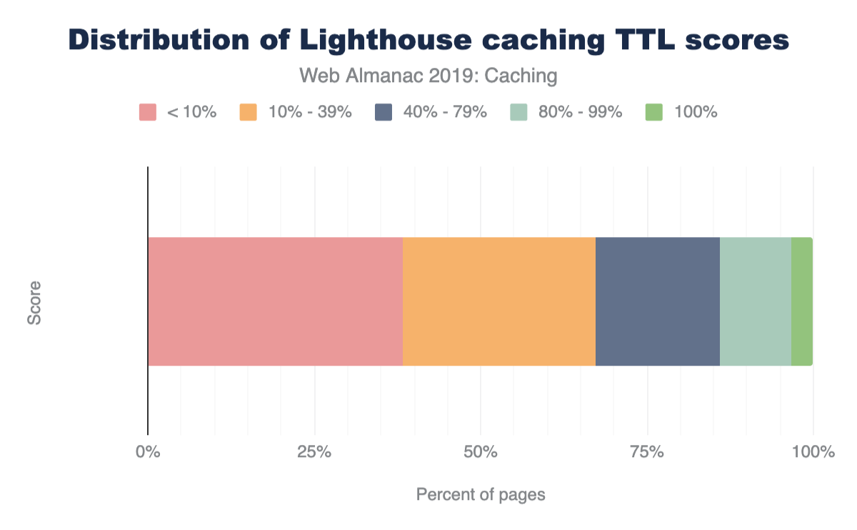
Only 3.4% of sites scored a 100%, meaning that most sites can benefit from some cache optimizations. A vast majority of sites sore below 40%, with 38% scoring less than 10%. Based on this, there is a significant amount of caching opportunities on the web.
Lighthouse also indicates how many bytes could be saved on repeat views by enabling a longer cache policy. Of the sites that could benefit from additional caching, 82% of them can reduce their page weight by up to a whole Mb!
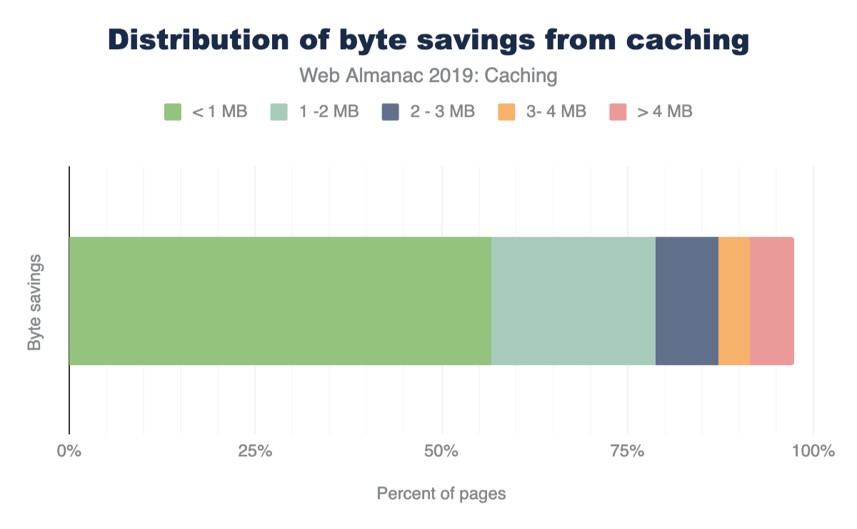
Conclusion
Caching is an incredibly powerful feature that allows browsers, proxies and other intermediaries (such as CDNs) to store web content and serve it to end users. The performance benefits of this are significant, since it reduces round trip times and minimizes costly network requests.
Caching is also a very complex topic. There are numerous HTTP response headers that can convey freshness as well as validate cached entries, and Cache-Control directives provide a tremendous amount of flexibility and control. However, developers should be cautious about the additional opportunities for mistakes that it comes with. Regularly auditing your site to ensure that cacheable resources are cached appropriately is recommended, and tools like Lighthousehttps://developers.google.com/web/tools/lighthouse and REDbothttps://redbot.org/ do an excellent job of helping to simplify the analysis.
Author
-
Paul CalvanoPaul Calvano is a Web Performance Architect at Akamaihttps://www.akamai.com/, where he helps businesses improve the performance of their websites. He’s also a co-maintainer of the HTTP Archive project. You can find him tweeting at @paulcalvano, blogging at http://paulcalvano.com and sharing HTTP Archive research at https://discuss.httparchive.org.
CDN

Introduction
“Use a Content Delivery Network” was one of Steve Souders original recommendationshttp://stevesouders.com/examples/rules.php for making web sites load faster. It’s advice that remains valid today, and in this chapter of the Web Almanac we’re going to explore how widely Steve’s recommendation has been adopted, how sites are using Content Delivery Networks (CDNs), and some of the features they’re using.
Fundamentally, CDNs reduce latency—the time it takes for packets to travel between two points on a network, say from a visitor’s device to a server—and latency is a key factor in how quickly pages load.
A CDN reduces latency in two ways: by serving content from locations that are closer to the user and second, by terminating the TCP connection closer to the end user.
Historically, CDNs were used to cache, or copy, bytes so that the logical path from the user to the bytes becomes shorter. A file that is requested by many people can be retrieved once from the origin (your server) and then stored on a server closer to the user, thus saving transfer time.
CDNs also help with TCP latency. The latency of TCP determines how long it takes to establish a connection between a browser and a server, how long it takes to secure that connection, and ultimately how quickly content downloads. At best, network packets travel at roughly two-thirds of the speed of light, so how long that round trip takes depends on how far apart the two ends of the conversation are, and what’s in between. Congested networks, overburdened equipment, and the type of network will all add further delays. Using a CDN to move the server end of the connection closer to the visitor reduces this latency penalty, shortening connection times, TLS negotiation times, and improving content download speeds.
Although CDNs are often thought of as just caches that store and serve static content close to the visitor, they are capable of so much more! CDNs aren’t limited to just helping overcome the latency penalty, and increasingly they offer other features that help improve performance and security.
- Using a CDN to proxy dynamic content (base HTML page, API responses, etc.) can take advantage of both the reduced latency between the browser and the CDN’s own network back to the origin.
- Some CDNs offer transformations that optimize pages so they download and render more quickly, or optimize images so they’re the appropriate size (both dimensions and file size) for the device on which they’re going to be viewed.
- From a security perspective, malicious traffic and bots can be filtered out by a CDN before the requests even reach the origin, and their wide customer base means CDNs can often see and react to new threats sooner.
- The rise of edge computinghttps://en.wikipedia.org/wiki/Edge_computing allows sites to run their own code close to their visitors, both improving performance and reducing the load on the origin.
Finally, CDNs also help sites to adopt new technologies without requiring changes at the origin, for example HTTP/2, TLS 1.3, and/or IPv6 can be enabled from the edge to the browser, even if the origin servers don’t support it yet.
Caveats and disclaimers
As with any observational study, there are limits to the scope and impact that can be measured. The statistics gathered on CDN usage for the Web Almanac does not imply performance nor effectiveness of a specific CDN vendor.
There are many limits to the testing methodology used for the Web Almanac. These include:
- Simulated network latency: The Web Almanac uses a dedicated network connection that synthetically shapes traffic.
- Single geographic location: Tests are run from a single datacenterhttps://httparchive.org/faq#how-is-the-data-gathered and cannot test the geographic distribution of many CDN vendors.
- Cache effectiveness: Each CDN uses proprietary technology and many, for security reasons, do not expose cache performance.
- Localization and internationalization: Just like geographic distribution, the effects of language and geo-specific domains are also opaque to the testing.
- CDN detectionhttps://github.com/WPO-Foundation/wptagent/blob/master/internal/optimization_checks.py#L51 is primarily done through DNS resolution and HTTP headers. Most CDNs use a DNS CNAME to map a user to an optimal datacenter. However, some CDNs use AnyCast IPs or direct A+AAAA responses from a delegated domain which hide the DNS chain. In other cases, websites use multiple CDNs to balance between vendors which is hidden from the single-request pass of WebPageTest. All of this limits the effectiveness in the measurements.
Most importantly, these results reflect a potential utilization but do not reflect actual impact. YouTube is more popular than “ShoesByColin” yet both will appear as equal value when comparing utilization.
With this in mind, there are a few intentional statistics that were not measured with the context of a CDN:
- TTFB: Measuring the Time to first byte by CDN would be intellectually dishonest without proper knowledge about cacheability and cache effectiveness. If one site uses a CDN for round trip time (RTT) management but not for caching, this would create a disadvantage when comparing another site that uses a different CDN vendor but does also caches the content. (Note: this does not apply to the TTFB analysis in the Performance chapter because it does not draw conclusions about the performance of individual CDNs.)
- Cache Hit vs. Cache Miss performance: As mentioned previously, this is opaque to the testing apparatus and therefore repeat tests to test page performance with a cold cache vs. a hot cache are unreliable.
Further stats
In future versions of the Web Almanac, we would expect to look more closely at the TLS and RTT management between CDN vendors. Of interest would the impact of OCSP stapling, differences in TLS Cipher performance. CWND (TCP congestion window) growth rate, and specifically the adoption of BBR v1, v2, and traditional TCP Cubic.
CDN adoption and usage
For websites, a CDN can improve performance for the primary domain (www.shoesbycolin.com), sub-domains or sibling domains (images.shoesbycolin.com or checkout.shoesbycolin.com), and finally third parties (Google Analytics, etc.). Using a CDN for each of these use cases improves performance in different ways.
Historically, CDNs were used exclusively for static resources like CSS, JavaScript, and images. These resources would likely be versioned (include a unique number in the path) and cached long-term. In this way we should expect to see higher adoption of CDNs on sub-domains or sibling domains compared to the base HTML domains. The traditional design pattern would expect that www.shoesbycolin.com would serve HTML directly from a datacenter (or origin) while static.shoesbycolin.com would use a CDN.
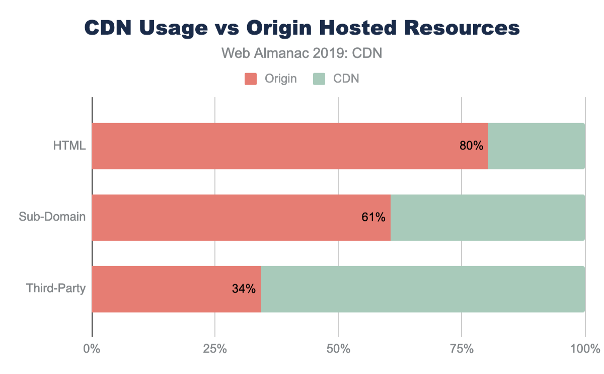
Indeed, this traditional pattern is what we observe on the majority of websites crawled. The majority of web pages (80%) serve the base HTML from origin. This breakdown is nearly identical between mobile and desktop with only 0.4% lower usage of CDNs on desktop. This slight variance is likely due to the small continued use of mobile specific web pages (“mDot”), which more frequently use a CDN.
Likewise, resources served from sub-domains are more likely to utilize a CDN at 40% of sub-domain resources. Sub-domains are used either to partition resources like images and CSS or they are used to reflect organizational teams such as checkout or APIs.
Despite first-party resources still largely being served directly from origin, third-party resources have a substantially higher adoption of CDNs. Nearly 66% of all third-party resources are served from a CDN. Since third-party domains are more likely a SaaS integration, the use of CDNs are more likely core to these business offerings. Most third-party content breaks down to shared resources (JavaScript or font CDNs), augmented content (advertisements), or statistics. In all these cases, using a CDN will improve the performance and offload for these SaaS solutions.
Top CDN providers
There are two categories of CDN providers: the generic and the purpose-fit CDN. The generic CDN providers offer customization and flexibility to serve all kinds of content for many industries. In contrast, the purpose-fit CDN provider offers similar content distribution capabilities but are narrowly focused on a specific solution.
This is clearly represented when looking at the top CDNs found serving the base HTML content. The most frequent CDNs serving HTML are generic CDNs (Cloudflare, Akamai, Fastly) and cloud solution providers who offer a bundled CDN (Google, Amazon) as part of the platform service offerings. In contrast, there are only a few purpose-fit CDN providers, such as Wordpress and Netlify, that deliver base HTML markup.
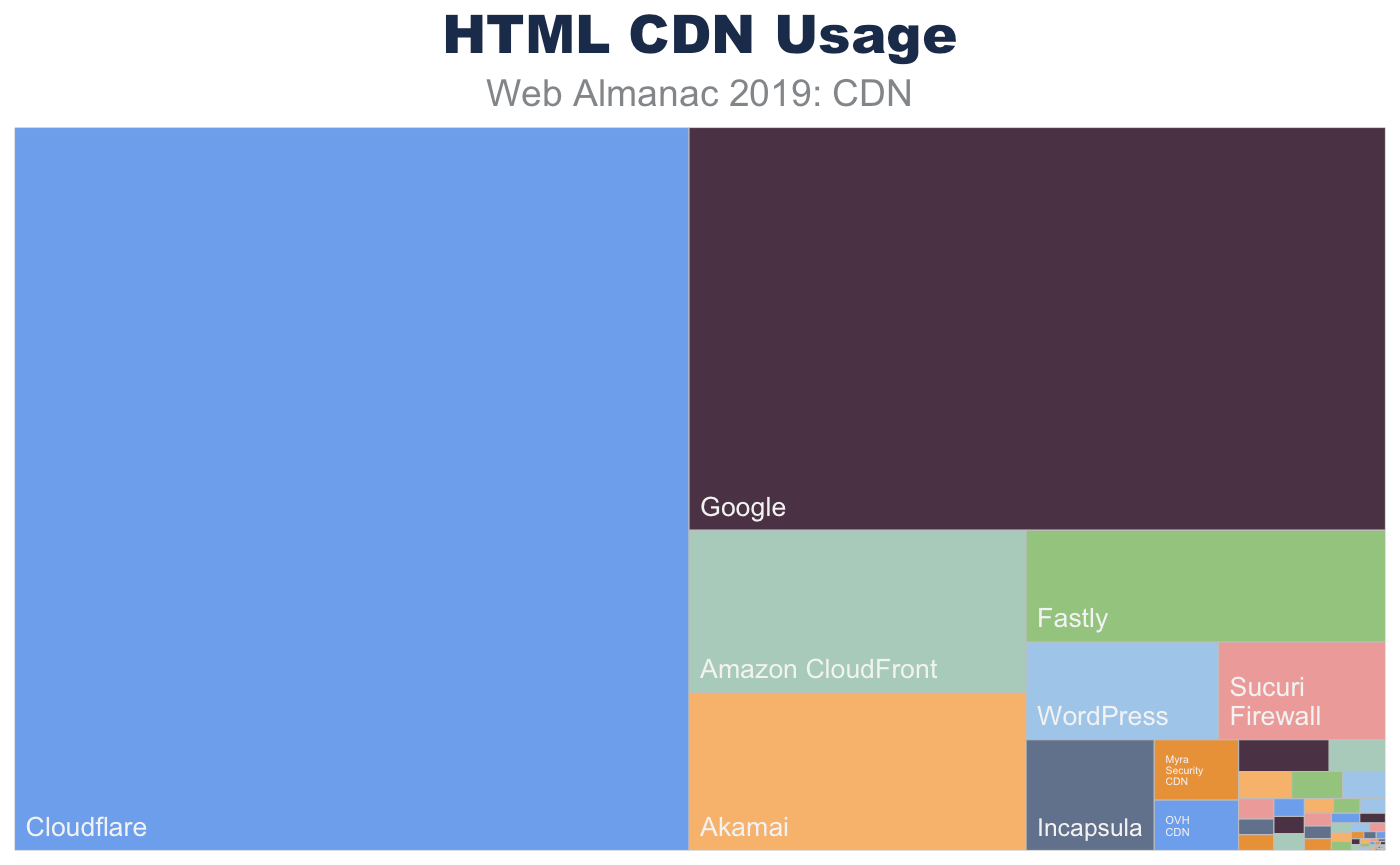
| HTML CDN Usage (%) | |
|---|---|
| ORIGIN | 80.39 |
| Cloudflare | 9.61 |
| 5.54 | |
| Amazon CloudFront | 1.08 |
| Akamai | 1.05 |
| Fastly | 0.79 |
| WordPress | 0.37 |
| Sucuri Firewall | 0.31 |
| Incapsula | 0.28 |
| Myra Security CDN | 0.1 |
| OVH CDN | 0.08 |
| Netlify | 0.06 |
| Edgecast | 0.04 |
| GoCache | 0.03 |
| Highwinds | 0.03 |
| CDNetworks | 0.02 |
| Limelight | 0.01 |
| Level 3 | 0.01 |
| NetDNA | 0.01 |
| StackPath | 0.01 |
| Instart Logic | 0.01 |
| Azion | 0.01 |
| Yunjiasu | 0.01 |
| section.io | 0.01 |
| Microsoft Azure | 0.01 |
Figure 17.3. Top 25 CDNs for HTML by site.
Sub-domain requests have a very similar composition. Since many websites use sub-domains for static content, we see a shift to a higher CDN usage. Like the base page requests, the resources served from these sub-domains utilize generic CDN offerings.
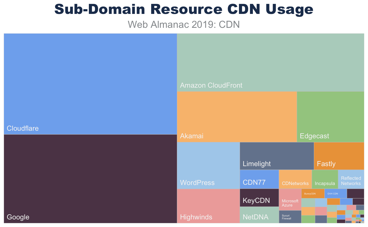
| Sub-Domain CDN Usage (%) | |
|---|---|
| ORIGIN | 60.56 |
| Cloudflare | 10.06 |
| 8.86 | |
| Amazon CloudFront | 6.24 |
| Akamai | 3.5 |
| Edgecast | 1.97 |
| WordPress | 1.69 |
| Highwinds | 1.24 |
| Limelight | 1.18 |
| Fastly | 0.8 |
| CDN77 | 0.43 |
| KeyCDN | 0.41 |
| NetDNA | 0.37 |
| CDNetworks | 0.36 |
| Incapsula | 0.29 |
| Microsoft Azure | 0.28 |
| Reflected Networks | 0.28 |
| Sucuri Firewall | 0.16 |
| BunnyCDN | 0.13 |
| OVH CDN | 0.12 |
| Advanced Hosters CDN | 0.1 |
| Myra Security CDN | 0.07 |
| CDNvideo | 0.07 |
| Level 3 | 0.06 |
| StackPath | 0.06 |
Figure 17.5. Top 25 resource CDNs for sub-domain requests.
The composition of top CDN providers dramatically shifts for third-party resources. Not only are CDNs more frequently observed hosting third-party resources, there is also an increase in purpose-fit CDN providers such as Facebook, Twitter, and Google.
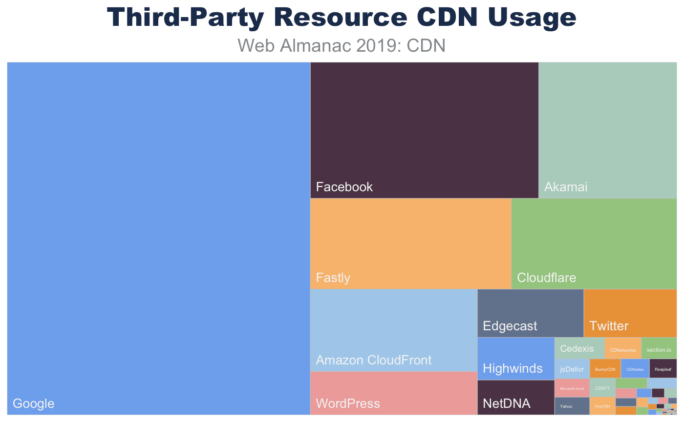
| Third-Party CDN Usage (%) | |
|---|---|
| ORIGIN | 34.27 |
| 29.61 | |
| 8.47 | |
| Akamai | 5.25 |
| Fastly | 5.14 |
| Cloudflare | 4.21 |
| Amazon CloudFront | 3.87 |
| WordPress | 2.06 |
| Edgecast | 1.45 |
| 1.27 | |
| Highwinds | 0.94 |
| NetDNA | 0.77 |
| Cedexis | 0.3 |
| CDNetworks | 0.22 |
| section.io | 0.22 |
| jsDelivr | 0.2 |
| Microsoft Azure | 0.18 |
| Yahoo | 0.18 |
| BunnyCDN | 0.17 |
| CDNvideo | 0.16 |
| Reapleaf | 0.15 |
| CDN77 | 0.14 |
| KeyCDN | 0.13 |
| Azion | 0.09 |
| StackPath | 0.09 |
Figure 17.7. Top 25 resource CDNs for third-party requests.
RTT and TLS management
CDNs can offer more than simple caching for website performance. Many CDNs also support a pass-through mode for dynamic or personalized content when an organization has a legal or other business requirement prohibiting the content from being cached. Utilizing a CDN’s physical distribution enables increased performance for TCP RTT for end users. As others have notedhttps://www.igvita.com/2012/07/19/latency-the-new-web-performance-bottleneck/, reducing RTT is the most effective means to improve web page performancehttps://hpbn.co/primer-on-latency-and-bandwidth/ compared to increasing bandwidth.
Using a CDN in this way can improve page performance in two ways:
Reduce RTT for TCP and TLS negotiation. The speed of light is only so fast and CDNs offer a highly distributed set of data centers that are closer to the end users. In this way the logical (and physical) distance that packets must traverse to negotiate a TCP connection and perform the TLS handshake can be greatly reduced.
Reducing RTT has three immediate benefits. First, it improves the time for the user to receive data, because TCP+TLS connection time are RTT-bound. Secondly, this will improve the time it takes to grow the congestion window and utilize the full amount of bandwidth the user has available. Finally, it reduces the probability of packet loss. When the RTT is high, network interfaces will time-out requests and resend packets. This can result in double packets being delivered.
CDNs can utilize pre-warmed TCP connections to the back-end origin. Just as terminating the connection closer to the user will improve the time it takes to grow the congestion window, the CDN can relay the request to the origin on pre-established TCP connections that have already maximized congestion windows. In this way the origin can return the dynamic content in fewer TCP round trips and the content can be more effectively ready to be delivered to the waiting user.
TLS negotiation time: origin 3x slower than CDNs
Since TLS negotiations require multiple TCP round trips before data can be sent from a server, simply improving the RTT can significantly improve the page performance. For example, looking at the base HTML page, the median TLS negotiation time for origin requests is 207 ms (for desktop WebPageTest). This alone accounts for 10% of a 2 second performance budget, and this is under ideal network conditions where there is no latency applied on the request.
In contrast, the median TLS negotiation for the majority of CDN providers is between 60 and 70 ms. Origin requests for HTML pages take almost 3x longer to complete TLS negotiation than those web pages that use a CDN. Even at the 90th percentile, this disparity perpetuates with origin TLS negotiation rates of 427 ms compared to most CDNs which complete under 140 ms!
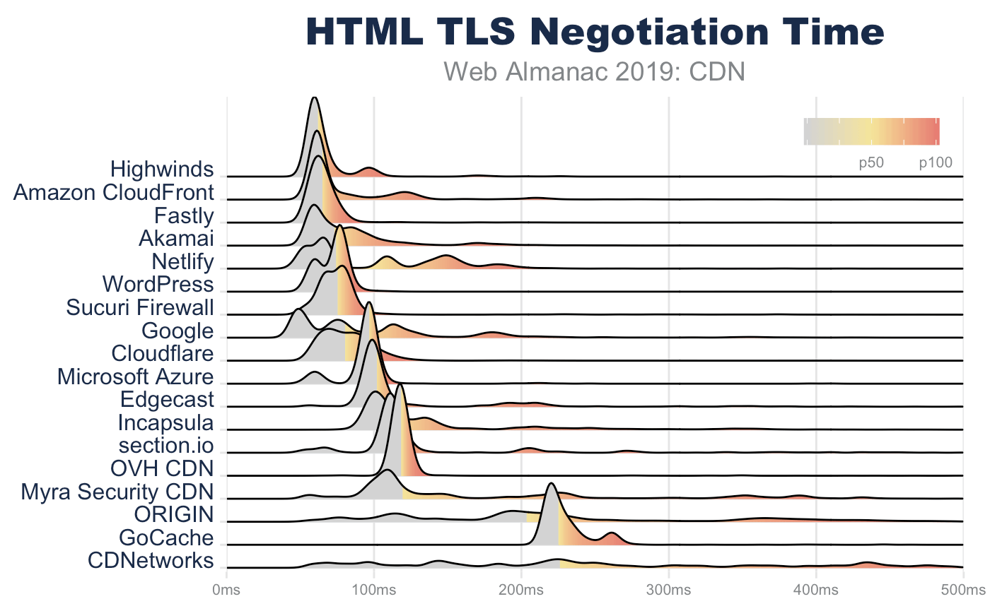
| 10th percentile | 25th percentile | 50th percentile | 75th percentile | 90th percentile | |
|---|---|---|---|---|---|
| Highwinds | 58 | 58 | 60 | 66 | 94 |
| Fastly | 56 | 59 | 63 | 69 | 75 |
| WordPress | 58 | 62 | 76 | 77 | 80 |
| Sucuri Firewall | 63 | 66 | 77 | 80 | 86 |
| Amazon CloudFront | 59 | 61 | 62 | 83 | 128 |
| Cloudflare | 62 | 68 | 80 | 92 | 103 |
| Akamai | 57 | 59 | 72 | 93 | 134 |
| Microsoft Azure | 62 | 93 | 97 | 98 | 101 |
| Edgecast | 94 | 97 | 100 | 110 | 221 |
| 47 | 53 | 79 | 119 | 184 | |
| OVH CDN | 114 | 115 | 118 | 120 | 122 |
| section.io | 105 | 108 | 112 | 120 | 210 |
| Incapsula | 96 | 100 | 111 | 139 | 243 |
| Netlify | 53 | 64 | 73 | 145 | 166 |
| Myra Security CDN | 95 | 106 | 118 | 226 | 365 |
| GoCache | 217 | 219 | 223 | 234 | 260 |
| ORIGIN | 100 | 138 | 207 | 342 | 427 |
| CDNetworks | 85 | 143 | 229 | 369 | 452 |
Figure 17.9. HTML TLS connection time (ms).
For resource requests (including same-domain and third-party), the TLS negotiation time takes longer and the variance increases. This is expected because of network saturation and network congestion. By the time that a third-party connection is established (by way of a resource hint or a resource request) the browser is busy rendering and making other parallel requests. This creates contention on the network. Despite this disadvantage, there is still a clear advantage for third-party resources that utilize a CDN over using an origin solution.
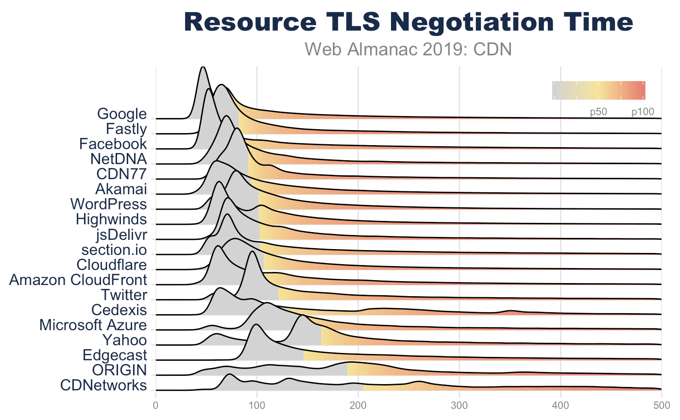
TLS handshake performance is impacted by a number of factors. These include RTT, TLS record size, and TLS certificate size. While RTT has the biggest impact on the TLS handshake, the second largest driver for TLS performance is the TLS certificate size.
During the first round trip of the TLS handshakehttps://hpbn.co/transport-layer-security-tls/#tls-handshake, the server attaches its certificate. This certificate is then verified by the client before proceeding. In this certificate exchange, the server might include the certificate chain by which it can be verified. After this certificate exchange, additional keys are established to encrypt the communication. However, the length and size of the certificate can negatively impact the TLS negotiation performance, and in some cases, crash client libraries.
The certificate exchange is at the foundation of the TLS handshake and is usually handled by isolated code paths so as to minimize the attack surface for exploits. Because of its low level nature, buffers are usually not dynamically allocated, but fixed. In this way, we cannot simply assume that the client can handle an unlimited-sized certificate. For example, OpenSSL CLI tools and Safari can successfully negotiate against https://10000-sans.badssl.com. Yet, Chrome and Firefox fail because of the size of the certificate.
While extreme sizes of certificates can cause failures, even sending moderately large certificates has a performance impact. A certificate can be valid for one or more hostnames which are are listed in the Subject-Alternative-Name (SAN). The more SANs, the larger the certificate. It is the processing of these SANs during verification that causes performance to degrade. To be clear, performance of certificate size is not about TCP overhead, rather it is about processing performance of the client.
Technically, TCP slow start can impact this negotiation but it is very improbable. TLS record length is limited to 16 KB, which fits into a typical initial congestion window of 10. While some ISPs might employ packet splicers, and other tools fragment congestion windows to artificially throttle bandwidth, this isn’t something that a website owner can change or manipulate.
Many CDNs, however, depend on shared TLS certificates and will list many customers in the SAN of a certificate. This is often necessary because of the scarcity of IPv4 addresses. Prior to the adoption of Server-Name-Indicator (SNI) by end users, the client would connect to a server, and only after inspecting the certificate, would the client hint which hostname the user user was looking for (using the Host header in HTTP). This results in a 1:1 association of an IP address and a certificate. If you are a CDN with many physical locations, each location may require a dedicated IP, further aggravating the exhaustion of IPv4 addresses. Therefore, the simplest and most efficient way for CDNs to offer TLS certificates for websites that still have users that don’t support SNI is to offer a shared certificate.
According to Akamai, the adoption of SNI is still not 100% globallyhttps://datatracker.ietf.org/meeting/101/materials/slides-101-maprg-update-on-tls-sni-and-ipv6-client-adoption-00. Fortunately there has been a rapid shift in recent years. The biggest culprits are no longer Windows XP and Vista, but now Android apps, bots, and corporate applications. Even at 99% adoption, the remaining 1% of 3.5 billion users on the internet can create a very compelling motivation for website owners to require a non-SNI certificate. Put another way, a pure play website can enjoy a virtually 100% SNI adoption among standard web browsers. Yet, if the website is also used to support APIs or WebViews in apps, particularly Android apps, this distribution can drop rapidly.
Most CDNs balance the need for shared certificates and performance. Most cap the number of SANs between 100 and 150. This limit often derives from the certificate providers. For example, LetsEncrypthttps://letsencrypt.org/docs/rate-limits/, DigiCerthttps://www.websecurity.digicert.com/security-topics/san-ssl-certificates, and GoDaddyhttps://www.godaddy.com/web-security/multi-domain-san-ssl-certificate all limit SAN certificates to 100 hostnames while Comodohttps://comodosslstore.com/comodo-mdc-ssl.aspx’s limit is 2,000. This, in turn, allows some CDNs to push this limit, cresting over 800 SANs on a single certificate. There is a strong negative correlation of TLS performance and the number of SANs on a certificate.
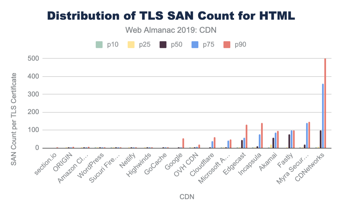
| 10th percentile | 25th percentile | 50th percentile | 75th percentile | 90th percentile | |
|---|---|---|---|---|---|
| section.io | 1 | 1 | 1 | 1 | 2 |
| ORIGIN | 1 | 2 | 2 | 2 | 7 |
| Amazon CloudFront | 1 | 2 | 2 | 2 | 8 |
| WordPress | 2 | 2 | 2 | 2 | 2 |
| Sucuri Firewall | 2 | 2 | 2 | 2 | 2 |
| Netlify | 1 | 2 | 2 | 2 | 3 |
| Highwinds | 1 | 2 | 2 | 2 | 2 |
| GoCache | 1 | 1 | 2 | 2 | 4 |
| 1 | 1 | 2 | 3 | 53 | |
| OVH CDN | 2 | 2 | 3 | 8 | 19 |
| Cloudflare | 1 | 1 | 3 | 39 | 59 |
| Microsoft Azure | 2 | 2 | 2 | 43 | 47 |
| Edgecast | 2 | 4 | 46 | 56 | 130 |
| Incapsula | 2 | 2 | 11 | 78 | 140 |
| Akamai | 2 | 18 | 57 | 85 | 95 |
| Fastly | 1 | 2 | 77 | 100 | 100 |
| Myra Security CDN | 2 | 2 | 18 | 139 | 145 |
| CDNetworks | 2 | 7 | 100 | 360 | 818 |
Figure 17.12. TLS SAN count for HTML.
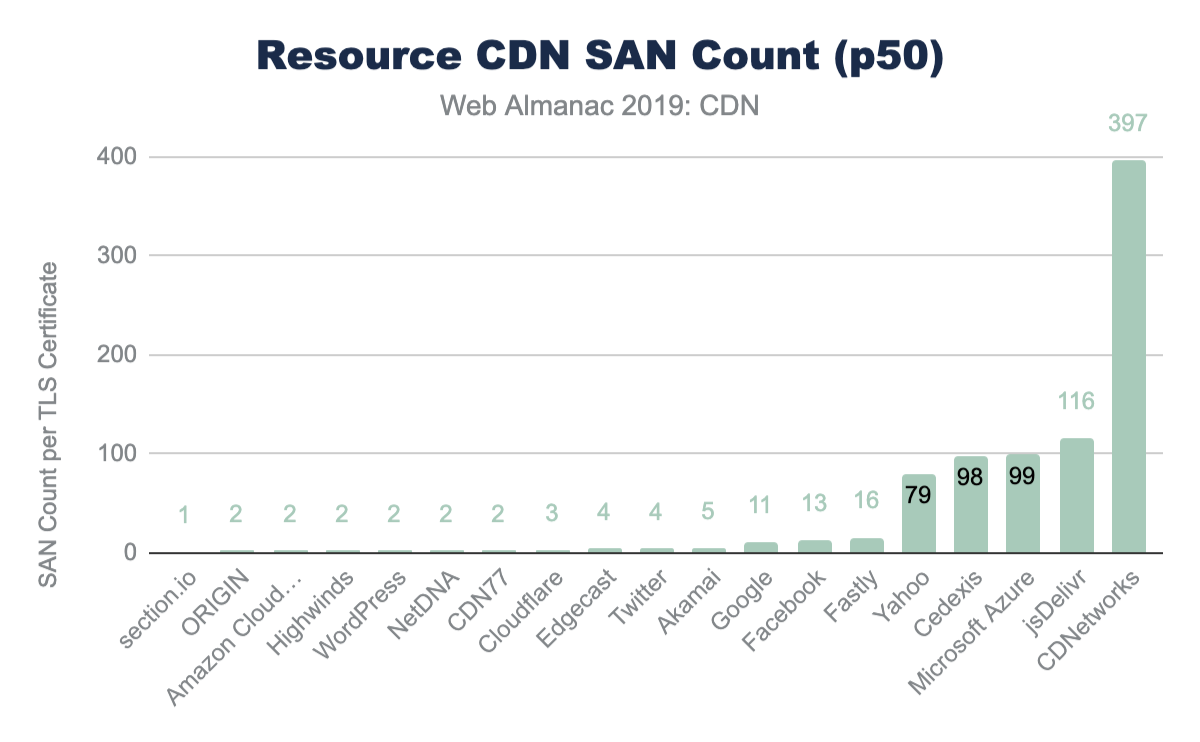
| 10th percentile | 25th percentile | 50th percentile | 75th percentile | 90th percentile | |
|---|---|---|---|---|---|
| section.io | 1 | 1 | 1 | 1 | 1 |
| ORIGIN | 1 | 2 | 2 | 3 | 10 |
| Amazon CloudFront | 1 | 1 | 2 | 2 | 6 |
| Highwinds | 2 | 2 | 2 | 3 | 79 |
| WordPress | 2 | 2 | 2 | 2 | 2 |
| NetDNA | 2 | 2 | 2 | 2 | 2 |
| CDN77 | 2 | 2 | 2 | 2 | 10 |
| Cloudflare | 2 | 3 | 3 | 3 | 35 |
| Edgecast | 2 | 4 | 4 | 4 | 4 |
| 2 | 4 | 4 | 4 | 4 | |
| Akamai | 2 | 2 | 5 | 20 | 54 |
| 1 | 10 | 11 | 55 | 68 | |
| 13 | 13 | 13 | 13 | 13 | |
| Fastly | 2 | 4 | 16 | 98 | 128 |
| Yahoo | 6 | 6 | 79 | 79 | 79 |
| Cedexis | 2 | 2 | 98 | 98 | 98 |
| Microsoft Azure | 2 | 43 | 99 | 99 | 99 |
| jsDelivr | 2 | 116 | 116 | 116 | 116 |
| CDNetworks | 132 | 178 | 397 | 398 | 645 |
Figure 17.14. 10th, 25th, 50th, 75th, and 90th percentiles of the distribution of resource SAN count.
TLS adoption
In addition to using a CDN for TLS and RTT performance, CDNs are often used to ensure patching and adoption of TLS ciphers and TLS versions. In general, the adoption of TLS on the main HTML page is much higher for websites that use a CDN. Over 76% of HTML pages are served with TLS compared to the 62% from origin-hosted pages.
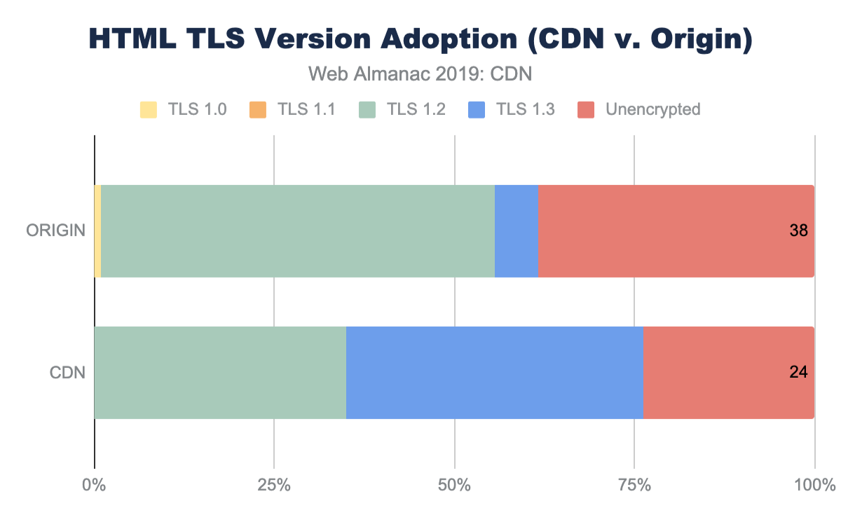
Each CDN offers different rates of adoption for both TLS and the relative ciphers and versions offered. Some CDNs are more aggressive and roll out these changes to all customers whereas other CDNs require website owners to opt-in to the latest changes and offer change-management to facilitate these ciphers and versions.
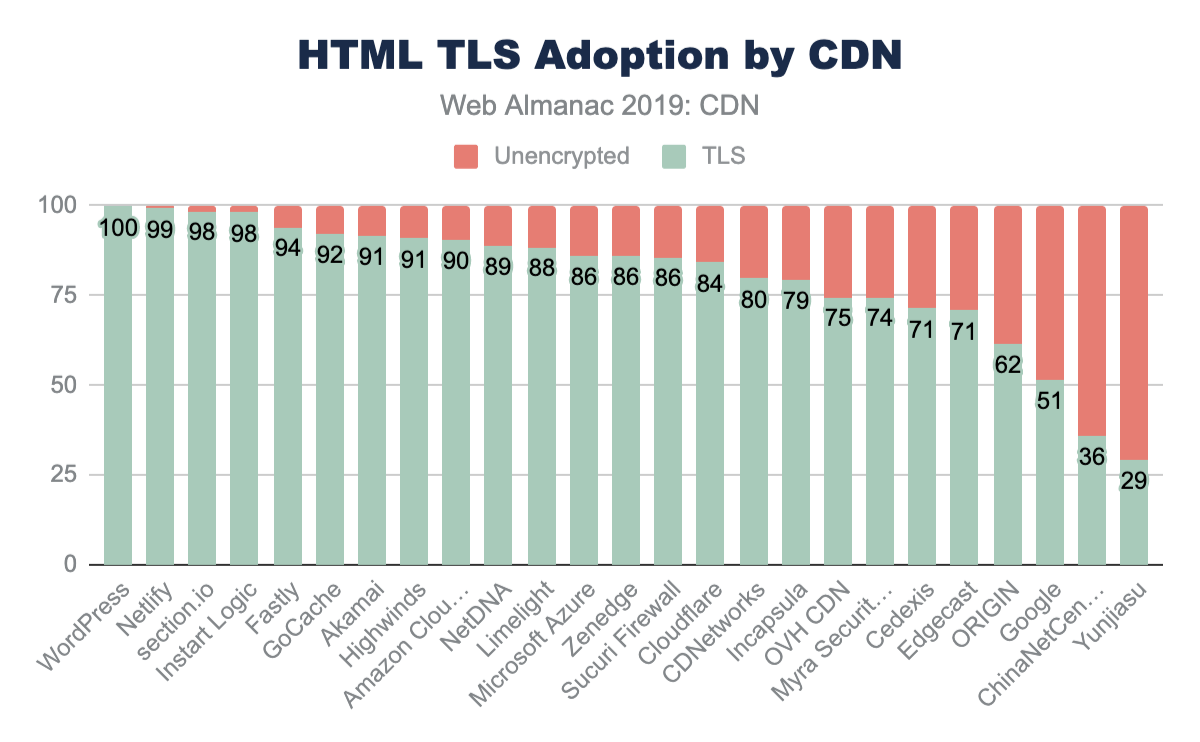
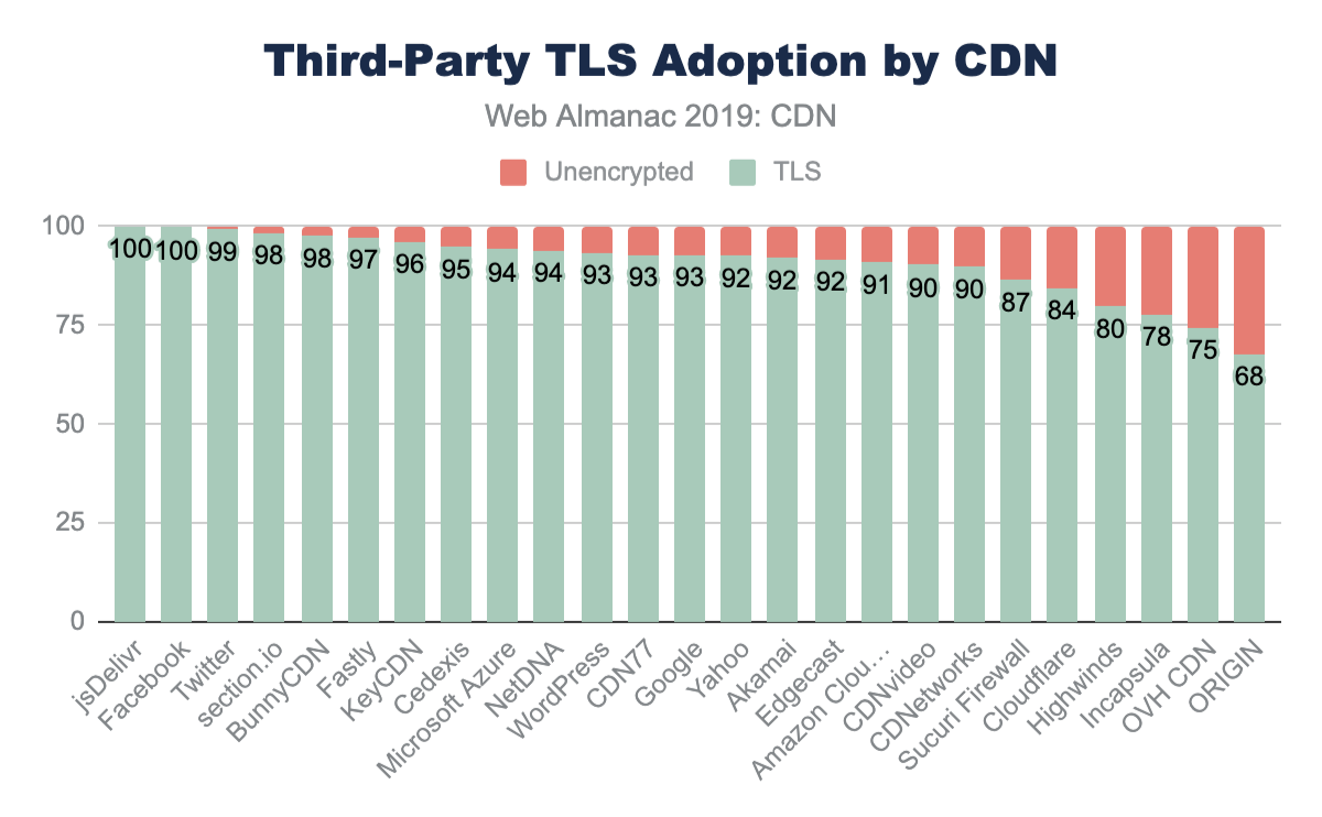
Along with this general adoption of TLS, CDN use also sees higher adoption of emerging TLS versions like TLS 1.3.
In general, the use of a CDN is highly correlated with a more rapid adoption of stronger ciphers and stronger TLS versions compared to origin-hosted services where there is a higher usage of very old and compromised TLS versions like TLS 1.0.
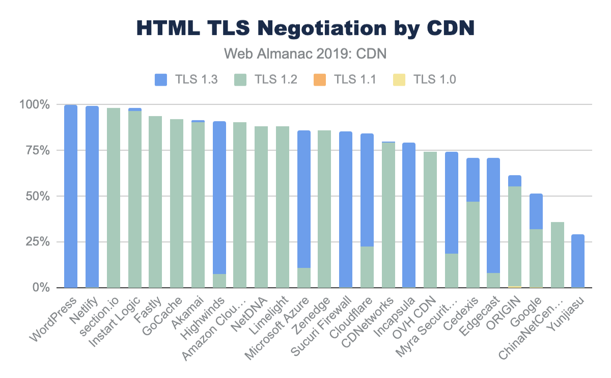
More discussion of TLS versions and ciphers can be found in the Security and HTTP/2 chapters.
HTTP/2 adoption
Along with RTT management and improving TLS performance, CDNs also enable new standards like HTTP/2 and IPv6. While most CDNs offer support for HTTP/2 and many have signaled early support of the still-under-standards-development HTTP/3, adoption still depends on website owners to enable these new features. Despite the change-management overhead, the majority of the HTML served from CDNs has HTTP/2 enabled.
CDNs have over 70% adoption of HTTP/2, compared to the nearly 27% of origin pages. Similarly, sub-domain and third-party resources on CDNs see an even higher adoption of HTTP/2 at 90% or higher while third-party resources served from origin infrastructure only has 31% adoption. The performance gains and other features of HTTP/2 are further covered in the HTTP/2 chapter.
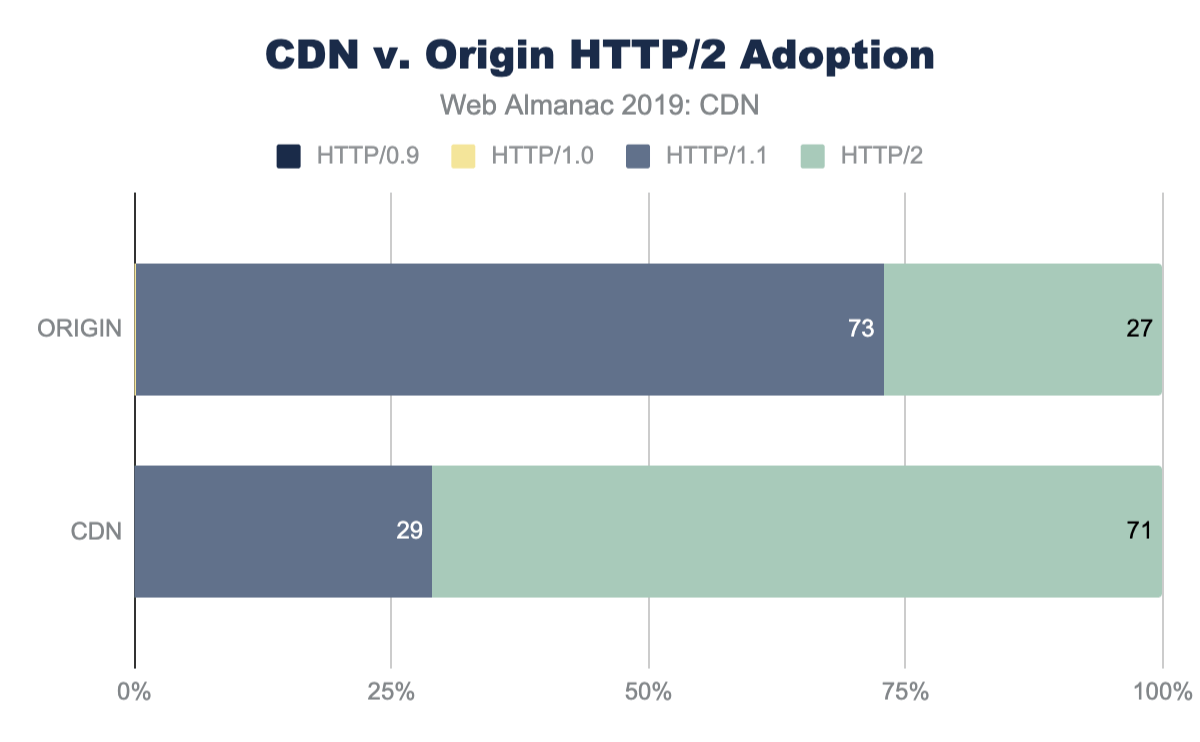
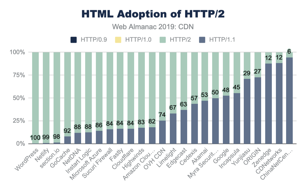
| HTTP/0.9 | HTTP/1.0 | HTTP/1.1 | HTTP/2 | |
|---|---|---|---|---|
| WordPress | 0 | 0 | 0.38 | 100 |
| Netlify | 0 | 0 | 1.07 | 99 |
| section.io | 0 | 0 | 1.56 | 98 |
| GoCache | 0 | 0 | 7.97 | 92 |
| NetDNA | 0 | 0 | 12.03 | 88 |
| Instart Logic | 0 | 0 | 12.36 | 88 |
| Microsoft Azure | 0 | 0 | 14.06 | 86 |
| Sucuri Firewall | 0 | 0 | 15.65 | 84 |
| Fastly | 0 | 0 | 16.34 | 84 |
| Cloudflare | 0 | 0 | 16.43 | 84 |
| Highwinds | 0 | 0 | 17.34 | 83 |
| Amazon CloudFront | 0 | 0 | 18.19 | 82 |
| OVH CDN | 0 | 0 | 25.53 | 74 |
| Limelight | 0 | 0 | 33.16 | 67 |
| Edgecast | 0 | 0 | 37.04 | 63 |
| Cedexis | 0 | 0 | 43.44 | 57 |
| Akamai | 0 | 0 | 47.17 | 53 |
| Myra Security CDN | 0 | 0.06 | 50.05 | 50 |
| 0 | 0 | 52.45 | 48 | |
| Incapsula | 0 | 0.01 | 55.41 | 45 |
| Yunjiasu | 0 | 0 | 70.96 | 29 |
| ORIGIN | 0 | 0.1 | 72.81 | 27 |
| Zenedge | 0 | 0 | 87.54 | 12 |
| CDNetworks | 0 | 0 | 88.21 | 12 |
| ChinaNetCenter | 0 | 0 | 94.49 | 6 |
Figure 17.21. HTML adoption of HTTP/2 by CDN.
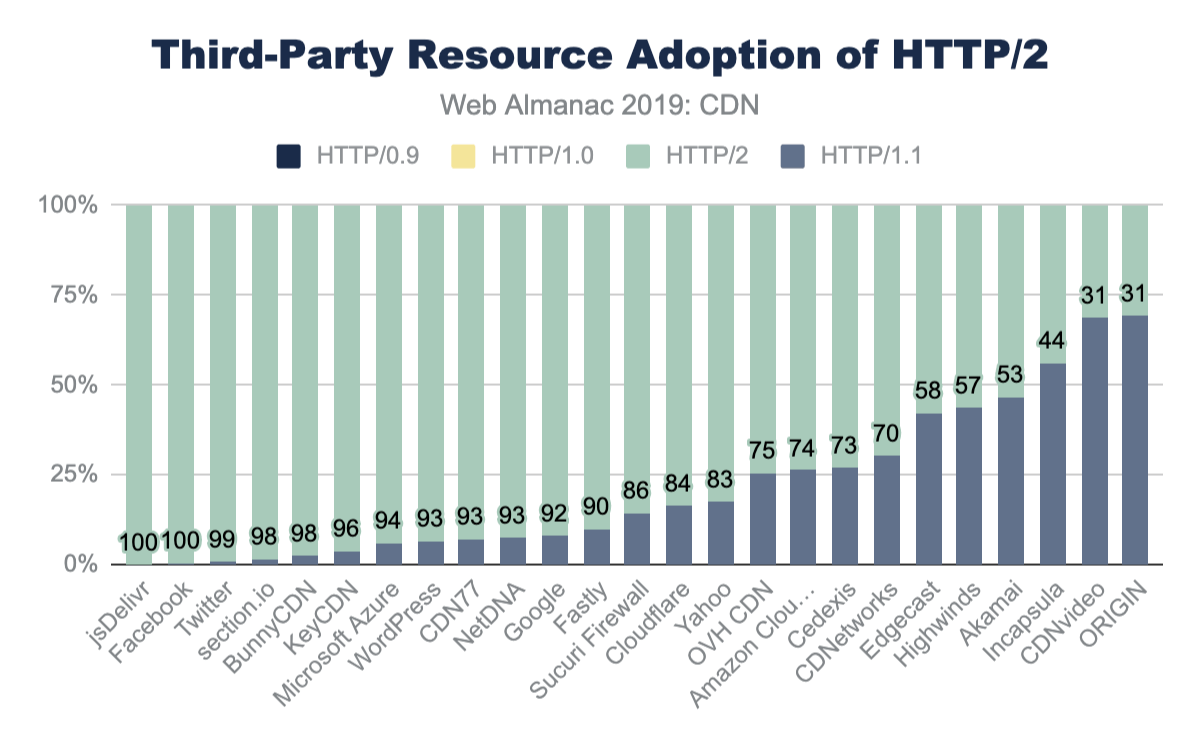
| cdn | HTTP/0.9 | HTTP/1.0 | HTTP/1.1 | HTTP/2 |
|---|---|---|---|---|
| jsDelivr | 0 | 0 | 0 | 100 |
| 0 | 0 | 0 | 100 | |
| 0 | 0 | 1 | 99 | |
| section.io | 0 | 0 | 2 | 98 |
| BunnyCDN | 0 | 0 | 2 | 98 |
| KeyCDN | 0 | 0 | 4 | 96 |
| Microsoft Azure | 0 | 0 | 6 | 94 |
| WordPress | 0 | 0 | 7 | 93 |
| CDN77 | 0 | 0 | 7 | 93 |
| NetDNA | 0 | 0 | 7 | 93 |
| 0 | 0 | 8 | 92 | |
| Fastly | 0 | 0 | 10 | 90 |
| Sucuri Firewall | 0 | 0 | 14 | 86 |
| Cloudflare | 0 | 0 | 16 | 84 |
| Yahoo | 0 | 0 | 17 | 83 |
| OVH CDN | 0 | 0 | 26 | 75 |
| Amazon CloudFront | 0 | 0 | 26 | 74 |
| Cedexis | 0 | 0 | 27 | 73 |
| CDNetworks | 0 | 0 | 30 | 70 |
| Edgecast | 0 | 0 | 42 | 58 |
| Highwinds | 0 | 0 | 43 | 57 |
| Akamai | 0 | 0.01 | 47 | 53 |
| Incapsula | 0 | 0 | 56 | 44 |
| CDNvideo | 0 | 0 | 68 | 31 |
| ORIGIN | 0 | 0.07 | 69 | 31 |
Figure 17.23. HTML/2 adoption: third-party resources.
Controlling CDN caching behavior
Vary
A website can control the caching behavior of browsers and CDNs with the use of different HTTP headers. The most common is the Cache-Control header which specifically determines how long something can be cached before returning to the origin to ensure it is up-to-date.
Another useful tool is the use of the Vary HTTP header. This header instructs both CDNs and browsers how to fragment a cache. The Vary header allows an origin to indicate that there are multiple representations of a resource, and the CDN should cache each variation separately. The most common example is compression. Declaring a resource as Vary: Accept-Encoding allows the CDN to cache the same content, but in different forms like uncompressed, with Gzip, or Brotli. Some CDNs even do this compression on the fly so as to keep only one copy available. This Vary header likewise also instructs the browser how to cache the content and when to request new content.
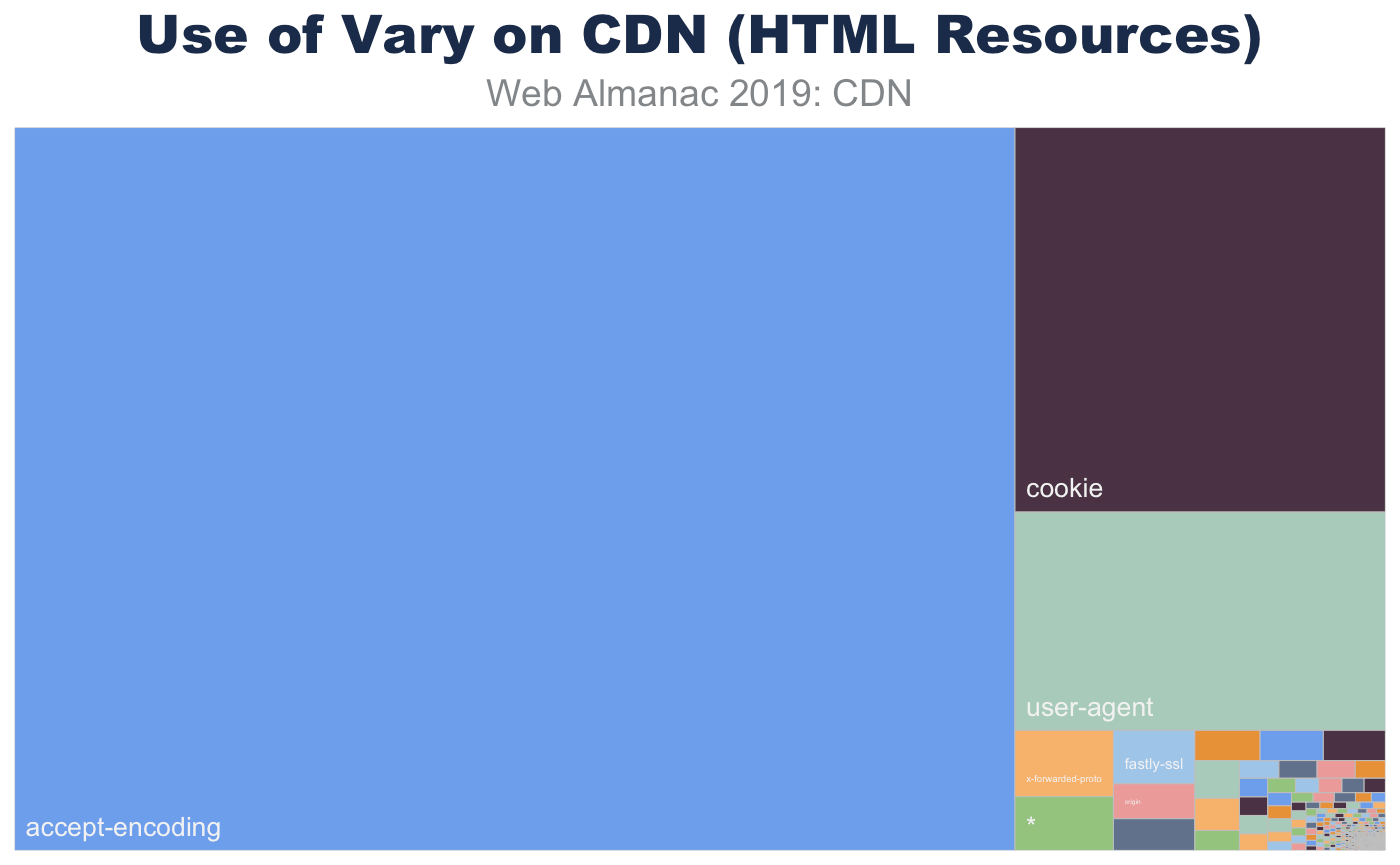
Vary for HTML served from CDNs.
While the main use of Vary is to coordinate Content-Encoding, there are other important variations that websites use to signal cache fragmentation. Using Vary also instructs SEO bots like DuckDuckGo, Google, and BingBot that alternate content would be returned under different conditions. This has been important to avoid SEO penalties for “cloaking” (sending SEO specific content in order to game the rankings).
For HTML pages, the most common use of Vary is to signal that the content will change based on the User-Agent. This is short-hand to indicate that the website will return different content for desktops, phones, tablets, and link-unfurling engines (like Slack, iMessage, and Whatsapp). The use of Vary: User-Agent is also a vestige of the early mobile era, where content was split between “mDot” servers and “regular” servers in the back-end. While the adoption for responsive web has gained wide popularity, this Vary form remains.
In a similar way, Vary: Cookie usually indicates that content that will change based on the logged-in state of the user or other personalization.
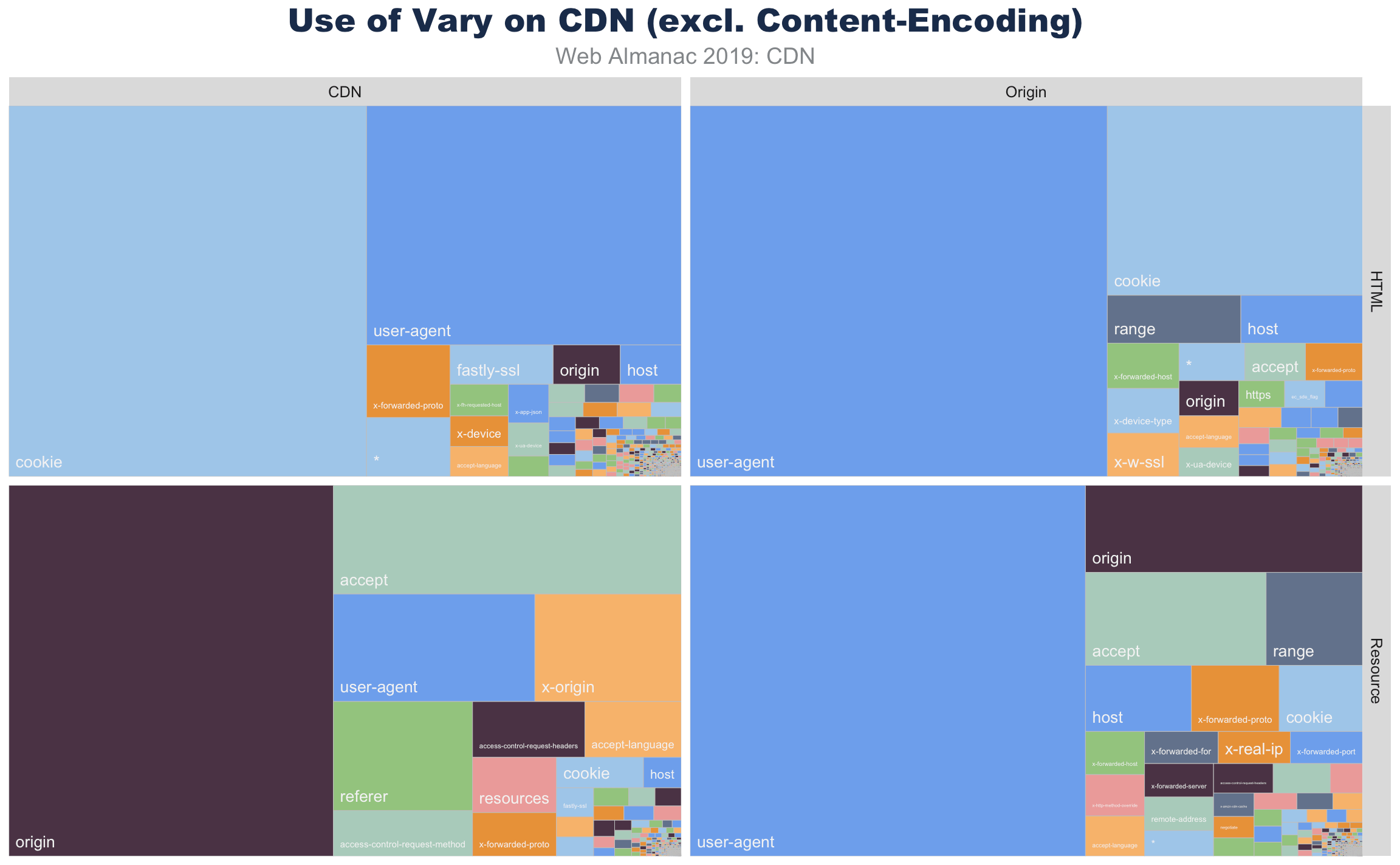
Vary usage for HTML and resources served from origin and CDN.
Resources, in contrast, don’t use Vary: Cookie as much as the HTML resources. Instead these resources are more likely to adapt based on the Accept, Origin, or Referer. Most media, for example, will use Vary: Accept to indicate that an image could be a JPEG, WebP, JPEG 2000, or JPEG XR depending on the browser’s offered Accept header. In a similar way, third-party shared resources signal that an XHR API will differ depending on which website it is embedded. This way, a call to an ad server API will return different content depending on the parent website that called the API.
The Vary header also contains evidence of CDN chains. These can be seen in Vary headers such as Accept-Encoding, Accept-Encoding or even Accept-Encoding, Accept-Encoding, Accept-Encoding. Further analysis of these chains and Via header entries might reveal interesting data, for example how many sites are proxying third-party tags.
Many of the uses of the Vary are extraneous. With most browsers adopting double-key caching, the use of Vary: Origin is redundant. As is Vary: Range or Vary: Host or Vary: *. The wild and variable use of Vary is demonstrable proof that the internet is weird.
Surrogate-Control, s-maxage, and Pre-Check
There are other HTTP headers that specifically target CDNs, or other proxy caches, such as the Surrogate-Control, s-maxage, pre-check, and post-check values in the Cache-Control header. In general usage of these headers is low.
Surrogate-Control allows origins to specify caching rules just for CDNs, and as CDNs are likely to strip the header before serving responses, its low visible usage isn’t a surprise, in fact it’s surprising that it’s actually in any responses at all! (It was even seen from some CDNs that state they strip it).
Some CDNs support post-check as a method to allow a resource to be refreshed when it goes stale, and pre-check as a maxage equivalent. For most CDNs, usage of pre-check and post-check was below 1%. Yahoo was the exception to this and about 15% of requests had pre-check=0, post-check=0. Unfortunately this seems to be a remnant of an old Internet Explorer pattern rather than active usage. More discussion on this can be found in the Caching chapter.
The s-maxage directive informs proxies for how long they may cache a response. Across the Web Almanac dataset, jsDelivr is the only CDN where a high level of usage was seen across multiple resources—this isn’t surprising given jsDelivr’s role as a public CDN for libraries. Usage across other CDNs seems to be driven by individual customers, for example third-party scripts or SaaS providers using that particular CDN.
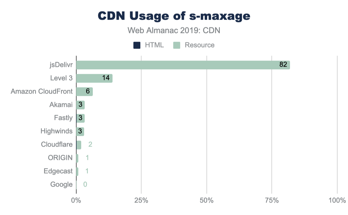
s-maxage across CDN responses.
With 40% of sites using a CDN for resources, and presuming these resources are static and cacheable, the usage of s-maxage seems low.
Future research might explore cache lifetimes versus the age of the resources, and the usage of s-maxage versus other validation directives such as stale-while-revalidate.
CDNs for common libraries and content
So far, this chapter has explored the use of commercials CDNs which the site may be using to host its own content, or perhaps used by a third-party resource included on the site.
Common libraries like jQuery and Bootstrap are also available from public CDNs hosted by Google, Cloudflare, Microsoft, etc. Using content from one of the public CDNs instead of a self-hosting the content is a trade-off. Even though the content is hosted on a CDN, creating a new connection and growing the congestion window may negate the low latency of using a CDN.
Google Fonts is the most popular of the content CDNs and is used by 55% of websites. For non-font content, Google API, Cloudflare’s JS CDN, and the Bootstrap’s CDN are the next most popular.
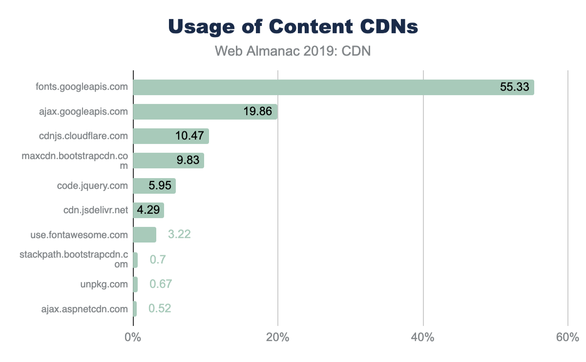
As more browsers implement partitioned caches, the effectiveness of public CDNs for hosting common libraries will decrease and it will be interesting to see whether they are less popular in future iterations of this research.
Conclusion
The reduction in latency that CDNs deliver along with their ability to store content close to visitors enable sites to deliver faster experiences while reducing the load on the origin.
Steve Souders’ recommendation to use a CDN remains as valid today as it was 12 years ago, yet only 20% of sites serve their HTML content via a CDN, and only 40% are using a CDN for resources, so there’s plenty of opportunity for their usage to grow further.
There are some aspects of CDN adoption that aren’t included in this analysis, sometimes this was due to the limitations of the dataset and how it’s collected, in other cases new research questions emerged during the analysis.
As the web continues to evolve, CDN vendors innovate, and sites use new practices CDN adoption remains an area rich for further research in future editions of the Web Almanac.
Authors
-
Andy DaviesAndy Davies is a Freelance Web Performance Consultant and has helped some of the UK’s leading retailers, newspapers and financial services companies to make their sites faster. He wrote The Pocket Guide to Web Performance, is co-author of Using WebPageTest and also an organizer of the London Web Performance meetup. You can find Andy on Twitter as @AndyDavies, and he occasionally blogs at https://andydavies.me
-
Colin BendellColin is part of the CTO Office at Cloudinaryhttps://cloudinary.com/ and co-author of the O’Reilly book High Performance Imageshttps://www.oreilly.com/library/view/high-performance-images/9781491925799/. He spends much of his time at the intersection of high volume data, media, browsers and standards. You can find him on tweeting @colinbendell and at blogging at https://bendell.ca.

Page Weight
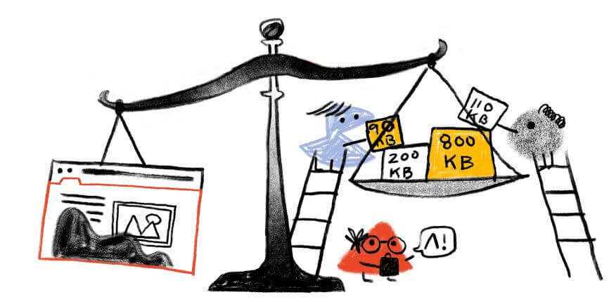
Introduction
The median web page is around 1900 KB in size and contains 74 requests. That doesn’t sound too bad, right?
Here’s the issue with medians: they mask problems. By definition, they focus only on the middle of the distribution. We need to consider percentiles at both extremes to get an understanding of the bigger picture.
Looking at the 90th percentile exposes the unpleasant stuff. Roughly 10% of the pages we’re pushing at the unsuspecting public are in excess of 6 MB and contain 179 requests. This is, frankly, terrible. If this doesn’t seem terrible to you, then you definitely need to read this chapter.
Myth: Page size doesn’t matter
The common argument as to why page size doesn’t matter anymore is that, thanks to high-speed internet and our souped-up devices, we can serve massive, complex (and massively complex) pages to the general population. This assumption works fine, as long as you’re okay with ignoring the vast swathe of internet users who don’t have access to said high-speed internet and souped-up devices.
Yes, you can build large robust pages that feel fast… to some users. But you should care about page bloat in terms of how it affects all your users, especially mobile-only users who deal with bandwidth constraints or data limits.
More bandwidth isn’t a magic bullet for web performance
Even if more people had access to better devices and cheaper connections, that wouldn’t be a complete solution. Double the bandwidth doesn’t mean twice as fast. In fact, it has been demonstratedhttps://developer.akamai.com/blog/2015/06/09/heres-why-more-bandwidth-isnt-magic-bullet-web-performance that increasing bandwidth by up to 1,233% only made pages 55% faster.
The problem is latency. Most of our networking protocols require a lot of round-trips, and each of those round trips imposes a latency penalty. For as long as latency continues to be a performance problem (which is to say, for the foreseeable future), the major performance culprit will continue to be that a typical web page today contains a hundred or so assets hosted on dozens of different servers. Many of these assets are unoptimized, unmeasured, unmonitored—and therefore unpredictable.
What types of assets does the HTTP Archive track, and how much do they matter?
Here’s a quick glossary of the page composition metrics that the HTTP Archive tracks, and how much they matter in terms of performance and user experience:
The total size is the total weight in bytes of the page. It matters especially to mobile users who have limited and/or metered data.
HTML is typically the smallest resource on the page. Its performance risk is negligible.
Unoptimized images are often the greatest contributor to page bloat. Looking at the 90th percentile of the distribution of page weight, images account for a whopping 5.2 MB of a roughly 7 MB page. In other words, images comprise almost 75% of the total page weight. And if that already wasn’t enough, the number of images on a page has been linked to lower conversion rates on retail sites. (More on that later.)
JavaScript matters. A page can have a relatively low JavaScript weight but still suffer from JavaScript-inflicted performance problems. Even a single 100 KB third-party script can wreak havoc with your page. The more scripts on your page, the greater the risk.
It’s not enough to focus solely on blocking JavaScript. It’s possible for your pages to contain zero blocking resources and still have less-than-optimal performance because of how your JavaScript is rendered. That’s why it’s so important to understand CPU usage on your pages, because JavaScript consumes more CPU than all other browser activities combined. While JavaScript blocks the CPU, the browser can’t respond to user input. This creates what’s commonly called “jank”: that annoying feeling of jittery, unstable page rendering.
CSS is an incredible boon for modern web pages. It solves a myriad of design problems, from browser compatibility to design maintenance and updating. Without CSS, we wouldn’t have great things like responsive design. But, like JavaScript, CSS doesn’t have to be bulky to cause problems. Poorly executed stylesheets can create a host of performance problems, ranging from stylesheets taking too long to download and parse, to improperly placed stylesheets that block the rest of the page from rendering. And, similarly to JavaScript, more CSS files equals more potential trouble.
Bigger, complex pages can be bad for your business
Let’s assume you’re not a heartless monster who doesn’t care about your site’s visitors. But if you are, you should know that serving bigger, more complex pages hurts you, too. That was one of the findings of a Google-led machine learning studyhttps://www.thinkwithgoogle.com/marketing-resources/experience-design/mobile-page-speed-load-time/ that gathered over a million beacons’ worth of real user data from retail sites.
There were three really important takeaways from this research:
The total number of elements on a page was the greatest predictor of conversions. Hopefully this doesn’t come as a huge surprise to you, given what we’ve just covered about the performance risks imposed by the various assets that make up a modern web page.
The number of images on a page was the second greatest predictor of conversions. Sessions in which users converted had 38% fewer images than in sessions that didn’t convert.
- Sessions with more scripts were less likely to convert. What’s really fascinating about this chart isn’t just the sharp drop-off in conversion probability after about 240 scripts. It’s the long tail that demonstrates how many retail sessions contained up to 1,440 scripts!
Now that we’ve covered why page size and complexity matter, let’s get into some juicy HTTP Archive stats so we can better understand the current state of the web and the impact of page bloat.
Analysis
The statistics in this section are all based on the transfer size of a page and its resources. Not all resources on the web are compressed before sending, but if they are, this analysis uses the compressed size.
Page weight
Roughly speaking, mobile sites are about 10% smaller than their desktop counterparts. The majority of the difference is due to mobile sites loading fewer image bytes than their desktop counterparts.
Mobile
| Percentile | Total (KB) | HTML (KB) | JS (KB) | CSS (KB) | Image (KB) | Document (KB) |
|---|---|---|---|---|---|---|
| 90 | 6226 | 107 | 1060 | 234 | 4746 | 49 |
| 75 | 3431 | 56 | 668 | 122 | 2270 | 25 |
| 50 | 1745 | 26 | 360 | 56 | 893 | 13 |
| 25 | 800 | 11 | 164 | 22 | 266 | 7 |
| 10 | 318 | 6 | 65 | 5 | 59 | 4 |
Figure 18.3. Page weight on mobile broken down by resource type.
Desktop
| Percentile | Total (KB) | HTML (KB) | JS (KB) | CSS (KB) | Image (KB) | Document (KB) |
|---|---|---|---|---|---|---|
| 90 | 6945 | 110 | 1131 | 240 | 5220 | 52 |
| 75 | 3774 | 58 | 721 | 129 | 2434 | 26 |
| 50 | 1934 | 27 | 391 | 62 | 983 | 14 |
| 25 | 924 | 12 | 186 | 26 | 319 | 8 |
| 10 | 397 | 6 | 76 | 8 | 78 | 4 |
Figure 18.4. Page weight on desktop broken down by resource type.
Page weight over time
Over the past year the median size of a desktop site increased by 434 KB, and the median size of a mobile site increased by 179 KB. Images are overwhelmingly driving this increase.
Mobile
| Percentile | Total (KB) | HTML (KB) | JS (KB) | CSS (KB) | Image (KB) | Document (KB) |
|---|---|---|---|---|---|---|
| 90 | +376 | -50 | +46 | +36 | +648 | +2 |
| 75 | +304 | -7 | +34 | +21 | +281 | 0 |
| 50 | +179 | -1 | +27 | +10 | +106 | 0 |
| 25 | +110 | -1 | +16 | +5 | +36 | 0 |
| 10 | +72 | 0 | +13 | +2 | +20 | +1 |
Figure 18.5. Change in mobile page weight since 2018.
Desktop
| Percentile | Total (KB) | HTML (KB) | JS (KB) | CSS (KB) | Image (KB) | Document (KB) |
|---|---|---|---|---|---|---|
| 90 | +1106 | -75 | +22 | +45 | +1291 | +5 |
| 75 | +795 | -12 | +9 | +32 | +686 | +1 |
| 50 | +434 | -1 | +10 | +15 | +336 | 0 |
| 25 | +237 | 0 | +12 | +7 | +138 | 0 |
| 10 | +120 | 0 | +10 | +2 | +39 | +1 |
Figure 18.6. Change in desktop page weight since 2018.
For a longer-term perspective on how page weight has changed over time, check out this timeseries graphhttps://httparchive.org/reports/page-weight#bytesTotal from HTTP Archive. Median page size has grown at a fairly constant rate since the HTTP Archive started tracking this metric in November 2010 and the increase in page weight observed over the past year is consistent with this.
Page requests
The median desktop page makes 74 requests, and the median mobile page makes 69. Images and JavaScript account for the majority of these requests. There was no significant change in the quantity or distribution of requests over the last year.
Mobile
| Percentile | Total | HTML | JS | CSS | Image | Document |
|---|---|---|---|---|---|---|
| 90 | 168 | 15 | 52 | 20 | 79 | 7 |
| 75 | 111 | 7 | 32 | 12 | 49 | 2 |
| 50 | 69 | 3 | 18 | 6 | 28 | 0 |
| 25 | 40 | 2 | 9 | 3 | 15 | 0 |
| 10 | 22 | 1 | 4 | 1 | 7 | 0 |
Figure 18.7. Mobile page requests broken down by resource type.
Desktop
| Percentile | Total | HTML | JS | CSS | Image | Document |
|---|---|---|---|---|---|---|
| 90 | 179 | 14 | 53 | 20 | 90 | 6 |
| 75 | 118 | 7 | 33 | 12 | 54 | 2 |
| 50 | 74 | 4 | 19 | 6 | 31 | 0 |
| 25 | 44 | 2 | 10 | 3 | 16 | 0 |
| 10 | 24 | 1 | 4 | 1 | 7 | 0 |
Figure 18.8. Desktop page requests broken down by resource type.
File formats
The preceding analysis has focused on analyzing page weight through the lens of resource types. However, in the case of images and media, it’s possible to dive a level deeper and look at the differences in resource sizes between specific file formats.
File size by image format (mobile)
| Percentile | GIF (KB) | ICO (KB) | JPG (KB) | PNG (KB) | SVG (KB) | WEBP (KB) |
|---|---|---|---|---|---|---|
| 10 | 0 | 0 | 3.08 | 0.37 | 0.25 | 2.54 |
| 25 | 0.03 | 0.26 | 7.96 | 1.14 | 0.43 | 4.89 |
| 50 | 0.04 | 1.12 | 21 | 4.31 | 0.88 | 13 |
| 75 | 0.06 | 2.72 | 63 | 22 | 2.41 | 33 |
| 90 | 2.65 | 13 | 155 | 90 | 7.91 | 78 |
Figure 18.9. Images file sizes on mobile broken down by image format.
Some of these results, particularly those for GIFs, are really surprising. If GIFs are so small, then why are they being replaced by formats like JPG, PNG, and WEBP?
The data above obscures the fact that the vast majority of GIFs on the web are actually tiny 1x1 pixels. These pixels are typically used as “tracking pixels”, but can also be used as a hack to generate various CSS effects. While these 1x1 pixels are images in the literal sense, the spirit of their usage is probably closer to what we’d associate with scripts or CSS.
Further investigation into the data set revealed that 62% of GIFs are 43 bytes or smaller (43 bytes is the size of a transparent, 1x1 pixel GIF) and 84% of GIFs are 1 KB or smaller.
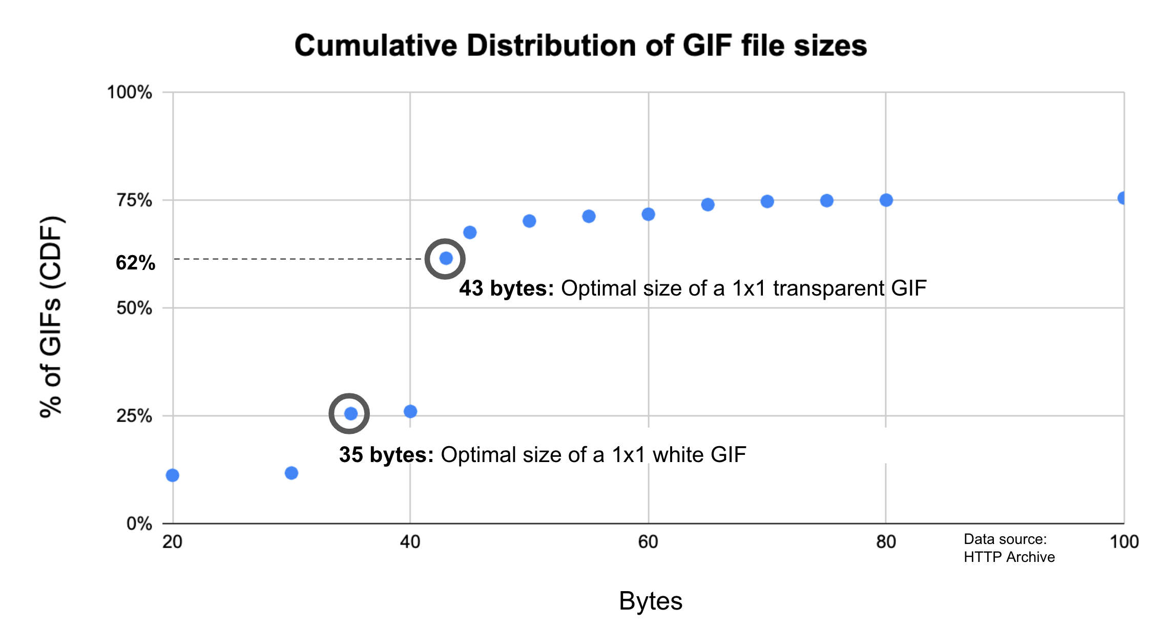
The tables below show two different approaches to removing these tiny images from the data set: the first one is based on images with a file size greater than 100 bytes, the second is based on images with a file size greater than 1024 bytes.
File size by image format for images > 100 bytes
| Percentile | GIF (KB) | ICO (KB) | JPG (KB) | PNG (KB) | SVG (KB) | WEBP (KB) |
|---|---|---|---|---|---|---|
| 10 | 0.27 | 0.31 | 3.08 | 0.4 | 0.28 | 2.1 |
| 25 | 0.75 | 0.6 | 7.7 | 1.17 | 0.46 | 4.4 |
| 50 | 2.14 | 1.12 | 20.47 | 4.35 | 0.95 | 11.54 |
| 75 | 7.34 | 4.19 | 61.13 | 21.39 | 2.67 | 31.21 |
| 90 | 35 | 14.73 | 155.46 | 91.02 | 8.26 | 76.43 |
Figure 18.11. File size by image format for images > 100 bytes.
File size by image format for images > 1024 bytes
| Percentile | GIF (KB) | ICO (KB) | JPG (KB) | PNG (KB) | SVG (KB) | WEBP (KB) |
|---|---|---|---|---|---|---|
| 10 | 1.28 | 1.12 | 3.4 | 1.5 | 1.2 | 3.08 |
| 25 | 1.9 | 1.12 | 8.21 | 2.88 | 1.52 | 5 |
| 50 | 4.01 | 2.49 | 21.19 | 8.33 | 2.81 | 12.52 |
| 75 | 11.92 | 7.87 | 62.54 | 33.17 | 6.88 | 32.83 |
| 90 | 67.15 | 22.13 | 157.96 | 127.15 | 19.06 | 79.53 |
Figure 18.12. File size by image format for images > 1024 bytes.
The low file size of PNG images compared to JPEG images may seem surprising. JPEG uses lossy compressionhttps://en.wikipedia.org/wiki/Lossy_compression. Lossy compression results in data loss, which makes it possible to achieve smaller file sizes. Meanwhile, PNG uses lossless compressionhttps://en.wikipedia.org/wiki/Lossless_compression. This does not result in data loss, which this produces higher-quality, but larger images. However, this difference in file sizes is probably a reflection of the popularity of PNGs for iconography due to their transparency support, rather than differences in their encoding and compression.
File size by media format
MP4 is overwhelmingly the most popular video format on the web today. In terms of popularity, it is followed by WebM and MPEG-TS respectively.
Unlike some of the other tables in this data set, this one has mostly happy takeaways. Videos are consistently smaller on mobile, which is great to see. In addition, the median size of an MP4 video is a very reasonable 18 KB on mobile and 39 KB on desktop. The median numbers for WebM are even better but they should be taken with a grain of salt: the duplicate measurement of 0.29 KB across multiple clients and percentiles is a little bit suspicious. One possible explanation is that identical copies of one very tiny WebM video is included on many pages. Of the three formats, MPEG-TS consistently has the highest file size across all percentiles. This may be related to the fact that it was released in 1995, making it the oldest of these three media formats.
Mobile
| Percentile | MP4 (KB) | WebM (KB) | MPEG-TS (KB) |
|---|---|---|---|
| 10 | 0.89 | 0.29 | 0.01 |
| 25 | 2.07 | 0.29 | 55 |
| 50 | 18 | 1.44 | 153 |
| 75 | 202 | 223 | 278 |
| 90 | 928 | 390 | 475 |
Figure 18.13. Video size by media format on mobile.
Desktop
| Percentile | MP4 (KB) | WebM (KB) | MPEG-TS (KB) |
|---|---|---|---|
| 10 | 0.27 | 0.29 | 34 |
| 25 | 1.05 | 0.29 | 121 |
| 50 | 39 | 17 | 286 |
| 75 | 514 | 288 | 476 |
| 90 | 2142 | 896 | 756 |
Figure 18.14. Video size by media format on desktop.
Conclusion
Over the past year, pages increased in size by roughly 10%. Brotli, performance budgets, and basic image optimization best practices are probably the three techniques which show the most promise for maintaining or improving page weight while also being widely applicable and fairly easy to implement. That being said, in recent years, improvements in page weight have been more constrained by the low adoption of best practices than by the technology itself. In other words, although there are many existing techniques for improving page weight, they won’t make a difference if they aren’t put to use.
Authors
-
Tammy EvertsTammy Everts has spent more than two decades studying usability and UX. For the past ten years, she’s focused on the intersection of UX with web performance and business. She is CXO at SpeedCurvehttps://speedcurve.com/, co-chair of the performance.now() conferencehttps://perfnow.nl/, and author of the O’Reilly book Time Is Money_bio: The Business Value of Performancehttp://shop.oreilly.com/product/0636920041450.do.
-
Katie HempeniusKatie Hempenius is an engineer on the Chrome team where she works on making the web faster.


Resource Hints
Introduction
Resource hintshttps://www.w3.org/TR/resource-hints/ provide “hints” to the browser about what resources will be needed soon. The action that the browser takes as a result of receiving this hint will vary depending on the type of resource hint; different resource hints kick off different actions. When used correctly, they can improve page performance by giving a head start to important anticipated actions.
Exampleshttps://youtu.be/YJGCZCaIZkQ?t=1956 of performance improvements as a result of resource hints include:
- Jabong decreased Time to Interactive by 1.5 seconds by preloading critical scripts.
- Barefoot Wine decreased Time to Interactive of future pages by 2.7 seconds by prefetching visible links.
- Chrome.com decreased latency by 0.7 seconds by preconnecting to critical origins.
There are four separate resource hints supported by most browsers today: dns-prefetch, preconnect, preload, and prefetch.
dns-prefetch
The role of dns-prefetch is to initiate an early DNS lookup. It’s useful for completing the DNS lookup for third-parties. For example, the DNS lookup of a CDN, font provider, or third-party API.
preconnect
preconnect initiates an early connection, including DNS lookup, TCP handshake, and TLS negotiation. This hint is useful for setting up a connection with a third party. The uses of preconnect are very similar to those of dns-prefetch, but preconnect has less browser support. However, if you don’t need IE 11 support, preconnect is probably a better choice.
preload
The preload hint initiates an early request. This is useful for loading important resources that would otherwise be discovered late by the parser. For example, if an important image is only discoverable once the browser has received and parsed the stylesheet, it may make sense to preload the image.
prefetch
prefetch initiates a low-priority request. It’s useful for loading resources that will be used on the subsequent (rather than current) page load. A common use of prefetch is loading resources that the application “predicts” will be used on the next page load. These predictions could be based on signals like user mouse movement or common user flows/journeys.
Syntax
97% of resource hint usage relied on using the <link> tag to specify a resource hint. For example:
<link rel="prefetch" href="shopping-cart.js">Only 3% of resource hint usage used HTTP headershttps://developer.mozilla.org/docs/Web/HTTP/Headers/Link to specify resource hints. For example:
Link: <https://example.com/shopping-cart.js>; rel=prefetchBecause the usage of resource hints in HTTP headers is so low, the remainder of this chapter will focus solely on analyzing the usage of resource hints in conjunction with the <link> tag. However, it’s worth noting that in future years, usage of resource hints in HTTP headers may increase as HTTP/2 Push is adopted. This is due to the fact that HTTP/2 Push has repurposed the HTTP preload Link header as a signal to push resources.
Resource hints
| Resource Hint | Usage (percent of sites) |
|---|---|
dns-prefetch
|
29% |
preload
|
16% |
preconnect
|
4% |
prefetch
|
3% |
prerender (deprecated)
|
0.13% |
Figure 19.1. Adoption of resource hints.
The relative popularity of dns-prefetch is unsurprising; it’s a well-established API (it first appeared in 2009https://caniuse.com/#feat=link-rel-dns-prefetch), it is supported by all major browsers, and it is the most “inexpensive” of all resource hints. Because dns-prefetch only performs DNS lookups, it consumes very little data, and therefore there is very little downside to using it. dns-prefetch is most useful in high-latency situations.
That being said, if a site does not need to support IE11 and below, switching from dns-prefetch to preconnect is probably a good idea. In an era where HTTPS is ubiquitous, preconnect yields greater performance improvements while still being inexpensive. Note that unlike dns-prefetch, preconnect not only initiates the DNS lookup, but also the TCP handshake and TLS negotiation. The certificate chainhttps://knowledge.digicert.com/solution/SO16297.html is downloaded during TLS negotiation and this typically costs a couple of kilobytes.
prefetch is used by 3% of sites, making it the least widely used resource hint. This low usage may be explained by the fact that prefetch is useful for improving subsequent—rather than current—page loads. Thus, it will be overlooked if a site is only focused on improving their landing page, or the performance of the first page viewed.
| Resource Hint | Resource Hints Per Page: Median |
Resource Hints Per Page: 90th Percentile |
|---|---|---|
dns-prefetch
|
2 | 8 |
preload
|
2 | 4 |
preconnect
|
2 | 8 |
prefetch
|
1 | 3 |
prerender (deprecated)
|
1 | 1 |
Figure 19.2. Median and 90th percentiles of the number of resource hints used per page, of all pages using that resource hint.
Resource hints are most effective when they’re used selectively (“when everything is important, nothing is”). Figure 19.2 above shows the number of resource hints per page for pages using at least one resource hint. Although there is no clear cut rule for defining what an appropriate number of resource hints is, it appears that most sites are using resource hints appropriately.
The crossorigin attribute
Most “traditional” resources fetched on the web (images, stylesheets, and scripts) are fetched without opting in to Cross-Origin Resource Sharing (CORShttps://developer.mozilla.org/docs/Web/HTTP/CORS). That means that if those resources are fetched from a cross-origin server, by default their contents cannot be read back by the page, due to the same-origin policy.
In some cases, the page can opt-in to fetch the resource using CORS if it needs to read its content. CORS enables the browser to “ask permission” and get access to those cross-origin resources.
For newer resource types (e.g. fonts, fetch() requests, ES modules), the browser defaults to requesting those resources using CORS, failing the requests entirely if the server does not grant it permission to access them.
crossorigin value |
Usage | Explanation |
|---|---|---|
| Not set | 92% | If the crossorigin attribute is absent, the request will follow the single-origin policy. |
| anonymous (or equivalent) | 7% | Executes a cross-origin request that does not include credentials. |
| use-credentials | 0.47% | Executes a cross-origin request that includes credentials. |
Figure 19.3. Adoption of the crossorigin attribute as a percent of resource hint instances.
In the context of resource hints, usage of the crossorigin attribute enables them to match the CORS mode of the resources they are supposed to match and indicates the credentials to include in the request. For example, anonymous enables CORS and indicates that no credentials should be included for those cross-origin requests:
<link rel="prefetch" href="https://other-server.com/shopping-cart.css" crossorigin="anonymous">Although other HTML elements support the crossorigin attribute, this analysis only looks at usage with resource hints.
The as attribute
as is an attribute that should be used with the preload resource hint to inform the browser of the type (e.g. image, script, style, etc.) of the requested resource. This helps the browser correctly prioritize the request and apply the correct Content Security Policy (CSPhttps://developers.google.com/web/fundamentals/security/csp). CSP is a security mechanism, expressed via HTTP header, that helps mitigate the impact of XSS and other malicious attacks by declaring a safelist of trusted sources; only content from these sources can be rendered or executed.
as attribute.
88% of resource hint instances use the as attribute. When as is specified, it is overwhelmingly used for scripts: 92% of usage is script, 3% font, and 3% styles. This is unsurprising given the prominent role that scripts play in most sites’ architecture as well the high frequency with which scripts are used as attack vectors (thereby making it therefore particularly important that scripts get the correct CSP applied to them).
The future
At the moment, there are no proposals to expand the current set of resource hints. However, priority hints and native lazy loading are two proposed technologies that are similar in spirit to resource hints in that they provide APIs for optimizing the loading process.
Priority Hints
Priority hintshttps://wicg.github.io/priority-hints/ are an API for expressing the fetch priority of a resource: high, low, or auto. They can be used with a wide range of HTML tags: specifically <image>, <link>, <script>, and <iframe>.
<carousel>
  <img src="cat1.jpg" importance="high">
  <img src="cat2.jpg" importance="low">
  <img src="cat3.jpg" importance="low">
</carousel>For example, if you had an image carousel, priority hints could be used to prioritize the image that users see immediately and deprioritize later images.
Priority hints are implementedhttps://www.chromestatus.com/feature/5273474901737472 and can be tested via a feature flag in Chromium browsers versions 70 and up. Given that it is still an experimental technology, it is unsurprising that it is only used by 0.04% of sites.
85% of priority hint usage is with <img> tags. Priority hints are mostly used to deprioritize resources: 72% of usage is importance="low"; 28% of usage is importance="high".
Native lazy loading
Native lazy loadinghttps://web.dev/native-lazy-loading is a native API for deferring the load of off-screen images and iframes. This frees up resources during the initial page load and avoids loading assets that are never used. Previously, this technique could only be achieved through third-party JavaScript libraries.
The API for native lazy loading looks like this: <img src="cat.jpg">.
Native lazy loading is available in browsers based on Chromium 76 and up. The API was announced too late for it to be included in the dataset for this year’s Web Almanac, but it is something to keep an eye out for in the coming year.
Conclusion
Overall, this data seems to suggest that there is still room for further adoption of resource hints. Most sites would benefit from adopting and/or switching to preconnect from dns-prefetch. A much smaller subset of sites would benefit from adopting prefetch and/or preload. There is greater nuance in successfully using prefetch and preload, which constrains its adoption to a certain extent, but the potential payoff is also greater. HTTP/2 Push and the maturation of machine learning technologies is also likely to increase the adoption of preload and prefetch.
Author
-
Katie HempeniusKatie Hempenius is an engineer on the Chrome team where she works on making the web faster.
HTTP/2
Introduction
HTTP/2 was the first major update to the main transport protocol of the web in nearly 20 years. It arrived with a wealth of expectations: it promised a free performance boost with no downsides. More than that, we could stop doing all the hacks and work arounds that HTTP/1.1 forced us into, due to its inefficiencies. Bundling, spriting, inlining, and even sharding domains would all become anti-patterns in an HTTP/2 world, as improved performance would be provided by default.
This meant that even those without the skills and resources to concentrate on web performance would suddenly have performant websites. However, the reality has been, as ever, a little more nuanced than that. It has been over four years since the formal approval of HTTP/2 as a standard in May 2015 as RFC 7540https://tools.ietf.org/html/rfc7540, so now is a good time to look over how this relatively new technology has fared in the real world.
What is HTTP/2?
For those not familiar with the technology, a bit of background is helpful to make the most of the metrics and findings in this chapter. Up until recently, HTTP has always been a text-based protocol. An HTTP client like a web browser opened a TCP connection to a server, and then sent an HTTP command like GET /index.html to ask for a resource.
This was enhanced in HTTP/1.0 to add HTTP headers, so various pieces of metadata could be included in addition to the request, such as what browser it is, the formats it understands, etc. These HTTP headers were also text-based and separated by newline characters. Servers parsed the incoming requests by reading the request and any HTTP headers line by line, and then the server responded with its own HTTP response headers in addition to the actual resource being requested.
The protocol seemed simple, but it also came with limitations. Because HTTP was essentially synchronous, once an HTTP request had been sent, the whole TCP connection was basically off limits to anything else until the response had been returned, read, and processed. This was incredibly inefficient and required multiple TCP connections (browsers typically use 6) to allow a limited form of parallelization.
That in itself brings its own issues as TCP connections take time and resources to set up and get to full efficiency, especially when using HTTPS, which requires additional steps to set up the encryption. HTTP/1.1 improved this somewhat, allowing reuse of TCP connections for subsequent requests, but still did not solve the parallelization issue.
Despite HTTP being text-based, the reality is that it was rarely used to transport text, at least in its raw format. While it was true that HTTP headers were still text, the payloads themselves often were not. Text files like HTML, JS, and CSS are usually compressed for transport into a binary format using Gzip, Brotli, or similar. Non-text files like images and videos are served in their own formats. The whole HTTP message is then often wrapped in HTTPS to encrypt the messages for security reasons.
So, the web had basically moved on from text-based transport a long time ago, but HTTP had not. One reason for this stagnation was because it was so difficult to introduce any breaking changes to such a ubiquitous protocol like HTTP (previous efforts had tried and failed). Many routers, firewalls, and other middleboxes understood HTTP and would react badly to major changes to it. Upgrading them all to support a new version was simply not possible.
In 2009, Google announced that they were working on an alternative to the text-based HTTP called SPDYhttps://www.chromium.org/spdy, which has since been deprecated. This would take advantage of the fact that HTTP messages were often encrypted in HTTPS, which prevents them being read and interfered with en route.
Google controlled one of the most popular browsers (Chrome) and some of the most popular websites (Google, YouTube, Gmail…etc.) - so both ends of the connection when both were used together. Google’s idea was to pack HTTP messages into a proprietary format, send them across the internet, and then unpack them on the other side. The proprietary format, SPDY, was binary-based rather than text-based. This solved some of the main performance problems with HTTP/1.1 by allowing more efficient use of a single TCP connection, negating the need to open the six connections that had become the norm under HTTP/1.1.
By using SPDY in the real world, they were able to prove that it was more performant for real users, and not just because of some lab-based experimental results. After rolling out SPDY to all Google websites, other servers and browser started implementing it, and then it was time to standardize this proprietary format into an internet standard, and thus HTTP/2 was born.
HTTP/2 has the following key concepts:
- Binary format
- Multiplexing
- Flow control
- Prioritization
- Header compression
- Push
Binary format means that HTTP/2 messages are wrapped into frames of a pre-defined format, making HTTP messages easier to parse and would no longer require scanning for newline characters. This is better for security as there were a number of exploitshttps://www.owasp.org/index.php/HTTP_Response_Splitting for previous versions of HTTP. It also means HTTP/2 connections can be multiplexed. Different frames for different streams can be sent on the same connection without interfering with each other as each frame includes a stream identifier and its length. Multiplexing allows much more efficient use of a single TCP connection without the overhead of opening additional connections. Ideally we would open a single connection per domain—or even for multiple domainshttps://daniel.haxx.se/blog/2016/08/18/http2-connection-coalescing/!
Having separate streams does introduce some complexities along with some potential benefits. HTTP/2 needs the concept of flow control to allow the different streams to send data at different rates, whereas previously, with only one response in flight at any one time, this was controlled at a connection level by TCP flow control. Similarly, prioritization allows multiple requests to be sent together, but with the most important requests getting more of the bandwidth.
Finally, HTTP/2 introduced two new concepts: header compression and HTTP/2 push. Header compression allowed those text-based HTTP headers to be sent more efficiently, using an HTTP/2-specific HPACKhttps://tools.ietf.org/html/rfc7541 format for security reasons. HTTP/2 push allowed more than one response to be sent in answer to a request, enabling the server to “push” resources before a client was even aware it needed them. Push was supposed to solve the performance workaround of having to inline resources like CSS and JavaScript directly into HTML to prevent holding up the page while those resources were requested. With HTTP/2 the CSS and JavaScript could remain as external files but be pushed along with the initial HTML, so they were available immediately. Subsequent page requests would not push these resources, since they would now be cached, and so would not waste bandwidth.
This whistle-stop tour of HTTP/2 gives the main history and concepts of the newish protocol. As should be apparent from this explanation, the main benefit of HTTP/2 is to address performance limitations of the HTTP/1.1 protocol. There were also security improvements as well - perhaps most importantly in being to address performance issues of using HTTPS since HTTP/2, even over HTTPS, is often much faster than plain HTTPhttps://www.httpvshttps.com/. Other than the web browser packing the HTTP messages into the new binary format, and the web server unpacking it at the other side, the core basics of HTTP itself stayed roughly the same. This means web applications do not need to make any changes to support HTTP/2 as the browser and server take care of this. Turning it on should be a free performance boost, therefore adoption should be relatively easy. Of course, there are ways web developers can optimize for HTTP/2 to take full advantage of how it differs.
Adoption of HTTP/2
As mentioned above, internet protocols are often difficult to adopt since they are ingrained into so much of the infrastructure that makes up the internet. This makes introducing any changes slow and difficult. IPv6 for example has been around for 20 years but has struggled to be adoptedhttps://www.google.com/intl/en/ipv6/statistics.html.
HTTP/2 however, was different as it was effectively hidden in HTTPS (at least for the browser uses cases), removing barriers to adoption as long as both the browser and server supported it. Browser support has been very strong for some time and the advent of auto updating evergreen browsers has meant that an estimated 95% of global users now support HTTP/2https://caniuse.com/#feat=http2.
Our analysis is sourced from the HTTP Archive, which tests approximately 5 million of the top desktop and mobile websites in the Chrome browser. (Learn more about our methodology.)
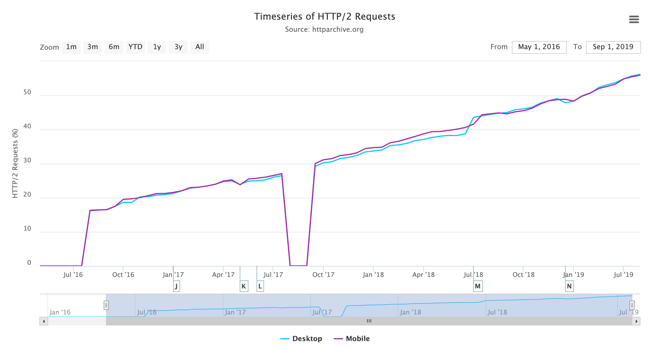
The results show that HTTP/2 usage is now the majority protocol-an impressive feat just 4 short years after formal standardization! Looking at the breakdown of all HTTP versions by request we see the following:
| Protocol | Desktop | Mobile | Both |
|---|---|---|---|
| 5.60% | 0.57% | 2.97% | |
| HTTP/0.9 | 0.00% | 0.00% | 0.00% |
| HTTP/1.0 | 0.08% | 0.05% | 0.06% |
| HTTP/1.1 | 40.36% | 45.01% | 42.79% |
| HTTP/2 | 53.96% | 54.37% | 54.18% |
Figure 20.3. HTTP version usage by request.
Figure 20.3 shows that HTTP/1.1 and HTTP/2 are the versions used by the vast majority of requests as expected. There is only a very small number of requests on the older HTTP/1.0 and HTTP/0.9 protocols. Annoyingly, there is a larger percentage where the protocol was not correctly tracked by the HTTP Archive crawl, particularly on desktop. Digging into this has shown various reasons, some of which can be explained and some of which can’t. Based on spot checks, they mostly appear to be HTTP/1.1 requests and, assuming they are, desktop and mobile usage is similar.
Despite there being a little larger percentage of noise than we’d like, it doesn’t alter the overall message being conveyed here. Other than that, the mobile/desktop similarity is not unexpected; HTTP Archive tests with Chrome, which supports HTTP/2 for both desktop and mobile. Real-world usage may have slightly different stats with some older usage of browsers on both, but even then support is widespread, so we would not expect a large variation between desktop and mobile.
At present, HTTP Archive does not track HTTP over QUIChttps://www.chromium.org/quic (soon to be standardized as HTTP/3) separately, so these requests are currently listed under HTTP/2, but we’ll look at other ways of measuring that later in this chapter.
Looking at the number of requests will skew the results somewhat due to popular requests. For example, many sites load Google Analytics, which does support HTTP/2, and so would show as an HTTP/2 request, even if the embedding site itself does not support HTTP/2. On the other hand, popular websites tend to support HTTP/2 are also underrepresented in the above stats as they are only measured once (e.g. “google.com” and “obscuresite.com” are given equal weighting). There are lies, damn lies, and statistics.
However, our findings are corroborated by other sources, like Mozilla’s telemetryhttps://telemetry.mozilla.org/new-pipeline/dist.html#!cumulative=0&measure=HTTP_RESPONSE_VERSION, which looks at real-world usage through the Firefox browser.
| Protocol | Desktop | Mobile | Both |
|---|---|---|---|
| 0.09% | 0.08% | 0.08% | |
| HTTP/1.0 | 0.09% | 0.08% | 0.09% |
| HTTP/1.1 | 62.36% | 63.92% | 63.22% |
| HTTP/2 | 37.46% | 35.92% | 36.61% |
Figure 20.4. HTTP version usage for home pages.
It is still interesting to look at home pages only to get a rough figure on the number of sites that support HTTP/2 (at least on their home page). Figure 20.4 shows less support than overall requests, as expected, at around 36%.
HTTP/2 is only supported by browsers over HTTPS, even though officially HTTP/2 can be used over HTTPS or over unencrypted non-HTTPS connections. As mentioned previously, hiding the new protocol in encrypted HTTPS connections prevents networking appliances which do not understand this new protocol from interfering with (or rejecting!) its usage. Additionally, the HTTPS handshake allows an easy method of the client and server agreeing to use HTTP/2.
| Protocol | Desktop | Mobile | Both |
|---|---|---|---|
| 0.09% | 0.10% | 0.09% | |
| HTTP/1.0 | 0.06% | 0.06% | 0.06% |
| HTTP/1.1 | 45.81% | 44.31% | 45.01% |
| HTTP/2 | 54.04% | 55.53% | 54.83% |
Figure 20.5. HTTP version usage for HTTPS home pages.
The web is moving to HTTPS, and HTTP/2 turns the traditional argument of HTTPS being bad for performance almost completely on its head. Not every site has made the transition to HTTPS, so HTTP/2 will not even be available to those that have not. Looking at just those sites that use HTTPS, in Figure 20.5 we do see a higher adoption of HTTP/2 at around 55%, similar to the percent of all requests in Figure 20.2.
We have shown that browser support for HTTP/2 is strong and that there is a safe road to adoption, so why doesn’t every site (or at least every HTTPS site) support HTTP/2? Well, here we come to the final item for support we have not measured yet: server support.
This is more problematic than browser support as, unlike modern browsers, servers often do not automatically upgrade to the latest version. Even when the server is regularly maintained and patched, that will often just apply security patches rather than new features like HTTP/2. Let’s look first at the server HTTP headers for those sites that do support HTTP/2.
| Server | Desktop | Mobile | Both |
|---|---|---|---|
| nginx | 34.04% | 32.48% | 33.19% |
| cloudflare | 23.76% | 22.29% | 22.97% |
| Apache | 17.31% | 19.11% | 18.28% |
| 4.56% | 5.13% | 4.87% | |
| LiteSpeed | 4.11% | 4.97% | 4.57% |
| GSE | 2.16% | 3.73% | 3.01% |
| Microsoft-IIS | 3.09% | 2.66% | 2.86% |
| openresty | 2.15% | 2.01% | 2.07% |
| … | … | … | … |
Figure 20.6. Servers used for HTTP/2.
Nginx provides package repositories that allow ease of installing or upgrading to the latest version, so it is no surprise to see it leading the way here. Cloudflare is the most popular CDN and enables HTTP/2 by default, so again it is not surprising to see it hosts a large percentage of HTTP/2 sites. Incidently, Cloudflare uses a heavily customizedhttps://blog.cloudflare.com/nginx-structural-enhancements-for-http-2-performance/ version of nginx as their web server. After those, we see Apache at around 20% of usage, followed by some servers who choose to hide what they are, and then the smaller players such as LiteSpeed, IIS, Google Servlet Engine, and openresty, which is nginx based.
What is more interesting is those servers that that do not support HTTP/2:
| Server | Desktop | Mobile | Both |
|---|---|---|---|
| Apache | 46.76% | 46.84% | 46.80% |
| nginx | 21.12% | 21.33% | 21.24% |
| Microsoft-IIS | 11.30% | 9.60% | 10.36% |
| 7.96% | 7.59% | 7.75% | |
| GSE | 1.90% | 3.84% | 2.98% |
| cloudflare | 2.44% | 2.48% | 2.46% |
| LiteSpeed | 1.02% | 1.63% | 1.36% |
| openresty | 1.22% | 1.36% | 1.30% |
| … | … | … | … |
Figure 20.7. Servers used for HTTP/1.1 or lower.
Some of this will be non-HTTPS traffic that would use HTTP/1.1 even if the server supported HTTP/2, but a bigger issue is those that do not support HTTP/2 at all. In these stats, we see a much greater share for Apache and IIS, which are likely running older versions.
For Apache in particular, it is often not easy to add HTTP/2 support to an existing installation, as Apache does not provide an official repository to install this from. This often means resorting to compiling from source or trusting a third-party repository, neither of which is particularly appealing to many administrators.
Only the latest versions of Linux distributions (RHEL and CentOS 8, Ubuntu 18 and Debian 9) come with a version of Apache which supports HTTP/2, and many servers are not running those yet. On the Microsoft side, only Windows Server 2016 and above supports HTTP/2, so again those running older versions cannot support this in IIS.
Merging these two stats together, we can see the percentage of installs per server, that use HTTP/2:
| Server | Desktop | Mobile |
|---|---|---|
| cloudflare | 85.40% | 83.46% |
| LiteSpeed | 70.80% | 63.08% |
| openresty | 51.41% | 45.24% |
| nginx | 49.23% | 46.19% |
| GSE | 40.54% | 35.25% |
| 25.57% | 27.49% | |
| Apache | 18.09% | 18.56% |
| Microsoft-IIS | 14.10% | 13.47% |
| … | … | … |
Figure 20.8. Percentage installs of each server used to provide HTTP/2.
It’s clear that Apache and IIS fall way behind with 18% and 14% of their installed based supporting HTTP/2, which has to be (at least in part) a consequence of it being more difficult to upgrade them. A full operating system upgrade is often required for many servers to get this support easily. Hopefully this will get easier as new versions of operating systems become the norm.
None of this is a comment on the HTTP/2 implementations here (I happen to think Apache has one of the best implementationshttps://x.com/tunetheweb/status/988196156697169920?s=20), but more about the ease of enabling HTTP/2 in each of these servers–or lack thereof.
Impact of HTTP/2
The impact of HTTP/2 is much more difficult to measure, especially using the HTTP Archive methodology. Ideally, sites should be crawled with both HTTP/1.1 and HTTP/2 and the difference measured, but that is not possible with the statistics we are investigating here. Additionally, measuring whether the average HTTP/2 site is faster than the average HTTP/1.1 site introduces too many other variables that require a more exhaustive study than we can cover here.
One impact that can be measured is in the changing use of HTTP now that we are in an HTTP/2 world. Multiple connections were a workaround with HTTP/1.1 to allow a limited form of parallelization, but this is in fact the opposite of what usually works best with HTTP/2. A single connection reduces the overhead of TCP setup, TCP slow start, and HTTPS negotiation, and it also allows the potential of cross-request prioritization.
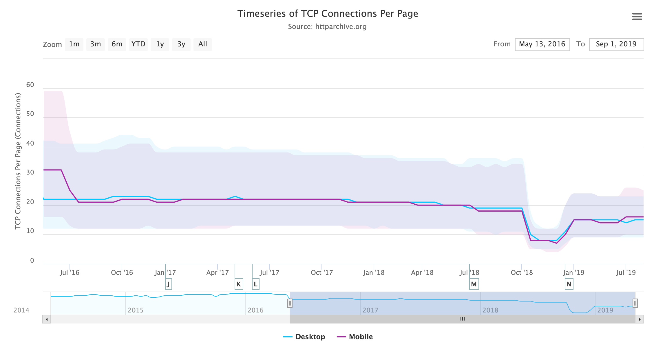
HTTP Archive measures the number of TCP connections per page, and that is dropping steadily as more sites support HTTP/2 and use its single connection instead of six separate connections.
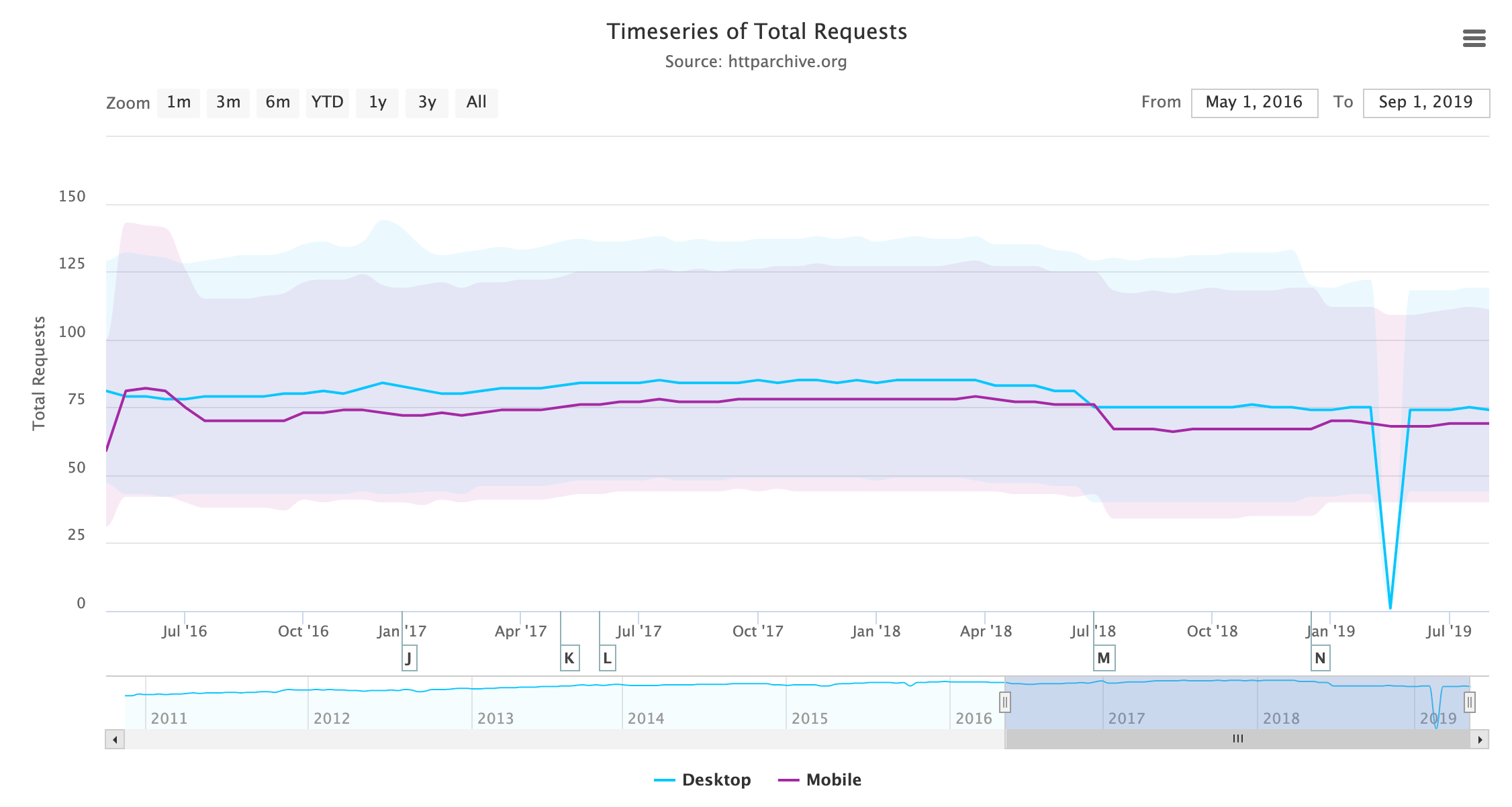
Bundling assets to obtain fewer requests was another HTTP/1.1 workaround that went by many names: bundling, concatenation, packaging, spriting, etc. This is less necessary when using HTTP/2 as there is less overhead with requests, but it should be noted that requests are not free in HTTP/2, and those that experimented with removing bundling completely have noticed a loss in performancehttps://engineering.khanacademy.org/posts/js-packaging-http2.htm. Looking at the number of requests loaded per page over time, we do see a slight decrease in requests, rather than the expected increase.
This low rate of change can perhaps be attributed to the aforementioned observations that bundling cannot be removed (at least, not completely) without a negative performance impact and that many build tools currently bundle for historical reasons based on HTTP/1.1 recommendations. It is also likely that many sites may not be willing to penalize HTTP/1.1 users by undoing their HTTP/1.1 performance hacks just yet, or at least that they do not have the confidence (or time!) to feel that this is worthwhile.
The fact that the number of requests is staying roughly static is interesting, given the ever-increasing page weight, though perhaps this is not entirely related to HTTP/2.
HTTP/2 Push
HTTP/2 push has a mixed history despite being a much-hyped new feature of HTTP/2. The other features were basically performance improvements under the hood, but push was a brand new concept that completely broke the single request to single response nature of HTTP. It allowed extra responses to be returned; when you asked for the web page, the server could respond with the HTML page as usual, but then also send you the critical CSS and JavaScript, thus avoiding any additional round trips for certain resources. It would, in theory, allow us to stop inlining CSS and JavaScript into our HTML, and still get the same performance gains of doing so. After solving that, it could potentially lead to all sorts of new and interesting use cases.
The reality has been, well, a bit disappointing. HTTP/2 push has proved much harder to use effectively than originally envisaged. Some of this has been due to the complexity of how HTTP/2 push workshttps://jakearchibald.com/2017/h2-push-tougher-than-i-thought/, and the implementation issues due to that.
A bigger concern is that push can quite easily cause, rather than solve, performance issues. Over-pushing is a real risk. Often the browser is in the best place to decide what to request, and just as crucially when to request it but HTTP/2 push puts that responsibility on the server. Pushing resources that a browser already has in its cache, is a waste of bandwidth (though in my opinion so is inlining CSS but that gets must less of a hard time about that than HTTP/2 push!).
Proposals to inform the server about the status of the browser cache have stalledhttps://lists.w3.org/Archives/Public/ietf-http-wg/2019JanMar/0033.html especially on privacy concerns. Even without that problem, there are other potential issues if push is not used correctly. For example, pushing large images and therefore holding up the sending of critical CSS and JavaScript will lead to slower websites than if you’d not pushed at all!
There has also been very little evidence to date that push, even when implemented correctly, results in the performance increase it promised. This is an area that, again, the HTTP Archive is not best placed to answer, due to the nature of how it runs (a crawl of popular sites using Chrome in one state), so we won’t delve into it too much here. However, suffice to say that the performance gains are far from clear-cut and the potential problems are real.
Putting that aside let’s look at the usage of HTTP/2 push.
| Client | Sites Using HTTP/2 Push | Sites Using HTTP/2 Push (%) |
|---|---|---|
| Desktop | 22,581 | 0.52% |
| Mobile | 31,452 | 0.59% |
Figure 20.11. Sites using HTTP/2 push.
| Client | Avg Pushed Requests | Avg KB Pushed |
|---|---|---|
| Desktop | 7.86 | 162.38 |
| Mobile | 6.35 | 122.78 |
Figure 20.12. How much is pushed when it is used.
These stats show that the uptake of HTTP/2 push is very low, most likely because of the issues described previously. However, when sites do use push, they tend to use it a lot rather than for one or two assets as shown in Figure 20.12.
This is a concern as previous advice has been to be conservative with push and to “push just enough resources to fill idle network time, and no more”https://docs.google.com/document/d/1K0NykTXBbbbTlv60t5MyJvXjqKGsCVNYHyLEXIxYMv0/edit. The above statistics suggest many resources of a significant combined size are pushed.
Figure 20.13 shows us which assets are most commonly pushed. JavaScript and CSS are the overwhelming majority of pushed items, both by volume and by bytes. After this, there is a ragtag assortment of images, fonts, and data. At the tail end we see around 100 sites pushing video, which may be intentional, or it may be a sign of over-pushing the wrong types of assets!
One concern raised by some is that HTTP/2 implementations have repurposed the preload HTTP link header as a signal to push. One of the most popular uses of the preload resource hint is to inform the browser of late-discovered resources, like fonts and images, that the browser will not see until the CSS has been requested, downloaded, and parsed. If these are now pushed based on that header, there was a concern that reusing this may result in a lot of unintended pushes.
However, the relatively low usage of fonts and images may mean that risk is not being seen as much as was feared. <link rel="preload" ... > tags are often used in the HTML rather than HTTP link headers and the meta tags are not a signal to push. Statistics in the Resource Hints chapter show that fewer than 1% of sites use the preload HTTP link header, and about the same amount use preconnect which has no meaning in HTTP/2, so this would suggest this is not so much of an issue. Though there are a number of fonts and other assets being pushed, which may be a signal of this.
As a counter argument to those complaints, if an asset is important enough to preload, then it could be argued these assets should be pushed if possible as browsers treat a preload hint as very high priority requests anyway. Any performance concern is therefore (again arguably) at the overuse of preload, rather than the resulting HTTP/2 push that happens because of this.
To get around this unintended push, you can provide the nopush attribute in your preload header:
link: </assets/jquery.js>; rel=preload; as=script; nopush5% of preload HTTP headers do make use of this attribute, which is higher than I would have expected as I would have considered this a niche optimization. Then again, so is the use of preload HTTP headers and/or HTTP/2 push itself!
HTTP/2 Issues
HTTP/2 is mostly a seamless upgrade that, once your server supports it, you can switch on with no need to change your website or application. You can optimize for HTTP/2 or stop using HTTP/1.1 workarounds as much, but in general, a site will usually work without needing any changes—it will just be faster. There are a couple of gotchas to be aware of, however, that can impact any upgrade, and some sites have found these out the hard way.
One cause of issues in HTTP/2 is the poor support of HTTP/2 prioritization. This feature allows multiple requests in progress to make the appropriate use of the connection. This is especially important since HTTP/2 has massively increased the number of requests that can be running on the same connection. 100 or 128 parallel request limits are common in server implementations. Previously, the browser had a max of six connections per domain, and so used its skill and judgement to decide how best to use those connections. Now, it rarely needs to queue and can send all requests as soon as it knows about them. This can then lead to the bandwidth being “wasted” on lower priority requests while critical requests are delayed (and incidentally can also lead to swamping your backend server with more requests than it is used to!https://www.lucidchart.com/techblog/2019/04/10/why-turning-on-http2-was-a-mistake/).
HTTP/2 has a complex prioritization model (too complex many say - hence why it is being reconsidered for HTTP/3!) but few servers honor that properly. This can be because their HTTP/2 implementations are not up to scratch, or because of so-called bufferbloat, where the responses are already en route before the server realizes there is a higher priority request. Due to the varying nature of servers, TCP stacks, and locations, it is difficult to measure this for most sites, but with CDNs this should be more consistent.
Patrick Meenanhttps://x.com/patmeenan created an example test pagehttps://github.com/pmeenan/http2priorities/tree/master/stand-alone, which deliberately tries to download a load of low priority, off-screen images, before requesting some high priority on-screen images. A good HTTP/2 server should be able to recognize this and send the high priority images shortly after requested, at the expense of the lower priority images. A poor HTTP/2 server will just respond in the request order and ignore any priority signals. Andy Davies has a page tracking the status of various CDNs for Patrick’s testhttps://github.com/andydavies/http2-prioritization-issues. The HTTP Archive identifies when a CDN is used as part of its crawl, and merging these two datasets can tell us the percent of pages using a passing or failing CDN.
| CDN | Prioritizes Correctly? | Desktop | Mobile | Both |
|---|---|---|---|---|
| Not using CDN | Unknown | 57.81% | 60.41% | 59.21% |
| Cloudflare | Pass | 23.15% | 21.77% | 22.40% |
| Fail | 6.67% | 7.11% | 6.90% | |
| Amazon CloudFront | Fail | 2.83% | 2.38% | 2.59% |
| Fastly | Pass | 2.40% | 1.77% | 2.06% |
| Akamai | Pass | 1.79% | 1.50% | 1.64% |
| Unknown | 1.32% | 1.58% | 1.46% | |
| WordPress | Pass | 1.12% | 0.99% | 1.05% |
| Sucuri Firewall | Fail | 0.88% | 0.75% | 0.81% |
| Incapsula | Fail | 0.39% | 0.34% | 0.36% |
| Netlify | Fail | 0.23% | 0.15% | 0.19% |
| OVH CDN | Unknown | 0.19% | 0.18% | 0.18% |
Figure 20.14. HTTP/2 prioritization support in common CDNs.
Figure 20.14 shows that a fairly significant portion of traffic is subject to the identified issue, totaling 26.82% on desktop and 27.83% on mobile. How much of a problem this is depends on exactly how the page loads and whether high priority resources are discovered late or not for the sites affected.
Another issue is with the upgrade HTTP header being used incorrectly. Web servers can respond to requests with an upgrade HTTP header suggesting that it supports a better protocol that the client might wish to use (e.g. advertise HTTP/2 to a client only using HTTP/1.1). You might think this would be useful as a way of informing the browser a server supports HTTP/2, but since browsers only support HTTP/2 over HTTPS and since use of HTTP/2 can be negotiated through the HTTPS handshake, the use of this upgrade header for advertising HTTP/2 is pretty limited (for browsers at least).
Worse than that, is when a server sends an upgrade header in error. This could be because a backend server supporting HTTP/2 is sending the header and then an HTTP/1.1-only edge server is blindly forwarding it to the client. Apache emits the upgrade header when mod_http2 is enabled but HTTP/2 is not being used, and an nginx instance sitting in front of such an Apache instance happily forwards this header even when nginx does not support HTTP/2. This false advertising then leads to clients trying (and failing!) to use HTTP/2 as they are advised to.
108 sites use HTTP/2 while they also suggest upgrading to HTTP/2 in the upgrade header. A further 12,767 sites on desktop (15,235 on mobile) suggest upgrading an HTTP/1.1 connection delivered over HTTPS to HTTP/2 when it’s clear this was not available, or it would have been used already. These are a small minority of the 4.3 million sites crawled on desktop and 5.3 million sites crawled on mobile, but it shows that this is still an issue affecting a number of sites out there. Browsers handle this inconsistently, with Safari in particular attempting to upgrade and then getting itself in a mess and refusing to display the site at all.
All of this is before we get into the few sites that recommend upgrading to http1.0, http://1.1, or even -all,+TLSv1.3,+TLSv1.2. There are clearly some typos in web server configurations going on here!
There are further implementation issues we could look at. For example, HTTP/2 is much stricter about HTTP header names, rejecting the whole request if you respond with spaces, colons, or other invalid HTTP header names. The header names are also converted to lowercase, which catches some by surprise if their application assumes a certain capitalization. This was never guaranteed previously, as HTTP/1.1 specifically states the header names are case insensitivehttps://tools.ietf.org/html/rfc7230#section-3.2, but still some have depended on this. The HTTP Archive could potentially be used to identify these issues as well, though some of them will not be apparent on the home page, but we did not delve into that this year.
HTTP/3
The world does not stand still, and despite HTTP/2 not having even reached its fifth birthday, people are already seeing it as old news and getting more excited about its successor, HTTP/3https://tools.ietf.org/html/draft-ietf-quic-http. HTTP/3 builds on the concepts of HTTP/2, but moves from working over TCP connections that HTTP has always used, to a UDP-based protocol called QUIChttps://datatracker.ietf.org/wg/quic/about/. This allows us to fix one case where HTTP/2 is slower then HTTP/1.1, when there is high packet loss and the guaranteed nature of TCP holds up all streams and throttles back all streams. It also allows us to address some TCP and HTTPS inefficiencies, such as consolidating in one handshake for both, and supporting many ideas for TCP that have proven hard to implement in real life (TCP fast open, 0-RTT, etc.).
HTTP/3 also cleans up some overlap between TCP and HTTP/2 (e.g. flow control being implemented in both layers) but conceptually it is very similar to HTTP/2. Web developers who understand and have optimized for HTTP/2 should have to make no further changes for HTTP/3. Server operators will have more work to do, however, as the differences between TCP and QUIC are much more groundbreaking. They will make implementation harder so the rollout of HTTP/3 may take considerably longer than HTTP/2, and initially be limited to those with certain expertise in the field like CDNs.
QUIC has been implemented by Google for a number of years and it is now undergoing a similar standardization process that SPDY did on its way to HTTP/2. QUIC has ambitions beyond just HTTP, but for the moment it is the use case being worked on currently. Just as this chapter was being written, Cloudflare, Chrome, and Firefox all announced HTTP/3 supporthttps://blog.cloudflare.com/http3-the-past-present-and-future/, despite the fact that HTTP/3 is still not formally complete or approved as a standard yet. This is welcome as QUIC support has been somewhat lacking outside of Google until recently, and definitely lags behind SPDY and HTTP/2 support from a similar stage of standardization.
Because HTTP/3 uses QUIC over UDP rather than TCP, it makes the discovery of HTTP/3 support a bigger challenge than HTTP/2 discovery. With HTTP/2 we can mostly use the HTTPS handshake, but as HTTP/3 is on a completely different connection, that is not an option here. HTTP/2 also used the upgrade HTTP header to inform the browser of HTTP/2 support, and although that was not that useful for HTTP/2, a similar mechanism has been put in place for QUIC that is more useful. The alternative services HTTP header (alt-svc) advertises alternative protocols that can be used on completely different connections, as opposed to alternative protocols that can be used on this connection, which is what the upgrade HTTP header is used for.
Analysis of this header shows that 7.67% of desktop sites and 8.38% of mobile sites already support QUIC, which roughly represents Google’s percentage of traffic, unsurprisingly enough, as it has been using this for a while. And 0.04% are already supporting HTTP/3. I would imagine by next year’s Web Almanac, this number will have increased significantly.
Conclusion
This analysis of the available statistics in the HTTP Archive project has shown what many of us in the HTTP community were already aware of: HTTP/2 is here and proving to be very popular. It is already the dominant protocol in terms of number of requests, but has not quite overtaken HTTP/1.1 in terms of number of sites that support it. The long tail of the internet means that it often takes an exponentially longer time to make noticeable gains on the less well-maintained sites than on the high profile, high volume sites.
We’ve also talked about how it is (still!) not easy to get HTTP/2 support in some installations. Server developers, operating system distributors, and end customers all have a part to play in pushing to make that easier. Tying software to operating systems always lengthens deployment time. In fact, one of the very reasons for QUIC is to break a similar barrier with deploying TCP changes. In many instances, there is no real reason to tie web server versions to operating systems. Apache (to use one of the more popular examples) will run with HTTP/2 support in older operating systems, but getting an up-to-date version on to the server should not require the expertise or risk it currently does. Nginx does very well here, hosting repositories for the common Linux flavors to make installation easier, and if the Apache team (or the Linux distribution vendors) do not offer something similar, then I can only see Apache’s usage continuing to shrink as it struggles to hold relevance and shake its reputation as old and slow (based on older installs) even though up-to-date versions have one of the best HTTP/2 implementations. I see that as less of an issue for IIS, since it is usually the preferred web server on the Windows side.
Other than that, HTTP/2 has been a relatively easy upgrade path, which is why it has had the strong uptake it has already seen. For the most part, it is a painless switch-on and, therefore, for most, it has turned out to be a hassle-free performance increase that requires little thought once your server supports it. The devil is in the details though (as always), and small differences between server implementations can result in better or worse HTTP/2 usage and, ultimately, end user experience. There has also been a number of bugs and even security issueshttps://github.com/Netflix/security-bulletins/blob/master/advisories/third-party/2019-002.md, as is to be expected with any new protocol.
Ensuring you are using a strong, up-to-date, well-maintained implementation of any newish protocol like HTTP/2 will ensure you stay on top of these issues. However, that can take expertise and managing. The roll out of QUIC and HTTP/3 will likely be even more complicated and require more expertise. Perhaps this is best left to third-party service providers like CDNs who have this expertise and can give your site easy access to these features? However, even when left to the experts, this is not a sure thing (as the prioritization statistics show), but if you choose your server provider wisely and engage with them on what your priorities are, then it should be an easier implementation.
On that note it would be great if the CDNs prioritized these issues (pun definitely intended!), though I suspect with the advent of a new prioritization method in HTTP/3, many will hold tight. The next year will prove yet more interesting times in the HTTP world.
Author
-
Barry PollardBarry Pollard is a software developer and author of the Manning book HTTP/2 in Actionhttps://www.manning.com/books/http2-in-action. He thinks the web is amazing but wants to make it even better. You can find him tweeting @tunetheweb and blogging at www.tunetheweb.com.

Methodology

Overview
The Web Almanac is a project organized by HTTP Archivehttps://httparchive.org. HTTP Archive was started in 2010 by Steve Souders with the mission to track how the web is built. It evaluates the composition of millions of web pages on a monthly basis and makes its terabytes of metadata available for analysis on BigQueryhttps://httparchive.org/faq#how-do-i-use-bigquery-to-write-custom-queries-over-the-data. Learn more about HTTP Archivehttps://httparchive.org/about.
The mission of the Web Almanac is to make the data warehouse of HTTP Archive even more accessible to the web community by having subject matter experts provide contextualized insights. You can think of it as an annual repository of knowledge about the state of the web, 2019 being its first edition.
The 2019 edition of the Web Almanac is comprised of four pillars: content, experience, publishing, and distribution. Each part of the written report represents a pillar and is made up of chapters exploring its different aspects. For example, Part II represents the user experience and includes the Performance, Security, Accessibility, SEO, PWA, and Mobile Web chapters.
About the dataset
The HTTP Archive dataset is continuously updating with new data monthly. For the 2019 edition of the Web Almanac, unless otherwise noted in the chapter, all metrics were sourced from the July 2019 crawl. These results are publicly queryablehttps://github.com/HTTPArchive/httparchive.org/blob/main/docs/gettingstarted_bigquery.md on BigQuery in tables prefixed with 2019_07_01.
All of the metrics presented in the Web Almanac are publicly reproducible using the dataset on BigQuery. You can browse the queries used by all chapters in our GitHub repositoryhttps://github.com/HTTPArchive/almanac.httparchive.org/tree/main/sql/2019.
For example, to understand the median number of bytes of JavaScript per desktop and mobile page, see 01_01b.sqlhttps://github.com/HTTPArchive/almanac.httparchive.org/blob/main/sql/2019/javascript/01_01b.sql:
#standardSQL
# 01_01b: Distribution of JS bytes by client
SELECT
  percentile,
  _TABLE_SUFFIX AS client,
  APPROX_QUANTILES(ROUND(bytesJs / 1024, 2), 1000)[OFFSET(percentile * 10)] AS js_kbytes
FROM
  `httparchive.summary_pages.2019_07_01_*`,
  UNNEST([10, 25, 50, 75, 90]) AS percentile
GROUP BY
  percentile,
  client
ORDER BY
  percentile,
  client
Results for each metric are publicly viewable in chapter-specific spreadsheets, for example JavaScript resultshttps://docs.google.com/spreadsheets/d/1kBTglETN_V9UjKqK_EFmFjRexJnQOmLLr-I2Tkotvic/edit?usp=sharing.
Websites
There are 5,790,700 websites in the dataset. Among those, 5,297,442 are mobile websites and 4,371,973 are desktop websites. Most websites are included in both the mobile and desktop subsets.
HTTP Archive sources the URLs for its websites from the Chrome UX Report. The Chrome UX Report is a public dataset from Google that aggregates user experiences across millions of websites actively visited by Chrome users. This gives us a list of websites that are up-to-date and a reflection of real-world web usage. The Chrome UX Report dataset includes a form factor dimension, which we use to get all of the websites accessed by desktop or mobile users.
The July 2019 HTTP Archive crawl used by the Web Almanac used the most recently available Chrome UX Report release, May 2019 (201905), for its list of websites. This dataset was released on June 11, 2019 and captures websites visited by Chrome users during the month of May.
Due to resource limitations, the HTTP Archive can only test one page from each website in the Chrome UX report. To reconcile this, only the home pages are included. Be aware that this will introduce some bias into the results because a home page is not necessarily representative of the entire website.
HTTP Archive is also considered a lab testing tool, meaning it tests websites from a datacenter and does not collect data from real-world user experiences. Therefore, all website home pages are tested with an empty cache in a logged out state.
Metrics
HTTP Archive collects metrics about how the web is built. It includes basic metrics like the number of bytes per page, whether the page was loaded over HTTPS, and individual request and response headers. The majority of these metrics are provided by WebPageTest, which acts as the test runner for each website.
Other testing tools are used to provide more advanced metrics about the page. For example, Lighthouse is used to run audits against the page to analyze its quality in areas like accessibility and SEO. The Tools section below goes into each of these tools in more detail.
To work around some of the inherent limitations of a lab dataset, the Web Almanac also makes use of the Chrome UX Report for metrics on user experiences, especially in the area of web performance.
Some metrics are completely out of reach. For example, we don’t necessarily have the ability to detect the tools used to build a website. If a website is built using create-react-app, we could tell that it uses the React framework, but not necessarily that a particular build tool is used. Unless these tools leave detectible fingerprints in the website’s code, we’re unable to measure their usage.
Other metrics may not necessarily be impossible to measure but are challenging or unreliable. For example, aspects of web design are inherently visual and may be difficult to quantify, like whether a page has an intrusive modal dialog.
Tools
The Web Almanac is made possible with the help of the following open source tools.
WebPageTest
WebPageTesthttps://www.webpagetest.org/ is a prominent web performance testing tool and the backbone of HTTP Archive. We use a private instancehttps://docs.webpagetest.org/private-instances/ of WebPageTest with private test agents, which are the actual browsers that test each web page. Desktop and mobile websites are tested under different configurations:
| Config | Desktop | Mobile |
|---|---|---|
| Device | Linux VM | Emulated Moto G4 |
| User Agent | Mozilla/5.0 (X11; Linux x86_64) AppleWebKit/537.36 (KHTML, like Gecko) Chrome/75.0.3770.100 Safari/537.36 PTST/190704.170731 | Mozilla/5.0 (Linux; Android 6.0.1; Moto G (4) Build/MPJ24.139-64) AppleWebKit/537.36 (KHTML, like Gecko) Chrome/65.0.3325.146 Mobile Safari/537.36 PTST/190628.140653 |
| Location |
Redwood City, California, USA The Dalles, Oregon, USA |
Redwood City, California, USA The Dalles, Oregon, USA |
| Connection | Cable (5/1 Mbps 28ms RTT) | 3G (1.600/0.768 Mbps 300ms RTT) |
| Viewport | 1024 x 768px | 512 x 360px |
Desktop websites are run from within a desktop Chrome environment on a Linux VM. The network speed is equivalent to a cable connection.
Mobile websites are run from within a mobile Chrome environment on an emulated Moto G4 device with a network speed equivalent to a 3G connection. Note that the emulated mobile User Agent self-identifies as Chrome 65 but is actually Chrome 75 under the hood.
There are two locations from which tests are run: California and Oregon USA. HTTP Archive maintains its own test agent hardware located in the Internet Archivehttps://archive.org datacenter in California. Additional test agents in Google Cloud Platformhttps://cloud.google.com/compute/docs/regions-zones/#locations’s us-west-1 location in Oregon are added as needed.
HTTP Archive’s private instance of WebPageTest is kept in sync with the latest public version and augmented with custom metricshttps://github.com/HTTPArchive/custom-metrics. These are snippets of JavaScript that are evaluated on each website at the end of the test. The almanac.jshttps://github.com/HTTPArchive/legacy.httparchive.org/blob/master/custom_metrics/almanac.js custom metric includes several metrics that were otherwise infeasible to calculate, for example those that depend on DOM state.
The results of each test are made available as a HAR filehttps://en.wikipedia.org/wiki/HAR_(file_format), a JSON-formatted archive file containing metadata about the web page.
Lighthouse
Lighthousehttps://developers.google.com/web/tools/lighthouse/ is an automated website quality assurance tool built by Google. It audits web pages to make sure they don’t include user experience antipatterns like unoptimized images and inaccessible content.
HTTP Archive runs the latest version of Lighthouse for all of its mobile web pages — desktop pages are not included because of limited resources. As of the July 2019 crawl, HTTP Archive used the 5.1.0https://github.com/GoogleChrome/lighthouse/releases/tag/v5.1.0 version of Lighthouse.
Lighthouse is run as its own distinct test from within WebPageTest, but it has its own configuration profile:
| Config | Value |
|---|---|
| CPU slowdown | 1x* |
| Download throughput | 1.6 Mbps |
| Upload throughput | 0.768 Mbps |
| RTT | 150 ms |
For more information about Lighthouse and the audits available in HTTP Archive, refer to the Lighthouse developer documentationhttps://developers.google.com/web/tools/lighthouse/.
Wappalyzer
Wappalyzerhttps://www.wappalyzer.com/ is a tool for detecting technologies used by web pages. There are 65 categorieshttps://www.wappalyzer.com/technologies of technologies tested, ranging from JavaScript frameworks, to CMS platforms, and even cryptocurrency miners. There are over 1,200 supported technologies.
HTTP Archive runs the latest version of Wappalyzer for all web pages. As of July 2019 the Web Almanac used the 5.8.3 versionhttps://github.com/AliasIO/Wappalyzer/releases/tag/v5.8.3 of Wappalyzer.
Wappalyzer powers many chapters that analyze the popularity of developer tools like WordPress, Bootstrap, and jQuery. For example, the Ecommerce and CMS chapters rely heavily on the respective Ecommercehttps://www.wappalyzer.com/categories/ecommerce and CMShttps://www.wappalyzer.com/categories/cms categories of technologies detected by Wappalyzer.
All detection tools, including Wappalyzer, have their limitations. The validity of their results will always depend on how accurate their detection mechanisms are. The Web Almanac will add a note in every chapter where Wappalyzer is used but its analysis may not be accurate due to a specific reason.
Chrome UX Report
The Chrome UX Reporthttps://developers.google.com/web/tools/chrome-user-experience-report is a public dataset of real-world Chrome user experiences. Experiences are grouped by websites’ origin, for example https://www.example.com. The dataset includes distributions of UX metrics like paint, load, interaction, and layout stability. In addition to grouping by month, experiences may also be sliced by dimensions like country-level geography, form factor (desktop, phone, tablet), and effective connection type (4G, 3G, etc.).
For Web Almanac metrics that reference real-world user experience data from the Chrome UX Report, the July 2019 dataset (201907) is used.
You can learn more about the dataset in the Using the Chrome UX Report on BigQueryhttps://web.dev/chrome-ux-report-bigquery guide on web.devhttps://web.dev/.
Third Party Web
Third Party Webhttps://www.thirdpartyweb.today/ is a research project by Patrick Hulce, author of the Third Parties chapter, that uses HTTP Archive and Lighthouse data to identify and analyze the impact of third party resources on the web.
Domains are considered to be a third party provider if they appear on at least 50 unique pages. The project also groups providers by their respective services in categories like ads, analytics, and social.
Several chapters in the Web Almanac use the domains and categories from this dataset to understand the impact of third parties.
Rework CSS
Rework CSShttps://github.com/reworkcss/css is a JavaScript-based CSS parser. It takes entire stylesheets and produces a JSON-encoded object distinguishing each individual style rule, selector, directive, and value.
This special purpose tool significantly improved the accuracy of many of the metrics in the CSS chapter. CSS in all external stylesheets and inline style blocks for each page were parsed and queried to make the analysis possible. See this threadhttps://discuss.httparchive.org/t/analyzing-stylesheets-with-a-js-based-parser/1683 for more information about how it was integrated with the HTTP Archive dataset on BigQuery.
Analytical process
The Web Almanac took about a year to plan and execute with the coordination of dozens of contributors from the web community. This section describes why we chose the metrics you see in the Web Almanac, how they were queried, and interpreted.
Brainstorming
The inception of the Web Almanac started in January 2019 as a post on the HTTP Archive forumhttps://discuss.httparchive.org/t/planning-the-web-almanac-2019/1553 describing the initiative and gathering support. In March 2019 we created a public brainstorming dochttp://bit.ly/web-almanac-brainstorm in which anyone in the web community could write-in ideas for chapters or metrics. This was a critical step to ensure we were focusing on things that matter to the community and have a diverse set of voices included in the process.
As a result of the brainstorming, 20 chapters were solidified and we began assigning subject matter experts and peer reviewers to each chapterhttps://github.com/HTTPArchive/almanac.httparchive.org/issues/2. This process had some inherent bias because of the challenge of getting volunteers to commit to a project of this scale. Thus, many of the contributors are members of the same professional circles. One explicit goal for future editions of the Web Almanac is to encourage even more inclusion of underrepresented and heterogeneous voices as authors and peer reviewers.
We spent May through June 2019 pairing people with chapters and getting their input to finalize the individual metrics that will make up each chapter.
Analysis
In June 2019, with the stable list of metrics and chapters, data analysts triaged the metrics for feasibility. In some cases, custom metricshttps://github.com/HTTPArchive/legacy.httparchive.org/blob/master/custom_metrics/almanac.js needed to be created to fill gaps in our analytic capabilities.
Throughout July 2019, the HTTP Archive data pipeline crawled several million websites, gathering the metadata to be used in the Web Almanac.
Starting in August 2019, the data analysts began writing queries to extract the results for each metric. In total, 431 queries were written by hand! You can browse all of the queries by chapter in the sql/2019https://github.com/HTTPArchive/almanac.httparchive.org/tree/main/sql/2019 directory of the project’s GitHub repository.
Interpretation
Authors worked with analysts to correctly interpret the results and draw appropriate conclusions. As authors wrote their respective chapters, they drew from these statistics to support their framing of the state of the web. Peer reviewers worked with authors to ensure the technical correctness of their analysis.
To make the results more easily understandable to readers, web developers and analysts created data visualizations to embed in the chapter. Some visualizations are simplified to make the conclusions easier to grasp. For example, rather than showing a full histogram of a distribution, only a handful of percentiles are shown. Unless otherwise noted, all distributions are summarized using percentiles, especially medians (50th percentile), and not averages.
Finally, editors revised the chapters to fix simple grammatical errors and ensure consistency across the reading experience.
Looking ahead
The 2019 edition of the Web Almanac is the first of what we hope to be an annual tradition in the web community of introspection and a commitment to positive change. Getting to this point has been a monumental effort thanks to many dedicated contributors and we hope to leverage as much of this work as possible to make future editions even more streamlined.
If you’re interested in contributing to the 2020 edition of the Web Almanac, please fill out our interest formhttps://forms.gle/Qyf3q5pKgdH1cBhq5. We’d love to hear your ideas for making this project even better!
Contributors


The Web Almanac has been made possible by the hard work of the web community. 103 people have volunteered countless hours in the planning, research, writing and production phases of the 2019 Web Almanac.
-
Abby TsaiTranslator
-
Abigail Klein
-
Adam Argyleand Brainstormer
-
Addy OsmaniBrainstormer
-
Ahmad AwaisBrainstormer, Developer, and Reviewer
-
Alan Kentand Brainstormer
-
Alberto Medinaand Brainstormer
-
Alessandro GhediniBrainstormer and Reviewer
-
Alex RussellBrainstormer
-
Alexey PyltsynTranslator
-
Andrew GalloniAnalyst and Reviewer
-
Andrew LimnReviewer
-
Andrew NobletDeveloper
-
André NaumannBrainstormer
-
Andy Daviesand Reviewer
-
Arthur RigaudTranslator
-
Artur Jancand Brainstormer
-
Aymen LoukilDeveloper and Reviewer
-
Barry Pollard, Brainstormer, Developer, Editor, and Reviewer
-
Boris SchapiraDeveloper and Translator
-
Brian Kardell, Brainstormer, and Reviewer
-
Carlos ArayaBrainstormer
-
Carlos TorresDeveloper and Translator
-
Catalin RosuDeveloper and Reviewer
-
Chen Hui JingReviewer
-
Cheng XiTranslator
-
Colin Bendelland Brainstormer
-
Daniel StenbergReviewer
-
Dave CrosslandBrainstormer
-
David FoxAnalyst, , Brainstormer, Editor, and Reviewer
-
Doug SillarsAnalyst, , and Brainstormer
-
Eduardo Q. GomesTranslator
-
Elayne LemosTranslator
-
Eric A. MeyerReviewer
-
Eric PortisReviewer
-
Erik NygrenBrainstormer and Reviewer
-
Fatma BadriTranslator
-
 Gabriel De GennaroDesigner
 -
Giacomo PignoniDeveloper
-
Heng YeowDeveloper
-
Henri HelveticaBrainstormer
-
Houssein Djirdehand Brainstormer
-
JABANE Mohamed AyoubTranslator
-
Jared WhiteBrainstormer
-
Jason HaralsonAnalyst
-
Jeff Posnickand Brainstormer
-
John FoxReviewer
-
John TeagueBrainstormer, Developer, and Reviewer
-
Jonathan WoldReviewer
-
José M. PérezDeveloper, Reviewer, and Translator
-
Justin AhinonTranslator
-
Justin WelenofskyDeveloper
-
Kari LarsonDeveloper
-
Kate TymoshkinaTranslator
-
Katie HempeniusAnalyst, , and Brainstormer
-
Laura EberlyReviewer
-
Leonardo DigiorgioTranslator
-
M.SakamakiDeveloper and Translator
-
Manuel GarciaTranslator
-
Mark NottinghamBrainstormer
-
Mark ZemanBrainstormer and Reviewer
-
Martin Splittand Brainstormer
-
Mathias BynensBrainstormer and Reviewer
-
 Matt LudwigReviewer
 -
Matthew PhillipsReviewer
-
Mike GeyserDeveloper
-
Morten Rand-HendriksenBrainstormer
-
Nektarios Paisios
-
Nicolas HoffmannTranslator
-
Noah BlonBrainstormer
-
Noah van der VeerTranslator
-
Patrick HulceAnalyst, , and Brainstormer
-
Patrick MeenanBrainstormer and Reviewer
-
Paul CalvanoAnalyst, , Brainstormer, Developer, and Reviewer
-
Pavel EvdokimovBrainstormer
-
Praveen PalTranslator
-
Rachel Costello, Brainstormer, and Editor
-
Raghu RamakrishnanAnalyst
-
Raghvendra KumarDeveloper
-
Renee Johnson
-
Rick ViscomiAnalyst, , Brainstormer, Developer, Editor, and Reviewer
-
Robin MarxReviewer
-
Rory HewittBrainstormer
-
Sakae KotaroTranslator
-
Sam Duttonand Brainstormer
-
Scott Helmeand Brainstormer
-
Sergey ChernyshevReviewer
-
Simon PietersBrainstormer and Reviewer
-
 Susie LuDesigner
 -
Sébastien AllemandTranslator
-
TJ MonserratAnalyst
-
Tammy Everts
-
Thomas Steinerand Brainstormer
-
Tommy HodginsReviewer
-
Una Kravetsand Brainstormer
-
Vamsee JastiReviewer
-
Vincent TerrasiBrainstormer and Reviewer
-
Weston RuterBrainstormer
-
William SandresTranslator
-
Yoav WeissBrainstormer and Reviewer
-
Yohan TottingDeveloper
-
Yvo SchaapAnalyst, , Brainstormer, and Developer
-
Zach Leathermanand Brainstormer


