Media
Introduction
Images, animations, and videos are an important part of the web experience. They are important for many reasons: they help tell stories, engage audiences, and provide artistic expression in ways that often cannot be easily produced with other web technologies. The importance of these media resources can be demonstrated in two ways: by the sheer volume of bytes required to download for a page, and also the volume of pixels painted with media.
From a pure bytes perspective, HTTP Archive has historically reported an average of two-thirds of resource bytes associated from media. From a distribution perspective, we can see that virtually every web page depends on images and videos. Even at the tenth percentile, we see that 44% of the bytes are from media and can rise to 91% of the total bytes at the 90th percentile of pages.

While media are critical for the visual experience, the impact of this high volume of bytes has two side effects.
First, the network overhead required to download these bytes can be large and in cellular or slow network environments (like coffee shops or tethering when in an Uber) can dramatically slow down the page performance. Images are a lower priority request by the browser but can easily block CSS and JavaScript in the download. This by itself can delay the page rendering. Yet at other times, the image content is the visual cue to the user that the page is ready. Slow transfers of visual content, therefore, can give the perception of a slow web page.
The second impact is on the financial cost to the user. This is often an ignored aspect since it is not a burden on the website owner but a burden to the end-user. Anecdotally, it has been shared that some markets, like Japan, see a drop in purchases by students near the end of the month when data caps are reached, and users cannot see the visual content.
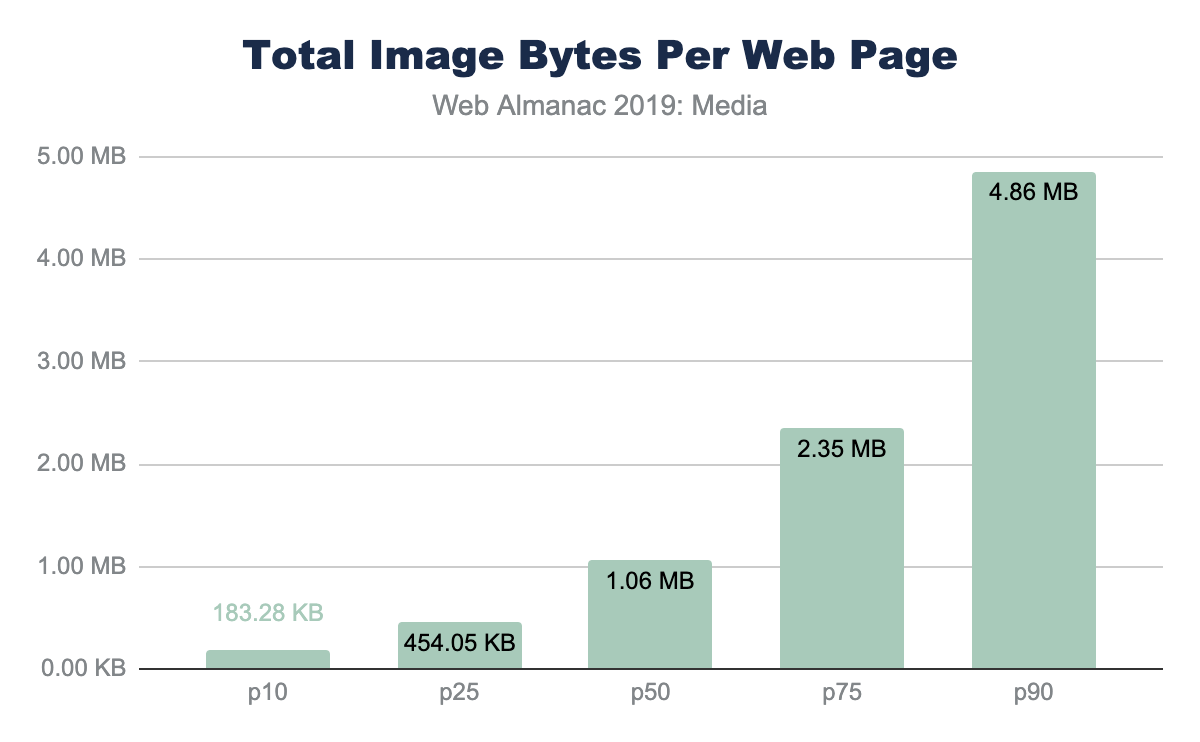
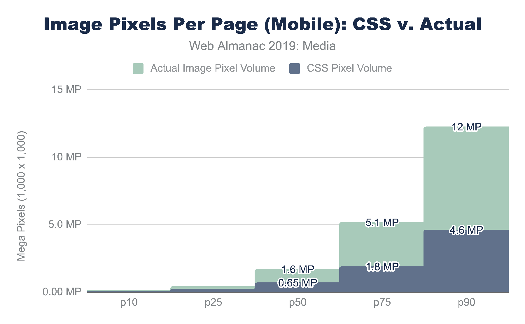
Further, the financial cost of visiting these websites in different parts of the world is disproportionate. At the median and 90th percentile, the volume of image bytes is 1 MB and 1.9 MB respectively. Using WhatDoesMySiteCost.com we can see that the gross national income (GNI) per capita cost to a user in Madagascar a single web page load at the 90th percentile would cost 2.6% of the daily gross income. By contrast, in Germany this would be 0.3% of the daily gross income.
Looking at bytes per page results in just looking at the costs—to page performance and the user—but it overlooks the benefits. These bytes are important to render pixels on the screen. As such, we can see the importance of the images and video resources by also looking at the number of media pixels used per page.
There are three metrics to consider when looking at pixel volume: CSS pixels, natural pixels, and screen pixels:
- CSS pixel volume is from the CSS perspective of layout. This measure focuses on the bounding boxes for which an image or video could be stretched or squeezed into. It also does not take into the actual file pixels nor the screen display pixels
- Natural pixels refer to the logical pixels represented in a file. If you were to load this image in GIMP or Photoshop, the pixel file dimensions would be the natural pixels.
- Screen pixels refer to the physical electronics on the display. Prior to mobile phones and modern high-resolution displays, there was a 1:1 relationship between CSS pixels and LED points on a screen. However, because mobile devices are held closer to the eye, and laptop screens are closer than the old mainframe terminals, modern screens have a higher ratio of physical pixels to traditional CSS pixels. This ratio is referred to as Device-Pixel-Ratio or colloquially referred to as Retina™ displays.
Looking at the CSS pixel and the natural pixel volume we can see that the median website has a layout that displays one megapixel (MP) of media content. At the 90th percentile, the CSS layout pixel volume grows to 4.6 MP and 6.3 MP mobile and desktop respectively. This is interesting not only because the responsive layout is likely different, but also because the form factor is different. In short, the mobile layout has less space allocated for media compared to the desktop.
In contrast, the natural, or file, pixel volume is between 2 and 2.6 times the layout volume. The median desktop web page sends 2.1MP of pixel content that is displayed in 1.1 MP of layout space. At the 90th percentile for mobile we see 12 MP squeezed into 4.6 MP.
Of course, the form factor for a mobile device is different than a desktop. A mobile device is smaller and usually held in portrait mode while the desktop is larger and used predominantly in landscape mode. As mentioned earlier, a mobile device also typically has a higher device pixel ratio (DPR) because it is held much closer to the eye, requiring more pixels per inch compared to what you would need on a billboard in Times Square. These differences force layout changes and users on mobile more commonly scroll through a site to consume the entirety of content.
Megapixels are a challenging metric because it is a largely abstract metric. A useful way to express this volume of pixels being used on a web page is to represent it as a ratio relative to the display size.
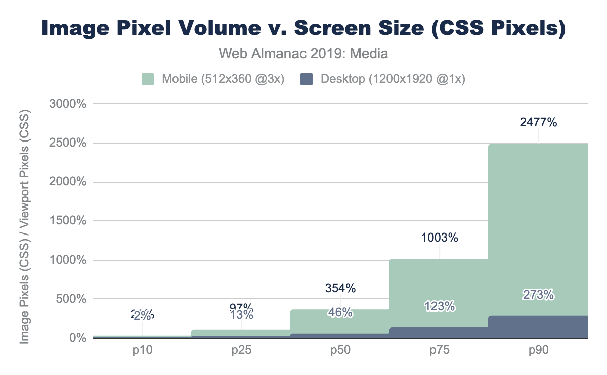
For the mobile device used in the web page crawl, we have a display of 512 x 360 which is 0.18 MP of CSS content. (Not to be confused with the physical screen which is 3x or 3^2 more pixels, which is 1.7MP). Dividing this viewer pixel volume by the number of CSS pixels allocated to images we get a relative pixel volume.
If we had one image that filled the entire screen perfectly, this would be a 1x pixel fill rate. Of course, rarely does a website fill the entire canvas with a single image. Media content tends to be mixed in with the design and other content. A value greater than 1x implies that the layout requires the user to scroll to see the additional image content.
Note: this is only looking at the CSS layout for both the DPR and the volume of layout content. It is not evaluating the effectiveness of the responsive images or the effectiveness of providing high DPR content.
For the median web page on desktop, only 46% of the display would have layout containing images and video. In contrast, on mobile, the volume of media pixels fills 3.5 times the actual viewport size. The layout has more content than can be filled in a single screen, requiring the user to scroll. At a minimum, there is 3.5 scrolling pages of content per site (assuming 100% saturation). At the 90th percentile for mobile, this grows substantially to 25x the viewport size!
Media resources are critical for the user experience.
Images
Much has already been written on the subject of managing and optimizing images to help reduce the bytes and optimize the user experience. It is an important and critical topic for many because it is the creative media that define a brand experience. Therefore, optimizing image and video content is a balancing act between applying best practices that can help reduce the bytes transferred over the network while preserving the fidelity of the intended experience.
While the strategies that are utilized for images, videos, and animations are—in broad strokes—similar, the specific approaches can be very different. In general, these strategies boil down to:
- File formats - utilizing the optimal file format
- Responsive - applying responsive images techniques to transfer only the pixels that will be shown on screen
- Lazy loading - to transfer content only when a human will see it
- Accessibility - ensuring a consistent experience for all humans
A word of caution when interpreting these results. The web pages crawled for the Web Almanac were crawled on a Chrome browser. This implies that any content negotiation that might better apply for Safari or Firefox might not be represented in this dataset. For example, the use of file formats like JPEG2000, JPEG-XR, HEVC and HEIC are absent because these are not supported natively by Chrome. This does not mean that the web does not contain these other formats or experiences. Likewise, Chrome has native support for lazy loading (since v76) which is not yet available in other browsers. Read more about these caveats in our Methodology.
It is rare to find a web page that does not utilize images. Over the years, many different file formats have emerged to help present content on the web, each addressing a different problem. Predominantly, there are 4 main universal image formats: JPEG, PNG, GIF, and SVG. In addition, Chrome has enhanced the media pipeline and added support for a fifth image format: WebP. Other browsers have likewise added support for JPEG2000 (Safari), JPEG-XL (IE and Edge) and HEIC (WebView only in Safari).
Each format has its own merits and has ideal uses for the web. A very simplified summary would break down as:
| Format | Highlights | Drawbacks |
|---|---|---|
| JPEG |
|
|
| PNG |
|
|
| GIF |
|
|
| SVG |
|
|
| WebP |
|
|
Image formats
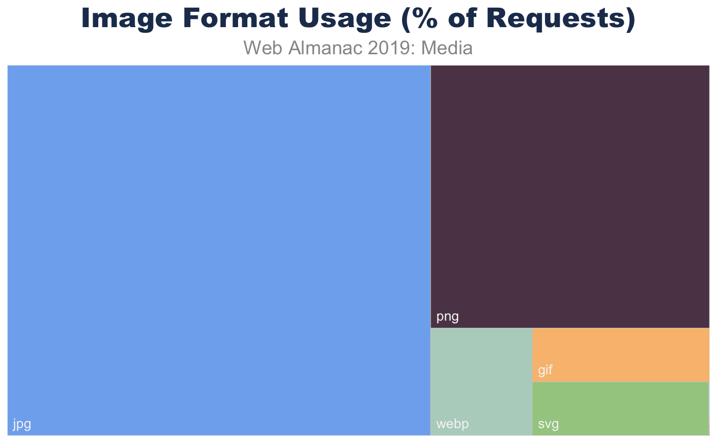
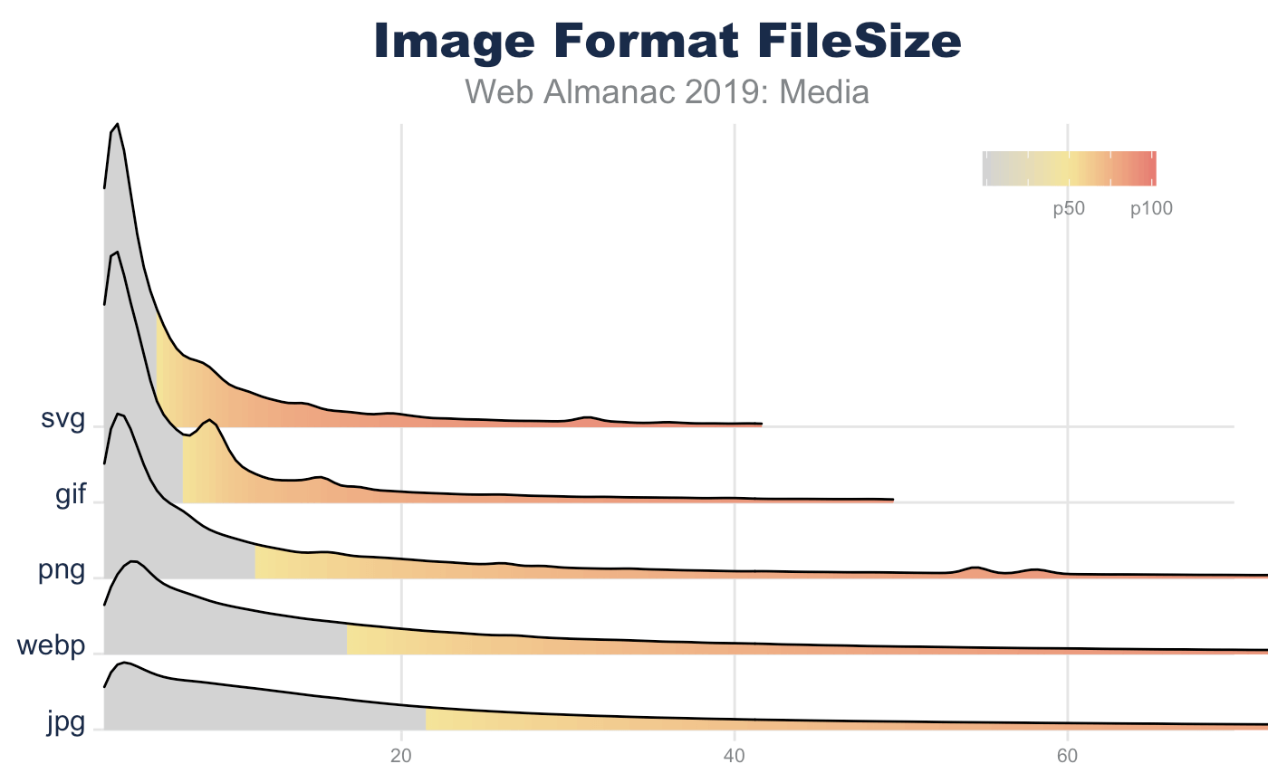
In aggregate, across all page, we indeed see the prevalence of these formats. JPEG, one of the oldest formats on the web, is by far the most commonly used image formats at 60% of the image requests and 65% of all image bytes. Interestingly, PNG is the second most commonly used image format 28% of image requests and bytes. The ubiquity of support along with the precision of color and creative content are likely explanations for its wide use. In contrast SVG, GIF, and WebP share nearly the same usage at 4%.
Of course, web pages are not uniform in their use of image content. Some depend on images more than others. Look no further than the home page of google.com and you will see very little imagery compared to a typical news website. Indeed, the median website has 13 images, 61 images at the 90th percentile, and a whopping 229 images at the 99th percentile.
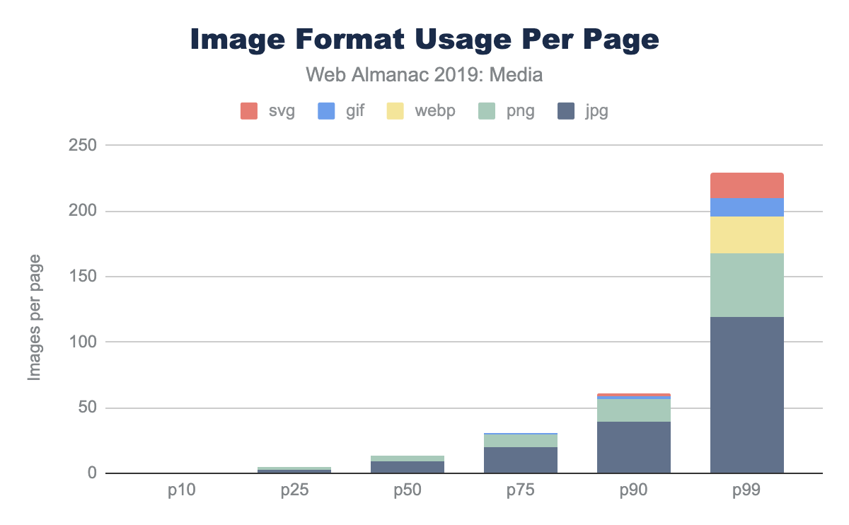
While the median page has nine JPEGs and four PNGs, and only in the top 25% pages GIFs were used, this doesn’t report the adoption rate. The use and frequency of each format per page doesn’t provide insight into the adoption of the more modern formats. Specifically, what percent of pages include at least one image in each format?
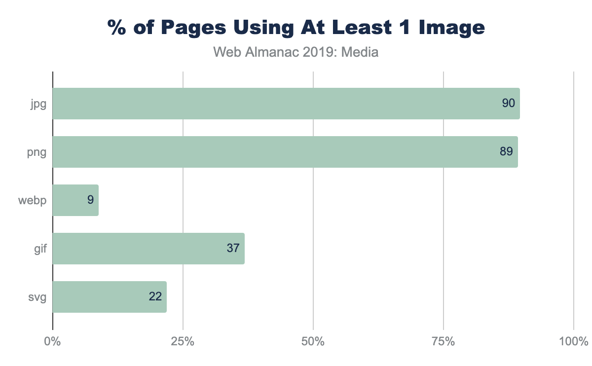
This helps explain why—even at the 90th percentile of pages—the frequency of WebP is still zero; only 9% of web pages have even one resource. There are many reasons that WebP might not be the right choice for an image, but adoption of media best practices, like adoption of WebP itself, still remain nascent.
Image file sizes
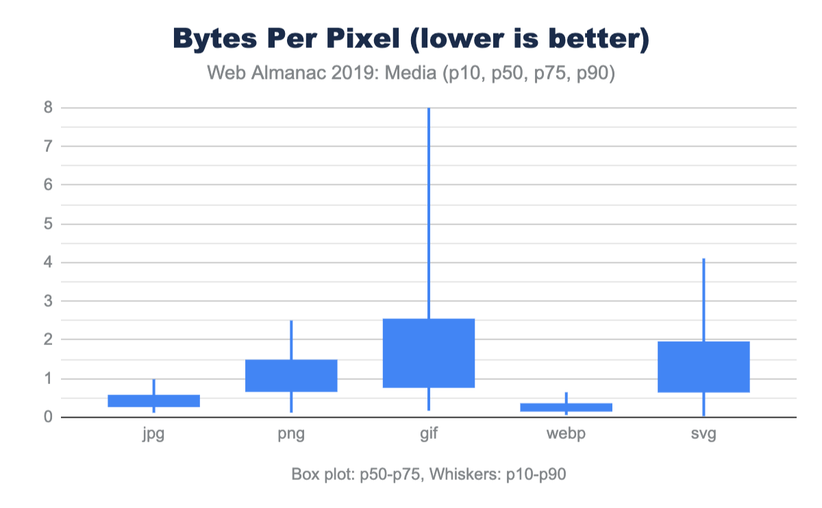
There are two ways to look at image file sizes: absolute bytes per resource and bytes-per-pixel.
From this we can start to get a sense of how large or small a typical resource is on the web. However, this doesn’t give us a sense of the volume of pixels represented on screen for these file distributions. To do this we can divide each resource bytes by the natural pixel volume of the image. A lower bytes-per-pixel indicates a more efficient transmission of visual content.
While previously it appeared that GIF files were smaller than JPEG, we can now clearly see that the cause of the larger JPEG resources is due to the pixel volume. It is probably not a surprise that GIF shows a very low pixel density compared to the other formats. Additionally, while PNG can handle high bit depth and doesn’t suffer from chroma subsampling blurriness, it is about twice the size of JPG or WebP for the same pixel volume.
Of note, the pixel volume used for SVG is the size of the DOM element on screen (in CSS pixels). While considerably smaller for file sizes, this hints that SVGs are generally used in smaller portions of the layout. This is why the bytes-per-pixel appears worse than PNG.
Again, it is worth emphasizing, this comparison of pixel density is not comparing equivalent images. Rather it is reporting typical user experience. As we will discuss next, even in each of these formats there are techniques that can be used to further optimize and reduce the bytes-per-pixel.
Image format optimization
Selecting the best format for an experience is an art of balancing capabilities of the format and reducing the total bytes. For web pages one goal is to help improve web performance through optimizing images. Yet within each format there are additional features that can help reduce bytes.
Some features can impact the total experience. For example, JPEG and WebP can utilize quantization (commonly referred to as quality levels) and chroma subsampling, which can reduce the bits stored in the image without impacting the visual experience. Like MP3s for music, this technique depends on a bug in the human eye and allows for the same experience despite the loss of color data. However, not all images are good candidates for these techniques since this can create blocky or blurry images and may distort colors or make text overlays become unreadable.
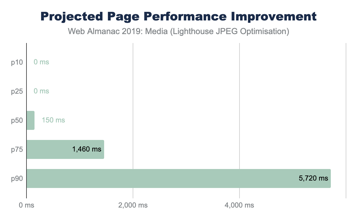
Other format features simply organize the content and sometimes require contextual knowledge. For example, applying progressive encoding of a JPEG reorganizes the pixels into scan layers that allows the browser to complete layout sooner and coincidently reduces pixel volume.
One Lighthouse test is an A/B comparing baseline with a progressively encoded JPEG. This provides a smell to indicate whether the images overall can be further optimized with lossless techniques and potentially with lossy techniques like using different quality levels.
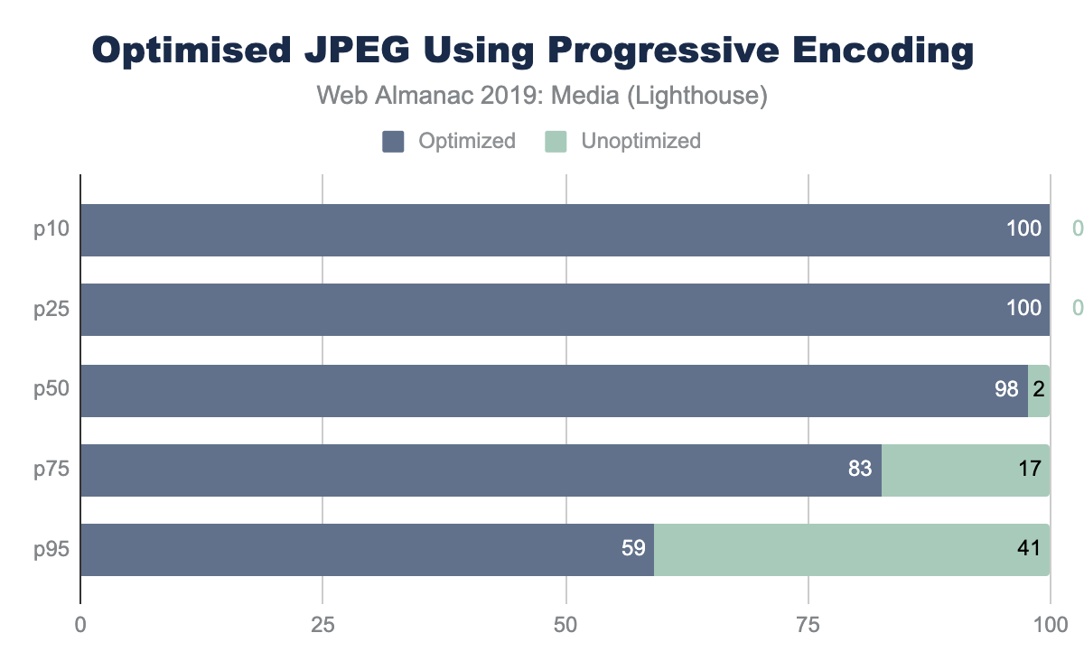
The savings in this AB Lighthouse test is not just about potential byte savings, which can accrue to several MBs at the 95th percentile, it also demonstrates the page performance improvement.
Responsive images
Another axis for improving page performance is to apply responsive images. This technique focuses on reducing image bytes by reducing the extra pixels that are not shown on the display because of image shrinking. At the beginning of this chapter, you saw that the median web page on desktop used one MP of image placeholders yet transferred 2.1 MP of actual pixel volume. Since this was a 1x DPR test, 1.1 MP of pixels were transferred over the network, but not displayed. To reduce this overhead, we can use one of two (possibly three) techniques:
- HTML markup - using a combination of the
<picture>and<source>elements along with thesrcsetandsizesattributes allows the browser to select the best image based on the dimensions of the viewport and the density of the display. - Client Hints - this moves the selection of possible resized images to HTTP content negotiation.
- BONUS: JavaScript libraries to delay image loading until the JavaScript can execute and inspect the Browser DOM and inject the correct image based on the container.
Use of HTML markup
The most common method to implement responsive images is to build a list of alternative images using either <img srcset> or <source srcset>. If the srcset is based on DPR, the browser can select the correct image from the list without additional information. However, most implementations also use <img sizes> to help instruct the browser how to perform the necessary layout calculation to select the correct image in the srcset based on pixel dimensions.
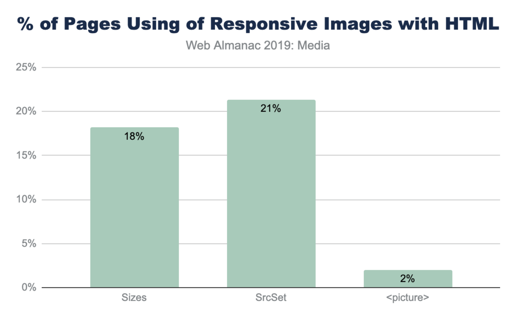
The notably lower use of <picture> is not surprising given that it is used most often for advanced responsive web design (RWD) layouts like art direction.
Use of sizes
The utility of srcset is usually dependent on the precision of the sizes media query. Without sizes the browser will assume the <img> tag will fill the entire viewport instead of smaller component. Interestingly, there are five common patterns that web developers have adopted for <img sizes>:
-
<img sizes="100vw">- this indicates that the image will fill the width of the viewport (also the default). -
<img sizes="200px">- this is helpful for browsers selecting based on DPR. -
<img sizes="(max-width: 300px) 100vw, 300px">- this is the second most popular design pattern. It is the one auto generated by WordPress and likely a few other platforms. It appears auto generated based on the original image size (in this case 300px). -
<img sizes="(max-width: 767px) 89vw, (max-width: 1000px) 54vw, ...">- this pattern is the custom built design pattern that is aligned with the CSS responsive layout. Each breakpoint has a different calculation for sizes to use.
<img sizes> |
Frequency (millions) | % |
|---|---|---|
(max-width: 300px) 100vw, 300px |
1.47 | 5% |
(max-width: 150px) 100vw, 150px |
0.63 | 2% |
(max-width: 100px) 100vw, 100px |
0.37 | 1% |
(max-width: 400px) 100vw, 400px |
0.32 | 1% |
(max-width: 80px) 100vw, 80px |
0.28 | 1% |
sizes patterns.
-
<img sizes="auto">- this is the most popular use, which is actually non-standard and is an artifact of the use of thelazy_sizesJavaScript library. This uses client-side code to inject a bettersizescalculation for the browser. The downside of this is that it depends on the JavaScript loading and DOM to be fully ready, delaying image loading substantially.
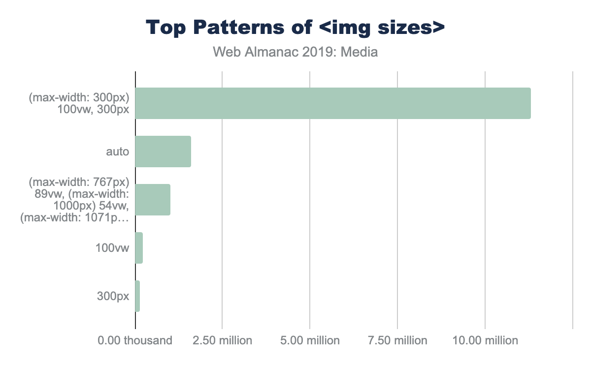
(max-width: 300px) 100vw, 300px’, 1.60 million use ’auto’, 1.00 million use ’img sizes=(max-width: 767px) 89vw...etc.’, 0.23 million use ’100vw’ and 0.13 million use ’300px’<img sizes>.
Client Hints
Client Hints allow content creators to move the resizing of images to HTTP content negotiation. In this way, the HTML does not need additional <img srcset> to clutter the markup, and instead can depend on a server or image CDN to select an optimal image for the context. This allows simplifying of HTML and enables origin servers to adapt overtime and disconnect the content and presentation layers.
To enable Client Hints, the web page must signal to the browser using either an extra HTTP header Accept-CH: DPR, Width, Viewport-Width or by adding the HTML <meta http-equiv="Accept-CH" content="DPR, Width, Viewport-Width">. The convenience of one or the other technique depends on the team implementing and both are offered for convenience.
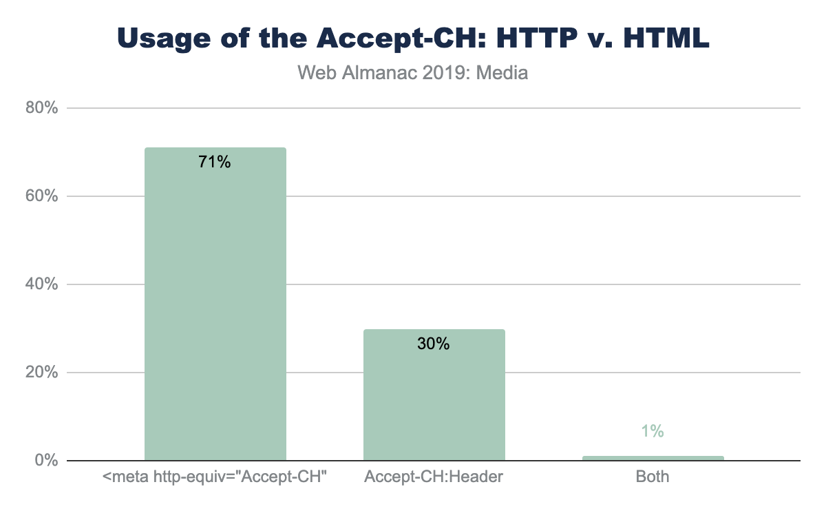
Accept-CH header versus the equivalent <meta> tag.
The use of the <meta> tag in HTML to invoke Client Hints is far more common compared with the HTTP header. This is likely a reflection of the convenience to modify markup templates compared to adding HTTP headers in middle boxes. However, looking at the usage of the HTTP header, over 50% of these cases are from a single SaaS platform (Mercado).
Of the Client Hints invoked, the majority of pages use it for the original three use-cases of DPR, ViewportWidth and Width. Of course, the Width Client Hint that requires the use <img sizes> for the browser to have enough context about the layout.
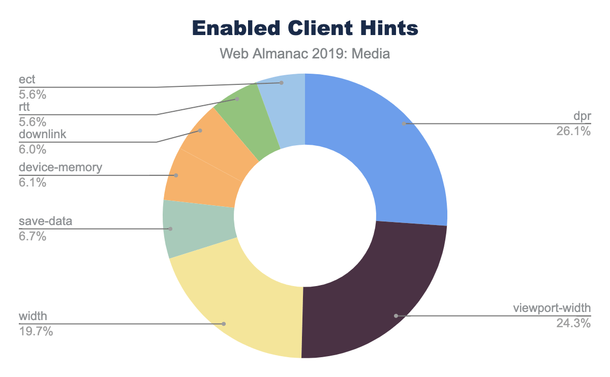
The network-related Client Hints, downlink, rtt, and ect, are only available on Android Chrome.
Lazy loading
Improving web page performance can be partially characterized as a game of illusions; moving slow things out of band and out of site of the user. In this way, lazy loading images is one of these illusions where the image and media content is only loaded when the user scrolls on the page. This improves perceived performance, even on slow networks, and saves the user from downloading bytes that are not otherwise viewed.
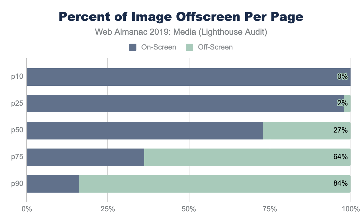
Earlier, in Figure 4.5, we showed that the volume of image content at the 75th percentile is far more than could theoretically be shown in a single desktop or mobile viewport. The offscreen images Lighthouse audit confirms this suspicion. The median web page has 27% of image content significantly below the fold. This grows to 84% at the 90th percentile.
The Lighthouse audit provides us a smell as there are a number of situations that can provide tricky to detect such as the use of quality placeholders.
Lazy loading can be implemented in many different ways including using a combination of Intersection Observers, Resize Observers, or using JavaScript libraries like lazySizes, lozad, and a host of others.
In August 2019, Chrome 76 launched with the support for markup-based lazy loading using <img loading="lazy">. While the snapshot of websites used for the 2019 Web Almanac used July 2019 data, over 2,509 websites already utilized this feature.
Accessibility
At the heart of image accessibility is the alt tag. When the alt tag is added to an image, this text can be used to describe the image to a user who is unable to view the images (either due to a disability, or a poor internet connection).
We can detect all of the image tags in the HTML files of the dataset. Of 13 million image tags on desktop and 15 million on mobile, 91.6% of images have an alt tag present. At initial glance, it appears that image accessibility is in very good shape on the web. However, upon deeper inspection, the outlook is not as good. If we examine the length of the alt tags present in the dataset, we find that the median length of the alt tag is six characters. This maps to an empty alt tag (appearing as alt=""). Only 39% of images use alt text that is longer than six characters. The median value of “real” alt text is 31 characters, of which 25 actually describe the image.
Video
While images dominate the media being served on web pages, videos are beginning to have a major role in content delivery on the web. According to HTTP Archive, we find that 4.06% of desktop and 2.99% of mobile sites are self-hosting video files. In other words, the video files are not hosted by websites like YouTube or Facebook.
Video formats
Video can be delivered with many different formats and players. The dominant formats for mobile and desktop are .ts (segments of HLS streaming) and .mp4 (the H264 MPEG):
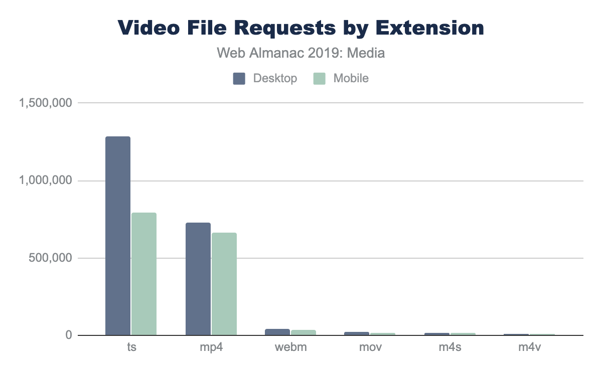
Other formats that are seen include webm, mov, m4s, and m4v (MPEG-DASH streaming segments). It is clear that the majority of streaming on the web is HLS, and that the major format for static videos is the mp4.
The median video size for each format is shown below:
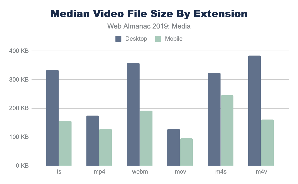
The median values are smaller on mobile, which probably just means that some sites that have very large videos on the desktop disable them for mobile, and that video streams serve smaller versions of videos to smaller screens.
Video file sizes
When delivering video on the web, most videos are delivered with the HTML5 video player. The HTML video player is extremely customizable to deliver video for many different purposes. For example, to autoplay a video, the parameters autoplay and muted would be added. The controls attribute allows the user to start/stop and scan through the video. By parsing the video tags in the HTTP Archive, we’re able to see the usage of each of these attributes:
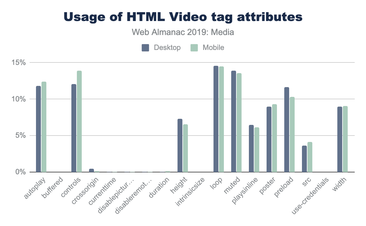
The most common attributes are autoplay, muted and loop, followed by the preload tag and width and height. The use of the loop attribute is used in background videos, and also when videos are used to replace animated GIFs, so it is not surprising to see that it is often used on website home pages.
While most of the attributes have similar usage on desktop and mobile, there are a few that have significant differences. The two attributes with the largest difference between mobile and desktop are width and height, with 4% fewer sites using these attributes on mobile. Interestingly, there is a small increase of the poster attribute (placing an image over the video window before playback) on mobile.
From an accessibility point of view, the <track> tag can be used to add captions or subtitles. There is data in the HTTP Archive on how often the <track> tag is used, but on investigation, most of the instances in the dataset were commented out or pointed to an asset returning a 404 error. It appears that many sites use boilerplate JavaScript or HTML and do not remove the track, even when it is not in use.
Video players
For more advanced playback (and to play video streams), the HTML5 native video player will not work. There are a few popular video libraries that are used to playback the video:
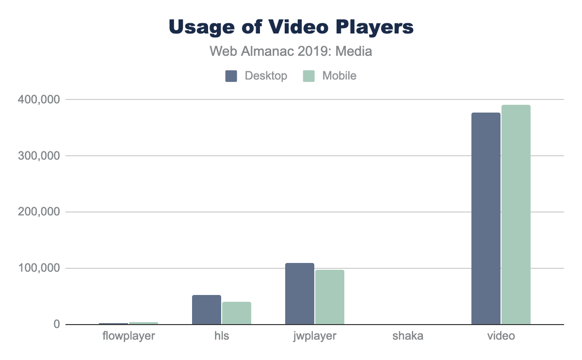
The most popular (by far) is video.js, followed by JWPLayer and HLS.js. The authors do admit that it is possible that there are other files with the name “video.js” that may not be the same video playback library.
Conclusion
Nearly all web pages use images and video to some degree to enhance the user experience and create meaning. These media files utilize a large amount of resources and are a large percentage of the tonnage of websites (and they are not going away!) Utilization of alternative formats, lazy loading, responsive images, and image optimization can go a long way to lower the size of media on the web.

