Media
Introduction
Images and videos are everywhere on the web. However, the ways they’re encoded and embedded on web pages are surprisingly varied and complex, and best practices are always evolving. The Web Almanac gives us a chance to take stock of that complexity and how well we’re managing it, giving us a zoomed-out, panoramic view of where media on the web is, how far it has come, and—just maybe—where it is going. So, let’s go!
Images
We’ll kick off with the most common media type—images. How often do you look at a web page without images? For us, it is extremely rare and if there are no images, we’re most likely looking at a nerdy developer blog.
It comes at no surprise that of the more than 10 million scanned and parsed pages, 99.9% requested at least one image.
Almost every page serves up some kind of an image, even if it’s just a background or favicon.
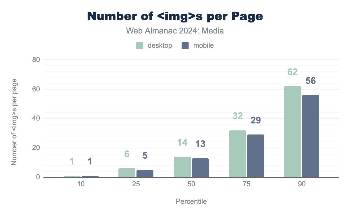
How many <img> elements did we find, per page?
<img> elements per page.
The median mobile page contains 13 <img> elements. And even at the 90th percentile, pages “only” contain 56 <img>s. Considering the visual nature of today’s web, this seems reasonable.
If you think that 56 <img>s per page is a lot, we probably shouldn’t tell you that the mobile crawler found a page with more than two thousand <img> elements.
<img> elements on a single page (mobile).
Images aren’t just pervasive and plentiful. Most of the time they are also a central part of users’ experiences. One way to measure that is to see how often images are responsible for pages’ Largest Contentful Paint.
It’s hard to overstate the importance of images on the web. So, let’s find out what we’re dealing with!
Image resources
We’ll start with the resources themselves. Most images are made of pixels (let’s ignore vector images for a moment). How many pixels do the web’s images typically have?
Perhaps surprisingly, many images contain just a single pixel!
Single-pixel images
| Client | 1×1 images |
|---|---|
| Mobile | 6.4% |
| Desktop | 6.0% |
<img> elements that contain just a single pixel.
One-by-one pixel images make up roughly 6% of all of the captured image requests. These are most likely tracking beacons and spacer GIFs as discovered in last year’s Media chapter. And looking back, we’re happy to report some good news: the percentage of single-pixel images has declined a full point since 2022. So maybe old habits are slowly being replaced with newer and better alternatives.
Image dimensions
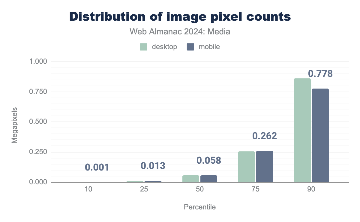
Let’s now turn to images that were larger than 1×1. How big were they?
Despite the fact that the Web Almanac’s mobile crawler hasn’t grown at all (rendering pages to a 360px-wide viewport, at a device pixel ratio of 3x), the median image—weighing in at 0.058 megapixels—is about 25% larger than it was the last time we looked. For reference, at a square aspect ratio, 0.058 megapixels works out to about 240×240.
Most pages have one image that has almost 10 times as many pixels as the median image:
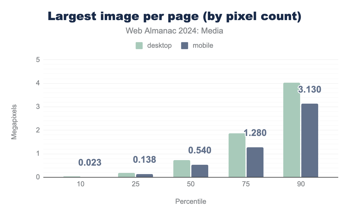
At a square aspect ratio, 0.54 megapixels works out to 735×735. Given the mobile crawler’s viewport and density, it is quite likely that many pages have one “hero” image that is being displayed full-width at high density.
As for the 50% of pages that sent images even larger than that, they are almost certainly sending the mobile crawler more pixels than it can actually display, and could have prevented that waste with some well-written responsive image markup. But more on that later.
Image aspect ratios
Now that we have some sense of how images on the web are sized, how are they shaped?
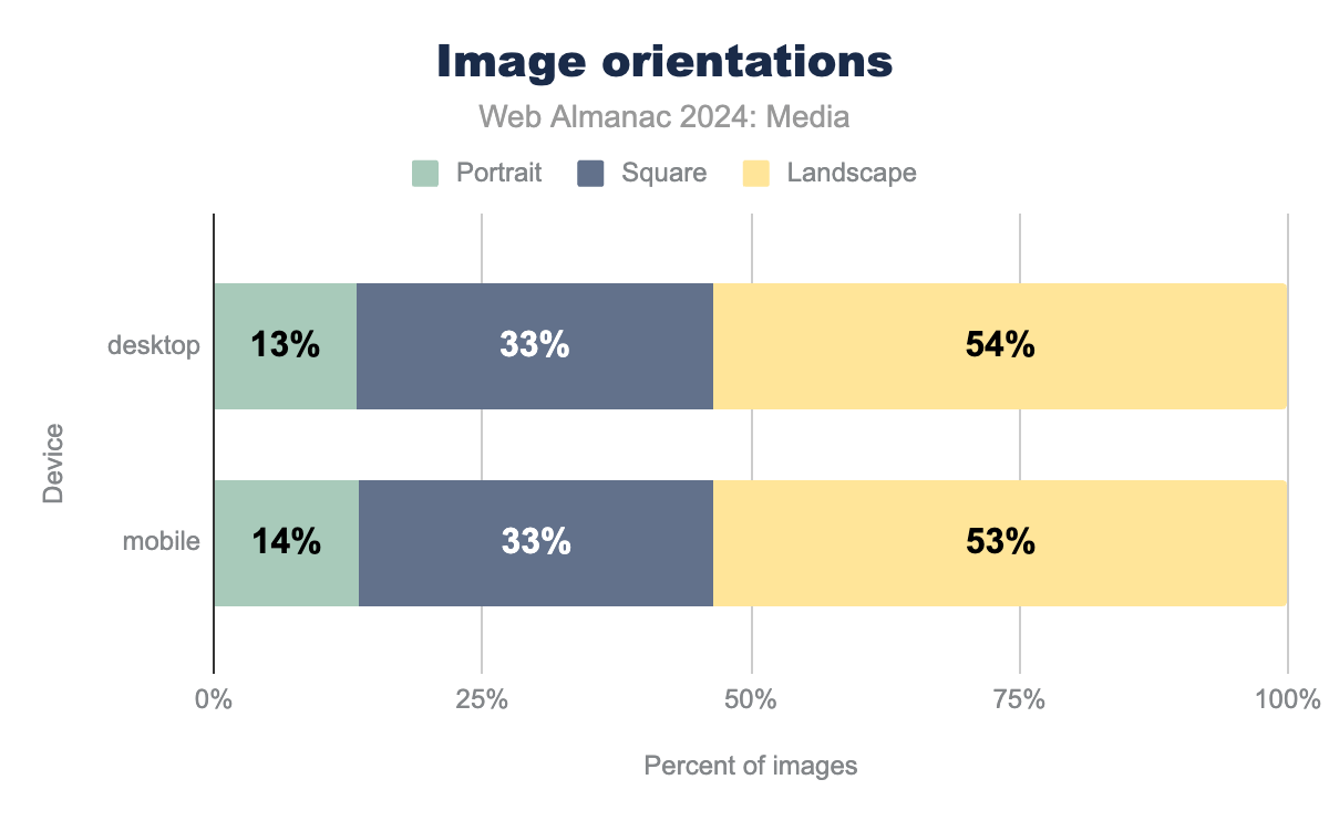
Most images are wider than they are tall—only 1 in 8 are taller than they are wide and a full one-third are exactly square. Square is by far the most popular exact aspect ratio:
| Aspect ratio (width / height) | % of images |
|---|---|
| 1:1 | 33.2% |
| 4:3 | 3.5% |
| 3:2 | 2.9% |
| 2:1 | 1.8% |
| 16:9 | 1.6% |
| 3:4 | 1.1% |
| 2:3 | 0.8% |
| 5:3 | 0.5% |
This data is essentially unchanged from two years ago. It still seems to indicate a bias towards desktop-based browsing—creators are missing opportunities to fill portrait-oriented mobile screens with big, beautiful, portrait-oriented imagery.
Image color spaces
The range of colors that are possible within a given image is determined by that image’s color space. The default color space on the web is sRGB. Unless images signal that their color data uses a different color space, browsers will use sRGB.
The traditional way to explicitly assign a color space to an image is to embed an ICC profile within it. We looked at all of the ICC profiles embedded in all of the images crawled in the dataset.
Here are the top ten:
| ICC profile description | sRGB-ish | Wide-gamut | % of images |
|---|---|---|---|
| No ICC profile | ✓ | 87.7% | |
| sRGB IEC61966-2.1 | ✓ | 3.8% | |
| c2ci | ✓ | 3.2% | |
| sRGB | ✓ | 1.6% | |
| uRGB | ✓ | 0.9% | |
| Adobe RGB (1998) | ✓ | 0.7% | |
| Display P3 | ✓ | 0.4% | |
| c2 | ✓ | 0.3% | |
| GIMP built-in sRGB | ✓ | 0.3% | |
| Display | 0.3% |
The vast majority of the web’s images rely on the sRGB default for correct rendering and don’t contain any ICC profile at all.
The most common ICC profile is the full, official sRGB color profile. This profile is relatively heavy—it weighs 3 KB. Thus, most of the rest of the top 10 ICC profiles are “sRGB-ish” profiles like Clinton Ingrahm’s 424-byte c2ci, which unambiguously specify that an image uses sRGB but with a minimum of overhead.
Over the last decade, hardware and software are increasingly able to capture and present colors that are outside of the range of colors that are possible with sRGB (aka the sRGB gamut). Adobe RGB (1998) and Display P3 are the only two “wide-gamut” profiles in the top 10. While Adobe RGB (1998)’s usage ticked down slightly from 2022, Display P3’s has ticked up, and total wide-gamut ICC profile adoption is up about 10% in relative terms. In absolute terms, wide-gamut ICC profiles are still relatively rare. We found them in 1 in 80 images on the web and 1 in 10 images that have an ICC profile.
One very important caveat here is that in our analysis we were only able to look at ICC profiles. As mentioned, these profiles can be relatively heavy. Modern image formats like AVIF (and recently modernized ones like PNG) allow images to signal their color space much more efficiently using a standard called CICP—which allows common color spaces to be signaled in just four bytes. It stands to reason that modern PNG encoders and any AVIF encoder worth its salt would use CICP instead of ICC to signal a wide gamut color space.
However, in our analysis, images containing CICP are categorized under “No ICC profile.” So, our accounting of wide-gamut usage on the web should be seen as a floor, rather than as an estimate of total adoption. In other words, we found that at least 1 in 80 images on the web is wide-gamut.
Encoding
Now that we’ve gleaned a bit about the web’s image content, what can we say about how that content is encoded for delivery?
Format adoption
For decades there were just three bitmap formats in common use on the web: JPG, PNG, and GIF. They are still the three most common formats:
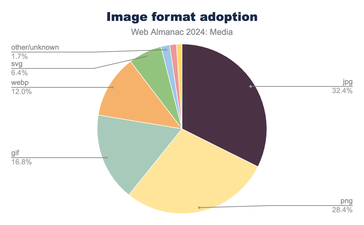
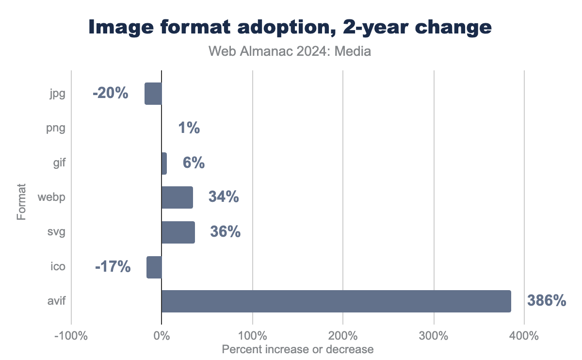
But we are happy to report that change is happening. The largest single absolute change in usage since 2022 was from JPEG, which fell from 40% of all images in 2022 down eight full percentage points to 32% in 2024. That’s a huge loss over two years.
Which formats saw more usage to make up the difference? WebP picked up three percentage points, SVG picked up a bit under two percentage points, and AVIF picked up almost a full point. Most surprisingly, the oldest and least efficient format of them all, GIF, picked up a percentage point, too.
And in relative terms, AVIF usage is taking off—we found almost four times more AVIFs served up by the crawled pages than we did two years ago.
If the crawler had accepted JPEG XLs, we probably would have seen a fair number of them as well. Alas, Chromium-based browsers don’t support the format.
Almost all of the JPEGs, PNGs, and GIFs on the web would be better-served using a modern format. WebPs are good, but AVIFs and JPEG XLs are even better. It is nice to see the massive ship that is all-of-the-images-on-the-web slowly but surely turning towards these more efficient formats. And it’s nice to see SVG usage tick upwards, too!
Lastly, a few words for the oldest format of the bunch: “Burn All GIFs” was good advice in 1999, and it is even better advice today. Developers should take Tyler Sticka’s advice about how to replace the 37-year-old format.
Byte sizes
How heavy is the typical image on the web?
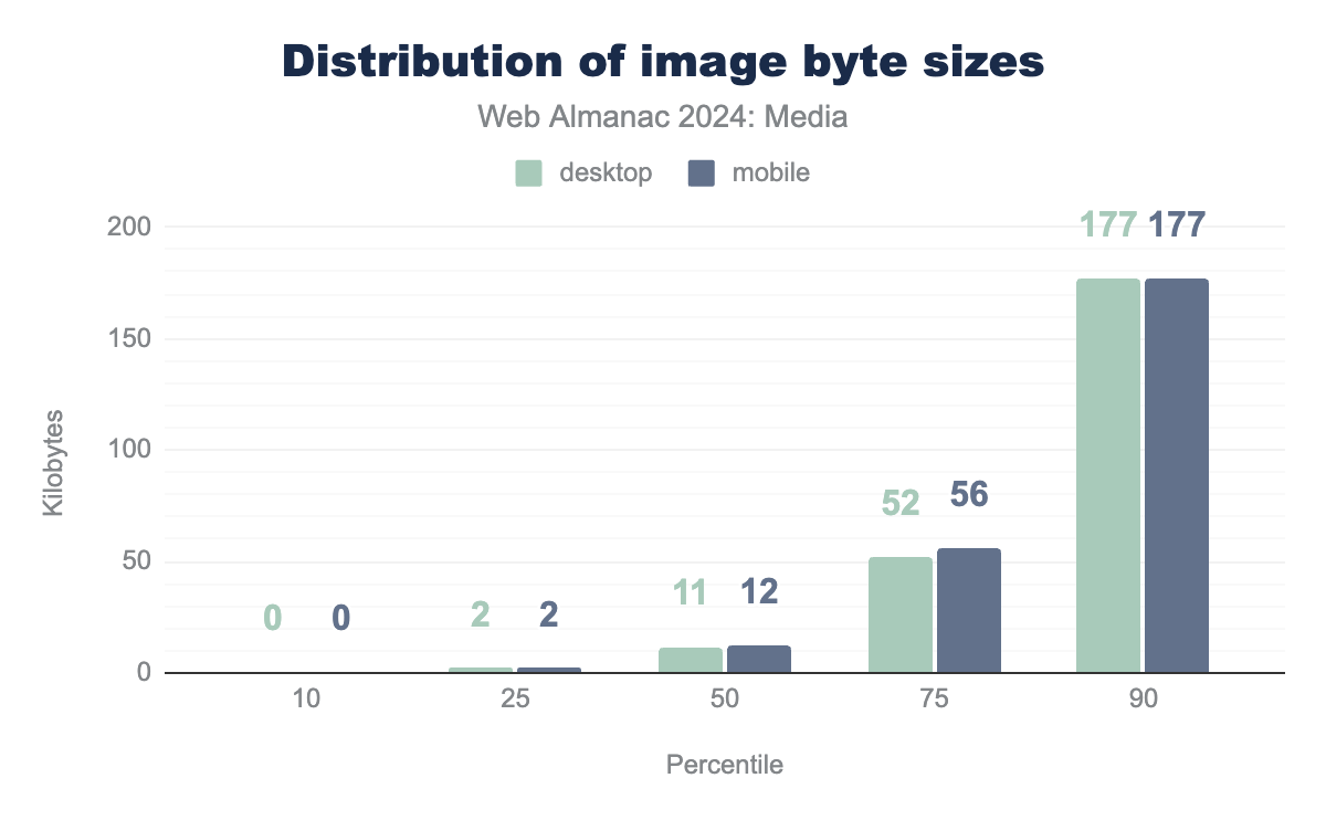
A median of 12 KB might lead one to think, “Eh, that’s not that heavy!” But, just as when we looked at pixel counts, we found that most pages contain many small images, and at least one large one.
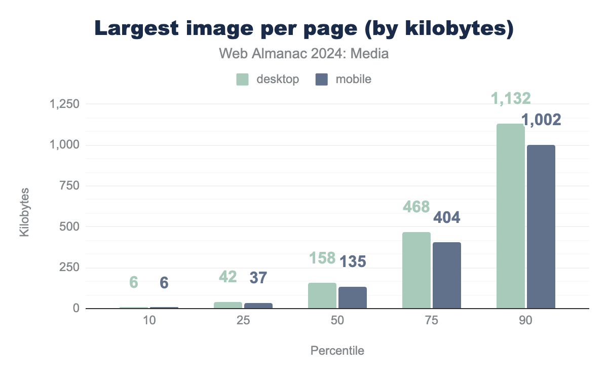
Most mobile pages have one image that’s 135 KB or more. That’s an 8% increase since 2022. And the further up we go in the distribution, the more things are accelerating: the 75th percentile is up 10% and the 90th percentile is up 13% (to almost exactly a megabyte).
Images are getting heavier, and the heaviest images are getting heavier faster.
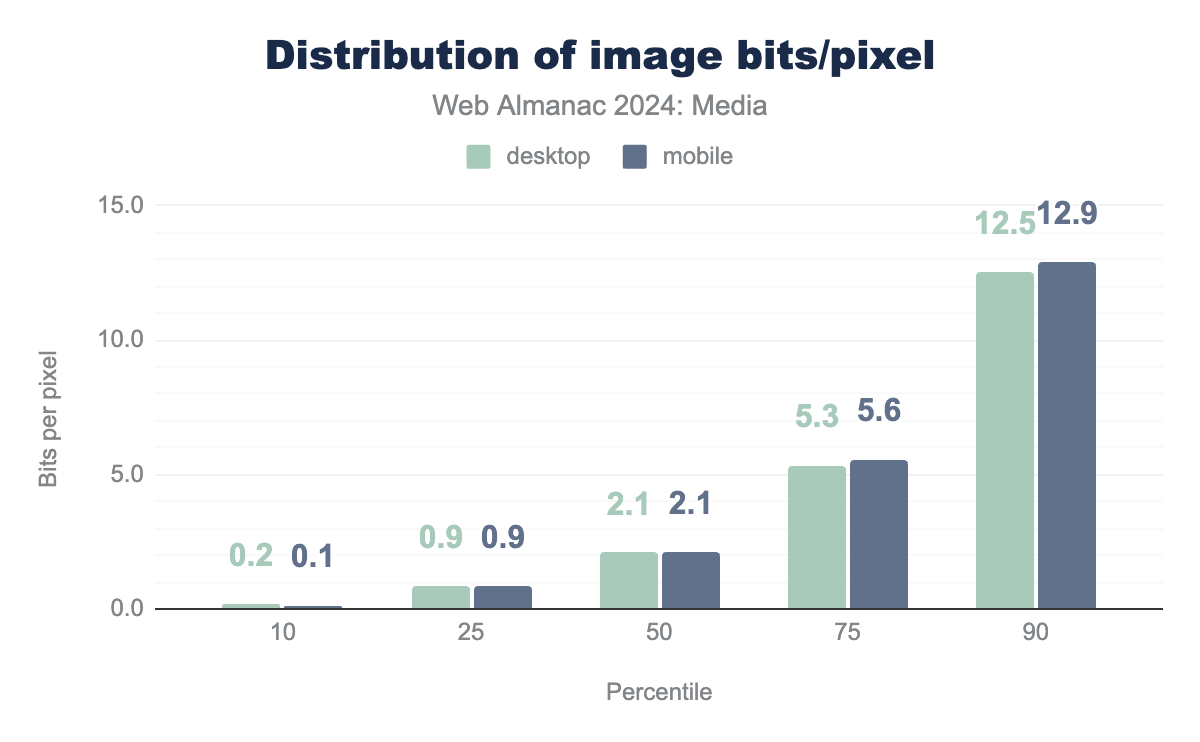
Bits per pixel
Bytes and pixel counts are interesting on their own, but to get a sense of how compressed the web’s image data is we need to put bytes and pixels together to calculate bits per pixel. Doing this allows us to make apples-to-apples comparisons of the information density of images, even if those images have different resolutions.
In general, bitmaps on the web decode to eight bits of uncompressed information per channel (per pixel). So, if we have an RGB image with no transparency, we can expect a decoded, uncompressed image to weigh in at 24 bits per pixel.
A good rule of thumb for lossless compression is that it should reduce file sizes by a 2:1 ratio (which would work out to 12 bits per pixel for our 8-bit RGB image). The rule of thumb for 1990s-era lossy compression schemes—JPEG and MP3—was a 10:1 ratio (2.4 bits per pixel).
It should be noted that, depending on image content and encoding settings, these ratios vary widely and modern JPEG encoders like MozJPEG and Jpegli typically outperform this 10:1 target at their default settings.
To summarize:
| Type of bitmap data | Expected compression ratio | Bits per pixel |
|---|---|---|
| Uncompressed RGB | 1:1 | 24 bits/pixel |
| Losslessly compressed RGB | ~2:1 | 12 bits/pixel |
| 1990s-era lossy RGB | ~10:1 | 2.4 bits/pixel |
So, with all of that as context, here’s how the web’s images stack up:
The median image is compressed to 2.1 bits per pixel, representing a tad more compression than that 1990s rule of thumb. This is also 8–10% more compression than we saw when we last surveyed the web’s images in 2022.
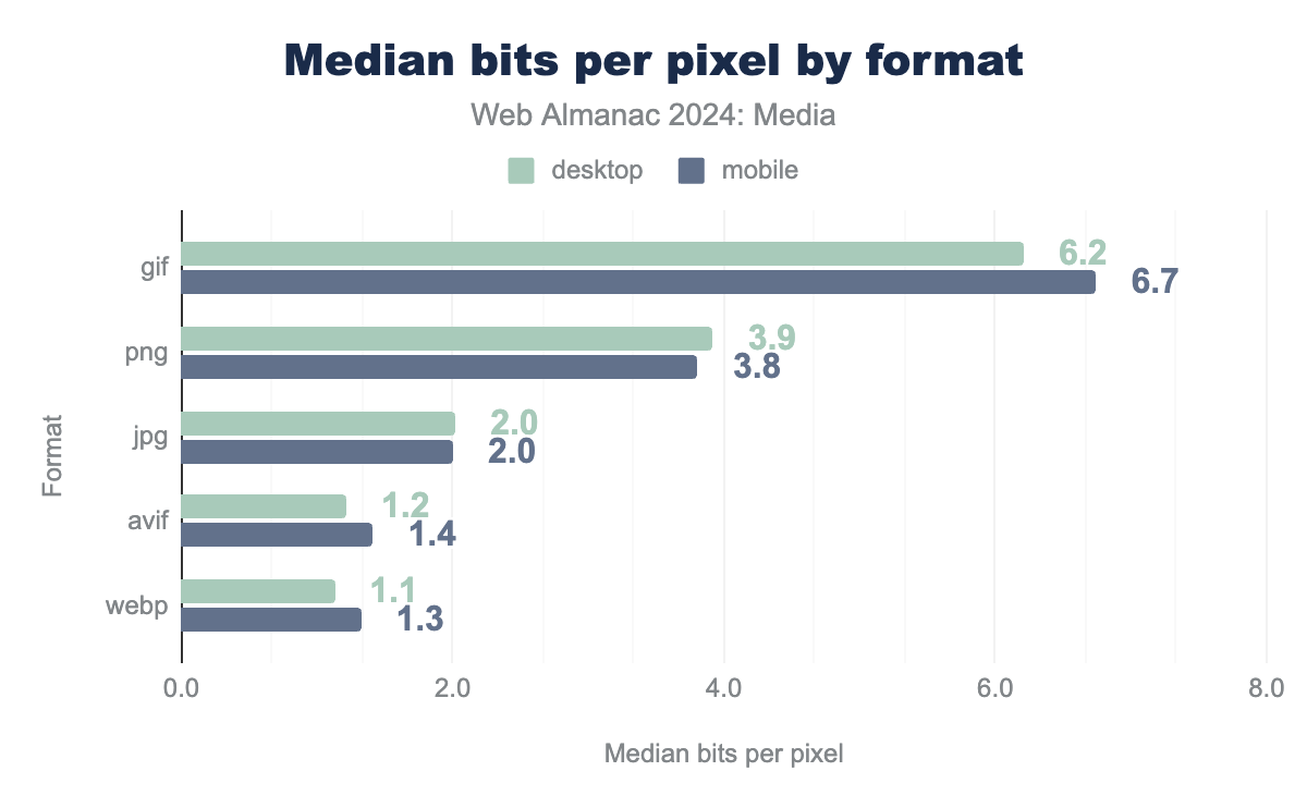
When we break compression down by format, we can see that every format saw fewer bits spent per pixel in 2024 than they did in 2022—except for one.
Bits per pixel by format
Compared to 2022, on mobile, the median PNG is compressed about 10% more, the median WebP is compressed about 7% more, and the median JPEG is compressed around 3% more. It is hard to know exactly what the causes are here, but we hypothesize that an increase in compression is the result of wider adoption of two things: modern encoders, which provide more bang for the buck, and automated image-processing pipelines, which ensure that every image that makes its way to a user has been well-compressed.
The one format that bucked this trend was AVIF. The median AVIF’s bits-per-pixel went up from approximately 1.0 in 2022 to around 1.4 bits per pixel in 2024—an increase of 47%. Funnily enough, we hypothesize the same root cause. The current, diverse crop of AVIF encoders is likely making different quality/filesize tradeoffs, sacrificing less quality at default settings than AOM’s official libavif encoder was two years ago.
We have no idea why GIFs got significantly more efficient, but we do know why they are so much less-compressed than all of the other formats. Our query is per pixel, and it does not take animated images into account, though many GIFs are animated!
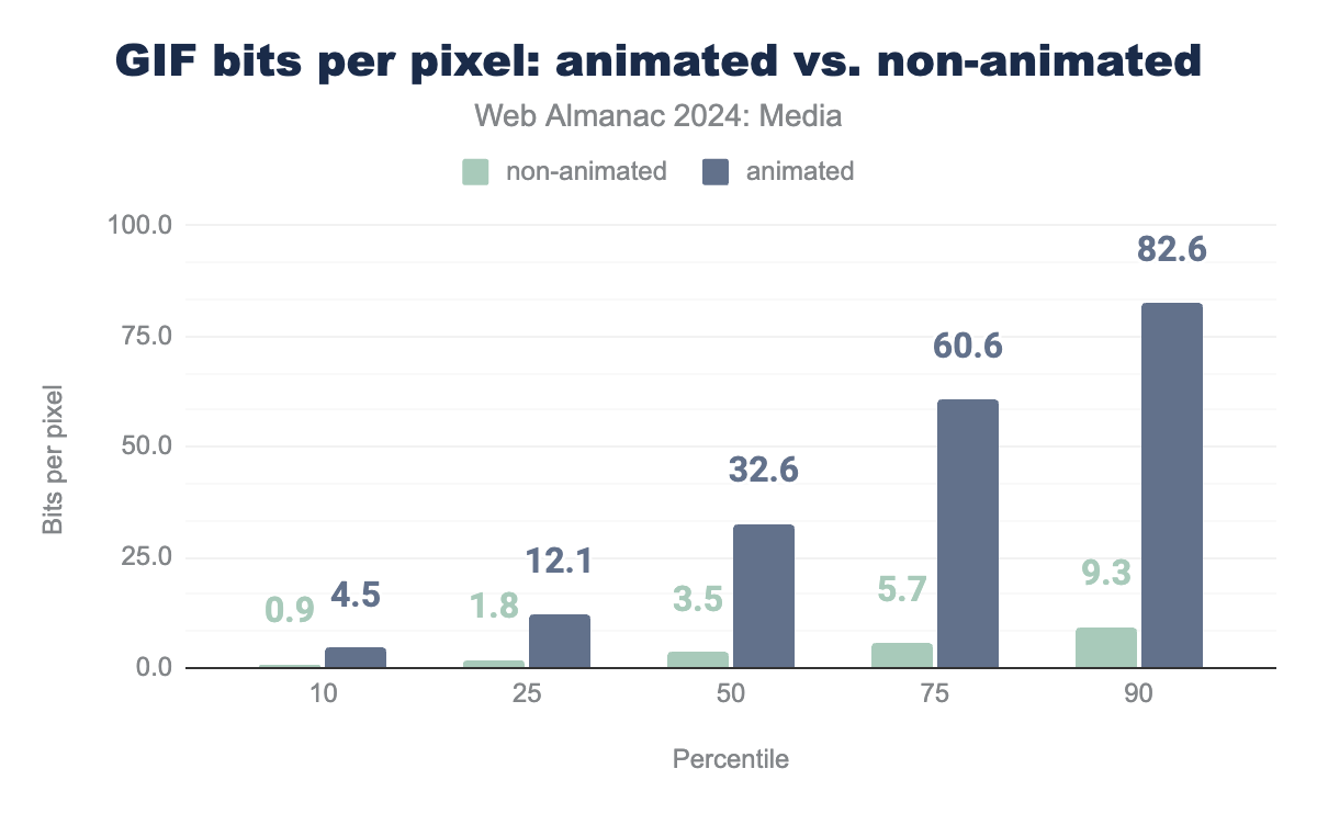
GIFs, animated and not
How many GIFs are animated?
When we separate the animated GIFs out from the animated ones, we can see that the median non-animated GIF is much more reasonably compressed:
3.5 bits per pixel is even less than the median PNG!
Turning to look at the animated GIFs specifically: How many frames do they have?
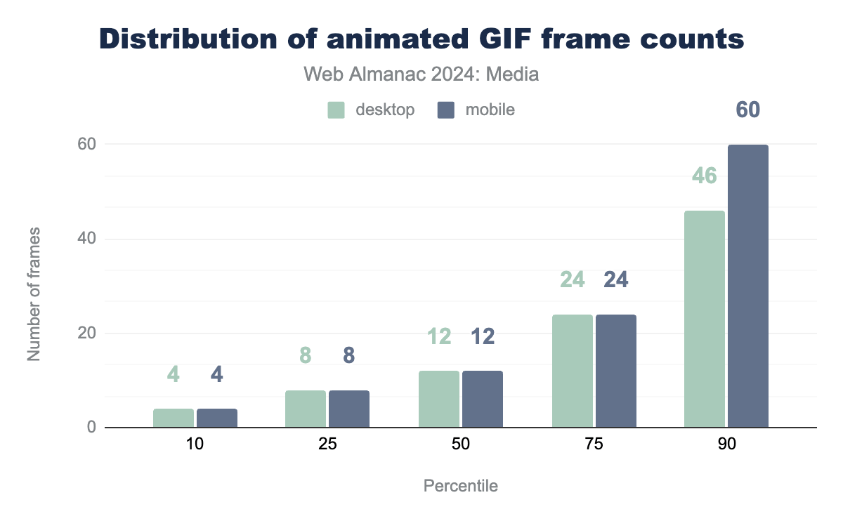
Generally: 10 to 20, which is more or less unchanged since 2022, although the longest GIFs have gotten longer, especially on mobile.
Just for fun, we also looked at the GIF with the most frames:
At 24-frames-per-second, that would take more than 37 minutes to play once through. Every animated GIF should probably be a video these days, but this one definitely should.
Embedding
Now that we have a sense of how the web’s image resources have been encoded, what can we say about how they are embedded on websites?
Lazy-loading
The biggest recent change in how images are embedded on websites has been the rapid adoption of lazy-loading. Lazy-loading was introduced in 2020, and just two years later it was adopted on almost a quarter of websites. Its climb continues, and it is now used on a full one-third of all websites:
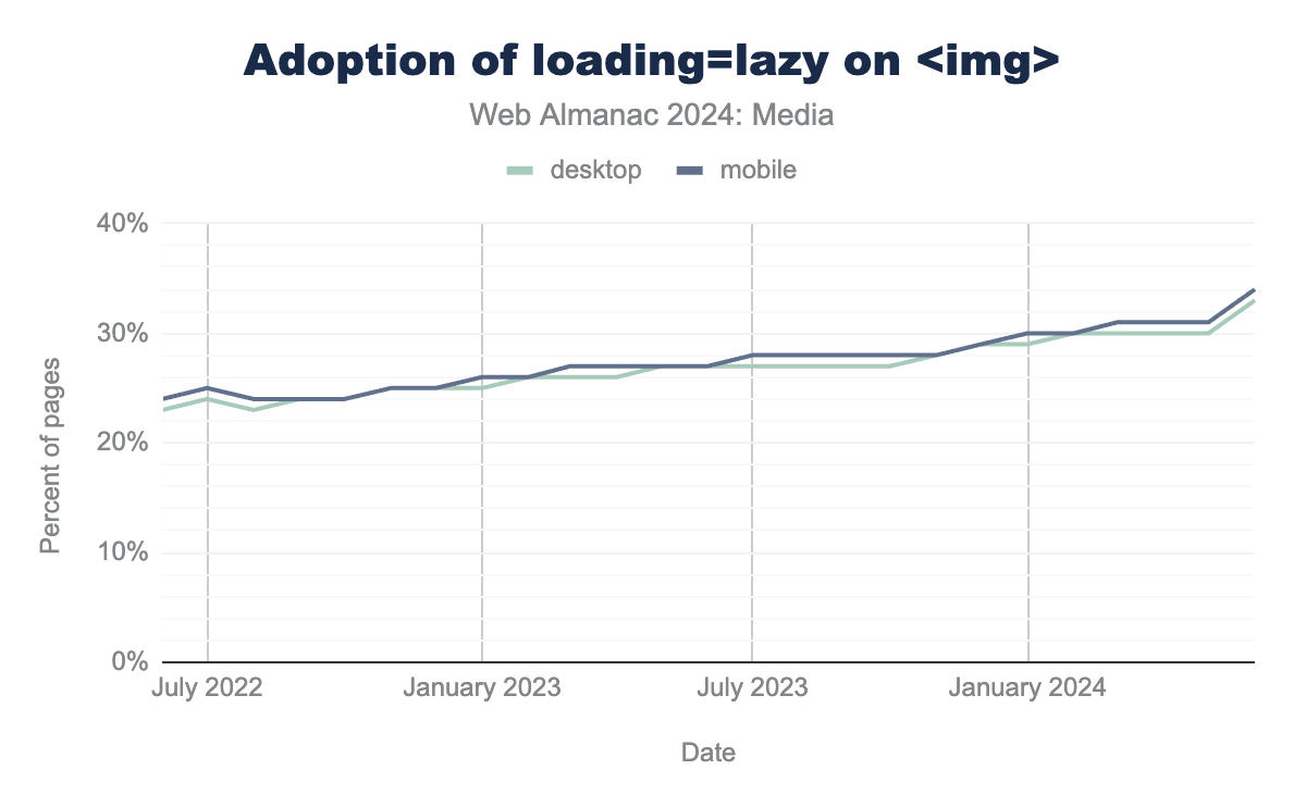
<img loading=lazy>.
And, just like last year, it seems pages are using lazy-loading a bit too much:
<img> elements that use native lazy-loading on mobile.
Lazy-loading the LCP element is an anti-pattern that makes pages much slower. While it is disheartening that nearly one-in-ten LCP-responsible <img>s are lazy-loaded, we are happy to report that things have improved ever-so-slightly over the last two years. The percentage of offending sites has decreased by 0.3 percentage points since 2022.
alt text
Images embedded with <img> elements are supposed to be contentful. That is to say: They’re not just decorative, and they should contain something meaningful. According to both WCAG requirements and the HTML spec, most of the time, <img> elements should have alternative text, and that alternative text should be supplied by the alt attribute.
alt attribute.
Unfortunately, 45 percent of <img> elements don’t have any alt text. Worse, the in-depth analysis from this year’s accessibility chapter indicates that many of the <img>s that do have alt text aren’t all that accessible either since their attributes only contain filenames or other meaningless, short strings.
There has been a one percentage point increase in alt text deployment since 2022, but still we can—and must—do better.
srcset
Prior to lazy-loading, the biggest thing to happen to <img> elements on the web was a suite of features for “responsive images,” which allowed images to tailor themselves to fit within responsive designs. First shipped in 2014, the srcset attribute, the sizes attribute, and the <picture> element are now a decade old. How often and how well are we using them?
Let’s start by looking at the srcset attribute, which allows authors to give the browser a menu of resources to choose from, depending on the context.
srcset attribute on mobile.
The last time we checked, this number was 34%—an eight percentage point increase over two years is significant and encouraging.
The srcset attribute allows authors to describe resources using one of two descriptors. x descriptors specify the resource’s density, allowing browsers to select different resources depending on users’ screen densities. w descriptors give the browser the resource’s width in pixels. When used in conjunction with the sizes attribute, w descriptors allow browsers to select a resource appropriate for both variable layout widths and variable screen densities.
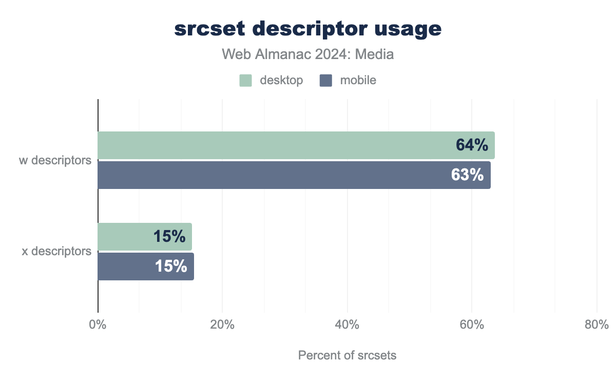
srcsets using x descriptors and w descriptors, on both mobile and desktop. x descriptors are used on 15% of srcsets on both desktop and mobile. w descriptors are used four times more: 64% of the time on desktop, and 62% of the time on mobile.srcset descriptor usage.
x descriptors shipped first and are simpler to reason about, but w descriptors are more powerful. It is encouraging to see that w descriptors are more common. And while x descriptor adoption hasn’t increased much since 2022, w descriptor usage is still growing—w descriptor adoption is up four percentage points on mobile and six percentage points on desktop.
sizes
We mentioned earlier that w descriptors should be used in conjunction with sizes attributes. So, how well are we using sizes? Not very well!
The sizes attribute is supposed to be a hint to the browser about the eventual layout width of the image, usually relative to the viewport width. The sizes attribute is explicitly supposed to be a hint, and so a little inaccuracy is OK and even expected.
But if the sizes attribute is more-than-a-little inaccurate, it can affect resource selection, causing the browser to load an image to fit the sizes width when the actual layout width of the image is significantly different.
So, how accurate are our sizes?
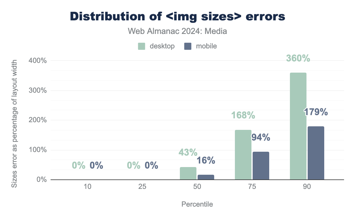
sizes attributes on both desktop and mobile. At first, it’s all zeros: at both the 10th and 25th percentile it’s 0% on both desktop on mobile. At the 50th percentile it’s 43% on desktop and 16% on mobile, at the 75th percentile it’s 168% and 94% respectively, and finally, at the 90th percentile it’s 360% and 179%.<img sizes> errors.
While many sizes attributes are entirely accurate, the median sizes attribute is 16% too large on mobile and 43% too large on desktop. That might be OK, given the hint-like nature of the feature, but as you can see, the 75th and 90th percentiles aren’t pretty. Most worryingly, all of these numbers have gotten significantly worse over the past two years—the median desktop sizes is more than twice as inaccurate as it was two years ago.
What’s the impact of all of this inaccuracy?.
sizes attributes that were inaccurate enough to affect srcset selection on desktop. On mobile, it is 14%.
On desktop, where the difference between the default sizes value (100vw) and the actual layout width of the image is likely to be larger than on mobile, 1 in 5 sizes attributes is inaccurate enough to cause browsers to pick a suboptimal resource from the srcset. These errors add up.
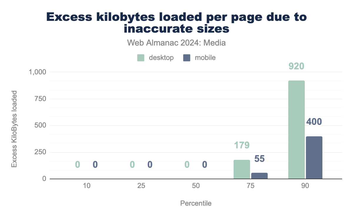
sizes attributes. It starts off with a bunch of zeros. At the tenth, 25th, and 50th percentile, both mobile and desktop weigh in at zero kilobytes. At the 75th percentile, the desktop crawler saw 179 wasted kilobytes and the mobile 55, at the 90th percentile, desktop saw 920 kilobytes and mobile 400.sizes.
We estimate that a quarter of all desktop pages that use w descriptors are loading 180 KB or more of wasted image data, because of their inaccurate sizes attributes. That is to say, a better, smaller resource is there for the picking in the srcset, but because the sizes attribute is so erroneous, the browser doesn’t pick it. The worst 10% of desktop pages that use w descriptors load close to a megabyte of excess image data because of bad sizes attributes.
This is quite troubling, but what’s worse is that all of these numbers are almost twice as bad as they were just two years ago. Things are bad and getting worse.
There are two solutions here that developers should pursue.
For LCP-responsible and other critical images, developers need to fix their sizes attributes. The best tool to audit and repair sizes is RespImageLint, which can help fix a host of other responsive image problems, too.
For below-the-fold and non-critical images, authors should start to adopt sizes="auto". This value can only be used in conjunction with lazy-loading, but it tells the browser to use the actual layout size of the <img> as the sizes value, ensuring that the used value is perfectly accurate.
Auto-sizes for lazy-loaded images is currently only implemented in Chrome, but Safari and Firefox have both expressed support for it. We hope they implement it soon and that developers start rolling it out now (with fallback values).
<picture>
The last responsive image feature to land in 2014 was the <picture> element. While srcset hands browsers a menu of resources to choose from, the<picture> element allows authors to take charge, giving browsers an explicit set of context-adaptive instructions about which child <source> element to load a resource from.
The <picture> element is used far less than srcset:
<picture> element.
This is up more than a percentage point and a half from 2022, but the fact that there are more than four pages that use srcset for every one page that uses <picture> suggests that either <picture> use cases are more niche or that <picture> is more difficult to deploy—or both.
What are people using <picture> for?
The <picture> element gives authors two ways to switch between resources. Type-switching allows authors to provide cutting-edge image formats to browsers that support them and fallback formats for everyone else. Media-switching facilitates art direction, allowing authors to switch between <source>s based on media conditions.
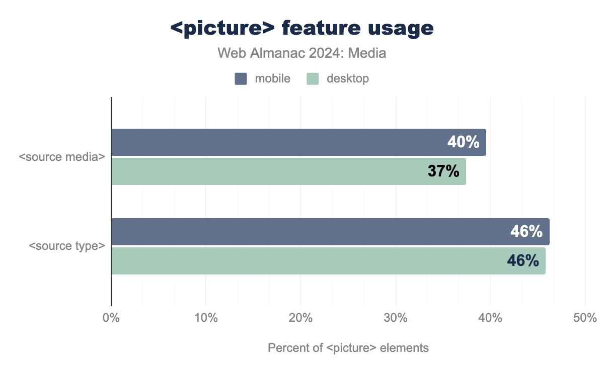
media and type attributes on source elements, in conjunction with the picture element. media is used with 40% of picture elements on mobile, and 37% on desktop. type is used with 46% of picture elements on both mobile and desktop (although the mobile bar is ever-so-slightly larger).<picture> feature usage.
While usage of the media attribute is down three percentage points from 2022, type-switching usage is up three percentage points. This increase is likely related to the increasing popularity of next-generation image formats, especially JPEG XL which does not yet enjoy universal browser support.
Layout
We already saw how the web’s image resources size up. But before they can be shown to a user, embedded images must be placed within a layout and potentially squished or stretched to fit it.
Layout widths
Let’s start by asking: How wide do the web’s images end up when painted to the page?
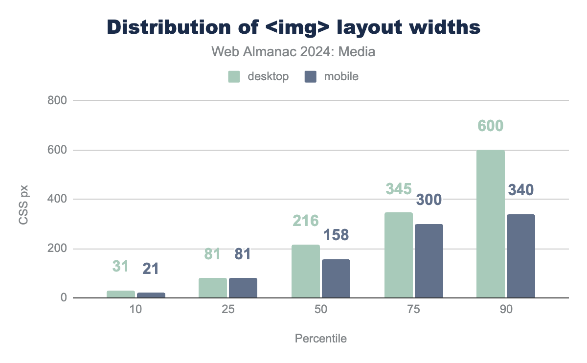
<img> layout widths.
Most of the web’s images end up pretty small within layouts. Interestingly, while most of the mobile layout sizes are essentially unchanged since 2022, the top half of desktop layout sizes have all increased by around 8%.
But while the majority of layout sizes are small, most pages have at least one fairly large <img>.
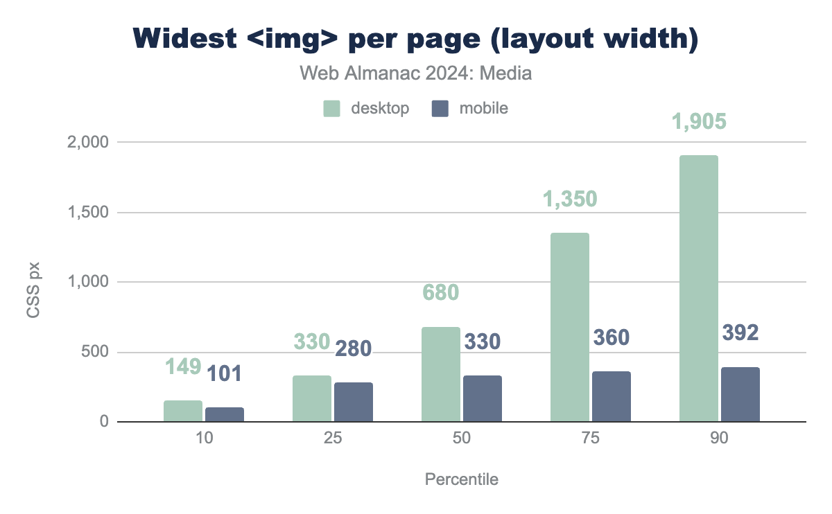
<img> per page (layout width).
Half of all mobile pages have at least one image that takes up approximately the full viewport. At the top end, mobile layouts are doing a good job of containing images so that they don’t take up much more than that. You can see the distribution quickly approach the mobile crawlers’ viewport width (360px) and then only barely exceed it.
Contrast this with the desktop layout widths, which don’t top out at all. They just keep growing, hitting full-viewport-width (1360px) at the 75th percentile and blowing right past it at the 90th percentile. Equally interesting, the 25th, 50th and 75th percentile layout sizes on desktop have gotten larger than they were two years ago, while the ends of the distribution are essentially unchanged. Large hero images are getting larger.
Intrinsic vs extrinsic sizing
How do the web’s images end up at these layout sizes? There are many ways to scale an image with CSS. But how many images are being scaled with any CSS at all?
Images, like all “replaced elements,” have an intrinsic size. By default—in the absence of a srcset controlling their density or any CSS rules controlling their layout width—images on the web display at a density of 1x. Plop a 640×480 image into an <img src> and, by default, that <img> will be laid out with a width of 640 CSS pixels.
Authors may apply extrinsic sizing to an image’s height, width, or both. If an image has been extrinsically sized in one dimension (for instance, with a width: 100%; rule), but left to its intrinsic size in the other (height: auto; or no rule at all), it will scale proportionally, using its intrinsic aspect ratio.
Complicating things further, some CSS rules size <img> elements based on their intrinsic dimensions, unless those intrinsic dimensions violate some constraint. For instance, an <img> element with a max-width: 100%; rule will be intrinsically sized, unless that intrinsic size is larger than the size of the <img> element’s container, in which case it will be extrinsically scaled down to fit.
With all of that explanation out of the way, here’s how the web’s <img> elements are sized for layout:
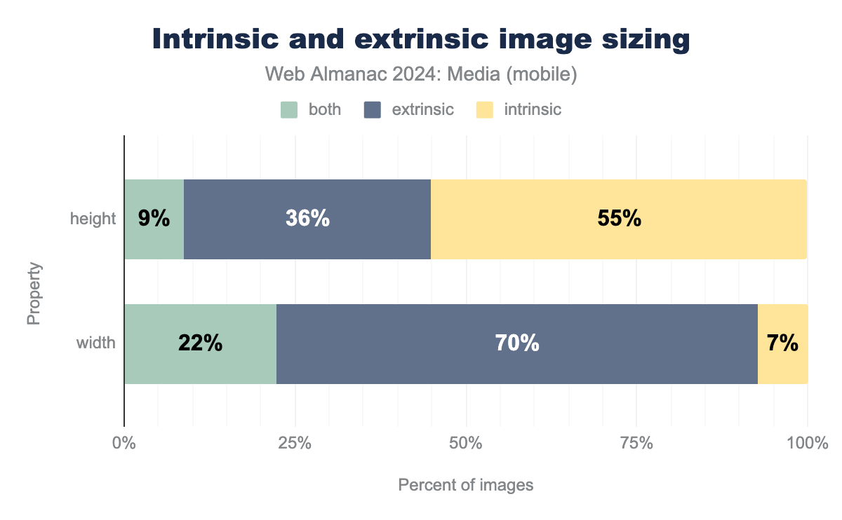
The majority of images have extrinsic widths and intrinsic heights. The “both” category for width—representing images with either a max-width or min-width sizing constraint—is also fairly popular. Leaving images to their intrinsic widths is far less popular and slightly less popular than it was in 2022.
height, width and Cumulative Layout Shifts
Any <img> whose layout size is dependent on its intrinsic dimensions risks triggering a Cumulative Layout Shift (CLS). In essence, such images risk being laid out twice—once when the page’s DOM and CSS have been processed, and then a second time when they finally finish loading and their intrinsic dimensions are known.
As we’ve just seen, extrinsically scaling an image to fit a certain width while leaving the height (and aspect ratio) intrinsic is very common. To prevent the resulting plague of layout shifts, authors should set the width and height attributes on the <img> element so that browsers can reserve layout space before the embedded resource loads.
<img> elements on mobile that have both height and width attributes set.
Usage of height and width is up four percentage points from 2022, which is good. But the attributes are still only used on a one-third of images, meaning we have a long way to go.
Delivery
Finally, let’s take a look at how images are delivered over the network.
Cross-domain image hosts
How many images are being delivered from a different domain than the document they’re embedded on? A growing majority:
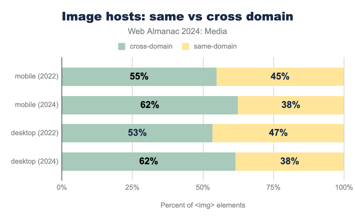
It is hard to disentangle the various potential causes here, but we hypothesize that one factor is just how hard images are to get right. This leads teams to adopt image CDNs, which provide image optimization and delivery as a service.
So, there you have it: a panoramic view of the current state of images on the web. Now let’s take a look at video on the web in 2024.
Video
The <video> element shipped in 2010, and has been the best and—since the demise of plugins like Flash and Silverlight—only way to embed video content on websites ever since. How are we using it?
<video> element adoption
Let’s start by answering the first and most basic question: How many pages include <video> elements at all?
<video> element. On desktop, it’s 7.7%.
This is a small fraction of the pages that include <img>s. But even though <video> was introduced 14 years ago, adoption is currently growing fast. The mobile number is up 32% (in relative terms) from 2022.
Video durations
How long are those videos? Not very long!
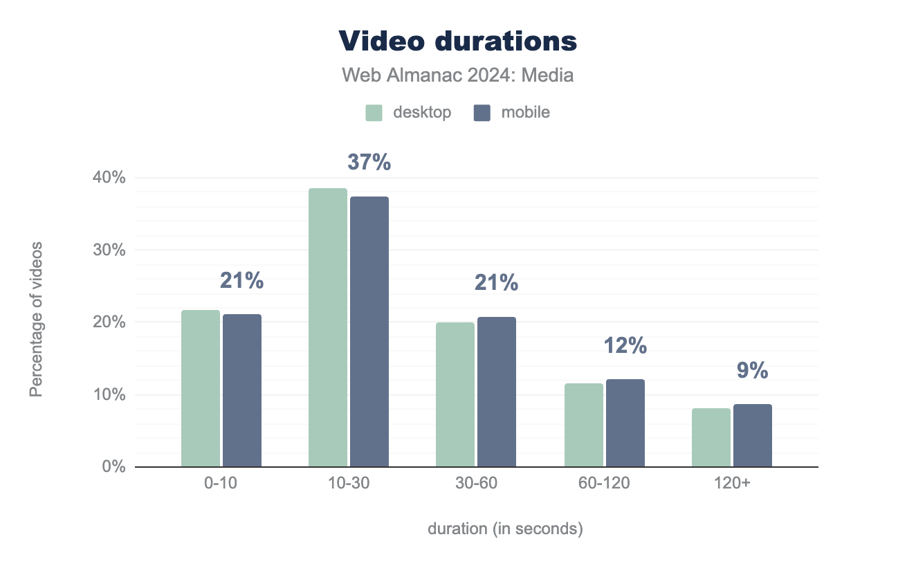
Nine out of ten videos are less than two minutes long. More than half are under 30 seconds. And almost one-quarter of videos are under ten seconds.
Format adoption
What formats are sites delivering in 2024? MP4, which enjoys universal support, is king:
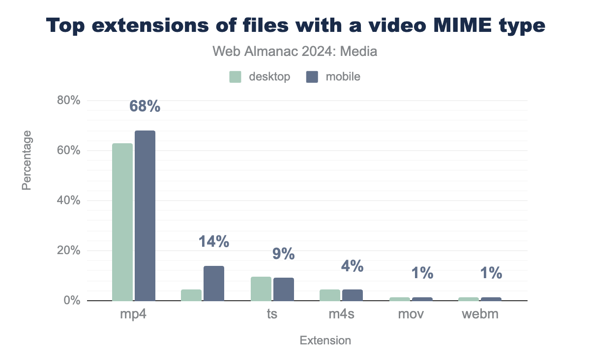
After .mp4, the three most common extensions are no-extension, .ts, and .m4s. This trio is delivered when a <video> element employs adaptive bitrate streaming using either HLS or MPEG-DASH. Video elements that deliver anything besides .mp4 or adaptive bitrate streaming are rare, accounting for only 4% of the extensions we found.
Embedding
The <video> element offers a number of attributes that allow authors to control how the video will be loaded and presented on the page. Here they are, ranked by usage:
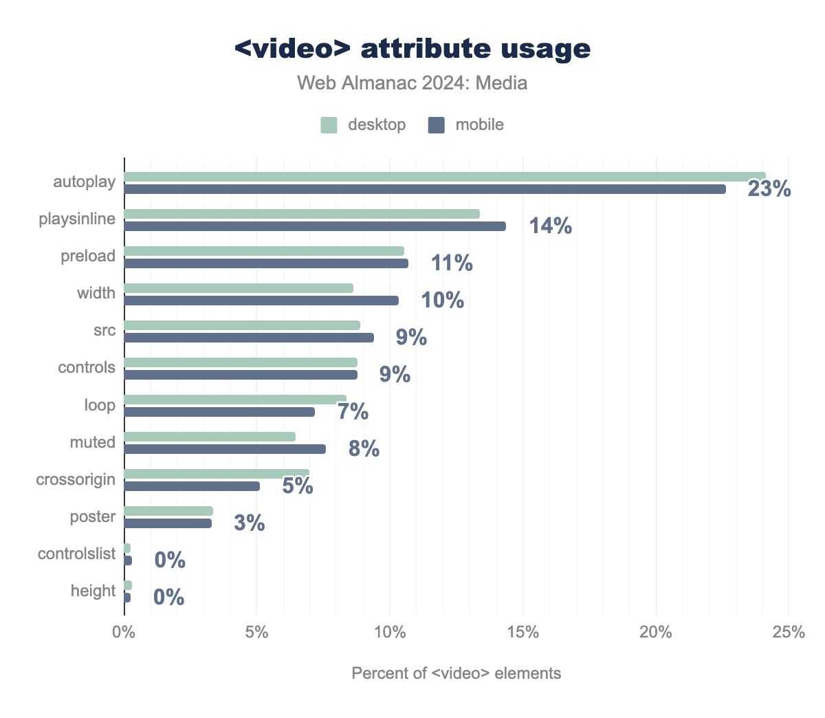
While both playsinline and autoplay are up three percentage points from 2022—likely representing increased adoption of short inline videos that play the same role as GIFs—the biggest mover over the past few years has been preload, whose usage has decreased six percentage points.
This continues a trend we have seen throughout the 2020s, and our hypothesis about why remains the same as it was in 2022. Browsers know more than authors do about end users’ contexts. By not including the preload attribute, authors are increasingly getting out of the browser’s way.
src and source
The src attribute is only present on 9% of <video> elements. Many of the rest of the <video> elements on the web use <source> children, allowing authors to—in theory—supply multiple, alternate video resources for use in different contexts.
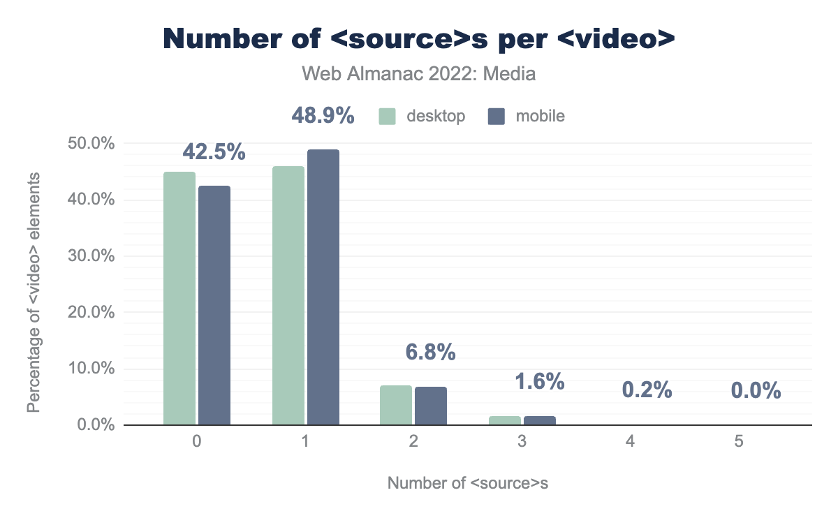
<source>s per <video>.
However most of the <video> elements with <source> children only have one—only one in ten <video> elements have multiple <source>s.
Conclusion
So there you have it, a snapshot of the state of media on the web in 2024, along with a look at how things have changed over the last couple of years. We’ve seen just how ubiquitous and important media is to the user experience of the web, and taken stock of how sites are—and aren’t—delivering it effectively.
Perhaps unsurprisingly, we found that images on the web are getting bigger. Whether you’re counting image pixels or layout dimensions, the numbers are going up. So even though we also saw an increase in compression ratios—driven in part by increased adoption of modern image formats—total image byte sizes are going up, too.
In a similar vein, the most notable change we saw on the video side was simply that there were a lot more of them than there were two years ago. The web continues to get more and more visual.
Aside from those top-line findings, notable encouraging things we found in this year’s analysis included the first sparks of adoption of wide-gamut color spaces, the continued rapid adoption of lazy-loading, and the continued steady rise of responsive image markup.
On the discouraging side, we saw a huge number of <img> elements with no or meaningless alt text, over-usage of lazy-loading leading to needlessly slow LCP times, a mysterious (if small) increase in GIF usage, and sizes accuracy getting even worse than it already was.
Here’s to more effective visual communication on the web in 2025!

