Media
Introduction
Almost three decades ago the <img> tag dropped and hypertext became hypermedia. The web has become increasingly visual ever since. What is the state of media on the web in 2021? Let’s look at images and videos, in turn.
Images
Images are ubiquitous on the web. Almost every page contains image content.
<img>.
And effectively all pages serve up some sort of imagery (even if it’s just a background or favicon).
The impact that all of these images have is hard to overstate. As the Page Weight chapter highlights, images are still responsible for more bytes-per-page than any other resource type. However, year-over-year, per-page image transfer sizes have decreased.
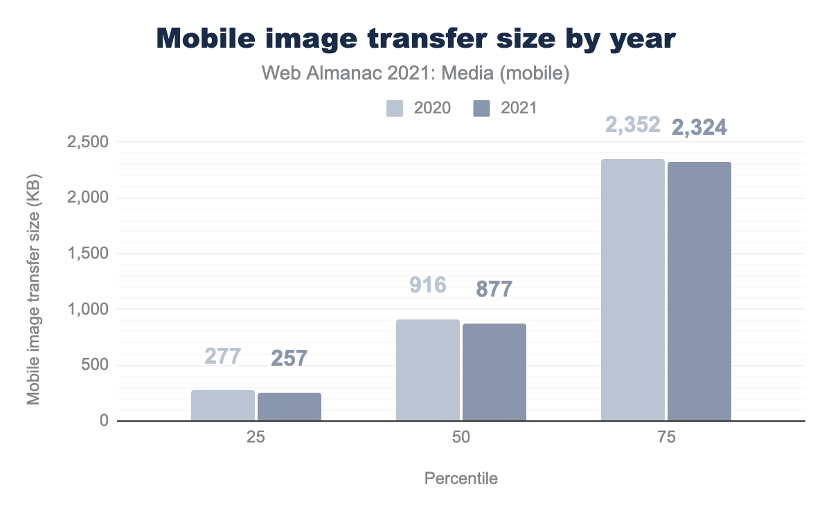
This is surprising. For the last decade, the Image Bytes chart on the HTTP Archive’s monthly State of Images report has seemingly only ever gone one direction: up. What reversed this trend in 2021? I think it may have something to do with native lazy-loading’s rapid adoption, which we will discuss more later in the chapter.
In any case, by quantity, images continue to make up an awful lot of the stuff of the web. But tallying the sheer number of elements, requests, and bytes doesn’t tell us how crucial images are to users’ experiences. To get a sense of that, we can look at the Largest Contentful Paint metric, which tries to identify the most important piece of above-the-fold content on any given page. As you can see in the Performance chapter, the LCP element has an image on around three quarters of pages.
Images are crucial to user’s experiences of the web! Let’s dive in, taking a closer look at how they’re encoded, embedded, laid out, and delivered.
Encoding
Image data on the web is encoded in files. What can we say out about these files, and the image data that they contain?
Let’s start by looking at their pixel dimensions. We’ll start small.
Single pixel images
Many <img> elements don’t actually represent contentful images and instead, they contain only a single pixel:
| Client | 1x1 images |
|---|---|
| Mobile | 7.5% |
| Desktop | 7.0% |
These single pixel <img> elements are, put bluntly, hacks: they are being abused either to do layout (which would be better done with CSS) or to track users (which would be better-accomplished using the Beacon API).
We can establish a baseline breakdown of what jobs all of these single pixel <img>s are doing by looking at how many use data URIs.
| Client | Data URI single pixel <img>s |
|---|---|
| Mobile | 44.7% |
| Desktop | 47.1% |
The single pixel <img>s containing data URIs are almost certainly being used for layout. The remaining ~54% which generate a request might be there for layout or they might be tracking pixels—we can’t tell.
Note that throughout the rest of this analysis, we have excluded single pixel <img>s from the results. For this media chapter, we’re interested in <img> elements that are presenting visual information to the user, not tracking pixels or layout hacks.
Multiple pixel images
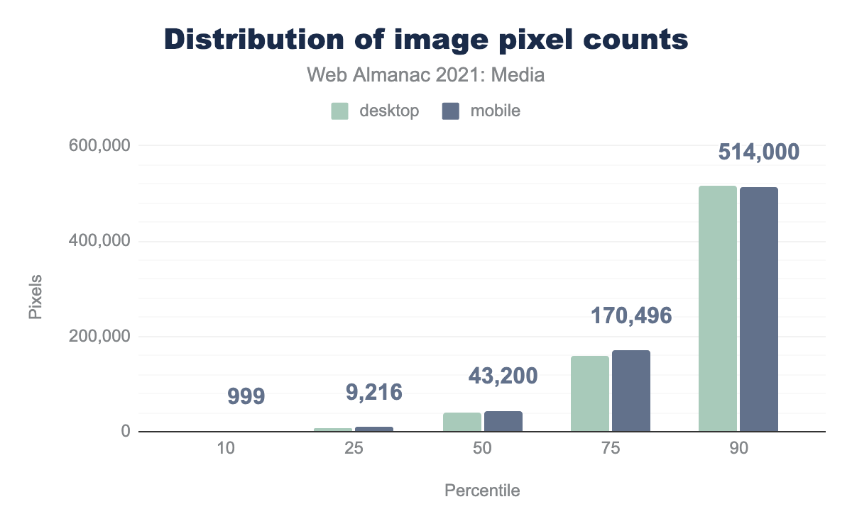
When <img>s contain more than one pixel, how many pixels do they contain?
The median <img> loads just over 40,000 pixels on mobile. I found this number surprisingly small. Just under half of crawled <img>s (excluding the ones that loaded single pixel images, or nothing at all) contain about the same number of pixels as a 200x200 image.
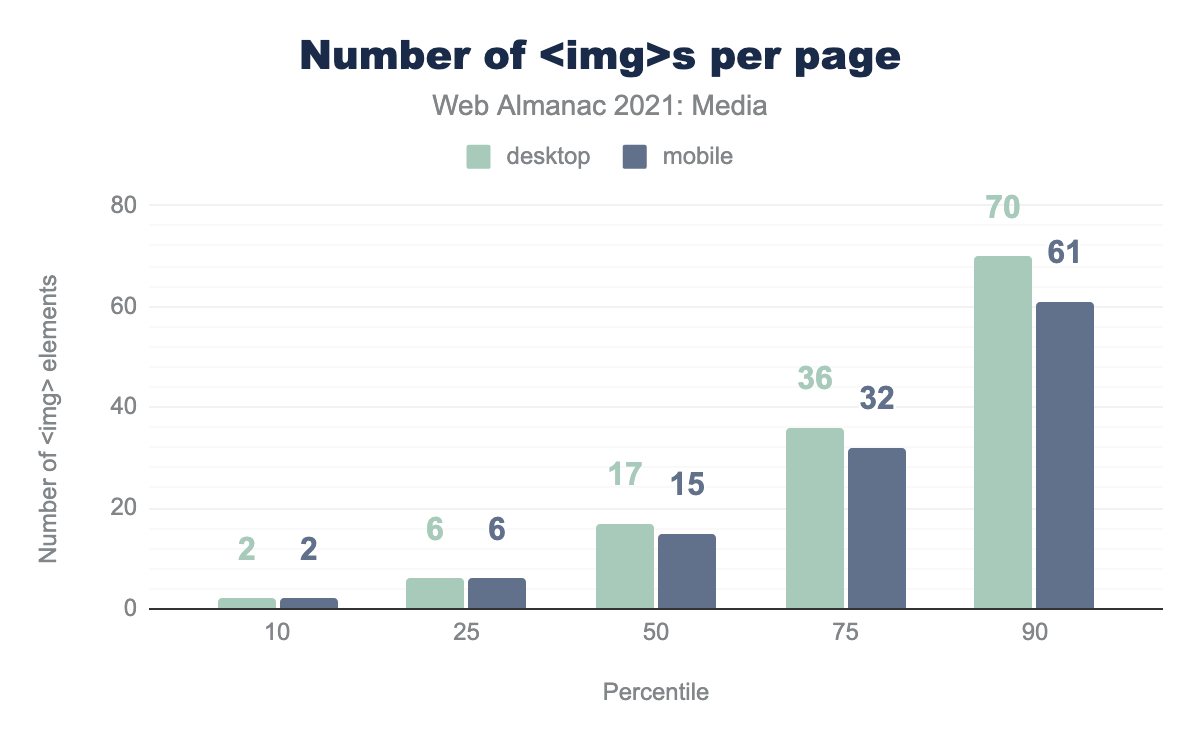
However, when you consider the number of <img> elements per page, this statistic is less surprising. Most pages contain more than 15 images, so they are often made up of many smaller images and icons. Thus, while images with more than half-a-megapixel might only account for one in ten <img> elements, they are not at all uncommon, as we navigate across pages. Many pages will include at least one larger image.
<img>s per page.
I was also surprised that there was almost no difference between desktop and mobile at the top end of the pixel count distribution. Initially, this seemed to indicate a lack of effective adoption of responsive image features, but when you consider that the mobile crawler has a 360 × 512px @3x viewport (so 1,080 by 1,536 physical pixels), while the desktop viewport is 1,376 × 768px @1x, it isn’t actually surprising: the crawlers’ viewports had similar widths, in physical pixels (1,080 vs 1,376). A bigger difference in physical pixel resolution between the crawlers would be more revealing.
Aspect ratios
Images on the web are mostly landscape-oriented, and portrait-oriented images are relatively rare.
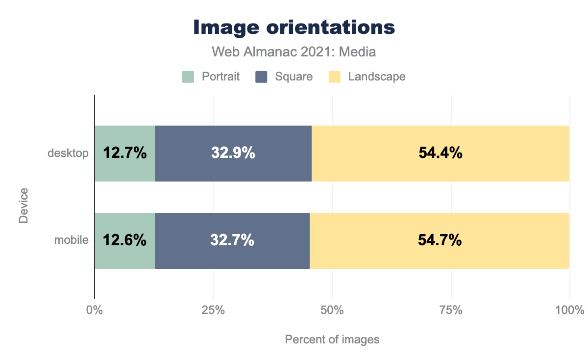
This feels like a missed opportunity on mobile. The success of the “stories” UI pattern shows that there’s value in imagery tailored to fill portrait-oriented mobile screens.
Images’ aspect ratios were clustered around “standard” values, such as 4:3, 16:9, and especially 1:1 (square). The top 10 aspect ratios accounted for nearly half of all <img>s:
| Aspect ratio | Desktop images | Mobile images |
|---|---|---|
| 1:1 | 32.9% | 32.7% |
| 4:3 | 3.7% | 4.1% |
| 3:2 | 2.5% | 2.6% |
| 2:1 | 1.6% | 1.7% |
| 16:9 | 1.5% | 1.5% |
| 3:4 | 0.9% | 1.0% |
| 2:3 | 0.7% | 0.7% |
| 5:3 | 0.6% | 0.5% |
| 6:5 | 0.5% | 0.5% |
| 8:5 | 0.5% | 0.5% |
Bytes
Let us turn our attention to file sizes.
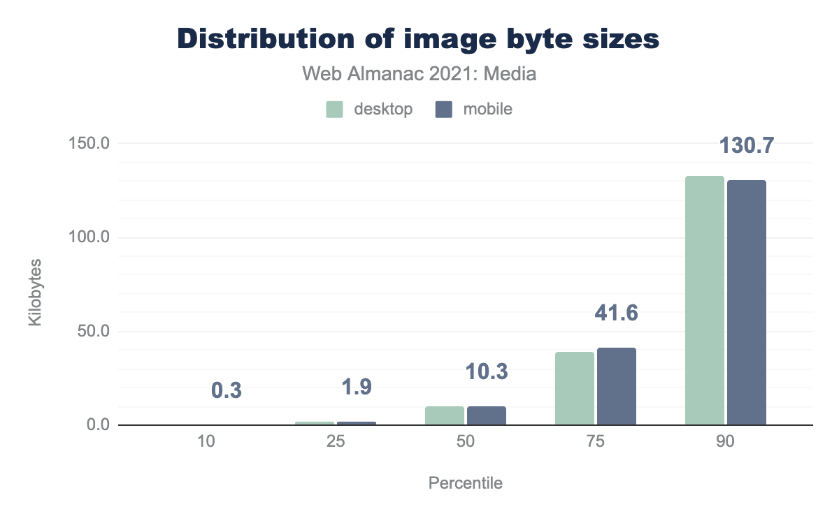
The median contentful <img> weighs in at just over 10kB. But, again, the median page contains more than 15 <img>s so, when looking at the ninetieth percentile of all images across pages, images that push past 100kB aren’t rare at all.
Bits per pixel
Bytes and dimensions are interesting on their own, but to get a sense of how compressed the web’s image data is, we need to put bytes and pixels together, to calculate bits per pixel. Doing so allows us to make apples-to-apples comparisons of the information density of images, even if those images have different resolutions.
In general, bitmaps on the web decode to eight bits of information per channel, per pixel. So, if we have an RGB image with no transparency, we can expect a decoded, uncompressed image to weigh in at 24 bits per pixel. A good rule of thumb for lossless compression is that it should reduce file sizes by a 2:1 ratio (which would work out to 12 bits per pixel for our 8-bit RGB image). The rule of thumb for 1990s-era lossy compression schemes (JPEG and MP3) was a 10:1 ratio (2.4 bits/pixel). It should be noted that, depending on image content and encoding settings, these ratios vary widely, and modern JPEG encoders like MozJPEG typically outperform this 10:1 target at their default settings.
So, with all of that context, here’s how the web’s images stack up:
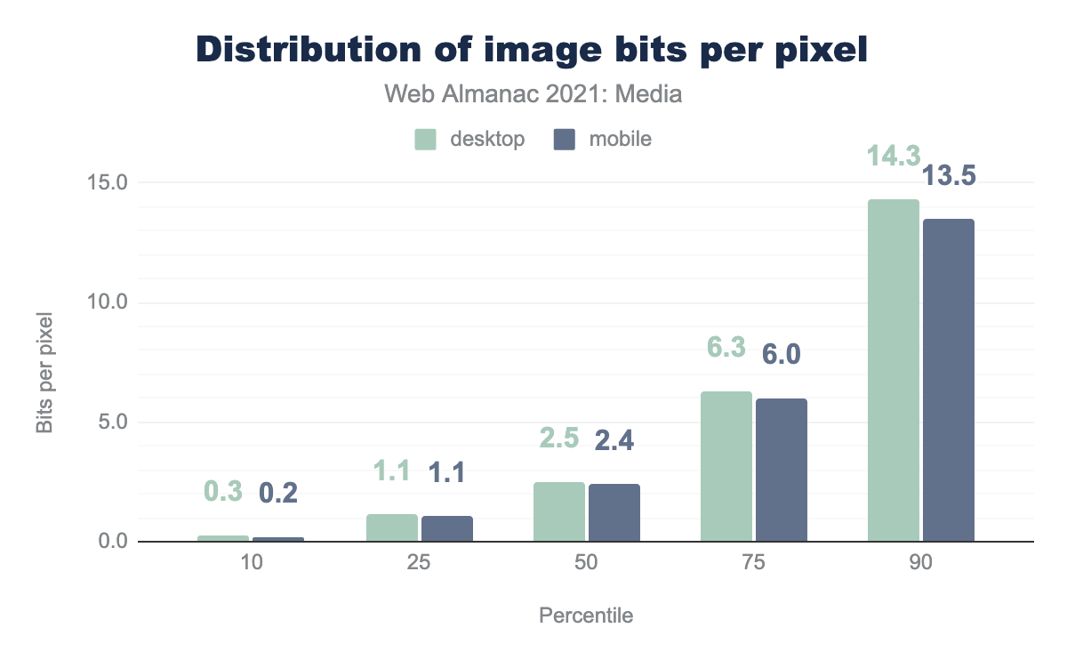
The median <img> on mobile hits that 10:1 compression ratio target on the nose: 2.4 bits/pixel. However, around that median, there is a tremendous spread. Let’s break things down by format in order to learn a bit more.
Bits per pixel, by format
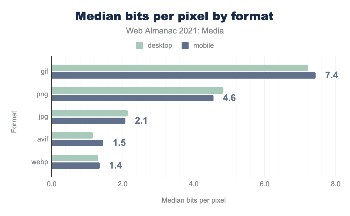
gif is 7.2 for desktop and 7.4 for mobile, png is 4.8 and 4.6 respectively, jpg is 2.1 and 2.1, avif is 1.2 and 1.5, webp is 1.3 and 1.4.The median JPEG weighs in at 2.1 bits per pixel. Given the format’s ubiquity, this is the best baseline to measure other formats by.
The median PNG weighs in at more than twice that. PNG is sometimes called a lossless format, but a median of 4.6 bits per pixel shows how false this is. True lossless compression should typically land at around 12-16 bits per pixel (depending on whether or not we’re dealing with an alpha channel). PNG comes in so far below this because common PNG tooling is usually lossy: it modifies pixels—reducing color palettes and introducing dithering patterns—before encoding pixels, to boost compression ratios.
GIFs, weighing in at 7.4 bits per pixel, come off terribly here, and make no mistake, they are terrible! But they’re also at a bit of an unfair disadvantage here because many GIFs on the web are animated. Web platform APIs don’t expose the number of frames in an animated image, so we haven’t accounted for frames. To give you a sense of how much this inflates GIF’s numbers: a GIF measured as 20 bits per pixel, here, which contains ten frames, should be fairly counted as using two bits per pixel.
Things get really interesting when we look at two next-gen formats: WebP and AVIF. Both weigh in almost 40% lighter than JPEG, at 1.3-1.5 bits per pixel. In formal studies using matched qualities, WebP outperforms JPEG by between 25-34%, so its real-world performance seems surprisingly good. On the other hand, AVIF’s creators have published data suggesting that it is capable of outperforming modern JPEG encoders JPEG by 50%+, in the lab. So, while AVIF’s performance here is good, I expected it to be better. I can think of a few possible explanations for these discrepancies between lab data and real-world performance.
First: tooling. JPEG encoders vary incredibly widely, ranging from hardware encoders in cameras which don’t spend much effort compressing images well, to ancient copies of libjpeg installed decades ago, to bleeding-edge, best-practice-by-default encoders like MozJPEG. In short, there are a lot of old, badly compressed JPEGs out there, but every WebP and AVIF has been compressed with modern tooling.
Also, anecdotally, the reference WebP encoder (cwebp) is relatively aggressive about quality/compression, and returns lower-quality, more-compressed results by default than most common JPEG tooling.
As far as AVIF is concerned: libavif is capable of a wide variety of compression ratios depending on which “speed” setting you choose. At its slowest speeds (producing the highest-efficiency files) libavif can take minutes to encode a single image. It’s reasonable to assume that different image-rendering pipelines will make different tradeoffs when choosing speed settings, depending on their constraints. This results in a wide distribution of compression performance.
Another thing to keep in mind when evaluating AVIF’s real-world performance here, is that there just aren’t that many AVIFs on the web, yet. The format is currently being used by relatively few sites, on a limited set of content, so we don’t yet have a full sense of how it will ultimately perform “in the wild.” This will be interesting to track over the coming years, as adoption increases (and tooling improves).
One thing that is absolutely clear is that both WebP and AVIF can be used to deliver a wide variety of content (including photography, illustrations, and images with transparency) more efficiently than the web’s legacy formats. But, as we’ll see in the next section, not that many sites have adopted them.
Format adoption
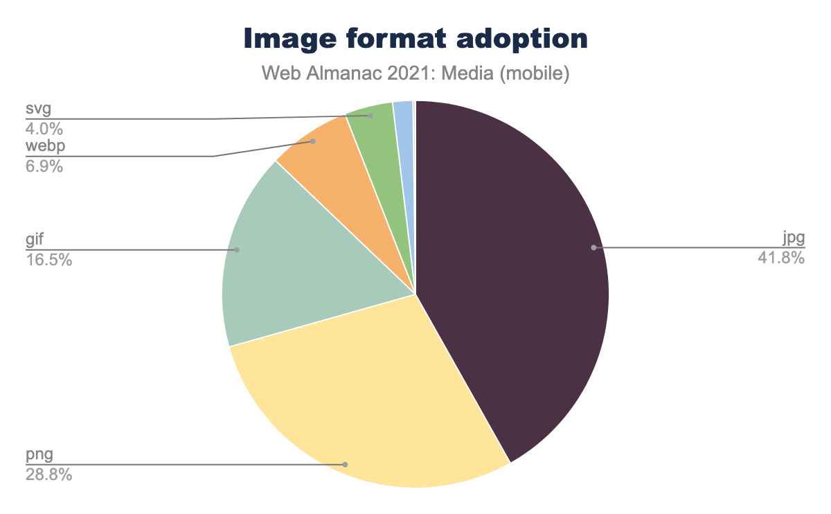
The old formats still reign: JPEG dominates, with PNG and GIF rounding out the podium. Together, they account for almost 90% of the images on the web. WebP—which is now more than a decade old but which only achieved universal browser support last year—is still in the single digits. And effectively no-one is using AVIF, which accounted for only 0.04% of crawled resources. We found a thousand JPEGs for every AVIF.
For an in-depth analysis of how (and educated guesses as to why) WebP and AVIF adoption has changed over time, the best resource is Paul Calvano’s excellent recent talk at ImageReady (full video and slides 13-15). In it, he shows that WebP adoption increased by ~34% from July 2020 (when Safari added support) to July 2021. AVIF’s numbers have risen even more rapidly, in percentage terms, though perhaps that’s not surprising given that the format is still brand new and used by relatively few sites. A few large players adopting AVIF was all it took.
Embedding
In order to display an image on a web page, we must embed it, using the <img> element. This venerable element has gained a handful of new features over the past few years but how are those features being put into practice?
Lazy-loading
If there is one breakout story this year as far as images on the web, it is native lazy-loading adoption. Look at this chart:
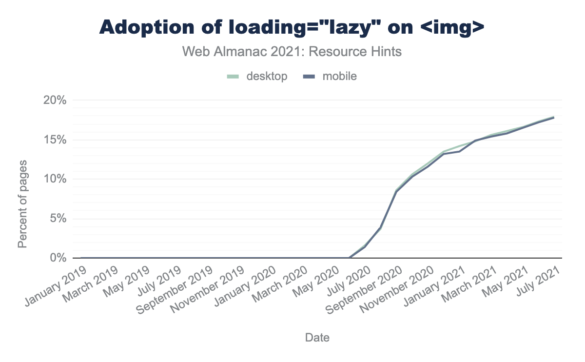
loading="lazy" on <img>.
In July of 2020, native lazy-loading was used on just 1% of pages. By July of 2021, that number had exploded, to 18%. This is an unbelievable rate of growth considering the vast number of pages and templates which are not updated from year to year.
Personally, I think native lazy-loading’s rapid adoption is the best explanation we have for the trend-breaking reduction in image bytes per page, this year.
What fueled lazy-load adoption? There’s some consensus that it was a combination of ease of use, pent-up developer demand, and WordPress enabling lazy-loading by default across a vast swath of the web.
Perhaps native lazy-loading has been too successful? The Resource Hints chapter notes that the majority of lazy-loaded images were in the initial viewport (whereas the feature is ideally used on “below the fold” images). Furthermore, the Performance chapter found that 9.3% of Largest Contentful Paint elements have their loading attribute set to lazy, which significantly delays the page’s most important piece of content from loading, and hurts users’ experiences.
Decoding
The decoding attribute on <img> serves as a useful point of contrast to highlight native lazy-loading’s success. First supported in 2018—about a year before native lazy-loading—the decoding attribute allows developers to prevent large image decode operations from blocking the main thread. It provides functionality that not all web developers need or understand, and that shows in the usage data. decoding is used on just 1% of pages, and on only 0.3% of <img> elements.
Accessibility
When you embed contentful images on web pages, you should make their content as accessible as possible for non-visual users. I note this only to refer you to the Accessibility chapter, whose in-depth analysis of image accessibility on the web found small year-over-year progress, but mostly: a whole lot of room for improvement.
Responsive images
In 2013, a suite of features enabling adaptive image loading on responsive websites landed, too much fanfare. Eight years in, how are responsive image features being used?
First, let us consider the srcset attribute, which allows developers to supply multiple possible resources for the same <img>.
x and w descriptor adoption
srcset.
Almost a third of crawled pages use srcset—pretty good!
And w descriptors, which allow browsers to select a resource based on both varying layout widths and varying screen densities, are four times more popular than x descriptors, which only enable DPR-adaptation.
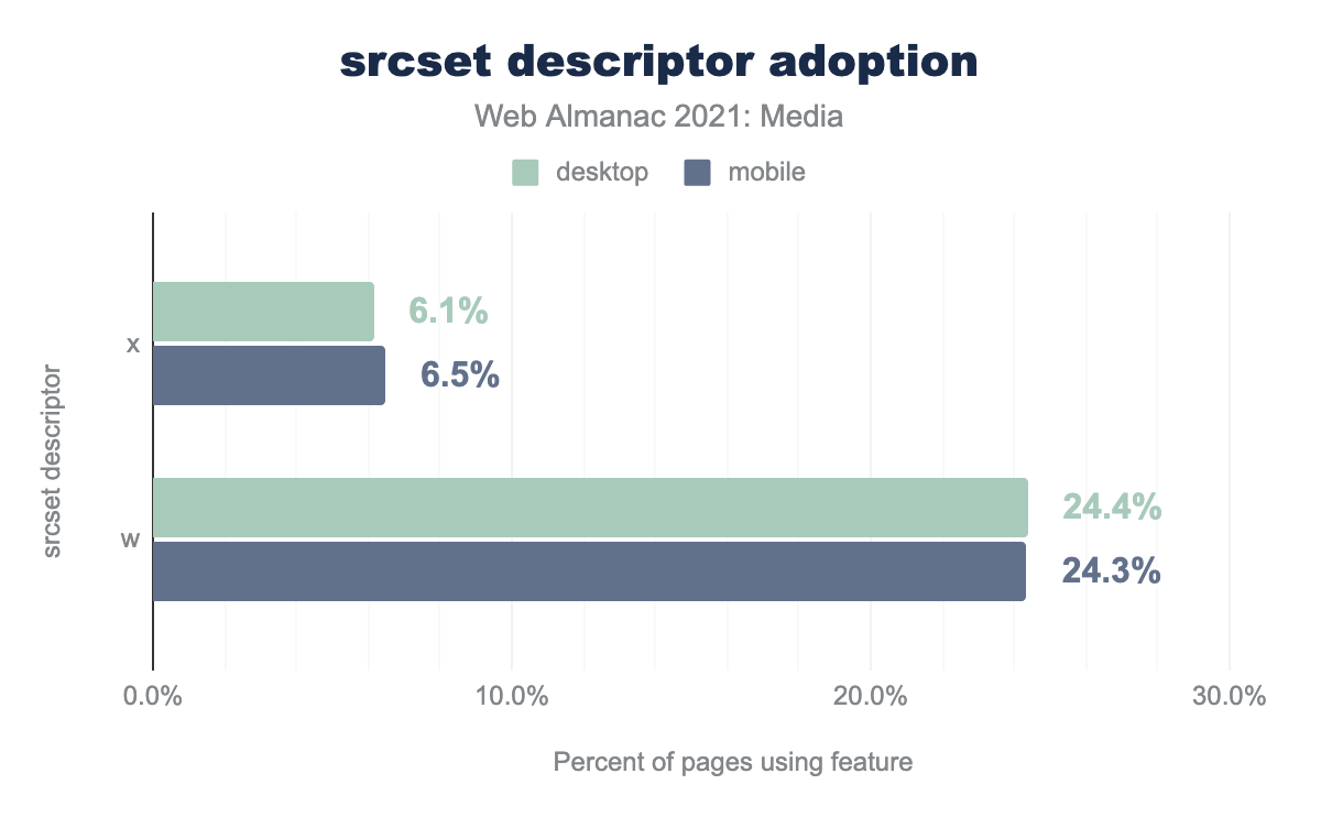
x descriptors and w descriptors, within srcset attributes, on both mobile and desktop. x descriptors are used on 6.1% of pages on desktop and 6.5% of pages on mobile. w descriptors are used four times more: 24.4% of the time on desktop, and 24.3% on mobile.srcset descriptor adoption.
How are developers populating their srcsets with resources?
Number of srcset candidates
Let’s first take a look at the number of candidate resources developers are including:
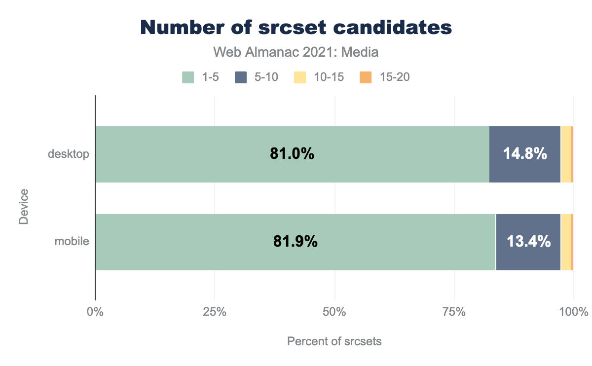
srcset attributes which contain different numbers of candidates. Almost all (80-90%) appear to contain 1-5 candidates, on both desktop and mobile. Next we have the 5-10 candidate bucket, which takes us up past 95%. Almost all of the remaining srcsets have 10-15 candidates, only a tiny sliver have 15-20.A large majority of srcsets are populated with five-or-fewer resources.
srcset density ranges
Are developers giving browsers an appropriately wide range of choices, within their srcsets? In order to answer this question, we must first understand how srcset and sizes values are used by browsers.
When browsers pick a resource to load out of a srcset, they first assign every candidate resource a density. Calculating the density of resources that use x descriptors is straightforward. A resource with a 2x density descriptor has a density of (wait for it) 2x.
w descriptors complicate things. What’s the density of a 1000w resource? It depends on the resolved sizes value (which might depend on the viewport width!). When w descriptors are used, each descriptor is divided by the resolved sizes value, to determine its density. For example:
<img
  srcset="large.jpg 1000w, medium.jpg 750w, small.jpg 500w"
  sizes="100vw"
/>
On a 500-CSS-px-wide viewport, these resources will be assigned the following densities:
| Resource | Density |
|---|---|
large.jpg |
1000w ÷ 500px = 2x |
medium.jpg |
750w ÷ 500px = 1.5x |
small.jpg |
500w ÷ 500px = 1x |
However, on a 1000-CSS-px-wide viewport, these same resources, marked up with the same srcset and sizes values, will have different densities:
| Resource | Density |
|---|---|
large.jpg |
1000w ÷ 1000px = 1x |
medium.jpg |
750w ÷ 1000px = 0.75x |
small.jpg |
500w ÷ 1000px = 0.5x |
After these densities are calculated, browsers pick the resource with the density that’s the best match for the current browsing context. It’s safe to say that in this example, the srcset did not contain a wide-enough range of resources. Viewports measuring more than 1,000 CSS px across, with higher than 1x densities, are not uncommon; if you’re reading this on a laptop, you’re probably browsing in such a context, right now. And in these contexts, the best browsers can do is pick large.jpg, whose 1x density will still appear blurry on the high-density display.
So, armed with both:
- an understanding of how browsers turn
xandwdescriptors,sizesvalues, and browsing contexts into resource densities. - an understanding of how the range of resource densities in a
srcsetchanges across browsing contexts, and ultimately impacts users.
…let’s look at the ranges of densities supplied by the srcsets that use either x descriptors or w descriptors:
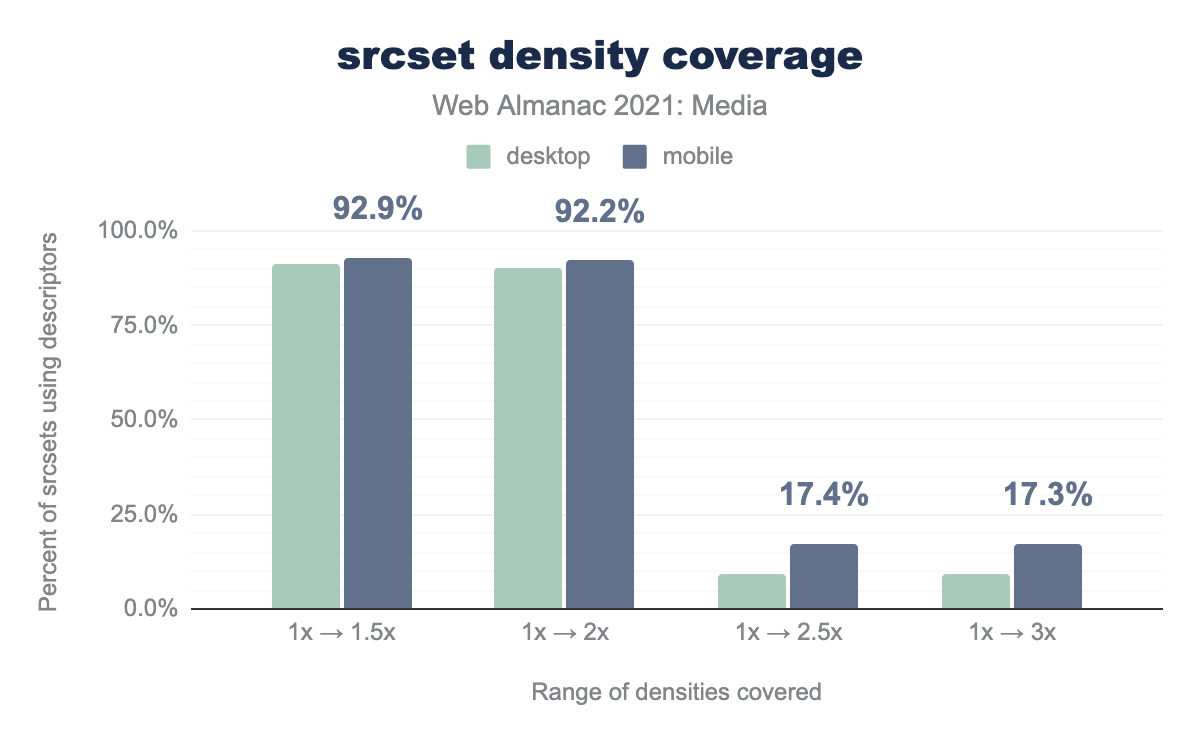
srcsets using descriptors that cover a few different ranges of densities, on both desktop and mobile. On desktop, 91.2% of srcsets covered a 1x to 1.5x range. 90.2% covered a 1x to 2x range. 9.2% covered a 1x to 2.5x range. And 9.1% covered a 1x to 3x range. On mobile, 92.9% covered a 1x to 1.5x range. 92.2% covered a 1x to 2x range. 17.4% covered a 1x to 2.5x range. And 17.3% covered a 1x to 3x range.srcsets that use either x or w descriptors.
As you interpret this data, keep in mind the viewports of the two different crawlers:
- Desktop: 1,376 × 768px @1x
- Mobile: 360 × 512px @3x
Different viewport widths would have altered many resolved sizes values and given different results.
That said, these results look good. Nine out of ten srcsets are providing a range of resources that covers a reasonable range of output display densities (1x-2x), even on the larger desktop viewport. Given the exponential bandwidth costs and diminishing visual returns of densities above 2x, the steep drop-off after 2x seems not only reasonable, but perhaps even optimal.
sizes accuracy
Responsive images can be tricky. Authoring reasonably-accurate sizes attributes—and keeping them up to date with evolving page layouts and content—might be the hardest part about getting responsive images right. How many authors get sizes wrong? And how wrong do they get it?
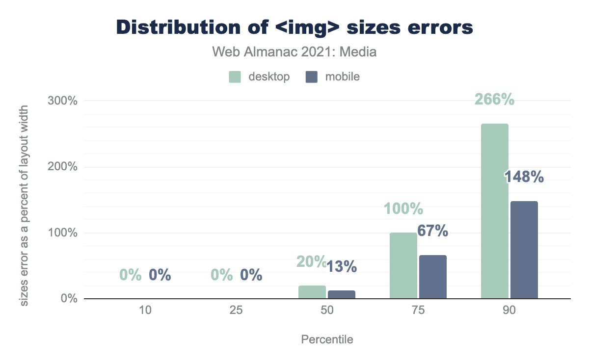
<img> sizes errors.
More than a quarter of sizes attributes are perfect: exact matches for the layout size of the image. As someone who has authored a number of erroneous sizes attributes, myself, I found this both surprising and impressive. That is, until I realized that the accuracy measurement here was taken after JavaScript runs, and many sizes attributes are ultimately written by client-side JavaScript. Here are the most common sizes values, before JavaScript runs:
| Sizes | Desktop | Mobile |
|---|---|---|
auto |
8.2% | 9.6% |
(max-width: 300px) 100vw, 300px |
4.7% | 5.9% |
(max-width: 150px) 100vw, 150px |
1.3% | 1.6% |
(max-width: 600px) 100vw, 600px |
1.0% | 1.2% |
(max-width: 400px) 100vw, 400px |
1.0% | 1.1% |
(max-width: 800px) 100vw, 800px |
0.8% | 0.9% |
(max-width: 500px) 100vw, 500px |
0.8% | 0.9% |
(max-width: 1024px) 100vw, 1024px |
0.7% | 0.9% |
(max-width: 320px) 100vw, 320px |
0.5% | 0.8% |
(max-width: 100px) 100vw, 100px |
0.7% | 0.8% |
100vw |
0.7% | 0.7% |
One in ten sizes attributes on mobile has an initial value of auto. This non-standard value is then presumably replaced by a JavaScript library (probably lazysizes.js), using the measured layout size of the image.
Some error in sizes is acceptable as the attribute provides a pre-layout hint to the browser in order to help it select an appropriate resource to load, before layout is complete. But large errors can lead to bad resource choices. This appears likely for the least-accurate quarter of sizes attributes, which report widths twice as large as the actual <img> layout width on desktop and 1.5x as large as the actual <img> layout width on mobile.
So: one in ten sizes attributes is being authored on the client by a JavaScript library, and at least one in four is inaccurate enough that the error is likely to impact resource selection. Both of these facts represent significant opportunities for either existing tooling or new web platform features to help more authors get sizes right.
<picture> usage
The <picture> element serves a couple of use cases:
-
Art direction, with the
mediaattribute -
Format-switching, based on MIME-type, via the
typeattribute
<picture>.
<picture> is used much less frequently than srcset. Here’s how usage breaks down between those two use cases:
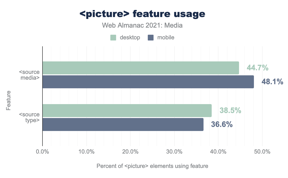
media and type attributes on source elements, in conjunction with the picture element. media is used with 48.1% of picture elements on mobile, and 44.7% on desktop. type is used with 37.6% of picture elements on mobile, and 38.5% of picture elements on desktop.<picture> feature usage.
Art direction appears a bit more popular than format-switching, but both features appear underutilized when you consider their potential utility. As we’ve seen, very few pages are tailoring images’ aspect ratios to fit mobile screens, and many more pages could deliver their imagery more efficiently using next-generation formats. These are exactly the problems that <picture> was invented to solve, and perhaps more than 5.9% of pages could be addressing them, using it.
It’s possible that format-switching with <source type> is only used on 2-3% of pages because format-switching can also be accomplished using server-side content negotiation. Unfortunately, server-side adaptation mechanisms are hard to detect in the crawled data, and we have not analyzed them here.
Notably, <source type> and <source media> are not mutually exclusive, and, put together, the usage percentages here do not add up to 100%. This suggests that at least 15% of <picture> elements do not leverage either of these attributes, making those <picture>s functionally equivalent to a <span>.
Layout
Once you’ve embedded an image on a page, you must lay it out amongst the rest of the page’s contents. There are many, many ways to do this, but we can derive a few insights about how it’s generally done by zooming out and answering a couple of big-picture questions.
Intrinsic vs extrinsic sizing
As replaced elements, images have a natural, “intrinsic” size. This is the size that they will render at by default, if there are no CSS rules placing “extrinsic” layout constraints upon them.
How many images are intrinsically vs extrinsically sized?
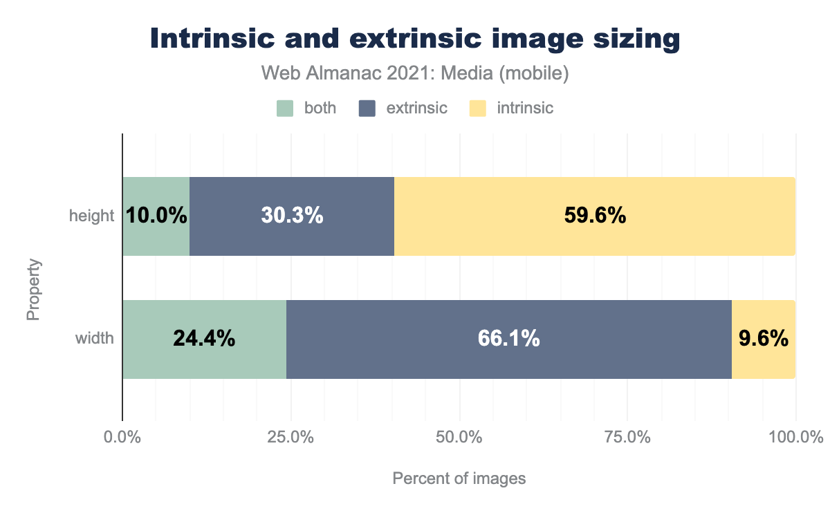
The question is a little complicated because some images (those with a max-width, max-height, min-width, or min-height constraint), are sometimes extrinsically sized, but sometimes left to their intrinsic size. We’ve labelled those images as “both.”
In any case, perhaps unsurprisingly, most images have extrinsic width constraints and height-constrained sizing is much less common.
Reducing layout shifts with height and width
This brings us to the last web platform feature that we’d like to investigate: using the height and width attributes to reserve layout space for flexible images.
By default, images left to their intrinsic dimensions take up no space until they load, and their intrinsic dimensions become known. At that point—poof—they pop into the page, causing a layout shift. This was exactly the problem that the height and width attributes were invented to solve—in 1996.
Unfortunately, height and width never played well with images that are assigned a variable extrinsic size in one dimension (e.g., width: 100%;), and left to fill out their intrinsic aspect ratio, in the other dimension. This is the dominant pattern in responsive design. So width and height fell out of favor within responsive contexts until 2019, when a tweak to how height and width are used by browsers fixed this problem. Now, consistently setting height and width is one of the best things authors can do to reduce Cumulative Layout Shift. How often are these attributes accomplishing this task?
<img>s on mobile that have both height and width attributes and are extrinsically sized in only one dimension.
It’s hard to tell how many of these <img>s were authored with the new browser behavior in mind, but they’re all benefiting from it. And that was the point—by re-using existing attributes, lots of existing content benefited from the change, automatically.
Delivery
Finally, let’s take a look at how images are delivered over the network.
Cross-origin image hosts
How many images are being hosted by the same origin that they’re being embedded on? The slimmest of minorities:
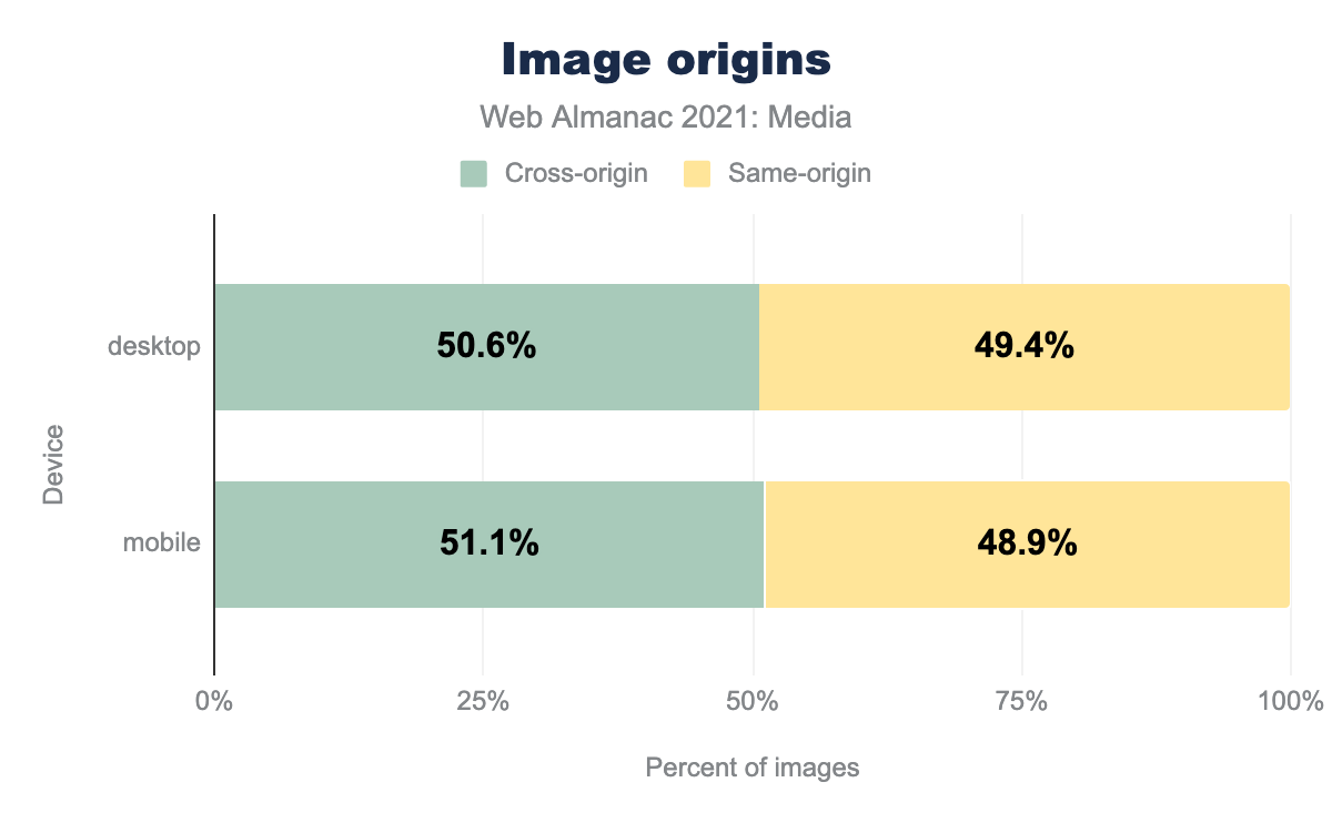
Cross-origin images are subject to significant security restrictions, and can sometimes incur performance costs. On the other hand, moving static assets to a dedicated CDN is one of the most impactful things you can do to help Time to First Byte, and image CDNs provide powerful transformation and optimization features which can automate all sorts of best-practices. It would be fascinating to see how many of the 51% of cross-origin images are hosted on image CDNs and to compare their performance against the rest of the web’s. Unfortunately, that was outside the scope of our analysis.
And with that, it is time to turn our attention to…
Video
As the world has dramatically changed over the last year, we have seen a huge growth in video usage on the web. In the 2020 media report, it was estimated that 1-2% of websites had a <video> tag. In 2021, that number has jumped drastically, with over 5% of desktop sites and 4% of mobile sites incorporating a <video> tag.
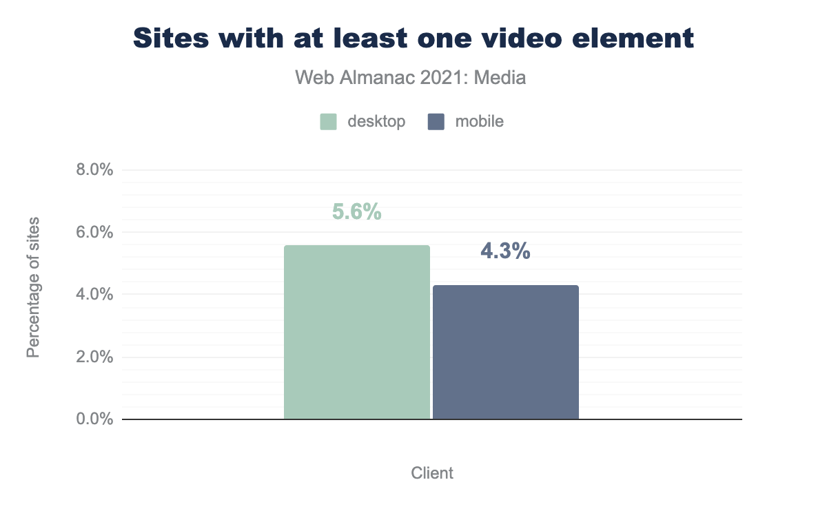
video elements. On desktop, 5.6% of sites have at least one video element, on mobile, 4.3%.This huge growth in video usage on the web indicates that as devices/networks improve, there is a desire to add immersive experiences such as video to sites.
When it comes to interaction with video, it is interesting to see how long the videos are when posted on a web page. We were able to query this value for 440k desktop videos, and 382k mobile videos, and broke down the duration into buckets of varying duration (in seconds):
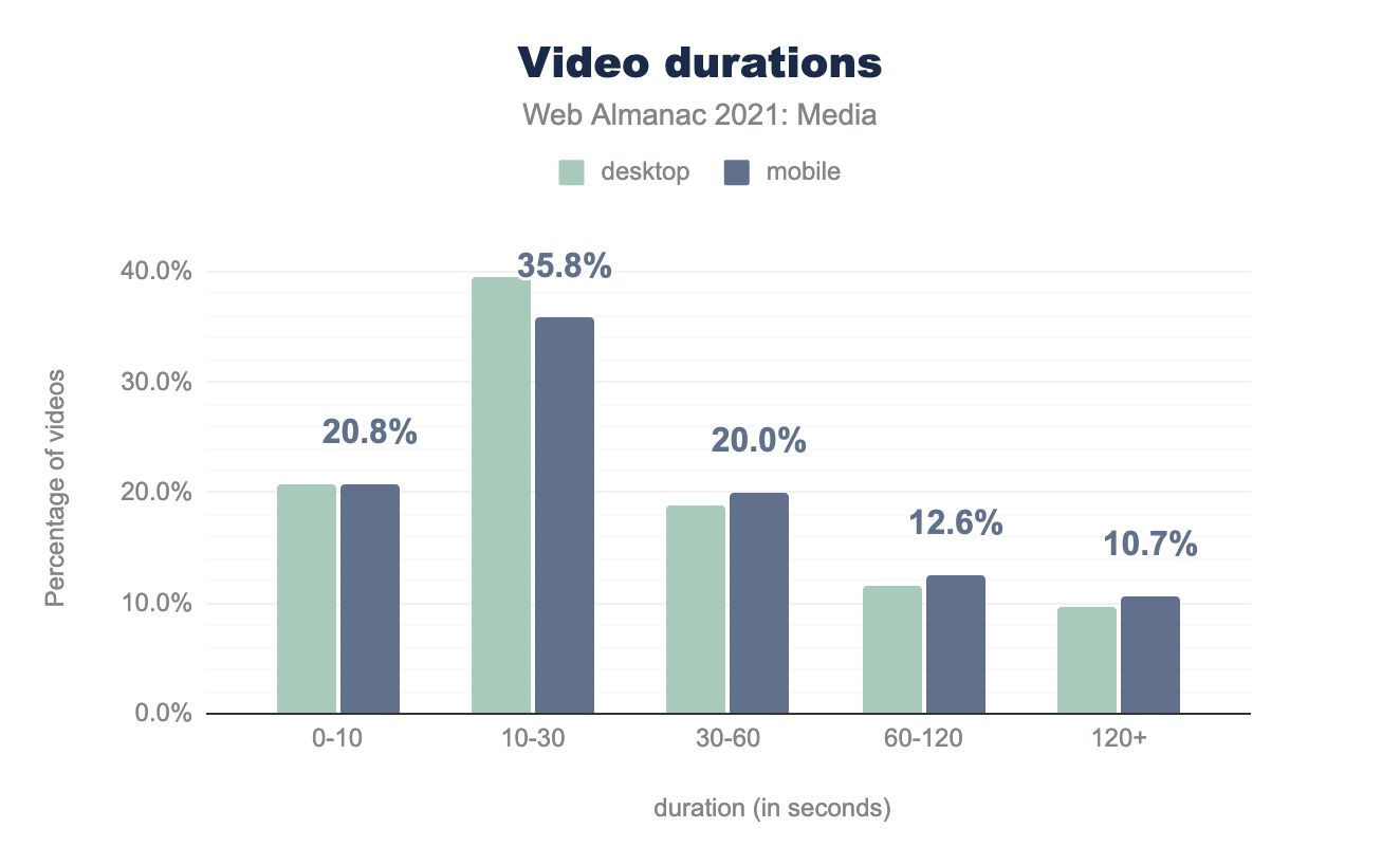
Most videos on the web are short: ~ 60% of videos are under 30 seconds long on both mobile and desktop. However, 12-13% are between one and two minutes, and 10% of videos are over two minutes long.
Video: formats
What types of files are being delivered as video? We queried all files with video in the MIME type, and then sorted by the file extension.
The chart below shows all video extensions with over 1% market share:
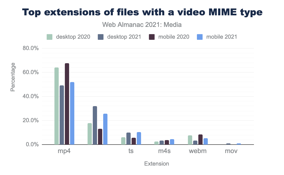
mp4 extension accounted for 64.3% of videos on desktop in 2020, but only 49.2% in 2021. Blank extensions accounted for 17.8% of videos in 2020, increasing sharply to 32.1% in 2021. The ts extension accounted for 6.3% of fvideos in 2020, and 10.0% in 2021. m4s rose from 2.4% to 3.3%. webm fell from 7.6% to 3.3%. Finally, mov grew from nothing in 2020 to 0.8% in 2021.By far, the #1 video format on the web is the mp4 (or MPEG-4), since the mp4 h264 format has 98.4% support in all modern browsers, and the 1.9% of browsers that do not support mp4 have no video support, so the number is really 100% coverage. Interestingly, the mp4 usage has dropped by ~15% YOY on both desktop and mobile. WebM support also dropped significantly YOY (50% drop on both mobile and desktop).
Where we see the growth are files with no extension (these are often from YouTube or other streaming platforms), and in web streaming. ts files are segments used in HTTP Live Streaming (HLS) where we see a 4% jump in usage. .m4s are MPEG Dynamic Adaptive Streaming over HTTP (MPEG-DASH) video segments. M4S files grew by 50% from 2.3% to 3.3% YOY.
Video CSS: display
To begin, let’s look at how a video will appear on a page by looking at the CSS display property for that video. What we find is that approximately half of all videos use a display value of block—placing the video on its own line and allowing for height and width values to be set for the video. The inline-block value also allows height and width to be specified—for a total of two thirds of all videos.
The display: none declaration hides the video from the viewer. One in five videos on the web is hidden behind this display value. From a data usage perspective, this is less than optimal, as the video is still downloaded by the browser.
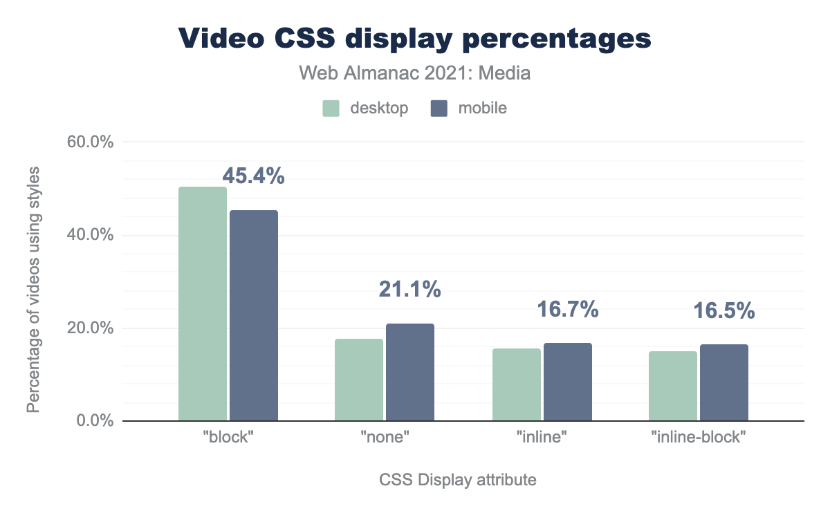
block accounts for 50.5% of elements on desktop, and 45.4% on mobile. none accounts for 17.8% on desktop and 21.1% on mobile. inline accounts for 15.5% of elements on desktop, and 16.7% on mobile. Finally, inline-block accounts for 14.9% of elements on desktop, and 16.5% on mobile.Video attributes
The <video> HTML5 tag has a number of attributes that can be used to define how the video player will appear to end users.
Let’s look at the most common attributes and how they are used inside the <video> tag:
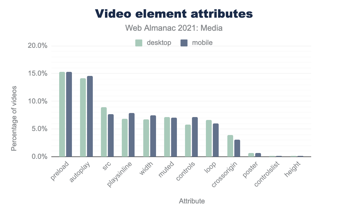
preload is 15.3% on desktop and 15.3% on mobile, autoplay is 14.1% and 14.5% respectively, src is 8.9% and 7.7%, playsinline is 6.9% and 7.8%, width is 6.8% and 7.5%, muted is 7.1% and 7.1%, controls is 5.8% and 7.2%, loop is 6.6% and 6.0%, crossorigin is 3.9% and 3.0%, poster is 0.7% and 0.7%, controlslist is 0.2% and 0.2%, and finally height is 0.1% and 0.1%
preload
The most commonly used attribute is preload. The preload attribute gives the browser a hint on the best way to handle the video download. There are four possible options: auto, metadata, none, and an empty response (which uses the default of auto).
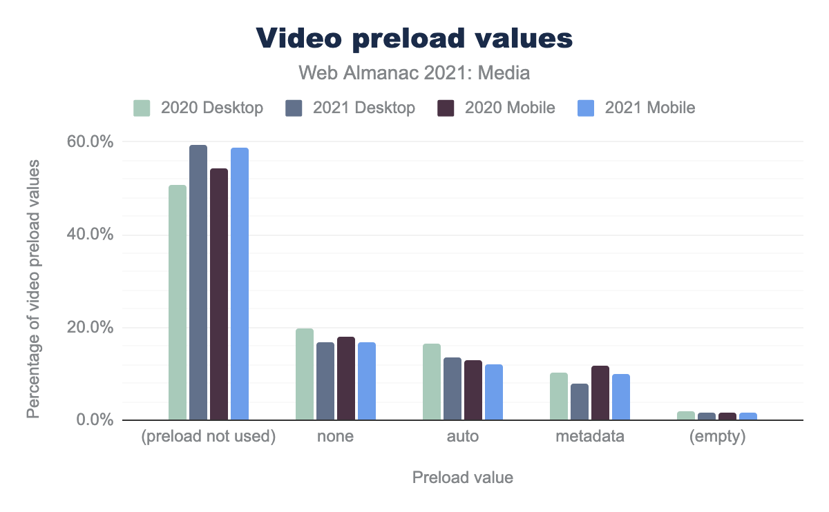
none was used on 19.8% of videos on desktop in 2020 dropping to 18.1% in 2021, for mobile the drop was smaller from 16.8% to 16.7%. The value auto was used on 16.6% of videos on desktop, dropping to 12.9% for 2021, with the mobile drop being from 13.7% to 12.0%. metadata was used on 10.1% of videos on desktop in 2020 rising to 11.8% in 2021, and on mobile there was a similar rise from 8.0% to 10.1%. No value was set for 1.8% of desktop videos in 2020, 1.7% of desktop videos in 2021, 1.5% of mobile videos in 2020 and 1.6% of mobile videos in 2021.Interestingly, we see a large push away from preload on both mobile and desktop. While it is possible that this changed for many videos, it could just be that the new videos added to the web over the last year do not utilize this setting. From a page weight perspective this is a large win for the web.
autoplay
The next most commonly used attribute is autoplay. This tells the browser that the video should play as soon as possible (and because of this, autoplay will actually override the preload attribute).
The autoplay attribute is a Boolean attribute, meaning that its presence by default means true. So, for the 190 sites that use autoplay="false", we’re sorry to tell you that is not going to work.
width
The width attribute is also one of the top <video> attributes. It tells the browser how wide the video player should be. Note that height is very rarely used, since the browser can set this - but it will use a default aspect-ratio of 2:1 which may be incorrect if not explicitly overridden with the aspect-ratio CSS styling.
The width can be presented as a percentage, or a width in pixels.
- When a percentage width is defined, the value
100%is used in 99% of cases. - When a width in pixels is defined, we see very similar numbers of videos at lower widths, but a large drop-off in the 1800 and 1920 widths:
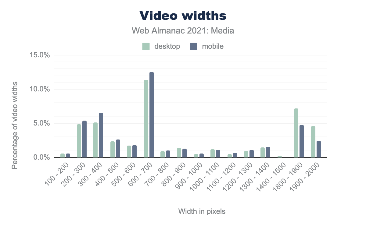
width attribute values. The values for desktop and mobile are very similar throughout most of the range, until the end. Starting at the left: values between 100-200 pixels were used 0.6% of the time on desktop and 0.5% on mobile, 200 - 300 is used 4.9% and 5.4% respectively, 300 - 400 is used 5.1% and 6.6%, 400 - 500 is used 2.4% and 2.6%, 500 - 600 is used 1.8% and 1.8%, 600 - 700 is used 11.4% and 12.6%, 700 - 800 is used 0.9% and 1.0%, 800 - 900 is used 1.4% and 1.3%, 900 - 1000 is used 0.5% and 0.6%, 1000 - 1100 is used 1.2% and 1.1%, 1100 - 1200 is used 0.5% and 0.7%, 1200 - 1300 is used 0.9% and 1.1%, 1300 - 1400 is used 1.5% and 1.6%, 1400 - 1500 is used 0.2% on desktop and not on mobile, 1800 - 1900 is used 7.2% and 4.8%, 1900 - 2000 is used 4.6% and 2.4%.It appears that about half of sites with larger videos that also define the width of the video remove the larger videos for mobile devices. Since very few devices need a 1080p (1920 wide) video embedded in a website, this makes sense.
src and <source>
The src attribute is used in the <video> tag to point to the URL of the video to be played. Another way to reference the video is to use the <source> element.
One of the key ideas behind the <source> element is that the developer can supply multiple video formats to the browser, and the browser will select the first format that the browser understands.
When we look at <source> usage, we see that about 40% of videos have no <source> element—implying that they use the src attribute. This is similar to the ratio found in 2020 (35%).
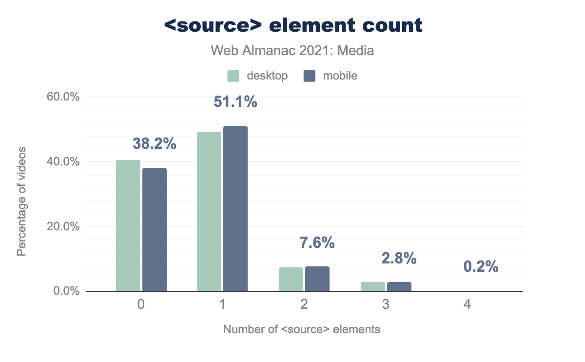
source elements per video element. The most common number of source elements per video is 1, around 49.2% of desktop and 51.1% of mobile videos contain this many sources. The second most common number of source children is 0: 40.5% of desktop and 38.2% of mobile videos have no source children. 7.2% and 7.6% respectively contain 2, 2.8% on both contain 3, and finally 0.2% of video elements on both desktop and mobile contain 4 elements.source element count.
We also see that the <source> element is most often used with just one element (50% of all <video> tags). Only 10% of <video> elements have 2 or more video sources named. By a 3:1 ratio, 2 is more common than 3 sources, and then there is a small selection of more than 3 (there is one video with 48 sources!).
Let’s look at the videos that use 2 sources. Here are the top 10 occurrences:
| Format | Desktop | Mobile |
|---|---|---|
["video/mp4","video/webm"] |
25.9% | 26.1% |
["video/webm","video/mp4"] |
22.3% | 23.3% |
["video/mp4","video/ogg"] |
20.2% | 24.2% |
[null,null] |
14.1% | 8.0% |
["video/mp4"] |
3.6% | 3.4% |
["video/mp4","video/mp4"] |
3.5% | 5.1% |
["application/x-mpegURL","video/mp4"] |
2.4% | 2.1% |
[] |
2.1% | 1.8% |
["video/mp4; codecs="avc1.42E01E, mp4a.40.2","video/webm; codecs="vp8, vorbis"] |
0.8% | 0.3% |
["video/mp4;","video/webm;"] |
0.4% | 0.3% |
type values, when there are two source elements within a video element.
In six of the top 10 examples, the MP4 is listed as the first source. MP4 support on the web is at 98.4%, and the browsers that do not support MP4 generally do not support the <video> tag at all. This implies that these sites do not need two sources and could save some storage on their web servers by removing their WebM or Ogg video sources—or they could reverse the order of the videos, and browsers that support WebM will download the WebM.
The same trend holds for <video> elements with three sources—eight of the top 10 examples begin with MP4.
| Format | Desktop | Mobile |
|---|---|---|
["video/mp4","video/webm","video/ogg"] |
30.4% | 28.6% |
["video/mp4; codecs=avc1","video/mp4; codecs=avc1","video/mp4; codecs=avc1"] |
13.3% | 16.4% |
["video/webm","video/mp4","video/ogg"] |
7.0% | 6.3% |
["video/mp4; codecs=avc1"] |
5.8% | 7.1% |
["video/mp4","video/ogg","video/webm"] |
5.0% | 5.5% |
["video/mp4;","video/ogg; codecs="theora, vorbis","video/webm; codecs="vp8, vorbis"] |
3.8% | 1.2% |
["video/mp4; codecs=hevc","video/webm","video/mp4"] |
3.2% | 3.4% |
["video/mp4"] |
3.0% | 3.0% |
["video/ogg; codecs="theora, vorbis","video/webm","video/mp4"] |
2.7% | 3.3% |
["video/mp4","video/webm","video/ogv"] |
2.5% | 1.7% |
type values, when there are three source elements within a video element.
Of course, these implementations will just play the MP4 file, and the WebM and Ogg files will be ignored.
The incorporation of video on the web has grown immensely over the last year—jumping from 1-2% of web pages to 4-5%. We expect this growth to continue. Interestingly, the “king of video”, MP4, while still the king, is having its market share eroded by video streaming formats (that feature responsive and adaptive video sizing).
We do see movement to more performant usage of the <video> tag—with less use of preload=auto—and more use of preload=none as well as we see behaviors in the width attribute that indicate that videos are being modified (or removed) for smaller screens.
Conclusion
As we stated at the outset: the web is increasingly visual, and the ways in which we use the web’s evolving feature set to encode, embed, lay out, and deliver media continue to evolve. This year, native lazy-loading stemmed the tide of ever-increasing image transfer sizes. And universal support for WebP and initial support for AVIF pave the way for a visually richer and more efficient future. On the video side, we saw an explosion in the number of <video> elements and increasing use of sophisticated delivery methods like adaptive bitrate streaming.
The Web Almanac is a chance to take stock and look back. It’s also a time to chart a path forward. Here’s to ever-more effective visual communication on the web in 2022.

