Performance

Introduction
Performance is important for user experience. Slow-to-load and slow-to-respond websites frustrate users and cause lost conversions. This is the first year that the Core Web Vitals have contributed to Google search rankings. As such, we’ve seen greater interest in improving website performance which is great news for users.
What are our top takeaways from this year’s report? First, we still have a long way to go in providing a good user experience. For example, faster networks and devices have not yet reached the point where we can ignore how much JavaScript we deliver to a site; and, we may never get there. Second, sometimes we misuse new features for performance, resulting in poorer performance. Third, we need better metrics for measuring interactivity, and those are on the way. And fourth, CMS- and framework-level work on performance can significantly impact user experience for the top 10M websites.
What’s new this year? We’re excited to share performance data by traffic ranking for the first time. We also have all the core performance metrics from previous years. Finally, we added a deeper dive into the Largest Contentful Paint (LCP) element.
Notes on Methodology
One thing that makes the performance chapter different from the others is that we rely heavily on the Chrome User Experience Report (CrUX) for our analyses. Why? If our number one priority is user experience, then the best way to measure performance is with real user data (real user metrics, or RUM for short).
The Chrome User Experience Report provides user experience metrics for how real-world Chrome users experience popular destinations on the web.
CrUX data only provides high-level field/RUM metrics and only for the Chrome browser. Additionally, CrUX reports data by origin, or website, instead of by page.
We supplement our CrUX RUM data with lab data from WebPageTest in HTTP Archive. WebPageTest includes very detailed information about each page, including the full Lighthouse report. Note that WebPageTest measures performance in locations across the U.S. The performance data in CrUX is global since it represents real user page loads.
When comparing performance year-over-year, keep in mind that:
- The Cumulative Layout Shift (CLS) calculation has changed since 2020.
- The First Contentful Paint (FCP) thresholds (“good”, “needs improvement”, and “poor”) have changed since 2020.
- Last year’s report was based on August 2020 data, and this year’s report was based on the July 2021 run.
Read the full methodology for the Web Almanac to learn more.
High-Level Performance: Core Web Vitals
Before we dive into the individual metrics, let’s take a look at combined performance for Core Web Vitals (CWV). Core Web Vitals (LCP, CLS, FID) are a set of performance metrics focused on user experience. They focus on loading, interactivity, and visual stability.
Web performance is notorious for an alphabet soup of metrics, but the community is coalescing on this framework.
This section focuses on websites that reached the “good” threshold on all three CWV metrics to understand how the web is performing at a high level. In the Analysis by Metric section, we’ll cover the same charts by each metric in detail, plus more metrics not in the CWV.
By Device
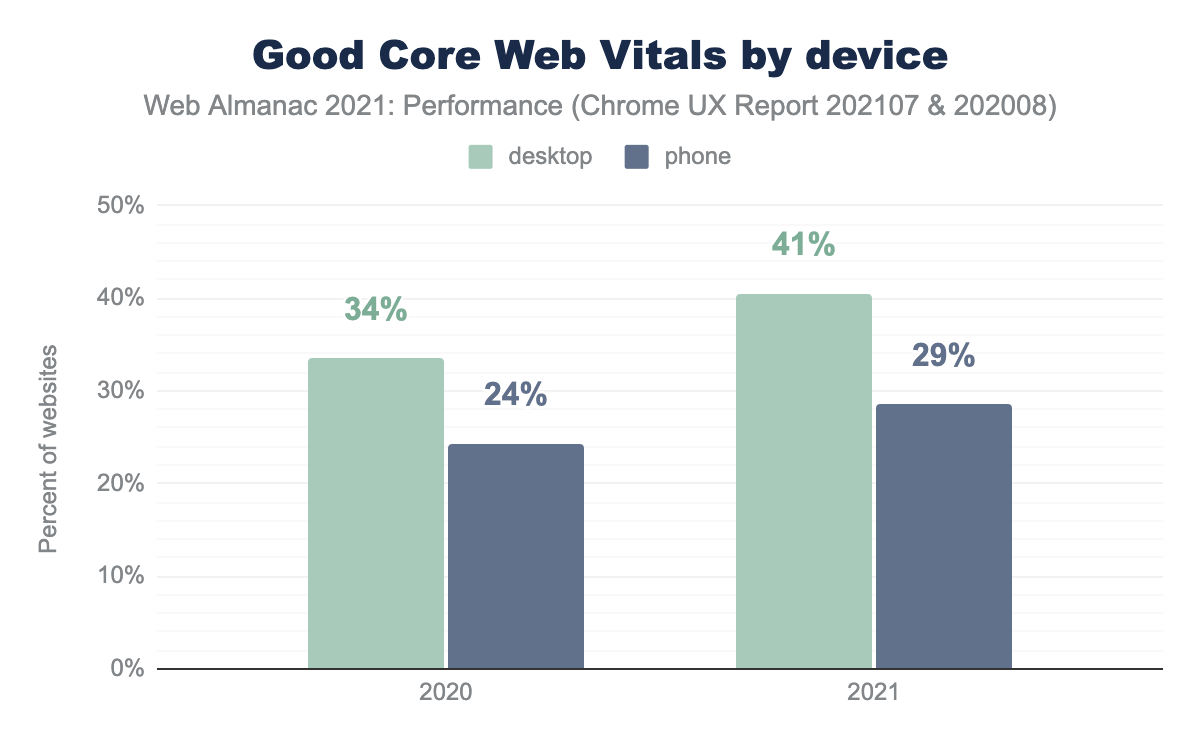
Core Web Vitals for websites in the Chrome User Experience Report improved year-over-year. But, a good part of this improvement could be due to a change in the CLS calculation, not necessarily to a performance improvement in CLS. The resulting CLS “improvement” was 8 points on desktop (2 for mobile). LCP improved by 7 points for desktop (2 for mobile). FID was already at 100% for desktop for both years and improved by 10 points on mobile.
As in previous years, performance was better on desktop machines than mobile devices. This is why it’s crucial to test your site’s performance on real mobile devices and to measure real user metrics (i.e., field data). Emulating mobile in developer tools is convenient in the lab (i.e., development) but not representative of real user experiences.
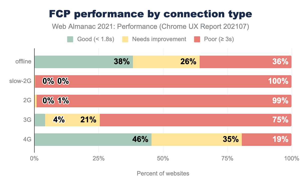
By Effective Connection Type
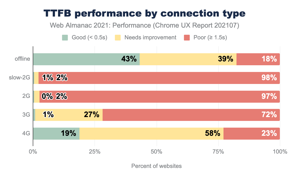
The data by connection type in CrUX can be difficult to understand. It is not based on traffic. If a website has any experiences in a connection type, then it increases the denominator for that connection type. If the experiences were good for that website in that connection type, then it increases the numerator. Said another way, for all the websites which experienced page loads at 4G speed, 36% of those websites had good CWV:
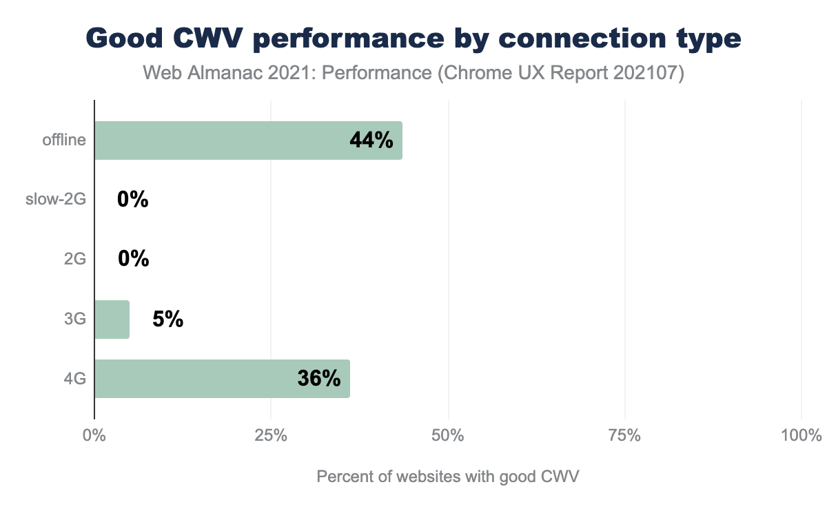
Faster connections correlated with better Core Web Vitals performance. Offline performance was better presumably because of service worker caching in progressive web apps. Yet, the number of origins in the offline effective connection type category is negligible at 2,634 total (0.02%).
The top takeaway is that 3G and lower speeds correlated with significant performance degradation. Consider providing pared-down experiences for access at low connection speeds (e.g., data saver mode). Profile your site with devices and connections that represent your users (based on your analytics data).
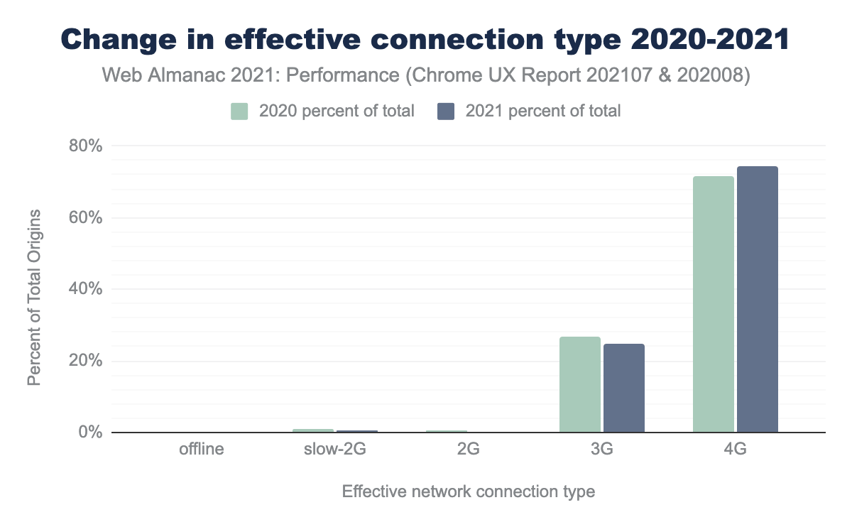
Earlier, we mentioned year-over-year improvements in LCP and FID improvements. These could be partly due to faster mobile devices and mobile networks. The chart above shows total origins accessed on 3G dropped by 2 percentage points while 4G access increased by 3 percentage points. Percent of origins is not necessarily correlated with traffic. But, I would guess if people have more access to higher speeds, then more origins would be accessed from that connection type.
Performance by connection type would be easier to understand if we could start tracking by traffic and not just origin. It would also be nice to see data for higher speeds. However, the API is currently limited to grouping anything above 4G as 4G.
By Geographic Region
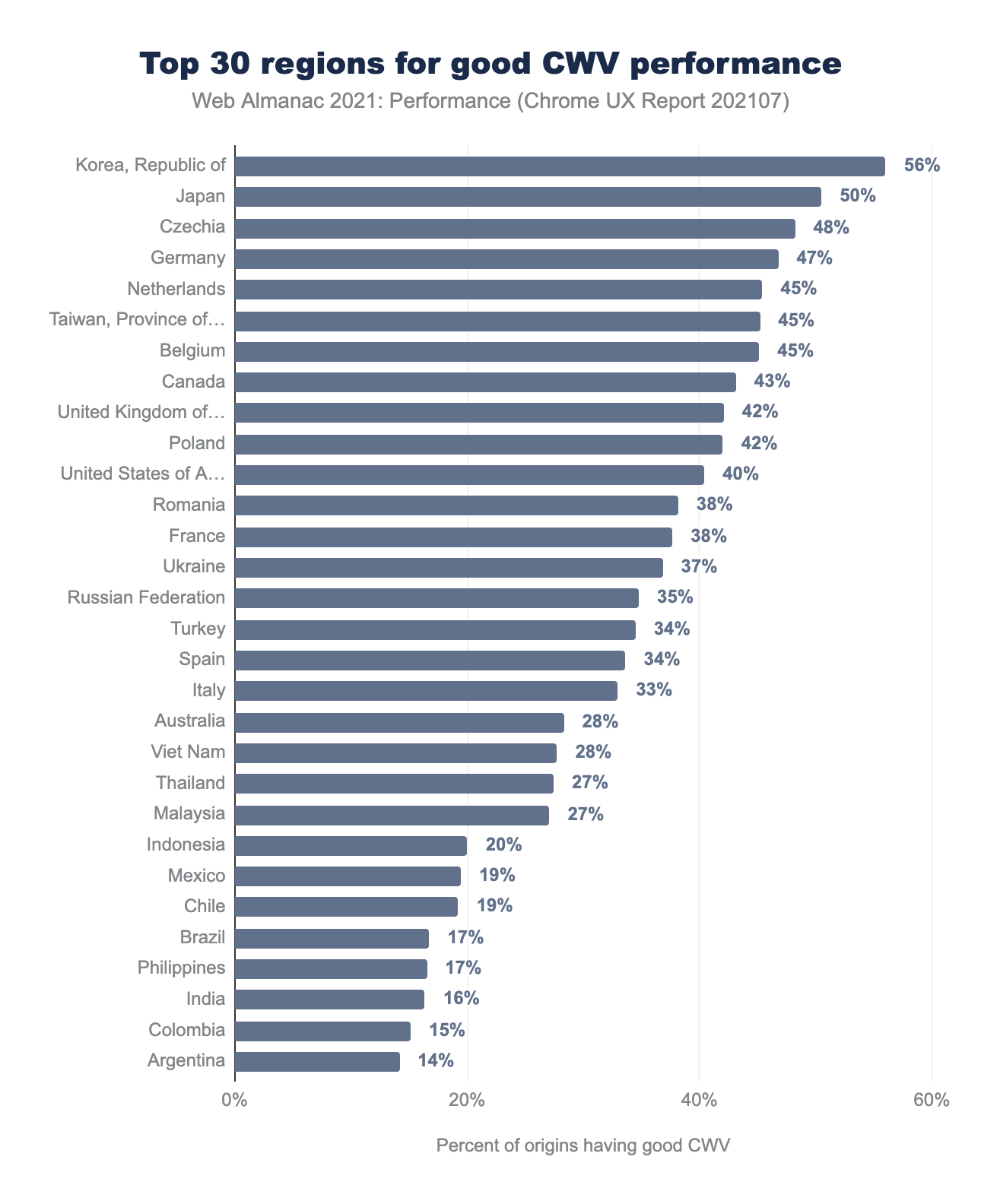
Regions in parts of Asia and Europe continued to have higher performance. This may be due to higher network speeds, wealthier populations with faster devices, and closer edge-caching locations. We should understand the dataset better before drawing too many conclusions.
CrUX data is only gathered in Chrome. The percent of origins by country does not align with relative population sizes. Reasons may include differences in browser share, in-app browsing, device share, level of access, and level of use. Keep these caveats in mind when evaluating regional-level differences and context for all CrUX analyses.
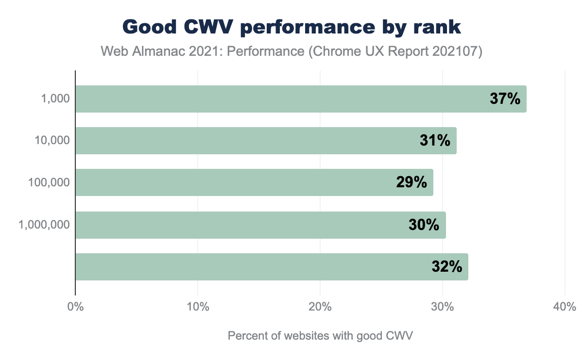
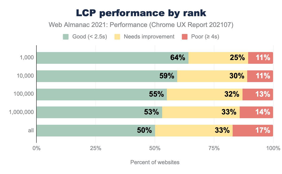
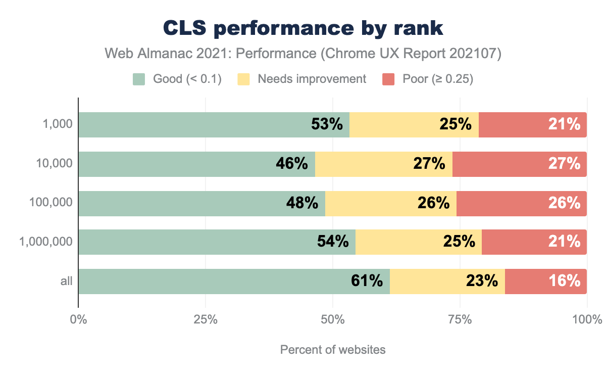
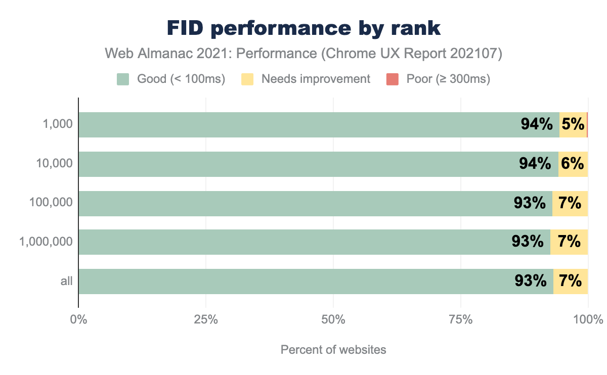
By Rank
This year for the first time, we have ranking data! CrUX determines ranking by the number of page views per website measured in Chrome. In the charts, the categories are additive. The top 10,000 sites include the top 1,000 sites, and so forth. See the methodology for more details.
The top 1,000 sites significantly outperformed the rest in Core Web Vitals. An interesting trough of poorer performance occurs in the middle of the chart which is due to CLS. FID was flat across all groupings. All other metrics correlated with higher performance for higher ranking.
Correlation is not causation. Yet countless companies have shown performance improvements leading to bottom-line business impacts (WPO stats). You don’t want performance to be the reason you can’t achieve higher traffic and increased engagement.
Analysis by Metric
In this section, we dive into each metric. For those who are less familiar, we’ve included links to articles that explain each metric in depth.
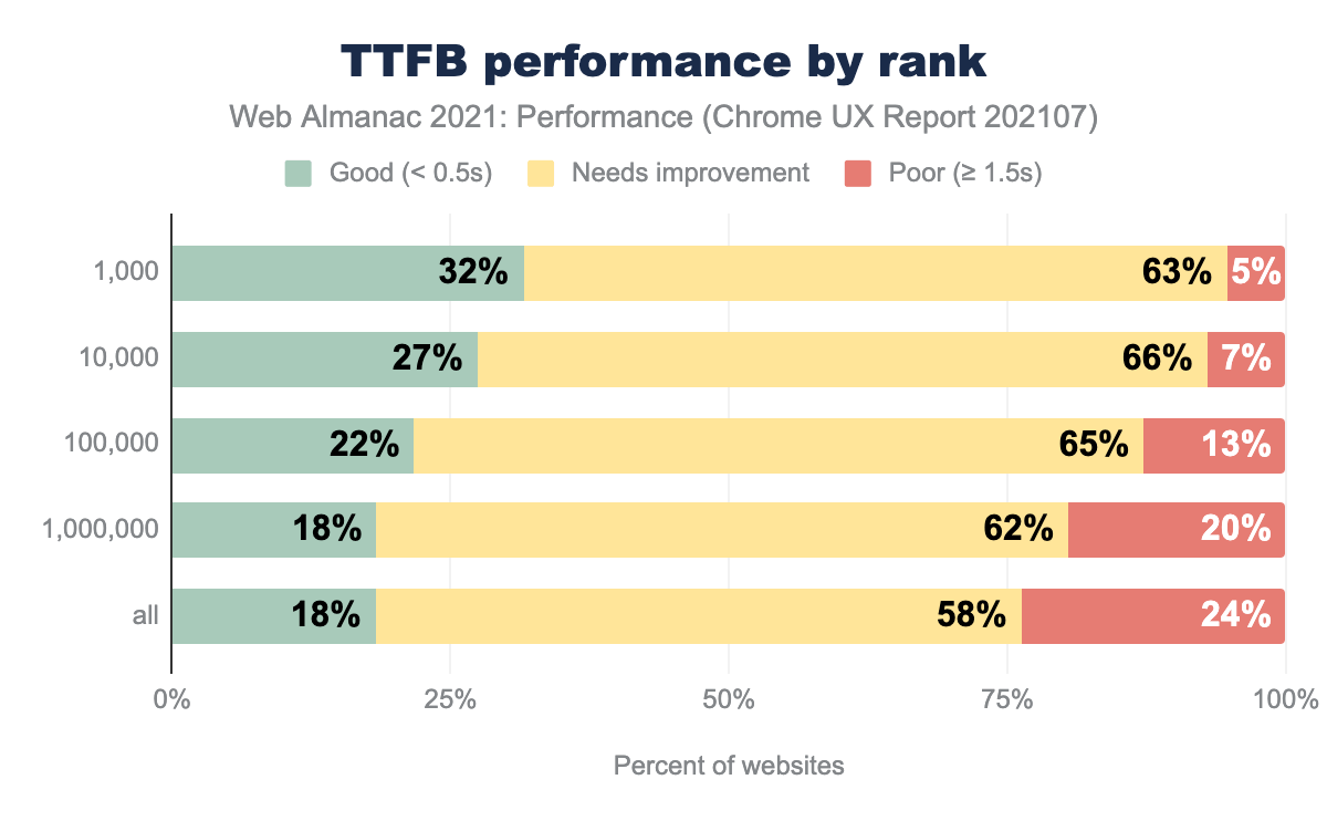
Time-to-First-Byte (TTFB)
Time-to-first-byte (TTFB) is the time between the browser requesting a page and when it receives the first byte of information from the server. It is the first metric in the chain for website loading. A poor TTFB will result in a chain reaction impacting FCP and LCP. It’s why we’re talking about it first.
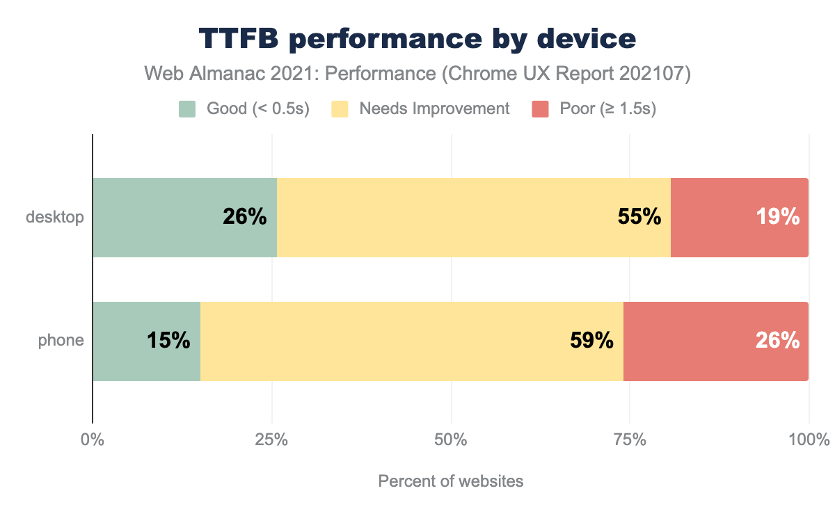
TTFB was faster on desktop than mobile, presumably because of faster network speeds. Compared to last year, TTFB marginally improved on desktop and slowed on mobile.
We have a long way to go for TTFB. 75% of our websites were in the 4G connection group and 25% in the 3G group, with the remaining ones negligible. At 4G effective speeds, only 19% of origins had “good” performance.
You may be asking yourself how TTFB can even occur with offline connections. Presumably, most of the offline sites that record and send TTFB data use service worker caching. TTFB measures how long it takes the first byte of the response for the page to be received, even if that response is coming from the Cache Storage API or the HTTP Cache. An actual server doesn’t have to be involved. If the response requires action from the service worker, then the time it takes the service worker thread to start up and handle the response can also contribute to TTFB. But even considering service worker startup times, these sites on average receive their first byte faster than the other connection categories.
For rank, TTFB was faster for higher-ranking sites. One reason could be that most of these are larger companies with more resources to prioritize performance. They may focus on improving server-side performance and delivering assets through edge CDNs. Another reason could be selection bias - the top origins might be accessed more in regions with closer servers, i.e., lower latency.
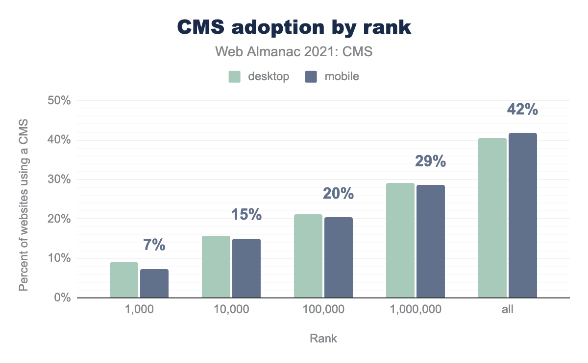
One more possibility has to do with CMS adoption. The CMS Chapter shows CMS adoption by rank.
42% of pages (mobile) in the “all” group used a CMS whereas the top 1,000 sites only had 7% adoption.
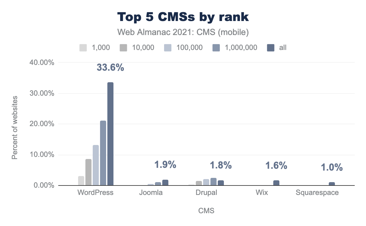
Then, if we look at the top 5 CMSs by rank, we see that WordPress has the highest adoption at for 33.6% of “all” pages:
Finally, if we look at the Core Web Vitals Technology Report, we see how each CMS performs by metric:
Only 5% of origins on WordPress experienced good TTFB in July 2021. Considering WordPress’s large share of the top 10M sites, its poor TTFB could be a contributor to the TTFB degradation by rank.
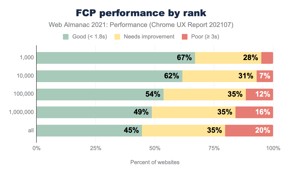
First Contentful Paint (FCP)
First Contentful Paint (FCP) measures the time from when a load first begins until the browser first renders any contentful part of the page (e.g, text, images, etc.).
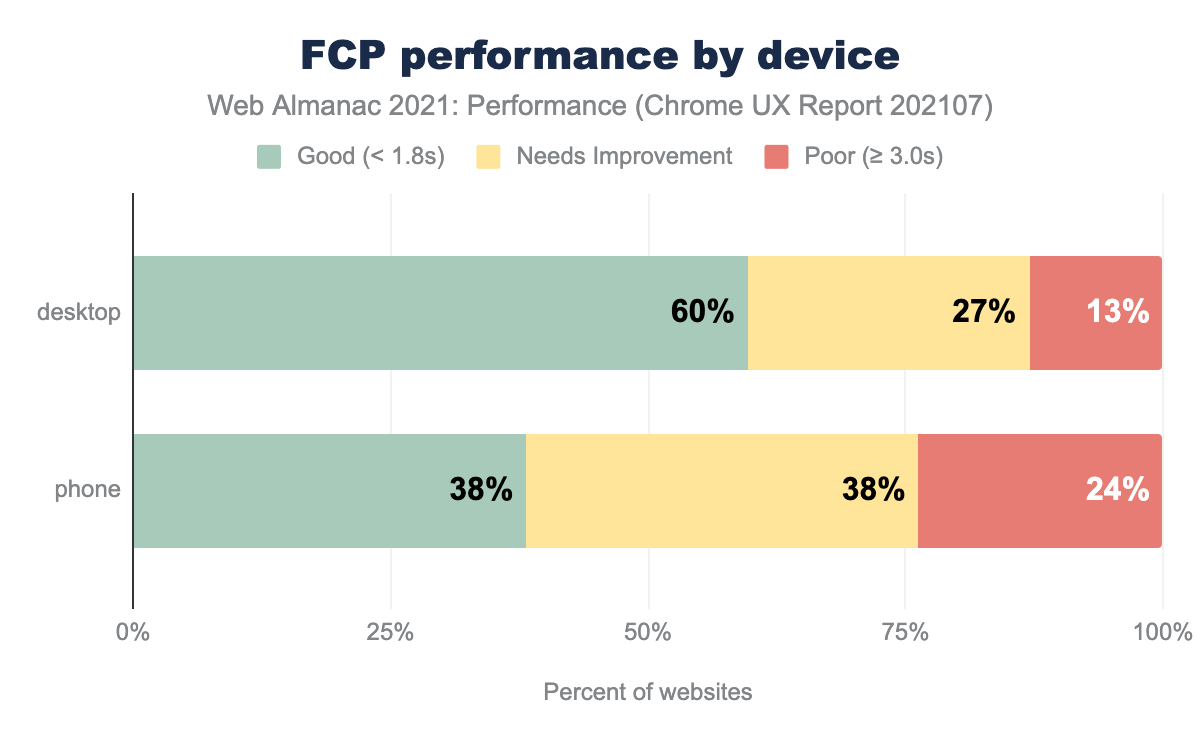
FCP was faster on desktop than mobile, likely due to both faster average network speeds and faster processors. Only 38% of origins had good FCP on mobile. Render-blocking resources such as synchronous JavaScript can be a common culprit. Because TTFB is the first part of FCP, poor TTFB will make it difficult to achieve a good FCP.
Origins at 3G and below speeds experienced significant degradations in FCP. Again, ensure that you are profiling your website using real devices and networks that reflect your user data from analytics. Your JavaScript bundles may not seem significant when you’re only profiling on high-end desktops with fiber connections.
Offline connections were closer in performance to 4G though not quite as good. Service worker start-up time plus multiple cache reads could have contributed. More factors come into play with FCP than with TTFB.
Like TTFB, FCP improved with higher rankings. Also like TTFB, only 19.5% of origins on WordPress experienced good FCP performance. Since their TTFB performance was poor, it is not surprising that their FCP is also slow. It’s difficult to achieve good scores on FCP and LCP if TTFB is slow.
Common culprits for poor FCP are render-blocking resources, server response times (anything associated with a slow TTFB), large network payloads, and more.
Largest Contentful Paint (LCP)
Largest Contentful Paint (LCP) measures the time from start load to when the browser renders the largest image or text in the viewport.
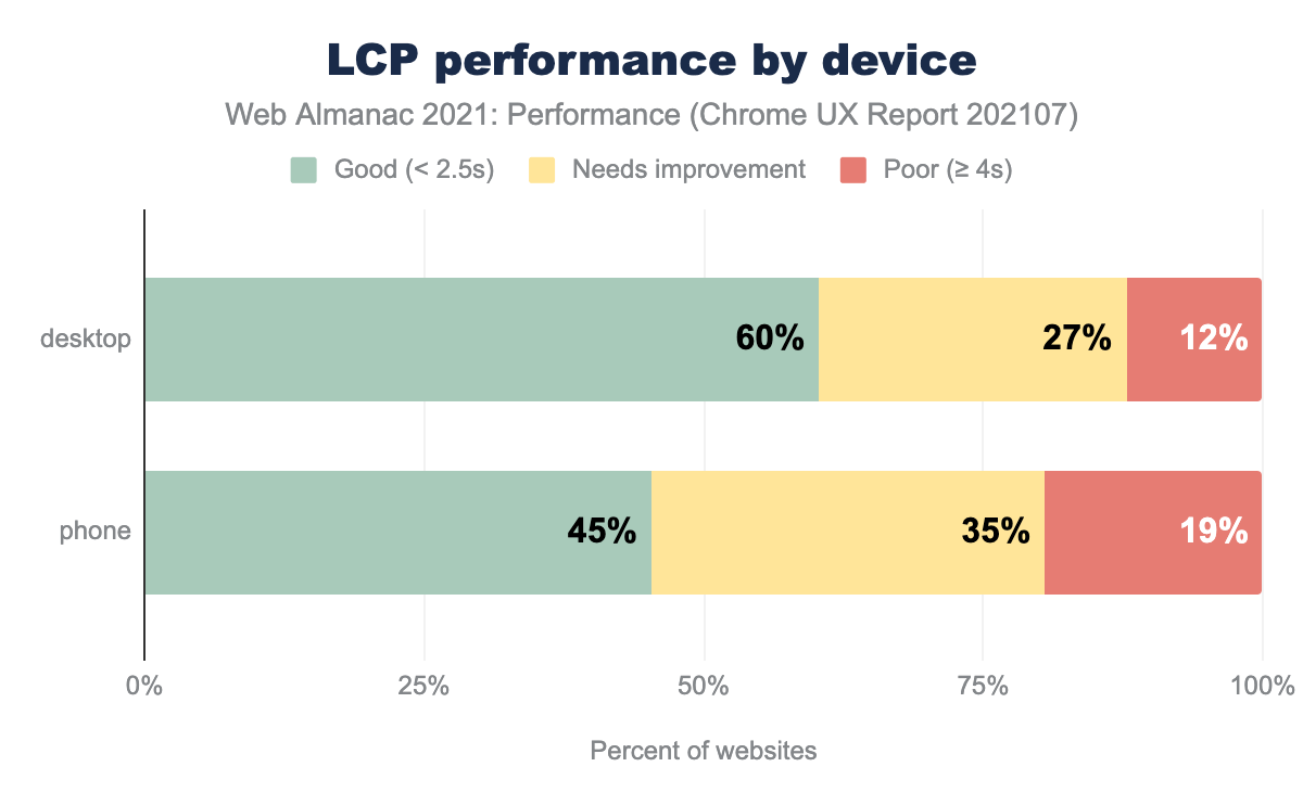
LCP was faster on desktop than mobile. TTFB affects LCP like FCP. Comparisons by device, connection type, and rank all mirror the trends of FCP. Render-blocking resources, total weight, and loading strategies all affect LCP performance.
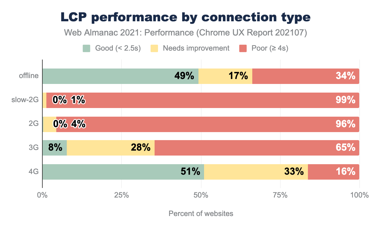
Offline origins with good LCP more closely matched 4G experiences, though poor LCP experiences were higher for offline. LCP occurs after FCP, and the additional budget of 0.7 seconds could be why more offline websites achieved good LCP than FCP.
For LCP, the differences in performance by rank were closer than FCP. Also, a higher proportion of origins in the top 1,000 had poor LCP. On WordPress, 28% of origins experienced good LCP. This is an opportunity to improve user experience as poor LCP is usually caused by a handful of problems.
The LCP Element
Let’s take a deeper dive into the LCP element.
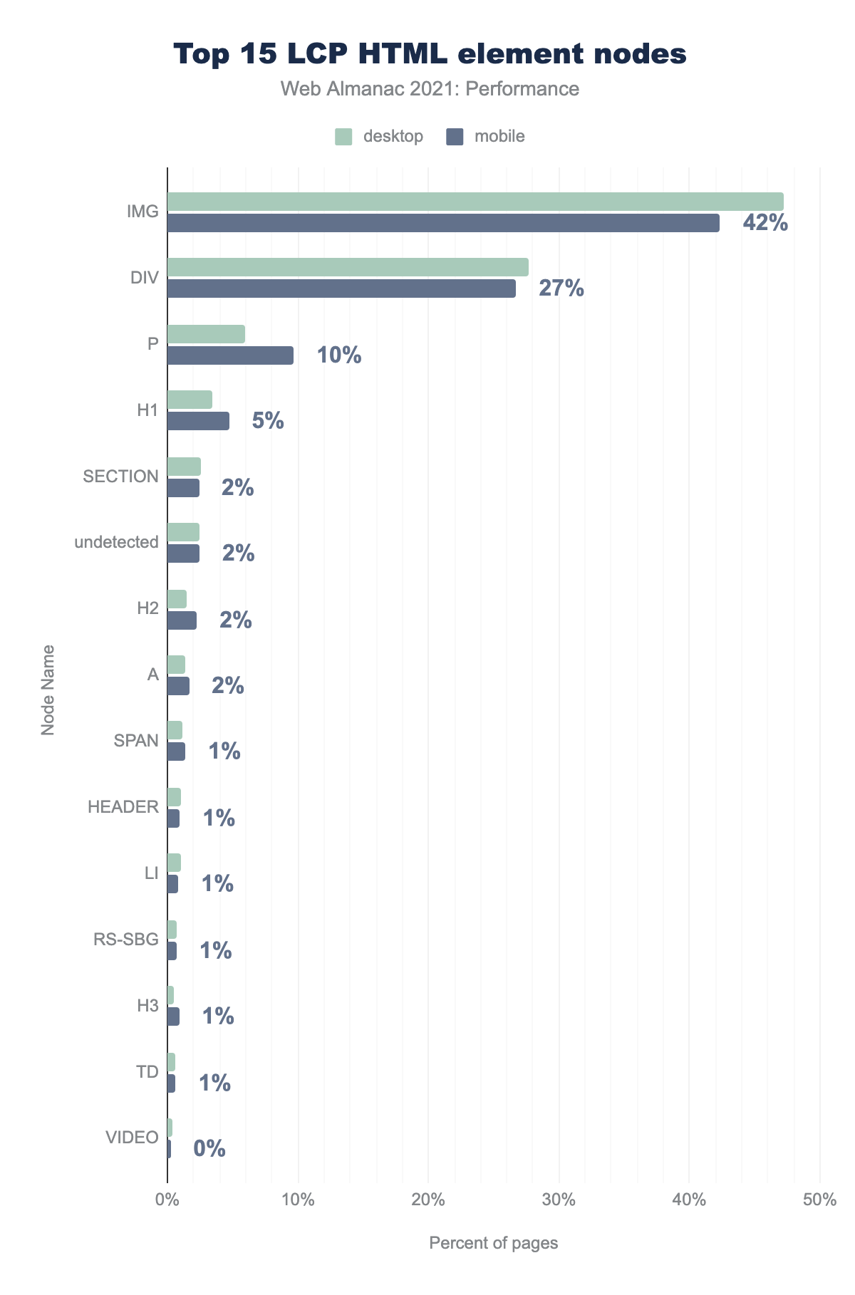
IMG 47% and 42%, DIV 28% and 27%, P 6% and 10%, H1 3% and 5%, SECTION 3% and 2%, undetected 2% and 2%, H2 2% and 2%, A 1% and 2%, SPAN 1% and 1%, HEADER 1% and 1%, LI 1% and 1%, RS-SBG 1% and 1%, H3 0% and 1%, TD 1% and 1%, VIDEO 0% and 0%IMG, DIV, P, and H1 made up 83% of all LCP nodes (on mobile). This doesn’t tell us if the content was an image or text, as background images can be applied with CSS.
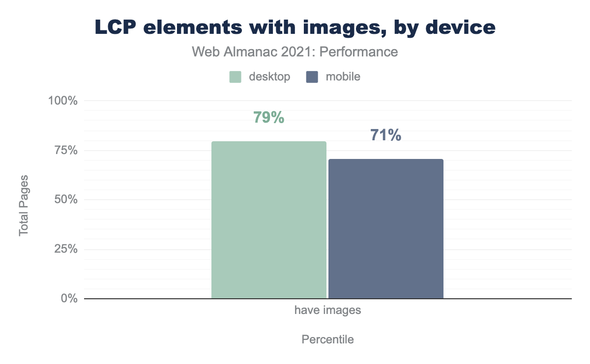
We can see that 71-79% of pages had an LCP element that was an image, regardless of HTML node. Furthermore, desktop devices had a higher rate of LCPs as images. This could be due to less real estate on smaller screens pushing images out of the viewport resulting in heading text being the largest element.
In both cases, images comprised the majority of LCP elements. This warrants a deeper dive into how those images are loading.
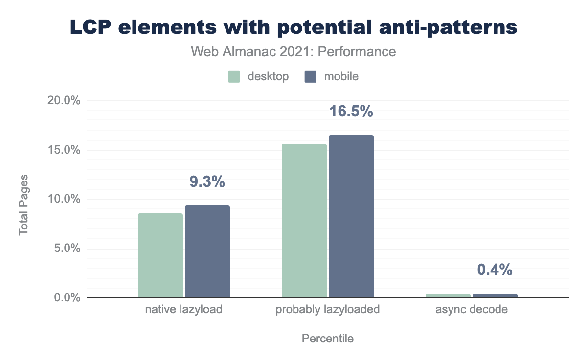
For user experience, we want LCP elements to load as fast as possible. User experience is why LCP was selected as one of the Core Web Vitals. We do not want it to be lazy-loaded as that further delays the render. However, we can see that 9.3% of pages used the native loading=lazy flag on the LCP <img> element.
Not all browsers support native lazy loading. Popular lazy loading polyfills detect a “lazyload” class on an image element. Thus, we can identify more possibly lazy-loaded images by adding images with a “lazyload” class to the total. The percent of sites probably lazy loading their LCP <img> element jumps up to 16.5% on mobile.
Lazy loading your LCP element will result in worse performance. Don’t do it! WordPress was an early adopter of native lazy loading. The early method was a naive solution applying lazy loading to all images, and the results showed a negative performance correlation. They were able to use this data to implement a more nuanced approach for better performance.
The decode attribute for images is relatively new. Setting it to async can improve load and scroll performance. Currently, 0.4% of sites used the async decode directive for their LCP image. The negative impact of asynchronous decode on an LCP image is currently unclear. Thus, test your site before and after if you choose to set an LCP image to decode="async".
Interestingly, 354 origins on desktop attempted to use native lazy-loading on HTML elements that do not support the loading attribute (e.g., <div>). The loading attribute is only supported on <img> and, in some browsers, <iframe> elements (see Can I use).
Cumulative Layout Shift (CLS)
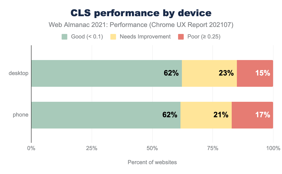
Cumulative Layout Shift (CLS) is characterized by how much layout shift a user experiences, not how long it takes to visually see something like FCP and LCP. As such, performance by device was fairly equivalent.
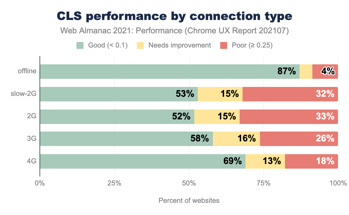
Performance degradation from 4G to 3G and below was not as pronounced as with FCP and LCP. Some degradation exists, but it’s not reflected in the device data, only the connection type.
Offline websites had the highest CLS performance of all connection types. For sites with service worker caching, some assets like images and ads that would otherwise cause layout shifts may not be cached. Thus, they would never load and never cause a layout shift. Often fallback HTML for these sites can be more basic versions of the online website.
For ranking, CLS performance showed an interesting trough for the top 10,000 websites. In addition, all the ranked groups above 1M performed worse than the sites ranked under 1M. Since the “all” group had better performance than all the other ranked groupings the sub-1M group performs better. WordPress may again play a role in this as 60% of origins on WordPress experienced a good CLS.
Common culprits for poor CLS include not reserving space for images, text shifts when web fonts are loaded, top banners inserted after first paint, non-composited animations, and iframes.
First Input Delay (FID)
First Input Delay (FID) measures the time from when a user first interacts with a page to the time the browser begins processing event handlers in response to that interaction.
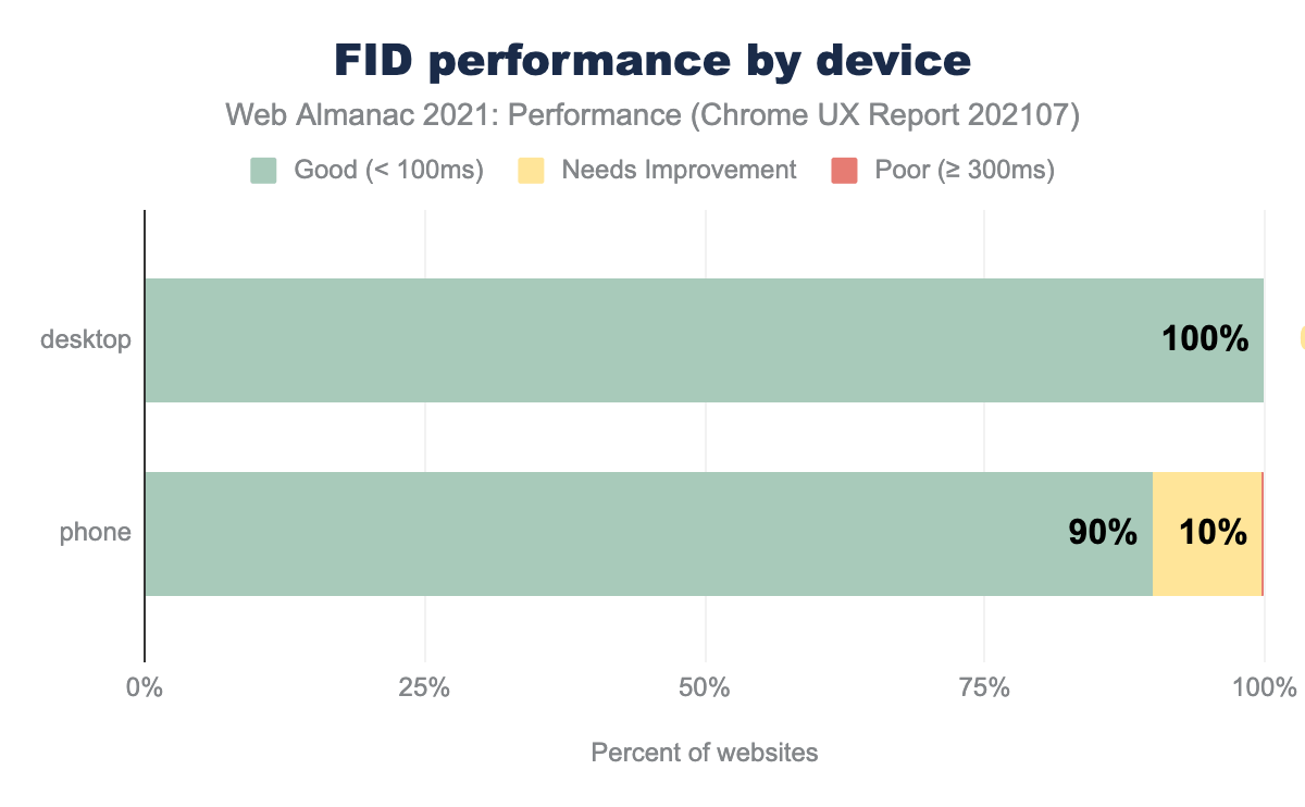
FID performance was better on desktop than on mobile devices likely due to device speeds which can better handle larger amounts of JavaScript.
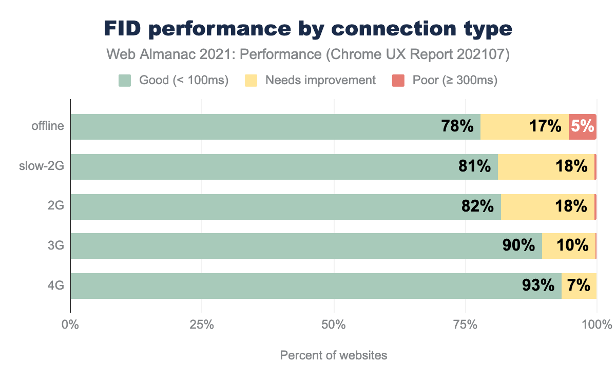
FID performance degraded some by connection type, but less so than the other metrics. The high distribution of scores seemed to reduce the amount of variance in the results.
Unlike the other metrics, FID was worse for offline websites than any other connection category. This could be due to the more complex nature of many websites with service workers. Having a service worker does not eliminate the impact of client-side JavaScript running on the main thread.
FID performance by rank was flat.
For all FID metrics, we see very large bars in the “good” category which makes it less effective unless we’ve truly hit peak performance. The good news is the Chrome team is evaluating this now and would like your feedback.
If your site’s performance is not in the “good” category, then you definitely have a performance problem. A common culprit for FID issues is too much long-running JavaScript. Keep your bundle sizes small and pay attention to third-party scripts.
Total Blocking Time (TBT)
The Total Blocking Time (TBT) metric measures the total amount of time between First Contentful Paint (FCP) and Time to Interactive (TTI) where the main thread was blocked for long enough to prevent input responsiveness.
Total Blocking Time (TBT) is a lab-based metric that helps us debug potential interactivity issues. FID is a field-based metric, and TBT is its lab-based analog. Currently, when evaluating client websites, I reach for total blocking time TBT as another indicator of possible performance issues due to JavaScript.
Unfortunately, TBT is not measured in the Chrome User Experience Report. But, we can still get an idea of what’s going on using the HTTP Archive Lighthouse data (only collected for mobile):
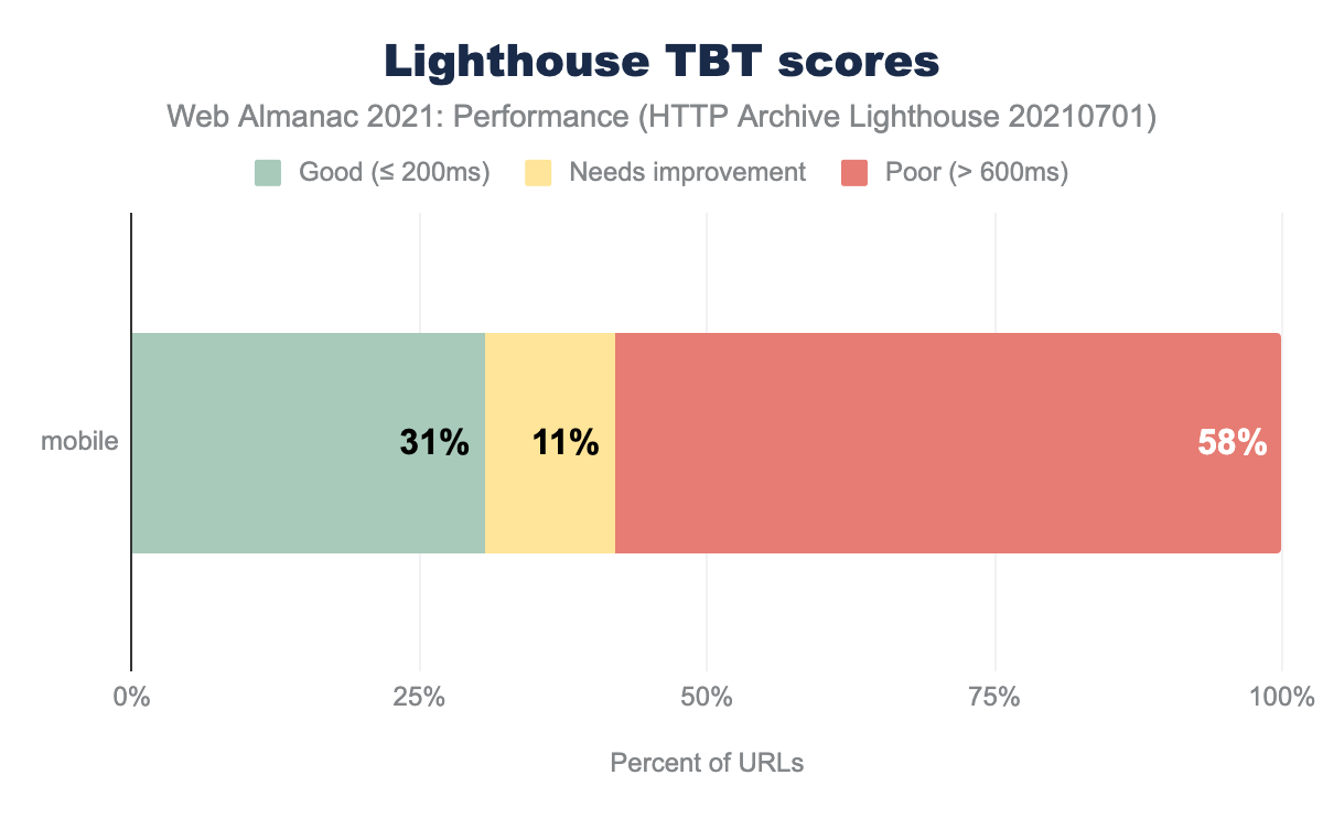
Remember that the data is a single, throttled-CPU Lighthouse run through WebPageTest and does not reflect real user experiences. Yet, potential interactivity looked much worse when looking at TBT versus FID. The “real” evaluation of your interactivity is probably somewhere between. Thus, if your FID is “good”, take a look at TBT in case you’re missing some poor user experiences that FID can’t catch yet. The same issues that cause poor FID also cause poor TBT.
Conclusion
Performance improved since 2020. Though we still have a long way to go to provide great user experience, we can take steps to improve it.
First, you cannot improve performance unless you can measure it. A good first step here is to measure your site using real user devices and to set up real-user monitoring (RUM). You can get a flavor of how your site performs with Chrome users with the CrUX dashboard launcher (if your site is in the dataset). You should set up a RUM solution that measures across multiple browsers. You can build this yourself or use one of many analytics vendors’ solutions.
Second, as new features in HTML, CSS, and JavaScript are released, make sure you understand them before implementing them. Use A/B testing to verify that adopting a new strategy results in improved performance. For example, don’t lazy-load images above the fold. If you have a RUM tool implemented, you can better detect when your changes accidentally cause regressions.
Third, continue to optimize for both FID (field/real-user data) and TBT (lab data). Take a look at the proposal for a new responsiveness metric and participate by providing feedback. A new animation smoothness metric is also being proposed. In our quest for a faster web, change is inevitable and for the better. As we continue to optimize, you’re participation is key.
Finally, we saw that WordPress can impact the performance of the top 10M websites, and maybe more. This is a lesson that every CMS and framework should heed. The more we can set up smart defaults for performance at the framework level, the better we can make the web while also make developers’ jobs easier.
What did you find most interesting or surprising? Share your thoughts with us on Twitter (@HTTPArchive)!
