CSS
Introduction
CSS (Cascading Style Sheets) is one of the three main pillars for building pages on the web—with HTML, used to define the structure; and JavaScript, used to specify behavior and interactions, completing the triumvirate.
Compared to last edition, the 2021 Web Almanac offers a deeper insight into how the use of CSS differs in the realm of what we all think we need versus what we actually see in production. As the calls for more robust CSS features and the challenge of centering a <div> with CSS kept making the rounds on our blog posts, conference talks, and Twitter chatter, pages around the web offered us vastly contradicting results, betraying the fact that CSS has, perhaps, become old enough to put more thought on staying stable instead of going wild with the zaniest of toys.
While CSS-in-JS adoption grew to 3% of all pages crawled (a 1 percentage point jump from last year), cutting-edge Houdini features are still mostly confined to tutorials and example galleries. Responsiveness continued to be one of most engrossing priorities, with max-width and min-width being the top media queries, and calc() being the top CSS function most commonly in use to determine widths.
As users continue to throng to the web, let’s jump into the data that would give us a better insight into how we have been faring in painting the internet—a place that is a second home, a workspace, a garage, or a rabbit hole for the rest of us.
Usage
It isn’t the heaviest component of most pages, but CSS—like the rest of the web—continues to grow in size from year to year. The median web page loads around 70 KB of CSS, and at the upper end, the average size is just over a quarter of a megabyte. Compared to 2020, the median total CSS weight rose about 7.9%, and the 90th percentile just under 7%, while preserving the pattern seen last year that mobile CSS is a little smaller than desktop CSS across all percentiles.
Not every page was so constrained: the page with the greatest CSS weight loaded 64,628 KB. The biggest mobile CSS weight seems positively svelte in comparison: only 17,823 KB.
As in 2020, it was found that page weight wasn’t significantly driven by preprocessors. 17% of desktop pages and 16.5% of mobile pages included sourcemaps, up slightly from 15% last year. The consistent share of CSS including sourcemaps seems to indicate that the sourcemap share is due more to build tool usage than sourcemap adoption, as we would expect to see much bigger year-over-year changes to sourcemap usage otherwise.
As for what kinds of sourcemaps were used, the numbers were largely consistent with last year:
| Sourcemap type | 2020 | 2021 |
|---|---|---|
| CSS files | 45% | 45% |
| Sass | 34% | 37% |
| Less | 21% | 17% |
While this could be taken as evidence that Sass continues to gain ground over Less, the changes are small enough that it’s difficult to call them significant, statistically or otherwise. Time, as always, will tell.
In terms of the average number of stylesheets per page, whether embedded or external, the numbers this year are up only slightly from last year. The 50th through 90th percentiles went up by one each, while the 10th and 25th percentiles didn’t budge.
Incredibly, this year’s record for the largest number of external stylesheets beat last year’s by nearly a factor of two: 2,368 versus 1,379 in 2020. Whoever’s done this, we beg you—combine some files and give your server a rest!
Number of stylesheets is one thing, but what about the number of actual style rules? Compared to last year, the lower percentiles rose a bit, while the highest barely budged. What is different in 2021 versus 2020 is that across nearly all percentiles, desktop pages have more rules on average than do mobile pages.
Selectors and the cascade
Understanding cascade is an incredibly important part of working with CSS. Even more so for instances when you’d see that the styles you had written for an element are not working at all.
CSS offers a number of ways of applying styles to pages, from classes, ids and using the all-important cascade to avoid duplicating styles.
Class names
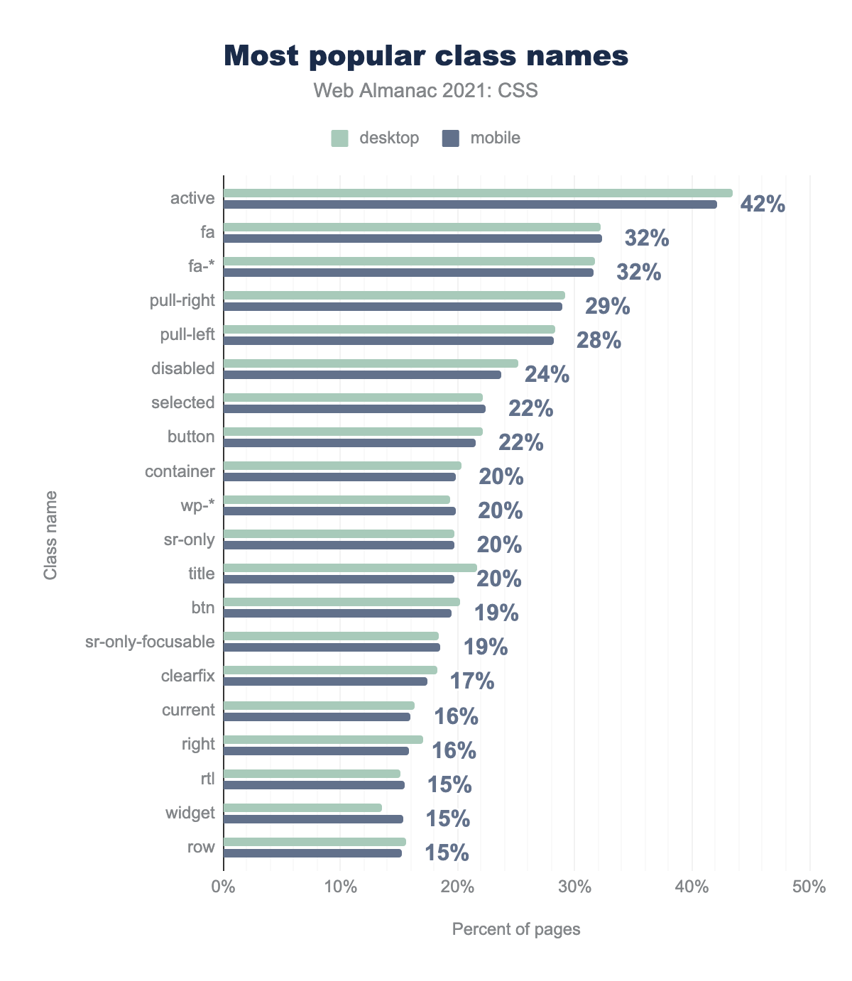
active 42%; fa 32%; fa-* 32%, pull-right 29%, pull-left 28%, disabled 24%, selected 22%, button 22%, container 20%, wp-* 20%, sr-only 20%, title 20%, btn 19%, sr-only-focusable 19%, clearfix 17%, current 16%, right 16%, rtl 15%, widget 15%, row 15%.Much like last year, the most popular class name on the web is active, and the fa, fa-* (the Font Awesome prefix), and wp-* (the WordPress prefix) class names make very strong showings. selected and disabled switched places in the lineup compared to last year, but the most heartening change was a 5% drop for clearfix, a sign that float-based layout continues to wane.
We were also heartened to see the placement of sr-only-focusable, which is a Bootstrap accessibility feature. It causes an element to be placed off-screen, yet remains accessible to screen readers.
IDs
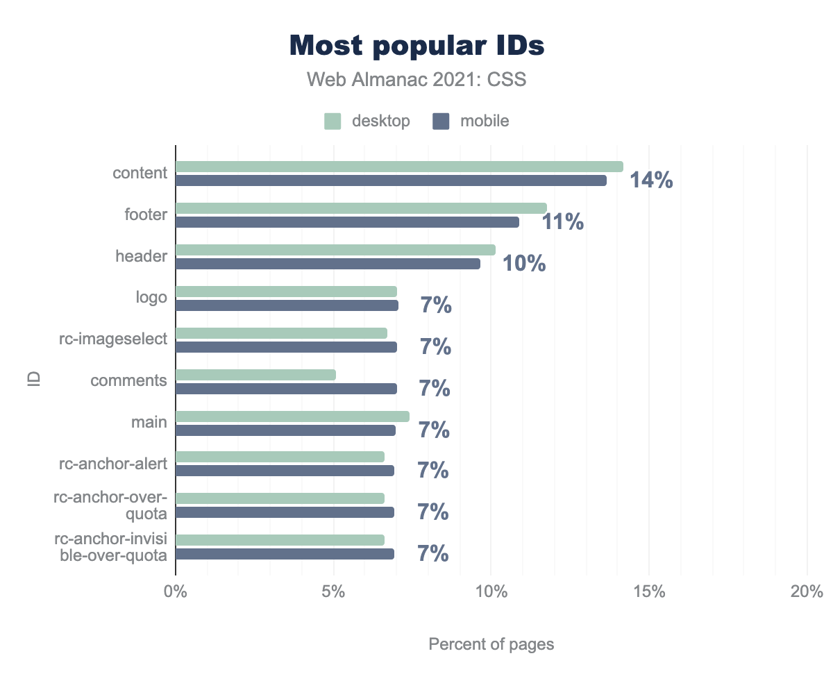
content 14%, footer 11%, header 10%, logo 7%, rc-imageselect 7%, comments 7%, main 7%, rc-anchor-alert 7%, rc-anchor-over-quota 7%, rc-anchor-invisible-over 7%Pages continue to use IDs, and at about the same rate as seen in 2020. Even the list of popular ID names is consistent: content sits in the top spot at about 14% of pages, followed by footer and header. These latter two IDs dropped about a percent versus last year, which isn’t really enough to say anything definitive about them other than, developers should replace them with the corresponding HTML elements <header> and <footer> whenever possible.
The IDs starting with rc- are part of Google’s reCAPTCHA system, most versions of which are inaccessible in various ways.
Attribute selectors
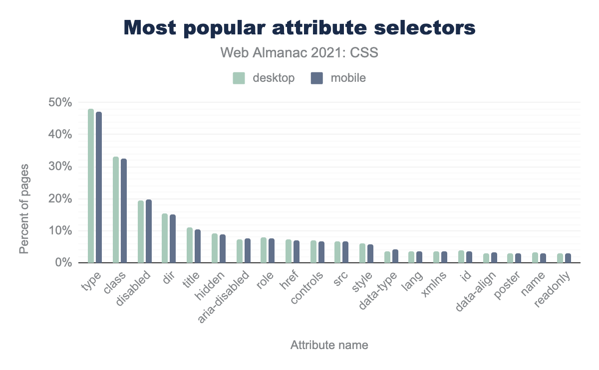
type, class, disabled, dir, title, hidden, aria-disabled, role, href, controls, src, style, data-type, lang, xmlns, id, data-align, poster, name, readonly.The most popular attribute selector continues to be type, which is most likely to be used in selecting form controls like checkboxes, radio buttons, text inputs, and so on.
Pseudo-classes and -elements
The ranking and distribution of both pseudo-classes and pseudo-elements was not greatly changed from the 2020 Web Almanac. A few rankings changed, but overall, things seemed highly static. Whether this represents a solidification of common practice, a snapshot of designer interests, or simply the nature of the analysis, is open to debate.
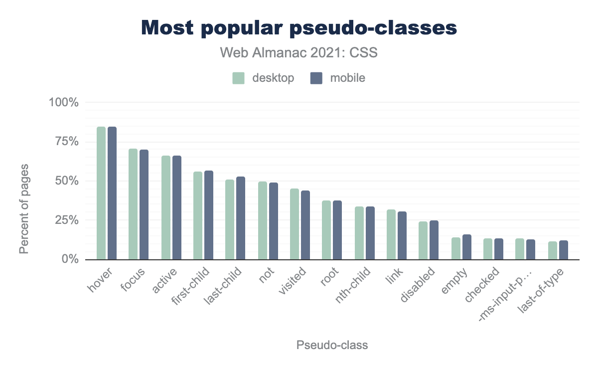
hover, focus, active, first-child, last-child, not, visited, root, nth-child, link, disabled, empty, checked, -ms-input, last-of-type.Just as in 2020, the user-action pseudo-classes :hover, :focus, and :active took the top three spots, with all of them appearing in a minimum of two-thirds of all pages. Structural pseudo-classes put in a number of appearances, but one of the most interesting changes was :not(), the negation pseudo-class, becoming more popular than :visited and achieving a 50% share of pages.
One thing we did check specifically this year was the use of :focus-visible, a way to style elements in focus in a way that better matches user expectations. This capability landed in Chromium in 2020, Firefox in January 2021, and (as of publication) is available in Safari 15 behind an experimental flag. Likely reflecting its recent implementation status, it appeared in less than 1% of the pages analyzed. It will be interesting to see if that number changes over the next few years.
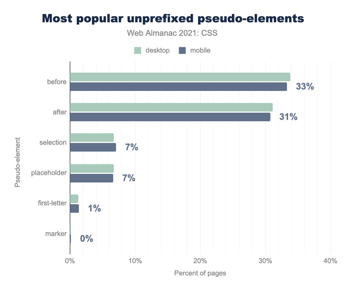
before (34% desktop and 33% mobile), after (31% desktop and mobile), selection (7% desktop and mobile), placeholder (7% desktop and mobile), first-letter (1% desktop and mobile), marker (0% desktop and mobile).Most of the pseudo-elements in use are browser-specific ways of selecting things like specific interface components, parts of browser chrome, or highlighted text. Once we filtered those out, we found that ::first-letter is used on a very small number of pages, but still many more than ::first-line, which didn’t make it onto the chart at all. ::marker, a way of selecting list item markers like bullets or counters in an ordered list, has much less than 1% page share, yet still made it onto the list. We should note here that cross-browser support for ::marker is relatively new (October 2020). It will be interesting to see if use increases over the next few years.
!important
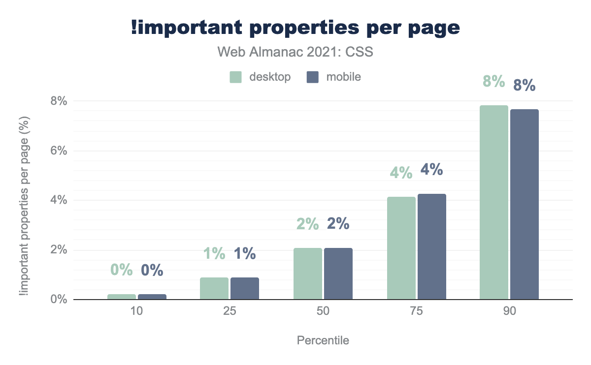
!important keyword. The results are as follows. 10th percentile, 0% for both desktop and mobile. 25th percentile, 1% for both desktop and mobile. 50th percentile, 2% for both desktop and mobile. 75th percentile, 4% for both desktop and mobile. 90th percentile, 8% for both desktop and mobile.!important.
That old battleaxe !important maintains a toehold on the web, with its share of marked rules hardly changing at all compared to the 2020 Web Almanac.
If that seems like a lot, hold on to your IDEs: we found a mobile page with 17,990 rules marked !important! That just edged out the most-important desktop page, which had 17,648 specificity-busting rules. We sincerely, truly hope these were the result of a script or preprocessor gone wrong.
As for what !important gets applied to, as with last year, it’s display, with the rest of the chart falling in the same order as in 2020—with the exception of the last item on the chart, where position bumped off float.
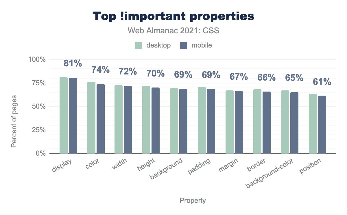
!important keyword, as a percentage of all pages containing a property so marked. Values are only given for mobile, but the desktop bars are all within a percent or two of their mobile counterparts. The list is as follows: display 81% of pages, color 74% of pages, width 72%, height 70%, background 69%, padding 69%, margin 67%, border 66%, background-color 65%, position 61%.!important.
Selector specificity
| Percentile | Desktop | Mobile |
|---|---|---|
| 10 | 0,1,0 | 0,1,0 |
| 25 | 0,2,0 | 0,1,3 (up 0,0,1) |
| 50 | 0,2,0 | 0,2,0 |
| 75 | 0,2,0 | 0,2,0 |
| 90 | 0,3,0 | 0,3,0 |
Many CSS methodologies recommend that authors restrict themselves to single classes in order to squash all selectors’ specificity into a single layer that is more easily managed. The BEM methodology, for example, was found on 34% of all pages. The 10th percentile of median selector specificity shows further evidence of this type of thinking, where both desktop and mobile specificity averages at (0,1,0). This is in line with last year’s findings, as are nearly all the medians—with the exception of mobile’s 25th percentile, which rose a little bit.
Values and units
CSS provides multiple ways to specify values and units, either in set lengths or calculations based on global keywords.
Lengths
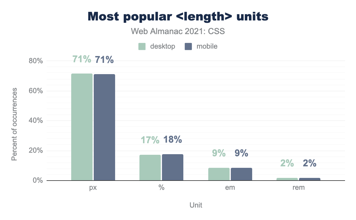
px (pixel) 71% for both desktop and mobile. % (percentage) 17% for desktop, 18% for mobile. em (the m unit) 9% for both desktop and mobile. rem (root-relative em) 2% for both desktop and mobile.Whatever you may think of pixel lengths, it’s still the most popular length unit by far, appearing in about 71% of all pages. The second-place length unit, percentage, trailed pixels by an overwhelming distance.
| Property | px |
<number> |
em |
% |
rem |
pt |
|---|---|---|---|---|---|---|
font-size |
(▼1%) 69% | 2% | (▼1%) 16% | (▼1%) 5% | (▲1%) 5% | 2% |
line-height |
(▼5%) 49% | (▲3%) 34% | (▲1%) 14% | (▼1%) 2% | (▲1%) 1% | 0% |
border-radius |
65% | (▼1%) 20% | 3% | 10% | (▲2%) 2% | 0% |
border |
71% | (▲1%) 28% | 2% | 0% | 0% | 0% |
text-indent |
(▼1%) 31% | (▲1%) 52% | 8% | (▼1%) 8% | 0% | 0% |
gap |
(▼8%) 13% | (▲2%) 18% | (▼1%) 0% | 0% | (▲7%) 69% | 0% |
vertical-align |
(▼11%) 18% | 12% | (▲11%) 66% | 4% | 0% | 0% |
grid-gap |
(▲3%) 66% | (▼1%) 10% | 9% | (▼1%) 0% | (▼2%) 14% | 0% |
padding-inline-start |
(▼7%) 26% | (▲2%) 7% | (▲4%) 66% | 0% | 0% | 0% |
mask-position |
0% | 0% | (▼1%) 49% | (▲1%) 51% | 0% | 0% |
margin-inline-start |
(▼7%) 31% | (▲5%) 51% | (▲1%) 15% | (▲2%) 2% | 1% | 0% |
margin-block-end |
(▲1%) 5% | (▲7%) 38% | (▼9%) 56% | 0% | (▲1%) 1% | 0% |
Where things become interesting is in the breakdown of exactly how the various length units are used. To pick one example, the most common length unit used on line-height is pixels, followed by <number> values (which includes all instances of unitless zero length values). ems are the most popular length unit for vertical-align and padding-inline-start.
The positive and negative figures given in parentheses next to the figures in this table show change from 2020 results. In almost every property we analyzed, pixels became less popular as compared to the uses of other length units, with just two exceptions. The biggest change by far was in vertical-align, with an 11-point shift from pixels to ems as the unit of choice when the supplied value was a length, as opposed to a keyword like baseline.
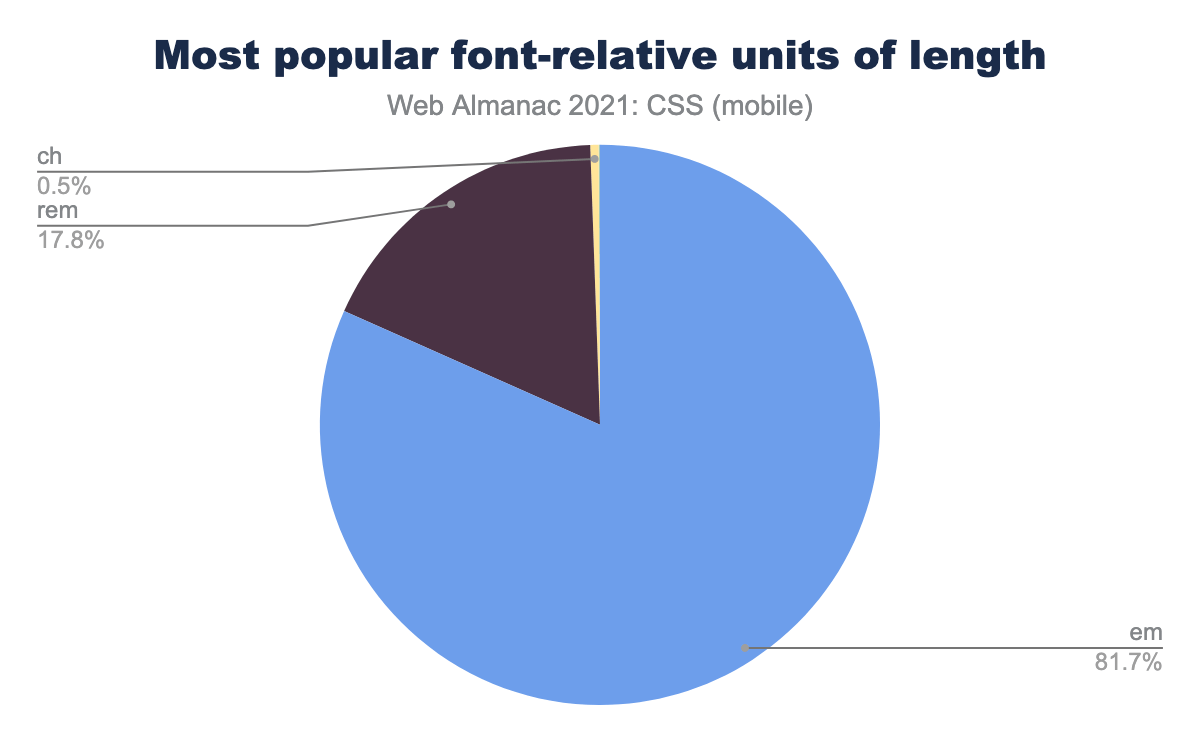
em (the m unit) 81.7%, rem (root-relative em) 17.8%, ch (zero-width advance) 0.5%.Although em maintains a huge dominance over rem when it comes to sizing fonts, there are signs of change: there was a seven-point swing from em to rem between 2020 and 2021.
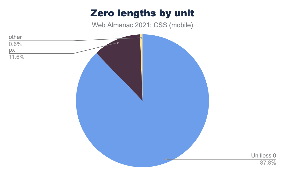
0px (pixels) 11.6%, all others 0.6%.There are a few properties that allow bare <number> units (e.g., line-height), but <length> values have a special case where a length of zero does not require a unit. When we looked at all zero-length values, almost 88% of them omitted the unit. Nearly all of those zero lengths that included a unit used pixels (0px). This was a nice result to see, since any length of zero doesn’t need a unit and including one is fairly pointless. We hope the share of unitless zero values will grow in the future.
Calculations
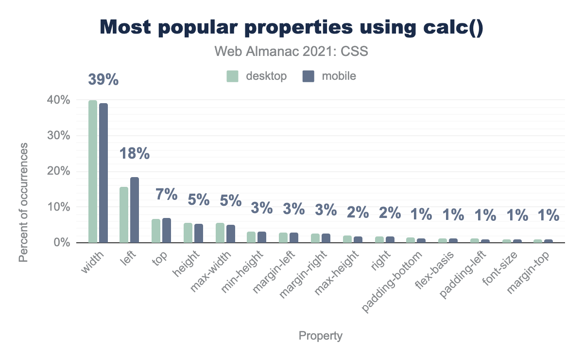
width 39%, left 18%, top 7%, height 5%, max-width 5%, min-height 3%, margin-left 3%, margin-right 3%, max-height 2%, right 2%, padding-bottom 1%, flex-basis 1%, padding-left 1%, font-size 1%, margin-top 1%.calc() functions.
As in past years, the most popular usage of calc() is to set widths, although the share of calc() values in width dropped a full 20 points as compared to 2020. This seems most likely to reflect an expansion of calc() use in other properties, rather than a contraction of its use for width.
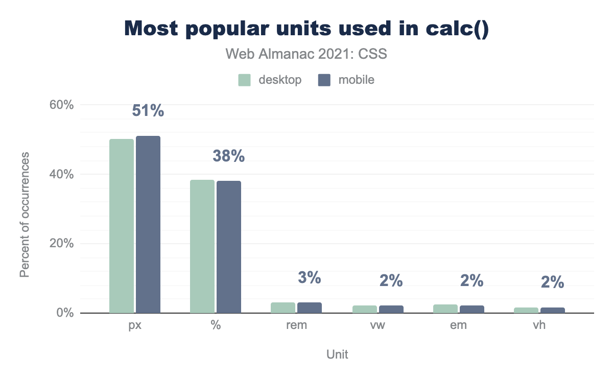
px (pixels) 51%, percentage 38%, rem (root-relative em) 3%, vw (viewport width) 2%, em (the m unit) 2%, vh (viewport height) 2%.calc() functions.
Although pixel units didn’t shift at all in terms of their usage in calculations, percentages lost a bit of ground compared to the long tail of other units, falling four points since 2020.
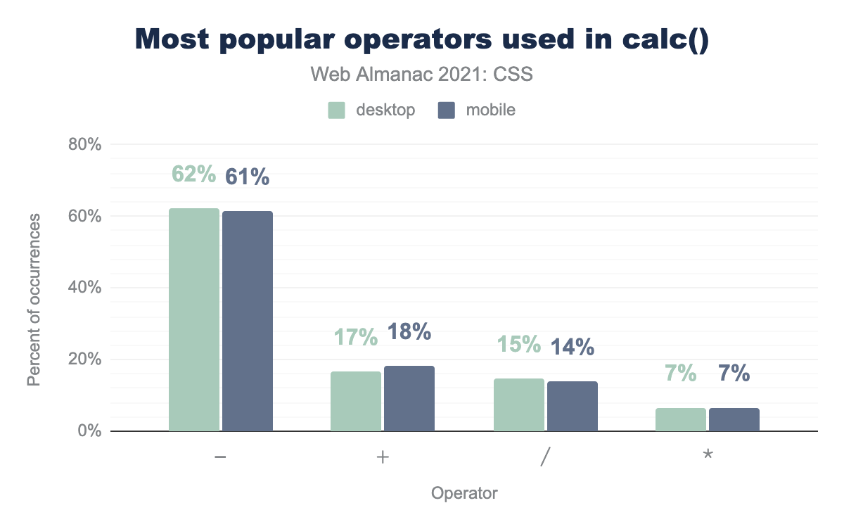
- 61%. + 18%, / (division) 14%, * (multiplication) 7%.calc() functions.
As with last year, when it comes to calculation operators, subtraction is the clear favorite, and barely shifted its share of usage. There were much bigger changes in the second and third spots, where addition vaulted ahead of division, gaining six points while division dropped a similar amount.
calc() functions.
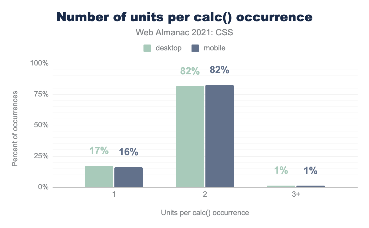
calc() values remain relatively simple, with the overwhelming preponderance of calculations using two different units, such as to subtract pixels from the calculated result of a percent value. A total of 99% of all calc() expressions use either one or two unit types.
Global keywords
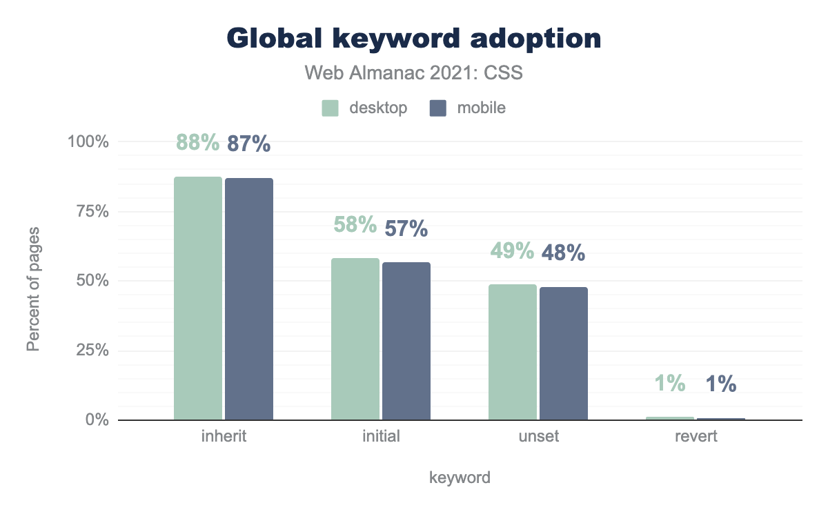
inherit 87%, initial 57%, unset 48%, revert 1%.The use of global keywords such as initial rose significantly as compared to the 2020 Web Almanac. While inherit only gained a couple of points, initial rose about eight points, and unset around 10 points. Even revert managed to lift itself up a point.
Colors
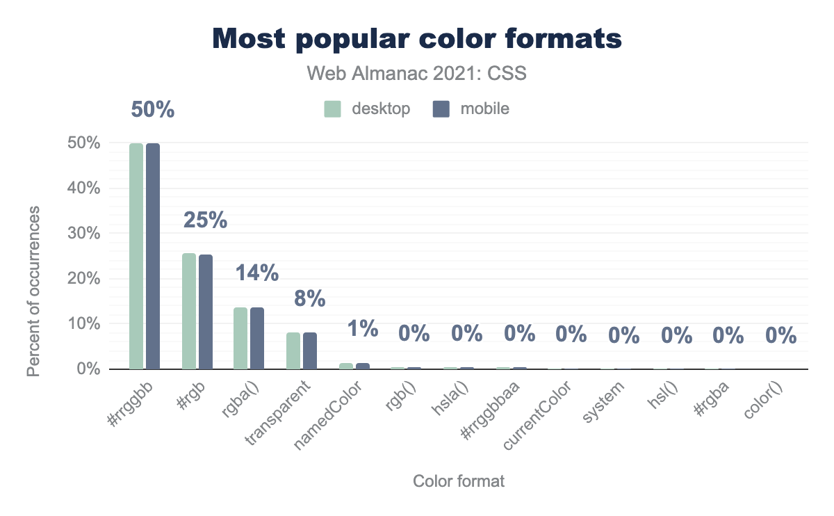
#rrggbb 50%, #rgb 25%, rgba() 14%, transparent 8%, namedColor 1%. Beyond that, the rest of the values are shown at 0%, in this order: rgb(), hsla(), #rrggbbaa, currentColor, system, hsl(), #rgba, color().Despite the availability of a wide number of color value types, the #RRGGBB syntax that has been with us since the days of Netscape 1.1 is still used in half of all color declarations. The CSS innovation of the #RGB shorthand came in second, at a quarter of color values. In other words, a solid 75% of all color values are expressed using hexadecimal RGB syntax. The third-place format, rgba(), points to the likely reason authors go beyond the classic hexadecimal format: to get access to alpha values. (Indeed, though both their shares are tiny, hsla() is more popular than hsl(), just as rgba() is much more common than plain rgb().)
In color formats where the value has historically used commas inside a functional syntax—for example, rgba(0, 0, 0, 1)—authors may now drop the commas and separate colors from alpha with a slash (thus, rgb(0 0 0 / 1). Since 2020, this comma-less syntax has doubled its usage share, going from 0.12% to 0.25% of all functional color syntax.
| Keyword | Desktop | Mobile | |
|---|---|---|---|
transparent |
82.24% | 82.93% | |
white |
7.97% | 7.59% | |
black |
2.44% | 2.29% | |
red |
2.23% | 2.17% | |
currentColor |
1.94% | 2.03% | |
gray |
0.68% | 0.64% | |
silver |
0.56% | 0.55% | |
grey |
0.39% | 0.37% | |
green |
0.32% | 0.31% | |
blue |
0.15% | 0.12% | |
whitesmoke |
0.12% | 0.11% | |
orange |
0.12% | 0.10% | |
lightgray |
0.08% | 0.08% | |
lightgrey |
0.07% | 0.07% | |
yellow |
0.07% | 0.06% | |
gold |
0.04% | 0.03% | |
magenta |
0.03% | 0.03% | |
Background |
0.02% | 0.03% | |
Highlight |
0.02% | 0.03% | |
pink |
0.03% | 0.03% |
In the realm of just the named colors, transparent is still the faraway favorite, with around 82% of all named color keyword usage. The familiar and comfortable white, black, and red total another 12% or so, and currentColor comes in fifth with a half-percent rise over its 2020 numbers.
In last year’s Web Almanac, there was a note about “the once-deprecated—now partially un-deprecated—system colors like Canvas and ThreeDDarkShadow” being just barely in use. This is still true, but oddly, there are now two such values in the top 20 instead of just one (Highlight). That said, both occur in the realm of tiny, tiny numbers of pages, so such shifts are probably unremarkable.
The usage of the display-p3 color space remains about as vanishingly small as was found in 2020, probably because it’s only supported in Safari (both desktop and mobile) as of this writing. Desktop and mobile use roughly tripled, to 90 and 105 pages, respectively. In the cases where color(display-p3) was used, it was with good reason: 79% of the colors expressed using display-p3 on mobile were colors that cannot be represented in the sRGB color space. Until the color() function becomes more widely supported by browsers, the web will remain stuck in sRGB, which permits about two-thirds of the colors that screens can actually display.
Images
They say a picture is worth a thousand words, but byte wise, they often cost an order of magnitude or two more. While there are a myriad of approaches to embedding images with JavaScript, or include them with the HTML scaffolding, here we looked at how CSS-loaded images are used.
Formats of images in CSS
First, here’s a breakdown of the image formats we looked for, and how often each format appeared:
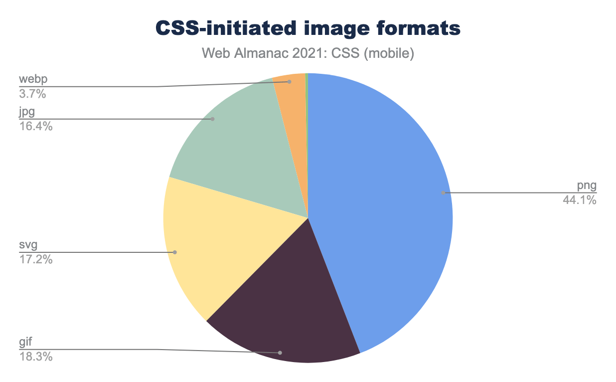
PNG was the clear favorite, with a surprisingly close clustering of GIF, SVG, and JPG following behind. The fairly new WEBP format accounted for only 3.7% of images loaded by CSS, and the tiny slice at the top corresponds to unrecognized values and the ICO format.
We did not attempt to determine whether any of the images were animated.
Please also note that this analysis only covers the images loaded by CSS: we did not check the HTML to see what was being loaded there. Thus, the following results cannot be taken as a metric of how heavy web pages are, or even how heavy CSS is or is not. It can only show how much CSS-loaded images contribute to a page’s total weight.
Number of images in CSS
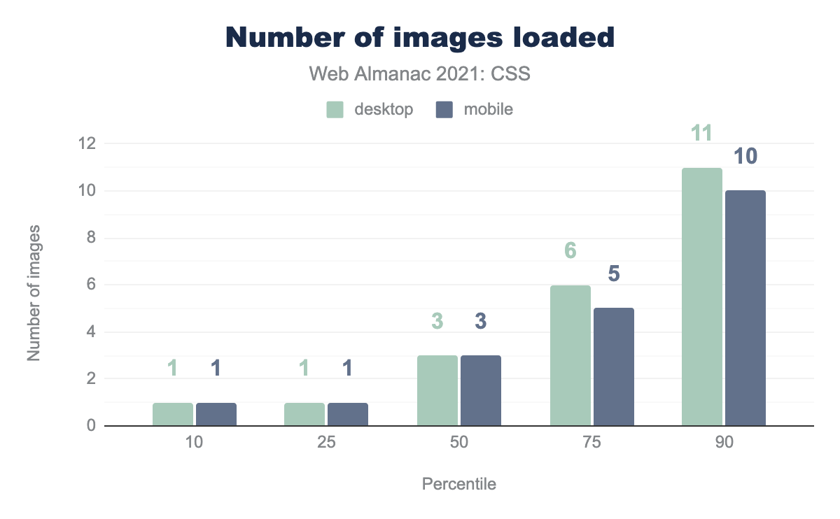
We found that most CSS doesn’t result in a lot of image loads: the lower two percentiles came in at one image each, and even the 90th percentile hovered around 10 images, across all image types.
We did find one site where the desktop CSS loaded 6,088 PNG images. The mobile version of the site actually added an image, bringing it to 6,089 PNGs. We hope they were all small and color-indexed for efficiency’s sake.
Weight of images in CSS
The number of images is one thing, but how much they weigh is at least as important—loading a single 10 MB background is worse than loading ten 100 KB pictures, after all, even with server compression factored in.
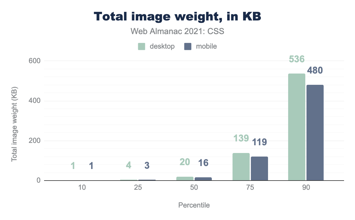
All told, things were not as bad as we’d feared going in: the median page’s CSS loads a total of 16 KB or so in images. It was also encouraging to see that overall, mobile image loading via CSS was consistently a bit lower than desktop—a sign that CSS developers do keep the limitations of mobile contexts at least somewhat in mind.
Sometimes, anyway. We did find a page where the total weight of the images loaded by CSS was a gargantuan 314,386.1 KB—a third of a gigabyte.
| Percentile | JPG | PNG | GIF | (other) | SVG | WebP |
|---|---|---|---|---|---|---|
| 10 | 4.5 | 0.7 | 0.5 | 0.3 | 0.4 | 1.7 |
| 25 | 28.2 | 2.2 | 1.7 | 0.3 | 0.6 | 14.2 |
| 50 | 114.3 | 7.0 | 3.7 | 0.3 | 1.7 | 39.6 |
| 75 | 350.7 | 36.4 | 8.3 | 48.1 | 5.4 | 133.9 |
| 90 | 889.3 | 173.6 | 13.0 | 229.2 | 20.0 | 361.8 |
When we broke down the image weights by format, we discovered a fascinating tidbit: at the 90th percentile, GIF images were actually lighter on average than even SVG files.
It was also interesting, though perhaps not surprising, that the heaviest image format was JPG. This is likely because JPG is favored for those big splashy photographs one so often sees across the tops of home pages and so forth, and even with compression and other optimization tricks, all those pixels do add up.
Gradients
| Property | Desktop | Mobile |
|---|---|---|
background |
62% | 62% |
background-image |
62% | 61% |
-webkit-mask-image |
5% | 5% |
--* |
1% | 1% |
mask-image |
1% | 1% |
border-image |
1% | 1% |
The share of pages using CSS gradients was roughly the same as last year: 77% of desktop pages and 76% of mobile pages. The properties on which they were used did change, however: while still the overwhelming favorites, background and background-image were the properties to which about 62% of gradients were assigned.
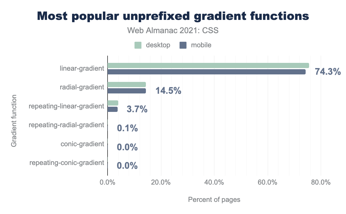
linear-gradient 74.3%, radial-gradient 14.5%, repeating-linear-gradient 3.7%, repeating-radial-gradient 0.1%, conic-gradient 0%, repeating-conic-gradient 0%.Linear gradients continue to be the clear favorite, maintaining the 5-to-1 lead over radial gradients seen in the 2020 Web Almanac.
When prefixed versions of gradients (e.g., -webkit-linear-gradient) were included, the resulting graph looked basically the same as last year’s.
Some other things we found in analyzing gradient values:
- The median number of color stops in gradients is just two, except at the 90th percentile, where the four stops was the median.
- Hard color stops—that is, gradients where two color stops were placed at the same position—occurred in just over half of all gradients.
- Color-stop interpolation (a.k.a. “midpoints”) were used in 21% of all gradient instances.

We also saw a dramatic reduction at the top end of gradient complexity. Last year, the gradient with the largest number of color stops had 646 stops. This year, the winner had only 81 color stops.
Layout
We have come a long, long way from using tables to create layouts on the web to a time when we have a number of options to choose from—Flexbox, Grid, and Multicolumn, as well as old chestnuts like floats, positioning and even CSS table properties. We did a simple search of stylesheets to see which property and value combinations were present, and came up with the following figures.
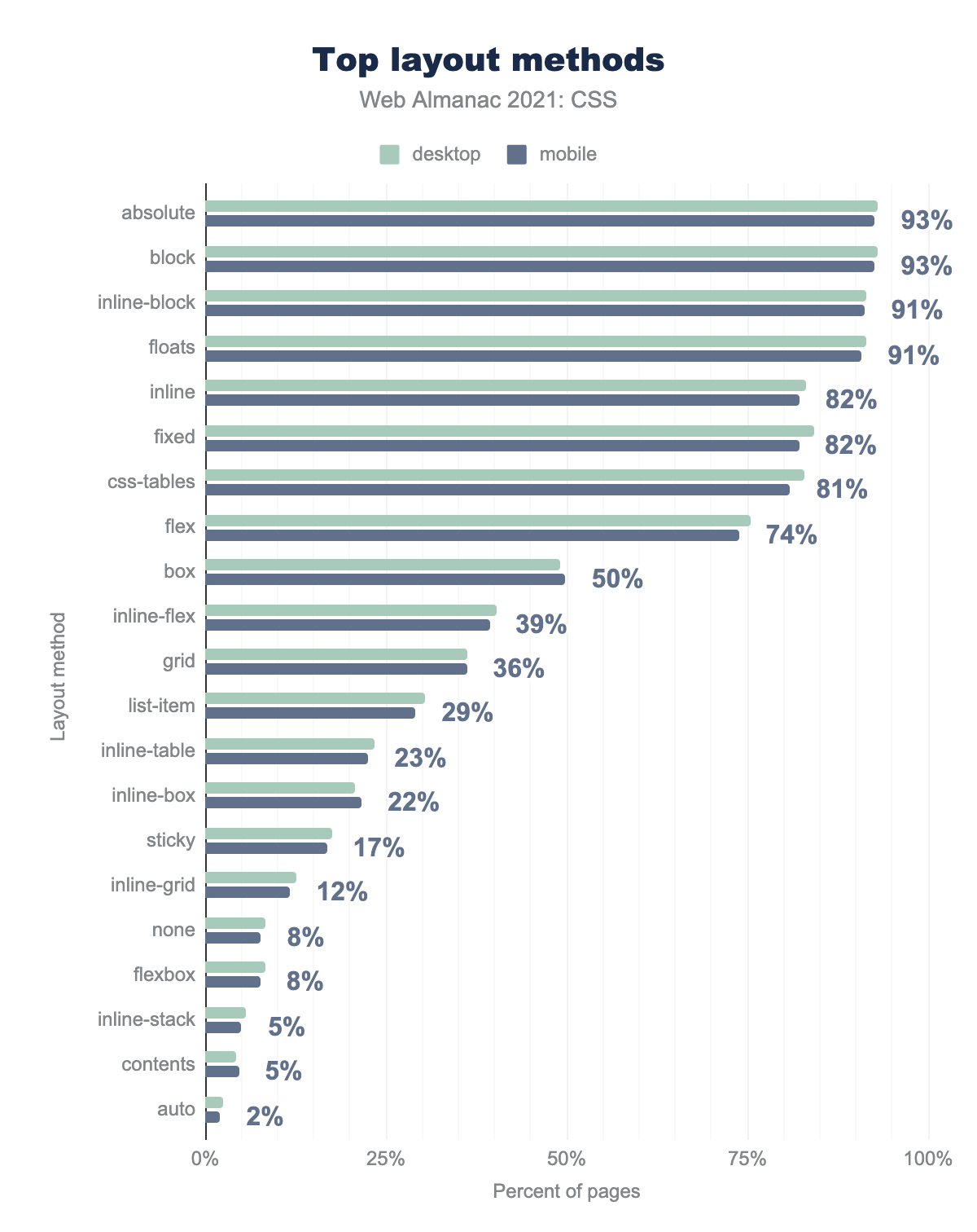
absolute 93%, block 93%, inline-block 91%, floats 91%, inline 82%, fixed 82%, css-tables 81%, flex 74%, box 50%, inline-flex 39%, grid 36%, list-item 29%, inline-table 23%, inline-box 22%, stick 17%, inline-grid 12%, none 8%, flexbox 8%, inline-stack 5%, contents 5%, auto 2%.Note that this doesn’t chart primary layout methods—we are not claiming here that 93% of the pages we analyzed are laid out using absolute positioning! Rather, what the chart says is that position: absolute appeared in the styles for 93% of the page we analyzed, even if that was just to put an icon in a corner or place bits of content -9999px offscreen. Similarly, display: grid may have appeared in 36% of page’s styles, but that doesn’t mean 37% of all pages are Grid pages, just that the combination appeared somewhere in the stylesheet.
The rest of this section is where more in-depth analyses were done, looking not just for property-value combinations, but for evidence of actual usage on pages.
Flexbox and Grid adoption
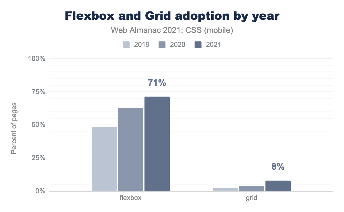
The adoption of Flexbox and grid continues to grow. In 2019, Flexbox adoption was 41%; in 2020, it was 63%. This year, Flexbox hit 71% on mobile and 73% on desktop. Grid, in the meantime, has been doubling each year of the Web Almanac, from 2% to 4% and now 8%. Note that, in contrast to the previous section, what is measured here is the percentage of pages that are actually using Flexbox or Grid for layout, as opposed to the pages that simply have some sort of Flexbox or Grid property in their stylesheet.
Usage of different Grid layout techniques
Digging into the various Grid properties, we discovered a few interesting patterns.
- About 15% of all Grid pages used
grid-template-areasto define named areas of the grid. - When we looked for square brackets in Grid templates, which would indicate the presence of named Grid lines, we found a little fewer than 10,000 pages out of the seven million or so analyzed.
We also analyzed Flexbox layouts to see which ones set the flex grow and shrink values to zero, and then set all the flex item widths to be something static, like percentage or pixel widths. These are referred to as “Grid-like Flexbox,” and we found that just over a quarter of all Flexbox layouts met these criteria. Given the complexity of the analysis, it is entirely possible that we missed many cases. Still, it seems clear that designers are strongly interested in grid-style layouts, and this could drive migration to Grid in the coming years.
Multicolumn
Even though multicolumn layout is a bit fraught on the web, where it can force users to scroll down to the bottom of a column and then back up to the top of the next column, we detected multicolumn use on 20% of the pages we analyzed, which is a 5% rise over the 2020 Web Almanac. We continue to be surprised to see it on so many pages, and even more surprised to see its adoption increasing.
Box sizing
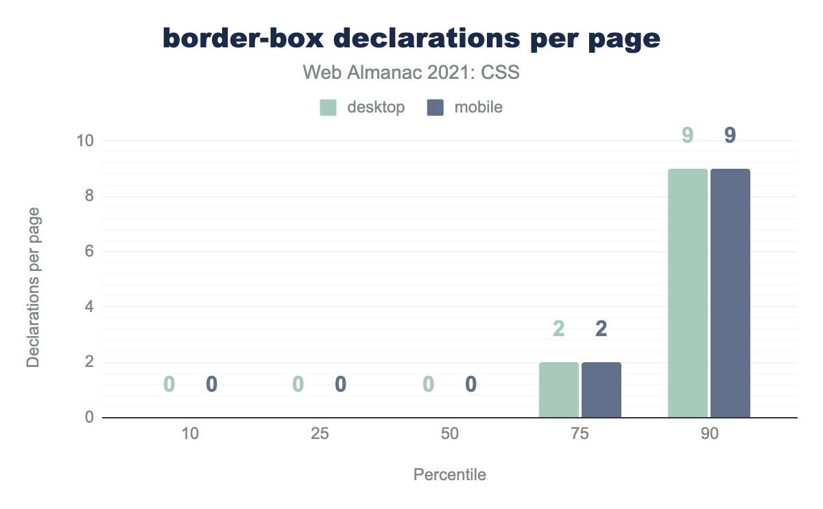
border-box declarations per page.
The principles of the original W3C box model continue to be rejected: when we looked to see how many pages were using box-sizing: border-box, it was an overwhelming 90%, up around 5% from 2020. Almost half of all pages analyzed apply border-box sizing to every element on the page via the universal selector (*). This “one sizing fitted to all” approach may help explain why the median number of border-box declarations per page is so low across the bottom three percentiles.
In addition, about a quarter of pages apply box-sizing to checkboxes and radio buttons.
Transitions and animations
Animations continue to be widely used, with the animation property appearing on 77% of all mobile and 73% of all desktop pages analyzed. It’s even more popular cousin, transition, is used on 85% of all mobile and 90% of all desktop pages.
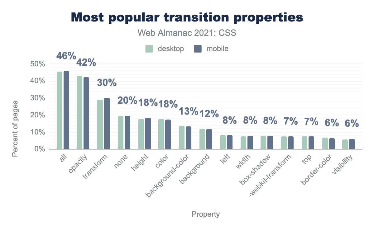
all 46%, opacity 42%, transform 30%, none 20%, height 18%, color 18%, background-color 13%, background 12%, left 8%, width 8%, box-shadow 8%, -webkit-transform 7%, top 7%, border-color 6%, visibility 6%.Among those transitions, the most common application is to all animatable properties using the all keyword (whether explicitly or by default), which occurred in 46% of the analyzed pages. Just behind that is opacity, at 42% of all pages containing transitions.
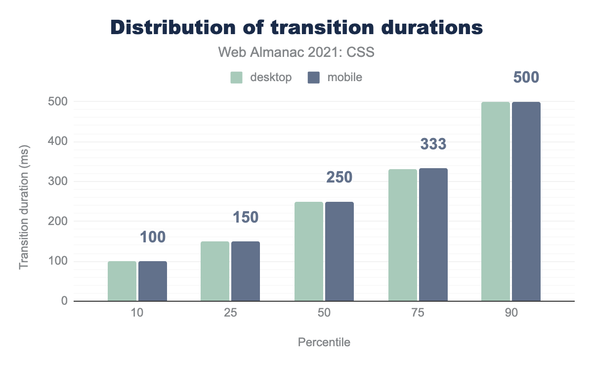
We took a look at the duration and delay times of those transitions. Even at the 90th percentile, the median transition duration was just half a second.
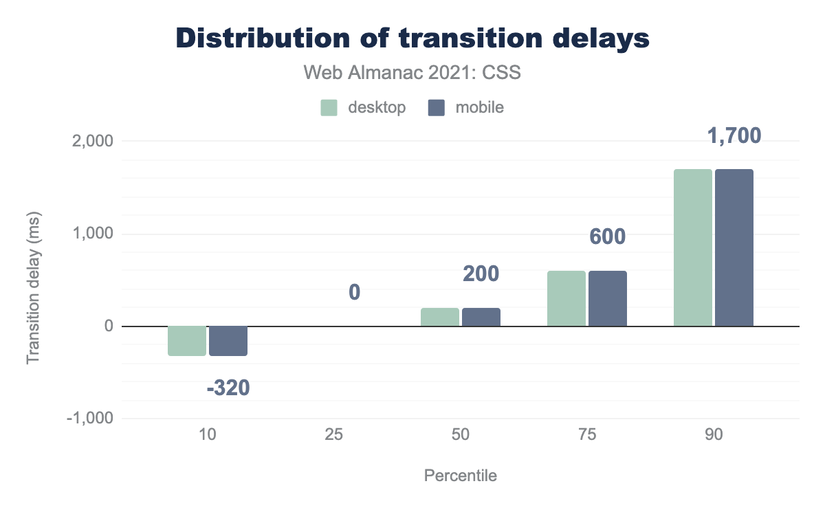
The highest median transition delay was 1.7 seconds, but even more interestingly, the 10th percentile median delay was about not quite one-third of a negative second, indicating that a large number of transitions are started partway through the resulting animation (which is what negative delays cause to happen).
A closer look at the range of transition durations and delays revealed some seriously lengthy spans of time. The largest duration value we found was 9,999,999,999,999,996 seconds, which corresponds to almost 317 million years. Put another way, if that duration were used in a horizontal scroll transition of If the Moon Were Only 1 Pixel, it would take just over two centuries to scroll to the right by a single pixel. This, however, pales in comparison to the longest transition delay we found: a value in milliseconds that equals not quite 31.7 quintillion years.

As for the timing functions used during the transitions, the clear leader is the default value, ease. There’s a virtual tie for second between ease-in-out and linear, but the surprise was our fourth-place finisher, cubic-bezier. This seems most likely to come from a library or some sort of tool, because while it’s possible to learn how to construct cubic Bézier curves by hand, very few people bother to do so (nor is there much reason why they should).
Okay, but what kinds of animations are being performed? To determine this, we classified various animation labels by the type of animation being performed. For example, animations labeled fa-spin, spin, spinner-spin, and so on were classified as “rotate” animations, and these were the most popular.
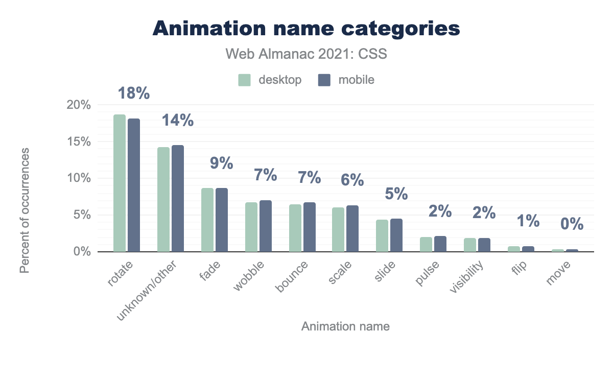
rotate 18%, unknown or other 14%, fade 9%, wobble 7%, bounce 7%, scale 6%, slide 5%, pulse 2%, visibility 2%, flip 1%, move 0%.One reason for the high ranking of “unknown/other” is the animation label a, which was around 6-7% of all named animations. (The most likely companion to these, b, had a 2% prevalence.)
The weak showing of “move” and “slide” style animations might seem surprising but remember: these are specifically types of animation. Transitions driven by the transition property are not represented in this sample. It is highly likely that many simple movements (and fades) are handled with transitions, and animation is reserved mostly for more complex effects.
Responsive design
Making a site that copes well with all the different screen sizes wherein you can now browse the web has become significantly easier with the advent of built-in tools like Flexbox and Grid, which are further enhanced by using media-queries.
Media features in use
When authors build their media queries, they most often test the width of the viewport. max-width and min-width were the most popular queries by far, the same as in 2020. There was no ranking change in the third and fourth place results either.
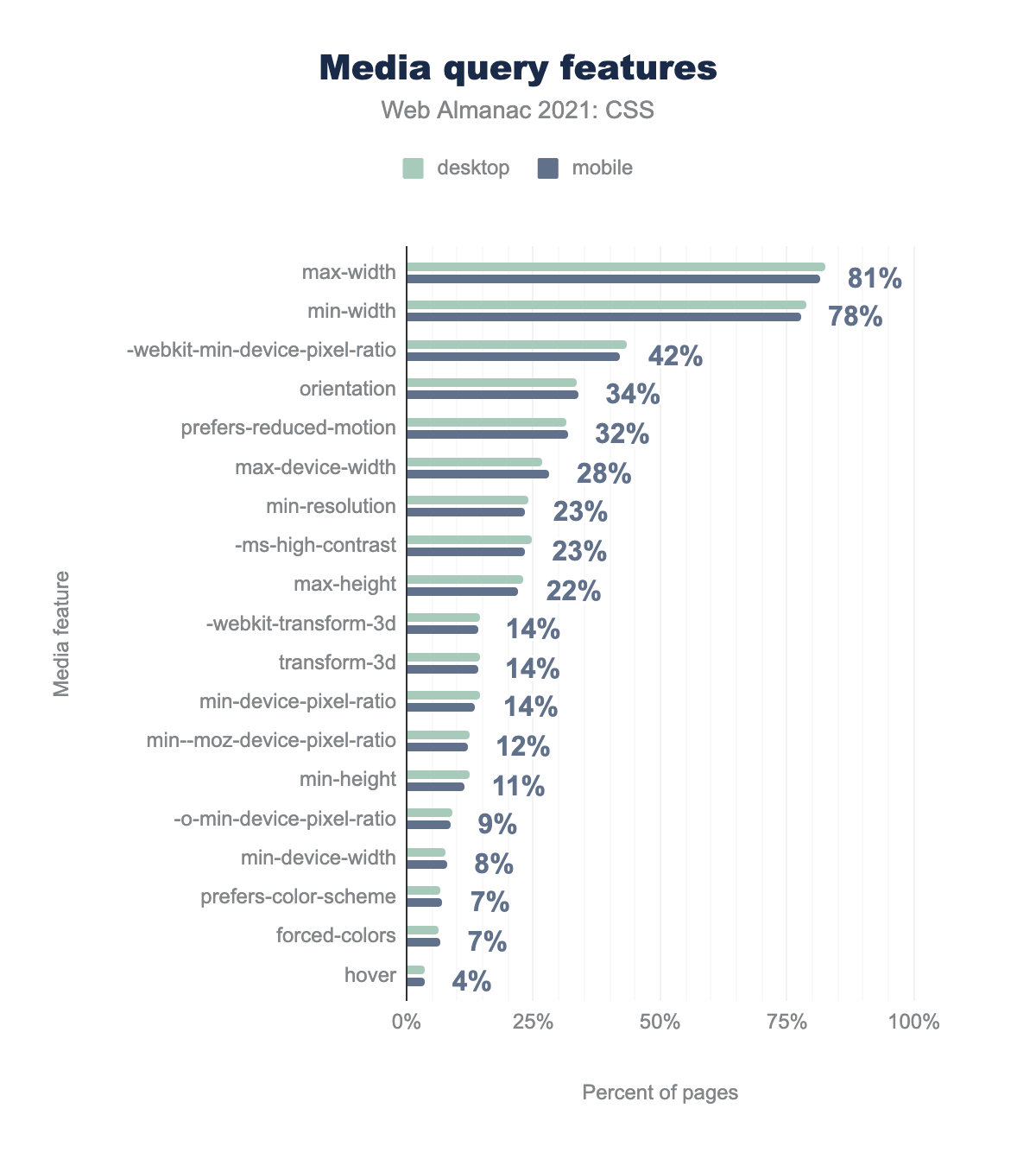
max-width 81%, min-width 78%, -webkit-min-device-pixel-ratio 42%, orientation 34%, prefers-reduced-motion 32%, max-device-width 28%, min-resolution 23%, -ms-high-contrast 23%, max-height 22%, -webkit-transform-3d 14%, transform-3d 14%, min-device-pixel-ratio 14%, min--moz-device-pixel-ratio 12%, min-height 11%, -o-min-device-pixel-ratio 9%, min-device-width 8%, prefers-color-scheme 7%, forced-colors 7%, hover 4%.Where we did see a notable change was in the ranking of the prefers-reduced-motion query. This query placed 7th in 2020, with a share of 24%; this year, with a share of 32%, it’s up to fifth, where it just missed edging out orientation.
We also saw newcomers come and go at the bottom of the list. pointer, a query which checks to see if the display device’s primary input mechanism is a pointing device such as a mouse and which placed 19th last year, fell off the chart as it slipped to 21st place. The hover media feature, on the other hand, entered the chart at 20th place. hover is used to test if the display device’s primary input mechanism can cause a hover state in elements on the page.
Both queries have a similar aim, which is (put simply) to figure out if the device being used to display the page is mouse-driven or not. Combined with a mobile-first design philosophy, where desktop styles are added to override the default mobile styling, one can see how queries like pointer or hover would be useful. While it’s too soon to say if one or the other will become dominant, the trends this year swung toward hover.
This year also saw the debut of prefers-color-scheme, coming in at 7%. This may be due to iOS devices adding dark mode support since last year’s report, but in any event, it’s good to see that designers are starting to take color scheme preferences into account.
Common breakpoints
As in 2020, the most common breakpoints by far are at 767 and 768 pixels, which correspond suspiciously well with the resolution of an iPad in portrait mode. We found 767px was overwhelmingly used as a maximum-width breakpoint and only rarely as a minimum-width value. 786px, by contrast, was quite often used as both a minimum and maximum breakpoint.
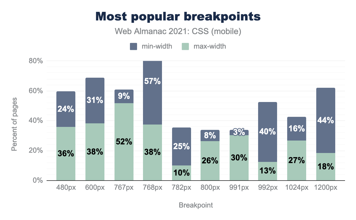
min-width and 36% max-width. 600 pixels, 31% min-width and 38% max-width. 767 pixels, 9% min-width and 52% max-width. 768 pixels, 57% min-width and 38% max-width. 782 pixels, 25% min-width and 10% max-width. 800 pixels, 8% min-width and 26% max-width. 991 pixels, 3% min-width and 30% max-width. 992 pixels, 40% min-width and 13% max-width. 1024 pixels, 16% min-width and 27% max-width. 1200 pixels, 44% min-width and 18% max-width.Beyond the 767-768 range, the next most popular breakpoints were at 600 and 1,200 pixels, and close behind that was 480 pixels.
Lest you think we converted all the breakpoint queries to pixels, we’re sorry to say we did not: these are the straight values from stylesheets. Out of all the breakpoints we analyzed, the first non-pixel value on the list is 48em, which came in at 76th on the ranking list, appearing in 1% of desktop and 2% of mobile styles. The next em-based value, 40em, is found in 85th place.
Properties inside media queries
So, what do authors actually style inside these media query blocks? The most often property to set is display, followed closely by color, width, and height.
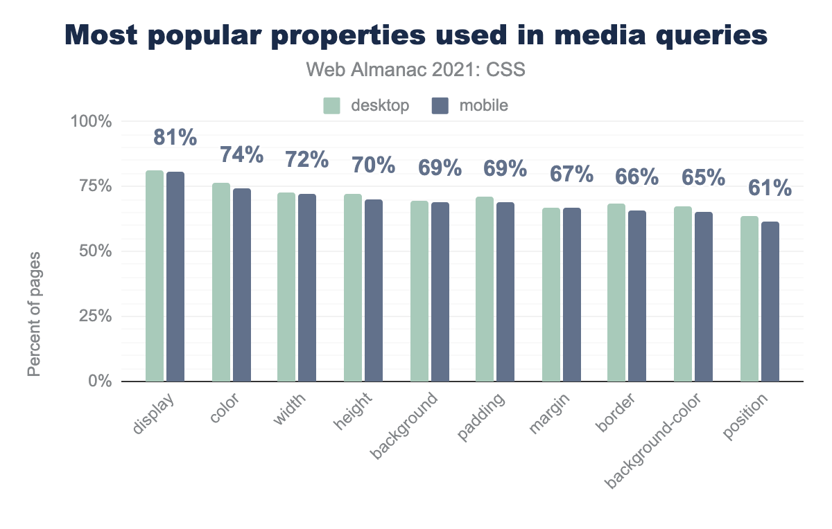
display 81%, color 74%, width 72%, height 70%, background 69%, padding 69%, margin 67%, border 66%, background-color 65%, position 61%.One of the most notable changes between 2020 and 2021 was the fall of font-size as a property set inside media blocks. In 2020, it appeared in 73% of all media blocks, placing fifth on the list. This year, it appeared in around 60% of all media blocks, coming in 12th on the list.
margin-right and margin-top had even bigger falls, going from 8th and 9th to 25th and 17th, respectively. These sorts of shifts strongly imply a change in a common framework or piece of software—a change in the default WordPress theme would be one example, though we cannot say if this is the exact source of the change.
Feature queries
Feature queries (@supports) continue to grow in usage. In 2019, 30% of pages were found to use them, and last year it was 39%. In 2021, almost 48% of pages are using feature queries to decide which CSS to apply in what contexts.
So, what do authors condition CSS upon? Sticky positioning was far and away the most popular query, accounting for over half of all feature queries.
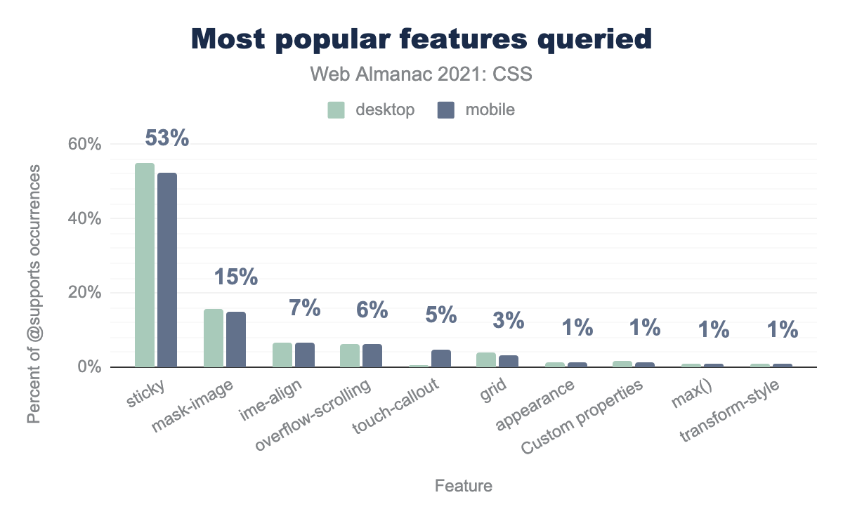
sticky 53%, mask-image 15%, ime-aligh 7%, overflow-scrolling 6%, touch-callout 5%, grid 3%, appearance 1%, custom properties 1%, max() 1%, transform-style 1%.@supports.
Only 3% of feature queries checked for Grid support, which translates to 261,406 pages querying Grid support. Given that we found grid layout in use on 2.7 million mobile pages and 2.3 million desktop pages, if our numbers are accurate, it appears that the vast majority of Grid layouts are deployed without fallbacks.
Custom properties
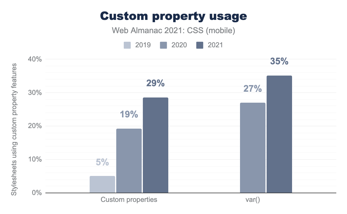
var() value function. Custom properties were used in 5% of stylesheets using custom-property features in 2019, 19.3% in 2020, and 28.6% in 2021. The var() value function was used in 27% of stylesheets using custom-property features in 2020 and 35.2% in 2021. There is no data for 2019 for var().Over the three years of the Web Almanac, custom properties (also known as CSS variables) have seen one of the greatest surges in usage. In 2019, usage was around 5% of all sites, and last year that had shot up to nearly 20% mobile and 15% desktop. This year, we found custom properties being defined on 28.6% of all mobile pages, and 28.3% of desktop pages. Even more, we found that 35.2% of mobile and 35.6% of desktop pages contained at least one var() function value.
Naming
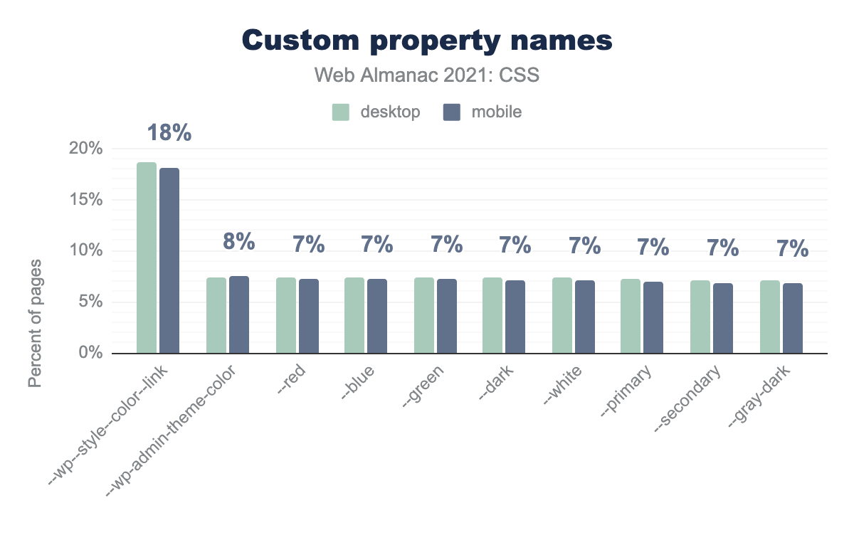
--wp-style--color--link, 18.1%. --wp-admin-theme-color, 7.5%. --red, --blue, and --green are all at 7.2%. --dark and --white are both at 7.1%. --primary and --secondary are at 6.9%. --gray-dark, 6.8%.The first thing we checked was, “What are developers calling their custom properties?” As it turned out, the prevalence of WordPress came out here, with the top entry being a link-coloring custom property defined by the WP core.
After that, a lot of color names were found. It might seem odd that anyone would need to define a custom value for --blue when the named color blue is sitting right there, but in practice, developers are assigning custom shades to their basic color names. So rather than --blue: blue, we see declarations like --blue: #3030EA.
Usage
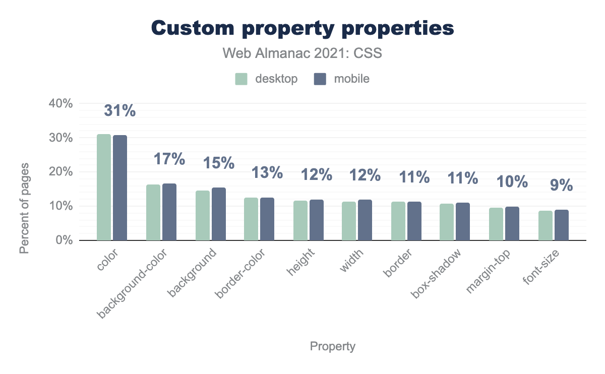
color 31%, background-color 17%, background 15%, border-color 13%, height 12%, width 12%, border 11%, box-shadow 11%, margin-top 10%, font-size 9%.In addition to all the custom properties named after colors, the four most popular properties to be the recipients of custom-property values (using the var() function) are all setting color in one way or another.
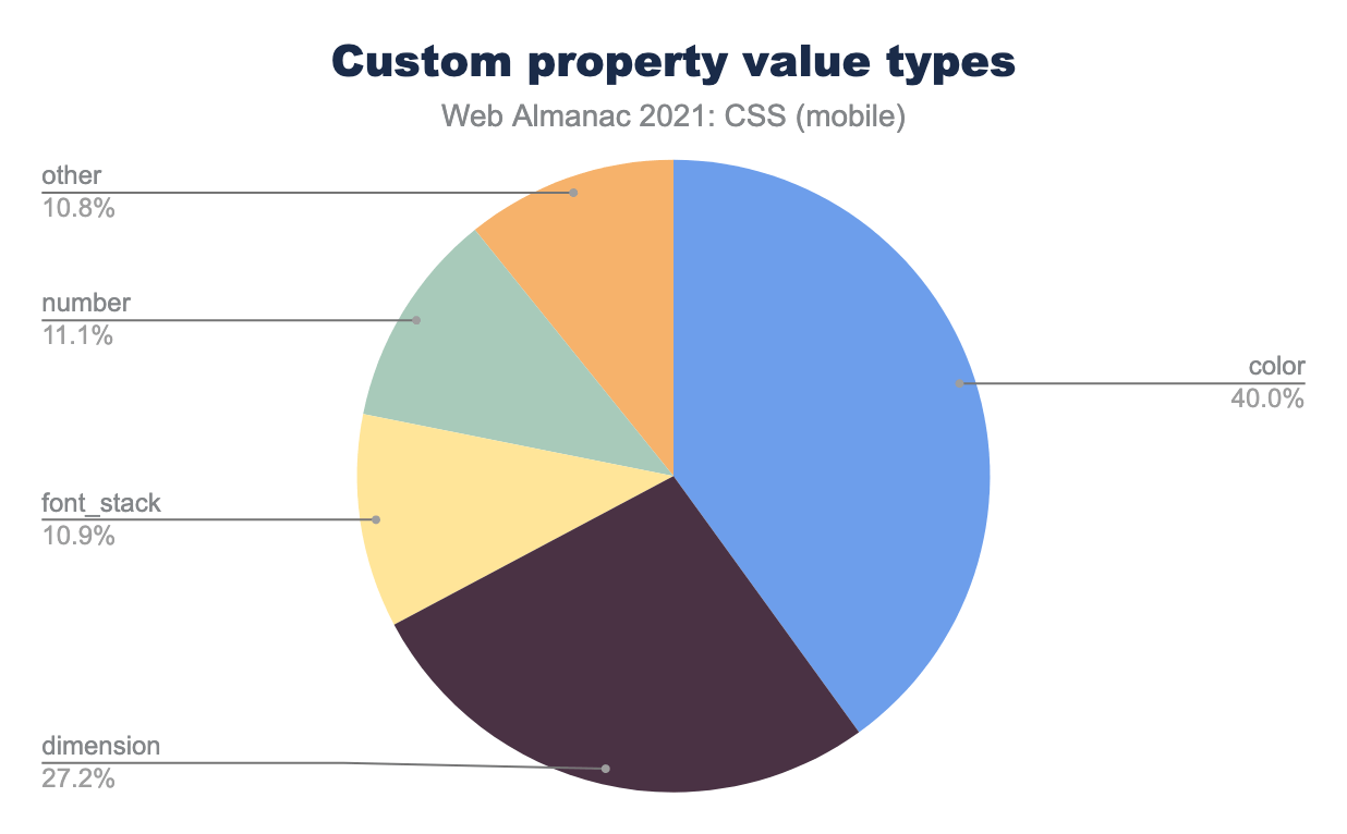
Each custom property gets a CSS value of one type or another. For example, --red: #EF2143 is assigning a color value to --red, whereas --multiplier: 2.5 is assigning a number value. We found that the most popular value type was colors, followed by dimensions (lengths), and then fonts families, whether singly or in groups.
Complexity
It’s possible to include custom properties in the values of other custom properties. Consider this example from the 2020 Web Almanac:
:root {
  --base-hue: 335; /* depth = 0 */
  --base-color: hsl(var(--base-hue) 90% 50%); /* depth = 1 */
  --background: linear-gradient(var(--base-color), black); /* depth = 2 */
}
As the comments in the previous example show, the more of these sub-references are chained together, the greater the depth of the custom property.
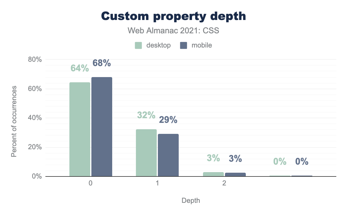
Perhaps unsurprisingly, the clear majority of custom properties had a value depth of zero: they did not include the values of other custom properties in their own values. Nearly a third have one level of depth, and beyond that, there are almost no custom-property values with a depth of two or more.
As in 2020, we also checked the selectors in which custom-property values were used. Almost 60% were set on the root element (using either the :root or html selectors), and around 5% were applied to the <body> element. The rest were applied to some descendant of the root element other than <body>. This means around two-thirds of all custom properties are used as what are, in effect, global constants. This is in line with the results seen last year.
Internationalization
English is written horizontally, and the characters are read from left to right. But for languages such as Arabic, Hebrew and Urdu, among others, are written right to left and then there are languages and scripts—such as Mongolian, Chinese, and Japanese—which can be written in vertical lines, from top to bottom. Owing to this, things can get quite complicated. Both HTML and CSS provide ways to handle this.
Direction
Text direction can be explicitly enforced using the CSS property direction. We found it in use on the <html> element in 11% of all pages, and on the <body> element on 3% of pages. (Note that there may be overlap there, as we did not check for duplicate results.)
Of those pages that used CSS to set direction, 92% of <html> elements and 82% of <body> elements were set to ltr (left-to-right). Overall, we found rtl (right-to-left) used on only 9% of pages that set a direction in CSS. This is more or less to be expected, given that most languages are not right-to-left.
Logical and physical properties
Another CSS feature useful for internationalization are the “logical” properties like margin-block-start, padding-inline-end, and so on, as well as values such as start and end for properties like text-align. These properties and values allow box features to be tied to the direction of text flow, rather than physical directions like top, right, bottom, and so on.
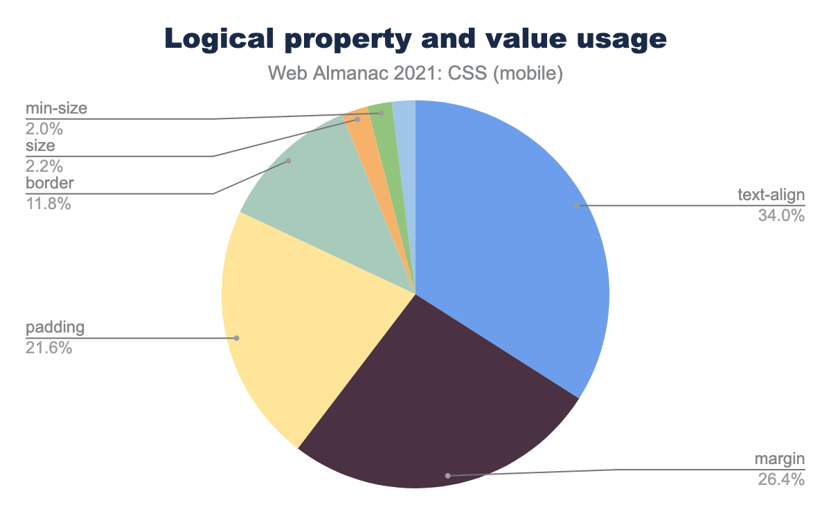
text-align 34%, margin 26.4%, padding 21.6%, border 11.8%, size 2.2%, min-size 2%.As of mid-2021, only 4% of pages were found to be using logical properties of any kind. Of the pages that did, about 33% were using it to set text-align to start or end. Another 46% or so (combined) were setting logical margins and padding. Again, note that there could be overlap in these figures.
Ruby
In addition to directionality and logical features, CSS also offers internationalization support via CSS Ruby, a collection of properties used to affect the layout of interlinear annotation, which are short runs of text alongside the base text. Its usage is vanishingly small: only 8,157 desktop pages and 9,119 mobile pages were found to be using it—less than 0.1% of all pages analyzed.
CSS and JS
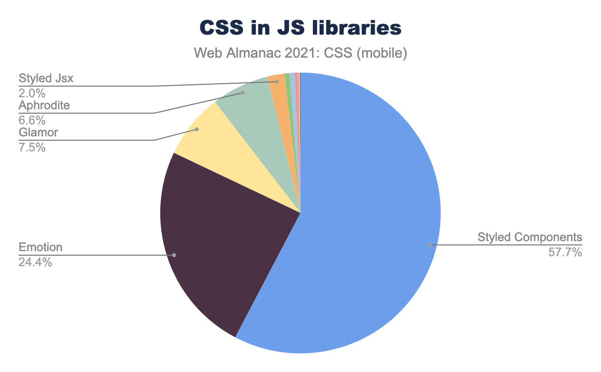
While the topic of “CSS in JS” is good for at least a Twitter flame war or two, its use in the wild continues to be very small. This year, we found that about 3% of pages are using some form of CSS-in-JS, up from 2% in 2020. Furthermore, nearly all of it comes from libraries built for the purpose, and more than half of that usage is from the Styled Components library.
Houdini
In some ways, CSS Houdini represents the opposite of the CSS-in-JS approach: it allows authors to mix a little JS into their CSS. Perhaps in part due to slow implementation (in browsers that aren’t based on Blink) of core parts of the specification, Houdini has struggled to find its feet. We find that it’s effectively not used on the open web in 2021: only 1,030 desktop pages and 1,175 mobile pages show evidence of animated custom properties, a feature of Houdini. This is a threefold increase over the 2020 findings, but it looks like it will still be some time before Houdini finds an audience.
Meta
In this section, we take a look at more generic concepts in CSS, such as how often declarations are repeated or what kinds of mistakes authors make in writing their CSS.
Declaration repetition
In the 2020 Web Almanac, analysis was done to determine the amount of “declaration repetition”—a metric meant to roughly estimate the efficiency of a stylesheet by determining how many declarations used the same property and value, and how many were unique within the page’s styles.
The 2021 figures are in and appear to show a slight drop in the median amount of repetition across all percentiles.
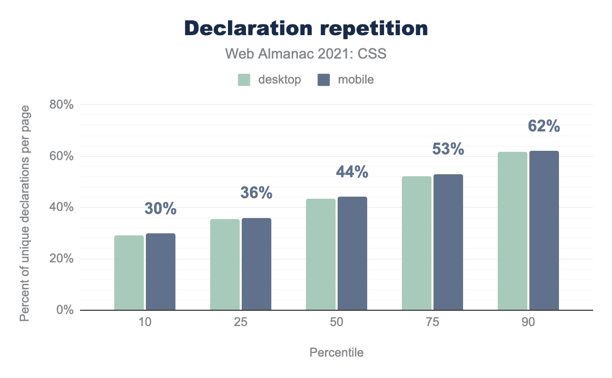
The degree of this drop is on the order of 2% for the 10th, 50th, and 90th percentiles, so it is entirely possible this is statistical noise. The only way to tell would be to continue the analysis in future years and chart the long-term trends.
Shorthands and longhands
There are many parts of CSS where a collection of very specific properties are also covered by a single “umbrella” property that can set the more specific properties’ values in a single declaration. font, for example, encompasses the values of font-family, font-size, line-height, font-weight, font-style, and font-variant. The umbrella property font is what’s called a “shorthand” property, because it allows authors to set a number of things in a kind of shorthand. The corresponding specific properties (e.g., font-family) are referred to as “longhand” properties.
Shorthands before longhands
If an author mixes shorthand properties like background and longhand properties like background-size in a stylesheet, it is always best to have the longhands come after the shorthands. We looked at instances where authors did this to see which longhands were most common.
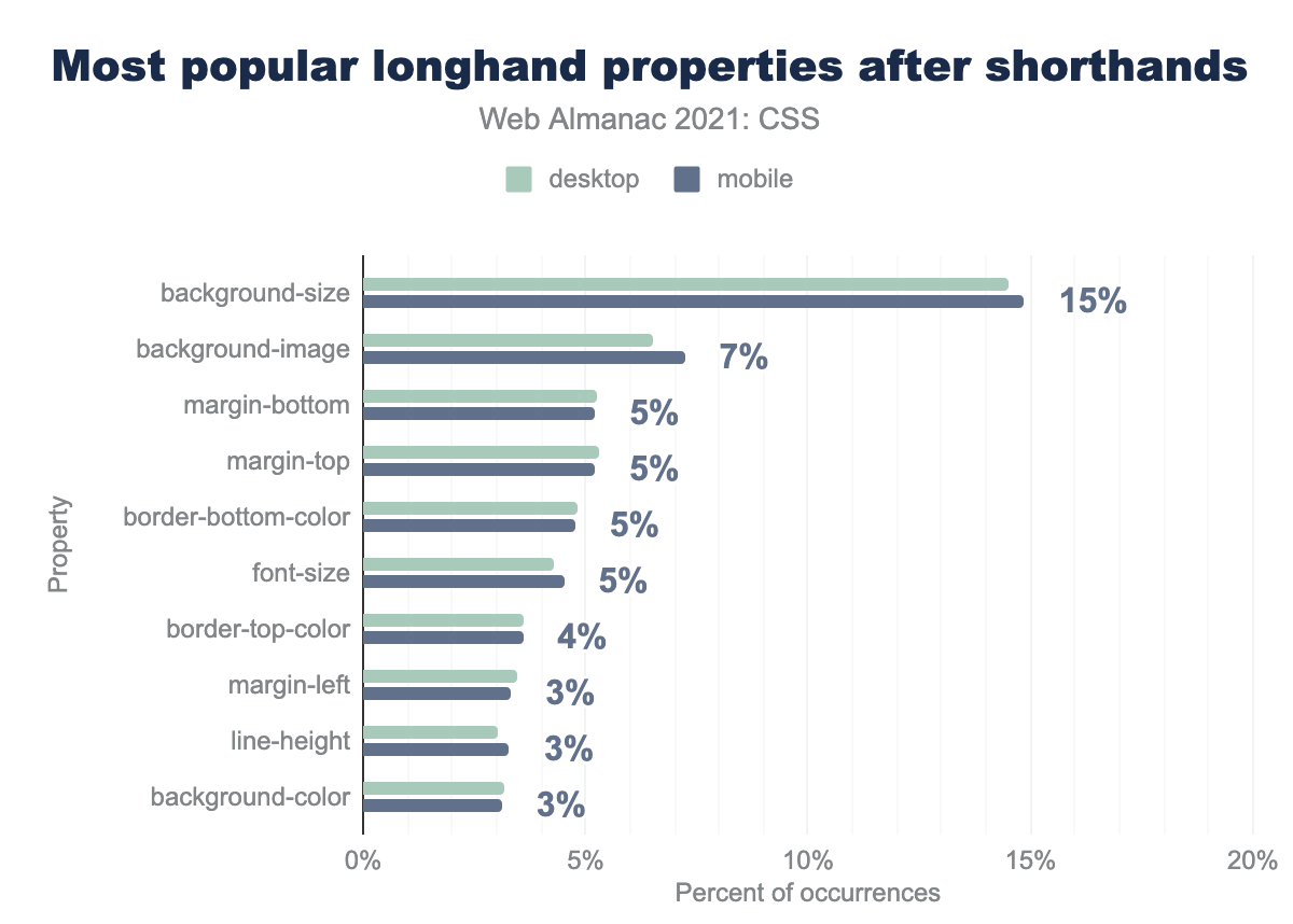
background-size, 15%. background-image, 7%. margin-bottom, margin-top, border-bottom-color, and font size, 5%. border-top-color, 4%. margin-left, line-height, and background-color, 3%. As in 2020, the winner was background-size, although last year it showed up in 41% of such cases on mobile, and this year was seen in only 15% of such cases.
Background
Since background longhand properties were at the top of the previous section’s chart, we turned our attention to the use of background shorthands and longhands.
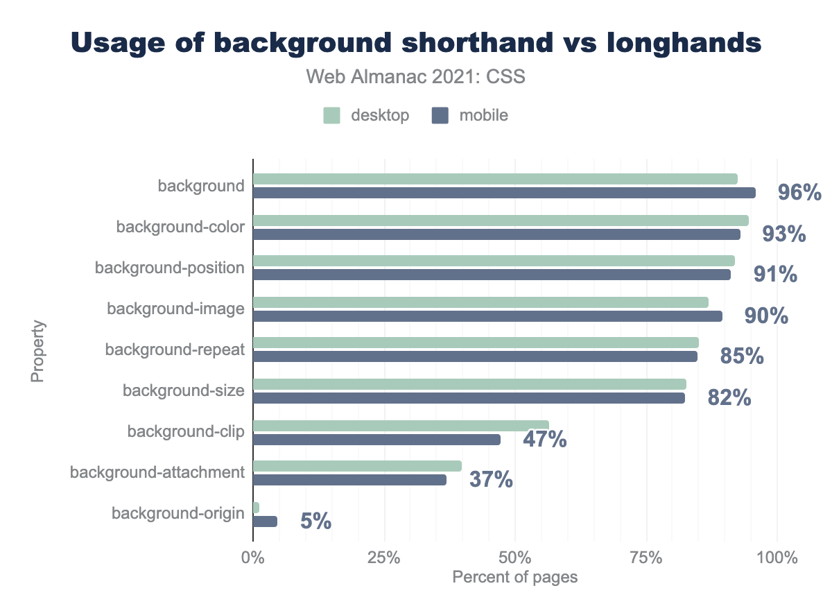
background 96%, background-color 95%, background-position 91%, background-image 90%, background-repeat 85%, background-size 82%, background-clip 47% (with desktop at 56%), background-attachment 37%, background-origin 5% (with desktop nearly 0%).It will come as little surprise that these are used almost universally; if anything, it came as a small surprise that there were any pages that didn’t set them. An overwhelming 96% of pages used the background shorthand, which goes back to CSS1 in 1996. The same went for the longhand properties of the same age, which were found being applied 85% or more of pages.
That said, the much more recent background-size has seen rapid and widespread adoption, appearing in 82% of pages, speaking to its incredible utility to authors. At the other end of the spectrum is background-origin, which dropped from 12% usage last year to just 5% this year.
Margins and paddings
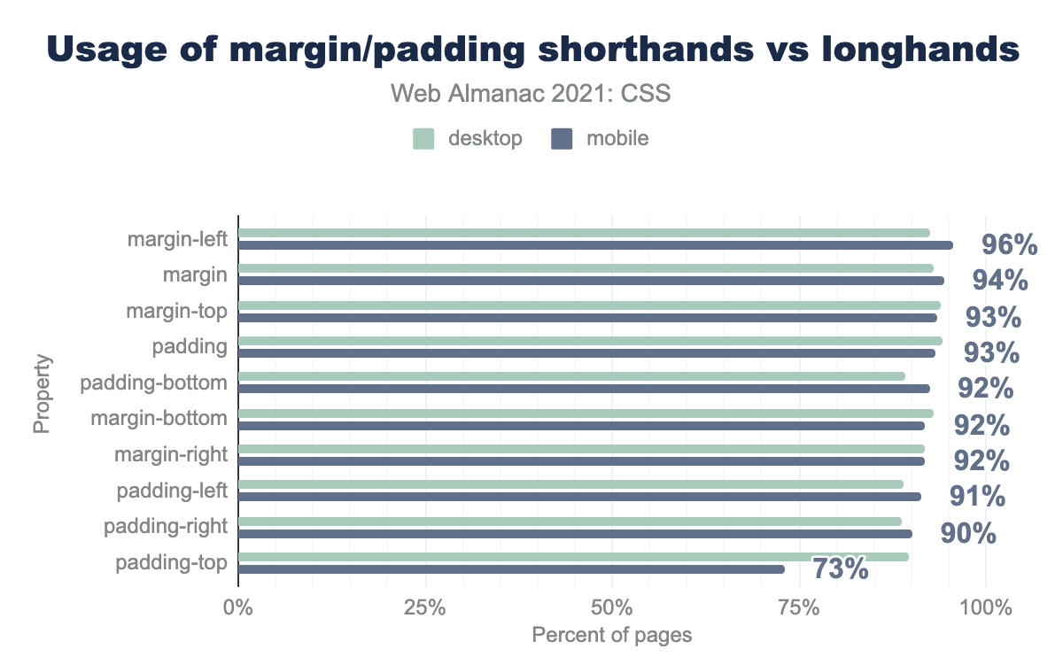
margin-left 96%, margin 9%, margin-top and padding 93%. padding-bottom, margin-bottom, and margin-right, 92%. padding-left 91%, padding-right 90%. padding-top 73% (with desktop at 90%).Moving down the list, we took a look at margin and padding properties. Much as with backgrounds, it’s more a surprise that any pages don’t set these properties than that so many do. What interested us this year was that the longhand margin-left edged out its shorthand counterpart margin to take the top ranking.
Font
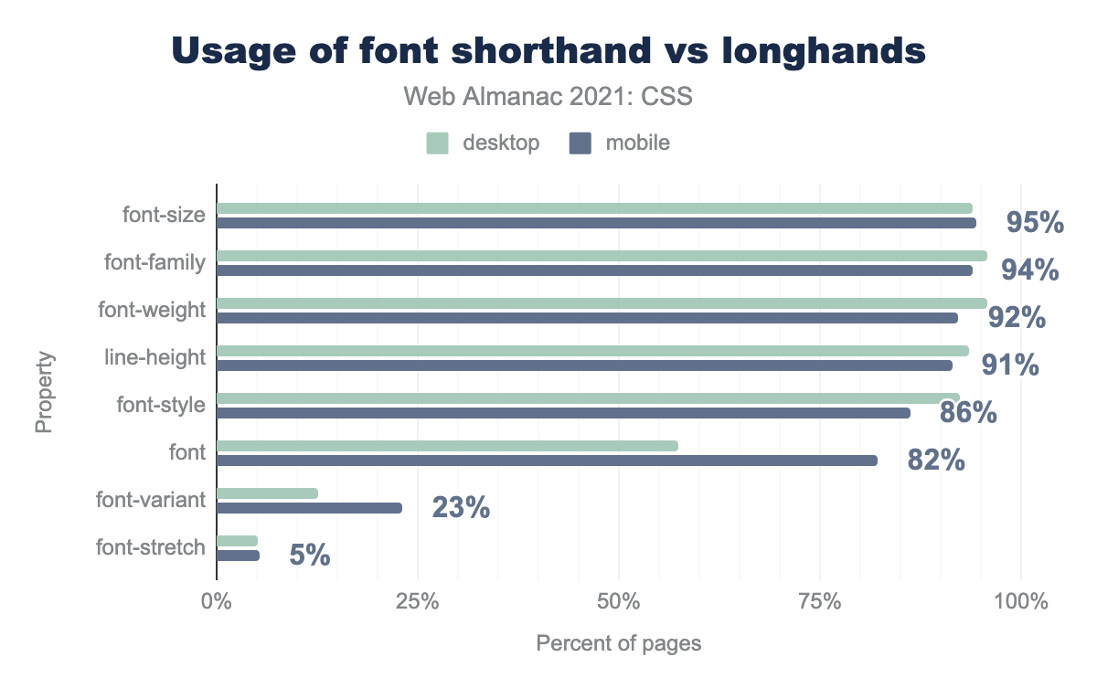
font-size 95%, font-family 94%, font-weight 92%, font-style 86%, font 82% with desktop at 57%, font-variant 23% with desktop at 12%, font-stretch 5%.Just as was the case in 2020, the shorthand font came in behind all of its common longhand counterparts, with font-size leading the way and taking the top spot from last year’s winner, font-weight.
The also-rans here, font-variant and font-stretch, have two very different stories. font-variant has been around since CSS1, but never really caught on with designers, perhaps because for a long time, the only thing you could do with it was set small-caps. Nowadays you can do a lot more with it and downloadable fonts, but authors do not seem to be making use of this capability. Its use dropped significantly this year, down from 43% in 2020 to 23% in 2021.
It’s worth taking a little closer look at font-variant. While it’s used on 23% of mobile pages, the longhand properties that it’s now a shorthand for are barely used at all. Here are the actual number of pages found that use not just font-variant, but each of its corresponding longhands.
| Property | Desktop | Mobile |
|---|---|---|
font-variant |
3,098,211 | 3,641,216 |
font-variant-numeric |
153,932 | 166,744 |
font-variant-ligatures |
107,211 | 112,345 |
font-variant-caps |
81,734 | 86,673 |
font-variant-east-asian |
20,662 | 20,340 |
font-variant-position |
5,198 | 5,842 |
font-variant-alternates |
4,876 | 5,511 |
font-variant properties.
Does this mean authors are only using the shorthand, and ignoring the longhands? That probably accounts for a lot of the existing usage, but the steep decline in use of font-variant since last year makes us wonder if a common framework or tool dropped font-variant from its default styles. Either way, authors may be missing out on a lot of font features that are widely supported.
The other low scoring property, font-stretch, is heavily dependent on both font families having wide or narrow faces available and authors choosing (or knowing) to make use of them, so its 5% share (down from 8% last year) comes as little surprise.
Flexbox
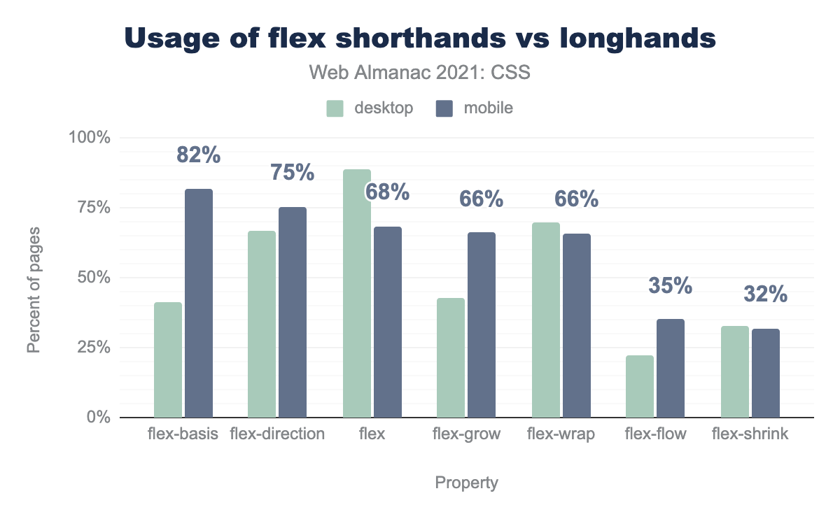
flex-basis, 35% desktop and 82% mobile. flex-direction, 90% desktop and 75% mobile. flex, 89% desktop and 68% mobile. flex-grow, 43% desktop and 66% mobile. flex-wrap, 70% desktop and 66% mobile. flex-flow, 23% desktop and 35% mobile. flex-shrink, 32% for both desktop and mobile.Some of the Flexbox longhand and shorthand properties have had a turbulent history; for example, the CSS Flexbox specification itself recommends that authors avoid using flex-grow, flex-shrink, and flex-basis and use the flex shorthand instead. This ensures that unset properties have sensible values. Unfortunately, this doesn’t seem to be bearing out in the wild, where flex-basis is used more often on mobile pages than is flex, by a margin of more than 10%.
It must be noted that there is a great deal of volatility in these figures as compared to last year’s, such as flex-basis doubling in usage on mobile while not really shifting on desktop. This could be due to changes in a common framework used in mobile development, or it could be some other factor.
Grid
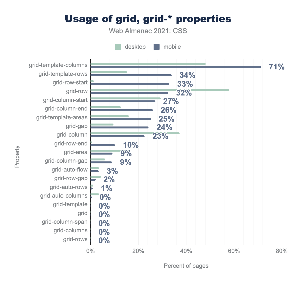
grid-template-columns 71%, grid-template-rows 34%, grid-row-start 33%, grid-row 32%, grid-column-start 27%, grid-column-end 26%, grid-template-areas 25%, grid-gap 24%, grid-column 23%, grid-row-end 10%, grid-area 9%, grid-column-gap 9%, grid-auto-flow 3%, grid-row-gap 2%, grid-auto-rows 1%. The following are all at 0%: grid-auto-column, grid-template, grid, grid-column-span, grid-columns, grid-rows.The pattern observed in past years is that Grid shorthand properties (grid-template, grid, etc.) are used far less often than the longhand properties they encompass. In fact, both come in at a staggering 0%, right next to each other in the rankings. The rest of the shorthands are all clustered with them, while longhand properties like grid-template-rows and grid-column enjoy widespread use. In fact, the only longhand property of any notable usage is grid-gap, with 24% usage on mobile Grid pages. It will be interesting to see if the more recent, and generic, gap will overtake grid-gap in years to come.
CSS mistakes
Sometimes, one can learn as much from a mistake as from a success. We took the opportunity to look for not just common errors, but things that looked like they should be correct, but weren’t.
Unrecoverable syntax errors
This year’s parsing run, which as in 2020 uses the Rework CSS parser, yielded more heartening numbers. Just 0.94% of desktop pages and 0.55% of mobile pages contained an unrecoverable error—that is, an error so bad, it made parsing the entirety of the stylesheet with Rework impossible. There certainly may have been a much greater number of pages with small, recoverable CSS errors, but the unrecoverable-error figures this year are a great deal lower than last year. This may easily indicate a change in Rework, as opposed to a sudden outbreak of syntax cleanup in the wild.
Nonexistent properties
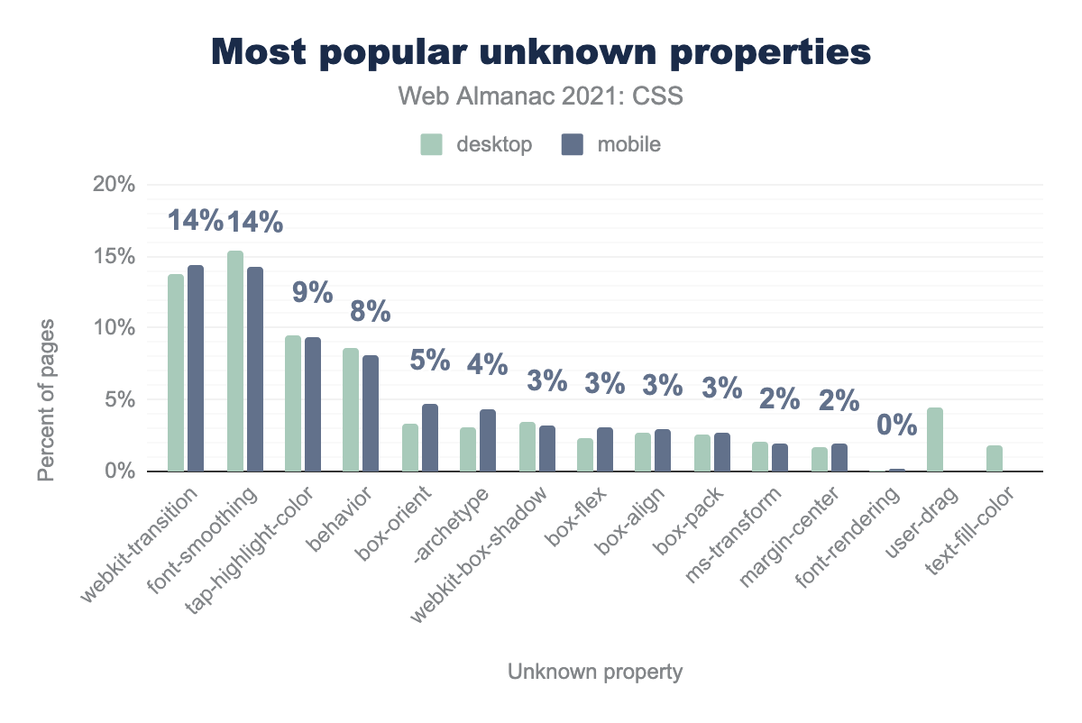
webkit-transition 14%, font-smoothing 14%, tap-highlight-color 9%, behavior 8%, box-orient 5%, -archetype 4%. webkit-box-orient, box-flex, box-align, and box-pack are all 3%. ms-transform and margin-center are both 2%. font-rendering, user-drag, and text-fill-color are all just above 0%.One of the things we like to check for is the existence of declarations that are syntactically valid, but use properties that don’t actually exist. This doesn’t count vendor-prefixed properties, but does include malformed vendor-prefixed properties. Indeed, the most widespread non-existent property we found was webkit-transition (which lacks the - at the beginning needed for a proper vendor prefix), appearing on 14% of all pages that contained a nonexistent property. Essentially tied with that was font-smoothing, an unprefixed version of -webkit-font-smoothing that does not actually exist, nor is it likely to any time soon.
Longhands before shorthands
In the previous section of this chapter, we looked at which longhand properties were most likely to appear after the corresponding shorthand property (e.g., background being followed by background-size at some point).
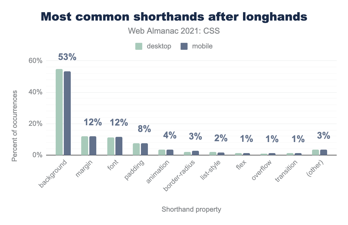
background 53%, margin 12%, font 12%, padding 8%, animation 4%, border-radius 3%, list-style 2%, flex 1%, overflow 1%, transition 1%, all others 3%Doing things the other way around, putting a shorthand after a longhand, is a depressingly common mistake, and it happens most often with background properties. In all the cases where a longhand was followed by a corresponding shorthand, a background longhand property was overwritten by the values in the background shorthand property.
Sass
One of the great advantages of CSS preprocessors is that they can reveal what’s missing in CSS itself, and can thus be a guide to how CSS should be extended in the future. This has already happened before, with variables being so popular in preprocessors that CSS eventually added custom properties to its repertoire. Other features of preprocessors, like color modifications and nested selectors, are also finding their way into the base language. This is why we devote a section of this chapter to seeing how developers are using Sass, one of the most popular preprocessors on the web today.
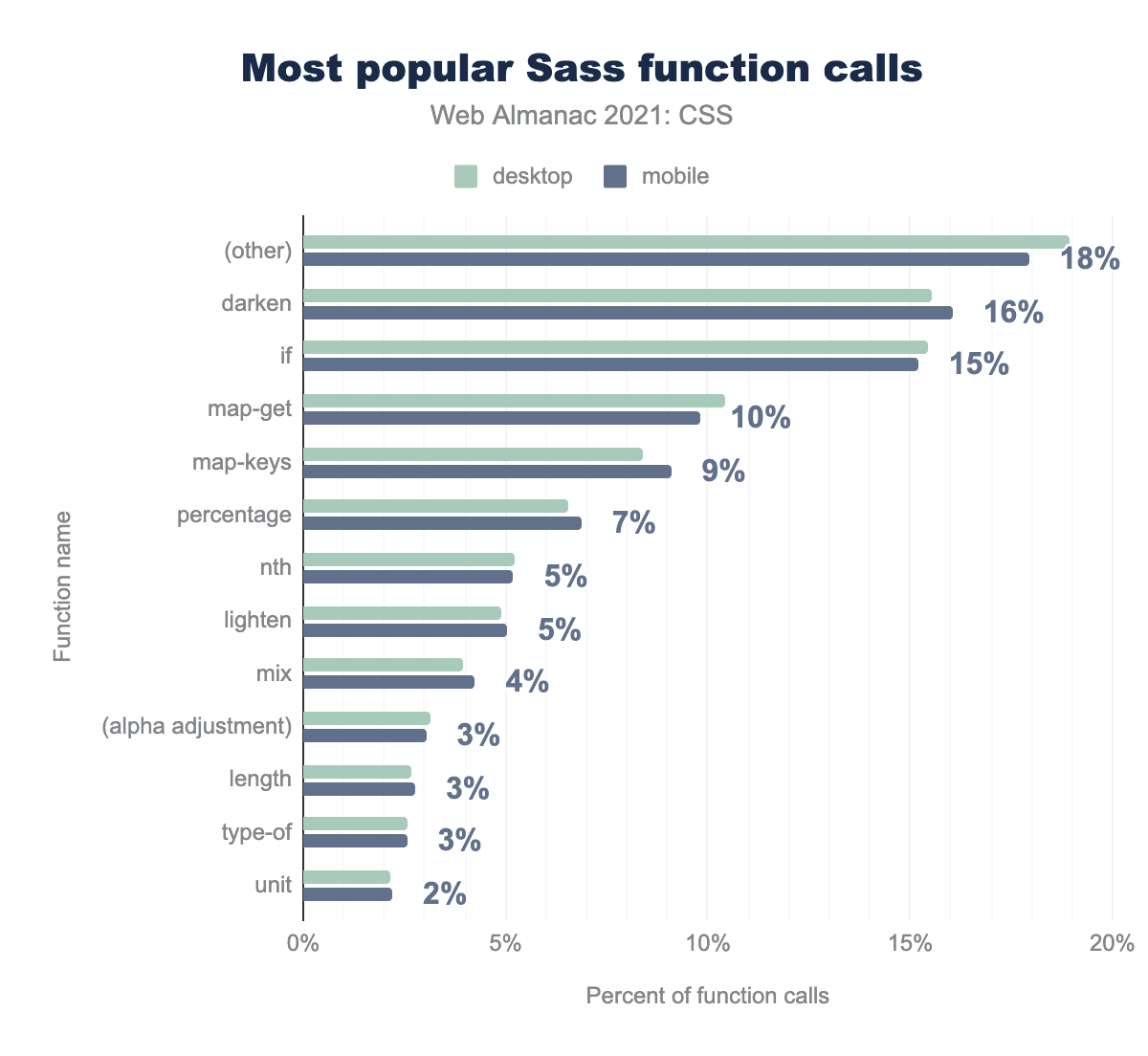
darken 16%, if 15%, map-get 10%, map-keys 9%, percentage 7%, nth 5%, lighten 5%, mix 4%, (alpha adjustment) 3%, length 3%, type-of 3%, unit 2%.The Sass functions we found in use largely mirrored those found in the 2020 Web Almanac, albeit with some changes in the specific percentages. When classified by type, we found that 28% of all Sass functions were those that modify colors (e.g., darken, mix) and a further 6% were used to read color components (e.g., alpha, blue).
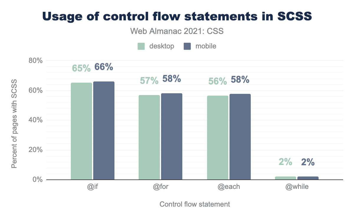
@if 66%, @for 58%, @each 58%, @while 2%.The desire for conditional behavior can be seen in the fact that the if() function placed third on the list, at 15% of all Sass functions.
This same desire can be seen even more clearly in the use of Sass’s flow control structures, like @if. Literally two-thirds of all Sass stylesheets use @if, and more than half use @for or @each (or both). This popular capability was recently added to CSS. By contrast, only 2% use the @while structure.
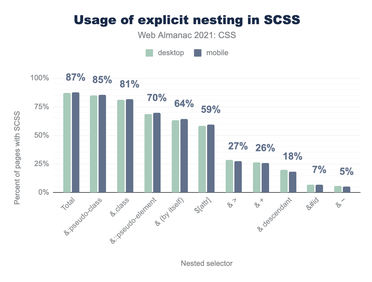
@:pseudo-class 85%, &.class 81%, &::pseudo-element 70%, & (by itself) 64%, $[attr] 59%, & > 27%, & + 26%, & descendant 18%, &#id 7%, & - 5%.Another of Sass’s major draws is the ability to nest rules inside other rules and thus avoid having to write repetitive selector patterns. This capability is under development for native CSS, and our analysis shows why: 87% of all Sass stylesheets use a detectable form of rule nesting. Implicit nesting, which does not require special characters, was not measured.
Conclusion
In the end, the 2021 Web Almanac tells the story of a technology that’s stable but still evolving. We saw very few instances of major shifts between last year’s Almanac and this year’s—some practices and web features are clearly growing, while others are beginning to fade, but overall, there was a very strong sense of continuity.
Does this mean CSS has become stagnant? Hardly: new layout methods are gaining ground, and major new capabilities are being developed, many of them based on practices worked out in the realm of preprocessors. We would not think to claim that CSS is “solved” or that the best possible practices have already been worked out. As practitioners gain ever more experience, changes will come to both CSS the language and CSS the practice. These changes may be gradual rather than sudden, steady rather than disruptive, but this is what we expect in any mature technology.
We look forward to seeing how CSS will grow over the years to come.

