Performance

Introduction
Web performance is crucial to user experience. We’ve all bounced from a site due to slow load times, or worse, have not been able to access important information. Additionally, numerous case studies have demonstrated that an improvement in web performance results in an improvement in conversion and engagement for businesses. Surprisingly, the industry spotlight is quite elusive for web performance—why is this? Some may say web performance is tough to define and even more challenging to measure.
How do we measure something that is hard to define in the first place? As Sergey Chernyshev, creator of UX Capture, says, “The best way to measure performance is to be embedded into the user’s brain to understand exactly what they’re thinking as they use the site”. We can’t—and shouldn’t in case that was unclear—do this, so what are our options?
Thankfully, there’s a way to measure some aspects of performance automatically! We know the browser is in charge of loading a page, and it goes through a checklist of steps each time. Depending on which step the browser is on, we can tell how far along the site is in the page load process. Conveniently, a number of performance timeline APIs are used to fire off timestamps when the browser gets to certain page load steps.
It’s important to note that these metrics are only our best guess at how to gauge user experience. For example, just because the browser fired an event that an element has been painted onto the screen, does that always mean it was visible to the user at that time? Additionally, as the industry grew, more and more metrics showed up while some became deprecated. It can be complicated to know where to start and understand what performance metrics are telling us about our users, especially for folks newer to the field.
This chapter focuses on Google’s solution to the problem: Core Web Vitals (CWV), web performance metrics introduced in 2020 and made a signal in search ranking during 2021. Each of the three metrics covers an important area of user experience: loading, interactivity, and visual stability. The public Chrome UX Report (CrUX) dataset is Chrome’s view of how websites are performing on CWV. There’s zero setup on the developer’s part; Chrome automatically collects and publishes data from eligible websites, for users who have opted in. Using this dataset, we’re able to get insights into the web’s performance over time.
Although the spotlight of this chapter, it’s important to note that CWV are relatively new to the field and not the only way to measure web performance. We chose to focus on these metrics because the search ranking influence was effective almost exactly one year ago, and this year’s data gives us insights on how the web is adjusting to this major shift in the industry and where room for opportunity might still exist. CWV are a common baseline that allows performance to be loosely comparable across sites, but it’s up to site owners to determine which metrics and strategies are best for their sites. As much as we wish otherwise, there’s no way to fit the entire history of the industry or all the different ways to evaluate performance in one chapter.
The CWV program suggests a clearly defined approach to measuring how users actually experience performance—a first for the industry. Are CWV the answer to helping the web become more performant? This chapter examines where the web is currently with CWV and takes a look into the future.
Core Web Vitals
Now that it’s been a year since CWV were added as a ranking signal in Google Search, let’s see how the program may have influenced user experiences on the web.
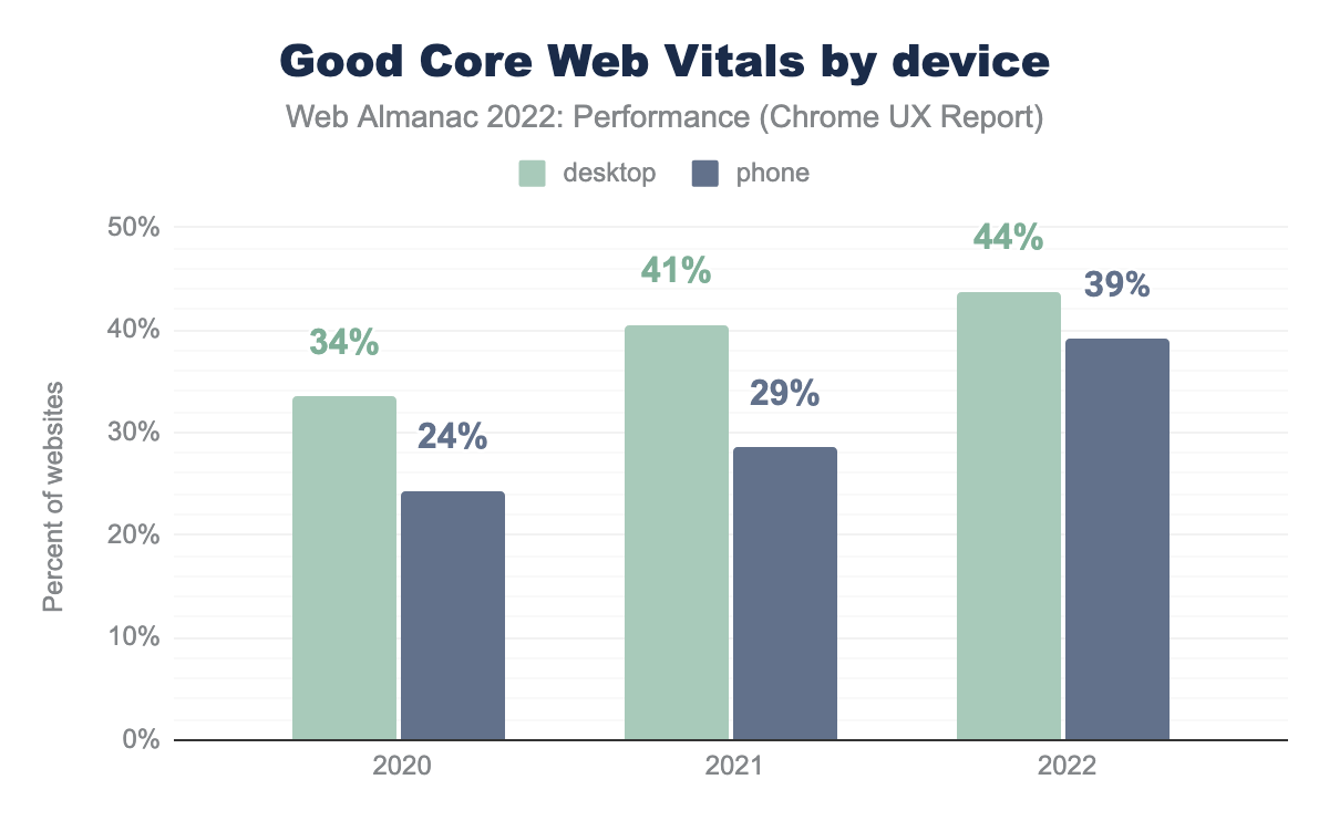
In 2021, 29% of websites were assessed as having good CWV for mobile users. This was a significant step up from 2020, representing a 5 percentage point increase. However, the progress in 2022 was an even bigger leap forward, now with 39% of websites having good CWV on mobile—representing a further 10 point increase!
44% of websites have good CWV on desktop. While this is better than mobile, the rate of improvement for desktop experiences is not as rapid as mobile, so the gap is closing.
There are a few possible explanations for why mobile experiences tend to be worse than desktop. While the portability of a pocket-sized computer is a great convenience, it may have adverse effects on the user experience. As described in the Mobile Web chapter, the smaller form factor has an impact on the amount of processing power that can be packed in, which is further constrained by the high cost to own more powerful phones. Devices with poorer processing capabilities take longer to perform the computations needed to render a web page. The portability of these devices also means that they can be taken into areas with poor connectivity, which hinders websites’ loading speeds. One final consideration is the way that developers decide how to build websites. Rather than creating a mobile-friendly version of the page, some websites may be serving desktop-sized images or unnecessary amounts of scripting functionality. All of these things put mobile users at a disadvantage compared to desktop users and may help to explain why their CWV performance is lower.
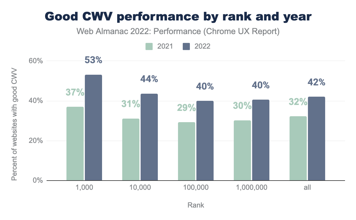
Many more websites were assessed as having good CWV in 2022 relative to 2021. But how evenly distributed was that improvement across the web?
We segmented sites by their relative popularity (rank) and year, without distinguishing between desktop and mobile. What’s interesting is that it seems websites across the board generally got more performant this year, regardless of their popularity. The top 1,000 most popular websites improved most significantly, a 16 percentage point increase to 53%, with all ranks improving by 10 points or more. The most popular websites also tend to have the best CWV experience, which is not too surprising if we assume that they have bigger engineering teams and budgets.
To better understand why mobile experiences have gotten so much better this year, let’s dive deeper into each individual CWV metric.
Largest Contentful Paint (LCP)
Largest Contentful Paint (LCP) is the time from the start of the navigation until the largest block of content is visible in the viewport. This metric represents how quickly users are able to see what is likely the most meaningful content.
We say that a website has good LCP if at least 75 percent of all page views are faster than 2,500 ms. Of the three CWV metrics, LCP pass rates are the lowest, often making it the bottleneck to achieving good CWV assessments.

This year, 51% of websites have good LCP experiences on mobile and 63% on desktop. LCP appears to be one of the major reasons why websites’ mobile experiences have gotten so much better in 2022, having a 6 percentage point improvement this year.
Why did LCP improve so much this year? To help answer that, let’s explore a couple of loading performance diagnostic metrics: TTFB and FCP.
Time to First Byte (TTFB)
Time to First Byte (TTFB) is the time from the start of the navigation to the first byte of data returned to the client. It’s our first step in the web performance checklist, representing the backend component of LCP performance, particularly network connection speeds and server response times.
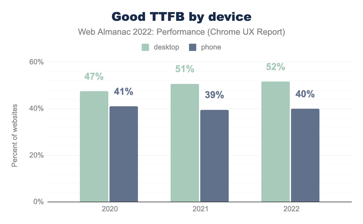
As an aside, note that earlier this year Chrome changed the threshold for “good” TTFB from 500 ms to 800 ms. In the chart above, all historical data is using this new threshold for comparison purposes.
With that in mind, the percentage of websites having good TTFB has not actually improved very much. In the past year, websites’ desktop and mobile experiences have gotten one percentage point better, which is nice but doesn’t account for the gains observed to LCP. While this doesn’t rule out improvements to the “needs improvement” and “poor” ends of the TTFB distribution, the “good” end is what matters most.
Another complication is that TTFB is still considered to be an experimental metric in CrUX. According to the CrUX documentation, TTFB does not factor in more advanced navigation types like pre-rendered and back/forward navigations. This is somewhat of a blind spot, so if there were improvements in these areas, they wouldn’t necessarily affect the TTFB results.
First Contentful Paint (FCP)
First Contentful Paint (FCP) is the time from the start of the request to the first meaningful content painted to the screen. In addition to TTFB, this metric can be affected by render-blocking content. The threshold for “good” FCP is 1,800 ms.
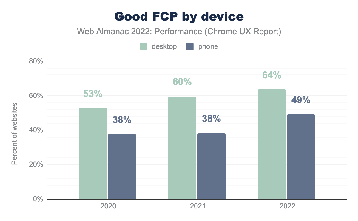
FCP improved dramatically this year, with 49% of websites having good mobile experiences and 64% for desktop. This represents an 11 and 4 percentage point increase for mobile and desktop, respectively.
In the absence of TTFB data to the contrary, this indicates that there were major improvements to frontend optimizations, like eliminating render-blocking resources or better resource prioritization. However, as we’ll see in the following sections, it seems like there may have been something else entirely to thank for the LCP improvements this year.
LCP metadata and best practices
These performance improvements may not actually be due to changes to the websites themselves. Changes to network infrastructure, operating systems, or browsers could also impact LCP performance at web-scale like this, so let’s dig into some heuristics.
Render-blocking resources
A page is considered to have render-blocking resources if resources hold up the initial paint (or render) of the page. This is particularly likely for critical scripts and styles that are loaded over the network. Lighthouse includes an audit that checks for these resources, which we’ve run on the home page of each website in CrUX. You can learn more about how we test these pages in our Methodology.
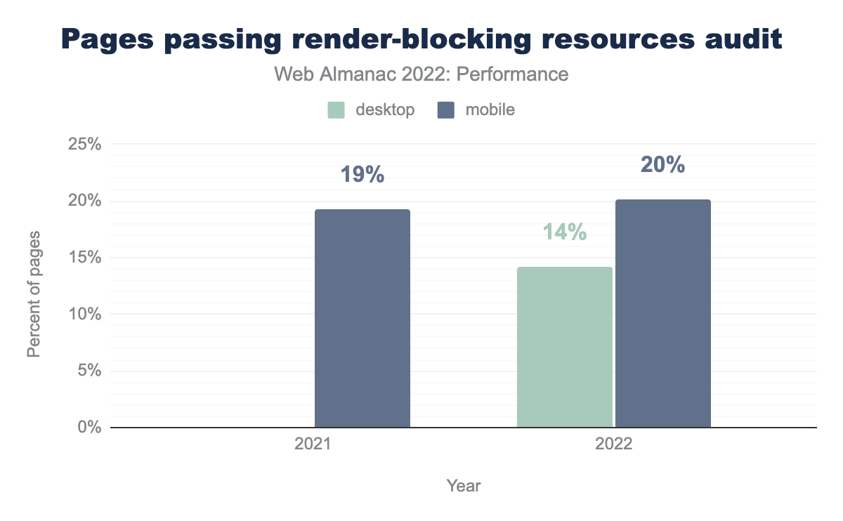
Surprisingly, there was no dramatic improvement in the percent of pages that have render-blocking resources. Only 20% of mobile pages pass the audit, which is a mere 1 percentage point increase over last year.
2022 is the first year in which we have Lighthouse data for desktop. So while we’re unable to compare it against previous years, it’s still interesting to see that many fewer desktop pages pass the audit relative to mobile, in spite of the trend of desktop pages tending to have better LCP and FCP performance.
LCP content types
The LCP element can be a number of different types of content, like an image, a heading, or a paragraph of text.
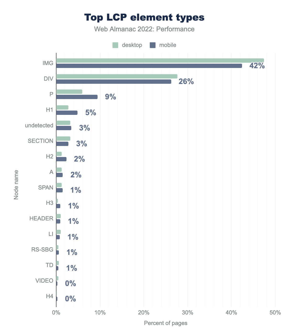
IMG is the LCP element on 47% of desktop pages and 42% of mobile pages, DIV on 28% and 26% respectively, P on 6% and 9%, H1 on 3% and 5%, undetected on 3% and 3%, SECTION on 3% and 3%, H2 on 1% and 2%, A on 1% and 2%, SPAN on 1% and 1%, H3 on 0% and 1%, HEADER on 1% and 1%, LI on 1% and 1%, RS-SBG on 1% and 1%, TD on 1% and 1%, VIDEO on 0% and 0%, and finally H4 is the LCP element type on 0% of both desktop and mobile pages.It’s clear that images are the most common type of LCP content, with the img element representing the LCP on 42% of mobile pages. Mobile pages are slightly more likely to have heading and paragraph elements be the LCP than desktop pages, while desktop pages are more likely to have image elements as the LCP. One possible explanation is the way that mobile layouts—especially in portrait orientation—make images that are not responsive appear smaller, giving way to large blocks of text like headings and paragraphs to become the LCP elements.
The second most popular LCP element type is div. This is a generic HTML container that could be used for text or styling background images. To help disambiguate how often these elements contain images or text, we can evaluate the url property of the LCP API. According to the specification, when this property is set, the LCP content must be an image.
We see that 72% of mobile pages and 82% of desktop pages have images as their LCP. For example, these images may be traditional img elements or CSS background images. This suggests that the vast majority of the div elements seen in the previous figure are images as well. 26% of mobile pages and 17% of desktop pages have text-based content as their LCP.
1% of pages actually use inline images as their LCP content. This is almost always a bad idea for a number of reasons, mostly around caching and complexity.
LCP prioritization
After the HTML document is loaded, there are two major factors that affect how quickly the LCP resource itself can be loaded: discoverability and prioritization. We’ll explore LCP discoverability later, but first let’s look at how LCP images are prioritized.
Images are not loaded at high priority by default, but thanks to the new Priority Hints API, developers can explicitly set their LCP images to load at high priority to take precedence over non-essential resources.
fetchpriority=high on their LCP element.
0.03% of pages use fetchpriority=high on their LCP elements. Counterproductively, a handful of pages actually lower the priority over their LCP images: 77 pages on mobile and 104 on desktop.
fetchpriority is still very new and not supported everywhere, but there’s little to no reason why it shouldn’t be in every developer’s toolbox. Patrick Meenan, who helped develop the API, describes it as a “cheat code” given how easy it is to implement relative to the potential improvements.
LCP static discoverability
Ensuring an LCP image is discovered early is key to the browser loading it as soon as possible. Even the prioritization improvements that we discussed above, cannot help if the browser does not know it needs to load the resource until later.
An LCP image is considered to be statically discoverable if its source URL can be parsed directly from the markup sent by the server. This definition includes sources defined within picture or img elements as well as sources that are explicitly preloaded.
One caveat is that text-based LCP content is always statically discoverable based on this definition. However, text-based content may sometimes depend on client-side rendering or web fonts, so consider these results as lower bounds.
<img data-src="kitten.jpg" class="lazyload">Custom lazy-loading techniques like the example above are one way that images are prevented from being statically discoverable, since they rely on JavaScript to update the src attribute. Client-side rendering may also obscure the LCP content.
39% of mobile pages have LCP elements that are not statically discoverable. This figure is even worse on desktop at 44% of pages, potentially as a consequence of the previous section’s finding that LCP content is more likely to be an image on desktop pages.
This is the first year that we’re looking at this metric, so we don’t have historical data for comparison, but these results hint at a big opportunity to improve the load delay of LCP resources.
LCP preloading
When the LCP image is not statically discoverable, preloading can be an effective way to minimize the load delay. Of course, it would be better if the resource was statically discoverable to begin with, but addressing that may require a complex rearchitecture of the way the page loads. Preloading is somewhat of a quick fix by comparison, as it can be implemented with a single HTTP header or meta tag.
Only about 1 in 200 mobile pages preload their LCP images. This figure falls to about 1 in 400 (0.25%) when we only consider pages whose LCP images are not statically discoverable.
Preloading statically discoverable images might be considered overkill, as the browser should already know about the image thanks to its preload scanner. However, it can help load critical images earlier above other statically discoverable images that may be earlier in the HTML—for example header images or mega menu images. This is especially true for browsers that do not support fetchpriority.
These results show that the overwhelming majority of the web could benefit from making their LCP images more discoverable. Loading LCP images sooner, either by making them statically discoverable or preloading them, can go a long way to improving LCP performance. But as with all things related to performance, always experiment to understand what’s best for your specific site.
LCP initiator
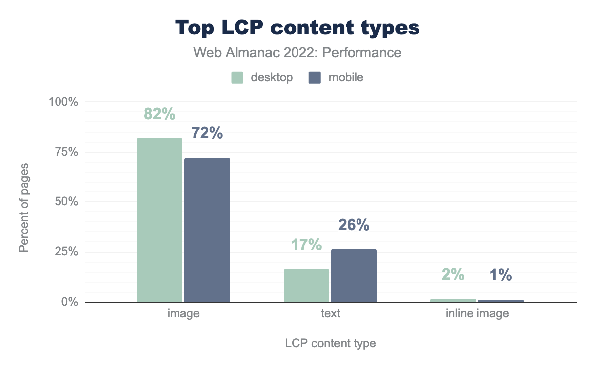
When an LCP resource is not statically discoverable, there must be some other, more convoluted process by which it gets discovered.
html is the initiator on 29% of desktop and 28% of mobile pages, css on 11% and 9% respectively, unknown on 5% and 4%, and finally other is the initiator on 0% of both desktop and mobile pages.27% of mobile pages have LCP images that are discovered in the HTML after the preload scanner has already run, typically due to script-based lazy-loading or client-side rendering.
8% of mobile pages depend on an external stylesheet for their LCP resource, for example using the background-image property. This adds a link in the resource’s critical request chain and may further complicate LCP performance if the stylesheet is loaded cross-origin.
4% of mobile pages have an undiscoverable LCP initiator whose type we’re unable to detect. These may be a combination of HTML and CSS initiators.
Both script- and style-based discoverability issues are bad for performance, but their effects can be mitigated with preloading.
LCP lazy-loading
Lazy-loading is an effective performance technique to delay when non-critical resources start loading, usually until they’re in or near the viewport. With precious bandwidth and rendering power freed up, the browser can load critical content earlier in the page load. A problem arises when lazy-loading is applied to the LCP image itself, because that prevents the browser from loading it until much later.
loading=lazy on it.
Nearly 1 in 10 of pages with img-based LCP are using the native loading=lazy attribute. Technically, these images are statically discoverable, but the browser will need to wait to start loading them until it’s laid out the page to know whether they will be in the viewport. LCP images are always in the viewport, by definition, so in reality none of these images should have been lazy-loaded. For pages whose LCP varies by viewport size or initial scroll position from deep-linked navigations, it’s worth testing whether eagerly loading the LCP candidate results in better overall performance.
Note that the percentages in this section are out of only those pages in which the img element is the LCP, not all pages. For reference, recall that this accounts for 42% of pages.
As we showed earlier, one way that sites might polyfill the native lazy-loading behavior is to assign the image source to a data-src attribute and include an identifier like lazyload in the class list. Then, a script will watch the positions of images with this class name relative to the viewport, and swap the data-src value for the native src value to trigger the image to start loading.
Nearly as many pages are using this kind of custom lazy-loading behavior as native lazy-loading, at 8.8% of pages with img-based LCP.
Beyond the adverse performance effects of lazy-loading LCP images, native image lazy-loaded is supported by all major browsers, so custom solutions may be adding unnecessary overhead. In our opinion, while some custom solutions may provide more granular control over when images load, developers should remove these extraneous polyfills and defer to the user agent’s native lazy-loading heuristics.
Another benefit to using native lazy-loading is that browsers like Chrome are experimenting with using heuristics to ignore the attribute on probable LCP candidates. This is only possible with native lazy-loading, so custom solutions would not benefit from any improvements in this case.
Looking at pages that use either technique, 18% of pages with img-based LCP are unnecessarily delaying the load of their most important images.
Lazy-loading is a good thing when used correctly, but these stats strongly suggest that there’s a major opportunity to improve performance by removing this functionality from LCP images in particular.
WordPress was one of the pioneers of native lazy-loading adoption, and between versions 5.5 and 5.9, it didn’t actually omit the attribute from LCP candidates. So let’s explore the extent to which WordPress is still contributing to this anti-pattern.
According to the CMS chapter, WordPress is used by 35% of pages. So it’s surprising to see that 72% of pages that use native lazy-loading on their LCP image are using WordPress, given that a fix has been available since January 2022 in version 5.9. One theory that needs more investigation is that plugins may be circumventing the safeguards built into WordPress core by injecting LCP images onto the page with the lazy-loading behavior.
Similarly, a disproportionately high percentage of pages that use custom lazy-loading are built with WordPress at 54%. This hints at a wider issue in the WordPress ecosystem about lazy-loading overuse. Rather than being a fixable bug localized to WordPress core, there may be hundreds or thousands of separate themes and plugins contributing to this anti-pattern.
LCP size
A major factor in the time it takes to load the LCP resource is its size over the wire. Larger resources will naturally take longer to load. So for image-based LCP resources, how large are they?
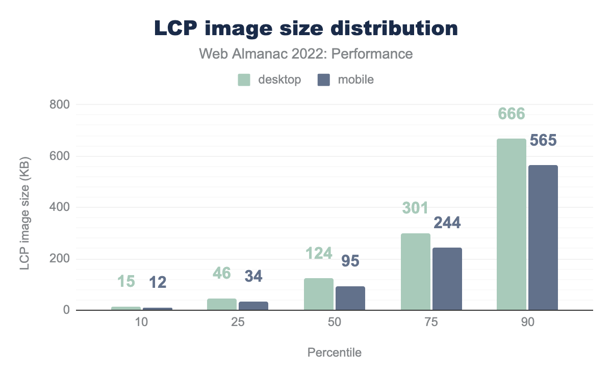
The median LCP image on mobile is 95 KB. To be honest, we expected much worse!
Desktop pages tend to have larger LCP images across the distribution, with a median size of 124 KB.
We also looked at the largest LCP image sizes and found a 68,607 KB image on desktop and 114,285 KB image on mobile. While it can be fun to look at how obscenely large these outliers are, let’s keep in mind the unfortunate reality that these are active websites visited by real users. Data isn’t always free, and performance problems like these start to become accessibility problems for users on metered mobile data plans. These are also sustainability problems considering how much energy is wasted loading blatantly oversized images like these.
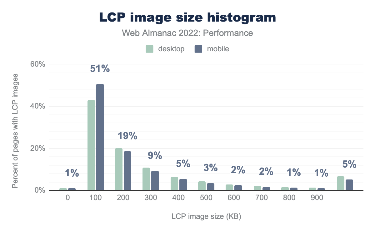
Looking at it a different way, the figure above shows the distribution as a histogram in 100 KB increments. This view makes it clearer to see how LCP image sizes fall predominantly in the sub-200 KB range. We also see that 5% of LCP images on mobile are greater than 1,000 KB in size.
How large an LCP image should optimally be depends on many factors. But the fact that 1 in 20 websites are serving megabyte-sized images to our 360px-wide mobile viewports clearly highlights the need for site owners to embrace responsive images. For more analysis on this topic, refer to the Media and Mobile Web chapters.
LCP format
Choice of LCP image format can have significant effects on its byte size and ultimately its loading performance. WebP and AVIF are two relatively newer formats that are found to be more efficient than traditional formats like JPG (or JPEG) and PNG.
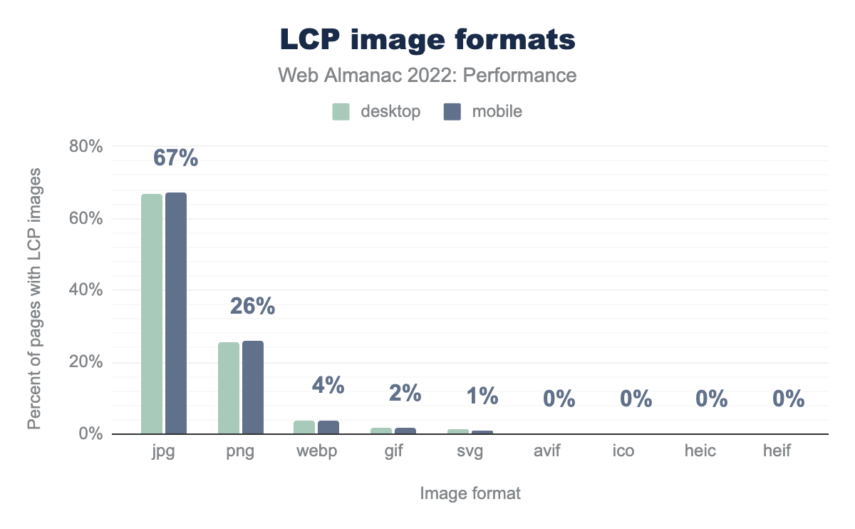
jpg is the LCP image format for 67% of desktop and mobile pages using LCP images, png for 26% of both, webp for 4% of both, gif for 2% of both, svg for 1% of both, and avif, ico, heic, and heif all show as 0% for both.According to the Media chapter, the JPG format makes up about 40% of all images loaded on mobile pages. However, JPG makes up 67% of all LCP images on mobile, which is 2.5x more common than PNG at 26%. These results may hint at a tendency for pages to use photographic-quality images as their LCP resource rather than digital artwork, as photographs tend to compress better as JPG compared to PNG, but this is just speculation.
4% of pages with image-based LCP use WebP. This is good news for image efficiency, however less than 1% are using AVIF. While AVIF may compress even better than WebP, it’s not supported in all modern browsers, which explains its low adoption. On the other hand, WebP is supported in all modern browsers, so its low adoption represents a major opportunity to optimize LCP images and their performance.
LCP image optimization
The previous section looked at the popularity of various image formats used by LCP resources. Another way that developers can make their LCP resources smaller and load more quickly is to utilize efficient compression settings. The JPG format can be lossily compressed to eke out unnecessary bytes without losing too much image quality. However, some JPG images may not be compressed enough.
Lighthouse includes an audit that will measure the byte savings from setting JPGs to compression level 85. If the image is more than 4 KB smaller as a result, the audit fails and it’s considered an opportunity for optimization.
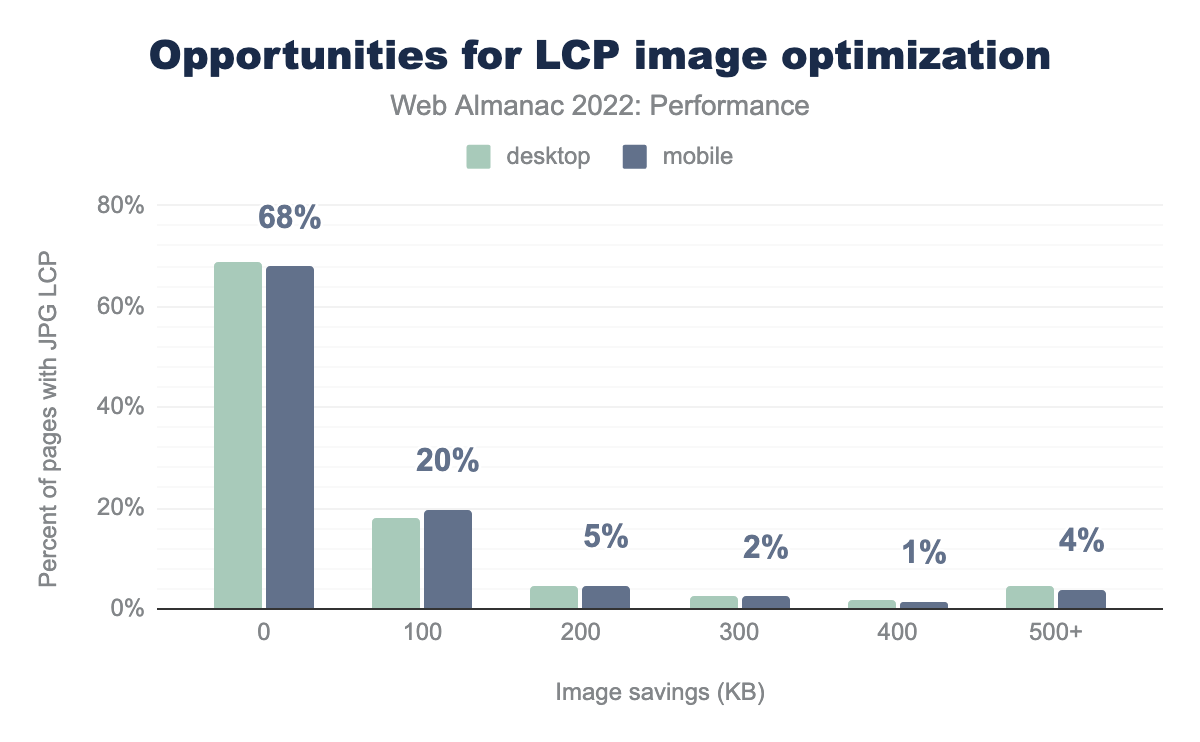
Of the pages whose LCP images are JPG-based and flagged by Lighthouse, 68% of them do not have opportunities to improve the LCP image via lossy compression alone. These results are somewhat surprising and suggest that the majority of “hero” JPG images use appropriate quality settings. That said, 20% of these pages could save as much as 100 KB and 4% can save 500 KB or more. Recall that the majority of LCP images are under 200 KB, so this is some serious savings!
LCP host
In addition to the size and efficiency of the LCP image itself, the server from which it loads can also have an impact on its performance. Loading LCP images from the same origin as the HTML document tends to be faster because the open connection can be reused.
However, LCP images may be loaded from other origins, like asset domains and image CDNs. When this happens, setting up the additional connection can take valuable time away from the LCP allowance.
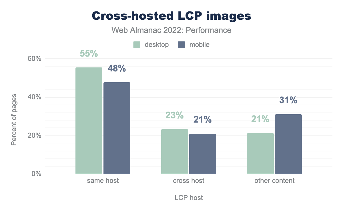
One in five mobile pages cross-host their LCP images. The time to set up the connection to these third-party hosts could add unnecessary delays to the LCP time. It’s best practice to self-host LCP images on the same origin as the document, whenever possible. Resource hints could be used to preconnect to the LCP origin—or better yet, preload the image itself—but these techniques are not very widely adopted.
LCP conclusions
LCP performance has improved significantly this year, especially for mobile users. While we don’t have a definitive answer for why that happened, the data presented above does give us a few clues.
What we’ve seen so far is that render-blocking resources are still quite prevalent, very few sites are using advanced prioritization techniques, and more than a third of LCP images are not statically discoverable. Without concrete data to suggest that site owners or large publishing platforms are concertedly optimizing these aspects of their LCP performance, other places to look are optimizations at the OS or browser level.
According to a Chromium blog post in March 2022, loading performance on Android improved by 15%. The post doesn’t go into too much detail, but it credits the improvement to “prioritizing critical navigation moments on the browser user interface thread.” This may help explain why mobile performance outpaced desktop performance in 2022.
The six percentage point improvement to LCP this year can only happen when hundreds of thousands of websites’ performance improves. Putting aside the tantalizing question of how that happened, let’s take a moment to appreciate that user experiences on the web are getting better. It’s hard work, but improvements like these make the ecosystem healthier and are worth celebrating.
Cumulative Layout Shift (CLS)
Cumulative Layout Shift (CLS) is a layout stability metric that represents the amount that content unexpectedly moves around on the screen. We say that a website has good CLS if at least 75% of all navigations across the site have a score of 0.1 or less.
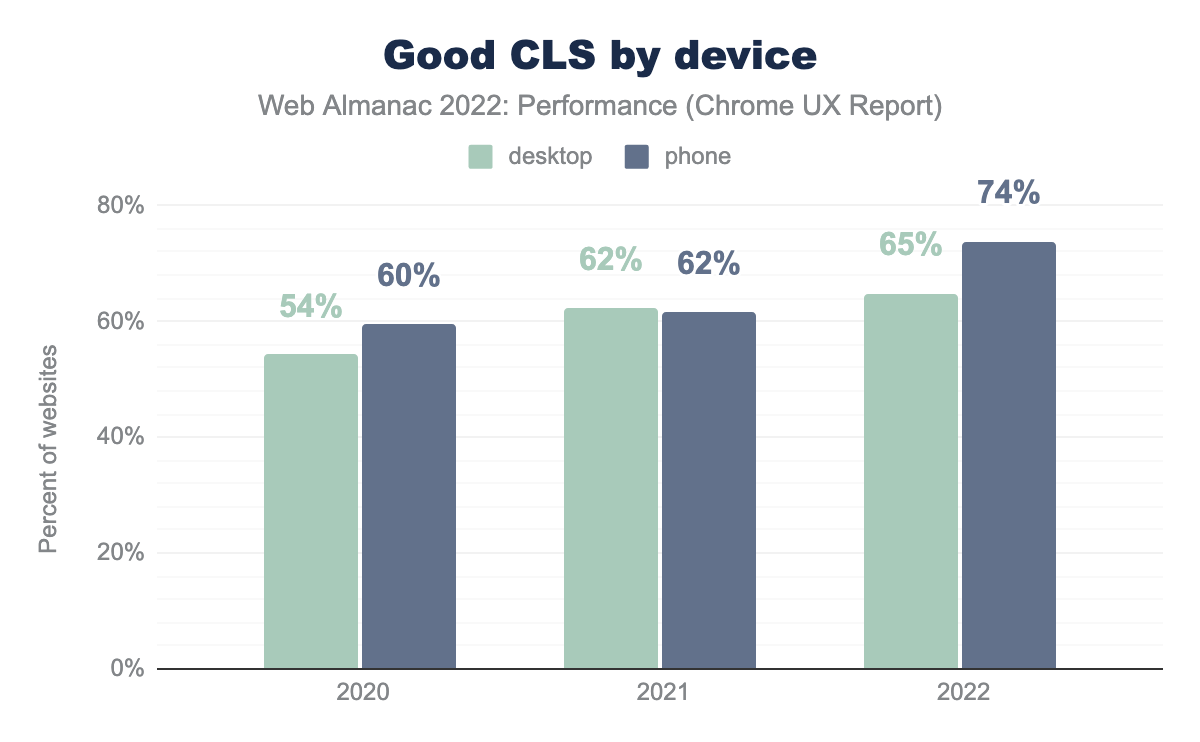
This year, the percentage of websites with “good” CLS improved significantly on mobile devices, going from 62% to 74%. CLS on desktop improved by 3 percentage points to 65%.
While LCP is the bottleneck for most sites to be assessed as having good CWV overall, there’s no doubt that the major improvements to mobile CLS this year have had a positive effect on the CWV pass rates.
What happened to improve mobile CLS by such a significant margin? One likely explanation is Chrome’s new and improved back/forward cache (bfcache), which was released in version 96 in mid-November 2021. This change enabled eligible pages to be pristinely restored from memory during back and forward navigations, rather than having to “start over” by fetching resources from the HTTP cache—or worse, over the network—and reconstructing the page.
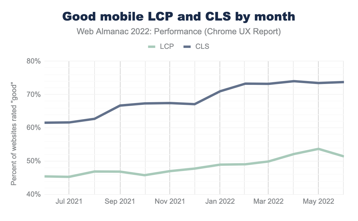
This chart shows LCP and CLS performance over time at monthly granularity. Over a two month period starting in January 2022, after Chrome released the bfcache update, the percent of websites having good CLS started to climb much more quickly than before.
But how did bfcache improve CLS so much? Due to the way Chrome instantly restores the page from memory, its layout is settled and unaffected by any of the initial instability that typically occurs during loading.
One theory why LCP experiences didn’t improve as dramatically is that back/forward navigations were already pretty fast thanks to standard HTTP caching. Remember, the threshold for “good” LCP is 2.5 seconds, which is pretty generous assuming any critical resources would already be in cache, and there are no bonus points for making “good” experiences even faster.
CLS metadata and best practices
Let’s explore how much of the web is adhering to CLS best practices.
Explicit dimensions
The most straightforward way to avoid layout shifts is to reserve space for content by setting dimensions, for example using height and width attributes on images.
72% of mobile pages have unsized images. This stat alone doesn’t give the full picture, because unsized images don’t always result in user-perceived layout shifts, for example if they load outside of the viewport. Still, it’s a sign that site owners may not be closely adhering to CLS best practices.
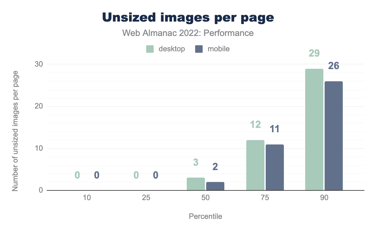
The median web page has 2 unsized images and 10% of mobile pages have at least 26 unsized images.
Having any unsized images on the page can be a liability for CLS, but perhaps a more important factor is the size of the image. Large images contribute to bigger layout shifts, which make CLS worse.
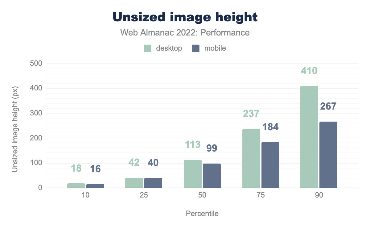
The median unsized image on mobile has a height of 99px. Given that our test devices have a mobile viewport height of 512px, that’s about 20% of the viewport area that would shift down, assuming full-width content. Depending on where that image is in the viewport when it loads, it could cause a layout shift score of at most 0.2, which more than exceeds the 0.1 threshold for “good” CLS.
Desktop pages tend to have larger unsized images. The median unsized image on desktop is 113px tall and the 90th percentile has a height of 410px.
In what we can only hope is either a measurement error or a seriously mistaken web developer, the largest unsized image that we found is an incredible 4 quintillion pixels tall. That image is so big it could stretch from the Earth to the moon… three million times. Even if that is some kind of one-off mistake, the next biggest unsized image is still 33,554,432 pixels tall. Either way, that’s a big layout shift.
Animations
Some non-composited CSS animations can affect the layout of the page and contribute to CLS. The best practice is to use transform animations instead.
38% of mobile pages use these layout-altering CSS animations and risk making their CLS worse. Similar to the unused images issue, what matters most for CLS is the degree to which the animations affect the layout relative to the viewport.
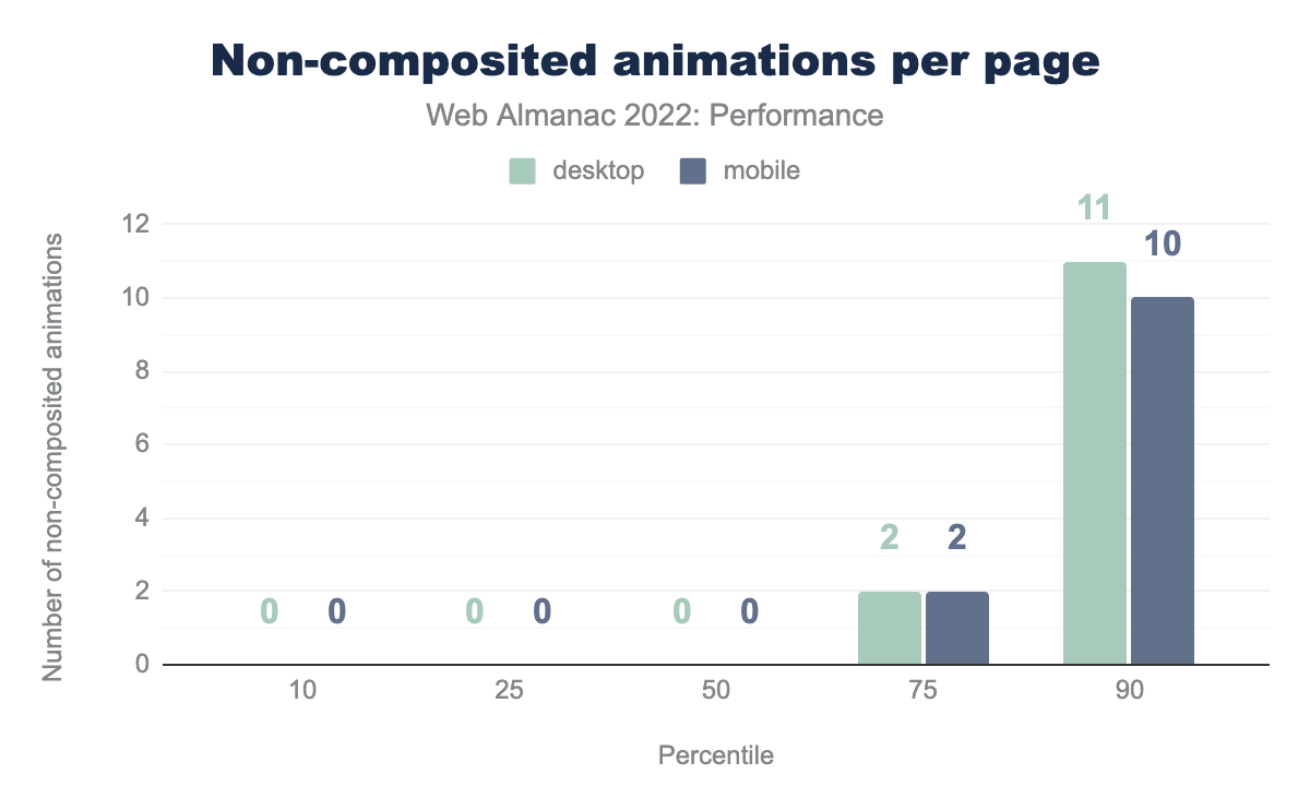
The distribution above shows that most pages don’t use these types of animations, and the ones that do only use it sparingly. At the 75th percentile, pages use them twice.
Fonts
In the page load process, it can take some time for the browser to discover, request, download, and apply a web font. While this is all happening, it’s possible that text has already been rendered on a page. If the web font isn’t yet available, the browser can default to rendering text in a system font. Layout shifts happen when the web font becomes available and existing text, rendered in a system font, switches to the web font. The amount of layout shift caused depends on how different the fonts are from each other.
82% of pages use web fonts, so this section is highly relevant to most site owners.
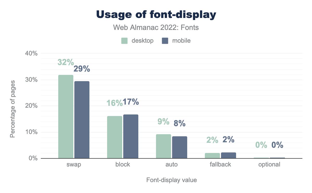
font-display values. 29% of mobile pages use swap, 17% block, 8% auto, 2% fallback, and less than 1% use optional. The values for desktop are similar.font-display values.
One way to avoid font-induced layout shifts is to use font-display: optional, which will never swap in a web font after the system text has already been shown. However, as noted by the Fonts chapter, less than 1% of pages are taking advantage of this directive.
Even though optional is good for CLS, there are UX tradeoffs. Site owners might be willing to have some layout instability or a noticeable flash of unstyled text (FOUT) if it means that their preferred font can be displayed to users.
Rather than hiding the web fonts, another strategy to mitigate CLS is to load them as quickly as possible. Doing so would, if all goes well, display the web font before the system text is rendered.
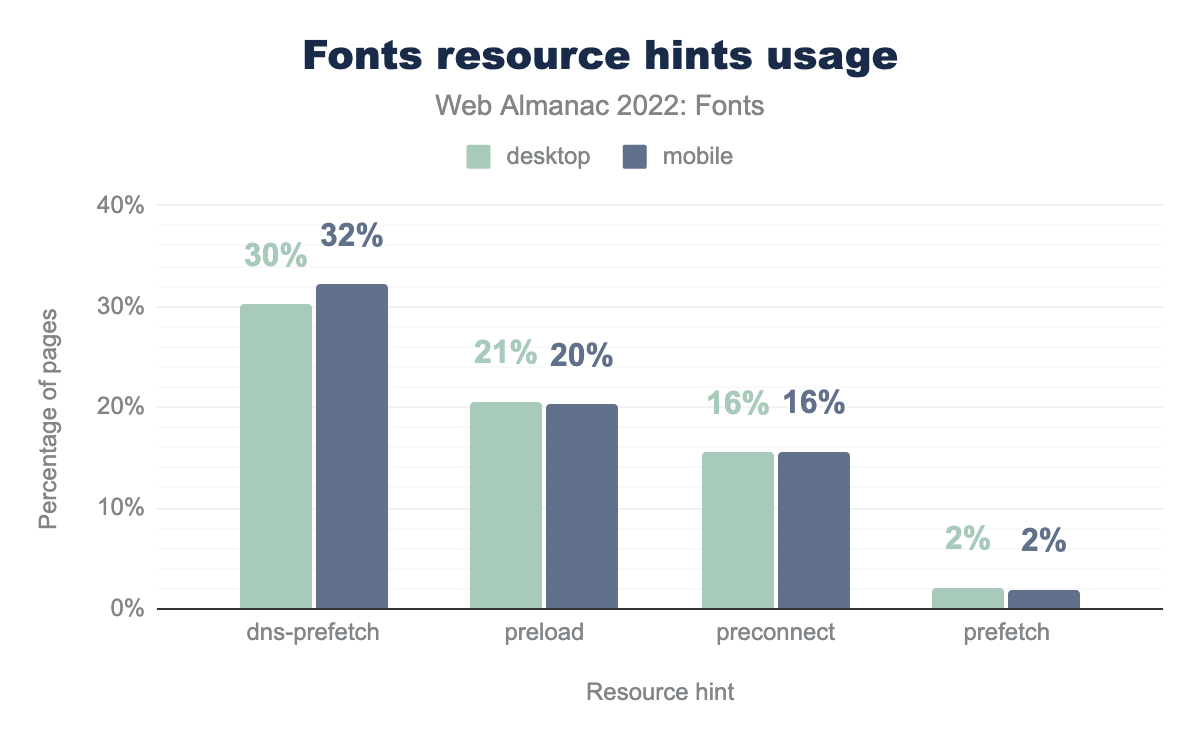
According to the Fonts chapter, 20% of mobile pages are preloading their web fonts. One challenge with preloading the font is that the exact URL may not be known upfront, for example if using a service like Google Fonts. Preconnecting to the font host is the next best option for performance, but only 16% of pages are using that, which is half as many pages that use the less-performant option to prefetch the DNS.
bfcache eligibility
We’ve shown how impactful bfcache can be for CLS, so it’s worth considering eligibility as a somewhat indirect best practice.
The best way to tell if a given page is eligible for bfcache is to test it in DevTools. Unfortunately, there are over 100 eligibility criteria, many of which are hard or impossible to measure in the lab. So rather than looking at bfcache eligibility as a whole, let’s look at a few criteria that are more easily measurable to get a sense for the lower bound of eligibility.
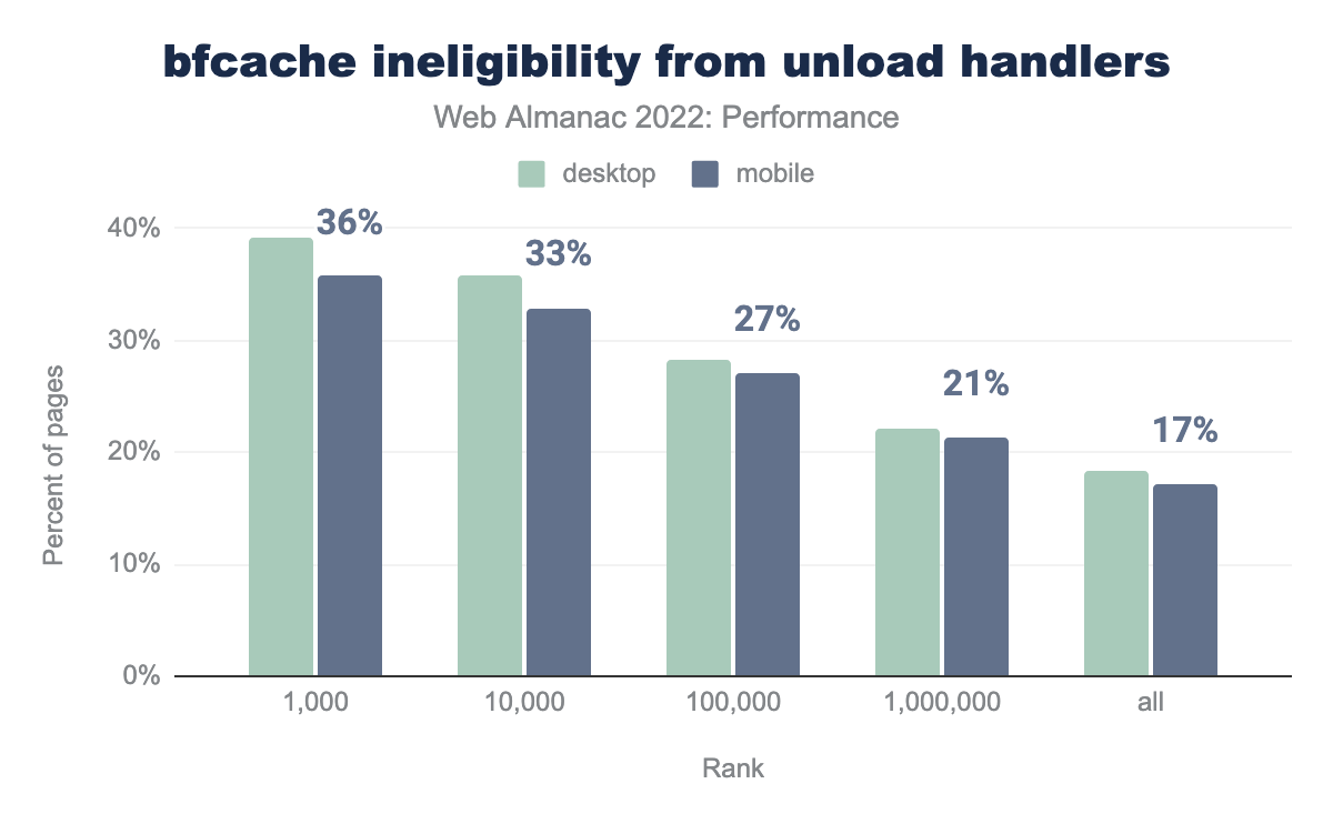
unload handlers, grouped by site popularity rank. 36% of the top 1 thousand mobile pages set this handler, 33% of the top 10 thousand, 27% of the top 100 thousand, 21% of the top million, and 17% of all mobile pages. Desktop pages tend to use the unload handler slightly more often by a couple of percentage points across the ranks.unload by site rank.
The unload event is a discouraged way to do work when the page is in the process of going away (unloading). Besides there being better ways to do that, it’s also one way to make your page ineligible for bfcache.
17% of all mobile pages set this event handler, however the situation worsens the more popular the website is. In the top 1k, 36% of mobile pages are ineligible for bfcache for this reason.
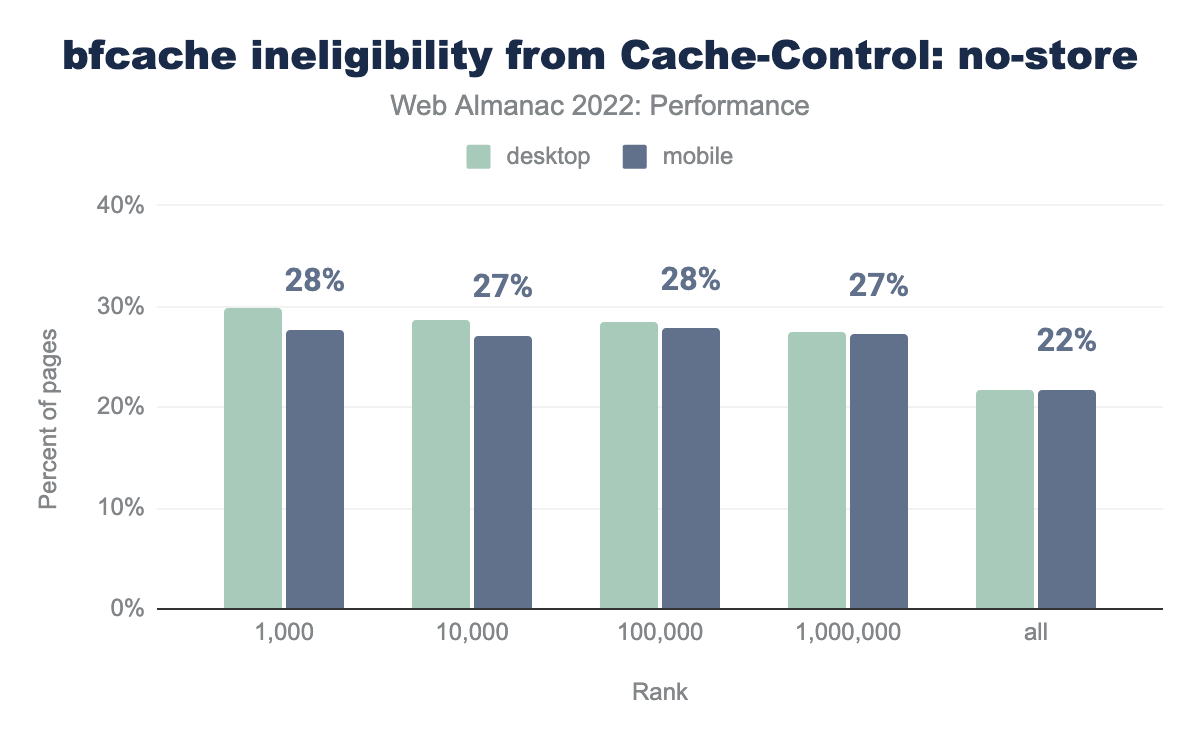
Cache-Control: no-store header on the main document. 28% of the top 1 thousand mobile pages set this header, 27% of the top 10 thousand, 28% of the top 100 thousand, 27% of the top million, and 22% of all mobile pages. Desktop pages use this header slightly more often by up to 2 percentage points.Cache-Control: no-store by site rank.
The Cache-Control: no-store header tells user agents never to cache a given resource. When set on the main HTML document, this makes the entire page ineligible for bfcache.
22% of all mobile pages set this header, and 28% of mobile pages in the top 1k. This and the unload criteria are not mutually exclusive, so combined we can only say that at least 22% of mobile pages are ineligible for bfcache.
To reiterate, it’s not that these things cause CLS issues. However, fixing them may make pages eligible for bfcache, which we’ve been shown to be an indirect yet powerful tool for improving layout stability.
CLS conclusions
CLS is the CWV metric that improved the most in 2022 and it appears to have had a significant impact on the number of websites that have “good” overall CWV.
The cause of this improvement seems to come down to Chrome’s launch of bfcache, which is reflected in the January 2022 CrUX dataset. However, at least a fifth of sites are ineligible for this feature due to aggressive no-store caching policies or discouraged use of the unload event listener. Correcting these anti-patterns is CLS’s “one weird trick” to improve performance.
There are other, more direct ways site owners can improve their CLS. Setting height and width attributes on images is the most straightforward one. Optimizing how animations are styled and how fonts load are two other—admittedly more complex—approaches to consider.
First Input Delay (FID)
First Input Delay (FID) measures the time from the first user interaction like a click or tap to the time at which the browser begins processing the corresponding event handlers. A website has “good” FID if at least 75 percent of all navigations across the site are faster than 100 ms.
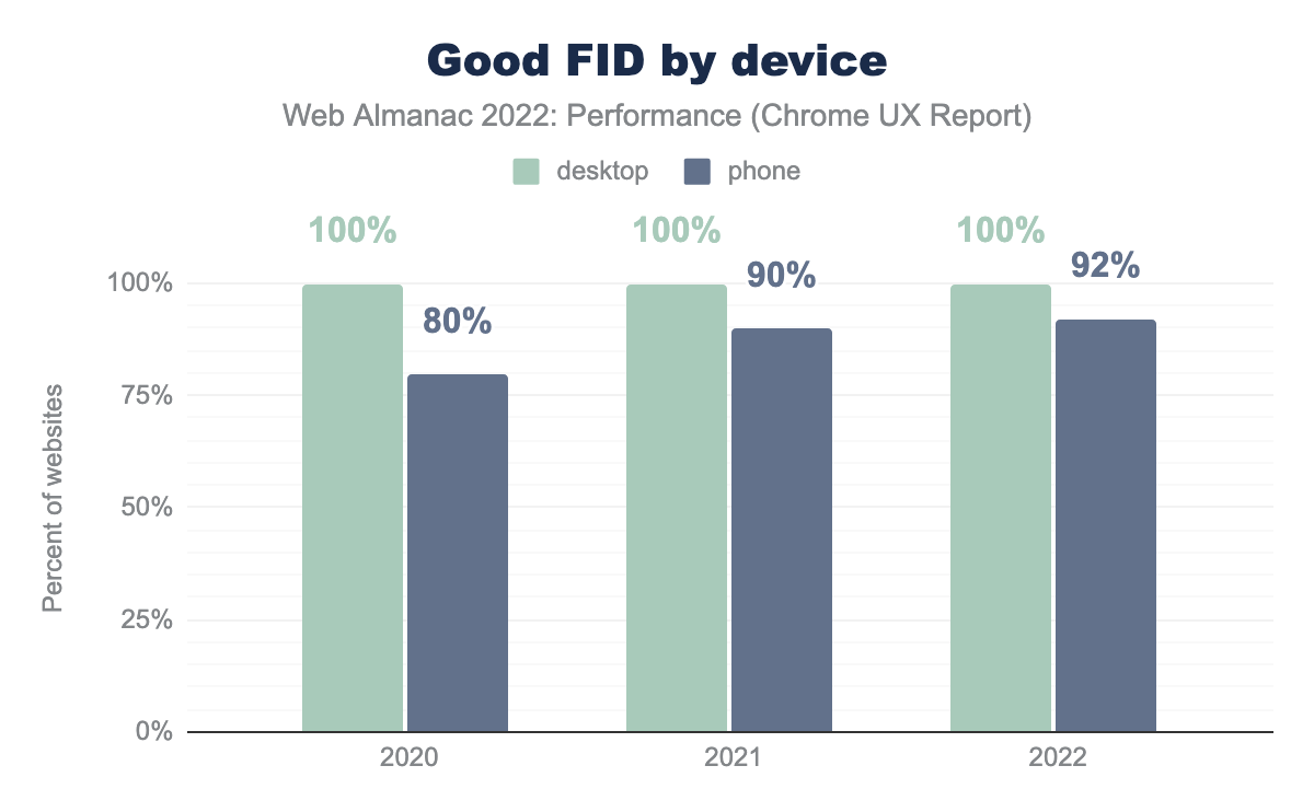
Effectively all websites have “good” FID for desktop users, and this trend has held firm over the years. Mobile FID performance is also exceptionally fast, with 92% of websites having “good” FID, a slight improvement over last year.
While it’s great that so many websites have good FID experiences, developers need to be careful not to become too complacent. Google has been experimenting with a new responsiveness metric that could end up replacing FID, which is especially important because sites tend to perform much worse on this new metric than FID.
FID metadata and best practices
Let’s dig deeper into the ways that responsiveness can be improved across the web.
Disabling double-tap to zoom
Some mobile browsers, including Chrome, wait at least 250 ms before handling tap inputs to make sure users aren’t attempting to double-tap to zoom. Given that the threshold for “good” FID is 100 ms, this behavior makes it impossible to pass the assessment.
<meta name="viewport" content="width=device-width, initial-scale=1">There’s an easy fix, though. Including a meta viewport tag in the document head like the one above will prompt the browser to render the page as wide at the device width, which makes text content more legible and eliminates the need for double-tap to zoom.
This is one of the quickest, easiest, and least intrusive ways to meaningfully improve responsiveness and all mobile pages should be setting it.
meta tag.
7.3% of mobile pages fail to set the meta viewport directive. Recall that about 8% of mobile websites fail to meet the threshold for “good” FID. This is a significant proportion of the web that is needlessly slowing down their sites’ responsiveness. Correcting this may very well mean the difference between failing and passing the FID assessment.
Total Blocking Time (TBT)
Total Blocking Time (TBT) is the time between the First Contentful Paint (FCP) and Time to Interactive (TTI), representing the total amount of time that the main thread was blocked and unable to respond to user inputs.
TBT is often used as a lab-based proxy for FID, due to the challenges of realistically simulating user interactions in synthetic tests.
Note that these results are sourced from the lab-based TBT performance of pages in the HTTP Archive dataset. This is an important distinction because for the most part we’ve been looking at real-user performance data from the CrUX dataset.
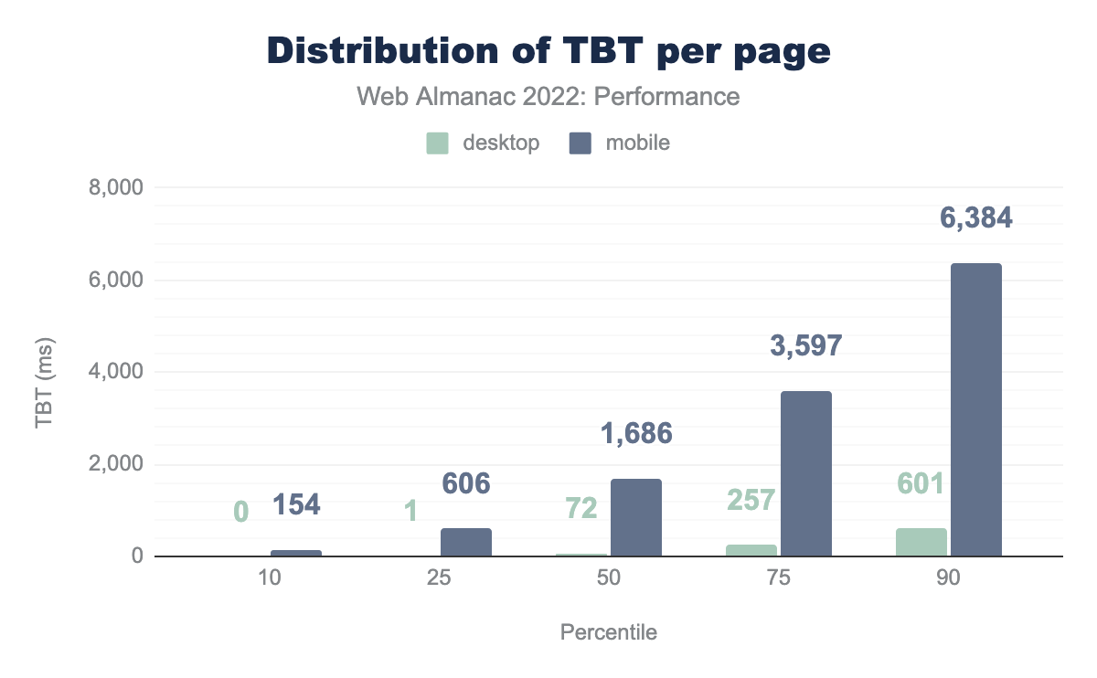
With that in mind, we see that mobile pages have significantly worse TBT than desktop pages. This isn’t surprising given that our Lighthouse mobile environment is intentionally configured to run with a throttled CPU in a way that emulates a low-end mobile device. Nevertheless, the results show that the median mobile page has a TBT of 1.7 seconds, meaning that if this were a real-user experience, no taps within 1.7 seconds of FCP would be responsive. At the 90th percentile, a user would have to wait 6.3 seconds before the page became responsive.
Despite the fact that these results come from synthetic testing, they’re based on the actual JavaScript served by real websites. If a real user on similar hardware tried to access one of these sites, their TBT might not be too different. That said, the key difference between TBT and FID is that the latter relies on the user actually interacting with the page, which they can do at any time before, during, or after the TBT window, all leading to vastly different FID values.
Long tasks
Long tasks are periods of script-induced CPU activity at least 50 ms long that prevent the main thread from responding to input. Any long task is liable to cause responsiveness issues if a user attempts to interact with the page at that time.
Note that, like the TBT analysis above, this section draws from lab-based data. As a result, we’re only able to measure long tasks during the page load observation window, which starts when the page is requested and ends after 60 seconds or 3 seconds of network inactivity, whichever comes first. A real user may experience long tasks throughout the entire lifetime of the page.
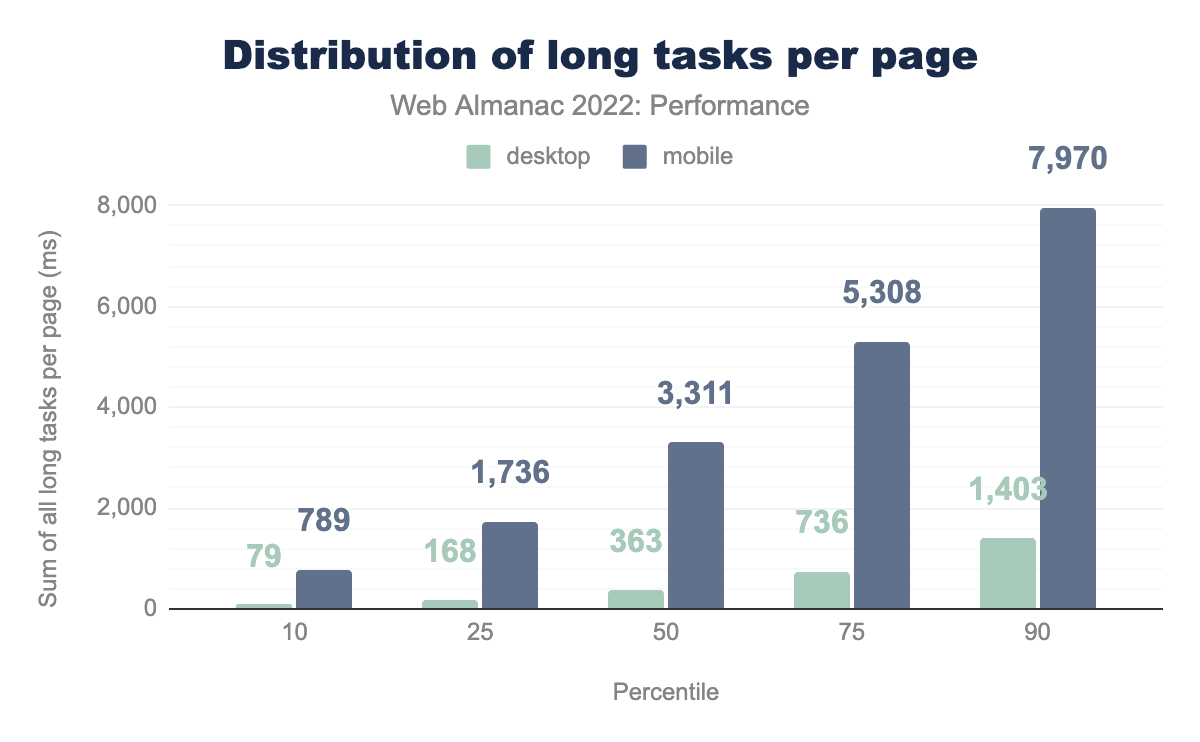
The median mobile web page has 3.3 seconds-worth of long tasks, compared to only 0.4 seconds for desktop pages. Again, this shows the outsized effects of CPU speed on responsiveness heuristics. At the 90th percentile, mobile pages have at least 8.0 seconds of long tasks.
It’s also worth noting that these results are significantly higher than the distribution of TBT times. Remember that TBT is bounded by FCP and TTI and FID is dependent on both how busy the CPU is and when the user attempts to interact with the page. These post-TTI long tasks can also create frustrating responsiveness experiences, but unless they occur during the first interaction, they wouldn’t be represented by FID. This is one reason why we need a field metric that more comprehensively represents users’ experiences throughout the entire page lifetime.
Interaction to Next Paint (INP)
Interaction to Next Paint (INP) measures the amount of time it takes for the browser to complete the next paint in response to a user interaction. This metric was created after Google requested feedback on a proposal to improve how we measure responsiveness. Many readers may be hearing about this metric for the first time, so it’s worth going into a bit more detail about how it works.
An interaction in this context refers to the user experience of providing an input to a web application and waiting for the next frame of visual feedback to be painted on the screen. The only inputs that are considered for INP are clicks, taps, and key presses. The INP value itself is taken from one of the worst interaction latencies on the page. Refer to the INP documentation for more info on how it’s calculated.
Unlike FID, INP is a measure of all interactions on the page, not just the first one. It also measures the entire time until the next frame is painted, unlike FID which only measures the time until the event handler starts processing. In these ways, INP is a much more representative metric of the holistic user experience on the page.
A website has “good” INP if 75% of its INP experiences are faster than 200 ms. A website has “poor” INP if the 75th percentile is greater than or equal to 500 ms. Otherwise, it’s INP is assessed as “needs improvement”.
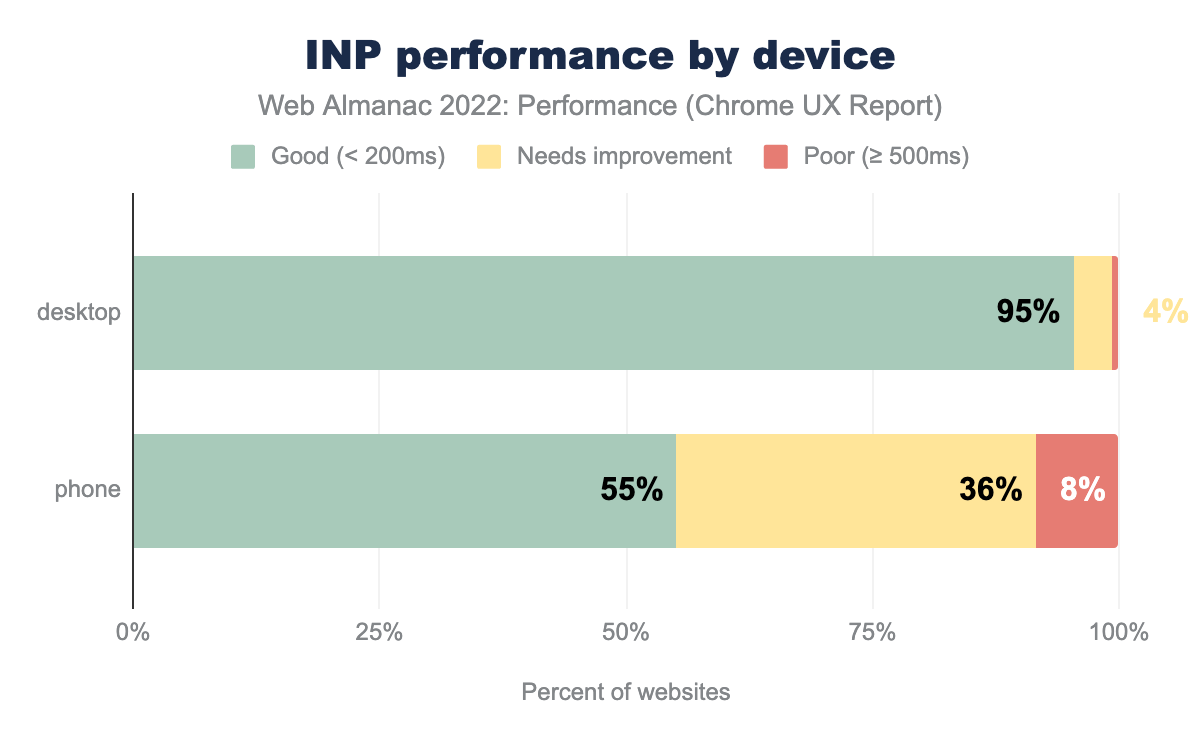
55% of websites have “good” INP on mobile, 36% are rated “needs improvement”, and 8% have “poor” INP. The desktop story of INP is more similar to FID in that 95% of websites are rated “good”, 4% are rated “needs improvement”, and 1% are “poor”.
The enormous disparity between desktop and mobile users’ INP experiences is much wider than with FID. This illustrates the extent to which mobile devices are struggling to keep up with the overwhelming amount of work websites do, and all signs point to the increasing reliance on JavaScript as a major factor.
INP by rank
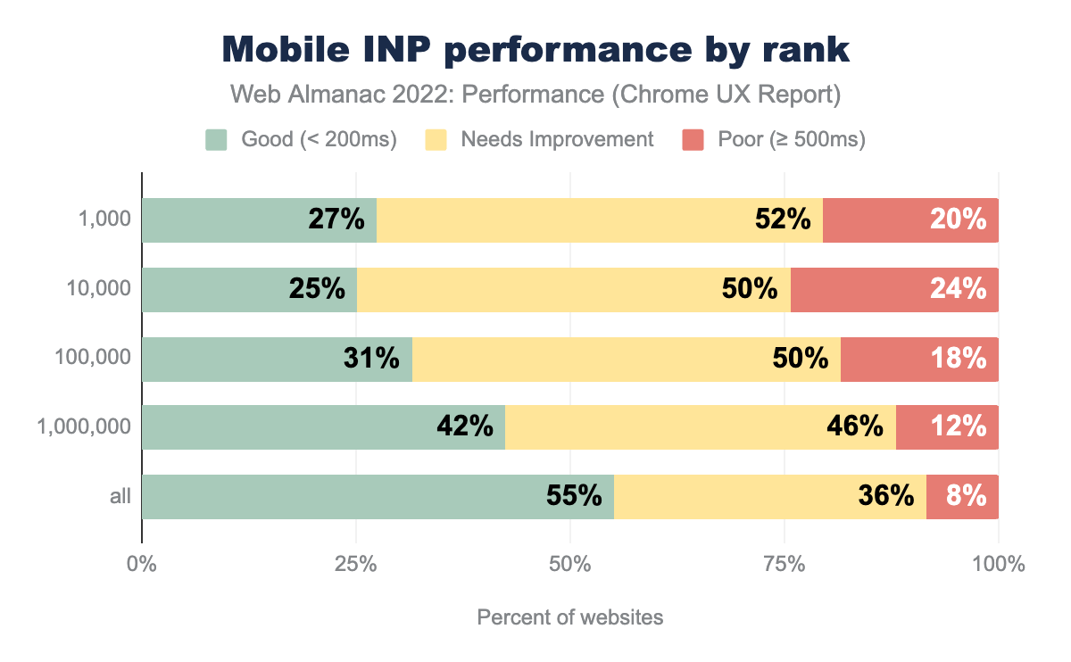
To see how unevenly distributed INP performance is across the web, it’s useful to segment websites by their popularity ranking.
27% of the top 1k most popular websites have good mobile INP. As the site popularity decreases, the percent having good mobile INP does something funny; it worsens at bit at the top 10k rank to 25%, then it improves to 31% at the top 100k, 41% at the top million, and it ultimately lands at 55% for all websites. Except for the top 1k, it seems that INP performance is inversely proportional to site popularity.
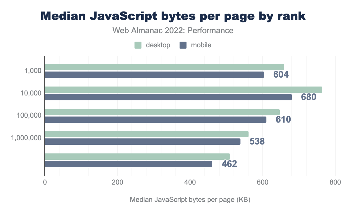
When we look at the amount of JavaScript that the median mobile page loads for each of these ranks, it follows the same funny pattern! The median mobile page in the top 1k loads 604 KB of JavaScript, then it increases to 680 KB for the top 10k before dropping all the way down to 462 KB over all websites. These results don’t prove that loading—and using—more JavaScript necessarily causes poor INP, but it definitely suggests a correlation exists.
INP as a hypothetical CWV metric
INP is not an official CWV metric, but Annie Sullivan, who is the Tech Lead for the CWV program at Google, has commented about its intended future, saying “INP is still experimental! Not a Core Web Vital yet, but we hope it can replace FID.”
This raises an interesting question: hypothetically, if INP were to be a CWV metric today, how different would the pass rates be?
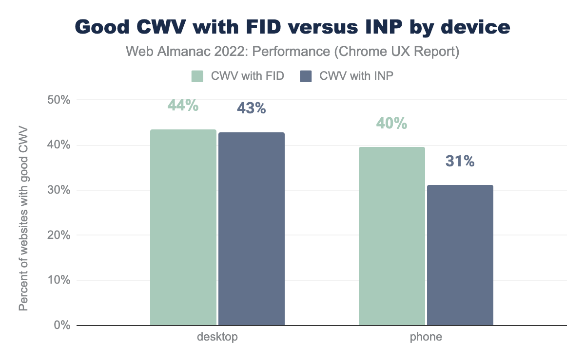
For desktop experiences, the situation wouldn’t change much. 43% of websites would have good CWV with INP, compared to 44% with FID.
However, the disparity is much more dramatic among websites’ mobile experiences, which would fall to 31% having good CWV with INP, from 40% with FID.
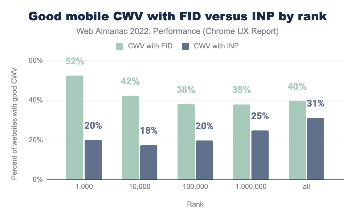
The situation gets even starker when we look at mobile experiences by site rank. Rather than 52% of the top 1k websites having good CWV with FID, only 20% of them would have good CWV with INP, a decrease of 32 percentage points. So even though the most popular websites overperform with FID compared to all websites (52% versus 40%), they actually underperform with INP (20% versus 31%).
The story is similar for the top 10k websites, which would decrease by 24 percentage points with INP as a CWV. Websites in this rank would have the lowest rate of good CWV with INP. As we saw in the previous section, this is also the rank with the highest usage of JavaScript. The rate of good CWV converges with FID and INP as the ranks become less popular, with the difference falling to 18, 13, and 9 percentage points respectively.
These results show that the most popular websites have the most work to do to get their INP into shape.
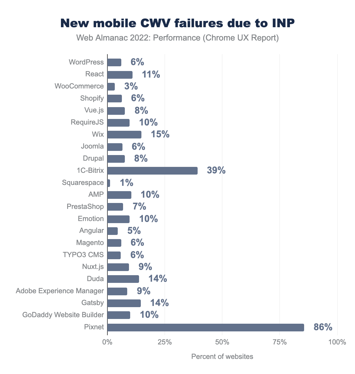
In this chart we’re looking at the percent of a given technology’s websites that would no longer be considered as having “good” CWV should FID be replaced with INP.
Two things jump out in this chart: 1C-Bitrix and Pixnet, which are CMSs and would have an enormous proportion of their websites ceasing to pass the CWV assessment with INP. Pixnet stands to lose 86% of its websites, down from 98% to 13%! The passing rate for 1C-Bitrix would fall from 79% to 40%, a difference of 39%.
11% of websites using the React framework would no longer pass CWV. Wix, which is now the second most popular CMS, uses React. 15% of its websites would not have “good” CWV. Proportionally though, there would still be more Wix websites passing CWV than React websites overall, at 24% and 19% respectively, but INP would narrow that gap.
WordPress is the most popular technology in the list and 6% of its 2.3 million websites would no longer have “good” CWV. Its passing rate would fall from 30% to 24%.
Squarespace would have the least amount of movement due to this hypothetical change, only losing 1% of its websites’ “good” CWV. This suggests that Squarespace websites not only have a fast first interaction but also consistently fast interactions throughout the page experience. Indeed, the CWV Technology Report shows Squarespace significantly outperforming other CMSs at INP, having over 80% of their websites passing the INP threshold.
INP and TBT
What actually makes INP a better responsiveness metric than FID? One way to answer that question is to look at the correlation between field-based INP and FID performance and lab-based TBT performance. TBT is a direct measure of how unresponsive a page can be, but it can never be a CWV itself because it doesn’t actually measure the user-perceived experience.
This section draws from Annie Sullivan’s research using the May 2022 dataset.
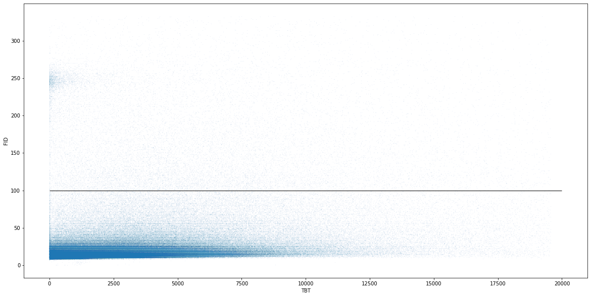
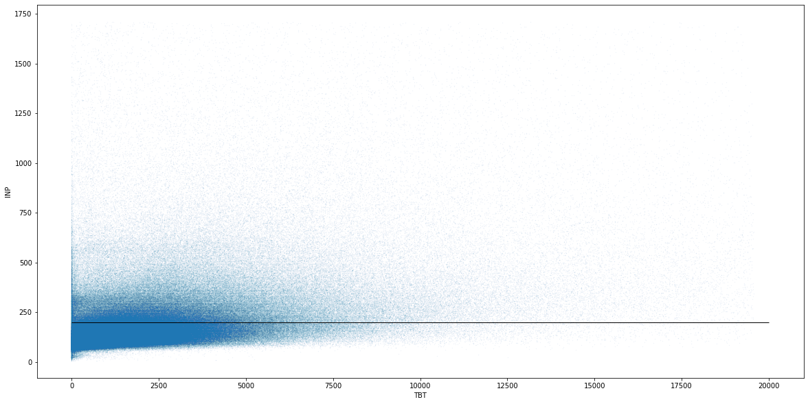
This chart shows the relationship between pages’ FID and TBT responsiveness. The solid horizontal line at 100 ms represents the threshold for “good” FID, and most pages fall comfortably under this threshold.
The most notable attribute of this chart is the dense area in the bottom left corner, which appears to be smeared out across the TBT axis. The length of this smear represents pages having high TBT and low FID, which illustrates the low degree of correlation between FID and TBT.
There’s also a patch of pages that have low TBT and a FID of about 250 ms. This area represents pages that have tap delay issues due to missing a <meta name=viewport> tag. These are outliers that can be safely ignored for this analysis’s purposes.
The Kendall and Spearman coefficients of correlation for this distribution are 0.29 and 0.40, respectively.
This is the same chart, but with INP instead of FID. The solid horizontal line here represents the 200 ms threshold for “good” INP. Compared to FID, there are many more pages above this line and not assessed as “good”.
Pages in this chart are more densely packed in the bottom left corner, which signifies the higher degree of correlation between FID and TBT. There’s still a smear, but it’s not as pronounced.
The Kendall and Spearman coefficients of correlation for this distribution are 0.34 and 0.45, respectively.
First, is INP correlated with TBT? Is it more correlated with TBT than FID? Yes and yes!But they are both correlated with TBT; is INP catching more problems with main thread blocking JavaScript? We can break down the percent of sites meeting the “good” threshold: yes it is!
As Annie notes, both metrics are correlated with TBT, but she concludes that INP is more strongly correlated, making it a better responsiveness metric.
FID conclusions
These results show that sites absolutely do have responsiveness issues, despite the rosy picture painted by FID. Regardless of whether INP becomes a CWV metric, your users will thank you if you start optimizing it now.
Nearly one in ten mobile sites are leaving free performance on the table by failing to disable double-tap to zoom. This is something all sites should be doing; it’s only one line of HTML and it benefits both FID and INP. Run Lighthouse on your page and look for the viewport audit to be sure.
By taking a hypothetical look at INP as a CWV, we can see just how much work there is to be done just to get back to FID-like levels. The most popular mobile websites would be especially affected by such a change as a consequence of their (over)use of JavaScript. Some CMSs and JavaScript frameworks would be hit harder than others, and it’ll take an ecosystem-wide effort to collectively rein in the amount of client-side work that they do.
Conclusion
As the industry continues to learn more about CWV, we’re seeing steady improvement both in terms of implementation and across all top-level metric values themselves. The most visible performance optimization strides are at the platform level, like Android and bfcache improvements, given that their impact can be felt across many sites at once. But let’s look at the most elusive piece of the performance puzzle: individual site owners.
Google’s decision to make CWV part of search ranking catapulted performance to the top of many companies’ roadmaps, especially in the SEO industry. Individual site owners are certainly working hard to improve their performance and played a major role in the CWV improvements over the last year, even if those individual efforts are much harder to spot at this scale.
That said, there’s still more work to be done. Our research shows opportunities to improve LCP resources’ prioritization and static discoverability. Many sites are still failing to disable double-tap to zoom to avoid artificial interactivity delays. New research into INP has uncovered responsiveness problems that were easy to overlook with FID. Regardless of whether INP becomes a CWV, we should always strive to deliver fast and responsive experiences, and the data shows that we can be doing better.
At the end of the day, there will always be more work to do, which is why the most impactful thing we can do is to continue making web performance more approachable. In the years to come, let’s emphasize getting web performance knowledge the “last mile” to site owners.

