Sustainability
Introduction
Back in 2019, GreenIT.fr estimated that there were 34 billion pieces of equipment and 4.1 billion internet users. As such, the digital world’s contribution to humanity’s carbon footprint may represent roughly 4% of primary energy consumption and greenhouse gas emissions, as well as 0.2% of water consumption and 5.5% of electricity consumption.
Another significant indicator is its contribution to the depletion of abiotic resources (“not alive” resources, such as metals). All the devices we use need materials in order to be produced. As such, the manufacture of user equipment is considered the most important source of environmental impact. This is followed by the end of life of equipment as most of them not being recycled at all. It is way more impactful than data centers, the network or even the usage of user equipment. Despite the efforts from some manufacturers, it will likely only get worse in the coming years because of the depletion of some required materials (indium, copper, gold, etc).
The previously mentioned study from GreenIT.fr states that the overall impact of digital services has been steadily increasing for years and could double or triple between 2010 and 2025. If we want to avoid—or at least mitigate–this, we should reduce the number of connected devices that we own and keep each of them for as long as possible: repairing rather than buying. This might sound tough because some devices, especially smartphones, seem to be aging quickly: the longer websites and applications take to load, the less a battery will last.
What we can do about that is to reduce the impact of digital services and change the way we think about digital services as being immaterial and environmentally friendly by default.
Considering all the data gathered, the Web Almanac sounds like a great place to assess the environmental impacts of websites as a whole. On this journey, we will also see how to reduce them through best practices and how widely these are already adopted.
For this, we will differentiate:
- Moderation: implementing something only when needed. It could be digital as a whole (do you really need connected diapers?), some functionality (are these social media feeds useful on your home page?) or content (decorative images, videos, etc). Ask yourself if everything on your website is useful, used, usable (and reusable).
- Efficiency: how you reduce the size and/or impact of what remains on your website after considering sobriety. For websites, this is mostly done through technical optimizations such as minification, compression, caching, etc.
Some online activities to get started:
- Are you an eco-responsible Internet user?
- What is the impact of your internet browsing?
- Weight comparison of various elements composing a web page
To guide us on this journey, we can rely on some resources, including:
- Repositories of best practices: 115 bonnes pratiques, Handbook of sustainable digital services.
- Books and websites: Sustainable Web Design.
- Online courses: INR - Sustainable IT, Environmental impact of digital services, Principles of Sustainable Software Engineering.
Limitations and hypothesis
We won’t be covering all best practices and available metrics can’t cover all of them. Metrics can’t tell us if a given website has unnecessary functionality or if some images are purely decorative. Even if such considerations go beyond the scope of this chapter, there is still a lot that can be done. And with Lighthouse providing more and more types of audits, we can expect new metrics to become available.
Carbon emissions are the only environmental indicator here but others—such as water consumption, land use, abiotic resources consumption—should be considered to avoid pollution transfers. This is exactly the point of LCA (Life Cycle Assessment). However, such an operation requires expertise, lots of information and time. As of today, some structures are reaching for a compromise by using less metrics and information, combined with LCI (Life Cycle Inventory). This helps make the evaluation of environmental impacts more affordable and accessible (and repeatable, for example in CI/CD or monitoring) while keeping under control the assumptions you need to make.
We will only use metrics collected on pages but, in order to assess the environmental impacts of some digital services, it might be more accurate to collect metrics on a whole user journey. For example, on an ecommerce website, it would be better to consider a user purchasing an article and paying for it.
Intersectional environmental issues
Sustainability has evolved significantly since its initial definition in 1987 by the Brundtland Commission. It now incorporates a variety of intersectional social and governance issues (the “S” and “G” in “ESG”) alongside its core environmental focus. A more responsible and sustainable internet should reflect this.
In other words, digital sustainability cannot focus only on emissions. While climate change is a huge driver, it cannot be used to justify inequitable solutions or fuel inequality [PDF] in any way. It must be grounded in climate justice.
To this end, when designing digital products and services, keep the following intersectional issues in mind:
- Accessibility: By removing barriers to content, your website becomes more usable and accessible. This also improves its environmental impact because users, especially those with disabilities, don’t have to find workarounds to accomplish tasks.
- Privacy: A less intrusive website is better for users, giving them control over their data and what they choose to share. Privacy-focused websites are also often more environmentally-friendly in that they track, store, and maintain less data.
- Mis/disinformation: People turn to the internet to answer questions. Content that includes misinformation (unintentional) and disinformation (intentional) undermines users’ ability to do this in an efficient manner.
- Attention economy: Avoiding deceptive patterns keeps users focused, reducing pointless browsing or diverting them from their initial purpose.
- Security: Aiming for sustainability can also help secure your website by reducing its attack surface: less external resources, less functionality, etc
These are all part of a broader organizational approach to corporate digital responsibility that aligns with digital sustainability principles.
Understanding the environmental impact of the web
The internet is the greatest, most energy intense, machine that has ever existed. To create and maintain the internet requires massive material input. One server can cause one ton or more of CO2 during manufacture. A laptop can cause 300 kg of CO2 to manufacture, and result in the mining of 1,200 kg of raw materials. There is no such thing as sustainable mining.
While most of the energy and waste of the internet is embedded in the devices themselves, the energy required to run the internet is not insignificant. While we are constantly marketed to about how data is essentially free, to store as much as we want, data storage and processing have real and exponentially growing energy demands. In 2015, for example, data centers in Ireland were consuming 5% of electricity, by 2021 that had grown to 14%—more than the demand of all the houses and buildings in rural Ireland.
We can design and develop more sustainability for the web by focusing on better managing our devices, and by seeking to put as little stress as possible on the devices that are used to interact with our websites or apps. In relation to our own devices, we must focus on device life and energy consumption. The longer the working life of a computer, the more we can amortize the harm that was caused during its manufacture. The pinnacle of this thinking is going open source and using an operating system like Linux to extend the life of a device. Open source is the original digital sustainability philosophy by focusing on reusing and sharing. Nonetheless, it should not prevent the implementation of sustainability best practices.
The less energy consumed during the design and development process the better. If we can reuse code or content, then that’s a great idea. Use the least amount of wattage. A laptop will be much more energy efficient than a desktop. Large screens, for example, should be avoided, as they can consume as much energy themselves as a laptop. Anything that reduces energy consumption is a good thing.
For popular, high demand websites or apps, up to 98% of the energy and waste consequences will occur on the smartphones or laptops of the users. Small savings can make a big difference. Danny van Kooten, developed a Mailchimp plugin for WordPress that is used by two million websites. He made a 20 KB reduction in code and estimated that that resulted in a monthly reduction of 59,000 kgs of CO2.
Evaluating the environmental impact of websites
We decided on the methodology already shared by some available tools such as Ecograder, Website Carbon, Ecoping, CO2.js and others. Thanks to this, we estimate the Greenhouse Gas emissions based solely on the amount of data transferred (for instance here, the page weight).
The community is still struggling on reaching a consensus on this topic. Given the metrics available here, this sounded as the best possible compromise. Yet, we are aware that not everybody will agree on this and that this methodology should and will probably evolve in the coming months or years.
So, we will start with an overview of page weight, then proceed with a calculation of carbon emissions.
Page weight
Page weight represents the amount of data transferred to access the web page (based only on HTTP requests). As explained before, it is here used as a proxy to calculate Greenhouse Gas Emissions.
It is recommended to keep this metric as low as possible. 1 MB should be a maximum when you get started but 500 kB should be your ultimate threshold.
For more on this, see the Page Weight chapter.
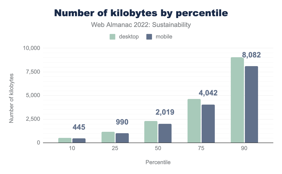
Comparing page weights on mobile and desktop, we notice that the difference between them is small, which seems surprising. Media should be served in an appropriate size and format depending on the size of the screen. This might not be the case here.
At the 90th percentile, desktop pages were over 9 MB and mobile pages over 8 MB. We are far from the recommended threshold of 500 kB. To find pages under this threshold, we have to get to the 10th percentile. If we feel generous and aim for 1 MB, this can be found around the 25th percentile. There is still a long way to go…
Carbon emissions
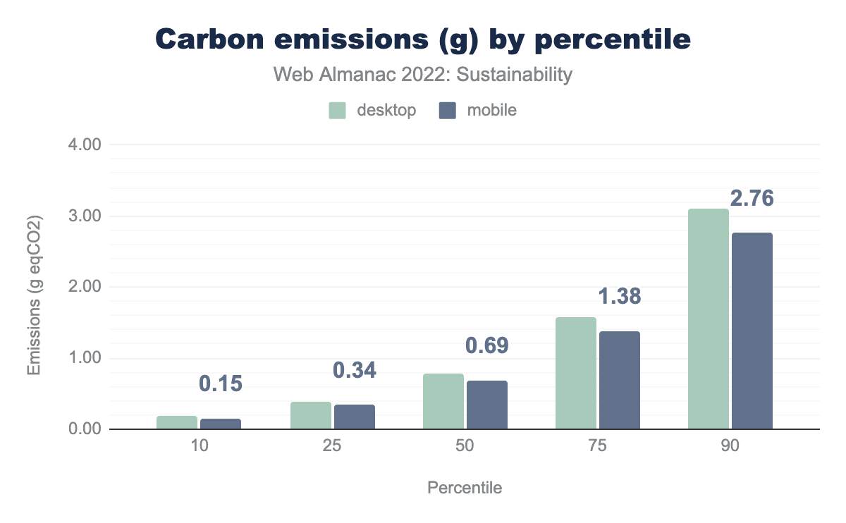
The carbon emissions for websites are very close on mobile and desktop. They seem quite low on the 10th percentile (around 0.15 g eqCO2, which would be equivalent to a little less than 1 meter with a thermal car). They reach as much as 2.76 g eqCO2 on the 90th percentile (a little more than 14 meters with a thermal car).
This doesn’t seem like much but you should keep in mind that each website gets thousands or even millions of visitors each month (sometimes even more) and what you see in the graph is emissions for a single page visited once. The environmental impact each month for all websites adds up.
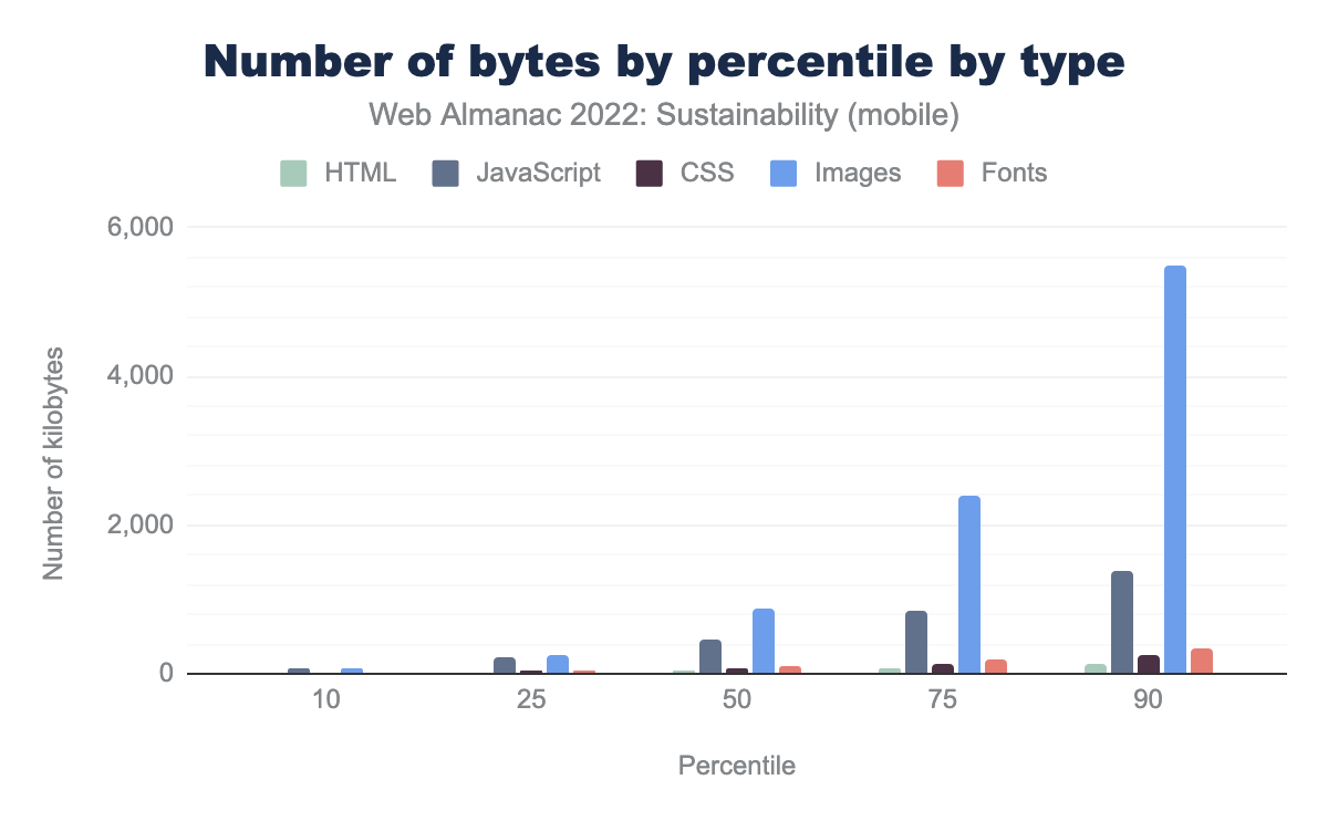
Now for an additional graph: emissions per percentile by type of content.
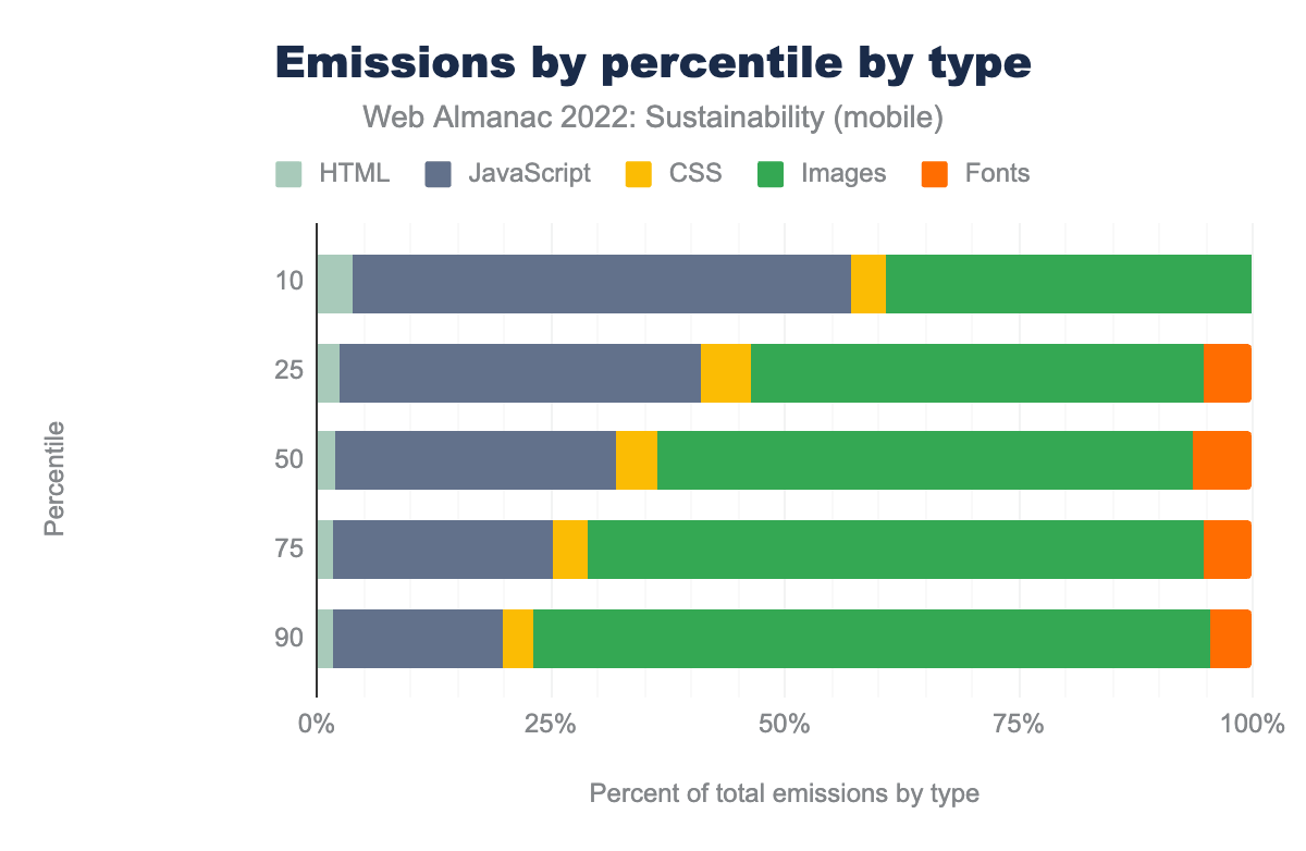
Images and JavaScript seem to be the more impactful but images get even more impactful as you go to upper percentiles. However, keep in mind that we only take data transfer into account to calculate carbon emissions. Processing JavaScript is usually more impactful than images. Once you have downloaded the JavaScript files, you still need to process them, sometimes leading to reloading your page or fetching other resources. Nonetheless, this graph underlines the necessity to reduce these impacts. It can be quite easy for images, as we will see later in this chapter. It gets more tricky with JavaScript, even though there are some easier technical optimizations such as minifying, compressing or reducing the need for it. More on that later too.
Number of requests
Requests are issued whenever a file is needed to load the page. As such, it helps represent the impact of the page on the network and servers, which is why it is sometimes used to calculate environmental impact. Analyzing the requests helps find possible optimizations, which we’ll consider when discussing the various types of assets and external requests.
The number of requests should be kept to a minimum. Keeping an upper limit of no more than 25 is a fairly good start. But trackers and such often make that target difficult to reach.
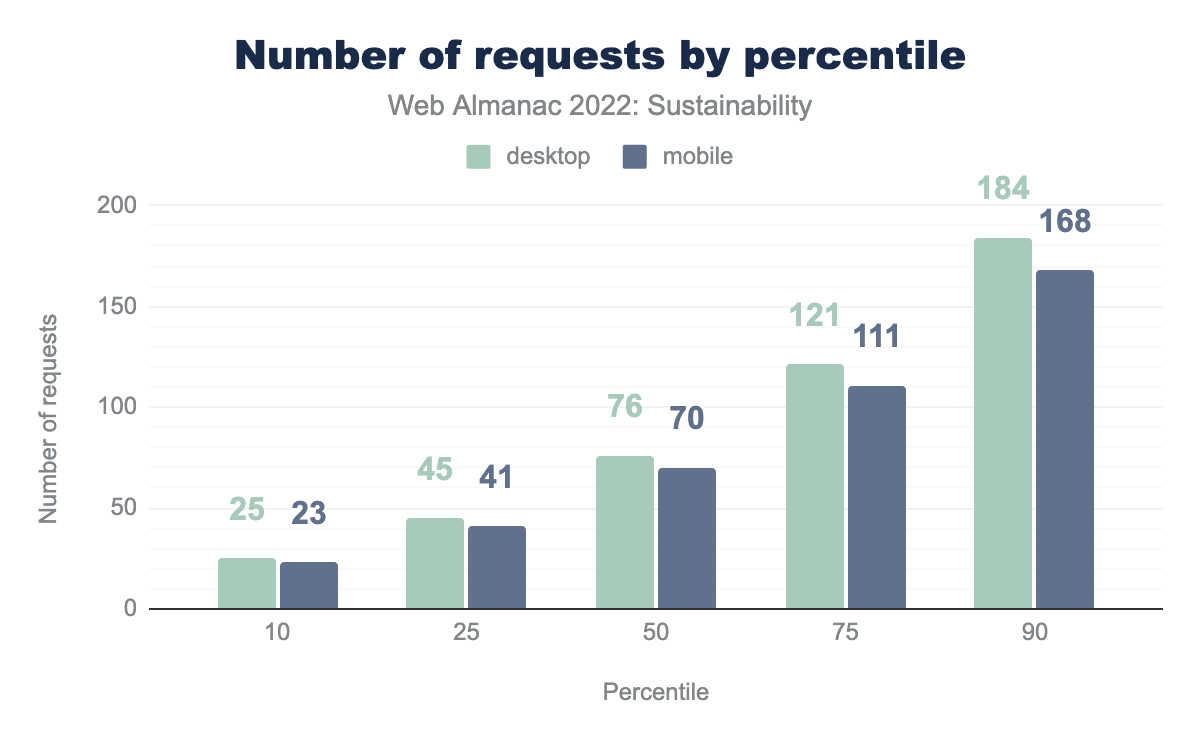
Comparing the number of requests of mobile and desktop, we once again find only a small difference, which shouldn’t be the case. To find pages under the threshold of 25 HTTP requests, we need to get to the 10th percentile again.
So, which content type is to blame for this?
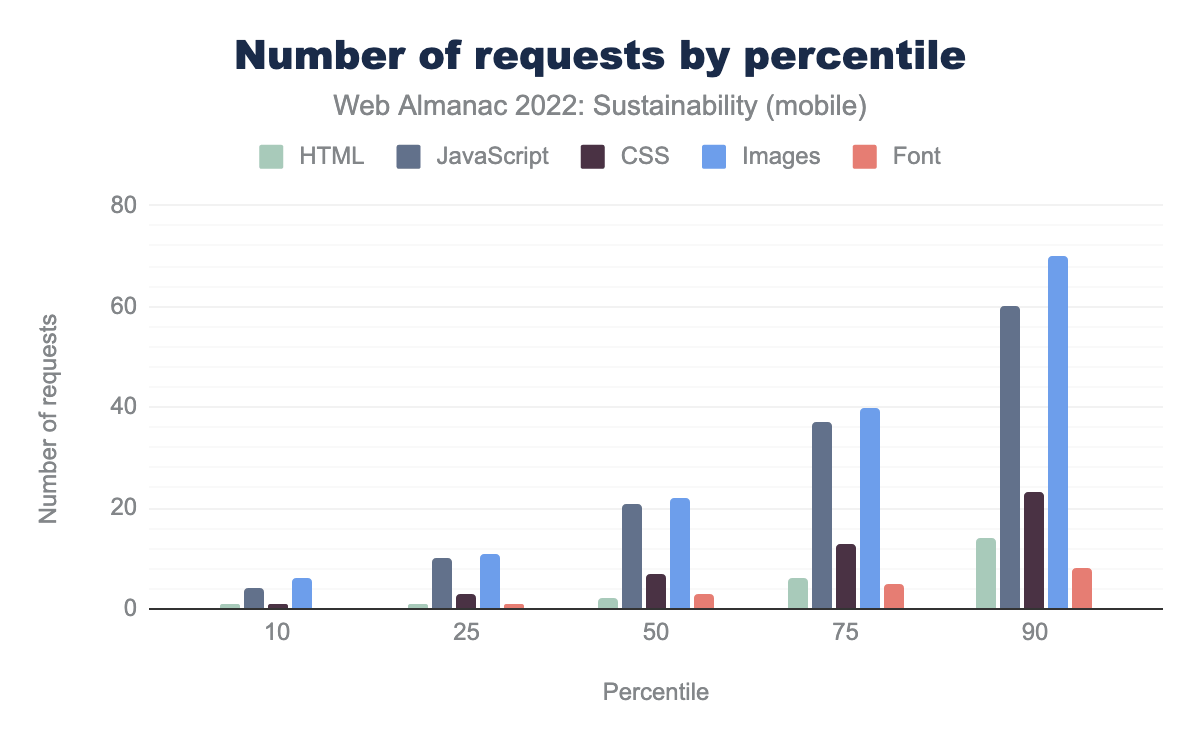
As usual, images are the main offenders but JavaScript is close behind.
There are almost as many HTTP requests for mobile and desktop versions, which shouldn’t be the case. As with page weight, mobile pages should be kept as light as possible to take into account aging devices, erratic connectivity and expensive mobile data. Since many individuals still use the web in such suboptimal conditions, mobile web should account for this and do everything possible to be accessible for all.
There are almost as many HTTP requests for images and JavaScript but the overall weight is much higher for images. JavaScript being generally heavier to process than images, this is still bad news. Once again, the results are really close for mobile and desktop, even if it would seem to make sense to offer lighter experiences on mobile.
More sustainable hosting
For the majority of this chapter, we focus on how changes in the quantity of resources like network, compute and storage affect the environmental impact of digital services—you might think of this as in terms of consumption as a lever for sustainability. However there are other levers too. You can’t efficiency your way to zero, and the same code, run on the same kind of server, but running on greener energy will have a lower environmental impact than otherwise. We can think of this lever as intensity.
Here there is some good news. Across the world, electricity grids we rely on are getting greener over time, driven by the falling costs of renewables and storage. 38% of our electricity came from clean sources in 2022 (examples in the ember climate, and this chart ).
However, not every grid, and not every region a provider operates is equally green. Amazon’s Web Service’s customer carbon footprint tools show how running services in one region over another can provide a measurable difference in carbon emissions, as does the open source cloud carbon footprint, for a growing number of providers. Elsewhere, the Green Web Foundation also provides an API for looking up any domain, for an estimate of how much the grid in that region is powered by fossil fuels.
You should however keep in mind that using renewable energy isn’t enough to provide truly sustainable hosting. You should also check the PUE (Power Usage Effectiveness), WUE (Water Usage Effectiveness), how equipment is handled, etc. To further investigate this, you could check an article from Wholegrain Digital and the European Data Centres Code of Conduct. More generally, beware of companies claiming to be carbon neutral (as stated by the french institute ADEME), especially since most of them don’t include Scope 3 emissions. Also, as stated above, compensating your carbon emissions is not enough, you should reduce them too.
How many of the sites listed in the HTTP Archive run on green hosting?
An increasing number of technology firms are also taking steps to green all the electricity they buy to power their infrastructure. Companies like Microsoft and Salesforce already buy as much green energy as their server farms use on an annual basis, as do many other companies. We used the Green Web Foundation Dataset to see how many organizations are “green hosts”, taking similar steps, and where they have shared evidence of powering all the energy they use on green energy, each year.
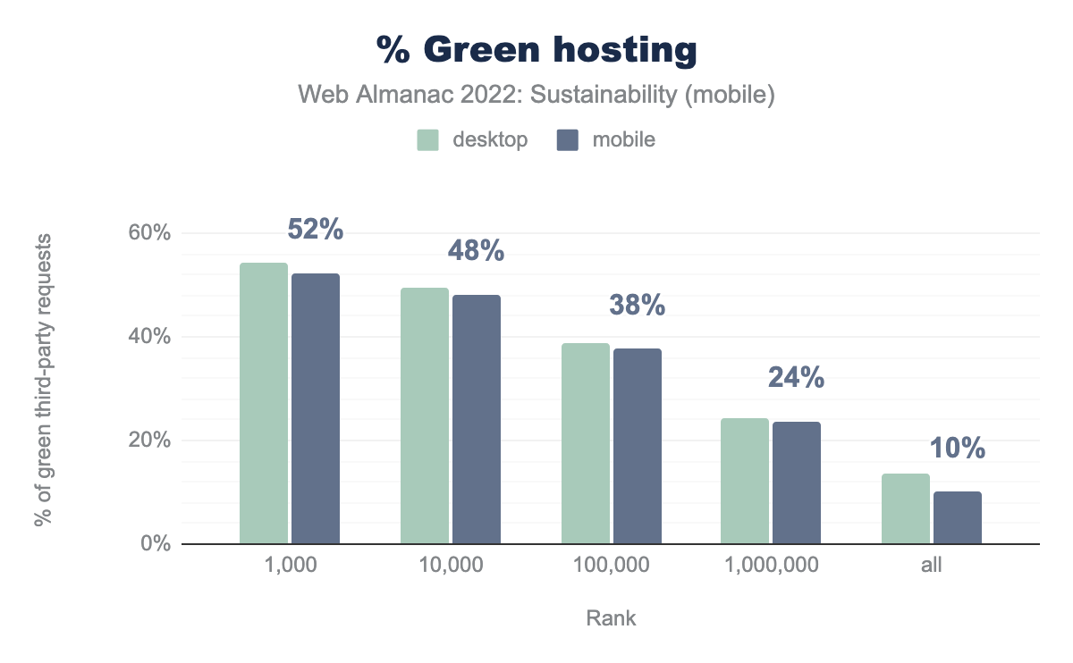
Overall, only 10 percent of the measured websites rely on green hosting. This highlights that a lot could and should be done on both sides: websites opting for green hosting as well as hosting companies aiming for more sustainability.
Reducing the environmental impact of websites
Best practices cannot work without measurements and vice versa. Now that we have a better representation of the environmental impacts of websites, let’s see how to mitigate this.
Avoiding waste
One of the most obvious ways to reduce the impact of websites is to avoid all that is unnecessary.
- Reduce content and code waste: A great many websites and apps have unnecessary content and features. Be the voice that asks whether we need this page or that feature. Cliché stock images add nothing to most pages except weight. Removing images is one of the best ways to reduce page weight. Unused code should go too.
- Reduce processing. Byte for byte, JavaScript has a much bigger impact than HTML, CSS, images or text, because it causes energy-intensive processing to occur on the user’s device. Try and choose the least energy intense implementation. Many web pages don’t even need JavaScript. Always choose the lightest coding option.
- Choose the lightest communication option. Text is by far the most environmentally friendly way to communicate. Video is by far the most energy-intense and unsustainable. As such, it should be used only if necessary, according to the needs of users. In these cases, video should be integrated as efficiently as possible.
- Design for long life. Design so that those using older machines and older operating systems can still use your website / app. Design so that you support people in holding onto their devices as long as possible. From a digital perspective, there’s nothing better you could do for the environment.
Loading unused assets
You should only load assets that are needed to display the page and more particularly the portion of the page that is visible. This could be done through lazy-loading, critical CSS and patterns such as Import on Interaction and Import on Visibility. It could also involve loading images at the right size for the client device. We will mostly focus here on oversized fonts and unused code.
Fonts
For sustainability, it is recommended to stick to system fonts. If you really need to use some custom fonts, there are some things to consider to avoid waste. Loading a font sometimes involves loading lots of characters and symbols that you might not need. For example, not all websites need Cyrillic characters but some fonts still include them natively. To check this, you can use tools such as wakamaifondue. To reduce the size of your font files, you should aim for a WOFF2 format and using variable fonts. You could also use subsets or use a tool such as subfont. The Google Fonts API offers some clever options for all this. Regarding Google Fonts, you should still keep GDPR in mind.
For more on this topic, see the Fonts chapter. You can also find some documentation on web.dev.
Unused CSS
Unused CSS is especially found when using CSS frameworks (Bootstrap and others). When doing so, you should keep in mind to remove unused CSS during your build phase. Chrome Dev Tools offer a Coverage tool to check on this. Be careful: on many websites, all CSS and JavaScript are loaded on the first visit in order to cache them for further visits and exploration of the website. This is not necessarily a bad thing, but unused code is one of the drawbacks that you should keep in mind, especially because it might slow down further code processing.
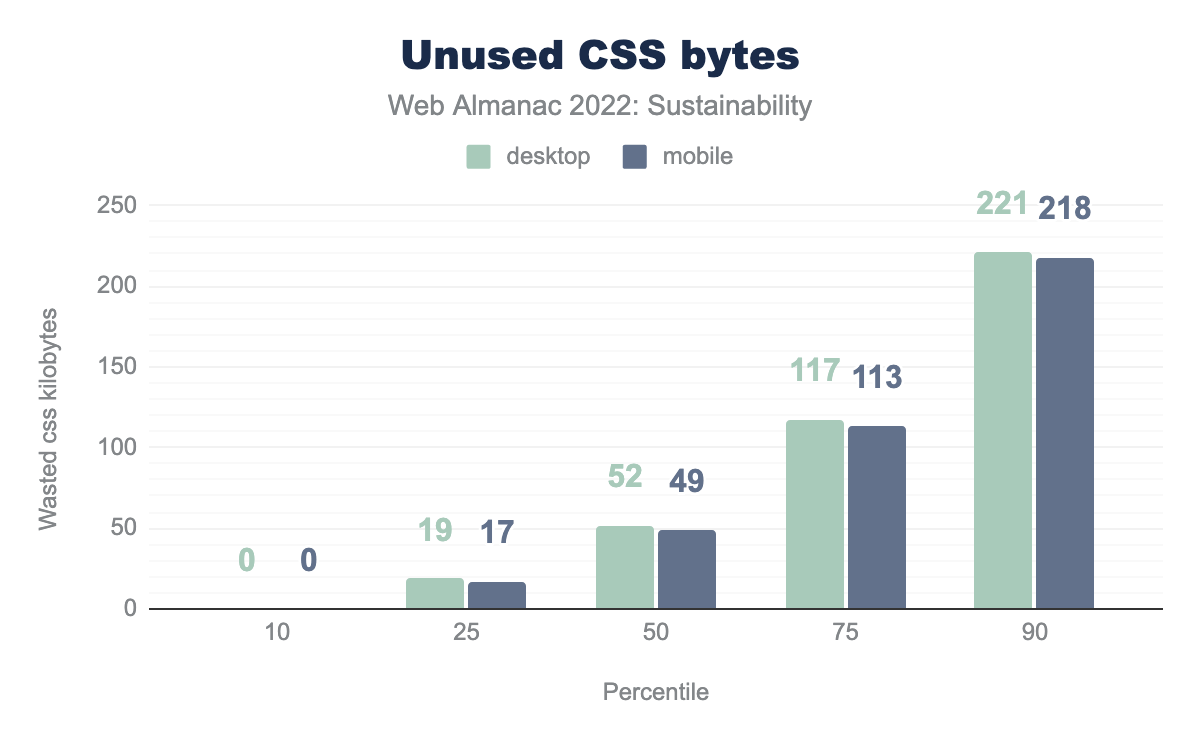
The good news is the 10 percentile websites load no unnecessary CSS. Unfortunately, it rises steadily on this graph, reaching more than 200 kB on the 90th percentile. Whether this for early caching reasons or otherwise, this should be checked. For sustainability, 200 kB of CSS is a big deal.
Unused JavaScript
The amount of unused JavaScript can grow quickly when adding dependencies or using libraries such as jQuery. The Coverage tool from Chrome Dev Tools is a good way to check on this. As for CSS, this is sometimes part of a strategy to cache everything needed for further browsing. This should be balanced by the fact that unused JavaScript tends to result in longer processing. When possible, look for smaller alternatives with only the functionality that you need instead of loading the whole toolbox, hoping it will one day prove useful. Once upon a time, jQuery was the all-in-one solution that you found on almost every website. As of today, a lot of things can be handled with modern JavaScript. Check your NPM dependencies and how they make your bundle bigger.
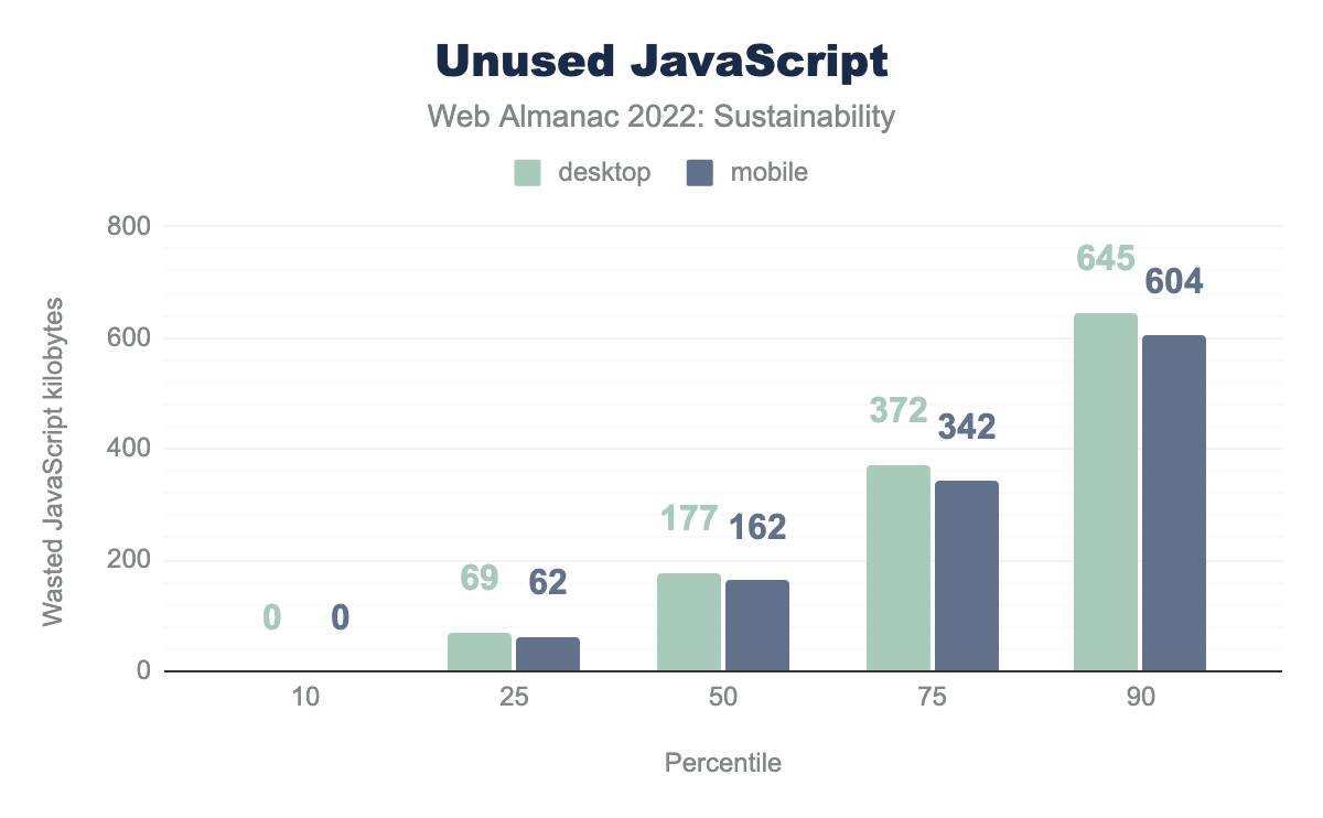
One again, the 10th percentile looks great with no unused JavaScript. However, this gets even worse than CSS for the upper percentiles, reaching more than 600 kB on the 90th percentile. This is already more than the ideal total page weight you should aim for.
Sustainable UX
Sustainable choices and optimizations can be made for a website before the development process during the early stages of design and prototyping. It is possible to design user experiences that prioritize efficient content from the beginning, even while creating experiences that engage users as active participants in sustainability practices. Contrary to some beliefs, all of this can be accomplished while still crafting beautiful, planet-centric web experiences.
While emissions associated with specific user experience tasks are difficult to quantify, some studies have estimated that consumer device use comprises as much as 52% of a product’s overall digital footprint. Therefore, it stands to reason that optimizing UX for sustainability can significantly reduce a product’s environmental impact.
Designing for stakeholders
The most sustainable products are those that retain a clear picture of who stakeholders are, including the non-human ones. In doing so, we have products that take both a human-centered and planet-centered approach during the design process.
Engaging in streamlined practices such as stakeholder mapping is helpful in identifying an ecosystem of stakeholders and their needs to set a path towards curating an inclusive experience for everyone involved. You’ll be able to use this research to map out opportunities for designing a product that prevents unintended consequences from ignoring the needs of all stakeholders involved (human and non-human). This can be taken even further by leveraging intersecting touchpoints to build planet-centric innovation into your business model that aligns with users’ goals.
Optimizing user journeys
Crafting strategic user journeys that prioritize helping users achieve their goals in the least amount of steps is one method for creating a carbon-friendly web experience for your site. The less time a user spends navigating your product—overcoming obstacles, and completing their tasks—the less energy, data, and resources are used during their visit. Strategies in doing so often include being mindful in the use of images, videos, and visual assets to help drive user engagement and direction.
This also involves a “less is more” approach by engaging in wasteless design practices that only show content that is necessary to a user at a given time and emphasizing asset choices that deliver the same value. These are all things that aid the user in getting what they need faster by avoiding the already surging attention economy on our devices for each page they visit. Continue to test and gather user feedback through prototyping and other methods to identify potential pain points that ensure you’re creating the most optimal experience for your users.
Empowering sustainable behavior
There has been a rising popularity in incorporating a choice architecture into product features to nudge users into making sustainable choices relative to the environmental touchpoint of that product. Examples of this practice range anywhere from providing users more sustainable packaging options at checkout, displaying the most carbon-friendly product options, and even building reward systems or dashboards that visualize and incentivize these choices.
Aiding in this decision-making and offering these types of choice can not only help users interact with your website in more sustainable ways, but also help remove barriers of entry that help optimize user interactions. More recently, popular options can include accessibility features, language choices, device optimization, or the ever-popular dark mode that utilizes low-energy colors while promoting proper contrast.
These types of options help minimize potential pain points of users while enabling a custom experience that saves time, energy, and prevents frustration in a user. The power of choice can grow deeper into popular opt-out features such as the enabling and frequency of notifications—all choices that inevitably save resources when utilized, thus allowing users to customize both their experience and impact per visit.
Designing for circularity and end-of-Life
Analyzing and understanding the entire lifecycle of a digital product or service reveals opportunities to reduce waste and improve environmental impact over time. Defining and tracking clear, measurable success indicators can help guide this process.
- Circularity: Designing modular, easily replaceable or updatable components and focusing on continuous improvement can help you reduce technical debt and prolong the life of a digital product or service. This also saves time and reduces resource use.
- End-of-Life: Creating a clear retirement plan for your digital product or service will reduce the energy required to store and serve outdated or unused data. Plus, good data disposal practices also align with emerging data privacy laws that respect users’ “right to be forgotten”.
Optimizing your content
Let’s say you have optimized your website, making sure unneeded content and functionalities were removed. This was the moderation part (and usually the tough part). We can now look into the efficiency part: making sure everything you keep is as sustainable as possible.
In this section, we will look into images, videos and animations. More info on these in the Media chapter.
Image optimization
Images represent a huge part of requests and page weight. Let’s see what we can do to mitigate this—in addition to avoiding stock images that bring you no additional information. As already mentioned, you should have already removed unnecessary images.
For a closer look on the relative benefits you can expect from possible technical optimizations, there is a post on the HTTP Archive that compares them. Since you can more and more easily rely on native HTML (and sometimes CSS) for this, you should implement all of them.
Format (WebP/AVIF)
WebP is already widely supported and one of the best formats you can find for your images. Its compression is impressive and results in less data being transferred and processed. In addition to this, it enjoys wide support. AVIF should be even better but it might be wise to wait until it has reached a wider adoption from browsers. Until then, just make sure you use the WebP format for your images. Your icons should be in optimized SVG and you could even include them directly in the HTML to avoid additional requests.
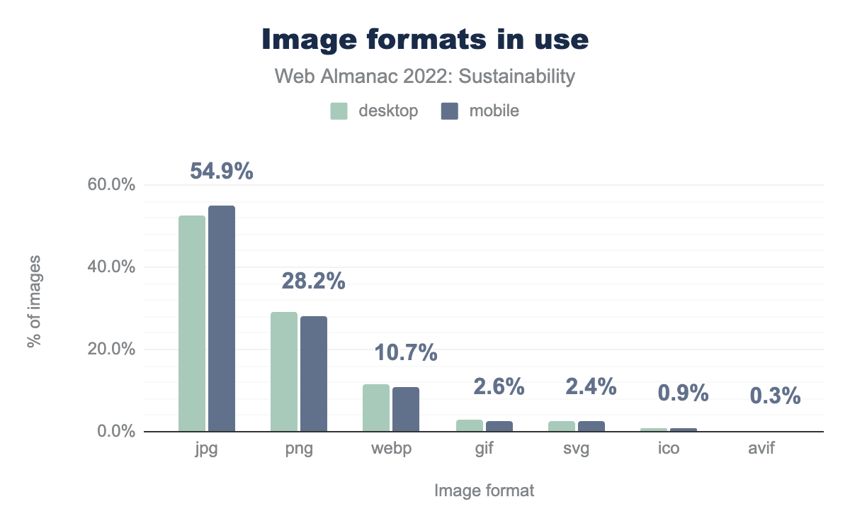
As of today, only 10% of the websites use WebP, which is already better than last year but far from ideal. This could be a huge opportunity and help reduce the overall weight of images. AVIF is even further behind, only slightly over 0% but we can hope this figure will rise in the coming years.
Responsiveness, size, and quality
As a growing proportion of users browse the web on various devices (mostly smartphones but also game consoles, smart watches, tablets, etc), you should aim to deliver images of the right size—and weight—for each of them. After all, this is one of the major topics of responsive design and developers have lots of tools to automate this.
Also remember that you often don’t need a quality of more than 85% since the human eye won’t detect a difference above this. Reducing quality to 85% will help reduce the size of images.
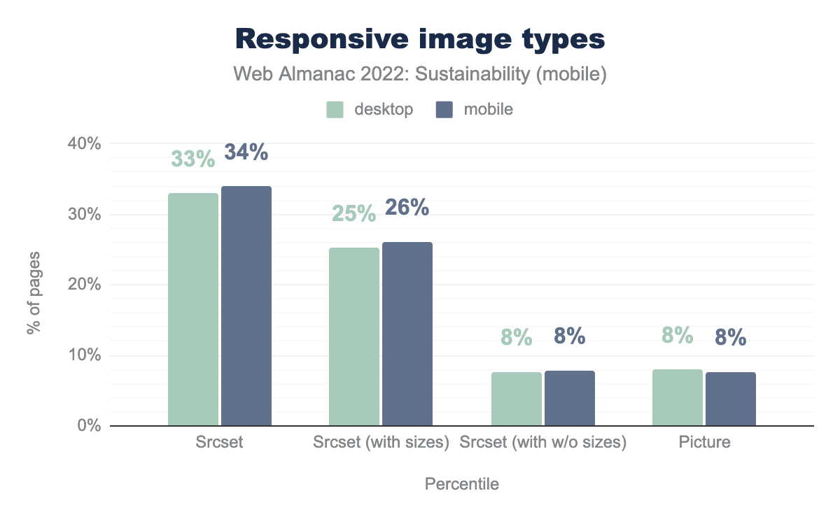
Around 34% of the websites use the srcset attribute, which is a great way to integrate responsive images. The <picture> element works great too and is already found on 7% of the websites. Being optimistic, we could focus on the fact that responsive images are gaining ground each year, even if it’s not used on a majority of websites. However, responsive design has been around for quite some time and this should be more widely spread.
Lazy-loading
An easy way to get a faster first load is to load images progressively: only load what you need when you need it. This is done through lazy-loading and most browsers now support this natively. Not all users will scroll your page in its entirety so you should avoid loading images that might never be seen by the current user. As such, this is a quick win for sustainability and your users.
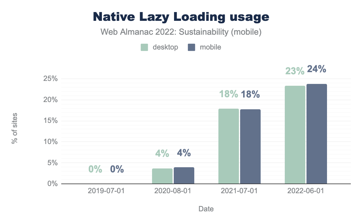
On this graph, we see that native lazy-loading has been more and more widely adopted since its implementation. Around one our of four websites use it. Some might still be using JavaScript libraries to implement this behavior and do not appear on this graph. Switching to native lazy-loading could be a great opportunity for them to slightly reduce requests and avoid some JavaScript processing.
A quick note on iframes: lazy-loading could also be natively applied to iframes, although, for sustainability reasons, you should consider avoiding iframes altogether. Most of the time, facade is the good pattern for you, whether you want, for example, to include embedded videos or interactive maps. Directly including external content on your page has a bad habit of increasing the weight and requests of the page and often causes accessibility issues.
Video
Videos are some of the most impactful resources you can include on a website. More info on these in the Media chapter. To integrate third-party videos, you should use facades. On top of this, you should set them up wisely. For instance, avoid preloading and autoplay. You could also learn how to quickly reduce the size of your videos.
Preload
Automatically preloading videos (or audio files) involves retrieving data that might not be useful for all users. On a page including such content and having many visitors, it can quickly add up. As such, preloading should be avoided and only done on user interaction.
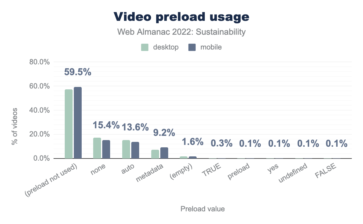
preload attribute is not used on 57.6% of desktop videos and 59.5% of mobile videos. The preload attribute can be found with the none value on 17.3% of desktop videos 15.4% of mobile videos. The auto value is used on 15.3% of desktop videos 13.6% of mobile videos. The metadata value is used on 7.5%% of desktop videos 9.2% of mobile videos. The preload attribute is empty on 1.6% of both desktop and mobile videos. The value preload attribute has a value TRUE on respectively 0.4% and 0.3% of desktop and mobile videos. Lastly, the preload attribute has a value of preload, yes, undefined or FALSE on 0.1% of both desktop and mobile videos.Looking at this graph, one should keep in mind that the preload attribute only has 3 possible values: none, auto and metadata (default). Using the preload attribute with no value or with an erroneous value might be the same as using the metadata value. It still involves loading as much as 3% of the video to get these metadata and can thus be quite impactful. none is still the best way to go for sustainability. But you have to keep in mind that this is only a hint for the browser. In the end, the browser has its own way of handling the preloading of the video and it might not fit with what you had in mind.
For more on this, you should check the article from Steve Souders (2013) and another one from web.dev (2017). Even if you can configure your browser or device to save data, video preload is something that browsers should handle more sustainable by default.
Autoplay
Most of the considerations we made on preload also apply with autoplay. In addition to the fact that it involves loading data and displaying content to users who might not be interested, it can cause accessibility issues. For some users, unsolicited moving pictures and/or sound might be bothersome and hinder their browsing experience.
Also, this attribute can override your preload setting since autoplaying requires loading (obviously).
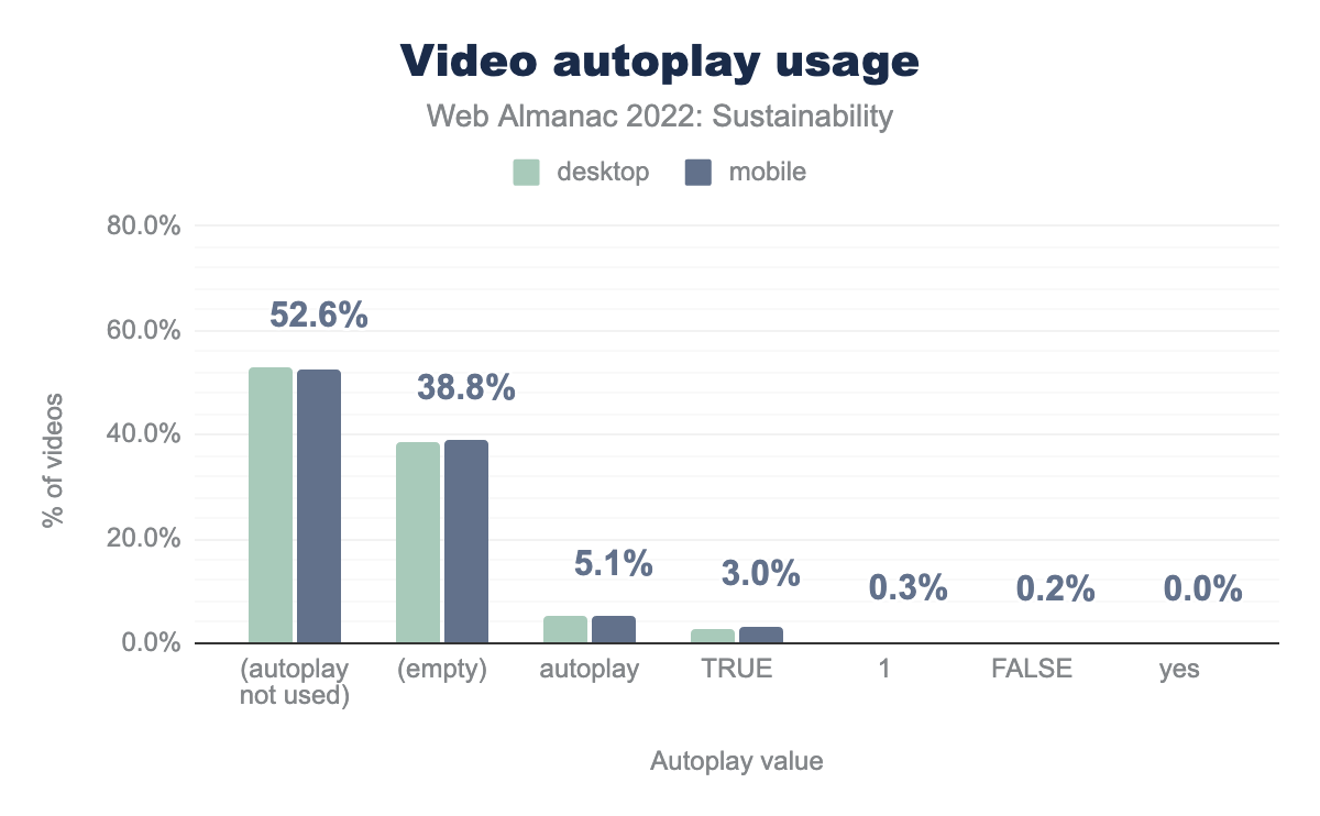
More than half of the websites don’t use autoplay, which is great. But this is a Boolean attribute so having it, even with an empty value (or wrong value), triggers autoplay. For all the reasons mentioned above, this should be avoided for both sustainability and accessibility.
Animations
For accessibility, moving and blinking parts should be avoided unless users have some control on them. Regarding sustainability, animations are costly: they tend to increase the battery discharge speed and CPU consumption—which might in the end reduce the autonomy of a smartphone. They also involve retrieving and running some code, which might delay rendering.
The (infamous) case of carousel is documented on these pages:
If you must use animations you should also avoid GIF or at least convert them to optimized videos, since animated GIFs can get really heavy.
Favicon and error pages
By default, your browser will look for a favicon upon arriving on a website. If it’s missing, most servers will return a 404 error and the HTML for the 404 page of said website. So, some things to consider:
- Don’t forget your favicon—and cache it!
- Don’t forget to optimize the HTML of your 404 page to make it as light as possible or, even better, configure your server to make sure it only sends some text rather than the HTML of your 404 page.
For more details on all this, see this article from Matt Hobbs.
Optimizing external content
One of the great things about web development is that you can easily rely on external content: frameworks and libraries but also content. However, just because it is easy to implement doesn’t make it useful or any less impactful. For each external element that you want to add, try to ponder whether it is really needed by the users. If so, then try to integrate it as efficiently as possible. And also keep in mind that each piece of content comes at a cost—requests and additional code, but also sometimes vulnerabilities or at least increasing the attack surface.
Third parties
Third-party requests account for 45% of all requests, with 94% of mobile websites having at least one identifiable third-party resource. This is not surprising, given that third-party code is often used to deliver complex functionality on web pages. It also serves as a quick fix for including cross-platform content onto a website.
With third-party requests making up such a large portion of requests on the web, it is reassuring to see that the vast majority of these requests are being served from green hosting providers.
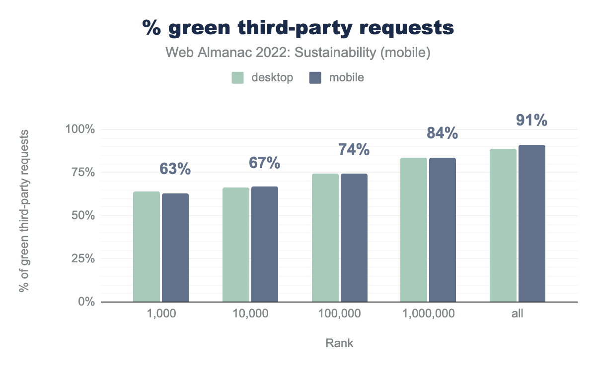
The chart above shows the percentage of third-party requests served from green hosting providers. It’s interesting to note that the trend here is opposite to green website hosting. One might expect this to be the case, however, since the top five most requested third parties are all Google entities (fonts, analytics, accounts, tag manager, and ads). URLs associated with these entities are almost entirely listed as served from green hosting.
Making third-party requests more sustainable
As we have seen, most third-party requests are being served from green hosting. However, there is still room for improvement, especially for higher ranked sites. If you are interested in the sustainability of third-party services used on your website, Are my third parties green? is an online testing tool, directory, and API that can help you get started. For the sake of transparency, it should be noted that this tool was created by one of the chapter authors.
Beyond hosting, we should also be considering the impact of data transfer for third parties. While providers of third-party services make it relatively easy to integrate their content on another website, that doesn’t mean it is always optimized to reduce the amount of data being transferred. For example, the Third Parties chapter of the 2022 Almanac uncovered that:
Google fonts are the most-popular third party on mobile devices being used by 62.6% of all websites. The CSS they provide is not minified. The data shows the average page which has Google Fonts could save 13.3 KB from minifying it.
In the case of fonts, self-hosting and subsetting are two techniques that, when combined, can help reduce this waste. However, most third-parties come in the form of scripts. These incur a cost when transferring data over the network, but also utilize processing power on the end-user’s device. For these, we can reduce their impact by loading them “just in time”.
This pattern is known as Import on Interaction, which sees static facades used in place of interactive content when the page first loads. The content then gets requested and loaded just before the user interacts with an element. This can result in less data being transferred initially, and also reduces the processing required when viewing the page—especially if the script is never requested.
Implementing technical optimizations
We have just seen a lot about the sustainability of the content of websites—even external content. This leaves us with all the other technical optimizations. There is a lot to be done here too and most of this could and should be automated. Once again, this might intersect with some other chapters from the Web Almanac but the idea is to offer you a whole chapter about sustainability and how to make websites more sustainable.
The web performance experts have done a lot in the field of technical optimizations so there is a lot to learn from them. Just keep in mind that some of their best practices don’t necessarily make your websites more sustainable. However, making things lighter and simpler is great for sustainability AND performance—not to mention accessibility.
JavaScript
There is a lot to be said about JavaScript and how it helped the web grow (and how it sometimes slows it down). Let’s stick to some quick wins: easy to implement and great for sustainability. If you want to learn more about all this, you should check the JavaScript chapter.
Minification
Minifying JavaScript involves removing unnecessary characters for the browser, making your files lighter.
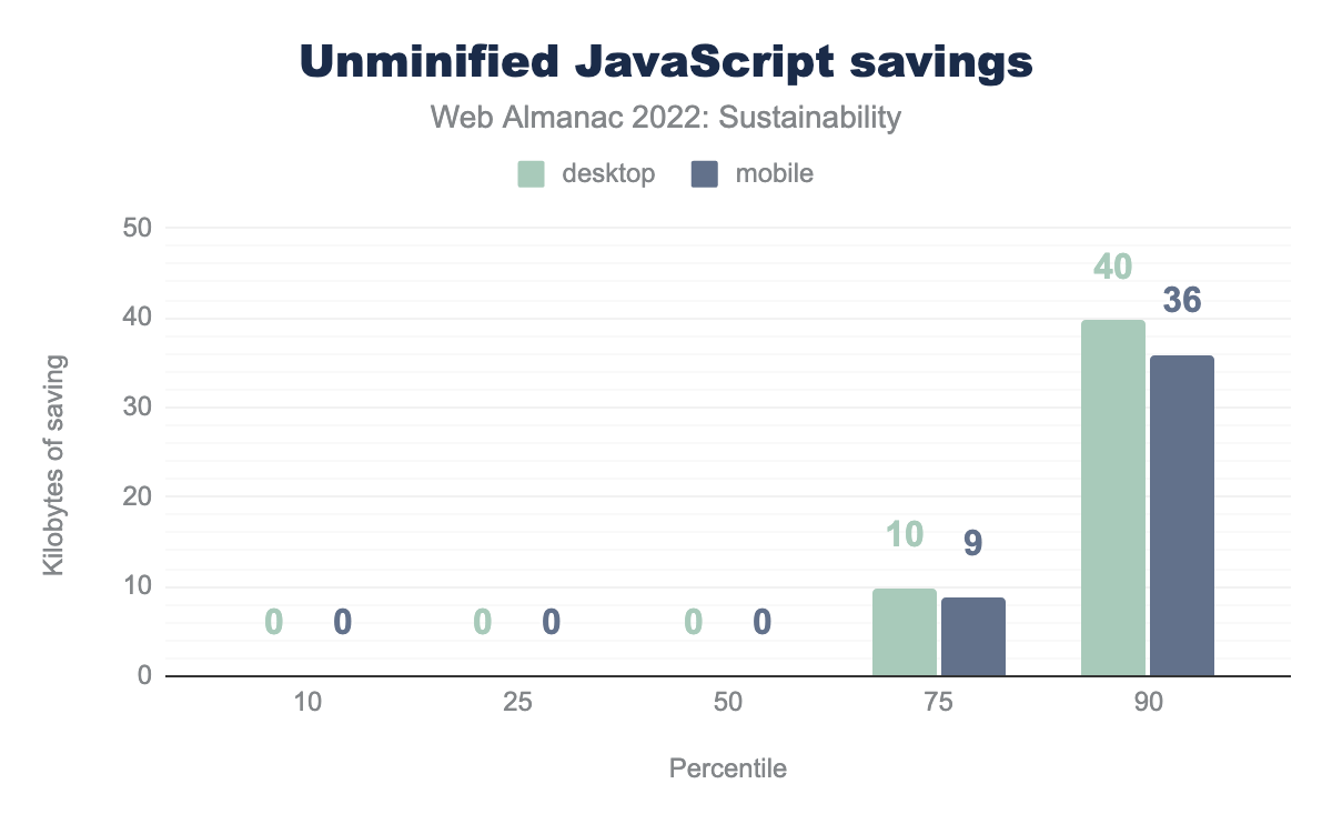
On this graph, we notice that most websites already do a great job at minifying JavaScript and that benefits from minifying are not so big. However, why not do it since it’s easy to implement and always beneficial?
Including as little as possible directly in HTML
Inlining code is bad practice, even more for sustainability. Making your HTML heavier to load and process is not something you want. Inlining JavaScript might also make it sometimes more difficult to optimize (and maintain).
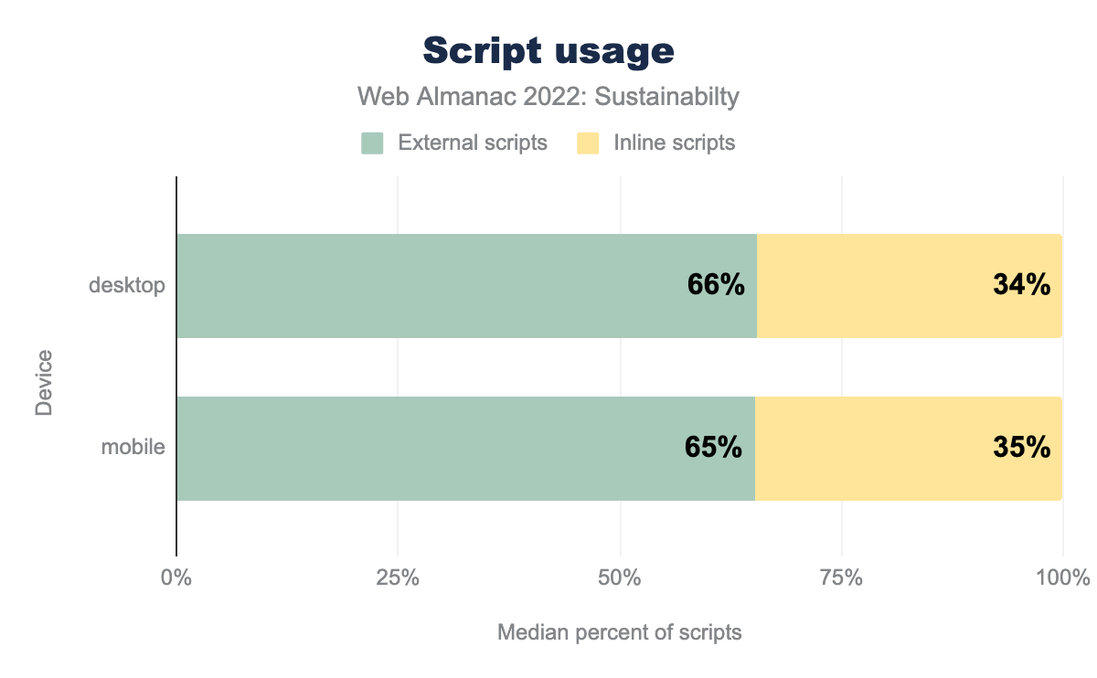
Almost one third of websites inline JavaScript. This is also something you see a lot with CMS.
CSS
CSS could be a great lever for sustainability, especially if you want to limit the number of images on your website or create some animations as mentioned earlier in this chapter. You can find documentation on how to write efficient CSS—and should definitely look for this—but we’ll stick to standard optimizations that should be implemented everywhere. If you want to learn more about all this, see the CSS chapter.
Minification
As with CSS, minifying JavaScript involves removing unnecessary characters for the browser, making your files lighter.
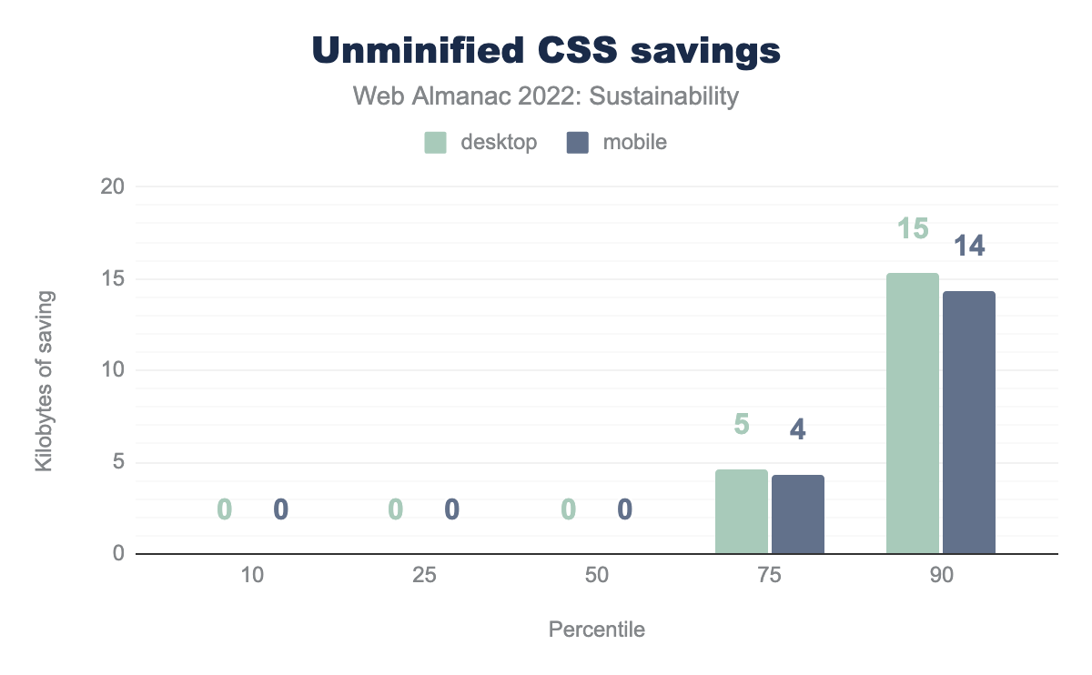
Unminified CSS is absent from most of the websites and the potential gains appear really light. However, it is still beneficial to minify CSS and this should be implemented on all websites.
Including as little as possible directly in HTML
As with JavaScript, inlining CSS could prove detrimental for the size of your HTML file and for the performance of your website. This is often found on websites built with CM and those relying on the Critical CSS method.
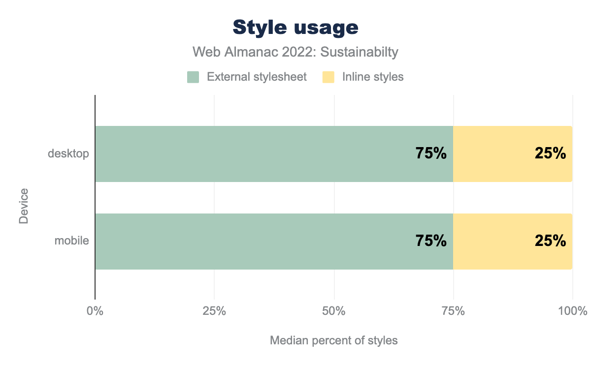
On this graph, it appears that a quarter of websites still use inline CSS. For sustainability reasons, this should be avoided.
CDN
Implementing a CDN can help make your website more sustainable. It helps get your assets as close to your users as possible and sometimes automatically helps optimize them.
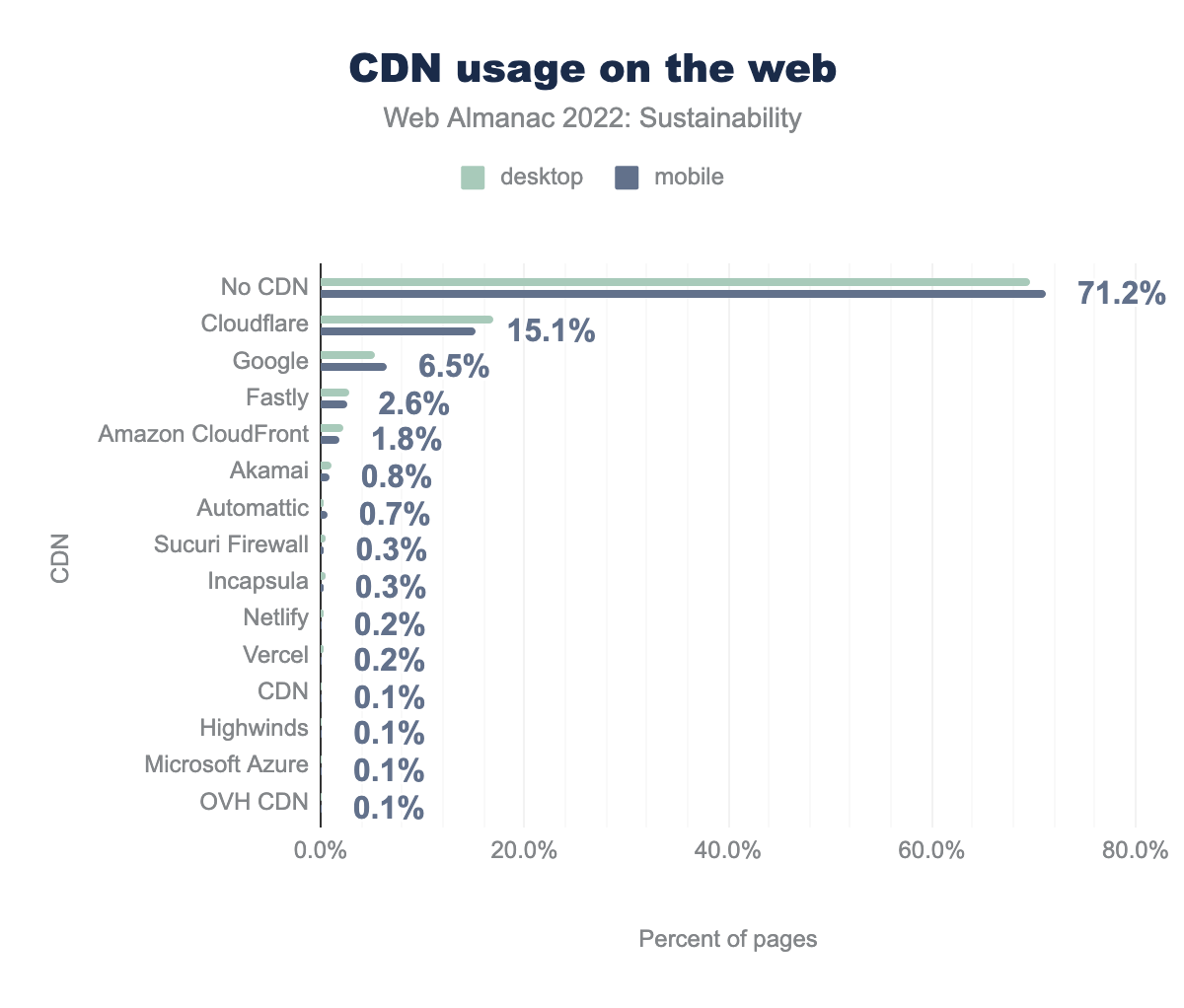
Despite these obvious benefits, more than 70% of websites still don’t use a CDN.
Text compression
Compressing the text assets for a website could require some (easy) server-side configuration. Text files such as HTML, JavaScript and CSS are then compressed (in Brotli or Gzip format), which can easily make them lighter.
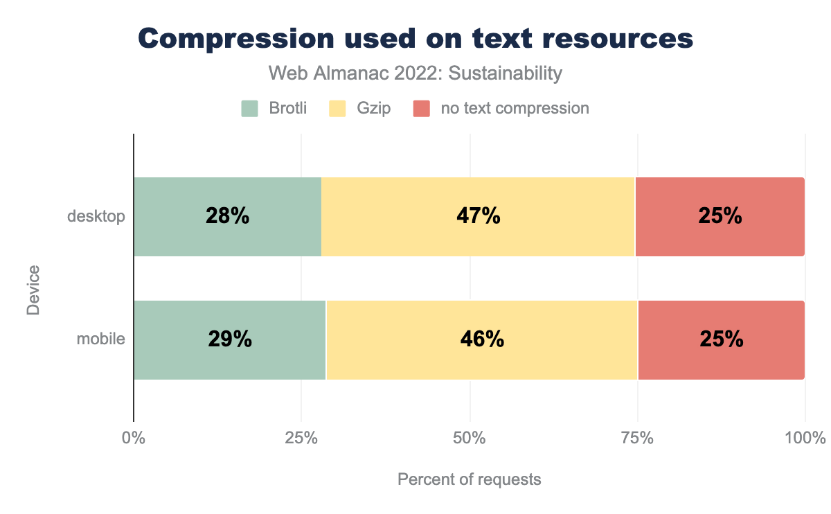
However, a quarter of websites still don’t implement text compression. Gzip is unanimously supported so feel free to use it.
Caching
Caching is one of the killer features of browsers but not always easy to implement flawlessly. Caching is great for sustainability since it prevents browsers from requesting all resources every time.
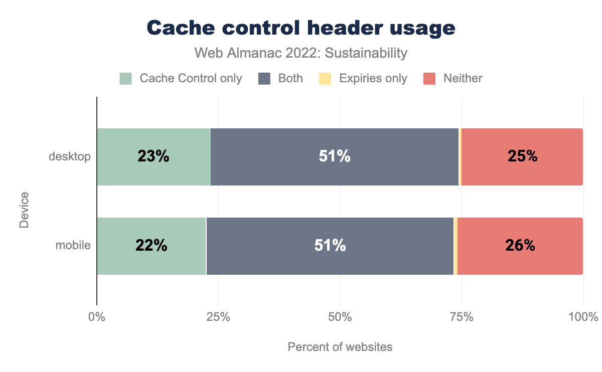
On this page, we see that more than a quarter of websites don’t use caching at all. This is a huge loss for sustainability and performance and—for obvious reasons, users.
SEO and sustainability
Similar to accessibility, estimating emissions specifically related to search engine optimization efforts is challenging. However, SEO does have significant sustainability implications:
- Keyword research, a foundation of SEO, helps authors align the content they create with specific target user needs.
- Structured data helps search engines better understand page content, allowing them to serve more relevant information in results.
- Search-optimized content is typically easier to find, quicker to skim due to its formatting, and clearly written, making it easier to understand.
- Analyzing content performance over time (bounce rates, scroll depth, etc.) helps authors improve the content they have published so it better serves user needs (and improves search results). Depending on tools used for analysis, privacy implications may arise.
Collectively, these efforts reduce the amount of time a user spends searching for information that is relevant to their needs. This reduces their energy use.
Conversely, search engines often reward long-form content like tutorials and guides, which can use more bandwidth (and energy) than listicles or other short-form content. As with many sustainability-related concepts, the key is finding the right balance between creating useful and compelling content and optimizing for performance and efficiency.
Many years ago, Google noted that the energy required for a single search could power a 60W light bulb for 17 seconds. In 2022, more research is needed to quantify the specific environmental impact of search engine optimization. Still, the sustainability implications of good SEO work are clear: optimized content reduces end user energy consumption (not to mention frustration).
Sustainable data and content management
As noted above, structured data helps search engines better understand web pages to produce more relevant results. However, our collective relationship with data has sustainability implications beyond SEO. For example:
- Unused, duplicated, outdated, or incomplete data and poorly managed content use up server space, cause errors for users, and require energy to host and maintain.
- Regular content audits and a clear content governance plan can help you measure content performance and prune outdated or underperforming content over time to keep your website lean, efficient, and well-organized.
- While third-party services may only inject a small snippet of code into an individual web page, the data they collect can be very resource-intensive. A single digital ad, for instance, can produce as much as 323 tons of CO2e.
- Data tool makers—like marketing automation, email marketing, and CRM systems—often focus their product management efforts on collecting data rather than optimizing it. In fact, some of these platforms charge for data use, making their business models at odds with sustainability principles.
- Similarly, many organizations don’t have clear data disposal policies nor do they train their teams on effective data management. This is not only a sustainability issue but a privacy and security issue as well.
These are just several examples from a long list of sustainability issues associated with poorly managed content and data. Organizations should regularly audit their content and data management practices to improve efficiency and reduce resource use.
Popular frameworks, platforms, and CMSs
Online platforms and CMS tools help lower the barrier to entry for those wishing to publish or do business on the web. Likewise, development frameworks and site generators allow those who build for the web to get started on projects faster, and enable them to take advantage of defaults and solutions that solve common development problems.
The charts below show the median page weight of the top five most popular eCommerce platforms, CMS tools, and site generator tools.
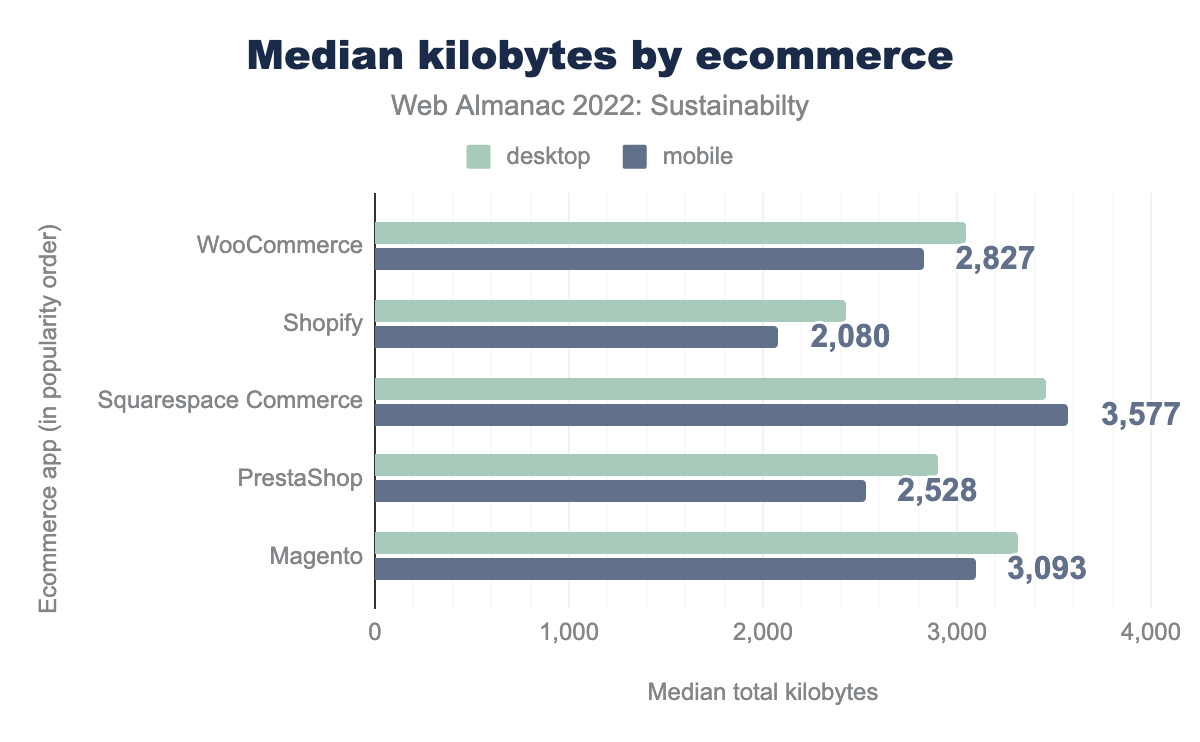
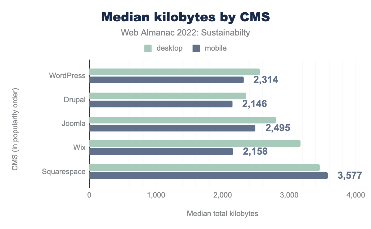
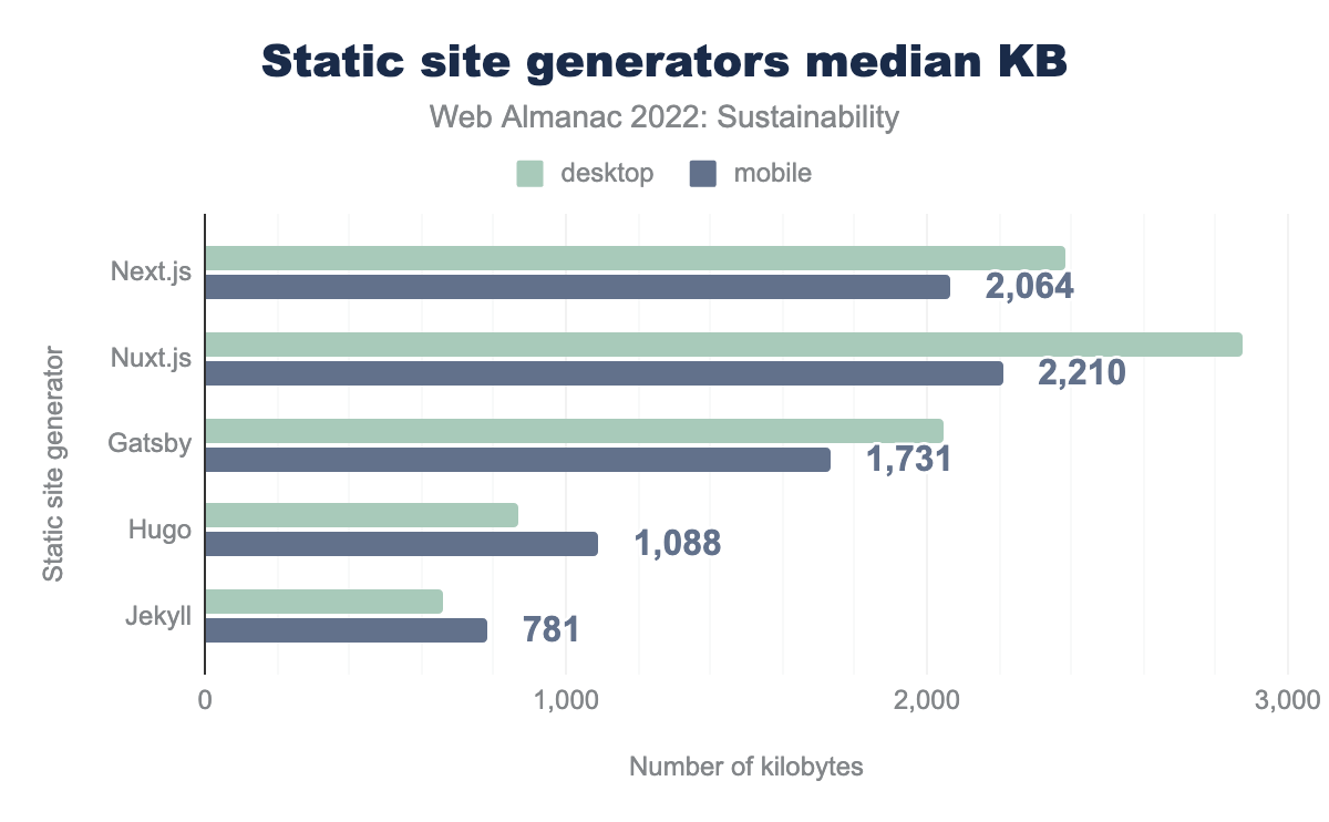
Of interest here is that all but three of the platforms/tools listed have a median mobile page weight that is less than the overall median (2,019 KB). These are all in the static site generator category, and especially in the case of Hugo and Jekyll, it can likely be attributed to the kinds of websites these tools are used to create—namely mostly blog and textual content, with much less reliance on JavaScript. It should also be noted that SSGs are often used with performance in mind, which makes them more likely to be further optimized than the average website using a CMS only for commodity reasons.
Another area of interest when looking across the three segments is that some show a bigger gap between desktop and mobile page size. On closer inspection, this seems to be largely down to image optimizations that some platforms seem to be applying for mobile devices. To highlight this, let’s look at the CMS category, where Wix shows a big difference between desktop and mobile size compared to the other popular platforms.
| CMS | Device | HTML | JavaScript | CSS | Image | Fonts |
|---|---|---|---|---|---|---|
| WordPress | Desktop | 40 | 521 | 117 | 1,202 | 166 |
| WordPress | Mobile | 37 | 481 | 115 | 1,100 | 137 |
| Drupal | Desktop | 23 | 416 | 68 | 1,279 | 114 |
| Drupal | Mobile | 23 | 406 | 66 | 1,158 | 92 |
| Joomla | Desktop | 26 | 452 | 86 | 1,690 | 104 |
| Joomla | Mobile | 22 | 401 | 83 | 1,504 | 82 |
| Wix | Desktop | 123 | 1,318 | 86 | 647 | 197 |
| Wix | Mobile | 118 | 1,215 | 9 | 290 | 148 |
| Squarespace | Desktop | 27 | 997 | 89 | 1,623 | 214 |
| Squarespace | Mobile | 27 | 990 | 89 | 1,790 | 202 |
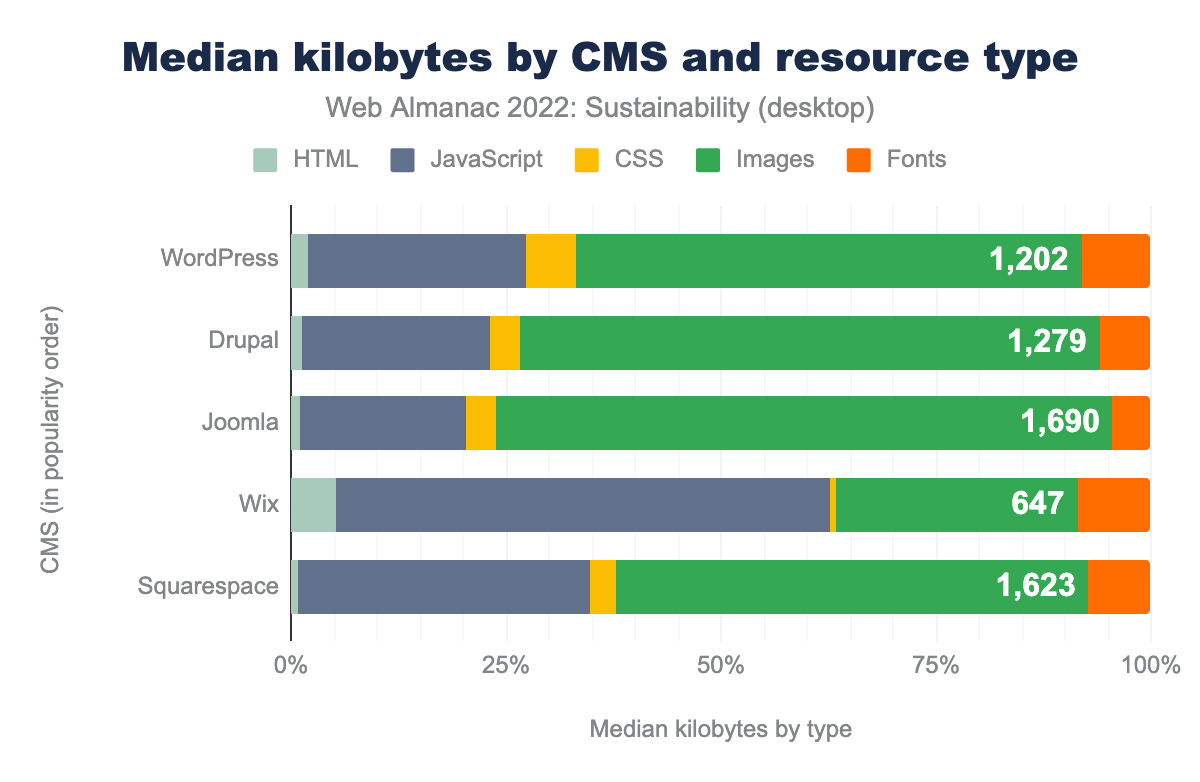
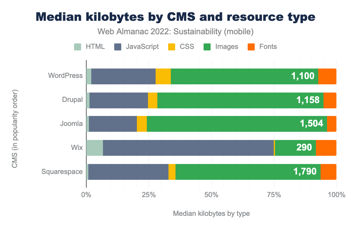
The table and charts above highlights that Wix, as part of their platform, appear to be applying much more aggressive mobile image optimizations. A similar pattern is seen in the site generator segment, especially when looking at frameworks like Next.js and Nuxt.js.
This seemingly small insight helps to capture the important role that platforms and frameworks can play in helping deliver more sustainable websites. By applying sensible defaults, platform developers and framework authors can help developers leverage their tools to make sites that are green by default.
Conclusion
This is the first Web Almanac chapter ever on sustainability and quite a symbolic year to do so with all the droughts, heat waves and other climatic events all over the world. There’s definitely something wrong and it’s getting harder and harder to look the other way. The web plays a part in this and it’s a priority to help everyone understand its environmental impacts. Given all the accessible data from HTTP Archive, this chapter is a unique occasion to gather metrics and take a step back to look at the state of the web regarding sustainability.
Based on available metrics, we see that some best practices are already being adopted and slowly spreading. However, there is still a lot to be done. Some of these actions are easy to implement but could still prove really beneficial. Also, both best practices and measures—preferably on real devices—are essential for continuous sustainability improvement.
It’s up to everyone to gain awareness about sustainability, discover the best practices and implement them. It’s essential to spread the word about all this and generate discussion. As with accessibility, this concerns all of us and we have everything we need to make the web more sustainable.
Most of what we have seen here shows what developers can do to make websites more sustainable. But we can and must go further. We have to reach for sobriety through design. Project managers need to make sustainability a priority and make sure that this is not something that can always be handled later. Companies need to think about making their business models more sustainable.
With this chapter, we hope to make you more aware about web sustainability, help you understand how sustainable websites are today and give you some tools and clues to handle this topic and spread the word.
Actions you can take
The sustainability of websites needs to be taken into account. As of today, there is still a lot to be done. If needed, you should start with some of the resources recommended above to gain awareness on this subject —and spread the word.
To get started on an existing website, you can:
- Optimize images (WebP + lazy-loading + responsiveness + cache + quality) and make sure this is done automatically
- Avoid implementing videos. If they are necessary, do not autoplay nor preload them
- Look for a more sustainable hosting
You should then:
- Clean up your 3rd-parties.
- Optimize your CSS and JavaScript starting with the easy technical optimizations and automating them.
- Review the design to make your page more sober (less visual content, less animations, etc) and streamline the user journey(s)
Making your websites more sustainable is part of continuous improvement. Not everything can—or should—be done at once. Rely on best practices and measurements to make sure you’re going the right way. Whether you’re working on an existing website or creating a new one from scratch, keep everyone in the team involved or at least aware of this topic.
Some of your users would love to know that your website is more sustainable and how you achieved it. And all of them would benefit from this.
With special thanks to Tom Greenwood, Hannah Smith, Eugenia Zigisova, Rick Viscomi and all the other wonderful people who made this chapter possible.


