Accessibility
Introduction
27% of the global online population is using voice search on mobile. 85% of Facebook videos are watched with closed captions on and sound off. When you ask voice assistants like Siri, Alexa, and Cortana a question, they typically read their answer from a web page using screen reader technology that has been around for as long as personal computers have existed.
When does a software feature cease being an “accessibility feature” and simply become a “feature” that we all use? Ask yourself that the next time you put your smartphone in silent/vibrate mode – especially if you’re not a member of the Deaf/Hard of Hearing community.
Good accessibility benefits everyone, not just those with disabilities. This is one of the core principles of Universal Design. Tim Berners-Lee said, “The power of the Web is in its universality. Access by everyone regardless of disability is an essential aspect.” After the COVID-19 pandemic started, more and more people have been reliant on the internet. Likewise, accessibility needs to improve as well, or we risk alienating a lot of people.
The median overall site score for all Lighthouse Accessibility audit data rose from 80% in 2020 to 82% in 2021, then 83% in 2022. We hope that this increase represents a shift in the right direction.
Although the state of web accessibility still leaves a lot to be desired, we did see an overall improvement in sites’ accessibility this year. The median overall site score for all Lighthouse Accessibility audit data rose from 80% in 2020 to 82% in 2021, then 83% in 2022. Looking at Lighthouse results audit-by-audit gives us a sense of what specific improvements have been made.
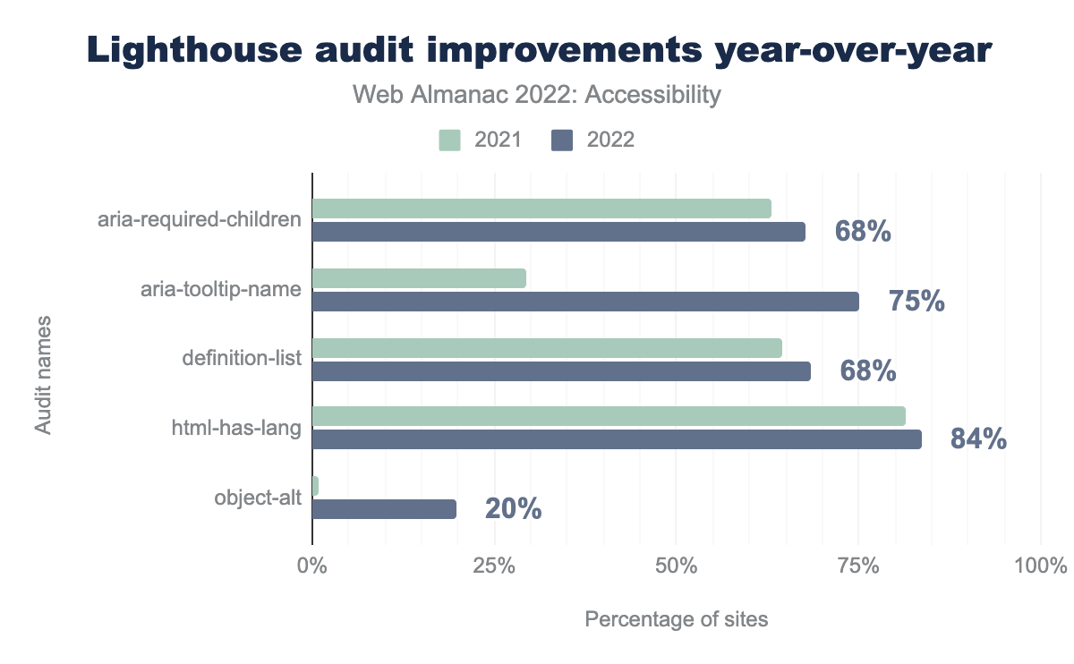
aria-required-children passes on 63% of sites in 2021, and 68% in 2022. aria-tooltip-name passes on 29% in 2021, and 75% in 2022. definition-list passes on 65% in 2021, and 68% in 2022. html-has-lang passes on 81% in 2021, and 84% in 2022. object-alt passes on 1% in 2021, and 20% in 2022.
Looking at Lighthouse audits reporting results, out of 41 automated checks, 35 passed successfully on more sites in 2022 compared to 2021. 11 audits show improvements greater than 1%, with aria-required-children, aria-tooltip-name, definition-list, html-has-lang, and object-alt showing the most noteworthy increases. We hope that this increase represents a shift in the right direction.
In the hope of improvement towards accessibility in the web, we have tried to write the chapter with some actionable links and solutions that people can follow. For consistency, we chose to use the person-first term “people with disabilities” throughout this chapter, though we acknowledge that the identity-first term “disabled people” is also used. Our choice in terminology is in no way prescriptive of which term is most appropriate.
Ease of reading
Readability of information and content on the web is crucial. There are a number of factors in a website that contribute to the content’s readability. These factors ensure that everyone on the internet can not only consume content, but also are not harmed by any aspect of the content.
Color contrast
Color contrast refers to how easily the foreground—which can include text, diagrams, iconography or other pieces of information—stands out from the background of the section. A higher color contrast usually means it’s easier for people to distinguish the content.
The minimum contrast requirement defined by the Web Content Accessibility Guidelines (WCAG) for normal sized text (up to 24px) is 4.5:1 for AA conformance and 7:1 for AAA conformance. However, for larger font sizes, the contrast requirement is only 3:1 as larger text has increased legibility even at a lower contrast.
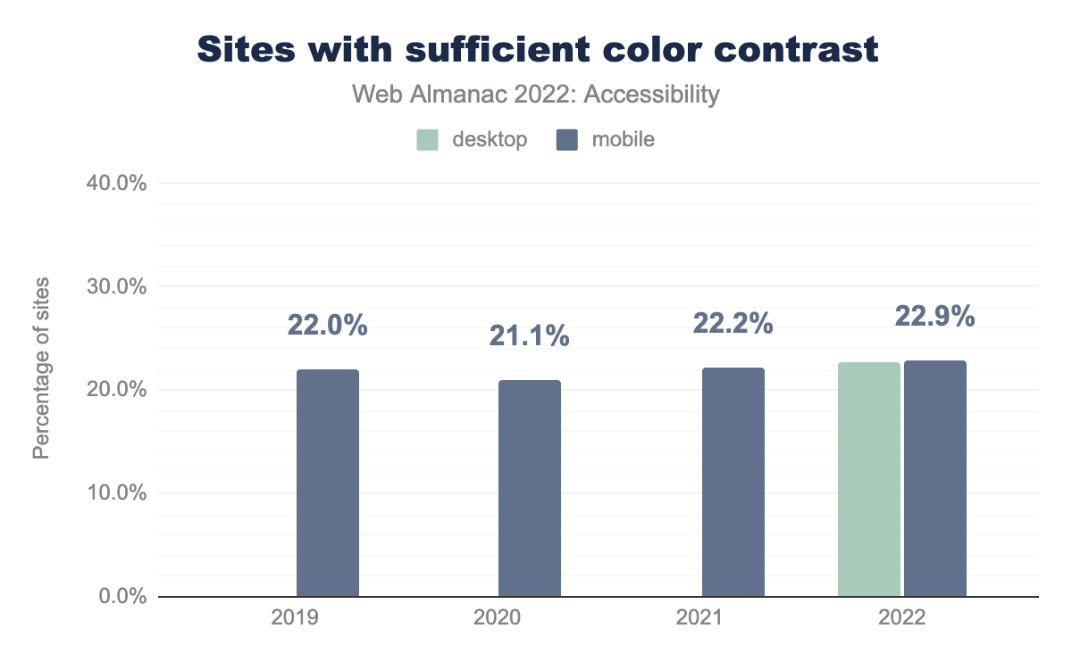
We found that 22.9% of mobile sites have sufficient text color contrast, which is less than a 1% increase from last year. In 2022, we also have data for desktop sites, with 22.7% passing automated text contrast checks. The color contrast issue—at least for the text-based color contrasts that we tested—is pretty straightforward to validate even before you start building the website. There are multiple tools that can help developers and designers to check color contrast of text and graphical elements such as:
It’s a good idea to select a color scheme that passes color contrast requirements at the beginning of a project or while addressing the issues and use it throughout the website. You can also provide other color modes such as dark mode, light mode, high contrast modes to let the user choose.
Zooming and scaling
Zooming is another feature that users with low vision often use to view the text in a website better. There are system settings in the browser, as well as some magnifying tools that allow a user to zoom and scale a website. Adrian Roselli talks in detail about the different reasons you should not disable zoom.
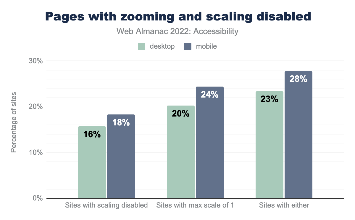
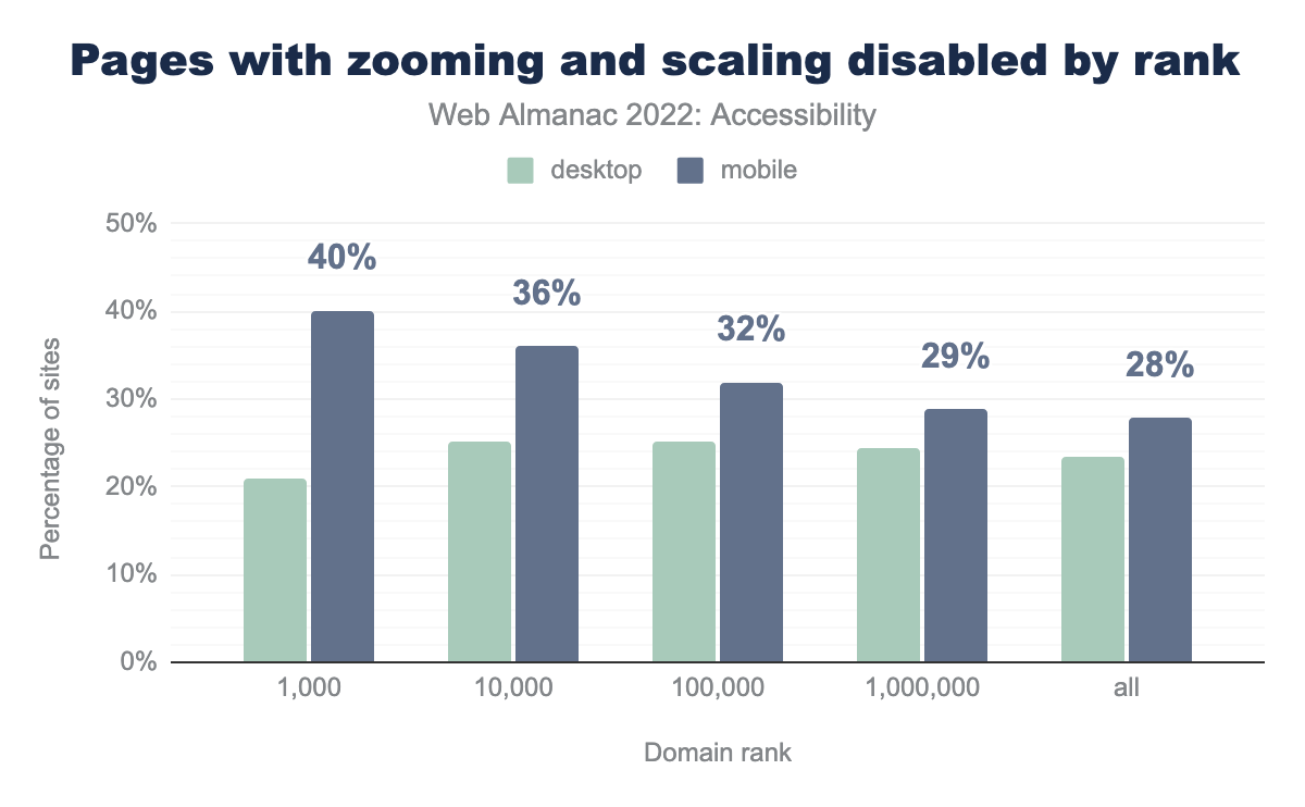
WCAG requires that text in a website can be resized up to at least 200%. We have found that 23% of desktop home pages and 28% of mobile home pages attempt to disable zoom.
The method by which a developer disabled zoom is by adding a <meta name="viewport" > tag with a value like maximum-scale, minimum-scale, user-scalable=no, or user-scalable=0 in the content attribute. So if you have a website that has one of these values, please delete those particular values from the content attribute to enable zoom.
Of the top 1,000 most visited sites, 21% of desktop sites and 40% of mobile sites are built using code that attempts to disable user zooming or scaling. This means that the percentage of sites with zooming disabled is almost double on mobile compared to desktop. It’s really important to not disable zooming on any device. To combat this, browsers have begun to override developers’ attempts to disable zoom. Manuel Matuzović wrote an article talking about the concerns with disabling zoom and user settings in browsers.
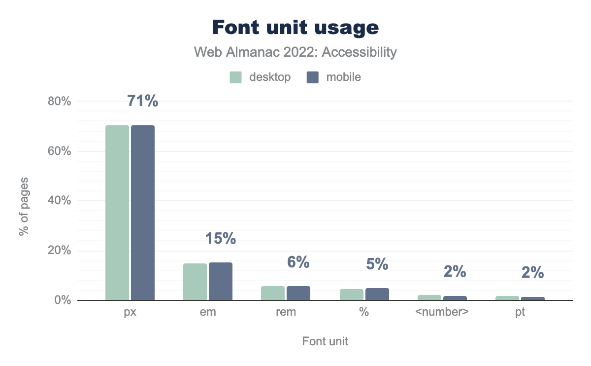
px is used for font sizes on 71% of desktop and mobiles pages, em on 15% of both, rem on 6% of both, % on 4% of desktop and 5% of mobile, <number> on 2% of both, and finally pt on 2% of both.Another thing to keep in mind is the unit you choose for font size. We found that 71% of pages in desktop use px, and only 15% and 6% use em and rem respectively. So the percentage of px usage in desktop has increased by 2% compared to last year, while em usage has decreased by 2%. It’s considered wise to use relative units such as em or rem when it comes to font-size because if you use px it will not scale if the user explicitly choses a bigger or smaller default font size in the browser settings.
Language identification
Language identification using the lang attribute is important for providing better screen reader support, and also helps for automatic browser translations. This is another good example of a feature that helps everyone, including people with disabilities. Without the lang attribute, the automatic browser translation in Chrome can often translate the text incorrectly. Manuel Matuzović gives one such example of an auto-translate mishap due to the lack of a lang attribute.
lang attribute.
It’s encouraging to see that 83% of mobile websites do have a lang attribute, and within that group, over 99% have a valid value. There’s still room for improvement given this is a Level A conformance issue under WCAG 2.1. To meet this success criteria, one can put the lang attribute in the <html> tag with a known primary language tag. The lang attribute is a global attribute and can be set on other tags as well in case the web page has content in more than one language. It’s important to define the correct language for a website. In cases where people copy a template to create a website, there is sometimes a discrepancy between the language used in the website’s content and the lang="en" attribute used in the code.
User preference
There are certain User Preference Media Queries from the CSS Media Queries Level 5 specification that can be used for various accessibility features. These range from choosing a color scheme or contrast mode that works better for the user to reducing animations on the page, which is helpful to people with vestibular disorders.
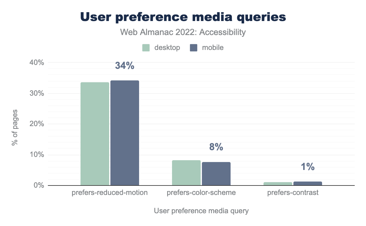
prefers-reduced-motion media query, 8% of desktop sites and 8% of mobile sites use prefers-color-scheme, and prefers-contrast is used by 1% of both desktop and mobile sites.We found that 34% of mobile websites use prefers-reduced-motion. Websites that rely on motion can cause issues for people with vestibular disorders, so it is important to adapt or remove those animations with the prefers-reduced-motion media query. There are many great resources related to designing accessible animation.
8% of desktop and mobile websites used the prefers-color-scheme media query, while 1% of desktop and mobile sites used prefers-contrast. Both of these media queries improve content readability by adjusting the display mode based on the user’s preference. prefers-color-scheme allows the browser to detect the user’s system color. Using this information, the web developer can then provide a light or dark mode accordingly. prefer-contrast is useful for users with low vision or photosensitivity who may benefit from high contrast modes.
Forced colors mode
Forced colors mode is an accessibility feature intended to increase the readability of text through color contrast. In forced colors mode, the user’s operating system takes over control of most color-related styles. Common patterns such as background images are completely disabled, so text-to-background contrast is more predictable. Its best-known implementation is the High Contrast Mode in Windows, renamed Contrast Themes in Windows 11. Those themes provide alternative low and high contrast color palettes, as well as the ability to customize any of the available system colors.
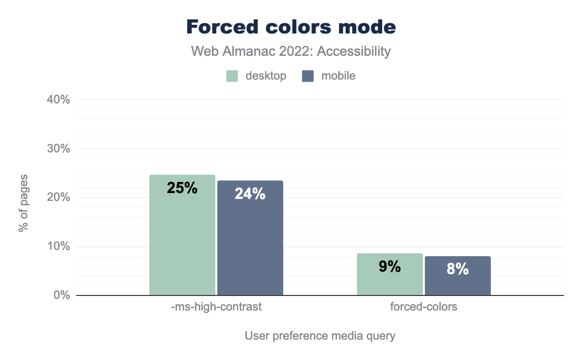
-ms-high-contrast media query, and 9% of desktop sites and 8% of mobile sites use forced-colors.
Like other user preference media queries, we see a lot of websites making adjustments based on forced colors mode. 8% of mobile sites and 9% of desktop sites use the forced-colors media query to alter their styles, while usage of the legacy IE11-only -ms-high-contrast media query is above 20% for both mobile and desktop. This doesn’t tell us to what extent sites do support forced colors mode, but the data is encouraging nonetheless considering the forced-colors media query has only been supported in major browsers since 2020, and support for emulating forced-colors mode on devices other than Windows is only available since February 2022.
Navigation
When talking about navigating through websites, one thing that is important to remember—and be cautious of—is that users may use a variety of methods and input devices. Some people use a mouse to scroll through a page, others use their keyboard or a switch control device, and some may use a screen reader to browse through the different heading levels. When making a website, it’s important to ensure that the website works for everyone, irrespective of the device or assistive technology that a person chooses to use.
Focus indication
Focus indication is really important for people who primarily rely on keyboard navigation or switch control devices. These tools are often used by people with limited motor capacity. There are many different switch control devices, from a single switch to a sip-and-puff device. Visible focus styles and proper focus orders are essential for such users to get a visual indication of where they are on a page.
Focus styles
The WCAG requires a visible focus indicator for all interactive content to help people know which element has the keyboard focus as they traverse through a page. In fact for WCAG 2.2 (which is expected to be published in December 2022), it has been promoted from AA to Level A .
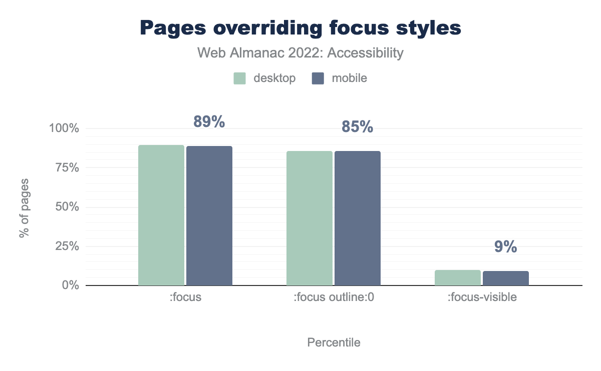
:focus pseudo class, and 90% of desktop sites and 91% of mobile sites use the :focus pseudo class to set the outline to 0 or none. 9% of desktop sites and 10% of mobile sites use the :focus-visible pseudo class.We found that 86% of websites add :focus {outline: 0}. This removes the default outline that browsers use for the focused interactive element. In some cases, they are overridden using some custom styling, but not always. This makes it impossible for users to determine which element has focus which in turn hinders navigation. Sara Soueidan has a great article on how to design WCAG-compliant focus indicators. However, it’s exciting to see that 9% of websites have :focus-visible compared to only 0.6% last year. This is definitely a step in the right direction.
tabindex
tabindex is an attribute that can be added to elements to control whether they can receive focus. Depending on its value, the element can also be organized within the keyboard focus or “tab” order.
We found that 60% of mobile websites and 62% of desktop websites use tabindex. The tabindex attribute can be used for a few different purposes, which may or may not cause accessibility issues:
- Adding
tabindex="0"adds an element in the sequential keyboard focus order. Custom elements and widgets that are intended to be interactive need an explicitly assignedtabindex="0". tabindex="-1"means that the element is not in the keyboard focus order, but can be programmatically focused using JavaScript.- A positive value for
tabindexis used to override the keyboard focus order and most of the time leads to a WCAG 2.4.3 - Focus Order failure
It’s important to remember that placing non-interactive elements in the keyboard focus order can be confusing for low-vision users and should hence be avoided.
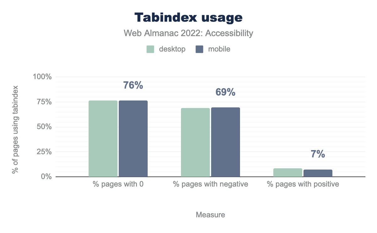
tabindex, a tabindex of 0 is used on 77% of those pages for desktop and 76% of those pages for mobile, a negative tabindex is used on 69% of both, and finally a positive tabindex is used on 8% of desktop and 7% of mobile sites.tabindex usage.
Out of all websites with tabindex attribute, 7% have tabindex with a positive value. Using positive values for tabindex is generally bad practice since it disrupts the normal navigation. Karl Groves has a great article that explains this concept further.
Landmarks
Landmarks help divide a web page into thematic regions that makes it easier for users of assistive technologies to understand the page structure and navigate the website. For example, a rotor menu can be used to navigate between different page landmarks, while skip links can be used to target landmarks, including <main>. Landmarks can be created using various HTML5 elements or explicitly adding ARIA landmark roles. However, following the first rule of ARIA, one should give preference to native HTML5 elements whenever possible.
| HTML5 element |
ARIA role equivalent |
Pages with element |
Pages with role |
Pages with element or role |
|---|---|---|---|---|
<main> |
role="main" |
31% | 17% | 38% |
<header> |
role="banner" |
63% | 13% | 65% |
<nav> |
role="navigation" |
63% | 22% | 67% |
<footer> |
role="contentinfo" |
65% | 11% | 66% |
The most commonly expected landmarks that the majority of web pages should have are <main>, <header>, <nav> and <footer>. We found that only 31% of desktop and mobile pages have a native HTML <main> element, while 17% of desktop pages have an element with a role="main", and 38% of pages have either <main> or role="main". It’s good to see the use of native elements increase. Scott O’ Hara’s article on landmarks covers all the details that one should keep in mind to ensure better accessibility.
Heading hierarchy
Headings help all users, including those using assistive technologies, to navigate through the website. Users with assistive technologies can navigate to the exact sections that they are interested in. As mentioned in Marcy Sutton’s article on headings and semantic structure , headings can be thought of as a table of contents that one can navigate through to go to a particular content area.
58% of websites pass the test for properly ordered headings that do not skip levels, which is the same as last year. Hopefully this number will increase next year since the document outline example in WHATWG standards have been updated. A very important thing to remember is that heading levels don’t have to represent the actual style (or importance) of a particular element. Headings are to be used primarily for hierarchy purposes, while CSS can be used for the styling of the element. A very good article on how to structure headings in your page is by Steve Faulkner titled, “How to mark up subheadings, subtitles, alternative titles and taglines”.
Secondary navigation
WCAG requires websites to have multiple ways to navigate between the different pages apart from the primary navigation menu in the header—see Success Criterion 2.4.5: Multiple Ways. For example many people, including those with cognitive limitations, prefer to use search features to find a page when there are a substantial number of pages in a website.
There are 23% of websites on mobile that have a search input, and 24% on desktop. Another recommended method for secondary navigation is to include a sitemap for a website. Although we do not have any data about the presence of site maps, this technique guide from the W3C explains what they are in detail and how to implement one effectively.
Skip links
Skip links allow keyboard or switch control device users to skip through different sections of pages without having to pass every focusable item. One of the most common sections to skip is the primary navigation to go to the <main> section, especially if a website has a really large number of interactive items in their primary navigation.
We found 21% of desktop and mobile pages likely have a skip link, allowing users to bypass part of the page content. This figure could be higher in practice, as our detection only checks for the presence of skip links early in the page (for example to skip navigation). Skip links can also be used to skip parts of the page.
Document titles
Descriptive page titles are useful when navigating between pages, tabs and windows, as the new page has its title read by assistive technologies to help users keep track of where they are.
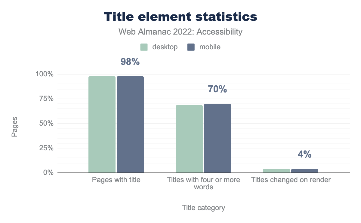
<title> element, 69% of desktop and 70% on mobile of those titles have four or more words, and 4% on both are changed on render.Though there are 98% of mobile websites which have a document title, only 70% have a title that is longer than four words. Since we only scan home pages of websites, it’s not possible for us to determine if the inner pages of the website use a more detailed text in the <title> tag that describes the page. A title should ideally have both the title of the website as well as a title giving context about the page in the website for better navigation.
Tables
Tables help in representing data and the relationships between the data using two axes. Tables should have a well-formatted structure with the appropriate elements and markups that helps assistive technology users to easily comprehend the data represented in the table, as well as navigate through the table. Table caption, appropriate headers and appropriate header cells for every row are as such important elements that help users of assistive technology to make sense of the data.
| Table sites | All sites | |||
|---|---|---|---|---|
| Desktop | Mobile | Desktop | Mobile | |
| Captioned tables | 5.4% | 4.7% | 1.3% | 1.2% |
| Presentational table | 1.2% | 0.9% | 0.6% | 0.5% |
When providing a caption for the table, the <caption> element is the correct semantic choice to provide the most context to a screen reader user—though there are alternative ways of labelling a table. Table captions act as a heading summarizing the information of the table. 1.3% of desktop and mobile sites with table elements present used a <caption>.
Tables are also sometimes used for laying out pages, though with the arrival of Flexbox and Grid properties in CSS, one should definitely avoid tables for any visual formatting. However, if there is no other option, tables can set a role="presentation". We observe 1% of tables using this workaround.
Forms
Forms are one of the most common ways that users submit information to and interact with websites. Whether it be logging into a site, creating a post on social media, or making a purchase at an ecommerce site, all of those user journeys will at some stage require a form. Without proper form accessibility, people with disabilities can’t interact with them properly which in turn stops them from completing their tasks and achieving full information and feature parity with non-disabled users.
There are specific things that one should keep in mind when it comes to accessibility in forms.
<label> element
The <label> element is the most effective way of providing accessible names to input fields (or form controls) in a form. One can link a <label> to a form control programmatically using the for attribute. The for attribute should contain the value of the id attribute of the form control element that you want to link it with. For example:
<label for="emailaddress">Email</label>
<input type="email" id="emailaddress">
The for attribute is important because without it, the <label>won’t be programmatically linked to a corresponding form control. This affects the usability of the form as it’s likely that a field does not have a semantically linked label unless another method is used.
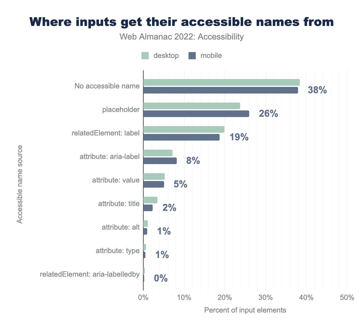
placeholder is the source for 24% of desktop pages and 26% of mobile pages. For relatedElement: label it’s 20% and 19% respectively, for attribute: aria-label it’s 7% and 8%, for attribute: value it’s 5% and 5%, for attribute: title it’s 4% and 2%, for attribute: alt it’s 1% on both, for attribute: type it’s 1% on both, for relatedElement: aria-labelledby it’s 0% on both.38% of inputs have no accessible names, while only 19% use <label> . Without a proper accessible name, a screen reader user or a voice-to-text user won’t be able to identify what data an input is trying to collect. Often there are inputs on websites that don’t have any visible labels, which causes issues for all users, or the input’s purpose isn’t clearly defined both visually and programmatically. In select cases where a label can be visually excluded (such as a search field), one must still add a screen reader-only <label> to provide the accessible name.
placeholder attribute
The purpose of a placeholder attribute in a form control is to provide an example of the data or format that the form control accepts. For example, <input type="text" id="credit-card" placeholder="1234-5678-9999-0000"> lets the user know that a card number should be entered with dashes in between every 4 digits.
However, unlike <label> elements, the placeholder attribute disappears the moment someone starts typing or entering data. This can cause users with cognitive disabilities to get disoriented about the data they were trying to input. Also, not all screen readers support the placeholder attribute for accessible names which is also problematic. Hence, using the placeholder attribute for accessible names can create many accessibility issues and should be avoided .
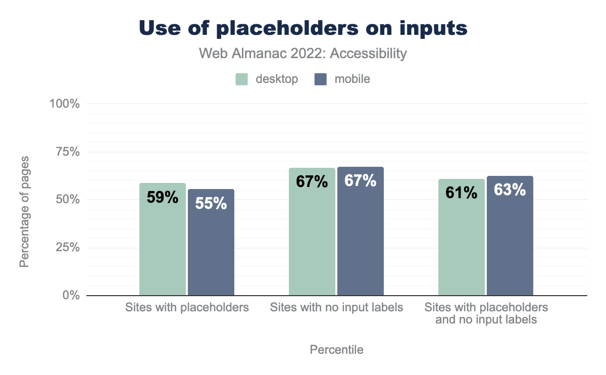
62.7% of the websites surveyed have inputs with only a placeholder attribute and no <label> element linked to it, which is extremely problematic. The HTML5 specification clearly states “The placeholder attribute should not be used as an alternative to a label.” It’s important to provide a <label> to improve accessibility for all.
Use of the placeholder attribute as a replacement for a label can reduce the accessibility and usability of the control for a range of users including older users and users with cognitive, mobility, fine motor skill or vision impairments.
Requiring information
When websites gather input from their users, they need a clear way to indicate what information is optional, and what information is required to submit. For example, in a form an email address might be a required field, but a middle name can be an optional field. Before HTML5 introduced the required attribute for <input> fields in 2014, a common convention was to put an asterisk (*) in the label for required input fields. However, just using an asterisk is only a visual indicator, and it provides no validation or sufficient information to assistive technologies that a field is required.
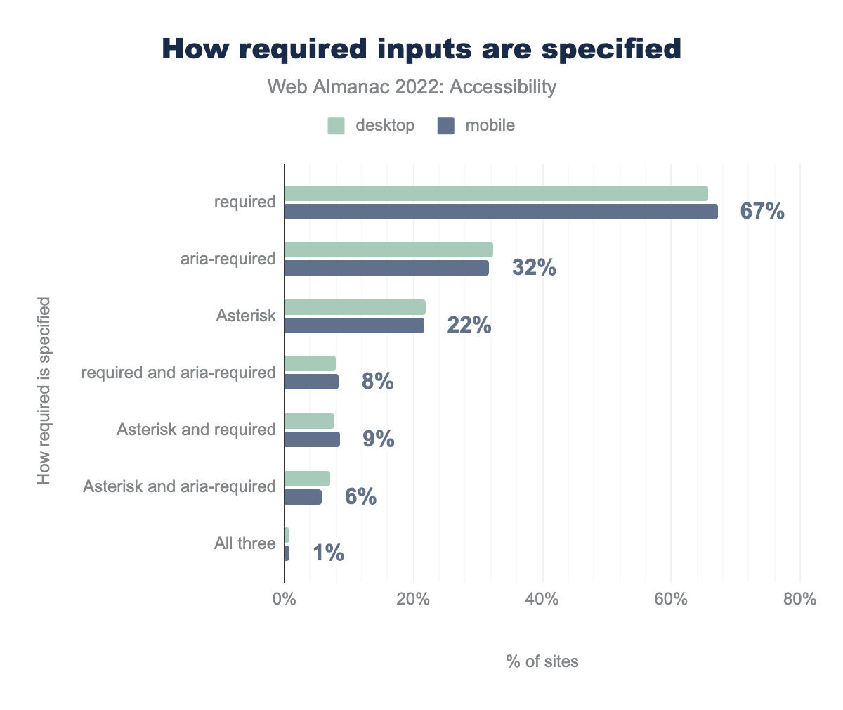
required attribute is used on 66% of desktop sites and 67% of mobile sites, aria-required is used by 32% and 32%, asterisk is used by 22% and 22%, required and aria-required is used by 8% and 8%, asterisk and required is used by 8% and 9%, asterisk and aria-required is used by 7% and 6%, and all three are used by 1% on both.The required and aria-required attributes are two ways of telling an assistive technology that an input field is not optional. The required attribute also prevents form submission without an input, while aria-required only conveys the information to assistive technology and doesn’t validate the input. We found that 67% of the sites use the required attribute and 32% use aria-required. However, there are still 22% websites which only use an asterisk (*) to indicate a field is required. That should definitely be avoided unless it is also accompanied with required and aria-required.
Captchas
Websites often want to verify that the visitor is a human and not a bot, which is a program that crawls through websites for many different purposes. For example, The Web Almanac is created each year by sending out a similar kind of web crawler to gather information from websites. These types of “human-only” tests are called a CAPTCHA – “Completely Automated Public Turing Test, to Tell Computers and Humans Apart”.
19% of mobile websites have one of two captcha implementations which we can detect. This type of test can be difficult to solve for everyone (see CAPTCHAs Have an 8% Failure Rate) but would likely be more difficult for people with low vision and other vision or reading-related disabilities. Also, such tests might fail under WCAG 3.3.7 Accessible Authentication once WCAG 2.2 is released. W3C actually has a paper on alternatives to visual turing tests that is definitely recommended.
Media on the web
Accessibility considerations become very crucial when it comes to media consumption on the web. A lot of media is often designed in ways that people with disabilities can’t consume unless alternative methods are provided. For example, a blind person or a person with a vision impairment needs an audio description for an image or a video so that they can understand the media. A screen reader can only create an audio description if an alternate text describing the image or the video is present. Similarly, for people with hearing disabilities, captions on videos or text tracks for audio are essential to accessing the material.
Images
Images on the web can have an alt attribute which provides an alternate text description of the image. A screen reader can then use this information to create an audio description of the image for people with a visual impairment. We found that 59% of sites pass the test for images with alt text, which is a small (1%) increase from 2021.
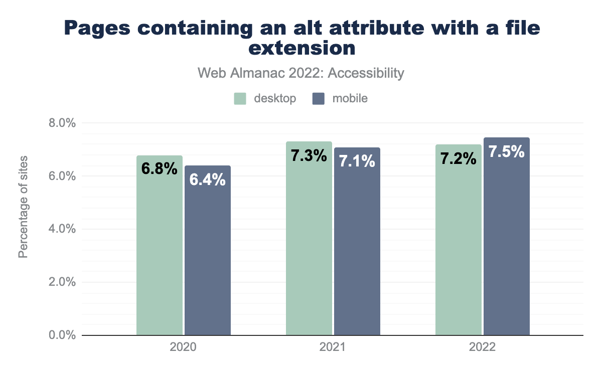
alt attribute. This increased to 7.3% of desktop sites and 7.1% of mobile sites in 2021, and in 2022 to 7.2% of desktop sites and 7.5% of mobile sitesalt attribute with a file extension.
The text in the alt attribute depends on the context. If the image is decorative and doesn’t provide any meaningful information, then alt="" is ideal. However, if the image is crucial to the context of the page, then a proper text description is essential. If the image is a child of a link, then ideally the alt attribute should be used to label the link so the user knows where the link takes them. We found that 7.5% of mobile web pages and 7.2% of desktop pages with an alt attribute have a file extension assigned to that alt attribute. This probably means that the alt attribute just contains the image filename, which is likely not helpful at all, and should be avoided in every case.
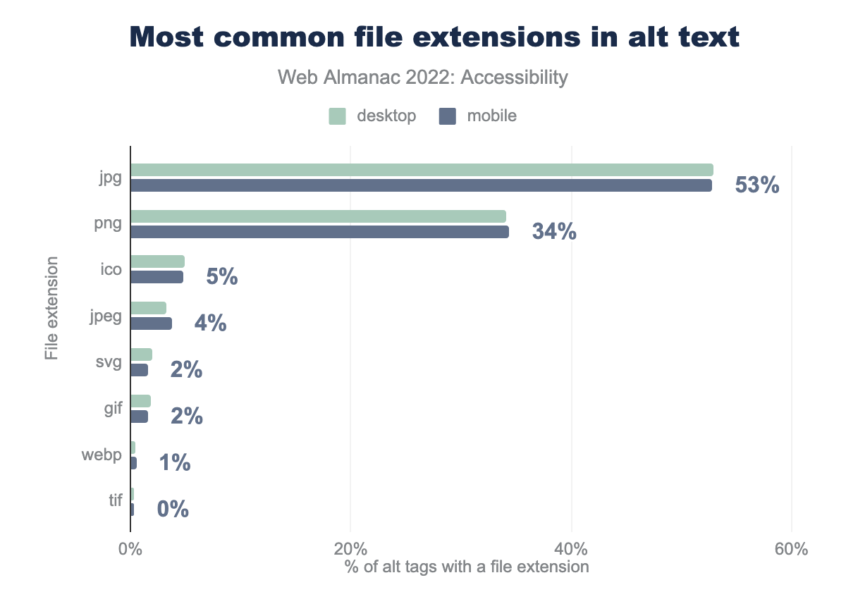
jpg is used 53% of the time on desktop sites and 53% for mobile, png is 34% and 34% and respectively, ico is 5% and 5%, jpeg is 3% and 4%, svg is 2% and 2%, gif is 2% and 2%, webp is 0% and 1%, and finally tif is 0% and 0%.alt text.
The top five file extensions explicitly included in the alt text value (for sites with images that have non-empty alt values) are jpg, png, ico, jpeg and svg. This likely reflects the use of CMS or other content management methods which auto-generate alternative text for images or ask the content editors for image descriptions compulsorily. However, if the CMS just puts the image filename in the alt attribute, this often provides no value to the users, so it’s important that meaningful text descriptions are provided.
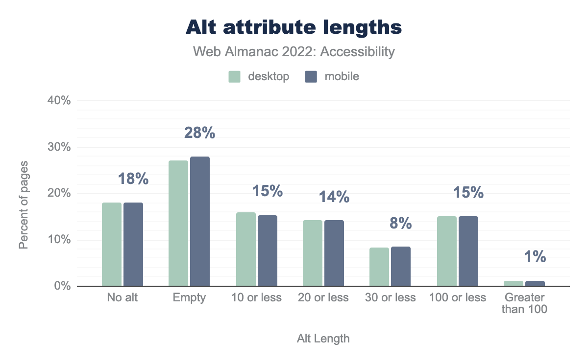
alt is set on 18% of desktop images and 18% of mobile images, it is set to empty on 27% and 28% respectively, it is 10 characters or less on 16% and 15%, 20 characters or less on 14% and 14%, 30 characters or less on 8% and 8%, 100 characters or less on 15% and 15%, and it is greater than 100 characters on 1% and 1%.alt attribute lengths.
We found that 27% of alt text attributes in desktop and mobile websites were empty. An empty alt attribute is supposed to be used only when the image is presentational and should not be described by screen readers or other assistive technologies. However, most images on the web do add value to the content in the web page and hence should have a proper text description. We found that 15.3% have 10 or fewer characters, which would be a strangely short description for most images, indicating that information parity has not been achieved. Though it is possible that some of them might be used to provide labeling for a link, in which case it’s okay.
Audio and video
<track> allows providing timed textual content for <audio> and <video> elements. This can be for subtitles, captions, descriptions, or chapters. Captions allow people with permanent or temporary hearing loss to be able to consume the audio content. Descriptions allow blind screen reader users to understand what is happening in the video.
<audio> element have at least one accompanying <track> element.
<track> loads one or more WebVTT files, which allows text content to be synchronized with the audio it is describing. When looking at only sites with a detectable <audio> element, we found that only 0.06% of all pages on desktop and 0.09% of all pages on mobile with had at least one accompanying <track> element. Looking at all <audio> elements, we see only 0.03% and 0.05% respectively include a <track>.
<video> elements with an accompanying <track> element.
The <track> element was included with a corresponding <video> element less than 1% of the time — 0.71% for desktop sites, and 0.65% for mobile sites. These data points do not include audio or video embedded via an <iframe> element, which is common for content like podcasts or YouTube videos. It should also be noted that most popular third-party audio and video embedding services include the ability to add synchronized text equivalents.
Assistive technology with ARIA
Accessible Rich Internet Applications, or ARIA defines a set of attributes for HTML5 elements that can be used to make web content more accessible for people with disabilities. However, overuse of ARIA can cause more issues than improvements to accessibility. It is always recommended to use ARIA attributes only when using HTML5 is not sufficient to create a fully accessible experience. It should not be used as a replacement of native HTML5 elements, or overused unnecessarily.
ARIA roles
When an assistive technology encounters an element, the element’s role communicates information about how someone might interact with its content.
For example, Tabbed interfaces are one of the most commonly used UI elements that need various ARIA roles to be defined explicitly to convey the structure of the UI properly. A common implementation for an accessible tabbed interface is mentioned in the WAI-ARIA Authoring Practices Design Patterns. When creating a tablist widget, a tablist role can be assigned to the container element since there is no native HTML equivalent.
HTML5 introduced many new native elements which have implicit semantics, including roles. For example, the <nav> element has an implicit role="navigation" and does not need to have this role added explicitly via ARIA.
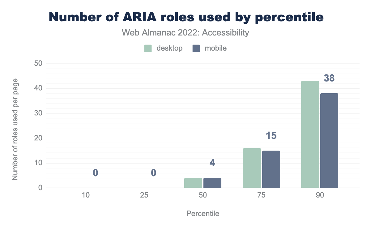
Currently 72% of desktop pages have at least one instance of an ARIA role attribute. The median site has four instances of the role attribute.
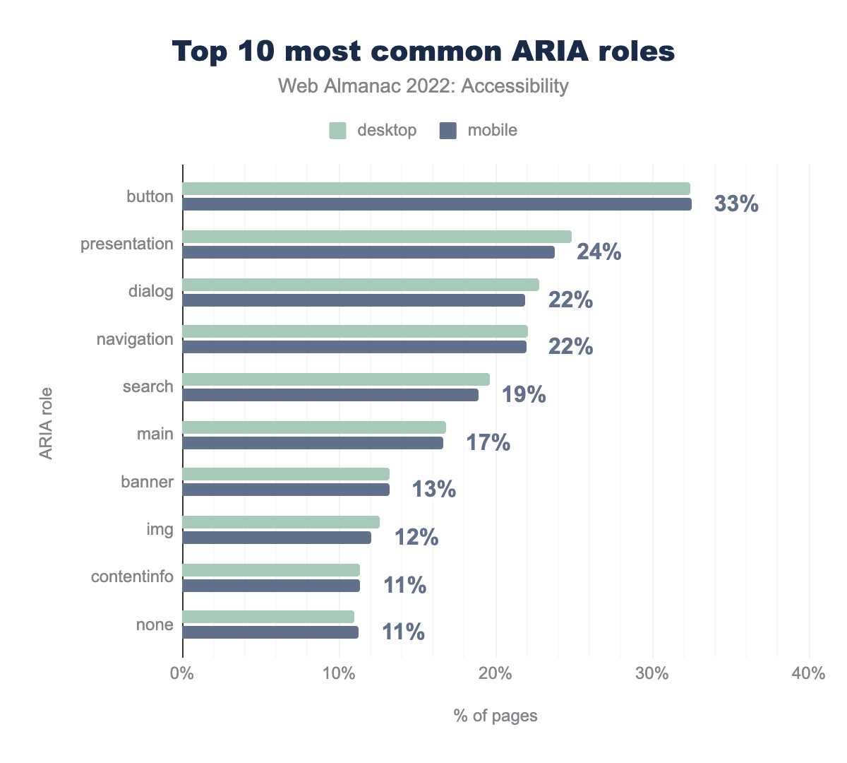
button is used by 32% of desktop sites and 33% of mobile sites, presentation by 25% and 24% respectively, dialog by 23% and 22%, navigation by 22% and 22%, search by 20% and 19%, main by 16.8% and 17%, banner by 13% and 13%, img by 13% and 12%, contentinfo by 11% and 11%, and finally none by 11% and 11%.We found that 33% (up from 29% in 2021, and 25% in 2020) of desktop and mobile sites had home pages with at least one element with an explicitly assigned role="button". This increase in percentage is likely not good since this indicates that websites are either creating custom buttons using <div> or <span>, or are adding a redundant role to <button> elements. Both of these are bad practices and go against the first rule of ARIA. Following this rule, one should always use a native HTML element—in this case, <button>—when possible.
button role.
Adding an ARIA role tells assistive technology what the element is, but doesn’t provide any other functionality to make elements behave like their native counterpart. For example, we found that 21% of websites had at least one link with a role="button". This kind of pattern can cause issues with keyboard navigation, as links and buttons have different interactions. Though both links and buttons are interactive, links are not activated with the space key, whereas buttons are.
Using the presentation role
When an element has role="presentation" declared on it, its semantics are stripped away, as well the semantics of any of its child elements if those child elements are required child elements (such as li nested under a ul element, or rows and cells in a table). For example, declaring role="presentation" on a parent table or list element will cascade the role to their required child elements and none of them will have table or list semantics.
role=presentation.
Removing an element’s semantics causes an element to lose its behavior. It becomes only visually present, and assistive technologies fail to understand the structure of the element and cannot convey that message to the user. For example, a list with a role="presentation" will no longer communicate any information to a screen reader about the list structure. We found that 25% of desktop pages and 24% of mobile pages have at least one element with role="presentation".
role=none.
The same effect of semantic removal takes place with role="none". We found that this year, the percentage of role="none" has also increased to 11% and is one of the top 10 most common ARIA roles. There are very few use cases where this is particularly helpful for assistive technology users, for example if there is a <table> element being used only for layout. But it can otherwise be harmful and should be used sparingly.
Most browsers ignore role="presentation" and role="none" on focusable elements, including links and inputs, or anything with a tabindex attribute set. Browsers also ignore the inclusion of the role if any of the element contains any global ARIA states and properties, such as aria-describedby.
Labeling elements with ARIA
Parallel to the DOM there is a similar browser structure called the accessibility tree. It contains information about HTML elements including accessible names, descriptions, roles and states. This information is conveyed to assistive technologies through accessibility APIs.
The accessible name can be derived from an element’s content (such as button text), an attribute (such as an image alt attribute value), or an associated element (such as a programmatically associated label for a form control). There is a specificity ranking that is used to determine where the element gets its accessible name from if there are multiple potential sources. Léonie Watson’s article, What is an accessible name? is a great source to learn more about accessible names.
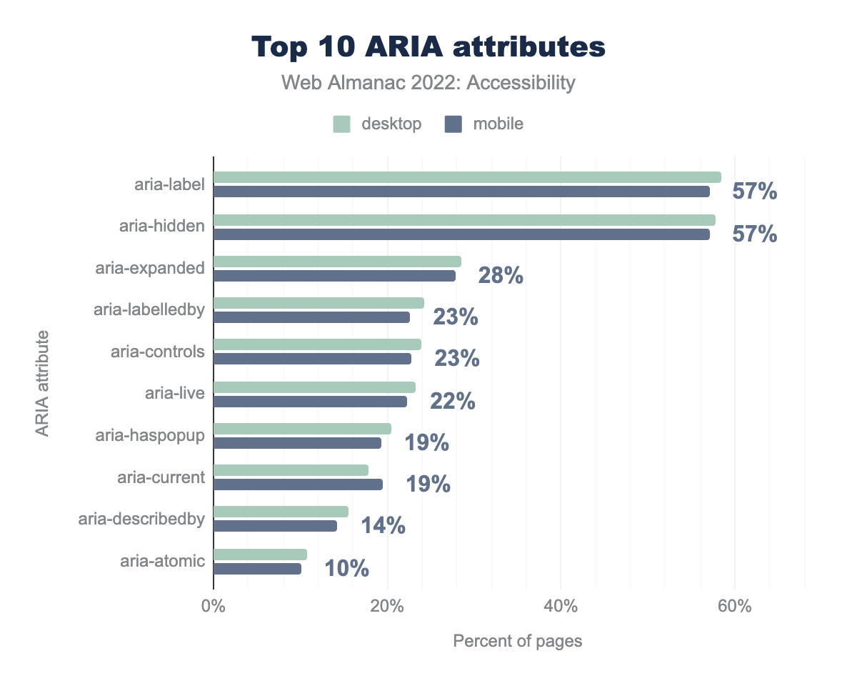
aria-label is used by 58% of desktop sites and 57% of mobile sites, aria-hidden by 58% and 57% respectively, aria-expanded by 29% and 28%, aria-labelledby by 24% and 23%, aria-controls by 24% and 23%, aria-live by 23% and 22%, aria-haspopup by 20% and 19%, aria-current by 18% and 19%, aria-describedby by 16% and 14%, and finally aria-atomic by 11% and 10%.There are two ARIA attributes that help in providing elements with an accessible name: aria-label and aria-labelledby. These attributes will be preferred over the native derived accessible name so they should be used very carefully and only when necessary. It’s always a good idea to test the accessible names obtained with a screen reader, and involve people with disabilities to confirm that it is actually helpful and doesn’t make the content more inaccessible.
We found that 58% of desktop pages and 57% of mobile home pages had at least one element with the aria-label attribute, making it the most popular ARIA attribute for providing accessible names. We found that 24% of desktop pages and 23% of mobile pages had at least one element with the aria-labelledby attribute. This could mean that more elements now have accessible names but it may also be indicative that more elements now lack a visual label which can be problematic for people with cognitive disabilities and voice to text users (see <label> element).
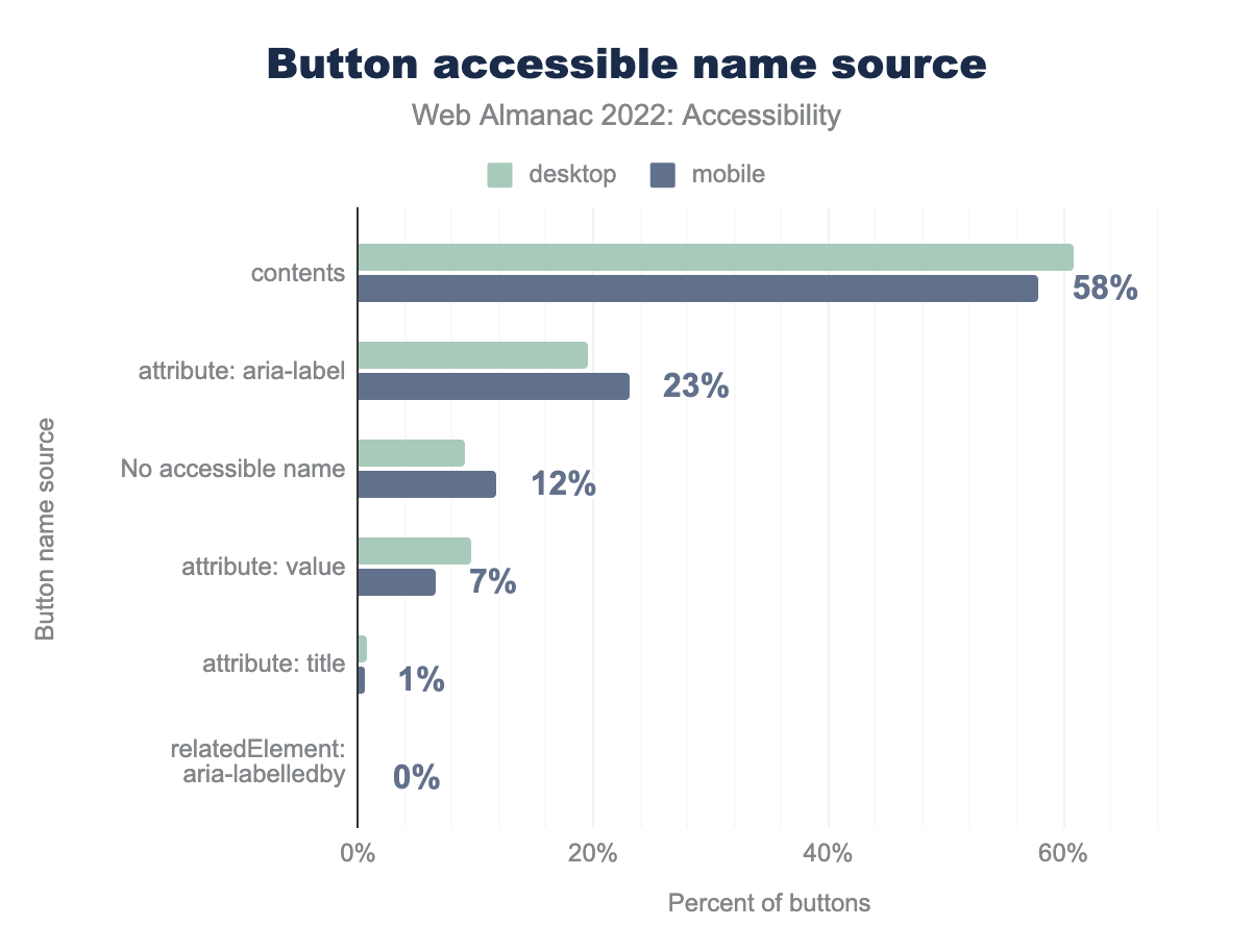
aria-label attribute is used for 20% and 23% respectively, there is no accessible name for 9% and 12%, the value attribute is used for 10% and 7%, title attribute is used for 1% on both, an aria-labelledby related element is used for 0% on both.Buttons typically get their accessible names from their content or an ARIA attribute. Per the first rule of ARIA, if an element can derive its accessible name without the use of ARIA, this is preferable. Therefore a <button> should get its accessible name from its text content rather than an ARIA attribute if possible.
We found that 61% of buttons on desktop and 58% in mobile sites get their accessible name from content which is good. We also found that 20% of buttons on desktop sites and 23% of buttons on mobile sites get their accessible names from the aria-label attribute.
There are a few cases where an aria-label can help. For example, if the page has multiple buttons with the same content, but different purposes, then an aria-label can be used to provide a better accessible name. Sometimes developers also use aria-label when the button has only an image or icon, which might be a reason why more mobile sites use the aria-label, rather than the content, to define accessible names.
Hiding content
Sometimes the visual interface can contain some redundant elements that are unhelpful for users of assistive technologies. In such cases aria-hidden="true" can be used to hide the element from screen readers. However, they should never be used if omitting such an element would provide a screen reader user with less information than the visual interface. Hiding content from assistive technologies should never be used to skip over content that is challenging to make accessible.
aria-hidden attribute.
We found that 58% of desktop pages and 57% of mobile pages had at least one instance of an element with the aria-hidden attribute. Hiding and showing content is a prevalent pattern in modern interfaces, and it can be helpful to declutter the UI for everyone.
It’s important to use the proper aria attribute to convey the correct message. For example, disclosure widgets should be making use of the aria-expanded attribute to indicate to assistive technology that something is revealed by expanding when the control is activated and hidden when activated again. We found that 29% of desktop pages and 28% of mobile pages had at least one element with the aria-expanded attribute.
Screen reader-only text
A common technique that developers employ to supply additional information for screen reader users is to use CSS to visually hide a passage of text but make it discoverable by a screen reader. This CSS code is used such that it’s present in the accessibility tree but hidden visually.
sr-only or visually-hidden class.
sr-only and visually-hidden are the most common class names used by developers and by UI frameworks to achieve screen reader-only text. For example, Bootstrap and Tailwind use sr-only classes for such elements. We found that 15% of desktop pages and 14% of mobile pages had one or both of these CSS class names. It is important to keep in mind that not all screen reader users are fully visually impaired, and thus one should avoid making too much use of screen reader-only solutions.
Dynamically-rendered content
The presence of new or updated content in the DOM sometimes needs to be communicated to screen readers. For example, form validation errors need to be conveyed whereas a lazy-loaded image may not. Updates to the DOM also need to be done in a way that is not disruptive.
aria-live.
ARIA live regions allow us to listen for changes in the DOM, such that the updated content can be announced by a screen reader. We found that 23% of desktop pages (up from 21% in 2021, 17% in 2020) and 22% of mobile pages (up from 20% in 2021, 16% in 2020) have live regions using aria-live. In addition, pages also use live region ARIA roles with implicit aria-live values:
| Role | Implicit aria-live value |
Desktop | Mobile |
|---|---|---|---|
status |
polite |
5.6% | 5.1% |
alert |
assertive |
3.7% | 3.4% |
timer |
off |
0.6% | 0.6% |
log |
polite |
0.4% | 0.4% |
marquee |
off |
0.0% | 0.0% |
aria-live value.
The <output> element also deserves an honorable mention, as the only HTML element with an implicit live region role that will announce its contents to end users. We see it used 16,144 times across our dataset for mobile sites and 12,120 times on desktop, or around 0.0002% of elements usage.
For more information about live region variants and usage check out the MDN live region documentation or play with this live demo by Deque.
Accessibility apps and overlays
Accessibility overlays are tools claiming to automatically fix websites’ accessibility issues.
The Overlay Fact Sheet defines them as “a broad term for technologies that aim to improve the accessibility of a website. They apply third-party source code (typically JavaScript) to automate improvements to the front-end code of the website.”
Their vendors generally promise a quick and easy solution to online accessibility: integrate one JavaScript snippet onto the site to make it compliant. Web accessibility is simply not possible to achieve with an out of the box solution like this. Automated tools can only detect 30 to 50% of accessibility issues to start with, and even for issues that can be detected, automated remediation via an overlay cannot always reliably fix those issues.
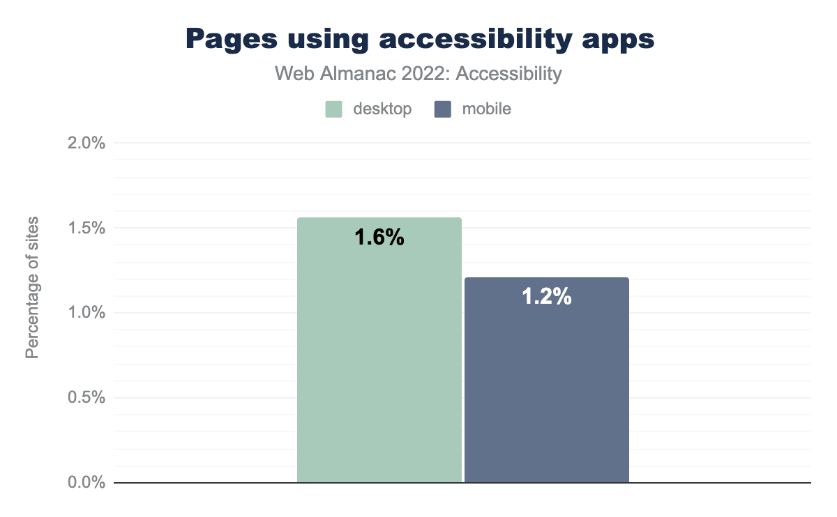
We found that 1.6% of desktop websites use one of 22 specific accessibility apps we could detect in 2022. This is a clear rise compared just under 1% in 2021.
Not all of those products are accessibility overlays, however the specific overlays we can detect show a similar rise.
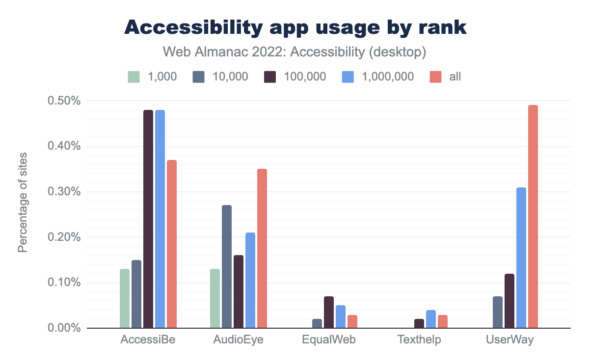
UserWay is the most popular overlay in our dataset, in use by 0.49% of desktop websites and 0.39% on mobile, compared to 0.39% and 0.33% respectively in 2021.
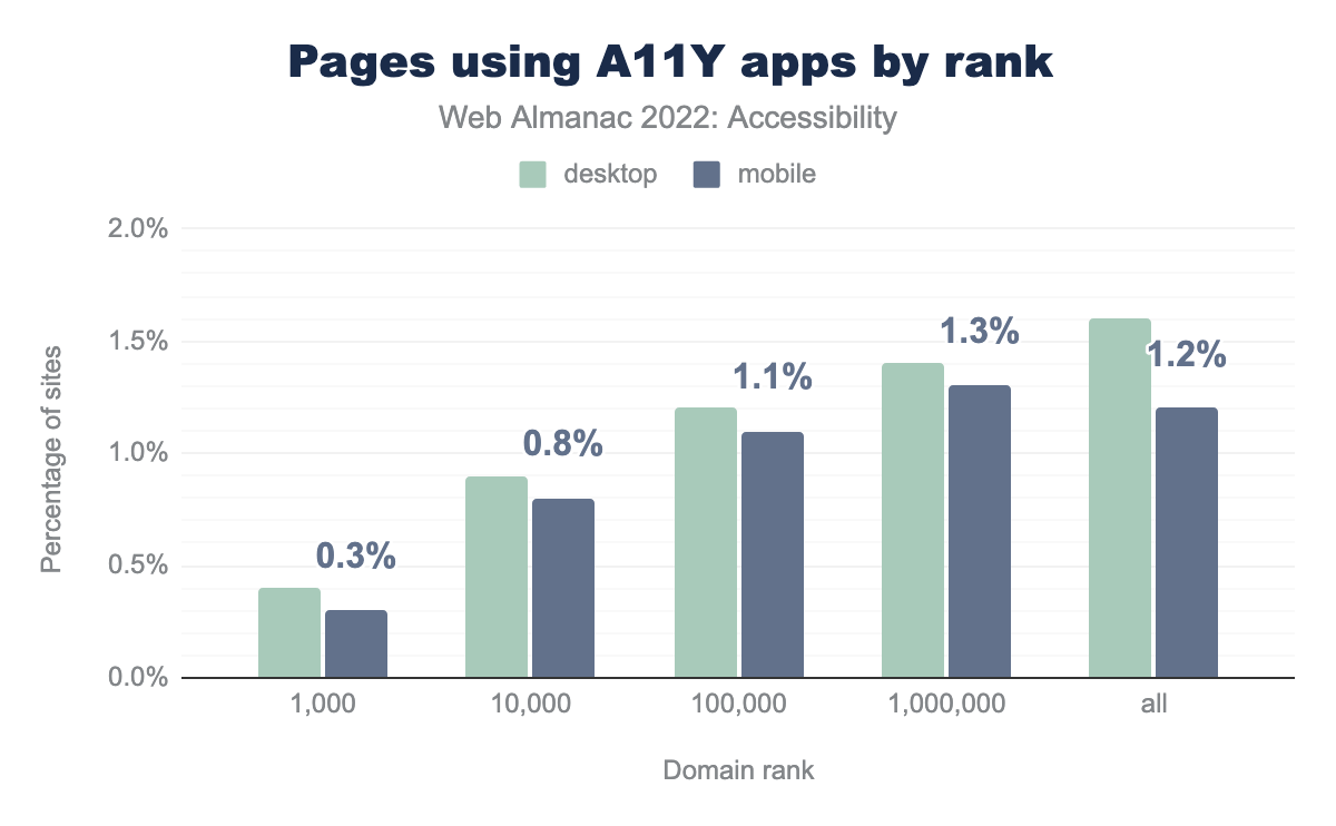
Usage of overlays, and accessibility apps generally, is more rare for high-traffic websites. For sites ranked in the top 1,000 by visits, only 0.3% – or 3 websites – use an overlay.
Concerns with overlays
There is a lot of pushback against overlays, from accessibility advocates and users alike. The National Federation of the Blind denounce the practices of accessiBe in particular, a company known for their deceptive marketing, including fake reviews:
[…] the Board believes that accessiBe currently engages in behavior that is harmful to the advancement of blind people in society. […] It seems that accessiBe fails to acknowledge that blind experts and regular screen reader users know what is accessible and what is not. The nation’s blind will not be placated, bullied, or bought off.
accessiBe raised an additional $30M in 2022, and is one of the overlays showing a clear rise in usage year-to-year, from 0.27% of desktop sites and 0.21% of mobile sites in 2021, to 0.37% and 0.25% in 2022.
Adrian Roselli’s #accessiBe Will Get You Sued is an excellent resource on the practical implications of using such an overlay, including legal risks and privacy issues.
Conclusion
Our analysis shows that there hasn’t been much of a substantial change in the accessibility issues seen across websites. Though there have been some improvements—for example, adoption of :focus-visible has increased by almost 9% this year. Our analysis shows that there are still a lot of straightforward fixes, such as color contrast and image alt attributes, that could cause high impacts if addressed.
We see that there are often a lot of misuse of features that may give an illusion of things being more accessible but in reality it often degrades the experience. For example, we see 20% of websites have an anchor tag with role=button. Also, we see that 2.2% of alt attributes across websites have a file extension in them, which almost certainly doesn’t help in conveying the meaning of the image.
A lot of the accessibility issues that we see in our analysis can be avoided if designers and developers start thinking about web accessibility from the very beginning and not as an enhancement at the end. Like Anna E. Cook once said, there’s “no MVP without accessibility”. The web community needs to realize that a website only has a great User Experience when that User Experience works for everyone, irrespective of the device and assistive technology used. We have tried to focus on key metrics that can be easily addressed in the hope that in 2023 we see the numbers improve.


