Page Weight
Introduction
We shall show that over the last ten years, mobile page weight has increased 594%. In this time, we’ve seen performance-enhancing technologies emerge to buffer the impact. More recent performance measuring methodologies like Core Web Vitals eschew page weight as a factor.
While the Google-driven Core Web Vitals initiative shifts the perception of performance to how quickly above-the-fold content because visible and usable, the large network payloads are still correlated to long load times.
Many building websites have the luxury of high-speed desktop connections and don’t experience the limited, and often expensive mobile network access.
According to the International Telecommunication Union’s Global Connectivity Report, 66% of global households have internet access. In low-income countries, only 22% have access compared to 91% in high-income countries. Often in rural areas of developing countries, only 3G is available despite 4G being the minimal connection for meaningful connectivity.
In more than half of the world’s low- and middle-income countries, residents pay more than 2% of their average monthly income for 1GB of mobile broadband data.
Page weight still matters. Whether you’re experiencing a weak network connection at an inopportune moment or live in a market where access to the internet is charged by the megabyte, inflated page weight decreases the availability of information.
What is page weight?
Page weight refers to the byte size of a web page. As it’s no longer 1994, a web page is rarely only the HTML of the URL viewed in a browser’s address bar. Rather, a web page as viewed and rendered in a browser uses specific elements and assets.
This is why page weight is inclusive of all assets used to create the page. These include:
- The HTML that makes up the page itself
- Images and other media (video, audio, etc) embedded into the page
- Cascading Style Sheets (CSS) used for styling the page
- JavaScript to provide interactivity
- Third-Party resource containing one or more of the above.
Each resource adds to the byte of the page as well as computational resources involved in the transmission, processing, and rendering of the page. Some resources like scripts have additional overhead in the form of CPU usage as each must be downloaded, parsed, compiled, and executed.
As page weight balloons, valiant efforts and methods have been proposed to mitigate the impact. Still, the machinations of page weight’s complex relationship to resource allocation is invisible to most users.
Let’s inspect closer the three impacts of page weight for resources: storage, transmission, and rendering.
Storage
Ultimately every resource that goes to make up a web page needs to be stored somewhere. For a website, that often means multiple places, all of which bring their own costs and overheads.
Storage on the web server tends to be relatively low cost when on disk storage, and relatively scalable. It’s perhaps a little more expensive if the web server is serving from memory. These resources might also be duplicated on intermediate caches and CDNs.
That’s just the source, ultimately the resources will need to be stored in some form on the client side too, where storage is potentially more limited, especially for mobile devices. Serving huge, bloated files may well fill the user’s cache, pushing out other useful resources.
Unoptimized images, at resolutions better suited to print media at multiple megabytes, and huge video files can still be routinely found.
A lot of this can be mitigated by picking the right formats and codecs for media and being mindful of size as well as quality. Services like Squoosh are great for getting the most out of your images at the smallest possible size, and there are specialist image CDNs that can automate much of this.
Media, although regularly the weightiest elements, are not the only place savings can be made—text resources can be compressed and minified too.
Putting your resources on a diet has never been easier!
Transmission
When you visit a web page for the first time, all the resources that the page requests need to be transmitted across the internet from the server to your device.
That can be across a superfast, high monthly usage broadband connection, but it could be from a slow, expensive, capped mobile connection, or even satellite.
The larger the page weight, the longer this will take. It can also be more expensive for those users with lower-capped data plans.
There are optimizations with things like preconnect, preload, and Priority Hints that can manage the order things are loaded and help perceived load times, but ultimately the resources still need to be transmitted and received, and the best optimization of all is serving smaller resources.
Rendering
The fetching of resources is just the first step of getting a website painted on-screen and viewable by the user. To do that, a web browser needs to render the page, using all the relevant resources.
Page weight plays an important role here—in a number of ways. First, if the transmission is slow—because the files are large—the longer it is until the browser gets the chance to even start working on these to render.
Large files have an effect even after they are received over the network. Larger files take more processing power and memory to be read, processed, and rendered. This in turn leads to longer delays from some—or even all—of the content from being displayed to the user. The longer the delay, the more likely a user is to abandon the page and seek the information from a more responsive site.
JavaScript is of special concern here, as it not only needs to be downloaded: it also needs to be parsed and executed.
Huge files can have an ongoing performance penalty, even if your user does wait for them to be initially downloaded. They can eat up all client-side resources available to the browser, leading to slow performance, or even crashing the browser entirely.
Modern, high-end smartphones, laptops, and tablets might have the power to handle these large files without noticeable performance issues but older or lower-powered devices may well struggle. These are also often the same devices with slow and potentially expensive mobile connections—leading to a ’double penalty’ for people who potentially need simple, reliable access the most.
What are we shipping?
Prior to the introduction of HTML 2.0 in 1995, page weights were predictable and manageable. The only asset to weigh was the HTML. RFC1866 introduced the <img> tag. Page weight dramatically increased once images could be included on web pages.
Further versions of the HTML spec added even more features that could add weight—like external CSS, allowing consistent styling across pages.
1996 saw the first emergence of JavaScript, 2005 brought XHR, and 2006 saw the birth of libraries like jQuery, followed by frameworks like Angular, React, Vue, and many more, fully unleashing the leviathan in waiting: JavaScript.
The swell of page weight brought a proliferation of file types intended to improve performance while retaining functionalities. Examining them by asset type will highlight the trade-offs.
Images
Images are the poster child for balance between performance-enhancing technologies and asset byte size. These static files serve as resources to build out and render web pages. The increasingly visual nature of the web ensures the media type will retain its title as most ubiquitous asset.
Older formats like PNG, JPEG, and GIF enjoy their legacy of broader “historical” browser support. Performance-focused file type WebP gained significant browser support and is now available to 97% of global users.
To delve into the findings and implications of image use on the web, refer to the Media chapter.
JavaScript
JavaScript is the most popular client-side scripting language on the web. We see that 98% of websites use it to create interactive online content—and other sources agree it’s that high. While magnificent when used in moderation, the intoxicating allure of JavaScript can also lead to serious performance, search engine optimization, and user experience issues.
Refer to JavaScript chapter for detailed insights into the internet’s favorite monkey paw.
Third-party services
A page’s weight is not limited to the assets hosted on the origin. Third-party resources requested by the page pile onto the weight in the form of analytics, chatbots, forms, embeds, analytics, A/B testing tools, and data collection.
According to the Third Parties chapter, 94% of all websites on mobile devices use at least one third-party resource! Each of these contributes to the byte size of page weight.
Other assets
The basic building blocks of the web have remained relatively unchanged for over 25 years. As the richness of web experiences increases, so does the use of fonts and videos.
These increases are in step with the other file weight increases with a notable expectation to the 100th percentile.
In 2021, the 100th percentile of mobile sites used 20,452 kilobytes of font files. In 2022, these outliers swelled to 110 megabytes. This 540% growth was not seen in the year-over-year comparison for desktop which sat at 66,257 kilobytes in 2021 and 68,285 in 2022.
However, the 100th percentile—while fun to investigate—will always show the worst of the web. At the 90th percentile, the mobile font weight was less extreme—though still large—401 kilobytes.
More insights into the typographical nature of the web can be found in the Fonts chapter.
Page weight by the numbers
Now we know what we are primarily interested in when considering page weight, let’s dive into the details.
Requests volume
It’s not only the total number of bytes requested—the number of requests made to create a page can affect the performance of a page. We, therefore, consider this as part of page weight.
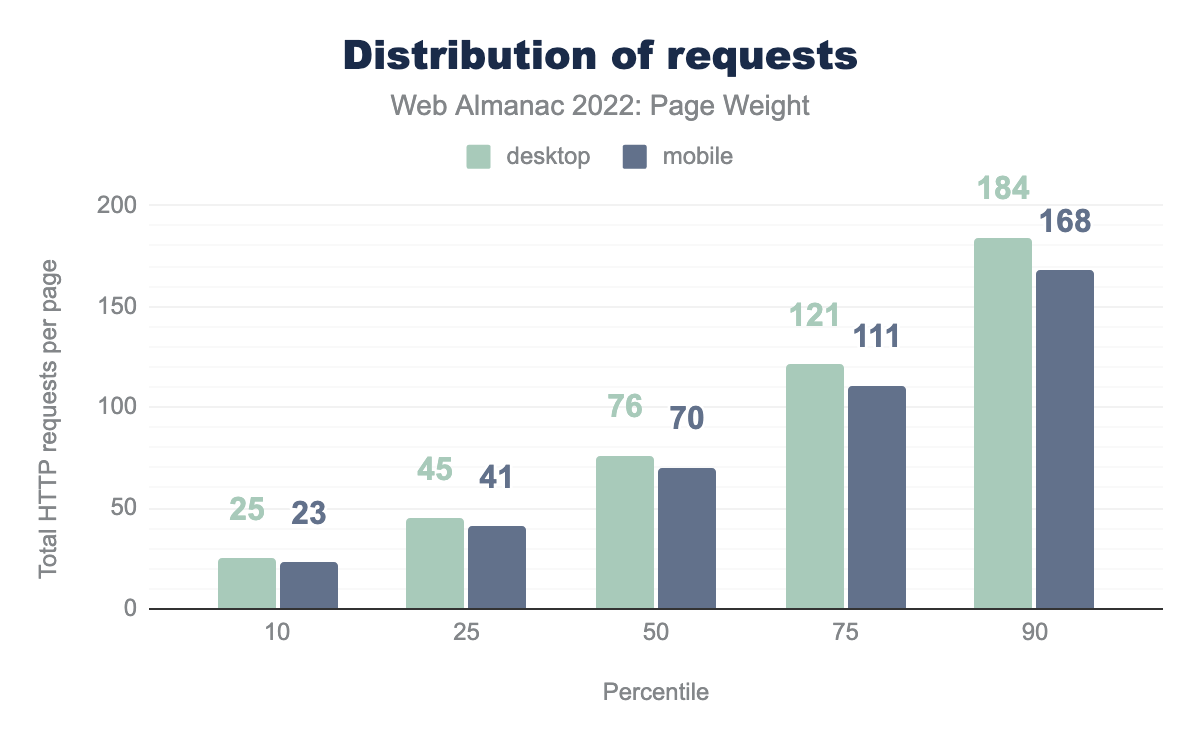
The median page (50th percentile) makes 76 requests for desktop page loads, and 70 on mobile page loads. At all percentiles the difference between desktop and mobile is minimal.
Last year’s median desktop request was 74, so no significant difference over last year.
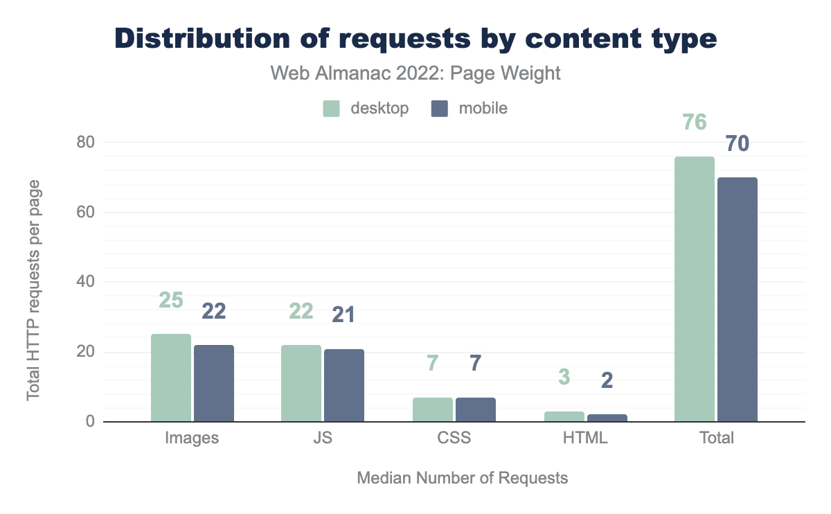
Breaking down requests by type shows that images are the leading resource requests, with the median page requesting 25 images for desktop page loads; 22 for mobile. This is nearly identical to last year’s 25 for desktop; 23 for mobile.
JavaScript is the next largest in request count, 22 requests for desktop page loads, 21 for mobile, again a very close match to 2021, where there were 21 for desktop and 20 for mobile.
In general, there’s little difference between desktop and mobile, other than images being slightly lower on mobile—perhaps attributable to lazy-loading not firing on smaller initial viewports.
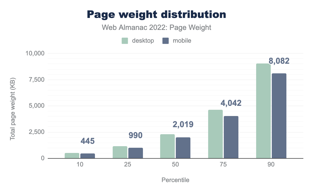
At the 50th percentile, desktop pages were over 2 MB, mobile pages just under that. By the 90th percentile, this has grown to a nearly 9.0 MB for desktop, and nearly 8.0 MB for mobile.
Overall page weight is remarkably close when looking at what is served desktop versus mobile user-agents, although the gap grows slightly in the higher percentile (larger) pages. Given that mobile devices tend to have fewer local resources and more constrained network capabilities, this is concerning.
At the 100th percentile, the largest pages we detected, desktop users were faced with eye-watering 678 MB pages, and mobile users 390 MB.
Let’s dig a little deeper into what is making up these large sizes.
Request bytes
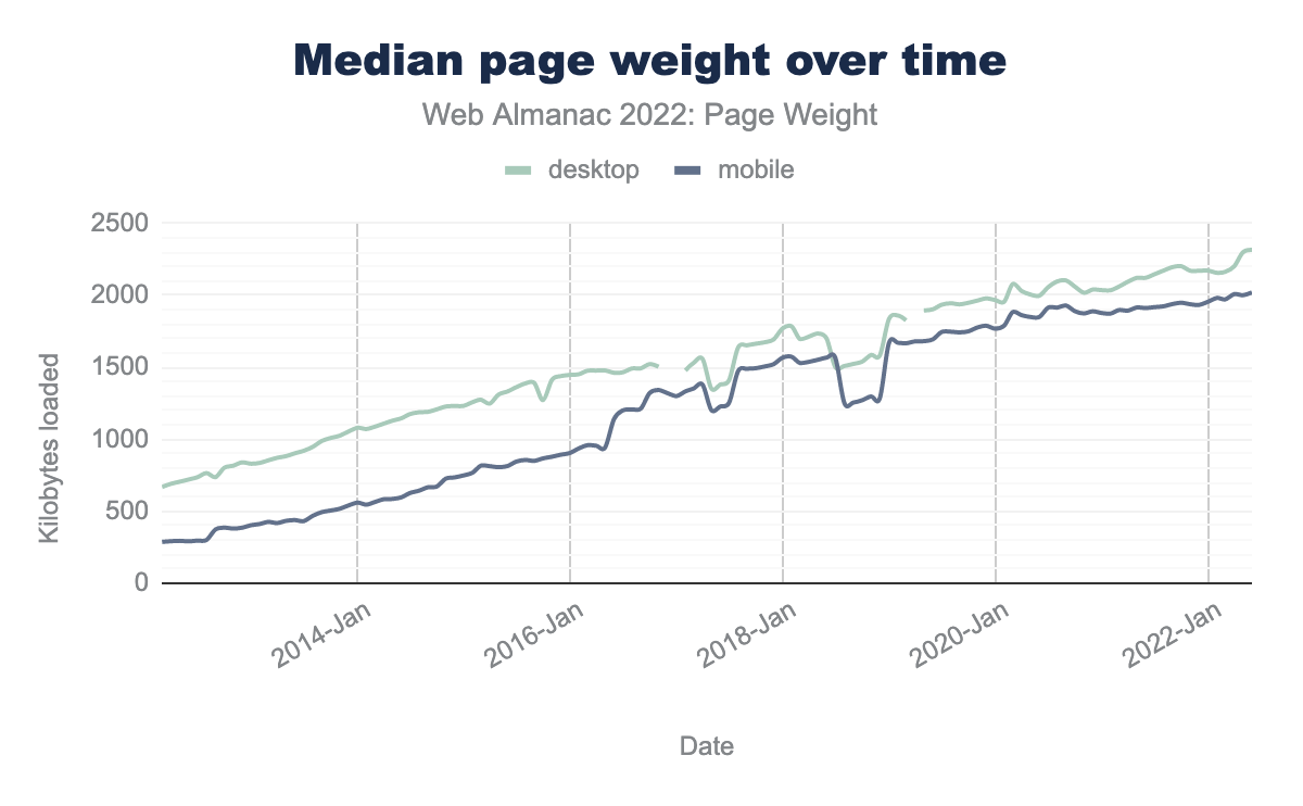
Looking at the median page weight over time, it remains clear that the trend remains disappointingly consistent, with the median weight only growing over time.
In the 10-year period between June 2012 to June 2022, the median page weight increased by 221%, or 1.6 MB, for desktop page loads, 594%, or 1.7 MB for mobile page loads
Year on year, (June 2022 versus June 2021) desktop increased from 2,121 KB to 2,315 KB on desktop, 1,912 KB to 2,020 KB on mobile.
Content type and file formats
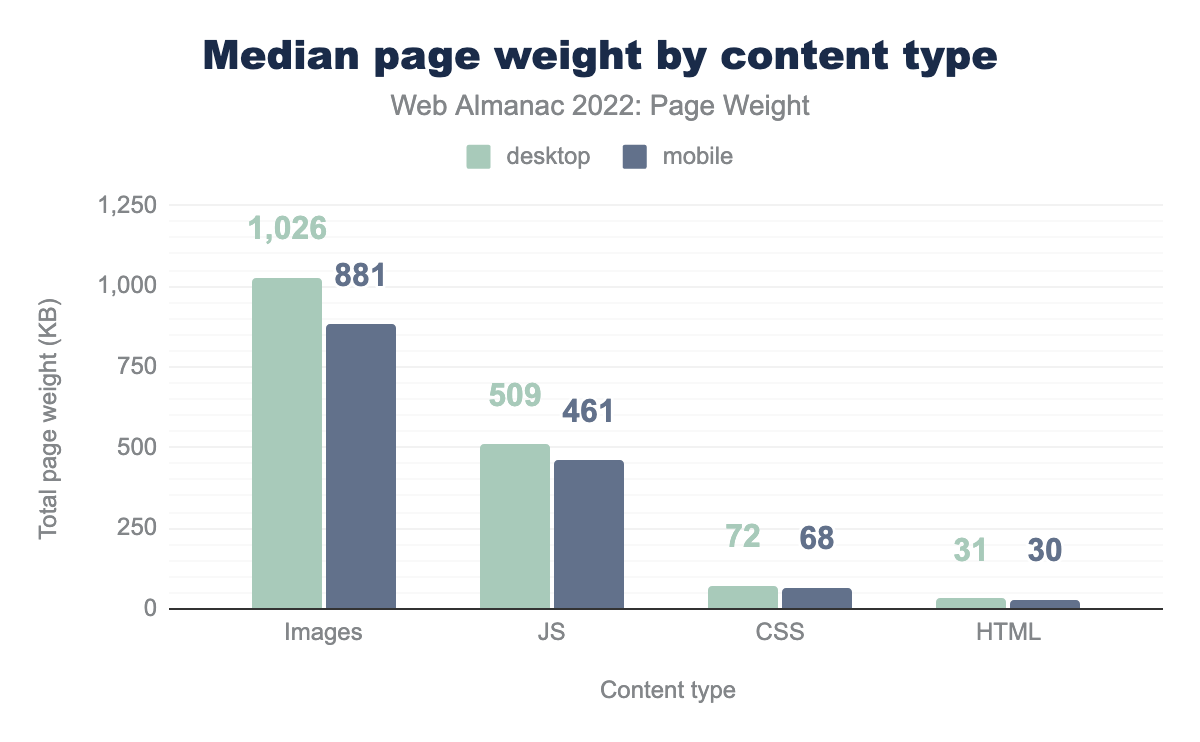
A look at the median weight of the most common resource content types making up the weight of pages shows images are the largest contributor, at 1,026 KB for desktop pages; 811 KB for mobile. JavaScript is the next largest contributor for both desktop and mobile page loads.
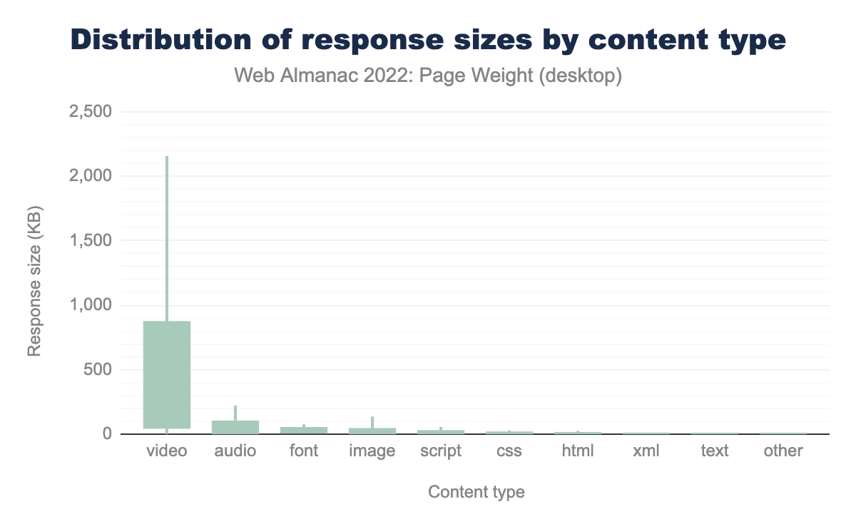
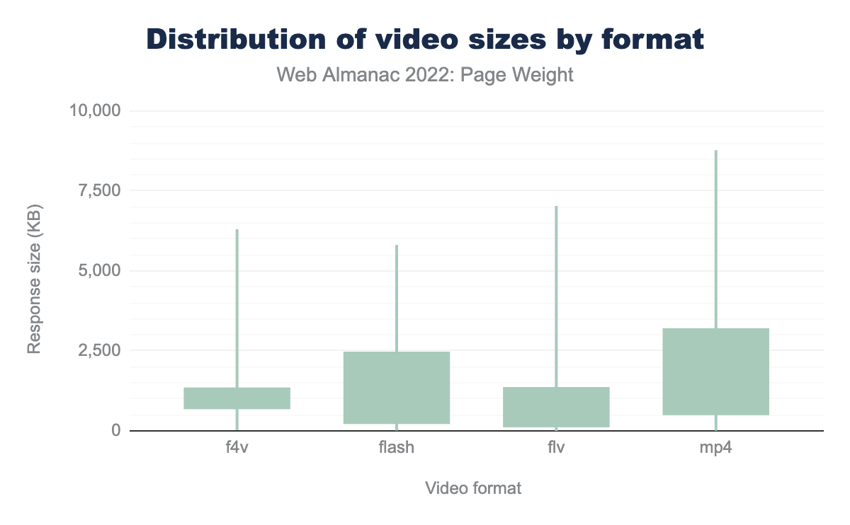
Whilst images are overall the biggest contributors to page weight across the internet, the biggest contributors in sheer size per request are video, audio, and fonts. At the 90th percentile, video requests weigh in at 2,158 KB, four times larger than all the other 90th percentile types combined.
Like images, there are a number of opportunities with more modern formats, and better encoding, sizing, and compression that could help slim this down. But it’s worth noting that video by its nature tends to be weightier, and there’s a balance between size and acceptable quality that needs to be struck. For more information, see the video section of the Media chapter.
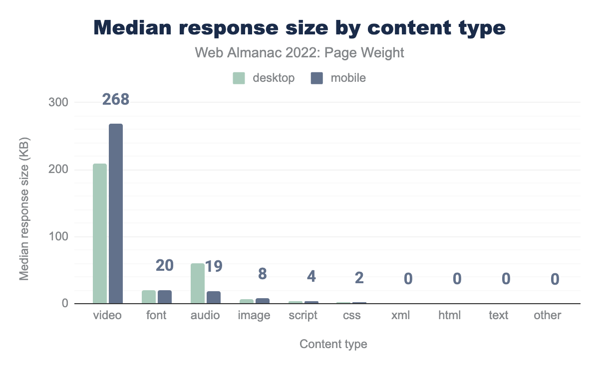
Looking at the median response size for each content type, it’s perhaps surprising to see that video content is larger at 268 KB on mobile page loads than desktop ones, at 208 KB. It’s quite surprising that the median weight of fonts is higher than images, over double at 20 KB versus 8 KB on mobile.
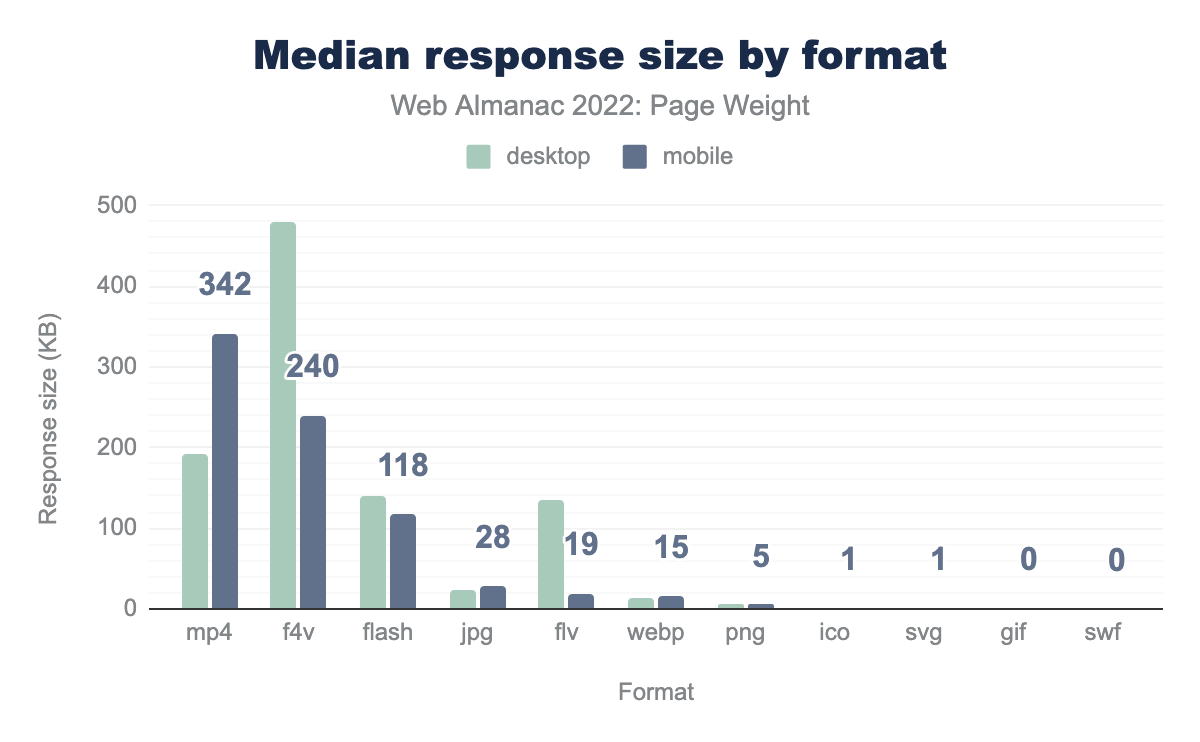
Focusing on file formats, it’s disappointing to see f4v, flash, and flv adding significant weight to pages, the flash player plugin was discontinued in 2021, and removed from major browsers like Chrome, meaning these bytes are most likely entirely wasted.
Image bytes
Since the inception of the Web Almanac images have represented the largest percentage of page weight by bytes, so it’s worth seeing what formats we are using for them.
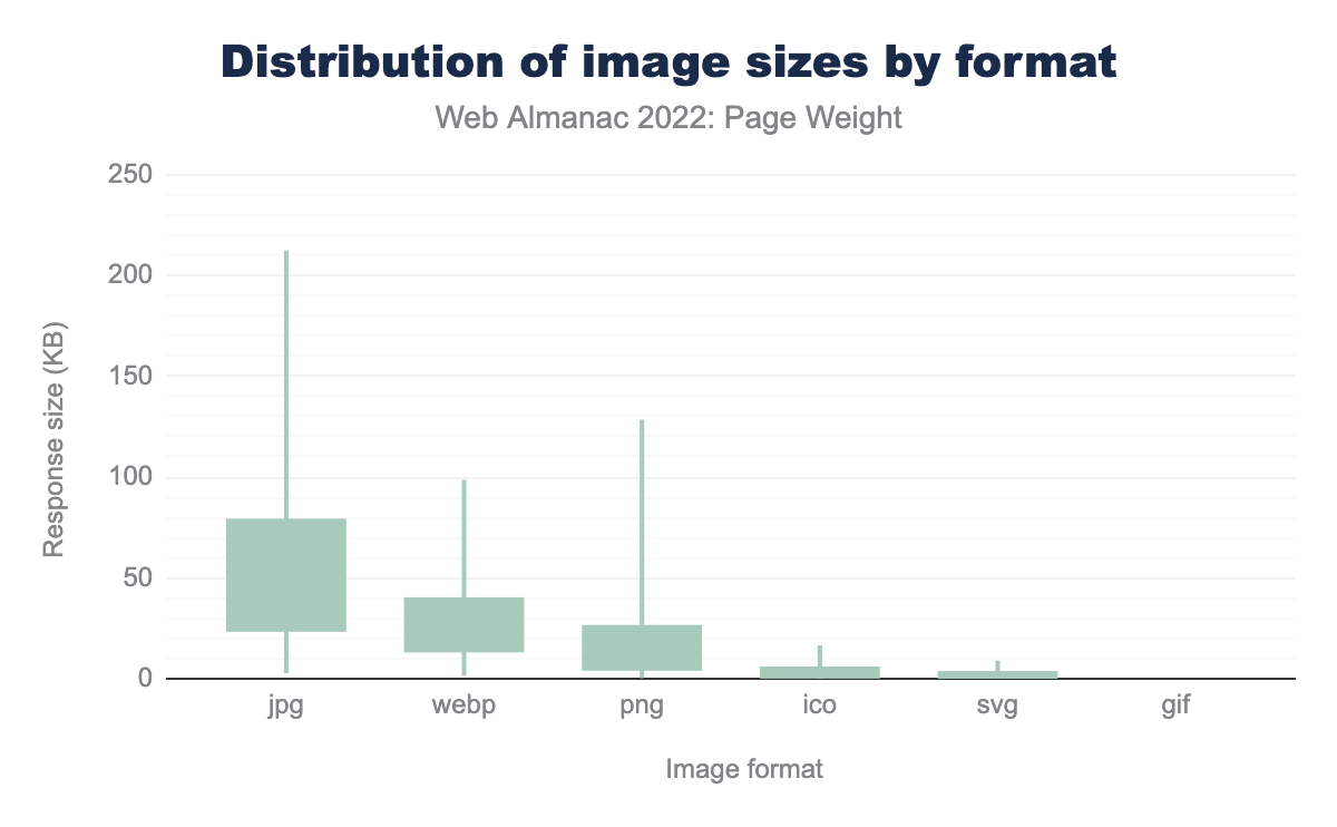
Distribution of image sizes by formats shows us that JPG, WebP, and PNG file formats retain their 2021 status as top sources of image weight.
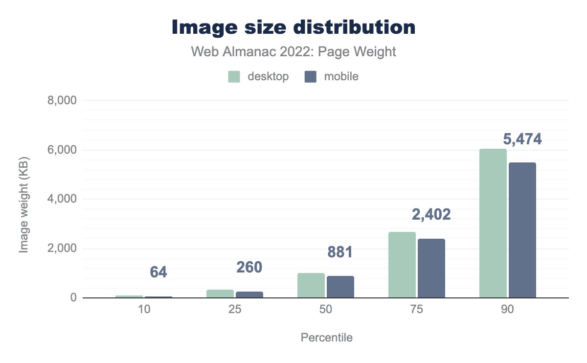
The median desktop image weight for 2022 was 1,026 kilobytes, a mere 44 kilobyte increase from 2021. Mobile barely shifted at 881 kilobytes.
The year-over-year consistency is only disrupted by the extremities of the 100th percentile. The largest desktop page contained 672MB of images, a significant increase from the hefty max of 186MB in 2021. Similarly, the mobile 100th percentile saw a 959% increase to 385MB.
Video bytes
According to the media chapter of the mobile web, 5% of mobile pages include the video element. This information aligns with the 100th percentile of other file type in overall page weight (as video files are grouped in the set). Pages bringing video experiences take on a corresponding increase in weight.
MP4s, which represent 51.5% of videos on the web, also represent the capacity for largest response size. At the 50th percentile, mp4 response sizes come in at 534 kilobytes.
Adoption rates of byte-saving technologies
So what can we do about all those bytes we’re sending? Well obviously we could just stop sending them, but obviously they are being sent for a reason—you’d hope! So let’s look at how to keep the content, but send it in more efficient ways than just stuffing kilobytes and kilobytes down the pipes.
Facades for videos & other embeds
Videos and other interactive embeds can massively increase the overall weight of a page. Videos by their nature can be large in terms of bytes, but other content—like social media embeds used to embed a tweet for example—can bring in a substantial amount of JavaScript and other data to enable these to become interactive.
A good design pattern is the use of facades, a form of lazy-loading. This is basically showing a graphical representation of the element, and not loading the full thing in until required. For example, for a YouTube video, the initial load could be just the poster image for the video, an approach taken by the popular lite-youtube-embed library, which changes to the actual full YouTube embed on click. Alternatively, it can even behave more like traditional image lazy-loading and change when in or near the viewport.
Whilst there are drawbacks to this approach, as detailed in the web.dev article on third-party facades the benefits to the user in terms of data sent over the wire are clear, they only need to pay that cost if they want to watch the video, or interact with the live chat app.
In practice, adoption here is hard to track. Lighthouse offers a test where it looks at the use of a limited set of third-party resources, and if these are requested, points out there might be a facade available.
If a site is successfully using a facade, these resources would not be requested, and therefore isn’t something lighthouse could test for.
The facade pattern doesn’t need to be limited to third-party resources either—although these do come with the additional downside of additional lookups and connections— the approach can work well for large self-hosted resources too.
Analysis showed that there are a number of sites where Lighthouse was able to detect that a facade might be beneficial:
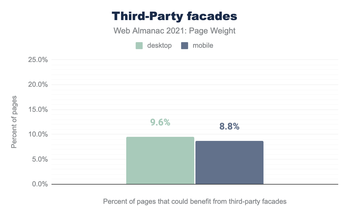
9.6% of desktop pages tested could have benefited from implementing a facade, a slightly better 8.8% for mobile visits.
Compression
Compressing resources before serving them to the client can save bytes that have to be sent across the network, and with fewer bytes. In theory, and usually in practice, this makes for faster loads.
For text, non-media, files like HTML, CSS, JavaScript, JSON, or SVG, as well as for ttf and ico files, HTTP compression is a powerful tool, using gzip or Brotli compression to squeeze down file size. Media like images and video tend not to see any benefit as they are already compressed.
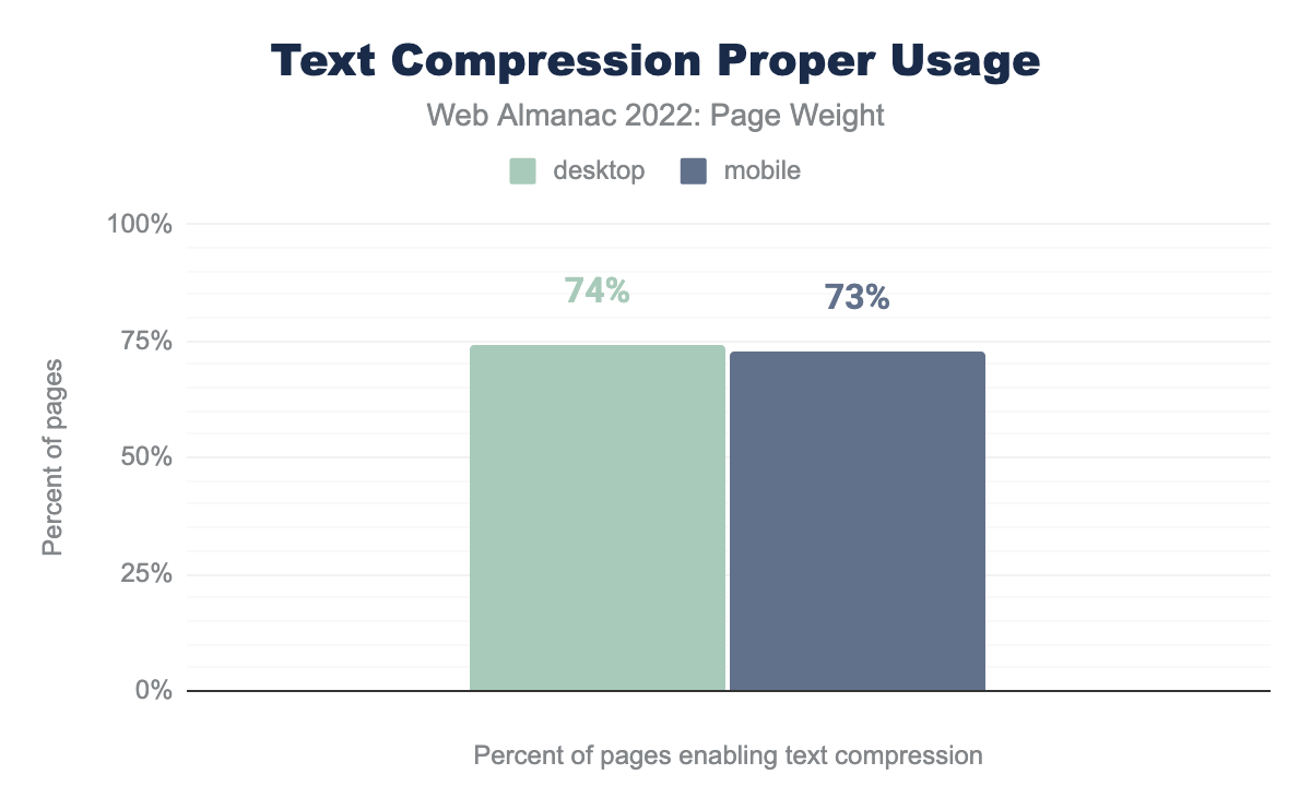
We detected that 74% of page loads on Desktop loads, and a slightly lower 73% of Mobile page loads.
The slightly lower proportion of mobile usage is a disappointing result because they are more likely to have slower and more expensive network connections.
Ultimately compression doesn’t reduce the whole impact of page weight, because these resources have to be decompressed on the client before they are used.
It’s not an entirely free process, either. There is processing overhead on the server to compress—although this might be cacheable for static resources—and likewise a cost on the client side to decompress these resources before use.
It’s about tradeoffs and tackling the worst bottleneck, which is often the network. Compression techniques are remarkably efficient, and the net benefit is usually worth it.
Minification
Minification helps to reduce the overall size of text-based resources by removing unnecessary characters, like whitespace, code comments, and other things that play no part in how a browser interprets and uses these resources.
CSS and JavaScript are great candidates for minification, and we looked at both, using Lighthouse’s test for these resources.
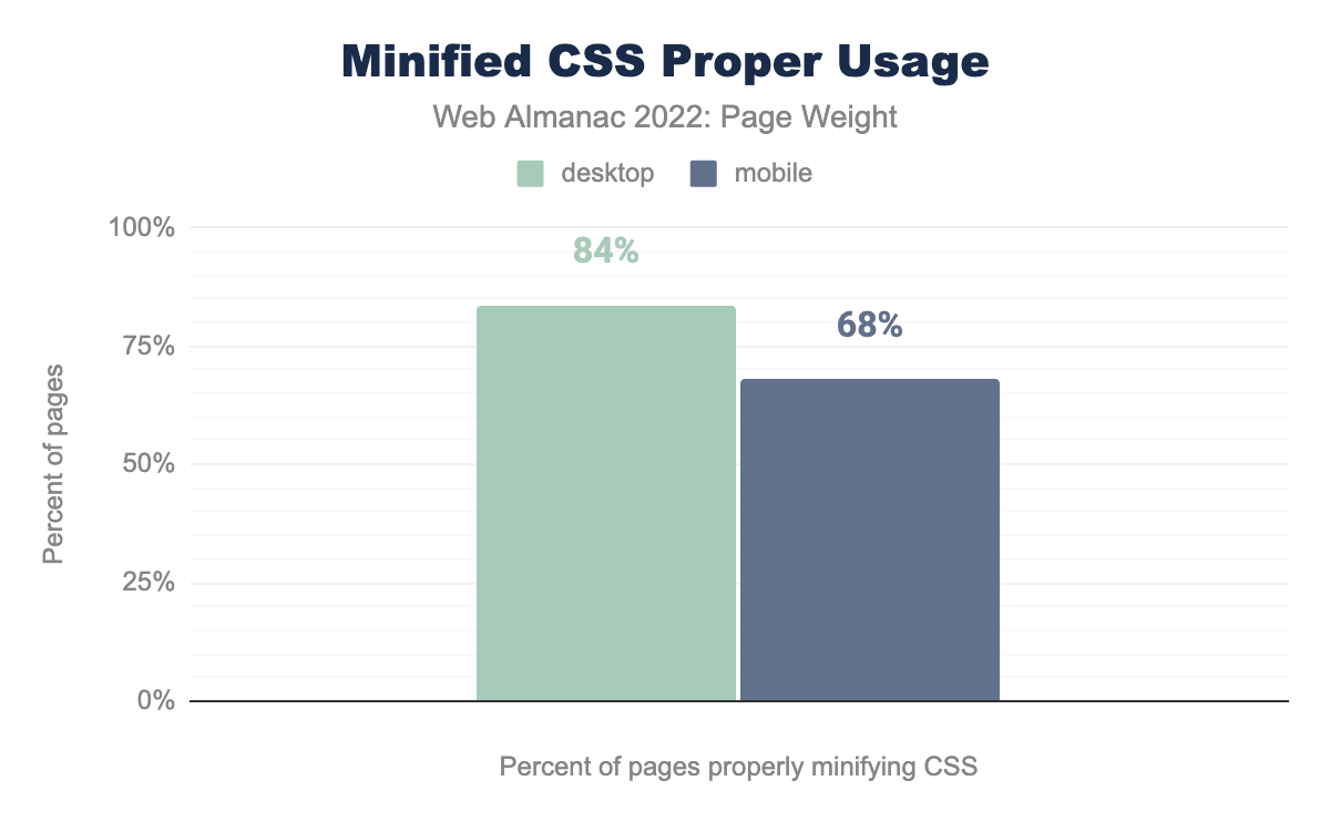
84% of Desktop page loads correctly minified the CSS served, and a smaller 68% of mobile page loads.
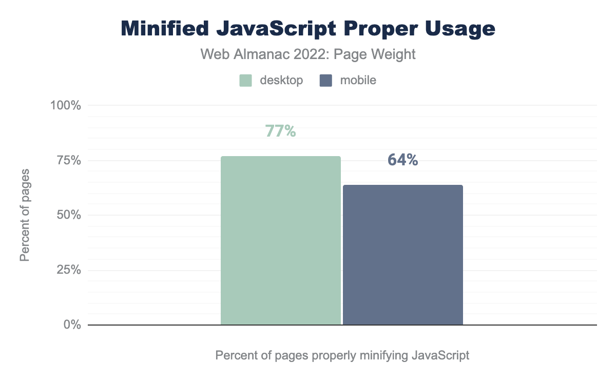
77% of Desktop page loads correctly minified the JavaScript resources served, and a smaller 64% of mobile page loads.
Whilst minification for both CSS and JavaScript is thankfully popular, with the majority of sites getting it right, there’s room for improvement still.
It’s disappointing that like in compression, minification for mobile users lags behind desktop. Like compression, saving bytes is especially helpful on mobile devices.
Unlike compression, there’s no overhead on the client side to minification, resources don’t need to be ’unminified’ to be used. There can be overhead on the server-side if the minification is done on-the-fly at serving time, but CSS and JavaScript are likely to be static files, and minification should be done at build time, or before publishing the resource, meaning there is no further overhead.
Caching and CDNs
Caching allows a resource to be reused until a specified expiration. Caches are used in browsers and on servers.
CDNs are a popular example. These interconnected servers are geographically distributed in order to send cached content from a network location closest to the user. CDNs do not reduce page weight but rather reduce the delay by reducing the distance between requestor and resource.
As such, we did not investigate this in this chapter, but the CDN chapter covers this in more detail and last year’s Caching chapter gives more detail on that.
Conclusion
A hefty page weight results in longer user wait. The expense of ever-inflating web pages is paid in cost of data-access, cost of devices to meet the technical requirements, and time.
While images and JavaScript remain the largest contributors to byte size, 2022 revealed surprising increases such as a greater prevalence of byte-heavy videos on mobile and the median font byte size being higher than that of its image counterpart.
While they thankfully are extreme compared to most of the web, the absurd outliers seen in the 100th percentile show the potential for unchecked bloat as new file types and functionalities are introduced to the digital experience.
Byte-saving technologies have alleviated some of the pressure but with higher adoption rates on desktop despite their use being more impactful to mobile users. Unchecked, this continued inflation will further the gap of digital inequality.

