Fonts
Introduction
We’ve come a long way since the early days of web fonts. We went from a handful of web-safe fonts to a typographic explosion of hundreds of thousands web fonts. The technology and ease of use is almost unrecognizable: from elaborate “bullet-proof” font loading strategies with several font formats to simply including a WOFF2 file.
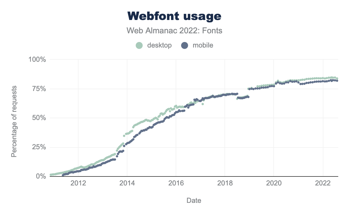
This progression in web fonts shows. Web font usage continues to grow. In the 2020 Fonts chapter, 82% of all desktop sites used web fonts. In the two years since then, usage has increased to about 84%. The numbers are slightly lower for mobile, but represents a similar growth.
While we’ve made tremendous progress we’re not quite there yet. Large percentages of the world’s population can’t use web fonts because their writing systems are either too large or too complex to be delivered as a (small) web font. Fortunately, the W3C Fonts Working Group is working hard on the Incremental Font Transfer web standard that will hopefully solve this.
There was no Fonts chapter in 2021, but we hope we can make up for that this year. We took a slightly different angle this year by taking a closer look at what is inside font files and how fonts are used in CSS. We of course also returned to the “classics” such as services, font-display, and resource hints usage. Finally, we wrap up the chapter with two special focus sections on variable fonts and color fonts—because we think they are great.
Performance
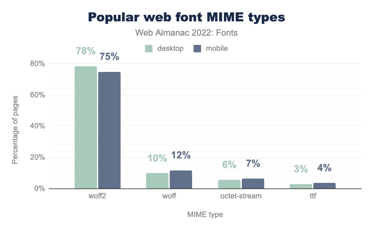
woff2 is used on 78% of the time on desktop and 75% on mobile, woff on 10% and 12% respectively, octet-stream on 6% and 7%, ttf on 3% and 4%, sfnt on 1% and 1%, otf on 0% and 0%, and finally opentype on 0% of desktop and 0% of mobile.Surprisingly, not a lot has changed in the types of fonts served. About 75% of all font files are served as WOFF2, about 12% as WOFF and the remainder as either octet-stream or TrueType Font—and then a whole bunch of random MIME types. This is fairly similar to the results in the 2020 Fonts chapter. Fortunately, SVG and EOT font usage has almost disappeared completely.
As noted in 2019, 2020: WOFF2 offers the best compression and should be the preferred format. In fact, we think it is also time to proclaim:
Use only WOFF2 and forget about everything else.
This will simplify your CSS and workflow massively and also prevents any accidental double or incorrect font downloads. WOFF2 is now supported everywhere. So, unless you need to support really ancient browsers, just use WOFF2. If you can’t, consider not serving any web fonts to those older browsers at all. This will not be a problem if you have a robust fallback strategy in place. Visitors on older browsers will simply see your fallback fonts.
Hosting
Where do people get their fonts? Do they self host, or use a web font service? Both? Let’s take a look at the numbers.
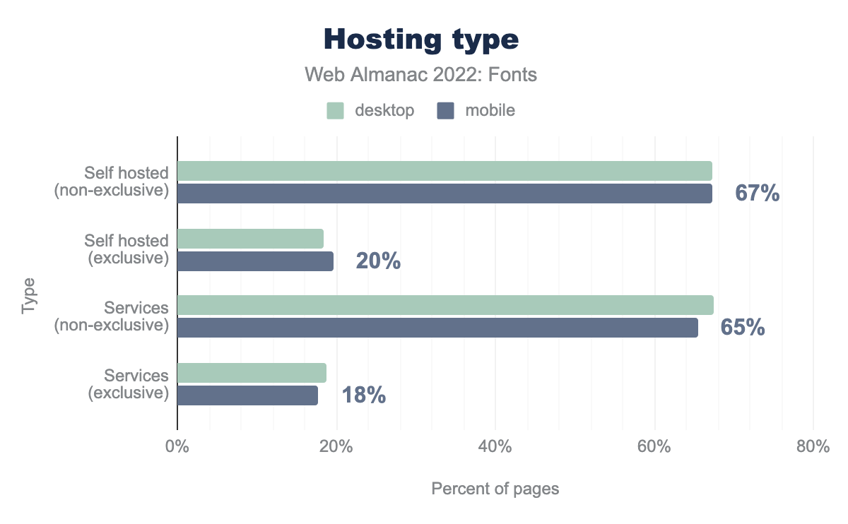
In general, it is a mixture: 67% self host and use a service. Only 19% only use self hosting exclusively. We expect this number to go up in the coming years for two reasons: there is no longer a performance benefit to using a hosted service after the introduction of cache partitioning, and European courts are slowly becoming highly skeptical of European-based companies using Google Fonts.
We can further split this data by service. Perhaps not surprisingly, Google Fonts is the most popular web font service with nearly 65% of all web pages using it. Free is hard to beat indeed.
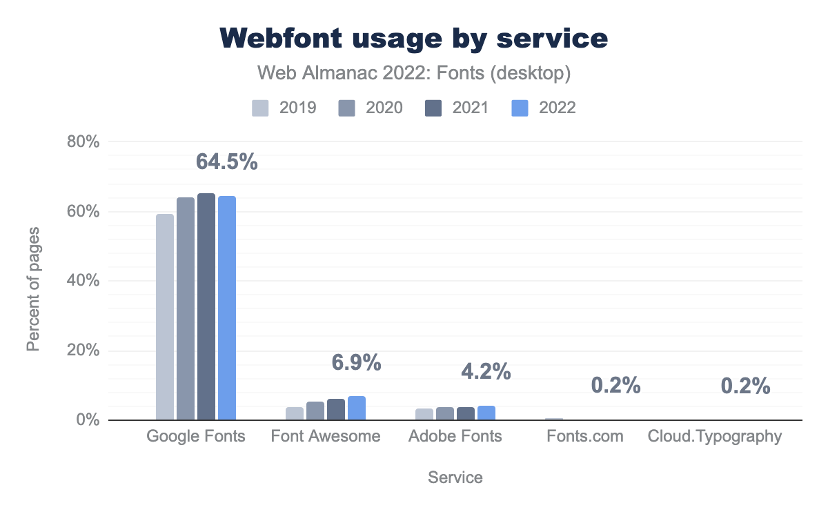
The next runner-up is the Font Awesome web service, which is used on nearly 7% of sites. That is an amazing achievement with only a single font family! In third place is the Adobe Fonts web service, which is used on 4.2% of sites. Trailing far behind are the Fonts.com and Cloud.Typography services, both present on 0.2% of sites.
Looking back at previous years, we can see that Google Fonts usage declined for the first time this year! It’s hard to say if this is due to the aforementioned cache partitioning, GDPR, or something else entirely. The decline is only slight, so it will be interesting to see if the trend continues next year.
In contrast, both Font Awesome and the Adobe Fonts service grew significantly over the last few years. Font Awesome service usage grew 86% from 2019 to 2022, while Adobe Fonts usage grew by 24% in the same period.
Note that the services data is measured differently compared to the 2020 and 2019 font chapters. Those chapters looked at the number of requests to a service, whereas the 2022 data looks at pages using the services. Thus the data in 2022 is more accurate as it isn’t influenced by the number of fonts loaded on a site. For example, the drop in Google Fonts usage noted in the 2020 chapter was most likely caused by Google Fonts switching to variable fonts and thereby significantly reducing the number of requests to their service.
File sizes
Compression is a great way to reduce the amount of data that needs to be downloaded, but it has its limits. To better understand what influences font file sizes, let’s take a look at the median font sizes across all fonts.
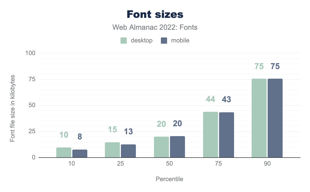
The median font size is about 20 kilobytes. That is pretty good. However, as we have seen earlier, font services account for nearly 70% of all font requests. Services like Google Fonts and Adobe Fonts have teams dedicated to optimizing the fonts as much as possible, so the median font sizes are likely heavily skewed by these services.
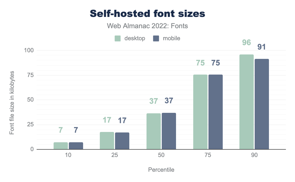
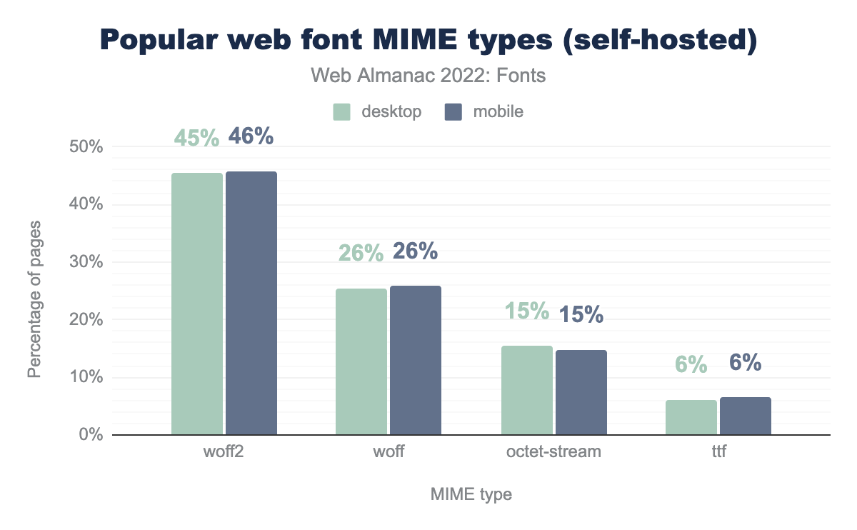
Looking at self-hosted font sizes paints a quite different picture. The median font size nearly doubles to about 40 kilobytes. What is going on here? If we revisit the chart of popular web font MIME types, and remove all requests coming from web font services we get some insight into what might be going on.
A lot of websites using self-hosted fonts are still using WOFF instead of WOFF2. It’s not clear if the fonts on these sites were never updated since WOFF2 was introduced, or if not enough developers know about WOFF2. Regardless, it’s an easy optimization that could benefit a lot of sites.
However, the difference in median font size between services and self-hosted is too large to be explained by a lower usage of WOFF2. While WOFF2 offers excellent compression, compression alone does not explain the large difference in median font sizes. The web font services must be performing other types of optimizations that aren’t being done (enough) for self hosted fonts. To find the answer, we’ll need to take a look at the insides of a font.
OpenType table sizes
A typical font is essentially a tiny relational database with each table storing data like glyph shapes, glyph relationships, and metadata. For example, there are tables to store the vector Bézier curves that make up glyphs—the characters in the font. There are also tables for relating glyphs to one another, that store things like kerning and ligature relationships (i.e. swap these two glyphs with this one when they are used together, like the famous fi ligature).
A reasonable way to measure how much of an impact a table has on overall file size is to multiply its median size by the number of fonts that include that table.
| OpenType table | Impact |
|---|---|
glyf (vector shapes) |
79.6% |
CFF (vector shapes) |
4.9% |
GPOS (positioning relationships) |
4.7% |
hmtx (horizontal metrics) |
2.5% |
post (metadata) |
2.2% |
name (name metadata) |
1.4% |
cmap (maps character codes to glyphs) |
1.3% |
fpgm (font program) |
0.9% |
kern (kerning data) |
0.6% |
The top ten highest impact tables starts with the glyf, CFF, GPOS, and hmtx tables. These contain the data for the Bézier curves that make up the outlines of all glyphs (glyf and CFF), OpenType positioning features (GPOS) and horizontal metrics (hmtx). This is great because these tables are directly related to the number of glyphs in the font. Reduce the number of glyphs in the font by removing glyphs you don’t need and you will dramatically reduce its file size.
Figuring out what you need and what you don’t need is the hard part though. You might accidentally remove glyphs, or break OpenType features that you need to render text correctly. Instead of subsetting manually using, for example, font tools, you can use tools like subfont or glyphhanger to automatically create a “perfect” subset based on the content on your site. However, be mindful whether the license of your font permits such modifications.
It is interesting to note that the name and post tables are in the top 10. These two tables primarily contain metadata that is important for desktop fonts, but not necessary for web fonts. This is an indication a lot of web fonts contain metadata that can be stripped without consequences, such as name table entries, glyph names in the post table, non-Unicode cmap entries, etc. We would love to see a universal set of recommendations (or even a pngcrush-like tool) that can be used by foundries and web developers to remove every last unnecessary byte from a web font.
Outline formats
You might have noticed the OpenType sizes table contains two entries for vector glyph outline data: glyf and CFF. There are actually four competing ways to store vector outlines in OpenType: TrueType (glyf), Compact Font Format (CFF), Compact Font Format 2 (CFF2), and Scalable Vector Graphics (SVG; not to be confused with the old SVG font format). There are also three image based formats—we will talk about two of them in the color fonts section.
The OpenType specification is what you could charitably call “a compromise”. Several competing approaches to do mostly the same thing were added to the specification because there was no consensus. If you’re interested in how this came to be, The Font Wars by David Lemon is a great read. We’ll see this pattern of competing approaches repeated again and again in the sections on variable and color fonts (though with different actors). At the end of the day, having multiple ways to store vector outlines mostly works, but it does place a heavy additional burden on type designers and implementations—not to mention increasing the attack surface area for exploits.
Type designers can choose the outline format they prefer. Looking at the distribution of outline formats, it is pretty clear what type designers have chosen. The overwhelming majority (91%) of fonts use the glyf outline format, while 9% use the CFF outline format. There is some SVG color font usage as well, but less than 1% (not pictured).
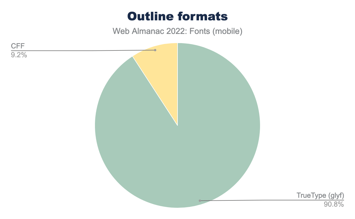
glyf) is 90.8% of mobile fonts, and CFF 9.2%.
The OpenType specification lists the differences between glyf and CFF:
- The
glyfformat uses quadratic Bézier curves whileCFF(andCFF2) uses cubic Bézier curves. This matters to some type designers, but not to users of the font. - The
glyfformat has more control over hinting—making small adjustments so that the glyph outlines snap to the correct pixels at smaller sizes—whileCFFhas most of its hinting built into the text rasterizer. - The
CFFformat claims to be a more efficient format, resulting in smaller font sizes.
The last claim is interesting. Is CFF smaller?
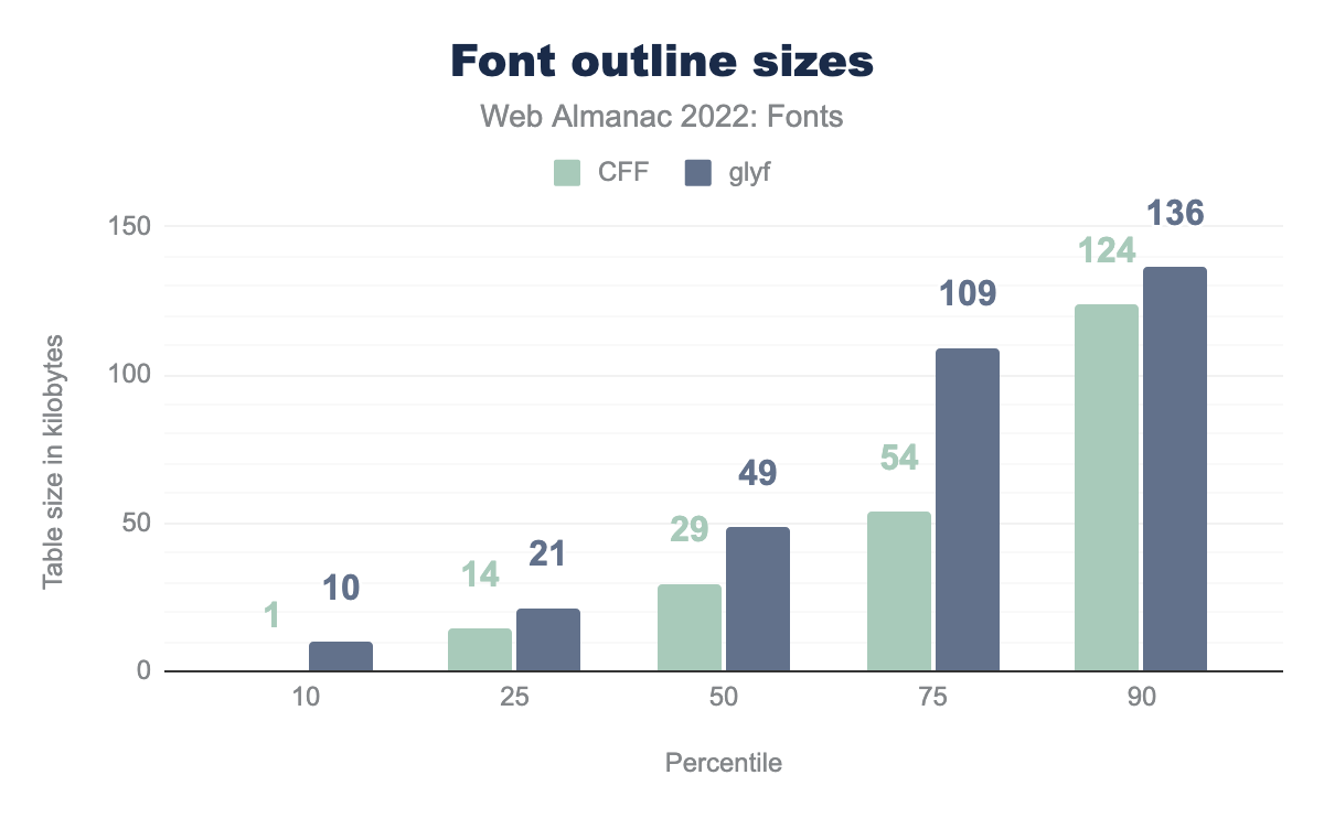
CFF is 1 KB and glyf 10 KB, at the 25th percentile it’s 14 and 21 respectively, at the 50th percentile it’s 29 and 49, at the 75th percentile it’s 54 and 109, and finally at the 90th percentile CFF is 124 KB and glyf 136 KB.On average, CFF does indeed produce a smaller table size. However, the reality is more nuanced, as it doesn’t take compression into account—the table sizes are recorded after the font has been uncompressed.
As can be seen in the WOFF2 evaluation report, the median glyf compression is at 66% while the median CFF compression is at 50% (from uncompressed to compressed using WOFF2).
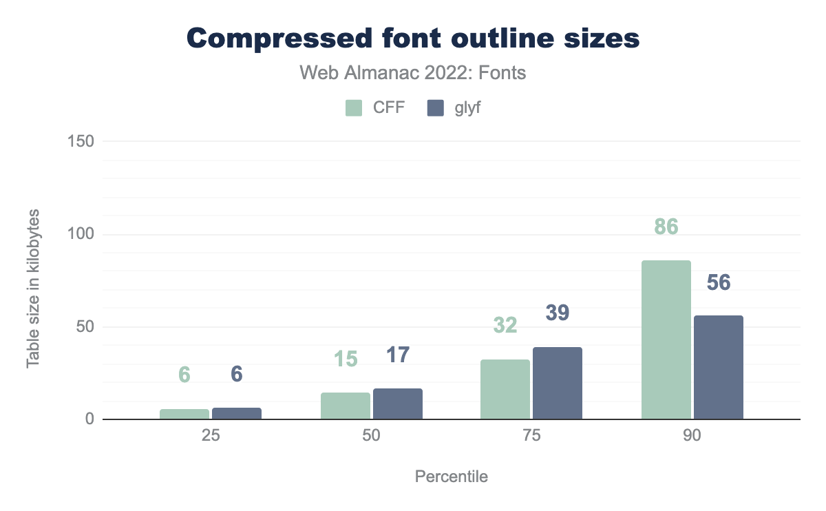
CFF and glyf font sizes are 6 KB, at the 50th percentile they start to diverge with CFF 15 KB and glyf 17 KB, at the 75th percentile it’s 32 and 39 KB respectively, and finally at the 90th percentile it’s CFF is 86 KB and glyf is only 56 KB.Applying compression paints a very different picture. The median file size differences are negligible, and large fonts are much smaller when using glyf outlines!
In other words, even if CFF starts out smaller, it compresses much less than glyf, so it all evens out in the end. In fact—for larger files—it appears using the glyf format produces smaller sizes.
Resource hints
Resource hints are special instructions to the browser to load or render a resource before it normally would. Browsers normally only load web fonts when they know a font is used on the page. In order to know that, it needs to have parsed both the HTML and CSS. However, if you, as a web developer, know that a font will be used, you can use resource hints to tell the browser to load fonts much earlier.
There are several types of resource hints that are relevant to web fonts: dns-prefetch, preconnect, and preload—in order of the lowest to highest impact. Ideally you would like to preload your most important fonts, but depending on where they are hosted that may not always be possible.
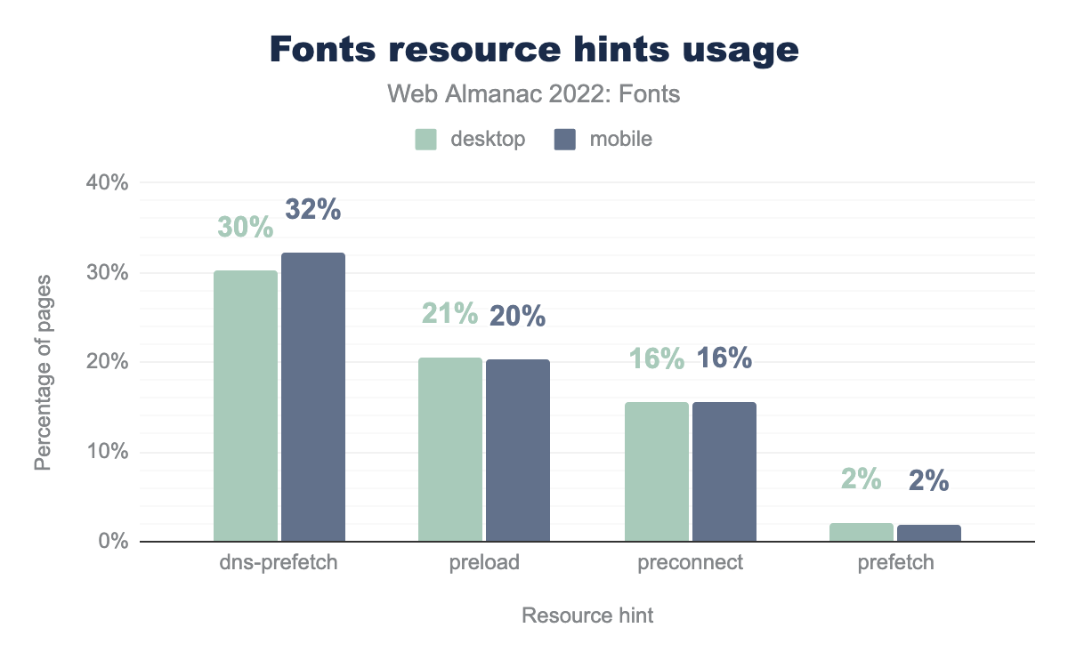
dns-prefetch is used on fonts on 30% of desktop pages and 32% of mobile pages, preload on 21% and 20% respectively, preconnect on 16% and 16%, and finally prefetch is used on 2% of desktop and 2% of mobile pages.There hasn’t been any large change in the use of dns-prefetch hints since 2020, but there has been a fairly significant increase in the use of preload (from 17% in 2020 to 20% in 2022) and preconnect (from 8% in 2020 to 15% in 2022). This is great!
As mentioned in the 2020 chapter, preload and preconnect resource hints have the single largest impact on your font loading performance. In most cases it is as simple as adding a link element to your head. For example, if you use Google Fonts:
<link rel="preconnect" href="https://fonts.gstatic.com">If you self-host your fonts you can go even further and provide hints to the browser to preload your most important fonts—your primary text font for example. That way the browser can load it early and it will likely be available when text rendering starts.
font-display
For many years most browsers did not render text until web fonts had loaded. On slow connections, this would often result in several seconds of invisible text even though the text content had already loaded. This behavior is called block, because it blocks rendering of the text. Other browsers showed fallback fonts right away and swapped them when the web font loaded. When a fallback font is replaced by a web font, this is called swap.
To give web developers more control over font loading, the font-display descriptor was introduced to tell the browser how it should behave while web fonts are loading. It defines four different values of what to do while fonts are loading. These values are implemented using different combinations of block and swap behavior.
swap: block for a very short period and always swap.block: block for a short period and always swap.fallback: block for a very short period and swap within a short period.optional: block for a very short period and no swap period.
There is also auto, which leaves the decision up to the browser—all modern browsers use block as the default value.
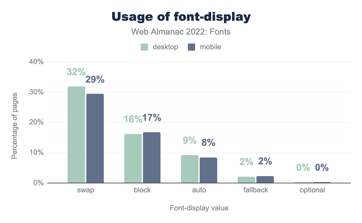
swap is used on 32% of desktop and 29% of mobile pages, block on 16% and 17% respectively, auto on 9% and 8%, fallback on 2% and 2%, and finally optional is on 0% of both desktop and mobile pages.font-display.
Use of font-display: swap has grown to an impressive 30% (from 11% in 2020). A fair chunk of this increase can most likely be attributed to Google Fonts making swap the recommended value in 2019. It is also interesting to see the block value overtaking auto as the second most used value. We are not sure why developers are intentionally degrading the performance of their site, but it is an interesting, if not slightly worrying, development.
Our guess is that developers—or their customers—really dislike seeing a flash of fallback fonts. Using font-display: block is an easy “fix” for that problem. However, there is a better solution on the horizon. In the near future you can use CSS font metric overrides to tweak your fallback fonts to approximate the metrics of your web fonts. This will reduce the jarring reflow of text when a fallback font is swapped with a web font.
The CSS ascent-override, descent-override, line-gap-override, and size-adjust descriptors go into the @font-face rule and can be used to override the metrics in any font. You can use these descriptors with local() to create a customized fallback font that roughly matches your web font—hey, finally a good use for local().
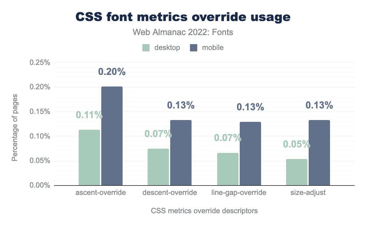
ascent-override is used on 0.11% of desktop and 0.20% mobile pages, descent-override on 0.07% and 0.13% respectively, line-gap-override on 0.07% and 0.13%, and finally size-adjust on 0.05% of desktop and 0.13% of mobile pages.These @font-face descriptors are very new, but are already seeing some use. To make them even more useful developers need two things:
- A set of consistent fallback fonts that are available in all browsers and on all platforms. They could even be variable fonts. Imagine the possibilities.
- Tools to automatically match fonts by tweaking its size and metrics. Doing this by hand is very time-consuming, so a tool is a must. This is not intended as a replacement for the web font, but merely as a temporary fallback while the web fonts are loading (or as a stand-in if the fonts don’t load or the browser is very old).
We’re slowly getting there with tools such as Font Style Matcher and Perfect-ish Font Fallback, but unfortunately, fallback fonts are still very much platform dependent.
Font usage
Performance is important, but it is also interesting to see how fonts are being used on the web. For example, what are the most popular fonts and foundries? Are people using OpenType features? Let’s take a look at the data.
Families & foundries
| Family | desktop | mobile |
|---|---|---|
| Roboto | 14.5% | 1.5% |
| Font Awesome | 10.5% | 12.8% |
| Noto Sans | 10.1% | 8.0% |
| Open Sans | 5.9% | 7.7% |
| Lato | 3.6% | 3.9% |
| Poppins | 3.0% | 4.0% |
| Montserrat | 2.5% | 3.1% |
| Source Sans Pro | 1.6% | 1.9% |
| icomoon | 1.3% | 1.5% |
| Proxima Nova | 1.0% | 1.0% |
| Raleway | 1.0% | 1.3% |
| Noto Serif | 0.8% | 1.0% |
| Ubuntu | 0.7% | 0.9% |
| NanumGothic | 0.7% | 0.3% |
| Oswald | 0.6% | 0.8% |
| PT Sans | 0.6% | 0.8% |
| GLYPHICONS Halflings | 0.5% | 0.6% |
| Rubik | 0.4% | 0.4% |
| eicons | 0.4% | 0.6% |
| revicons | 0.4% | 0.5% |
With Google Fonts’ massive impact on web font serving, it is no surprise the most used font on the web is Roboto. Roboto was created by Google as a system font for its Android operating system. This also explains the huge discrepancy between Roboto’s use on mobile compared to desktop sites. On Android, Google Fonts will use the system installed version instead of downloading it as a web font.
Font Awesome takes the number two spot, which is an impressive accomplishment for what is essentially a single font family. Font Awesome, combined with Icomoon, Glyphicons, eicons, and revicons make up nearly 18% of all web fonts used on websites! Icon fonts are problematic from an accessibility point of view, so it is worrying to see this being so popular.
A special note should also be made of Proxima Nova at 1% usage. It is the only commercial, non-icon, font in the top 20. That’s an amazing achievement by Mark Simonson Studio.
Another interesting fact is that a large portion of the top families are open source. This can be credited to Google Fonts who have either commissioned these fonts or included existing open source fonts in their library.
| Vendor | desktop | mobile |
| 30.5% | 17.7% | |
| Font Awesome | 12.3% | 15.6% |
| Łukasz Dziedzic | 3.6% | 4.3% |
| Indian Type Foundry | 3.0% | 4.1% |
| Julieta Ulanovsky | 2.5% | 3.1% |
| Adobe | 1.6% | 1.9% |
| Ascender Corporation | 1.6% | 2.0% |
| Icomoon | 1.3% | 1.5% |
| Mark Simonson Studio | 1.3% | 1.3% |
| ParaType Inc. | 1.0% | 1.4% |
The list of most popular type foundries (or in some cases type designers) is equally fascinating. Besides large companies like Google, Adobe, Ascender (Monotype), it is good to see several smaller companies and even several individuals having such a large impact.
OpenType features
OpenType features are often referred to as a font’s superpowers. And of course, the fonts with superpowers are often unrecognized. OpenType features are hard to discover and use. Fortunately, there are web tools, such as Wakamai Fondue, that clearly show you which features there are, what they do, and how to use them.
Some OpenType features are for stylistic purposes only, while others are required to render text correctly. You might often see these two mentioned as discretionary and required features. Almost 44% of all fonts have either discretionary or required OpenType features. So, there’s a good chance the font you are using also has super powers!
Discretionary features can be used to, for example, replace two adjacent glyphs with a ligature to improve legibility. It’s also common for OpenType features to offer alternative versions of glyphs, for example by adding swashes.
A significant number of fonts have discretionary OpenType features. The most common discretionary feature is, not surprisingly, ligatures. This is followed by a whole range of features that modify numerals like fractions, proportional numerals, tabular numerals, lining numerals, and ordinals. Superscripts are also somewhat common.
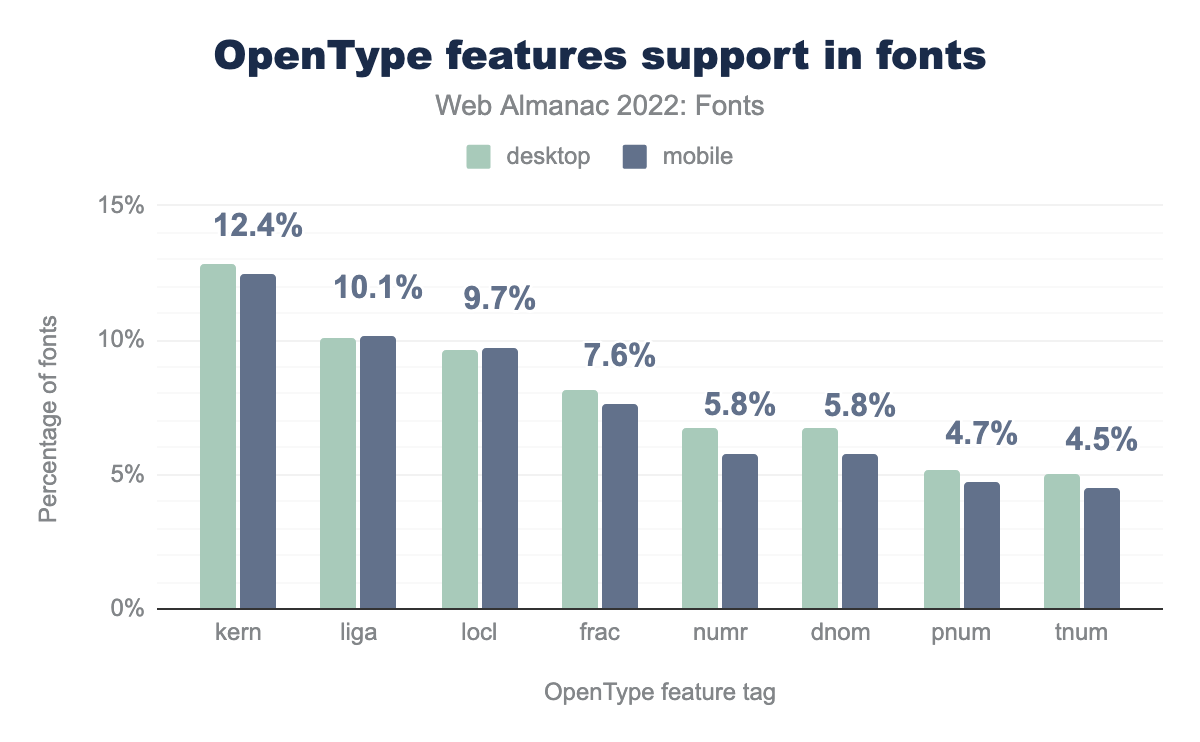
kern is used on 12.8% of desktop fonts and 12.4% of mobile fonts, liga on 10.0% and 10.1% respectively, locl on 9.6% and 9.7%, frac on 8.1% and 7.6%, numr on 6.8% and 5.8%, dnom on 6.7% and 5.8%, pnum on 5.1% and 4.7%, and finally tnum on 5.0% of desktop and 4.5% of mobile fonts..If we look at required OpenType features, there are two that stand out from everything else: kerning and localized forms. Localized forms are used to specify alternate glyphs that are required or preferred by some languages. This implies that a good amount of fonts support multiple languages, which is a great sign of progress for internationalization.
Kerning is the process of slightly increasing or decreasing the space between any combination of two glyphs to make the space between them seem more even. Kerning is enabled by default on all browsers, so as long as the font supports kerning it will be enabled.
Only 34% of all web fonts have kerning data stored as either an OpenType feature, or using the older kern table. Nearly all fonts need kerning to look correct, so we would have expected this number to be much higher than it is. One explanation is that when web fonts started taking off, browser support for kerning wasn’t very good, so many early web fonts did not include kerning data to save on space. Nowadays, all browsers support kerning so there is no reason fonts should not have kerning data in them.
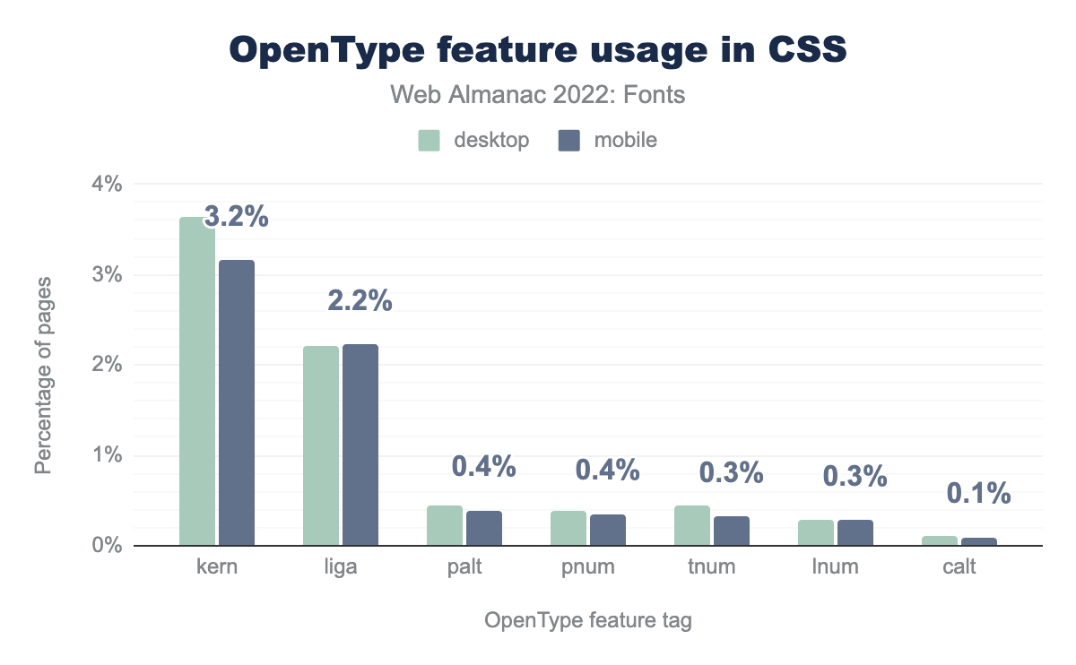
kern is used on 3.6% of desktop pages and 3.2% of mobile pages, liga on 2.2% and 2.2% respectively, palt on 0.4% and 0.4%, pnum on 0.4% and 0.4%, tnum on 0.4% and 0.3%, lnum on 0.3% and 0.3%, and finally calt on 0.1% of desktop and 0.1% mobile pages.
What’s even more interesting is that kerning is also the most common feature tag used in the font-feature-settings property. Nearly 3.2% of sites manually enable (or worse, disable) kerning. There is no need for that; it is enabled by default. In fact, there is no need to ever change kerning settings through font-feature-settings or the higher level font-kerning property. Disabling kerning won’t make your site faster, but your typesetting will be poorer for it.
The other most used features are roughly in line with what type designers actually include: ligatures and various numerals. It is interesting to see the palt (proportional alternates) feature in this list, as it is primarily used for CJK fonts (which themselves aren’t common because they are usually too large to be used as web fonts, even with WOFF2 compression). Like kerning, the calt feature (contextual alternates) is enabled by default and should not be explicitly enabled or disabled. There are many other useful OpenType features such as stylistic sets, character variants, small caps, and swashes that have low usage, but have the potential to really enhance your typography. Our recommendation is to drop your fonts in Wakamai Fondue and explore all the hidden superpowers.
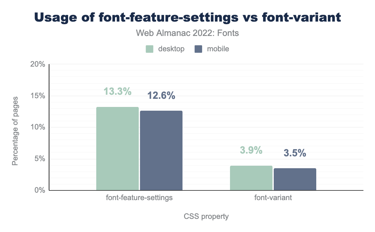
font-feature-settings is used on 13.3% of desktop pages and 12.6% of mobiles pages, and font-variant is used on 3.9% of desktop pages and 3.5% of mobile pages.Overall, usage of OpenType feature usage is quite low on the web. We were hoping most people are using the high-level font-variant properties to enable OpenType features, but their usage is even lower than font-feature-settings. The font-feature-settings property is used on 12.6% of sites, while the font-variant properties are used on only 3.5% of sites.
This is disappointing. Not only are people not using the OpenType features present in fonts, they are also primarily using the error-prone font-feature-settings property instead of the high-level font-variant property. You need to be extra careful with the font-feature-settings property, as it will reset any OpenType feature you didn’t explicitly list to its default value.
All of the most commonly used font-feature-settings values have font-variant equivalents that are more readable, and do not unset other OpenType features as a side effect. While support for these high-level features wasn’t that great in the past they are well supported these days—except for the recently introduced font-variant-alternates property.
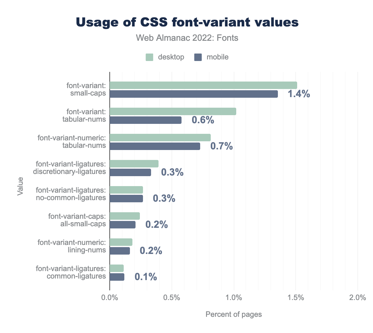
font-variant: small-caps is used on 1.5% of desktop pages and 1.4% of mobile pages, font-variant: tabular-nums on 1.0% and 0.6% respectively, font-variant-numeric: tabular-nums on 0.8% and 0.7%, font-variant-ligatures: discretionary-ligatures on 0.4% and 0.3%, font-variant-ligatures: no-common-ligatures on 0.3% and 0.3%, font-variant-caps: all-small-caps on 0.2% and 0.2%, font-variant-numeric: lining-nums on 0.2% and 0.2%, and finally font-variant-ligatures: common-ligatures on 0.1% of desktop and mobile pages.The most used font-variant value is small-caps at 1.4% of pages. This is surprising, because small caps are only supported by 0.7% of fonts. That means that most people using font-variant: small-caps and font-variant-caps will get faux small caps that are generated by the browser instead of small caps created by the type designer! In the future, you can avoid faux small caps by using the font-synthesis-small-caps property.
The other values roughly match what is provided by the fonts themselves. Even though use of the font-variant properties is low, we expect—or rather hope—that these numbers will go up over time and use of font-feature-settings becomes relegated to use with custom or proprietary OpenType features.
Writing system and languages
To understand what kind of fonts are being made and used, we thought it would be interesting to look at what languages fonts support. For example, do people make a lot of German, Vietnamese, or Urdu fonts? Unfortunately, it is hard to answer this question because a lot of languages share the same writing system. That means they might share the same character set, but might have only been explicitly designed for one specific language. So instead of languages, we’ll take a look at writing systems.
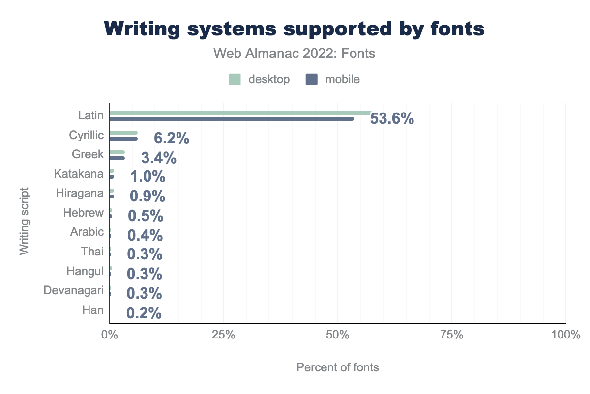
Not surprisingly, the Latin system is in the lead with a whopping 53.6% of all fonts supporting (a significant) subset of the Latin writing system. This includes a lot of languages used in the western world, like English, French, and German. However, it also covers languages in Asia, such as Vietnamese and Tagalog. The number two and three spots are taken by Cyrillic and Greek. Again, this is not a surprise, they are commonly used and a reasonably small amount of work to add to a font due to their limited number of extra glyphs that need to be added. Katakana and Hiragana (Japanese) are at 1% and 0.9% respectively—a combined 1.9%. Note that about 10% of fonts failed to meet the minimum threshold of a writing system (not pictured). This includes fonts that, for example, only support a small number of characters or ones that are heavily subsetted.
Sadly, other writing systems are much less prevalent. For example, Han (Chinese) is the 2nd most used writing system in the world (after Latin), but only supported by 0.2% of web fonts. Arabic is the third most used writing system, but again, only supported by 0.4% of web fonts. The reason that some of these writing systems are not used as web fonts is that they are very large due to the sheer number of glyphs they have to support, and the difficulty in subsetting them correctly.
While services like Google Fonts and Adobe Fonts support these writing systems, they are using proprietary technologies that simply are not available for self-hosting. However, the W3C Fonts Working Group is working on a new standard called Incremental Font Transfer that enables web developers to self-host large fonts. We hope to see other writing systems catch up with Latin once this technology becomes widely available.
Generic font families
We already touched on fallback fonts while talking about font-display. Sometimes you don’t need web fonts at all though, for example in UI elements or form inputs. One of our favorite ways to avoid using web fonts is to use the new generic system-ui family name which maps to the font family used by the operating system. Did you know there are several other generic families? There is ui-monospace, ui-sans-serif, ui-serif, and ui-rounded as well, if you want to use an operating system font, but have slightly more specific needs.
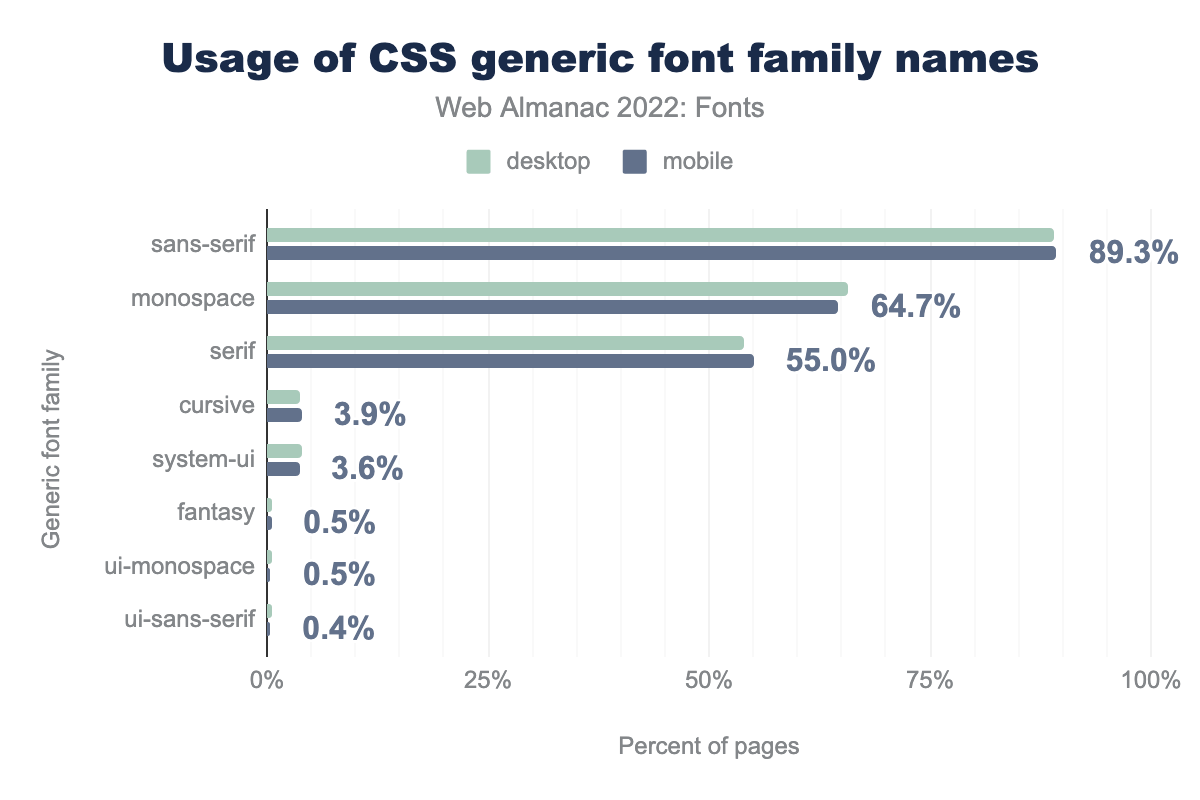
sans-serif is used on 89.1% of desktop pages and 89.3% of mobile pages, monospace on 65.8% and 64.7% respectively, serif on 54.0% and 55.0%, cursive on 3.7% and 3.9%, system-ui on 4.0% and 3.6%, fantasy on 0.5% and 0.5%, ui-monospace on 0.6% and 0.5%, and finally ui-sans-serif is used on 0.5% of desktop and 0.4% of mobiles pages.While these are fairly new, they are already seeing significant use. The usual suspects, sans-serif, monospace, and serif obviously take the lead as they have been around since the first version of the CSS specification.
The most popular, and well-known, is system-ui at 3.6%, followed by ui-monospace at 0.5% and ui-sans-serif at 0.4%. It isn’t clear what the 0.5% of requests for fantasy were hoping for, as that generic is so under-specified as to be effectively useless.
We hope to see more use of these generic family names next year. They are great for UI elements, forms, or really anything where you want to evoke a native feel. As an added benefit, they are also great for performance as they are guaranteed to use a locally installed font.
Font smoothing
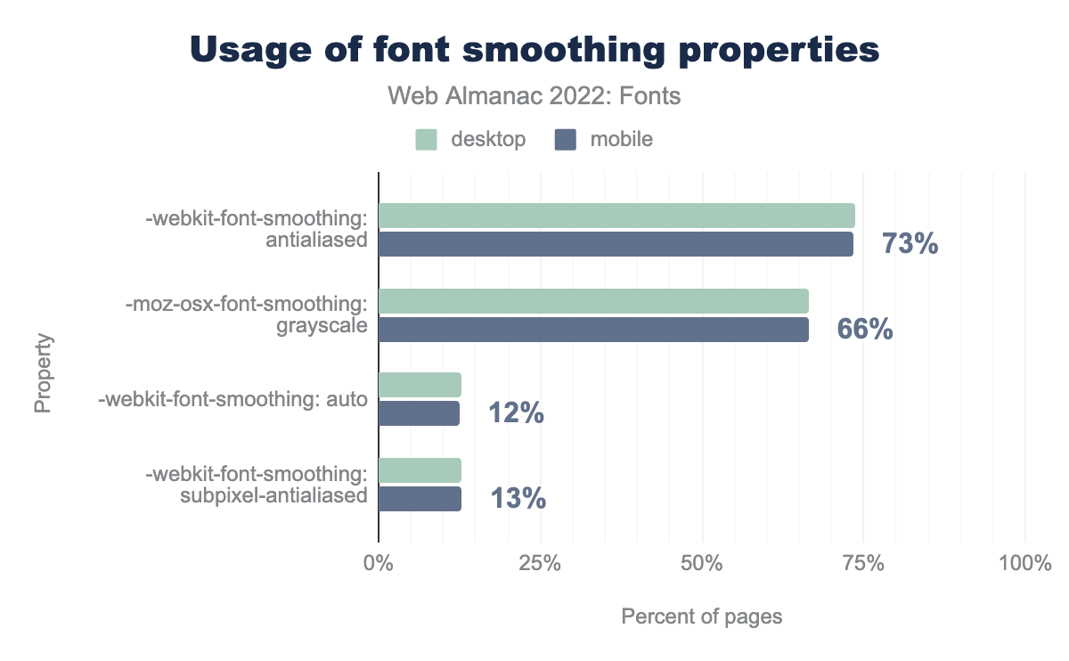
-webkit-font-smoothing: antialiased is used on 74% of desktop and 73% of mobile pages, -moz-osx-font-smoothing: grayscale on 67% and 66%, -webkit-font-smoothing: auto on 13% and 12%, and finally -webkit-font-smoothing: subpixel-antialiased is used on 13% of desktop and 13% of mobile pages.And now for a complete surprise—to us anyway: people really like to specify their MacOS-only font smoothing preferences. For example, the -webkit-font-smoothing: antialiased value is used on 73.4% of all sites. This is surprising because it—and its siblings -mox-osx-font-smoothing, and font-smoothing—are not even official CSS properties. This might make them the most used unofficial CSS properties!
Our hunch this is a combination of CSS frameworks including these properties and a dislike of how fonts are rendered slightly bolder on macOS—variable font grades to the rescue! It would be interesting to return to these properties in the 2023 Fonts chapter. Perhaps it is also time to put these properties on a standards track? The demand is clearly there.
Variable fonts
Variable fonts allow type designers to combine multiple styles of a family into a single font file. They do this by defining one or more design axes, such as weight (thin, regular, and bold) or width (condensed, normal, and expanded). Instead of storing each style as individual font files, a variable font interpolates them from a handful of “master” instances.
For example, even if the type designer did not explicitly create a semibold style, using a variable font with a weight axis, the text rendering engine will simply interpolate a semibold style for you (and any other weight you might need, assuming the variable font’s weight axis supports that range). Not only do variable fonts increase typographic expressiveness, they also offer a major benefit for web developers in terms of file size savings when several font variations are used. Variable fonts will however be larger than a single variation.
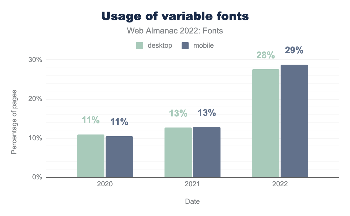
Usage of variable fonts has nearly tripled since the last measurement in the Almanac’s 2020 Fonts chapter! Nearly 29% of websites use variable fonts. Most of this growth seems to have happened in the last year, with an amazing 125% growth.
This impressive growth in usage can be explained by splitting the request data by host. Google Fonts accounts for 97% of variable fonts served, while everyone else accounts for only 3%. Even with Google’s massive influence on web font serving, this growth can only be explained by replacing popular existing static styles with variable versions, rather than the introduction of completely new variable fonts.
As a result, Google Fonts and their users are probably seeing huge benefits in performance. Variable fonts are usually smaller than using multiple static instances. For example, if a website uses more than two or three styles from the same family, a variable font is smaller in file size and only takes a single request. It doesn’t take a lot: using regular, bold, and light weights are usually sufficient reasons to use a variable font. As an added benefit, with a variable font you can also tweak the axes to suit your needs—semi-demi-bold anyone?
Regardless of a single actor being responsible for the growth, it is an amazing achievement, and a good indicator of the usefulness of variable fonts to optimize your site’s performance.
Variable fonts also have two competing formats: the variable extensions of the glyf format and the Compact Font Format 2 (CFF2) format. The main differences between the glyf format and CFF2 are the same as its CFF predecessor: different types of Bézier curves, more automated hinting, and a claim about smaller file sizes.
glyf outline format.
So which format should you use? Fortunately, for developers, type designers, and browser vendors the situation is quite simple. Out of all variable fonts served, 99.99% use the variable glyf format. Even if you exclude Google Fonts and other font services from the calculation the number changes to a whopping 99.98%. Nobody is using CFF2.
Our recommendation is to avoid CFF2-based variable fonts (for now, at least). Browsers and operating systems only recently added support for CFF2, and some browsers still don’t support it. The only tangible benefit of using CFF2 over glyf based variable fonts is the supposed file size savings, but as we’ve seen in the performance section this claim is dubious at best.
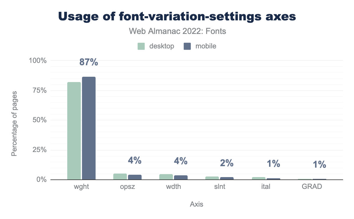
wght is used on 82% of desktop pages and 87% of mobile pages, opsz on 5% and 4% respectively, wdth on 5% and 4%, slnt on 3% and 2%, ital on 2% and 1%, and finally GRAD is used on 1% of desktop and mobile pages.So, how are people using variable fonts? Not surprisingly the weight axis is the most popular value used with the font-variation-settings property, followed by optical sizes, width, slant, italic, and grades.
This somewhat surprised us, because there is no need to use the low-level font-variation-settings property to set a custom weight axis value. You can simply use the font-weight property with a custom value, for example, font-weight: 550 for a weight between 500 and 600.
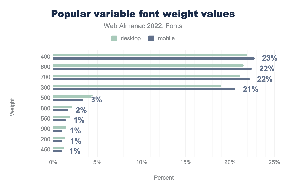
400 is used on 22% of desktop pages using variable fonts and 23% of mobile pages using variable fonts, 600 on 22% of both, 700 on 21% of desktop and 22% of mobile pages, 300 on 19% and 21% respectively, 500 on 4% and 3%, 800 on 2% of both pages, 550 on 2% of desktop and 1% of mobile pages, 900 on 1% of both, 200 on 1% of both, and finally 450 on 1% of both desktop and mobile pages.Even more puzzling is that the most popular weight axis values are the “default” CSS weight values that have been around since the early days of CSS! Only 16% of the weight values are custom values along the weight range.
The most popular “custom” weight value is 550 at only 1.5% of use, followed by 450 at 1% use. Similar results can be seen for the optical size, width, italic, and slant axes, which can be set using the high-level font-optical-sizing, font-stretch, and font-style properties. Using the higher level properties will make your CSS more readable and avoid accidentally disabling an axis—a common source of errors with the low-level property.
One of the highly promoted benefits of variable fonts is animating one or multiple axes. Despite the high usage of variable fonts, very few people are actually animating them through CSS transitions or keyframes. Out of the entire HTTP Archive dataset, only a couple hundred websites do any sort of animation involving variable fonts.
To us, it appears that variable fonts are primarily used for their performance benefits, and less so for their ability to make typographic adjustments. While that’s great, we do hope to see more people use variable fonts to their full typographic potential in the coming years.
Color fonts
Color fonts are pretty much what you would expect: fonts with built in colors. Though the technology was originally created for emoji fonts, there are now more text color fonts than emoji fonts.
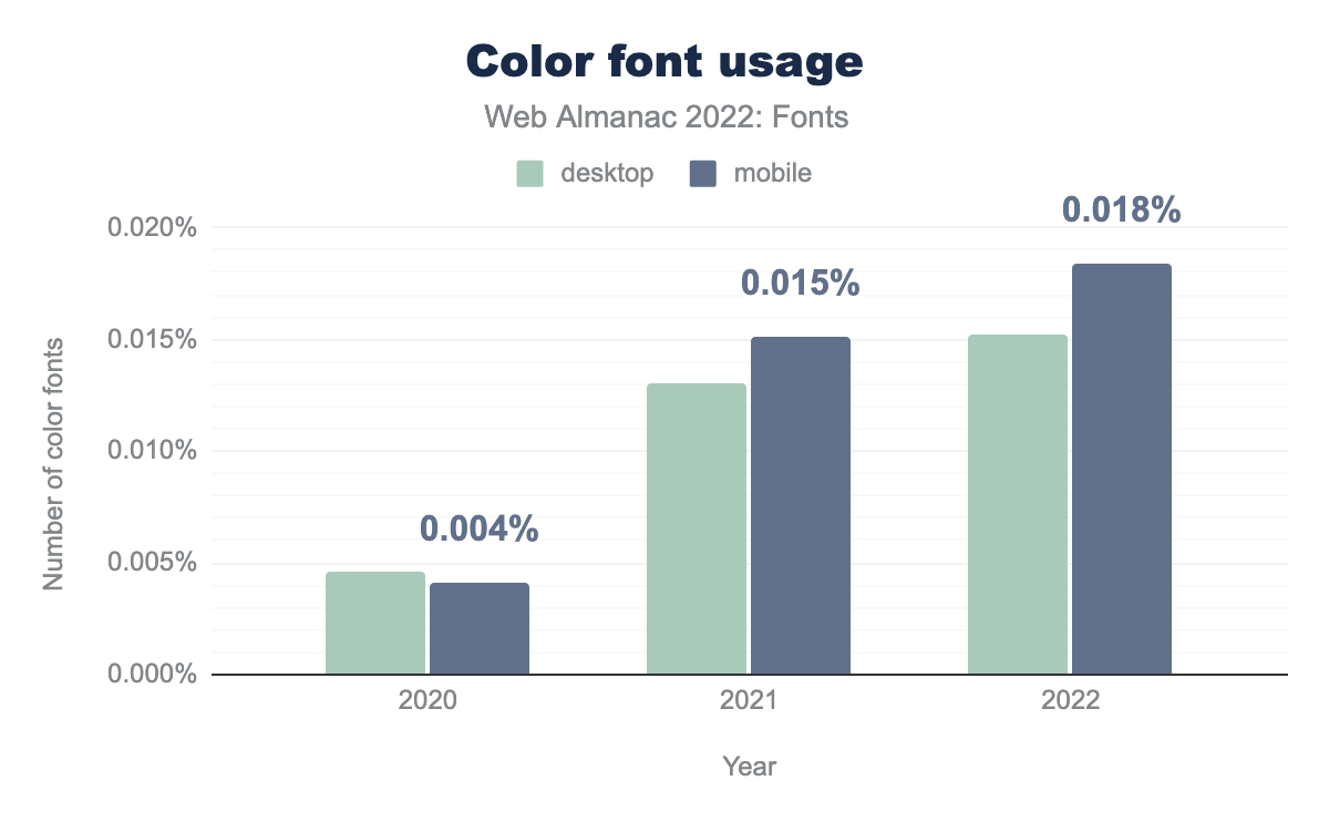
Color fonts usage has grown quite a bit since the last Fonts chapter in 2020. Usage went from 0.004% of pages using color fonts in 2020 to about 0.018% in 2022. While those numbers are still very small, there is a clear growth in their usage.
However, compared to the growth in variable font usage, the limited uptake of color fonts is somewhat disappointing. While color fonts are a relatively new addition to the OpenType specification (2015), variable fonts are an even more recent addition (2016).
The primary factors that have severely hindered color font adoption (and might continue to do so) is the ongoing standards “battle” for the one true color font format, and the lack of support in browsers for the CSS that allows you to select and edit color font palettes—until recently.
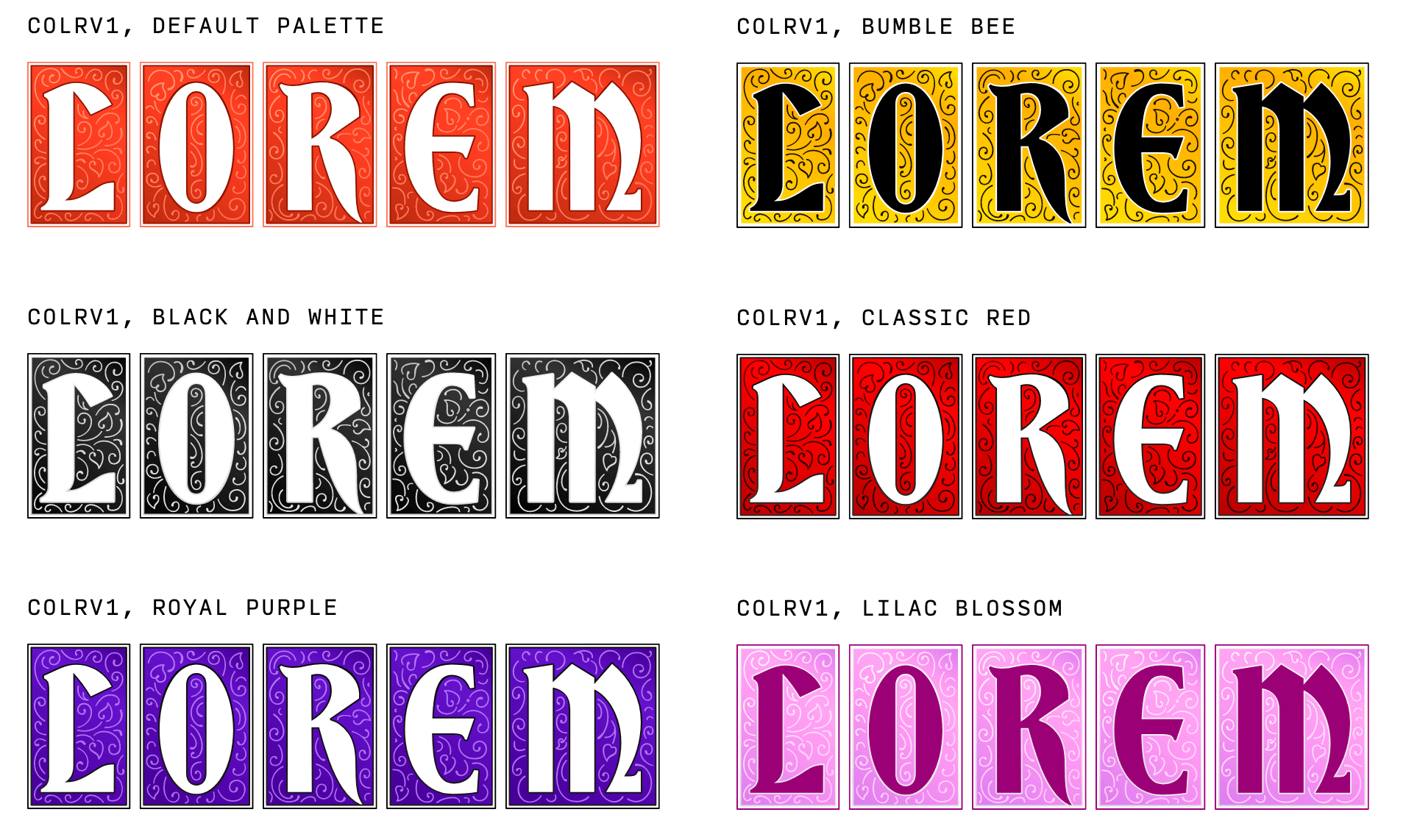
There are currently four competing color font formats: two based on vector outlines (SVG and COLR) and two on images (CBDT and sbix). The COLR format re-uses the existing glyph outline and adds solid colors and layering to them. The most recent version, dubbed COLRv1 introduced gradients, compositing and blending modes as well. Due to its re-use of existing glyph outlines, the COLR format also supports variable fonts, so you can have animated color fonts. The SVG format takes a different approach and essentially embeds an SVG image for each glyph in the font. Unfortunately, the SVG format does not support variable fonts, and is unlikely to do so in the future. Both CBDT and sbix embed images for each glyph and they only differ in the supported image formats.
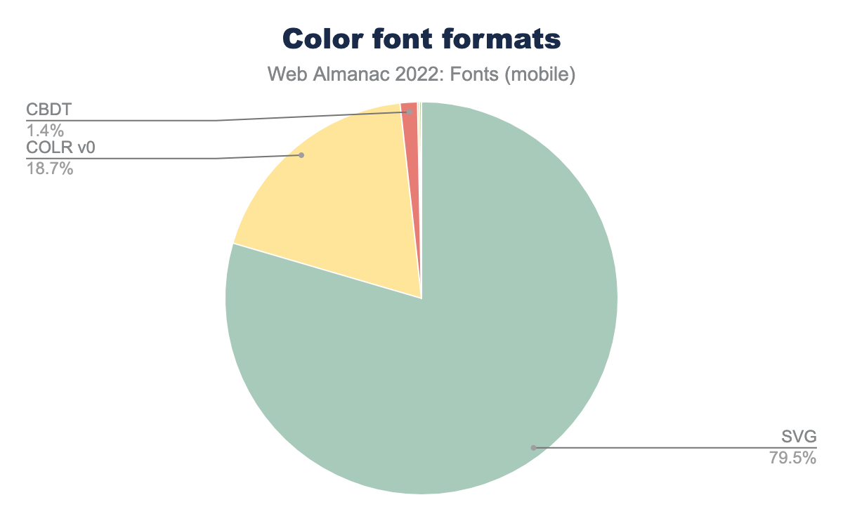
Taking a look at usage data paints an interesting picture: 79% of color font usage is using SVG, 19% uses COLRv0, and 2% uses CBDT.
We can safely conclude that the image based formats are not popular, and for good reasons: the embedded images don’t scale well, and their file sizes are not appropriate for web usage.
The split between the vector color font formats however is more nuanced. While SVG seems to have the upper hand at the moment, COLR still has significant usage. The COLR format has a lot going for it: it is supported by all browsers, it can be used in variable fonts, and it is easy to implement. For those reasons alone, we expect it to become the most popular format. A more cynical take is that it will become the most popular format because Google is refusing to implement SVG support in Chrome and Android. Interestingly, Apple is refusing to implement COLRv1, because a lot of COLRv1 features are already supported by the SVG format. Unfortunately, web developers are caught in the middle of this “color fonts war”. We hope this situation is soon resolved and we can all start using color fonts.
The CSS specification has been updated to support color fonts to allow selection and customization of palettes. Palettes are custom color schemes stored in the font by the type designer. The CSS font-palette property allows you to select a palette from the font and the @font-palette-values rule allows you to create new palettes or override existing ones. One of the more obvious use cases of this technology is to have light and dark mode palettes built right into the color font. There is a lot of unexplored potential there.
Unfortunately, usage of these CSS properties is currently nonexistent. This is likely because support for these properties was only recently added to browsers combined with the limited number of color fonts.
One of the main drivers behind the development of color font technology was emoji. However, there are only a couple dozen web fonts that have color emoji. Most color fonts are for writing text, not emoji. There could be several explanations for this:
- Every OS already includes their own color emoji font, so users don’t feel the need to use anything else.
- There are a large number of emoji and it takes a lot of effort—and money—to create fonts for them.
- Emoji fonts are generally quite large and not as suitable as web fonts.
Still, it would be nice to see some more diversity in emoji fonts. With the introduction of the COLR v1 format we’re likely to see more emoji fonts in the future.
Again, all of this is based on very low usage numbers, but there appear to be some developing trends. We’re not quite ready to declare 2023 the year of color fonts, but it seems clear we’ll see significant color font growth in the coming years, especially as the industry settles on a single recommended color font format and browser support for color fonts improves. Google Fonts has also just added the first batch of color fonts to their library, which will surely have an impact.
Conclusion
Looking back over this chapter and the previous years it stands out to us how much of an impact web font services have had—and likely will continue to have. For example, Google Fonts alone is responsible for most of web font usage, most of the popular web fonts, and most of variable fonts usage. That’s an impressive feat.
While we strongly believe that self-hosting is the future for web fonts, it can not be denied that using a web font service makes a lot of sense for a lot of developers. They are easy to use, provide good out-of-the-box performance—though not the best—and for the most part you do not need to worry about font licensing. It is a good tradeoff.
On the other hand, self-hosting is now easier than ever, and will give you the best performance, more control, and no privacy headaches. If you plan to self-host, be sure to use WOFF2, resource hints, and font-display. Combined, they will have the biggest impact on the font loading performance of your site.
Variable fonts have taken off in a spectacular fashion in the last couple of years—thanks Google! While most people seem to be using them for performance reasons, we believe this is a case where adoption will drive innovation. We can’t wait to see what kind of fun and downright crazy typography we’ll see in the coming years.
We’re cautiously optimistic about color fonts as well. Usage is finally growing. The technology has been there for a while, but the disagreements over color font formats and the limited CSS support have hindered adoption. We hope these will be resolved soon and we’ll start seeing some real growth.
It is clear that web font usage will continue to grow and evolve over time. We’re curious to see what the future holds. Technologies like Incremental Font Transfer will unlock web fonts for more writing systems, enabling billions of people to start using web fonts for the first time. That’s exciting!
