Fonts
Introduction
Text is at the heart of most web sites, and typography is the art of presenting that text in a way that’s visually appealing and effective. Creating good typography requires choosing the appropriate fonts and designers have a tremendous range of web fonts to choose from. As with all resources, there are performance and compatibility concerns but, done right, the benefit is well worth it. In this chapter, we’ll dive into data to show how web fonts are being used, and in particular how they’re optimized.
Where are web fonts being used?
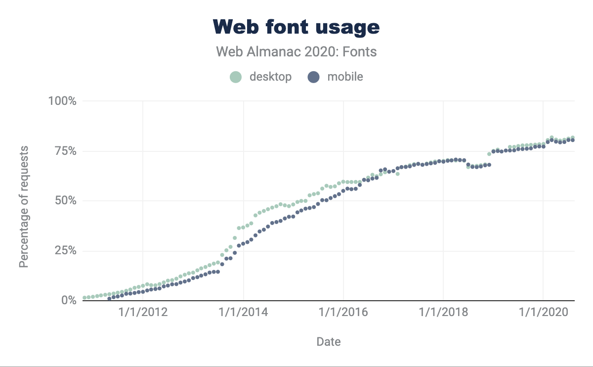
Web font usage has been growing steadily over time (it was near zero as late as 2011), with 82% of web pages for desktop using web fonts, and mobile at 80%.
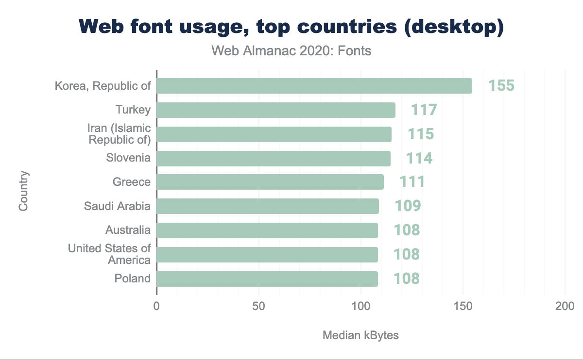
Usage of web fonts is fairly consistent around the world, with a few outliers. The charts below are based on the median number of kilobytes of web fonts per web page, which can be an indicator of lots of fonts, large fonts, or both.
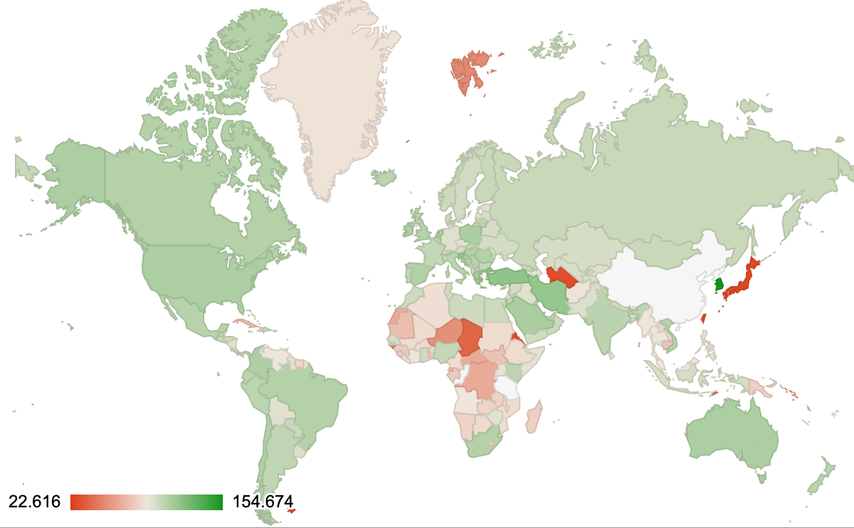
The country that uses the most font bytes is South Korea, which is not all that surprising given their consistently high internet speeds and low latency and the fact that Korean (Hangul) fonts are almost an order of magnitude larger than Latin. Web font usage in Japan and Chinese-speaking countries is considerably lower, likely because Chinese and Japanese fonts are vastly larger (the median font size can be 1000 times or more larger than the median Latin size). This means web font usage in Japan is very low, and usage in China is effectively zero. Although recent developments in progressive font enhancement–which we will cover more below–may make web fonts usable in both countries within a couple of years. There have been reports that Google Fonts have not been reliably accessible in China and that might also have been a factor holding back adoption.
There’s an interesting thread on web font usage by country on the HTTP Archive discussion forum that certainly influenced the queries used by this chapter. Given the large number of typefaces produced for Asian languages, it’s likely usage will rise in that region as technology for serving those fonts more efficiently becomes available.
Serving with a service
It likely comes as no surprise that Google Fonts remains by far the most popular platform, but the percentage use has actually dropped almost 5% from 2019 to about 70%. Adobe Fonts (formerly Typekit) has dropped about 3% as well, but Bootstrap usage has grown from about 3% to over 6% (in aggregate from several providers). It is worth noting that the largest provider for Bootstrap (BootstrapCDN) also provides icon fonts from Font Awesome, so it may be that it is not Bootstrap itself but rather older versions also referencing icon font files that is behind the rise in that source data.
Another surprise in the data is the rise in fonts being served by Shopify. Growing from roughly 1.1% in 2019 to about 4% in 2020, there has clearly been a significant uptick in usage of web fonts by sites hosted on that platform. It is unclear if that is due to that service offering more fonts that they host on their CDN, if it is growth in use of their platform, or both. However, the increase in usage of both Shopify and Bootstrap represent the largest amount of growth other than Google Fonts, making it a very noticeable data point.
Not all services have the same service
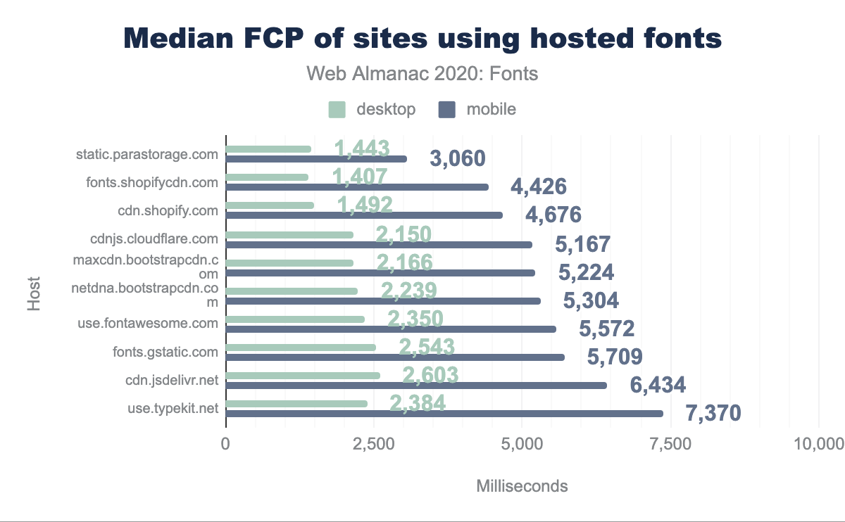
static.parastorage.com is fastest at 1,443 milliseconds for desktop and 3,060 for mobile, fonts.shopifycdn.com is at 1,407 for desktop and 4,426 for mobile, cdn.shopify.com is at 1,492 and 4,676 respectively, cdnjs.cloudflare.com is at 2,150 and 5,167, maxcdn.bootstrapcdn.com is at 2,166 and 5,224, netdna.bootstrapcdn.com is at 2,239 and 5,304, use.fontawesome.com is at 2,350 and 5,572, fonts.gstatic.com is at 2,543 and 5,709, cdn.jsdelivr.net is at 2,603 and 6,434, and use.typekit.net is at 2,384 and 7,370.It was interesting to note the differences in speed for sites using the various free/open source and commercial services. When looking at First Content Paint (FCP) and Last Content Paint (LCP) times, sites using Google Fonts are roughly in the middle, but generally a bit slower than the median value. The fastest sites in the dataset are Shopify and Wix (serving assets from parastorage.com), and it might be presumed they focus on a small number of highly optimized files. Google on the other hand is also serving web fonts globally of widely varying sizes (due to language), likely resulting in slightly slower median times.
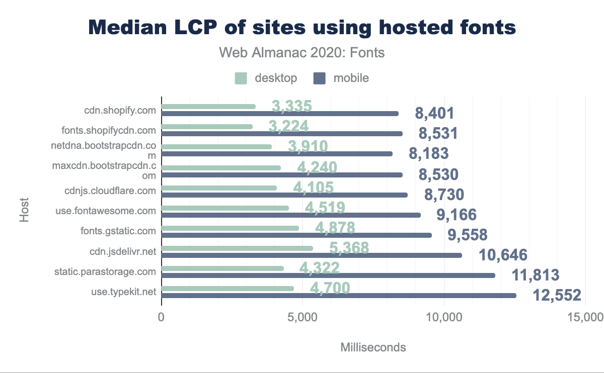
cdn.shopify.com is fastest at 3,335 on desktop and 8,401 on mobile, fonts.shopifycdn.com is at 3,224 and 8,531 respectively, netdna.bootstrapcdn.com is at 3,910 and 8,183, maxcdn.bootstrapcdn.com is at 4,240 and 8,530, cdnjs.cloudflare.com is at 4,105 and 8,730, use.fontawesome.comis at 4,519 and 9,166, fonts.gstatic.com is at 4,878 and 9,558, cdn.jsdelivr.net is at 5,368 and 10,646, static.parastorage.com is at 4,322 and 11,813, use.typekit.net is at 4,700 and 12,552.When viewing commercial services such as Adobe (use.typekit.net) or Monotype (fast.fonts.com) it is interesting to note that on desktop they tend to be as fast or slightly faster than Google Fonts, but are noticeably slower on mobile. Conventional wisdom has generally held that the tracking scripts used by those services substantially slow them down, but that is apparently less an issue today than it has been in years past. While it’s true that we are measuring site performance and not necessarily performance of the font host, those tracking scripts impact font loading on the client so it seems relevant to include these observations.
Self-hosting isn’t always better
Self-hosting fonts on the same domain as the website can be faster, as we discovered for this very website, however this is not always the case as the data shows.
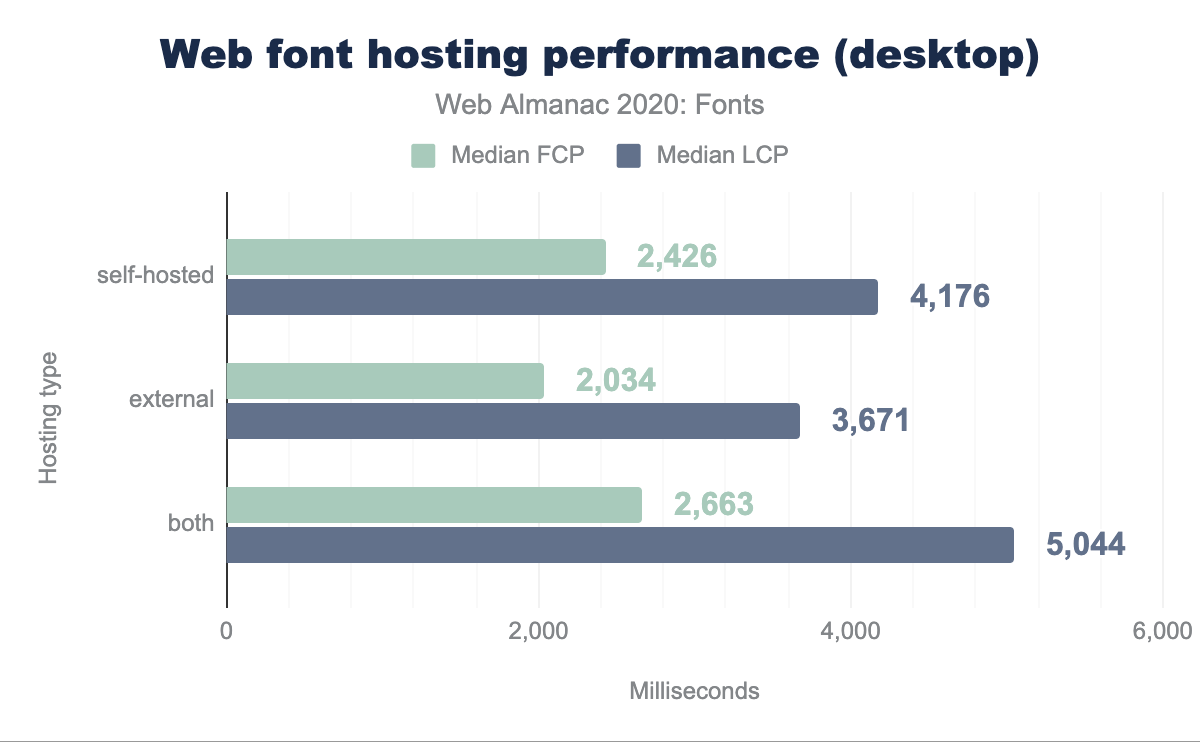
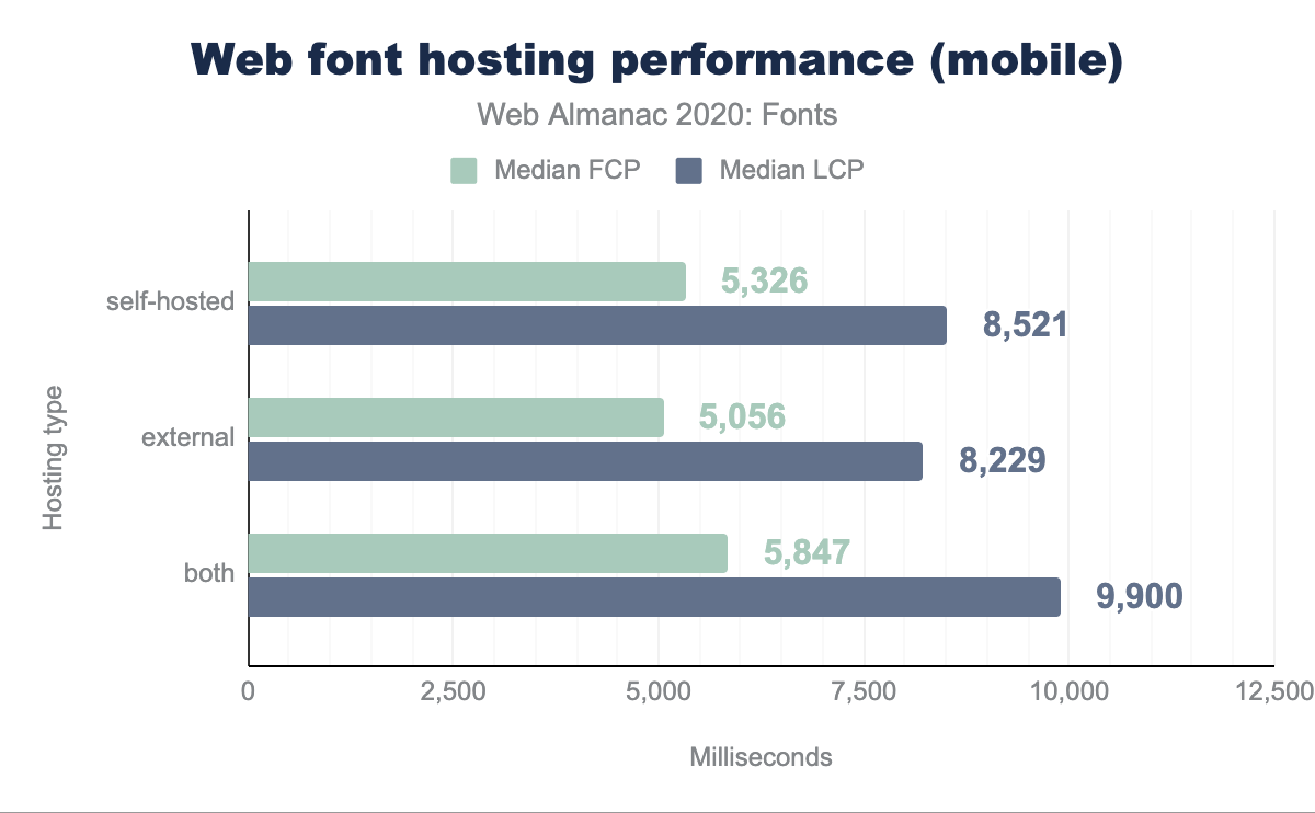
It wouldn’t be sound to infer causality between hosting strategy from the above data, as there are other variables that may confound the relationship. But, putting that aside, we find that adding the self-hosting fonts doesn’t always lead to better performance. Hosted font solutions often perform a number of optimizations (like subsetting, removing OpenType features, and ensuring the smallest possible font format) that may not always be replicated when self-hosting.
Local isn’t always better
Another option from self-hosting fonts on the site’s server, is to use the system-installed fonts on the client where they exist through the use of local in the font-face declaration. The use of local is controversial, as it can save bytes, but it can also yield bad results if the locally installed version of the font is outdated. As of November 2020, Google Fonts has moved to using local only for Roboto on mobile platforms, otherwise the font is always fetched over the network.
Racing to first paint
The biggest performance concern about integrating web fonts is that they may delay the time when the first readable text is displayed. Two optimization techniques can help mitigate those issues: font-display and resource hints.
The font-display setting controls what happens while waiting for the web font to load and is generally a trade-off between performance and visual richness. The most popular is swap, used on about 10% of web pages, which displays using the fallback font if the web font doesn’t load quickly, then swaps in the web font when it does load. Other settings include block, which delays displaying text at all (minimizing the potential flashing effect), and fallback, which is like swap but gives up quickly and uses the fallback font if the font doesn’t load in a moderate amount of time, and optional, which immediately gives up and uses the fallback font; this is used by only 1% of web pages, presumably those most concerned with performance.
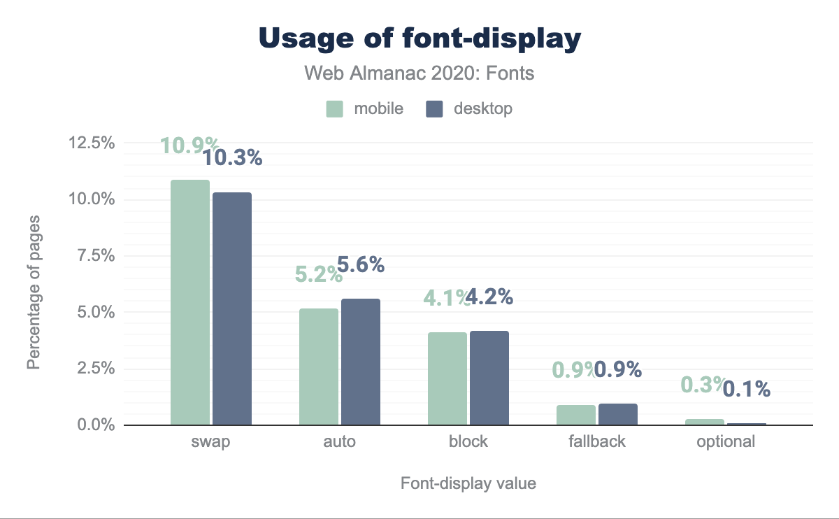
swap is used by 10.9% of desktop sites and 10.3% of mobile sites, auto is used by 5.2% and 5.6% respectively, block by 4.1% and 4.2% respectively, fallback by 0.9% for both, and finally optional is used by 0.3% of desktop sites and 0.1% of mobile sites.We can analyze the effect of these settings on First Contentful Paint and Largest Contentful Paint. Not surprisingly, the optional setting has a major effect on Largest Contentful Paint. There is also an effect on First Contentful Paint, but that might be more correlation than causation, as all of the modes except for block display some text after an “extremely small block period.”
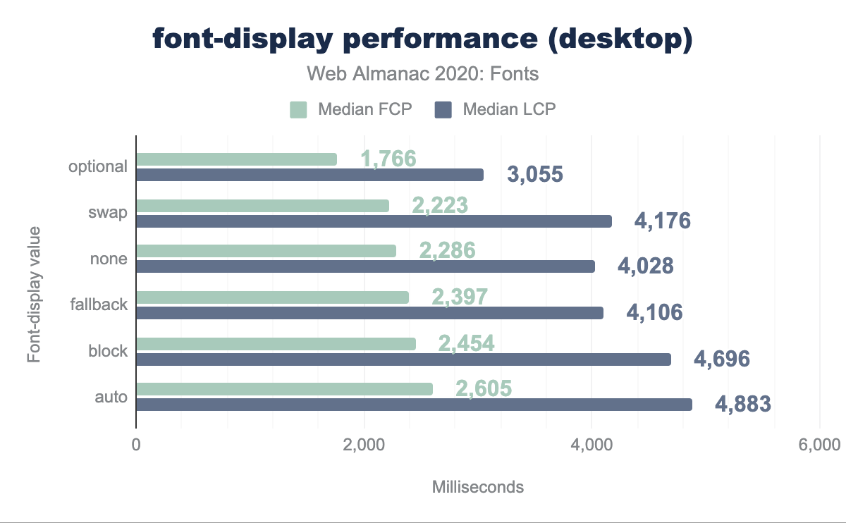
none has a median FCP of 2,286 ms and median LCP of 4,028 ms, optional has 1,766 ms and 3,055 ms respectively, swap has 2,223 ms and 4,176 ms, fallback has 2,397 ms and 4,106 ms, block has 2,454 ms and 4,696 ms, and auto has 2,605 ms and 4,883 ms.font-display performance on desktop.
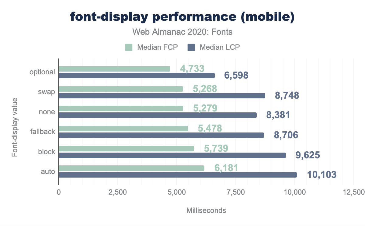
none has a median FCP of 5,279 ms and median LCP of 8,381 ms, optional has 4,733 ms and 6,598 ms respectively, swap has 5,268 ms and 8,748 ms, fallback has 5,478 ms and 8,706 ms, block has 5,739 ms and 9,625 ms, and auto has 6,181 ms and 10,103 ms.font-display performance on mobile.
There are two other interesting inferences from this data. One might expect the block setting to have a significant impact on FCP, especially on mobile, but in practice the effect is not that large. That suggests that waiting for font assets is seldom the limiting factor for the web page performance as a whole, though it would certainly be a major factor in pages without lots of resources such as images. The auto setting (which is also what you get if you don’t specify it) is up to the browser. It looks a lot like block because the default is blocking in most cases.
Finally, one justification for using fallback is to improve Largest Content Paint times compared to swap (which is more likely to respect the designer’s visual intent), but the data do not support this case; this performance metric is no better. Perhaps this is why the setting is not popular, used by only about 1% of pages.
Google Fonts now recommends swap in its suggested integration code. If you’re not using it now, adding it might be a way to improve performance, especially for users on slow connections.
Resource hints
While font-display can speed up the presentation of the page when the fonts are slow to load, resource hints can move the loading of web font assets to earlier in the cascade.
Ordinarily, fetching web fonts is a two-stage process. The first stage is loading the CSS, which contains a reference (in @font-face sections) to the actual font binaries.
This is especially relevant for hosted font solutions. Only after discovering the font is needed, can the connection to that server begin, which further breaks down into the DNS query for the server, and actually initiating a connection (which, these days, usually involves an HTTPS cryptographic handshake).
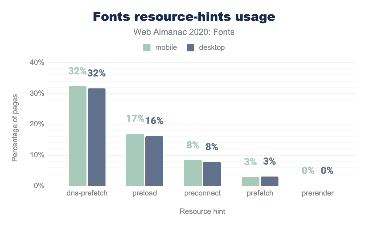
dns-prefetch is used by 32% of both desktop and mobile sites, preload by 17% of desktop and 16% of mobile, preconnect by 8% of both, prefetch by 3% of both, and prerender by 0% for both.Adding a resource hint element in the HTML starts that second connection earlier. The various resource hint settings control how far that gets before having the URL for the actual font resource. The most common (at about 32% of web pages) is dns-prefetch, even though in most cases there are better choices.
Next we will look at whether these resource hints have an impact on page performance.
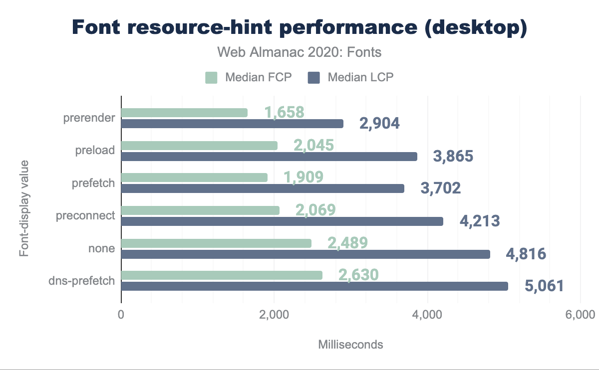
prerender has a median FCP of 1,658 ms and median LCP of 2,904 ms, preload has 2,045 ms and 3,865 ms respectively, prefetch has 1,909 ms and 3,702 ms, preconnect has 2,069 ms and 4,213 ms, none has 2,489 ms and 4,816 ms, and dns-prefetch has 2,630 ms and 5,061 ms.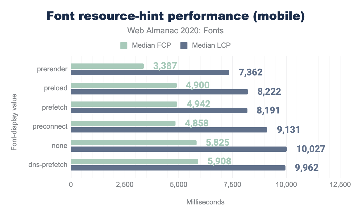
prerender has a median FCP of 3,387 ms and median LCP of 7,362 ms, preload has 4,900 ms and 8,222 ms respectively, prefetch has 4,942 ms and 8,191 ms, preconnect has 4,858 ms and 9,131 ms, none has 5,825 ms and 10,027 ms, and dns-prefetch has 5,908 ms and 9,962 ms.Analysis of this data suggests that the dns-prefetch setting, while the most popular, doesn’t improve performance much, if at all. Presumably, the DNS for popular web font servers are likely to be cached anyway. The other settings give a lot more bang for the buck, with preconnect being a sweet spot for ease of use, flexibility, and performance improvement. As of March 2020, Google Fonts recommends adding this line to the HTML source, immediately before the CSS link:
<link rel="preconnect" href="https://fonts.gstatic.com">The use of preconnect has grown considerably since last year, now at 8% from 2%, but there’s a lot more potential performance still left on the table. Adding this line might be the single best optimization for web pages that use Google Fonts.
It might be tempting to go even farther into the pipeline, preloading or prerendering the font asset, but that potentially conflicts with other optimizations, such as fine-tuning the font for the capabilities of the rendering engine, or the unicode-range optimization described below. To preload a resource, you have to know exactly what resource to load, and the best resource for the task may depend on information not readily available at HTML authoring time.
Home on the (Unicode) range
Fonts increasingly have support for lots and lots of languages. Other fonts can have a large number of glyphs because the writing system (especially CJK) requires it. Either reason can increase the file size. That’s unfortunate if the web page is not in fact a multilingual dictionary, and only uses a fraction of the font’s capabilities.
One older approach is for the HTML author to explicitly indicate a font subset. However, that requires deeper knowledge of the content, and risks a “ransom note” effect when the content uses characters supported by the font but not by the chosen subset. See the excellent essay When fonts fall by Marcin Wichary for lots more detail about how fallback works.
Static subsets, indicated by unicode-range, are a better approach to this problem. The font is sliced into subsets, each with a separate @font-face rule that indicates the Unicode coverage for that slice with a unicode-range descriptor. The browser then analyzes the content as part of its rendering pipeline, and downloads only the slices needed to render that content.
For alphabetic languages, this typically works well although it can result in poor kerning between characters in different subsets. For languages which rely on glyph shaping, such as Arabic, Urdu and many Indic languages, static subsets frequently result in broken text rendering. And for CJK, static subsets based on contiguous Unicode ranges provide almost no benefit because the characters used on a particular page are scattered almost randomly across the various subsets. Because of these issues, correct and performant use of static subsets is tricky, and requires careful analysis and implementation.
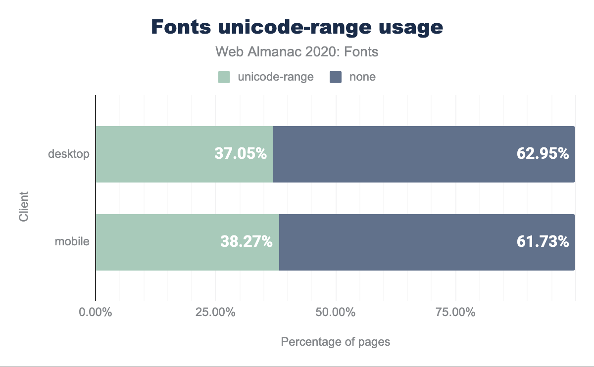
unicode-range usage in mobile and desktop web pages that use web fonts. On desktop 37.05% of pages use unicode-range while 62.95% do not. On mobile 38.27% of pages use unicode-range while 61.73% do not.unicode-range.
Correctly applying unicode-range is tricky, as there’s a lot of complexity to the way text layout maps Unicode into glyphs, but Google Fonts does this automatically and transparently. It is only likely to be a win for fonts with large glyph counts. In any case, current usage is 37% on desktop and 38% on mobile.
Formats and MIME types
WOFF2 is the best compression format and is now supported by effectively all browsers except for versions 11 and earlier of Internet Explorer. It is almost possible to serve web fonts using an @font-face rule with a WOFF2 source only. This format makes up about 75% of all fonts served.
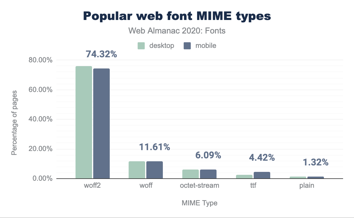
WOFF is an older, less efficient compression mechanism, but almost universally supported, accounting for an additional 11.6% of fonts served. In almost all cases (Internet Explorer 9-11 being the main exception), serving a font as WOFF is leaving performance on the table, and shows a risk of self-hosting; even if the format choices were optimal at the time of integration, it requires extra effort to update them as browsers improve. Using a hosted service guarantees that the best format is chosen, along with all relevant optimizations.
Ancient versions of Internet Explorer (6-8), which still make about 1.5% of global browser share, only support the EOT format. These don’t show up in the top 5 MIME formats but are necessary for maximum compatibility.
Uncompressed fonts, like OTF and TTF files, are 2-3x larger than compressed, but still make up almost 5% of all fonts served, disproportionately on mobile. If you’re serving these, it should be a red flag that optimization is possible.
Popular fonts
Icon fonts are half of the top 10 most popular web fonts, the rest being clean, robust sans-serif typeface designs (Roboto Slab is at #19 and Playfair Display at #26 in this ranking, for debuts of other styles, though serif designs are well represented in the tail of the distribution).
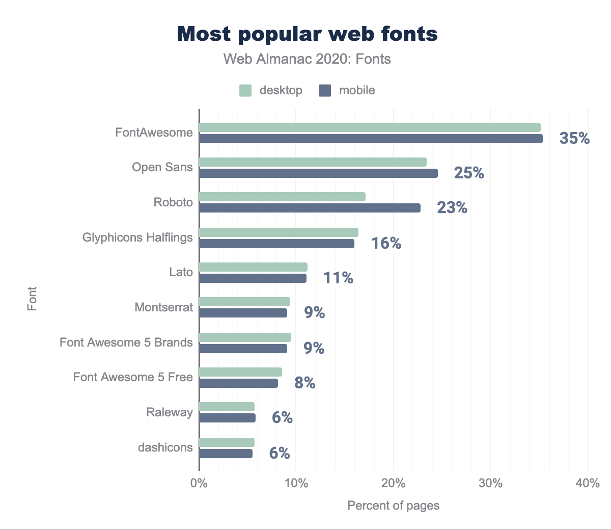
A note of caution, in determining the most popular fonts you can get different results depending on measurement methodology. The chart above is based on counting the number of pages that include an @font-face rule referencing the named font. That counts multiple styles only once, which arguably weights in favor of single-style fonts.
Color fonts
Color fonts, in one form or other, are supported by most modern browsers, but usage is still close to nonexistent (a total of 755 pages total, the majority of which are in SVG format, which is not supported in Chrome). No doubt part of the problem is the diversity of formats, in fact four in widespread use. These come in bitmap and vector flavors. The two bitmap formats are technologically very similar, but SBIX (originally a proprietary Apple format) is not supported in Firefox, while CBDT/CBLC is not supported in Safari.
The COLR vector format is supported on all major modern browsers, but only fairly recently. The fourth format is embedding SVG in OpenType (not to be confused with SVG fonts), but not supported in Chrome. One drawback of SVG in OpenType is lack of support for font variations, an increasingly important aspect of modern Web design. For this reason, the COLR format is likely to prevail, particularly as support for gradients and clipping is being developed for a future version of COLR. Vector formats are usually much smaller than images, and also scale cleanly to larger sizes, so when COLR arrives with a richer shading model, it could well become popular.
One reason for the poor support of color fonts on the web is that the colors have to be baked into the font files themselves. If you use the same typeface with three different color combinations, near-identical files have to be downloaded three times and changing a color means reaching for a font editor.
While there is a feature in CSS to override or replace the color palettes in fonts, this has not yet been implemented in browsers, which certainly holds back the ease of deploying color web fonts.
Probably most usage of color fonts is for emoji, but the capability is general purpose and color fonts offer many design possibilities. While color web fonts haven’t taken off yet, the underlying technology is heavily used to deliver system emoji, where file format compatibility is much less of an issue.
Browser support is so fragmented that color fonts are not yet tracked by caniuse.com, though there is an issue open for it.
Lots more information about color fonts, including examples, are available at colorfonts.wtf.
Variable fonts
Variable fonts are certainly one of the biggest stories this year. They’re seen in 10.54% of desktop pages, and 11.00% of mobile. That’s up from an average of 1.8% last year, a huge growth factor. It is not hard to see why their popularity is increasing – they offer more design flexibility, and also potentially smaller binary font sizes, especially if multiple styles of the same font are used on the same page.
Likely the greatest driver of this increase is due to Google Fonts now serving a number of their more popular offerings as variable fonts when there are enough weights in use on a page and the browser supports them. The ability to ’swap in’ variable fonts where a performance gain can be achieved without altering any of the CSS in use or any intervention required of the web author is a remarkable testament to the viability of the technology.
The simplest description of the variable font format is a single font file that acts as many: rather than individual font files for every weight and width or even italics, they can all be contained in a single, highly efficient file. That resulting file can render the font at a given combination of axis values via CSS (or other applications that support them). There are a number of standardized, or ’registered’, axes plus the ability for font designers to define their own axes and expose them to the user.
Weight (wght) corresponds to the traditional notion of regular or bold or light; width (wdth) maps to styles like condensed or extended; slant (slnt) refers to an oblique angle of the font; italic (ital) usually slants the font and replaces certain glyphs with alternate styles; and optical size (opsz) refers to something relatively new to the web, but is actually a revival of a technique common in metal type creation going back hundreds of years. Historically, optical sizing refers to the practice of reducing stroke contrast (thick and thin lines) and open up letter spacing when a font is made at a physically smaller size in order to increase legibility, and conversely to increase that contrast and tighten spacing when a font is displayed at much larger sizes. Enabling this in digital type can allow a single font to look and behave substantially differently when used at very small or large sizes. You can learn more about them and see lots of examples at variablefonts.io.
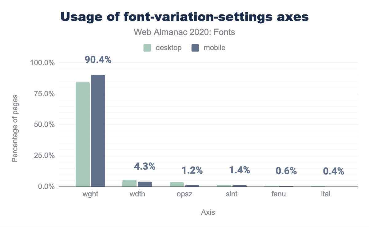
wght at 84.7% for desktop and 90.4% for mobile, with a massive drop off to the remaining ones with wdth at 5.6% for desktop and 4.3% for mobile, opsz at 3.7% and 1.2% respectively, slnt at 1.8% and 1.4%, fanu at 0.5% and 0.6%, and ital at 0.5% for desktop and 0.4% for mobile.By far the most commonly used axis is wght (which controls weight), at 84.7% desktop and 90.4% mobile. However, wdth (width) accounts for approximately 5% of variable font usage. In 2020, Google Fonts began serving 2-axis fonts with both width and weight axes.
It is worth noting that the preferred method is to use font-weight and font-stretch rather than the lower-level font-variation-settings syntax for these two axes as they are completely supported by all browsers that support variable fonts. By setting weight via font-weight: [number] and width via font-stretch: [number]%, authors provide more appropriate style hints to the browser, which in turn enables better rendering for the end user should the variable font fail to load. This also avoids altering the normal inheritance of styles via the cascade.
The optical size (opsz) feature is used for approximately 2% of the variable font usage. This is one to watch, as tuning the appearance of a font to match its intended size of presentation improves the visual refinement in perhaps subtle but very real ways. Usage is also likely to increase once some current cross-browser and cross-platform uncertainties on how the optical sizes are defined are cleared up. One appealing aspect of the optical size feature is that with the auto setting, the variation happens automatically, so the developer gets the benefit of that refinement just by using a font with the opsz feature.
There are many potential benefits to using variable fonts. While each included axis increases file size, the tipping point seems to be generally if more than two or three weights of a given typeface are in use, a variable version will likely be similar in total file size or smaller. This is supported by the dramatic increase in variable fonts being served by Google Fonts.
Adopting and leveraging variable fonts for more varied design (by using more of the available range of weights and widths) is another. Using a width axis could improve line wrapping on smaller screens, especially with larger headings and longer languages. With the rise in adoption of alternate light modes, making small adjustments to font-weight when switching modes can improve legibility (see variablefonts.io for more on usage and implementation).
Conclusion
Web font technology is fairly mature, with incremental improvements in compression and other technical improvements, but new features are arriving. Browser support for variable fonts has become quite good, and this is the feature that’s seen the most growth in the previous year.
The performance landscape is changing somewhat, as the advent of cache partitioning reduces the performance benefit from sharing the cache of CDN font resources across multiple sites. The trend of hosting more font assets on the same domain as the site, rather than using a CDN, will probably continue. Even so, services such as Google Fonts are highly optimized, and best practices such as use of swap and preconnect mitigate much of the impact of the additional HTTP connection.
The use of variable fonts is accelerating greatly, and that trend will no doubt continue, especially as browser and design tool support improve. It is also possible that 2021 will be the year of the color web font; even though the technology has been in place, that certainly hasn’t happened yet.
Finally, it is worth mentioning a new concept in web font technology currently being researched by the W3C’s Web Font Working Group: Progressive Font Enrichment. PFE is designed as an answer to many of the challenges pointed out in this chapter: addressing performance and user experience when using large glyph count font files (like Arabic or CJK fonts), larger multi-axis or color fonts, or just slow network connectivity environments.
The concept in its simplest terms is that only a portion of a given font file would need to be downloaded in order to render the content on a given page. Subsequent page loads would then deliver a ’patch’ to the font file that includes only the glyphs necessary to render each new page. Thus at no time would the user need to download the whole font file at once.
There are various details to work out, including ones that will help ensure privacy and backwards compatibility—but initial research has been extremely promising, and it is hoped this technology will reach the wider web sometime in the next couple years. You can learn more about it in this introduction by Jason Pamental, and read the full Working Group Evaluation Report on the W3C site.

