Mobile Web

Introduction
Mobile Web has grown explosively in the last decade and is now the primary way many people experience the web. In spite of this, engagement and online sales still lag behind desktop. In this chapter, we take a look at recent trends on the mobile web and analyze why user journeys are often difficult to complete.
2020 has seen a big surge in internet usage, on both mobile and desktop, due to the global pandemic. There has been an uptick in visits to news sites, ecommerce and social media sites as people across the globe adjusted to a new lifestyle with stay-at-home orders and social distancing. 2020 has been a significant year in history, for the web and for mobile usage.
Data sources
We’ve used a few different data sources in this chapter:
Please visit the links above to learn more about the methodology and caveats with each data source. It is worth noting that the HTTP Archive and Lighthouse data is limited to the data identified from websites’ home pages only, and not site-wide.
In addition to the above, we also used a non-public Chrome data source in the section on page loads in Chrome. For more information on this, read about Chrome’s data collection API.
While this data is only collected from a subset of (opted in) Chrome users, it does not suffer from being limited to home pages. It is pseudonymous and consists of histograms and events.
Mobile web & desktop traffic trends
How much are users visiting websites on mobile web and desktop? Are there any patterns in the traffic that websites receive from mobile versus desktop? In order to examine these questions and what it means for websites, we looked at data from a couple of lenses.
A report published on perficient.com shows mobile versus desktop traffic trends over several years, using similarweb as a data source. While the majority of visits—58% of site visits—were from mobile devices, mobile devices made up only 42% of total time spent online. Moreover, the average time spent per visit is roughly twice as much on desktop compared to mobile (11.52 minutes on desktop versus 5.95 minutes on mobile).
Page loads in Chrome (Chrome data source)
Note that this section references stats that have been made available specifically for this chapter from non-public Chrome data source, see details here. We use this data to assess page loads on Android and Windows—as a proxy for mobile and desktop respectively.
Page loads across origins ranked by popularity
We looked at traffic to origins by popularity—how often are users visiting certain origins, and what does that tell us about the global distribution across the web.
Rick Byers tweeted this distribution a year ago, we looked at the latest data. The chart shows us the overall distribution across origins by their popularity, captured by their contribution to % page loads in Chrome.
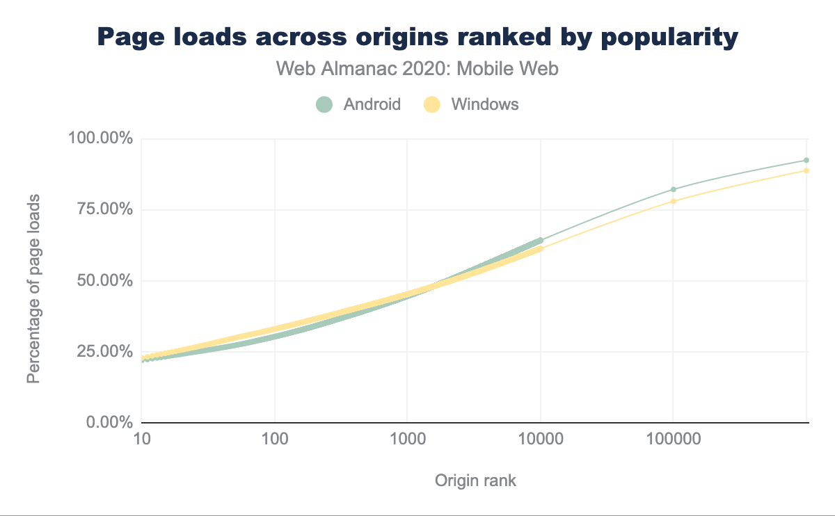
Some takeaways:
- Usage of Chrome is roughly evenly divided between the top 200 sites, the next 10,000, and all the rest.
-
The web has a fat head.
- A small number of origins constitute a large fraction of traffic, for both mobile and desktop.
- The top 30 origins constitute 25% of aggregate traffic on mobile.
- The top 200 origins constitute 33% of aggregate traffic on mobile.
-
The web has a broad torso.
- The top 10k origins constitute roughly two-thirds of traffic: 64% of traffic on mobile.
-
The web has a long tail.
- 3M origins in top 98% on Android versus 1.8M on Windows.
- The tail is about twice as long on Android as Windows. This is most likely attributable to the larger number of mobile devices and users, compared to desktop.
Traffic to a site from mobile versus desktop (CrUX)
Could a website reason about their expected mobile versus desktop traffic distribution?
It’s hard to predict, because the distribution between mobile and desktop will vary greatly based on the site. Furthermore, it heavily depends on the industry category (e.g. entertainment, shopping) and whether the site has native apps, and how aggressively native apps are promoted etc.
We looked at the CrUX dataset to assess Chrome traffic to sites from mobile devices vs desktop.
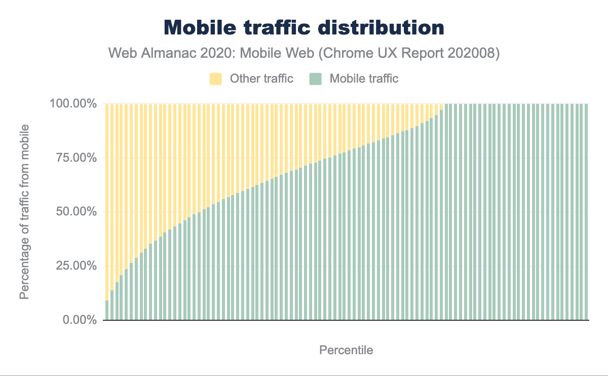
The distribution appears mobile heavy. A reason for that is that there are many (2 million+ in CrUX) sites which, while low in total traffic, only get traffic from mobile. Mobile has a much longer “tail” as we saw in the previous section.
If we put all the websites with CrUX data, in a bucket and randomly choose one, 50% of the time the website you chose would be receiving 77.61% or more of their traffic from mobile (a slight decrease from 79.93% in 2019).
Note that while this is an interesting observation, it’s hard to draw conclusions from CrUX about broad trends for mobile versus desktop because:
- CrUX is Chrome only data, and missing other browsers, including Safari - a major mobile browser.
- Even for Chrome, this is a subset from opted-in users, and impacted by opt-in rates and variance across platforms.
Trend conclusions
So what did we learn in terms of reasoning about mobile versus desktop traffic to a website?
Traffic distribution from mobile vs desktop is highly specific to a site and dependent on the industry category, and other factors such as presence of native apps. However odds are that for site visits in Chrome, a given website has traffic predominantly from mobile web, in spite of users spending more time on desktop. This is due to a much longer tail for mobile Chrome.
While one cannot generalize the expected traffic distribution from mobile versus desktop for individual websites, it is worth comparing your site’s distribution to that of the industry category.
If your website is substantially different from the industry average, it could be worth digging into the reason, for instance poor loading performance could be one reason.
The user journey
User journeys, including commercial journeys, on the mobile web are often difficult to complete.
While mobile represents 79.6% of time spent amongst retail sites, it only accounts for 32.3% of eCommerce sales. This suggests that users frequently start their journey on mobile, but often finish on desktop. Why might that be?
To reason about questions like this, we need to first understand the elements of the user journey.
We break down the user journey into 4 phases.
1. Acquisition
For a website, acquisition of visitors is a crucial entry phase. Acquisition involves getting visitors to the website, often through search engines, Ad clicks, links from other sites and from social media.
SEO
SEO is crucial for the acquisition phase. Search engines are an important source of visitors being sent to websites, embarking on their user journeys. The main goal of SEO is to ensure that a website is optimized for search engines, i.e. search engine bots that need to crawl and index its pages, as well as the users that will be navigating the website and consuming its content.
A lot of users now start their search on mobile.
Responsive web design
Due to the popularity of mobile devices to browse and search the web, Google search moved to a mobile-first Index a few years ago. This means that search ranking considers pages as seen by mobile users, and mobile friendliness is now a ranking factor. Google will fully switch to a mobile-first index, for all sites, in March 2021.
Websites should ensure mobile friendliness for a good search experience and SEO, as this impacts traffic from search users. Responsive web design is the recommended way to achieve this.
Responsive websites use the viewport meta tag as well as CSS media queries to provide a mobile friendly experience. To learn more about these mobile friendliness aspects, head over to the SEO chapter.
Learn more about responsive web design here.
Beyond organic traffic from search engines, Ad clicks could be a key source of visitors being sent to websites. Similar to SEO, optimizing Ads can be important for websites who invest in and receive traffic from Ads.
Loading performance
First impressions matter. Delivering page content in a timely manner is critical for avoiding visitor abandonment and user frustration. Loading performance is a key aspect of the acquisition phase, poor loading performance results in users abandoning this journey.
A recent study showed that 0.1s mobile speed improvement increased conversion rates by +8.4% for retail sites and +10.1% for travel sites.
Loading performance is a vast topic, so we picked a couple of aspects to cover here.
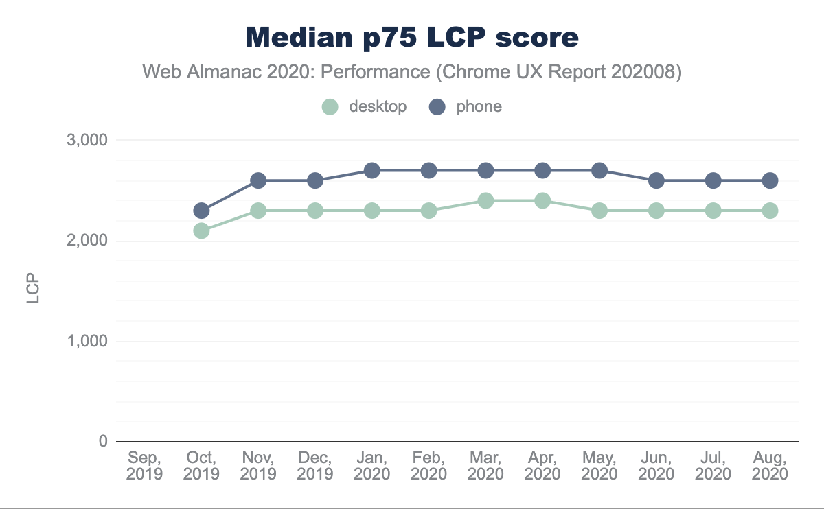
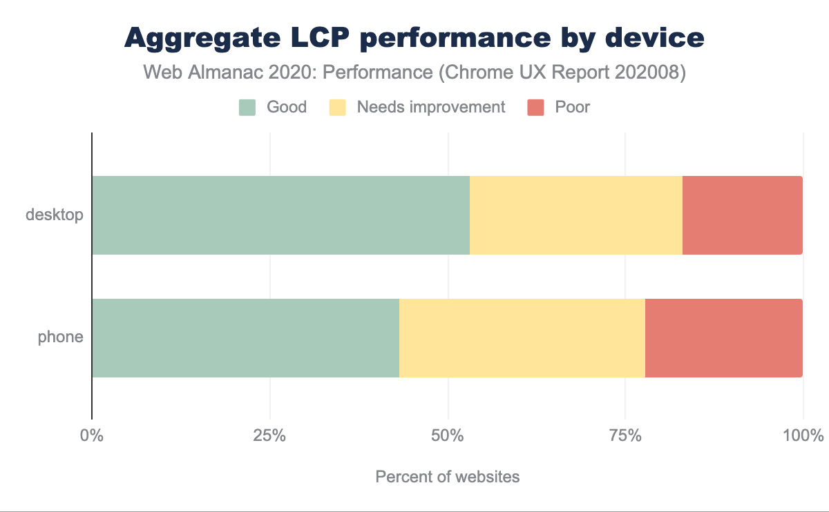
Largest Contentful Paint
A key aspect of the loading experience is how quickly the main content of a web page loads and is visible to users. This has been difficult to measure, in the past Google recommended performance metrics like First Meaningful Paint (FMP) to capture this, but it was hard to explain, and often unable to identify when the main content of the page was visible.
Sometimes simpler is better. More recently it’s been found that a more accurate way to measure when the main content of a page is loaded is to simply look at when the largest element was rendered. Largest Contentful Paint (LCP) is a timing-based metric that captures this—the time at which the largest above-the-fold element was rendered.
A good LCP score is 2.5s at p75. We found that the median LCP at p75 is 2.6s on mobile and 2.3s on desktop. Mobile web is especially susceptible to missing the mark on LCP.
Images
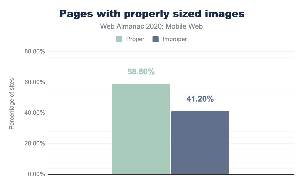
While every type of asset, such as font, CSS, JavaScript etc. plays an important role in loading performance, we take a closer look at images.
The web continues to move towards image-heavy pages, with the growth of bandwidth and the ubiquity of smartphones. And images impose a cost on loading performance.
Improperly sized and unoptimized images are frequent sources for image performance problems. A staggering 41.20% of pages have improperly sized images.
4.1% of pages which have images, use the lazy loading attribute on their images, decent adoption for a relatively new primitive.
2. Engagement
The next phase of the user journey is engagement of users towards consuming content and fulfilling their intent.
Shifting content
Shifting content is detrimental to the experience of users engaging with content. Specifically, content that shifts in position as resources load, impedes the user experience. Since browsers download and display content as soon as they are able, it’s important to design your site to smooth over the user experience. This is especially important for mobile web, as shifting content is more noticeable on small screens.

Cumulative Layout Shift
Cumulative Layout Shift (CLS) is a metric that quantifies how much content within the viewport shifts around, during the user visit.
The most common causes of a poor CLS are:
- Images without dimensions.
- Ads, embeds, and iframes without dimensions.
- Dynamically injected content.
- Web Fonts causing FOIT/FOUT.
- Actions waiting for a network response before updating DOM.
It’s not trivial to identify these causes locally or in a development environment, as it is heavily dependent on how real users experience the page. Third-party content or personalized content often doesn’t behave the same in development as it does in production.
According to CrUX data, 60% of mobile sites and 54% of desktop sites, have a good CLS.
Design elements
To engage users, it’s important to help them quickly find what they’re looking for, and fulfill their intention.
Landing pages
Simple design tweaks go a long way, for instance a clear call-to-action, and making the value proposition evident to the user, with a few words.
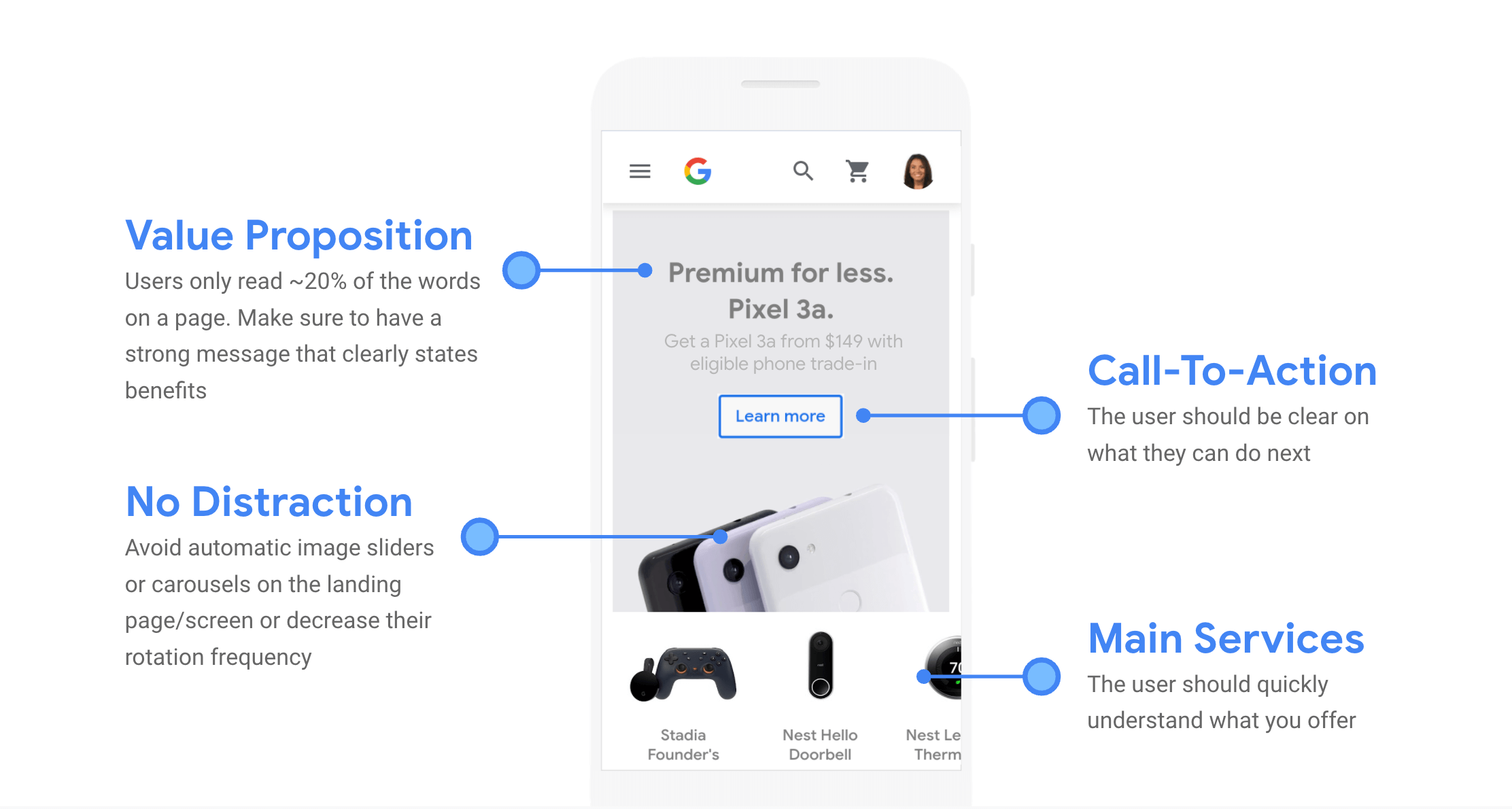
(Source: Google)
Research has shown that auto-forwarding carousels are detrimental to the user experience. Auto-forwarding carousels on the home page should be avoided or their frequency should be decreased.
Color and contrast
Consider the following examples from 5 lessons Eastpak learned from its mobile audience:
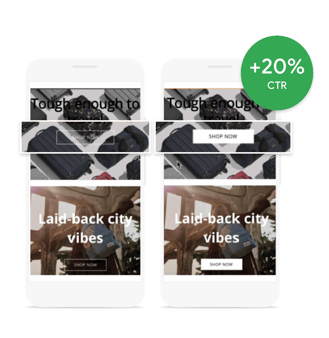
(Source: Google)
Here, a simple change from a button that’s hard to see, to a button with contrasting colors, improved click through rate on the main call to action by 20%.
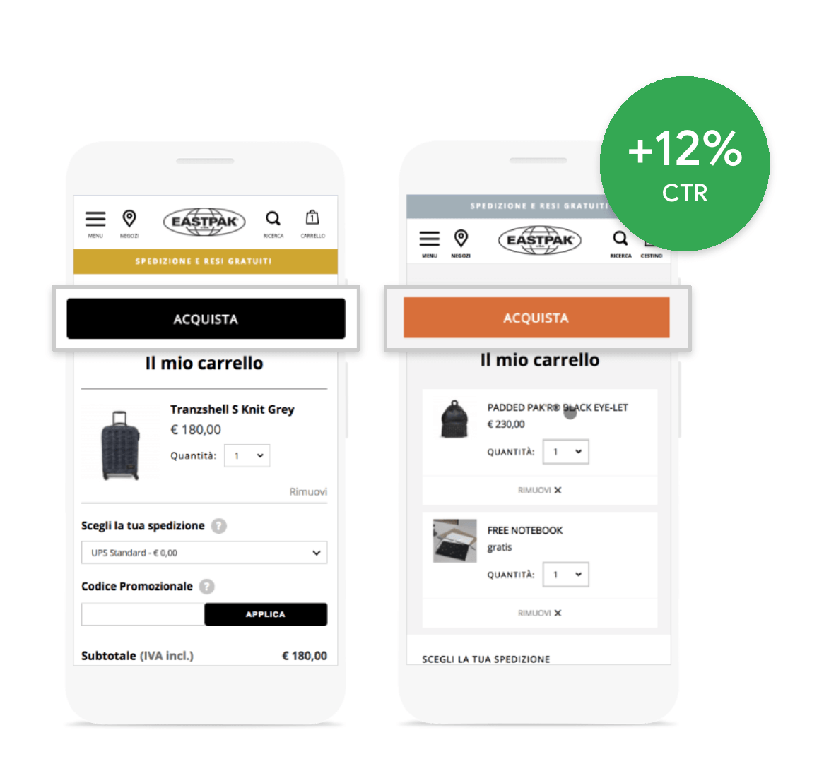
(Source: Google)
A simple color change on the check out button from black to orange, made it stand out more and increased their conversion rate by 12%.
Mckinsey & Company published a report that shows that companies that are strong at design and UX demonstrate better financial performance. Design and UX focused companies demonstrated stronger revenue growth compared to their industry counterparts.
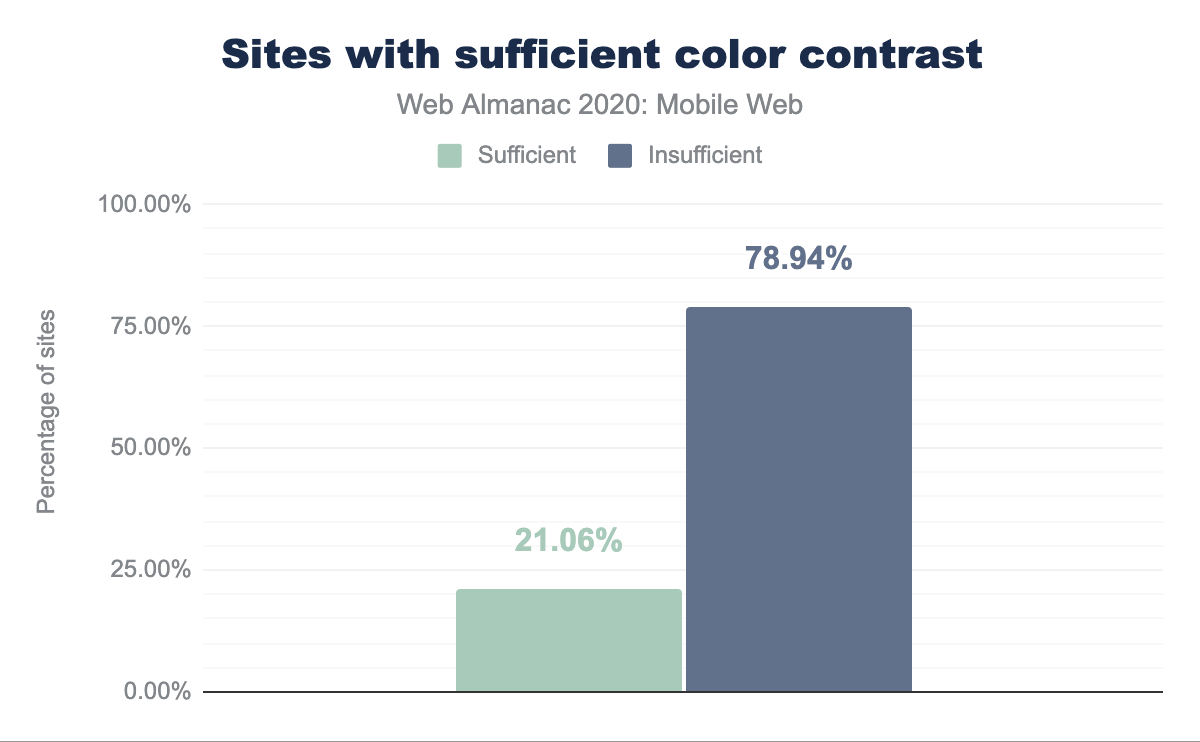
Text with low contrast ratio is hard to read, for instance, light gray text on a white background. This can reduce reading comprehension and reading speed for users.
Lighthouse now checks for color contrast, we found that 78.94%—a majority of web pages, were lacking sufficient color contrast.
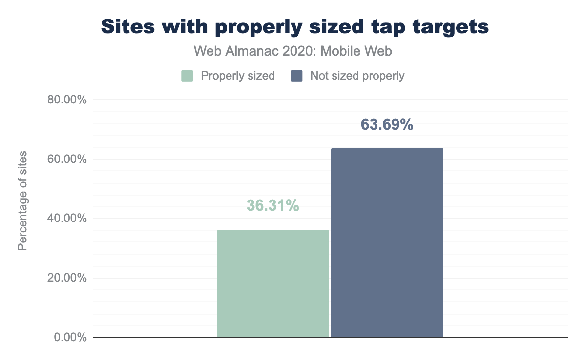
Tap targets
Mobile user experience is susceptible to “fat fingering”, as users engage with sites using their fingers—a rather imprecise tool compared to using a mouse on a desktop.
Based on research, there are standards for minimum size of buttons and tap targets, as well as the minimum distance they should be spaced apart. Lighthouse recommends that targets should be no smaller than 48 px by 48 px, and no closer than 8 px apart. We found that 63.69%—a majority of web pages, had improperly sized tap targets. This is a slight improvement over last year, where 65.57% web pages had improperly sized tap targets.
Search input
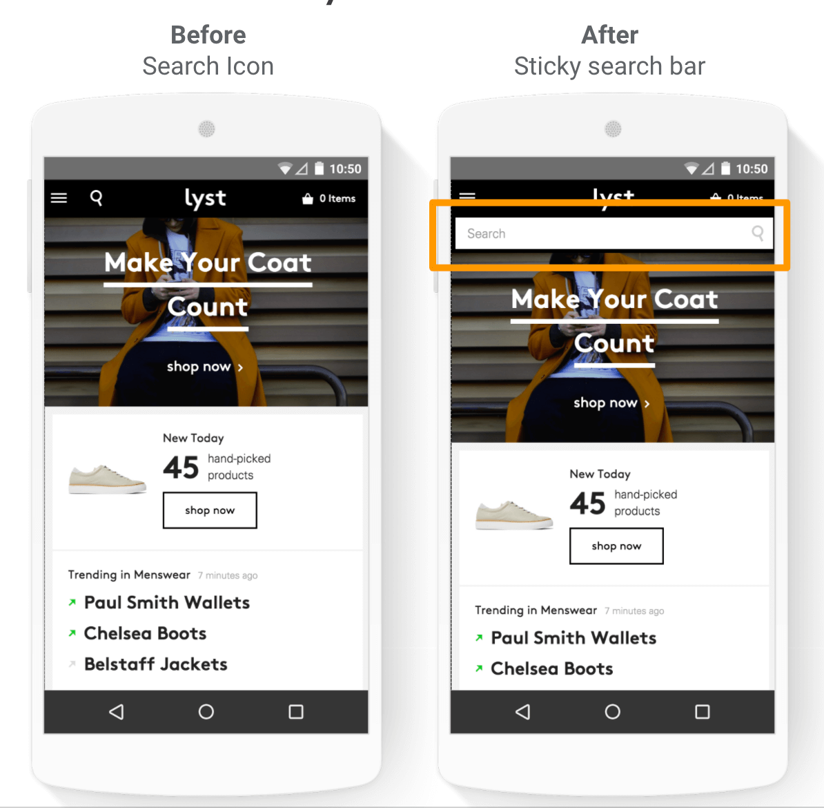
Search input or a search bar is a crucial tool for engaging users, it enables them to quickly find the information they are looking for. It is especially important for mobile devices, as they lack the screen real estate to easily consume large amounts of information.
Search is heavily used in large e-commerce sites, content heavy sites, news sites, and booking sites to help users find information easily. While a small website that has a few pages, does not need a search input, it will be needed as the website grows. For sites with 100+ pages, it is recommended to feature a prominent search bar.
A case study with fashion website lyst.com, showed that replacing the search icon with a search box enabled users to locate the search function more easily, increasing usage by 43% on desktop, and by 13% on mobile.
(Source: Google)
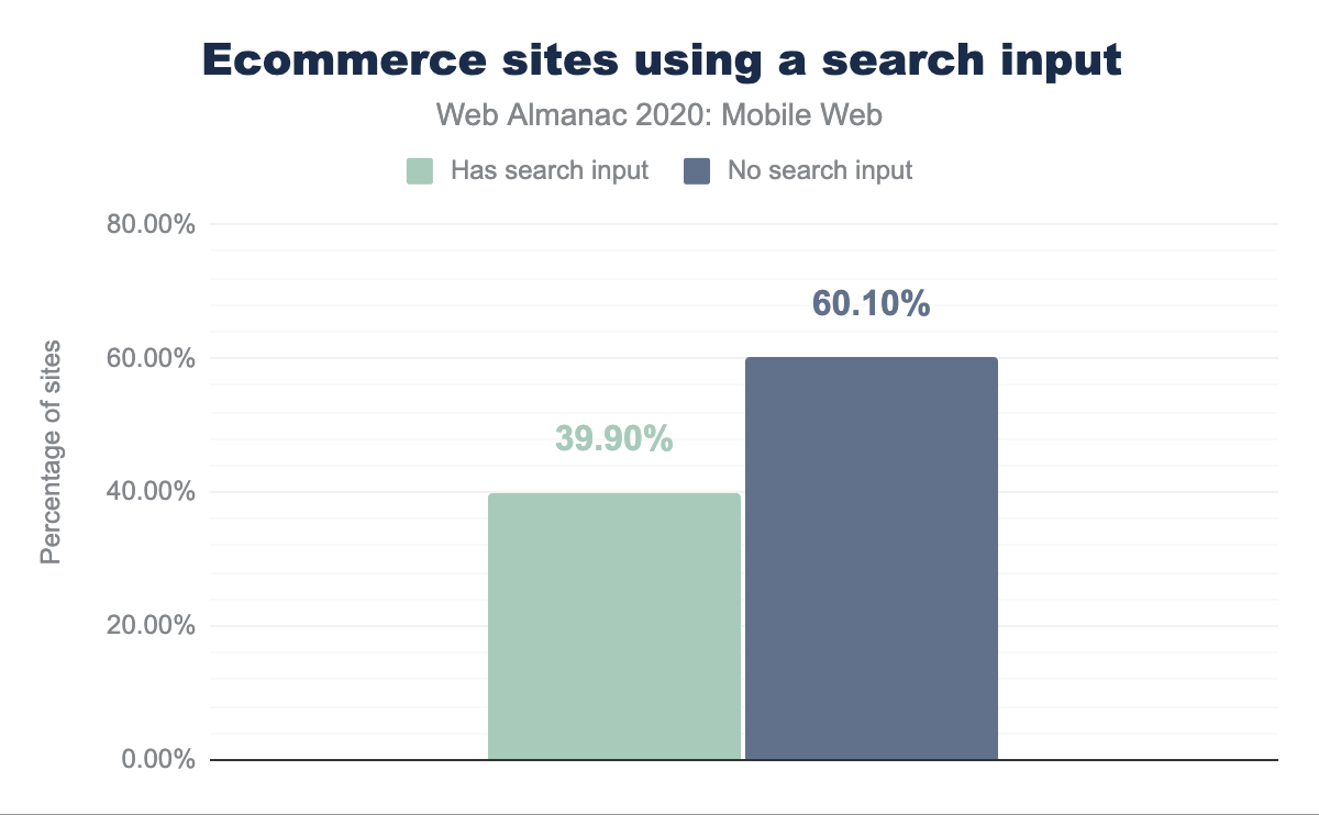
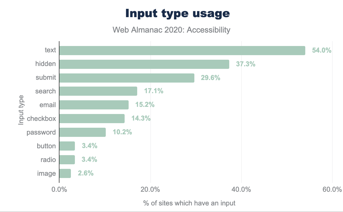
Search input is used in 17% of all sites using any input. At 60.10%, a majority of ecommerce landing pages are missing the presence of search input.
A/B testing
A/B testing is a crucial tool for making data driven decisions on matters of design and UX. A/B testing enables validating that the UX & design changes measurably improve intended metrics and don’t cause unexpected regressions.
Here’s a sampling of design questions that can be A/B tested:
- Would changing the color of a button increase the click through rate?
- Would increasing the size of click targets increase the number of clicks?
- Would replacing the search icon with a search box increase the number of searches completed?
According to thirdpartyweb.today, Optimizely is the most popular third party product for A/B testing, it is used in over 20,000 pages.
3. Conversion
While “conversion” may sound like a concept pertaining to e-commerce sites, a conversion can refer to a successful user transaction, such as signing up for a music streaming service, booking a rental home, writing a review on a travel site, etc.
According to Comscore Media Matrix, traffic from mobile devices account for 79.6% of time spent on US retail sites, but only 32.3% of US eCommerce sales.
Compared to desktop, transacting on mobile devices is error-prone and tedious, as users must input personal information using small keyboards and screen sizes. Checkout flows should be simple and short to avoid user frustration, or worse, abandonment. 27% of users abandon checkout because of a “too long / complicated checkout process”. 35% of users will abandon the checkout if a retailer does not offer guest checkout.
Form semantics
Users can more easily enter required information on mobile devices when their keyboard is optimized for the appropriate input type. For example, a numeric keyboard is useful for entering phone numbers, while keyboards displaying the “@” symbol are useful for entering email addresses. Sites can provide browser hints to display the most appropriate keys using the type attribute on input tags.
Sign up, sign in and checkout
Today, browsers can help populate the necessary user information to complete a transaction and help reduce potential input errors. The autocomplete attribute can provide browsers hints to populate input elements with the correct user information. Users who successfully use Chrome Autofill to enter their information go through checkout an average of 30% faster than those who don’t.
Auto-complete can be especially helpful in completing checkout flows that require a user to login and hence remember their password. According to a study by HYPR in 2019, 78% of users forgot and had to reset a password in the past 90 days.
It’s also possible to eliminate some form fields altogether. The Credential Management and Payment Request APIs are standards-based browser APIs that provide a programmatic interface between sites and the browser for seamless sign-in and payments. Only .61% of eCommerce sites are using the Payment Request API and only 0.008% use the Credential Management API. It’s worth noting that adoption of the Payment Request API has increased compared to 2019, with a 6x increase in payment completion rate.
4. Retention
The last phase in the journey is user retention, this means re-engaging the user and making them a returning customer or a loyal visitor.
Installability with PWA
Returning users benefit from a native-app-like experience with a PWA. A key value proposition for user retention is the installability of a PWA. When a PWA is installed, it is available from the places that a mobile user expects to find an app: the homescreen and the app tray. When the user taps and launches the PWA, it loads in full screen and is available in the task switcher, just like a native app.
Rakuten 24 is an online store provided by Rakuten, one of the largest e-commerce companies in Japan. A recent case study with Rakuten 24, showed that making their web app installable, resulted in a whopping 450% jump in visitor retention rate, compared to the previous mobile web flow, over a 1-month timeframe.
By implementing installability, Rakuten 24 also saw these improvements over a 1-month timeframe:
- 310% increase in visit frequency per user, compared to the rest of their web users
- 150% increase in sales per customer by 150%
- 200% increase in conversion rate
A seamless experience across devices
Finally, providing a seamless experience across devices can unlock deeper user engagement and retention, the signed-in experience powers this.
At the start of the User Journey we mentioned that mobile represents 79.6% of time spent amongst retail sites, but it only accounts for 32.3% of eCommerce sales. This suggests that users often browse on mobile and start the user journey on mobile devices, but they often convert or complete transactions on desktop.
Hopefully by now we have gained a better understanding to reason about this, for instance reasons may include ease of finding and consuming content, the ease of typing, form filling etc.
For larger sites, it’s often not a question of whether to invest in mobile web or desktop, as they both often complement each other.
It helps to consider all the four phases of the user journey to understand the full spectrum of opportunities for engaging the user, as well as the risks and challenges in each phase of the journey.
Conclusion
Mobile is now the predominant way of accessing the web, and access to the web has become all the more important in the last year. The needs of mobile are different from those of desktop. Image sizes can, and should, be smaller on mobile due to smaller screens and often limited network but seeing two fifths of improperly sized images show we still have some way to go. Similarly tap targets need to be bigger on mobile since we don;’t have the precision of a mouse but we have shown this is still a problem. In all there is much website owners can do to make the use of mobile web easier but it may often require a different mindset to desktop, but also not flipping the other way entirely and forgetting desktop users either.

