Mobile Web
Introduction
Let’s step back for a moment, to the year 2007. The “mobile web” is currently just a blip on the radar, and for good reason too. Why? Mobile browsers have little to no CSS support, meaning sites look nothing like they do on desktop — some browsers can only display text. Screens are incredibly small and can only display a few lines of text at a time. And the replacements for a mouse are these tiny little arrow keys you use to “tab around”. Needless to say, browsing the web on a phone is truly a labor of love. However, all of this is just about to change.
In the middle of his presentation, Steve Jobs takes the newly unveiled iPhone, sits down, and begins to surf the web in a way we had only previously dreamed of. A large screen and fully featured browser displaying websites in their full glory. And most importantly, surfing the web using the most intuitive pointer device known to man: our fingers. No more tabbing around with tiny little arrow keys.
Since 2007, the mobile web has grown at an explosive rate. And now, 13 years later, mobile accounts for 59% of all searches and 58.7% of all web traffic, according to Akamai mPulse data in July 2019. It’s no longer an afterthought, but the primary way people experience the web. So given how significant mobile is, what kind of experience are we providing our visitors? Where are we falling short? Let’s find out.
The page loading experience
The first part of the mobile web experience we analyzed is the one we’re all most intimately familiar with: the page loading experience. But before we start diving into our findings, let’s make sure we’re all on the same page regarding what the typical mobile user really looks like. Because this will not only help you reproduce these results, but understand these users better.
Let’s start with what phone the typical mobile user has. The average Android phone is ~$250, and one of the most popular phones in that range is a Samsung Galaxy S6. So this is likely the kind of phone they use, which is actually 4x slower than an iPhone 8. This user doesn’t have access to a fast 4G connection, but rather a 2G connection (29% of the time) or 3G connection (28% of the time). And this is what it all adds up to:
I imagine some of you are surprised by these results. They may be far worse conditions than you’ve ever tested your site with. But now that we’re all on the same page with what a mobile user truly looks like, let’s get started.
Pages bloated with JavaScript
The state of JavaScript on the mobile web is terrifying. According to HTTP Archive’s JavaScript report, the median mobile site requires phones to download 375 KB of JavaScript. Assuming a 70% compression ratio, this means that phones have to parse, compile, and execute 1.25 MB of JavaScript at the median.
Why is this a problem? Because sites loading this much JS take upwards of 10 seconds to become consistently interactive. Or in other words, your page may appear fully loaded, but when a user clicks any of your buttons or menus, the user may experience some slowdown because the JavaScript hasn’t finished executing. In the worst case scenario, users may be forced to keep clicking the button for upwards of 10 seconds, just waiting for that magical moment where something actually happens. Think about how confusing and frustrating that can be.
Let’s delve deeper and look at another metric that focuses more on how well each page utilizes JavaScript. For example, does it really need as much JavaScript as it’s loading? We call this metric the JavaScript Bloat Score, based on the web bloat score. The idea behind it is this:
- JavaScript is often used to both generate and change the page as it loads.
- It’s also delivered as text to the browser. So it compresses well, and should be delivered faster than just a screenshot of the page.
- So if the total amount of JavaScript a page downloads alone (not including images, css, etc) is larger than a PNG screenshot of the viewport, we are using far too much JavaScript. At this point, it’d be faster just to send that screenshot to get the initial page state!
The results of this? Of the 5+ million websites analyzed, 75.52% were bloated with JavaScript. We have a long way to go.
Note that we were not able to capture and measure the screenshots of all 5 million+ sites we analyzed. Instead, we took a random sampling of 1000 sites to find what the median viewport screenshot size is (140 KB), and then compared each site’s JavaScript download size to this number.
For a more in-depth breakdown of the effects of JavaScript, check out The Cost of JavaScript in 2018 by Addy Osmani.
Service Worker usage
Browsers typically load all pages the same. They prioritize the download of some resources above others, follow the same caching rules, etc. Thanks to Service Workers though, we now have a way to directly control how our resources are handled by the network layer, often times resulting in quite significant improvements to our page load times.
Despite being available since 2016 and implemented on every major browser, only 0.64% of sites utilize them!
Shifting content while loading
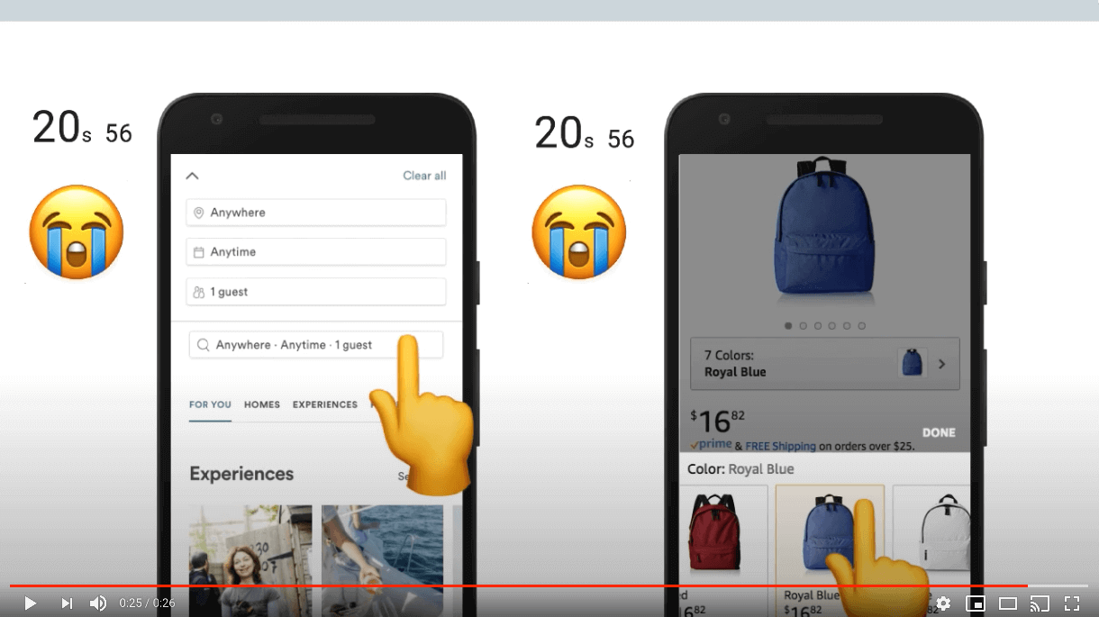
One of the most beautiful parts of the web is how web pages load progressively by nature. Browsers download and display content as soon as they are able, so users can engage with your content as soon as possible. However, this can have a detrimental effect if you don’t design your site with this in mind. Specifically, content can shift position as resources load and impede the user experience.

Imagine you’re reading an article when all of a sudden, an image loads and pushes the text you’re reading way down the screen. You now have to hunt for where you were or just give up on reading the article. Or, perhaps even worse, you begin to click a link right before an ad loads in the same spot, resulting in an accidental click on the ad instead.
So, how do we measure how much our sites shift? In the past it was quite difficult (if not impossible), but thanks to the new Layout Instability API we can do this in two steps:
Via the Layout Instability API, track each shift’s impact on the page. This is reported to you as a percentage of how much content in the viewport has shifted.
-
Take all the shifts you’ve tracked and add them together. The result is what we call the Cumulative Layout Shift (CLS) score.
Because every visitor can have a different CLS, in order to analyze this metric across the web with the Chrome UX Report (CrUX), we combine every experience into three different buckets:
- Small CLS: Experiences having CLS under 5%. That is, the page is mostly stable and does not shift very much at all. For perspective, the page in the video above has a CLS of 42.59%.
- Large CLS: Experiences having CLS 100% or greater. These may consist of many small individual shifts or a few large and noticeable shifts.
- Medium CLS: Anything in between small and large.
So what do we see when we look at CLS across the web?
Nearly two out of every three sites (65.32%) have medium or large CLS for 50% or more of all user experiences.
20.52% of sites have large CLS for at least half of all user experiences. That’s about one of every five websites. Remember, the video in Figure 12.3 only has a CLS of 42.59% — these experiences are even worse than that!
We suspect much of this may be caused by websites not providing an explicit width and height for resources like ads and images that load after text has been painted to the screen. Before browsers can display a resource on the screen, they need to know how much room the resource will take up. So unless an explicit size is provided via CSS or HTML attributes, browsers have no way to know how how large the resource actually is and display it with a width and height of 0px until loaded. When the resource loads and browsers finally know how big it is, it shifts the page’s contents, creating an unstable layout.
Permission requests
Over the last few years, the line between websites and “app store” apps has continued to blur. Even now, you have the ability to request access to a user’s microphone, video camera, geolocation, ability to display notifications, and more.
While this has opened up even more capabilities for developers, needlessly requesting these permissions may leave users feeling wary of your web page, and can build mistrust. This is why we recommend to always tie a permission request to a user gesture, like tapping a “Find theaters near me” button.
Right now 1.52% of sites request permissions without a user interaction. Seeing such a low number is encouraging. However, it’s important to note that we were only able to analyze home pages. So for example, sites requesting permissions only on their content pages (e.g., their blog posts) were not accounted for. See our Methodology page for more info.
Textual content
The primary goal of a web page is to deliver content users want to engage with. This content might be a YouTube video or an assortment of images, but often times, it’s simply the text on the page. It goes without saying that ensuring our textual content is legible to our visitors is extremely important. Because if visitors can’t read it, there’s nothing left to engage with, and they’ll leave. There are two key things to check when ensuring your text is legible to readers: color contrast and font sizes.
Color contrast
When designing our sites we tend to be in more optimal conditions, and have far better eyes than many of our visitors. Visitors may be colorblind and unable to distinguish between the text and background color. 1 in every 12 men and 1 in 200 women of European descent are colorblind. Or perhaps visitors are reading the page while the sun is creating glare on their screen, which may similarly impair legibility.
To help us mitigate this problem, there are accessibility guidelines we can follow when choosing our text and background colors. So how are we doing in meeting these baselines? Only 22.04% of sites give all their text sufficient color contrast. This value is actually a lower limit, as we could only analyze text with solid backgrounds. Image and gradient backgrounds were unable to be analyzed.

#FFFFFF, the light shade of brown background is #FCA469, and the recommended shade of brown background is #BD5B0E. The grayscale equivalents are #B8B8B8 and #707070 respectively. Image courtesy of LookZookFor colorblindness stats for other demographics, see this paper.
Font size
The second part of legibility is ensuring that text is large enough to read easily. This is important for all users, but especially so for older age demographics. Font sizes under 12px tend to be harder to read.
Across the web we found 80.66% of web pages meet this baseline.
Zooming, scaling, and rotating pages
Zooming and scaling
Designing your site to work perfectly across the tens of thousands of screen sizes and devices is incredibly difficult. Some users need larger font sizes to read, zoom in on your product images, or need a button to be larger because it’s too small and slipped past your quality assurance team. Reasons like these are why device features like pinch-to-zoom and scaling are so important; they allow users to tweak our pages so their needs are met.
There do exist very rare cases when disabling this is acceptable, like when the page in question is a web-based game using touch controls. If left enabled in this case, players’ phones will zoom in and out every time the player taps twice on the game, resulting in an unusable experience.
Because of this, developers are given the ability to disable this feature by setting one of the following two properties in the meta viewport tag:
-
user-scalableset to0orno -
maximum-scaleset to1,1.0, etc
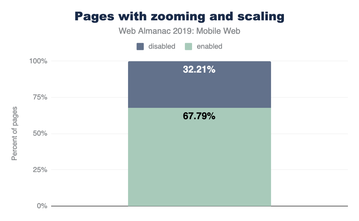
However, developers have misused this so much that almost one out of every three sites (32.21%) disable this feature, and Apple (as of iOS 10) no longer allows web developers to disable zooming. Mobile Safari simply ignores the tag. All sites, no matter what, can be zoomed and scaled on newer Apple devices, which account for over 11% of all web traffic worldwide!
Rotating pages
Mobile devices allow users to rotate them so your website can be viewed in the format users prefer. Users do not always keep the same orientation throughout a session however. When filling out forms, users may rotate to landscape mode to use the larger keyboard. Or while browsing products, some may prefer the larger product images landscape mode gives them. Because of these types of use cases, it’s very important not to rob the user of this built-in ability of mobile devices. And the good news is that we found virtually no sites that disable this. Only 87 total sites (or 0.0016%) disable this feature. This is fantastic.
Buttons and links
Tap targets
We’re used to having precise devices like mice while on desktop, but the story is quite different on mobile. On mobile we engage with sites through these large and imprecise tools we call fingers. Because of how imprecise they can be, we constantly “fat finger” links and buttons, tapping on things we never intended.
Designing tap targets appropriately to mitigate this issue can be difficult because of how widely fingers vary in size. However, lots of research has now been done and there are safe standards for how large buttons should be and how far apart they need to be separated.
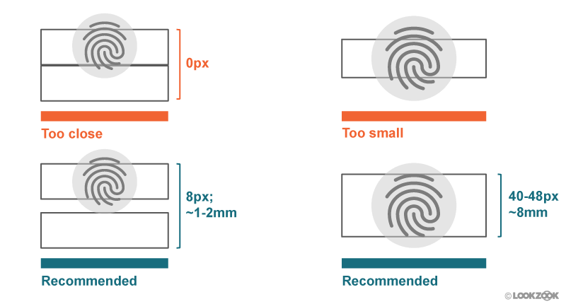
As of now, 34.43% of sites have sufficiently sized tap targets. So we have quite a ways to go until “fat fingering” is a thing of the past.
Labeling buttons
Some designers love to use icons in place of text — they can make our sites look cleaner and more elegant. But while you and everyone on your team may know what these icons mean, many of your users will not. This is even the case with the infamous hamburger icon! If you don’t believe us, do some user testing and see how often users get confused. You’ll be astounded.
This is why it’s important to avoid any confusion and add supporting text and labels to your buttons. As of now, at least 28.59% of sites include a button with only a single icon with no supporting text.
Semantic form fields
From signing up for a new service, buying something online, or even to receive notifications of new posts from a blog, form fields are an essential part of the web and something we use daily. Unfortunately, these fields are infamous for how much of a pain they are to fill out on mobile. Thankfully, in recent years browsers have given developers new tools to help ease the pain of completing these fields we know all too well. So let’s take a look at how much they’ve been getting used.
New input types
In the past, text and password were some of the only input types available to developers as it met almost all of our needs on desktop. This is not the case for mobile devices. Mobile keyboards are incredibly small, and a simple task, like entering an email address, may require users to switch between multiple keyboards: the standard keyboard and the special character keyboard for the “@” symbol. Simply entering a phone number can be difficult using the default keyboard’s tiny numbers.
Many new input types have since been introduced, allowing developers to inform browsers what kind of data is expected, and enable browsers to provide customized keyboards specifically for these input types. For example, a type of email provides users with an alphanumeric keyboard including the “@” symbol, and a type of tel will display a numeric keypad.
When analyzing sites containing an email input, 56.42% use type="email". Similarly, for phone inputs, type="tel" is used 36.7% of the time. Other new input types have an even lower adoption rate.
| Type | Frequency (pages) |
|---|---|
| phone | 1,917 |
| name | 1,348 |
| textbox | 833 |
Make sure to educate yourself and others on the large amount of input types available and double-check that you don’t have any typos like the most common ones in Figure 12.7 above.
Enabling autocomplete for inputs
The autocomplete input attribute enables users to fill out form fields in a single click. Users fill out tons of forms, often with the exact same information each time. Realizing this, browsers have begun to securely store this information so it can be used on future pages. All developers need to do is use this autocomplete attribute to tell browsers what exact piece of information needs to be filled in, and the browser does the rest.
autocomplete.
Currently, only 29.62% of pages with input fields utilize this feature.
Pasting into password fields
Enabling users to copy and paste their passwords into your page is one way that allows them to use password managers. Password managers help users generate (and remember) strong passwords and fill them out automatically on web pages. Only 0.02% of web pages tested disable this functionality.
Conclusion
For over 13 years we’ve been treating the mobile web as an afterthought, like a mere exception to desktop. But it’s time for this to change. The mobile web is now the web, and desktop is becoming the legacy one. There are now 4 billion active smartphones in the world, covering 70% of all potential users. What about desktops? They currently sit at 1.6 billion, and account for less and less of web usage every month.
How well are we doing catering to mobile users? According to our research, even though 71% of sites make some kind of effort to adjust their site for mobile, they’re falling well below the mark. Pages take forever to load and become unusable thanks to an abuse of JavaScript, text is often impossible to read, engaging with sites via clicking links or buttons is error-prone and infuriating, and tons of great technologies invented to mitigate these problems (Service Workers, autocomplete, zooming, new image formats, etc) are barely being used at all.
The mobile web has now been around long enough for there to be an entire generation of kids where this is the only internet they’ve ever known. And what kind of experience are we giving them? We’re essentially taking them back to the dial-up era. (Good thing I hear AOL still sells those CDs providing 1000 hours of free internet access!)