Fonts
Introduction
Web fonts enable beautiful and functional typography on the web. Using web fonts not only empowers design, but it democratizes a subset of design, as it allows easier access to those who might not have particularly strong design skills. However, for all the good they can do, web fonts can also do great harm to your site’s performance if they are not loaded properly.
Are they a net positive for the web? Do they provide more benefit than harm? Are the web standards cowpaths sufficiently paved to encourage web font loading best practices by default? And if not, what needs to change? Let’s take a data-driven peek at whether or not we can answer those questions by inspecting how web fonts are used on the web today.
Where did you get those web fonts?
The first and most prominent question: performance. There is a whole chapter dedicated to performance but we will delve a little into font-specific performance issues here.
Using hosted web fonts enables ease of implementation and maintenance, but self-hosting offers the best performance. Given that web fonts by default make text invisible while the web font is loading (also known as the Flash of Invisible Text, or FOIT), the performance of web fonts can be more critical than non-blocking assets like images.
Are fonts being hosted on the same host or by a different host?
Differentiating self-hosting against third-party hosting is increasingly relevant in an HTTP/2 world, where the performance gap between a same-host and different-host connection can be wider. Same-host requests have the huge benefit of a better potential for prioritization against other same-host requests in the waterfall.
Recommendations to mitigate the performance costs of loading web fonts from another host include using the preconnect, dns-prefetch, and preload resource hints, but high priority web fonts should be same-host requests to minimize the performance impact of web fonts. This is especially important for fonts used by very visually prominent content or body copy occupying the majority of a page.
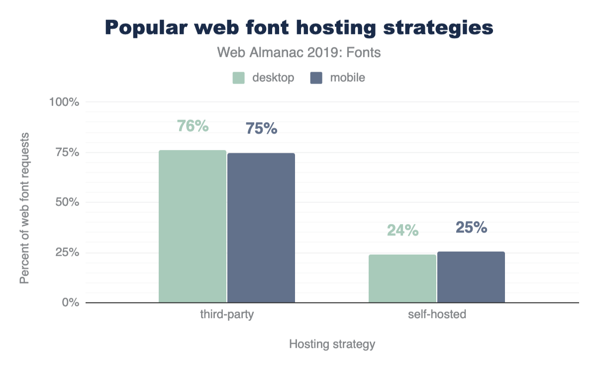
The fact that three quarters are hosted is perhaps unsurprising given Google Fonts dominance that we will discuss below.
Google serves fonts using third-party CSS files hosted on https://fonts.googleapis.com. Developers add requests to these stylesheets using <link> tags in their markup. While these stylesheets are render blocking, they are very small. However, the font files are hosted on yet another domain, https://fonts.gstatic.com. The model of requiring two separate hops to two different domains makes preconnect a great option here for the second request that will not be discovered until the CSS is downloaded.
Note that while preload would be a nice addition to load the font files higher in the request waterfall (remember that preconnect sets up the connection, it doesn’t request the file content), preload is not yet available with Google Fonts. Google Fonts generates unique URLs for their font files which are subject to change.
What are the most popular third-party hosts?
| Host | Desktop | Mobile |
|---|---|---|
| fonts.gstatic.com | 75.4% | 74.9% |
| use.typekit.net | 7.2% | 6.6% |
| maxcdn.bootstrapcdn.com | 1.8% | 2.0% |
| use.fontawesome.com | 1.1% | 1.2% |
| static.parastorage.com | 0.8% | 1.2% |
| fonts.shopifycdn.com | 0.6% | 0.6% |
| cdn.shopify.com | 0.5% | 0.5% |
| cdnjs.cloudflare.com | 0.4% | 0.5% |
| use.typekit.com | 0.4% | 0.4% |
| netdna.bootstrapcdn.com | 0.3% | 0.4% |
| fast.fonts.net | 0.3% | 0.3% |
| static.dealer.com | 0.2% | 0.2% |
| themes.googleusercontent.com | 0.2% | 0.2% |
| static-v.tawk.to | 0.1% | 0.3% |
| stc.utdstc.com | 0.1% | 0.2% |
| cdn.jsdelivr.net | 0.2% | 0.2% |
| kit-free.fontawesome.com | 0.2% | 0.2% |
| open.scdn.co | 0.1% | 0.1% |
| assets.squarespace.com | 0.1% | 0.1% |
| fonts.jimstatic.com | 0.1% | 0.2% |
The dominance of Google Fonts here was simultaneously surprising and unsurprising at the same time. It was unsurprising in that I expected the service to be the most popular and surprising in the sheer dominance of its popularity. 75% of font requests is astounding. TypeKit was a distant single-digit second place, with the Bootstrap library accounting for an even more distant third place.
<head>.
While the high usage of Google Fonts here is very impressive, it is also noteworthy that only 29% of pages included a Google Fonts <link> element. This could mean a few things:
- When pages uses Google Fonts, they use a lot of Google Fonts. They are provided without monetary cost, after all. Perhaps they’re being used in a popular WYSIWYG editor? This seems like a very likely explanation.
- Or a more unlikely story is that it could mean that a lot of people are using Google Fonts with
@importinstead of<link>. -
Or if we want to go off the deep end into super unlikely scenarios, it could mean that many people are using Google Fonts with an HTTP
Link:header instead.
<head>.
Google Fonts documentation encourages the <link> for the Google Fonts CSS to be placed as the first child in the <head> of a page. This is a big ask! In practice, this is not common as only half a percent of all pages (about 20,000 pages) took this advice.
More so, if a page is using preconnect or dns-prefetch as <link> elements, these would come before the Google Fonts CSS anyway. Read on for more about these resource hints.
Speeding up third-party hosting
As mentioned above, a super easy way to speed up web font requests to a third-party host is to use the preconnect resource hint.
Wow! Less than 2% of pages are using preconnect! Given that Google Fonts is at 75%, this should be higher! Developers: if you use Google Fonts, use preconnect! Google Fonts: proselytize preconnect more!
In fact, if you’re using Google Fonts go ahead and add this to your <head> if it’s not there already:
<link rel="preconnect" href="https://fonts.gstatic.com/">Most popular typefaces
| Rank | Font family | Desktop | Mobile |
|---|---|---|---|
| 1 | Open Sans | 24% | 22% |
| 2 | Roboto | 15% | 19% |
| 3 | Montserrat | 5% | 4% |
| 4 | Source Sans Pro | 4% | 3% |
| 5 | Noto Sans JP | 3% | 3% |
| 6 | Lato | 3% | 3% |
| 7 | Nanum Gothic | 4% | 2% |
| 8 | Noto Sans KR | 3% | 2% |
| 9 | Roboto Condensed | 2% | 2% |
| 10 | Raleway | 2% | 2% |
| 11 | FontAwesome | 1% | 1% |
| 12 | Roboto Slab | 1% | 1% |
| 13 | Noto Sans TC | 1% | 1% |
| 14 | Poppins | 1% | 1% |
| 15 | Ubuntu | 1% | 1% |
| 16 | Oswald | 1% | 1% |
| 17 | Merriweather | 1% | 1% |
| 18 | PT Sans | 1% | 1% |
| 19 | Playfair Display | 1% | 1% |
| 20 | Noto Sans | 1% | 1% |
It is unsurprising that the top entries here seem to match up very similarly to Google Fonts’ list of fonts sorted by popularity.
What font formats are being used?
WOFF2 is pretty well supported in web browsers today. Google Fonts serves WOFF2, a format that offers improved compression over its predecessor WOFF, which was itself already an improvement over other existing font formats.
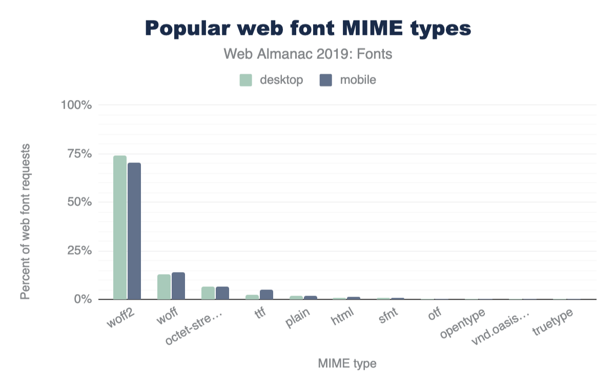
From my perspective, an argument could be made to go WOFF2-only for web fonts after seeing the results here. I wonder where the double-digit WOFF usage is coming from? Perhaps developers still serving web fonts to Internet Explorer?
Third place octet-stream (and plain a little further down) would seem to suggest that a lot of web servers are configured improperly, sending an incorrect MIME type with web font file requests.
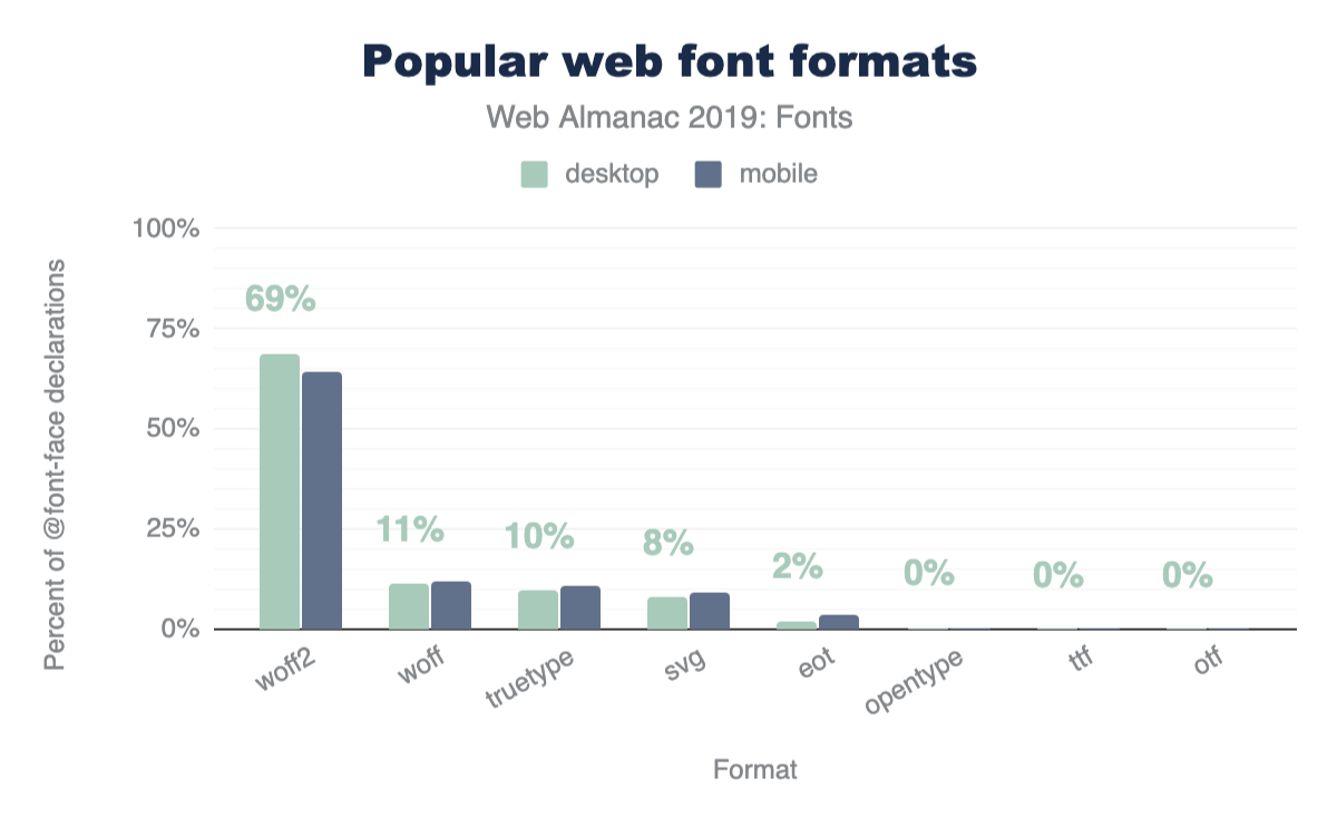
Let’s dig a bit deeper and look at the format() values used in the src: property of @font-face declarations:
@font-face declarations.
I was hoping to see SVG fonts on the decline. They’re buggy and implementations have been removed from every browser except Safari. Time to drop these, y’all.
The SVG data point here also makes me wonder what MIME type y’all are serving these SVG fonts with. I don’t see image/svg+xml anywhere in Figure 6.7. Anyway, don’t worry about fixing that, just get rid of them!
WOFF2-only
| Rank | Format combinations | Desktop | Mobile |
|---|---|---|---|
| 1 | woff2 | 84.0% | 81.9% |
| 2 | svg, truetype, woff | 4.3% | 4.0% |
| 3 | svg, truetype, woff, woff2 | 3.5% | 3.2% |
| 4 | eot, svg, truetype, woff | 1.3% | 2.9% |
| 5 | woff, woff2 | 1.8% | 1.8% |
| 6 | eot, svg, truetype, woff, woff2 | 1.2% | 2.1% |
| 7 | truetype, woff | 0.9% | 1.1% |
| 8 | woff | 0.7% | 0.8% |
| 9 | truetype | 0.6% | 0.7% |
| 10 | truetype, woff, woff2 | 0.6% | 0.6% |
| 11 | opentype, woff, woff2 | 0.3% | 0.2% |
| 12 | svg | 0.2% | 0.2% |
| 13 | eot, truetype, woff | 0.1% | 0.2% |
| 14 | opentype, woff | 0.1% | 0.1% |
| 15 | opentype | 0.1% | 0.1% |
| 16 | eot | 0.1% | 0.1% |
| 17 | opentype, svg, truetype, woff | 0.1% | 0.0% |
| 18 | opentype, truetype, woff, woff2 | 0.0% | 0.0% |
| 19 | eot, truetype, woff, woff2 | 0.0% | 0.0% |
| 20 | svg, woff | 0.0% | 0.0% |
This dataset seems to suggest that the majority of people are already using WOFF2-only in their @font-face blocks. But this is misleading of course, per our earlier discussion on the dominance of Google Fonts in the data set. Google Fonts does some sniffing methods to serve a streamlined CSS file and only includes the most modern format(). Unsurprisingly, WOFF2 dominates the results here for that reason, as browser support for WOFF2 has been pretty broad for some time now.
Importantly, this particular data doesn’t really support or detract from the case to go WOFF2-only yet, but it remains a tempting idea.
Fighting against invisible text
The number one tool we have to fight the default web font loading behavior of “invisible while loading” (also known as FOIT), is font-display. Adding font-display: swap to your @font-face block is an easy way to tell the browser to show fallback text while the web font is loading.
Browser support is great too. Internet Explorer and pre-Chromium Edge don’t have support but they also render fallback text by default when a web font loads (no FOITs allowed here). For our Chrome tests, how commonly is font-display used?
font-display style.
I assume this will be creeping up over time, especially now that Google Fonts is adding font-display to all new code snippets copied from their site.
If you’re using Google Fonts, update your snippets! If you’re not using Google Fonts, use font-display! Read more about font-display on MDN.
Let’s have a look at what font-display values are popular:
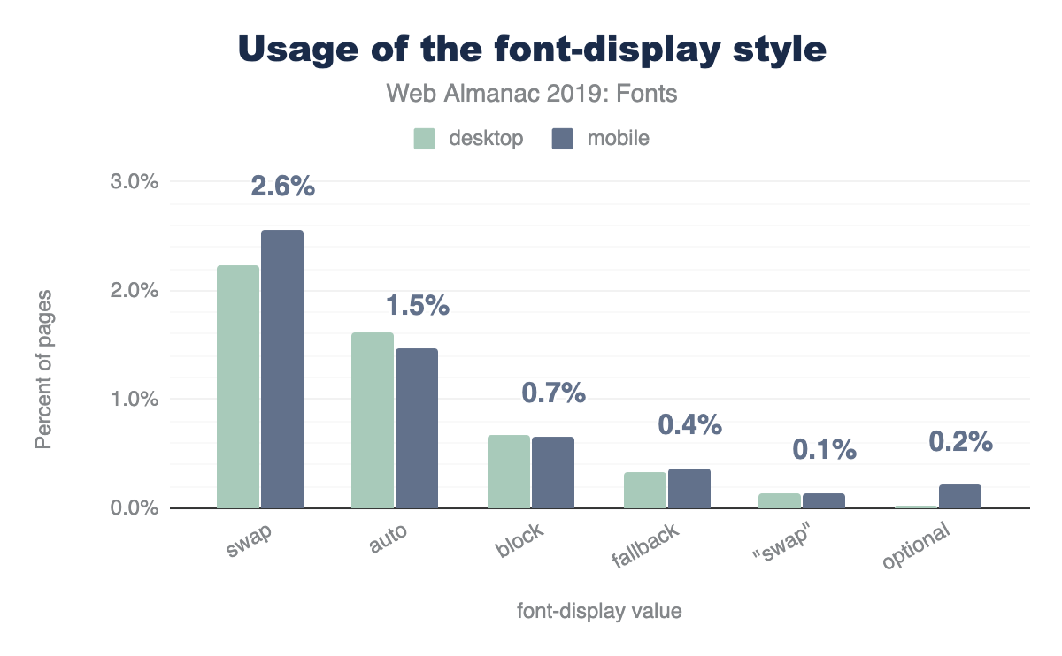
swap, 1.5% to auto, 0.7% to block, 0.4% to fallback, 0.2% to optional, and 0.1% to swap enclosed in quotes, which is invalid. The desktop distribution is similar except swap usage is lower by 0.4 percentage points and auto usage is higher by 0.1 percentage points.font-display values.
As an easy way to show fallback text while a web font is loading, font-display: swap reigns supreme and is the most common value. swap is also the default value used by new Google Fonts code snippets too. I would have expected optional (only render if cached) to have a bit more usage here as a few prominent developer evangelists lobbied for it a bit, but no dice.
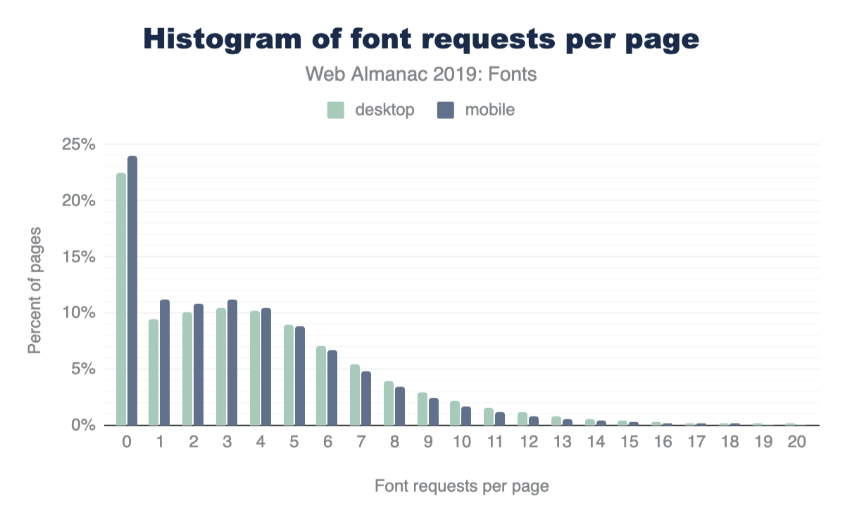
How many web fonts are too many?
This is a question that requires some measure of nuance. How are the fonts being used? For how much content on the page? Where does this content live in the layout? How are the fonts being rendered? In lieu of nuance however let’s dive right into some broad and heavy handed analysis specifically centered on request counts.
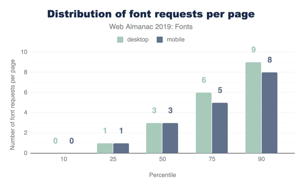
The median web page makes three web font requests. At the 90th percentile, requested six and nine web fonts on mobile and desktop, respectively.
It does seem quite interesting that web font requests seem to be pretty steady across desktop and mobile. I’m glad to see the recommendation to hide @font-face blocks inside of a @media queries didn’t catch on (don’t get any ideas).
That said there are marginally more requests for fonts made on mobile devices. My hunch here is that fewer typefaces are available on mobile devices, which in turn means fewer local() hits in Google Fonts CSS, falling back to network requests for these.
You don’t want to win this award
The award for the page that requests the most web fonts goes to a site that made 718 web font requests!
After diving into the code, all of those 718 requests are going to Google Fonts! It looks like a malfunctioning “Above the Page fold” optimization plugin for WordPress has gone rogue on this site and is requesting (DDoS-ing?) all the Google Fonts—oops!
Ironic that a performance optimization plugin can make your performance much worse!
More accurate matching with unicode-range
unicode-range property.
unicode-range is a great CSS property to let the browser know specifically which code points the page would like to use in the font file. If the @font-face declaration has a unicode-range, content on the page must match one of the code points in the range before the font is requested. It is a very good thing.
This is another metric that I expect was skewed by Google Fonts usage, as Google Fonts uses unicode-range in most (if not all) of its CSS. I’d expect this to be less common in user land, but perhaps filtering out Google Fonts requests in the next edition of the Almanac may be possible.
Don’t request web fonts if a system font exists
local() property.
local() is a nice way to reference a system font in your @font-face src. If the local() font exists, it doesn’t need to make a request for a web font at all. This is used both extensively and controversially by Google Fonts, so it is likely another example of skewed data if we’re trying to glean patterns from user land.
It should also be noted here that it has been said by smarter people than I (Bram Stein of TypeKit) that using local() can be unpredictable as installed versions of fonts can be outdated and unreliable.
Condensed fonts and font-stretch
font-stretch property.
Historically, font-stretch has suffered from poor browser support and was not a well-known @font-face property. Read more about font-stretch on MDN. But browser support has broadened.
It has been suggested that using condensed fonts on smaller viewports allows more text to be viewable, but this approach isn’t commonly used. That being said, that this property is used half a percentage point more on desktop than mobile is unexpected, and 7% seems much higher than I would have predicted.
Variable fonts are the future
Variable fonts allow several font weights and styles to be included in the one font file.
Even at 1.8% this was higher than expected, although I am excited to see this take off. Google Fonts v2 does include some support for variable fonts.
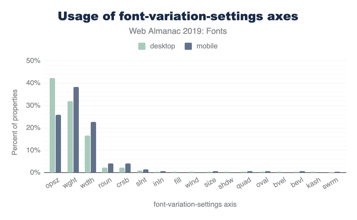
opsz value, 32% to wght, 16% to wdth, 2% or fewer to roun, crsb, slnt, inln, and more. The most notable differences between desktop and mobile pages are 26% usage of opsz, 38% of wght, and 23% of wdth.font-variation-settings axes.
Through the lens of this large data set, these are very low sample sizes-take these results with a grain of salt. However, opsz as the most common axis on desktop pages is notable, with wght and wdth trailing. In my experience, the introductory demos for variable fonts are usually weight-based.
Color fonts might also be the future?
Usage here of these is basically nonexistent but you can check out the excellent resource Color Fonts! WTF? for more information. Similar (but not at all) to the SVG format for fonts (which is bad and going away), this allows you to embed SVG inside of OpenType files, which is awesome and cool.
Conclusion
The biggest takeaway here is that Google Fonts dominates the web font discussion. Approaches they’ve taken weigh heavily on the data we’ve recorded here. The positives here are easy access to web fonts, good font formats (WOFF2), and for-free unicode-range configurations. The downsides here are performance drawbacks associated with third-party hosting, different-host requests, and no access to preload.
I fully expect that in the future we’ll see the “Rise of the Variable Font”. This should be paired with a decline in web font requests, as Variable Fonts combine multiple individual font files into a single composite font file. But history has shown us that what usually happens here is that we optimize a thing and then add more things to fill the vacancy.
It will be very interesting to see if color fonts increase in popularity. I expect these to be far more niche than variable fonts but may see a lifeline in the icon font space.
Keep those fonts frosty, y’all.
