Fonts
Introduction
Typography plays a major role in user experience on the web, from legibility and readability to accessibility and emotional impact. And whereas web developers used to be limited to a small number of web-safe fonts, we now have vast libraries offering both expressive range and increasingly comprehensive script support for the world’s many writing systems.
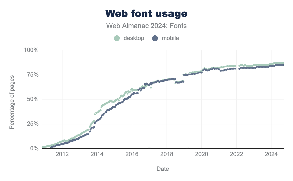
This year’s HTTP Almanac web crawl found that web font usage continues to grow, though at a slower pace than what was observed in previous years. Web fonts are now used on around 87% of all websites, whether alone or in combination with self-hosted fonts. At the same time, an increasing number of websites are now self-hosting as their exclusive means of delivering fonts. This trend coincides with a slight decline in websites using a combination of self-hosting and a font service. Still, the Google Fonts service continues to deliver the majority of fonts seen on the web. Around 57% of websites observed on the HTTP Archive’s desktop crawl and 48% on its mobile crawl use Google Fonts, whether alone or alongside another hosting option.
OpenType feature support continues to rise, following a trend seen in the past editions of the HTTP Almanac. This means an increasing share of the fonts currently used on the web have been designed with at least one OpenType feature, such as ligatures, kerning, or fractions. While this trend reflects an increasing tendency for designers to include OpenType features in the fonts themselves, this year’s data shows that more web developers are also taking advantage of these OpenType features in CSS.
Alongside broader implementation and use of longstanding OpenType features, there has also been a significant uptake of newer OpenType capabilities, such as color and variable fonts. In the case of color fonts, adoption is still at fairly low levels (just a few thousand websites across the entire internet) but rising at a considerable rate each year. Meanwhile, variable font usage has picked up even more dramatically, and a large factor driving adoption appears to be the popularity of variable fonts for several writing systems used by large populations of web users. Chinese, Japanese, and Korean (CJK) fonts, especially in the Noto superfamily, accounted for an especially large share of the variable fonts currently in use: about 42% on desktop and 34% on mobile of all the variable fonts on the web come from Noto’s CJK families.
More broadly, there has been a general rise in the use and support of various global scripts and languages on the web, reducing the once-overwhelming presence of Latin fonts. This displays the fruit of recent efforts to support the design and development of quality typefaces for languages that were long neglected in type catalogs, historically focused almost exclusively on Western characters.
The remainder of this chapter explores these subjects and more in detail, using data from the HTTP Archive web crawl as a means of depicting the current state of fonts on the web. The chapter is divided into sections touching upon various subjects related to the design and use of web fonts. We start with practical decisions surrounding how fonts are delivered to users, including the hosting, format, and size of font files. We then examine the most popular font families, the foundries that designed these fonts, and their level of support for different writing systems. We close by discussing emerging technologies, such as color and variable fonts, as well as technical choices concerning how fonts are built and used on the web.
Before proceeding into the chapter, however, we would like to make a few technical notes. Our overall approach to analyzing this year’s font data is heavily focused on trends. To examine these trends, we compare this year’s data to previous editions of the HTTP Almanac. Because there was no Almanac published in 2023, many of our comparisons point to data from the 2022 edition. In several cases, we also include 2023 data when it’s available and relevant.
When we present percentages throughout the chapter, it is important to pay close attention to what is actually counted in each specific case and how the corresponding count is normalized to arrive at the percentage in question. Without keeping this in mind, it would be easy to erroneously compare apples with oranges when considering any two percentages. We use three counting methods:
- Web Pages: This method follows the Web Almanac’s methodology and counts the number of root pages.
- Font Requests: This method counts font requests on root pages, then divides by the total number of font requests in the crawl. If a certain font happens to be requested several times by the browser when loading a page, it will be counted equally many times.
- Font Files: This method counts the number of distinct font URLs, then divides by the total number of font URLs in the crawl. If the same URL happens to be used on multiple websites, it will be counted only once. This mode of counting aims to observe the total set of font files accessible online.
Hosting and services
There are basically just two methods for delivering fonts to website visitors. One way is to provide web fonts through a service, whether a free one like Google Fonts or a paid one like Adobe Fonts. The other way is to self-host the font files from the website’s own domain, keeping full control over the files with no external dependencies.
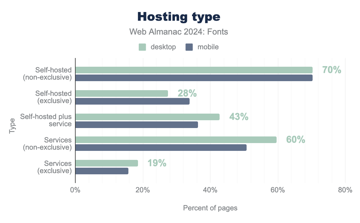
To understand the font hosting choices made by web developers, we follow the method from past Almanacs and look at several overlapping categories. The “Self-hosted (non-exclusive)” category points to all websites using self-hosted fonts, even if they also use a hosting service. The “Self-hosted (exclusive)” category counts websites that only use self-hosted fonts. Likewise, the “Services (non-exclusive)” category points to all websites that use a hosting service, even if they also use a self-hosted font. Sites in the “Services (exclusive)” category use only a hosting service. We have also added a new category this year, “Self-hosted plus service,” referring to sites that use both self-hosted fonts and a service (e.g. the non-exclusive self-hosted sites minus exclusive self-hosted sites).
This year, there has been a significant increase in exclusive self-hosting (desktop: from 22% in 2022 to 28%; mobile: from 28% in 2022 to 34%). At the same time, there has been a coinciding decrease in non-exclusive use of services (desktop: from 63% in 2022 to 60%; mobile: from 55% in 2022 to 51%). These interconnected trends were first spotted in 2022, when more people began to self-host their fonts because it often yields better performance and privacy (since the introduction of cache partitioning, using a shared font CDN is no longer beneficial). This suggests a sizable number of websites that once used both a web service and their own self-hosted fonts are now using self-hosted fonts alone.
Meanwhile, the number of websites exclusively using a web font service has actually remained fairly consistent over the last two years, amounting to roughly 19% of desktop and 16% of mobile websites. A full 70% of websites now use some form of self-hosted font, whether alone or with a service. This means the overall share of websites with self-hosted fonts has risen about two percentage points since 2022.
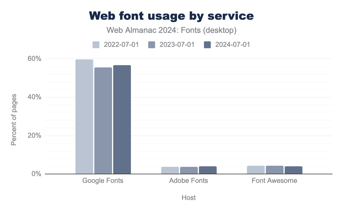
The service market for web fonts is highly consolidated, and increasingly so. The only major font services are now Google Fonts, Adobe Fonts, and Font Awesome. Fonts.com and cloud.typography dropped to very low levels of usage as of two years ago. Even Google Fonts, which is something of a giant in font hosting, registered a few points of declining usage in the 2023 crawl—dropping from 60% to 57% of total font hosting—albeit with a recovery showing now-stable usage levels. Meanwhile, fonts served by Adobe and Font Awesome were each found on about 4% of webpages this year.
With their 4% share of the service market, Adobe Fonts presents the one case of a font service whose proportion of the web fonts market grew in this year’s data. Adobe registered an increase of 11% percentage points over the last two years. The most likely explanation is that Adobe Fonts bundles many high quality and popular commercial typefaces with its Creative Cloud subscription. As Adobe web font usage is not charged by pageviews, it can be a cheap option for high traffic websites compared to buying a more expensive web license from a distributor or foundry.
Because a website can pull fonts from multiple sources, the popularity of different font hosting options is not a zero-sum game and the most popular options are often found in combinations on a single website.
| Services | desktop | mobile |
|---|---|---|
| Google Fonts, Self-hosted | 39% | 33% |
| Self-hosted | 28% | 34% |
| Google Fonts | 13% | 11% |
| Google Fonts, Font Awesome, Self-hosted | 2% | 1% |
| Google Fonts, Font Awesome | 1% | 1% |
About 39% of desktop and mobile websites crawled by the HTTP Archive this year used both Google and self-hosted fonts, whereas 28% used only self-hosted fonts and 13% used only Google. Altogether, these two sources together provided the vast majority of fonts seen on the web: 79% of websites crawled in 2024 used either self-hosted fonts, Google web fonts, or both. Still, there was a noticeable drop in the number of websites combining Google Fonts with self-hosting. Between 2022 and 2023, the combination of Google and self-hosted fonts dropped from 41% of websites to 38%. That number has begun to rebound slightly this year, as the figure started climbing again to reach 39%.
Overall, the trend is clear: more and more people prefer to self-host their web fonts. This is a great choice in many cases because self-hosting avoids external dependencies for something as critical to rendering as fonts are. Plus, when self-hosted fonts are well optimized, they give you the best performance (but more on that later).
File formats
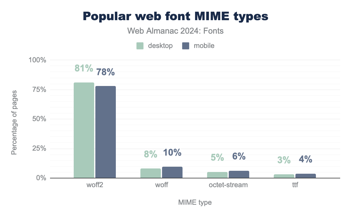
Which font formats are found most often on the web? WOFF2 is by far the most popular format for web fonts, being used on 81% of desktop and 78% of mobile websites. This marks an increase of three percentage points in WOFF2 usage since 2022. It is also an encouraging trend because WOFF2 offers smaller file sizes, and thus increased loading performance, among other benefits. This format’s predecessor, WOFF, is also found on 8% of desktop and 10% of mobile websites, though these numbers represent a two percentage point drop since 2022.
application/octet-stream MIME type is used on 5% for desktop and 6% of mobile. Finally, TrueType (TTF) is used at 3% of desktop and 4% of mobile pages.Altogether, WOFF and WOFF2 make up the vast majority of web fonts at nearly 90% of the combined total for desktop and mobile websites. TrueType files also accounted for a small but noteworthy share (3%–4%) of the non-WOFF web fonts found in this year’s data. It’s also worth pointing out that 5%–6% of websites are serving fonts as application/octet-stream, an incorrect MIME type. Looking at the data, the main “self-hosted” hosts serving incorrect mime types for fonts are two incorrectly configured CDNs: cdnjs and Wix.
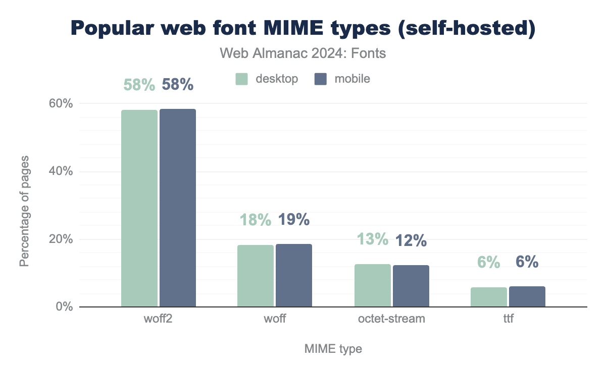
While these are useful insights into the global state of web font formats, the global data paints a slightly-too-positive picture of trends because the market is skewed so heavily toward web services like Google Fonts, Font Awesome, and Adobe Fonts. These services have a vested interest in reducing the amount of data they serve, and because of their large footprint on the web, the decisions made by these few major players will tend to skew the overall picture. To understand decisions made by web developers, it’s much more interesting to exclude web services and look at the dataset for self-hosted fonts alone.
application/octet-stream MIME type is used on 13% for desktop and 12% of mobile. Finally, TrueType (TTF) is used at 6% for both desktop and mobile pages.Luckily, WOFF2 also takes the lead here, but surprisingly, the older WOFF format is still very popular on websites that self-host their fonts. In general, uncompressed font formats still make up a significant portion of self-hosted fonts. Developers who are still holding out have a lot to gain by switching to WOFF2, and making the switch should be viewed as low-hanging fruit. There are many online and command line tools to convert OTF or TTF files to WOFF2. It’s also possible to decompress WOFF and recompress the files as WOFF2 (though one must be cautious that conversion is in compliance with a font’s license).
File sizes
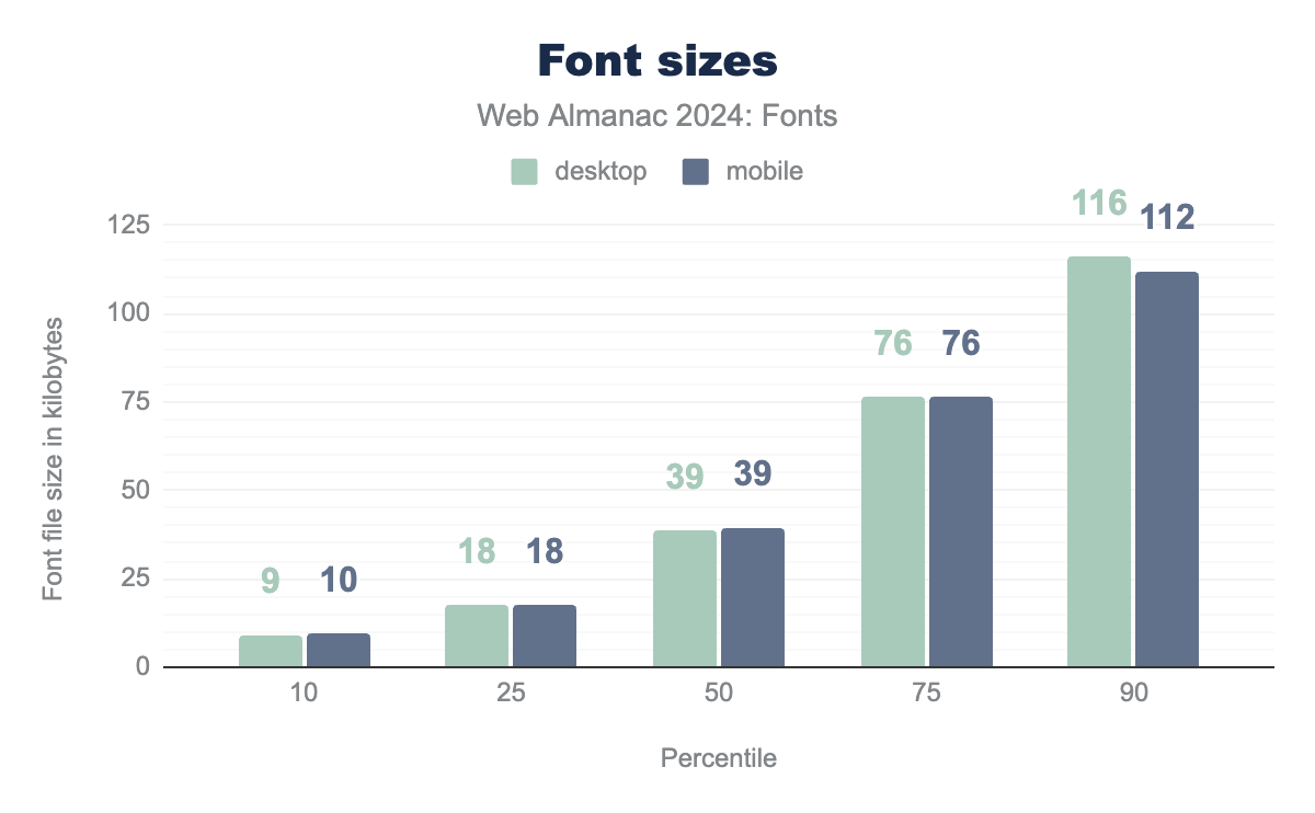
The average size of web fonts has risen for most websites on desktop and mobile since 2022. This general trend is especially striking in the 50th, 75th, and 90th percentiles, where the average size across desktop and mobile websites shows major increases. Delivering these larger fonts in compressed format offers a valuable means of keeping manageable load times.
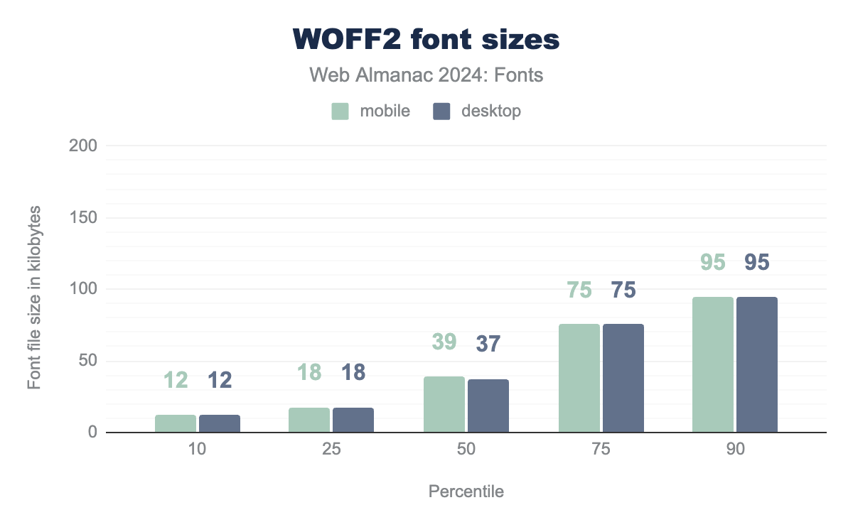
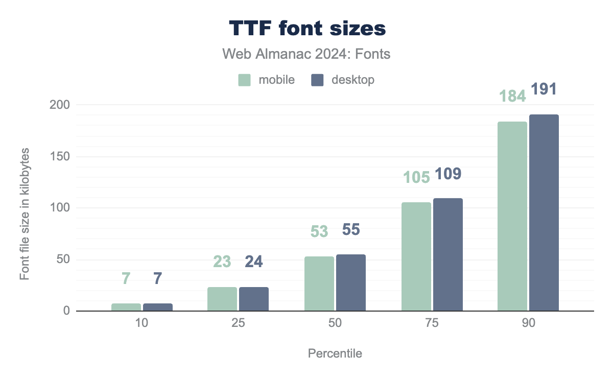
By observing font formats individually, we can compare the relative impact of compression by looking at WOFF2 file sizes and plain TTF file sizes side by side. The size of a font file depends a lot on its format. The more highly compressed formats like WOFF and WOFF2 should have smaller file sizes, on average, than non-compressed font formats like plain TrueType and OpenType files (which you shouldn’t be using). The steady increase in WOFF2 usage is good news: with average font file size going up, WOFF2 can help manage the performance impact of these larger files.
The difference in file size for WOFF2 compared to TTF is greatest in the higher percentiles, representing the largest files of each type used on the web this year. At the 90th percentile, the TTF files used this year were roughly twice as large as WOFF2 files. Moving toward lower percentiles, this difference converges and finally reverses. At the 10th percentile, representing the smallest bracket of fonts found for each format, WOFF2 files are nearly twice the size of TTF files. This relationship in file sizes is most likely due to the overhead of the WOFF2 compression dictionary. Because your choice of font format can have such a dramatic effect on website performance, we repeat our call to action from 2022 and urge developers to use WOFF2 fonts.
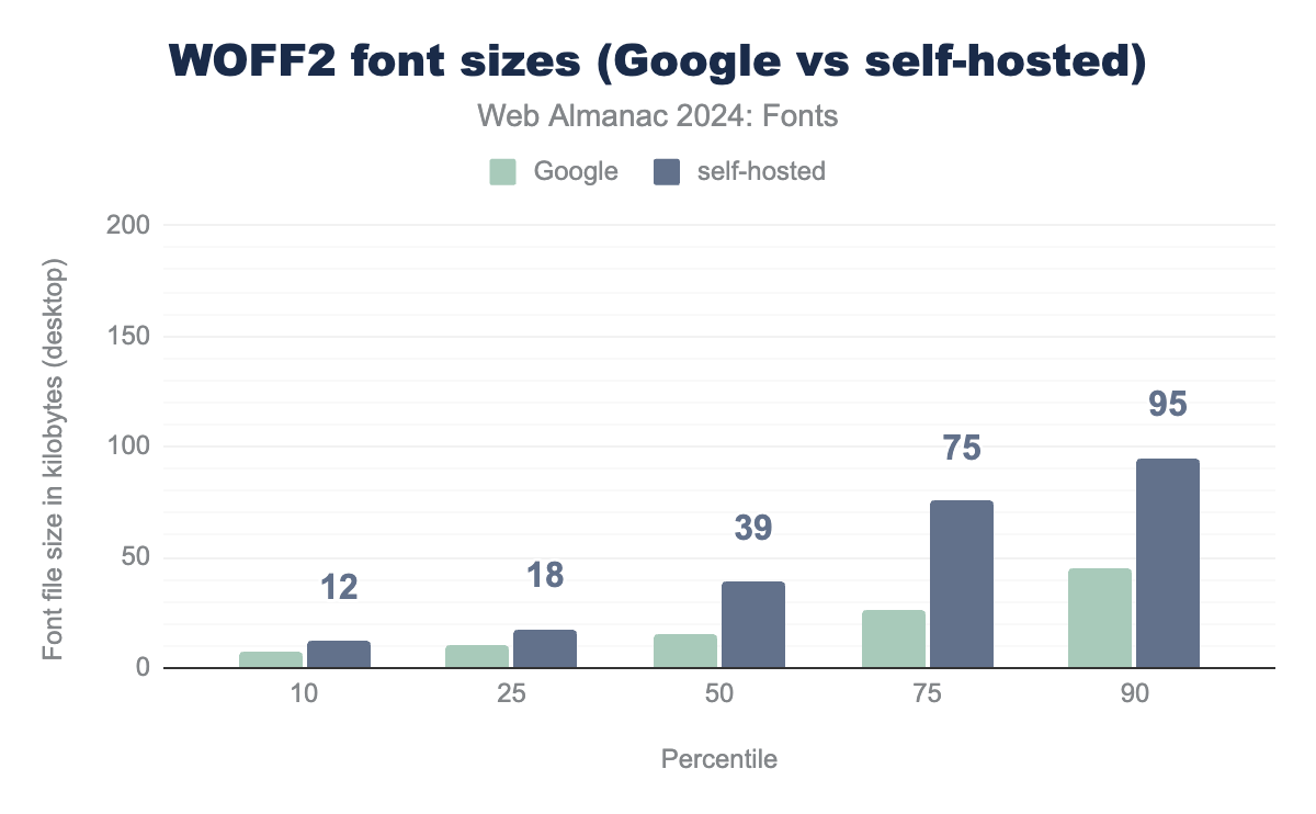
Looking at the difference between WOFF2 file sizes for self-hosted sites versus Google Fonts (we chose Google for the comparison as they are the most performance focused service), the difference is staggering. In the 50th percentile and up, self-hosted WOFF2 file sizes are on average double that of what is served by Google Fonts.
We can only speculate on the reasons for this discrepancy. Some of it can be explained by differences in the set of fonts used by each of these groups. But as we’ll see later, a lot of self-hosted fonts are downloaded from Google Fonts and should have similar compression rates. Another explanation could be that a lot of Google Fonts users are using the subsetting offered by Google, while the self-hosted users are serving the entire font. Whatever causes this difference, it’ll be interesting to explore in future editions of the almanac.
Digging down even further, we can take a look at the individual table sizes used in fonts. As noted in 2022, a reasonable approach to measuring the impact of a particular OpenType table on overall file size is to multiply its median size by the number of fonts that include that table.
| OpenType table | desktop | mobile |
|---|---|---|
| glyf | 77% | 78% |
| GPOS | 6% | 6% |
| CFF | 5% | 4% |
| hmtx | 3% | 3% |
| post | 2% | 2% |
| name | 1% | 1% |
| cmap | 1% | 1% |
| gvar | 1% | 1% |
| fpgm | 1% | 1% |
| GSUB | 1% | 1% |
Because it contains the actual glyph outlines, glyf remains the table with the highest impact. However, there have been some noticeable changes in the order of the tables compared to 2022. GPOS (Glyph Positioning, which controls the placement of glyphs) has overtaken CFF (Compact Font Format, which is an alternative to glyf). This trend is most likely due to declining usage of CFF fonts (on which more in the next section). It’s also good to see that the kern table has dropped out of the top 10 as it is replaced by the more modern kerning implementation in the GPOS table.
The post and name tables are still in the top 10, which (as pointed out in the 2022 chapter) means the fonts have not been properly optimized. We would still love to see a tool that helps with this optimization process, as post and name mostly contain unnecessary data for web fonts (unless a web app allows users to add web fonts to its font menu).
Outline formats
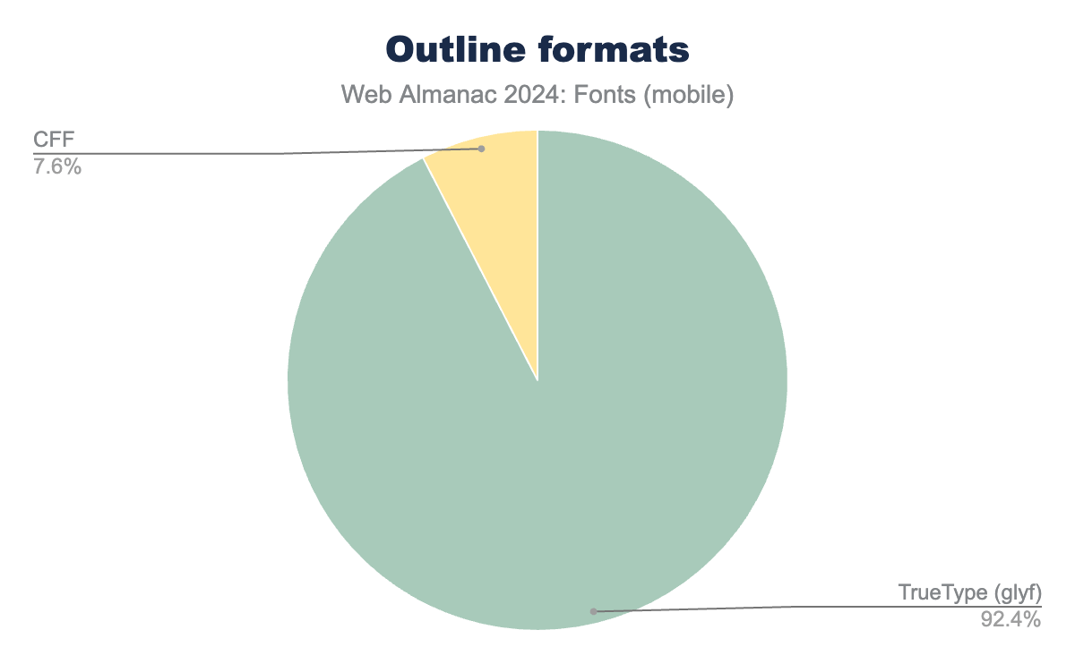
The most common outline format continues to be TrueType (glyf), which accounted for 92% of both desktop and mobile fonts. This number has slowly ticked upward in recent years, suggesting that the glyf format has a solid hold over its nearest competitor, CFF, which held a declining share of 8%. Compared to 2022, the slight increase in glyf usage (2 percentage points for desktop, 1 point for mobile) corresponds almost exactly to the drop in CFF outlines. Other outline formats, such as SVG and CFF2, registered a fairly minuscule presence well under 1% of web fonts (not pictured).
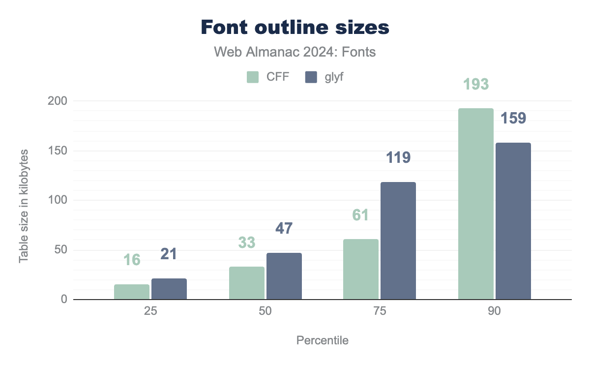
glyf (TrueType) outline format, while only about 7.6% use the Compact Font Format (CFF).There has also been a small increase in font outline sizes, consistent with general increases in the size of font files. Interestingly, this increase seems to disproportionately affect CFF. We think this is caused by the decrease in overall CFF usage combined with the fact that the most used CFF-based fonts are CJK fonts, which tend to be on the larger side.
CFF is at 16 KB and glyf at 21 KB, at the 50th percentile CFF is at 33 KB and glyf at 47 KB, at the 75th percentile CFF is at 61 KB and glyf at 119 KB. Finally, at the 90th percentile CFF is at 193 KB and glyf at 159 KB.CFF and glyf.
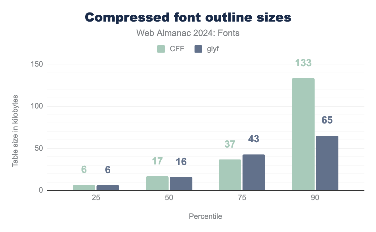
As noted in 2022, it is not a good idea to take raw table size comparisons at face value. Web fonts should always be compressed, so a fairer comparison would be to look at the compressed table sizes. For this we used the same approach as in 2022, by applying the median compression rates in the WOFF2 evaluation report. Approximating compression paints a very clear picture: large fonts are better served using glyf (TrueType) outlines rather than CFF.
CFF and glyf are both at 6 KB, at the 50th percentile CFF is at 17 KB and glyf at 16 KB, at the 75th percentile CFF is at 37 KB and glyf at 43 KB. Finally, at the 90th percentile CFF is at 133 KB and glyf at 65 KB.CFF and glyf.
There are some efforts underway to add cubic Bézier curves to glyf, so it will be interesting to see whether the difference in size between glyf and CFF is due to the different curve type (cubic Bézier curves have more control points), or inefficiencies in the CFF format. Our money is on a combination of both factors, but time will tell.
Resource hints
To decrease page loading times, web developers can instruct browsers to load essential resources, such as web fonts, before they’re actually needed. This is done using resource hints, which guide the browser to load or render specific resources ahead of schedule. By leveraging resource hints, you can inform the browser to download and load critical fonts even if they haven’t been explicitly referenced in the code yet, thereby improving page performance. The browser can then display content faster and provide a smoother user experience.
There are three types of resource hints relevant for web fonts, each with its own level of impact. The preload hint is the most impactful type of resource hint, as it directly instructs the browser to load a resource (such as a web font) before it’s actually needed. The preconnect hint tells the browser to establish a connection with a server, preparing it for future requests, including font loading, and this has a medium impact on performance. The dns-prefetch hint signals the browser to prefetch DNS information for a specific domain, but doesn’t initiate a connection nor font loading. This has a relatively low impact on performance.
We made some changes in the data gathered on resource hints for this year’s Almanac, as we realized the 2022 analysis was capturing too much. We are now measuring two different aspects. For dns-prefetch and preconnect we are only measuring resource hint usage against known font services (the same ones used throughout the chapter). This excludes pre-connecting and DNS-prefetching to one’s own web host or CDN that self-hosts fonts, so actual usage is probably much higher. For preload, we are measuring when the hint has an as attribute with value font.
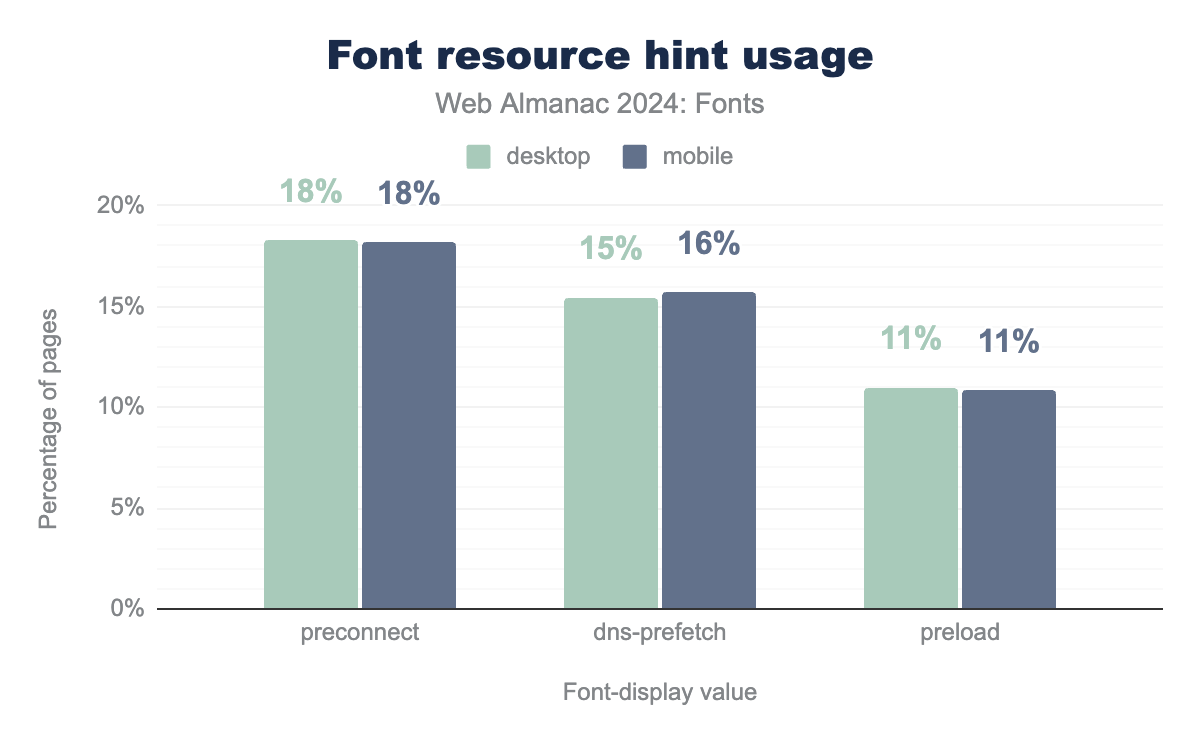
preconnect hint is used at 18% of pages for both mobile and desktop. The dns-prefetch resource hint is used on 15% of pages for desktop and 16% of pages for mobile. The preload resource hint is used on 11% of pages for both desktop and mobile.In this year’s data, preconnect and dns-prefetch are used to speed up connecting to web font services at 18% and 16% respectively. The most effective resource hint, preload,is only used on 11% of pages. We’d like to see this number go up by a lot, as using the preload resource hint is the single most effective thing you can do to speed up your font loading! With that said, it is not always possible to use preload, for example if you use a service that does not provide stable font URLs. In those cases, it is best to use preconnect or dns-prefetch hints.
Unfortunately, the usage of resource hints for fonts hasn’t changed much in the last two years either, so this is an underused (but very effective!) feature that we would love to see adopted more broadly by web developers.
Font display
The font-display descriptor for the @font-face CSS directive allows developers to choose when and how their website renders its text depending on the time it takes to fetch its fonts. Depending on the value of the font-display descriptor, the browser will either wait until web fonts are downloaded or swap to a fallback font after timing out.
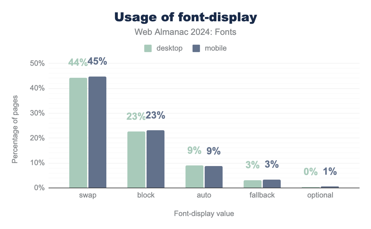
font-display values in CSS. The swap value is used at 44% of desktop pages and 45% of mobile pages. The block value is used on 23% of pages for both desktop and mobile. The auto value is used on 9% of pages for both desktop and mobile. The fallback value is used on 3% of pages for both desktop and mobile. Finally, the optional value is used on 0% of pages for desktop and 1% for mobile.font-display values.
The use of swap for font-display has grown considerably in recent years, from 11% in 2020, to 30% in 2022, to about 45% on desktop and mobile this year. This is a good sign because swap offers earlier text rendering. The only tradeoff is a potential layout shift when the web font loads. This is preferable for users on slower connections as they’ll see content much earlier, while users on faster connections might not even notice the layout shift (which can be further reduced using resource hints and font metrics overrides).
Meanwhile, the bad news is that this year’s crawl also shows increasing use of block for font-display, which literally blocks text from rendering until the intended font is available or the timeout period has expired. While there are legitimate use cases for block, most websites should use swap, fallback, or optional. The rising use of block (24% desktop, 23% mobile) continues a trend from 2022, when it overtook auto as the second most common value chosen when using the font-display descriptor. The auto value itself is now used on 9% of websites, while fallback is used on 3%. The optional and normal values were used with font-display on less than 1% of websites.
We think the rise of block usage is concerning so we decided to investigate a bit further. Looking at the top 10 @font-face rules using font-display: block reveals an interesting discovery: all of the top 10 fonts are icon fonts!
| Family | desktop | mobile |
|---|---|---|
| Font Awesome | 15.5% | 16.1% |
| ETmodules | 1.7% | 1.7% |
| TablePress | 1.1% | 1.1% |
| icomoon | 1.0% | 1.1% |
| vcpb-plugin-icons | 0.8% | 0.7% |
| fl-icons | 0.6% | 0.6% |
| dm-social-font | 0.5% | 0.5% |
| dm-font | 0.5% | 0.5% |
| dm-social-icons | 0% | 0.5% |
| dm-common-icons | 0% | 0.5% |
font-display: block.
Font Awesome leads at a whopping 15% usage, while other icon fonts make up the remainder of the top 10. This makes sense, as icon fonts are usually encoded in the Private Use Area (or worse, override ASCII), so showing a fallback while an icon font is loading does not provide a good user experience. This is one of the major downsides of using fonts to display icons, but it does explain the rising use of font-display: block. We remain highly skeptical of the usage of icon fonts and feel that in most cases it will be better to provide icons as (embedded) SVG files.
Emoji fonts do not suffer from this problem as emoji are encoded in Unicode so they’ll fall back to a system font properly when the font loading is delayed or fails. So it is safe to use emoji fonts on the web (using font-display: swap of course).
Families and foundries
Which font families were most popular this year, and which foundries made them? Taking a look at the top 20 there are few surprises in the first ten entries compared to 2022. Roboto still leads the pack, with a small increase in use*. Font Awesome use has remained fairly stable, and so has Noto usage (unlike 2022, Noto is now split into script specific items). The only surprise is the decline of Lato, which has been overtaken by Poppins and Montserrat.
Looking at the remainder of the top 20, Proxima Nova usage has increased slightly to reach about 1% of websites. As the only commercial, non-icon font in the top 20, this level of popularity is extremely impressive. Like in 2022, icon fonts make up about 18% of web fonts in 2024. The meteoric rise of Inter should also not go unnoticed, as it also stands around 1%. Due to its prominence in frameworks and libraries, we expect Inter to rise into the top 10 within the next few years.
| Family | desktop | mobile |
|---|---|---|
| Roboto | 15.2% | 2.7% |
| Font Awesome | 10.4% | 12.4% |
| Noto Sans JP | 6.1% | 5.7% |
| Open Sans | 5.6% | 6.8% |
| Poppins | 4.7% | 5.8% |
| Montserrat | 3.3% | 3.9% |
| Lato | 3.2% | 3.8% |
| Noto Sans KR | 1.6% | 0.8% |
| Source Sans Pro | 1.4% | 1.7% |
| Noto Serif JP | 1.2% | 1.4% |
| Proxima Nova | 1.2% | 1.2% |
| Raleway | 1.2% | 1.4% |
| Inter | 1.0% | 1.1% |
| icomoon | 0.9% | 1.1% |
| Oswald | 0.7% | 0.8% |
| Ubuntu | 0.6% | 0.8% |
| eicons | 0.6% | 0.8% |
| Barlow | 0.6% | 0.7% |
| Rubik | 0.6% | 0.6% |
| NanumGothic | 0.6% | 0.3% |
Looking at foundries, the main surprise is the rise of Adobe Fonts as a foundry. There are two reasons for this change. This year we combined the two vendor identifiers that Adobe uses for their commercial and open source fonts. The other reason is that the Noto Sans CJK (Chinese, Japanese, Korean) fonts were a collaboration between Google, Adobe, and several other foundries. In 2022 these fonts were served with a Google vendor identifier and thus attributed to Google, but these fonts are now served with an Adobe vendor identifier and thus the very popular Noto CJK superfamily is attributed to Adobe.
| Foundry | desktop | mobile |
|---|---|---|
| Google Fonts | 34% | 19% |
| Adobe Fonts | 14% | 15% |
| Font Awesome | 14% | 19% |
| Indian Type Foundry | 7% | 10% |
| Łukasz Dziedzic | 5% | 6% |
| Julieta Ulanovsky | 5% | 6% |
| Mark Simonson Studio | 2% | 2% |
| Ascender Corporation | 2% | 2% |
| Paratype | 2% | 2% |
| Linotype | 1% | 2% |
For this year, we thought it would also be interesting to take a look at the top 10 self-hosted fonts and the top 10 fonts for Google Fonts and Adobe Fonts (we excluded Font Awesome as they only serve a single font).
The top 10 for self-hosted fonts contains very few surprises. As we saw earlier, a lot of people switched from using hosted Google Fonts to self-hosting files from the Google Fonts library, and this is reflected in this list as well. Apart from Font Awesome, icomoon, and eicons, the most popular self-hosted families are all open source fonts.
| Rank | Family |
|---|---|
| 1 | Font Awesome |
| 2 | Open Sans |
| 3 | Roboto |
| 4 | Montserrat |
| 5 | Poppins |
| 6 | icomoon |
| 7 | Lato |
| 8 | eicons |
| 9 | Inter |
| 10 | Source Sans Pro |
There is a close match between the top 10 most popular families from Google Fonts and the global top list. It should be noted that the Google Fonts top 10 contains quite a few CJK families (Noto Sans JP, Noto Sans KR, and Noto Serif JP) that are not present in the self-hosted list. It’s great that CJK languages are seeing more use and that Google is actively supporting the development of global scripts (more on that later in the Writing systems section).
| Rank | Family |
|---|---|
| 1 | Roboto |
| 2 | Noto Sans JP |
| 3 | Open Sans |
| 4 | Poppins |
| 5 | Lato |
| 6 | Montserrat |
| 7 | Noto Sans KR |
| 8 | Noto Serif JP |
| 9 | Source Sans Pro |
| 10 | Raleway |
The Adobe Fonts top 10 list is quite distinct from the other top lists because it contains primarily commercial fonts that Adobe licenses from foundries. As such, it offers an interesting insight into the world of commercial type (well, at least those foundries that licensed their fonts to Adobe). The most popular font at Adobe Fonts is Proxima Nova, which is no surprise as it also holds a high position on the global list. It’s noteworthy that Adobe themselves only have two of their own fonts on the top list, with Adobe Garamond Pro at 4th and Acumin Pro at 7th place. The rest of the Adobe top 10 list is dominated by other foundries like Mark Simonson Studio (Proxima Nova), Paratype (Futura PT), HvD fonts (Brandon Grotesque), MoTyFo (Sofia Pro), Dalton Maag (Aktiv Grotesk), EuropaType (Europa), The Freight Collection (Freight Sans), and exljbris (Museo Sans).
| Rank | Family |
|---|---|
| 1 | Proxima Nova |
| 2 | Futura PT Web |
| 3 | Brandon Grotesque |
| 4 | Adobe Garamond Pro |
| 5 | Sofia Pro |
| 6 | Aktiv Grotesk |
| 7 | Acumin Pro |
| 8 | Europa |
| 9 | FreightSans Pro |
| 10 | Museo Sans |
As noted, there has been an uptick in the support of various global scripts over the last two years, so let’s take a look at that next!
Writing systems
There are thousands of languages in the world, and these languages are represented in at least 150 distinct character sets, known as writing systems or simply scripts. This presents type designers and developers with the daunting task of making and supporting fonts for so many different scripts with their own unique features, idiosyncrasies, and technical demands. Among the world’s many character sets, the Latin script holds a position of somewhat dubious privilege as the longtime epicenter of digital type design. Because the Latin alphabet is the basis of digital character encodings and also the most commonly supported character set, other scripts tend to be commonly lumped into the unfortunate catch-all category of ’non-Latin’ fonts. This term is very Eurocentric and should no longer be used. While this change of terminology may not happen any time soon, the overall balance has begun to shift in recent years as the overall level of support for various scripts has expanded along with access to free, high-quality web fonts handling these character sets.
The trend toward increasing support for multi-script fonts can be seen directly in this year’s data. The overall proportion of fonts supporting Latin stands at roughly 46% this year, declining by 8% for desktop and mobile websites since 2022. Meanwhile, there has been a corresponding increase in the number of fonts supporting multi-script text, amounting to many-fold increases essentially across the board. In other words, it’s not that fewer fonts are being made in languages like English, French, Swedish, and Polish that use the Latin script, but rather more fonts are now available to support scripts like Arabic, Cyrillic, Hangul, Devanagari, and many others that now represent a growing share of text across the web.
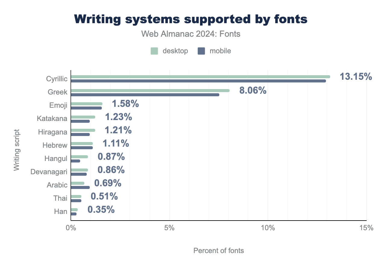
To give a sense of where these increases have been most consequential, it helps to break down the level of script support in fonts by their overall presence. Cyrillic is the second most common script on the web, and rising. This year’s crawl found fonts supporting Cyrillic on 13% of websites, a rise of about seven percentage points from 2022. Meanwhile, Greek character support has also risen about five percentage points to total about 8% of all websites.
In terms of the world’s most widely used fonts, notable increases also registered in languages of the Indian subcontinent, East Asia, and the Middle East. Support for the Devanagari script, which is used for languages spoken by roughly 700 million people in Northern India and Nepal, has increased roughly three-fold. Likewise, support for Arabic has tripled, which is good news for over 400 million native speakers. Meanwhile, Thai support has nearly tripled for its 25-30 million speakers.
Use of web fonts, however, remains near-zero for Chinese. This is most likely a matter of file size: these fonts are simply too large to serve as a simple WOFF2 file. Even compressed, a Chinese language font file will be several megabytes, which is far too large.
A recent technical development called Incremental Font Transfer (IFT) offers a promising solution to this problem. Languages like Chinese usually have an extraordinarily large possible character set, but not every document will use every character. The IFT specification attempts to solve this problem by splitting a font file into “chunks” of characters that are loaded on demand when needed. It essentially streams the required portions of a large font to the browser depending on the content of a particular page. We look forward to seeing more “large” scripts use IFT to load web fonts efficiently.
In terms of the global scripts that are benefiting most from recent increases in web font support, some of the most dramatic numerical increases have registered for smaller language groups (found in less than 1% of fonts on this year’s crawl). Armenian support is up by roughly 500%, Cherokee by nearly 400%, and Tamil by about 300%. Writing systems found on fewer than 10,000 websites show even more dramatic increases from 2022. The Tibetan script showed a sixteen-fold increase this year, Syriac nine-fold, Samaritan roughly thirty-fold, and Balinese by about seven-fold. In other words, it’s not just the writing systems for huge populations like Hindi and Arabic that have benefited from the growing diversity of scripts supported by new type designs.
So, which font families are most used for different scripts? The expansion of certain families into “superfamilies” supporting several different scripts has made this question somewhat more complicated than it once was. Families like Roboto, Open Sans, Montserrat, and Lato are not only among the most popular Latin fonts, but also register on the top list for Cyrillic and Greek. So just because it is included in the top list for a certain script doesn’t necessarily mean it is used for that script, it just means it supports that script.
Noto is an outlier in this regard. Noto’s goal is to offer a single superfamily supporting every script encoded in the Unicode standard, which includes both living and extinct scripts. While Noto does not make the top 10 for Latin font families, where the competition is most intense, it is near the top for a large number of other scripts, particularly in East Asian countries using Noto’s CJK variants. Overall, Noto Sans and Serif together reached the top 10 for over 30 different scripts.
Another complexity arises when gathering data to measure “support” of a script. Let’s say a given script, as defined by Unicode, has 100 characters. If a font includes 50 of those characters, does it support the script? Depending on your needs, the answer might be different. For the purpose of this chapter we have (rather arbitrarily) defined “support” as having more than 5% of that script’s characters. That’s a low threshold. The reason for this low threshold is that most scripts are complex, and very few fonts have 100% coverage of any given script. This low-threshold measurement is meant to capture the intent to support a script, and we feel that covering even 5% of a given script shows that the type designer did intend to support it. Needless to say, this approach will generate some false positives, and so we must take these results with a grain of salt.
With those caveats out of the way, let’s take a look at the top lists for Arabic, Devanagari, Korean, Japanese, and Chinese. While there is some overlap between these scripts, there is usually less overlap with popular Latin fonts (apart from the exceptions noted above).
The top 10 list for Arabic contains primarily fonts that were either designed explicitly for the Arabic script (for example, Cairo, Tajawal, and Almarai), or fonts created for other scripts that were extended to support Arabic (Droid Arabic, Segoe UI, Arial, DIN Next).
| Rank | Family |
|---|---|
| 1 | Cairo |
| 2 | Tajawal |
| 3 | Rubik |
| 4 | Almarai |
| 5 | Droid Arabic Kufi |
| 6 | Segoe UI |
| 7 | Material Design Icons |
| 8 | Arial |
| 9 | IRANSansWeb |
| 10 | DIN Next LT Arabic |
The one oddity in the list of top Arabic web fonts is the inclusion of Material Design Icons. One possible reason for this font’s apparent popularity in Arabic is that it maps some icons to code points used in Arabic’s Unicode range, but we were unable to verify this conjecture through the actual crawl data. Regardless, what stands out most in the top 10 list for Arabic fonts is the variety of styles represented, which is great news because Arabic is a script with many distinctly expressive forms of writing.
Like Arabic, the top 10 Devanagari family list contains a mix of fonts specifically designed for the Devanagari script and existing families extended to support Devanagari. The top font is Poppins, followed by Noto Sans. We’re not sure if these fonts are popular because they are used for Devanagari or if they’re in the list just because they’re popular and happen to support Devanagari. However, there’s no question about Hind, Mukta, Rajdhani, and Baloo 2, which are fonts explicitly designed for Devanagari.
| Rank | Family |
|---|---|
| 1 | Poppins |
| 2 | Noto Sans |
| 3 | Hind |
| 4 | Mukta |
| 5 | Segoe UI |
| 6 | Rajdhani |
| 7 | Teko |
| 8 | FiraGO |
| 9 | SVN-Poppins |
| 10 | Baloo 2 |
For Korean, Pretendard is listed as the most commonly used font, with various Noto versions in the top 4 (adding up the totals for the various Noto versions would put it in the number one spot). And while open-source fonts have a strong presence in many writing systems, Korea had an especially strong showing: their ten most popular fonts are all open source!
| Rank | Family |
|---|---|
| 1 | Pretendard |
| 2 | Noto Sans KR |
| 3 | NotoKR |
| 4 | Noto Sans CJK KR |
| 5 | 나눔고딕 |
| 6 | Spoqa Han Sans Neo |
| 7 | SpoqaHanSans |
| 8 | NanumGothic |
| 9 | 나눔스퀘어 |
| 10 | SUIT |
The top 10 Japanese font list is surprisingly similar to the Korean list. Noto and Pretendard take the top spots. It’s also interesting to see three Korean fonts in the Japanese top 10 list: Noto Sans KR, 나눔고딕 (Nanum Gothic), and 나눔스퀘어 (Nanum Square). While these are Korean fonts, they also have support for a significant number of Japanese characters and, by our standard of measurement, have made the list. Having so much crossover with the Korean top 10 list, it’s fitting that the Japanese list also consists entirely of open-source fonts. Nice!
| Rank | Family |
|---|---|
| 1 | Noto Sans JP |
| 2 | Pretendard |
| 3 | Noto Serif JP |
| 4 | Noto Sans TC |
| 5 | Noto Sans KR |
| 6 | 나눔고딕 |
| 7 | Rounded Mplus 1c |
| 8 | Zen Kaku Gothic New |
| 9 | 나눔스퀘어 |
| 10 | Noto Sans CJK JP |
Unfortunately, the data for top Chinese language fonts seems to be unreliable. The Chinese list only contains a single (Traditional) Chinese font. The rest of the families are all false positives, most likely due to the inclusion of Kanji in Japanese and Korean fonts. Kanji characters are adapted from the Chinese writing system, and due to the Han unification in Unicode share the same code points as the Chinese writing systems.
| Rank | Family |
|---|---|
| 1 | Noto Sans JP |
| 2 | Noto Sans TC |
| 3 | 나눔스퀘어 |
| 4 | 나눔바른고딕 |
| 5 | 나눔고딕 |
| 6 | Noto Sans KR |
| 7 | 源ノ角ゴシック JP |
| 8 | 카카오OTF |
| 9 | Noto Sans CJK JP |
| 10 | Noto Serif JP |
It’s fair to say there are very few Chinese (Traditional or Simplified) fonts being used. The reason is that Chinese has a very large possible set of characters (100,000 or more) and as noted above, Chinese fonts are especially large. This is an area where the new Incremental Font Transfer standard will definitely help and we hope to see more Chinese fonts in the coming years (and many other writing systems!).
OpenType features
OpenType features are one of the “hidden” gems in the OpenType format. Some OpenType features are required to render text correctly (quite common in various scripts) while others offer different stylistic options (for example, alternate versions of the ampersand). Browsers (and other applications) often enable some features by default in case they are required to render the text correctly, while others work on an opt-in basis. It’s up to the type designer to decide what OpenType features they’ll include in their fonts, so not all fonts have the same features. In this section we’ll take a look at the prevalence of OpenType features and how they’re used most often on the web.
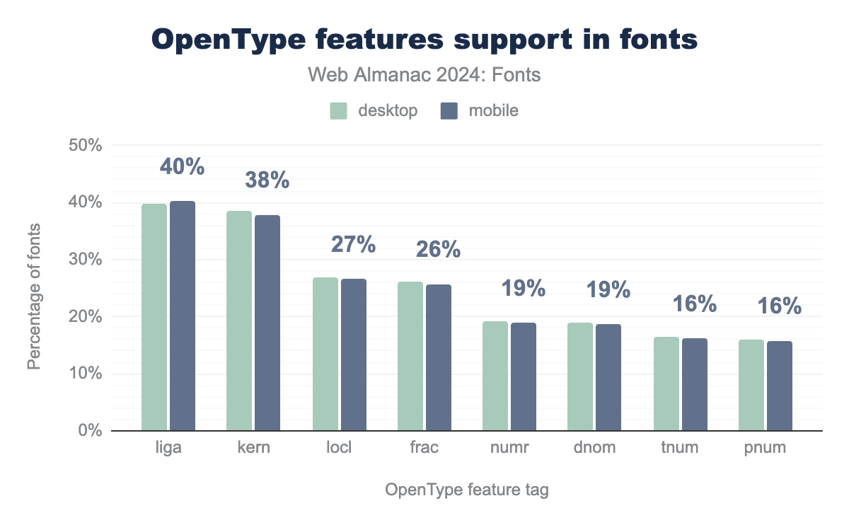
The prevalence of OpenType features has risen steadily in recent years, reaching about 55% of fonts. This marks an increase of about seven percentage points from 2022. Looking at individual features we see a similar increase. This year’s data shows ligature (liga) support up from 10% to 40%, kerning (kern) from 13% to 38%, localized forms (locl) from 10% to 27%, fractions (frac) from 8% to 26%, numerator (numr) from 7% to 19%, and denominator (dnom) from 7% to 19%.
Some of OpenType’s lesser used features have also shown increased uptake in font files used on the web this year versus 2022: access to alternates (aalt, which provides multiple versions of a given character), ordinals (ordn, which provides ordinal numbers), and character composition (ccmp, which provides special character combinations) have each risen from about 1% to 3% support in fonts used for both desktop and mobile websites.
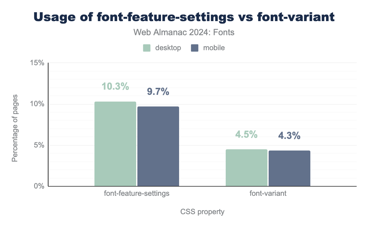
It’s great that fonts now support more features, but are they actually being used on websites? There are two different CSS properties available to control the behavior of fonts on a website: font-variant (and its various longhand properties that make it up) and the lower-level font-feature-settings. The font-variant property is used to select from a set of predefined font variants, such as small caps (small-caps). The font-feature-settings property should primarily be used when there is no font-variant equivalent.
font-feature-settings versus font-variant. The font-feature-settings property is used on 10.3% of desktop pages and 9.7% of mobile pages. In comparison, the font-variant property is used on 4.5% of desktop pages and 4.3% of mobile pages.font-feature-settings vs. font-variant.
Overall use of font-feature-settings is down by about 3 percentage points this year, from 13.3% to 10.3% on desktop and 12.6% to 9.7% on mobile websites. Meanwhile, use of font-variant has risen slightly, up from 3.9% to 4.5% on desktop and 3.5% to 4.3% on mobile websites. The most likely explanation is that more and more sites are using the newer (and better!) font-variant properties now that they are better supported. We hope to see this trend continue and font-variant eventually overtake font-feature-settings as the primary method to enable or disable OpenType features.
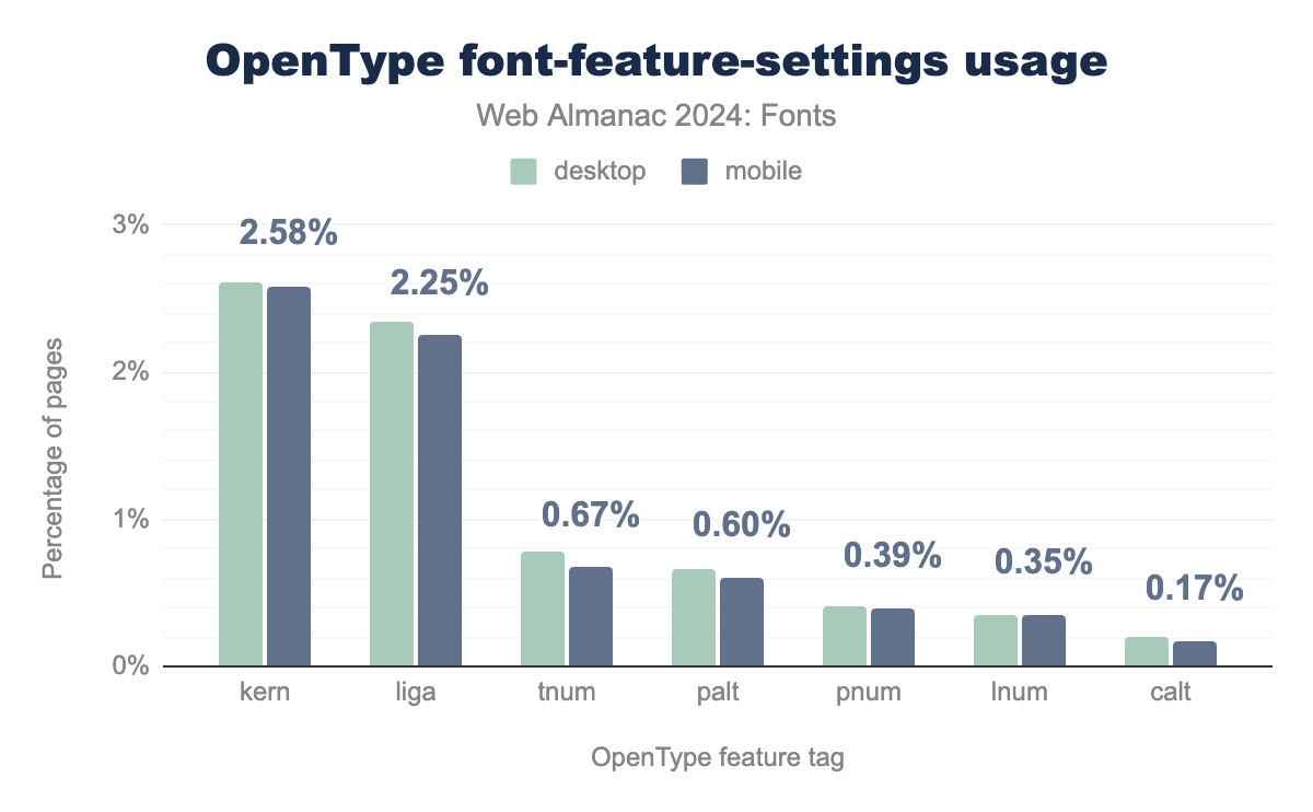
This point is driven home if we take a look at the features used in combination with the font-feature-settings property. All of the top features used with font-feature-settings have font-variant equivalents!
font-feature-settings values. The kern feature tag is at 2.6% of desktop and mobile pages, the liga feature tag is used on 2.3% of desktop pages and 2.2% of mobile pages, the tnum feature tag is used on 0.8% of desktop and 0.7% of mobile pages, the palt feature tag is used on 0.7% of desktop pages and 0.6% of mobile pages, the pnum feature tag is used on 0.41% of desktop pages and 0.39% of mobile pages, the lnum feature tag is used at 0.4% of mobile and 0.3% of desktop pages, and finally the calt feature tag is used at 0.2% of both desktop and mobile pages.font-feature-settings values.
Worse, many of the features are enabled by default in all browsers (kerning, common ligatures, and contextual alternates), so there is no need to include it in font-feature-settings. The only reason would be to disable these features, but that would be an odd thing to do. The good news is that the use of these features hasn’t really grown since 2022. Aside from custom and non-standard OpenType features, there isn’t any need to use font-feature-settings. You can achieve expert-level typesetting with the font-variant properties alone.
Variable fonts
Variable fonts represent a major advancement in expressive possibilities for digital typography. Officially known as OpenType Variable Fonts (OTVF), this format allows for the continuous variation of letterforms along a set of axes that fine-tune the font’s appearance. In other words, a single variable font file contains the full range of instances in a font family, as well as every granular adjustment and combination of adjustments the designer has defined along the specific axes included in the font. So, how does this work?
Whereas a conventional font family may offer bold or thin weights, a variable font allows the user to make the letters exactly as bold or thin as they like using the weight (wght) axis. Likewise, tweaking the width (wdth) axis can push or pull the letterform into condensed and extended variants. And because the size of type often calls for fine adjustments (such as x-height) that affect legibility and typographic color, variable fonts permit subtle refinement of optical size until the letters feel just right for the space they occupy and role they play.
In addition to giving designers and end-users more typographic expressiveness, variable fonts can also be a performance improvement if you use multiple styles from the same family. Internally variable fonts do not store outlines for each style, but a more efficient set of deltas and offsets, so a variable font can be many times smaller than their corresponding “static” styles.
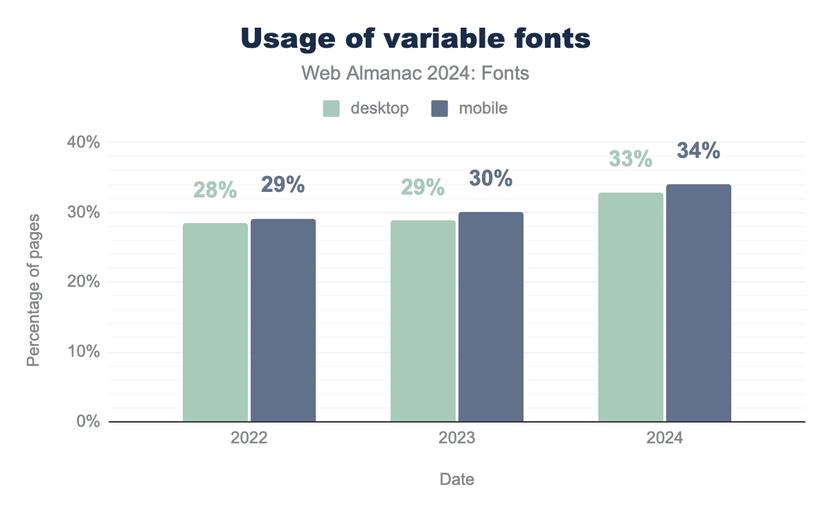
While variable fonts may sound like an exotic new technology, they are already supported by all major browsers and are used on an increasing number and share of websites across the web. In all, about 33% of websites are now using variable fonts. This marks a 4–5 percentage point increase in variable fonts across the web since 2022. Even so, the jump in variable font adoption was much larger between 2020 and 2022, when the presence of variable fonts nearly tripled. It will be interesting to continue tracking this rate of adoption in the coming years to see whether variable font use keeps growing or has begun to reach a plateau.
As an aside, usage doesn’t necessarily imply that a web developer chose to use a variable font over regular fonts. It’s very likely that quite a large percentage of web pages are using variable fonts because the service(s) they use chose to serve a variable font instead of regular font styles. Variable fonts usually contain instances that correspond to the individual styles of a font family, so a service can easily serve a variable font without web developers needing to modify their CSS styles. In fact, as noted in 2022, this is likely the cause of the sudden jump in variable font usage, as Google Fonts have been rapidly replacing their fonts with variable equivalents.
| Family | desktop | mobile |
|---|---|---|
| Noto Sans JP | 27% | 23% |
| Open Sans | 16% | 18% |
| Montserrat | 9% | 10% |
| Noto Sans KR | 7% | 4% |
| Noto Serif JP | 5% | 5% |
| Raleway | 3% | 4% |
| Inter | 3% | 3% |
| Noto Sans TC | 2% | 2% |
| Google Sans 18pt | 2% | 2% |
| Oswald | 2% | 2% |
The most popular variable font family this year was Noto Sans JP, which was found on about 27% of desktop websites and 23% of mobile websites. Its serif variety, Noto Serif JP, accounted for a further 5% of websites. The Hangul version of the same font, Noto Sans KR, also pulled a considerable share, found on a little over 7% of sites using variable fonts. And while Noto Sans TC (Traditional Chinese) trailed at just about 2% and Noto Serif TC had a little under half a percent, altogether Noto’s CJK offerings have an impressive footprint in the current adoption of variable fonts: about 42% of all the sites using variable fonts come from the Noto super family.
Open Sans was the second most popular variable font this year, being found on 16% of the websites using variable fonts. Montserrat was also found on 9%–10% of these websites. Given that both Open Sans and Montserrat support several of the most widely used scripts, including Greek and Cyrillic, the adaptability of these fonts to many use cases may help explain why these are some of the most used typefaces on the web, both as variable fonts and in general popularity.
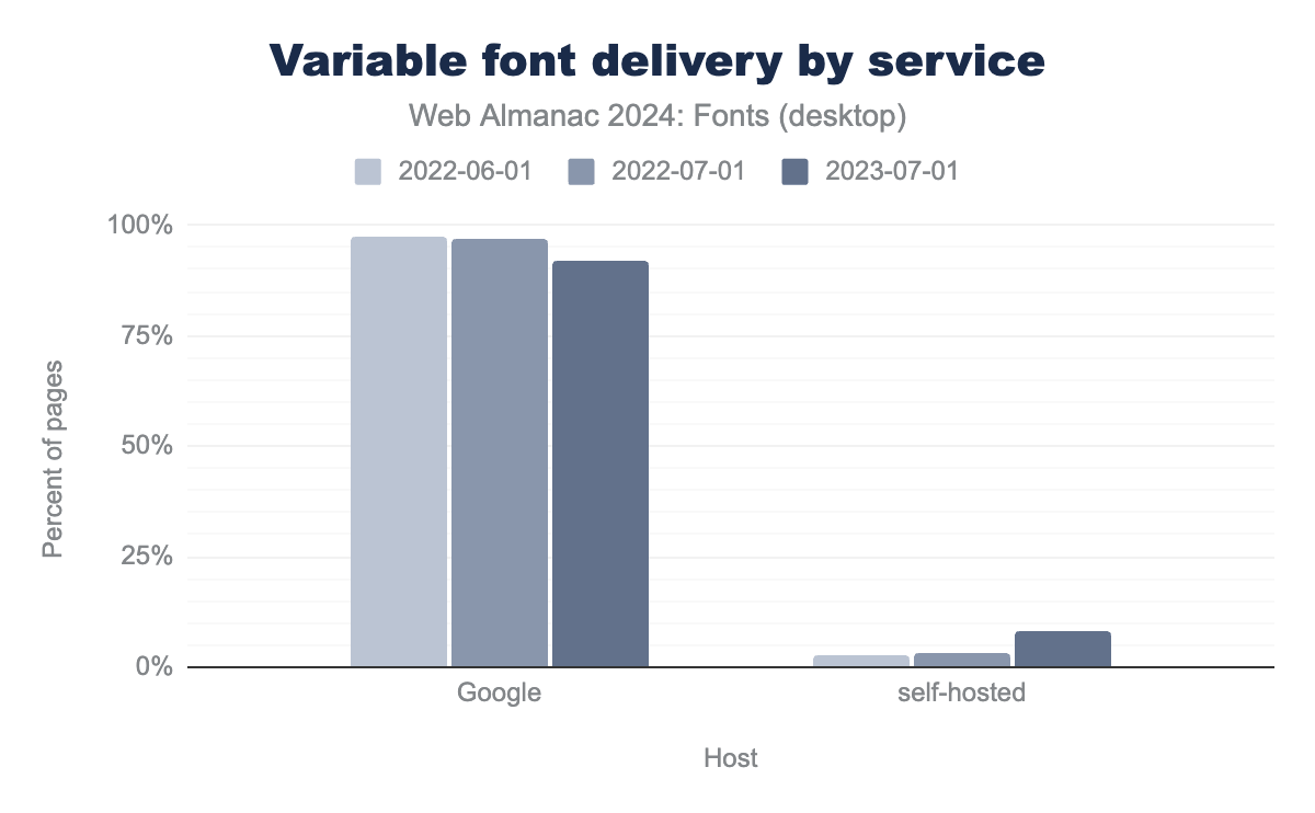
In terms of serving variable fonts, the vast majority of users choose between two options: Google and self-hosting. No other variable font source registered more than a fraction of a percent of the websites using this technology. And while Google Fonts serves the vast majority of variable fonts (92% desktop, 91% mobile), their share of this market has actually declined slightly in recent years. In 2022, Google Fonts served 97% of variable fonts for desktop and mobile, meaning their share is down about 5- 6% for desktop and mobile this year. This change corresponds to an equivalent rise in self-hosting as a website’s primary means of delivering variable fonts, amounting to 8% of sites crawled this year. Given that the share of non-Google variable fonts served in 2022 was just 3%, the corresponding rise of 5 percentage points in the share of websites that self-host variable fonts appears to reflect a direct drift in Google’s share of the variable font market. As noted above, other services like Adobe Fonts and Type Network served below 1% of the variable fonts found on the web this year.
Like color fonts, variable fonts also have two competing outline formats: the variable extensions of the glyf format and Compact Font Format 2 (CFF2). The main technical differences between the glyf format and CFF2 are the types of Bézier curves, more automated hinting, and (perhaps most importantly) the companies backing them. CFF2 is backed by Adobe and glyf by all other major contributors to the OpenType specification (Google, Microsoft, and Apple).
glyf outline format.
Unfortunately for Adobe, over 99% of the outlines used for variable fonts this year were in the glyf format. This overwhelming share for glyf outlines has been fairly consistent since 2022, dropping only 0.2 percentage points in the intervening two years. Since variable fonts introduction in 2016, CFF2 has only accumulated a miniscule 0.6% of usage. Usage of CFF2 just doesn’t seem to be picking up and it’s worth wondering if efforts are not better spent elsewhere.
For now, our recommendation is the same as in 2022: avoid CFF2 based variable fonts because browser and operating system support is still patchy (and there is a perfectly viable alternative in glyf).
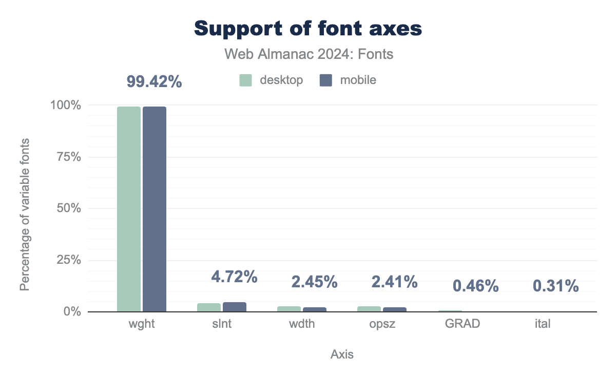
wght axis is supported by 99% of variable fonts on both mobile and desktop, the slnt axis is supported by 4.1% of fonts on desktop and 4.7% on mobile, the wdth axis is supported by 2.8% of fonts on desktop and 2.4% on mobile, the opsz axis is supported by 2.8% of fonts on desktop and 2.4% on mobile, the GRAD axis is supported by 0.6% of fonts on desktop and 0.5% on mobile, finally the ital axis is supported by 0.5% of fonts on desktop and 0.3% on mobile.In order to get a sense of how type designers are approaching the technical affordances of variable fonts, this is the first year the HTTP Almanac has gathered data about the axes supported in variable fonts used on the web. At over 99%, no other variable font axis comes close to the near ubiquity of wght. Trailing in the single digits were slant (slnt) at 5%, width (wdth) with 2%, optical size (opsz) with 2%, and the grade axis (GRAD) with about half a percent on desktop and mobile websites. It will be interesting in the coming years to continue tracking which axes are found in variable fonts on the web because this will signal trends in the design and availability of different affordances for using these fonts.
Beyond these trends in the design of variable fonts, how are these variable font axes actually being used on websites? For that, we turn to CSS data. There are generally two ways to use variable fonts in CSS, through the low-level font-variation-settings property or through the good old font-weight, font-stretch, and font-style properties that have been updated to support variable fonts.
It’s difficult to detect usage of variable fonts with the standard font properties in CSS because it requires reconstructing the CSS object model and tracing the usage of each family and associated property for each crawled site. Instead we take a look at the usage of font-variation-settings as an approximation (so take these results with a grain of salt).
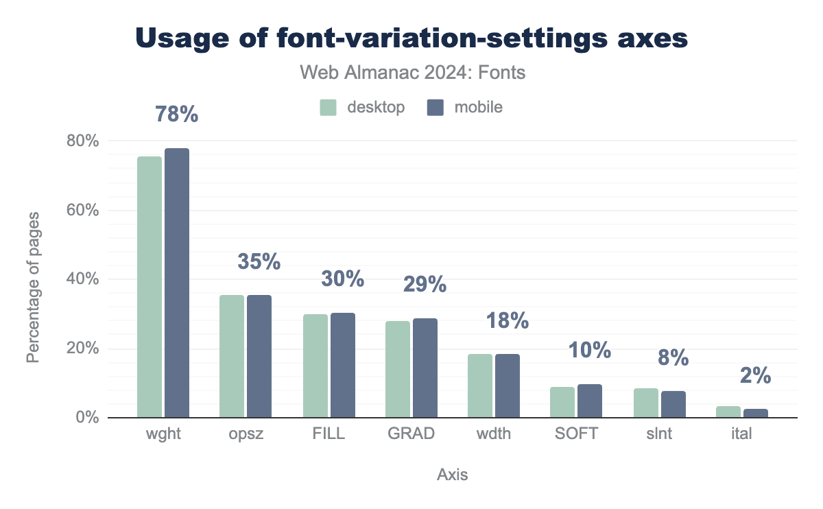
font-variation-settings axes. The wght axis is used on 75% of desktop pages and 78% of mobile pages, the opsz axis is used on 36% of desktop pages and 35% of mobile pages, the FILL axis is used on 30% of both desktop and mobile pages, the GRAD axis is used on 28% of desktop and 29% of mobile pages, the wdth axis is used on 18% of both mobile and desktop pages, the SOFT axis is used on 9% of desktop pages and 10% of mobile pages, the slnt axis is used on 9% of desktop sites and 8% of mobile pages, finally, the ital axis is used on 3% of desktop pages and 2% of mobile pages.font-variation-settings axes on pages using variable fonts.
The weight axis (wght) remains the most commonly used variable font axis by a wide margin. This axis, which affects the thinness or boldness of glyphs, was found on over 78% of sites using variable fonts this year. This is a slight decline from two years ago when the weight axis was used on 82% of sites. This decline is most likely due to an increase in people switching to the more common font-weight property for setting variable font weight axis values. At the same time, we see an increase in most other “standard” axes: opsz (optical size), wdth (width), slnt (slant), and ital (italic). While there are standard CSS properties for each of these axes, people are either not aware of how to use them or are following old out-dated advice. We hope to see the use of these values drop over the coming years as more people become accustomed to using variable fonts.
It’s also good to see growing use of several non-standard axes (FILL, GRAD or grade, and SOFT) which do not have CSS properties to control them. The only way to use these axes is through the font-variation-settings property. If their popularity grows, it would be a clear indicator to the authors of the CSS specification (and the OpenType standard) that these axes deserve their own CSS properties (if applicable; some axes are highly specific to a single typeface and can not be standardized).
Other interesting trends appear in the use of more niche variable font features this year. Variable font animation is on the rise but remains quite low. In 2022, a total of just 163 desktop and 147 mobile sites were found to use animation by the HTTP Archive crawl, but this year that figure grew to 35,000 desktop and 46,000 mobile sites. On the scale of the internet, this is still just a tiny fraction of websites (0.28%), but suggests that more advanced variable font features are slowly being adopted.
Color fonts
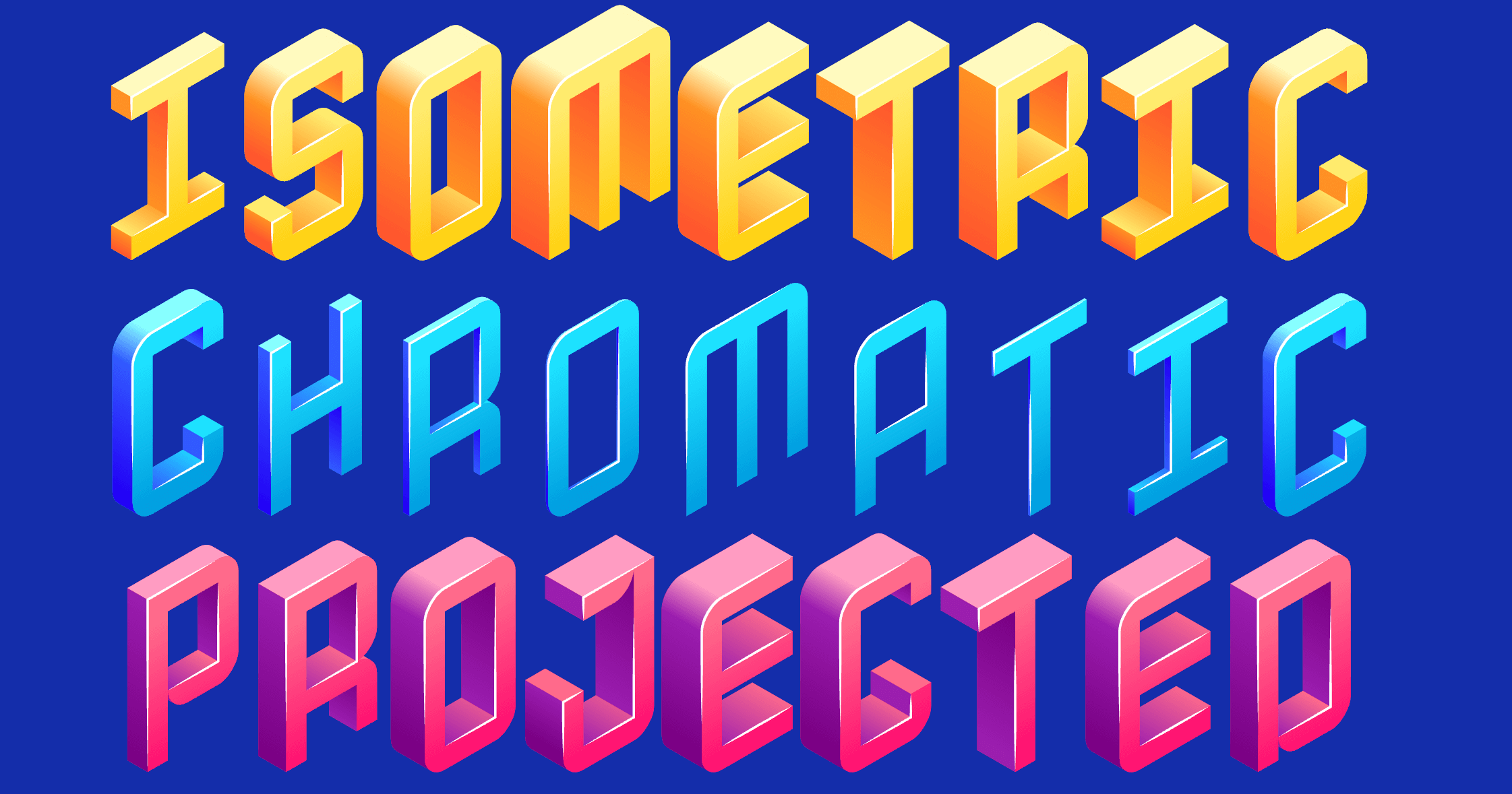
Color fonts, also known as chromatic fonts, offer the capacity to display letters in multiple colors or gradients.
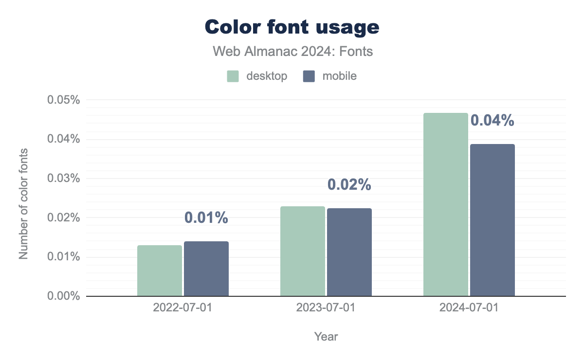
The number of websites using color fonts is still quite small on the scale of the entire internet, but has risen considerably over the last two years. The 2022 crawl found color fonts on between 1,000–1,400 websites, amounting to 0.02% of the total websites surveyed in that year’s data. This year’s crawl found color fonts on between 5,800–6,200 websites, amounting to 0.04%. Going by these figures, it would appear that the number of websites using color fonts has tripled over the last two years, despite remaining a small fraction of all websites.
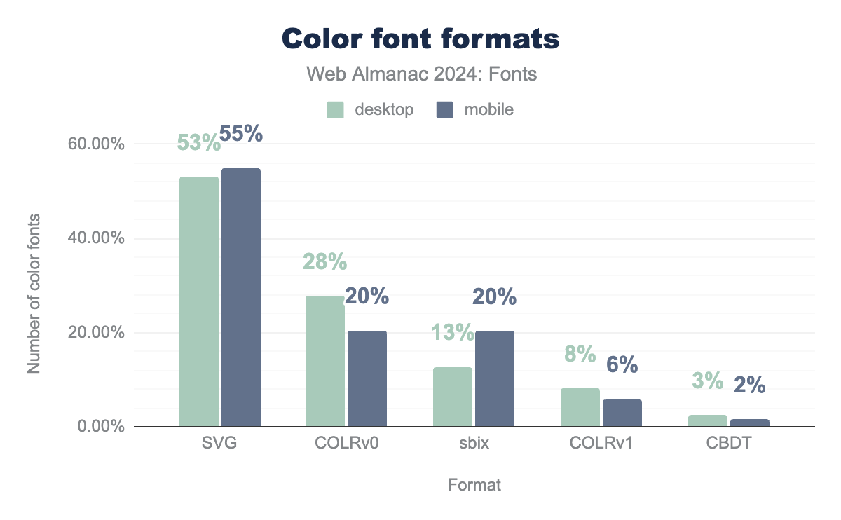
As a relatively new technology, color font use is split between several competing formats. The most popular color font formats, SVG (also called OT-SVG, not to be confused with SVG images) and COLR, are based on vector outlines. The difference between these two is that COLR reuses the outline format in the font itself (i.e. either glyf or CFF) while SVG embeds an SVG document for each glyph. COLR also provides integration with OpenType Variations, a feature that OT-SVG lacks. So it is possible to make a color variable font using COLR (see Nabla for a great example of a color variable font), but not with SVG. Still, SVG was the most commonly used format this year, being found on 53% of desktop sites with color fonts. The COLR format has two different versions: v0 and v1 (a newer version of COLR with more features, such as gradients). We’ll refer to these as COLRv0 and COLRv1 from here. COLRv0 fonts also carried a considerable share with 28% of desktop sites. In contrast, COLRv1 fonts were found on just 8% of desktop sites using color fonts.
SVG format was used by 53% of color fonts on desktop and 55% on mobile, the COLRv0 format was used by 28% of color fonts on desktop and 20% on mobile, the sbix format was used by 13% on desktop and 20% on mobile, the COLRv1 format was used by 8% of color fonts on desktop and 6% on mobile, finally, the CBDT format was used by 3% of color fonts on desktop and 2% of mobile pages.The two raster-based color font formats, SBIX (Sbit Binary Image eXtension, lowercased as an OpenType table) and CBDT, were found on a small but notable share of websites using this technology. SBIX accounted for 13% of desktop, while CBDT files made up 3% of desktop color fonts.
The most popular color font families this year were Noto Color Emoji (25% desktop, 28% mobile) and Joy Pixels SVG (23% desktop, 11% mobile). Two Japanese fonts also registered a strong share of color fonts in this year’s data: 貂明朝 (Ten Mincho, 11% desktop, 13% mobile) and 貂明朝テキスト(Ten Mincho Text, 7% desktop, 9% mobile). However, as we’ll see later, it is questionable to call these true color fonts as they contain only a handful of color glyphs.
| Family | desktop | mobile |
|---|---|---|
| Noto Color Emoji | 25% | 28% |
| JoyPixelsSVG | 23% | 11% |
| 貂明朝 | 11% | 13% |
| 貂明朝テキスト | 7% | 9% |
| Toss Face Font Mac | 4% | 7% |
| noto-glyf_colr_1 | 3% | 2% |
| Material Icons Two Tone | 3% | 5% |
| Twemoji Mozilla | 1% | 0% |
| Aref Ruqaa Ink | 1% | 1% |
| Cairo Play | 1% | 2% |
We wanted to draw special attention to the most used color font: Noto Color Emoji. It is somewhat unique in that it comes in multiple color formats and thus occupies several spots on the list of most popular color fonts. Noto Color Emoji has a COLR, CBDT (raster), and an SVG version. The COLR version is the most popular, followed by CBDT, and finally SVG.
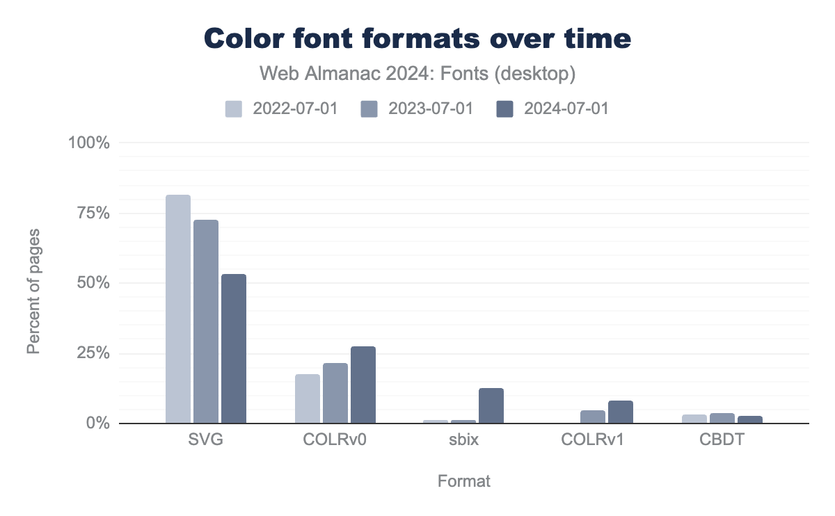
Given the relatively small number of websites with color fonts, usage trends over the last two years have led to some significant changes in the most popular formats. There was a large decrease in the use of SVG from 82% in 2022 to 53% in 2024. Both COLRv0 and COLRv1 saw a steady increase in use in 2023 and 2024. The combined use of COLRv0 and COLRv1 formats was 26% of total color font usage in 2023 and 36% in 2024. That’s a significant increase, and is expected to continue as SVG declines in popularity.
SVG was at 82% in 2022, 73% in 2023, and 53% in 2024. COLRv0 usage was at 18% in 2022, 21% in 2023, and 28% in 2024. sbix usage was at 1% in 2022 and 2023, and 13% in 2024. COLRv1 usage as at 0% usage in 2022, 5% in 2023, and 8% in 2024. CBDT usage was at 3% in 2022, 4% in 2023, and 3% in 2024.The most unexpected change in this year’s color font data is the sudden rise in SBIX format. SBIX was introduced by Apple to support the storage of bitmap images within font files. However, the SBIX format has some limitations when it comes to efficiency: binary overhead and lack of compression. This year’s rise in SBIX usage is almost entirely due to the popularity of the Toss Face Font, a Korean font with thousands of emojis and a very large file size. At 12.7 MB uncompressed and 11.7 MB compressed (WOFF2), this font would surely be better delivered in the COLR format. In fact, the home page for Toss Face Font is using a simplified COLRv0 font, which, sadly, does not appear to be publicly available. The COLRv0 version weighs in at 6 MB uncompressed and 1.1 MB compressed (WOFF2). While it may be hard to create a COLRv1 version with the same fidelity as the SBIX version, the COLRv0 version demonstrates the benefits of conversion to a vector format in terms of file size reduction. We hope the COLRv0 version is soon made available to the public, and this sudden rise in SBIX usage is a temporary blip.
Although emoji offered a major impetus for the initial development and support of color fonts, the last edition of the HTTP Almanac found a surprising lack of emojis on websites where color fonts had been used (just 4% of the desktop crawl and 2% of mobile). This year’s data shows a strong upward shift in the use of color fonts for emoji: 42% of desktop and 31% percent of mobile results found a color font with at least some emoji characters. While this signals significant growth in the use of color fonts for emoji, it is also worth noting (once again) that the total number of websites using color fonts is still quite small. This year’s crawl found color fonts on about 5,800 desktop and 6,200 mobile sites across the web.
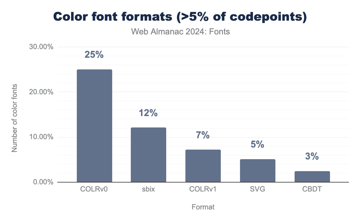
It’s worth noting a point of complexity in the data gathered on color fonts. Our analysis considers a font with a single color glyph a color font. That is a rather broad definition and also includes many fonts which are primarily used for their non-color glyphs. If we remove fonts with only a small percentage of color glyphs from the equation, the use of color font technology looks very different. For example, the top three fonts using SVG, 貂明朝 (Ten Mincho), 貂明朝テキスト (Ten Mincho Text), and Source Code Pro make up a combined 41% of SVG total usage, while having only a handful of color glyphs. Removing all “color” fonts with less than 5% of their codepoints mapped to color glyphs from the calculation would reduce the share of SVG to roughly 5%! While the COLR formats also have some fonts with a low percentage of color glyphs, that percentage is much lower at 3-4%, reducing the COLRv0 share to 25.1% and 7.2% for COLRv1. This would make COLR the most popular format by far!
COLRv0 format is at 25%, the sbix format is at 12%, the COLRv1 format at 7%, the SVG format is at 5%, and the CBDT format is at 3%.We plan to refine our analysis of color fonts in future editions of the Almanac, but our expectation is that COLR usage will continue to grow and it will soon become the dominant color font format (if it isn’t already).
Font smoothing
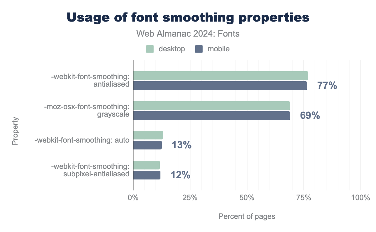
The non-standard CSS font smoothing properties claim to allow developers to choose between different ways of rendering a font. As these are non-standard properties, they are prefixed with a dash and a vendor prefix: -webkit-font-smoothing and -moz-osx-font-smoothing. Theoretically they allow web developers to switch between grayscale and subpixel antialiasing on Apple’s MacOS only. That’s interesting because in 2018, Apple removed subpixel antialiasing from MacOS with the release of Mojave. Even more interesting, more than about 70-77% of all websites set this property to antialiased or grayscale.
font-smoothing properties and their values. The -webkit-font-smoothing: antialiased property is at 77% of desktop and mobile pages, the -moz-osx-font-smoothing: grayscale property is used on 69% of desktop and mobile pages, the -webkit-font-smoothing; auto property is used on 13% of desktop and mobile pages, and the -webkit-font-smoothing: subpixel-antialiased property is used at 12% of desktop and mobile pages.So what is going on here? Why is everyone setting this property if MacOS uses grayscale antialiasing regardless of the value of the property? Is it legacy cruft set by old versions of CSS libraries and frameworks, or does it actually do something?
To clear this up: the property does nothing on other operating systems and it does not change the antialiasing settings on MacOS. However, it disables the MacOS-specific stem darkening that makes fonts look a little bolder than they were drawn. Apple implemented this to improve the legibility of small text by making the stems (the vertical parts of a letter) a bit thicker. Setting -webkit-font-smoothing: antialiased (and its -moz equivalent) disables this stem darkening and makes the font appear a little lighter, especially on darker backgrounds.
Our hunch is that a lot of designers and developers do not like this MacOS-specific behavior and use these properties to disable it. We’re not clear what the best solution might be. It’s clearly a MacOS-only issue (which would generally disqualify it from standardization in CSS). Standardizing the font-smoothing property does not make sense either. The stem darkening is only tangentially related to antialiasing, plus browsers and operating systems generally don’t allow you to switch antialiasing methods anyway. However, judging by the popularity of this font smoothing choice in the crawl data, it certainly appears to be a problem for web developers and a better solution deserves some careful consideration.
Generic family names
While system font families are not ideal from a design perspective, as universally available options they offer a useful fallback in case self-hosted or web fonts fail to load for some reason. They’re also a good alternative if you want to achieve a “native” look and feel for your web application, or if you have performance budget constraints and can’t use web fonts at all.
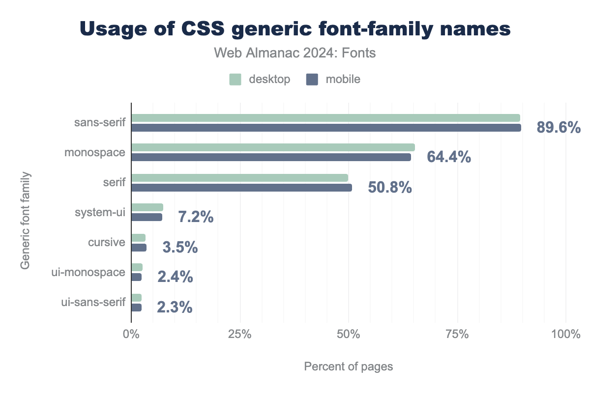
font-family names. The sans-serif generic family name is used on 89% of desktop and mobile pages, the monospace generic family names is used on 65% of desktop pages and 64% of mobile pages, the serif generic family name is used on 50% of desktop pages and 51% of mobile pages, the system-ui generic family name is used on 7% of desktop pages and 7% of mobile pages, the cursive generic family name is used on 3% of both desktop and mobile pages, the ui-monospace generic family name is used on 3% of desktop pages and 2% of mobile pages, the ui-sans-serif generic family name is used on 2% of both desktop and mobile pages.font-family names.
So, what are the most used generic family names on the web? Most used in 2024 were sans-serif at about 90%, monospace at 65%, and serif at 50%. These figures have been relatively consistent since 2022 for sans-serif and monospace, but mark a 7% decline for serif system fonts. While system-ui fonts were only represented on about 3.6% of desktop and mobile websites, it is now at 7.2%, roughly double what was seen in 2022. This is a clear indication that more and more people are using it to build apps whose typography matches the system.
When it comes to system fonts, the greatest increase over the last two years registered for several generic families totaling less than 1% of cases (not pictured). Emoji system fonts, in particular, grew with something on the order of a thirteen-fold increase between 2022 and 2024. System fonts for math also showed a major increase despite a small overall footprint, growing from a little over 100 websites in the 2022 crawl to reach roughly 1,300 websites on desktop and mobile this year.
Conclusion
Where are things going in the world of web typography? This year’s data highlights several promising trends in matters of performance. More developers are using the WOFF2 format, whose efficient compression offers better load times to handle font files that are growing in size. That’s great, but we would like to see more self-hosted fonts in the TrueType, OpenType, and WOFF formats converted to WOFF2. In most cases, this is a simple process that will significantly reduce file sizes and thus load times. Another area where there’s significant potential for performance gain is the use of resource hints. Currently only 11% of pages use resource hints to preload web fonts. We’d love to see that number go up significantly in the next couple of years as it requires very little effort (adding a simple <link rel="preload" href="..." as="font"> to your pages) and has a huge impact on web font performance.
This year’s web font data also leads to several key insights. The rise in self-hosting rates and declining use of web font services seen in the 2022 data has largely stabilized for now. In the future, it will be interesting to observe whether these rates continue to plateau, or else begin to shift again in either direction. A major factor in future hosting decisions will be privacy regulations surrounding the use of web font services. Other factors may involve a tradeoff between performance and convenience for self-hosted fonts versus services.
We also expect the use of new technologies like color fonts and variable fonts to continue rising in the coming years. As color fonts go, the COLR format is the clear winner due to its overall versatility, integration with variable fonts, and support for palettes in CSS. As for variable fonts, the trend toward designing for more axes, and implementing these in practice, is likely to continue proliferating as more designers and developers avail themselves of these technical affordances. Although variable fonts appear to have gained initial and impressive traction largely through CJK fonts, we expect the coming years to show increasing spread of variable fonts through other writing systems. Moreover, the continued development of new multi-script fonts is likely to continue increasing the typographic variety of global web design.
What does the future hold for (web) fonts? We expect many incremental technical advancements, such as the addition of cubic Beziér curves to glyf outlines and breaking the 65k glyph limit in fonts. These and other changes to fonts are outlined in the so-called “Boring Expansion” specification, whose aim it is to add support for various features to the OpenType font standard while mostly staying backwards compatible (hence the “boring” part). The recent development of Incremental Font Transfer (IFT) also promises considerable performance increases for web fonts, particularly ones with large character sets, as the user will only need to download the part of the font file that’s used on a particular website.
Overall, observing the state of web fonts in 2024, we’re excited to see more and more support for various writing systems, and an increasing adoption of variable and color font technology. While there is still a lot of low-hanging fruit when it comes to web font performance, it is clear that developers are adopting technologies like WOFF2, resource hints, and font-display to improve the performance of their sites. We hope to see these trends continue in 2025!
