Markup

Introduction
The web as we know it is built on the foundation of HTML. Every website, every web application, and every online interaction starts with HTML at its core, making it one of the most essential web standards. It’s the language that structures content, defines relationships, and communicates with browsers, ensuring that what we create can be viewed, interacted with, and understood by users worldwide. This chapter is dedicated to understanding how HTML continues to shape the web in 2024, exploring trends in its use, the rise of custom elements, and how developers are leveraging new features to build more accessible, efficient, and future-proof websites.
This year’s edition brings a broader perspective, as our dataset now includes not only home pages but also a wide variety of secondary pages. By analyzing pages beyond just the front doors of websites, we’re able to capture a richer, more accurate snapshot of how HTML is used across different types of content and contexts. From blog posts and product pages to login screens and article archives, this expanded scope gives us deeper insights into the real-world application of HTML.
We encourage readers to dive deeper into the data, explore their own insights, and join the conversation about the future of the web’s foundational language.
General
Let’s start with some of the more general aspects of a markup document. In this section we’re covering the document types, the size of the documents, language and compression. ‘
Doctypes
| Doctype | Rendering Mode | Desktop | Mobile |
|---|---|---|---|
<!doctype html> |
standards mode | 91.7% | 92.8% |
html public "-//w3c//dtd xhtml 1.0 transitional//en" "http://www.w3.org/tr/xhtml1/dtd/xhtml1-transitional.dtd" |
almost standards mode | 3.4% | 2.7% |
| No doctype | quirks mode | 2.1% | 2.2% |
html public "-//w3c//dtd xhtml 1.0 strict//en" "http://www.w3.org/tr/xhtml1/dtd/xhtml1-strict.dtd" |
standards mode | 0.8% | 0.7% |
html public "-//w3c//dtd html 4.01 transitional//en" "http://www.w3.org/tr/html4/loose.dtd" |
almost standards mode | 0.6% | 0.4% |
html public "-//w3c//dtd html 4.01 transitional//en" |
quirks mode | 0.3% | 0.3% |
93% of all mobile pages use the standard HTML doctype. That is, <!DOCTYPE html>.
This is 3 percentage points higher than the 2022 data. The surprising part is the next most popular: XHTML 1.1 Transitional—but slowly disappearing (2.7%, down from 3.9% in 2022).
Document size
A page’s document size is the amount of HTML bytes transferred over the network, including compression.
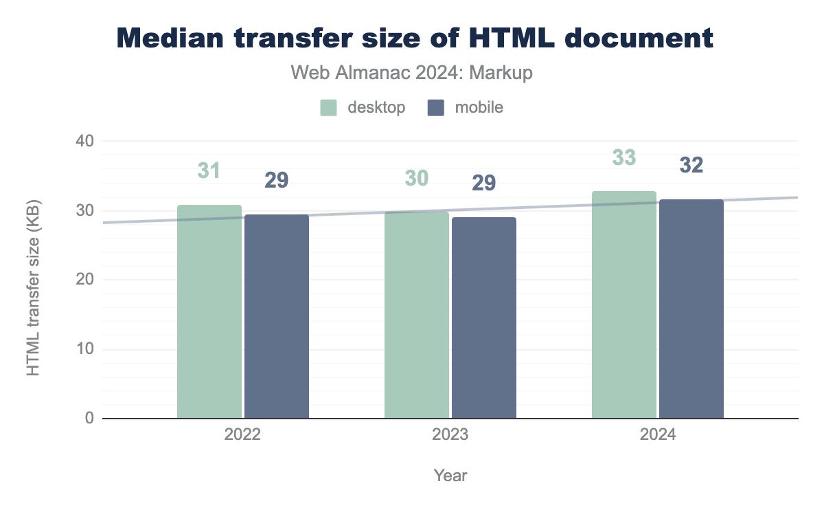
After a slight decrease in 2023, the HTML transfer size increased this year compared to 2022 and 2023.
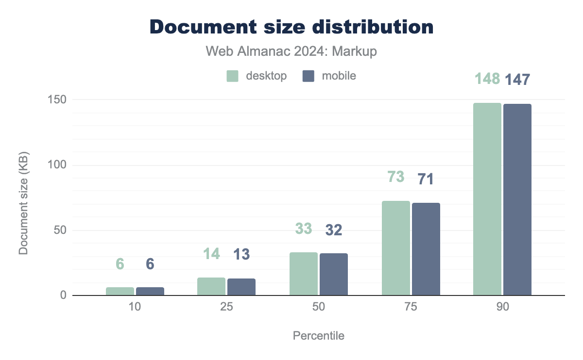
Although the median looks like something reasonable, let’s take a closer look at the other percentiles.
The percentile distribution reveals that at the 10th percentile, HTML files are as small as 6 KB, while at the 90th percentile, they reach up to 147 KB. These extremes highlight a significant variation in how developers structure their pages.
Compression
In the context of analyzing HTML document files, compression continues to play a crucial role in improving load times and overall performance.
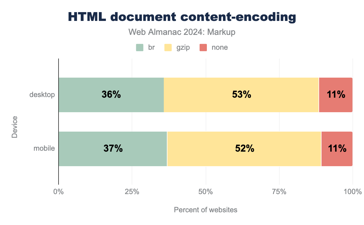
One notable trend is the increasing popularity of the Brotli (br) compression format. In 2024, Brotli is used on 37% of mobile pages, a steady increase from 28% in 2023.
While gzip remains the most widely used compression method (52% on mobile), its usage has slightly declined from previous year as br gains traction (58% in 2022).
Despite these improvements, a small percentage of HTML files (10.5% on mobile) are still served without any compression, presenting missed opportunities for optimization.
Document language
In our analysis, we’ve encountered 5,625 unique instances of the lang attribute on the html element on mobile.
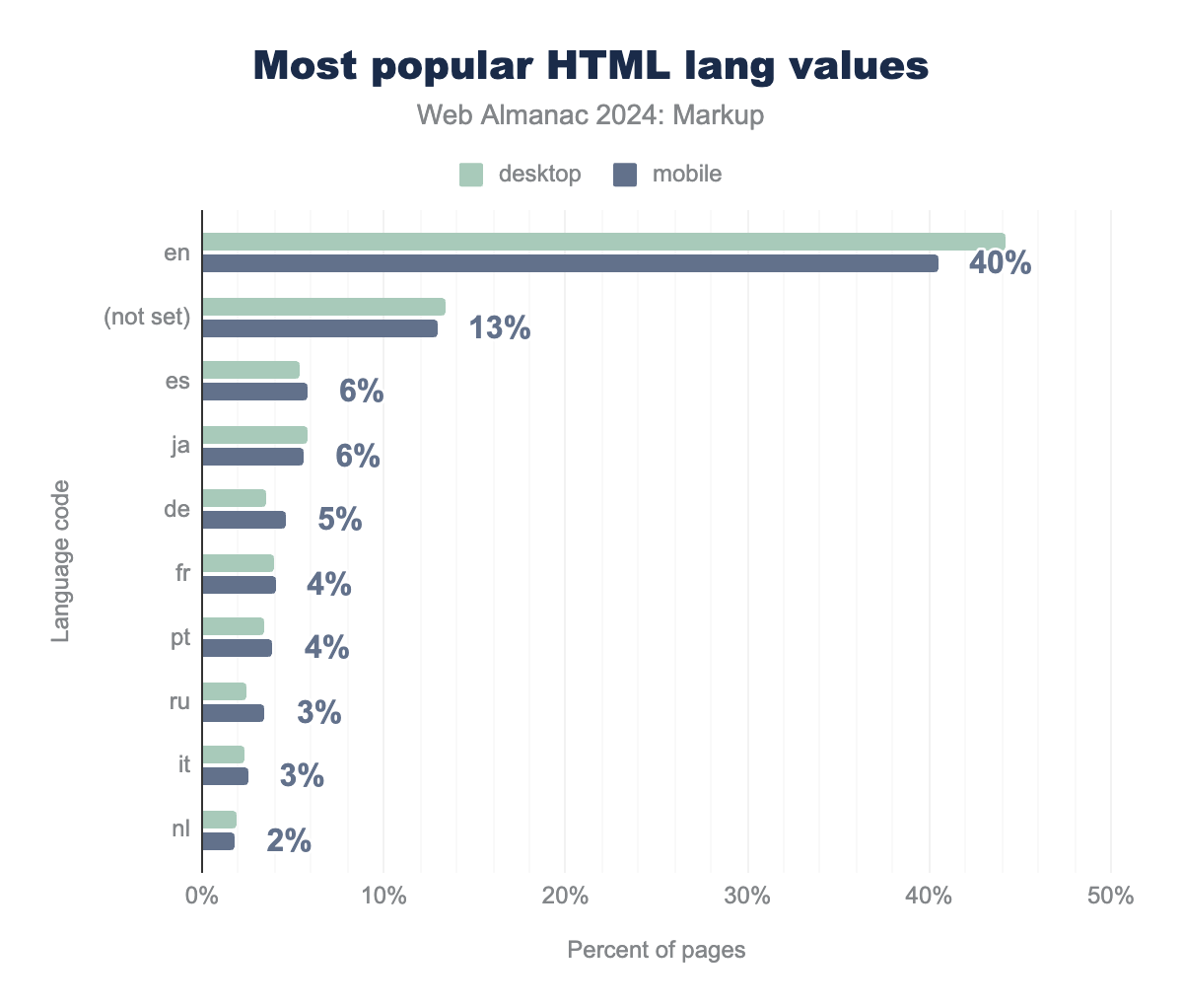
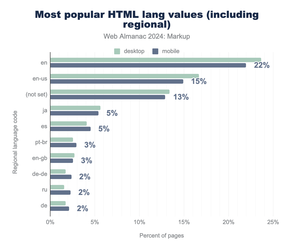
The HTML lang attribute plays an important role in helping screen readers and search engines understand the language of a webpage’s content. However, interestingly, Google Search ignores the lang attribute when determining the language of a page because they’ve identified that “it is almost always wrong”. This may explain why en remains dominant in the dataset, with 44.2% of desktop and 40.5% of mobile pages using it as the primary language attribute, even though the actual language of the content might differ.
Additionally, 13% of pages have no lang attribute set at all, showing that many websites fail to provide this indicator.
If we aggregate the percentages of non-English and non-“not set” lang values, we still capture around 46% of the total pages, reflecting the truly global nature of web content. However, as mentioned above, it’s important to remember that the high proportion of en values doesn’t always mean the content is in English, given the frequent misconfiguration of the lang attribute.
In terms of non-English languages, ja (Japanese) and es (Spanish) stand out as some of the most popular choices, used on approximately 5-6% of pages.
The most common regional variant, en-us, appears on 16.7% of desktop and 15% of mobile pages.
Despite the issues with incorrect lang attribute values, the attribute still plays a vital role in improving accessibility. For users with screen readers, setting the lang attribute correctly remains an essential practice in modern web development.
Comments
HTML comments are snippets of text that developers include within their code to leave notes or explanations without affecting the visual display of the webpage. These comments are enclosed in <!-- --> tags and are not rendered by browsers, meaning users will never see them. While useful during the development process, HTML comments are not necessary in production code, as they can slightly increase the file size without any benefit to end users.
According to our analysis, 86% of mobile pages still contain at least one comment.
In addition to regular comments, there’s a specific type known as conditional comments. These were once used extensively to target specific versions of Internet Explorer (IE), allowing developers to provide custom styles or scripts that only older IE browsers would process.
<!--[if IE]>
<link rel="stylesheet" href="ie-only-styles.css">
<![endif]-->
With modern browsers and the retirement of Internet Explorer, conditional comments have become obsolete. Despite this, 26% of mobile pages still contain conditional comments, likely due to legacy code that was never cleaned up, or because some sites continue to support older versions of Internet Explorer for compatibility reasons.
Elements
In this section, we’ll explore HTML elements—what elements are commonly used, how often they appear, and which ones you’re likely to find on a typical page. We’ll also look into custom and outdated elements. And just to clarify: is “divitis” still around? Yes, it is.
Element diversity
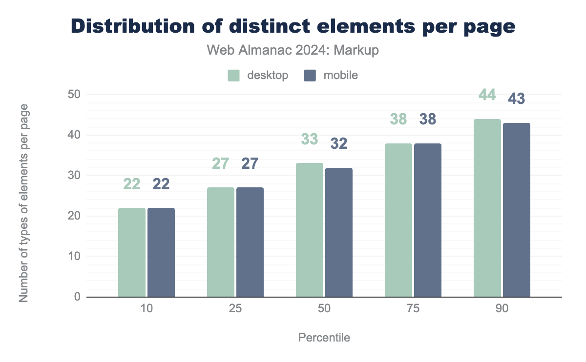
For both desktop and mobile pages, the data shows that the 10th percentile has 22 distinct elements, while the 90th percentile reaches 44 elements on desktop and 43 on mobile. The median number of distinct elements for mobile pages has remained consistent at 32 this year, the same as in 2022, and only slightly higher than the 31 observed in 2021.
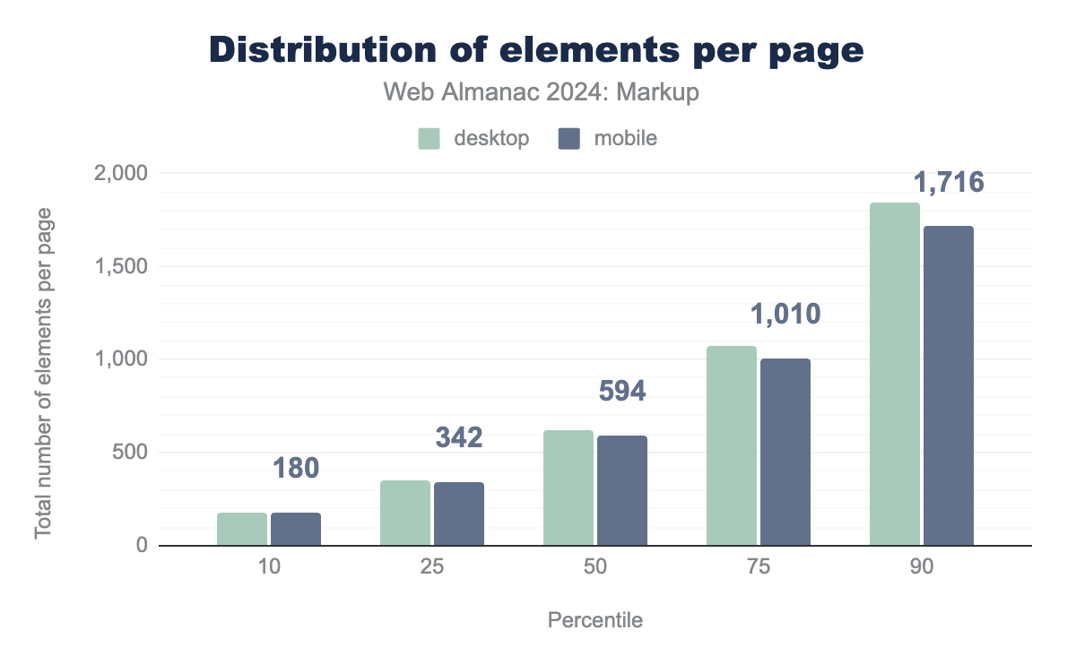
However, there are some differences when checking the distribution of elements per page. The data shows a slight decrease compared to 2022. For mobile, the median number of elements has dropped from 653 in 2022 to 594 in 2024. At the lower end, the 10th percentile for mobile shows a small drop from 192 to 180. The 90th percentile also shows a modest decrease, with mobile pages dropping from 1,832 to 1,716. This overall reduction suggests that pages are becoming slightly leaner in terms of the number of HTML elements used.
Top elements
The following elements are used most frequently:
| 2021 | 2022 | 2023 | 2024 |
|---|---|---|---|
div |
div |
div |
div |
a |
a |
a |
a |
span |
span |
span |
span |
li |
li |
li |
li |
img |
img |
script |
script |
script |
script |
img |
img |
p |
p |
p |
p |
link |
link |
link |
link |
meta |
i |
meta |
path |
i |
meta |
path |
meta |
The list remains largely consistent with previous years, but some shifts have occurred.
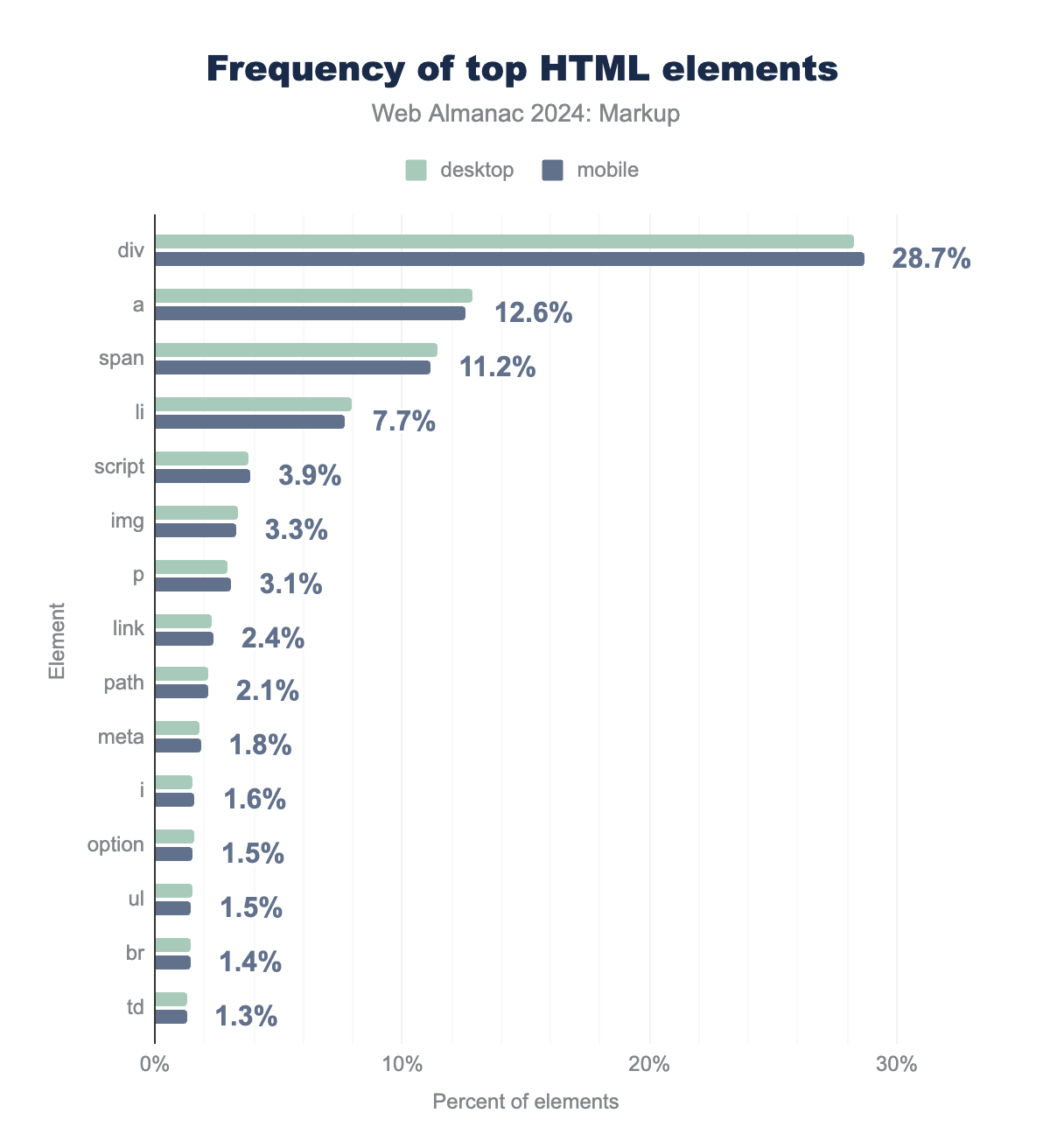
<div> remains by far the most dominant element. So “divitis” is still a thing, and it doesn’t look like it’s going to change in the next few years.
div is the most used (28.7% on mobile), followed by a (12.6%), span (11.2%), li (7.7%) and script (3.9%). The rest of the top 15 elements are img, p, link, path, meta, i, option, ul, br, and td, with values ranging from 3.3% to 1.3%.Following <div>, the <a> element remains a key player, consistently in second place. As the backbone of hyperlinking, it plays a critical role in navigation, anchoring user journeys across sites.
One of the notable shifts in recent years has been the increased usage of <script>. In 2023, it surpassed <img> in popularity, reflecting the growing reliance on JavaScript for dynamic content, interactivity, front-end logic, and trace marketing campaigns . The trend has continued in 2024, solidifying <script> as the fifth most-used element.
Another notable shift is the emergence of <path>, which entered the top 10 in 2023. In 2024, it has surpassed <meta>, reflecting the increasing use of Scalable Vector Graphics (SVG) for icons, illustrations, and graphical elements.
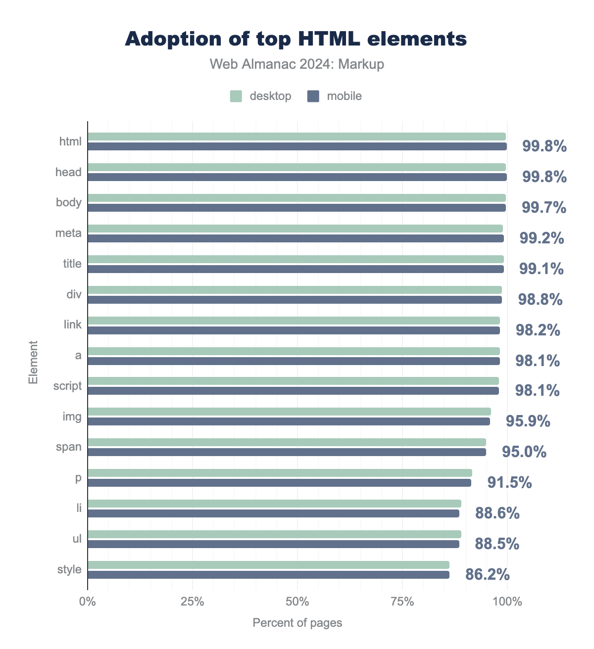
The adoption of top HTML elements across both desktop and mobile platforms remains consistently high, reflecting their foundational role in modern web development. The <html>, <head>, and <body> elements are nearly ubiquitous, appearing on over 99.7% of both desktop and mobile pages.
html and head tags are used on 99.8% of mobile pages, body on 99.7%, meta on 99.2%, and title on 99.1%. div, link, a, script, img, span, p, li, ul, and style are the rest of the top 15 HTML elements, with values ranging from 98.8% to 86.2%.A notable observation is that 0.9% of mobile pages are missing the <title> tag, similar to the 2022 data (1%).
The next elements, <link>, <a>, <script>, and <img>, also have strong adoption rates. It’s also interesting to see the increasing use of SVG (Scalable Vector Graphics), even though this tag is not part of the top 15 elements. <svg> adoption on mobile has grown from 45.5% in 2022 to 51.6% in 2024, marking a significant shift towards more scalable, resolution-independent graphics on the web.
Custom elements
Custom elements, easily recognized by their hyphenated names, have once again made their mark in our analysis this year, showcasing their continued importance in extending HTML’s native functionality.
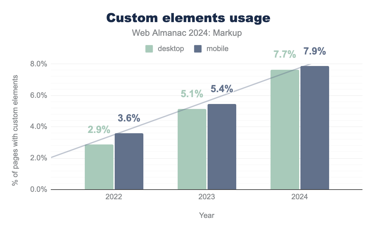
The usage of custom elements has seen a significant increase in recent years, with adoption rates rising from 3.6% on mobile in 2022 to 7.9% in 2024. This increase highlights a growing trend among developers and technologies to leverage custom elements for building richer, more interactive web experiences.
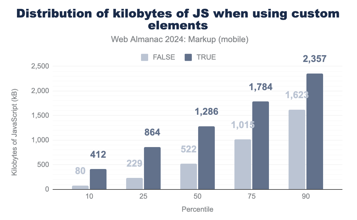
However, custom elements typically need extra JavaScript to enable their functionality and interactivity. This requirement is particularly evident when examining the JavaScript payloads of web pages.
In this chart, we can see that at the median, pages with custom elements use 1,286 kB of JavaScript while pages without custom elements only require 522 kB. Hence, while the rise of custom elements represents a valuable evolution in web development—enabling developers to create modular and reusable components—it’s essential to consider the implications of their use.
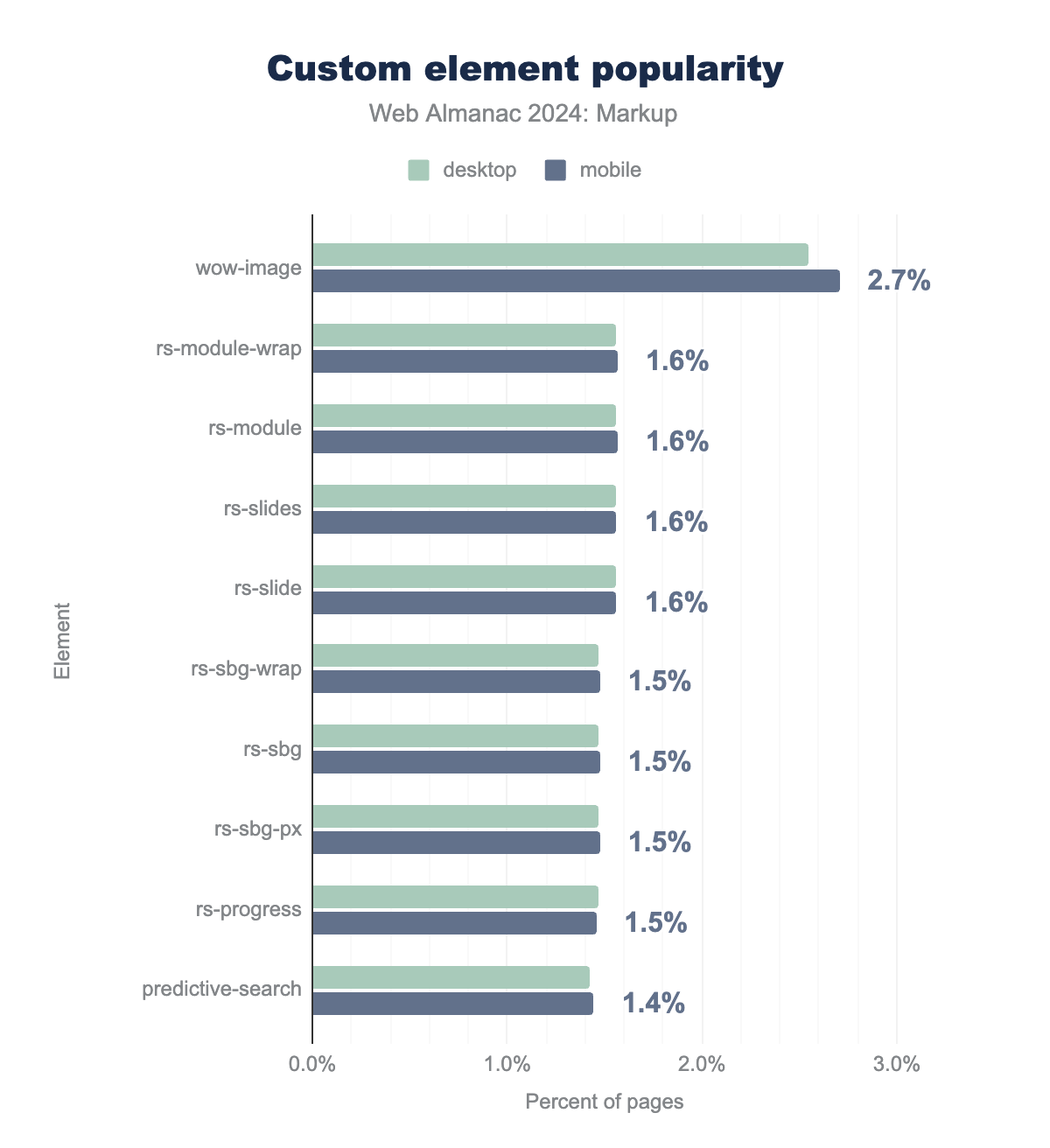
Let’s now take a closer look at the top 10 custom elements:
wow-image (2.7% on mobile), rs-module-wrap, rs-module, rs-slides and rs-slide (1.6% on mobile), rs-sbg-wrap, rs-sbg, rs-sbg-px and rs-progress (1.% on mobile), and predictive-search(1.4% on mobile).
As in the 2022 edition, most of the top 10 custom elements are dominated by rs-* elements from Slider Revolution. However, this year we see a new (and surprising) winner: wow-image element, which is used by the @wix/image package on Wix sites.
The last of this year’s top 10 list is also a newcomer: predictive-search , a Shopify component that shows suggested results as you type.
Obsolete elements
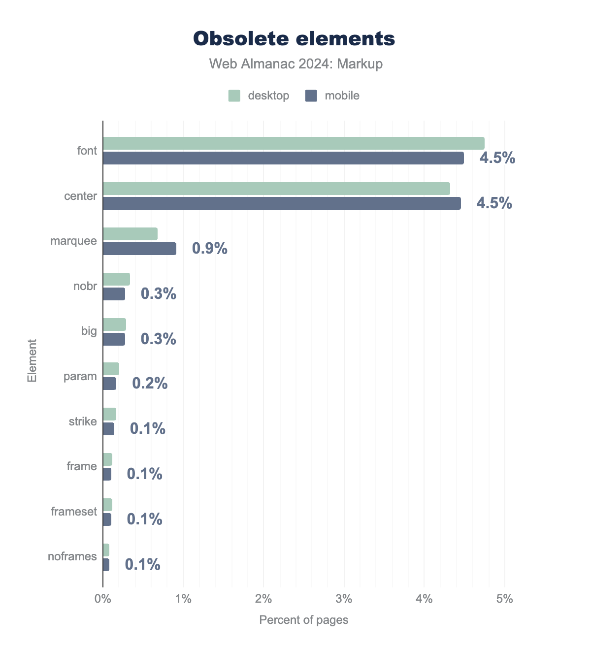
There are currently 29 obsolete and deprecated elements according to HTML specification. And except from keygen, all of them still appear in some (or many) pages of this year’s dataset.
font is the most used, found on 4.5% of mobile pages, followed by center (4.5% of mobile pages). The rest of the list includes marquee, nobr, big, param, strike, frame, frameset, and noframes, with values ranging from 0.9% to 0.1%.If we compare these results to the 2022 ones, we see a slow but steady decline in their usage. One notable improvement is the drop in the use of the <center> element, which has fallen from 6.1% in mobile sites last year to 4.5% this year. This marks a significant decrease and has led to <center> being surpassed by the <font> element as the most commonly used obsolete tag, now present on 4.5% of mobile pages. Interestingly, despite this positive trend, some high-profile sites, like Google’s home page, still rely on the <center> element in their markup.
Attributes
This section focuses on how attributes are used in documents and explores patterns in data-* usage and social markup.
Top attributes
In HTML, attributes are key-value pairs attached to elements that provide additional information or modify the behavior of the element. These attributes are fundamental in defining characteristics such as styles, classes, links, and behavior within the web page. They often influence how elements are displayed or interacted with by users and scripts. For example, the src attribute in an <img> tag defines the image source, while the href attribute in an <a> tag specifies the link’s destination.
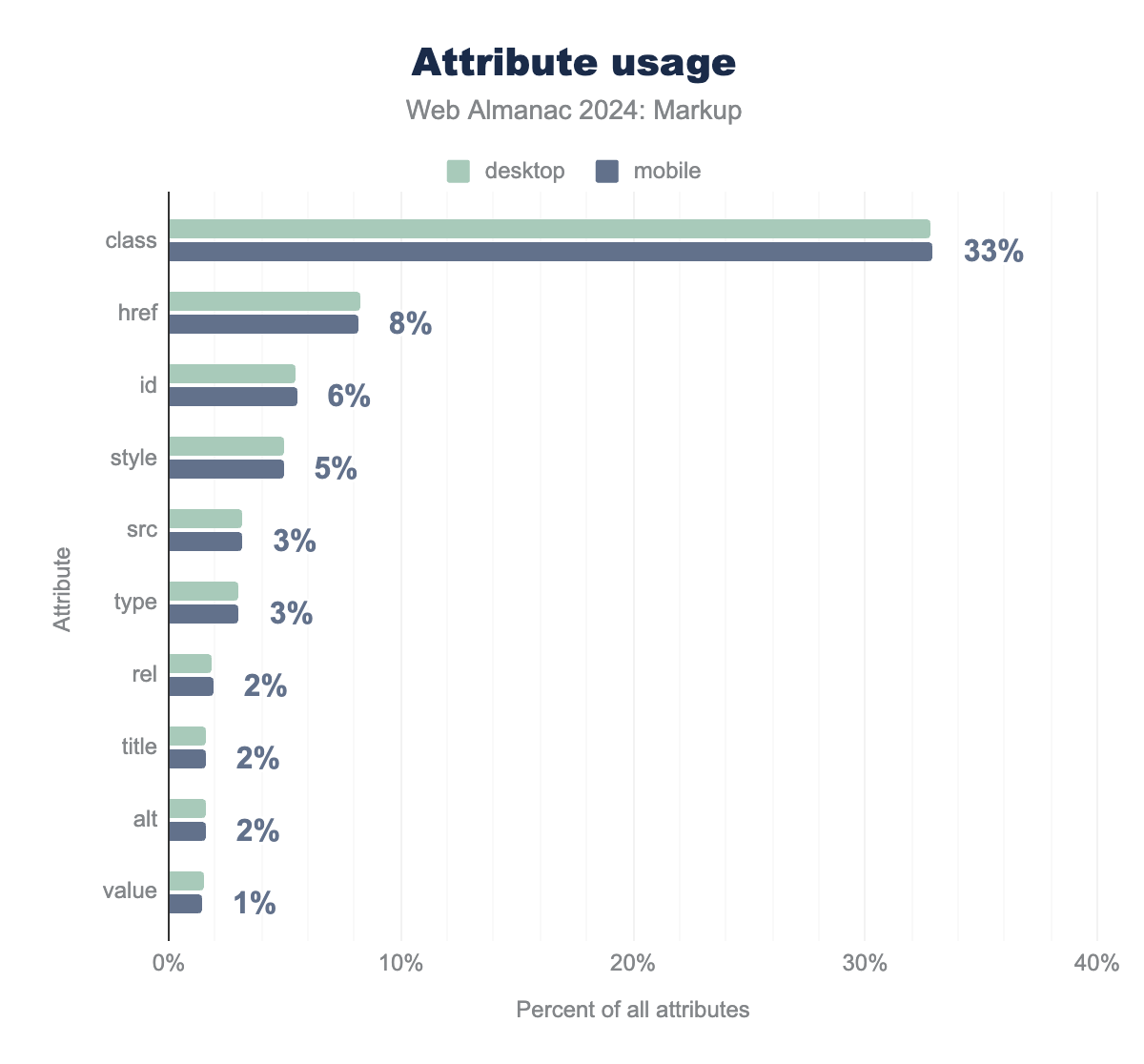
For another year, the most used attribute by far is class, with 48 billion occurrences in our mobile dataset, representing 33% of all attributes used.
class is the most used (33% on mobile), followed by href (8% on mobile), id (6% on mobile), style (5% on mobile) and src (3% on mobile). The rest of the top 10 are type, rel, title, alt and value, with values ranging from 3% to 1%.And when we look at the attributes used per page, we find the following used on almost all of them:
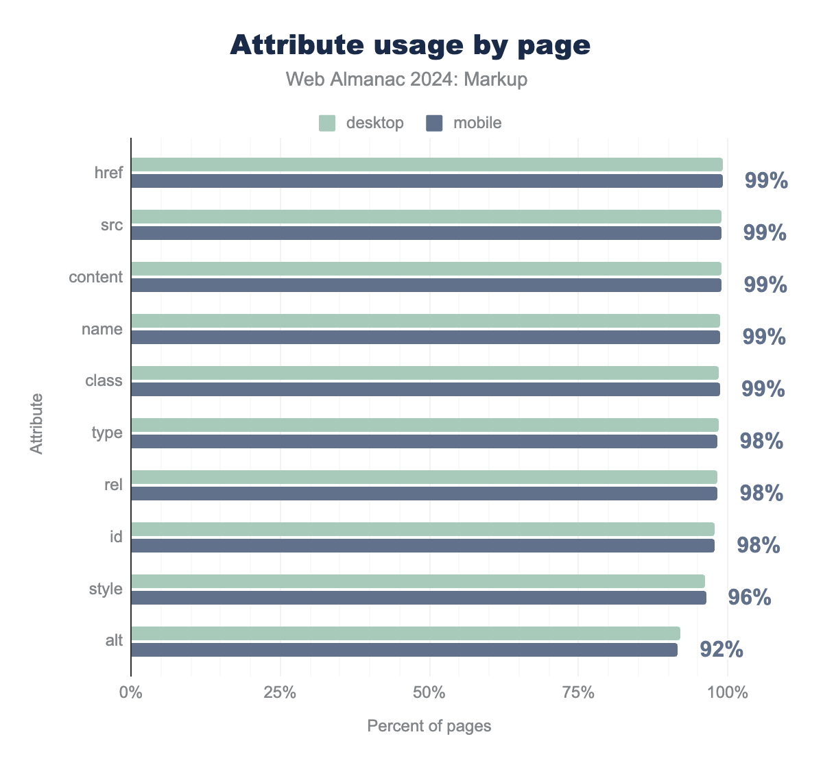
href is the most used (present on 99% of mobile pages), followed by src (99% on mobile), content (99% on mobile), name (99% on mobile) and class (99% on mobile). The rest of the top 10 are type, rel, id, style and alt, with values ranging from 98% to 92%.
data-* attributes
Let’s now take a closer look to a subset of attributes: the data-* attributes. HTML allows developers to define custom attributes that begin with data-. These attributes are designed to store additional information specific to the page or application, such as custom data, annotations, or state information. They offer a way to embed extra, non-standard metadata that doesn’t fit into any predefined HTML attributes, making them particularly useful when there’s no existing attribute or tag to handle that specific information. The data- attributes are private to the application and can be easily accessed or manipulated via JavaScript, providing a flexible method to manage dynamic content or data states.
data-* attribute.
The overall data shows that 90% of the analyzed documents use at least one data-* attribute. Let’s deep dive into the data.
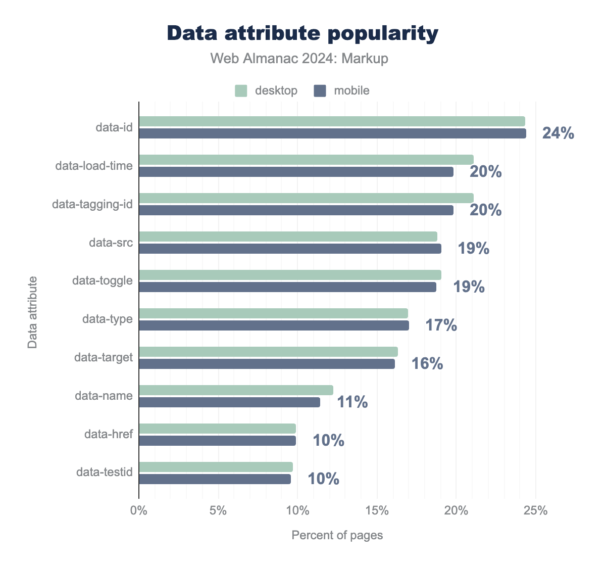
data-* attributes. data-id is the most used (present on 24% of mobile pages), followed by data-load-time (20% on mobile), data-tagging-id (20% on mobile), data-src (19% on mobile) and data-toggle (19% on mobile). The rest of the top 10 are data-type, data-target, data-name, data-href and data-testid, with values ranging from 17% to 10%.Analyzing the popularity of data-* attributes from 2022 to 2024 reveals some interesting shifts in their usage. This year, data-id is the most popular, used on 24% of mobile pages, a significant increase from 19% in 2022. This increase also marked a significant jump from fifth place in 2022 to first place this year.
Another notable change is the appearance of new elements in the list: data-load-time and data-tagging-id appear on 20% of pages in 2024, occupying the second and third position of the ranking. These attributes were not part of the data-* attributes identified in 2022, indicating that performance tracking and tagging have become more important in modern web development.
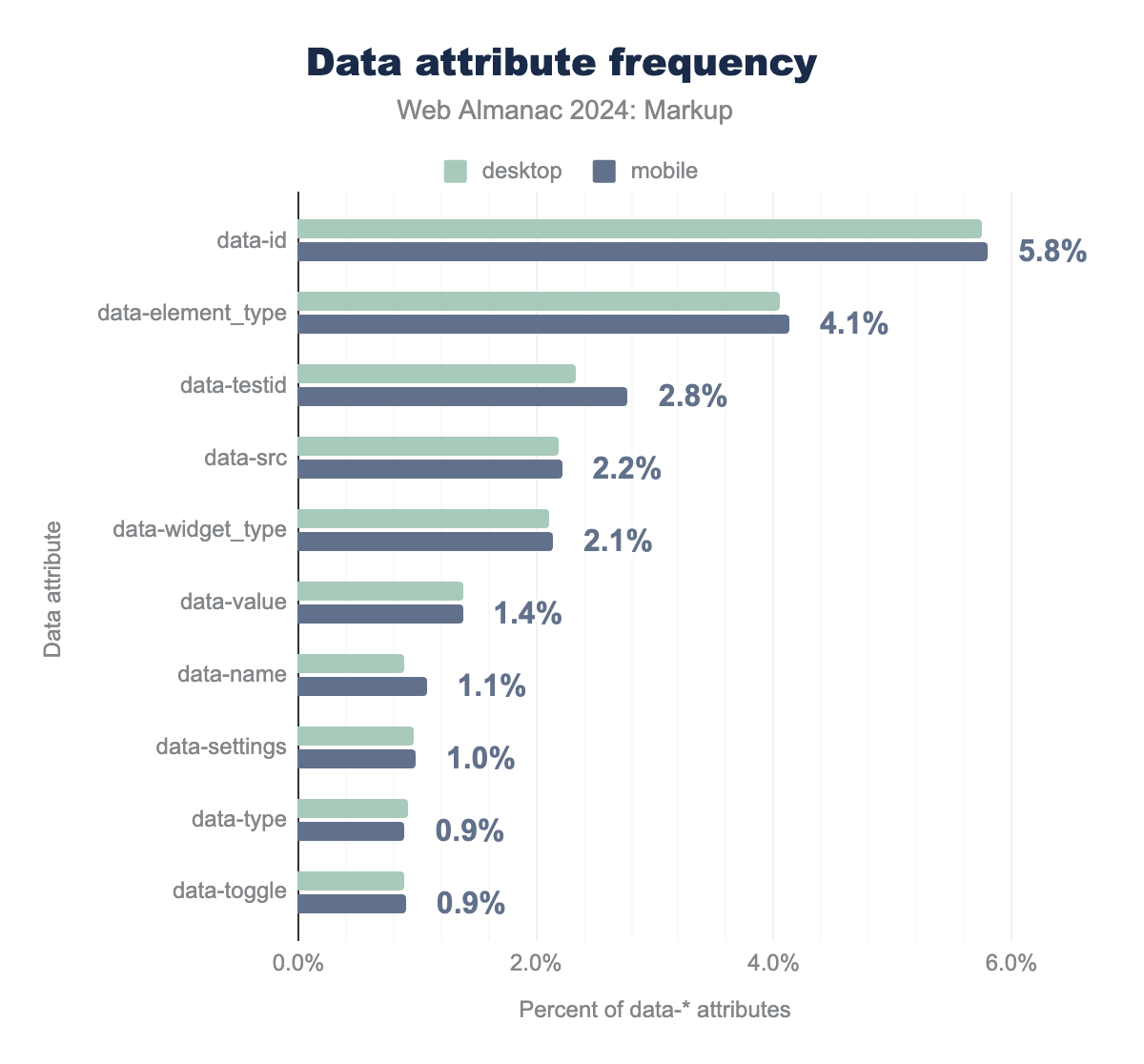
data-* attributes. data-id is the most used (5.8% of total data-* attributes on mobile pages), followed by data-element_type (4.1% on mobile), data-testid (2.8% on mobile), data-src (2.2% on mobile) and data-widget_type (2.1% on mobile). The rest of the top 10 are data-value, data-name, data-settings, data-type and data-toggle, with values ranging from 1.4% to 0.9%.Social markup
Social markup refers to the set of meta tags embedded within HTML documents that enhance how web content is shared and displayed across social media platforms. These tags provide essential metadata, such as titles, descriptions, images, and URLs, ensuring that when users share a webpage, platforms like Facebook, X (formerly Twitter), and LinkedIn can pull the correct information. The most common social markup standards include Open Graph (og:) and Twitter Cards (twitter:), both of which offer a richer, more controlled sharing experience by defining how content appears in previews.
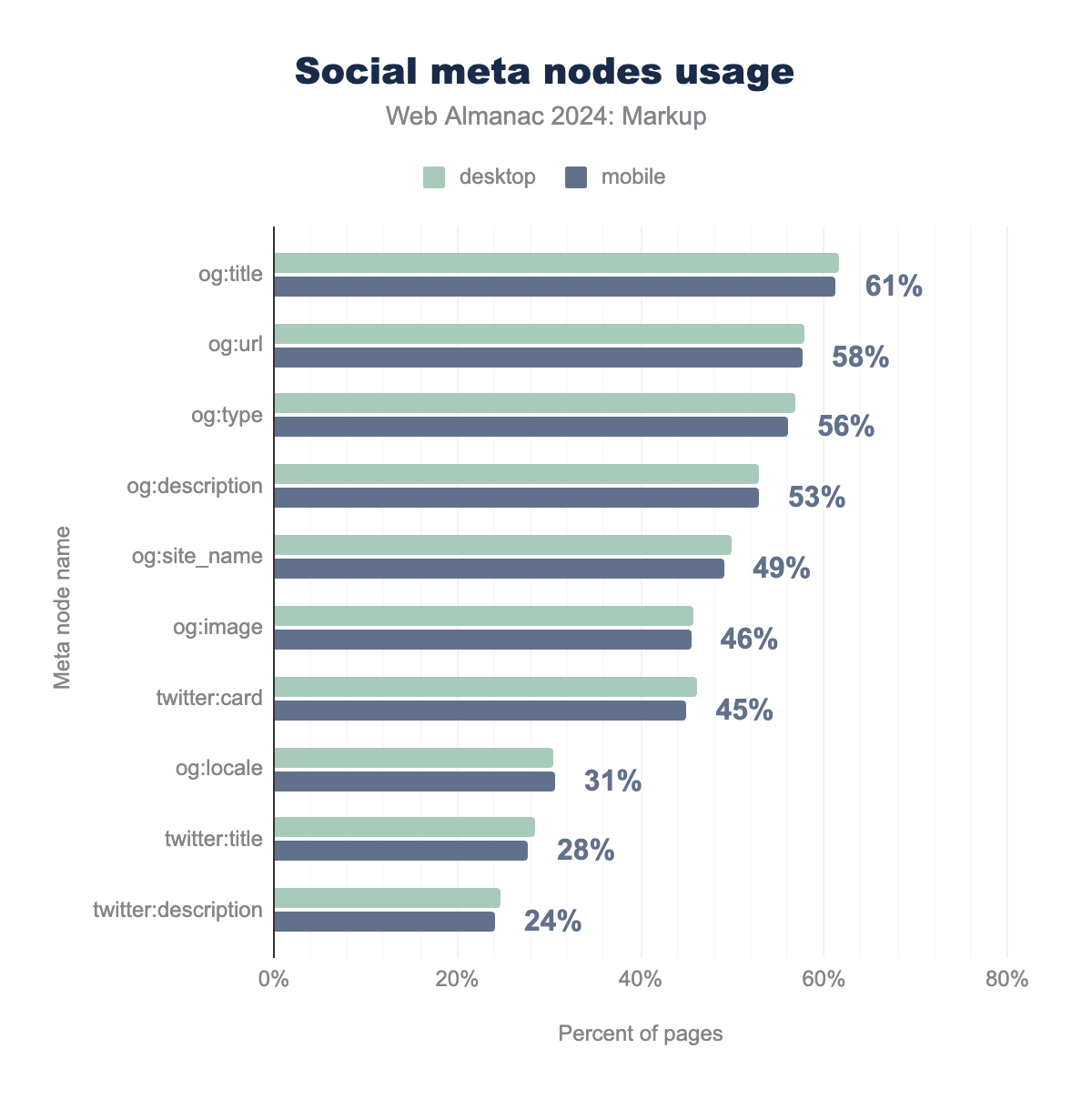
og:title is the most used (present on 61% of mobile pages), followed by og:url (58% on mobile), og:type (56% on mobile), og:description (53% on mobile) and og:site_name (49% on mobile). The rest of the top 10 are og:image, twitter:card, og:locale, twitter:title and twitter:description, with values ranging from 46% to 24%.According to 2024 data, the most frequently used Open Graph meta tags are og:title (used by 61% of mobile pages) and og:url (58%). These tags define the title and canonical URL of the shared content, followed closely by og:type (56%) and og:description (53%), which offer insights into the content type and a brief summary. Twitter-specific meta tags like twitter:card (45%) and twitter:description (24%) are also still widely used, even though the platform is now branded as “X,” illustrating a lag in terminology updates across the platform.
Miscellaneous
In the preceding sections, we have provided an overview of HTML in general, as well as the adoption of the most commonly used elements and attributes. In this section, we will undertake a deeper analysis of some special cases, including viewports, favicons, buttons, inputs, and links.
viewport specifications
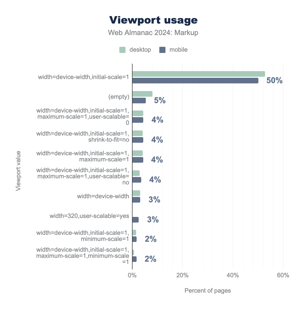
The viewport meta tag specifies how the content should be scaled on various devices by setting properties like width and initial-scale. A common configuration, width=device-width,initial-scale=1, ensures that the page takes the full width of the screen and loads at the correct zoom level for mobile devices.
width=device-width,initial-scale=1 is the most used (present on 50% of mobile pages in our data set), followed by (empty) (5% on mobile), width=device-width,initial-scale=1,maximum-scale=1,user-scalable=0 (4% on mobile), width=device-width,initial-scale=1,shrink-to-fit=no (4% on mobile) and width=device-width,initial-scale=1,maximum-scale=1 (4% on mobile). The rest of the top 10 are width=device-width,initial-scale=1,maximum-scale=1,user-scalable=no, width=device-width, width=320,user-scalable=yes, width=device-width,initial-scale=1,minimum-scale=1 and width=device-width,initial-scale=1,maximum-scale=1,minimum-scale=1, with values ranging from 4% to 2%.In terms of current usage, the most common configuration is width=device-width,initial-scale=1, present on 50% of mobile pages. Interestingly, 5.4% of the pages analyzed on mobile have no viewport tag. So, these pages are not designed for mobile experiences. Other configurations include variations like width=device-width,initial-scale=1,maximum-scale=1,user-scalable=0, which disables user scaling, found on 4.4% of mobile pages.
Favicons
Favicons, those small icons associated with websites, play an important role in enhancing the user experience and brand recognition. These icons are displayed in browser tabs, bookmarks, and even on mobile home screens when users save websites. One of the most interesting aspects of favicons is that they can work even without explicit HTML markup. Favicons support various image formats, including .png, .ico, .jpg, and .svg.
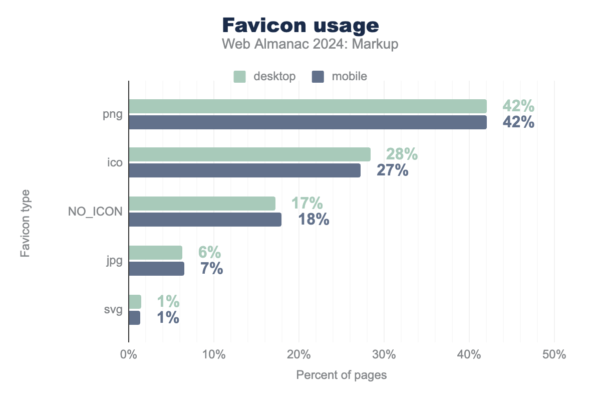
png is the most used (present on 42% of mobile pages in our data set), followed by ico (27% on mobile), NO_ICON (18% on mobile), jpg (7% on mobile) and svg (1% on mobile).As of 2024, .png is the most commonly used format for favicons informed by <link rel="icon"> tags, appearing on 42% of mobile pages, up from 35% in 2021. In contrast, the use of .ico files has decreased from 33% in 2021 to 27%, likely due to developers moving away from this format in favor of other options like .png and .svg. However, it’s interesting to highlight that .svg favicons are not supported on Safari.
Interestingly, about 18% of pages still lack a favicon, showing a slight improvement from the 22% that had no favicon in 2021.
Buttons and input types
Buttons in web development have been a source of frequent debate due to their dual functionality and various use cases. The controversy typically revolves around when to use the native <button> element versus anchor (<a>) links or even custom-styled div elements acting as buttons. We won’t get into that debate, but we will look at the data to review its usage.
73% of mobile pages use at least one <button> element on them, a significant increase from 65.5% in 2021. Like in 2021, we didn’t run a query for input-typed buttons, but the Accessibility chapter has more very interesting information about buttons. You should read it too!
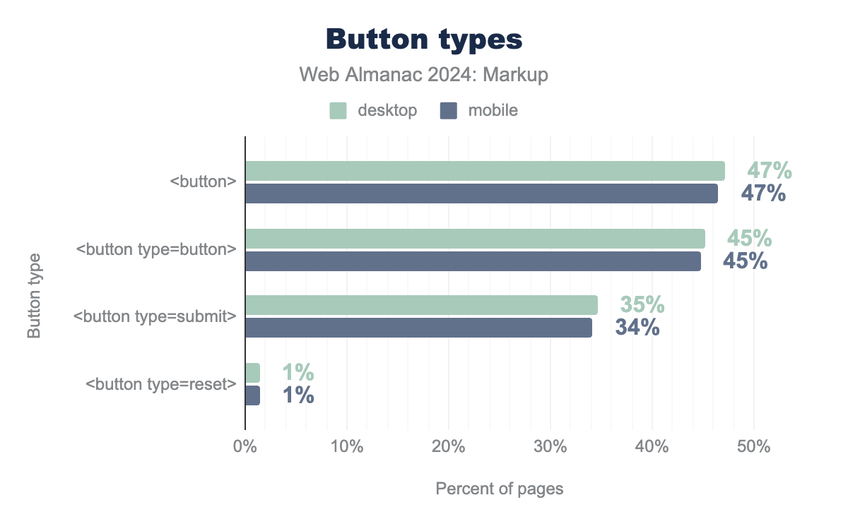
<button> is the most used (present on 47% of mobile pages in our data set), followed by <button type=button> (45% on mobile), <button type=submit> (34% on mobile), and <button type=reset> (1% on mobile). Desktop is slightly higher in most cases but within a percentage point.Here’s a closer look at the breakdown:
- The generic
<button>element appears on 46.5% of mobile pages. The button has no default behavior so it can have client-side scripts listen to the element’s events. - 44.7% of mobile pages use
<button type="button">, which is typically employed for actions not associated with form submissions (e.g., triggering JavaScript functions). - The
<button type="submit">variant, used specifically for form submission, is present on 34.1% of mobile pages. <button type="reset">is relatively rare, seen on just 1.4% of mobile pages, indicating that resetting forms is less common or developers opt for custom solutions.
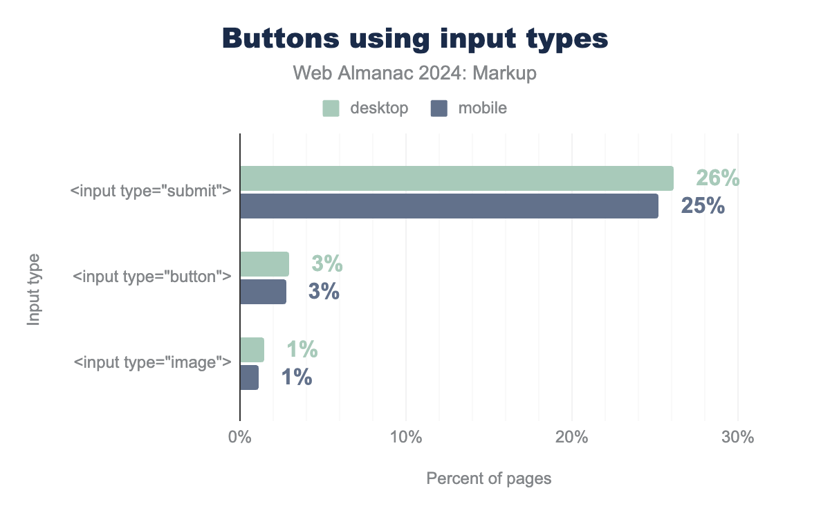
Apart from buttons, certain input elements are also rendered and used as buttons.
<input type="submit"> is the most used (present on 25% of mobile pages in our data set), followed by <input type="button"> (3% on mobile), and <input type="image"> (1% on mobile). Desktop is slightly higher in most cases but within a percentage point.Data shows that 25.2% of mobile pages in our data set have at least one <input type="submit"> element, 2.8% have at least one <input type="button"> element, and 1.1% have at least one <input type="image"> element.
Link targets
In the past, if you linked to a page with a target="_blank" attribute to open it in a new tab, the target page could access your page via window.opener, which could be exploited to perform malicious actions. To prevent this, developers had to add a rel="noopener" attribute to target="_blank" links. The noopener value ensures that the new tab doesn’t have access to the window.opener object. In addition, noreferrer was often used in conjunction with noopener to prevent the referrer information from being passed to the new tab.
In modern browsers, this security issue has been resolved: now, when target="_blank" is used, browsers automatically apply rel="noopener" behind the scenes. This means that, in most cases, developers no longer need to manually include noopener in their link attributes to avoid the security vulnerability. Despite this, we still see a widespread use of noopener and noreferrer on many web pages, likely due to legacy code or developers being cautious about cross-browser compatibility.
| Link | Desktop | Mobile |
|---|---|---|
Has target="_blank" |
81% | 81% |
Sometimes uses target="_blank" with noopener and noreferrer |
77% | 76% |
Has target="_blank" without noopener and noreferrer |
68% | 67% |
Has target="_blank" with noopener |
25% | 24% |
Always uses target="_blank" with noopener and noreferrer |
23% | 24% |
Has target="_blank" with noopener and noreferrer |
20% | 19% |
Has target="_blank" with noreferrer |
3% | 3% |
Looking at the data, 81% of pages use target="_blank". Interestingly, 76% of pages include at least one target="_blank" link with noopener and noreferrer while 67% have target="_blank" without noopener and noreferrer. Additionally, 24% of mobile pages always use target="_blank" links with noopener and noreferrer.
Conclusion
The analysis of HTML usage in 2024 reveals significant trends and insights that underscore its evolution and the ongoing relevance of this foundational language in web development.
One of the most notable findings is the increasing standardization around the HTML doctype, with 93% of mobile pages now using the standard <!DOCTYPE html>. This reflects a positive shift towards compliance with web standards, though XHTML remains present.
Document size has seen a slight increase, indicating a trend towards more complex pages, yet the use of compression—especially Brotli—has become more prevalent, which enhances load performance. However, the continued absence of compression in about 10% of HTML files suggests that there are still optimization opportunities for many developers.
The rise of custom elements usage, which has increased from 3.6% to 7.9%, indicates a growing trend for building richer, more interactive web experiences. The presence of obsolete items, while decreasing, still indicates the need for ongoing code maintenance and adoption of modern standards.
Surprisingly, the top data-* attribute list shows significant changes, with a completely different top 3 attributes in it. data-id, data-load-time, and data-tagging-id usage suggests that performance tracking and tagging have become more important in current web development.
However, some things remain stable from year to year. Divitis is still a thing, and class continues to be the sovereign of the attribute world.
