Mobile Web

Introduction
Mobile access to web content is a critical aspect of internet access as a whole. In fact, in many situations and regions, it is the default means of accessing the internet. It is also often the backbone of communication that happens seamlessly on platforms that use desktop, native app, and web apps to facilitate cross-device behavior and allows consumers to use their preferred method of access, simplifying and further democratizing information and communication online.
This chapter will outline the state of the web in 2022 when it is accessed from a mobile device. In some cases, mobile data is compared to desktop data, which many people are more familiar with. This comparison is important because though many will focus on desktop data, there is now more mobile web traffic around the world than there is desktop, and this has been the case since about 2016 or 2017, depending on the source.
Worldwide connectivity
As seems to always be the case, we are living in a more connected world this year than the world has ever experienced. The evolution of mobile technology and mobile web has been fueled not only by more than two years of even more digital-focused commerce caused by the COVID-19 pandemic, but also the growth and evolution of 5G communication networks, cloud and hybrid-cloud computing environments, and the growing adoption of digital and voice assistants, “casting” technology, and IoT.
New generations are getting involved in social media and have earlier access to mobile technology, and it is more readily socially acceptable than ever before. So, the growth of connectivity marches on, with no end in sight, and children, teens, and young adults of today—colloquially referred to as digital natives because they were born into the digitally connected world—are sure to push the evolution of mobile technology, mobile web, and connectivity to new highs. All this progress makes the newest technology of today look foundational and fundamental for technologies of the future.
Traffic from mobile versus desktop
In keeping with the Methodology, the primary data source for this report is the HTTP Archive and the Chrome UX Report (CrUX). In cases where tablet data was included as a separate measurement from any data source, it was omitted, since it does not neatly fit in the primary mobile or desktop classifications and can add confusion and complexity when interpreting or contrasting mobile and desktop information that is more neatly segmented out. Refer to the CrUX documentation for more information about eligible mobile platforms.
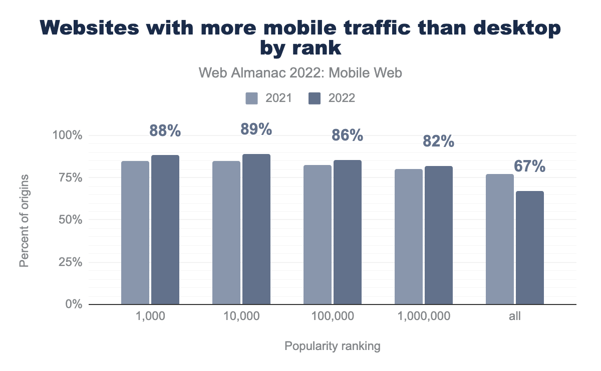
Across the most popular ranks, the percentage of sites with more mobile traffic than desktop traffic has increased relative to last year. In 2022, 88% of the top 1,000 most popular sites receive more traffic from mobile devices than desktop, up from about 85% in 2021. And among the top 10,000 most popular sites, 89% of them receive more traffic from mobile devices and that is up from about 86% in 2021 - so roughly a 3% increase in sites that receive more mobile traffic than desktop in both of those to top-popularity ranking groups.
According to Oberlo, about 58% of web traffic in 2022 is from mobile devices. The consistent growth and pervasiveness of these statistics is a clear indication of the obvious increasing importance in the overall evaluation of mobile web access and interactions.
Communication from the mobile web
The value of the mobile web is largely in its ability to seamlessly connect people to other people and to information in an ongoing, portable, familiar, and unobtrusive way. Phones have always been primarily for communication, but the addition of the mobile web to the mobile phone fundamentally changed how phones are seen, used, and evaluated. This section of the report will go through how we can perceive the most important aspects of communication from the mobile web, and how potential for communication is reflected in mobile websites.
Alternative protocol links
Being that mobile devices are so critical in people’s daily communication, it can be interesting to evaluate the most common types of link formatting that is present in the mobile web, something called alternative protocol links. Rather than linking one page on a website to another page on a website, these alternative protocols link to a type of activity other than web browsing.
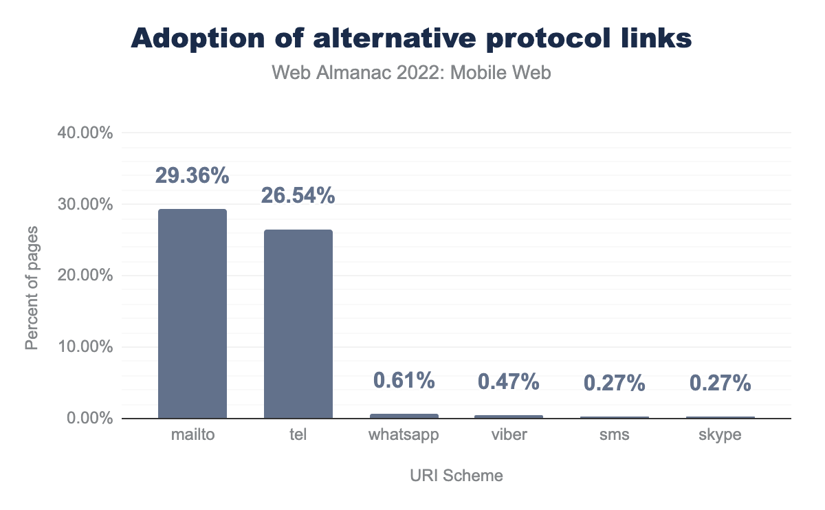
The figure above outlines how the different alternative protocol links are being used on the web in 2022. The most popular options are: mailto for email, tel to make a call, sms to send a text message, and other application-specific protocols for different messaging services like WhatsApp, Skype, and Viber.
The mailto protocol is found on 29% of mobile pages. Close behind is the tel protocol, found on 27% of pages. That these protocols are found more on mobile pages is potentially indicative that websites are being modified with functionality to encourage a more multi-modal experience on mobile, like placing a call, which would be more complex to execute on desktop.
sms link protocol.
Adoption of the sms protocol on mobile websites is much lower, coming in at 0.27%. This is interesting because linking someone to a pre-formatted SMS message can be an effective way to encourage people to sign up for an SMS loyalty program that can keep users much more engaged with a brand in the long-term, but it seems likely that designers, developers, or marketers do not consider this when they are building a site.
Messaging application links are used very rarely by comparison, at less than 1% adoption. This could potentially be explained by the growth of deep linking on the mobile web, whereby an app can be directly opened and navigated to a deep section within the app.
Input fields
Engagement and interactivity are critical for a good mobile web experience, but for years many developers have overlooked setting specific type declarations for mobile users, to ensure that the correct keyboard appears immediately, when the user finally decides to interact. The correct setting will return a number keyboard when a user is entering a phone number, and a keyboard that includes an @ symbol when they are entering an email address. Other types of input fields include submit functions, searches, checkboxes, password fields, radio buttons, other buttons, or as hidden elements.
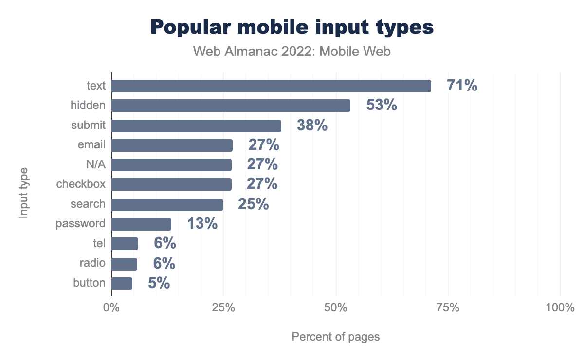
Since modulating keyboards with input fields is much more important on mobile than it is on desktop, we track the most popular mobile input types across their archive of websites. In 2022, text was still the most popular input type, used on 71% of pages, which is down slightly from last year at 73%. hidden was the next most common input type at 53% of pages, then submit at 38%.
After the most common input types, there is a cluster of input types that occur on around one quarter of the pages. These include email, no input fields (N/A) and checkbox at 27%, followed by search at 25%.
Compared to last year, checkbox, email, and search have increased a bit in prevalence. This possibly indicates more attention to the mobile use-case than in previous years, when more input fields may have been less indiscriminately lumped together as simply text.
Advanced input types
Advanced input types include color, date, datetime-local, email, month, number, range, reset, search, tel, time, url, week, datalist. They are considered advanced because they were introduced in the HTML 5 specification to alter the input method in the browser, generally changing the presentation of options that a user can interact with on the mobile site.
Of pages with at least one input, 47% of them use one or more advanced input types, which is up from 2021, when only 45% of mobile sites used an advanced input type.
In general, the use of specialized input fields and protocols can help make visitor interactions more engaging, useful, and efficient. It is unfortunate that it is still quite common for input fields and related functionality to be so often overlooked on the mobile web, but it is not entirely disheartening. These types of mobile controls have been around for many years, but they may be growing outdated or may now be executed by web app functionality and JavaScript, rather than by the traditional methods of coding that are expected in this type of analysis.
Similarly, with the evolution of deep links, which can open and directly navigate to a deep screen within a native app, specialized input fields might not be as necessary. In some cases, brands may try to push visitors from a website to an app, if they believe that it will provide users with a better experience or have better overall conversion statistics than the website. This is especially true when apps are the main focus of the company, or when the apps are being more actively updated and maintained than the website. This is rarely technically necessary, since both websites and apps can basically complete all of the necessary tasks, so it is mostly about the brand’s preference, or their own internal success metrics.
The variations on input fields are generally included to make web interaction more profitable for the company and more efficient for the user. They are often associated with digital checkout processes, and thus, can directly impact the bottom line. For some brands, the importance of the functionality may make it more likely that developers push users to a native app to complete a purchase, in order to streamline the processing, leverage saved user loyalty information, or speed up the completion of the transaction. This perception that native apps are better for this kind of interaction seems misguided though. Now, most consumers expect to have a smooth and seamless experience wherever they begin their encounter, rather than being forced to transition from web to app or vice versa. Whenever possible, parity between app and web functionality should be a top priority and advanced input methods can help with this, especially for things that impact the bottom line, like checkout processes.
It is possible that traditional input fields—whether they are link protocols, input types, or advanced input types—may just be handled by deep links to apps, and these are handled differently. The protocols for linking to apps that may be replacing some web functionality is broadly called deep linking, or Universal Links on iOS and Android App Links on Android. In code, these links look just like a regular web link, and the launching of the app is handled by a web app manifest file hosted in the /well-known directory at the root of the website. That said, it is hard to make assumptions about what changes and variations in these numbers mean in a practical interpretation, because we don’t know if losses and gains are absolute, or if there is just a transitioning of technology and norms in these aspects of the mobile web.
Looking at this topic in another light, it may also be too high of an expectation that developers specifically code the input types and variations for everything on their site. It may be possible for mobile browsers to do more of the heavy lifting in determining what the right action or keyboard layout is for a particular link or input field, based on obvious clues from the code or previous user interactions. Browsers may even be able to leverage this very research to optimize experiences like that.
For example, if every user that clicks on a particular input field switches to the number keyboard or submits only numbers, maybe the browser could find a way to use that kind of interaction and metadata to heuristically enable the numeric keyboard by default. We hope that browsers will continue the trend of simplifying tasks that have historically been complex and inefficient for site owners to code, relieving developers of the burden. When browsers assume more responsibility for aspects of interactivity, it allows them to live up to their namesake role as the user agent, rather than pushing all the responsibility for good user experiences on the site owners. These heuristic defaults for web-only sites, along with deep links to apps when their enhanced potential for functionality are available, seem like the ideal path forward.
Accessibility on the mobile web
Mobile devices are cheaper, lighter, and more portable than computers, so they house a lot of potential to help populations that have historically been ignored or marginalized by technology, often with only minor tweaks to a site’s accessibility. According to Google, true accessibility on the web means that “the site’s content is available, and its functionality can be operated by literally anyone.” In a more detailed explanation, Google offers that:
Accessibility, then, refers to the experience of users who might be outside the narrow range of the “typical” user, who might access or interact with things differently than you expect. Specifically, it concerns users who are experiencing some type of impairment or disability - and bear in mind that that experience might be non-physical or temporary.
Web accessibility and mobile web accessibility are evolving in their importance and prevalence in the conversations and general consciousness of the web as a whole. Building more accessible sites will allow the mobile web to reach more users and potential customers for businesses online. It will also help position information and associated brands as inclusive and in-touch with the needs of all users rather than perpetuating insensitivity and further marginalization by only considering the average user.
Accessibility concerns can be broken down into three types: situational, temporary, and permanent. In most cases, it is possible to imagine circumstances in which an aspect of web accessibility is critical for someone with a permanent impairment while also being incredibly useful for people with situational or temporary impairments. And while it is not explicitly rewarding aspects of accessibility with rankings, meeting web accessibility standards often has the side benefit of improving organic rankings in Google search results.
The W3C summarizes the basic tenets of accessibility in four groups of concerns, which make the website: perceivable (something you can see or hear), operable (buttons and gestures you can use), understandable (layout and presentation concerns), and robust (ability to enter and submit forms and information). The elements that we focus on here fall mostly under the perceivable and operable groups, including: color contrast, tap targets, and zooming and scaling.
It is possible that the increased focus on mobile accessibility will reframe the function and importance of mobile and digital communication, especially if it helps us to reassert the humanity of digital technology and communication. This is particularly important in cultures where the increased digital connectivity may actually be perpetuating isolation and a lack of real-world connectivity. Making the mobile web more accessible should have a direct and indirect positive impact on mobile technology and society at large.
Color contrast
Color contrast is an important aspect of mobile web accessibility for a large variety of reasons, and it is one of the easiest accessibility needs to spot and update when reviewing a mobile site. On mobile devices, where screens are always small and fonts may be smaller than normal, having good color contrast can make a big difference in the legibility of the content. When any kind of vision impairment is present, including common afflictions like color blindness, glaucoma, or cataracts, viewing web content on a mobile phone can be difficult or impossible.
Even people with perfect vision can sometimes struggle to consume mobile web content on a screen when the screen is dirty, has a lot of glare, or the user is in bright sunlight. A high contrast ratio between the colors of a mobile site can help make it easier to use and appreciate, even in bad conditions and even for people with perfect vision.
That said, many people don’t have perfect vision and use glasses or contact lenses to help them see. People with perfect vision can expect their vision to eventually degrade as they age, at least to some degree, so this accessibility standard is one that we can expect to impact everyone, albeit eventually.
Given the stakes, it is sad that only 23% of mobile sites this year actually have adequate color contrast. This is only one full percentage point up from the 2021 statistic (22%), so it is an improvement, but not a substantial improvement. When we look back further, this statistic has actually been 22% since 2019, so there has been almost no improvement in 4 years - Disappointing for something that is widely considered the most impactful accessibility standard on the web.
According to the US General Services Administration, site owners should “make sure the contrast between the text and background is greater than or equal to 4.5:1 for small text and 3:1 for large text.” The W3C backs this ratio and also adds an enhanced guideline that calls for “a contrast of at least 7:1 (or 4.5:1 for large-scale text).” Obviously there are more mobile sites that miss the mark for enhanced accessibility, making that statistic likely far below the 23% that meet the basic requirements for color contrast on mobile sites.
If enhancing the perceivability of a site by improving the color contrast and making it actually usable is not enough of an incentive, having a minimum level of contrast between text and background colors has long been an important element for ranking in Google searches as well. It started as a means of preventing spammers from including hidden text on websites, which was often white text on a white background. Later, Google moved it over to be part of the original Mobile Friendly guidelines, and now is simply included as part of their general guidelines for designing websites that are good for users.
Color contrast is something that we would like to encourage webmasters to focus on, especially in light of new color capabilities in browsers, like dark-mode. If you are making site updates to improve your sites compatibility in dark-mode, you should ideally also take the time to improve overall color contrast as part of that project. This feature is often easier for some people to use, so you can count this combined effort as a double-benefit!
Tap targets
Tap targets are effectively the clickable elements on a page. Since many designers and developers still think about websites as being designed on and for desktop interactions rather than mobile-first, it can be common to overlook having large enough spaces for touchscreen interactions, on which navigation and clicking with a finger is so much less precise. On mobile devices, when things are resized and rearranged to fit the smaller screen, it is common for linked elements to be close together. This can become a problem if multiple clickable elements are clustered together, as they might appear in a navigation menu or footer.
Having appropriately sized tap targets makes it less likely that a user will errantly click on the wrong button or link, and have to navigate back to try the click again. It is also not ideal to expect users to zoom in on the mobile screens simply to click the right button. From an accessibility standpoint, having appropriately sized tap targets is also important for users that have any kind of motor impairment, or difficulty with fine motor skills.
The minimum size for a tap target is generally considered to be no smaller than 48 pixels by 48 pixels, which is a rough estimation of the size of a finger being used on a touchscreen. Tap targets are also expected to be a minimum of 8 pixels apart from each other in order to pass any of Google’s evaluations. In our research, 42% of mobile sites had sufficient tap targets, which is disappointing as less than half of the sites manage to universally have appropriately sized tap targets.
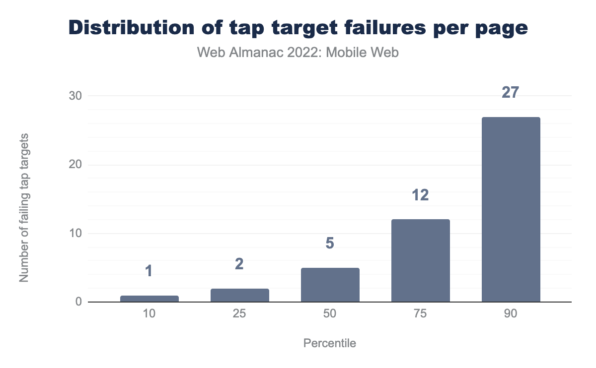
Pages that fail the audit generally have more than one failing link. The median number of failing tap targets is five, but in some cases, when sites fail, the number of failing tap targets can be quite high. We see that the worst 10 percent of sites have at least 27 failing tap targets.
Zooming and scaling
Mobile devices have become a big part of daily life for most people, and the expectation is that interaction with mobile web content should be quick and easy. How websites handle zooming and scaling can go a long way to improving interactions on mobile. There are different takes on this, and while most will agree that you need to set a proper initial scale in the viewport for mobile users (<meta name="viewport" content="width=device-width, initial-scale=1">), there is not universal agreement about the second part of a viewport setting, which controls if you should or shouldn’t disable scaling and zooming (…user-scalable=no"> or perhaps …user-scalable=yes">). Most authorities, including the W3C, suggest that restricting scaling and zooming can create a bad user experience and adversely impact accessibility, so it should be avoided. Settings for minimum-scale and maximum-scale can also be set, and these are often safer limits, if a developer believes that limits are needed.
Zooming can be a good workaround for a user who is visually impaired, or anyone who just doesn’t have their reading glasses handy when they need them. On the other hand, it can be hard to build sites that universally scale well on mobile. There are many different font size settings that would need to be accommodated, and getting it wrong can make the site much harder to interact with. This is why some designers prefer to prevent scaling and zooming, to ensure that the page renders in a highly predictable way that is not impacted by scaling and zooming. While this is true, disabling zooming and scaling impedes the usability of a mobile site, and thus, should be avoided for the sake of accessibility.
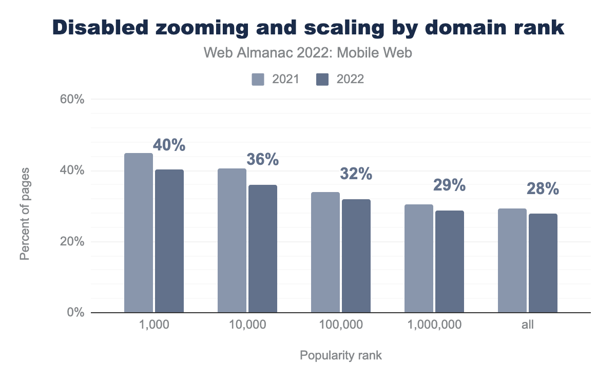
Of the mobile websites in the top 1,000 rank, 40% of them had disabled zooming and scaling, down from about 45% in 2021. When you look at the top 10,000, 36% of mobile sites had disabled scaling and zooming, and this is down from about 41% in 2021. Looking at the other end of the scale, the widest ranking group, which includes all the sites in the data set, 28% of sites prevented zooming and scaling, down from about 29% in 2021. Overall, what we can see here is that the prevalence of this accessibility-limiting setting is on the decline, especially for the most popular sites, which is good news, but the fact that more than half of the sites are still using this type of limiting setting is disappointing.
As a whole, we know that accessibility concerns are not going to go away, and as time progresses, meeting accessibility standards will become a basic expectation—especially on mobile devices. As is often the case, the use cases for mobile interactivity are more broad-ranging compared to desktop, so users’ expectations are higher, even though the development constraints for web mobile content make it more difficult to actually achieve. Nevertheless, accessibility is becoming a critical component of good web design, and should be embraced to create a more inclusive mobile web. It is good to see that there is increasing adherence to basic accessibility guidelines, but there is still considerable room for improvement.
For many years, Google has created a positive impact on the web by rewarding websites that meet certain basic requirements with better rankings. They have done it for load time, performance, security and mobile-friendliness, but not yet for accessibility. Google does write and support a lot of advancements for web accessibility in their official communications, but there is an opportunity to do more. While many accessibility updates do naturally have a positive impact on website rankings, it may be time for Google to explicitly incentivize some level of compliance to basic accessibility standards with better rankings—not just because they can enhance the semantic understanding of a website, but also because they simply make the web a better place for everyone.
Mobile performance
One of the most complex problems that site owners have to address on the mobile web is performance, which is experienced as the delay that users incur when they request or interact with websites on smaller devices. Though they have evolved quite a lot, mobile devices still generally have less-powerful processors than larger devices and are often getting data over slower and less reliable internet connections. In addition, the probability that users may incur a cost for mobile data requests, especially if they go over a plan limit, makes efficiency important as a practical concern, beyond just its impact on user experience and speed.
Core Web Vitals
Core Web Vitals is a collection of performance metrics that Google compiles to evaluate different websites, and specifically, different page groups on websites to describe how they perform in both mobile and desktop page settings. The elements of Core Web Vitals include loading, interactivity, and layout stability.
All three are aspects of how users perceive the performance of a page that can help or hinder the loading experience for users. This type of evaluation began in May of 2020, and these metrics are taken into account in Google’s ranking algorithm specifically as an aspect of the page experience evaluation, and thus, the metrics are organized around thresholds of performance that are either considered “good”, “needs improvement”, or “poor”. For a site to be considered “good”, 75% of visits must meet the prescribed thresholds for each of the Core Web Vitals metrics.
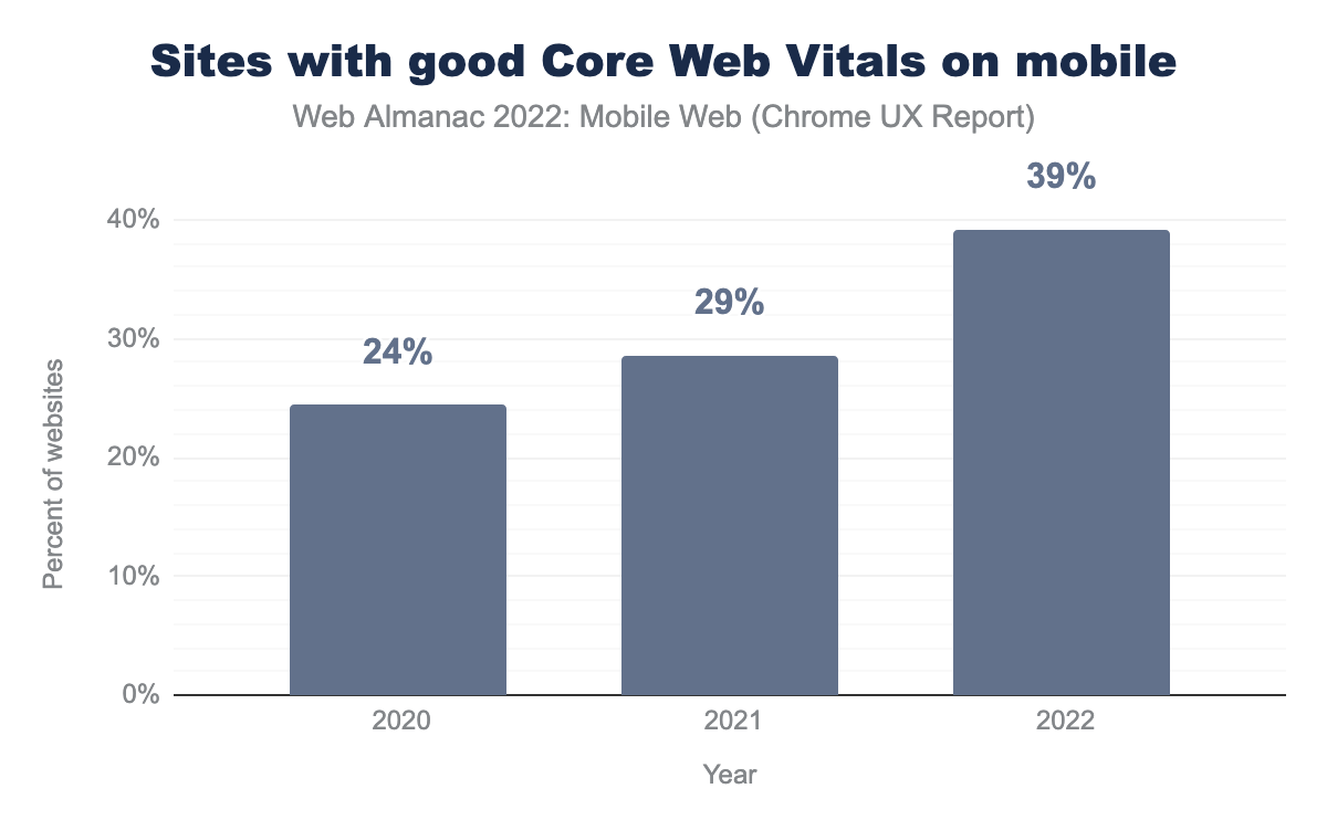
The figure above shows how the overall performance of the web has changed since Core Web Vitals first launched in 2020. You can see that overall, mobile websites are consistently improving year over year. In 2022, 39% of websites have good Core Web Vitals experiences on mobile devices. See the Performance chapter for a deeper look at what may have caused such a significant change this year.
Loading performance metrics
Load time on the mobile web is measured in the same way that it is measured in any other context, and despite the more difficult burdens that mobile devices face, that makes it harder for them to load a site quickly. Research shows that mobile visitors are more impatient, and actually expect and want the experience on a phone to be faster than it is on a larger device.
Time to First Byte (TTFB)
Time to First Byte, which is often abbreviated as TTFB, is the measurement of the amount of time that elapses from the start of the navigation to the first byte of data received in response to the request. TTFB describes the responsiveness of the server and other network resources that are needed to begin building a page.
TTFB is not a Core Web Vitals metric itself, but it has a direct impact on all loading performance metrics, and thus, is often discussed as part of the optimization of all Core Web Vitals elements and general site performance, especially Largest Contentful Paint.
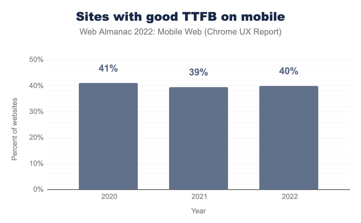
As you can see above, there are only minor fluctuations in the percent of mobile sites that are considered “good” from 2020 to 2022, going from 41% in 2020 down to 39% in 2021, then back up to 40% in 2022.
Largest Contentful Paint (LCP)
Largest Contentful Paint, or LCP, is a metric that describes how long it takes for a website to load the largest portion of the page content that is first displayed to a user with meaningful content; it is often a function of the size and performance of a header image or design. The LCP is important because it signals to a user when the page is ready to start consuming.
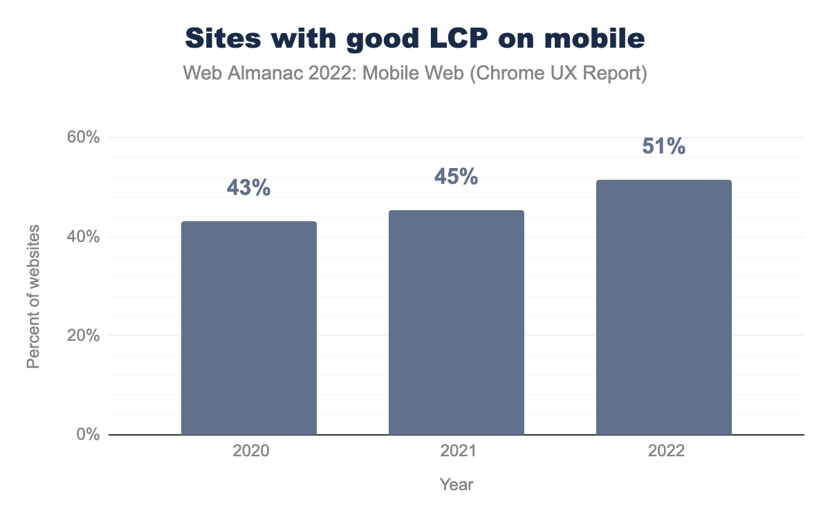
LCP performance is improving. In 2020, 43% of mobile sites had a LCP assessed as “good”. In 2021, this number improved to 45% of mobile sites. There was a significant jump in 2022 in which 51% of mobile sites had good LCP performance. The Performance chapter explores some possible explanations for why this may have happened.
Images
Images can contribute a lot to providing a good mobile experience, but they can also contribute a lot to slow performance and bad loading experiences if they are not set up correctly. This section explores how site owners are handling—or not handling—the performance impact of images.
Appropriately sized images
Using images that are sized properly for a mobile device has long been one of the easiest ways that anyone could improve mobile load time. In the early days of the mobile web, site owners would often simply send the same images to desktop users as they would for mobile users, because ultimately, mobile browsers would scale and resize the images to fit in the mobile rendering of the page. Unfortunately, this didn’t work well, because it ended up requiring a lot of extra data to send rich, high-quality images that were better suited for a desktop viewing experience.
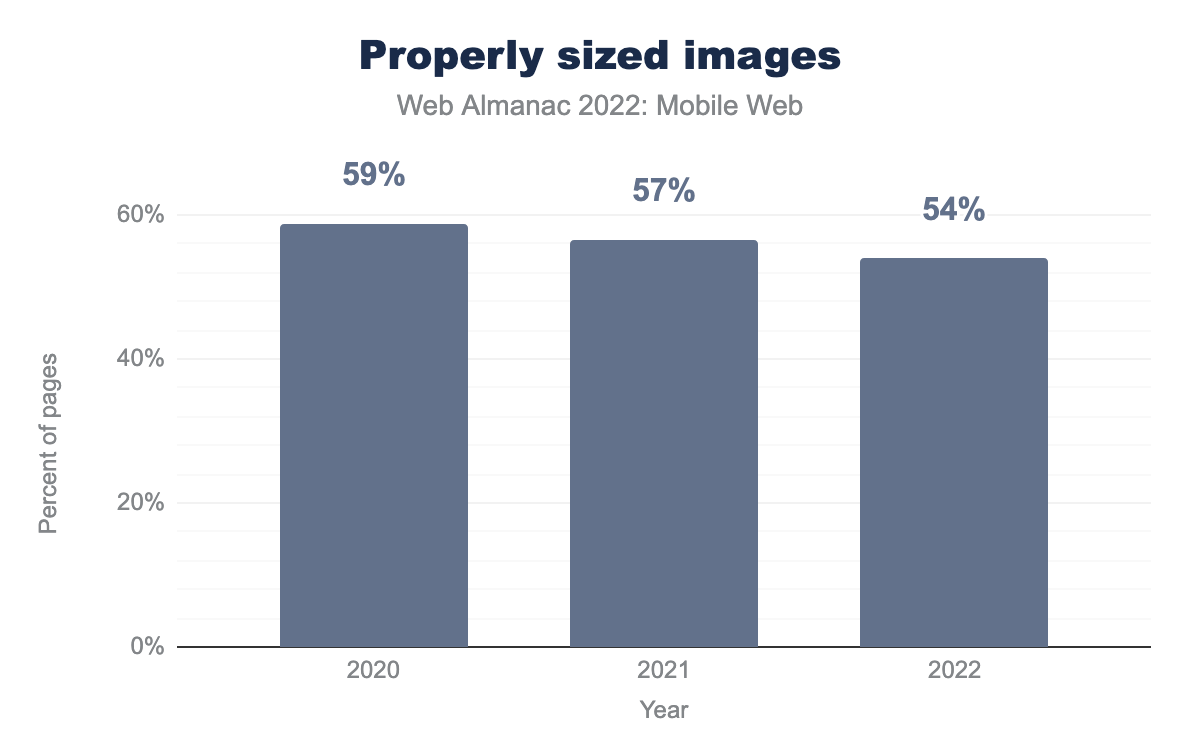
Given Google’s increased focus on rewarding good performance with their Core Web Vitals program, you would expect that more sites would be optimizing their images. However, it’s interesting to see that sites are actually having fewer optimized images over time. The figure above shows that there is a decrease in the percentage of pages with properly sized images since 2020, when 59% of sites had properly sized images. But in 2022, that number is down to only 54%.
Responsive images
Creating images that can be responsive to different screen sizes is a common way to handle mobile image sizing. Using responsive images is a great way for websites to handle even the most unique presentation scenarios, like viewing a website on a wide-screen TV, viewing a website on a connected digital assistant, or even on a small feature phone or handheld gaming system.
There are two main methods for embedding images on a screen: the img element, and the more-expanded picture element. The picture element offers a few more possibilities to include images based on certain criteria. The srcset attribute is available on both elements and enables images to be conditionally included based on things like screen size and display density. Some browsers may also take bandwidth into account when choosing an appropriate image.
The picture element further expands on these capabilities to allow for art direction, for example specifying a 4:3 ratio image for mobile portrait screens, and a 16:9 for desktop or landscape views. A further use is being able to specify different image formats, for example the browser can load an AVIF image where supported, otherwise it will fall back to a WebP or PNG image. Allowing the browser to make the sensible choice based on the conditions it’s operating in usually means better performance and thus a better user experience.
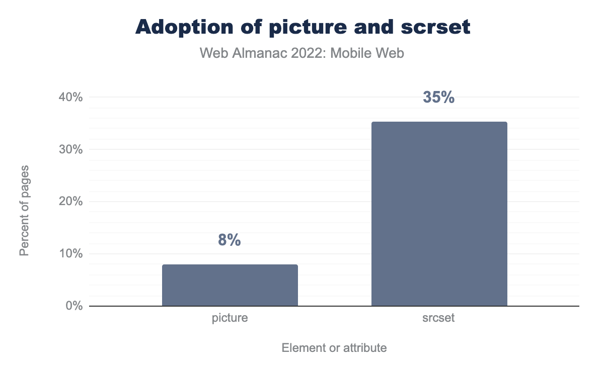
picture element and srcset attribute.
The adoption of the picture element is at only 8% of mobile pages (up from 6% last year), but srcset is at 35%. In 2021, the use of srcset was around 32%, so we have seen a growth of about 3 percentage points.
Overall, it is great to see an increase in the use of responsive image techniques. The relatively small uptake for picture, despite offering more flexibility in art direction and format fallback support, could be down to the fact that it can require more work to produce, and is less likely to be supported by default in popular CMS systems, like WordPress, which stick to the venerable img tag (for now).
Lazy-loading
Lazy-loading is the process of assigning different loading priority levels to elements of a web page based on where they occur on a page. Without lazy loading, all of the elements and images on a page will eventually be loaded, but lazy loading allows images to be deferred until it is clear that they will be needed, based on where the user has scrolled to on the page. Lazy-loading is especially relevant on mobile devices, because common responsive design patterns will almost always stack content for a mobile rendering. The narrow nature of mobile screens ensures that many stacked elements of the page are pushed far down below the fold, and may not be immediately necessary—especially if all the user wants to do is click a link in the top navigation. Lazy-loading eliminates that unnecessary data transfer, and the load time associated with it.
loading="lazy".
Native lazy-loading has been available since 2019, which allows browsers to do the complex calculations in the most efficient way possible, and only requires that site owners tag images with either lazy or eager. This simple tagging can be a great boon for page and site performance, and can also save a lot of time and effort associated with maintaining your own lazy-loading code. As long as you don’t inadvertently lazy-load your LCP image at the top of the page, it is an easy win, but we found that only 25% of sites are currently using the loading=lazy attribute for their images.
Layout stability
Layout stability is an important part of performance that has recently been pushed to the fore with Google’s introduction of Core Web Vitals. Elements of Core Web Vitals are designed to measure and assess the loading experience of a page, and layout stability of a page is an important part of that. If a page is constantly moving and re-painting while it is being loaded, this makes it seem like the page is taking much longer to load than it otherwise could if the experience were more predictable and once things load, they remain exactly in the place where they have loaded.
Since the loading order of content can be different under different conditions, or in different browsers, building and planning around layout stability is a good way to ensure a smooth loading experience regardless of the circumstances. The most relevant metrics for evaluating layout stability is Cumulative Layout Shift (CLS) but other aspects of performance like image sizing and lazy loading can also impact layout stability.
Cumulative Layout Shift (CLS)
Cumulative Layout Shift, which is often abbreviated as CLS, is a representation of the stability of a page while it is in use.
A low CLS represents a visually stable layout, which makes the experience less frustrating to users. Pages with a high CLS often experience movement when images begin to load and text must be rendered to fit, or wrap around the image. This can also happen when font files load and the page has to be painted to accommodate differences caused by the font, sometimes described as reflow, or when a large header image loads and moves all the content on the page—occurrences that had been colloquially described as jank.
The screen size of the device requesting the page can have a significant impact on the way elements are laid out, and how much they move when shift-causing elements are loaded.
CLS is measured as a score, and the highest instance of movement in any session window during the page lifespan is what is measured. This changed in 2021, when CLS was previously measured as the sum of all individual shift scores on a page. Google considers scores of 0.1 or less as “good” and scores over 0.25 to be “poor”.
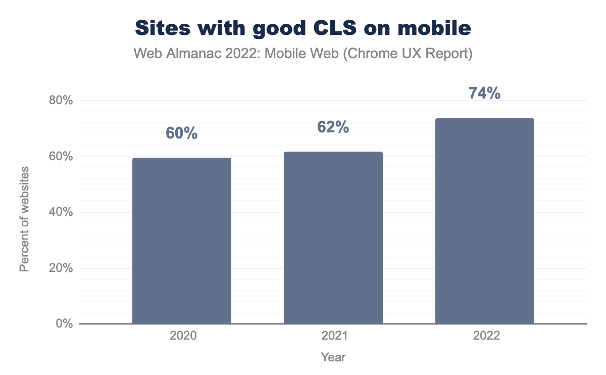
The percentage of websites with “good” CLS on mobile has improved significantly to 74%, up from 62% last year.
Responsiveness
Responsiveness is always good in a mobile scenario, but it can have a layered meaning, In general, technology that is responsive is good, and is reacting to cues that it is given in an efficient and meaningful way. When we talk about mobile responsiveness in terms of design, we are describing content that will respond and adjust its layout to accommodate the different screen sizes of the devices that request it. In a more broad sense though, responsive also indicates how quickly and efficiently a page responds to user interactions - so this type of responsiveness is less about layout, and more about quick interaction. Having a site that is very responsive is good because it creates an efficient user interaction, in which users feel immediately acknowledged when they interact with the site. The metrics used to evaluate this kind of responsiveness are First Input Delay (FID) and Interaction to Next Paint (INP), and those will be covered in this section.
First Input Delay (FID)
First Input Delay (FID) describes the responsiveness of a site, especially related to how long it takes for a site to respond after a user first clicks on a page element. A low FID is desirable, especially on mobile web interactions, where the responsiveness of a mobile site should ideally rival the responsiveness of a comparable native app, to make the interactions feel equally fluid and satisfying. Google considers a site to have “good” FID if at least 75% of experiences are under 100 ms.
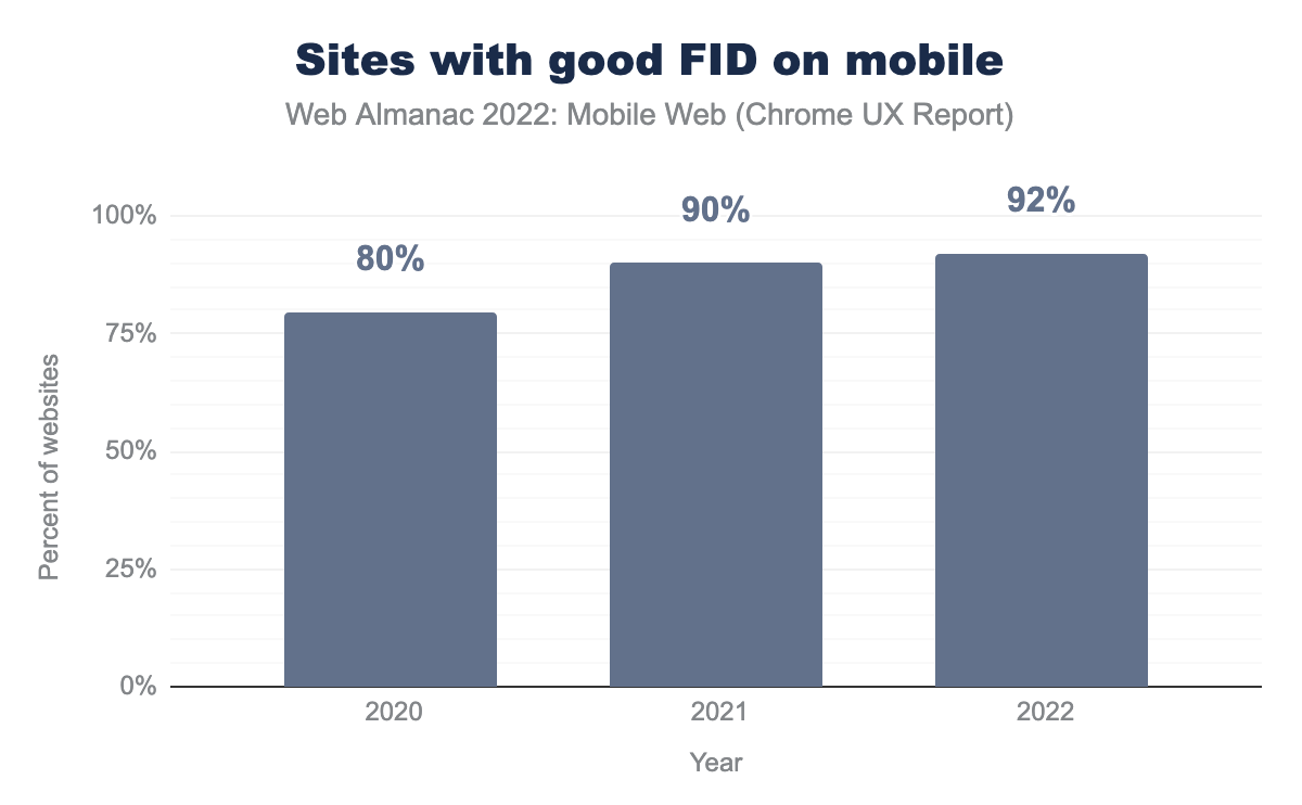
There has been a consistent growth in the percent of mobile sites that have “good” FID in the past three years, going from only 80% in 2020 to 90% in 2021, and reaching 92% in 2022.
Interaction to Next Paint (INP)
Interaction to Next Paint (INP) is an experimental metric from Google that is used to measure responsiveness and response time on a page when a user interacts with it. A low INP is desirable because it means that the page was able to respond quickly to user interactions without substantial delays waiting for content to paint after it is requested. A “good” INP is 200 ms or less, and a poor one is anything over 500 ms. Eventually, INP could be added to the official Core Web Vitals metrics, but for now it is still being tested to make sure that it is a reliable and consistent metric that site owners will find useful.
This is the first year that INP data is available to us, so we don’t have any historical context, but what we see is that 55% of websites have good INP on mobile. This is especially interesting because of how much worse the mobile web performs on INP compared to FID. If INP does end up replacing FID as a Core Web Vital, responsiveness will become a much more prevalent issue.
Conclusion
In a comparison of data from 2020 and 2021 to 2022, there has been a lot of evolution in both the use and expectations of the mobile web. Aspects of performance like layout stability used to be considered optional, overly technical, or niche, have now become mainstream concerns for site owners that focus on mobile and desktop alike. The added complexity of providing a good user experience has come into higher relief for mobile devices, where it is confoundingly more expected but also much harder.
The good news for those who care about the mobile web and its user experiences is that much of the hard work of building sites that work well across all different devices is being offloaded from individual site and CMS development teams to browsers. We see this happening with lazy-loading, the srcset element for responsive images, and some other aspects of performance, but we hope that this type of initiative will also be taken on by the browsers to help simplify work in other ways as well. There are still many opportunities to improve mobile web accessibility, interactivity across different types of phone functionality, and eventually maybe even interplay with connected devices for things like casting, sharing, and other connected home and IoT scenarios. Google and other search engines can also do more to explicitly incentivize attention to mobile accessibility concerns to create a wide-spread positive impact on the web.
Traffic and popularity statistics in this report are clear that mobile web is basically now just synonymous with web. The expectation of mobile website interaction should be a default in almost every scenario. This means that to move forward, site owners and the web community will need to continue to raise consciousness of this reality with the less technical teams, divisions, and groups that we work with. It is not enough to simply pay lip-service to the concept of mobile-first design and development; these concepts need to continue to be embraced and pushed when necessary. They also need to experience their own growth—outside of the web scenario to larger elements of business planning, marketing, strategy, and communication.
