SEO

Introduction
Search Engine Optimization (SEO) is the practice of optimizing websites’ technical configuration, content relevance, and link popularity to make their information easily findable and more relevant to fulfill users’ search needs. As a consequence, websites improve their visibility in search engines’ results for relevant user queries regarding their content and business, growing their traffic, conversions, and profits.
Despite its complex multidisciplinary nature, in recent years SEO has evolved to become one of the most popular digital marketing strategies and channels.
The goal of the Web Almanac’s SEO chapter is to identify and assess main elements and configurations that play a role in a website’s organic search optimization. By identifying these elements, we hope that websites can leverage our findings to improve their ability to be crawled, indexed, and ranked by search engines. In this chapter, we provide a snapshot of their status in 2020 and a summary of what has changed since 2019.
It is important to note that this chapter is based on analysis from Lighthouse on mobile sites, the Chrome UX Report on mobile and desktop, as well as raw and rendered HTML elements from the HTTP Archive on mobile and desktop. In the case of the HTTP Archive and Lighthouse, it is limited to the data identified from websites’ home pages only, not site-wide crawls. We have taken this into consideration when doing assessments. Keeping this distinction in mind is important when drawing conclusions from our results. You can learn more about it on our Methodology page.
Let’s go through this year’s organic search optimization main findings.
Fundamentals
This section features the optimization-related findings of the web configurations and elements that make up the foundation for search engines to correctly crawl, index, and rank websites to provide users the best results for their queries.
Crawlability and indexability
Search engines use web crawlers (also called spiders) to discover new or updated content from websites, browsing the web by following links between pages. Crawling is the process of looking for new or updated web content (whether web pages, images, videos, etc.).
Search crawlers discover content by following links between URLs, as well as using additional sources that website owners can provide, like the generation of XML sitemaps, which are lists of URLs that a website’s owner wants search engines to index, or through direct crawl requests via search engines tools, like Google’s Search Console.
Once search engines access web content they need to render—similar to what web browsers do—and index it. Search engines will then analyze and catalog the identified information, trying to understand it as users do, to ultimately store it in its index, or web database.
When users enter a query, search engines search their index to find the best content to display on the search results pages to answer their queries, using a variety of factors to determine which pages are shown before others.
For websites looking to optimize their visibility in search results, it is important to follow certain crawlability and indexability best practices: correctly configuring robots.txt, robots meta tags, X-Robots-Tag HTTP headers, and canonical tags, among others. These best practices help search engines in accessing web content more easily and indexing them more accurately. A thorough analysis of these configurations is provided in the following sections.
robots.txt
Located at the root of a site, a robots.txt file is an effective tool in controlling which pages a search engine crawler should interact with, how quickly to crawl them, and what to do with the discovered content.
Google formally proposed making robots.txt an official internet standard in 2019. The June 2020 draft includes clear documentation on technical requirements for the robots.txt file. This has prompted more detailed information about how search engine crawlers should respond to non-standard content.
A robots.txt file must be plain text, encoded in UTF-8, and respond to requests with a 200 HTTP status code. A malformed robots.txt, a 4XX (client error) response, or more than five redirects are interpreted by search engine crawlers as a full allow, meaning all content may be crawled. A 5XX (server error) response is understood as a full disallow, meaning no content may be crawled. If the robots.txt is unreachable for more than 30 days, Google will use the last cached copy of it, as described in their specifications.
Overall, 80.46% of mobile pages responded to robots.txt with a 2XX response. Of these, 25.09% were not recognized as valid. This has slightly improved over 2019, when it was found that 27.84% of mobile sites had a valid robots.txt.
Lighthouse, the data source for testing robots.txt validity, introduced a robots.txt audit as part of the v6 update. This inclusion highlights that a successfully resolved request does not mean that the cornerstone file will be able to provide the necessary directives to web crawlers.
| Response Code | Mobile | Desktop |
|---|---|---|
| 2XX | 80.46% | 79.59% |
| 3XX | 0.01% | 0.01% |
| 4XX | 17.67% | 18.64% |
| 5XX | 0.15% | 0.12% |
| 6XX | 0.00% | 0.00% |
| 7XX | 0.15% | 0.12% |
robots.txt response codes.
In addition to similar status code behavior, Disallow statement use was consistent between mobile and desktop versions of robots.txt files.
The most prevalent User-agent declaration statement was the wildcard, User-agent: *, appearing on 74.40% of mobile and 73.16% of desktop robots.txt requests. The second most prevalent declaration was adsbot-google, appearing in 5.63% of mobile and 5.68% of desktop robots.txt requests. Google AdsBot disregards wildcard statements and must be specifically named as the bot checks web page and app ad quality across devices.
The most frequently used directives focused on search engines and their paid marketing counterparts. SEO tools Ahref and Majestic were in the top five Disallow statements for both devices.
% of robots.txt |
||
|---|---|---|
User-agent |
Mobile | Desktop |
* |
74.40% | 73.16% |
| adsbot-google | 5.63% | 5.68% |
| mediapartners-google | 5.55% | 3.83% |
| mj12bot | 5.49% | 5.30% |
| ahrefsbot | 4.80% | 4.66% |
robots.txt User-agent directives.
When analyzing the usage of the Disallow statement in robots.txt by using Lighthouse-powered data of over 6 million sites, it was found that 97.84% of them were completely crawlable, with only 1.05% using a Disallow statement.
An analysis of the robots.txt Disallow statement usage along the meta robots indexability directives was also done, finding 1.02% of the sites including a Disallow statement along indexable pages featuring a meta robots index directive, with only 0.03% of sites using the Disallow statement in robots.txt along noindexed pages via the meta robots noindex directive.
The higher usage of the Disallow statement on indexable pages than noindexed ones is notable as Google documentation states that site owners should not use robots.txt as a means to hide web pages from Google Search, as internal linking with descriptive text could result in the page being indexed without a crawler visiting the page. Instead, site owners should use other methods, like a noindex directive via meta robots.
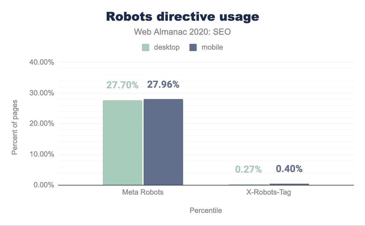
Meta robots
The robots meta tag and X-Robots-Tag HTTP header are an extension of the proposed Robots Exclusion Protocol (REP), which allows directives to be configured at a more granular level. Directive support varies by search engine as REP is not yet an official internet standard.
Meta tags were the dominant method of granular execution with 27.70% of desktop and 27.96% of mobile pages using the tag. X-Robots-Tag directives were found on 0.27% and 0.40% of desktop and mobile, respectively.
X-Robots-Tag directives.
When analyzing the usage of the meta robots tag in Lighthouse tests, 0.47% of crawlable pages were found to be noindexed. 0.44% of these pages used a noindex directive and did not disallow crawling of the page in the robots.txt.
The combination of Disallow within robots.txt and noindex directive in meta robots were found on only 0.03% of pages. While this method offers belt and suspenders redundancy, a page must not be blocked by a robots.txt file in order for an on-page noindex directive to be effective.
Interestingly, rendering changed the meta robots tag in 0.16% of pages. While there is no inherent issue with using JavaScript to add a meta robots tag to a page or change its content, SEOs should be judicious in execution. If a page loads with a noindex directive in the meta robots tag before rendering, search engines won’t run the JavaScript that changes the tag value or index the page.
Canonicalization
Canonical tags, as described by Google, are used to specify to search engines which is the preferred canonical URL version to index and rank for a page—the one that is considered to be better representative of it—when there are many URLs featuring the same or very similar content. It is important to note that:
- The canonical tag configuration is used along with other signals to select the canonical URL of a page; it is not the only one.
- Although self-referencing canonical tags are sometimes used, these aren’t a requirement.
In last year’s chapter, it was identified that 48.34% of mobile pages were using a canonical tag. This year the number of mobile pages featuring a canonical tag has grown to 53.61%.
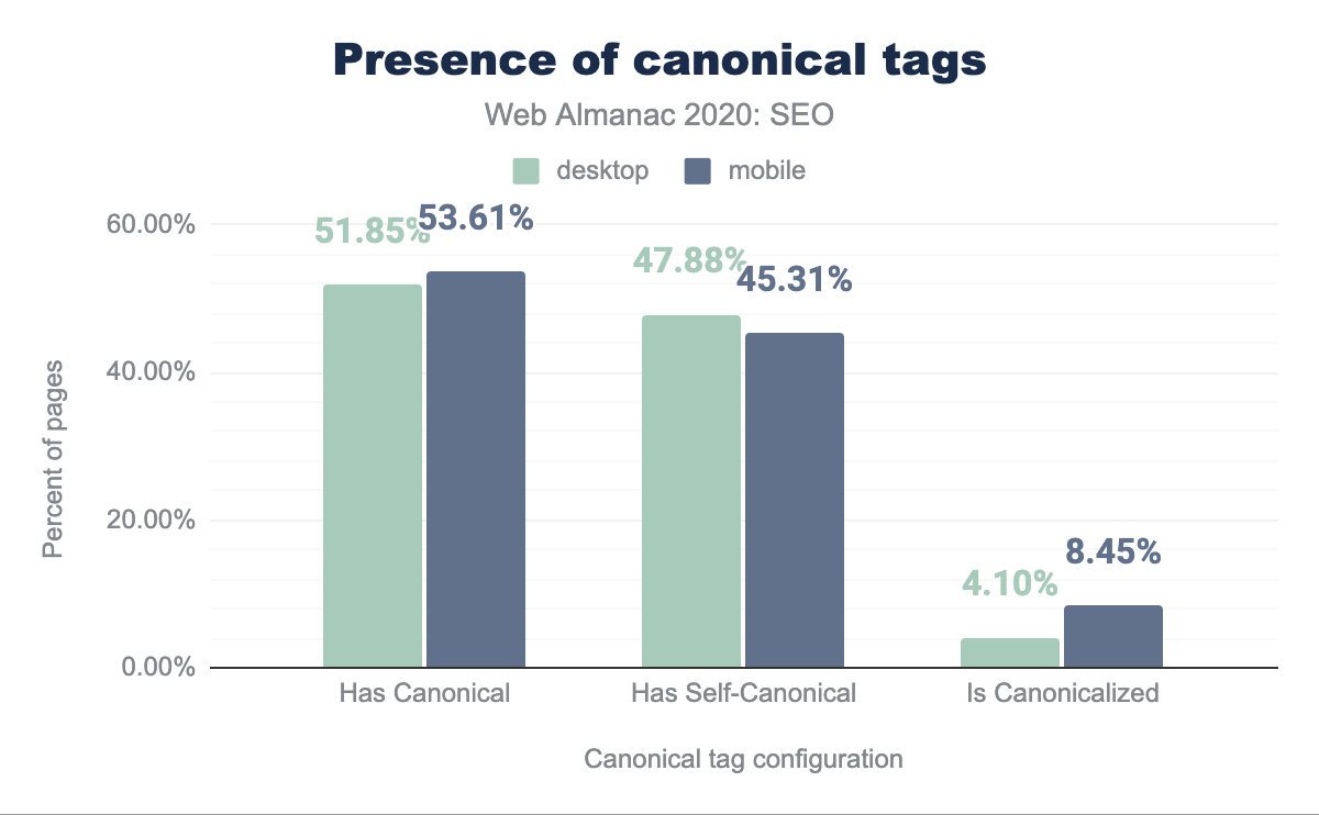
When analyzing this year’s mobile pages canonical tag configuration, it was detected that 45.31% of them were self-referential and 8.45% were pointing to different URLs as the canonical ones.
On the other hand, 51.85% of the desktop pages were found to be featuring a canonical tag this year, with 47.88% being self-referential and 4.10% pointing to a different URL.
Not only do mobile pages include more canonical tags than desktop ones (53.61% versus 51.85%), there are relatively more mobile homes pages canonicalizing to other URLs than their desktop counterparts (8.45% vs. 4.10%). This could be explained by the usage of an independent (or separate) mobile web version by some sites that need to canonicalize to their desktop URLs alternates.
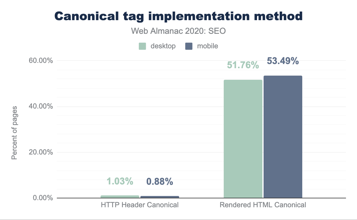
Canonical URLs can be specified through different methods: by using the canonical link via the HTTP headers or the HTML head of a page, or by submitting them in XML sitemaps. When analyzing which is the most popular canonical link implementation method, it was found that only 1.03% of desktop pages and 0.88% of mobile ones are relying on the HTTP headers for their implementation, meaning that canonical tags are prominently implemented via the HTML head of a page.
head canonicalization methods.
When analyzing the canonical tag implemented in the raw HTML versus those relying on client-side JavaScript rendering, we identified that 0.68% of the mobile pages and 0.54% of the desktop ones include a canonical tag in the rendered but not the raw HTML. This means that there’s only a very small number of pages that are relying on JavaScript to implement canonical tags.
On the other hand, in 0.93% of the mobile pages and 0.76% of the desktop ones, we saw canonical tags implemented via both the raw and the rendered HTML with a conflict happening between the URL specified in the raw versus the rendered HTML of the same pages. This can generate indexability issues as mixed information is sent to search engines about which is the canonical URL for the same page.
A similar conflict can be found with the different implementation methods, with 0.15% of the mobile pages and 0.17% of the desktop ones showing conflicts between the canonical tags implemented via their HTTP headers and HTML head.
Content
The primary purpose that both search engines and Search Engine Optimization serve is to give visibility to content that users need. Search engines extract features from pages to determine what the content is about. In that way, the two are symbiotic. The features extracted align with signals that indicate relevance and inform ranking.
To understand what search engines are able to effectively extract, we have broken out the components of that content and examined the incidence rate of those features between the mobile and desktop contexts. We also reviewed the disparity between mobile and desktop content. The mobile and desktop disparity is especially valuable because Google has moved to mobile-first indexing (MFI) for all new sites and, as of March of 2021, will move to a mobile-only index wherein content that does not appear within the mobile context will not be evaluated for ranking.
Rendered versus non-rendered text content
The usage of Single Page Application (SPA) JavaScript technologies has exploded with the growth of the web. This design pattern introduces difficulties for search engine spiders because both the execution of JavaScript transformations at runtime and user interactions with the page after load can cause additional content to appear or be rendered.
Search engines encounter pages through its crawling activity, but may or may not choose to implement a second step of rendering a page. As a result, there may be disparities between the content that a user sees and the content that a search engine indexes and considers for rankings.
We assessed word count as a heuristic of that disparity.
| Values | Desktop | Mobile | Difference |
|---|---|---|---|
| Raw | 360 | 312 | -13.33% |
| Rendered | 402 | 348 | -13.43% |
| Difference | 11.67% | 11.54% |
This year, the median desktop page was found to have 402 words and the mobile page had 348 words. While last year, the median desktop page had 346 words, and the median mobile page had a slightly lower word count at 306 words. This represents 16.2% and 13.7% growth respectively.
We found that the median desktop site features 11.67% more words when rendered than it does on an initial crawl of its raw HTML. We also found that the median mobile site displays 13.33% less text content than its desktop counterpart. The median mobile site also displays 11.54% more words when rendered than its raw HTML counterpart.
Across our sample set, there are disparities across the combination of mobile/desktop and rendered/non-rendered. This suggests that although search engines are continually improving in this area, most sites across the web are missing out on opportunities to improve their organic search visibility through a stronger focus on ensuring their content is available and indexable. This is also a concern because the lion’s share of available SEO tools do not crawl in the above combination of contexts and automatically identify this as an issue.
Headings
Heading elements (H1-H6) act as a mechanism to visually indicate structure in a page’s content. Although these HTML elements don’t carry the weight they used to in search rankings, they still act as a valuable way to structure pages and signal other elements in the search engine results pages (SERPs) like featured snippets or other extraction methods that align with Google’s new passage indexing.
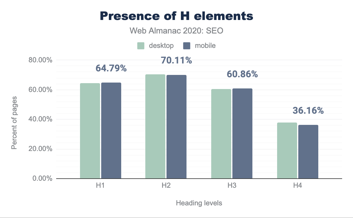
Over 60% of pages feature H1 elements (including empty ones) in both the mobile and desktop contexts.
These numbers hover around 60%+ through H2 and H3. The incidence rate of H4 elements is lower than 4%, suggesting that the level of specificity is not required for most pages or the developers style other headings elements differently to support the visual structure of the content.
The prevalence of more H2 elements than H1s suggests that fewer pages are using multiple H1s.
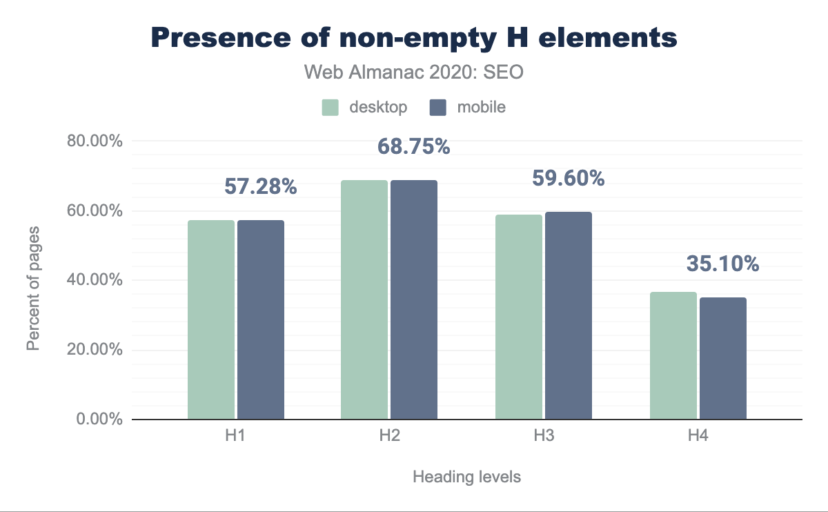
In reviewing the adoption of non-empty heading elements, we found that 7.55% of H1, 1.4% of H2, 1.5% of H3, and 1.1% of H4 elements feature no text. One possible explanation for these low results is that those portions are used for styling the page or are the result of coding mistakes.
You can learn more about the usage of headings in the Markup chapter, including the misuse of non-standard H7 and H8 elements.
Structured data
Over the course of the past decade, search engines, particularly Google, have continued to push towards becoming the presentation layer of the web. These advancements are partially driven by their improved ability to extract information from unstructured content (e.g., passage indexing) and the adoption of semantic markup in the form of structured data. Search engines have encouraged content creators and developers to implement structured data to give more visibility to their content within components of search results.
In a move from “strings to things”, search engines have agreed upon a broad vocabulary of objects in support of marking up a variety of people, places, and things within web content. However, only a subset of that vocabulary triggers inclusion within search results components. Google specifies those that they support and how they’re displayed in their search gallery, and provides a tool to validate their support and implementation.
As search engines evolve to reflect more of these elements in search results, the incidence rates of the different vocabularies change across the web.
As part of our examination, we took a look at the incidence rates of different types of structured markup. The available vocabularies include RDFa and schema.org, which come in both the microformats and JSON-LD flavors. Google has recently dropped the support for data-vocabulary, which was primarily used to implement breadcrumbs.
JSON-LD is generally considered to be the more portable and easier to manage implementation and so it has become the preferred format. As a result, we see that JSON-LD appears on 29.78% of mobile pages and 30.60% of desktop pages.
| Format | Mobile | Desktop |
|---|---|---|
| JSON-LD | 29.78% | 30.60% |
| Microdata | 19.55% | 17.94% |
| RDFa | 1.42% | 1.63% |
| Microformats2 | 0.10% | 0.10% |
We find that the disparity between mobile and desktop continues with this type of data. Microdata appeared on 19.55% of mobile pages and 17.94% of desktop pages. RDFa appeared on 1.42% of mobile pages and 1.63% of desktop pages.
Rendered versus non-rendered structured data
We found that 38.61% of desktop pages and 39.26% of mobile pages feature JSON-LD or microformat structured data in the raw HTML, while 40.09% of desktop pages and 40.97% of mobile pages feature structured data in the rendered DOM.
When reviewing this in more detail, we found that 1.49% of desktop pages and 1.77% of mobile pages only featured this type of structured data in the rendered DOM due to JavaScript transformations, relying in search engines JavaScript execution capabilities.
Finally, we found that 4.46% of desktop pages and 4.62% of mobile pages feature structured data that appears in the raw HTML and is subsequently changed by JavaScript transformations in the rendered DOM. Depending on the type of changes applied to the structured data configuration, this could generate mixed signals for search engines when rendering them.
Most prevalent structured data objects
As seen last year, the most prevalent structured data objects remain to be WebSite, SearchAction, WebPage, Organization, and ImageObject, and their usage has continued to grow:
WebSitehas grown 9.37% on desktop and 10.5% on mobileSearchActionhas grown 7.64% on both desktop and mobileWebPagehas grown on desktop 6.83% and 7.09% on mobileOrganizationhas grown on desktop 4.75% and 4.98% on mobileImageObjecthas grown 6.39% on desktop and 6.13% on mobile
It should be noted that WebSite, SearchAction and Organization are all typically associated with home pages, so this highlights the bias of the dataset and does not reflect the bulk of structured data implemented on the web.
In contrast, despite the fact that reviews are not supposed to be associated with home pages, the data indicates that AggregateRating is used on 23.9% on mobile and 23.7% on desktop.
It’s also interesting to see the growth of the VideoObject to annotate videos. Although YouTube videos dominate video search results in Google, the usage of VideoObject grew 30.11% on desktop and 27.7% on mobile.
The growth of these objects is a general indication of increased adoption of structured data. There’s also an indication of what Google gives visibility within search features increases the incidence rates of lesser used objects. Google announced the FAQPage, HowTo, and QAPage objects as visibility opportunities in 2019 and they sustained significant year-over-year growth:
FAQPagemarkup grew 3,261% on desktop and 3,000% on mobile.HowTomarkup grew 605% on desktop and 623% on mobile.QAPagemarkup grew 166.7% on desktop and 192.1% on mobile.
The adoption of structured data is a boon for the web as extracting data is valuable to a wealth of use cases. We expect this to continue to grow as search engines expand their usage and as it begins to power applications beyond web search.
Metadata
Metadata is an opportunity to describe and explain the value of the content on the other side of the click. While page titles are believed to be weighed directly in search rankings, meta descriptions are not. Both elements can encourage or discourage a user to click or not click based on their contents.
We examined these features to see how pages are quantitatively aligning with best practices to drive traffic from organic search.
Titles
The page title is shown as the anchor text in search engine results and is generally considered one of the most valuable on-page elements that impacts a page’s ability to rank.
When analyzing the usage of the title tag, we found that 99% of desktop and mobile pages have one. This represents a slight improvement since last year, when 97% of mobile pages had a title tag.
The median page features a page title that is six words long. There is no difference in the word count between the mobile and desktop contexts within our dataset. This suggests that the page title element is an element that is not modified between different page template types.
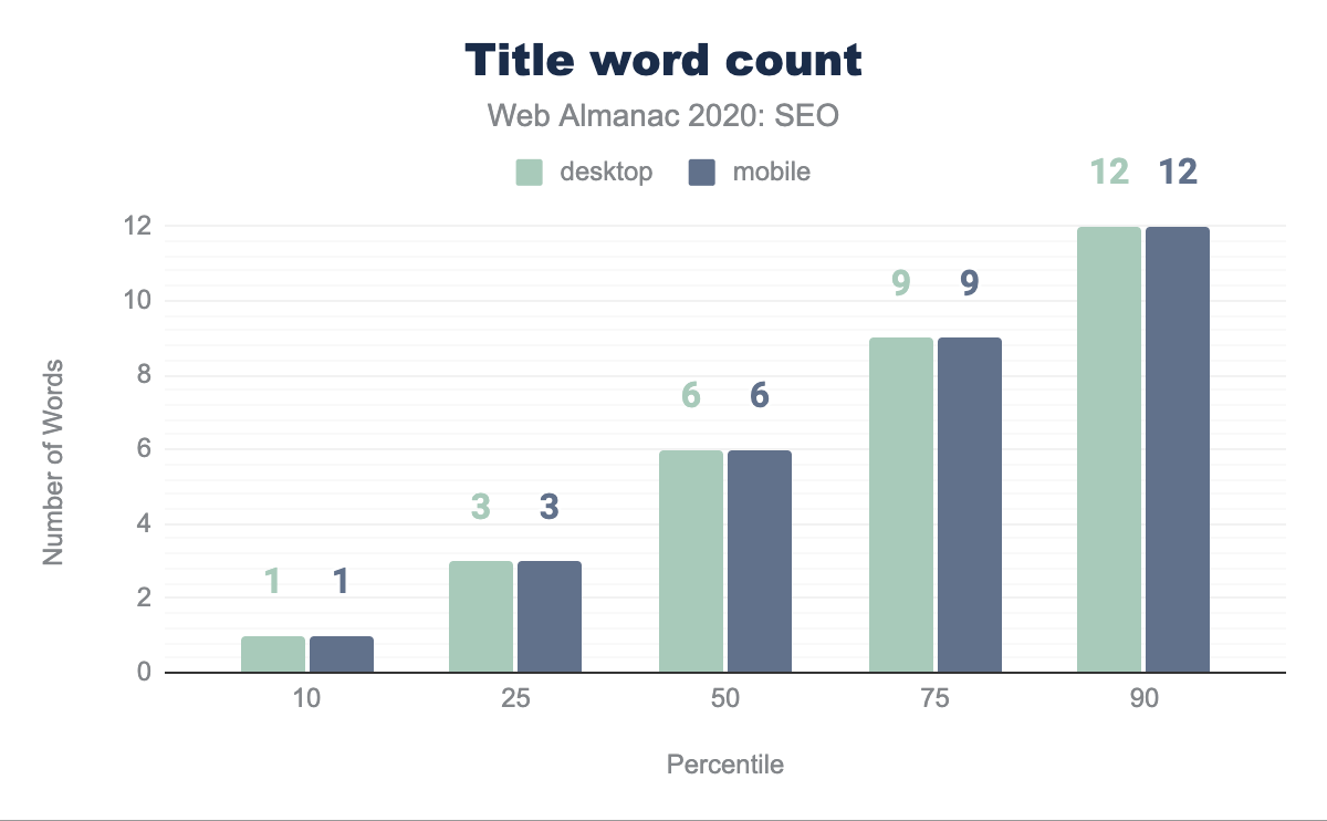
The median page title character count is 38 characters on both mobile and desktop. Interestingly, this is up from 20 characters on desktop and 21 characters on mobile from last year’s analysis. The disparity between the contexts has disappeared year-over-year except within the 90th percentile wherein there is a one character difference.

Meta descriptions
The meta description acts as the advertising tagline for a web page. Although a recent study suggests that this tag is ignored and rewritten by Google 70% of the time, it is an element that is prepared with the goal of enticing a user to click through.
When analyzing the usage of meta descriptions, we found that 68.62% of desktop pages and 68.22% of mobile pages have one. Although this may be surprisingly low, it is a slight improvement from last year, when only 64.02% of mobile pages had a meta description.
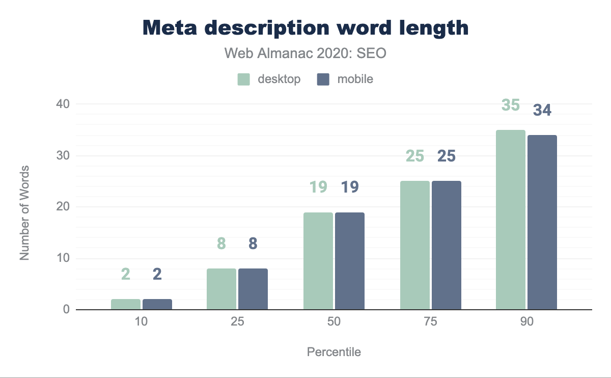
The median length of the meta description is 19 words. The only disparity in word count takes place in the 90th percentile where the desktop content has one more word than mobile.
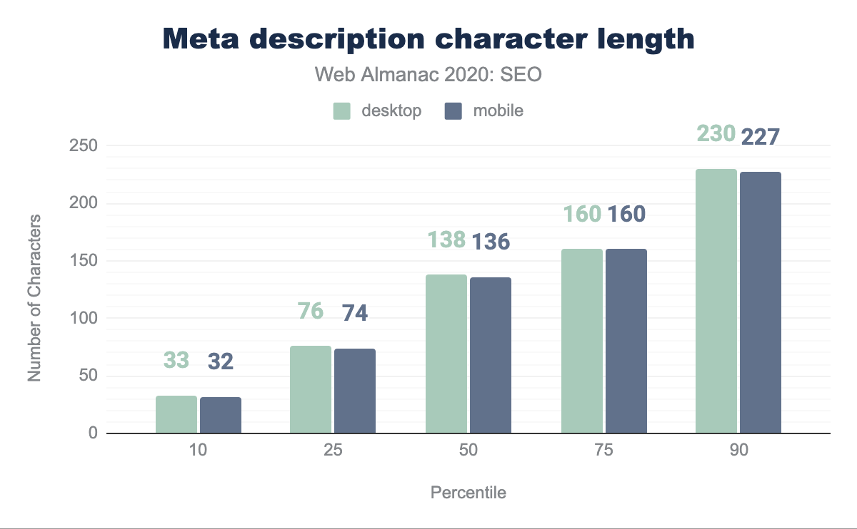
The median character count for the meta description is 138 characters on desktop pages and 136 characters on mobile pages. Aside from the 75th percentile, there is a small disparity between mobile and desktop meta description lengths distributed across the dataset. SEO best practices suggest limiting the specified meta description to up to 160 characters, but Google, inconsistently, may display upwards of 300 characters in its snippets.
With meta descriptions continuing to power other snippets such as social and news feed snippets, and given that Google continually rewrites them and does not consider them a direct ranking factor, it is reasonable to expect that meta descriptions will continue to grow beyond the 160 character limitation.
Images
The usage of images, particularly using img tags, within a page often suggests a focus on visual presentation of content. Although search engine capabilities regarding computer vision have continued to improve, we have no indication that this technology is being used in the ranking of pages. alt attributes remain the primary way to explain an image in lieu of a search engine’s ability to “see” it. alt attributes also support accessibility and clarify the elements on the page for users that are visually impaired.
The median desktop page includes 21 img tags and the median mobile page has 19 img tags. The web continues to trend toward image-heaviness with the growth of bandwidth and the ubiquity of smartphones. However, this comes at a cost of performance.
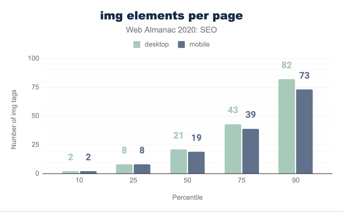
<img> elements per page per percentile (10, 25, 50, 75, and 90). The median desktop page features 21 <img> elements and the median mobile page features 19 <img> elements.<img> elements per page.
The median web page is missing 2.99% of alt attributes on desktop and 2.44% of alt attributes on mobile. For more information on the importance of alt attributes, see the Accessibility chapter.
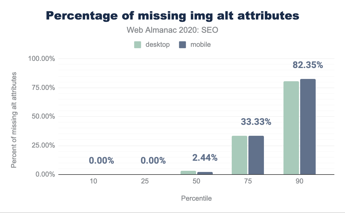
alt attributes per percentile (10, 25, 50, 75, and 90). The median web page is missing 2.99% alt attributes on desktop and 2.44% of alt attributes on mobile.<img> elements missing image alt attributes per page.
We found that the median page contains alt attributes on only 51.22% of their images.
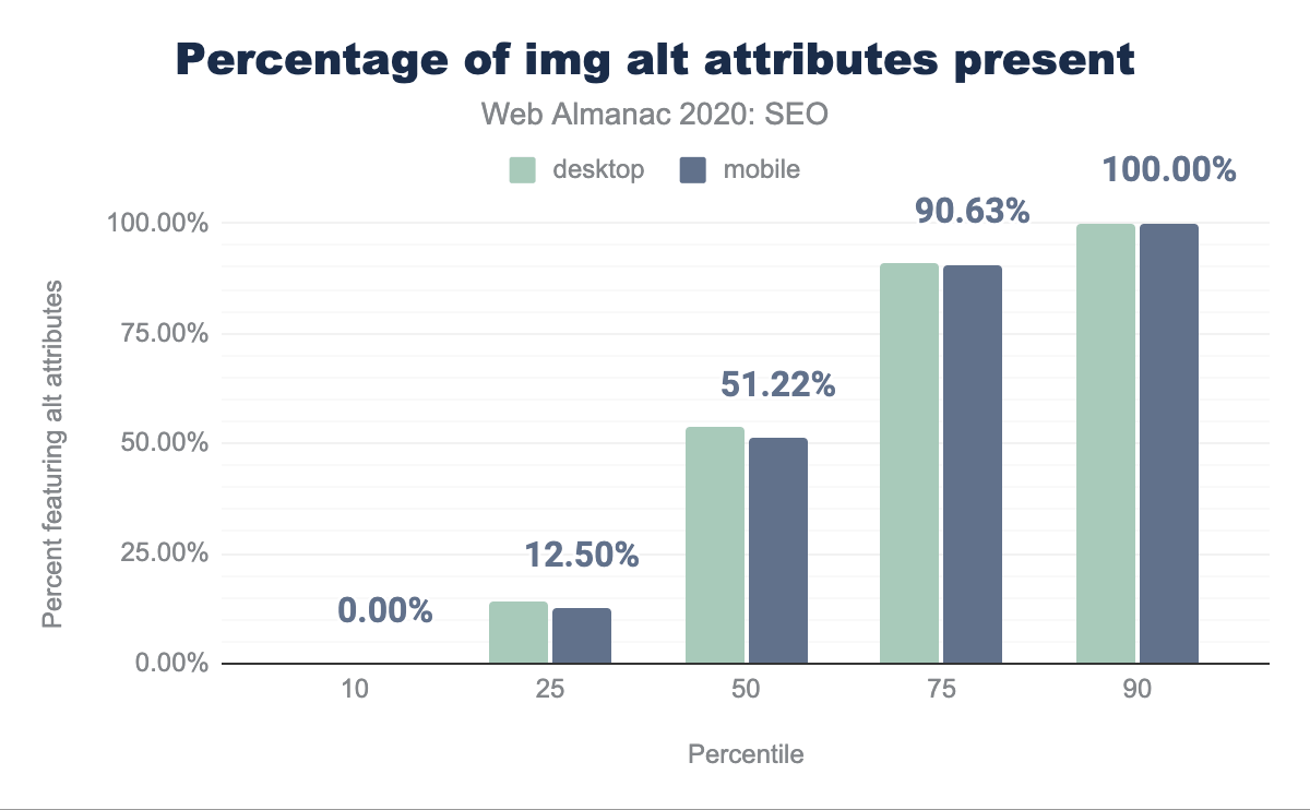
alt attributes present per percentile (10, 25, 50, 75, and 90). It was found that only 53.86% of desktop and 51.22% of mobile pages featured image alt attributes.alt attributes per page.
The median web page has 10.00% of images with blank alt attributes on desktop and 11.11% on mobile.
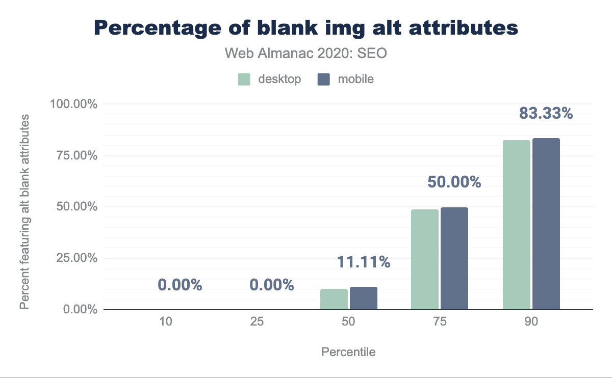
alt blank attributes per percentile (10, 25, 50, 75, and 90). The median web page features 10% blank alt attributes on desktop and 11.11% blank alt attributes on mobile.alt attributes per page.
Links
Modern search engines use hyperlinks between pages for the discovery of new content for indexing and as an indication of authority for ranking. The link graph is something that search engines actively police both algorithmically and through manual review. Web pages pass link equity through their sites and to other sites through these hyperlinks, therefore it is important to ensure that there is a wealth of links throughout any given page, but also, as Google mentions in its SEO Starter Guide to link wisely.
Outgoing links
As part of this analysis we are able to assess the outgoing links from each page, whether to internal pages from the same domain, as well as external ones, however, have not analyzed incoming links.
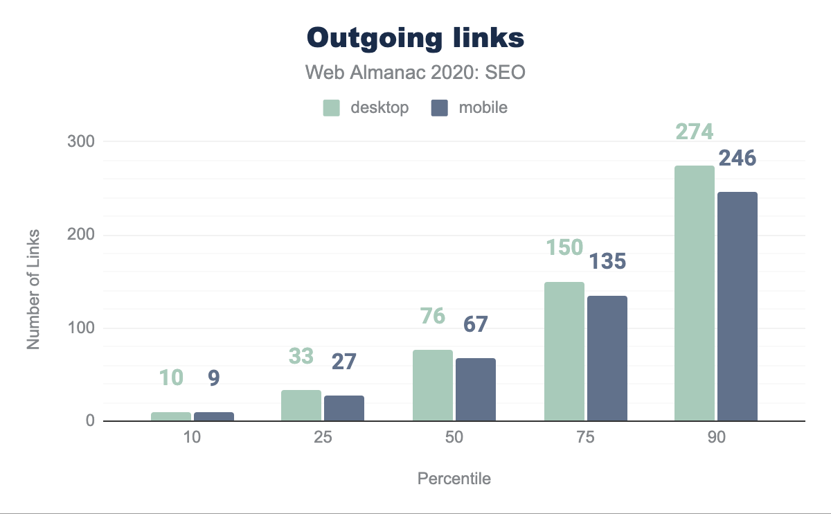
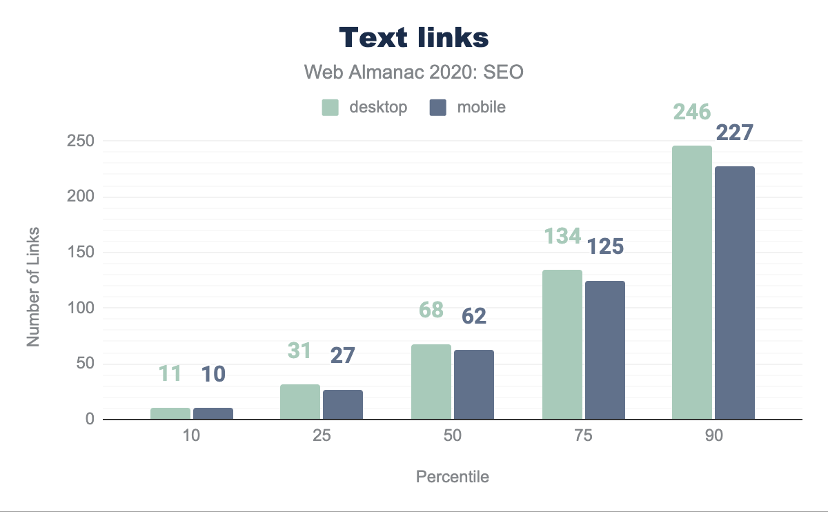
The median desktop page includes 76 links while the median mobile page has 67. Historically, the direction from Google suggested that links be limited to 100 per page. While that recommendation is outdated on the modern web and Google has since then mentioned that there are no limits, the median page in our dataset adheres to it.
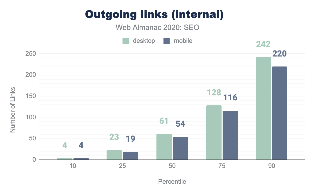
The median page has 61 internal links (going to pages within the same site) on desktop and 54 on mobile. This is down 12.8% and 10% respectively from last year’s analysis. This suggests that sites are not maximizing the ability to improve the crawlability and link equity flow through their pages in the way they did the year before.
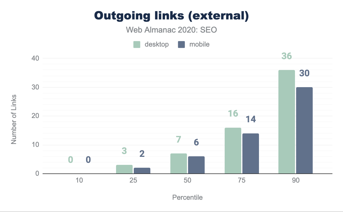
The median page is linking to external sites 7 times on desktop and 6 times on mobile. This is a decrease from last year, when it was found that the median number of external links per page were 10 in desktop and 8 on mobile. This decrease in external links could suggest that websites are now being more careful when linking to other sites, whether to avoid passing link popularity or referring users to them.
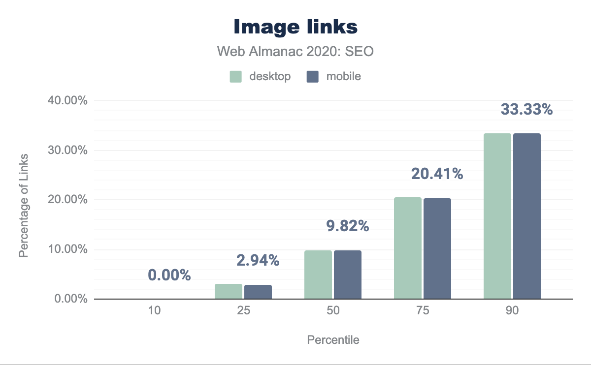
Text versus image links
The median web page uses an image as anchor text to link in 9.80% of desktop and 9.82% of mobile pages. These links represent lost opportunities to implement keyword-relevant anchor text. This only becomes a significant issue at the 90th percentile of pages.
Mobile versus desktop links
There is a disparity in the links between mobile and desktop that will negatively impact sites as Google becomes more committed to mobile-only indexing rather than just mobile-first indexing. This is illustrated in the 62 links on mobile versus the 68 links on desktop for the median web page.
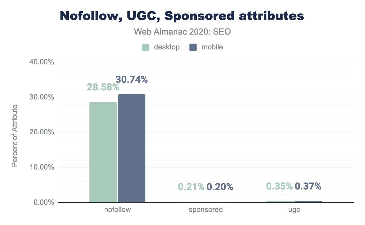
rel=nofollow, ugc, and sponsored attributes usage
In September of 2019, Google introduced attributes that allow publishers to classify links as being sponsored or user generated content. These attributes are in addition to rel=nofollow which was previously introduced in 2005. The new attributes, rel=ugc and rel=sponsored, are meant to clarify or qualify the reason as to why these links are appearing on a given web page.
Our review of pages indicates that 28.58% of pages include rel=nofollow attributes on desktop and 30.74% on mobile. However, rel=ugc and rel=sponsored adoption is quite low with less than 0.3% of pages (about 20,000) having either. Since these attributes don’t add any more value to a publisher than rel=nofollow, it is reasonable to expect that the rate of adoption will continue to be slow.
rel attributes on desktop and mobile. Our review indicates that 28.58% of pages feature nofollow attributes on their desktop versions and 30.74% on mobile. However, ugc and sponsored adoption is quite low with less than 0.3% pages featuring either. rel=nofollow, rel=ugc, and rel=sponsored attributes.
Advanced
This section explores the opportunities for optimization related to web configurations and elements that may not directly affect a site’s crawlability or indexability, but have either been confirmed by search engines to be used as ranking signals or will affect the capacity of websites to leverage search features.
Mobile friendliness
With the increasing popularity of mobile devices to browse and search across the web, search engines have been taking mobile friendliness into consideration as a ranking factor for several years.
Also, as mentioned before, since 2016 Google has been moving to a mobile-first index, meaning that the content that is crawled, indexed, and ranked is the one accessible to mobile users and the Smartphone Googlebot.
Additionally, since July 2019 Google is using the mobile-first index for all new websites and earlier in March, it announced that 70% of pages shown in their search results have already shifted over. It is now expected that Google fully switches to a mobile-first index in March 2021.
Mobile friendliness should be fundamental for any website looking to provide a good search experience, and as a consequence, grow in search results.
A mobile-friendly website can be implemented through different configurations: by using a responsive web design, with dynamic serving, or via a separate mobile web version. However, maintaining a separate mobile web version is not recommended anymore by Google, who endorse responsive web design instead.
Viewport meta tag
The browser’s viewport is the visible area of a page content, which changes depending on the used device. The <meta name="viewport"> tag (or viewport meta tag) allows you to specify to browsers the width and scaling of the viewport, so that it is correctly sized across different devices. Responsive websites use the viewport meta tag as well as CSS media queries to deliver a mobile friendly experience.
42.98% of mobile pages and 43.2% desktop ones have a viewport meta tag with the content=initial-scale=1,width=device-width attribute. However, 10.84% of mobile pages and 16.18% of desktop ones are not including the tag at all, suggesting that they are not yet mobile friendly.
| Viewport | Mobile | Desktop |
|---|---|---|
initial-scale=1,width=device-width |
42.98% | 43.20% |
| not-set | 10.84% | 16.18% |
initial-scale=1,maximum-scale=1,width=device-width |
5.88% | 5.72% |
initial-scale=1,maximum-scale=1,user-scalable=no,width=device-width |
5.56% | 4.81% |
initial-scale=1,maximum-scale=1,user-scalable=0,width=device-width |
3.93% | 3.73% |
content attribute value.
CSS media queries
Media queries are a CSS3 feature that play a fundamental role in responsive web design, as they allow you to specify conditions to apply styling only when the browser and device match certain rules. This allows you to create different layouts for the same HTML depending on the viewport size.
We found that 80.29% of desktop pages and 82.92% of the mobile ones are using either a height, width, or aspect-ratio CSS feature, meaning that a high percentage of pages have responsive features. The most popularly used features can be seen in the table below.
| Feature | Mobile | Desktop |
|---|---|---|
max-width |
78.98% | 78.33% |
min-width |
75.04% | 73.75% |
-webkit-min-device-pixel-ratio |
44.63% | 38.78% |
orientation |
33.48% | 33.49% |
max-device-width |
26.23% | 28.15% |
Vary: User-Agent
When implementing a mobile friendly website with a dynamic serving configuration—one in which you show different HTMLs of the same page based on the used device—it is recommended to add a Vary: User-Agent HTTP header to help search engines discover the mobile content when crawling the website, as it informs that the response varies depending on the user agent.
Only 13.48% of the mobile pages and 12.6% of the desktop pages were found to specify a Vary: User-Agent header.
<link rel="alternate" media="only screen and (max-width: 640px)">Desktop websites that have separate mobile versions are recommended to link to them using this tag in the head of their HTML. Only 0.64% of the analyzed desktop pages were found to be including the tag with the specified media attribute value.
Web performance
Having a fast-loading website is fundamental to provide a great user search experience. Because of its importance, it has been taken into consideration as a ranking factor by search engines for years. Google initially announced using site speed as a ranking factor in 2010, and then in 2018 did the same for mobile searches.
As announced in November 2020, three performance metrics known as Core Web Vitals are on track to be a ranking factor as part of the “page experience” signals in May 2021. Core Web Vitals consist of:
Largest Contentful Paint (LCP)
- Represents: user-perceived loading experience
- Measurement: the point in the page load timeline when the page’s largest image or text block is visible within the viewport
- Goal: <2.5 seconds
First Input Delay (FID)
- Represents: responsiveness to user input
- Measurement: the time from when a user first interacts with a page to the time when the browser is actually able to begin processing event handlers in response to that interaction
- Goal: <300 milliseconds
Cumulative Layout Shift (CLS)
- Represents: visual stability
- Measurement: the sum of the number of layout shift scores approximating the percent of the viewport that shifted
- Goal: <0.10
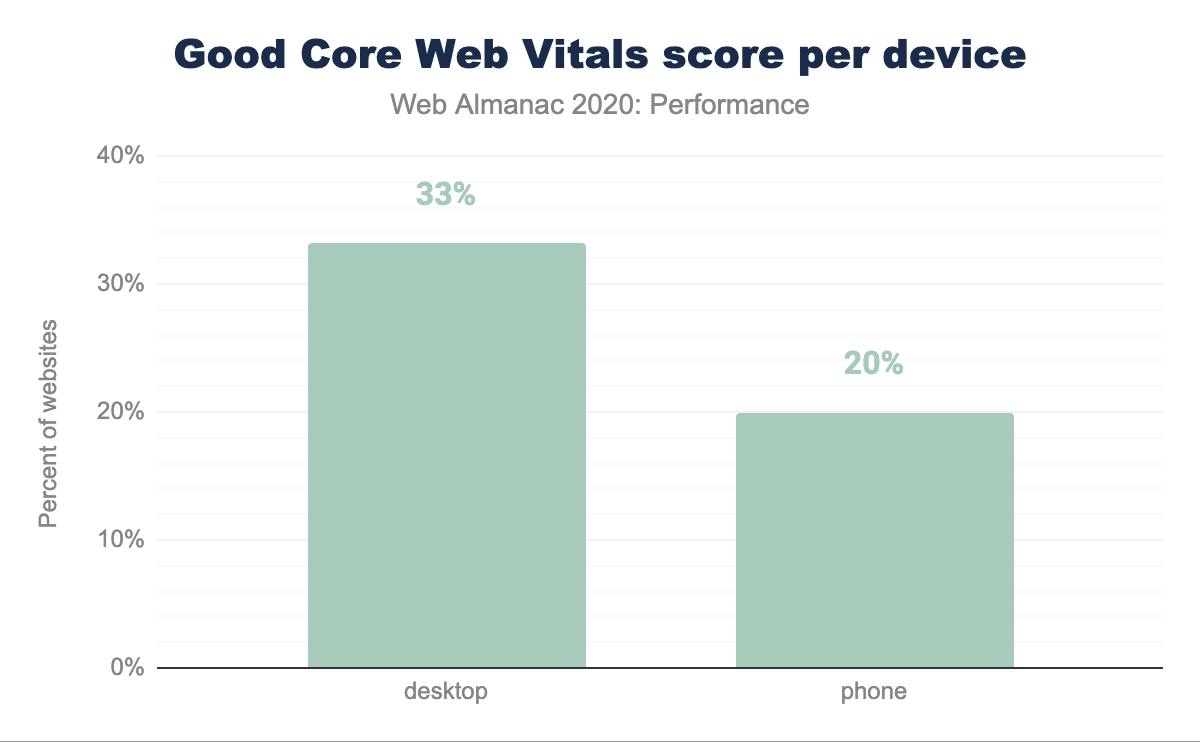
Core Web Vitals experiences per device
Desktop continues to be the more performant platform for users despite more users on mobile devices. 33.13% of websites scored Good Core Web Vitals for desktop while only 19.96% of their mobile counterparts passed the Core Web Vitals assessment.
Core Web Vitals experiences per country
A user’s physical location impacts performance perception as their locally available telecom infrastructure, network bandwidth capacity, and the cost of data create unique loading conditions.
Users located in the United States recorded the largest absolute number of websites with Good Core Web Vitals experiences despite only 32% of sites earning the passing grade. Republic of Korea recorded the highest percentage of Good Core Web Vital experiences at 52%. The relative portion of total websites requested by each country is worth noting. Users in United States generated 8X the total origin requests as generated by Republic of Korea users.
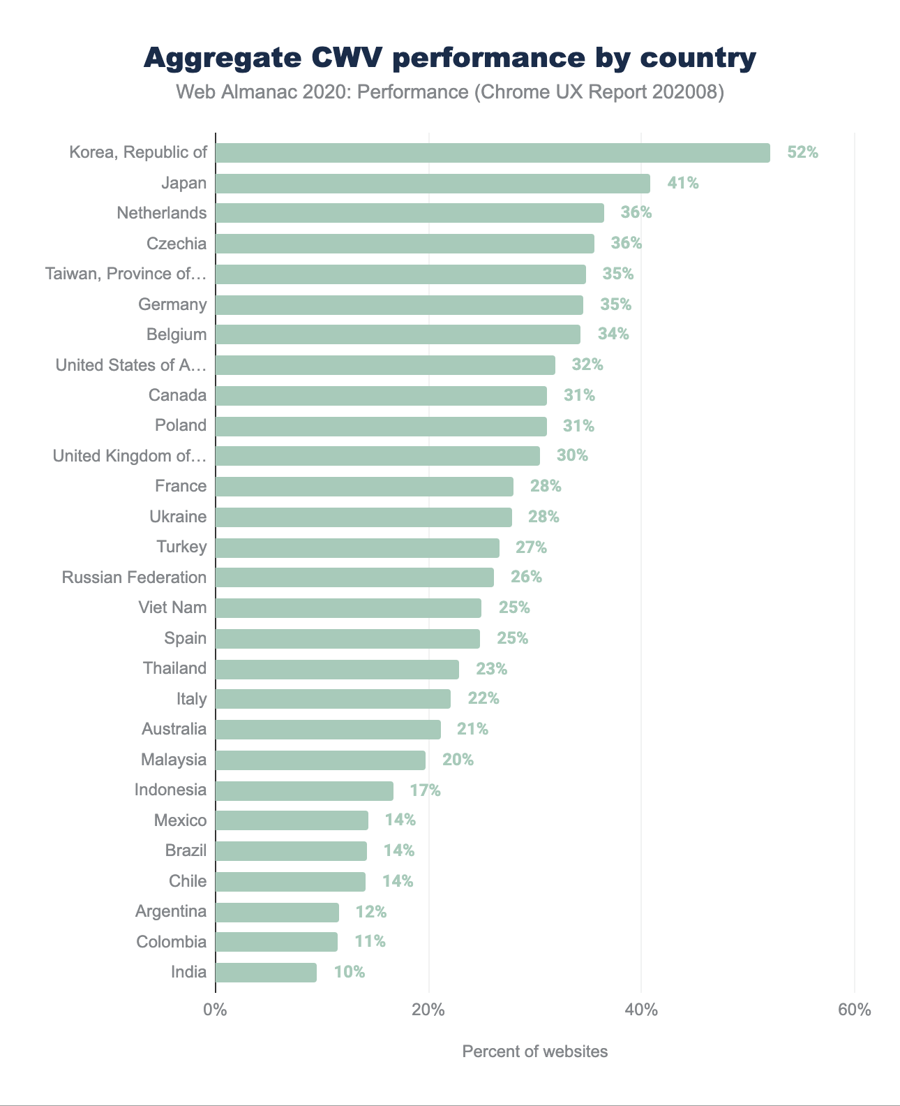
Additional analyses of Core Web Vitals performance by dimensions by effective connection type and specific metrics are available in the Performance chapter.
Internationalization
Internationalization covers the configurations that multilingual or multi-country websites can use to inform search engines about their different language and/or country versions, specify which are the relevant pages to show users in each case, and avoid targeting issues.
The two international configurations that we analyzed are the content-language meta tag and the hreflang attributes, that can be used to specify the language and the content of each page. Additionally, hreflang annotations allow you to specify the alternate language or country versions of each page.
Search engines like Google and Yandex use hreflang attributes as a signal to determine the page’s language and country target, and although Google doesn’t use the HTML lang or the content-language meta tag, the latter last tag is used by Bing.
hreflang
8.1% of desktop pages and 7.48% of mobile pages use the hreflang attribute, which might seem low, but this is natural because these are only used by multilingual or multi-country websites.
We found that only 0.09% of the desktop pages and 0.07% of the mobile pages implement hreflang via their HTTP headers, and that most rely on the HTML head implementation.
We also identified that there are some pages that rely on JavaScript to render hreflang annotations. 0.12% of desktop and mobile pages are showing hreflang in the rendered but not in the raw HTML.
From a language and country value perspective, when analyzing the implementation via the HTML head, we found that English (en) is the most popular used value, with 4.11% of the mobile and 4.64% of the desktop pages including it. After English, the second most popular value is x-default (used when defining a default or fallback version for users of non-targeted languages or countries), with 2.07% of mobile and 2.2% of the desktop pages including it.
The third, fourth and fifth most popular are German (de), French (fr) and Spanish (es), followed by Italian (it) and English for the US (en-us), as can be seen in the table below with the rest of the values implemented via the HTML head.
| Value | Mobile | Desktop |
|---|---|---|
en |
4.11% | 4.64% |
x-default |
2.07% | 2.20% |
de |
1.76% | 1.88% |
fr |
1.74% | 1.87% |
es |
1.74% | 1.84% |
it |
1.27% | 1.33% |
en-us |
1.15% | 1.31% |
ru |
1.12% | 1.13% |
en-gb |
0.87% | 0.98% |
pt |
0.87% | 0.87% |
nl |
0.83% | 0.94% |
ja |
0.73% | 0.81% |
pl |
0.72% | 0.75% |
de-de |
0.69% | 0.78% |
tr |
0.69% | 0.66% |
hreflang values in the HTML head.
Something slightly different was found in top hreflang language and country values implemented via the HTTP headers, with English (en) being again the most popular one, although in this case followed by French (fr), German (de), Spanish (es) and Dutch (nl) as the top values.
| Values | Mobile | Desktop |
|---|---|---|
en |
0.05% | 0.06% |
fr |
0.02% | 0.02% |
de |
0.01% | 0.02% |
es |
0.01% | 0.01% |
nl |
0.01% | 0.01% |
hreflang values in HTTP headers.
Content-Language
When analyzing the content-language usage and values, whether by implementing it as a meta tag in the HTML head or in the HTTP headers, we found that only 8.5% of mobile pages and 9.05% of desktop pages were specifying it in the HTTP headers. Even fewer websites were specifying their language or country with the content-language tag in the HTML head, with only 3.63% of mobile pages and 3.59% of desktop pages featuring the meta tag.
From a language and country value perspective, we found that the most popular values specified in the content-language meta-tag and HTTP headers are English (en) and English for the US (en-us).
In the case of English (en) we identified that 4.34% of desktop and 3.69% of mobile pages specified it in the HTTP headers and 0.55% of the desktop and 0.48% of the mobile pages were doing so via the content-language meta tag in the HTML head.
For English for the US (en-us), the second most popular value, it was found that only 1.77% of mobile pages and 1.7% of desktop ones were specifying it in the HTTP headers, and 0.3% of the mobile pages and 0.36% desktop ones were doing it so in the HTML.
The rest of the most popular language and country values can be seen in the tables below.
| Value | Mobile | Desktop |
|---|---|---|
en |
3.69% | 4.34% |
en-us |
1.77% | 1.70% |
de |
0.50% | 0.44% |
es |
0.34% | 0.33% |
fr |
0.31% | 0.34% |
ru |
0.18% | 0.16% |
pt-br |
0.15% | 0.16% |
nl |
0.13% | 0.15% |
it |
0.13% | 0.13% |
ja |
0.08% | 0.10% |
content-language values in HTTP headers.
| Value | Mobile | Desktop |
|---|---|---|
en |
0.48% | 0.55% |
en-us |
0.30% | 0.36% |
pt-br |
0.24% | 0.24% |
ja |
0.19% | 0.26% |
fr |
0.18% | 0.19% |
tr |
0.17% | 0.13% |
es |
0.16% | 0.15% |
de |
0.15% | 0.11% |
cs |
0.12% | 0.12% |
pl |
0.11% | 0.09% |
content-language values in HTML meta tags.
Security
Google places a specific focus on security in all respects. The search engine maintains lists of sites that have shown suspicious activity or have been hacked. Search Console surfaces these issues and Chrome users are presented with warnings before visiting sites with these problems. Additionally, Google provides an algorithmic boost to pages that are served over HTTPS (Hypertext Transfer Protocol Secure). For a more in-depth analysis on this topic, see the Security chapter.
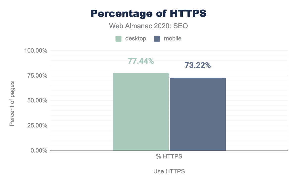
HTTPS usage
We found that 77.44% of desktop pages and 73.22% of mobile pages have adopted HTTPS. This is up 10.38% from last year. It is important to note that browsers have become more aggressive in pushing HTTPS by signaling that pages are insecure when you visit them without HTTPS. Also, HTTPS is currently a requirement to capitalize on higher performing protocols such as HTTP/2 and HTTP/3 (also known as HTTP over QUIC). You can learn more about the state of these protocols in the HTTP/2 chapter.
All of these things have likely contributed to the higher adoption rate year over year.
AMP
AMP (previously called Accelerated Mobile Pages) is an open source HTML framework that was launched by Google in 2015 as a way to help pages load more quickly, especially on mobile devices. AMP can be implemented as an alternate version of existing web pages or developed from scratch using the AMP framework.
When there’s an AMP version available for a page, it will be shown by Google in mobile search results, along with the AMP logo.
It is also important to note that while AMP usage is not a ranking factor for Google (or any other search engine), web speed is a ranking factor.
Additionally, as of this writing, AMP is a requirement to be featured in Google’s Top Stories carousel in mobile search results, which is an important feature for news-related publications. However, this will change in May 2021, when non-AMP content will become eligible as long as it meets the Google News content policies and provides a great page experience as announced by Google in November this year.
When checking the usage of AMP as an alternate version of a non-AMP based page, we found that 0.69% of mobile web pages and 0.81% of desktop ones were including an amphtml tag pointing to an AMP version. Although the adoption is still very low, this is a slight improvement from last year’s findings, in which only 0.62% of mobile pages contained a link to an AMP version.
On the other hand, when assessing the usage of AMP as a framework to develop websites, we found that only 0.18% of mobile pages and 0.07% of desktop ones were specifying the <html amp> or <html ⚡> emoji attribute, which are used to indicate AMP-based pages.
Single-page applications
Single-page applications (SPAs) enable browsers to retain and update a single page load even as the on-page content updates to match a user request. Multiple technologies such as JavaScript frameworks, AJAX, and WebSockets are used to accomplish lightweight subsequent page loads.
These frameworks required special SEO considerations, although Google has worked to mitigate the issues caused by client-side rendering with aggressive caching strategies. In a video from Google Webmaster’s 2019 conference, Software Engineer Erik Hendriks shared that Google no longer relies on Cache-Control headers and instead looks for ETag or Last-Modified headers to see if the content of the file has changed.
SPAs should utilize the Fetch API for granular control of caching. The API allows for the passing of Request objects with specific cache overrides set and can be used to set the necessary If-Modified and ETag headers.
Undiscoverable resources are still the primary concern of search engines and their web crawlers. Search crawlers look for the href attributes in <a> tags to find linked pages. Without these, the page is seen as isolated without internal linking. 5.59% of desktop pages studied contained no internal links as well as 6.04% of mobile-rendered pages. This is a marker that the page is part of a JavaScript framework SPA and missing the necessary <a> tag with valid href attributes required for their internal linking to be discovered.
The discoverability of links in popular JavaScript frameworks used for SPAs increased dramatically in 2020 over the previous year. In 2019, 13.08% of mobile navigation links on React sites used deprecated hash URLs. For 2020, only 6.12% of the tested React links were hashed.
Similarly, Vue.js saw a drop to 3.45% from the previous year’s 8.15%. Angular was the least likely to use uncrawlable hashed mobile navigation links in 2019 with only 2.37% of mobile pages using them. For 2020, that number plummeted to 0.21%.
Conclusion
Consistent with what was found and concluded last year, most sites have crawlable and indexable desktop and mobile pages, and are making use of the fundamental SEO-related configurations.
It is important to highlight how the link discoverability for major JavaScript frameworks used for SPAs increased dramatically compared to 2019. By testing mobile navigation links for hashed URLs, we saw -53% instances of uncrawlable links from sites using React, -58% fewer from Vue.js powered sites, and a -91% reduction from Angular SPAs.
Additionally, we also identified that there has been a slight improvement from last year’s findings across many of the analyzed areas:
-
robots.txt: Last year 72.16% of mobile sites had a validrobots.txtversus 74.91% this year. - canonical tag: Last year we identified that 48.34% of mobile pages were using a canonical tag versus 53.61% this year.
-
titletag: This year we found that 98.75% of the desktop pages are featuring one, while 98.7% of mobile pages are also including it. Last year’s chapter found that 97.1% of mobile pages were featuring atitletag. -
metadescription: This year, we found 68.62% of desktop pages and 68.22% of mobile ones had ametadescription, an improvement from last year when 64.02% of mobile pages had one. - structured data: Despite the fact that reviews are not supposed to be associated with home pages, the data indicates that
AggregateRatingis up 23.9% on mobile and 23.7% on desktop. - HTTPS usage: 77.44% of desktop pages and 73.22% of mobile pages have adopted HTTPS. This is up 10.38% from last year.
However, not everything has improved over the last year. The median desktop page includes 61 internal links while the median mobile page has 54. This is down 12.8% and 10% respectively from last year, suggesting that sites are not maximizing the ability to improve the crawlability and link equity flow through their pages.
It is also important to note how there’s still an important opportunity for improvement across many critical SEO related areas and configurations. Despite the growing use of mobile devices and Google’s move to a mobile-first index:
- 10.84% of mobile pages and 16.18% of desktop ones are not including the
viewporttag at all, suggesting that they are not yet mobile friendly. - Non-trivial disparities were found across mobile and desktop pages, like the one between mobile and desktop links, illustrated in the 62 links on mobile versus the 68 links on desktop for the median web page.
- 33.13% of websites scored Good Core Web Vitals for desktop while only 19.96% of their mobile counterparts passed the Core Web Vitals assessment, suggesting that desktop continues to be the more performant platform for users.
These findings could negatively impact sites as Google completes its migration to a mobile-first index in March 2021.
Disparities were also found across rendered and non-rendered HTML. For example, the median mobile page displays 11.5% more words when rendered than its raw HTML, indicating a reliance on client-side JavaScript to show content.
Search crawlers look for the <a href> tags to find linked pages. Without these, the page is seen as isolated without internal linking. 5.59% of desktop pages contained no internal links as well as 6.04% of mobile-rendered pages.
These findings suggest that search engines are continually evolving in their capacity to effectively crawl, index, and rank websites, and some of the most important SEO configurations are now also better taken into consideration.
However, many sites across the web are still missing out on important search visibility and growth opportunities, which also shows the persisting need of SEO evangelization and best practices adoption across organizations.


