CSS
Introduction
Cascading Style Sheets (CSS) are used to paint, format, and layout web pages. Their capabilities span concepts as simple as text color to 3D perspective. It also has hooks to empower developers to handle varying screen sizes, viewing contexts, and printing. CSS helps developers wrangle content and ensure it’s adapting properly to the user.
When describing CSS to those not familiar with web technology, it can be helpful to think of it as the language to paint the walls of the house; describing the size and position of windows and doors, as well as flourishing decorations such as wallpaper or plant life. The fun twist to that story is that depending on the user walking through the house, a developer can adapt the house to that specific user’s preferences or contexts!
In this chapter, we’ll be inspecting, tallying, and extracting data about how CSS is used across the web. Our goal is to holistically understand what features are being used, how they’re used, and how CSS is growing and being adopted.
Ready to dig into the fascinating data?! Many of the following numbers may be small, but don’t mistake them as insignificant! It can take many years for new things to saturate the web.
Color
Color is an integral part of theming and styling on the web. Let’s take a look at how websites tend to use color.
Color types
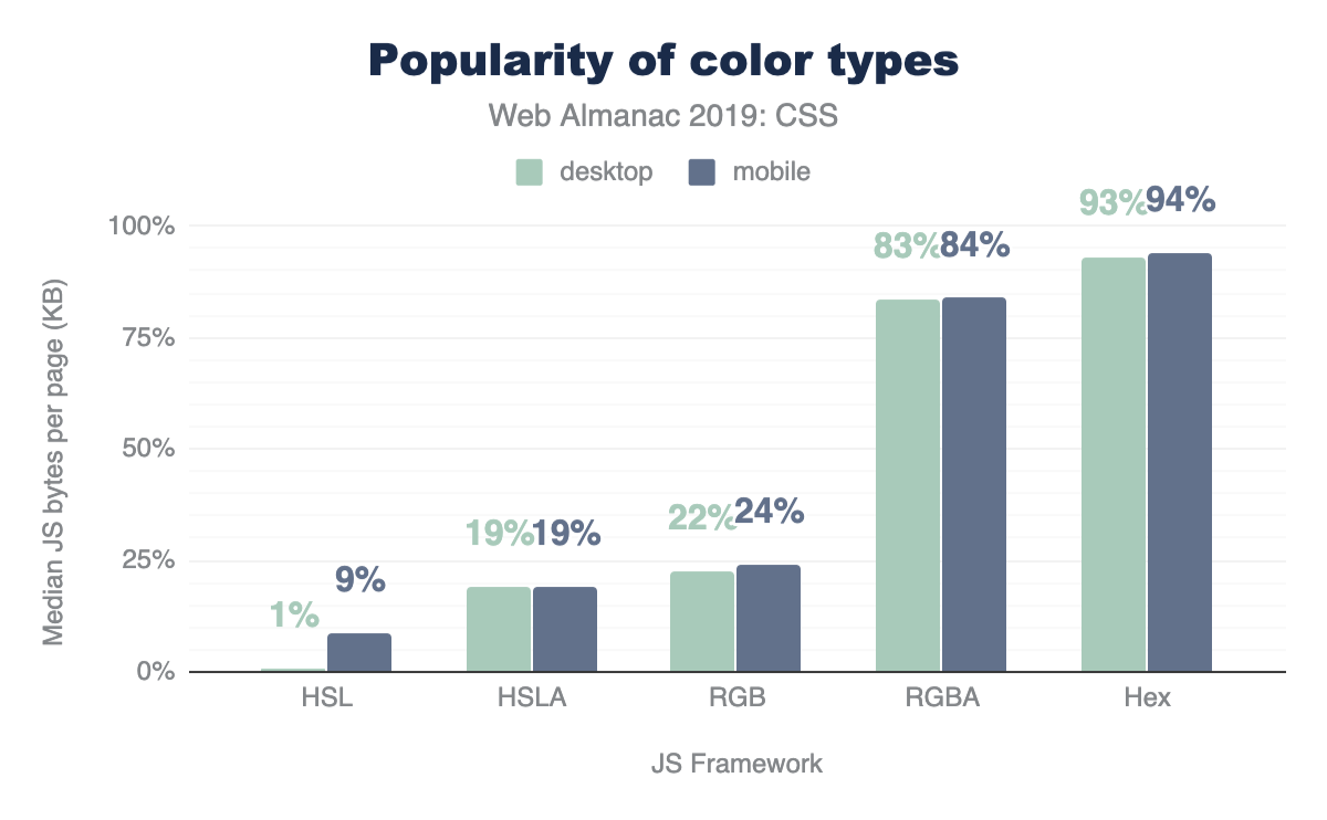
Hex is the most popular way to describe color by far, with 93% usage, followed by RGB, and then HSL. Interestingly, developers are taking full advantage of the alpha-transparency argument when it comes to these color types: HSLA and RGBA are far more popular than HSL and RGB, with almost double the usage! Even though the alpha-transparency was added later to the web spec, HSLA and RGBA are supported as far back as IE9, so you can go ahead and use them, too!
Color selection
There are 148 named CSS colors, not including the special values transparent and currentcolor. You can use these by their string name for more readable styling. The most popular named colors are black and white, unsurprisingly, followed by red and blue.
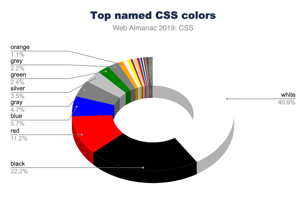
Language is interestingly inferred via color as well. There are more instances of the American-style “gray” than the British-style “grey”. Almost every instance of gray colors (gray, lightgray, darkgray, slategray, etc.) had nearly double the usage when spelled with an “a” instead of an “e”. If gr[a/e]ys were combined, they would rank higher than blue, solidifying themselves in the #4 spot. This could be why silver is ranked higher than grey with an “e” in the charts!
Color count
How many different font colors are used across the web? So this isn’t the total number of unique colors; rather, it’s how many different colors are used just for text. The numbers in this chart are quite high, and from experience, we know that without CSS variables, spacing, sizes and colors can quickly get away from you and fragment into lots of tiny values across your styles. These numbers reflect a difficulty of style management, and we hope this helps create some perspective for you to bring back to your teams or projects. How can you reduce this number into a manageable and reasonable amount?
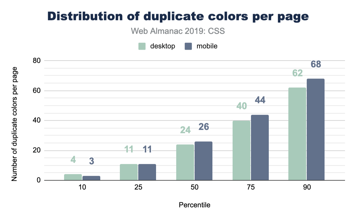
Color duplication
Well, we got curious here and wanted to inspect how many duplicate colors are present on a page. Without a tightly managed reusable class CSS system, duplicates are quite easy to create. It turns out that the median has enough duplicates that it could be worth doing a pass to unify them with custom properties.
Units
In CSS, there are many different ways to achieve the same visual result using different unit types: rem, px, em, ch, or even cm! So which unit types are most popular?
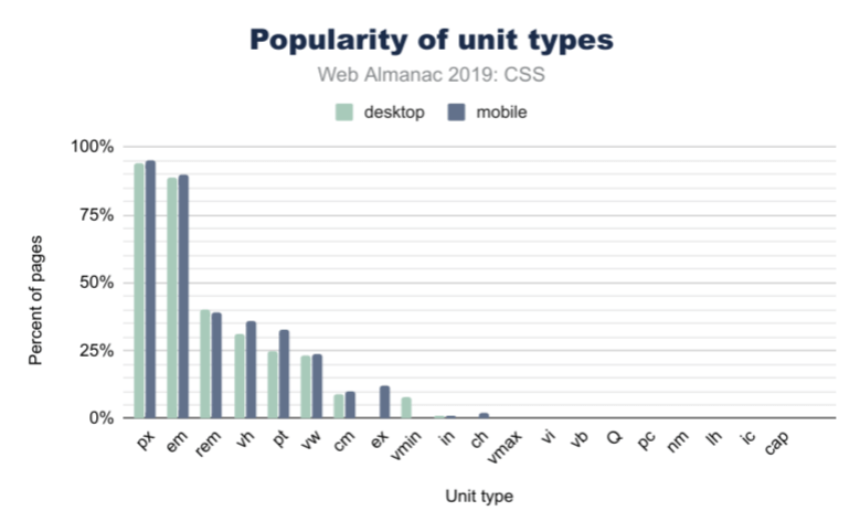
Length and sizing
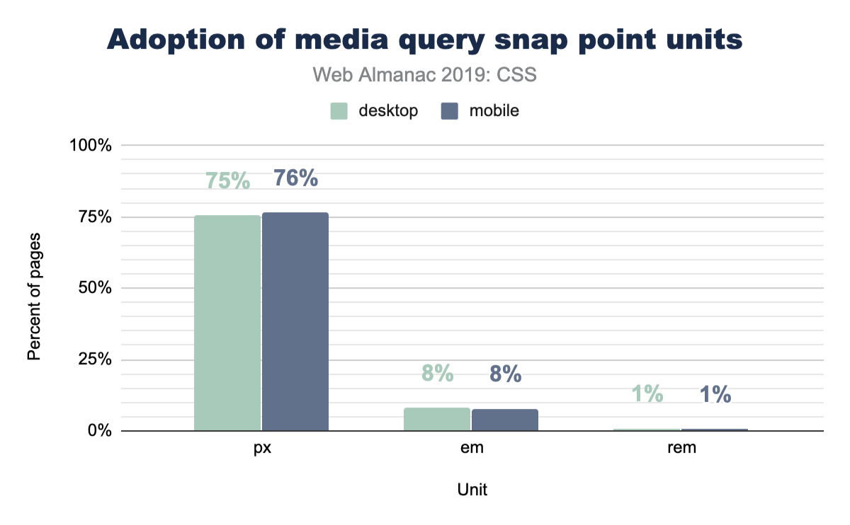
Unsurprisingly, in Figure 2.5 above, px is the most used unit type, with about 95% of web pages using pixels in some form or another (this could be element sizing, font size, and so on). However, the em unit is almost as popular, with about 90% usage. This is over 2x more popular than the rem unit, which has only 40% frequency in web pages. If you’re wondering what the difference is, em is based on the parent font size, while rem is based on the base font size set to the page. It doesn’t change per-component like em could, and thus allows for adjustment of all spacing evenly.
When it comes to units based on physical space, the cm (or centimeter) unit is the most popular by far, followed by in (inches), and then Q. We know these types of units are specifically useful for print stylesheets, but we didn’t even know the Q unit existed until this survey! Did you?
Viewport-based units
We saw larger differences in unit types when it comes to mobile and desktop usage for viewport-based units. 36.8% of mobile sites use vh (viewport height), while only 31% of desktop sites do. We also found that vh is more common than vw (viewport width) by about 11%. vmin (viewport minimum) is more popular than vmax (viewport maximum), with about 8% usage of vmin on mobile while vmax is only used by 1% of websites.
Custom properties
Custom properties are what many call CSS variables. They’re more dynamic than a typical static variable though! They’re very powerful and as a community we’re still discovering their potential.
We felt like this was exciting information, since it shows healthy growth of one of our favorite CSS additions. They were available in all major browsers since 2016 or 2017, so it’s fair to say they’re fairly new. Many folks are still transitioning from their CSS preprocessor variables to CSS custom properties. We estimate it’ll be a few more years until custom properties are the norm.
Selectors
ID vs class selectors
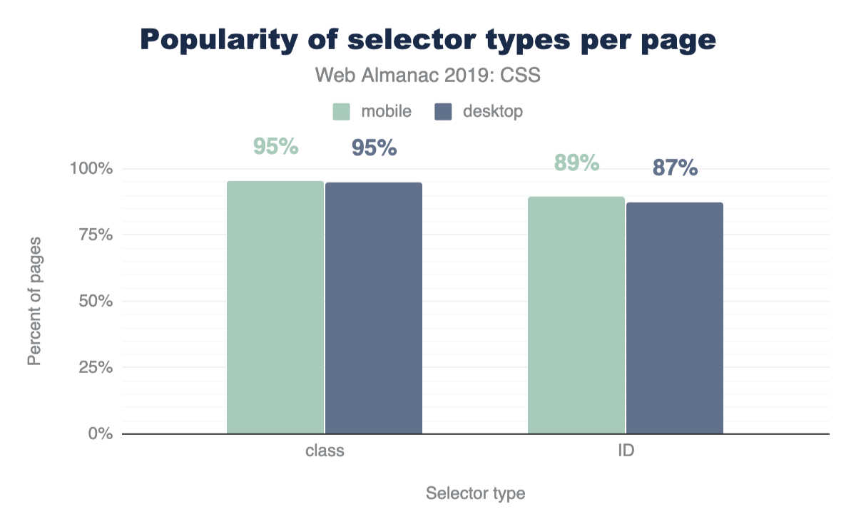
CSS has a few ways to find elements on the page for styling, so let’s put IDs and classes against each other to see which is more prevalent! The results shouldn’t be too surprising: classes are more popular!
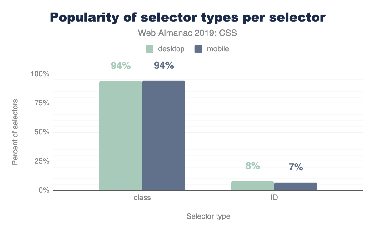
A nice follow up chart is this one, showing that classes take up 93% of the selectors found in a stylesheet.
Attribute selectors
CSS has some very powerful comparison selectors. These are selectors like [target="_blank"], [attribute^="value"], [title~="rad"], [attribute$="-rad"] or [attribute*="value"]. Do you use them? Think they’re used a lot? Let’s compare how those are used with IDs and classes across the web.
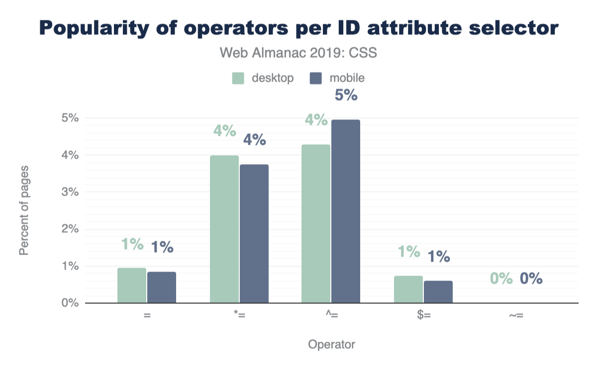
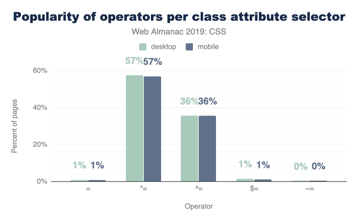
These operators are much more popular with class selectors than IDs, which feels natural since a stylesheet usually has fewer ID selectors than class selectors, but still neat to see the uses of all these combinations.
Classes per element
With the rise of OOCSS, atomic, and functional CSS strategies which can compose 10 or more classes on an element to achieve a design look, perhaps we’d see some interesting results. The query came back quite unexciting, with the median on mobile and desktop being 1 class per element.
Layout
Flexbox
Flexbox is a container style that directs and aligns its children; that is, it helps with layout in a constraint-based way. It had a quite rocky beginning on the web, as its specification went through two or three quite drastic changes between 2010 and 2013. Fortunately, it settled and was implemented across all browsers by 2014. Given that history, it had a slow adoption rate, but it’s been a few years since then! It’s quite popular now and has many articles about it and how to leverage it, but it’s still new in comparison to other layout tactics.
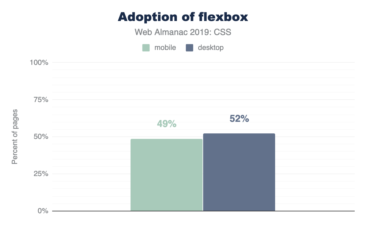
Quite the success story shown here, as nearly 50% of the web has flexbox usage in its stylesheets.
Grid
Like flexbox, grid too went through a few spec alternations early on in its lifespan, but without changing implementations in publicly-deployed browsers. Microsoft had grid in the first versions of Windows 8, as the primary layout engine for its horizontally scrolling design style. It was vetted there first, transitioned to the web, and then hardened by the other browsers until its final release in 2017. It had a very successful launch in that nearly all browsers released their implementations at the same time, so web developers just woke up one day to superb grid support. Today, at the end of 2019, grid still feels like a new kid on the block, as folks are still awakening to its power and capabilities.
This shows just how little the web development community has exercised and explored their latest layout tool. We look forward to the eventual takeover of grid as the primary layout engine folks lean on when building a site. For us authors, we love writing grid: we typically reach for it first, then dial our complexity back as we realize and iterate on layout. It remains to be seen what the rest of the world will do with this powerful CSS feature over the next few years.
Writing modes
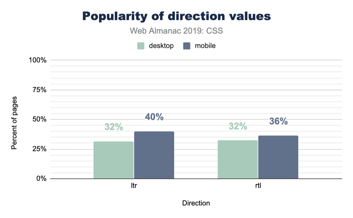
The web and CSS are international platform features, and writing modes offer a way for HTML and CSS to indicate a user’s preferred reading and writing direction within our elements.
Typography
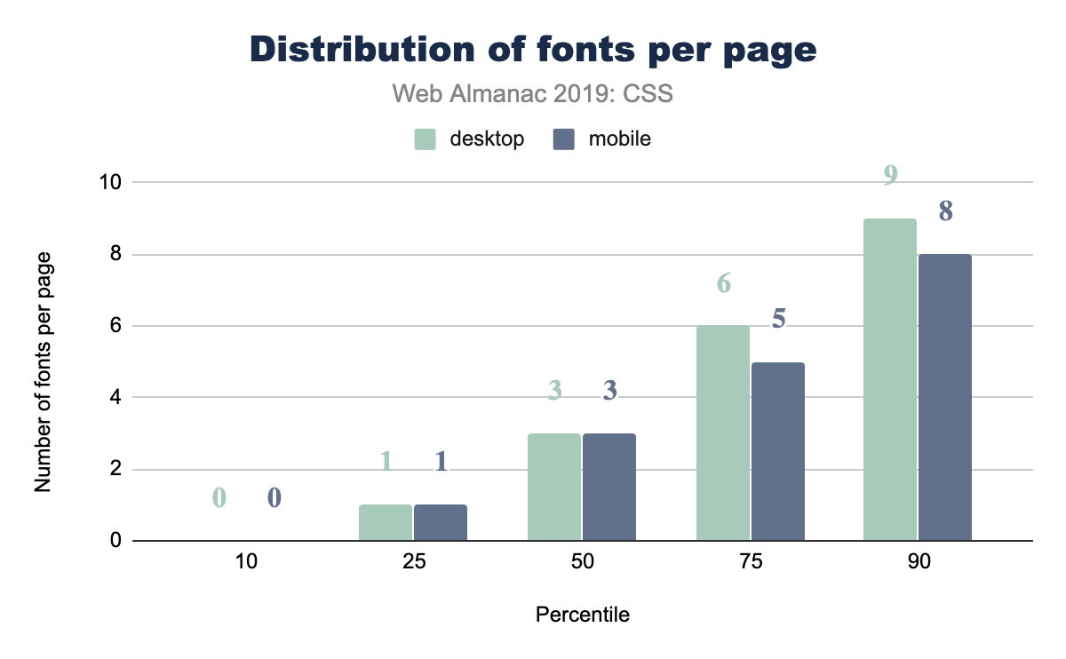
Web fonts per page
How many web fonts are you loading on your web page: 0? 10? The median number of web fonts per page is 3!
Popular font families
A natural follow up to the inquiry of total number of fonts per page, is: what fonts are they?! Designers, tune in, because you’ll now get to see if your choices are in line with what’s popular or not.
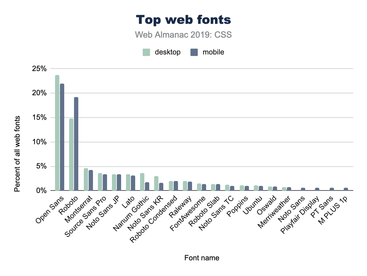
Open Sans is a huge winner here, with nearly 1 in 4 CSS @font-family declarations specifying it. We’ve definitely used Open Sans in projects at agencies.
It’s also interesting to note the differences between desktop and mobile adoption. For example, mobile pages use Open Sans slightly less often than desktop. Meanwhile, they also use Roboto slightly more often.
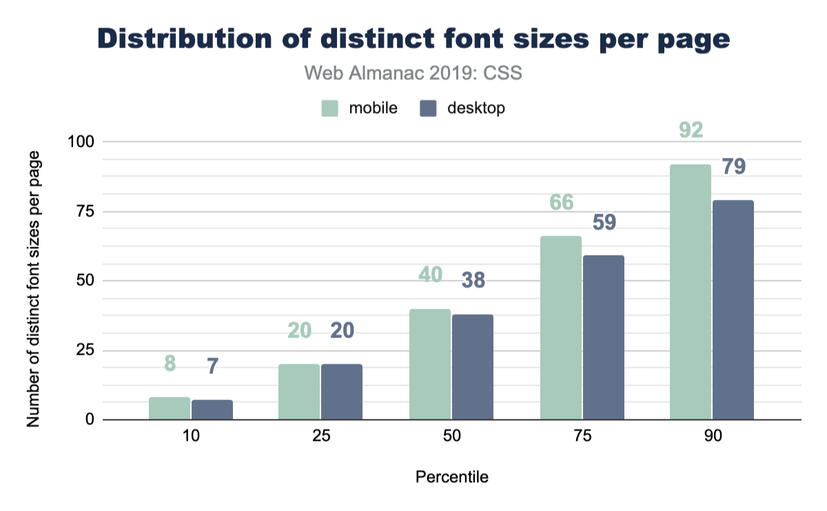
Font sizes
This is a fun one, because if you asked a user how many font sizes they feel are on a page, they’d generally return a number of 5 or definitely less than 10. Is that reality though? Even in a design system, how many font sizes are there? We queried the web and found the median to be 40 on mobile and 38 on desktop. Might be time to really think hard about custom properties or creating some reusable classes to help you distribute your type ramp.
Spacing
Margins
A margin is the space outside of elements, like the space you demand when you push your arms out from yourself. This often looks like the spacing between elements, but is not limited to that effect. In a website or app, spacing plays a huge role in UX and design. Let’s see how much margin spacing code goes into a stylesheet, shall we?

Quite a lot, it seems! The median desktop page has 96 distinct margin values and 104 on mobile. That makes for a lot of unique spacing moments in your design. Curious how many margins you have in your site? How can we make all this whitespace more manageable?
Logical properties
We estimate that the hegemony of margin-left and padding-top is of limited duration, soon to be supplemented by their writing direction agnostic, successive, logical property syntax. While we’re optimistic, current usage is quite low at 0.67% usage on desktop pages. To us, this feels like a habit change we’ll need to develop as an industry, while hopefully training new developers to use the new syntax.
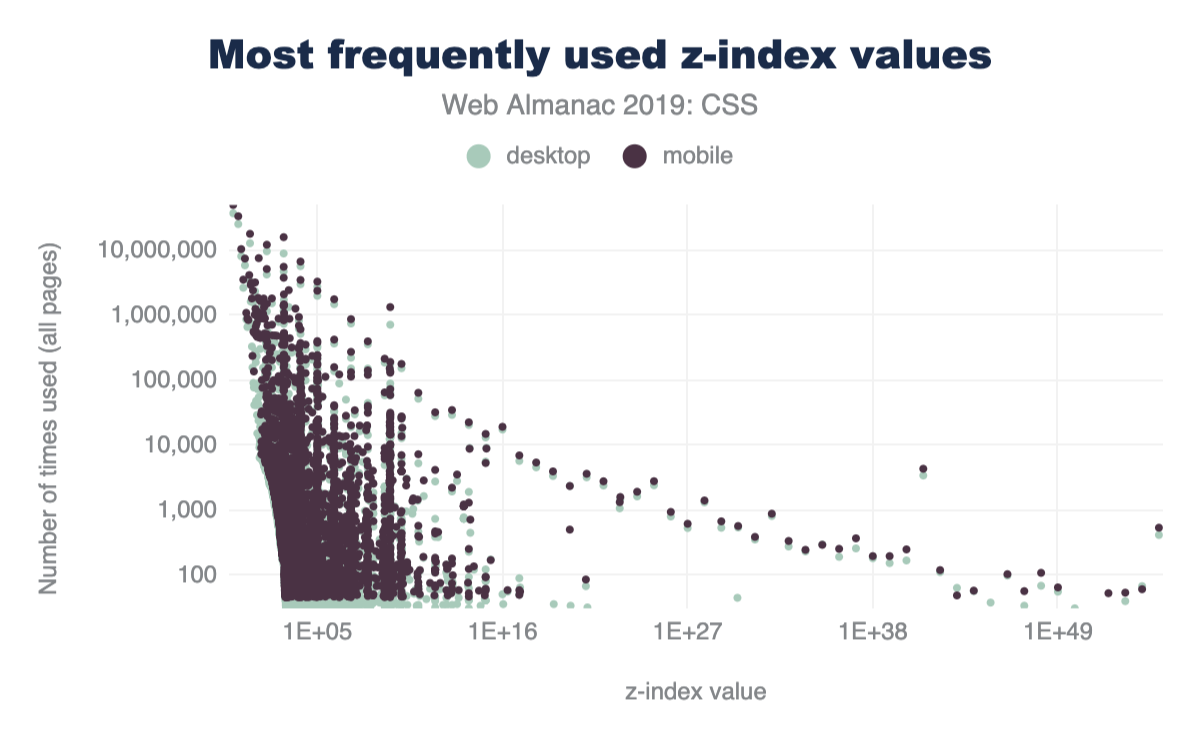
z-index
Vertical layering, or stacking, can be managed with z-index in CSS. We were curious how many different values folks use in their sites. The range of what z-index accepts is theoretically infinite, bounded only by a browser’s variable size limitations. Are all those stack positions used? Let’s see!

z-index values per page.
Popular z-index values
From our work experience, any number of 9’s seemed to be the most popular choice. Even though we taught ourselves to use the lowest number possible, that’s not the communal norm. So what is then?! If folks need things on top, what are the most popular z-index numbers to pass in? Put your drink down; this one is funny enough you might lose it.
z-index values.
z-index value.
Decoration
Filters
Filters are a fun and great way to modify the pixels the browser intends to draw to the screen. It’s a post-processing effect that is done against a flat version of the element, node, or layer that it’s being applied to. Photoshop made them easy to use, then Instagram made them accessible to the masses through bespoke, stylized combinations. They’ve been around since about 2012, there are 10 of them, and they can be combined to create unique effects.
filter property.
We were excited to see that 78% of stylesheets contain the filter property! That number was also so high it seemed a little fishy, so we dug in and sought to explain the high number. Because let’s be honest, filters are neat, but they don’t make it into all of our applications and projects. Unless!
Upon further investigation, we discovered FontAwesome’s stylesheet comes with some filter usage, as well as a YouTube embed. Therefore, we believe filter snuck in the back door by piggybacking onto a couple very popular stylesheets. We also believe that -ms-filter presence could have been included as well, contributing to the high percent of use.
Blend modes
Blend modes are similar to filters in that they are a post-processing effect that are run against a flat version of their target elements, but are unique in that they are concerned with pixel convergence. Said another way, blend modes are how 2 pixels should impact each other when they overlap. Whichever element is on the top or the bottom will affect the way that the blend mode manipulates the pixels. There are 16 blend modes -- let’s see which ones are the most popular.
*-blend-mode property.
Overall, usage of blend modes is much lower than of filters, but is still enough to be considered moderately used.
In a future edition of the Web Almanac, it would be great to drill down into blend mode usage to get an idea of the exact modes developers are using, like multiply, screen, color-burn, lighten, etc.
Animation
Transitions
CSS has this awesome interpolation power that can be simply used by just writing a single rule on how to transition those values. If you’re using CSS to manage states in your app, how often are you employing transitions to do the task? Let’s query the web!
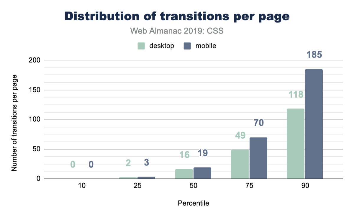
That’s pretty good! We did see animate.css as a popular library to include, which brings in a ton of transition animations, but it’s still nice to see folks are considering transitioning their UIs.
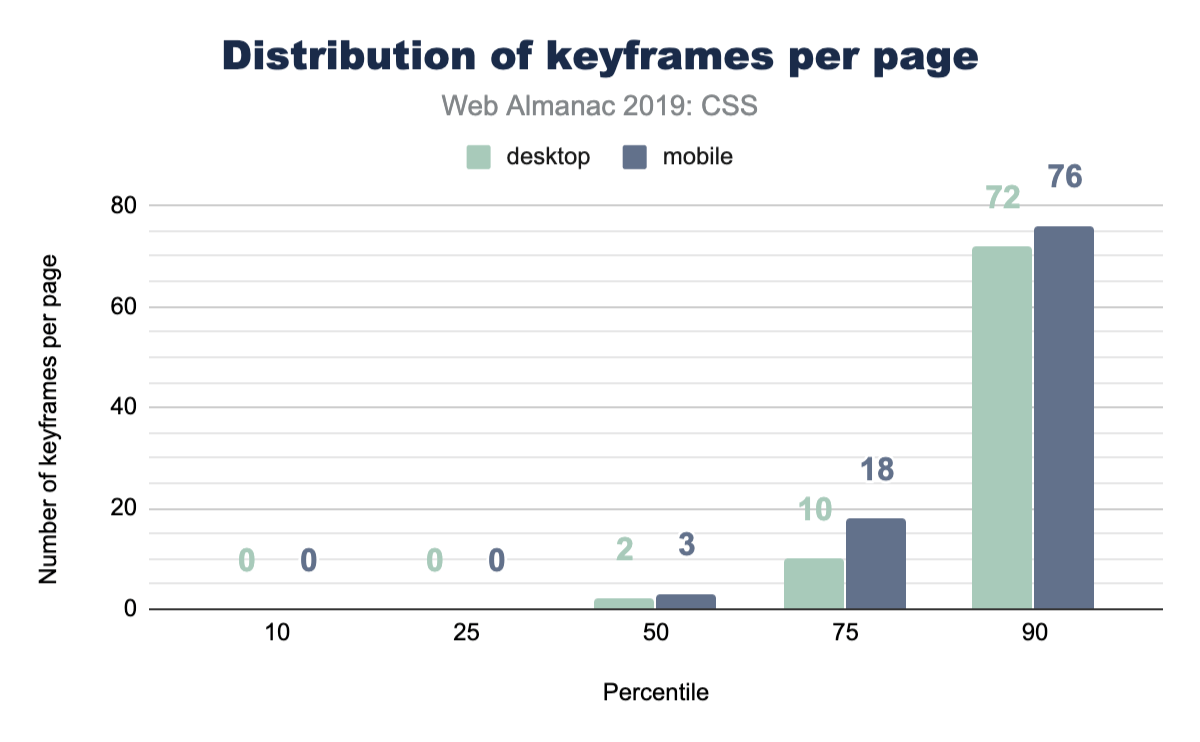
Keyframe animations
CSS keyframe animations are a great solution for your more complex animations or transitions. They allow you to be more explicit which provides higher control over the effects. They can be small, like one keyframe effect, or be large with many many keyframe effects composed into a robust animation. The median number of keyframe animations per page is much lower than CSS transitions.
Media queries
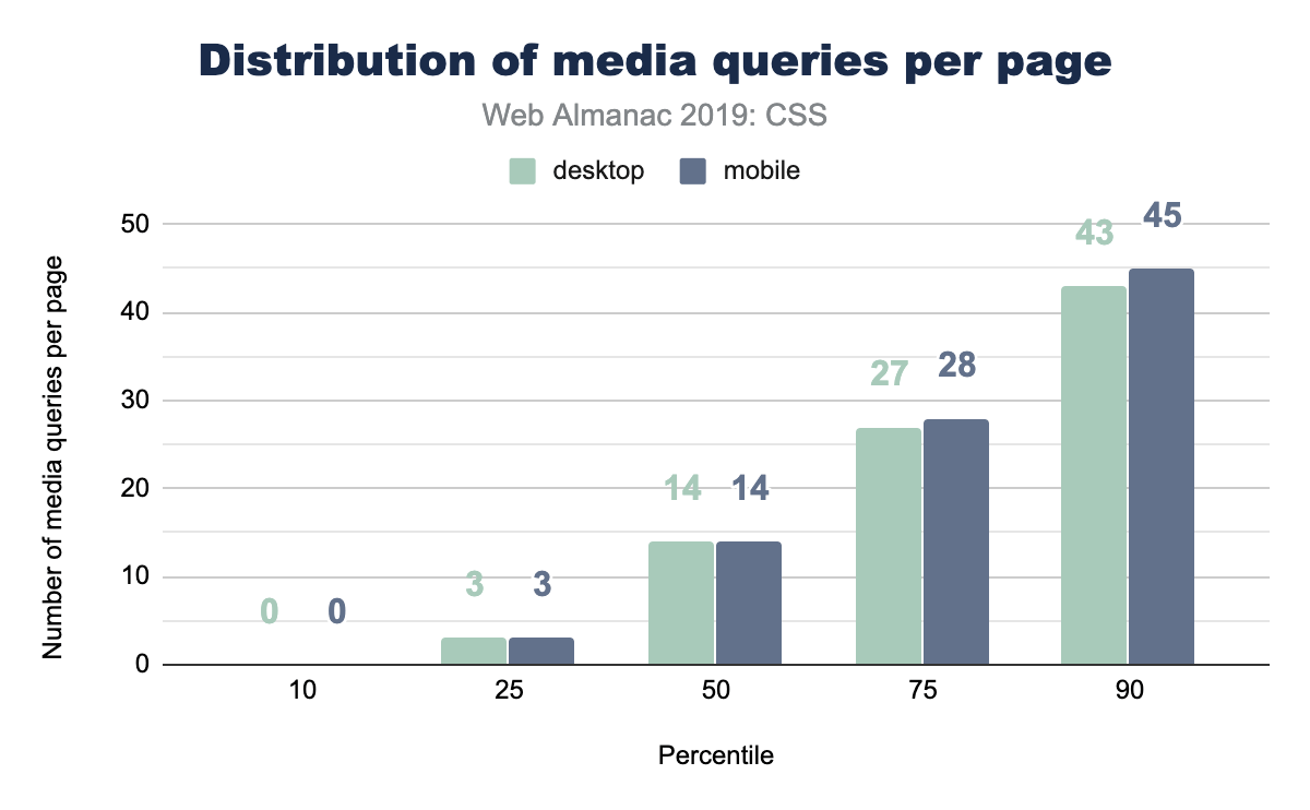
Media queries let CSS hook into various system-level variables in order to adapt appropriately for the visiting user. Some of these queries could handle print styles, projector screen styles, and viewport/screen size. For a long time, media queries were primarily leveraged for their viewport knowledge. Designers and developers could adapt their layouts for small screens, large screens, and so forth. Later, the web started bringing more and more capabilities and queries, meaning media queries can now manage accessibility features on top of viewport features.
A good place to start with media queries, is just about how many are used per page? How many different moments or contexts does the typical page feel they want to respond to?
Popular media query breakpoint sizes
For viewport media queries, any type of CSS unit can be passed into the query expression for evaluation. In earlier days, folks would pass em and px into the query, but more units were added over time, making us very curious about what types of sizes were commonly found across the web. We assume most media queries will follow popular device sizes, but instead of assuming, let’s look at the data!

Figure 2.28 above shows that part of our assumptions were correct: there’s certainly a high amount of phone specific sizes in there, but there’s also some that aren’t. It’s interesting also how it’s very pixel dominant, with a few trickling entries using em beyond the scope of this chart.
Portrait vs landscape usage
The most popular query value from the popular breakpoint sizes looks to be 768px, which made us curious. Was this value primarily used to switch to a portrait layout, since it could be based on an assumption that 768px represents the typical mobile portrait viewport? So we ran a follow up query to see the popularity of using the portrait and landscape modes:
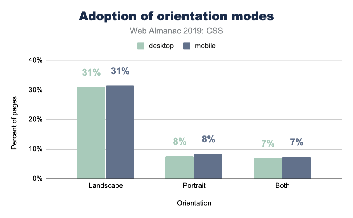
Interestingly, portrait isn’t used very much, whereas landscape is used much more. We can only assume that 768px has been reliable enough as the portrait layout case that it’s reached for much less. We also assume that folks on a desktop computer, testing their work, can’t trigger portrait to see their mobile layout as easily as they can just squish the browser. Hard to tell, but the data is fascinating.
Most popular unit types
In the width and height media queries we’ve seen so far, pixels look like the dominant unit of choice for developers looking to adapt their UI to viewports. We wanted to exclusively query this though, and really take a look at the types of units folks use. Here’s what we found.
min-width vs max-width
When folks write a media query, are they typically checking for a viewport that’s over or under a specific range, or both, checking if it’s between a range of sizes? Let’s ask the web!
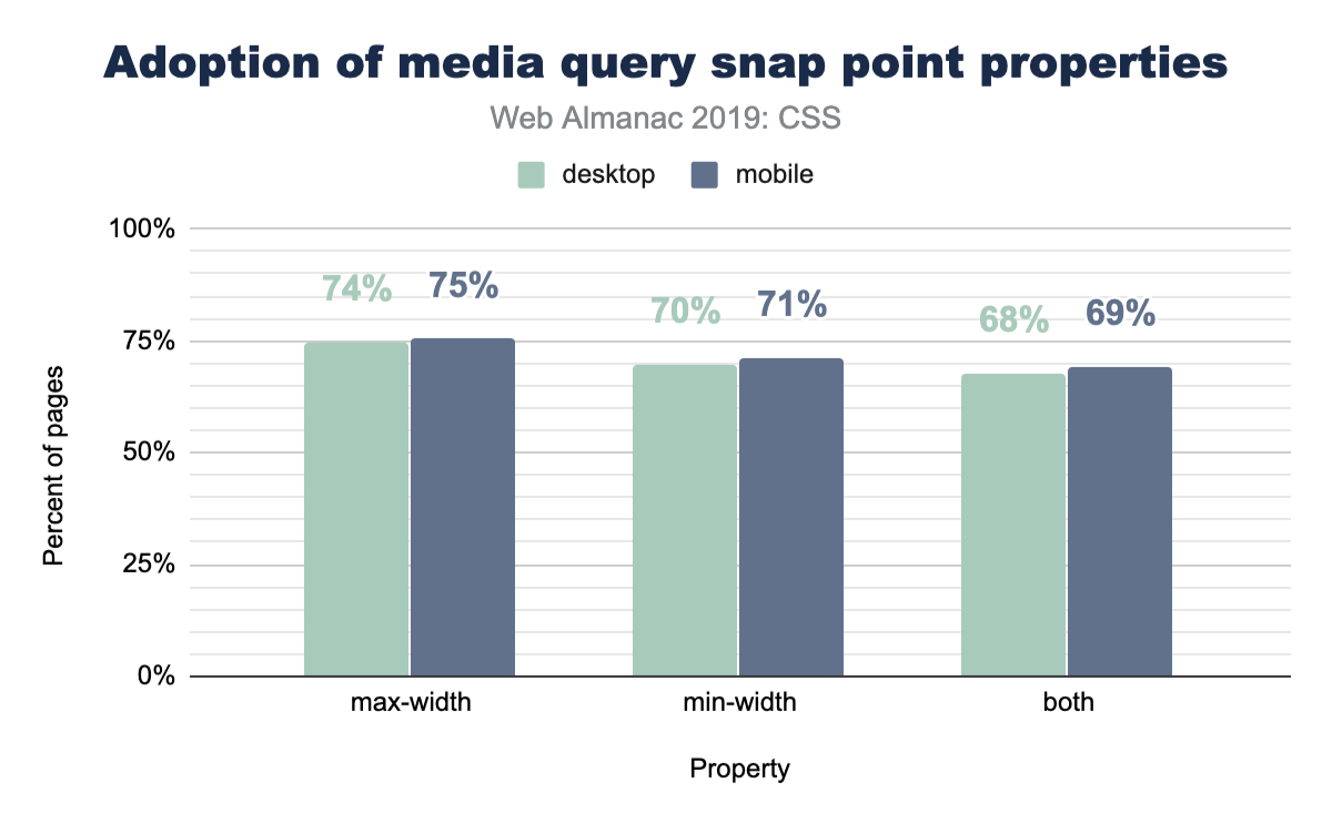
No clear winners here; max-width and min-width are nearly equally used.
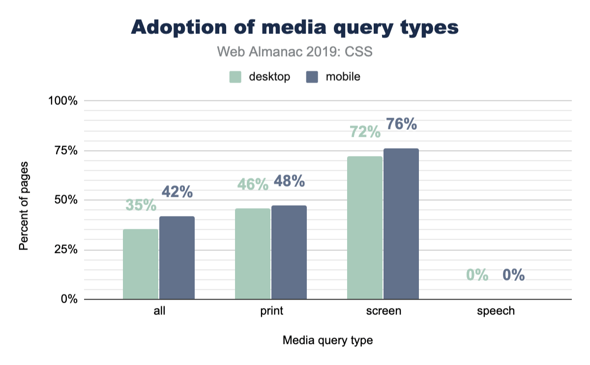
Print and speech
Websites feel like digital paper, right? As users, it’s generally known that you can just hit print from your browser and turn that digital content into physical content. A website isn’t required to change itself for that use case, but it can if it wants to! Lesser known is the ability to adjust your website in the use case of it being read by a tool or robot. So just how often are these features taken advantage of?
Page-level stats
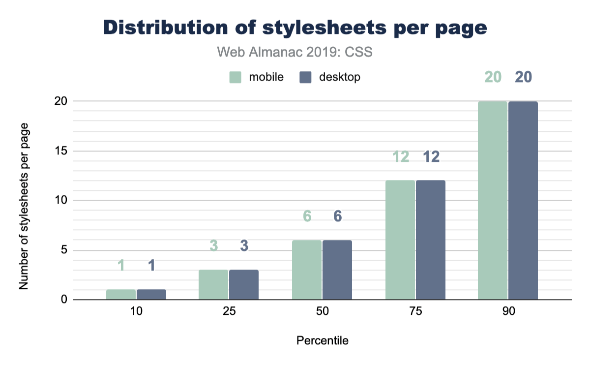
Stylesheets
How many stylesheets do you reference from your home page? How many from your apps? Do you serve more or less to mobile vs desktop? Here’s a chart of everyone else!
Stylesheet names
What do you name your stylesheets? Have you been consistent throughout your career? Have you slowly converged or consistently diverged? This chart shows a small glimpse into library popularity, but also a large glimpse into popular names of CSS files.
| Stylesheet name | Desktop | Mobile |
|---|---|---|
| style.css | 2.43% | 2.55% |
| font-awesome.min.css | 1.86% | 1.92% |
| bootstrap.min.css | 1.09% | 1.11% |
| BfWyFJ2Rl5s.css | 0.67% | 0.66% |
| style.min.css?ver=5.2.2 | 0.64% | 0.67% |
| styles.css | 0.54% | 0.55% |
| style.css?ver=5.2.2 | 0.41% | 0.43% |
| main.css | 0.43% | 0.39% |
| bootstrap.css | 0.40% | 0.42% |
| font-awesome.css | 0.37% | 0.38% |
| style.min.css | 0.37% | 0.37% |
| styles__ltr.css | 0.38% | 0.35% |
| default.css | 0.36% | 0.36% |
| reset.css | 0.33% | 0.37% |
| styles.css?ver=5.1.3 | 0.32% | 0.35% |
| custom.css | 0.32% | 0.33% |
| print.css | 0.32% | 0.28% |
| responsive.css | 0.28% | 0.31% |
Look at all those creative file names! style, styles, main, default, all. One stood out though, do you see it? BfWyFJ2Rl5s.css takes the number four spot for most popular. We went researching it a bit and our best guess is that it’s related to Facebook “like” buttons. Do you know what that file is? Leave a comment, because we’d love to hear the story.
Stylesheet size
How big are these stylesheets? Is our CSS size something to worry about? Judging by this data, our CSS is not a main offender for page bloat.
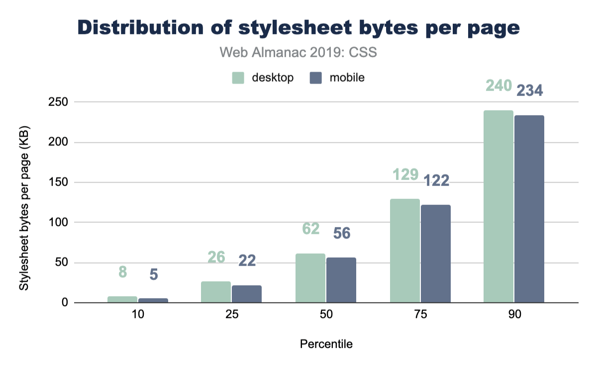
See the Page Weight chapter for a more in-depth look at the number of bytes websites are loading for each content type.
Libraries
It’s common, popular, convenient, and powerful to reach for a CSS library to kick start a new project. While you may not be one to reach for a library, we’ve queried the web in 2019 to see which are leading the pack. If the results astound you, like they did us, I think it’s an interesting clue to just how small of a developer bubble we can live in. Things can feel massively popular, but when the web is inquired, reality is a bit different.
| Library | Desktop | Mobile |
|---|---|---|
| Bootstrap | 27.8% | 26.9% |
| animate.css | 6.1% | 6.4% |
| ZURB Foundation | 2.5% | 2.6% |
| UIKit | 0.5% | 0.6% |
| Material Design Lite | 0.3% | 0.3% |
| Materialize CSS | 0.2% | 0.2% |
| Pure CSS | 0.1% | 0.1% |
| Angular Material | 0.1% | 0.1% |
| Semantic-ui | 0.1% | 0.1% |
| Bulma | 0.0% | 0.0% |
| Ant Design | 0.0% | 0.0% |
| tailwindcss | 0.0% | 0.0% |
| Milligram | 0.0% | 0.0% |
| Clarity | 0.0% | 0.0% |
This chart suggests that Bootstrap is a valuable library to know to assist with getting a job. Look at all the opportunity there is to help! It’s also worth noting that this is a positive signal chart only: the math doesn’t add up to 100% because not all sites are using a CSS framework. A little bit over half of all sites are not using a known CSS framework. Very interesting, no?!
Reset utilities
CSS reset utilities intend to normalize or create a baseline for native web elements. In case you didn’t know, each browser serves its own stylesheet for all HTML elements, and each browser gets to make their own unique decisions about how those elements look or behave. Reset utilities have looked at these files, found their common ground (or not), and ironed out any differences so you as a developer can style in one browser and have reasonable confidence it will look the same in another.
So let’s take a peek at how many sites are using one! Their existence seems quite reasonable, so how many folks agree with their tactics and use them in their sites?
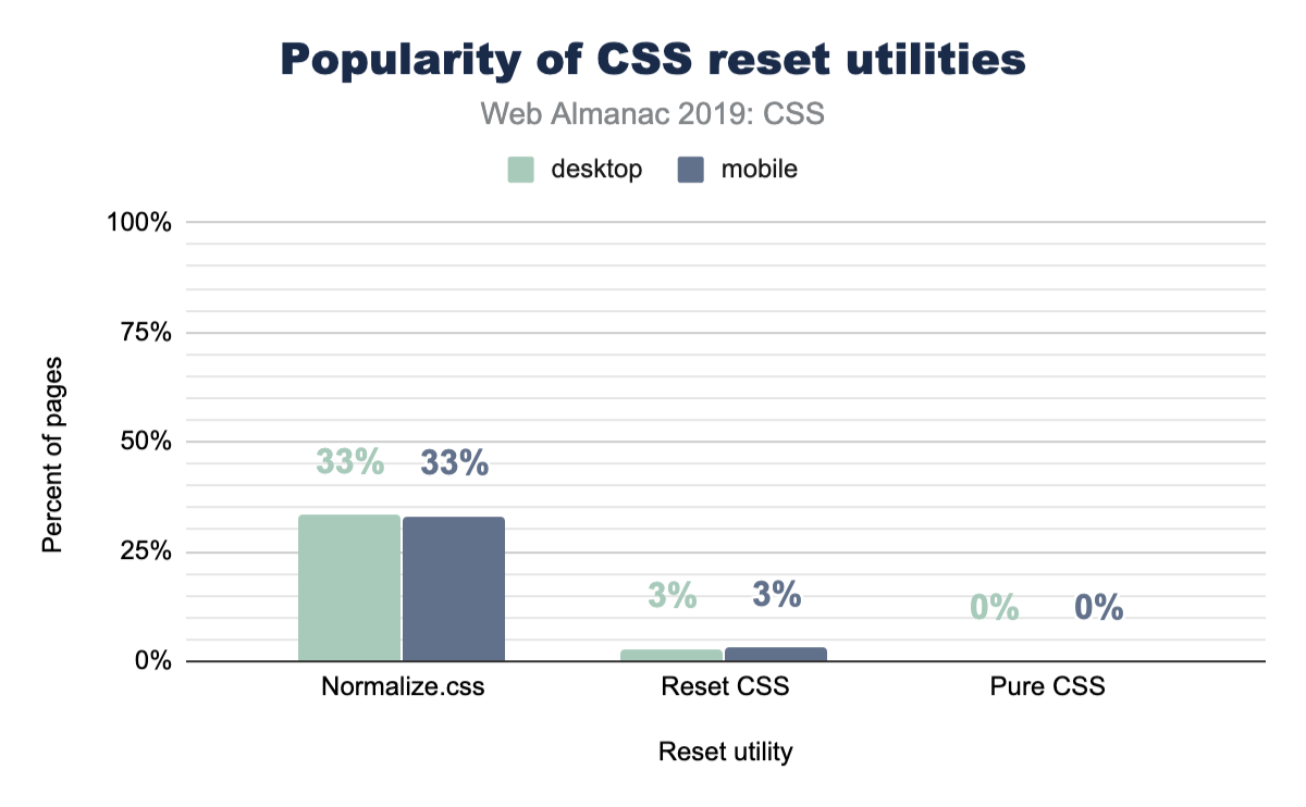
Turns out that about one-third of the web is using normalize.css, which could be considered a more gentle approach to the task then a reset is. We looked a little deeper, and it turns out that Bootstrap includes normalize.css, which likely accounts for a massive amount of its usage. It’s worth noting as well that normalize.css has more adoption than Bootstrap, so there are plenty of folks using it on its own.
@supports and @import
CSS @supports is a way for the browser to check whether a particular property-value combination is parsed as valid, and then apply styles if the check returns as true.
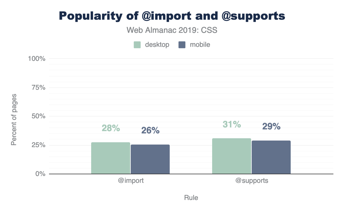
Considering @supports was implemented across most browsers in 2013, it’s not too surprising to see a high amount of usage and adoption. We’re impressed at the mindfulness of developers here. This is considerate coding! 30% of all websites are checking for some display related support before using it.
An interesting follow up to this is that there’s more usage of @supports than @imports! We did not expect that! @import has been in browsers since 1994.
Conclusion
There is so much more here to datamine! Many of the results surprised us, and we can only hope that they’ve surprised you as well. This surprising data set made the summarizing very fun, and left us with lots of clues and trails to investigate if we want to hunt down the reasons why some of the results are the way they are.
Which results did you find the most alarming? Which results make you head to your codebase for a quick query?
We felt the biggest takeaway from these results is that custom properties offer the most bang for your buck in terms of performance, DRYness, and scalability of your stylesheets. We look forward to scrubbing the internet’s stylesheets again, hunting for new datums and provocative chart treats. Reach out to @una or @argyleink in the comments with your queries, questions, and assertions. We’d love to hear them!

