Page Weight
Introduction
In the early days of the web, every byte was a luxury. Developers spent hours dither-mapping GIFs and hand-optimizing scripts to ensure pages could crawl through 56k modems. Today, in an era of gigabit fiber and 5G dominance, that scarcity mindset has largely vanished. However, as our “bandwidth pipes” have grown wider, the content we push through them has expanded to fill the space.
Page weight—the total volume of bytes transferred to a user’s device—remains one of the most critical metrics for understanding the health of the web. While it is tempting to view a few extra megabytes as a negligible cost of modern rich experiences, the reality is far more complex.
What is page weight?
Page weight (also called page size) is the total volume of data—measured in kilobytes (KB) or megabytes (MB)—that a user must download to view a specific webpage.
When you navigate to a URL, your browser doesn’t just download one file; it sends dozens or even hundreds of requests for various assets required to make the page look and function correctly. The sum of all these “shipped” bytes constitutes the page weight.
A modern webpage is an assembly of several different types of resources. Each contributes to the total “heaviness” of the site:
- Images & video: High-resolution photos, background videos, and GIFs can quickly balloon page size.
- JavaScript: Files that provide interactivity (like menus, tracking pixels, or animations). While often smaller in KB than images, JavaScript is “heavy” because the browser has to spend significant CPU power parsing and executing it.
- CSS: Stylesheets that determine the layout, colors, and fonts of the page.
- Fonts: Custom web fonts can add several hundred KB if multiple weights (bold, italic, light) are used.
- HTML: The structural code of the page, which is usually the smallest part of the total weight.
- Third-party scripts: These include ads, analytics, and social media widgets that are fetched from other servers.
Not all bytes are created equally. In this chapter we will explore page weight by bytes and by request volume of file types.
Why weight matters
Page weight is a direct proxy for performance and accessibility. A “heavy” page creates several negative ripple effects:
- The performance gap: Larger payloads can require more CPU cycles and use more device memory to parse and render, often leading to sluggish experiences on low-end devices, regardless of connection speed.
- The economic toll: In many parts of the world, data is a metered commodity. A 5 MB page isn’t just a slow experience; it is an exclusive one. If a user cannot afford the data to load your page, your site is, by definition, inaccessible to them.
- The accessibility barrier: If a page is “heavy,” it doesn’t just load slowly—it becomes physically and cognitively harder to use. Excessive page weight creates significant inequities, heavily penalizing users who rely on less powerful devices or expensive, slow connections with limited data caps. Refer to the Accessibility chapter to learn more about how page weight is a silent but significant barrier to entry for millions of users with disabilities.
- The environmental impact: Every megabyte transferred requires energy—from data centers to cooling systems to the device in the user’s hand. As the web grows, so does its carbon footprint.
- Speed & SEO: Heavier pages take longer to load, especially on slower connections. Google uses page speed (via Core Web Vitals) in their core algorithm, meaning bloated pages can rank lower in search results. See also the SEO chapter.
The weight effects can be divided into three main categories: storage, transmission, and rendering.
Storage
Storage refers to how assets (images, scripts, HTML) sit on a web server or CDN. At this stage, page weight is about file size on disk.
- Compression at rest: Developers often store files in highly compressed formats (like WebP for images or Brotli-compressed text). A 1 MB file can be stored as 300 KB.
- The database bottleneck: For dynamic sites, the “weight” starts with database queries. If a server has to retrieve 2 MB of raw data from a database to generate one page, the initial response time (Time to First Byte (TTFB)) increases before a single byte is even sent.
- The cost: Inefficient storage doesn’t just affect speed; it increases hosting costs and the carbon footprint of the data center.
Transmission
Transmission is the process of moving those stored files across the internet. This is where network constraints turn page weight into a performance barrier.
- Transfer size versus actual size: Thanks to “on-the-fly” compression (like Gzip), the number of bytes sent over the wire is often much smaller than the original file size.
- Latency and round trips: It’s not just about how much data is sent, but how many files. Each separate file requires a “round trip” to the server. A page with 50 small images (totaling 1 MB) can actually feel slower than a page with one large 2 MB image because of the transmission overhead of 50 separate requests.
- The bottleneck: On mobile 4G/5G, signal interference can cause “packet loss.” The heavier the page, the more likely a packet will drop, forcing the browser to ask for it again and causing a visible hang.
Rendering
Rendering is what happens once the data arrives. This is the most misunderstood part of page weight: Once a file is downloaded, it must be “unpacked” and processed by the device.
- Memory inflation: An image might only take up 200 KB during transmission, but once the browser “renders” it, it must be decoded into raw pixels in the device’s RAM. That 200 KB file can easily take up 5 MB of memory.
- The JavaScript tax: This is the “heaviest” part of rendering. 100 KB of an image is just pixels, but 100 KB of JavaScript is work. The CPU must parse, compile, and execute that code. On a low-end smartphone, this “weight” can freeze the screen for several seconds.
- DOM complexity: Every HTML tag adds a “node” to the browser’s memory. A page with 5,000 nodes (a “heavy” DOM) will make scrolling feel laggy, regardless of how fast the internet connection is.
Websites may be changing their rendering strategies, sometimes prompted by rethinking how websites are accessed and consumed by the growing AI chatbots and other large language model tools. Not all of these changes are aimed at AI crawler accessibility. Some testing has been done to identify the technical requirements for AI crawler accessibility, as these may vary between crawlers. We do know that all key information should be present in the initial raw HTML, since AI crawlers do not render JavaScript.
Given the growing awareness of these factors, we could expect broader adoption of such strategies, including a reduction in the use of JavaScript files in future editions.
What are we shipping?
In this chapter, we analyze trillions of bytes across millions of websites to answer a fundamental question: Are we getting more value out of our payloads, or are we simply succumbing to “weight creep”? We will explore the dominance of media—images and video—which continue to claim the lion’s share of the transfer budget, and the steady rise of JavaScript, which carries a performance tax far heavier than its file size suggests.
Request bytes
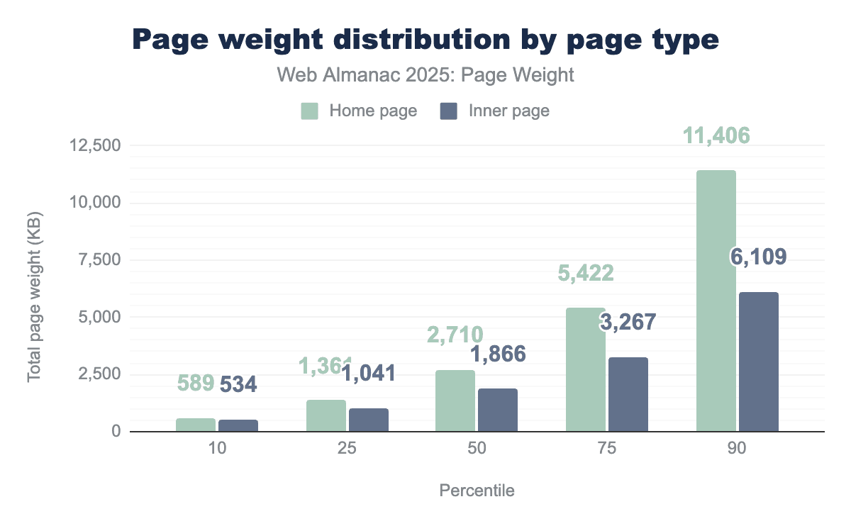
Median page weight over time shows that page size growth is accelerating, since October 24 there has been a noticeable upward trend, in particular for mobile devices. This is shown on a grander scale with the home page, which on average is close to 45.8% larger than inner pages.
Home page page weight has similarly accelerated but earlier, around early 2023/late 2022.
This does have wider implications:
Page weight implications for AI
There is an increase in energy consumption and computation costs, heavier pages mean more bandwidth, rendering and CPU load per visit, which all increase the energy footprint of web crawling and indexing.
This results in slower or shallower crawling, as AI-driven crawlers that try to “understand” the web by performing actions such as extracting entities or content summarization, may limit the depth or frequency of crawling to manage their computation budgets.
This could lead to a bias towards lighter-footprint web content with faster loading or more semantically clear sites, as they are easier to parse and therefore model. Sites overloaded with JavaScript and client-side rendering could end up being underrepresented in large-scale training sets since the crawlers AI models employ do not render. Finally, AI may skip or truncate what they see on slow or very heavy pages as performance becomes more critical.
Page weight implications for users
As pages get heavier, more sites will likely fall short on LCP and INP, which could directly reduce their visibility in search results. More importantly, this can make a frustrating user experience, potentially leading to lower conversion rates, as convenience has become an increasingly important factor.
Heavier pages widen the digital divide between users on slower connections or lower-end devices, as they would be disproportionately impacted by these increases. This highlights the importance for search marketers to optimize websites with these users in mind.
Page weight implications for publishers
Slower performance correlates with lower online traffic, conversion rates and ad views. Ad tech and analytics scripts drive additional weight, creating additional friction between user experience and monetization.
In summary: AI systems may adapt by scraping less and summarizing more, filling gaps with “hallucinations”. This could reduce user confidence in brands and lead to lower online traffic and conversions. User behavior could shift away from traditional page visits toward AI-mediated browsing experiences, as convenience continues to play a key role in how people access online information.
Page weight over time
Since the inception of the Web Almanac, we’ve consistently observed two trends:
- The total volume of requests increases.
- Desktop page loads result in more requests than mobile page loads.
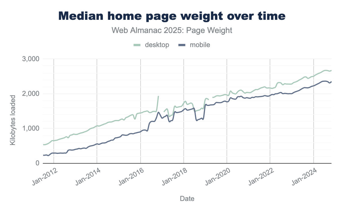
In July 2015, the median mobile home page was a meager 845 KB. As of July 2025, the same median page is now 2,362 KB. The page decade brought a 202.8% increase. The median desktop home page saw a 110.2% increase in the same time frame.
Year over year, the median home page size grew 7.8% to 2.7 MB. The median mobile home page is 2.6 MB, growing 8.4% from 2.4 MB in 2024. In 2025, the median desktop page size reached 2.9 MB, up 7.3% from 2024’s median of 2.7 MB.
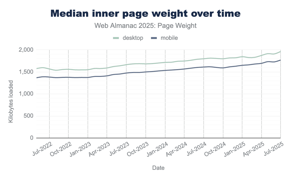
Inner page weight continued to increase, up 9.5% year over year. Since data for tracking inner page weight began in 2022, the median mobile inner page weight has increased by 27.8% to 1.8 MB, while desktop has grown by 25.2% to reach 2 MB during the same period.
Page weight in bytes
Every update to page functionality introduces additional weight and file types designed to enhance performance while preserving core features. We’ve examined common file types, their frequency, and response sizes to gain a clearer understanding of their implementation, including comparisons across different devices and page types.
Median page by the bytes
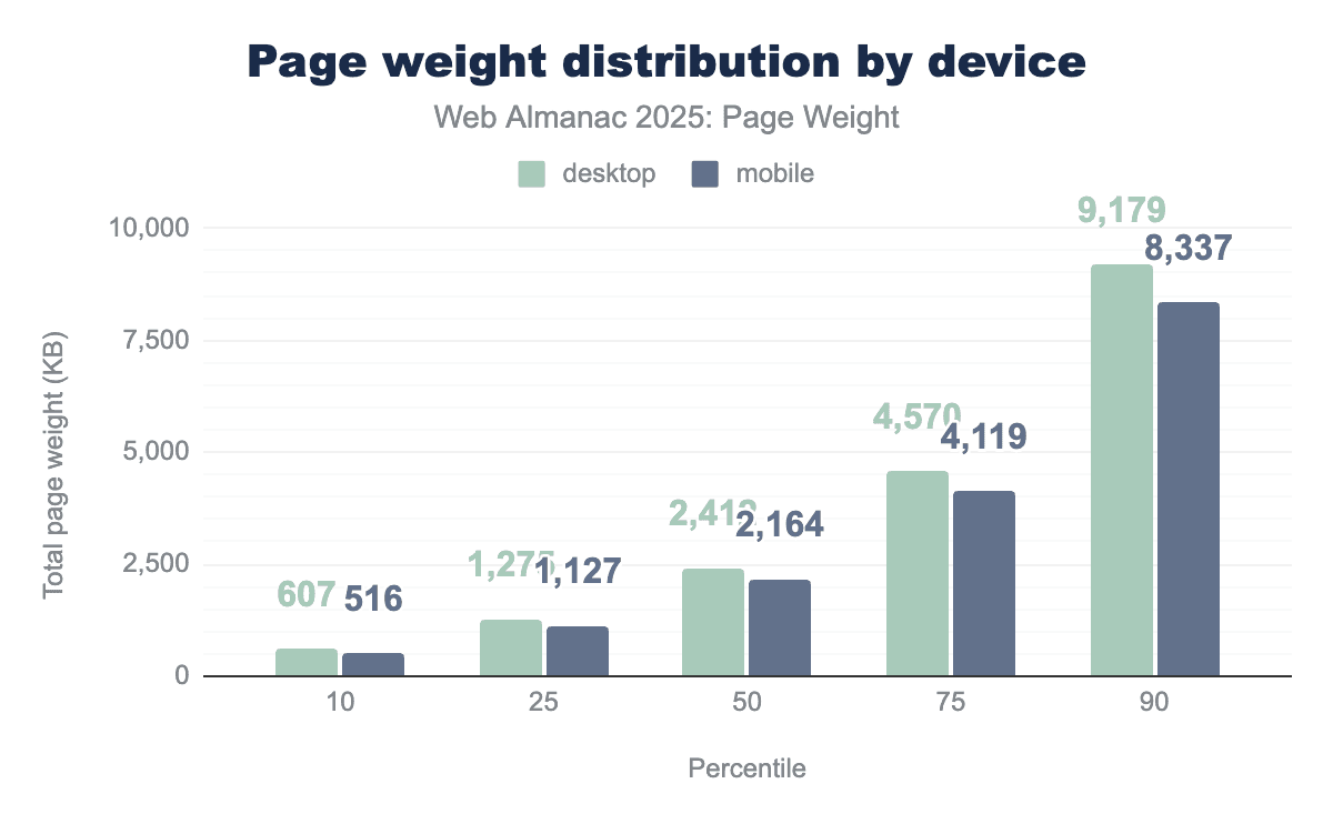
To better understand the web, we can examine the 50th percentile. The median represents the typical value and context to study relative page weights.
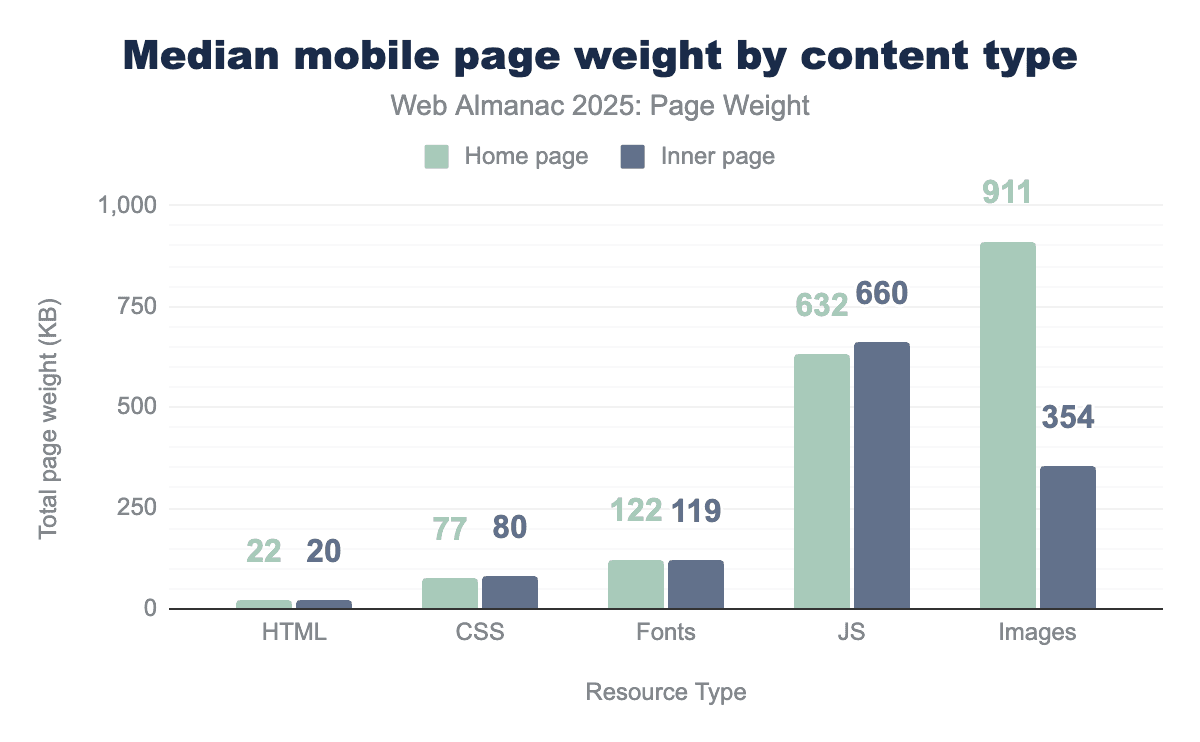
In 2025, the median mobile home page used:
- 22 KB of HTML resources
- 77 KB of CSS resources
- 122 KB of fonts
- 632 KB of JavaScript
- 911 KB of images
Inner pages were similar, with the exception of images, which decreased from 911 KB to 354 KB.
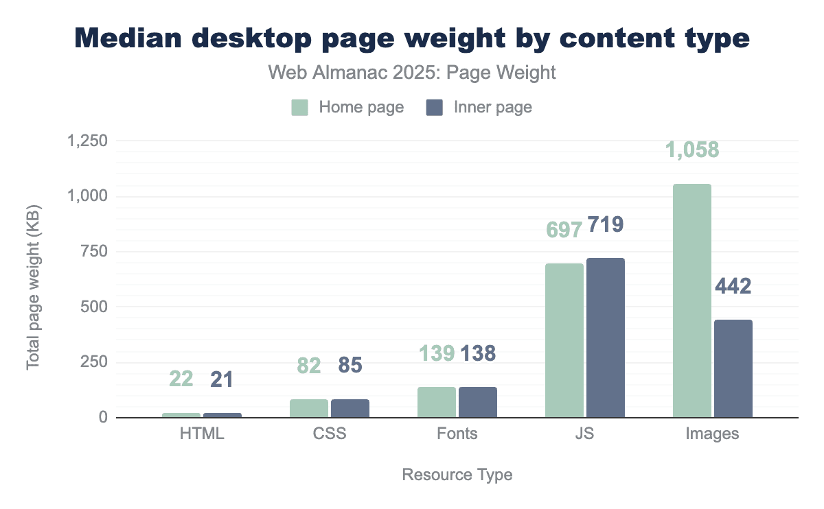
The median desktop page’s weight by resource type matched mobile, though the resources were slightly larger in KB. In 2025, the median desktop home page used:
- 22 KB of HTML resources
- 82 KB of CSS resources
- 139 KB of fonts
- 697 KB of JavaScript
- 1,058 KB of images
For both device types, images saw the greatest gap in kilobytes with 1.06 MB used on home pages and 442 KB on inner pages.
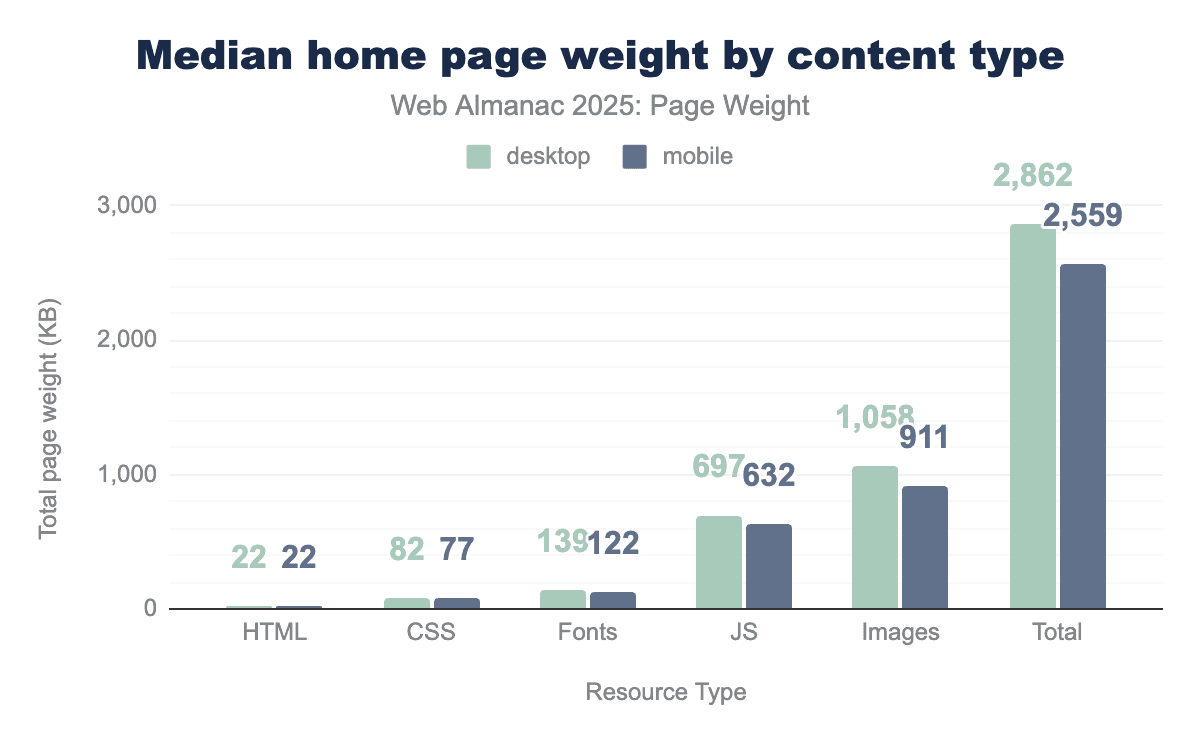
The median home page in 2025 was 2.86 MB on desktop and 2.56 MB on mobile. Images accounted for the most bytes on both mobile and desktop, followed by JavaScript and fonts.
Response size by content type
Not all file types are created equally—or equally sized. File types define how data is stored and encoded, telling a program how to open and display a file’s contents.
Mobile devices are typically more challenging for performant experiences. Their smaller, varied screen sizes and weaker connections mean that content can take longer to load. This is what makes it so strange that mobile home pages also had some of the heaviest files.
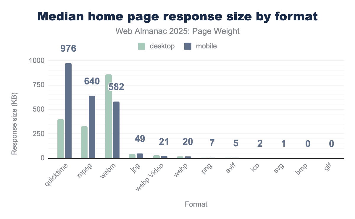
The largest file types, QuickTime and MPEG, are used for video. The median mobile home page used 976 KB of QuickTime, 244% more than desktop’s 400 KB. Similarly, the median mobile home page used 196% more MPEG bytes than desktop. The third-largest file type was WebM, a video format optimized for faster loading and lower bandwidth usage. Despite being ideal for mobile connections, more WebM bytes were shipped for desktop.
Upon further investigation, we were surprised to find that video files were particularly susceptible to duplicate downloads where browsers were making multiple requests, often with different range headers. This inflated the bytes for videos, and seemed worse on mobile—perhaps due to slower network downloads? We could find no documentation for this behavior, but would be interested to hear more if any readers can explain this.
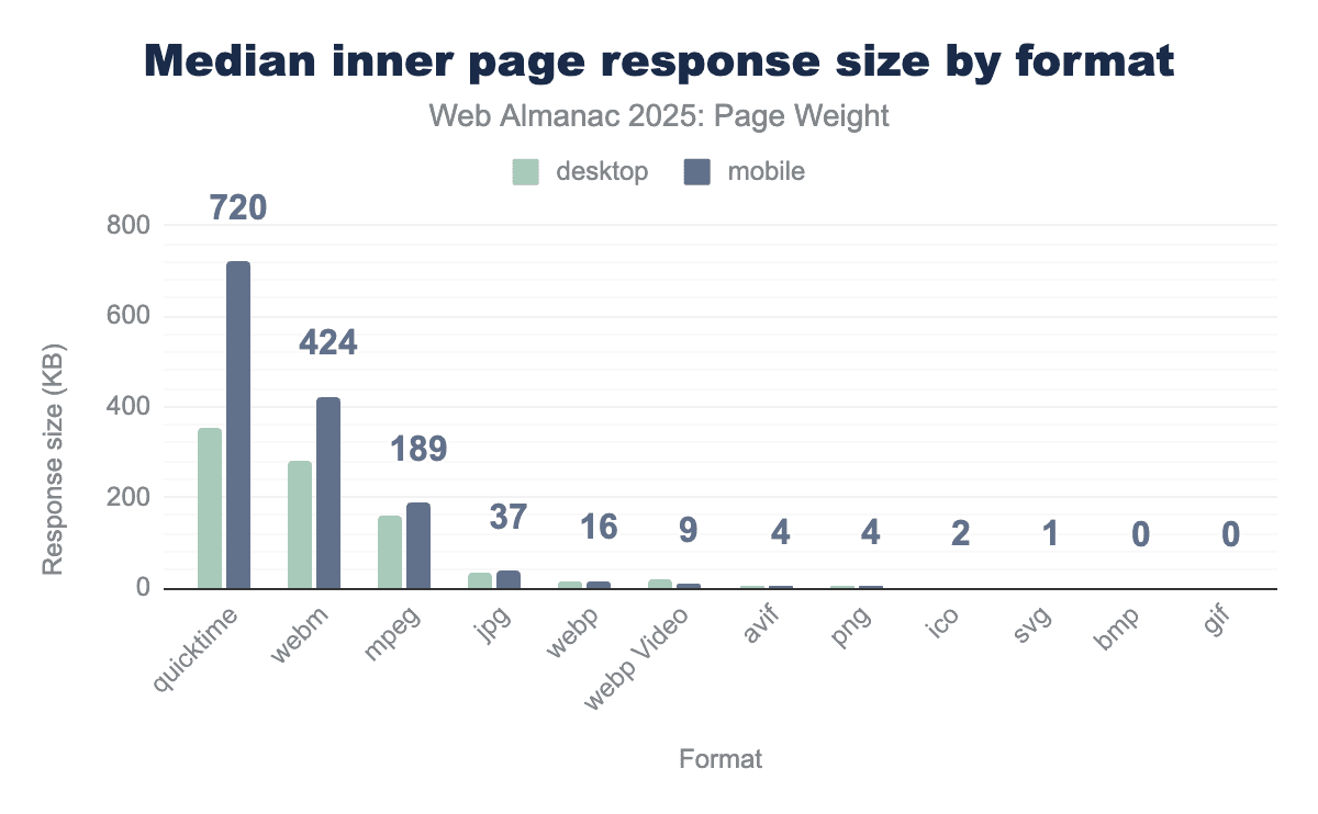
For median inner pages, QuickTime files remained the largest file type in bytes. Mobile saw 720 KB compared, 202% the 352.6 KB found on desktop. WebM surpassed MPEG as the second-largest file type for inner pages, at 423.6 KB on mobile and 280.8 KB on desktop. These were followed by MPEG, with more even distribution between device types (161.6 KB desktop; 188.8 KB mobile) than seen on home pages.
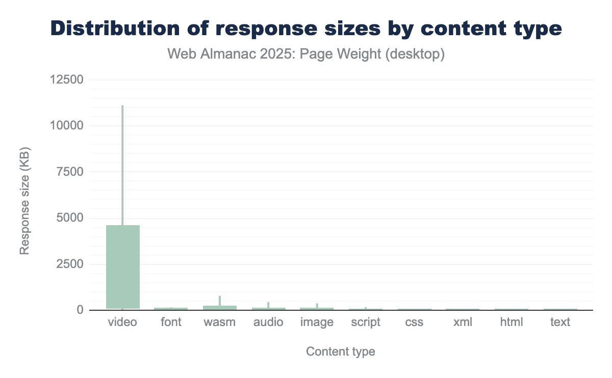
Videos, by their very nature, tend to be the largest of files. They also have the largest range in size—from 7 KB at the 10th percentile up to 1GB at the 100th. That range is only surpassed by image file types which saw 0 KB on the 10th percentile on 1.2GB at the 100th. XML files saw the smallest range with the 10th to 50th percentiles having 0 KB of the file type and the most extreme desktop pages having 52.1 MB at the 100th.
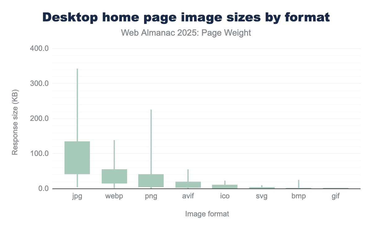
Image bytes
Image bytes refer to the binary data required to render visual elements such as photographs, icons, and illustrations. Unlike text-based files (like HTML, CSS, and JavaScript), which are highly efficient and easily compressed, image data is inherently dense. The “weight” of these bytes is determined by three primary factors:
- Resolution: The total pixel count of the asset.
- Encoding: The mathematical method used to store the data (for example, JPEG, PNG, or modern formats like WebP and AVIF).
- Compression: The degree to which redundant data is removed to shrink the file size, often at the cost of visual fidelity.
The accumulation of image bytes creates a “heavy” page, which directly correlates with increased latency and slower Largest Contentful Paint (LCP) scores. For users on mobile devices or limited-bandwidth connections, high image byte counts can lead to prohibitive load times and increased data costs.
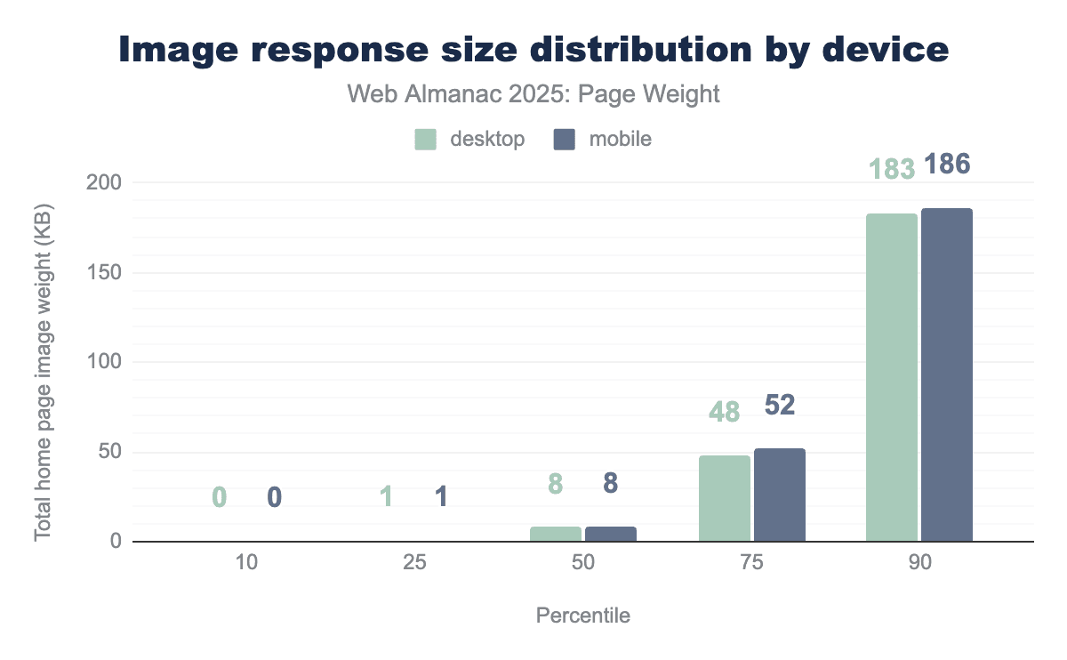
At the 50th percentile, individual image files were 8 KB on both mobile and desktop. It is worth noting that many sites use small images, known as tracking pixels, as part of their analytics. These tiny, often invisible 1x1 pixel images are embedded in web pages and trigger a server request when loaded. Since these files are not differentiated from standard, user-focused image assets, they may cause the median image size to appear smaller than expected.
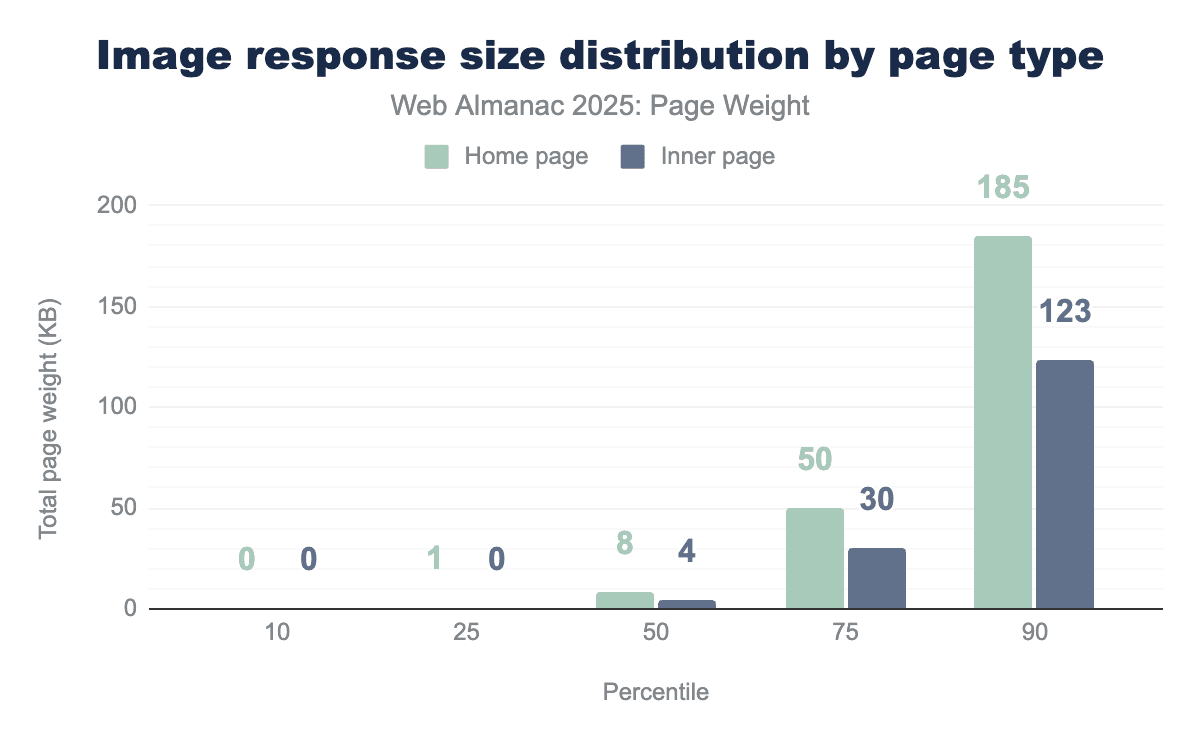
Inner pages had smaller individual image file sizes than home pages with a median size of 4 KB. At the 90th percentile, home page images were 185 KB while inner images were 123 KB.
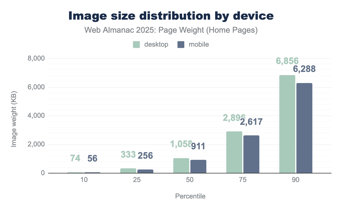
A web page rarely uses a single image. When aggregated together, the median desktop page used 1,059 KB of images. Mobile pages used 911 KB. Desktop pages consistently loaded more total image bytes.
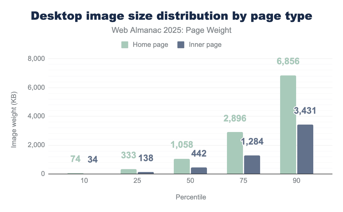
Desktop home pages consistently used more images than their inner page counterparts. The median home page used 239% the image bytes of similar inner pages. At the 90th percentile, home pages used nearly twice the image bytes at 6,856 KB compared to inner pages at 3,431 KB.
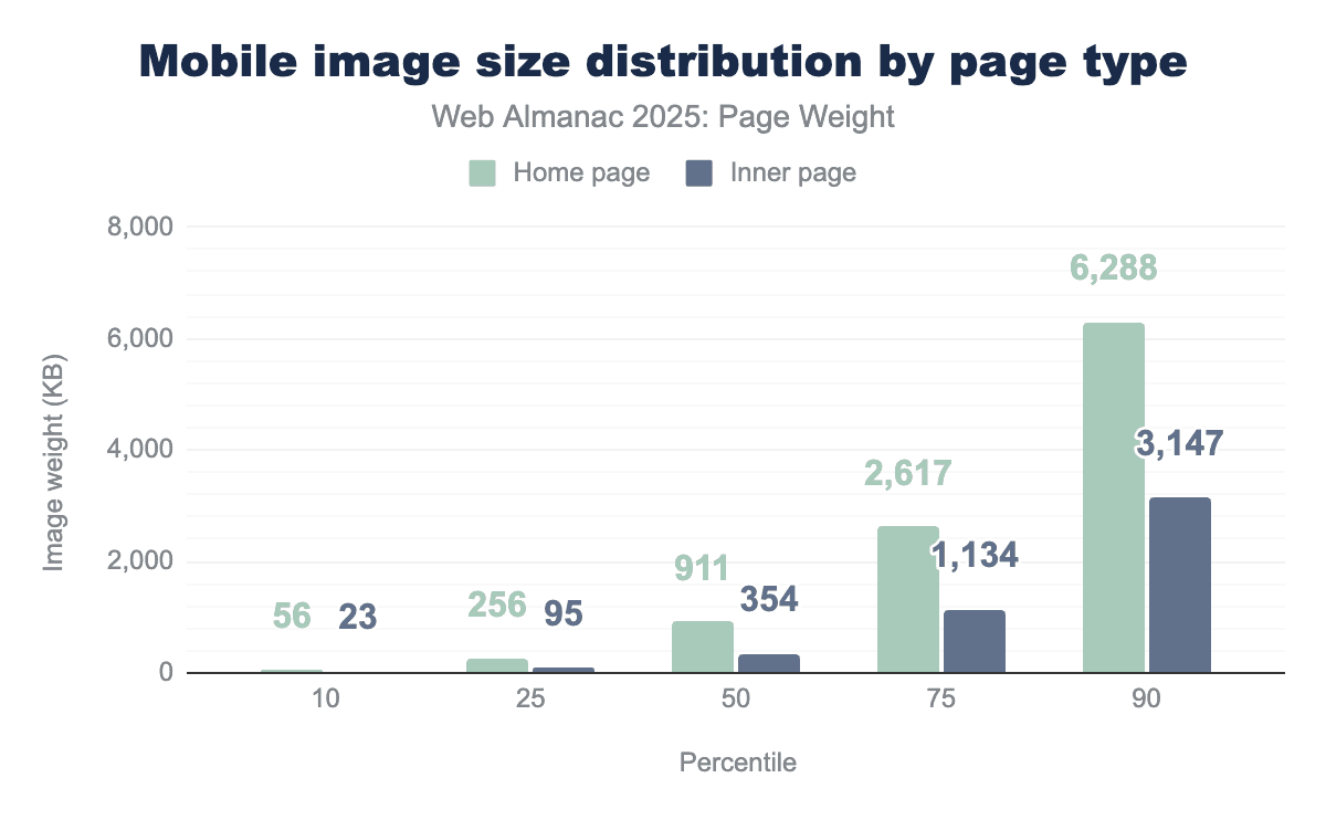
In narrowing the scope of inner versus home page image use to only mobile devices, the trend continues. Mobile devices often have slower connection speeds and limited computational power when compared to desktop. This doesn’t appear to deter mobile home pages from celebrating their topic with image bytes. The median mobile home page used 911 KB of images while inner pages used 354 KB. At the 90th percentile, mobile home pages used 6,288 KB of images, nearly matching their desktop equivalent of 6,856 KB.
The impact of file type on image size comes down to how the digital information is organized and discarded. While every image starts as a grid of raw pixels, the way a file format stores those pixels determines if the file is a few kilobytes or several megabytes.
-
JPG files are lossy file types. They permanently delete “unnecessary” data to achieve massive size reductions. How much is deleted is at the discretion of the file creator. This is likely why JPG file size spans the largest range, from 3 KB at the 10th percentile to 278 KB at the 90th.
-
WebP is considered the all-purpose file type for images. Available as both lossy and lossless, these file types spanned from 1 KB at the 10th percentile to 97 KB at the 90th.
-
AVIF is the newest of the widely adopted image file formats and was introduced in 2019 for its state of the art compression efficiency. This file format can be used for both lossy and lossless compression while producing high quality web images. AVIF ranged from 1 KB at the 10th percentile to 37 KB at the 90th percentile
-
PNGs are used to create large but perfect image files, making the format ideal for logos and icons. PNG ranged from 0 KB at the 10th percentile to 278 KB at the 90th percentile.
JavaScript bytes
The growing weight of JavaScript is another significant trade-off as websites continue to lean on JavaScript to provide interactive features. While these scripts enhance user engagement, the consistent rise in payload size poses a challenge to site performance
It’s important to note that this data set represents bytes for compressed JavaScript files. Depending on how effective compression was, this can be a significant difference. The larger the transfer (assuming compression) the discrepancy between uncompressed and compressed can be exponential. Additionally, inlined JavaScript in the HTML page is not represented on this data.
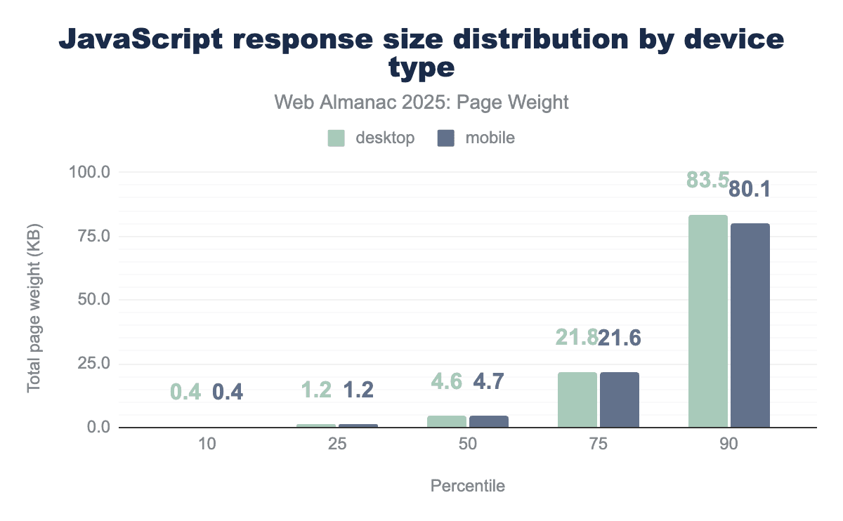
Much in the way that no one raindrop believes it caused the flood, the median individual JavaScript file is quite small at 4.6 KB for desktop and 4.7 KB for mobile. Smaller JavaScript files are ideal as they allow for small tasks to be completed without delaying response to user interaction. At the 10th percentile, the daintiest JavaScript files were 0.4 KB for both device types. At the 90th percentile, desktop saw JavaScript files at 83.5 KB and mobile saw 80.1 KB.
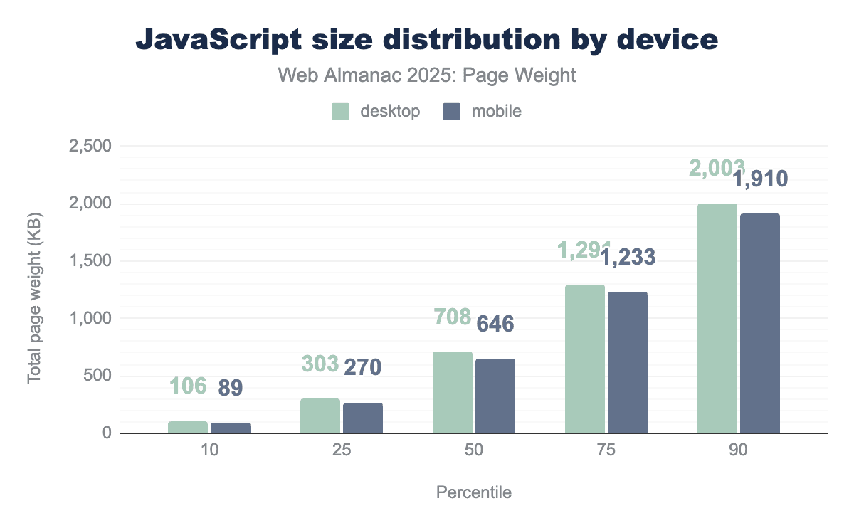
When the relatively small individual JavaScript files are aggregated together, we get a better view of use on pages at large. JavaScript use was relatively consistent between mobile and desktop. At the 10th percentile, desktop used 106 KB and mobile 89 KB. The median desktop page uses 708 KB of JavaScript. This is slightly higher than mobile’s 646 KB. These numbers quickly balloon past the median. At the 90th percentile, desktop used just over 2 MB and mobile used 1.9 MB.
Desktop pages at the 100th percentile used 189.9 MB of JavaScript and mobile used 181.1 MB. For perspective, downloading a standard definition 30 minute television show is about 150 MB.
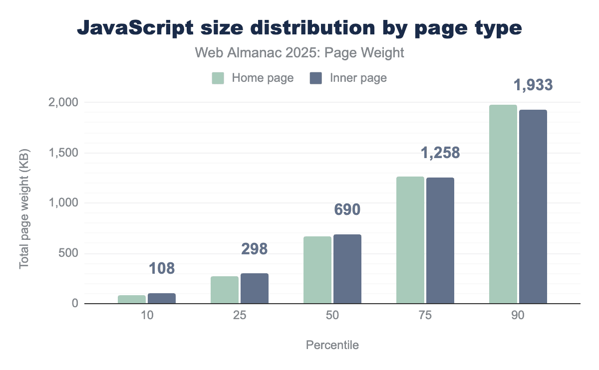
Unlike images, JavaScript use was consistent between home pages and inner pages. At the 10th percentile, home pages used 87 KB and mobile used 108 KB of JavaScript. Median home pages used 664 KB, while their inner page counterparts used 690 KB. At the 90th percentile, home and inner pages used 1,979 and 1,933 KB respectively.
Unused JavaScript
Unused JavaScript files represent not only a wasted opportunity but also page bloat. Every script called must be downloaded, parsed, compiled, and executed—regardless of whether it contributes to the page.
It’s important to note that this data set comes from Lighthouse tests run in tandem with the Web Almanac crawl. Unused is unused javascript after it’s been uncompressed. For example, amazon.co.uk downloads 423 KB of JavaScript, but when it’s uncompressed that’s 1,721 KB.
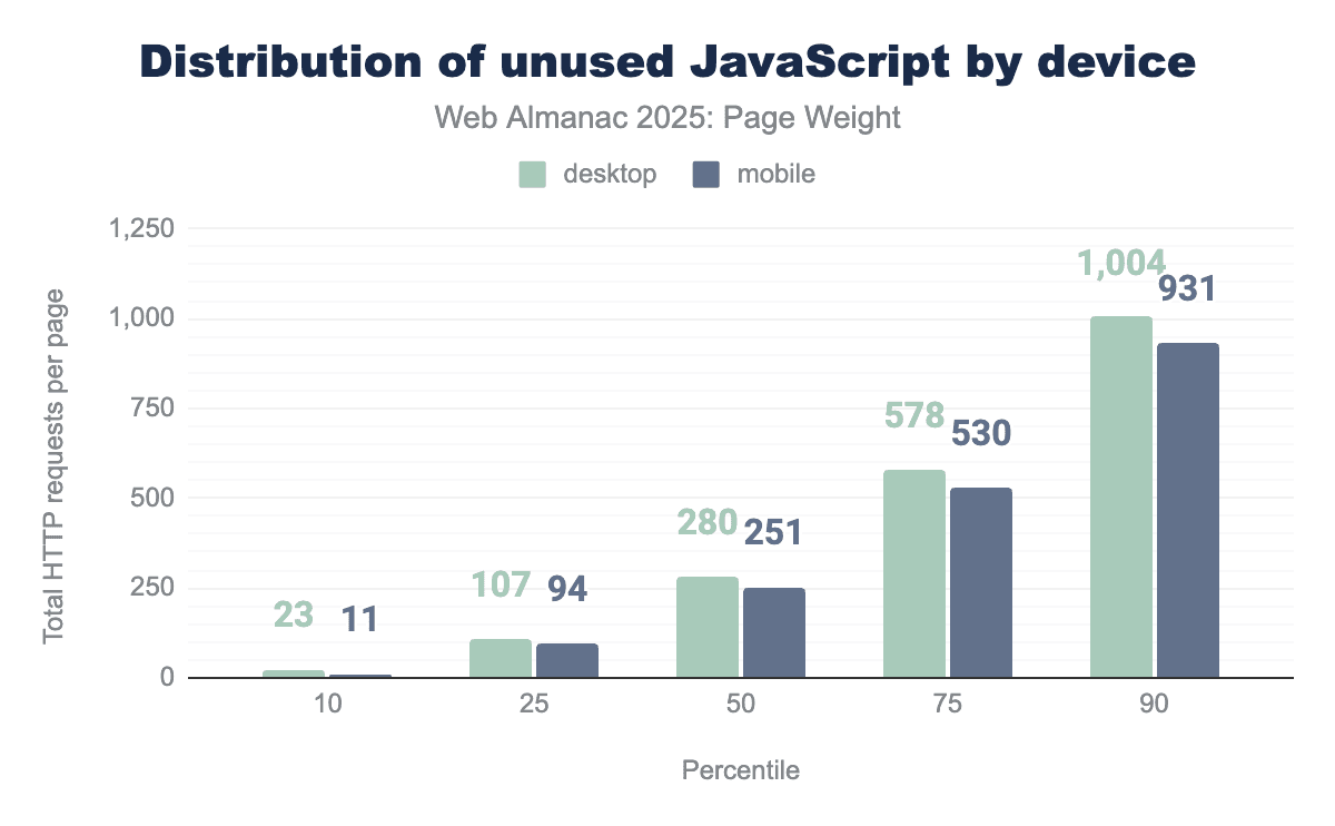
The median page saw a reasonable 280 KB of uncompressed, unused JavaScript on desktop and 251 KB on mobile. At the 100th percentile, desktop pages saw an astonishing 203.2 MB of uncompressed, unused JavaScript.
Video bytes
While images are often the most numerous assets on a web page, video bytes are the undisputed heavyweights of digital payload. As the web shifts toward “video-first” experiences—utilizing background “hero” videos, looping product previews, and embedded clips—the sheer volume of data transferred has reached unprecedented levels.
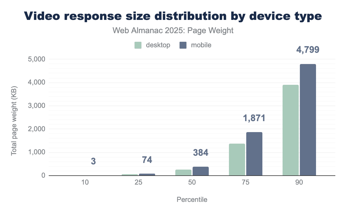
Video bytes for the median page increased 28% year over year from 246 KB in 2024 to 315 KB in 2025. Mobile consistently used more video bytes across all percentiles. At the 100th percentile, pages shipped 695 MB of video. To put this in context, if a user on a mobile device attempted to load one of these pages without a data plan in place (leaving them to pay $0.15 cents per MB), the experience could cost them $104.10 for video bytes alone.
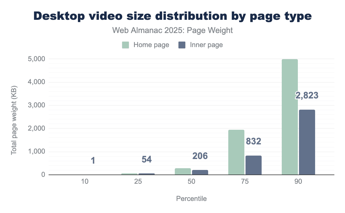
More video bytes were shipped on home than inner pages for desktop. The median home page with video saw 288 KB while inner pages with video came in at 206 KB. The gap between page types is largest in the 75th percentile where home pages come in at 1,934 KB, 232.6% larger than inner pages at 832 KB.
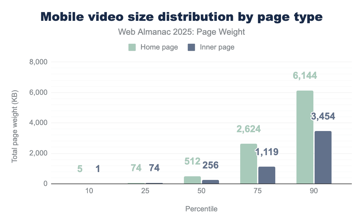
The pattern of more video bytes on home pages continued for mobile devices as well. The median home page shipped double the bytes (512 KB) compared to inner pages at 256 KB. At the 90th percentile, mobile home pages loaded 6.1 MB of video.
Several technical layers impact a video files size:
- File formats: The “wrapper” (for example, MP4, WebM) that holds the video and audio streams. While the container itself is light, the choice of container often dictates which efficient codecs can be used.
- Codecs (compression/decompression): The efficiency of the mathematical algorithm used to shrink the video. Legacy codecs like H.264 (AVC) are widely compatible but “heavy,” whereas modern codecs like HEVC (H.265) and AV1 offer significantly better visual quality at a fraction of the byte count.
- Chroma subsampling: A method of reducing file size by implementing lower resolution for color information than for brightness (luma) information, taking advantage of the human eye’s higher sensitivity to brightness.
File formats are the most easily observed factor on video bytes. WebM files are designed specifically for the web. Common knowledge expects WebM files to be lighter than MP4s because they are built for the constraints of a browser.
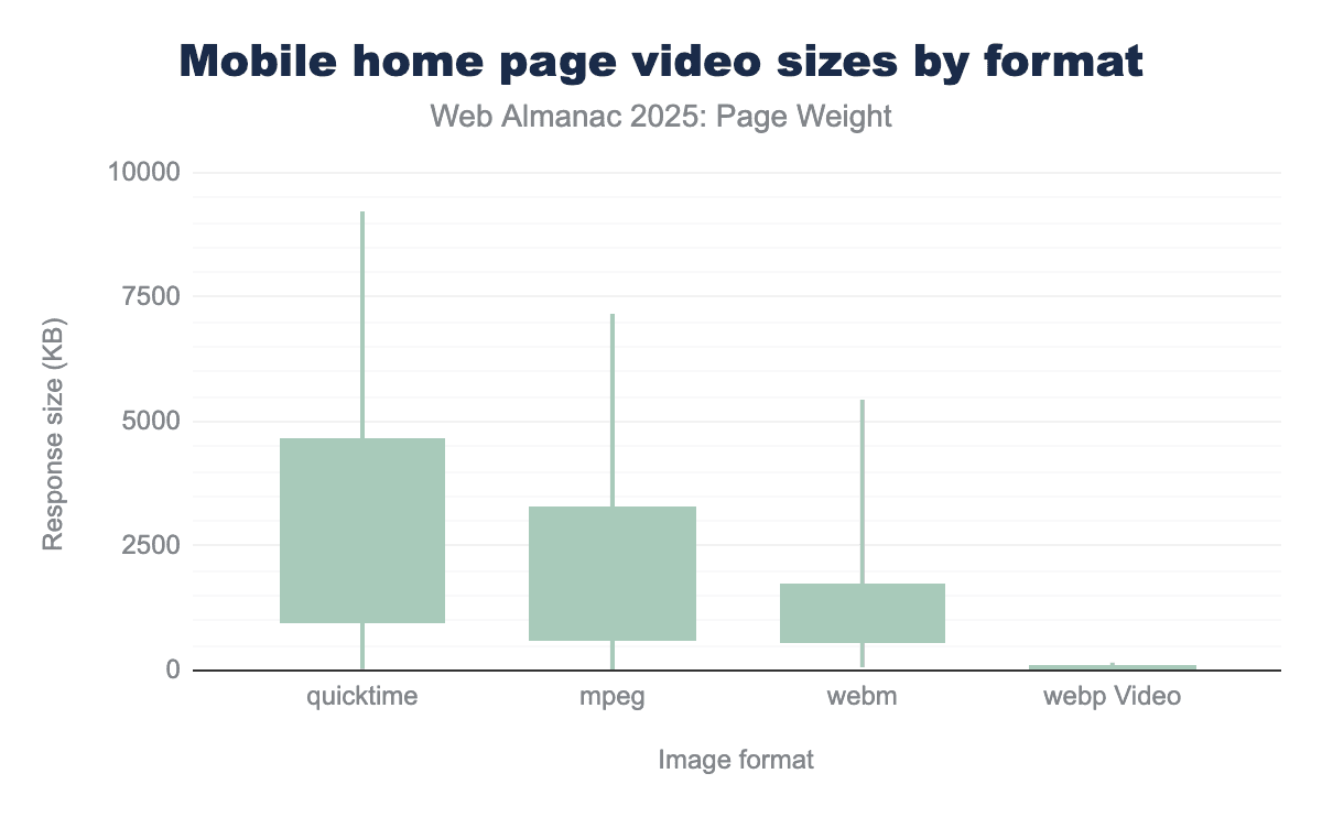
For the median percentile of mobile home page videos, QuickTime files have the highest median response size (976.0 KB), followed by mpeg (639.5 KB) and WebM (581.8 KB). webp Video has a significantly smaller median size of 21.3 KB. WebP Video files are consistently the smallest across all measured percentiles, with a maximum size of 5,743.5 KB and a 90th percentile of 155.6 KB.
The largest home page desktop video files encountered were mpeg, coming at 326 MB for the 100th percentile.
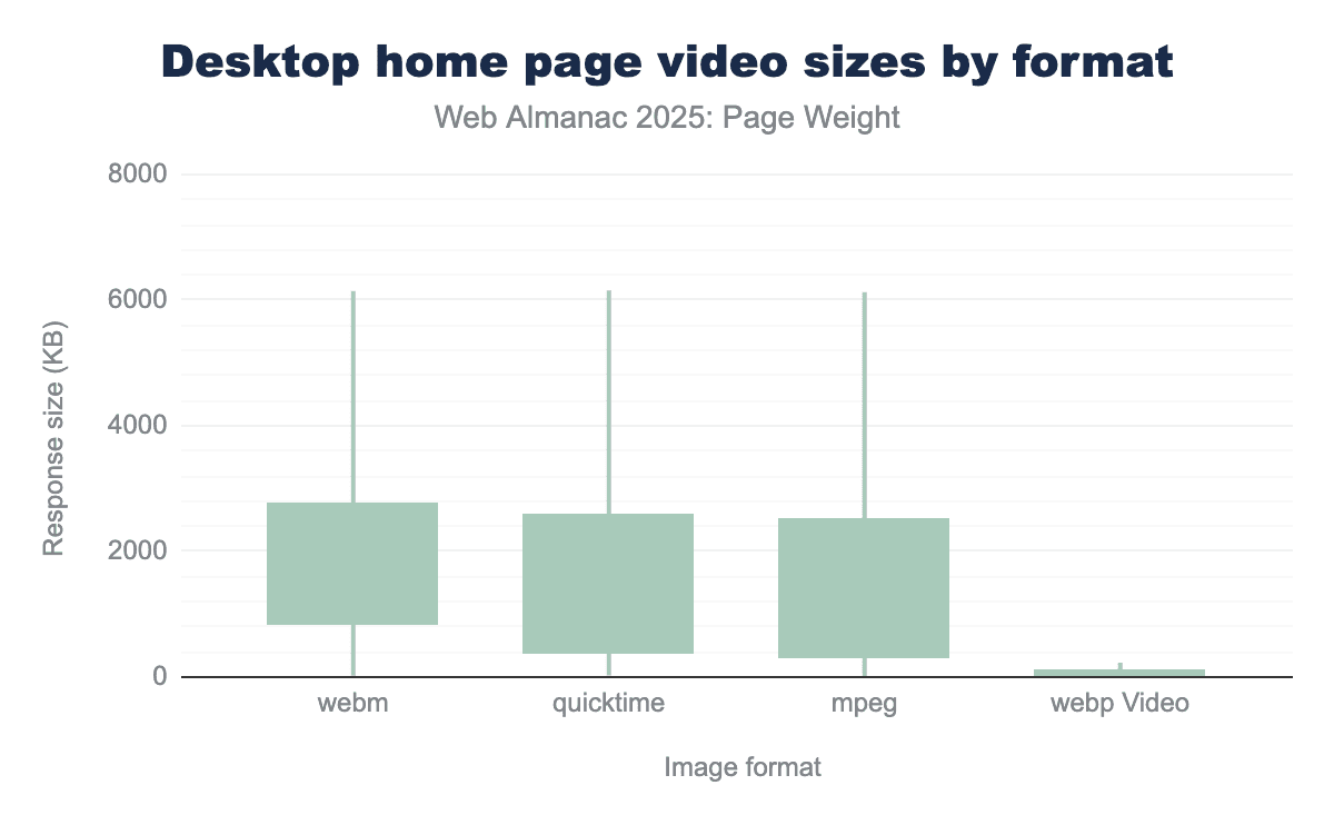
While the high-end sizes are similar, the median (50th percentile) sizes vary, with WebM having the largest median at 860.22, followed by QuickTime (399.97 KB) and mpeg (326.52 KB). This suggests that a ’typical’ webm file is larger than its QuickTime or mpeg counterparts, despite the largest files being about the same size.
The median response size for webp Video is 32.58 KB, which is 10 to 26 times smaller than the median of the other formats. Even at the 90th percentile, webp Video’s size of 228.33 is exceptionally small. This means 90% of webp Video files are smaller than the smallest 90% of the other three formats, where the 90th percentile is over 6,100.
The median size for WebM (860.22) is more than double that of QuickTime (399.97) and almost triple that of mpeg (326.52), suggesting that while all formats can handle very large files, the center of the WebM distribution is skewed toward larger sizes.
The largest home page desktop video files encountered were QuickTime, coming at 431 MB for the 100th percentile.
CSS bytes
Cascading style sheets or CSS have been used to stylise pages on the web for years, they are a relatively lightweight way to create the layout and control the visual elements of a page.
CSS works alongside HTML giving control of font styles, colors, spacing and even visibility of elements providing a more granular level of control but also a separation from other page aspects making it more maintainable. CSS is more lightweight than images and can help improve site performance by replacing large assets with CSS effects and animations.
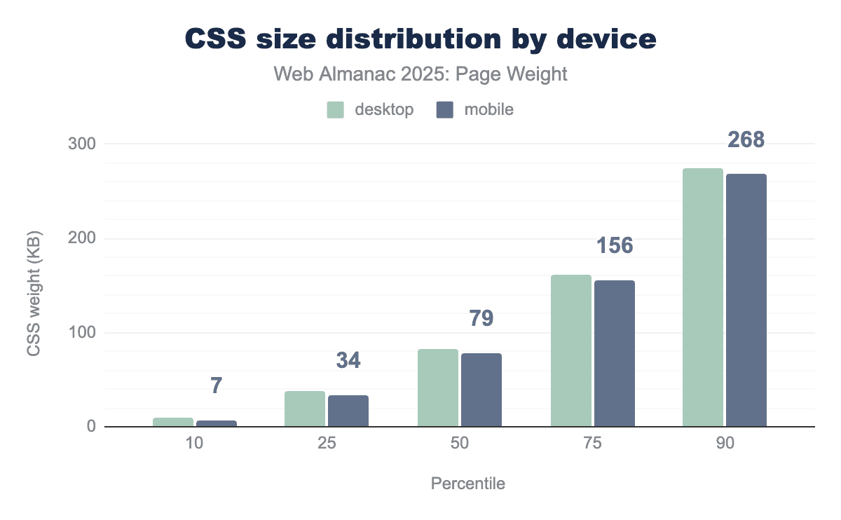
CSS bytes for mobile have grown in all percentiles except the bottom 10 where we saw a contraction versus last year.
However this growth is mostly modest when compared to other aspects of a page. At the 90th percentile the total file size is just slightly over ¼ of a mb, growing by just 8 KB against last year,
At the 50th percentile it was a growth of 4 KB against last year which is roughly an additional 4000 characters added to CSS files pointing to continued heavy use.
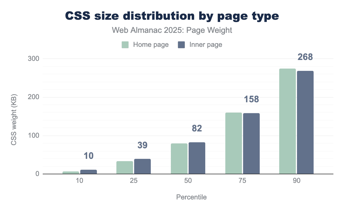
Inner pages follow this same trend of growth in all percentiles except the lowest 10th which again saw a 1 KB contraction. Inner pages feature a slightly higher usage of CSS in the 25th, 50th and 75th percentile.
Notably when we get to the top end of the results, the 75th and 90th percentile, home pages actually have a greater CSS size. This could be due to inefficient use of CSS, i.e. loading the majority of files irrespective of use on the current page or potentially heavier reliance on CSS to provide visuals for all pages.
HTML bytes
HTML bytes refers to the pure textual weight of all the markup on the page. Typically it will include the document definition and commonly used on page tags such as <div> or <span>. However it also contains inline elements such as the contents of script tags or styling added to other tags. This can rapidly lead to bloating of the HTML doc.
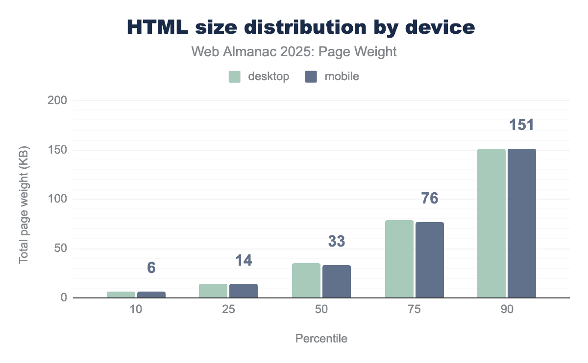
HTML size remained uniform between device types for the 10th and 25th percentiles. Starting at the 50th percentile, desktop HTML was slightly larger. Not until the 100th percentile is a meaningful difference when desktop reached 401.6 MB and mobile came in at 389.2 MB.

There is little disparity between inner pages and the home page for HTML size, only really becoming apparent at the 75th and above percentile. At the 100th percentile, the disparity is significant. Inner page HTML reached an astounding 624.4 MB—375% larger than home page HTML at 166.5 MB.
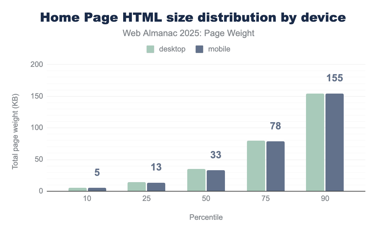
The size difference between mobile and desktop is extremely minor, this implies that most websites are serving the same page to both mobile and desktop users.
This approach dramatically reduces the amount of maintenance for developers but does mean that overall page weight is likely to be higher as effectively two versions of the site are deployed into one page.
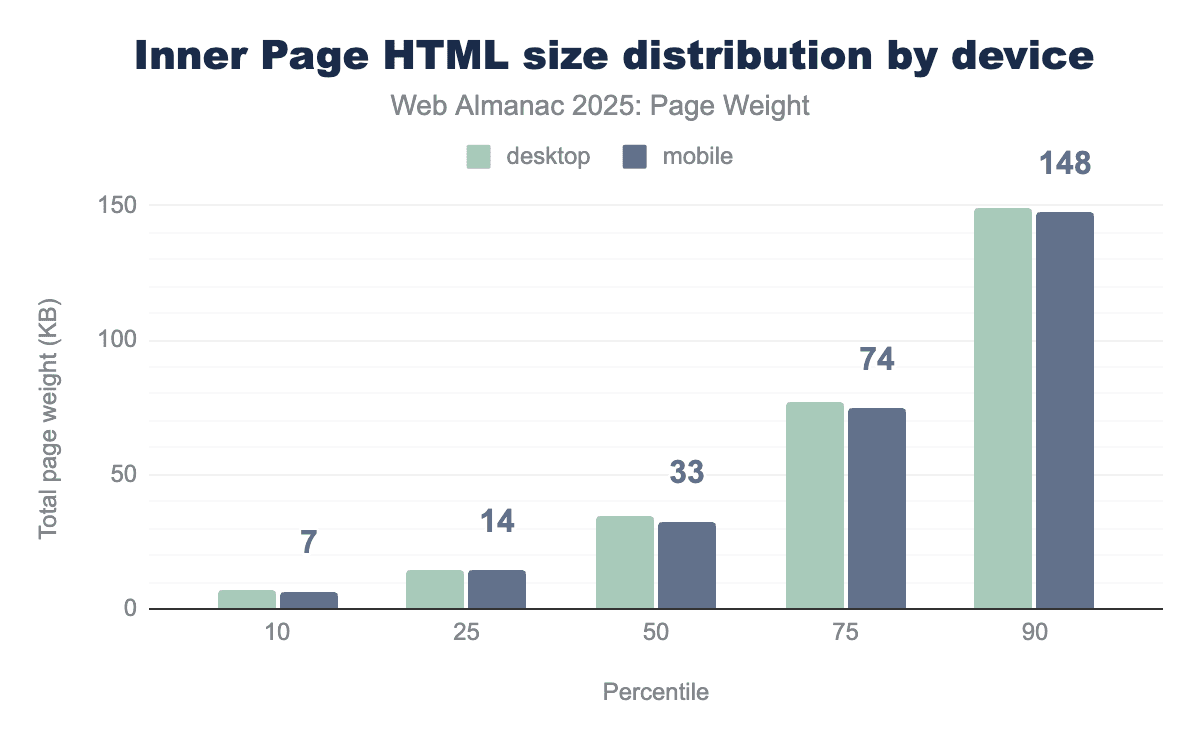
Inner pages behaved similar to their home page counter parties through the 90th percentile. At the 100th percentile, the largest inner page HTML response was the same for both device types: 624.4 MB. On a standard 10-25 Mbps connection, this would take 30 to 90 seconds to load.
Font bytes
While images and videos are the most obvious contributors to page bloat, web fonts represent a subtle but significant portion of modern page weight. Often overlooked during the design phase, the transition from system-standard fonts to custom “web fonts” has introduced a new layer of latency. Every unique weight (bold, light, thin) and style (italic) of a typeface requires a separate file download, meaning a single font family can quickly balloon into several hundred kilobytes of additional data.
The “weight” of these fonts is determined by three main factors:
- Character support: A font that includes support for multiple languages (Latin, Cyrillic, Greek) contains thousands more “glyphs” (the shapes of the letters) than a basic English-only font.
- Styles and weights: Each variation (for example, Roboto Regular, Roboto Bold, Roboto Bold Italic) is typically a distinct file. Loading a full “family” can be heavier than a large optimized image.
- Format efficiency: Older formats like TTF (TrueType) and OTF (OpenType) are uncompressed, whereas modern web-specific formats like WOFF2 use Brotli compression to reduce file sizes by up to 30% without losing quality.
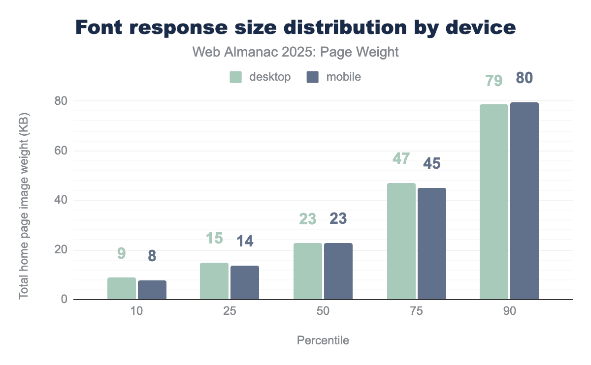
The median page shipped 23 KB of fonts. Bytes shipped remained closely matched between devices through the 90th percentile. Home pages and inner pages shipped the exact same amount of bytes across percentiles with 23 KB representing the median. For a deeper dive, see the Fonts chapter.
Other file types
Ultimately the web is a diverse ecosystem with many file types. Some lesser encountered file types include 15 KB of WASM, 12 KB of audio, on the median page and across device types, audio. JSON, XML, and txt file types saw 0 KB of use on the median page. It’s noteworthy that at least one site is shipping 117.6 MB of JSON on mobile pages, landing it the title of largest infrequent file type.
Page weight in request volume
While the total number of bytes measures the raw volume of data, the volume of requests measures the complexity of the conversation between the browser and the server. Studying page weight through both lenses is essential because a “light” page (in bytes) can still be “slow” if it requires too many individual requests to render. Bytes represent the bandwidth required to download a page. The volume of requests represents the latency overhead inherent in web architecture.
File type volume for the median page
To understand what file types contribute the most to page weight, we looked at the file type requests by the median page (50th percentile). This approach establishes a baseline for measuring the overall impact of each file type.
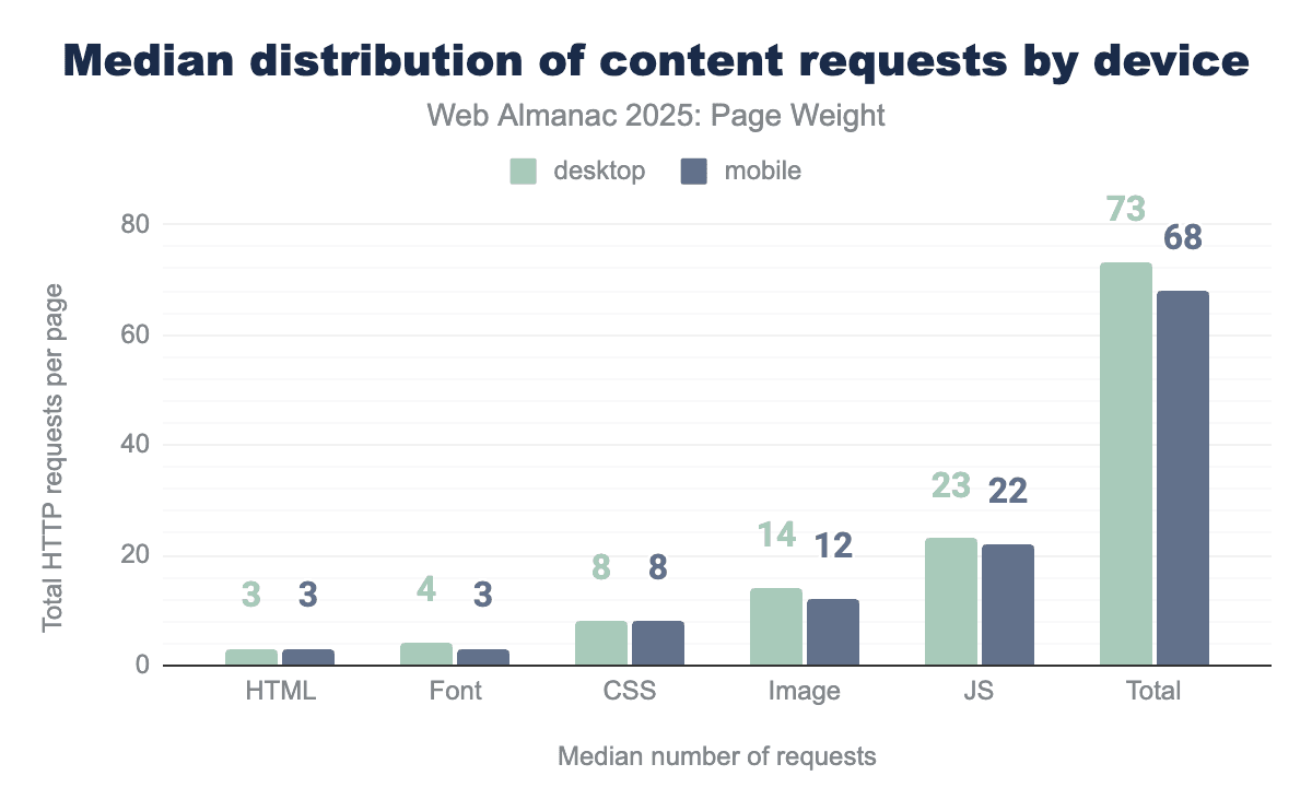
The median page makes 77 requests on desktop and 72 on mobile. Overall requests grew 9% year over year on mobile and 8% on desktop. Image file types continued their downward trend in 2025, decreasing 6% year-over-year.
Requests by file type remained largely consistent year over year. The median desktop calls 77 resources while its mobile counterpart requires only 72. The number of HTML files returned increased from 2 to 3 across both page types. Median home page CSS increased slightly to match the use on inner pages, which remained stable year-over-year. JavaScript remained the most requested file type.
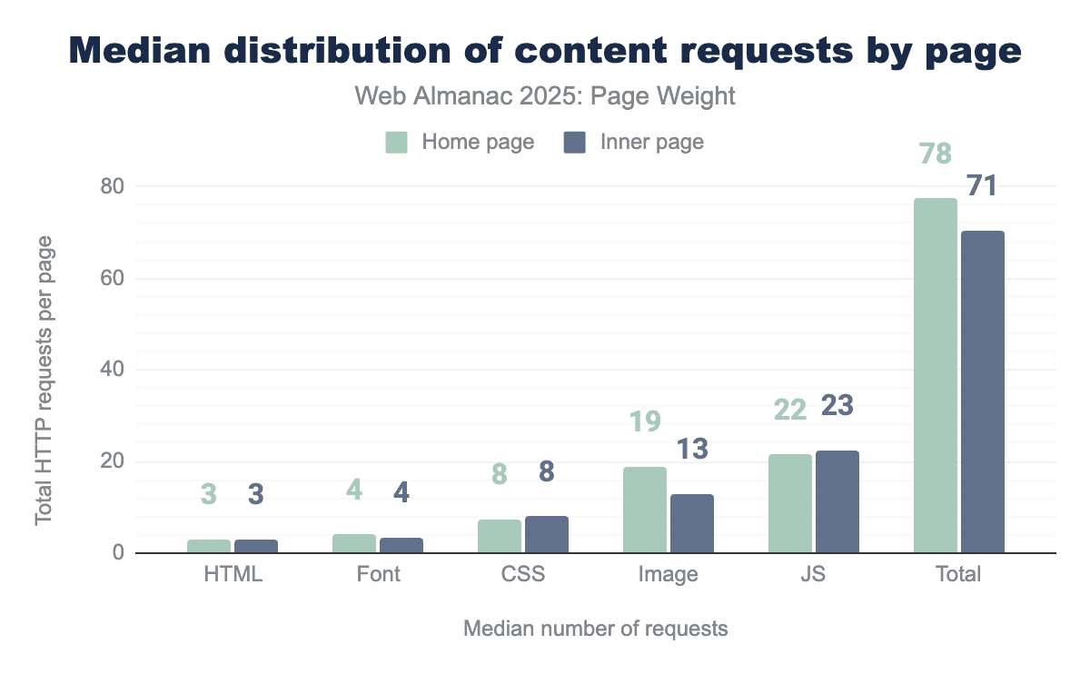
The median home page loads 3 HTML files, 4 font files, 8 CSS files, 19 images and 22 JavaScript files for 78 files total. The median inner page loads 3 HTML files, 4 font files, 8 CSS files, 13 images, 23 JavaScript files for 71 files total.
Request volume distribution
With our meridian behaviors established, we can step back to look at our data across percentiles. Percentiles provide a clear picture of how data points are spread out, making it easier to interpret patterns.
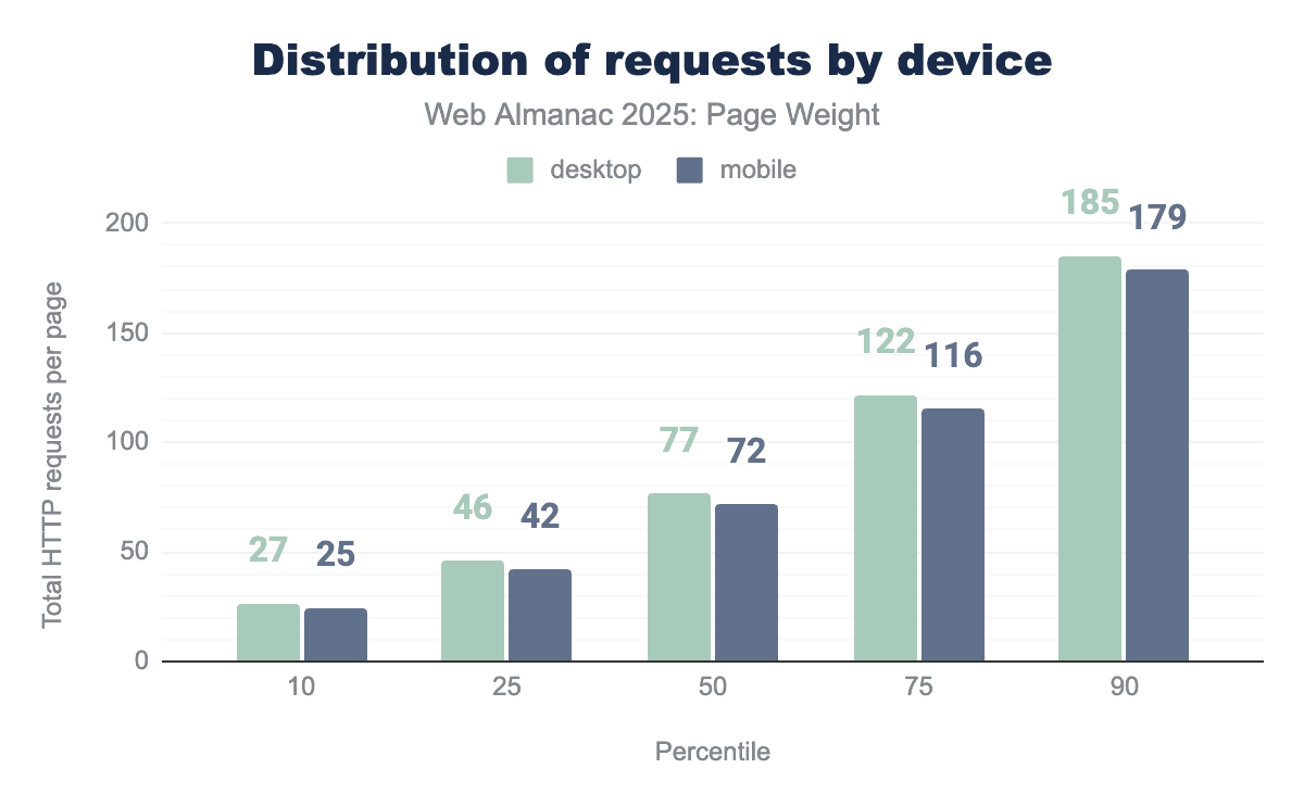
Even the lightest of pages got heavier this year. At the 10th percentile, the most spartan pages added 3 requests this year. In contrast, the 90th percentile requested 9 additional files. This illustrates that mobile and desktop make the same number of requests, as demonstrated by the extremes.
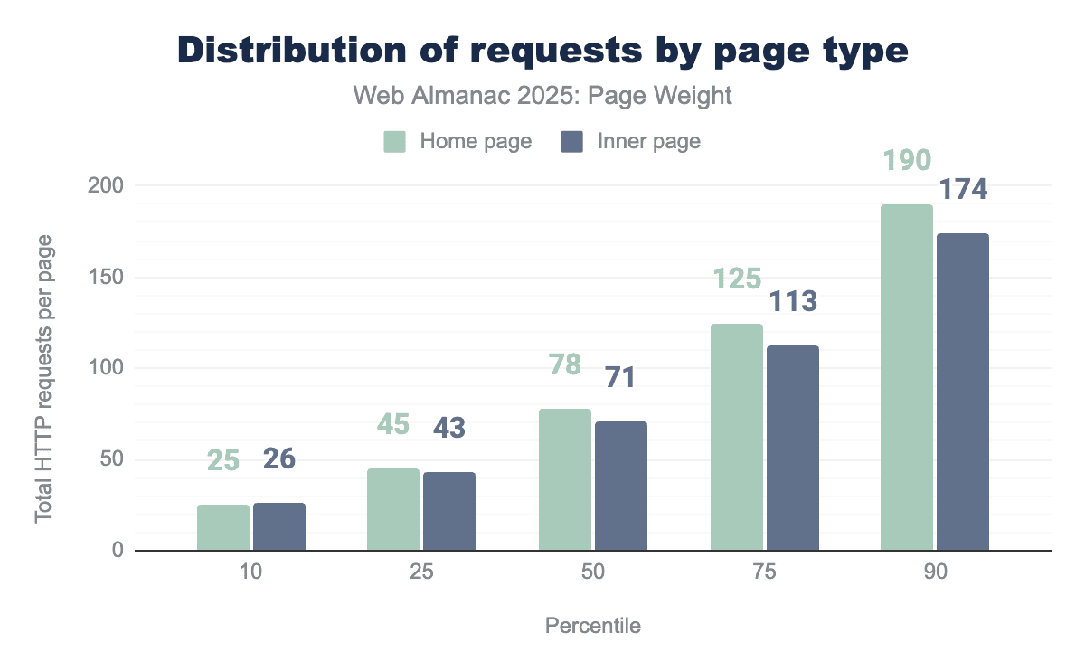
When viewing the data grouped by home page versus inner page, increases in file requests were consistent across all percentiles. The median page makes 77 requests on desktop and 72 on mobile. The gap between home pages and inner pages increases as the percentile grows.
This is particularly interesting, as we see consistency in the number of requests when viewing the data by mobile versus desktop, indicating that home page requests are a key differentiator.
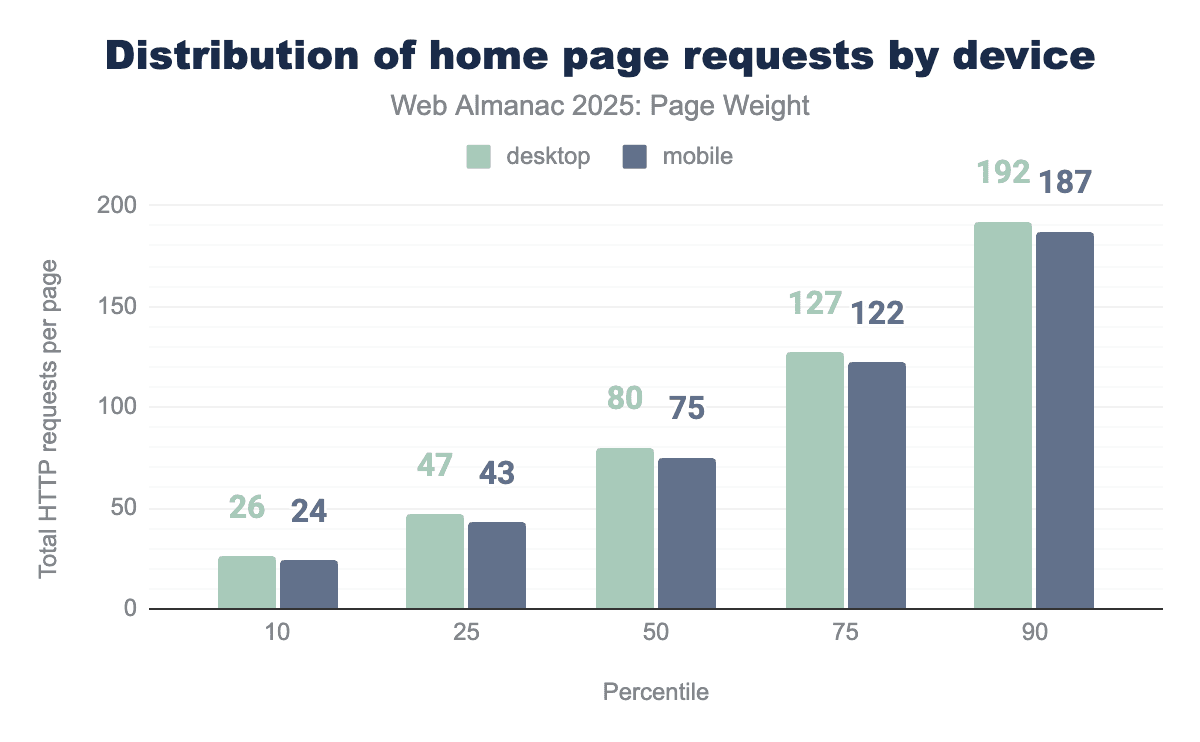
Viewing home page requests by device type allows deep analysis. Each device requires slightly more requests than when home and inner pages data is blended. The median desktop home page makes 80 requests while its mobile counterpart makes 75. Behavior remains consistent across devices, with minor variance in percentiles.
Image request volume
Some say the internet was created for cat pictures. While that may be an exaggeration from devoted animal lovers, it highlights the fact that visual content dominates the web.
Images play a vital role in everything from product verification to credible news reporting. Yet, these static files are often among the heaviest digital resources, making them prime candidates for performance optimization and technological innovation.
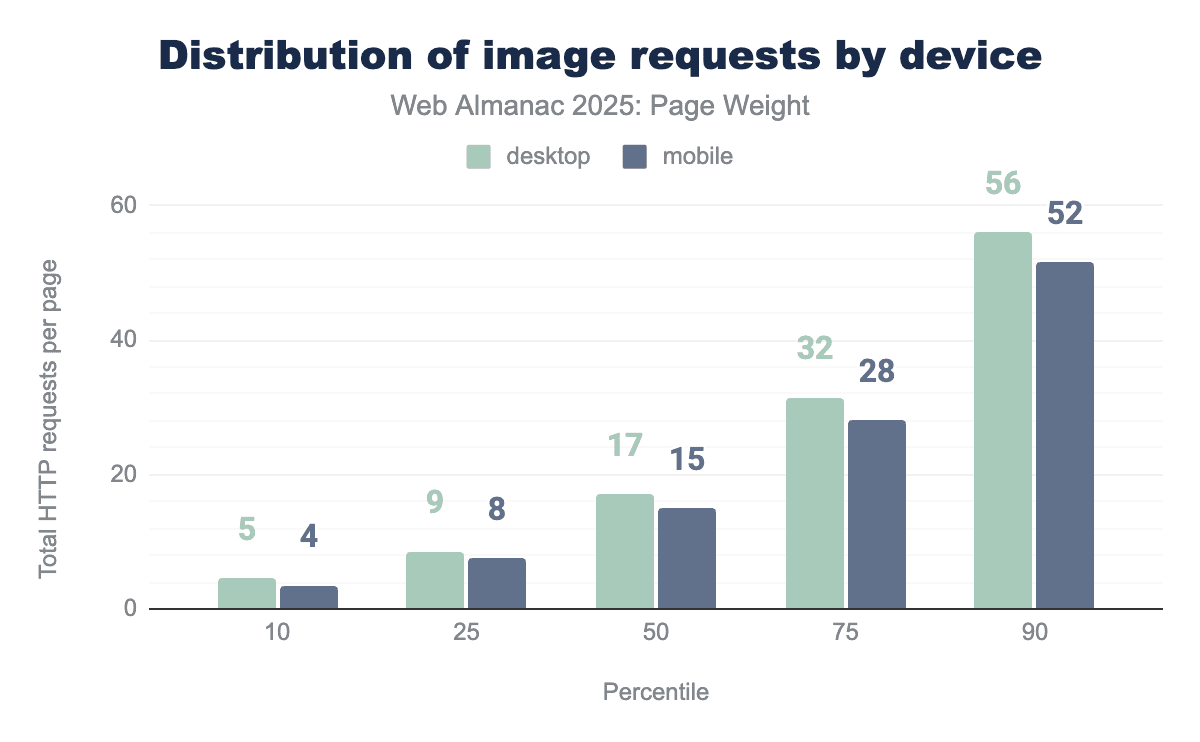
At the 50th percentile, desktop made 17 and mobile made 15 images requests. Desktop used more image files consistently across percentiles. This is a slight decrease from 2024 where desktop pages called 18 images and mobile requested 16. At the 100th percentile, desktop pages requested 26,330 images. We can only imagine how magical that page must be.
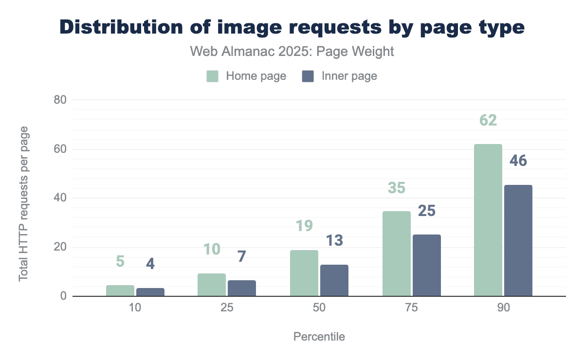
When comparing home pages to inner pages, the difference remains consistent: the median home page loads 19 images versus 13 on an inner page. This pattern holds across the full distribution range and closely mirrors 2024”s data, where home pages averaged 20 image requests and inner pages 14.
Although there”s a slight decrease in image requests, a trend also reflected at the 75th and 90th percentiles, the minimal changes suggest no major shift in how site owners or publishers approach imagery. Instead, it appears to be business as usual in web image usage.
CSS request volume
Cascading Style Sheets (CSS) act as the presentation layer of the web. It’s a style language that allows developers to define the layout of a document written in a markup language that is visually presented. In the scope of the web almanac, then exclusively html. Occasionally, SVGs might also account for some.
CSS enables the developer to specify elements such as colors, fonts, layout and sizing ,separating presentation from the structural content defined in HTML. It continues to grow increasingly more powerful, offering interesting capabilities for responsive design, touches of animation or sophisticated layouts. Visual effects that once required JavaScript can now be done through CSS, making CSS a basis for modern web design.
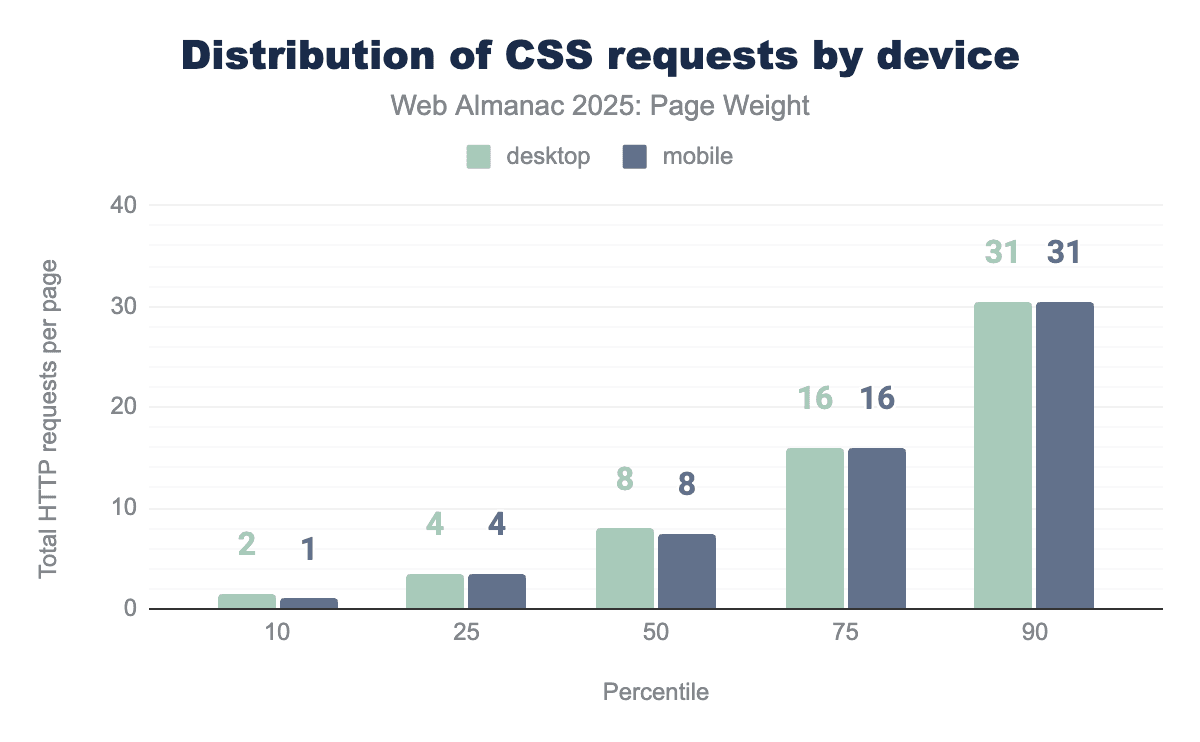
Across all both desktop and mobile devices, there was very little difference in the amount of CSS a page requested. At the 50th percentile, both mobile and desktop devices requested 8 CSS resources, there was no more than 1 resource request difference across the whole distribution. This very much matches 2024’s pattern, and indeed up to the 90th percentile were more or less stable in the amount of requests, compared year over year
At the 90th percentile, 31 desktop and 30 mobile CSS requests were made this year, a slight increase over 2024’s 26 on both desktop and mobile. This suggests that there’s been little change to developer approaches to CSS over the preceding 12 months in terms of how many separate assets they are split into, nor the tools they use.
It also points to developers being far more likely serving the same CSS files, regardless of client type.

The median page made 8 CSS requests. Inner pages made more requests than home pages through the 75th percentile. At the 90th percentile, the home page made 1 more request than the inner pages.
There is very little variation in the number of files requested on home pages compared to inner pages. Whilst we can’t tell from this analysis if it’s the same files being served, it does point to the fact that developers are shipping one set of CSS resources across the whole site, which could be a missed opportunity to reduce the weight of CSS on individual pages by splitting these, and only sending the CSS needed for the actual page.
JavaScript request volume
While images and videos are static weight, JavaScript is active weight. Its impact is unique because it consumes resources twice: once when it is downloaded (network) and again when it is executed (CPU). When JavaScript is split into a high volume of requests—often due to modular coding practices or third-party plugins—it introduces a “double tax” on performance.
Even if the total byte count remains low, a high volume of script requests can paralyze a browser’s main thread, leading to a site that looks loaded but remains unresponsive to user input.
98.1% of all pages make at least one request for a JavaScript file. This number doesn’t include inlined JavaScript which can be found in HTML.
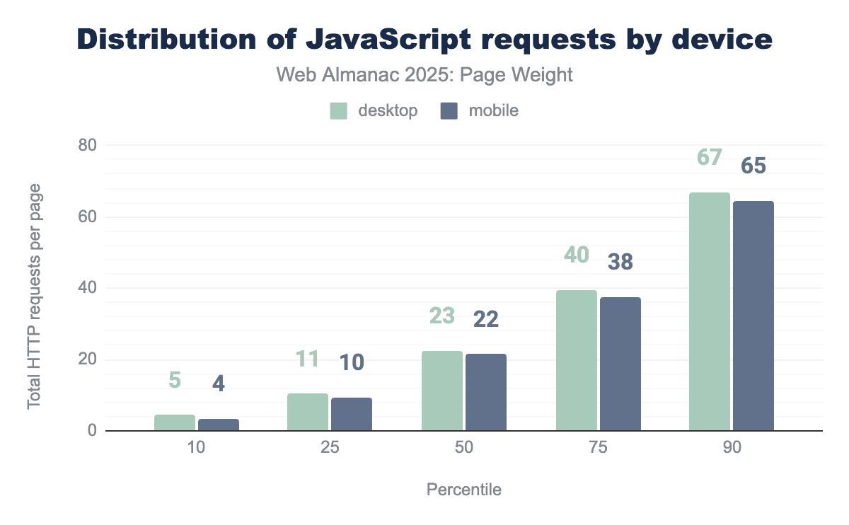
The median desktop page made 23 requests for JavaScript on desktop and 22 on mobile. Desktop pages consistently called for more JavaScript files than mobile. Desktop home pages called for the most JavaScript files with 12,676 being requested at the 100th percentile. The Web Almanac crawler earned its annual hibernation this year.

Inner pages consistently called slightly more JavaScript files than home pages. The median home page requested 22 JavaScript files while its small screened counterpart called 23.
Fonts request volume
Font files allow the website to specify styling for the text parts of the website, typically they consist of all letters from A-Z both upper and lowercase. This allows the browsers to transform text into other styles than just the system installed fonts.
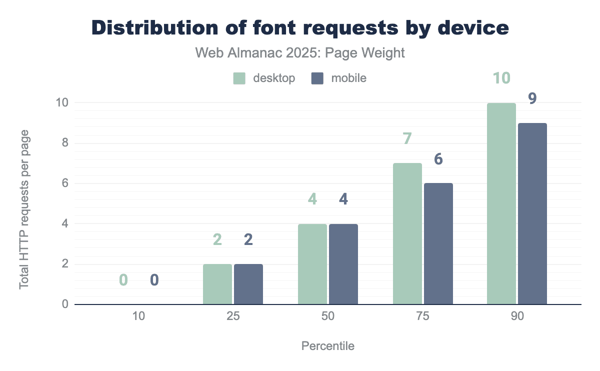
The bottom 10th percentile do not use extra font requests, relying instead on the system installed fonts for both mobile and desktop. Mobile font requests are lower above the 75th percentile with one fewer request on average.
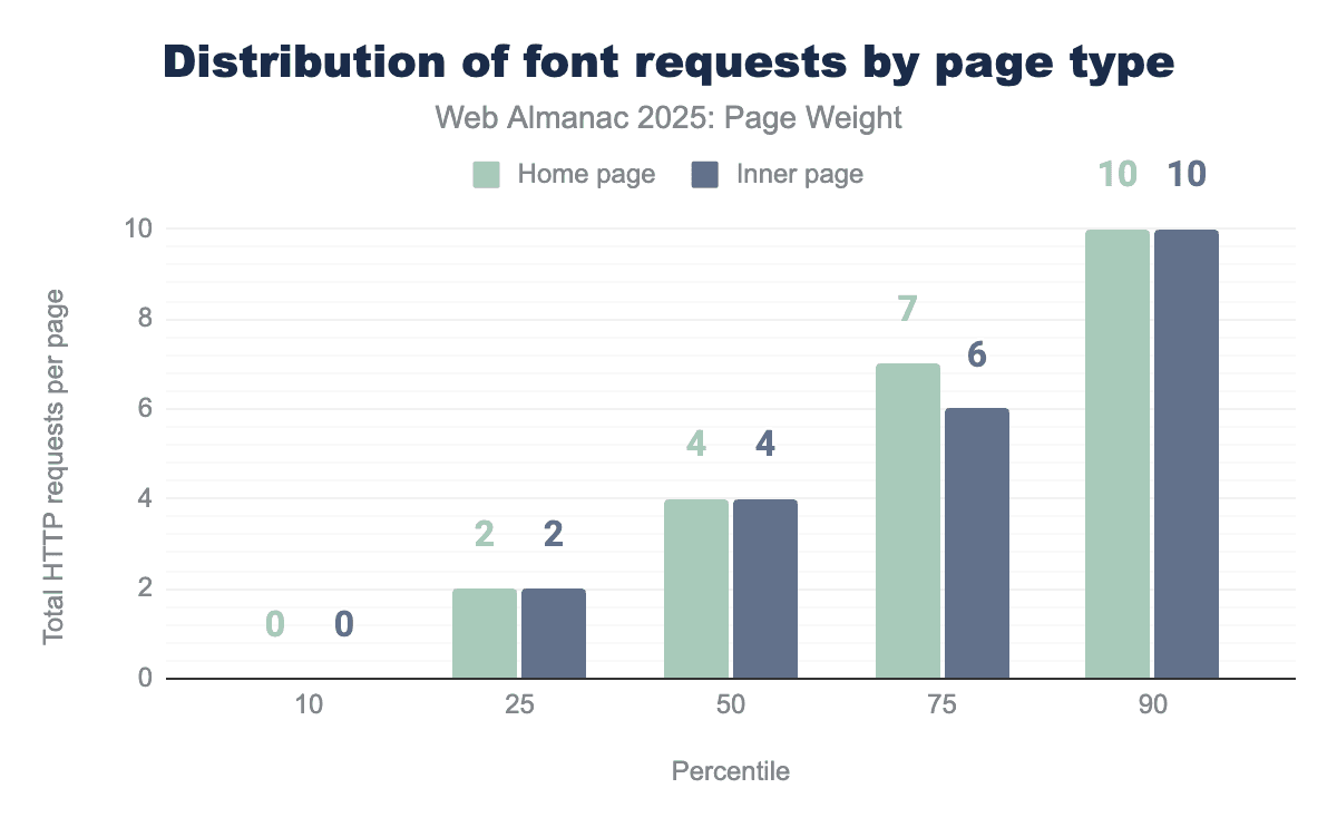
Home pages and inner pages are identical in average requests with the one exception at the 75th percentile. Desktop home pages loaded the most fonts with 3,038 files requested at the 100th percentile. We truly hope the site in question is a font repository with performance optimizations prioritized for Q1.
Broadly it would be expected that different fonts are not used on individual pages but rather as a style across the site. There are exceptions to this, such as for promotional material, but the average indicates that most of the time imported fonts are used across the whole site.
Other request volume
The request volume of “utility” files—including HTML fragments, JSON data, and third-party assets—creates a significant, cumulative “latency tax.” In modern web architecture, particularly with the rise of microservices and modular design, a single page load can trigger dozens of requests for small, disparate files. Even if these files are lightweight in terms of bytes, the sheer quantity of requests can overwhelm the browser”s network stack and delay the rendering of the page.
The median page made 2 requests for HTML and 2 other file types. At the 90th percentile, this climbs to 12 HTML and 12 other file types. Still, there are some out there committed to setting new records for innocuous file types. Somewhere out there, there’s a desktop inner page requesting 17,065 other file types for a page load. They have achieved the dream of being the 100th percentile. You did it, buddy. Put the JSON down.
Adoption rates of byte-saving technologies
The simplest way to reduce page weight is to not send the bytes in the first place. Being mindful of how you build web pages, and making optimizing resources a standard part of how you work, can have a big impact on the overall weight of your pages, before even considering specific technologies.
Along this that, there are also specific technologies and techniques that can be employed to reduce the amount of data sent over the network. In this section we look at three of these: facades for third-party embeds, minification, and compression.
Facades for videos & other embeds
Facades, also termed import on interaction, is a design pattern that replaces heavy items, such as video embeds, social media posts or chat widgets with a simple graphical representation that is only replaced by the full, interactive element when users interact.
Think of a simple thumbnail for a video that loads the youtube embed, and all the associated data and resources when users click on it.
This can provide performance improvements as users aren’t trying to download these extra resources at page load time, and ultimately save page weight. If users don’t want to see that video or open a chat bot session those bytes are never requested.
Detection of sites that are using facades is not really possible. However, Lighthouse, prior to the release of version 13, did have a test for common embeds that do have recognized facade solutions, called Lazy load third-party resources with facades. The crawl this year was run with version 12, so we had access to this metric.
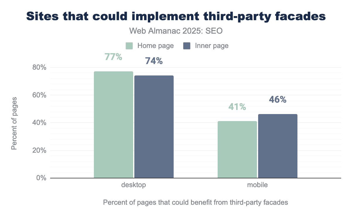
41% of home pages on mobile loads and 77% of home pages loaded with the desktop client were detected as having an opportunity to implement lazy loading with facades. This represents a regression from 2024 for desktop, where 70% were detected, but mobile loads represent an improvement from 45%.
Like 2024, mobile pages seem more likely to implement a facade than desktop pages.
Interestingly inner pages scored better on desktop at 74% and yet worse on mobile at 46%. Perhaps developers are focusing more on home page performance for their mobile visitors?
The figures do show there could be significant opportunities to reduce page weight, but likewise, they aren’t without their own issues, with sometimes perceptible delays once a user does interact with the element, and with videos in particular, double clicks or taps needed to start playing.
But it is worth assessing the embeds you have on your page, and see if any could benefit from implementing this approach.
Compression
Compression involves reducing the size of a resource before it’s sent across the network to a device, where it’s then decompressed. This process usually leads to faster page loads, especially when the network is the biggest bottleneck.
HTTP compression applied to text based files, like HTML, CSS, JavaScript, JSON, SVG, ico and ttf font files, can offer great over the wire page weight savings. It’s worth noting the benefits don’t extend to other file types, eg media, where the compression is part of their encoding.
Using GZip, Brotli, or the new kid on the compression block, Zstandard (zstd) to compress HTTP requests can often significantly reduce the weight of these text-based resources, increasing performance.
It needs to be noted that compression doesn’t entirely make page weight issues go away, they do need to be decompressed to their full size, and the process of compressing and decompressing could, if overdone, slow down the overall speed, although that would be a rare occurrence, certainly over the network bytes saved.
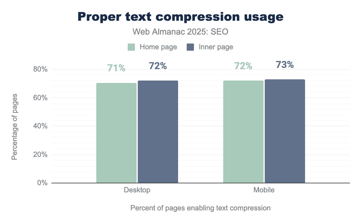
In 2025, 71% of desktop and 72% of mobile home page loads had proper text compression, as measured by Lighthouse’s Enable text compression audit.
For inner pages, the pass rates were slightly higher at 72% on desktop and 73% on mobile.
This shows a small improvement compared to 2024, when home pages had a 70% desktop and 71% mobile pass rate, and inner pages reached a 71% desktop and 72% inner page pass rate. In other words, each segment improved by just 1 percentage point year over year.
While any increase is positive, it still is slightly disappointing that over 25% of pages across all devices and page types, still fail to use efficient compression.
Minification
Minifying text resources removes unnecessary data, such as spaces, comments and can even shorten function and variable names to leave a smaller file.
There is no additional client side overhead in minifying, In other words, a file doesn’t need to be unminified to work. Any overhead is purely server side if done on the fly.
However, for many resources, such as CSS or JavaScript, minification can be handled upfront as part of the build process. It only needs to be done once.
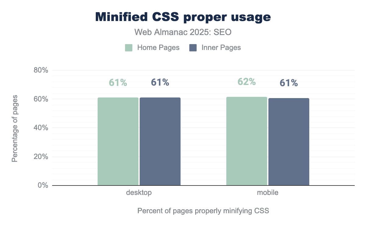
2025’s analysis shows that 61% of desktop, 62% of mobile home page loads, and 61% of desktop and mobile inner page loads passed lighthouse’s Minify CSS audit.
This means a slight decline from 2024, with each metric dropping by 1%, a small but unfortunate trend
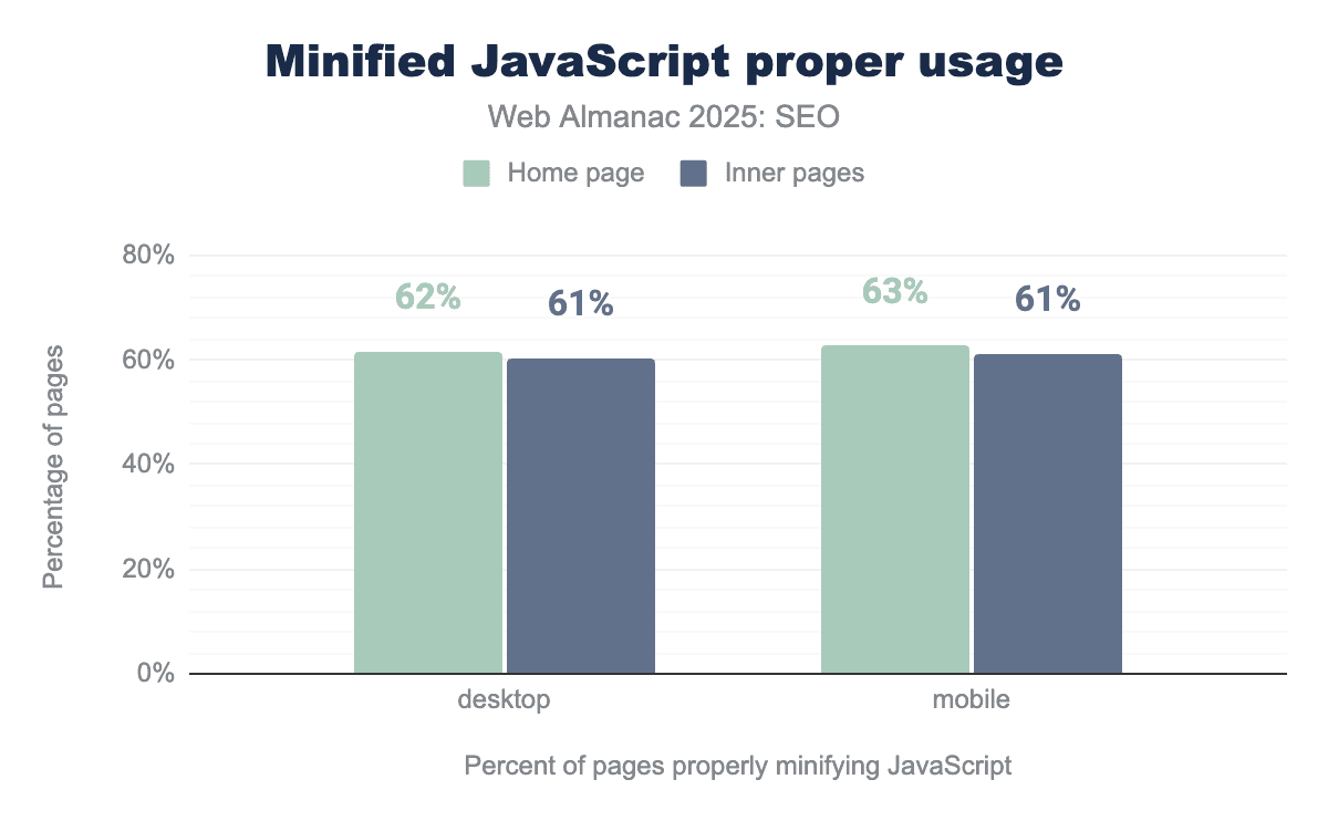
In 2025, 62% of desktop and 63% of mobile home page loads passed Lighthouse’s Minify JavaScript test.
For inner pages, the result was similar: 61% of desktop and 63% of mobile loads passed.
This represents an improvement from 2024, when 58% of desktop and 57& of mobile home pages passed and 59% of desktop and 58% of mobile inner pages did the same.
Although this year’s slight decline in correctly minified CSS is somewhat, it is encouraging to see a bigger increase in JavaScript being minified, even when there still is plenty of room for further adoption.
Caching
The sensible use of caching rules can help mitigate excessive page weight. When a common resource is cached locally by the browser, it does not need to be downloaded again as visitors navigate that website or even when they return later. This results in fewer network requests and faster page loads.
Naturally, this doesn’t entirely mitigate the issue of heavy resources, they still have to be requested and downloaded at least once.
Caching is most effective for static resources, ones that are unlikely to change between requests.
Lighthouse offers a use efficient cache lifetimes audit, which looks for static resources called by a page that have a cache lifetime of at least 30 days,unless explicitly set to not be cached.
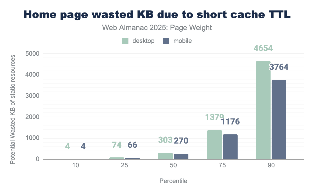
The data shows that many websites could reduce page weight by making better use of browser caching. For desktop home pages, the median site could save around 303 KB, while mobile home pages could save approximately 270 KB if resources were consistently loaded from cache.
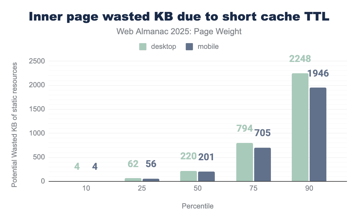
Inner pages perform slightly better, but there”s still room for improvement. The median potential savings are 220 KB on desktop and 201 KB on mobile.
These numbers represent potential savings. They don”t apply to first-time visitors and there”s no guarantee that any given resource will be cached or subsequently retrieved from the browser cache.
However, given the potential savings, it may be worth reviewing your cache strategy. For example, consider looking at cache timings and review the guidance in Prevent unnecessary network requests with the HTTP Cache article on eb.dev. Some adjustments may lead to faster experiences for returning users and reduce unnecessary network activity.
CDNs
Like caching, CDNs are not a definite solution for page weight, as they do not reduce file size by default. Instead, they serve as a mitigation .
CDNs can cache and serve content from a server geographically closer to the user than the origin server. This means that, while resources do not become lighter, the reduced physical distance means faster content delivery and improved perceived performance.
Many CDNs also offer additional features, such as handling compression, re-encoding and resizing of assets like images and video. These features are often automatic or near-automatic,ie, they require minimal development time, and can provide a simple way to reduce actual page weight..
If you are struggling to implement these page weight saving optimization techniques, it may be worth evaluating what your current CDN service offers, if you already use one, or exploring other CDN providers to see what their built-in tools might offer. CDNs grow increasingly prevalent and powerful, and we recommend getting more insights in the CDN chapter.
Page weight and Core Web Vitals
This year, we were able to include Core Web Vitals data in our analysis. These new insights come with an important caveat: not all pages have URL-level CrUX data.
To be clear, CrUX or Chrome User Experience data is the data that is collected from opt-in Chrome users as they browse websites. This data reflects how actual users experience a web page, instead of how it performs in a controlled environment.
To be included in the CrUX dataset, a page must drive a minimum number of visitors. As a result, the dataset will be weighted toward more popular sites and doesn’t represent the entire crawl corpus.
Despite this limitation, we hope that you find these findings, as they offer a valuable perspective while we work to balance functionality and page weight on the ever-changing web.
Core Web Vitals are a set of human-centric metrics designed to measure the quality of the human experience when interacting with websites. The focus is on three key areas:
- Largest Contentful Paint, which measures visual loading
- Cumulative Layout Shift, which measures visual stability
- Interaction to Next Time, which measures interactivity
CrUX data: Core Web Vitals assessment by weight
For a page to pass the Core Web Vitals assessment, it must have CrUX user data showing good LCP and CLS metrics at the 75th percentile, and its INP must either be good at the 75th percentile or be entirely absent. INP measures interactivity, and because not every page drives visits, INP dataset tends to be the most sparse. While page weight is not a part of their calculation, the data shows a clear correlation between total megabytes and pass rates.
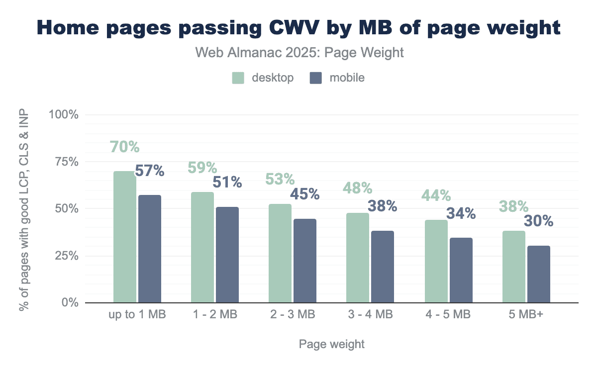
70% of desktop home pages under 1 MB passed this assessment. In contrast, only 38% of home pages 5 MB or larger passed, which is nearly half the success rate of their lighter counterparts. Mobile pages show a similar pattern: . 57% of pages under1 MB passed compared to only 30% of those 5 MB or larger. Passing rates decline steadily as home page weight increases with mobile consistently lagging behind desktop across all weight categories.
In 2025, the median home page was 2.9 MB for desktop and 2.6 MB on mobile. Within the 2-3 MB range, 63% of desktop pages passed the Core Web Vitals assessment. Because these figures rely on CrUX field data, they primarily reflect the performance of the most popular sites. For mobile in the same weight range, 53% of pages passed.
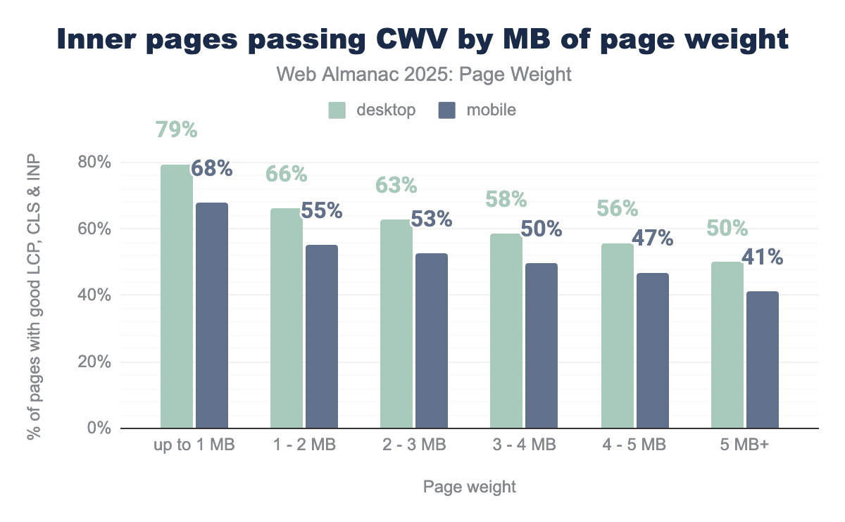
As observed above, inner pages tend to be lighter than home pages. In 2025, the median home page weighted 2.9 MB for desktop and 2.6 MB for mobile. Inner pages were lighter in comparison, with median sizes of 1.8 MB for mobile, and 2 MB for desktop.
The data shows a softened pattern for inner pages than home pages. 79% of desktop inner pages weighing under 1 MB passed the Core Web Vitals assessment. 50% of inner pages 5 MB or larger passed the assessment. Mobile pages are less likely to pass, and passing rates decline gradually with each additional megabyte.
CrUX data: Largest Contentful Paint by weight
Largest Contentful Paint (LCP) measures how long it takes for the largest image, text block or video in the viewport to render, starting when the user starts navigating to the page. A page achieves a passing score when the 75th percentile of user experiences fall under in 2.5 seconds.
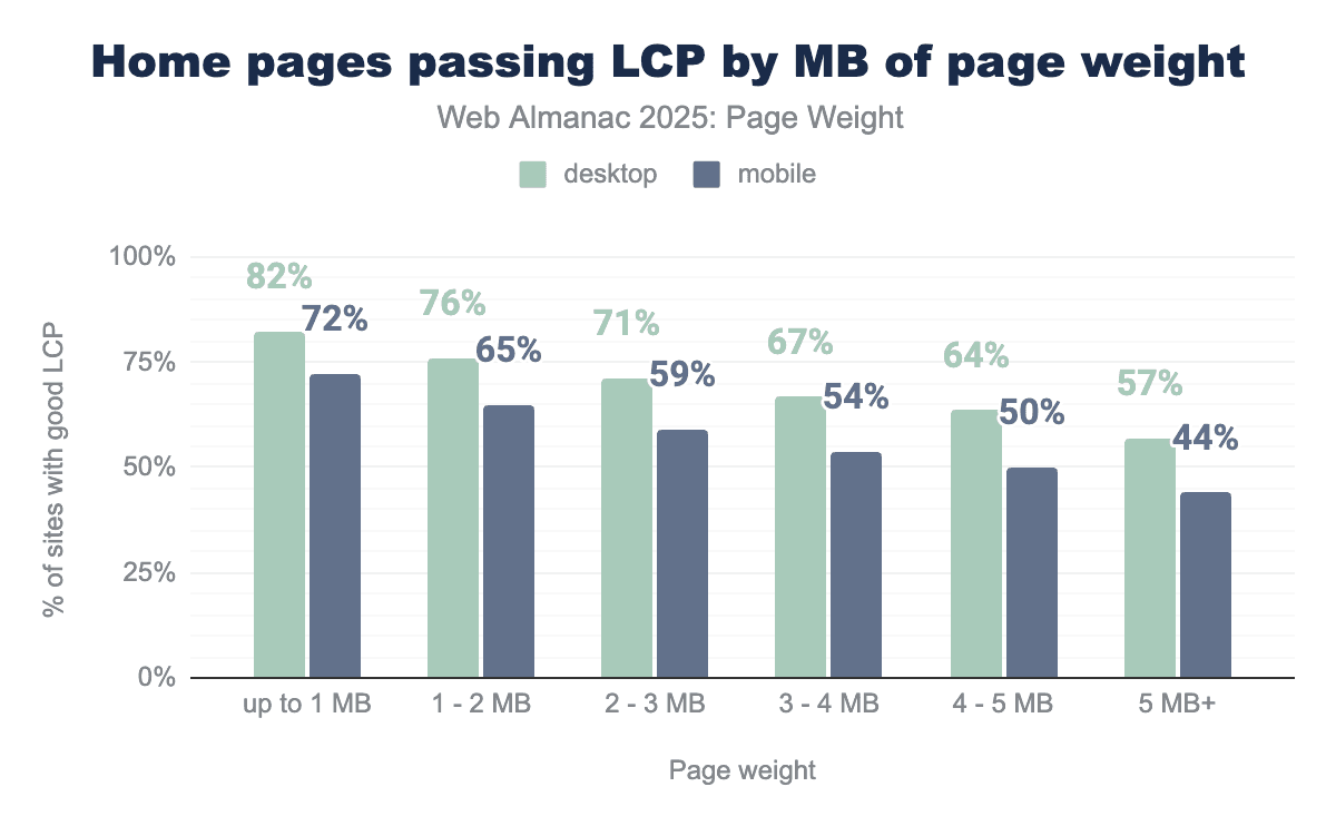
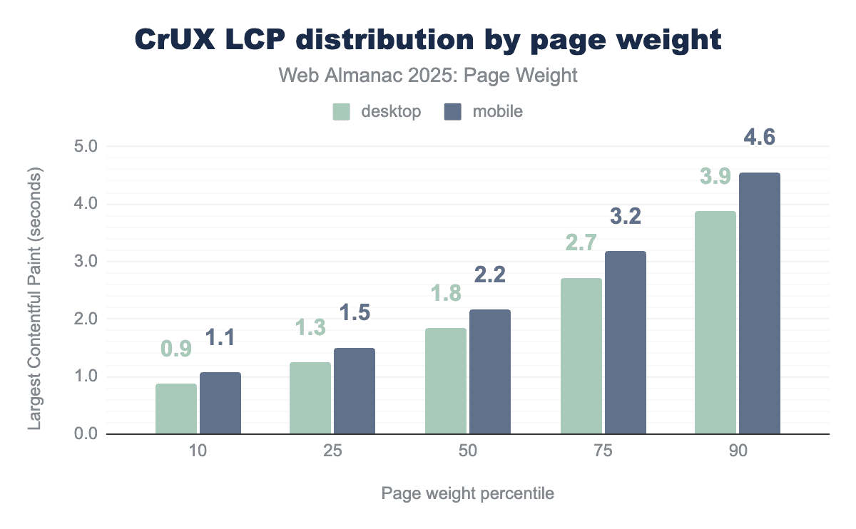
The lightest pages passed LCP, with 82% of desktop and 72% of mobile pages achieving a passing score. Pages in the 2-3 MB range, which represents the median page weight, passed at rates of 71% for desktop and 59% for mobile. The heaviest of pages, ie, those 5 MB or larger, passed rates dropped to 57% for desktop and 44% for mobile.
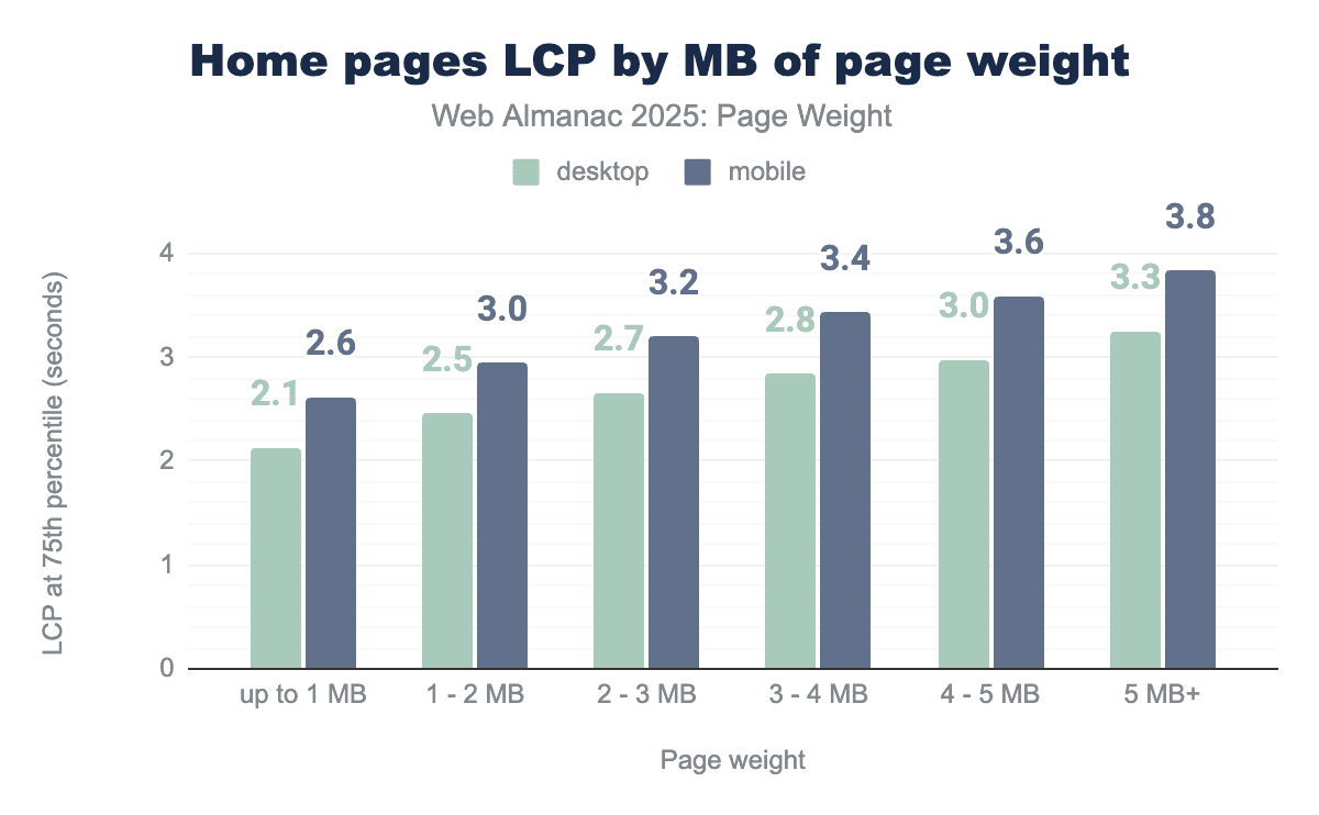
For home pages in the 2-3 MB range, LCP was achieved in 2.7 seconds on desktop and 3.2 seconds on mobile. Mobile struggled to achieve sub-2.5-second times, even for pages under 1 MB, which recorded 2.6 seconds for LCP. As page weight increases, LCP times rise accordingly, with mobile taking roughly half a second longer to render the largest content element.
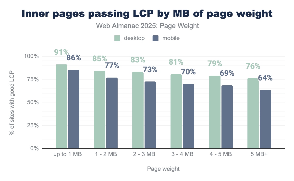
Inner pages show better Largest Contentful Paint performance than home pages. For pages under 1 MB, 91% of desktop and 86% of mobile inner pages passed the metric.
Pages in the 1-2 MB range represent the median mobile inner page size, with 77% of pages in this range achieving a score. At 2 MB, the desktop median inner page sits at the cutover for two ranges, both of which behave similarly. 83% of inner desktop pages passed in the 2-3 MB range.
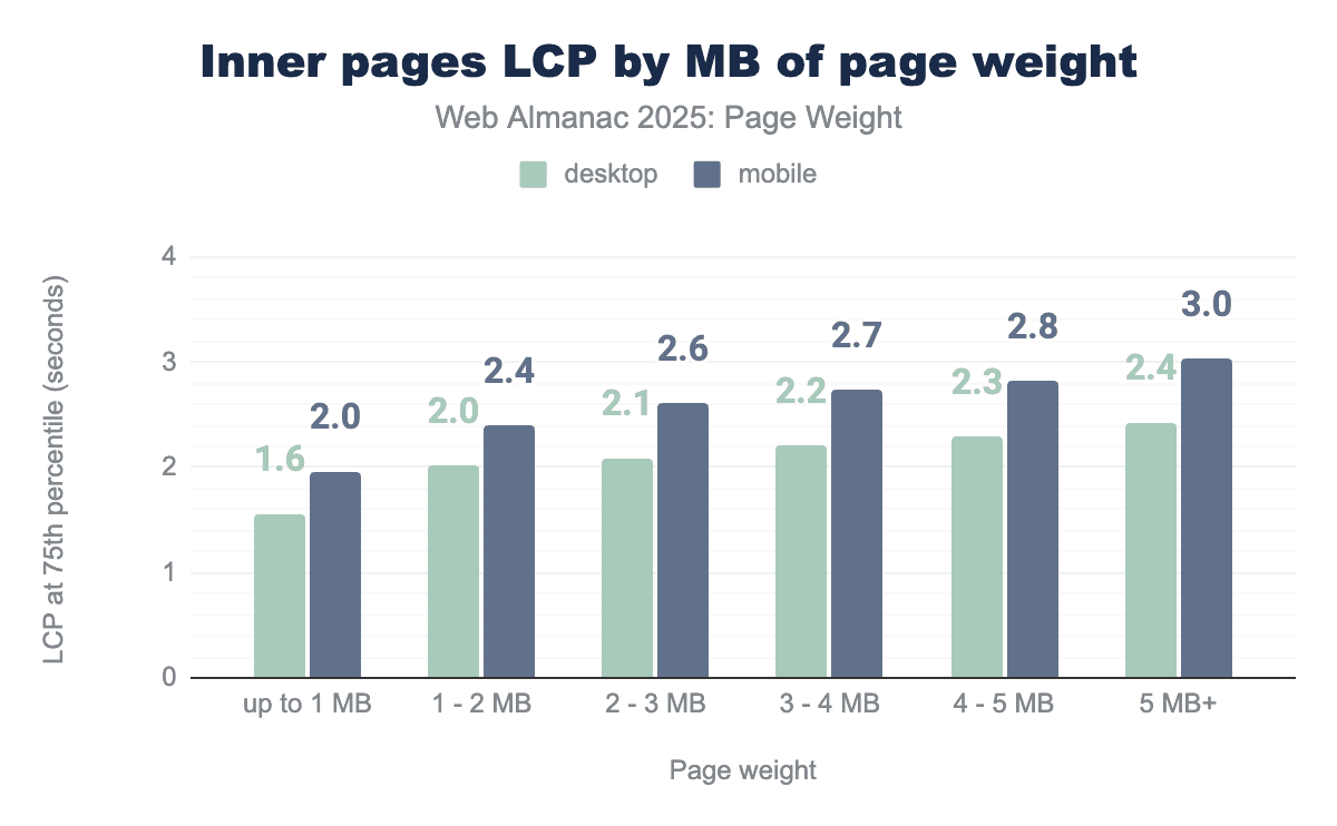
Inner pages show better LCP performance than home pages overall. Pages up to 2 MB met the LCP passing threshold for the 75th percentile. Desktop pages consistently passed the assessment for all size ranges.
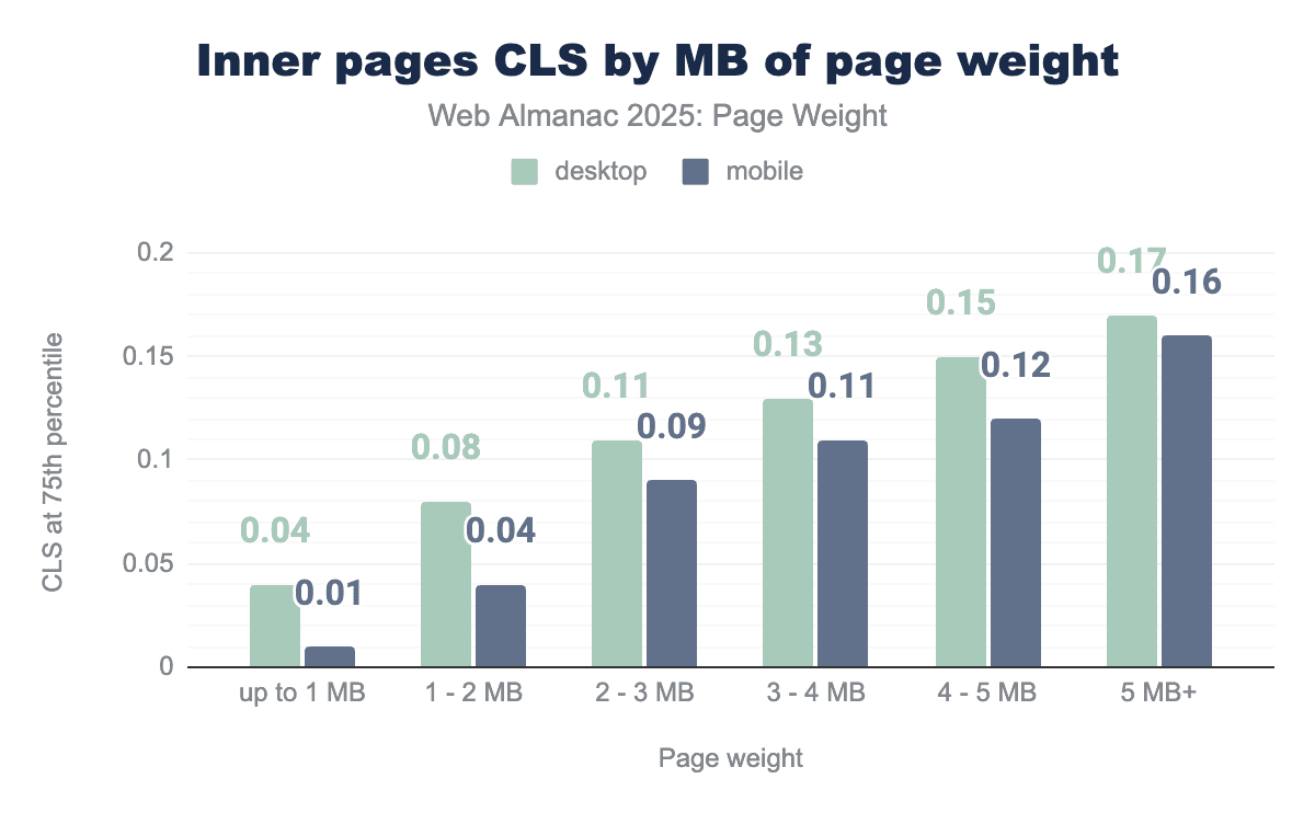
CrUX data: Cumulative Layout Shift by weight
The second Core Web Vitals metric, Cumulative Layout Shift (CLS), measures the visual stability of the page. It calculates how much visible elements unexpectedly move during the first five seconds of page load, factoring in both the size of the element that moves and the distance it travels. These shifts are averaged across the session window to produce the final score.
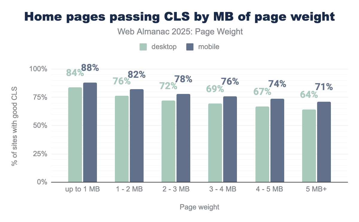
At the 75th percentile, 72% of desktop and 78% of mobile home pages in the 2-3 MB range meet the CLS recommendation. These pages represent the median page in 2025. CLS saw less drop off between percentiles than LCP. 88% of mobile pages under 1 MB passed. 71% of mobile pages still passed when the page weight exceeded 5 MB.
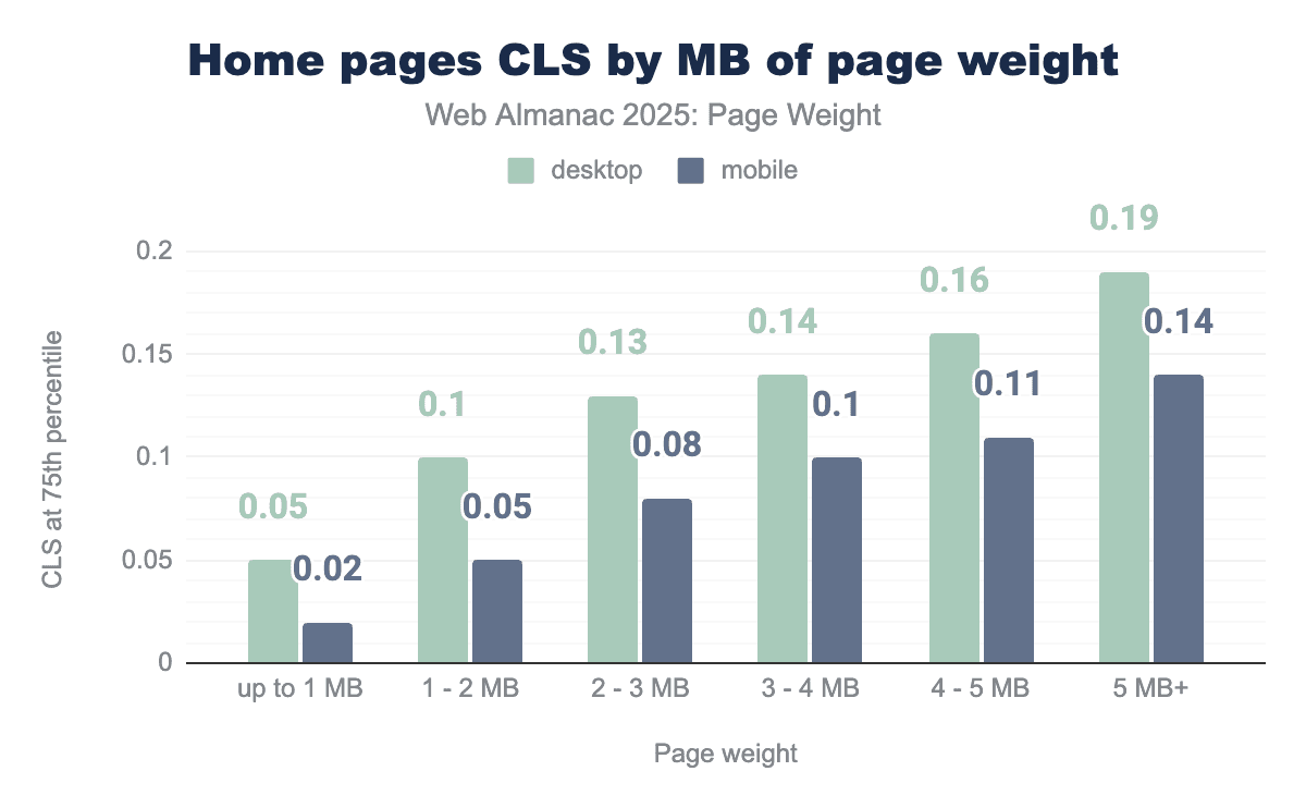
A passing CLS score is ≤ 0.10. CLS scores were consistently higher on desktop, likely because the larger landscape provides more space for items to shift. Pages below 2 MB passed the assessment on desktop, while pages below 4 MB achieved the desired score on mobile.
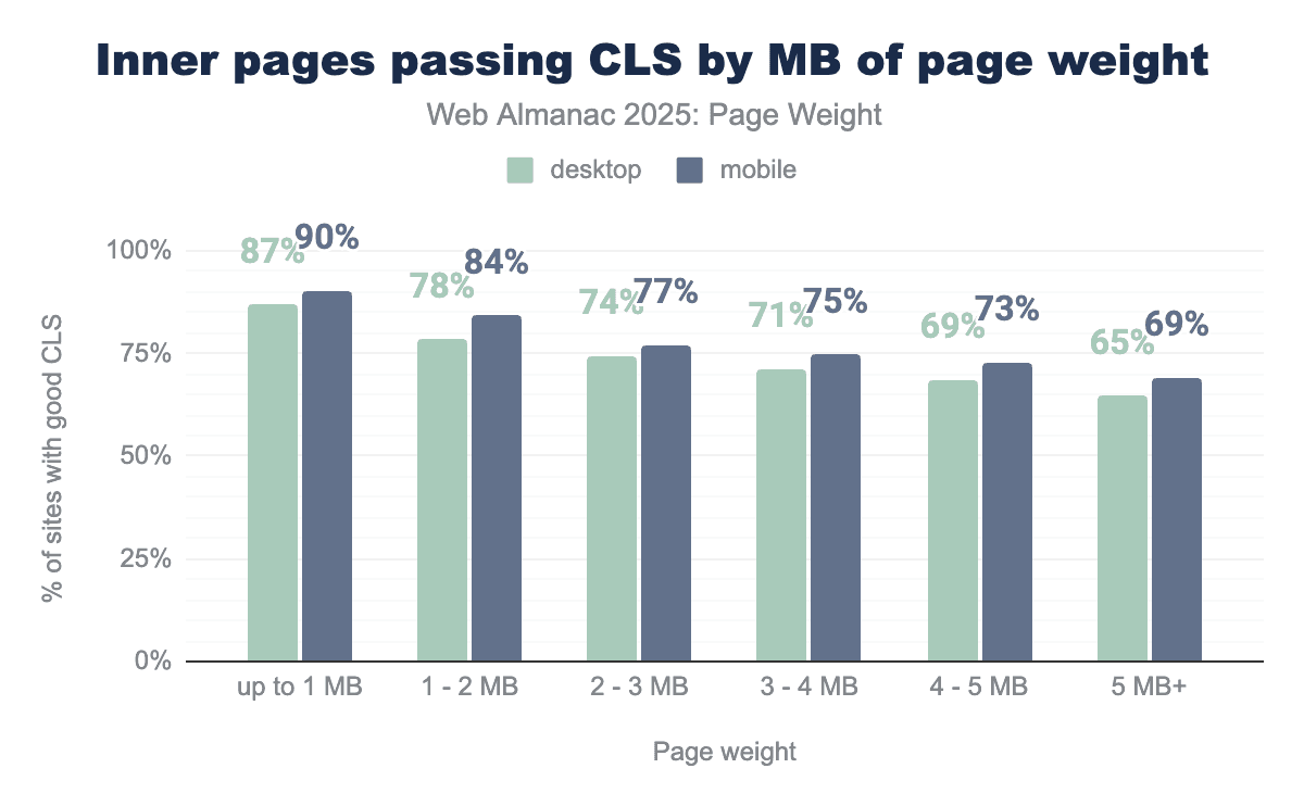
The percentage of inner pages passing CLS was similar to the rates of home pages. While 72% of desktop mobile home pages represent the median 2-3 MB, 74% of their inner page counterparts passed. 77% of mobile inner pages passed compared to 78% of mobile desktop pages.
The impact of page weight on inner page CLS shows a consistent march across the ranges. Desktop pages under 2 MB and mobile pages under 3 MB were able to achieve a score of less than 0.10. Pages over 3 MB consistently scored over the desired threshold.
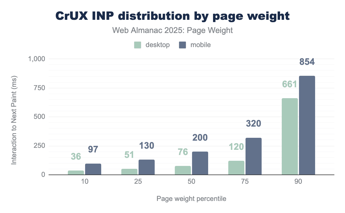
CrUX data: Interaction to Next Paint by weight
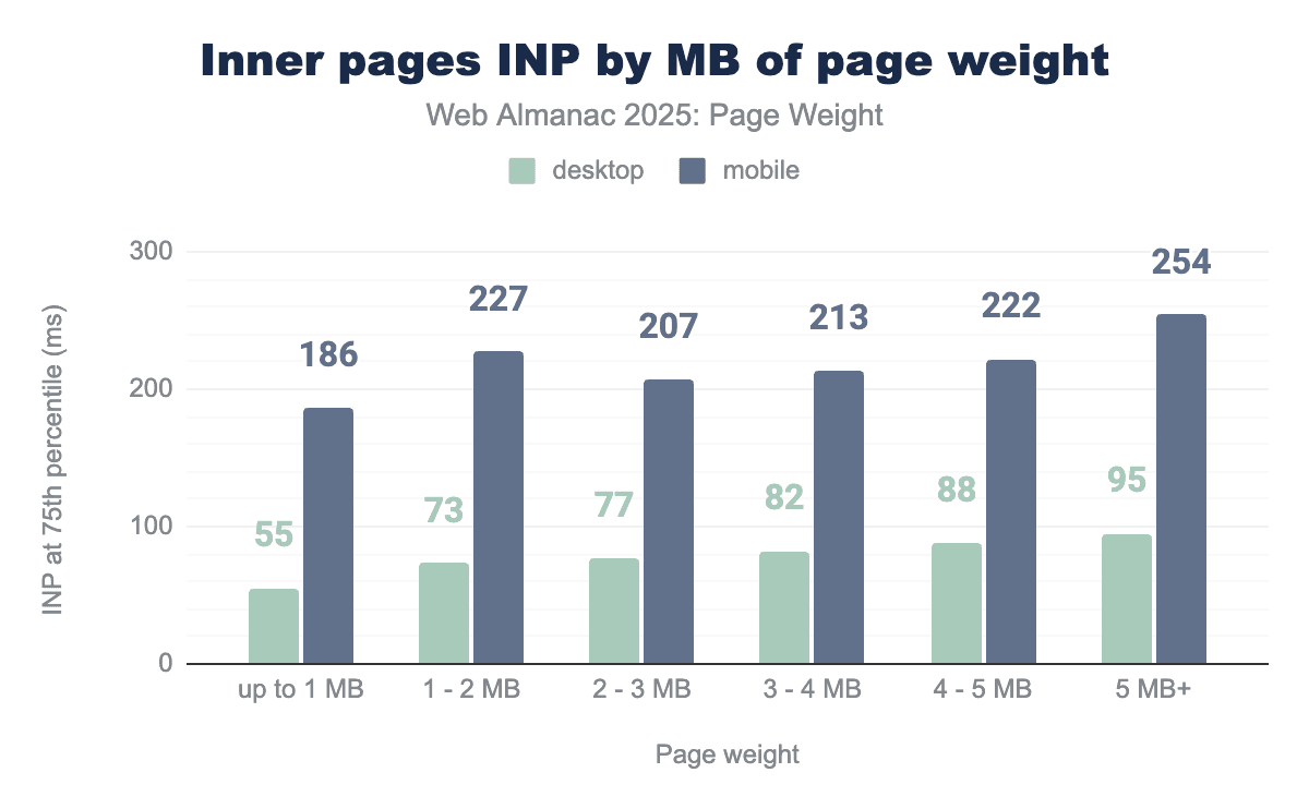
The third Core Web Vital Metric is Interaction to Next Paint (INP). Designed to represent interactivity throughout a page’s lifecycle, INP measures the total latency of an interaction, from the moment a user clicks, taps or presses a key until the next visual update appears. An INP of 200 milliseconds or less indicates good responsiveness.
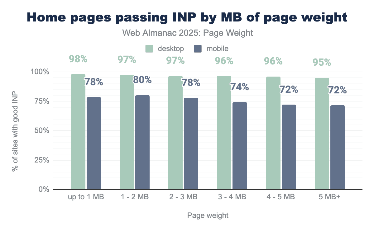
The INP metric shows the highest desktop pass rates of all the Core Web Vitals metrics. For home pages under 1 MB, 98% passed the INP, and even at 5in the 5+ MB range, 95% of desktop home pages still passed the assessment.
Mobile home pages passed at lower score rates, with 78% of pages up to 1 MB passing, while those pages in the 1-2 MB range performed slightly better, with 80% of them achieving INP in under 200 ms.
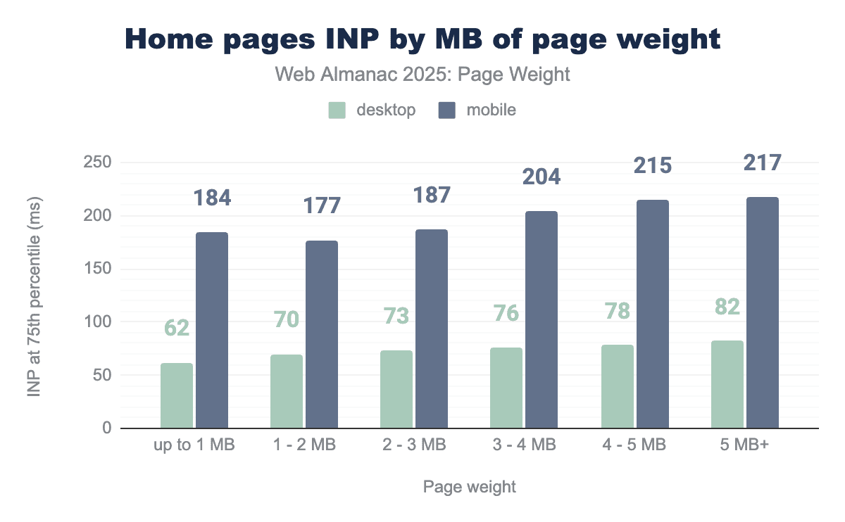
Desktop home pages consistently achieved INP times below the 200ms threshold across all weight categories even in the heaviest range, at 5 MB+, INP for the 75th percentile was just 82ms. Mobile home pages up to 3 MB achieved their INP goal. However, those in the 3-4 MB range, INP at the 75th percentile exceeded 200ms.
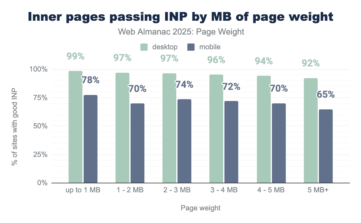
Inner pages show a similar gap between mobile and desktop. 99% of pages up to 1 MB achieved a sub-200ms INP compared to only 78% of mobile pages in the same weight range. At 5 MB+, 92% of desktop inner pages passed the interactivity assessment, while 65% of mobile pages achieved the goal.
Lighthouse data: Core Web Vitals assessment by weight
In addition to the newly available CrUX data analyzed above, we’ve continued our synthetic Core Web Vitals assessments, first introduced in 2024. This data is collected by running Lighthouse during the HTTP Archive crawl that powers this annual report. Lighthouse is a free, open-source, automated tool developed by Google that evaluates web page quality across multiple areas, including performance, accessibility and SEO. It is frequently used by developers as part of their release process to monitor and mitigate issues in production.
It’s essential to distinguish between Lighthouse data as lab or synthetic data. While designed to emulate a real experience, it can’t account for all the factors that impact site performance for actual users. It also measures only the initial load of a page, limiting calculations for interactivity to ongoing interactivity and visual stability.
While CrUX is a more accurate representation of real human experience, it also has limitations. Web pages need to receive enough visits to meet data anonymization requirements before they can appear in the dataset, meaning that popular pages and websites are more likely to be represented.
When CrUX data is available for a URL, it should be considered the focus of efforts to create more performant experiences. Field data allows you to solve for real human problems. Lab data, like Lighthouse, provides more metrics to troubleshoot the issues as identified in real user metrics.
Lighthouse data: Largest Contentful Paint by weight
Largest Contentful Paint can be most accurately captured in synthetic testing of the three core web vitals. The output is only an estimate based on the specific test scenarios it runs (cold load, for its predefined screen size, network throttling, and CPU throttling). Whether those conditions are realistic for a site’s particular users will determine how “accurate” the Lighthouse LCP is.
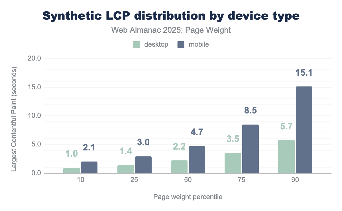
A good Largest Contentful Paint score is less than 2.5 seconds. In Lighthouse tests, the median desktop page met this threshold, achieving 2.2 seconds. Mobile performance was significantly worse, as the same task took 4.7s to reach LCP. Only the fastest 10th percentile of mobile pages achieved a passing score, with an LCP of 2.1 seconds. In sharp contrast, mobile pages at the 90th percentile, achieved an LCP of 15.1 seconds, roughly six times slower than the recommended target. Desktop pages achieved LCP in under 2.5 seconds up to the 50th percentile.
Real user metrics provided by the Chrome User Experience report paint a much more performant picture of the web. Both mobile and desktop pages achieved LCP in under 2.5 seconds through the 50th percentile. At the 90th percentile, desktop field data was 1.8 seconds faster than lab data. mobile showed an even wider gap, as starting at the 25th percentile, Lighthouse reported LCP values more than double those seen in CrUX, and by the 90th percentile, synthetic results were 328% higher than real-user metrics.
Such significant differences in the data sets may serve to support the cause for the metric’s existence. Pages with slower LCP are more likely to be abandoned as users perceive the lack of visual loading as unresponsive. More abandoned page loads reduce the likelihood of achieving enough page views to be eligible for the CrUX data set.
Lighthouse data: Cumulative Layout Shift by weight
Visual stability can only be measured during initial page load in synthetic testing. This does not accurately reflect the robust nature of the metric. CLS, as measured in the page loads of real users, is not a single measurement but an aggregation of all layout shifts within a “session window.” A session window is a 5-second period where multiple layout shifts occur, separated by less than 1 second. The highest-scoring session window is reported as the page’s CLS score.
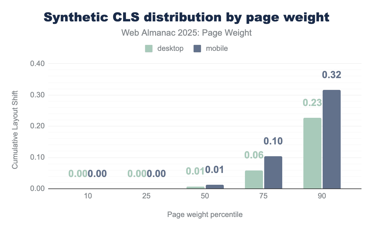
Synthetic data shows pages through the 75th percentile effectively passing CLS as judged by their initial pageload. Mobile and desktop scores were consistent through the 50th percentile. The highest scores were those of mobile pages in the 90th percentile, which scored 0.32.
With CrUX data, we introduce an extended time frame and better accounting for the mechanics of single-page applications (SPAs) and dynamically loaded content. Real user metric calculation for CLS focuses on the largest “burst” of layout shifts that a user is likely to experience.
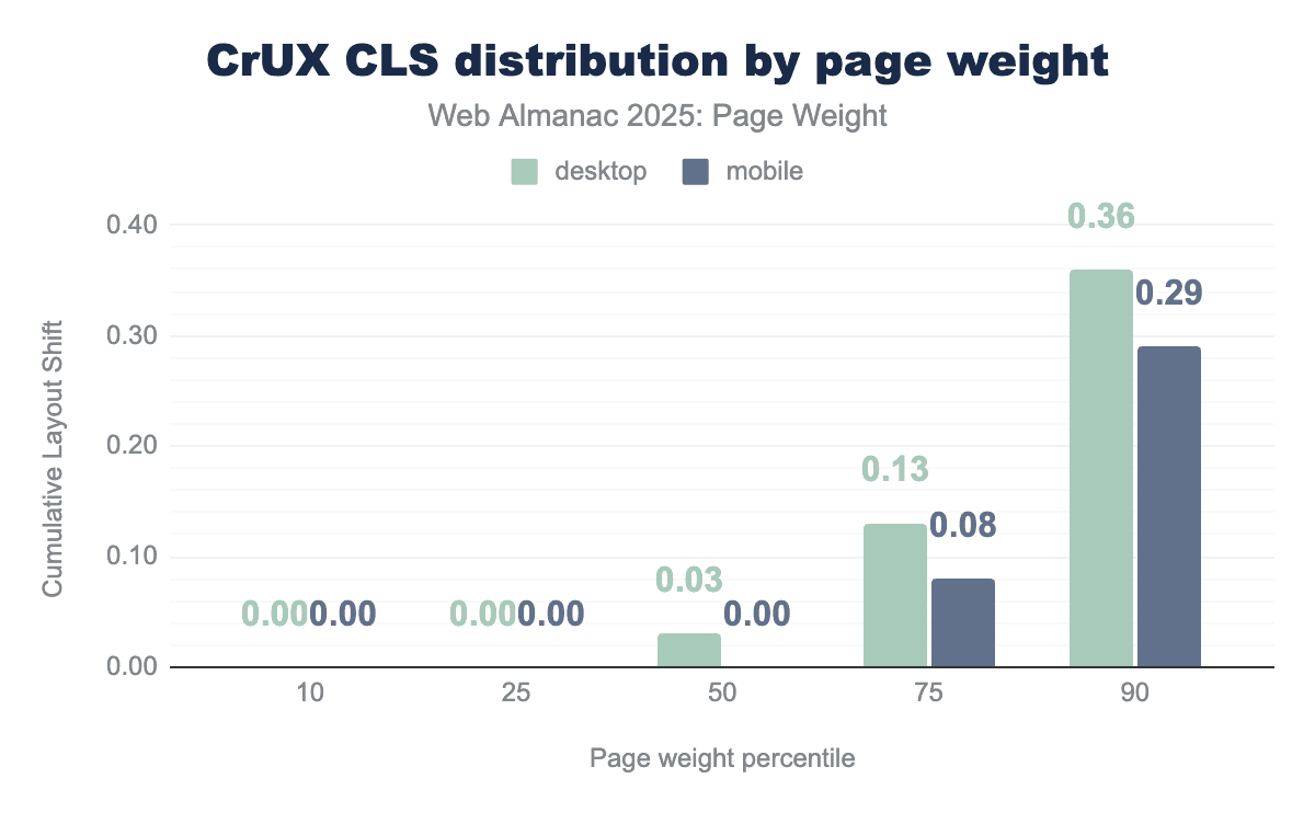
All users through the 50th percentile experienced CLS of less than 0.10. At the 75th percentile, desktop users saw good CLS while mobile inched over the threshold to a CLS of 0.13. At the 90th percentile, CrUX desktop users experienced higher visual instability (0.36) than mobile users (0.29). CrUX data for mobile users at the 90th percentile was lower than its synthetic counterpart (0.32 in Lighthouse; 0.29 in CrUX).
Lighthouse data: Total Blocking Time by weight
For CrUX data, interactivity is measured as Interaction to Next Paint (INP), in other words, this metric measures the time between user input and visual feedback throughout the page’s lifecycle. Lighthouse can only measure the initial page load and, because of this, uses an alternative metric to estimate interactivity. Total Blocking Time (TBT) is a lab metric that measures the total time during page load that the main thread was blocked. TBT serves as a proxy for INP because high TBT often leads to high INP, meaning that fixing TBT is a key way to improve INP.
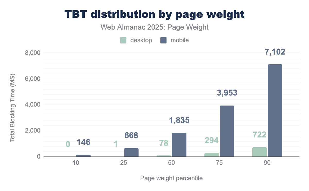
A page is considered to have good TBT when the main thread is blocked for less than 200 milliseconds. Only the 10th percentile of mobile pages achieved this metric. Desktop pages achieved a TBT of under 200 ms through the 50th percentile. At the 90th percentile, the main thread of mobile devices was blocked for 7.1 seconds.
INP, the field metric counterpart to TBT, shares the same timing goal of 200 ms. CrUX paints a more responsive picture of mobile experiences. Mobile and desktop pages through the 50th percentile achieved good responsiveness. At the 75th percentile, the differences between devices become more pronounced, with INP of 120 ms for desktop, still considered good responsiveness, and 320 on mobile, meaning users perceive more lag. The 90th percentile of mobile CrUX data calculated at INP at 4X the 200 ms goal. The 90th percentile of synthetic mobile data saw TBT 35X the same goal.
Conclusion
The simple conclusion is that all pages on the web continue to grow in size year on year. This growth is broadly accelerating increasing demand on user devices and internet connection.
The balance of functionality versus accessibility is continuing to tilt in favour of functionality meaning users on limited connections or devices suffer a worse and less inclusive experience.
Javascript is still a primary driver of this growth with 98.1% of pages making at least one request. Javascript is often inefficiently added to pages, adding weight to the pages but then not being actively used.
Images and their wide use on both home pages and inner pages contribute a significant amount of the weight to pages, the discrepancy between desktop and mobile has shrunk versus last year which implies that optimization is less of a focus which is troubling given the impact images have on the web experience.
The effect of all this weight can be seen in the high falling rates of Core Web Vitals as the weight increases, including in Chrome User Experience report data, showing the impact is real for the user, not theoretical.
Ultimately there is massive opportunity for improvements here without impacting the user experience at all, lossless compression and only using what is needed for javascript represent significant gains for users and reduced costs for web owners, but currently too many of these opportunities are being ignored.
Page weight continues to be a key issue but currently it seems we are getting further away from a solution.

