Fonts
Introduction
When the HTTP Archive first began gathering data on web typography in 2011, the use of custom web fonts was in the low single digits. Only about 3-5% of websites at the time delivered self-hosted fonts via @font-face or used services like Typekit, Fonts.com, or Google Web Fonts. Every other site in 2011 was limited to the small handful of “web-safe” system fonts (Arial, Courier, Times, etc.) that were available on every user’s device.
Web fonts quickly rose to become the norm when designers realized that custom typography could distinguish their visual identity from other, more generic sites. By 2015, web fonts were used by over half of websites. They reached around 75% adoption by 2020. Today, the question is less about whether a website uses web fonts, but rather which specific typefaces it displays and whether they use font features to display their full expressive potential.
At the same time, font delivery methods have been shifting. An increasing number of sites are choosing to self-host their font files rather than relying exclusively on third-party CDNs, and many use a mix of both approaches. Last year’s data showed a clear rise in exclusive self-hosting alongside a decline in sites that combined self-hosting with external services, and we investigate whether this trend continues in 2025.
This chapter explores several dimensions of web typography today: which providers command the largest share, how fonts are loaded and optimized for speed, which typefaces lead in actual CSS implementations, how non-Latin scripts are handled, and what variable fonts and color fonts mean for the future of web typography.
Webfont usage
Web font usage continues to grow, although its growth has naturally slowed as the spread of web fonts reaches saturation on the web (for all but the largest CJK character sets).
In 2025, web fonts were found on roughly 88% of websites, up slightly from about 87% in 2024. (The metric here is the share of pages that request web font files, which effectively represents the percentage of websites using web fonts.)
This widespread usage highlights how far web typography has come since the days when developers were limited to core system fonts, though a notable minority (around 12% of sites) still stick to those older defaults.
Hosting and services
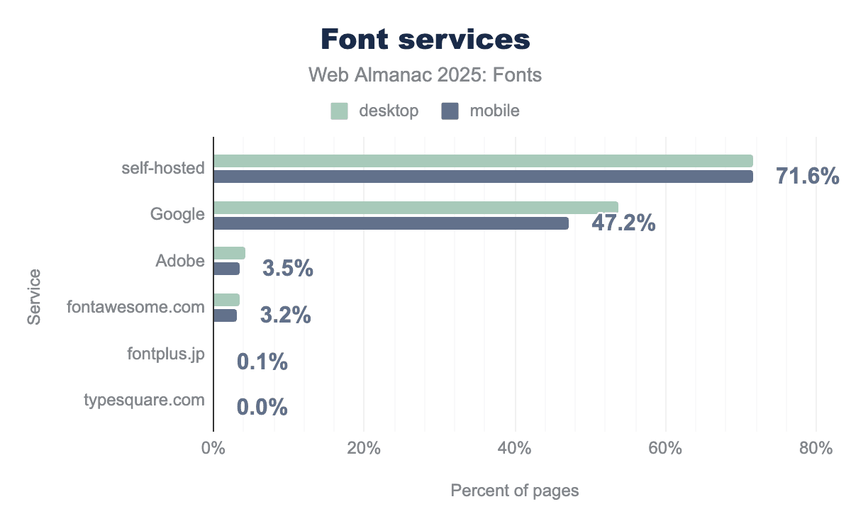
This year’s Web Almanac crawl confirms that self-hosting is the most widespread means of delivering web fonts. About 72% of websites (both desktop and mobile) serve at least one font file from their own origin, either by self-hosting exclusively or by using a mix of self-hosted and externally hosted fonts. That figure is just over one percentage point higher than last year, and about 4-5 points higher than in 2022, indicating a steady increase. In other words, the rise in self-hosting that became apparent in 2022 is still continuing.
Within that 72%, we can break down two significant groups:
-
Exclusively self-hosted fonts: About 31.5% of desktop sites and 36.4% of mobile sites use only self-hosted fonts (no third-party font services at all). Averaging those, roughly one-third of all sites rely solely on self-hosting in 2025 (up from about 30% last year). This marks a real shift: more sites have decided to host all their fonts themselves, removing external providers from the critical path.
-
Mixed hosting (self-hosting + a service): Another 36.1% of desktop sites and 31.7% of mobile sites use a combination of self-hosted fonts and a font service on the same page. In most of these cases the service is Google Fonts, with perhaps an icon CDN or another source added in. This “hybrid” approach was slightly more common last year (around 38.5% of desktop and 32.7% of mobile pages in 2024), so it has dipped a bit as some sites fully switch over to self-hosting.
Combining those groups, about 72% of sites self-host in some capacity. The remaining ~28% of sites rely exclusively on third-party services for fonts (with Google Fonts being by far the most likely choice in that category).
Web font services
Even with the growth of self-hosting, hosted font CDNs still appear on roughly half of all websites, primarily because of Google’s massive footprint. This year’s crawl found Google Fonts on about 54% of desktop sites and 47% of mobile sites. (This counts any site that uses Google’s API to fetch fonts, whether Google is the only source or used alongside others.) Google’s reach on desktop dropped about 3 percentage points from 57% in 2024, and is down about 6 points from 2022, reflecting the shift toward self-hosting. On mobile, Google’s share dipped only slightly (about 0.3 points since last year, and about 4 points since 2022). The overall pattern is the same as noted in 2024: Google Fonts is still the default choice for many, but its dominance is slowly diminishing as more sites self-host.
Other font hosting services are much smaller by comparison. Adobe Fonts (formerly Typekit) grew modestly again. In 2025 around 4.2% of desktop sites and 3.5% of mobile sites use Adobe Fonts (roughly 3.8% combined), up from about 4.1% last year. This is a small slice of the web, but it represents real growth (a 10-11% relative increase over two years).
Font Awesome, a popular icon-font CDN, has seen a slow decline. In 2022 it was used by about 4.4% of sites, in 2024 by 4.0%, and in 2025 it’s down to roughly 3-4% of sites. This slide is likely caused by many sites moving to alternative icon solutions (inline SVGs, icon sprite sheets, or self-hosted icon sets) while other developers avoid loading a large icon font for performance reasons. Even so, Font Awesome’s continued use on about 1 in 25 websites is significant—few other single font families (icon or text) come close to that reach.
Every other service is essentially negligible at the web scale. Legacy services like Monotype’s Fonts.com, Extensis, Cloud.Typography, and Type Network each account for well under 1% of sites. Many of these have declined to the point of near-invisibility in our crawl data. In practical terms, if a website is using a hosted font service in 2025, it’s almost certainly Google Fonts. There’s a small chance it’s Adobe Fonts or Font Awesome, and very little chance that it’s something else.
Font hosting combinations
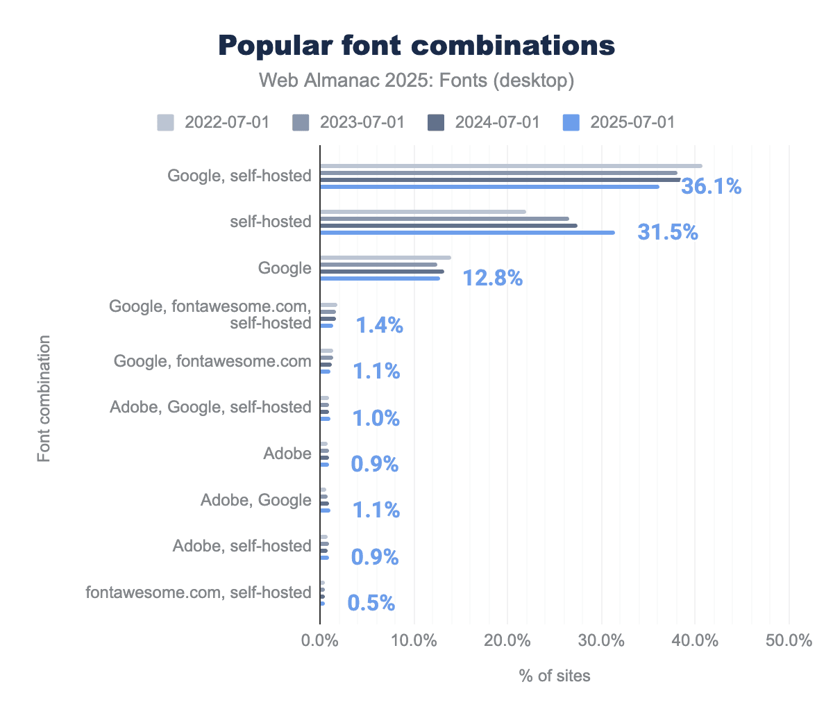
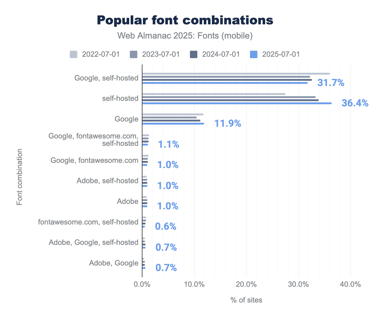
Because most sites don’t rely on just one source for web typography, it’s useful to look at how they mix and match delivery. In practice the web has converged on a few predictable combinations—self-hosting only, Google only, or a hybrid of the two.
-
Google Fonts together with self-hosted fonts: used by ~36% of desktop sites and ~32% of mobile sites. This hybrid approach is very common: for example, a site might self-host some brand or icon fonts while also pulling in a Google-hosted font for body text (or vice versa).
-
Self-hosted fonts only: used by ~32% of desktop sites and ~36% of mobile sites (approximately 34% of sites overall). This means all custom fonts on the page are served from the site’s own domain. As noted, this share has grown from about 30% last year to about one-third of sites this year.
-
Google Fonts only: used by ~13% of desktop sites and ~12% of mobile sites. These sites exclusively rely on Google’s CDN for their font needs (often via the standard
<link>to Google’s stylesheet).
Together, these three configurations account for roughly four out of five websites. Every other combination (such as using Google + Adobe together, or Adobe + self-hosting, etc.) becomes rare very quickly in the crawl data. In fact, beyond the top few patterns, the share of any given combination falls below 1%, and by the time you get to the 8th or 10th most common configuration, their usage is almost imperceptible (around 0.05% of sites).
Beyond these commonplace service combinations, year-over-year the balance is tilting toward self-hosting. In 2024, about 30% of sites were exclusively self-hosted, but now it’s roughly 34%. Correspondingly, the “mixed” approach (self-hosting + a service) has shrunk a bit (from ~38% to ~36% of sites on desktop, for example). In other words, fewer sites are hedging by doing both—more have decided to host everything themselves. This is likely due to performance and privacy motivations. As last year’s chapter noted, modern browser changes like cache partitioning have removed some of the old performance advantage of using Google’s CDN.
Font file hosting
Another way to look at font hosting is to ask: which specific font files are being requested the most, and are they coming from self-hosting or from services? This gives insight into the most popular font families on the web and how they’re being delivered.
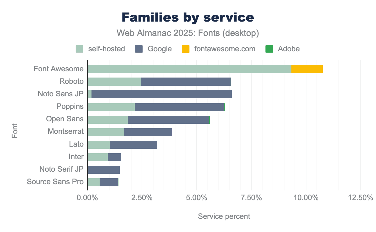
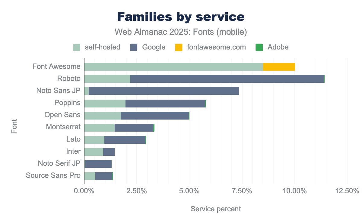
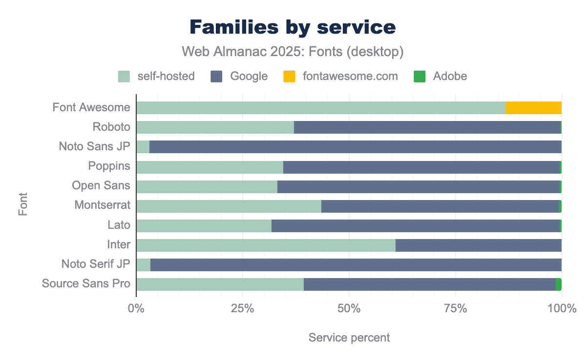
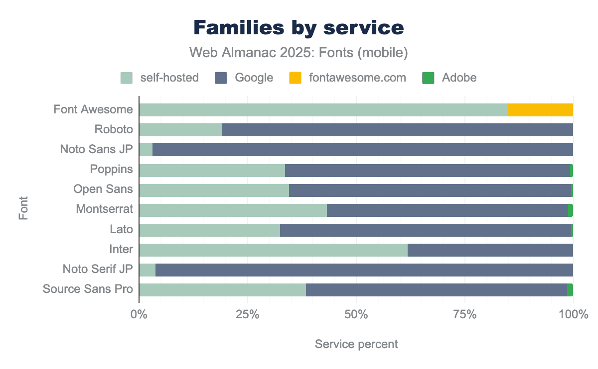
On the self-hosted side, traffic is heavily focused on icon font files and common library assets. A locally served copy of Font Awesome (the TTF/WOFF files of the icon set) accounts for about 8.5% of desktop font requests and 9.3% of mobile font requests in the 2025 crawl. That makes Font Awesome one of the most frequently fetched font resources on the web, even though it’s an icon set rather than a text face. Notably, most of Font Awesome’s usage is via self-hosting—only a much smaller fraction is fetched directly from the fontawesome.com CDN. Other popular utility fonts show a similar pattern: for example, IcoMoon (another icon font generator output) accounts for about 1.0% of desktop and 1.1% of mobile font requests, and ETmodules (often seen in WordPress themes) about 0.5% desktop and 0.7% mobile. These too are almost always self-hosted fonts residing on the site using them. In practice, this segment of “self-hosting” on the web is about bundling these common icon/font assets with your own site’s files, not just self-hosting bespoke text fonts.
On the Google Fonts side, font requests have a classic long-tail distribution: a few extremely popular fonts at the head, and many more with smaller usage. On desktop, Roboto is the single most requested Google-hosted font, making up about 9.2% of all Google font requests. Right after it is Noto Sans JP (Japanese), at about 7.1% of Google’s requests. This immediately shows how global Google’s reach is—one of the top two fonts is a Latin/English UI face, and the other is a Japanese font. Below those, the list looks exactly like one might expect in 2025: Poppins (~3.8% of Google font requests on desktop), Open Sans (~3.3% via Google on desktop), Lato (~2.0%), and Montserrat (~1.9%). On mobile, the order shifts slightly: Noto Sans JP is actually first at about 6.4%, with Roboto at 4.1%, but Poppins (~4.1%), Open Sans (~3.7%), Lato (~2%), and Montserrat (~2.2%) are all in the same top group. In short, Google Fonts’ highest-volume fonts include both widely-used Latin families and important non-Latin fonts (especially for CJK scripts).
It’s interesting to note which of these fonts tend to be self-hosted versus served from Google. For example, Noto Sans JP (a large Japanese font) is almost entirely served by Google’s CDN in our data. The self-hosted share of Noto Sans JP was only about 0.2% of requests, meaning nearly everyone who uses that font chooses to let Google handle the delivery (likely because it’s a very large file, and Google’s infrastructure is optimized for it). Noto Serif JP is similar: it appears around 1.3-1.4% of requests (mostly Google-hosted). In contrast, many popular Latin-script families have sizable self-hosted footprints in addition to their Google-served usage. We see Roboto being self-hosted too (about 2.2% of font requests on desktop are for self-hosted Roboto files, on top of the 9.2% from Google). Similarly, Poppins is ~2.0% self-hosted, Open Sans ~1.7% self-hosted, Montserrat ~1.4%, Lato ~1.0%, and Inter ~0.9% self-hosted (desktop figures). In each of these cases, the same font is also delivered by Google on many sites. Because the most popular Google Fonts (Roboto, Open Sans, Poppins, Montserrat, Lato, Inter) also appear at non-trivial rates in the self-hosted data, and because self-hosting is growing while Google’s share is easing, it’s likely that many projects begin with Google Fonts and later bring the same families in-house for performance or privacy reasons. (NB: Our data can show the overlap and directional shift, but not the per-site migration path.)
Adobe Fonts, being a different kind of service (one that requires a kit and serves a wide variety of distinctive commercial fonts), has a different profile. No single Adobe-served font dominates in share. The top Adobe font family in 2025 is Proxima Nova, which accounts for roughly 0.8-0.9% of font requests on both desktop and mobile. Below that, Adobe’s traffic is spread across a long list of families. These are mostly popular branding and editorial faces like Futura PT, Brandon Grotesque, Freight Sans, Acumin, Sofia Pro, Aktiv Grotesk, and Museo, each contributing between a few hundredths of a percent up to half a percent of requests. This aligns with how Adobe Fonts is positioned in general: a wide variety of very fine fonts, each used by relatively few sites, rather than one font being found on millions of sites. It’s essentially the opposite of Google’s pattern, in which a handful of fonts account for a huge portion of usage.
Performance
Typographic performance on the web in 2025 is about shipping web fonts in the smallest, cleanest way possible. This section looks at the two performance levers that matter most: the formats (where the web has basically consolidated on WOFF2, with WOFF hanging on as fallback) and the actual transfer sizes those formats produce (where the median is perfectly reasonable but the long tail can really lag). If you wish to read these results as a web font hygiene checklist: be sure to use WOFF2, check your MIME types, subset large fonts as appropriate, and pay special attention if you self-host, because that’s where most of the inefficiencies still reside.
File formats and optimization
When it comes to font file formats on the web, the modern WOFF2 format continues to lead the way. WOFF2 (Web Open Font Format 2) offers superior compression, resulting in smaller file sizes for faster transfer, and it’s been supported by all major browsers for years now. In 2025, WOFF2 accounts for about 65% of font file requests on both desktop and mobile pages. This is an overwhelming majority of modern font formats, and represents the continued consolidation around WOFF2 as the web’s standard font format. In other words, about two-thirds of all web fonts in this year’s data are in WOFF2 format. This consolidation around WOFF2 is a positive trend for performance, as the better compression leads to faster font loads and less bandwidth usage.
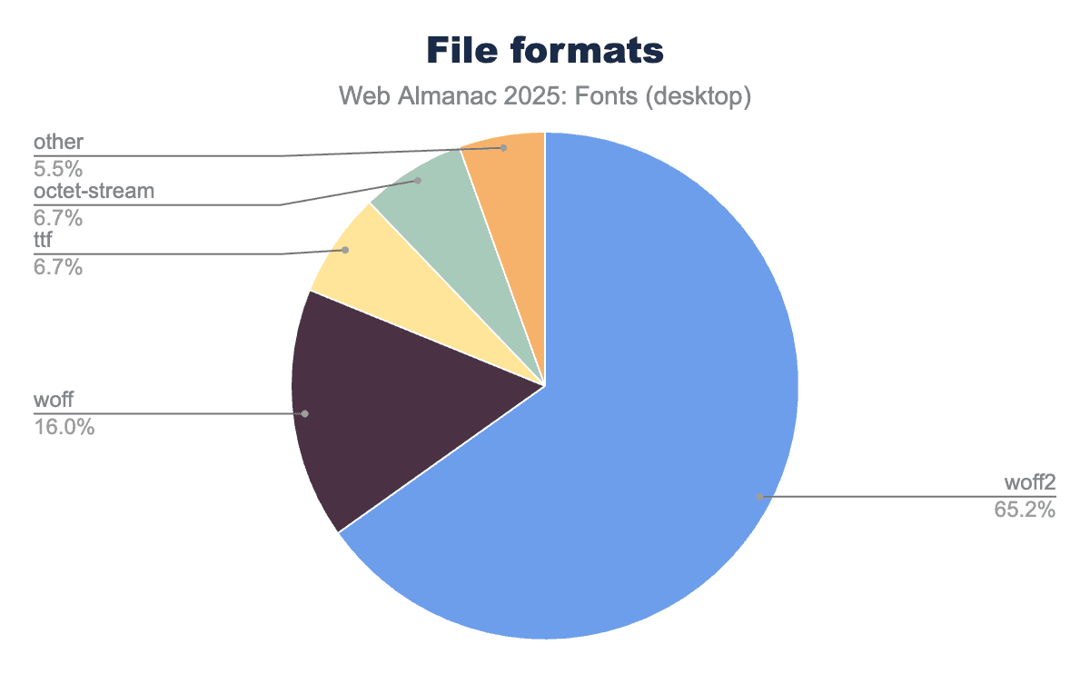
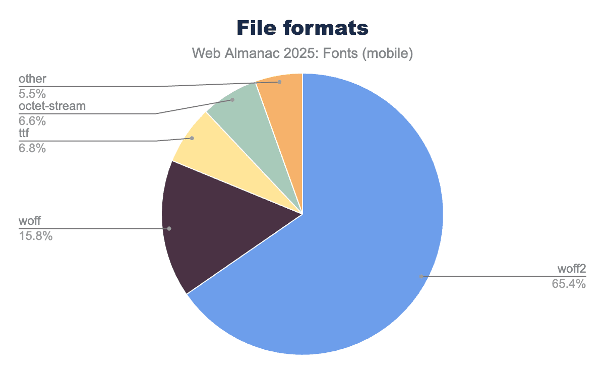
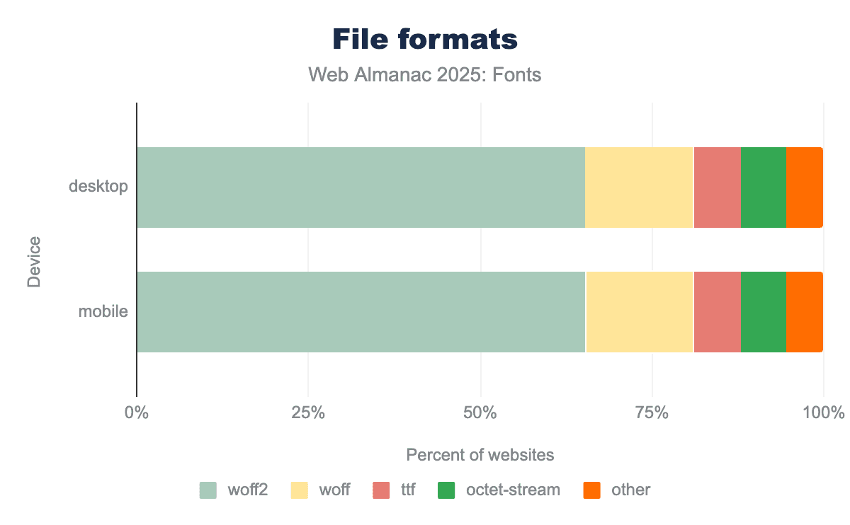
Right behind WOFF2 is the older WOFF 1.0 format, which remains a significant fallback. In 2025, WOFF 1.0 comprises about 16% of font requests on both desktop and mobile. Combined with WOFF2’s 65% share, the two WOFF formats together account for about 81% of all font requests. This reflects an ongoing consolidation around WOFF2 as the primary format, with WOFF 1.0 hanging on mainly for legacy and compatibility cases. More sites and font providers are phasing out WOFF in favor of WOFF2, since nearly all use cases are covered by WOFF2’s broad browser support now. WOFF was a great improvement back in the early 2010s when it was introduced, but today it’s largely a legacy fallback—used mainly for older browsers or by sites that haven’t updated their font files in a long time.
Beyond WOFF and WOFF2, only minor formats remain, mostly as edge cases. As we note below, the arrival of Incremental Font Transfer technology next year may be an especially valuable improvement for large fonts and begin to cut into WOFF2’s share. Still, a notable percentage of fonts are still served as raw TrueType (.ttf) files. In 2025 about 6.7% of font requests are TTF, often due to CDNs or self-hosting setups that serve the original font file without repackaging it as WOFF. Similarly, around 6.6% of font requests are delivered with the generic application/octet-stream MIME type. Note that octet-stream isn’t a distinct font format—it usually indicates a misconfiguration where the server isn’t specifying the proper font MIME (e.g., a WOFF2 file might be served with Content-Type: application/octet-stream instead of the correct font/woff2). In 2025, this misconfigured MIME issue unfortunately persists—roughly 6-7% of font files are still being sent with an incorrect MIME type. This is largely attributable to a few major hosts (in last year’s analysis, cdnjs and Wix’s CDN were notable culprits) that have configuration issues. It’s a small but noteworthy slice, as using the correct MIME type (like font/woff2 or font/woff) ensures better content handling and debugging.
Crucially, if we combine the modern formats, WOFF2 + WOFF together account for over four-fifths of the web font ecosystem. Other formats like OpenType/CFF (.otf) or SVG fonts have effectively vanished from the public web (despite being very much alive on the desktop), and EOT (the old IE-specific format) is practically extinct. Back in 2020, the Web Almanac already noted that SVG and EOT were nearly gone, and that trend has only continued. It’s now rare to encounter a non-WOFF font file in a typical site crawl. The overwhelming advice remains: use WOFF2 for your web fonts, and drop the older formats unless you have a very specific need. This year’s crawl data strongly validates this advice as we see virtually everyone converging on WOFF2, with WOFF as a trailing fallback, while everything else is negligible.
File sizes and performance
From a performance standpoint, using modern formats is important because font files themselves have been getting larger on average. Last year’s analysis found that the median web font file size increased considerably from prior years, implying that sites are using more complex fonts (e.g., fonts with more glyphs to support multiple languages, or variable fonts that bundle many styles). Our 2025 data shows that this trend toward larger font files has continued, making optimization even more critical.
Looking at the distribution of font transfer sizes on the web:
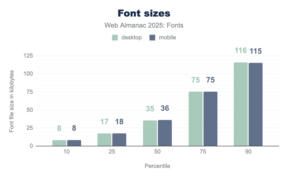
In 2024, the median font file size was around 36-39 KB (gzip-compressed), up from the low-30s KB a couple of years before. Now in 2025, the median remains in the mid-to-upper-30s KB range (mid-30s on desktop, slightly higher on mobile), indicating that typical font files haven’t grown much further in the past year, they’re holding at that larger size.
At the 75th percentile, 2024 font files were about 76-77 KB. In 2025, this is roughly similar (mid-70s KB). So three-quarters of web fonts are under 80 KB, which is still manageable especially with WOFF2 compression.
However, at the 90th percentile, 2024 saw font files around 112-116 KB. The 2025 crawl shows a similar 90th percentile in the 115-116 KB range. So, the top 10% of fonts are pretty large (well above 100 KB). These tend to be fonts for complex scripts (CJK fonts with thousands of glyphs), or full-featured variable fonts with many axes, or simply un-subsetted files.
The tail end of the distribution is very heavy: at the 99th percentile, desktop font files in 2024 were around 776 KB (and 572 KB on mobile). In 2025, the largest 1% of fonts we see are still in the hundreds of kilobytes. These are likely massive CJK fonts, icon fonts with embedded graphics, or fonts accidentally served with debug tables. It’s a reminder that while most fonts are reasonably sized, a few outliers can be extremely heavy.
The takeaway is that most websites serve moderately sized font files, but we have a non-trivial number of very large font files out there. This makes it important to use efficient formats and techniques. WOFF2 helps a lot by squeezing down file sizes, but if a font is half a megabyte uncompressed, even WOFF2 can only do so much. Techniques like subsetting (i.e., including only the needed glyphs) are essential for those very large fonts, especially for CJK or icon fonts.
While it’s encouraging that the prevalence of WOFF2 will help mitigate the performance impact of larger font files, we also found that sites which self-host fonts have more room to optimize on average. For example, in 2024 only about 58% of self-hosted font requests were WOFF2 (versus about 78-81% overall). Self-hosted setups had a larger share of WOFF (around 18-19%) and even some raw TTF (about 6%). This implies that some developers self-hosting their fonts might be using older files or not compressing to WOFF2, whereas big providers like Google will always serve WOFF2 if the browser supports it.
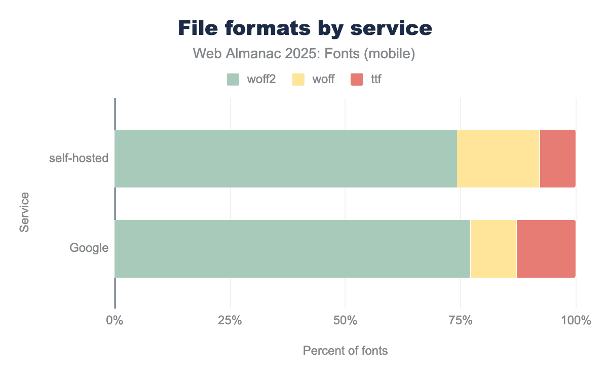
The 2025 data shows improvement—more self-hosters are moving to WOFF2—but there’s still a gap. It’s a reminder that if you self-host, you need to be diligent: ensure you have WOFF2 versions of your fonts and configure your server to serve them with the correct Content-Type. A significant portion of self-hosted font files in 2024 were served with misconfigured MIME types (5-6% as mentioned), which is something that developers can fix with a simple server tweak. The good news is that WOFF2’s dominance is growing across the board, just a bit more slowly in the self-hosted sphere than on Google’s platform. In essence, self-hosted sites are catching up, but they still lag slightly in terms of using the optimal format.
CSS techniques and font loading
CSS techniques and font loading are where typography actually becomes real: pages don’t just choose a font, they tell the browser how soon to connect to the font origin, which files to fetch first, and what to show while those files are in transit. In this section we look at those mechanisms—resource hints (preconnect, preload, and the fading dns-prefetch), the now-standard font-display patterns that split clearly between text and icon fonts, and the underlying outline formats.
Resource hints
Because web fonts can cause visual abnormalities through render-blocking or delayed text rendering, many sites use resource hints to optimize how fonts are loaded. The data shows a steady adoption of these hints, with some shifting as best practices evolve.
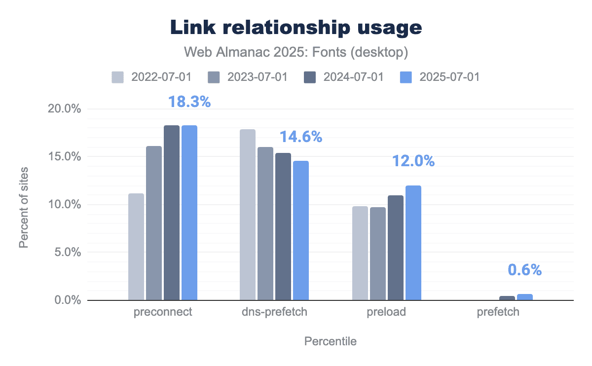
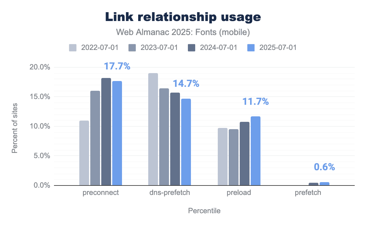
The most popular hint is still <link rel="preconnect"> (often used to preemptively open a connection to a font host). In the 2025 data, about 18.3% of desktop pages include a preconnect hint (virtually unchanged from 18.3% in 2024), and 17.7% of mobile pages do so. This plateau suggests that preconnect usage has leveled off after climbing in previous years. It’s a common technique, present on nearly one in five pages, which makes sense now that many performance conscious sites add preconnect for domains like fonts.googleapis.com or their own CDN.
Meanwhile, dns-prefetch (a lighter hint that only resolves DNS) has been trending downward. In 2025, we found about 14.6% of desktop pages using dns-prefetch for fonts, down from ~17.9% in 2022. Mobile is similar at 14.7%. This decline makes sense: once developers discover preconnect (which includes DNS resolution as part of establishing the connection), the separate dns-prefetch becomes less necessary. Many sites that previously used dns-prefetch have upgraded to using preconnect, which provides a more substantial optimization by also doing the TLS handshake early.
The preload hint has seen a quiet but significant rise. In 2025, we found about 12.0% of desktop pages using <link rel="preload" as="font"> for at least one font, up from about 11.0% in 2024. Mobile shows a similar increase (around 11.7% from last year). This indicates that more sites are explicitly preloading their critical web font files, rather than relying on the browser to discover them. Preloading a font can cut down on load delay because the browser starts fetching the font as soon as it sees the preload hint, instead of waiting for the CSS and then the font declaration. This technique is especially popular in performance-focused setups and is encouraged when font files are large or if you want to avoid FOIT (flash of invisible text).
Finally, prefetch remains a niche tool. It’s used on only about 0.6% of pages in 2025 (up slightly from ~0.5% last year). Prefetch is generally used to load resources that might be needed in the near future (like another route or page), so seeing prefetch under 1% aligns with it being a rather specialized hint for fonts. The small uptick could be from single-page application frameworks or aggressive optimizers that prefetch assets for subsequent pages.
In summary, preconnect and preload are the dominant font-loading hints in use for 2025, with preconnect appearing on roughly one-fifth of pages and preload on about one-eighth. This matches the decline of dns-prefetch as it gets replaced by preconnect, whereas prefetch is rare but slowly growing. This reflects the industry’s move toward stronger, more explicit loading signals: developers increasingly favor immediate actions (preconnect, preload) over speculative ones (dns-prefetch, prefetch).
Font display
The CSS font-display descriptor has effectively become standard practice in web font usage. Whereas a few years ago it was a “nice optimization” to consider, in 2025 most pages that use web fonts now also specify a font-display policy to control how text renders while fonts load. The data shows a strong preference for fast text rendering, with a clear split between text fonts and icon fonts.
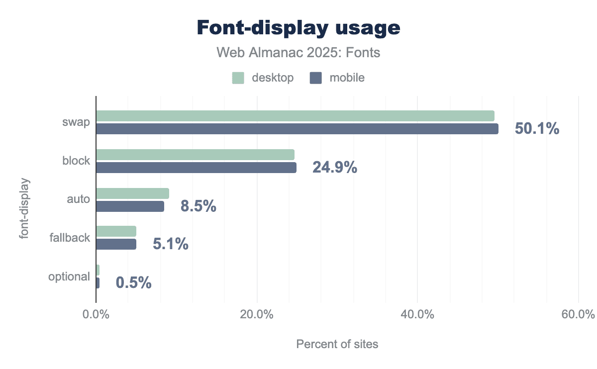
The most common choice is font-display: swap. It appears on about 49.6% of desktop pages and 50.1% of mobile pages in our 2025 crawl. In other words, about half of all pages using web fonts now specify font-display: swap for at least one font. This value ensures text is displayed immediately using a fallback font and then swapped to the web font when it finishes loading. The popularity of swap aligns with web best practices (it’s recommended by Google Fonts and many experts). Essentially, it’s now the default mindset for text content: developers prefer a quick first paint of text, even if it’s in a fallback font for a moment.
Next, font-display: block is the second most common value, on about 24.7% of desktop pages and 24.9% of mobile pages—roughly half the prevalence of swap. By definition, block hides the glyphs briefly while the font loads, which could look risky if we assumed it was being used mainly for body text. But the data shows that about 70% of real-world font-display: block usage comes from icon font styles (Font Awesome, theme icon sets, etc.), where authors intentionally prefer a short delay to missing icons. In those cases, block is doing exactly what it’s supposed to do: prevent broken UI rather than optimize for first text paint. So, virtually all the block usage is not from body text fonts, but from UI iconography that needs to either render fully or not at all. This pattern was a “surprise” finding in the 2024 chapter, and the 2025 data confirms it: the prevalence of block is not because many developers prefer invisible text for content, but because icon kits still ship with block as the default to prevent missing icons.
Beyond swap and block, the other values are much less common. font-display: auto (which defers to the browser’s default behavior) is used on 9.1% of desktop and 8.5% of mobile pages. This share is shrinking as more people explicitly set a value. We also see font-display: fallback (which allows a very brief invisible period and then always swaps) on about 5.1% of pages. This value is sometimes favored by developers who want text to swap quickly but still give a small window for critical fonts to load. Finally, font-display: optional remains a rarity, with only about 0.4-0.5% of pages using it. The optional value is the most aggressive for performance (often it will not swap at all if the font isn’t loaded immediately), and it’s typically used only by performance-sensitive sites or highly specific typographic setups.
Looking at individual font families and their font-display behavior reinforces these conclusions. The most commonly loaded text fonts (e.g., Roboto, Open Sans, Montserrat, Poppins, Inter, Lato) are overwhelmingly served with font-display: swap in their @font-face rules. For example, Roboto with swap shows up on about 12% of pages, Open Sans with swap on about 8%, etc. Conversely, the fonts we see with font-display: block are predominantly icon kits. Font Awesome’s CSS (which by default uses block) was observed on about 17% of pages, while other icon fonts like ETmodules, IcoMoon, and Bootstrap Icons also contribute with block usage in the low-single-digit percentages. A small segment of text-oriented sites use font-display: fallback (for instance, some sites using Inter or certain serif fonts deliberately set fallback to balance flash of unstyled vs. flash of faux-bold text). But hardly any sites use block for regular text fonts.
The modern best practice is clearly reflected in the numbers: about half the web uses swap to ensure quick text rendering, and the quarter that uses block is mostly doing so for non-text glyphs. The remaining quarter either has not specified a font-display (thus using browser default) or is trying specialized strategies (fallback/optional). Compared to 2024, these proportions are essentially unchanged: last year, swap was used around 50% and block about 25% of the time. This stability means the guidance from 2024 still holds: if you see font-display: block in a site, it’s likely an icon font. For almost all textual web content, developers today prefer swap for better UX.
Font outline formats
Another technical aspect of typography is the outline format (TrueType vs PostScript outlines) inside the font file. Most web fonts are either in TrueType (glyf table) format or CFF (Compact Font Format) outlines, regardless of the container. The data from 2022-2025 shows the web has overwhelmingly standardized on TrueType outlines.
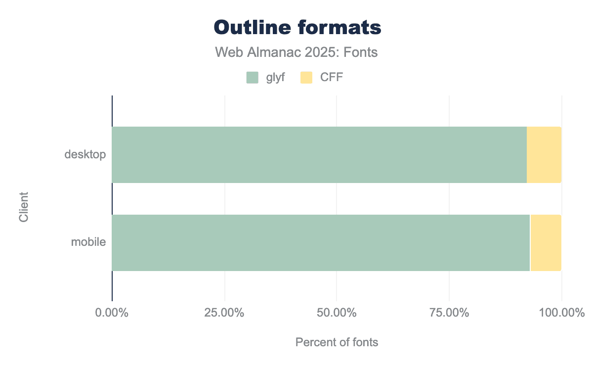
This year, about 92-93% of fonts loaded on the web were using TrueType outlines (the traditional quadratic Bézier “glyf” table). This is up slightly from about 90% in 2022. In contrast, PostScript/CFF outlines (the cubic Bézier outlines often found in .otf fonts) have declined to around 7% of web fonts (down from ~9-10% a few years ago). Modern web font services and foundries often provide TTF/WOFF2 even for fonts originally designed as PostScript outlines, because TrueType can have performance or size advantages for certain use cases (especially when not hinting with bytecode).
Everything else is a tiny fraction. CFF2 (the newer variant used for variable fonts with PostScript outlines) is almost nonexistent in the wild, showing up in 0.01-0.02% of fonts. SVG glyphs (fonts with SVG tables, often color fonts) are also in the very low fractions of decimals. Essentially, outside the specialized case of color/emoji fonts, web developers don’t need to worry much about these—they’ll virtually always be dealing with TrueType-based fonts, with a minority of CFF outlines still around, especially from older packages.
Hyphenation and justification
Proper text layout involves breaking lines in the right places for readability. Browsers by default use a greedy line-breaking algorithm which can lead to uneven spacing or “rivers” of whitespace in justified text. Instead, we can use hyphenation (to break words) and the newer CSS properties for improved line breaking (text-wrap: balance or pretty). Let’s see how these are being used.
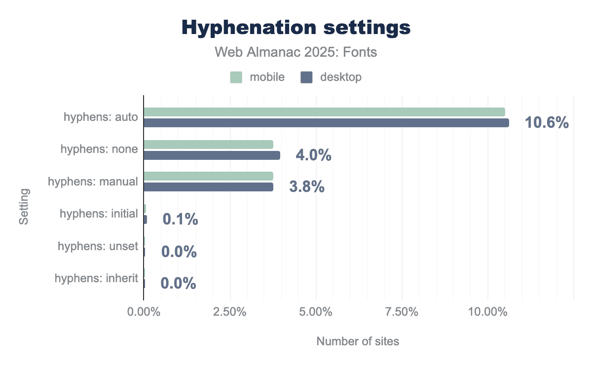
hyphens: auto property is the most popular choice, implemented on roughly 10.6% of sites. Other explicit settings like none and manual see significantly lower usage, hovering around 4% and 3.8% respectively. Across all categories, the data shows nearly identical implementation rates for both mobile and desktop users.First, let’s talk about hyphenation (CSS hyphens property). By default, browsers only hyphenate text if certain conditions are met (like lang is specified and the words are long, etc.), and some (like Chrome) might not hyphenate at all unless told. The hyphens: auto property allows automatic hyphenation when needed. In 2025, only about 10.5% of pages globally use hyphens: auto in their CSS. That’s up a bit from previous years, but still quite low. This suggests that roughly one in ten sites explicitly enables hyphenation (usually to improve justified text or narrow column text).
On the other hand, about 3.8-4.0% of pages have hyphens: none or hyphens: manual set (often by resets or frameworks). This is usually done to ensure no automatic hyphenation (for example, some designers prefer to avoid hyphens in titles or certain components, or older CSS resets set hyphens: none to avoid any unexpected breaks).
Combining these, roughly 14-15% of pages mention the hyphens property at all. The vast majority (85%) do not touch it, effectively leaving it to the browser default (which for many languages means no hyphenation). So, hyphenation is far from universal, likely because it has to be used carefully (with correct language tagging and expectation of varying browser support), and not all content benefits from hyphenation (it’s mostly a concern for justified text or narrow columns).
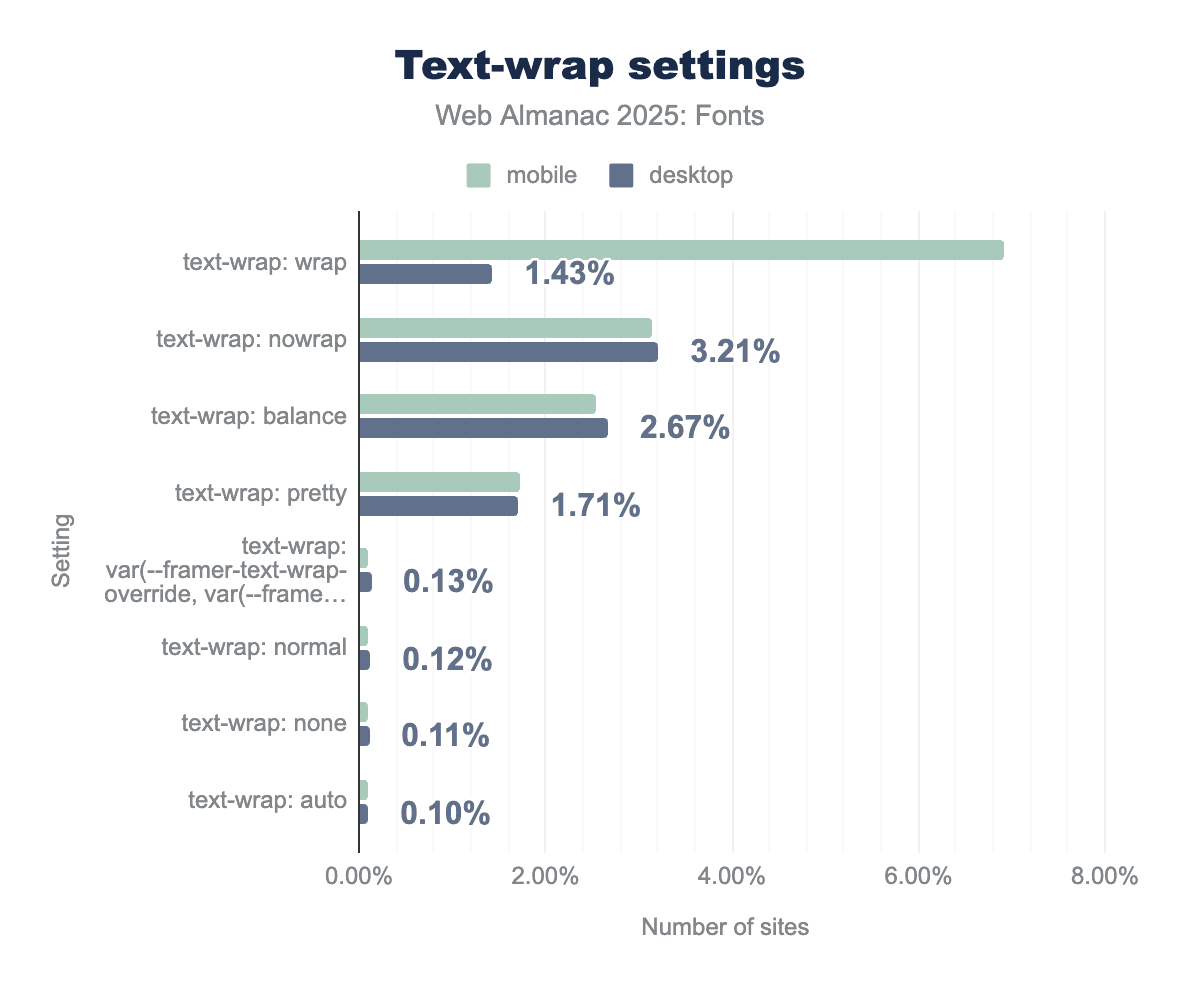
text-wrap: wrap property shows the highest usage overall, specifically surging to nearly 7% on mobile devices compared to less than 2% on desktop. Other advanced typographic controls like nowrap, balance, and pretty each account for roughly 1.7% to 3.2% of sites, showing more consistent implementation between the two platforms.Text wrapping and line breaking (CSS text-wrap property): CSS Text Module Level 4 introduced text-wrap: balance and text-wrap: pretty to help browsers distribute text more evenly. These are fairly new (only recently supported in some browsers like Safari and Chromium-based ones). Their adoption, while small, is telling of an emerging best practice for multi-line headings and such.
On desktop sites, about 2.7% of pages use text-wrap: balance. On mobile, about 2.5% do. This property attempts to make lines roughly equal length (great for multi-line titles). It’s impressive to already see it on about 1 in 40 pages given how new it is. This likely reflects quick adoption by frameworks or large sites for their hero sections.
The text-wrap: pretty property (which allows a bit of looseness in spacing to avoid very short words and other funny placements) is on about 1.7% of pages (both desktop and mobile). This is slightly lower than the balance property. Pretty is more for paragraphs, to avoid harsh breaks, and might be used selectively where full justification or certain line-breaking issues occur.
Interestingly, on mobile, text-wrap: wrap (which is the default normal behavior) appears explicitly on about 6.9% of pages. This could be due to frameworks restating it, or toggling from balance back to wrap for smaller screens. And text-wrap: nowrap (to prevent wrapping within an element) is used on about 3.1% of mobile pages and 3.2% of desktop pages, often to keep things like buttons or logos on one line.
The relatively higher usage of nowrap and explicit wrap on mobile indicates that controlling line breaks is particularly important on small screens (e.g., preventing awkward wraps in tight UI elements).
The hyphenation and text-wrap features together paint this picture: A minority of sites are really taking fine-grained control of text rendering (these likely include news sites, carefully designed editorial sites, or app-like interfaces). Those sites use hyphenation and balanced wrapping to improve text blocks. The majority of sites still rely on the default (which is non-hyphenated, greedy line breaks).
For justification specifically: If a site sets text-align: justify (which some do, especially for article content), ideally they should also use hyphens: auto and perhaps text-wrap: pretty to avoid large gaps. We see that not many do so yet, which means a lot of justified text on the web probably has suboptimal spacing. The tools exist (hyphenation, balance, pretty) but adoption is lagging. Part of that is browser support (these are somewhat cutting-edge properties), and part might be lack of awareness.
Lastly, properties like hyphenate-character (to specify a custom hyphen glyph) or hyphenate-limit-chars (to avoid hyphenating very short words) seem to be essentially unused—we saw negligible usage of those properties, which are very fine tweaks that few authors go into. Most just accept the browser defaults.
So, hyphenation is slowly growing but still used by only about 1 in 10 sites, and new line-wrapping options are emerging—a few percent of sites are already using balanced line wraps for nicer titles. We expect these numbers to rise as responsive design and multi-line layout techniques push developers to seek better control.
Families and foundries
This section looks at the supply side of web typography. First we trace which fonts and foundries actually get declared in CSS, then we look at the role of system and generic stacks, and finally we follow the metadata back to foundries, designers, and licenses to see what’s most prevalent for users across the web.
Popular font families
Which font families are web designers actually using? By examining the CSS of pages, we can see which font-family names are most frequently declared. The results for 2025 show a mix of ubiquitous icon fonts, widely-used web fonts, and system font fallbacks.
The single most common font family seen in CSS is still Font Awesome (a leading icon font). It’s declared on about 8.5-9.3% of pages in our dataset. This high prevalence is because many sites include Font Awesome’s CSS (even if they use only a few icons from it), and some popular frameworks bundle it by default. Font Awesome being at the top underscores that developers frequently rely on icon fonts for UI icons, although this might change as inline SVG icons continue to rise.
Right behind are the usual text workhorses from Google Fonts and similar libraries. Roboto is declared on about 10-10.7% of pages, making it the second most popular family overall. Poppins (5.8-6.0% of pages) and Open Sans (5.0-5.6%) follow. These Google Fonts staples are top choices for sans-serif body and UI text on the web. Next is Montserrat (around 3.3-3.9% of pages), growing in popularity for headings and branding in recent years. One notable climber is Inter, which is now on roughly 1.4-1.5% of pages. Inter is a highly regarded open-source font for UI design, and its rise in usage reflects adoption by many modern frameworks and designers. We can also see other familiar names like Oswald, Nunito, and Raleway on a few percent of pages.
The main takeaway is that icon fonts and a few versatile sans-serifs dominate the CSS landscape. Font Awesome’s prominence in CSS (even if not all sites using it render an icon to the end user) shows how frameworks can drive adoption. Among text fonts, Google’s open-source offerings (Roboto, Open Sans, Montserrat, Poppins, Lato, etc.) continue to lead by a large margin—no surprise, as they’re freely available, widely known, and cover many languages. We also see evidence that new open-source fonts (like Inter) can still break into the mainstream when they fulfill a need (in Inter’s case, optimized for screens and very complete in features).
Generic and system fonts
Despite the prevalence of custom web fonts, system fonts and generic family names remain a bedrock of web design, especially for performance and native look-and-feel. Many sites specify system font stacks or fallbacks for body text or UI elements. The data from 2025 highlights how common these are:
| Family | Desktop | Mobile |
|---|---|---|
sans-serif |
89% | 89% |
monospace |
64% | 63% |
serif |
47% | 48% |
system-ui |
10% | 9% |
ui-monospace |
4% | 4% |
ui-sans-serif |
4% | 4% |
cursive |
3% | 3% |
The generic sans-serif is by far the most common family name in CSS (as a fallback at the end of font-family lists). It’s included on about 89% of desktop and mobile pages. Essentially, nearly every site has a line in its CSS that ends with sans-serif (or starts with it in a system font stack), to ensure there is always a default font. The generic monospace is also extremely common (seen on ~64% of pages) because developers often set monospaced fonts for code snippets or preformatted text. The generic serif appears on roughly 48% of pages, likely as a fallback for headings or when a serif design is desired.
What’s more interesting is the rise of platform-specific generics like system-ui. The system-ui value (which maps to the operating system’s UI font, like San Francisco on macOS/iOS, Segoe UI on Windows, Roboto on Android, etc.) is now used on about 9.7% of pages (desktop) and 9.3% (mobile). This is a significant uptick—these values barely registered a few years ago. Adoption is largely driven by modern CSS frameworks and design systems that aim for a “native app” aesthetic or which defer to the user’s default UI font for performance reasons. Similarly, the newer generic ui-monospace (the system’s default monospaced font) is used on ~4% of pages, and ui-sans-serif on ~3.5%. These numbers indicate that a non-trivial subset of sites (around one in ten) are explicitly choosing system fonts for their text, often for speed and consistency with native apps. This matches trends with sites like GitHub and Medium using system fonts to avoid loading any web font for body text.
In summary, system fonts have typically been the unsung heroes on many websites. Developers often use a hybrid approach, system fonts (or at least a safe generic fallback like sans-serif) for most UI text, and then load a few custom fonts for branding or headers. The generic sans-serif, serif, and monospace are ubiquitous as fallbacks, and the system-ui family and related ones are now more prominent in many CSS frameworks.
Font foundries
If we look at the @font-face metadata to see which foundries or vendors are credited with creating the fonts, we find that the majority is served by a small number of foundries—plus a large chunk of uncredited fonts—with a long tail of others in the low percentiles.
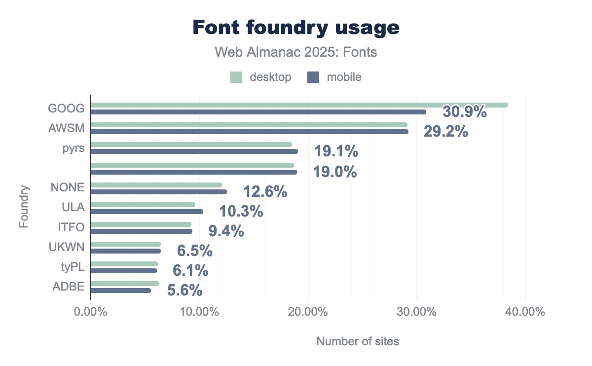
GOOG) leads as the most prominent foundry, utilized by over 30% of sites, followed closely by Font Awesome (AWSM) at roughly 29%. Other notable contributors include pyrs and ULA, while Adobe (ADBE) represents a smaller portion of the market at approximately 5.6%. Consistent with other typographic data, there is very little variation between desktop and mobile usage, indicating that foundry choice is typically a site-wide design decision rather than one tailored to specific devices.By page coverage, the top “foundry” labels on the web are:
-
Google, which is listed as the foundry for about 34% of websites using web fonts. This makes Google (via Google Fonts) the largest single source of fonts by far. This is largely due to Google’s funding of open-source designs by independent designers.
-
Font Awesome (AWSM), which is credited on roughly 29% of websites. This is the second largest share (trailing Google by ~5 percentage points) and entirely due to the ubiquity of the Font Awesome icon font. It’s a bit unique since Font Awesome is an icon set (the foundry “Dave Gandy” could also be cited, but often the font metadata uses “Font Awesome” or “AWSM” as foundry).
Together, Google and Font Awesome-affiliated fonts appear on about two-thirds of all pages, which is enormous. After those two, the next biggest category is actually unattributed or custom fonts. Around 19% of pages have fonts with no foundry specified (“UNSPEC”) and another 12% list “none” or a generic value for foundry. In total, well over a quarter of fonts lack clear foundry info in their metadata. This chunk likely represents custom self-hosted fonts, smaller foundries, or fonts where the naming wasn’t standardized.
Among identifiable foundries beyond Google and Font Awesome, a few stand out: “pyrs” (Fontlab) is listed on ~17% of pages (this is a label often associated with open-source icon sets or certain CJK fonts, and might need normalization from multiple case variations). ULA (for Julia Ulanovsky, the designer of Montserrat) is around 10%. Indian Type Foundry is around 9%. ADBE (Adobe) is around 6%. These numbers are on the same order of magnitude as last year, with some slight reordering due to how fonts like Noto are attributed. For example, Noto fonts were a collaboration between Google and others, so some of these collaborative fonts now show up under Adobe’s foundry code, slightly boosting Adobe’s share compared to last year’s method of counting.
In short, attributions for fonts on the web now fall to Google, Font Awesome, a few dozen publishers of popular fonts, plus a big anonymous middle. About 30% or so of fonts have unclear or no foundry info. The rest is split among a “who’s who” of active web font foundries: Indian Type Foundry (which has released many popular fonts via Google), independent designers grouped under foundry tags like “pyrs”, and a smattering of commercial foundries like Adobe, Monotype, etc. This distribution underscores the influence of Google Fonts as a purveyor of open-source fonts and the widespread use of Font Awesome, while also reminding us that a large portion of web fonts come from the broader open-source community or custom kits where attribution isn’t strong.
Font designers
Many font files include the name of the type designer(s) in the metadata. By tallying those, we can see whose work is most prevalent on the web (keeping in mind that many fonts don’t list a designer at all in the metadata).
| Designer | Desktop | Mobile |
|---|---|---|
| 78.3% | 76.7% | |
| Dave Gandy | 13.6% | 13.8% |
| Adrian Frutiger | 1.5% | 1.6% |
| Jan Kovarik | 1.5% | 1.4% |
| Rasmus Andersson | 1.2% | 1.2% |
| Linotype Design Studio | 1.0% | 1.2% |
| 1.1% | 1.1% | |
| Julieta Ulanovsky | 1.0% | 1.1% |
| Mark Simonson | 0.9% | 0.8% |
| Commercial Type, Inc. | 0.4% | 0.7% |
The data shows that most web fonts do not specify a designer. Approximately 77-78% of pages use at least one font that has no designer listed in its metadata. This could be due to omission or because the font is attributed to a foundry or project rather than individuals. That huge blank category means we should take the “designer rankings” with a grain of salt—it’s a partial view.
That said, one name dominates the credited share. Dave Gandy is the creator of Font Awesome, and his name appears on about 13.7% of pages (basically every page that self-hosts Font Awesome and has the designer field populated). This makes him by far the most visible type designer on the web (in metadata terms) because of the prevalence of his icon font. It’s an interesting quirk: it’s not that web developers are consciously choosing “a Dave Gandy typeface” for aesthetic reasons, but rather that one highly successful toolkit has put his name on millions of sites.
Beyond that, there’s a cluster of well-known type designers whose names each show up on around 1% of pages (give or take a few tenths). These include classics like Adrian Frutiger (1.5%) thanks to Univers and the eponymous Frutiger typeface, Rasmus Andersson (1.2%, the designer of Inter), the generic label “Google” (1.1%, used on some Google fonts when a specific designer isn’t credited), Linotype’s design studio (1.1%), Julieta Ulanovsky (1.0%, designer of Montserrat), and Mark Simonson (0.9%, designer of Proxima Nova among others).
These numbers reflect the web’s most popular fonts: Montserrat carries Ulanovsky’s name, Inter carries Andersson’s, Proxima Nova carries Simonson’s (though Proxima via Adobe might not list him, depending on the kit metadata), and so on. We also see names like Łukasz Dziedzic (designer of Lato, most likely showing up under multiple spellings) in the longer tail, and other contributors to Google font projects and major foundries. Each of these shares, however, is below 1% individually.
The key point is that designer attribution on the web is very sparse and highly skewed. One icon font author overshadows the stats due to a utility tool’s popularity. The rest of the visible designer attributions reads like a mix of famous 20th-century type designers (Frutiger, etc.), creators of the most popular open-source fonts (Andersson for Inter, Ulanovsky for Montserrat), and large foundry teams (Linotype, Monotype, etc.). It’s a testament to how fonts are distributed on the web: often the platform (Google, etc.) or foundry is front and center, and individual creators aren’t always named unless they’re attached to a big project that retains their name.
Font licenses
Font files often include a license URL or identifier in their metadata, which we can use to gauge what licenses are common on the web. The caveat here is that about half of fonts don’t clearly specify a license in a parseable way. With that in mind, the data suggests that open source licenses completely dominate web fonts.
| License | Desktop | Mobile |
|---|---|---|
| OFL | 64% | 65% |
| 49% | 50% | |
| Font Awesome | 13% | 13% |
| Apache | 21% | 8% |
| Adobe | 5% | 4% |
| Monotype | 4% | 4% |
By far the most common license is the SIL Open Font License (OFL). Around 64% of websites in our sample use at least one font under the OFL. This isn’t surprising, as the OFL is the license used by the majority of Google Fonts and other open-source font projects. It essentially allows free use, modification, and redistribution of the font as long as the name is changed upon modification. The prevalence of OFL fonts means that nearly two-thirds of sites are using open-source fonts.
The next big “license” category is actually no license specified. On roughly 50% of pages, at least one font had a blank or unrecognized license field. This could mean the font is a custom one with no metadata, or a commercial font where the license isn’t embedded (as often happens), or even some data entry as “unknown”. It’s a reminder that a lot of font use on the web isn’t easily traceable by license in the file—but likely many in this bucket are proprietary fonts that just don’t declare their license in the @font-face (since web designers might not always fill that out).
The Font Awesome license (a proprietary/open license hybrid) is present on about 13% of pages, aligning with Font Awesome’s usage numbers. Adobe’s font license (for fonts via Adobe Fonts) shows up on about 4-5% of pages, which also matches Adobe’s usage share. Similarly, Monotype’s typical EULA covers about 4% (though many Monotype fonts on the web might appear as “no license” if self-hosted).
Aside from those, the Apache License (another open-source license used by some older Google Fonts and other projects) is the second most common explicitly listed license after OFL, reinforcing that open licenses are the norm. Interestingly, there’s a desktop/mobile split: it’s higher on desktop crawls (~21%) and lower on mobile (~8%), possibly due to certain fonts or frameworks being more common on desktop sites.
Beyond these, it’s a long tail of specific foundry and vendor licenses: we see markers for Commercial Type, Typotheque, Hoefler&Co (Typography.com), Dalton Maag, and Naver (for some Noto Sans CJK distributions) on less than 1% of pages each. These indicate specific use of commercial font libraries on certain sites, but for the most part, the web runs on open font licenses.
Global language support
The web is increasingly global, and so the web’s typography must support the world’s many writing systems. While Latin script is still the most commonly supported writing system in web fonts, other scripts are steadily rising thanks to the efforts in recent years to create and distribute fonts for them.
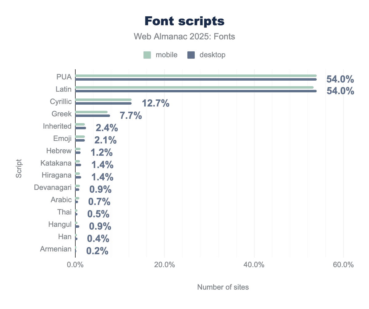
In 2025, just over half of all web fonts include Latin characters (around 54% of fonts in our dataset). Since Latin is included in most multi-script fonts, this essentially means any font intended for European or American audiences is counted there. Alongside Latin, about 54% of fonts also include the Unicode Private Use Area (PUA), which is where icon fonts and custom symbols reside. The prevalence of PUA indicates (once again) how many fonts on the web are actually icon sets or have embedded icons (Font Awesome, theme icon fonts, etc., all map to PUA).
After Latin, the next most common script is Cyrillic, supported by roughly 12-13% of web fonts. Cyrillic’s share has grown a bit (it was about 7% in 2022 and 10% in 2024), reflecting more fonts covering languages like Russian, Serbian, and Ukrainian. Greek coverage is present in about 7-8% of fonts, up from a few years ago as well. These extensions often come together because many extended character sets have Latin, Latin-extended, Cyrillic, and Greek in one file.
The presence of CJK (Chinese, Japanese, Korean) scripts is visible but more modest than their populations might suggest, mainly due to file size concerns. Japanese writing systems show up via Katakana (around 1.3-1.4% of fonts include Katakana characters) and Hiragana (similarly about 1.3-1.4%). Additionally, Han ideographs (the characters used in Chinese and Japanese writing) appear in about 0.4% of fonts. The Han percentage is small because full Chinese/Japanese font files are huge and relatively few sites serve them fully. Often, sites will rely on system fonts for those or use subsets (the Katakana/Hiragana presence suggests some Japanese fonts or subsets are being used). Korean Hangul syllabary is included in about 0.9-1.0% of fonts. While these numbers seem small, they represent the fact that some open-source CJK fonts (like Noto Sans JP, Noto Sans KR, etc.) are being used—a significant change from a decade ago, when hardly any websites served CJK web fonts due to size.
Other scripts with notable presence: Hebrew appears in about 1.2% of fonts (there are a number of Hebrew web fonts now, both via Google and self-hosted). Arabic script is supported by roughly 0.7% of fonts on desktop and 0.9% on mobile—a slight rise, possibly as mobile-heavy regions use more web fonts. Devanagari (used for Hindi and other languages in India) is present in just under 1% of fonts. Thai characters are seen in about 0.5% of fonts. Armenian and Georgian are each in the 0.2-0.3% range. Other South and Southeast Asian scripts like Gujarati, Gurmukhi, Tamil, Lao, Khmer each register below 0.1% of fonts.
So, while many scripts outside the Latin alphabet are used by under 2% of fonts, collectively they indicate broader adoption. The key trend is that the dominance of Latin-only fonts is slowly decreasing. More fonts are multi-script or targeted at other writing systems. A lot of this expansion in global language support is thanks to open-source font projects. For example, the significant Japanese and Korean usage can be attributed to open fonts like Noto Sans/Serif JP, Nanum Gothic, and Noto Sans KR, which have made high-quality CJK fonts freely available. In 2024, we noted that all of the top 10 web font families in Korean were open-source, and that pattern continues, showing that when designers have access to free, well-crafted fonts for their language, they will use these fonts. Similarly, the top web fonts for Japanese were open-source (Noto, etc.), carrying a lot of weight across neighboring languages due to shared Han characters.
One caveat is Chinese (particularly Simplified Chinese): it still remains rare to see Chinese-specific web fonts in use (the data above shows very low Han usage outside of Japanese subsets). Chinese font files are extremely large if you include thousands of characters, so most sites still avoid self-hosting them. They either use system fonts or serve a very limited subset for maybe a logo or heading. So, while we see growth in Japanese and Korean web fonts, Chinese has not seen the same uptake, largely for performance reasons. As a preview of developments to come, the development of Incremental Font Transfer (IFT) promises to shift the performance dynamics that have hindered Chinese web fonts in the past. IFT will enable users to fetch only the characters needed to display a specific page, dramatically reducing file sizes for languages with large character sets. If standardized and widely adopted, IFT could make full-featured Chinese web fonts much more practical by cutting the effective cost of those large character sets. The same mechanism would also benefit large, multi-axis variable fonts more broadly, since IFT can avoid transferring unused glyphs and unused variation data, making rich variable typography cheaper to deploy at scale.
In summary, the web font landscape is gradually becoming more multilingual. Latin is still on roughly half of fonts (and nearly all sites need Latin, even if just for numbers or basic symbols). But the share of fonts supporting other scripts is expanding year by year. It’s a positive sign of increased localization and the fruits of efforts like Google’s Noto project and others that have provided fonts for under-served languages. For a developer, this means that if you need, say, a Devanagari or Arabic font for your site, there’s a decent chance an open web font exists and is being used by your peers. It also means that font file sizes and performance require attention from experimental developments like IFT, as multi-script fonts can be huge.
Advanced formats and features
As web fonts have expanded to cover more scripts and larger character sets, the next question is what we can actually do with these fonts. In this final section, we look beyond basic coverage to the advanced machinery inside modern font files—OpenType features, variable fonts, and color fonts—and how often developers are using those capabilities across the web.
OpenType features
OpenType features enable advanced visual styles like ligatures, alternate characters, old-style figures, and other details that signalled the hallmark of typographic craft in the print era. We can observe the adoption of these features through two approaches: whether fonts contain OpenType features, and whether sites are using those features via CSS.
First, looking at the fonts themselves: OpenType layout features are now the norm in web fonts. In the 2022 data, under half of fonts had an OpenType layout table (GSUB/GPOS). By 2024, it was a small majority (around 54% on mobile). In 2025, roughly 61-62% of distinct font files on the web include at least one OpenType feature table (like substitutions or positioning). This level of usage represents a clear majority of fonts, and it’s growing each year. It reflects that newer font files (especially open-source ones) are being built with full features included, whereas older, simpler fonts (or icon fonts) might not have them.
If we weigh OpenType feature adoption by usage (font requests), the share is even higher. By requests, well over 99% of font fetches are for fonts with OpenType features. This number suggests that the fonts without OpenType features tend to be niche or very low-usage (or icon fonts that count as many files but are a smaller share of traffic). Essentially, almost every font that users actually see on the web is capable of features like ligatures or kerning. Even if the site isn’t activating these features, the font file supports them.
So, many developers can assume OpenType features are available in the fonts they use (especially for text fonts). Only a minority (less than 4 out of 10 fonts, and shrinking) lack these tables, mostly older web-safe-ish fonts or specialized cases.
Now, which OpenType features are common in fonts? Among the fonts that have OpenType features, the most common ones are:
-
Kerning (
kern): about 44-46% of fonts include a kerning feature. This was only ~35-38% a few years ago, so its presence has increased significantly. It means many fonts rely on GPOS kerning (or have a kern table) to adjust spacing between specific pairs of letters. It’s a sign of quality and typographic refinement becoming standard. -
Standard Ligatures (
liga): Roughly 43% of fonts include this feature, which replaces sequences of characters (like “fi”) with a single ligature glyph. This huge jump from about 10% in 2022 now indicates that most new fonts are supporting ligatures (even if it’s just the basic ones). -
Localized forms (
locl): About 33% of fonts have this, which allows different glyphs for different languages (like Polish kreska accents or Turkish dotted i). This being one-third means many multi-language fonts have built-in local optimizations. -
Numerical features: Around 33% support fractions (frac), and about 25% support numerators (numr) and denominators (dnom) (for building arbitrary fractions). Tabular figures (tnum) and proportional figures (pnum) are each in roughly 20% of fonts. This is great to see—it means if you pick a random modern font, there’s a decent chance it has the fancy number alignments and fraction-building ability, which is useful for tables, financial data, etc.
-
Mark positioning (
markandmkmk): About 17% have basic mark positioning, and 14% have mark-to-mark. These are critical for Arabic, Indic scripts, and any accent stacking, such as Vietnamese characters. The fact that mark positioning is found in about 1/6 of fonts suggests the impact of complex scripts since it’s less common for Latin-only fonts to need a mark table. On the other hand, Google’s efforts to increase Pan-African support within many Latin fonts may also be boosting the presence of mark tables. -
Stylistic sets (
ss01,ss02, etc.) and alternates: These show up in the data at healthy but lower levels. ~12% of fonts have an ss01, and smaller percentages have ss02, ss03, etc., or a salt (stylistic alternate) feature. This corresponds to fonts that offer optional alternate designs for certain characters (like a different “a” or “g”). -
Caps and small caps: Features like smcp (small caps) or c2sc (caps to small caps) are present in some fonts (a few percent), reflecting more advanced typographic families.
-
Script-specific features: For instance, rlig (required ligatures, used in Arabic) and various Indic features (like abvs, blws for above-base, below-base substitutions) each appear in around 1% or less of fonts. That matches roughly the share of fonts for those scripts, which we discussed above.
Overall, this means web fonts are getting more sophisticated. Over half the fonts seen in this year’s web crawl have at least one OpenType trick up their sleeve, and many have a dozen or more. Common things like ligatures and kerning are now expected, not just special perks.
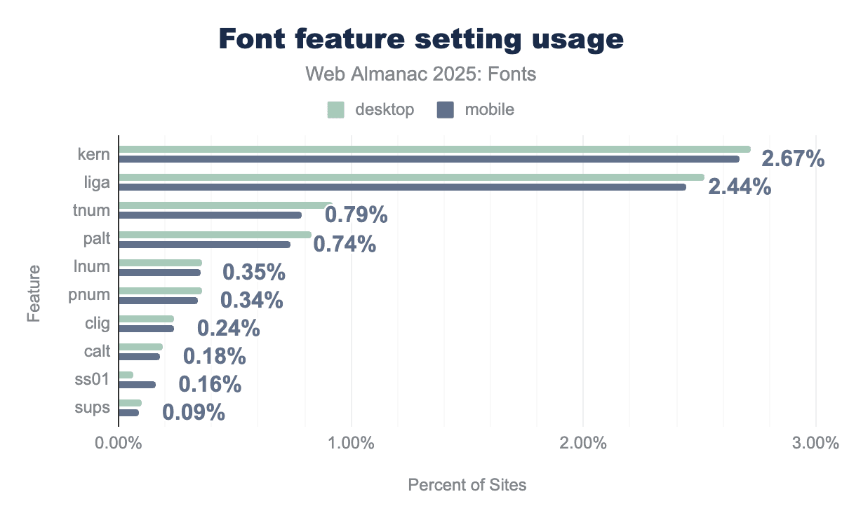
Now, are developers using these features in CSS? Many browser engines apply core features like liga and kern by default (unless turned off), so some features are used without the author doing anything. But authors can explicitly control features via CSS font-feature-settings or higher-level font-variant properties.
The usage of low-level font-feature-settings is relatively small in absolute terms. Only about 2-3% of pages manually set specific OpenType features through this property. The most commonly toggled features in CSS are kern and liga—likely because some CSS resets or frameworks ensure kerning is on or ligatures are on/off deliberately. In 2025, font-feature-settings: kern appears on roughly 2.7% of desktop pages, and liga on about 2.5%. After that, there’s a drop: tnum (tabular numbers) on ~0.8-0.9%, palt (proportional alternate width, used for some CJK spacing tweaks) on ~0.7-0.8%, and then things like lnum (lining nums) or pnum on ~0.4%. Stylistic sets (like ss01) or discretionary ligatures appear on only ~0.1% or less of pages via direct settings.
However, if we count pages that have any font-feature-settings usage (including those that might just set normal or include it via a library), that number is higher. Around 11-12% of pages have at least one font-feature-settings declaration. This suggests that many sites include some boilerplate or framework that touches font features (for example, setting font-feature-settings: "liga" 0 to turn off ligatures in certain cases, or some older kits enabling certain features).
In contrast, the more human-friendly font-variant CSS properties are used on about 5-6% of pages. The most common is font-variant-numeric, often used to request tabular numbers or old-style figures. For instance, font-variant-numeric: tabular-nums is seen on 3.2-3.3% of pages, and we see small usage of properties like font-variant-caps: small-caps (~1.5% of pages). A not insignificant number of pages (around 0.5%) use font-variant-ligatures: none to deliberately disable ligatures (commonly as part of a CSS reset or for monospaced code where ligatures are typically unwanted).
The trend here is that developers are gradually adopting OpenType controls, but not universally. Most rely on browser defaults (which usually handle the basics). A subset—roughly one in ten pages—includes some advanced tweaking, either via their framework or by hand. The most frequent intentional uses are aligning numbers (tabular vs proportional), explicitly enabling/disabling ligatures or kerning, and occasionally using small-caps. The fact that direct font-feature-settings usage is about double the font-variant usage might indicate that frameworks output the low-level syntax, or that for certain less common features (like stylistic sets) developers have no choice but to use font-feature-settings since a higher-level property doesn’t exist.
For day-to-day guidance: it’s good news that if a font has features like ligatures, they’re likely already working by default in browsers. And if you need special features (say, tabular numbers), a small but growing number of sites demonstrate how to use them via CSS. We expect that as more designers become aware of the fine typography controls available, these numbers will continue to rise.
Variable fonts
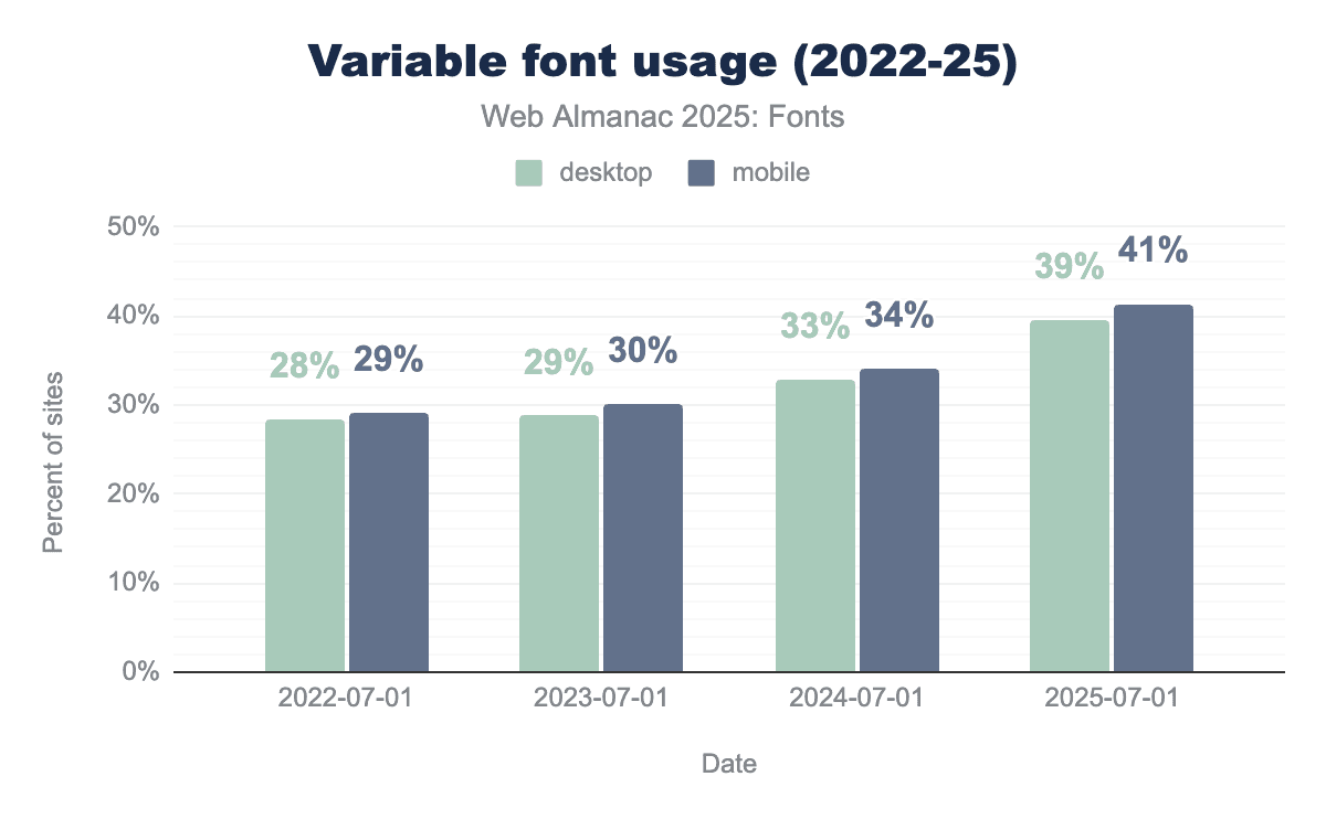
Variable fonts (which allow multiple styles such as weights and widths in one file) have moved from experimental to fairly mainstream in the past few years. The 2025 data shows continued growth in adoption.
How popular are variable fonts? This year, 39.4% of desktop websites and 41.3% of mobile websites used at least one variable font on their pages. In other words, now about 4 in 10 sites are using variable fonts. This is up from roughly 33% on desktop and 34% on mobile in 2024. The growth (~6-7 percentage points in a year) is steady and significant. Notably, mobile has consistently led desktop by a small margin in variable font adoption—possibly because mobile performance benefits more from combining font files, or because many modern mobile-first sites or PWAs have embraced variable fonts for their flexibility.
However, the usage distribution of specific variable fonts is very top-heavy. Just a few font families account for a very large share. The single most used variable font on the web remains Noto Sans JP (the Japanese sans-serif from Google’s Noto family). In 2024, Noto Sans JP was found on about 27% of all sites using variable fonts, and in 2025 it now appears on roughly 25-26% of pages using variable fonts. That makes Noto Sans JP the top variable font by reach—a testament to how many sites rely on this font in East Asia and globally for CJK content. After that, the next three biggest variable fonts are Roboto, Open Sans, and Montserrat. Combined with Noto Sans JP, these four families account for almost 60% of all variable font requests on both desktop and mobile. Specifically, Roboto is used on about 15% of variable font sites, Open Sans on 11%, and Montserrat on 7-8%. These are all available through Google Fonts in variable form, which explains their prominence (as Google started serving these as variable fonts by default).
Beyond the top four, we see a cluster of other notable variable fonts: Noto Sans KR (~5% of variable font sites, reflecting Korean usage), Noto Serif JP (~4%), Noto Sans TC (~2%), which are all part of the same Noto family for CJK scripts. Then popular Latin variable fonts like Inter (~3.3%), Raleway, Oswald, Playfair Display, Rubik, Roboto Slab, Google Sans, Nunito, each on 2-3% of sites that use variable fonts. This long tail shows that while many variable fonts exist, the ones being used at scale are mostly those that solve a big problem (like covering multiple scripts or multiple styles efficiently) and are easy to obtain (mostly open-source via Google).
It’s also interesting to observe how these variable fonts are being used. The common axes that are set in CSS on variable fonts provide insight: The weight axis (wght) is the most used by far—weight is explicitly adjusted on about 57-61% of pages using variable fonts. This indicates that most people use variable fonts basically to have multiple weights in one file (e.g., making text bolder or lighter at different breakpoints). The next most common axes, however, come from a specific variable font system: FILL and opsz (optical size) each appear on roughly 35-39% of variable font pages, while GRAD follows at about 27%. These correspond to the Material Symbols icon font (which has axes for glyph fill, grade, and optical size)—a widely used variable icon font by Google. So, a large portion of variable font usage is actually due to icons with multiple stylistic axes, not for text. Width (wdth) and slant (slnt) are the other main axes in use: slant is found on about 19% of desktop (24% of mobile) variable font pages, and width on about 17% of both. This suggests a smaller but solid fraction of sites are tweaking width or using intermediate slants (perhaps as replacements for true italics or responsive adjustments). All other axes (like custom design axes or many of the more granular axes in something like Roboto Flex) show up at under 5% or even 1% of usage—possibly even as noise from demos or very specific projects.
So in practice, variable fonts on the web are mostly being used for weight adjustments, and in some cases width or slant. The high showing of opsz, FILL, and GRAD seems to be an artifact of one popular icon font’s usage rather than a broad trend. The promise of variable fonts (fine-tuning typography with continuous variation) is supported by high levels of technical integration, but still in an early phase of creative exploration for most designers—many are using variable fonts as convenient multi-weight files, not yet as fully dynamic resources for typographic expression.
And then, variable font animation (using CSS transitions or keyframes on font variation properties) is extremely niche. Only about 0.3% of all pages in 2025 include an animation or transition involving variable font axes (either via the low-level font-variation-settings or via font-weight or other shorthands on a variable font). Even among just the pages that use variable fonts, that’s under 1% (around 0.7-0.8%) that do any kind of animation with them. The cases where it does happen are usually decorative, like a hero title expanding or contracting, or an icon button with a hover effect that changes weight. It’s not common presumably because it can cause layout shifts or just because not many have ventured into that design space yet.
Color fonts
Color fonts (a new technology offering fonts with multicolored glyphs, often for emoji or icons) have been an intriguing technology, but their adoption on the web remains extremely limited. The 2025 data shows a slight increase from an almost nonexistent base, but they’re still far from mainstream.
Only about 0.05-0.06% of websites observed in our crawl were using a color font. That’s on the order of 1 in 2,000 pages. This has grown from roughly 0.01% a few years ago—still a 5x increase, but tiny overall. In raw terms, we found color fonts on roughly 6,000-7,000 desktop pages and a similar number of mobile pages. So, while the usage has “multiplied,” it still resides in the territory of rounding errors compared to other figures in this report.
Why so low? A few reasons: Until recently, cross-browser support for the newer color font formats (COLR/CPAL v1) was incomplete. Authoring color fonts or finding use cases beyond emoji has been uncommon. And many potential uses (icons, symbols) have been served just as SVG or images instead.
Looking at the few sites that do use color fonts, what are they used for? The data shows that a vast majority of pages with color fonts are using them for emoji or specialized iconography. In fact, the most common color font by far is Noto Color Emoji (the Google/Android emoji font, which has multiple formats including COLR and CBDT bitmaps). Noto Color Emoji appears on about 73% of desktop pages that use a color font (and a majority of mobile color-font pages too). Essentially, most sites that use a color font are using it to render emoji with a consistent look, rather than relying on the OS emoji. After that, a substantial chunk is due to two Japanese color SVG fonts (used as decorative text in certain sites): those account for a respective 7% and 5% each of the color-font-using pages. Everything else is a long tail: Twemoji (Twitter’s emoji) on a few percent, some icon fonts with color layers, and a handful of decorative multi-color text fonts.
In terms of color font technology, there are a few formats: SVG-in-OpenType, COLR/CPAL (v0 and v1), and older bitmap fonts (CBDT/CBLC for Google’s bitmaps, sbix for Apple). The usage breakdown by font requests in 2025 is roughly 58-60% SVG, 25% COLR v0, 16% COLR v1, and a small couple percent for CBDT/sbix (bitmap). SVG being the highest is interesting—it’s actually because of those two Japanese fonts which are SVG-based and used on some high-traffic pages. COLR v0 (the first version of the layered vector glyph format) is used by many current color fonts (including some emoji sets and icon fonts). COLR v1, which allows gradients and is more compact for emoji, is new but already accounts for ~16%. This likely comes from updated emoji fonts like Noto Emoji COLR v1. The bitmap formats (CBDT for Google’s color emoji, sbix for Apple’s) are almost negligible now on the web—they were more for native apps.
Another notable phenomenon: Some color fonts include multiple formats for compatibility. For example, Noto Color Emoji might have both CBDT and COLR tables. This means counting by “families” can double count that font in multiple format categories. But from a usage perspective, COLR v1 is gaining traction with increased browser support (it’s much more efficient than SVG or bitmaps for emoji).
Color palettes within color fonts (where a font provides different preset color schemes) are not widely used. Over 95% of color fonts have either zero or one palette defined. That is, they have a fixed set of colors, or else rely on the default. Only a tiny fraction have multiple palettes (such as an emoji font that could switch skin tones or themes via the palette mechanism). And those color fonts that do have multiple palettes, often just have two or three at most. Most color fonts today are not aiming to offer thematic color switching—they just hard-code the colors needed. This is as it should be: the place for thematic switching is in CSS as font palette overrides, not in the font.
The number of color layers is also small for most color fonts used today. Many icon fonts might use just 2 colors (e.g., foreground and background). Larger numbers of layers appear only in full emoji sets (which can have hundreds of layers to construct all emoji characters).
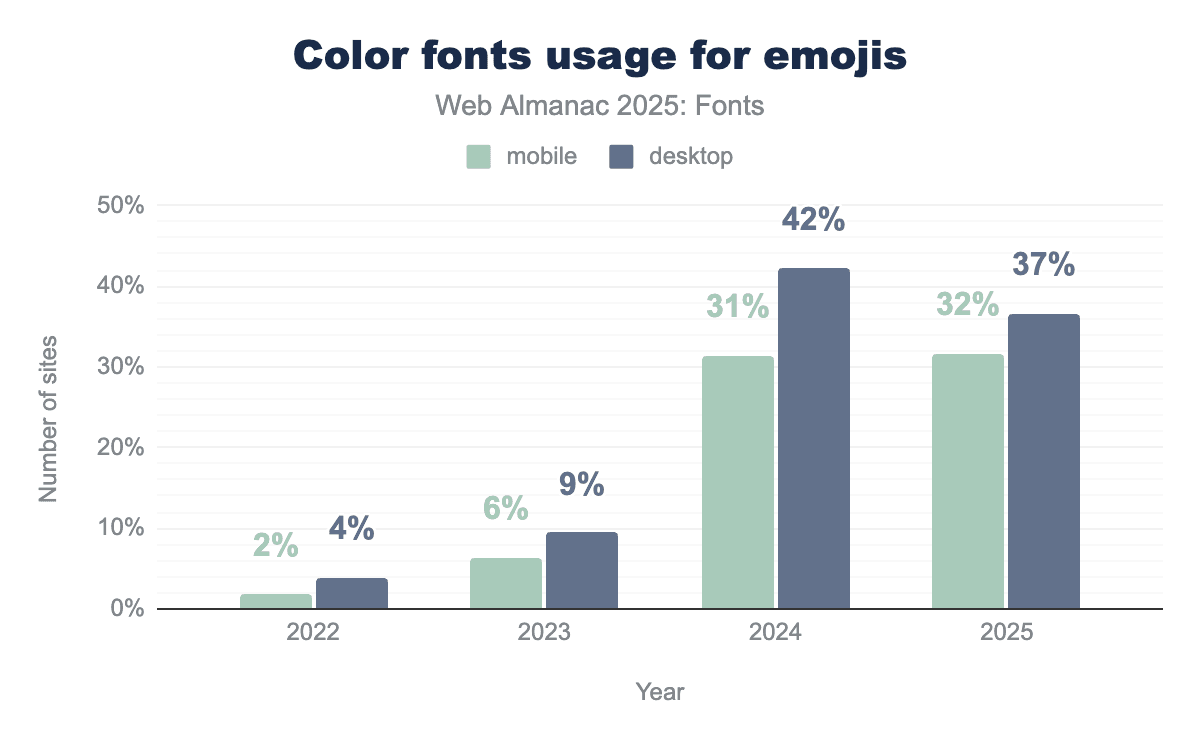
So, we can see that by volume, about 32-37% of color font requests are for emoji (this percentage went up in 2024 and slightly down this year as other uses grew). That trend means the majority (~63-68%) of color font requests are now for non-emoji uses (like those decorative CJK fonts, or multi-color icons). However, by page count, emoji fonts (Noto Color Emoji in particular) are still the principal use of color fonts. While some large platforms or sites may include Noto Color Emoji as a fallback, contributing to many pages, other color fonts might be used on a few pages but fetched many times (like decorative fonts on a site with many page views).
In 2025, color fonts remain a novelty on the web. They’re growing, but from a tiny base. Most developers either don’t need them, or else avoid them due to past support issues. The ones who do use color fonts are primarily ensuring consistent emoji rendering or doing something very custom (like a multi-color logotype or icon). As browser support stabilizes (COLR v1 is now supported in Chrome, Edge, and Firefox), we might see more usage—for example, some people might start embedding emoji fonts to have colored emojis that match across OSes. But for now, in terms of advanced formats, color fonts are hundreds of times less common than variable fonts on the web.
Conclusion
The state of web fonts in 2025 depicts a mature, nearly ubiquitous technology that’s continuing to see incremental improvements rather than major changes. Over the last decade, web fonts have gone from a fringe feature to an essential part of the web: almost nine out of ten sites use them, and that proportion grows slowly each year toward total saturation.
Several key trends observed in previous years have solidified:
-
Self-hosting versus services: Web font delivery is shifting slowly from services toward self-hosting. Google Fonts still delivers fonts for over half of all websites, but its share is gently declining as more developers choose to host fonts themselves for performance or privacy. About one-third of sites now self-host all their fonts, up from about one-fifth a few years ago. Another large share of sites use a hybrid of Google’s CDN plus self-hosting. This suggests a balance where developers are not entirely reliant on third-party infrastructure and can optimize caching and loading to their needs.
-
Format consolidation: The web has standardized on WOFF2 as the primary font format. About 65% of font files are WOFF2, and combined with WOFF, that’s about 81%. Old formats like raw TTF, EOT, or SVG fonts are almost completely phased out. This consolidation is great for performance (WOFF2 has superior compression) and simplifies what developers need to support. The data shows that most sites have followed in this direction, though a few self-hosted environments still lag in offering WOFF2 or sending correct MIME types.
-
Font sizes and performance: The typical web font is in the 30-40 KB range (compressed) and sites often use multiple fonts, so fonts still carry a slight weight cost. The median size went up a bit recently, reflecting richer fonts (e.g., variable fonts or ones with more glyphs). A significant portion of fonts are larger than 100 KB, especially for Asian scripts or when not subsetted. This underlines the importance of subsetting and careful loading strategies. The fact that most of these fonts are now WOFF2 helps mitigate the cost, but developers should still be mindful: a heavy use of many large font files can hurt load speeds. The 2025 crawl data suggests most sites are moderate in their font usage, but a small percentage go overboard and skew the “tail” of the distribution dramatically.
-
Global scripts: Web typography has become more globally focused, with greater support for languages beyond the Latin script. We see a meaningful presence of Cyrillic, Greek, Arabic, Hebrew, Devanagari, CJK, and others in web font usage every year. This is largely thanks to collaborative projects and open-source efforts producing high-quality fonts for these scripts. It’s a major shift from the early 2010s, when web fonts were almost exclusively developed for the Latin alphabet. Now, developers can reasonably expect to find web fonts for a variety of writing systems. The data especially highlights Japanese and Korean adoption of web fonts, which continues to grow due to font families like Noto. Chinese remains a more difficult problem due to file size, but perhaps techniques like Incremental Font Transfer (IFT)—which is a way to load only needed portions of fonts on the fly—might change that in the future (this is on the horizon and could be a breakthrough for huge fonts, though still experimental).
-
Variable fonts: Once a cutting-edge concept, variable fonts are now mainstream. Around 40% of websites use them, often transparently via Google Fonts serving a variable file instead of multiple static files. They haven’t revolutionized design yet in terms of fancy animations or continuous variability in content, but they have delivered practical benefits: simplifying font requests and sometimes reducing total bytes when multiple styles are needed. Many popular fonts are now variable by default (Roboto, etc.), and developers use them mostly like they’ve used multiple weights before—albeit with the bonus of more fine-grained control if desired.
-
Color fonts: Despite growing support for color fonts (COLR/CPAL, SVG glyphs), they are still rare on the web. Aside from the use of emoji, few sites have taken advantage of multicolor glyphs. It remains an area to watch, but as of 2025, color fonts have yet to find a foothold in general web use.
-
CSS for rendering: More sites are using the available CSS to optimize font loading and rendering.
font-displayis now specified on the majority of sites using fonts, reflecting a conscious choice about FOIT/FOUT. The dominant use ofswapshows a shared priority for quick text appearance, with only icon fonts intentionally delaying for integrity. Resource hints likepreconnectandpreloadare not universal, but a healthy minority employ these techniques, indicating performance-aware development practices on the rise. And while still niche, the adoption of properties liketext-wrap: balanceandhyphens: autoshows that even finer typographic tweaks are gradually gaining traction for improving text layout. In essence, web developers are more actively managing how fonts load and how text flows, rather than leaving everything to default. This is a sign of the ecosystem maturing, where front-end developers are treating typography with the same seriousness as other performance and UX aspects.
Overall, web fonts in 2025 tell a story of convergence and refinement. We see convergence on formats (WOFF2 everywhere), on delivery patterns (self-hosting on the rise, though services still important), on widely used families (a handful of web fonts are practically core now), and on best practices (font-display: swap, preloading critical fonts, etc.). Refinements include better global language support, open-type feature usage, and new CSS capabilities to smooth out the rough edges of text display. So, the web font landscape is largely stable, but not stagnant. No single change grabs the headline, but collectively these developments make the web more polished and accessible.
What might be the next major development in fonts? As noted, Incremental Font Transfer (IFT) is a very promising new technology. It would allow browsers to download just the needed glyphs of a font for a specific set of text, rather than frontloading the entire file. If standardized and adopted, IFT could be revolutionary for huge fonts like CJK, emoji, or icon sets—effectively solving the “font size” problem. This technology is still in development, but next year’s Web Almanac may have data available to report on the adoption and impact of IFT.
And so, the 2025 chapter closes on a confident note: fonts are a fundamental building block of the web, used smartly by most developers, and the path ahead is about making them faster, more inclusive, more expressive, and easier to work with for everyone.
