Performance
Introduction
Web performance refers to how quickly and smoothly web pages load and also respond to user interactions. Performance plays an important role in shaping engagement, retention, and overall trust, particularly as the web is used across a wide range of devices and network conditions. Pages that feel fast and responsive encourage exploration and continued use, while experiences that feel slow or unpredictable can interrupt flow and reduce confidence. Understanding the factors that influence performance is therefore essential to building web experiences that feel reliable to end users.
Measuring web performance includes a broad set of metrics that describe how pages load, render, and respond to user input in real-world conditions. It is not always possible for the web to feel instantaneous due to device, network, and execution constraints. As a result, performance is not only about speed, but also about how an experience feels while work is in progress. Providing clear feedback while content loads and keeping layouts visually stable when expected helps users understand page behavior and feel in control as they interact with a website.
These considerations have influenced the development and adoption of user-centric performance metrics called Core Web Vitals: Largest Contentful Paint (LCP), Interaction to Next Paint (INP), and Cumulative Layout Shift (CLS), which capture key aspects of loading performance, responsiveness, and visual stability. Over the last year, support for reporting two of the Core Web Vitals—LCP and INP—has expanded beyond Chrome to include other browsers, allowing user experience to be measured more consistently across browser engines.
These metrics are complemented by more traditional indicators such as Time to First Byte (TTFB) and First Contentful Paint (FCP), as well as measures of page resource loading behavior. Together, this broader set of signals helps describe where performance bottlenecks tend to occur and how they relate to overall page behavior. A more comprehensive overview of modern web performance metrics is available at web.dev.
This Performance chapter examines these signals at scale across devices and network conditions to provide a data-driven view of the state of web performance. By analyzing real-world data, it highlights where the web is improving, where challenges remain, and which patterns are associated with better user experiences. This year’s analysis also includes emerging performance features such as Early Hints and Speculation Rules.
Data sources and methodology
This chapter draws on data from the HTTP Archive and the Chrome UX Report (CrUX), combining lab-based measurements with real-user performance data. The HTTP Archive collects Chrome-based page load data via WebPageTest, providing detailed insight into how pages behave under controlled conditions, while CrUX reflects real-world user experiences collected from Chrome users. The primary analysis is based on measurements from July 2025 and spans millions of websites and a large volume of page loads across the web. Additional details on data collection and methodology are available in the Methodology.
Core Web Vitals summary
Core Web Vitals are Google’s main metrics for understanding how a webpage feels to real users. A page is considered good when:
- Largest Contentful Paint (LCP): the main content appears quickly (within 2.5 seconds) so the page feels useful.
- Interaction to Next Paint (INP): the page responds to clicks or taps almost immediately (within 200 milliseconds).
- Cumulative Layout Shift (CLS): the layout stays mostly stable, with very little unexpected movement (score ≤ 0.1).
When a page meets these thresholds for most users, it is classified as delivering a “good” overall page experience.
Of course these are broad measures intended to an estimated categorization across the web as a whole. Individual websites may find that the expectations of “good” for their users may differ.
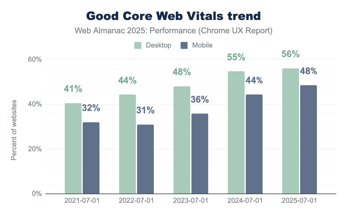
Mobile Core Web Vitals have shown consistent year-over-year improvement, increasing from 36% in 2023 to 44% in 2024, and reaching 48% in 2025. This rise may reflect improvements in browsers, devices, and networks, alongside site optimizations.
Desktop performance also saw a positive trend, moving from 48% in 2023 to 55% in 2024. However, the improvement for 2025 was marginal, increasing only to 56%.
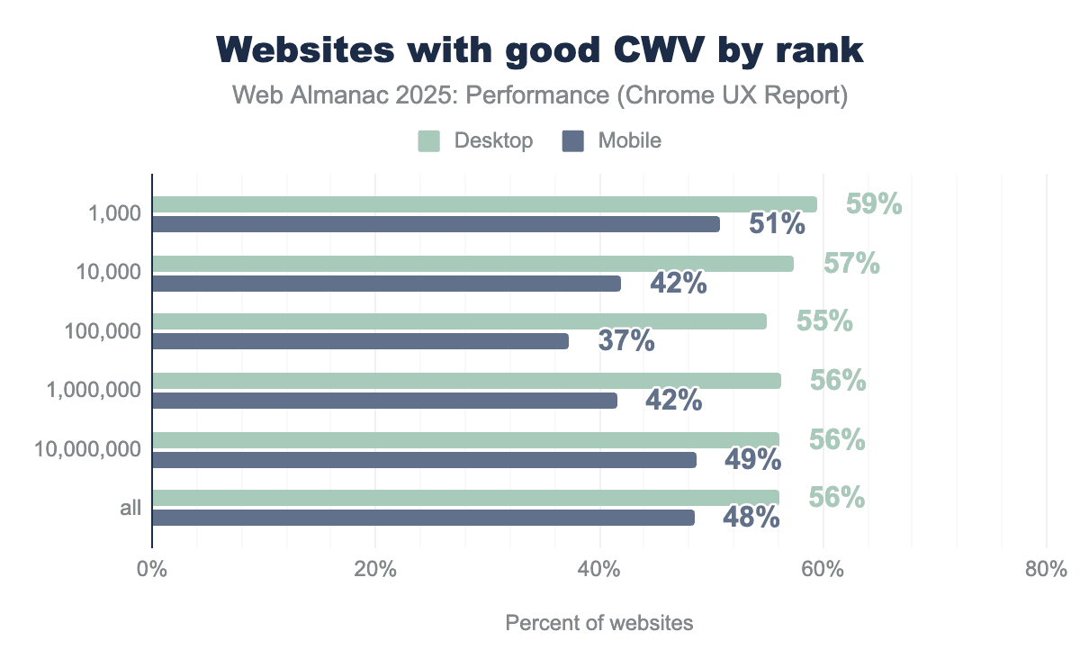
To better understand these trends, the following section examines how Core Web Vitals vary by page popularity, where more popular pages appear at lower rank values.
On mobile, the most and least popular sites tend to perform better than those in the middle of the popularity distribution. The most popular sites show better Core Web Vitals results, while performance drops for mid-popularity sites before improving again among the least popular sites.
- 51% of the 1,000 most popular mobile sites have good Core Web Vitals (CWV).
- CWV drops to 42% for the next 10,000 sites and 37% for the next 100,000.
- However, it improves to 42% for the next 1,000,000 sites and 48% for the next 10,000,000.
This pattern may reflect differences in page complexity and performance investment across the popularity tiers.
- Highly popular sites often treat performance as a priority and are more likely to invest in ongoing optimization, given its close correlation to user engagement and business outcomes.
- Mid-popularity sites may combine higher complexity such as additional features and third-party scripts with less sustained focus on performance, leading to drop in results.
- Less popular sites are often simpler, with fewer features and lighter pages, which can benefit from platform defaults and hence offer comparatively better performance.
This U-shaped pattern is more evident on mobile, where slower devices and less stable network conditions tend to amplify the effects of page complexity and limited optimization. On desktop, more powerful hardware and more stable networks can reduce the visible impact of these differences.
Performance can also vary significantly between primary and secondary page navigations. Primary navigations typically occur when a user lands on a site for the home page, requiring more resources to be fetched and executed, while secondary navigations happen as users move between pages within the same site and can benefit from previously loaded and cached resources.
While most CrUX data in this chapter is per origin, our crawler also collects page-level CrUX data at the time of crawl where available allowing us to examine how Core Web Vitals differ between home and secondary page navigations.
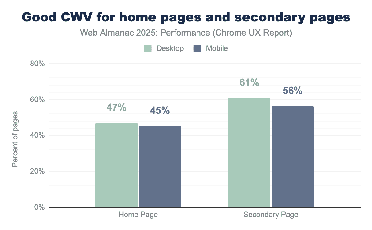
Secondary pages show higher CWV pass rates than home pages, with a 14% lead on desktop and an 11% lead on mobile. This performance gap suggests that secondary pages often benefit from having cached information, which contributes to faster page loads. Home pages are also updated more frequently and tend to include more dynamic and varied components, while secondary pages are often more templated and consistent, which may make them more stable and easier to optimize.
Modern single page websites often use JavaScript-based navigations, where content changes without a full page reload. While these navigations feel like moving between pages to users, they are not always fully captured by current Web Vitals measurements. Support for soft navigations is expected to improve how Core Web Vitals are captured for these in-page transitions, providing a more accurate view of real user experience beyond the initial page load.
Loading speed
A major factor influencing a user’s perception of quality and reliability is the initial loading speed of a website. However, ’speed’ is inherently relative and difficult to define with a single value in the context of websites. Because performance varies based on a user’s device capabilities and network conditions, we cannot rely on a single ’load time’ to capture the user experience. Thus, we look at multiple user-centric metrics that measure not just how fast a site loads, but how fast it feels.
The following sections focus on two key loading metrics: First Contentful Paint (FCP) and Largest Contentful Paint (LCP).
First Contentful Paint
To understand the user’s first impression of a webpage’s speed, we look at First Contentful Paint (FCP). This metric captures the exact time it takes for a page to begin displaying any content, measured from the point the user first requested the page. A page that has a FCP score under 1.8 seconds is considered “good”, scores between 1.8 and 3.0 seconds indicate that the page “needs Improvement”, and a score over 3.0 seconds is considered “poor” performance.
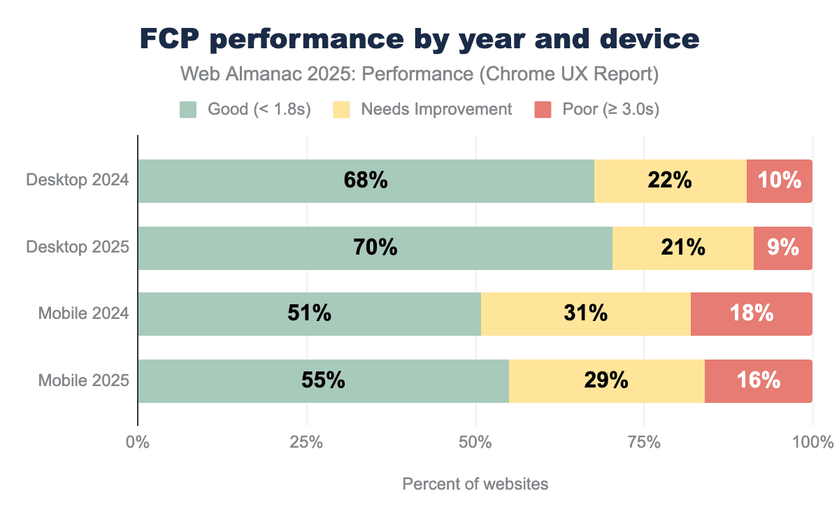
FCP performance improved across both desktop and mobile since 2024. The share of desktop sites achieving a “Good” FCP increased by 2%, while mobile sites saw a larger gain of 4%. FCP can be broadly understood as consisting of two main parts, each influenced by different aspects of the loading process:
- The first is the network and server overhead, captured by Time to First Byte (TTFB). This includes connection setup, redirects, and server processing time, and is largely influenced by network infrastructure and protocol efficiency. When a Service Worker serves a response from cache, the network round trip can be avoided, improving TTFB on repeat visits. However, Service Worker startup can also add latency, which Navigation Preload helps mitigate by starting the network request in parallel during initialization.
- The second part is client-side rendering, which begins after the first byte is received. This reflects the time required for the browser to parse resources and render the first visible content on the page, and is influenced by factors such as browser behavior, render-blocking resources, and user hardware capabilities.
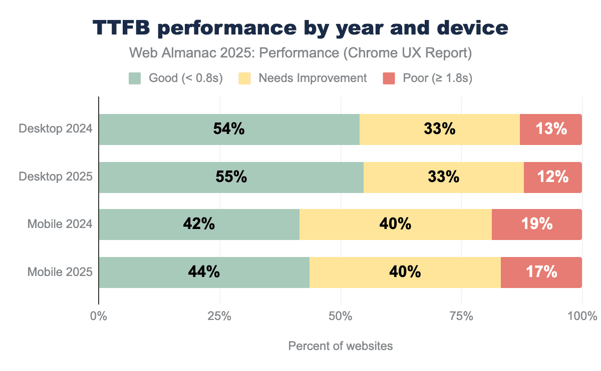
Since 2024, the share of sites achieving a “Good” TTFB increased by 1% on desktop and by 2% on mobile.
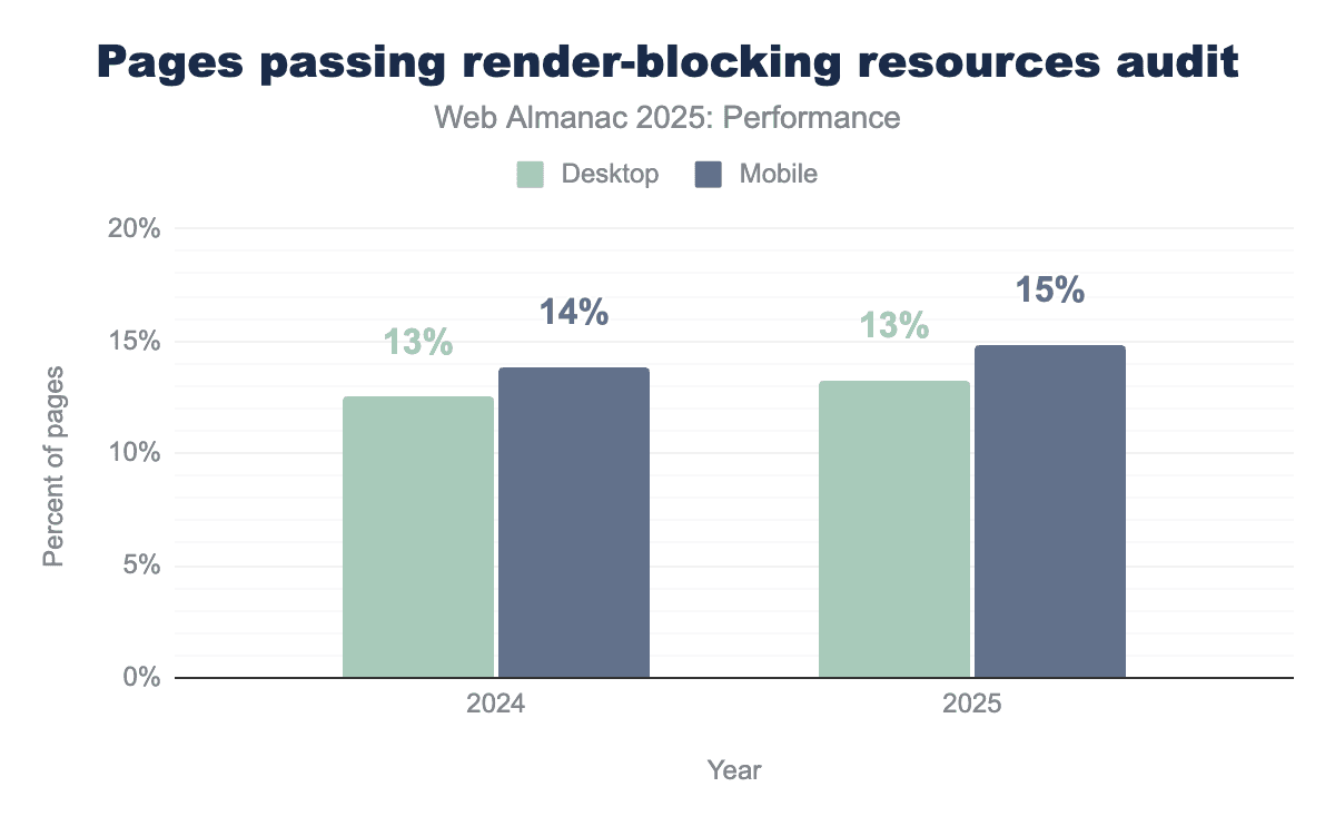
Over the same period, the proportion of pages passing the “render-blocking resources audit” remained flat on desktop and increased by 1% on mobile.
Taken together, improvements in FCP between 2024 and 2025 align with these modest gains in server response times and small reductions in render-blocking work. This suggests that incremental improvements across both network delivery and client-side rendering are contributing to earlier first paint, with slightly more impact on mobile devices.
While FCP captures the first visual response, LCP reflects when the page’s primary content becomes visible and typically involves a longer and more complex critical path. Like FCP, LCP can be understood as the sum of several sequential phases: the time to receive the first byte from the server (TTFB), the delay before the browser begins fetching the LCP resource (resource load delay), the time spent loading that resource (resource load duration), and any delay before the element is rendered (element render delay). Understanding where time is spent across these phases is key to improving LCP, and in turn, overall Core Web Vitals performance.
Largest Contentful Paint
To understand when a page feels meaningfully loaded, we look at Largest Contentful Paint (LCP). This metric measures the time from when the user first requests the page to when the largest visible element—typically a hero image, headline, or prominent text block—finishes rendering on screen. A page with an LCP score under 2.5 seconds is considered “good”, scores between 2.5 and 4.0 seconds indicate that the page “needs improvement”, and a score over 4.0 seconds is considered “poor” performance.
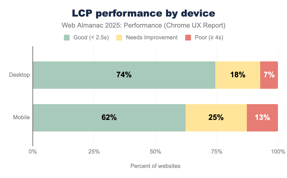
Currently, 74% of desktop pages achieve a “good” LCP score compared to 62% on mobile, with mobile also showing nearly double the rate of “poor” experiences (13% versus 7%); a gap that is consistent with the combined effects of slower networks and less capable devices on mobile.
LCP content types
To optimize LCP effectively, we first need to understand what types of content typically become the LCP element.
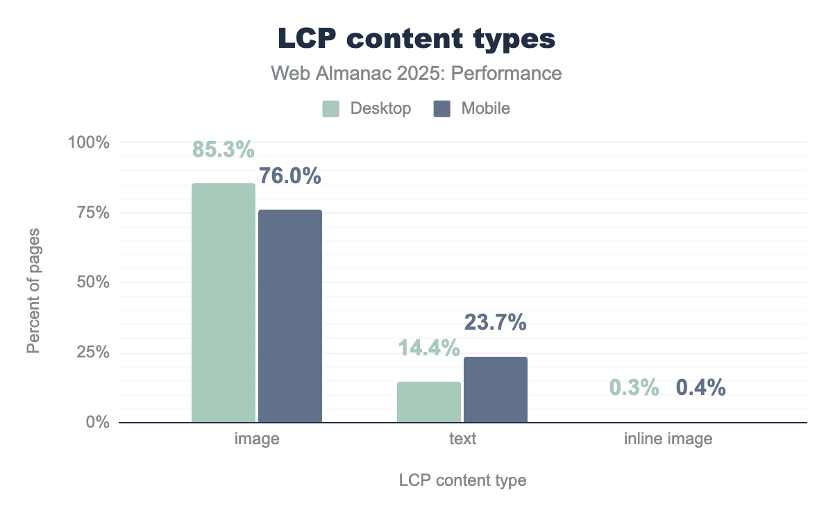
The trend in LCP content types is similar to previous years (see also 2022 and 2024 data). Images continue to dominate LCP elements across both device types, with 85.3% of desktop pages and 76% of mobile pages having an image as their LCP element. Text-based LCP elements account for much of the remainder—14.4% on desktop versus 23.7% on mobile. This gap likely reflects responsive design practices where hero images are resized, replaced with smaller visuals, or removed entirely on narrower viewports, allowing headline text to become the largest visible element instead.
Inline images (data URIs embedded directly in HTML) remain rare at around 0.5% of pages, indicating limited and careful adoption and awareness of the trade-offs related to larger HTML payloads and caching efficiency.
LCP image formats
Given this continued dominance of images as the LCP element, it becomes relevant to look at the image formats in use, as it directly affects the resource load duration phase of LCP. While the 2024 chapter showed this phase has less optimization potential than others, image format efficiency still contributes to overall performance.
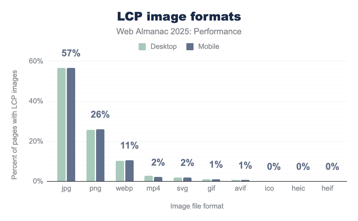
Modern formats like WebP and AVIF offer better compression than legacy formats, meaning smaller file sizes and faster transfers. However, we see that legacy JPG and PNG are still highly used (JPG accounting for 57% of LCP images and PNG at 26%).
There are some encouraging signs though, such as JPG usage has decreased by 4% since 2024 while WebP has increased by 4%.
With PNG and other formats being the same as their 2024 percentages (aside from AVIF reaching 0.7%), it looks like web pages are moving from JPG to WebP, albeit slowly. This slow adoption may reflect the cost of migrating existing image pipelines and content libraries, even as modern formats have broad support.
Cross-origin LCP images
The origin of an LCP image affects how quickly the browser can begin downloading it, impacting the resource load delay phase. When an image is hosted on the same domain as the page, the browser can reuse the existing connection. Cross-origin images may incur additional connection setup (DNS/TCP/TLS), especially when the origin isn’t already connected, increasing the time before the download can start.
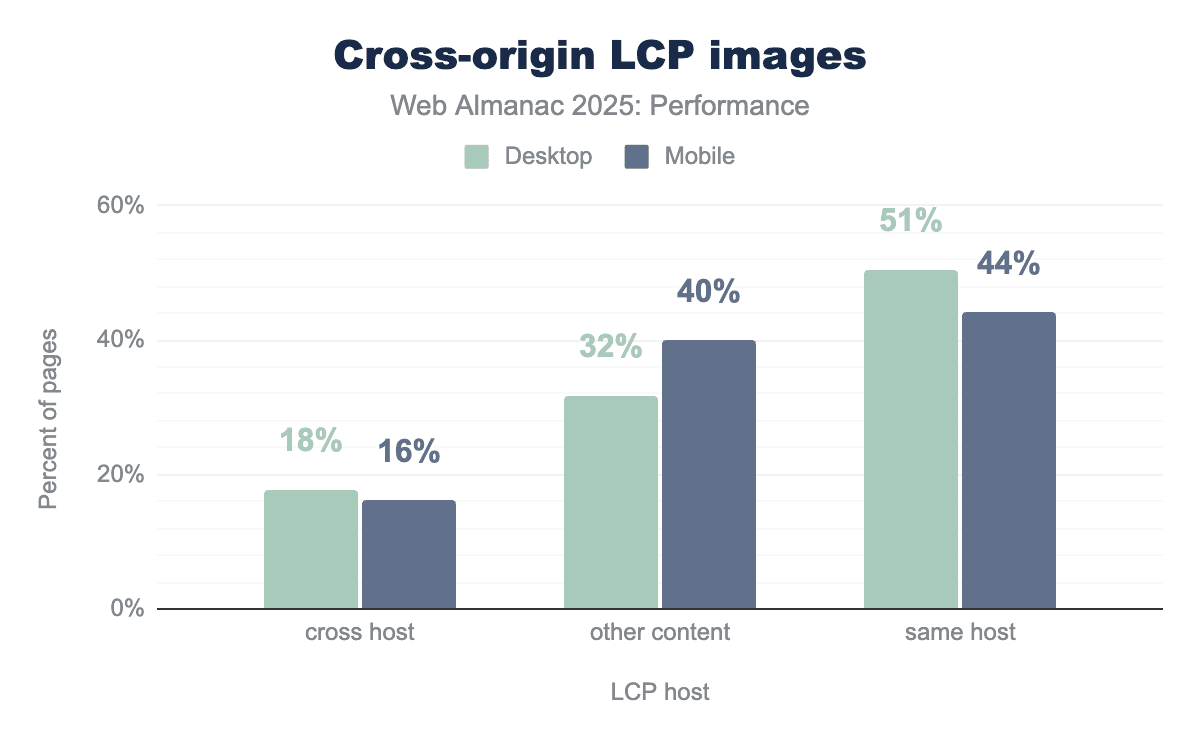
51% of desktop pages and 44% of mobile pages serve their LCP image from the same host as the document. Cross-hosted LCP images account for 16-18% of pages—a meaningful portion that may be paying a connection overhead cost unless mitigated with preconnect hints.
The “other content” category (32% desktop, 40% mobile) represents pages where the LCP element isn’t an image at all, likely text blocks or background elements. The higher mobile percentage for “other content” may reflect responsive design patterns where hero images are deprioritized on smaller viewports, though we do not conclusively know using this data alone.
LCP resource prioritization
Since resource load delay phase often constitutes a large portion of LCP time, browsers provide tools to help accelerate critical resources. The fetchpriority="high" attribute tells the browser to prioritize a resource higher than it normally would—useful since images are typically not considered high priority even when they’re the LCP element. Meanwhile, <link rel="preload"> instructs the browser to fetch a resource before it would naturally discover it in the HTML.
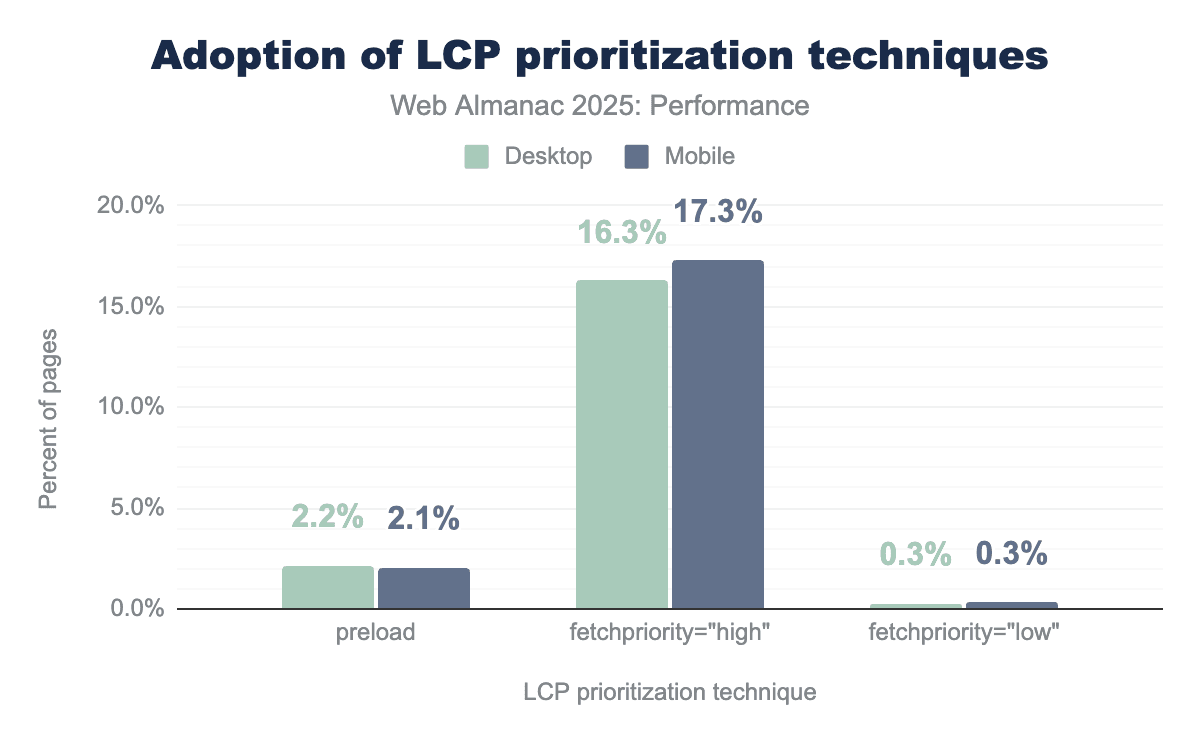
Adoption of fetchpriority="high" has continued its growth, now appearing on 17% of mobile pages with LCP images—up from 15% in 2024. Preload usage remains low at 2.1-2.2%.
Both techniques are relatively simple to implement, though it should be noted that preload is only necessary when the resource is not quickly discoverable in the HTML document. Additionally when preload is used, it should be combined with fetchpriority="high" to ensure the image is fetched with high priority—which is not guaranteed by just using preload alone.
The 0.3% of pages using fetchpriority="low" on their LCP images is likely unintentional, since identifying which image will become the LCP element at development time can be tricky for developers (varies by viewport and content).
LCP lazy loading
Lazy loading for images means delaying the loading of images until they are needed, for example loading below the fold images only when they are close to entering the user’s viewport, instead of the default loading all images at page load. This helps prioritize critical above-the-fold content. Lazy loading is generally a useful optimization, but applying it to the LCP image can be harmful because it delays the main content users are waiting to see.
Overall, about 16%-17% of pages lazy-load their LCP image, a figure that has held steady since 2024. However, the composition has shifted: native loading="lazy" usage has increased slightly (from 9.5% to 10.4% on mobile, 10.2% to 11.5% on desktop), while custom approaches like hiding sources behind data-src attributes have decreased (from 6.7% to 5.9% on mobile). Native loading="lazy" accounts for a larger share of LCP lazy-loading than custom approaches, indicating a shift toward standardized browser features.
Loading speed conclusion
In summary, the loading metrics highlight following key trends:
- FCP and LCP have both improved since 2024, with desktop consistently outperforming mobile.
- Adoption of newer image formats remains limited, despite a gradual shift from JPG to WebP.
- About 16% of web pages still lazy load their LCP image, delaying the display of primary content.
Interactivity
Historically web performance measurement has concentrated on loading speed but there is an increasing recognition—thanks to metrics like INP—that measuring interactivity on the page after it has loaded is equally, if not more important.
Interaction to Next Paint (INP)
Interaction to Next Paint (INP) is calculated by observing all the interactions made with a page during the session and reporting the worst latency (for most sites, there is an additional allowance for pages with many interactions to ignore outliers). An interaction’s latency consists of the single longest duration of a group of event handlers that drive the interaction, from the time the user begins the interaction to the moment the browser is next able to paint a frame.
For an origin to receive a “good” INP score, at least 75% of all sessions need an INP score of 200 milliseconds or less. The INP score is the slowest or near-slowest interaction time for all interactions on the page. See Details on how INP is calculated for more information.
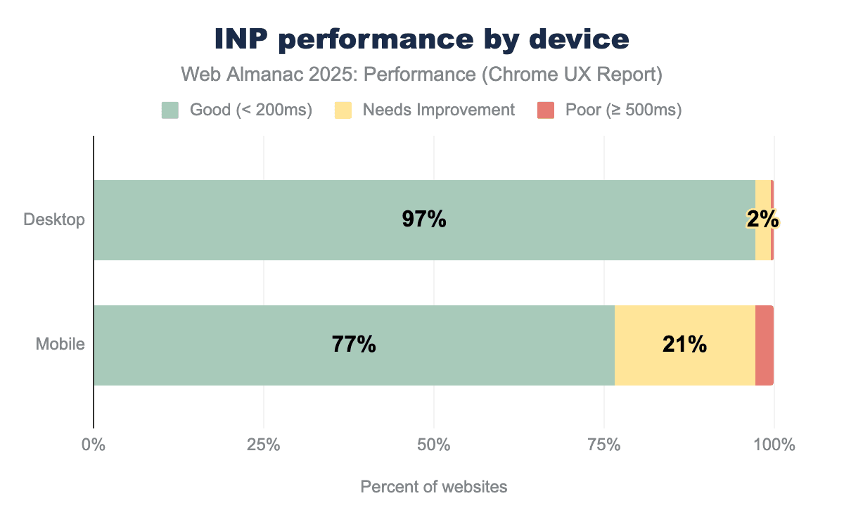
In 2025, mobile INP performance showed encouraging improvement, with 77% of websites achieving good scores—up from 74% in 2024. This 3 percentage point gain represents meaningful progress, as millions of websites now deliver more responsive experiences to mobile users. Desktop performance remained exemplary at 97%, maintaining the high standard established in previous years.
Notably, the mobile-desktop performance gap has begun to narrow, shrinking from 23 percentage points in 2024 to 20 percentage points in 2025. While a 20 percentage point gap remains substantial, this marks the first measurable step toward closing the divide. The trend demonstrates that mobile optimization efforts are gaining traction across the web.
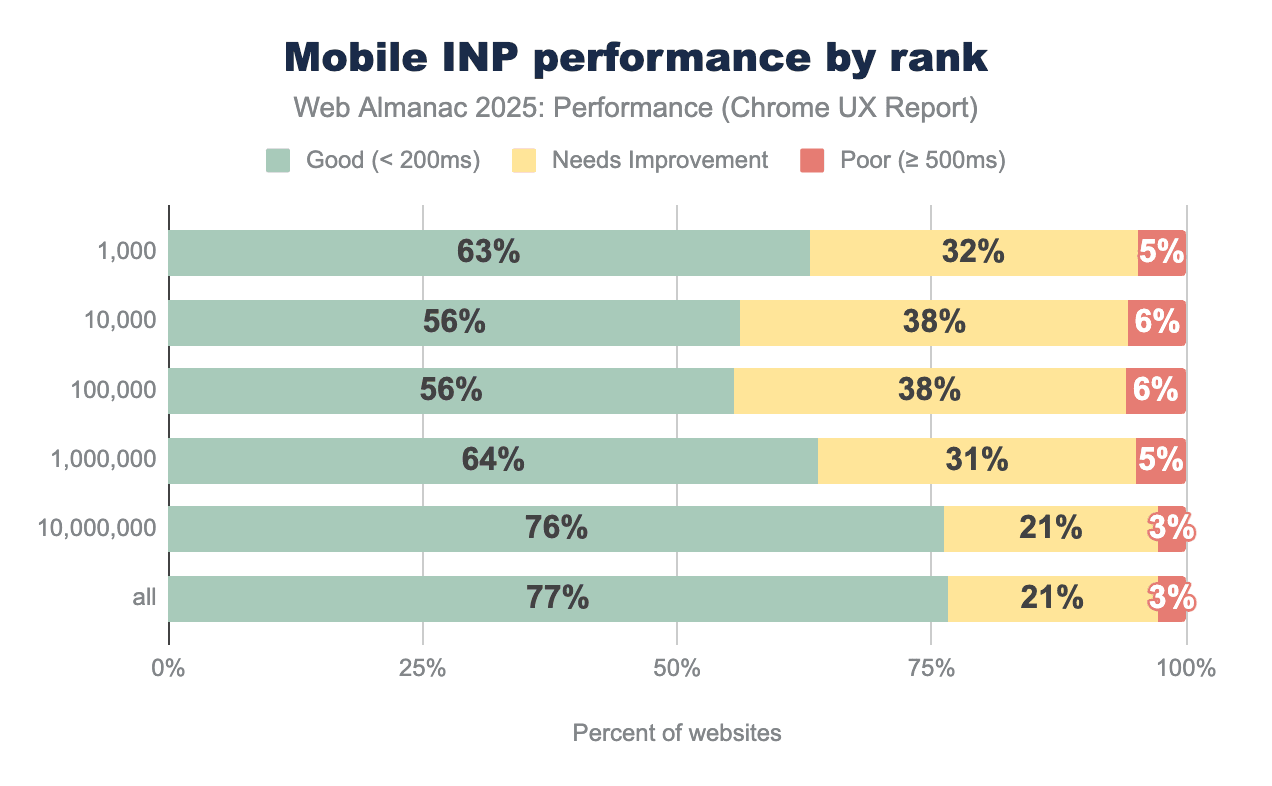
The most popular websites showed remarkable INP improvement in 2025, with the top 1,000 sites jumping from 53% to 63% good scores—a 10 percentage point gain that outpaced all other categories. This signals that high-traffic websites are prioritizing interactivity optimization, likely driven by the direct impact on user engagement and business metrics.
While popular sites still lag behind the overall average of 77%, the gap has narrowed significantly. The top 1,000 sites were 21 percentage points below average in 2024 but only 14 percentage points below in 2025—the fastest rate of improvement observed across any category.
This pattern reflects the unique challenges faced by high-traffic websites: more complex functionality, richer interactive features, heavier third-party integrations, and diverse user interaction patterns. E-commerce platforms, social media sites, and news portals inherently require more JavaScript execution than simpler websites, making good INP scores harder to achieve.
The substantial year-over-year improvements suggest that major websites are successfully tackling these challenges through code splitting, interaction optimization, and selective feature loading. As the most visited sites continue to enhance their performance, they set higher standards and provide valuable optimization patterns for the broader web ecosystem.
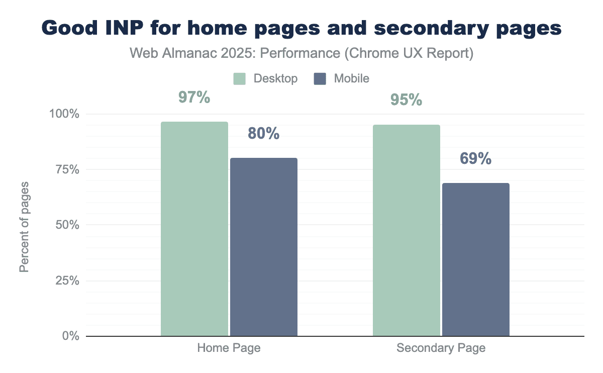
In a notable shift from 2024, home pages now demonstrate significantly better INP performance than secondary pages on mobile devices, when looking at page-level CrUX data. Mobile home pages achieved 80% good INP scores—a 7 percentage point improvement over 2024. Secondary pages declined to 69%, creating an 11 percentage point gap. This divergence represents a change from 2024, when home and secondary pages performed nearly identically (73% vs 72% on mobile). Desktop performance remained strong for both page types at 97% and 95% respectively.
The improvement in home page INP likely reflects increased optimization focus on landing pages, where first impressions are critical. However, the decline in secondary page performance warrants attention, as these pages often contain more complex interactions like filters, carousels, and form validation, while also accumulating JavaScript from third-party widgets and analytics that activate deeper in the user journey.
Total Blocking Time (TBT)
Total Blocking Time (TBT) measures the total amount of time after First Contentful Paint (FCP) where the main thread was blocked for long enough to prevent input responsiveness.
TBT is a lab metric and is often used as a proxy for field-based responsiveness metrics like INP, which can only be collected using real user monitoring. Lab-based TBT and field-based INP are correlated, meaning TBT results generally reflect INP trends. A TBT below 200 milliseconds is considered good, but most mobile websites exceed this target significantly.
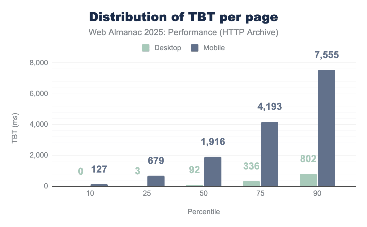
The median TBT on mobile increased to 1,916 milliseconds in 2025—up 58% from 1,209 milliseconds in 2024. Desktop TBT also rose from 67 milliseconds to 92 milliseconds. At the 90th percentile, mobile users now face over 7.5 seconds of blocking time before the page becomes fully interactive.
This presents an apparent contradiction: while field-based INP scores improved, lab-based TBT worsened significantly. Several factors could be behind this divergence.
- Real-world devices have become more powerful, masking increased code complexity that lab tests reveal using consistent emulated devices.
- Some sites may be optimizing the interactions that dominate INP while still executing substantial background work that shows up in TBT.
- The INP metric continues to evolve, with upcoming improvements focused on stabilizing measurements and better capturing real-world interaction behavior, as documented in Chromium’s INP metric changelog.
The widening gap between desktop (92ms median) and mobile (1,916ms median) reinforces the persistent performance inequality between device classes, suggesting that despite INP improvements, the fundamental challenge of main thread blocking has intensified.
Interactivity conclusion
The main takeaways of the interactivity results are:
- Mobile INP improved to 77% (up from 74%), narrowing the mobile-desktop gap to 20 percentage points.
- Top 1,000 websites achieved the strongest gains, improving from 53% to 63% good INP.
- Home pages now outperform secondary pages significantly (80% vs 69% on mobile).
- TBT increased 58% despite INP improvements, indicating heavier overall JavaScript execution.
Visual stability
Visual stability is measured by Cumulative Layout Shift (CLS) and is an indicator of how predictable and smooth pages feel to users. This section focuses on highlighting progress, device differences, and shifts over the recent years.
Cumulative Layout Shift (CLS)
Cumulative Layout Shift (CLS) measures unexpected layout movement during page load and interaction, with higher scores indicating more disruptive visual shifts. CLS scores are categorized into three thresholds: “good” (≤ 0.1), “needs improvement” (> 0.1 and ≤ 0.25), and “poor” (> 0.25), providing a standardized way to evaluate and compare visual stability across websites.
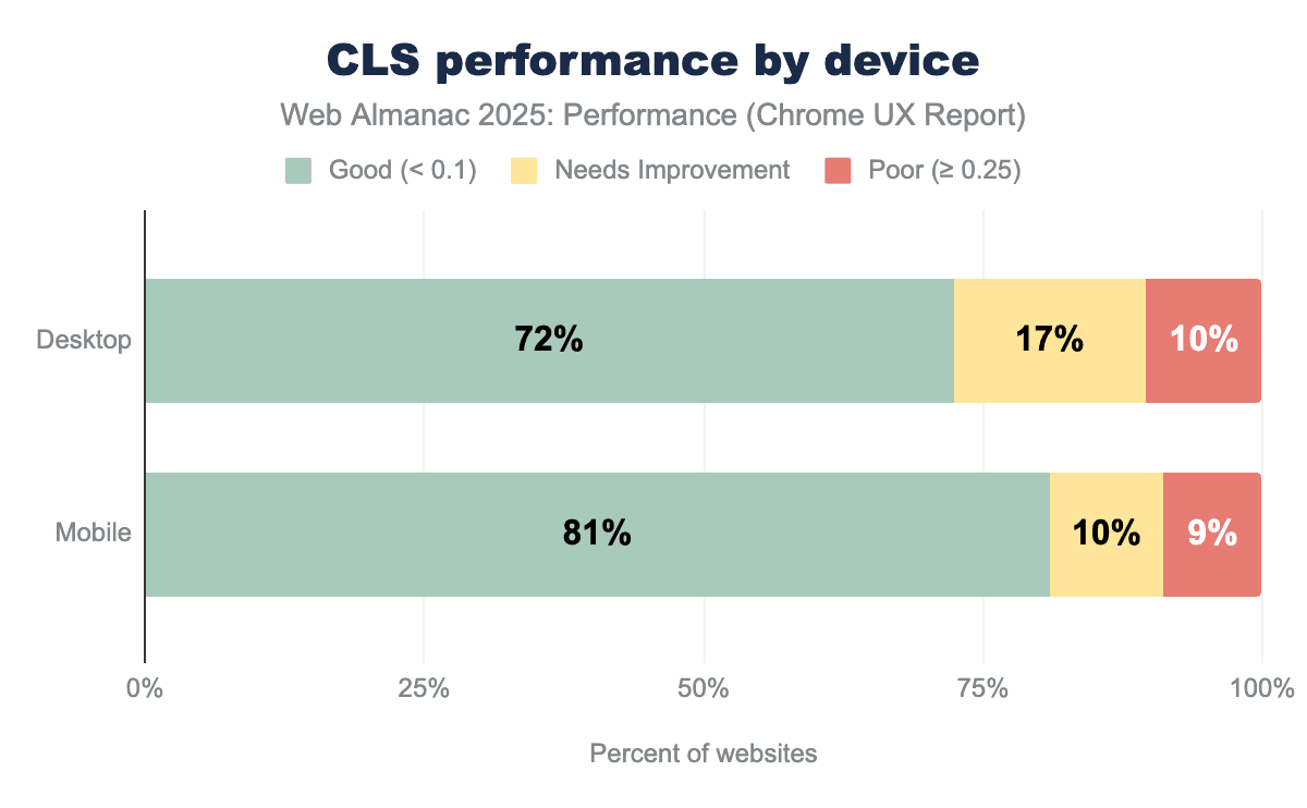
In 2025, 72% of desktop pages and 81% of mobile pages achieve a “good” Cumulative Layout Shift (CLS) score. Desktop pages show a higher share of “needs improvement” CLS (17%) compared to mobile (10%), while the proportion of pages with “poor” CLS is similar across devices at around 9-10%. This shows that most pages are close to meeting the CLS threshold, with fewer pages experiencing severe layout instability.
Compared to 2024, the share of desktop pages with “poor” CLS decreased by 1%, with a similar increase in pages classified as “needs improvement”.
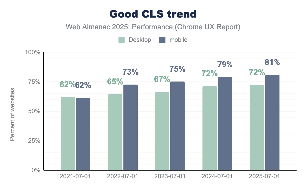
Looking at the past years, the percentage of websites meeting the “good” CLS threshold has increased each year for both desktop and mobile. Desktop CLS improved gradually from 62% in 2021 to 72% in 2025, while mobile saw stronger gains, reaching 81% over the same period. However, the increase compared to last year is marginal, with the share of sites meeting the “good” CLS threshold on desktop remaining unchanged and mobile improving by only 2%.
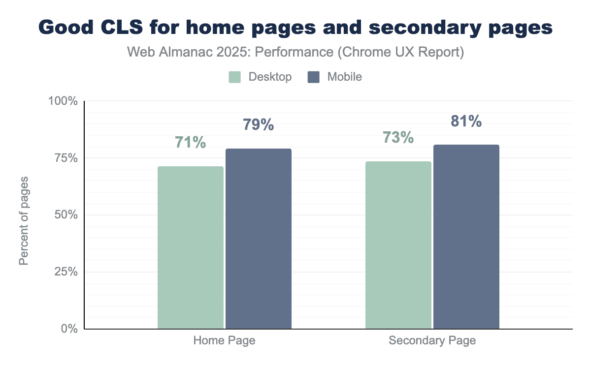
Pages beyond the homepage show slightly better visual stability than homepages across both desktop and mobile devices when looking at page-level CrUX data. In 2025, 73% of desktop secondary pages achieve “good” CLS compared to 71% of desktop homepages, while on mobile 81% of secondary pages meet the “good” CLS threshold versus 79% of mobile homepages. This suggests that homepages, which often contain more dynamic content such as hero media, banners, and promotional elements, remain more prone to layout shifts than secondary pages.
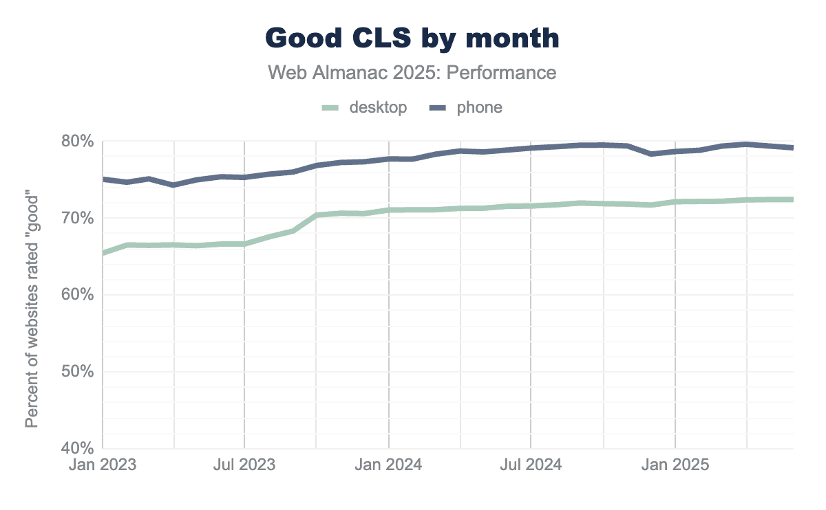
From 2023 to 2025, the share of sites with “good” CLS increases steadily across both device types, with mobile consistently outperforming desktop. While there are minor fluctuations over time, both trends show a gradual upward trajectory with no sharp inflection points, indicating sustained improvements rather than sudden changes.
CLS best practices
There are a number of best practices sites can follow to reduce the likelihood of CLS.
Back/forward cache (bfcache)
The back/forward cache (bfcache) allows browsers to instantly restore a page from memory when users navigate using the browser’s back or forward buttons. Rather than reloading the page and re-executing JavaScript, the browser preserves the page’s state, resulting in near-instant navigations and improved user experience. Because pages are restored in their previous state, bfcache can also help avoid layout shifts that might otherwise occur during re-navigation.
However, not all pages are eligible for bfcache. Eligibility depends on a set of page lifecycle requirements, and pages that violate these constraints fall back to full reloads. You can see a list of ineligible reasons in the HTML specification. While bfcache behavior is ultimately handled by the browser, developers can evaluate page eligibility by using Chrome DevTools.
Pages may be excluded from bfcache due to known lifecycle behaviors, including the use of unload or beforeunload event handlers, non-restorable side effects such as active connections or unmanaged timers, and certain third-party scripts that interfere with safe page restoration. Hence, the unload event is deprecated and discouraged due to its negative impact on performance and its incompatibility with the back/forward cache.
The Chrome team recommends avoiding unload in favor of alternatives such as visibilitychange or pagehide, a shift that is reflected in recent usage patterns. Compared to 2024, unload handler usage declined across all ranks and both devices in 2025. This reduction suggests that more pages are now eligible for bfcache behavior. Despite this progress, unload handlers remain more common on higher-ranked sites and on desktop, continuing to limit bfcache eligibility for a significant portion of the web, as seen below in the graph.
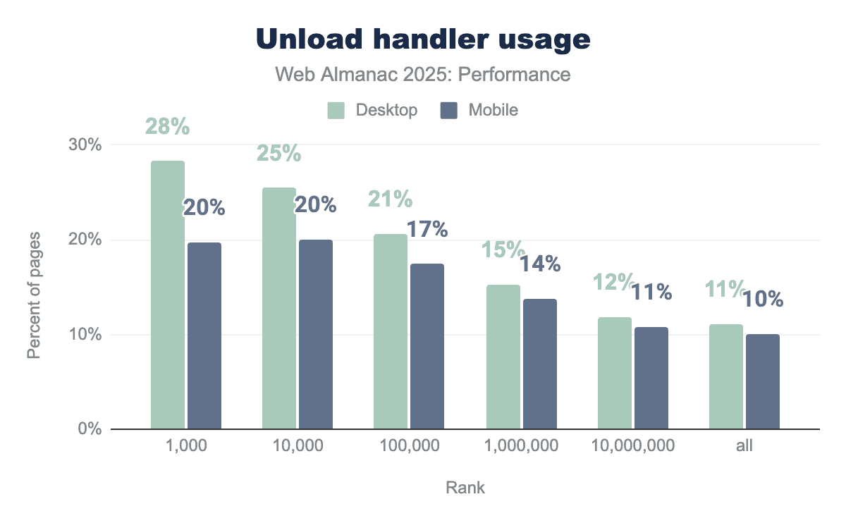
It is interesting to see that unload handler usage decreases consistently as site popularity decreases. Among higher-traffic websites (top 1,000 sites), unload handlers are present on 28% of desktop pages and 20% of mobile pages, and this share declines steadily across lower-ranked sites, reaching 11% on desktop and 10% on mobile. At every rank, desktop pages exhibit higher unload handler usage than mobile, suggesting that unload handlers remain more common on larger, more complex sites than across the long tail of the web. Possibly due to top sites relying more heavily on analytics, advertising, and legacy lifecycle patterns that register unload handlers.
Another common reason for websites to fall in the bfcache ineligibility category is the use of the Cache-Control: no-store directive. This cache control header instructs the browser (and any intermediate caches) not to store a copy of the resource, ensuring that the content is fetched from the server on every request.
Cache-Control: no-store.
23% of the sites now use Cache-Control: no-store, up from 21% in 2024. This increase may reflect the growing prevalence of authenticated and personalized experiences, stricter security or compliance requirements, and evolving browser behavior that has reduced the performance impact of Cache-Control: no-store, particularly with respect to bfcache eligibility.
Note that while historically all browsers have treated Cache-Control: no-store as a reason to avoid bfcache, Chrome may allow bfcache for some no-store pages when safe. Other browsers including Firefox and Safari generally still treat Cache-Control: no-store as a bfcache blocker.
Fixed image sizes
Images are one of the most common causes of Cumulative Layout Shift (CLS) when the browser does not know how much space to reserve for them upfront. If an image loads without explicit dimensions, the browser initially lays out the page as if the image has zero height, and then shifts surrounding content once the image finishes loading.
To prevent this, images should always have intrinsic dimensions defined either via width and height attributes or by using CSS aspect-ratio so the browser can allocate the correct amount of space before the image is fetched.
In 2025, a significant share of pages still risk layout instability due to images without explicit dimensions. On mobile, 62% of pages fail to set dimensions on at least one image, an improvement from 66% in 2024, indicating gradual adoption of CLS friendly image practices.
Desktop pages show a similar but slightly worse pattern, with 65% affected in 2025, down from 69% in 2024. While the downward trend is encouraging, the majority of pages still leave the browser guessing image sizes at layout time, making images one of the most persistent and preventable contributors to CLS.
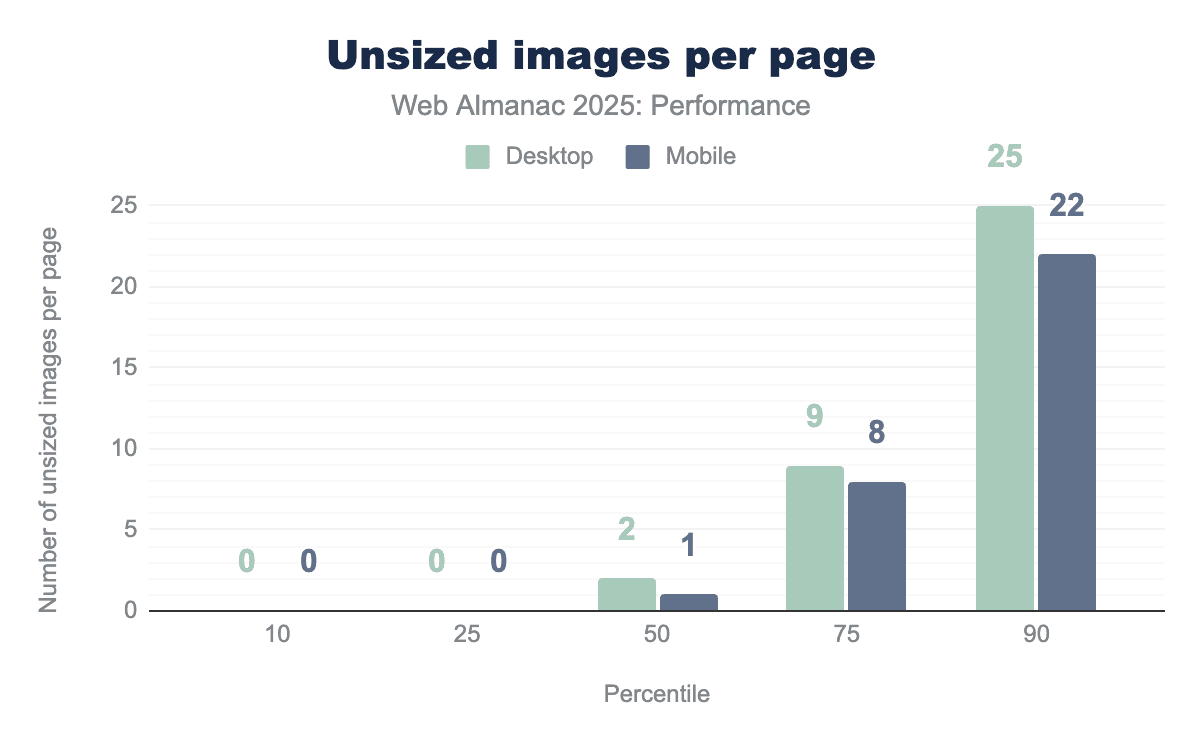
The median number of unsized images per web page is two. At the 90th percentile, this number increases sharply to 26 on desktop and 23 on mobile. Unsized images increase the risk of layout shift. However, their actual impact on CLS depends on both the size of the image and how far content shifts when it loads, especially if the shift affects the viewport. CLS is calculated based on the impact fraction (how much of the viewport is affected) and the distance fraction (how far elements move), meaning larger images or shifts closer to the top of the page tend to contribute more heavily to CLS.
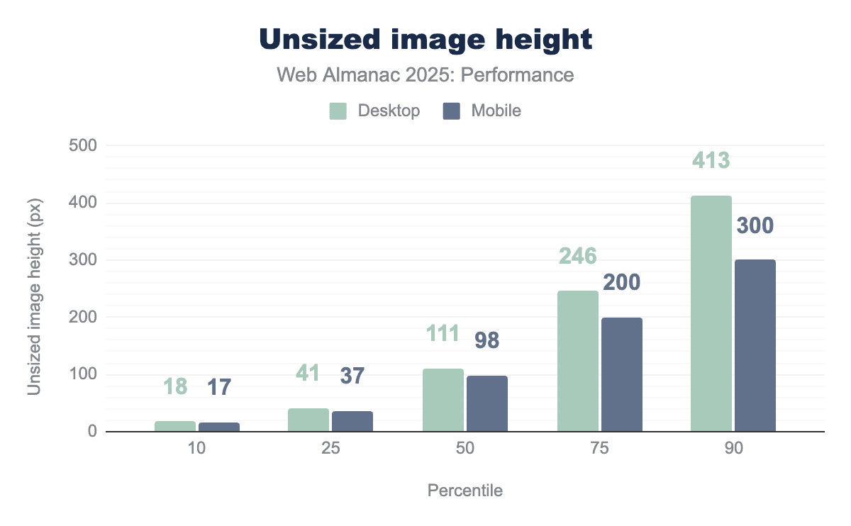
Unsized images are much taller at higher percentiles. At the median, unsized images are about 100px tall on both desktop and mobile, but by the 90th percentile they grow to around 413px on desktop and 300px on mobile. Taller unsized images increase CLS because they cause larger vertical layout shifts when they load, especially if they appear in the viewport. Since web pages scroll vertically, missing image height has a much bigger impact on CLS than missing width.
Fonts
Browsers often initially display text using a fallback (system) font while a custom web font is still downloading. This temporary rendering can cause a negative impact on the Cumulative Layout Shift (CLS) score. When the custom font finally loads, the browser replaces the fallback font, which can alter the text’s size and spacing, leading to content shifting.
A significant majority 87% of mobile pages utilize at least one web font. This widespread use of custom typography requires downloading and application, substantially raising the potential for layout shifts.
To effectively minimize layout shifts caused by fonts, it is crucial to load essential fonts as early as possible, ideally using resource hints. If a font loads before or very near the first render, the browser can display text using the correct font immediately. This prevents the swap from a default font, which is a common cause of layout shifts. Current data indicates that this opportunity is frequently missed.
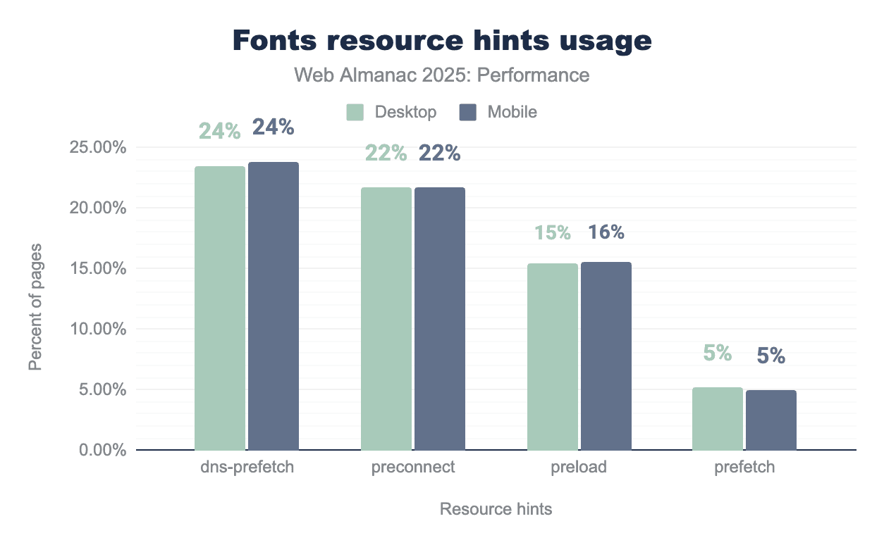
dns-prefetch is the most commonly used hint, appearing on 24% of pages on both desktop and mobile, followed by preconnect at 22% on each device. preload is used less frequently at 15% on desktop and 16% on mobile, while prefetch remains rare at around 5% on both platforms.Font resource hint usage is very similar across desktop and mobile. About 24% of pages use dns-prefetch and 22% use preconnect, which mainly helps in reducing connection setup time. Preload is a good way to make fonts available early during rendering but is used on only 15-16% of pages. Even fewer pages, around 5%, use prefetch, which is generally less useful for fonts needed during the initial page load. This suggests there is substantial opportunity to improve font performance through more targeted use of resource hints.
Non-composited animations
Non-composited animations contribute to layout shift because they modify layout-affecting properties, triggering reflows that move surrounding content after rendering has begun. Animations using composited properties like transform and opacity avoid this by updating visual appearance without changing layout, making them safer for visual stability.
Non-composited animations remain common, appearing on 40% of mobile pages and 44% of desktop pages.
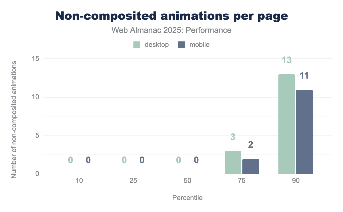
Non-composited animations impact emerges primarily at higher percentiles, with usage increasing at the 75th percentile and rising sharply at the 90th percentile to 13 animations on desktop and 11 on mobile.
Visual stability conclusion
Visual stability across the web has advanced significantly over the years, particularly on mobile devices. Most pages now deliver stable experiences with minimal unexpected movement, reflecting improved adoption of best practices. However, with around 20-30% of pages still not achieving “good” CLS, especially on desktop, there remains room for continued refinement and optimization.
Despite gradual improvements, unsized images remain common and font-loading patterns still create opportunities for layout shifts, suggesting many sites haven’t fully implemented known CLS mitigations. Adopting simple best practices like explicit image sizing, preloading critical fonts, and using composited animations, pages can help improve visual stability.
Early Hints
Early Hints provide an early signal to the browser about the resources it will need to load for the requested page.
Early Hints are sent from the server to the browser while the requested page is still being prepared. In this way, browsers can start taking action to optimistically preconnect to other domains or preload an asset before the requested page has been returned to it.
This allows Early Hints to have an absolute impact on the loading performance of the currently requested pages. Consider if, rather than having to wait for the HTML to return to the browser, and the parser to find the link (or even preload link) for the main CSS file and/or LCP asset, it could begin fetching those assets before the HTML was even returned to the browser. This could allow for an FCP that is nearly perfectly rendered, in a single paint.
Since Early Hints can also contain crossorigin attribute and CSP header information, it is recommended that they only be used over HTTP/2 or higher for for security reasons.
Early Hints usage
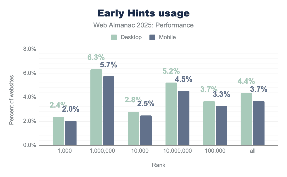
We see adoption has not exactly taken off: usage is quite low in all groups, barely breaking 6% on desktop in the top 1,000,000 sites; most other groups are well below 5%.
This is likely related to the complexities of setting up and configuring Early Hints: the assets for any given page must be related to the server before the page is complete and ready for sending; for most CMSs this would be a challenge.
The mobile/desktop parity is also quite noticeable; never more than a 1% difference, and typically closer to 0.5%. Meaning, where Early Hints are implemented, they are likely done so similarly for all device types.
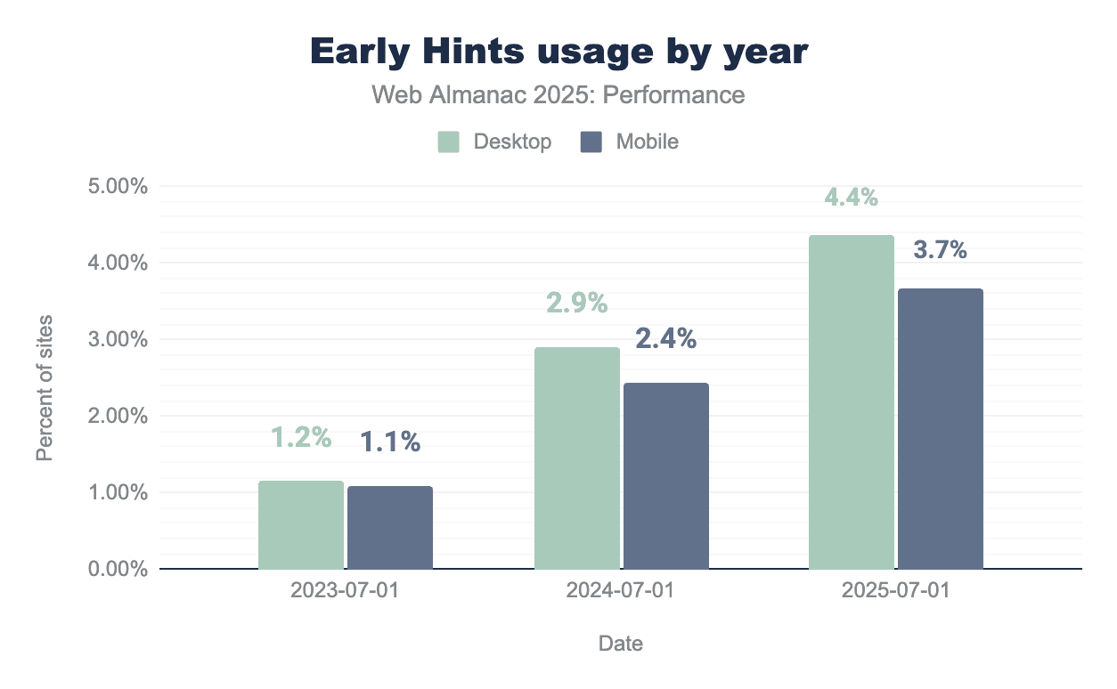
While usage remains low in 2025, there has been a noticeable increase over the past three years.
Early Hints support
Unlike most web performance features, Early Hints relies not only on browsers, but also on servers for support. As of this publication, preconnect is supported in all browsers, and preload in all except Safari.
With regards to servers, Early Hints are fully supported for Node, H2O and NGINX, and for Apache if you are using mod_http2.
Early Hints are available via CDNs including Fastly since 2020, Cloudflare since 2021, and Akamai since 2023.
Speculation Rules
Speculation Rules are an experimental browser API for optimistically prefetching or prerendering complete pages, with the hope that the user will navigate to one of the pages after viewing the current page. These actions happen in the background of the page the user is currently viewing. It currently implemented primarily in Chromium-based browsers, though Safari has a partial implementation for prefetch behind a flag.
While Speculation Rules do not help the current page’s performance, they can greatly improve the loading performance of subsequent pages, often to the point of almost an instantaneous page load.
The intent is for this API to replace <link rel="prefetch"> for pages and <link rel="prerender"> with more advanced configuration options. Again, the Speculation Rules API is for full pages only; for individual assets, you would still need to use <link rel="prefetch">.
Speculation Rules usage
In the chart below, which shows the percentage of home pages that contain Speculation Rules, we see something interesting: Speculation Rules usage on the top 1,000 sites is quite low, only 3% on desktop and 5% on mobile. And while usage climbs for each subsequent group, it only reaches 15%, mobile and desktop, for the top 1,000,000 sites. It is not until the final group, the top 10,000,000, that we see the percentage jump sharply up, to 24% desktop and 25% mobile:
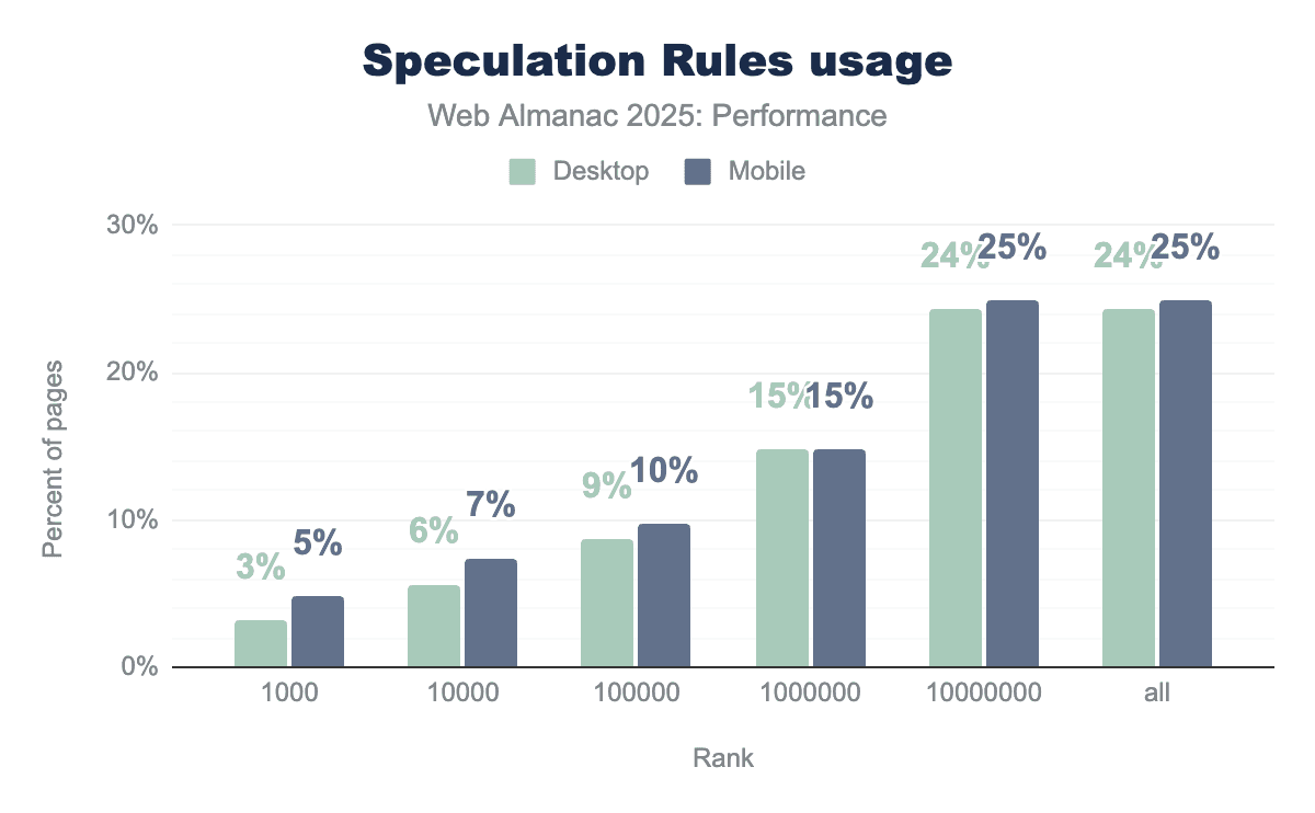
This could be related to the complexities of configuring Speculation Rules: a site should be careful when prefetching or prerendering pages, since the user’s exact intent can never be known, and anything that is fetched and not used is wasteful. So, for a larger site, such as an ecommerce site, and especially a large site with numerous categories and perhaps menu options to jump directly to, Speculation Rules could be difficult to configure properly. They could also be tricky to implement into a legacy or bespoke CMS.
Conversely, Speculation Rules now come baked into WordPress, which powers a large share of the Internet, which may help explain higher adoption in the long tail.
Also notable is the parity between mobile and desktop usage; seldom more than a 1% difference. Meaning, where Speculation Rules are implemented, they are likely done so similarly for all device types.
Conclusion
Our analysis of this year’s data paints a picture of a web that is becoming more responsive, yet remains complex to optimize. We see clear progress in how the web feels to use: mobile interactivity has improved significantly, with the performance gap between phones and desktop computers finally starting to narrow. This tells us that perhaps the industry’s focus on new metrics like Interaction to Next Paint (INP) is working, and developers are trying to prioritize the interactions that matter most to users.
However, we also observe a “performance divide” in how different segments of the web adopt new standards. For example, we saw that the most popular sites lead the way in improving interactivity (INP), likely through manual optimization of complex JavaScript. In contrast, newer standards like Speculation Rules are seeing their highest adoption not at the top, but in the “long tail” of the web, driven by platform-level integrations in popular CMSs like WordPress. This suggests that the future of performance may rely less on individual manual effort and more on smart defaults baked into the tools that build the web.
Despite these advancements, the basics of web performance still pose a challenge. While advanced metrics improve, fundamental issues still persist: nearly 40% of mobile pages still use non-composite animations that risk visual instability, and the majority of pages still lack the correct sizing for images or the resource hints needed to load critical fonts smoothly. This suggests that while frameworks are helping us manage complex JavaScript, we often miss the simpler best practices that ensure good web performance.
Finally, the landscape of measurement itself is maturing. As more browsers extend support for modern metrics like INP, cross-browser comparisons can become more consistent. As we look ahead, the goal for developers is to look past the top-level scores and bridge the gap between potential and practice, leveraging both the manual optimizations used by top sites and the automated tools of the modern web to deliver reliable experiences for every user.


