Interoperability

Introduction
In 2019, the Mozilla Developer Network’s (MDN) Product Advisory Board put together a significant survey of over 28,000 developers and designers from 173 countries. Findings from this were published as the first Web Developer Needs Assessment (Web DNA). This study identified—among other things—that some of the key frustrations and pain points most often involved differences between browsers. In 2020 this led to a followup known as the MDN Browser Compatibility Report.
Historically, implementer priorities and focus are independently managed. However, given this new data, browser manufactures came together for another first-of-its-kind effort called Compat 2021, which identified 5 specific areas of joint focus toward alignment across thousands of Web Platform Tests. At the beginning of Compat 2021, all engines scored only 65-70% compatibility in the five areas in stable, shipping browsers. Today, all of them are over 90%. In 2022, this effort was expanded—and renamed—to Interop 2022.
Both of these efforts offer some different things for this chapter to look at. It’s been nearly a year since most improvements from Compat 2021 shipped, and while many things in Interop 2022 are already deployed in shipping browsers, there is more to come before the end of the year.
An interesting question in these efforts is “how do we know that we did well (or didn’t)?” Seeing significant score improvements is useful, but insufficient without developer adoption. So, this year for the first time, the Web Almanac will also include a new Interoperability chapter to begin wrestling with these questions and provide some central information to developers about what’s changed, and what’s worth another look.
This chapter will summarize the work done in Compat 2021 and measure what we can, as well as look into what’s happening in Interop 2022 and consider whether there are also potentially valuable metrics we can track over time. Both of these efforts contain a wide mix of cases from stable, already useful features with varying degrees of incompatibility or frustration to brand new things we tried to set off right from the start.
Compat 2021
Compat 2021 had 5 major focus areas
- Grid
- Flexbox
- Sticky Position
- Transforms
- Aspect Ratio
In January 2021, all stable/shipping browsers scored 65-70% compatibility in these areas, and it wasn’t necessarily the same 30-35% of tests that were failing in each browser.
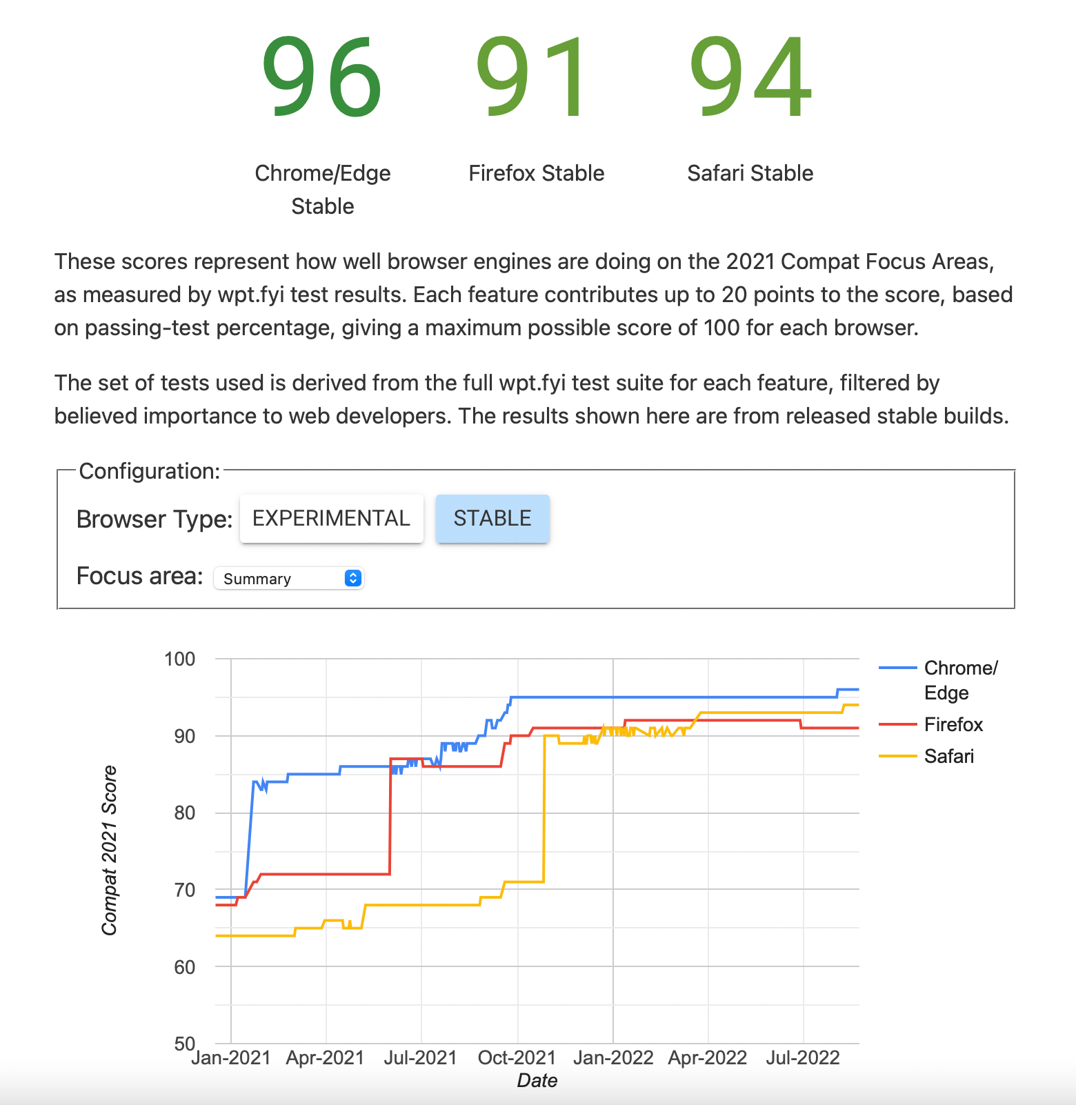
(Source: Web Platform Tests)
Today, you can see that significant levels of improvement have been made. Chrome and Edge are at 96%, Firefox at 91%, and Safari at 94%.
Grid
CSS Grid is one of the most popular features in many years. The HTTP Archive data shows year over year doubling of adoption since its arrival, with a slight slowdown this year—only increasing half-again instead of doubling. Grid already had quite a high degree of interoperability, but there were still a number of minor differences in support. Work was done throughout 2021 and 2022 to improve alignment of the over 900 tests in Web Platform Tests that test features of Grid. If you’ve had past headaches trying to do something in Grid, give it another try—the situation may have changed for the better.
A good example of this is the ability to animate grid tracks—grid rows and columns—which as of mid-2022 was only supported by Firefox. However, as this chapter was being written, grid-track animation was added to both WebKit and Chromium, meaning all three major engines should be animating grid tracks by the time you read this.
Flexbox
Flexbox is even older and more widely used. This year its use has grown again, now appearing on 75% of mobile pages and 76% of desktop pages. It has a similar number of tests to Grid and despite very wide adoption started in much worse shape. Entering 2021, we had a combination of ragged bugs and sub-features that remained under-implemented. For example, positional-alignment keyword values (which can be applied to justify-content and align-content and also to justify-self and align-self) had ragged support and several interoperability issues. For absolute positioned flex items this was even worse. These issues have been resolved.
flex-basis: content in their stylesheets.
Another bit of focus was toward flex-basis: content, which is used to automatically size based on the flex item’s content. This was initially implemented in Firefox, but implementations in WebKit and Chromium were underway in 2021. Today these tests pass uniformly in all browsers and flex-basis: content appears on 112,323 pages on desktop and 75,565 mobile, roughly 1% of pages. That’s not a bad start for a feature in its first year of universal support and about double what it was last year. We’ll keep an eye on this metric in the future.
Sticky positioning
position: sticky in their stylesheets.
Sticky positioning has been around for a while. In fact, it’s worth noting that it is the most popular feature query in used by a large margin, accounting for over 50% of feature queries. It had several interoperability issues; for example, the inability to stick headers in tables in Chrome. position: sticky is actively used in around 5% of desktop pages and 4% of mobile pages in 2022. We’ll keep an eye on this metric for some time to come to see how addressing those interoperability issues affects adoption over time.
CSS transforms
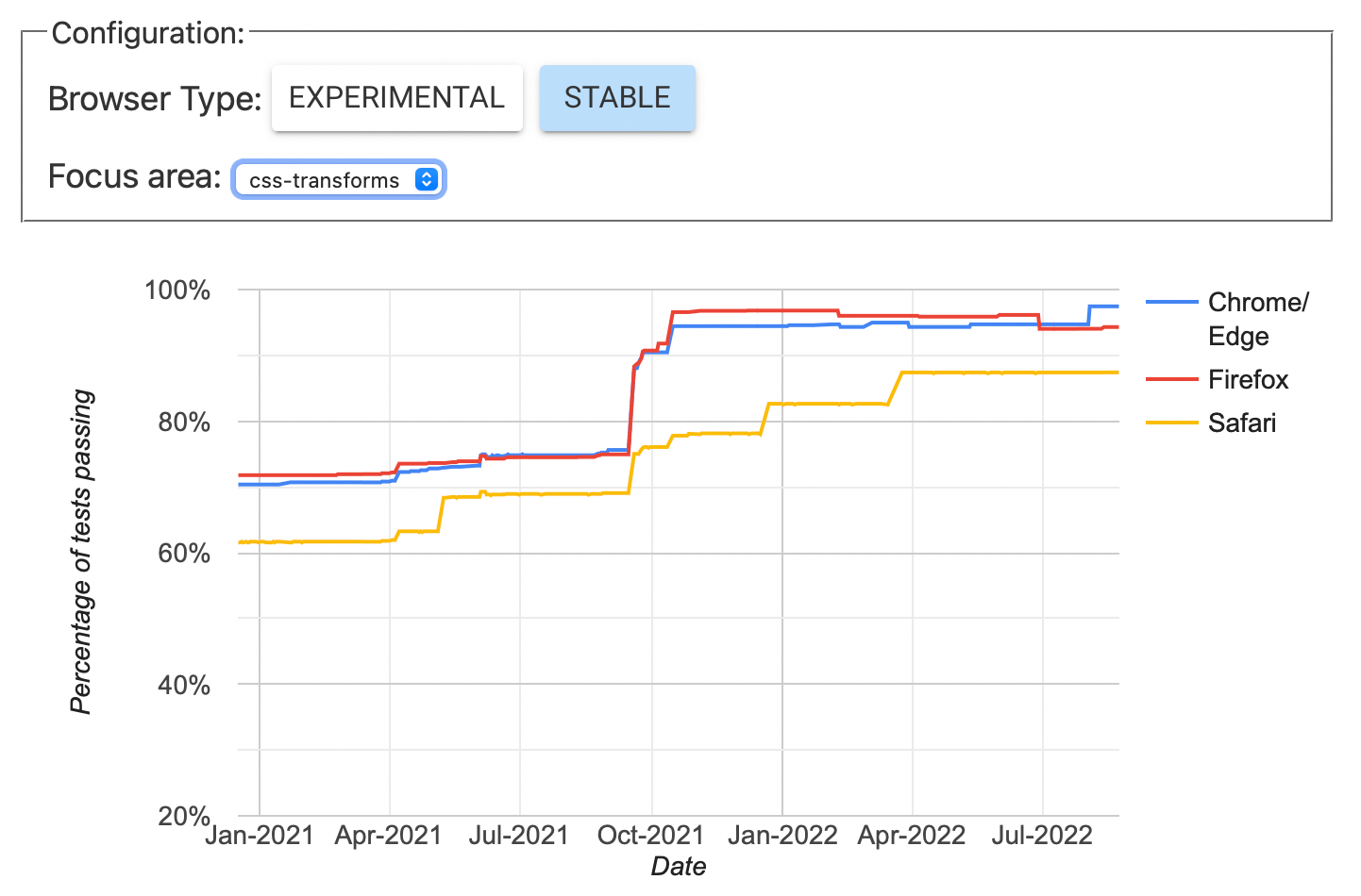
(Source: Web Platform Tests)
CSS Transforms are popular and have been around for a long time. However, there were many interoperability issues at the start, particularly around perspective:none and transform-style: preserve-3d. This meant that many animations were annoyingly inconsistent.
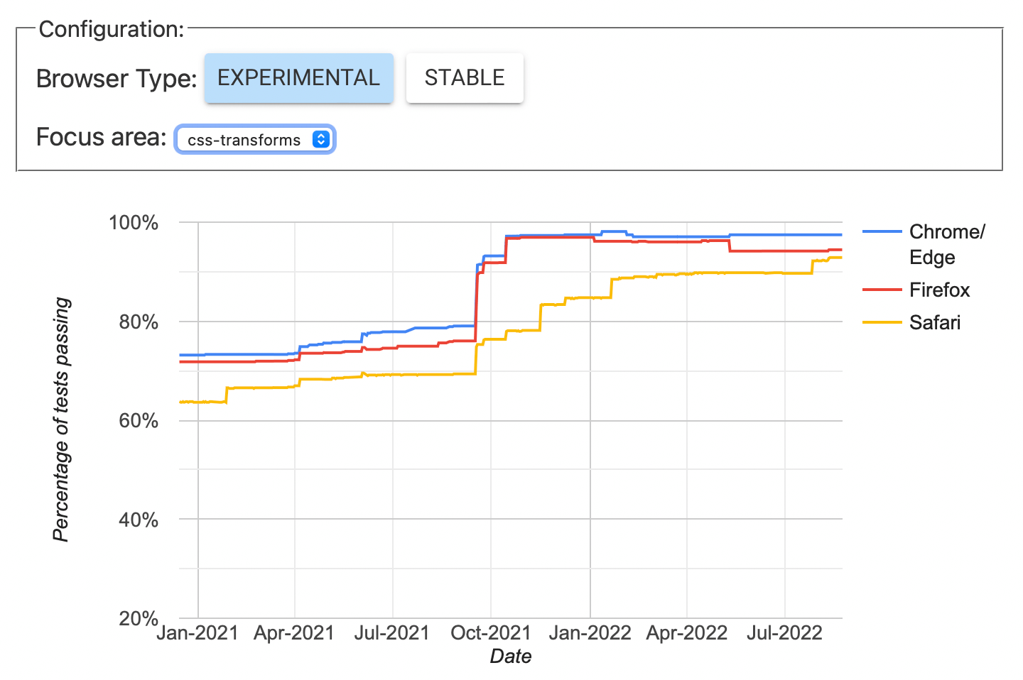
(Source: Web Platform Tests)
A recent compat 2021 graph showing the same CSS transforms in experimental browsers as above shows all browsers are scoring 90% or better in their experimental versions, which show future versions of the browsers. This was one of the areas with big, visible improvements in stable browsers, which continue to improve, as part of Interop 2022 involves continuing Compat 2021 work.
aspect-ratio
aspect-ratio was a new feature developed in 2021. Given its potential widespread usefulness, we chose to aim for high interoperability from the start.
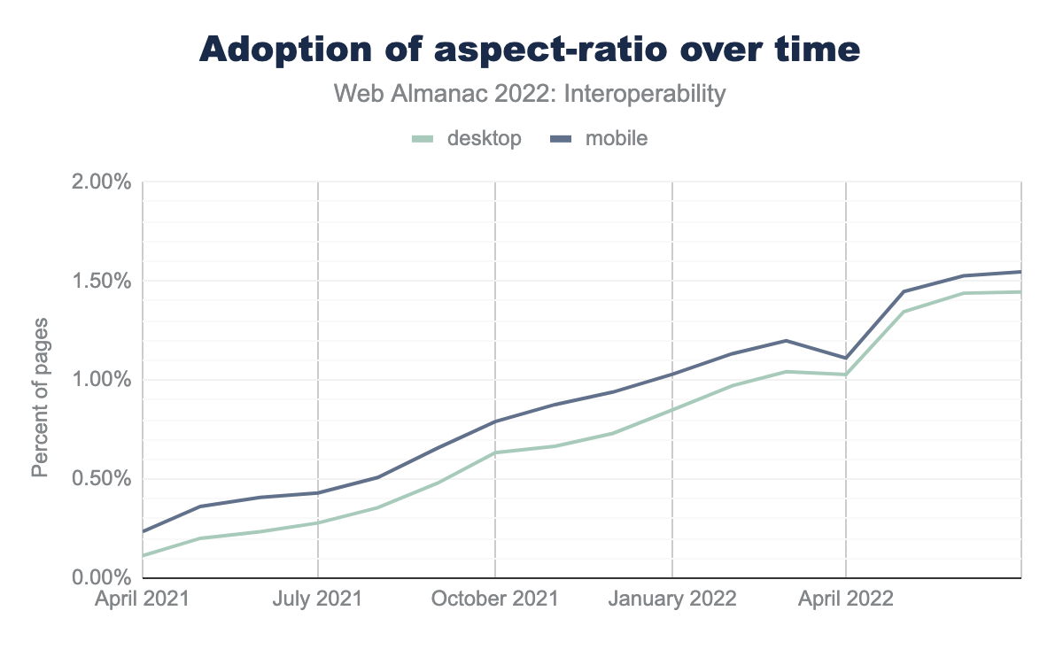
(Source: Chrome Status)
In 2022, aspect-ratio is already appearing in the CSS of 2% of URLs in the archive crawl. Note that doesn’t mean that 2% of these pages are using aspect-ratio themselves: rules may be loaded for use in other pages on the site. Which rules are applied in those pages is a different question, and it shows a more modest 1.55% of page views on desktop and 1.44% on mobile. Still, the growth chart shows steady and increasing adoption. This will be an interesting metric to track as we move forward.
Interop 2022
Like the Compat effort before it, the renamed Interop effort focuses on a mix of things from collections of bugs to landing good, final implementations to relatively new but quickly shipping features we’d like to set off in good standing. Let’s start with the bugs…
Bugs
In many cases, we have otherwise mature features with ragged bugs reported in different browsers. Ragged bugs mean that the authoring experience is potentially a lot worse than individual pass rates might imply. For example, if all browsers report a pass rate on a series of tests of 70%, but all browsers fail on a different 30%, interoperability in practice would be quite low. A significant portion of our focus in Interop 2022 is around aligning implementations and closing bugs on features like these.
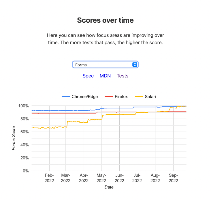
Forms
For most of the web’s history, forms have played a pretty important role. In 2022, over 69% of desktop pages include a <form> element. They’ve had a lot of investment, but despite that, they’re still the source of a lot of browser bugs as developers find cases where things differ from the specs, or differ from other implementations in sometimes subtle ways. We identified a set of 200 tests in which the pass rate was very ragged. Individual scores ranged from ~62% (Safari) to ~91% (Chrome), but again, each browser had different gaps in support.
We have made some pretty radical progress toward closing these gaps in experimental releases, and we hope that as we close out the year these will land in stable browsers. There is probably little that can be tracked here using the HTTP Archive data in terms of use, or adoption, but hopefully developers experience less pain and frustration and require fewer workarounds for individual browsers.
(Source: Web Platform Tests)
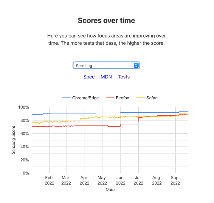
Scrolling
Over the years we’ve added new patterns and developed new abilities around scroll experiences like scroll-snap, scroll-behavior, and overscroll-behavior. The desire for these sorts of powers are clear—in 2022, the number of CSS stylesheets including some of these key properties looked like this:
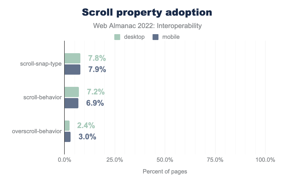
scroll-snap-type is used on 7.8% of desktop pages and 7.9% of mobile pages, scroll-behavior is used on 7.2% of desktop pages and 6.9% of mobile pages, and finally overscroll-behavior is used on 2.4% of desktop pages and 3.0% of mobile pages.Unfortunately, this is an area where a number of incompatibilities remain, and dealing with incompatibilities in scrolling causes developers a lot of pain. We identified 106 Web Platform Tests around scrolling. At the beginning of the process, stable-release scores ranged from ~70% (Firefox and Safari) to about 88% (Chrome). Again, keep in mind that these are overall scores—because the gaps differed, the real “interoperability” intersection was lower than any of these.
(Source: Web Platform Tests)
It is very difficult to estimate what effect these improvements will have on adoption over time, but we’ll keep an eye on these metrics. In the meantime, if you’ve experienced some interoperability pains with scrolling features, you might give them another look. We hope that as these improvements continue and reach stable browser releases, the experience will get a lot better.
Typography and Encodings
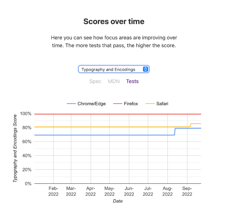
Rendering of text is sort of the web’s forte. Like forms, many basic ideas have been around forever, but there remain a number of gaps and inconsistencies around support for typography and encodings.
Interop 2022 took up a general bag of issues around font-variant-alternates, font-variant-position, the ic unit, and CJK text encodings. We identified 114 tests in Web Platform Tests representing different sorts of gaps.
(Source: Web Platform Tests)
Chrome has recently begun to close gaps with Safari, but both Safari and WebKit still require some attention to catch up to the completeness of Firefox in this area.
Completing Implementations
Aligning implementations is particularly difficult. There is a delicate balance between the need for experimentation and initial implementation experience and having enough agreement to ensure that the work is well understood and very likely to reach the status of shipping implementation in all browsers. Sometimes this alignment can take years. This year we’ve focused on three items which had an implementation and at least some agreement that it’s ready: The <dialog> element, CSS Containment, and Subgrid. Let’s look at each.
<dialog>
A dialog element was first shipped in Chrome 37 in August 2014. Introducing a dialog requires introducing and defining a number of supporting concepts like “top-layer” and “inertness.” It also requires answering many new accessibility and UX questions.
A number of things caused work on dialogs to stall for a long time, but over the years it’s picked back up. It landed in Firefox Nightly 53 behind a flag in April 2017. Since then, a lot of work has gone into answering all of those questions. Final details were sorted out and work was prioritized as part of Interop 2022 to ensure good interoperability to start with. We identified 88 Tests. It was shipped by default in stable browsers in both Firefox 98 and Safari 15.4 in March 2022, with all browsers scoring ~93% or better.
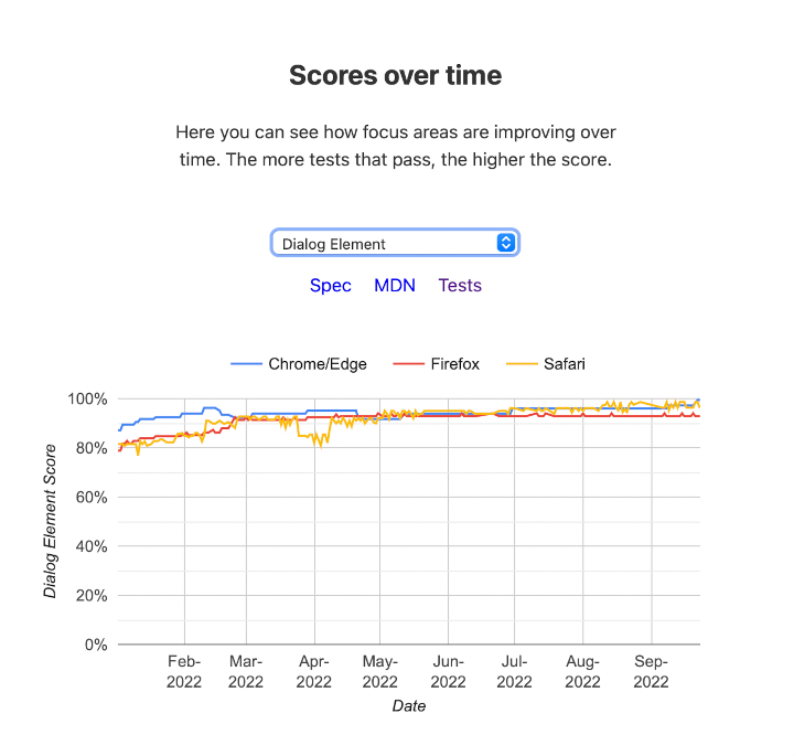
(Source: Web Platform Tests)
It’s hard to predict how many of the pages the archive crawls will require a <dialog>, but tracking its growth will be informative and interesting. Last year, only one shipping browser supported <dialog>, and it appeared on ~0.101% of pages in the mobile data set. At the time of the crawl we used for this chapter, it had been shipping universally for about 5 months and we found it appearing in ~0.148%. Still small numbers, but that’s ~146% of what it was this time last year. We will continue to track this metric next year. In the meantime, if you have a need for a <dialog> there’s good news: It’s now universally available for use!
CSS containment
CSS containment introduces a concept for isolating a subtree of the page from the rest of the page in terms of how CSS should process and render it. It was introduced as a primitive which could be used to improve performance, and to open the door for figuring out Container Queries.
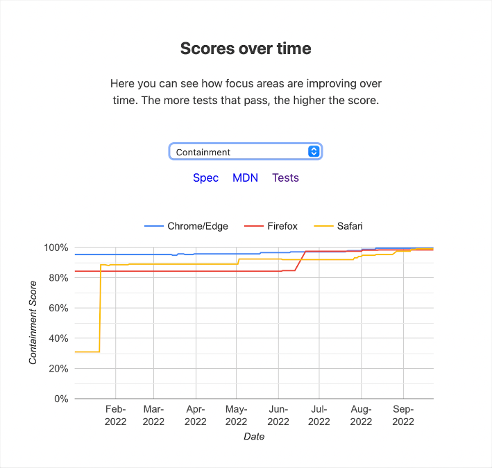
(Source: Web Platform Tests)
It first shipped in Chrome stable in July 2016. Firefox shipped the second implementation in September 2019. This year it was taken up by Interop 2022 to align and ensure that as it becomes universally available, we start out in good shape. We identified 235 tests. Safari shipped containment support in stable release 15.4 in March 2022. Throughout the year, each browser improved support, and it is now universally available.
In the 2022 data, containment appears in stylesheets on 3.7% of pages on mobile and 3.1% of pages on desktop.
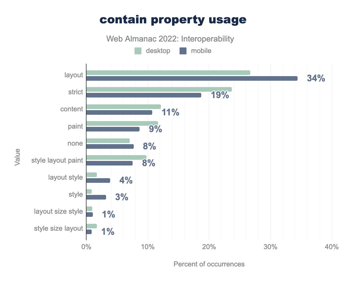
layout is 27% of contain values on desktop pages and 34% on mobile pages, strict is 24% and 19%, content is 12% and 11%, paint is 12% and 9%, none is 7% and 8%, style layout paint is 10% and 8%, layout style is 2% and 4%, style is 1% and 3%, layout size style is 1% and 1%, style size layout is 2% and 1%contain property usage.
The figure above shows the relative appearance of values in those pages—layout containment being far and away the most popular usage, accounting for 34% of contain values.
While it is useful on its own, additional levels of containment support are a prerequisite to supporting container queries, so this will be an interesting metric to continue to track over time as container queries is the #1 most requested CSS feature for many years. Now that containment is universally available, it’s a great time for you to have a look and familiarize yourself with the basic concepts.
Note that some degree of container queries support is already available in Chrome and Safari and polyfills are available, so we also decided to look at how many stylesheets already contain a @container ruleset, wondering how much this would account for the use we saw above.
@container ruleset.
Not much, yet it would seem! A mere 238 pages, out of the nearly 8 million pages we crawled in our mobile data set use container queries. Given that it is brand new and not yet completely shipping, this isn’t surprising. It does give us a nice baseline to start tracking adoption from in the future though.
Subgrid
While CSS grid layout has allowed a container to express layout of its children in terms of rows, columns and tracks—there has always been something of a limit here. There is frequently a need for descendants that are not children to participate in the same grid layout. Subgrid is the solution for problems like this. It was first supported in a stable release in Firefox in December 2019, but other implementations didn’t immediately follow.
Coordinating work on this long awaited feature and ensuring good interoperability was another goal in Interop 2022. We marked 51 Tests in Web Platform Tests.
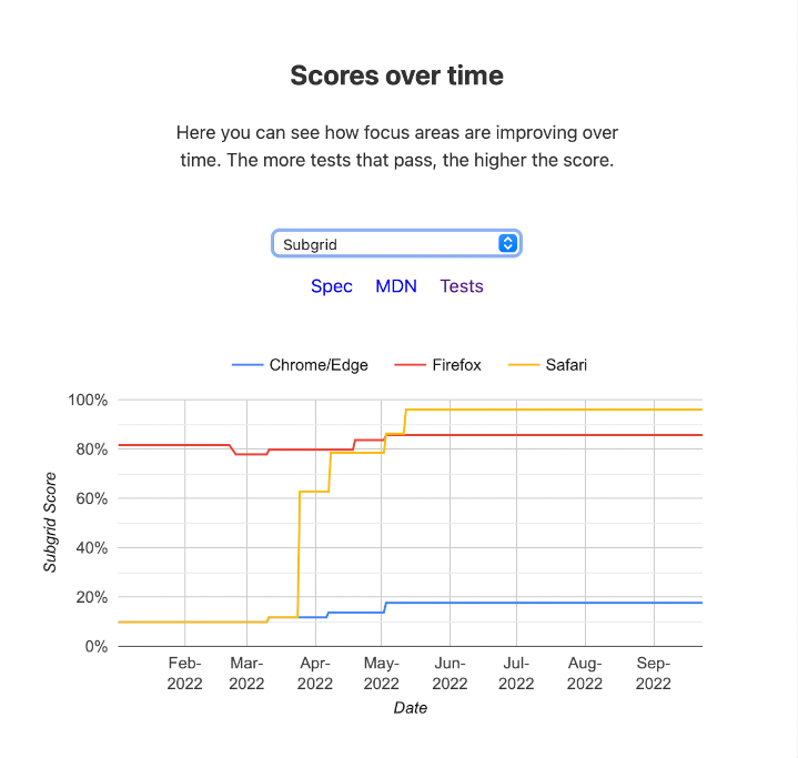
(Source: Web Platform Tests)
As of the time of this writing, there has been very good progress (Safari is now the most complete), and there are at least 2 implementations (Safari and Firefox) in stable shipping browsers. We hope to see rapid improvement in Chrome before the end of the year.
subgrid in their stylesheet.
While this isn’t fully available in all stable browsers yet the dataset did include some small amount of use already.
New Features
This year, all of the new features that fall under the category of CSS, and most of the data about them, will be covered in the CSS chapter. Here, we’ll mainly focus on some highlights.
Color Spaces and Functions
Color on the web has always been full of fascinating challenges. Over the years, we’ve given authors many ways to express what are—in the end—the same sRGB colors. That is, one can write as a color name (red). Simple enough.
However, we could also use its hex equivalent(#FF0000). Humans don’t generally think in hexadecimal, so we added the rgb() color function (rgb(255,0,0)). Note that both of those are just using two different, but equivalent, numbering systems. They are also about expressing things in terms of mixing the intensity of individual lights that were common in cathode ray tube displays.
The RGB method of constructing colors can be very hard for humans to visualize, so we developed other coordinate systems for expressing sRGB colors in a (perhaps?) easier to understand, like hsl(0, 100%, 50%)or hwb(0, 0%, 0%). However, again, these are sRGB coordinate systems.
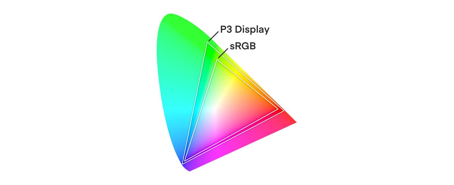
So, what happens when our display abilities exceed their limits? This is, in fact, the case today, as can be seen with wide gamut displays.
In Safari 10, released in 2017, Apple added support for P3 color images. The new lab() and lch() coordinate systems were added to CSS in order to support the full available gamut space, based on the CIELAB model. They are perceptually uniform, allowing us to express colors we could not previously (and defining what to do if support is lacking). Support for these first shipped in Safari 15 in September 2021.
The fuller gamut space and better perceptual uniformity of lab() and lch() also allow us to more easily focus on new color functions like color-mix(), which takes two colors and returns the result of mixing them in a specified color space by a specified amount.
Interop 2022 took up 189 tests around these items with a goal of prioritizing good interoperability. Safari began pretty well out ahead and has only improved—both Firefox and Chrome have made steady improvements, but they’re still quite a bit behind in this area. One challenge, inevitably, is that much lower-level support—throughout the underlying graphics library, rendering pipeline, etc.—is also built to deal in sRGB, so adding support is not easy.
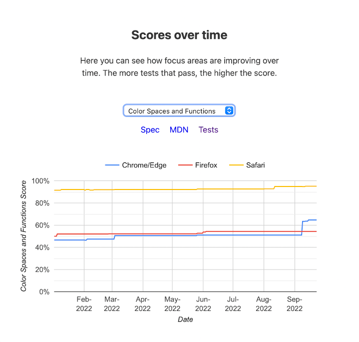
(Source: Web Platform Tests)
Viewport Units
In the 2020 MDN Browser Compatibility Report, the ability to work with the reported size of the viewport with existing vh/vw units was a common theme. As browsers experiment with different interface choices and websites have different design needs, the CSS Working Group defined several new classes of viewport units for measuring the largest (lv* units), smallest (sv* units) and dynamic (dv* units) viewport measures. All viewport related measures includes similar units:
- 1% of the width (
vw,lvw,svw,dvw) - 1% of the height (
vh,lvh,svh,dvh) - 1% of the size in the inline axis (
vi,lvi,svi,dvi) - 1% of the size of the initial containing block (
vb,lvb,svb,dvb) - The smaller of two dimensions (
vmin,lvmin,svmin,dvmin) - The larger of two dimensions (
vmax,lvmax,svmax,dvmax)
(Source: Web Platform Tests)
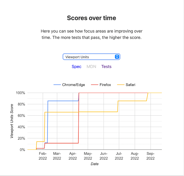
Interop 2022 identified 7 tests to verify various aspects of those units. Safari shipped the first support for these units in March 2022, followed by Firefox at the end of May. As of the time of this writing it is supported in experimental builds of Chromium.
As of the time of this writing, the HTTP Archive hasn’t turned up any use of these units in the wild yet, but it’s very new. We’ll continue to track adoption on this going forward.
Cascade Layers
Cascade Layers are an interesting new feature of CSS, built on a fundamental idea that has existed in CSS all along. As authors, our primary means of expressing the importance of rules has been specificity. This works well for a lot of things but it can quickly get unwieldy as we try to incorporate ideas for design systems or components. Browsers also use CSS internally in what is called the UA stylesheet. However, you might note that you don’t typically have specificity related battles with the UA stylesheet. That’s because there are “layers” of rules built right into how CSS works. Cascade Layers provides a way for authors to plug into that same mechanism and manage their CSS and specificity challenges more effectively. Miriam Suzanne wrote a fuller explanation and guide.
(Source: Web Platform Tests)
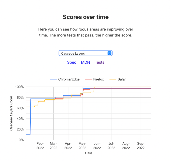
To set this off well, Interop 2022 defined 31 tests in Web Platform Tests. Support in stable browsers at the beginning of the year was non-existent, but since April it is now universally implemented among stable releases in the 3 engines. Here’s what development looked like.
@layer ruleset.
As of the time of the dataset for this year, layers occurred on a very small number of sites in the wild.
The largest number of layers defined was 6. Future editions of the Web Almanac will continue to track adoption and trends on Cascade Layers. Hopefully aligned work, close releases and early focus on good interoperability help it reach its potential and reduce any frustrations.
Given that it’s shipping everywhere, now would be a great time to learn more about how Cascade Layers can help you wrangle control of your CSS.
Conclusion
Interoperability is the goal of standards, and ultimately key to large scale adoption. However, in practice, reaching interoperability is the culmination of complex independent work, focus, budgeting and priorities. Historically this has occasionally been challenging with gaps of sometimes many years between implementations landing and then various incompatibilities. Browser vendors have heard this feedback and begun to put efforts toward increased focus on coordinated efforts to close existing gaps and to tighten the timeframe that it takes for new implementations to arrive with a very high degree of interoperability.
We hope that this review of the work that has been done this year serves to inform developers and prompt adoption of and attention to these features. We will continue to track those metrics that we can and look toward how we can use data to inform our sense of how we’re doing and influence where and how we’re focusing.
