Mobile Web
Introduction
In January 2021, 59.5% of the global population was on the internet. Of the global 4.66 billion active internet users, 92.6% accessed the internet on a mobile device.
With the ubiquity of mobile web tucked in our pockets, Statista reports that 80.8% of the global population owns a smartphone. This is a relatively minor growth of 0.0% year over year. In comparison, 49.4% of the population in 2016 owned a smartphone.
In this chapter, we looked at recent trends on the mobile web including worldwide connectivity, technology adoption, and mobile-friendly feature usage.
A note on methodology
When considering the challenge of how to categorize tablet experiences in relation to the mobile web, we decided to omit the data set from our analysis. Often, tablet data will be grouped into desktop or mobile. There is no uniform standard as to which it should default.
A note on our data sources
We’ve used a few different data sources in this chapter:
- CrUX
- HTTP Archive
- Lighthouse
- Wappalyzer
- Akamai
It is worth noting that HTTP Archive and Lighthouse data is limited to the data identified from websites’ home pages only, and not site-wide. Learn more in our Methodology page.
Worldwide connectivity
2021 is another year affected by the global COVID-19 pandemic, which has both affected different regions of the world differently, and the measures to combat the pandemic have varied from area to area too. Has this changed how people use their mobile devices versus laptops and computers?
Cost of mobile web access
The financial cost of mobile web access varied greatly in 2021. One analysis showed that the average price of 1 GB is only $0.05 USD in Israel. The same data cost usage in Equatorial Guinea would cost a user $49.67 USD.
Data from the Performance chapter shows the median site now weighs 2,205 KB. Using market data, What Does My Site Cost calculated the best-case scenario price to load the median site.
The most expensive paid loads cost Canadian users $0.26 USD, followed by Brazil at $0.18 USD. The same page loaded on a commonly available data plan in Poland or Russia would barely register on a users’ bill, costing less than $0.01 USD.
Traffic to a site from mobile versus desktop (CrUX)
What percentage of traffic comes from mobile devices vs. desktop? Predicting this for any individual site can be hard, and the type of site and the industry it is in can vastly change the make-up of these different users.
Traffic use by popularity
New this year, the CrUX dataset allows us to query the most popular sites ranked by magnitude, by traffic recorded to these origins.
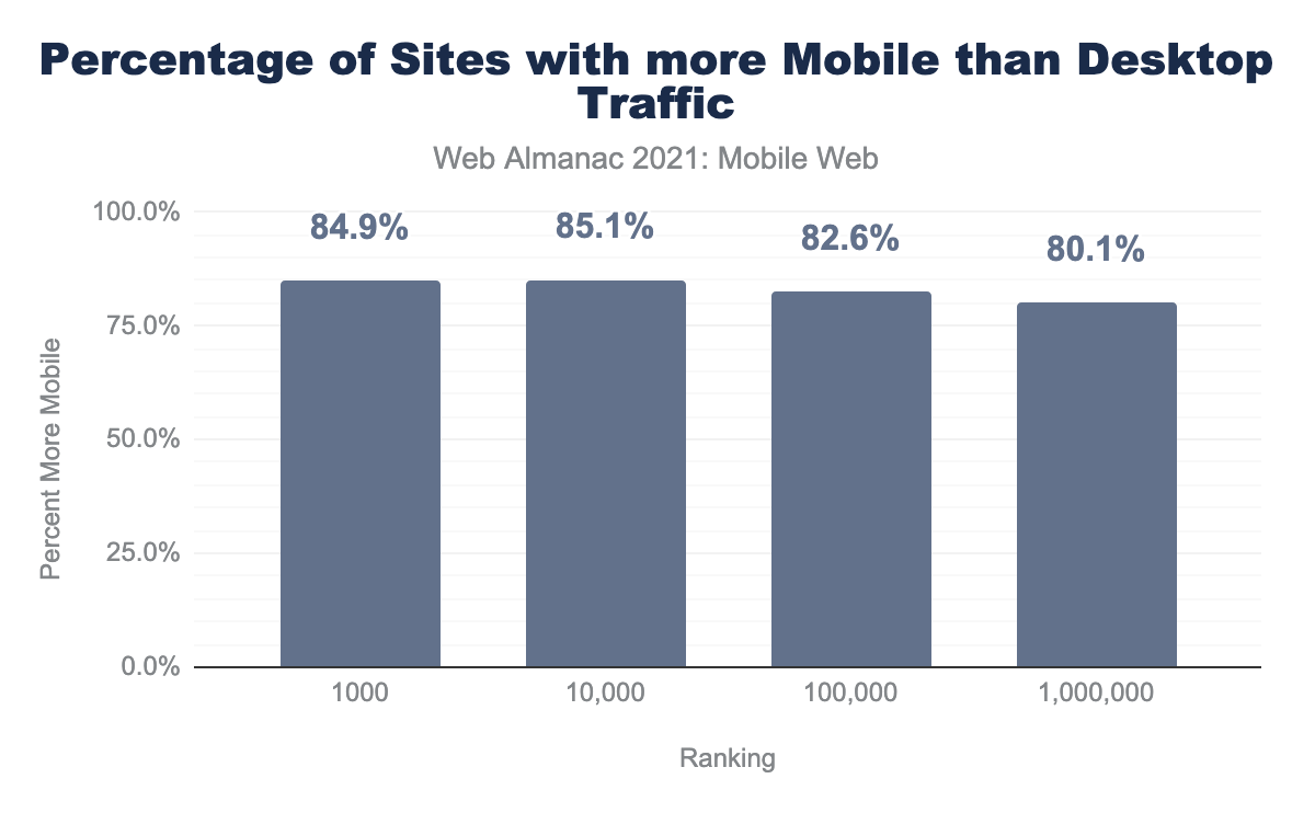
When grouped by CrUX ranking (the top 1,000, 10,000 and so on origins by traffic in the dataset), the more traffic a site receives, there is a slight increase of the percentage of traffic it gets from mobile, all except the top 1,000, which get slightly less (84.9% vs. 85.1%) mobile vs. desktop.
Traffic distribution
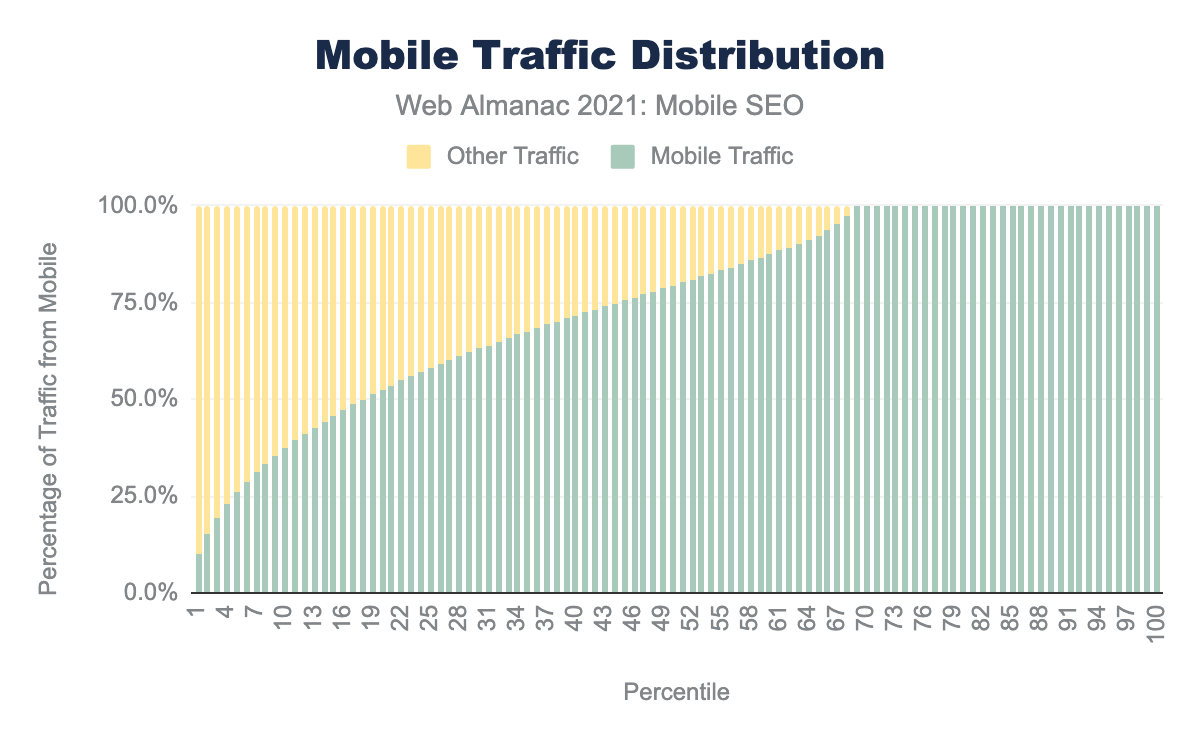
The distribution shows a similar, mobile heavy trend. At the 50th percentile, 79.4% of traffic comes from mobile devices, an increase over 77.6% in 2020, and catching up with the 79.9% percentage in 2019.
Beyond CrUX data
A limitation of the CrUX dataset is that it can only collect data from Chrome users, who are signed in, have syncing enabled and have not disabled the Make searches and browsing better / Sends URLs of pages you visit to Google setting. This means that:
- Other major browsers, like Firefox and Safari are missing
- There is no data from iOS users at all (Chrome uses WebKit on iOS, like all other browsers on iOS devices)
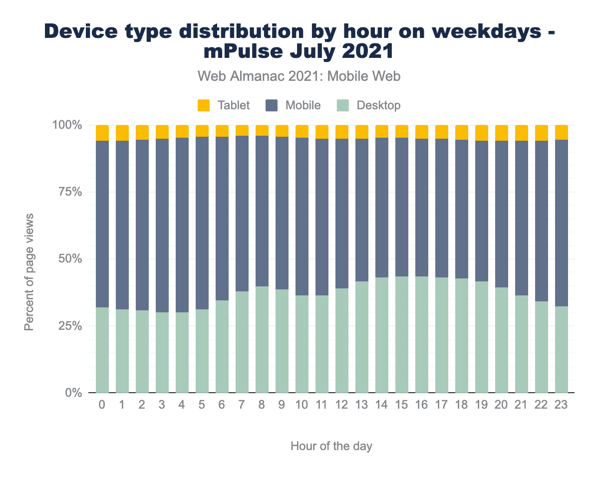
Fortunately, there are a few other sources. Paul Calvano ran some analysis on the Akamai mPulse real user monitoring data for July 2021. It found a slightly more even match between Mobile and Desktop traffic, at 59.4% being from mobile devices. The mPulse data is aggregated hourly, so it reveals some interesting trends
Not all days are equal
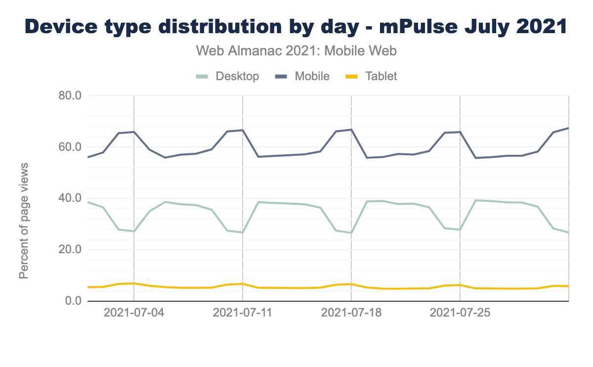
Weekend days show a greater proportion of mobile traffic, climbing somewhere around 10% from around 55 - 56% to 65 - 67%. Globally, not every country has Monday to Friday work weeks - Sunday to Thursday is also another common pattern, something that can be seen with a slight ramp up on Fridays, leading to a bigger jump in mobile usage on Saturdays and Sundays.
Not all times are equal
On weekdays, mobile usage decreases, and desktop usage increases as an overall percentage of traffic. This indicates that internet users are switching between mobile and desktop devices. Around 5 AM UTC and starts climbing again at 7 PM UTC (with a small bump around 10 / 11 AM). This aligns with working hours.
On weekends the split between mobile and desktop traffic remains more stable.
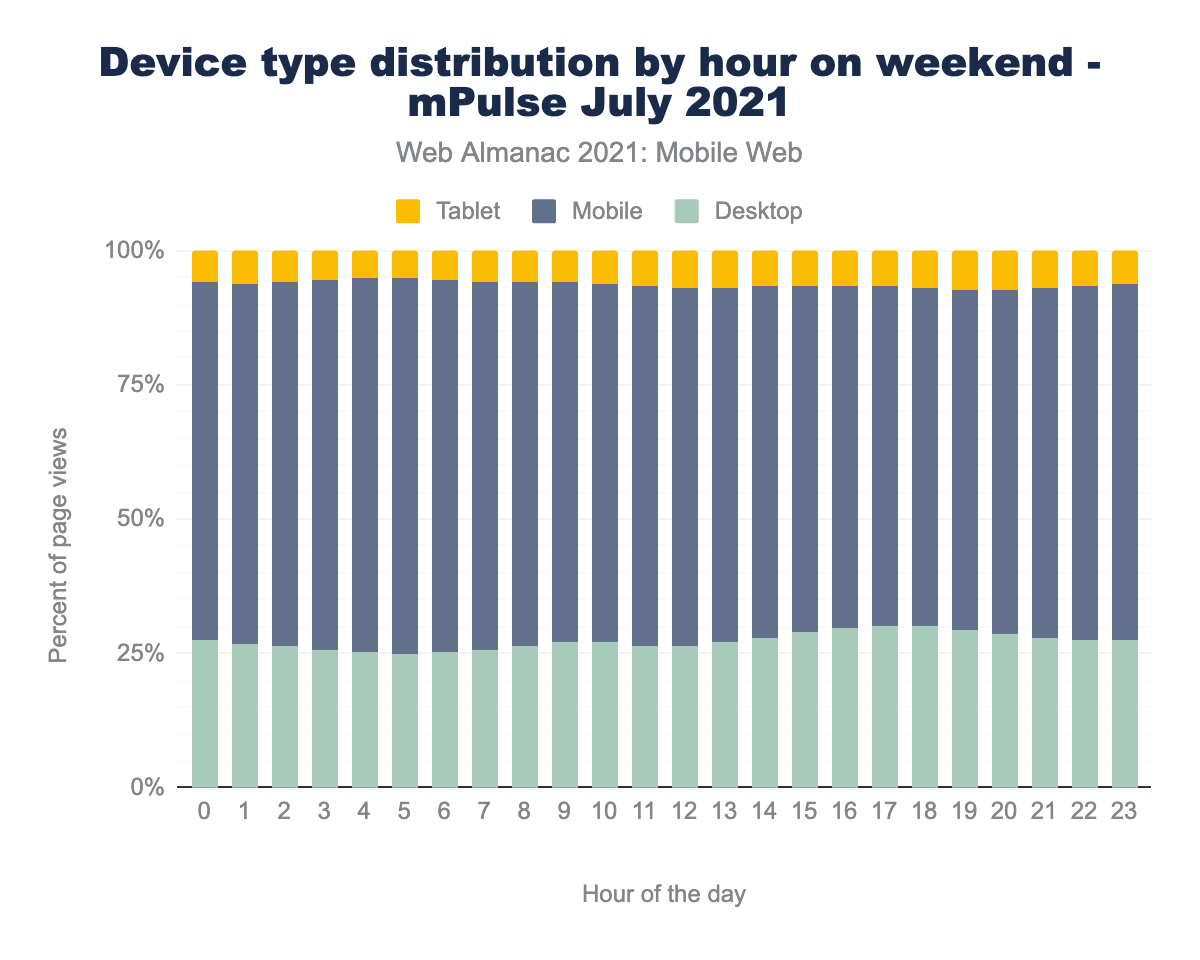
This all suggests that people who have the choice between different devices are more likely to use mobile ones in their personal time.
Cloudflare also released a great study. Like the Akamai data, this study shows a much closer split between mobile and desktop devices than the CrUX dataset. In the 30 days leading up to October 4th, 52% of traffic was mobile.
We looked for, in the past month, the country with the highest proportion of mobile Internet traffic. And the answer is… Sudan, with 83% of Internet traffic is done using mobile devices — actually it’s a tie with Yemen.
Cloudflare’s Radar trend reports allow them to segment traffic by geographic region, and it’s interesting to see the variations regionally between the split of mobile vs. desktop, from Sudan and Yemen tying at 83% usage, compared to the Seychelles at just 29% mobile.
Drawing conclusions
Mobile device usage remains strong, and it’s apparent that despite a global trend of people being at home more than ever before (due to restrictions and advice from health authorities and governments), mobile devices remain the most popular way to access websites. The popularity of mobile over desktop seems to have regained most of the ground lost last year—itself a fairly small regression.
Naturally the figures cannot tell us the reasons behind that, but it’s worth remembering that for a large amount of web users, mobile devices may be the only device available to them, and there is no choice between using a mobile or a desktop.
Whilst it can be hard to predict if your mobile traffic percentage is expected, if it seems low vs. your region and sector, it could be an indication you are under-serving this portion of your user base.
Mobile methodology & tech stacks
While mobile web is highly used, these experiences typically have less processing power and slower internet interconnectivity. Many technologies have emerged to mitigate these limitations. These include Client Hints and APIs that identify the connection type and serve assets best suited for the connection.
In this section we will also look at overall app usage for the mobile web and how the programming languages, content management systems, and web servers compare to desktop experiences.
Client Hints
Client Hints are a collection of HTTP request header fields a server can request from the client accessing it to get information on the device, its capabilities, the network conditions and other agent settings and preferences.
This gives the ability to make decisions and serve code, content and experience that’s more tailored to that device.
For the mobile web, poor network conditions and lower powered devices are much more common, and sites that are proactively requesting this information are likely to be thinking beyond merely squeezing down their desktop pages to fit on a mobile screen.
HTTP Client Hints are a relatively new, and somewhat experimental feature, with the RFC only published in February this year. It’s therefore fairly encouraging that we found 1.4% of sites are requesting at least one of these Client Hints from mobile users, compared with just 1.0% for desktop users.
Whilst we are not able to tell what the sites might do with that information, and exactly how they use these hints to tailor the experience to mobile users, asking is a good first sign.
These hints can be roughly assigned into three groups:
- Device Client Hints: Details of the capabilities and features of the device accessing the site.
- Network Client Hints: Details of the network connection between the device and the server.
- User-Agent Hints: Details about the agent accessing the site.
Device Client Hints
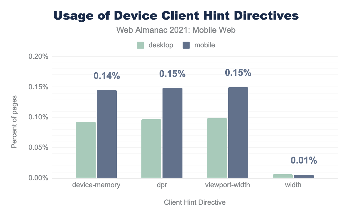
device-memory, dpr, or viewport-width Client Hints (approximately 0.10% compared to 0.15%). Usage of the width was equal between device types at 0.01%.
Uptake here is low, with DPR and Viewport-Width leading with 0.15% of mobile sites requesting this, Device-Memory a little behind at 0.14% and Width at just 0.0%, but this is now deprecated, the proposed replacement being Sec-CH-Width, we detected no sites requesting this.
Currently, only Chrome, (and Chromium based browsers like Microsoft’s Edge), and Opera support these headers, with Safari and Firefox not yet onboard.
Network Client Hints
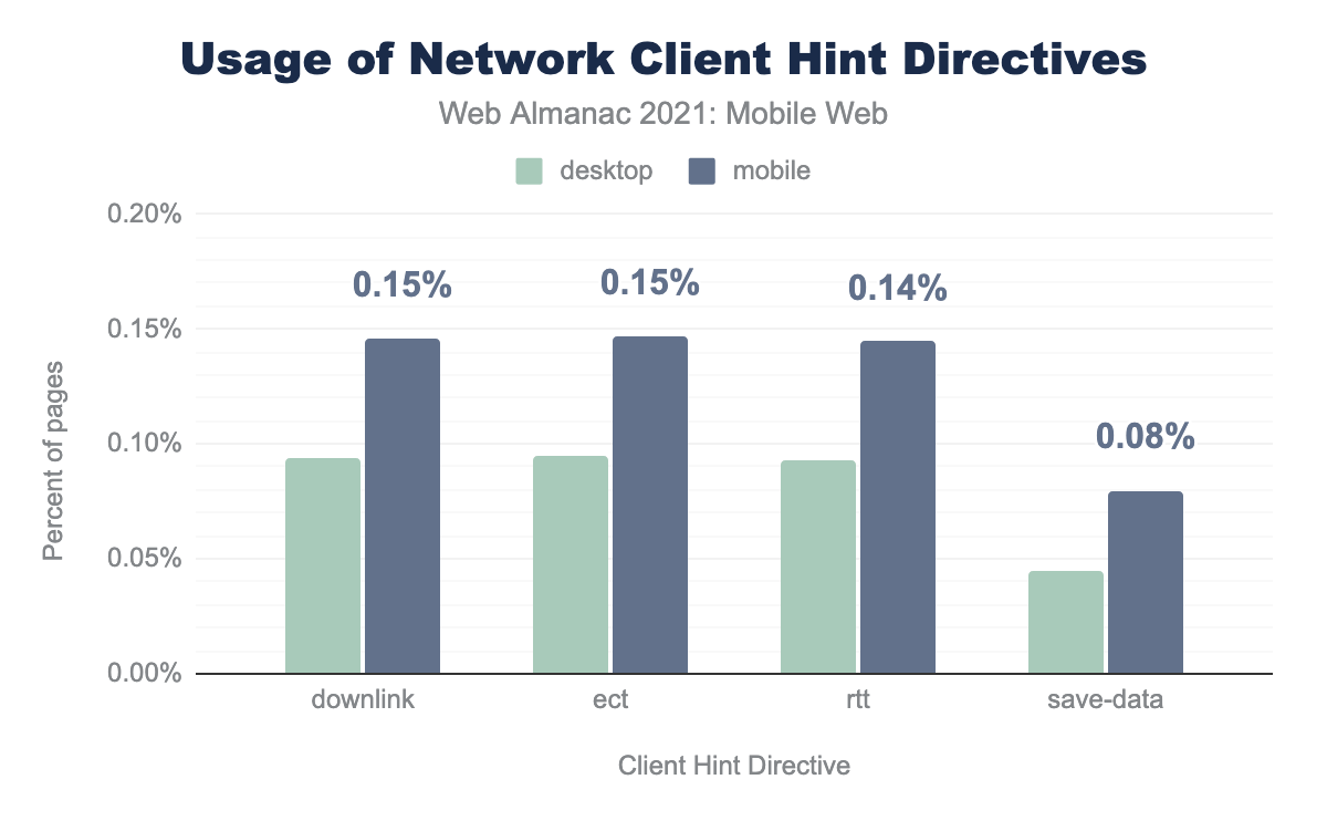
save-data being used less by both at 0.04% and 0.08% respectively.Network Client Hints show a similar uptake to Device Client Hints, with Downlink and ECT (effective connection type) being requested by 0.2% of loads on mobile, and RTT (round trip time) on 0.1% of loads on mobile.
Save-Data is surprisingly present less, at just 0.1% of mobile requests, seemingly a missed opportunity, given the user benefits possible, as detailed in the Google Web Fundamentals article, Delivering Fast and Light Applications with Save-Data.
User-Agent Client Hints
Major browsers like Chrome, Safari and Firefox reducing and capping the User-Agent string to reduce passive fingerprinting.
Traditionally, sites may have used this information to tailor the experience to those devices. This approach has always had some drawbacks in trying to keep up with the ever-changing landscape of devices, and the fact the user-agent string is easily changeable and spoofable.
User-Agent Client Hints offer a way to get this information, but unlike the Device and Network Hints do not require the server to request this via the Accept-CH header. This is perhaps why we detected only a tiny handful of sites requesting this.
Network Information API and Device Memory API usage
The Network Information API and Navigator.deviceMemory offer an interface to JavaScript to gather device and connection information, similar in scope to those exposed with Client Hints.
Network Information API
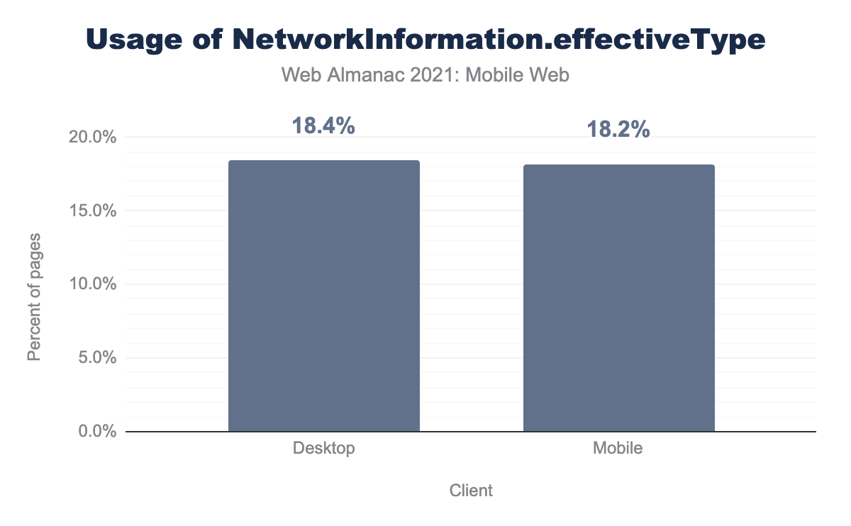
NetworkInformation.effectiveType.
We focused of mobile vs. desktop page loads making use of NetworkInformation.effectiveType, which returns a string based on the effective connection type, slow-2g, 2g, 3g, or 4g. The top tier is 4g, so could really be seen as “4g or faster”, including 5g and broadband, fixed connections.
18.2% of mobile requests had page loads utilizing NetworkInformation.effectiveType, but surprisingly, a very slightly higher 18.4% of desktop requests detected use of this API.
Device Memory API
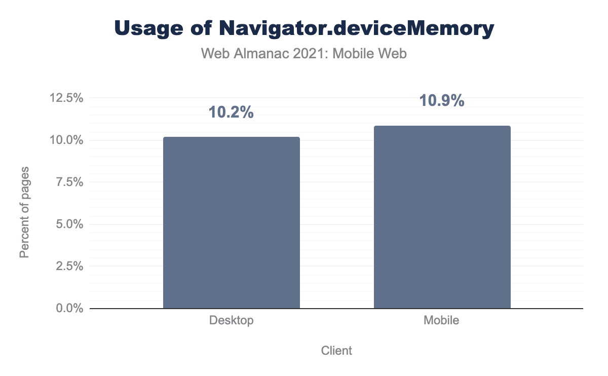
Navigator.deviceMemoryAPI on mobile and desktop. 10.2% of desktop sites used the Device Memory API compared to 10.9% of mobile page loads.Navigator.deviceMemory.
This API returns an approximate amount of device memory, useful to judge what the client might be capable of handling and adapt accordingly.
10.9% of mobile page loads utilized this API, slightly higher than 10.2% for desktop loads.
Much like Client Hints, these APIs are still experimental, and also do not have universal support across browsers (source: Network Information API & Navigator.deviceMemory but have much wider adoption.
One reason for wider adoption could be third-party scripts requesting these on page loads. Another reason may be ease of implementation. Setting and reading HTTP headers may be seen as more complex and more likely to involve changes to infrastructure.
Client Hints, Network Information API and Device Memory API conclusions
For experimental APIs and features, there are already some encouraging take up of these features. Hopefully as browser support grows and the APIs move from experimental status, uptake will grow further.
If you have a network or device capability limited web app, and you have a significant proportion of users accessing from lower powered devices, and/or poor network connections, now might be the time to investigate if these APIs can let you offer a better user experience for them.
App usage on the mobile web
The most commonly used libraries and technologies found on the mobile web impact performance and inform us on technology adoption.
According to Wappalyzer data, JavaScript library JQuery is the dominant library of the mobile web, present in 84.4% of tested sites. Google is the dominant provider, holding three of the top five spots.
| App | Mobile | Desktop | Diff desktop v mobile use |
|---|---|---|---|
| jQuery | 84.4% | 84.4% | 1.0% |
| Google Analytics | 65.4% | 68.6% | 3.2% |
| PHP | 50.5% | 50.5% | -0.4% |
| Google Font API | 47.6% | 47.6% | -0.1% |
| Google Tag Manager | 43.4% | 43.4% | 2.6% |
Of the top five mobile web technologies, adoption rates for three were higher on desktop sites. It is reasonable to attribute lower mobile adoption rates of these apps to mobile performance initiatives as these apps are frequently flagged by Lighthouse, the open-source auditing tool recommended by Google to diagnose performance issues.
In 2021, Google added the Page Experience Ranking Signal to its algorithm. This ranking signal is specific to search engine results pages served on mobile devices and uses aggregated data from real user page loads to measurement performance.
JavaScript library JQuery is the dominant library of the mobile web, present in 84.4% of mobile page loads. Google is the dominant provider, holding three of the top five spots.
Content Management Systems
Content management systems allow site owners to publish, update, and control content through an authenticated backend. The top five content management systems on the mobile web in 2021 were:
| CMS | Mobile | Desktop |
|---|---|---|
| WordPress | 33.6% | 32.9% |
| Joomla | 2.0% | 1.7% |
| Drupal | 1.8% | 2.1% |
| Wix | 1.6% | 1.2% |
| Squarespace | 1.0% | 1.2% |
WordPress, an open-source CMS written in PHP, was the dominant CMS in 2021. The technology appeared on 33.6% of sites.
Comparing desktop technology adoption rates
Technology adoption rates for the mobile web moved in step with desktop. The most notable difference came in the form of third-party pixel use. 68.6% of desktop sites used Google Analytics compared to 65.4% of mobile sites.
| Category | Technology | Desktop | Mobile | % higher desktop adoption rate |
|---|---|---|---|---|
| Analytics | Google Analytics | 68.6% | 65.4% | 3.2% |
| Tag managers | Google Tag Manager | 46.0% | 43.4% | 2.6% |
| Analytics | Facebook Pixel | 20.6% | 18.9% | 1.7% |
| Widgets | 28.0% | 26.3% | 1.6% | |
| JavaScript libraries | jQuery UI | 23.8% | 22.2% | 1.5% |
Given the changes to performance measurement and prioritization, it’s reasonable to consider the absence of these JavaScript-heavy, third-party, assets as part of an intentional effort to improve mobile page experience. The Facebook Pixel analytics script was found on -1.7% fewer mobile sites than desktop.
Mobile sites were more likely to adopt certain technologies, but with a smaller margin. Blogger was found on 3.1% of mobile sites and 1.7% of desktop sites
| Category | Technology | Desktop | Mobile | % higher mobile adoption rate |
|---|---|---|---|---|
| Blogs | Blogger | 1.7% | 3.1% | 1.5% |
| Web servers | OpenGSE | 1.7% | 3.2% | 1.5% |
| Programming languages | Python | 2.2% | 3.6% | 1.4% |
| Programming languages | Java | 2.8% | 4.0% | 1.2% |
Drawing conclusions on mobile web app usage
JavaScript via JQuery permeated the mobile web in 2021. Third-party analytics tools had a lower adoption rate on mobile.
One thing that shines through in the data is that at a CMS and web server level, mobile and desktop share a close correlation in how people develop sites, perhaps in large part to the lower overheads of responsive design, meaning one codebase for all experiences.
With WordPress not only maintaining, but extending its popularity for mobile sites, and other CMSs enjoying a similar share to the desktop experience, there’s a great opportunity for CMS core improvements and optimizations to bring an outsized benefit to the whole mobile web.
This makes drives like the proposed WordPress Performance Team important and valuable.
Interacting with the mobile web
Attention to mobile design and friendliness are critical to reducing friction in the user journey. Users navigate the mobile web with taps of their fingers rather than the more refined control provided by a mouse or trackpad.
Alternative protocol links
The web is built on links. On the mobile web, Unique Resource Identifier schemes beyond http/s, can allow users to complete tasks like dialing a phone number using tel: or starting an email with minimal friction.
The most prevalent URI schemes were https:, found on 93.2% of sites, and its non-secure equivalent, http:, appearing on 56.7%. The high use of non-secure link protocols is noteworthy as 2020 saw major announcements from browsers to protect users’ safety by alerting them when content is not secure.
After web page links, the next five most used protocols in anchor href values on the mobile web are as follows:
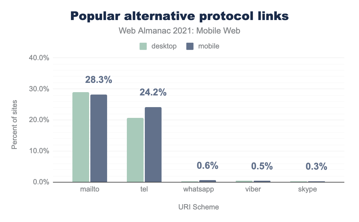
mailto is used slightly more on desktop (28.9% compared to 28.3%), tel more on mobile (20.7% versus 24.2%), whatsapp, viber, and skype are used less but more so on mobile (0.4%, 0.4%, and 0.3% on desktop compared to 0.6%, 0.5%, and 0.3% respectively on mobile).Mobile devices whilst limited in some aspects do tend to be better connected, they are a phone, have SMS and other messaging services where desktop clients may not. Usage of other link protocols past the standard http: / https: can help unlock some of these capabilities. Providing a tappable link to call or send a message without having to copy and paste makes for a smoother, more integrated user interaction.
mailto
mailto: invokes the users chosen email client, clicking:
<a href="mailto:enquiries@example.com?subject=Enquiring about Red Widgets">
  enquiries@example.com
</a>
Would prefill an email with the specified email address and subject line. Helpful on mobile, but also relevant for desktop too.
tel
tel: invokes a call:
<a href="tel:+44123467890">
  Call +44 (0)123 4567890
</a>
Would open the phone app, ready to dial that number. This saves copy / paste and reduces friction if your business values phone leads or enquiries.
sms
sms: invokes the clients default SMS messaging app:
<a href="sms:+441234567890">
  Text Us
</a>
When clicked would prefill a message with the right number, you can also prefill the message body. This fell out of the top 5, with just 0.3% of mobile site loads utilizing this.
Other messaging apps
Other messaging apps can register a protocol to have a <a href=""> open them, as seen in the table above, WhatsApp and Viber are the two leading ones here, outstripping the native sms: app usage.
Alternative protocol links conclusions
mailto: has a long history on the internet, right back to 1994, but it’s encouraging to see tel: reach 24% usage, not a long way behind, given its additional usefulness on mobile devices.
It’s surprising to see sms with such small uptake, and disappointing that its uptake is below proprietary apps like WhatsApp and Viber.
SMS is more likely to be available as default and require no additional installations, so seemingly more accessible. However, WhatsApp and Viber messages are free, while SMS messages may incur charges from the user’s mobile provider. This could explain that relative popularity.
If you aren’t using some of the extended capabilities for communication that protocols past https: can offer your users, and it’s a good fit for your mobile website, these could offer a simple, user friendly, low development benefit.
Input fields
While URI schemes allow users to take actions from a website, input fields allow users to provide information to a website.
Input elements are one of the most powerful and complex features in HTML. Input elements are used to create interactive controls for web-based forms. Web users experience these elements such as buttons, checkboxes, calendars, search, and other elements which allow control of a page’s content based on user input.
71.5% of mobile pages tested contained inputs. This is slightly higher than the 71.1% of desktop.
Type declarations
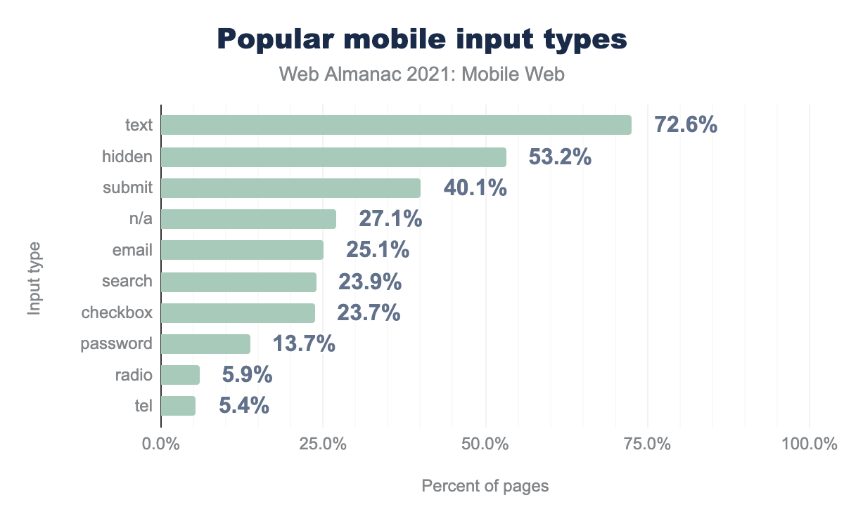
text is used on 72.6% of mobile pages that use input types, hidden is used on 53.2%, submit is used on 40.1%, it is not set (n/a) on 27.1%, email is used on 25.1%, search is used on 23.9%, checkbox is used on 23.7%, password is used on 13.7% radio is used on 5.9%, and finally tel is used on 5.4%.We can track occurrences of interactive controls created by input by looking for the type attribute. The type attribute is the most important because it controls how the input element works. The type attribute value was declared on 70.9% of tested sites.
If the type attribute is not present the input defaults to text, a single line text field. In analysis of pages using input elements, 27.1% of those pages did not declare an input type and used the default text string value.
Out of all pages using inputs, 72.6% contained at least one text input type. This was the most used.
The declared text value combined with the fallback value indicates that 99.7% of sites using input elements capture a text value.
Advanced input types
Of pages with at least one input, 44.8% of them use one or more “advanced input types”. Advanced input types include color, date, datetime-local, email, month, number, range, reset, search, tel, time, url, week, datalist.
Telephone
5.4% of pages asked users for their telephone number. For mobile users, navigating from the alpha to numeric keyboard is a high friction point. 62.6% of pages soliciting a telephone number used an input field missing the type=tel value.
The email input type requires the user to submit a valid email address. A non-email value entered in the form prompts an error to display when the form is submitted.
25.1% of pages contained at least one field asking users for their email.
Email collection is often a key micro conversion in the user journey so capturing it with minimal friction benefits the site with a higher conversion rate. Even with this clear business value, 42% of pages which ask for user emails do not use the type=email input type on at least one instance.
Search input
Site search is a powerful tool in navigating users to their desired content. Search inputs are text fields functionally identical to text. The main difference between search and text input fields is how they are handled by the browser.
Use of the search input type can trigger a cross icon which allows users to quickly clear existing query text. Many modern browsers also store search queries across domains. When the search type is denoted, stored queries can be used to autocomplete the field.
23.9% of tested pages contained a search input field. It is worth noting that these fields may be present though using a text or undeclared input type. This is a slight increase over 2020 which saw 17% of sites using search input.
Business value appears to impact input type adoption. Ecommerce sites have a vested interest in swiftly moving users to a desired product in order to meet the business goal of a transaction.
43.3% of tested ecommerce sites use search input on their mobile experience. Interestingly, this is higher than 42.6% of sites using the input type for desktop clients.
Autocomplete
The autocomplete attribute allows some control over how forms and inputs work with browsers autofill features. There are a number of options, from disabling it entirely, to providing hints as to what to autofill, like a name, or street address.
Inputting text and data on mobile devices is a generally more tedious process than on a device with a full keyboard, so autofill becomes an even more useful and time saving feature than for desktop users. Google discovered a 25% increase in form submission when autofill is used.
For mobile page loads, 24.8% of pages utilized the autocomplete attribute, lower than the 27% of desktop page loads.
As the HTTP Archive data captures only home pages, usage could be much higher in checkout, contact and other places that are likely to require inputs, but it is perhaps disappointing to see lower usage on mobile experiences, where arguably it is the most useful.
Input field conclusions
Input type declarations are critical in reducing friction. If an input element is marked up using the appropriate type, input elements can prompt different keyboards to improve the experience. The boon to user experience makes the low-lift adoption of input types a meaningful investment.
The low rates of adoption for input types like telephone and email are surprising given the ubiquity of input fields on the mobile web. This gap between business goals and the user experience illustrates that user experience on the mobile web is critical. The greatest opportunities from websites may not come from in-house feature development, but rather leveraging the growing functionalities natively available in modern browsers.
Accessibility on the mobile web
The pandemic forced humans around the world to isolate themselves from friends, family, and community. The number of persons facing disabilities also increased due to post-COVID conditions. This shift forced digital spaces to the new default as in-person services, commerce, and communication were disrupted.
The goal of accessibility is to create web experiences which provide feature and information parity to all users. Users on the mobile benefit from accessibility as accessibility practices make information available to people using slow internet connections, or who have limited or expensive data plans.
ARIA roles
Accessible Rich Internet Applications (ARIA) is a set of attributes that supplement HTML so that commonly used interactions and widgets can be passed to assistive technologies. These attributes are also useful to search engines in understanding page content.
When a site is accessed using assistive technology, an element’s ARIA role communicates information about how the user can interact.
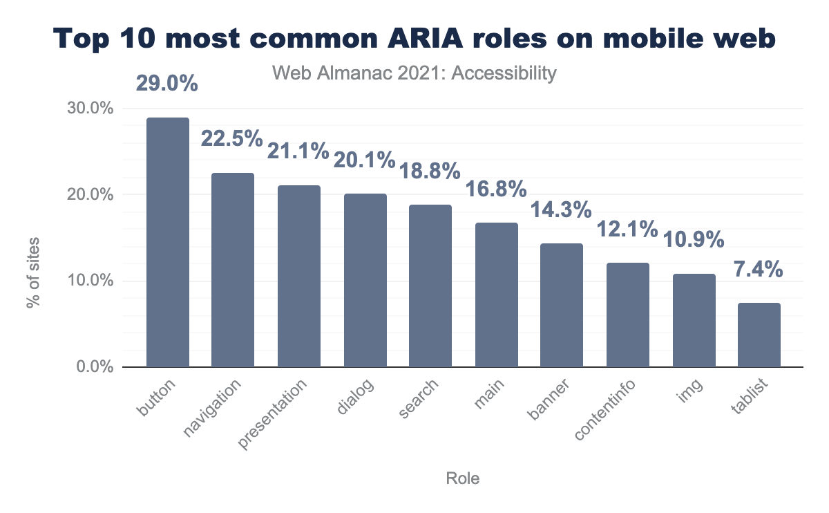
button is used on 29.0% of mobile page loads, followed by navigation (22.5%), presentation (21.1%), dialog (20.1%), search (18.8%), main (16.8%), banner (14.3%), contentinfo (12.1%), img (10.9%), and finally tablist (7.4%). Desktop usage looks similar.The most prevalent ARIA role in 2021 was button which appeared on 29% of sites. The button role indicates a clickable element that triggers a response when activated by users.
While over 71% of mobile sites have interactive-controls for web-based forms, the most commonly adopted ARIA attribute, aria-label, only appeared on 11.2% of tested sites. This accessibility-focused attribute is used to label input with a text string.
Color contrast
A lack of color contrast impacts users with color blindness as well as low color sensitivity, a condition common in older people. Sufficient color contrast allows for equal access to content and a positive impact to business goals. In a case study by Google, ecommerce site Eastpak saw a 20% increase in click through rate when call-to-action buttons used sufficient contrast between text color and its background.
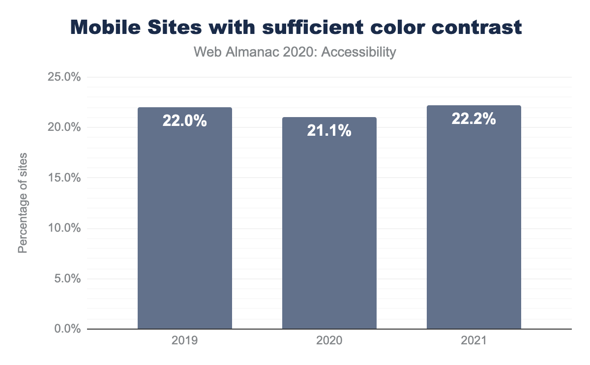
Despite the potential for increased conversion, 77.8% of sites failed Lighthouse audits for use of sufficient color contrast. This is a slight improvement year over year.
Tap targets
Tap targets are elements that respond to user input. These include links, buttons, form fields, and many others.
In order for effective user interactions, tap targets need to be both appropriately sized and spaced apart from other tap targets on the page. Interactive elements should be at least 48x48 pixels and have a padding of at least 8 pixels separating them from other interactive elements.
Overall, 39.3% of sites tested used sufficiently-sized mobile tap targets. Tap target adoption was consistent across domain rank groupings. This is a slight increase from 2020, which saw 36.3% of tap targets properly sized.
Zoom and scaling
The Viewport meta element is important to inform a browser how to lay out the page on a user’s device. It’s also possible to configure this by adding the user-scalable="no" or a small maximum-scale: parameter to either prevent totally, or limit the ability for users to zoom in on the content. On mobile devices, this is commonly pinch zooming.
Preventing the ability to zoom in is an issue for low vision users and is something that would fail the WCAG 2.0 guidance.
Disappointingly, 29.4% of mobile page loads fail this requirement, and contained a viewport that prevented zooming, this is a slight improvement over the 30.7% (source: 2020 Web Almanac Accessibility chapter).
Things look even worse when looking at the usage by domain ranking.
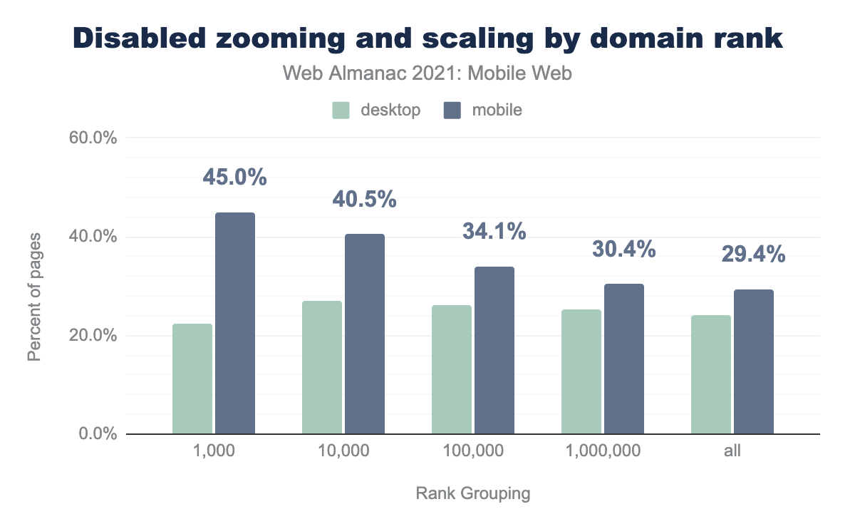
The more popular sites are more likely to fail this, meaning that overall, more users are reaching mobile sites that are not compliant.
Accessibility conclusions
When the web is accessible, more people can perceive, understand, navigate, interact with, and contribute to the web. Equal and inclusive access must be prioritized in order to keep pace with the growth and necessity of web access.
The areas we’ve covered here are a small part of accessibility. ARIA, zooming, and color contrasts are bare minimum requirements. A study from W3C’s Web Accessibility Initiative show that 15% of the world’s population (over 1 billion people) have a recognized disability. Far more may go unregistered or will develop a disability at some point in their lives that may affect their ability to access your sites. Accessibility isn’t for a tiny minority.
The poor adoption of good accessibility practice creates a technical barrier to these users that should disturb us as humans, aside from the clear commercial opportunity of properly catering for this sizable group of potential users.
In many jurisdictions, accessibility is not just good practice.
Last year lawsuits related to the Americans with Disabilities Act were up 20%.
To learn more about accessibility on the mobile web, visit the Accessibility chapter.
Mobile Search Engine Optimization (SEO)
For any website, acquisition is a critical step, the best optimized mobile website is no different to the worse if no one finds and visits it.
The primary avenue of discovery is quite likely to be from a search engine, along with social media and links from other websites.
With search engines being the primary source of acquisition for many sites, and a still sizeable one for many more, SEO is an important consideration for pretty much every site.
There are some mobile specific areas and concerns in SEO.
Mobile-first index
Google recognizes that the predominant method of accessing the web is now mobile, and now index websites predominately with a mobile user-agent. Since July 2019, all new sites have been indexed this way, and most existing sites have now transitioned to mobile-first indexing too.
This means that if you have content or markup that’s only served to desktop devices, google will no longer index that part.
Mobile-friendliness
Both Google and Bing, among other search engines, use some concept of mobile friendliness as a direct ranking signal. This mostly comprises testing to make sure that the content fits in the viewport, text is legible and tap targets are of a reasonable size.
Google offers a mobile-friendly test, as does Bing to help diagnose if your pages are passing.
The recommended way of achieving this is using responsive web design, web.dev have a great learning resource.
Core Web Vitals & Page Experience
On July 15th 2021, Google announced that they were rolling out the Page Experience Ranking Update. This comprises a few different signals, including mobile-friendliness, with the major new additions being the Core Web Vitals metrics.
Of particular interest to the mobile web is that the Core Web Vitals part is mobile specific, these metrics only play a part in the mobile results so far, although a roll out to desktop is planned in February 2022.
You can learn more about the role of mobile-friendliness and the Core Web Vitals in SEO over in the SEO chapter.
Mobile performance
A mobile device is likely to be lower powered, and on a slower and less reliable network connection than desktop devices. Given these circumstances, performance can be a bigger challenge and a bigger priority.
Loading performance
Grabbing the attention of your newly acquired user or keeping the attention of a returning user begins with making sure they see the important content of the site quickly.
Largest Contentful Paint
Largest Contentful Paint (LCP) is a metric designed to capture this experience (and is one of the Core Web Vitals). It’s a measure of when the largest element in the viewport is rendered, it’s limited to <img>, <image> inside an <svg>, <video> (if the poster is set), a block element with a background image, or a text block.
An LCP of 2.5 seconds or less is considered a good score.
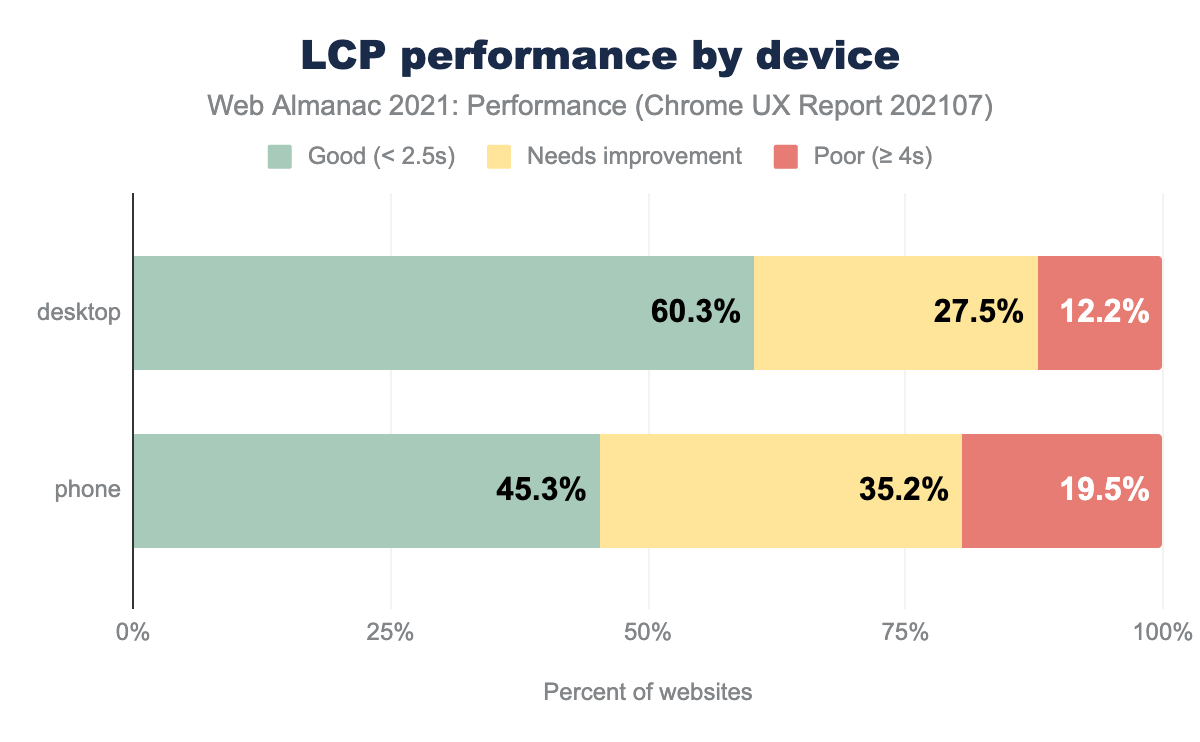
The data shows that just 45% of mobile page loads recorded in the CrUX dataset are meeting the 2.5 second or under target, far lower than the 60% desktop achieves.
It does represent a small improvement from 2020, where only 43% of mobile page loads met the 2.5 second or under threshold.
There are clearly bigger challenges to achieving good LCP scores for the mobile demographic, but one worth chasing. A recent study from Vodafone showed that a reduction of just 8% in LCP times lead to increased conversions of 31%. Performance can have a direct effect on revenue.
Images
Many different assets can and do affect load times on mobile, CSS & JavaScript can all play a big part. But a big factor remains images.
Too often an approach to responsive web design is to supply an image whose native size is appropriate for desktop users, and just scale it to the screen with CSS.
Appropriately sized images
This is sadly a step back from 58.8% in 2020. That’s 43.4% of mobile users getting the wrong size images.
Responsive images
Images can be served responsively too, the srcset attribute, and the <picture> element allow appropriately sized, and appropriately formatted images to be specified, allowing the browser to download the one that best matches the screen and device.
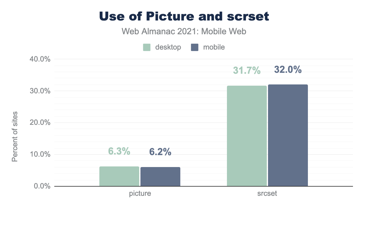
<picture> elements (compared to 6.3% of desktop sites) and 32.0% used srcset attributes (compared to 31.7% of desktop sites) to load images responsively.<picture> and srcset to serve responsive images.
Just 6.2% of mobile page loads that included images used the <picture> element, slightly lower than desktop.
A healthier 32% of mobile page loads including images use the srcset attribute. It is worth mentioning here that this attribute can be used in both the <picture> element and the <img> element, so there’s likely to be some crossover here.
Lazy loading
Deferring, or lazy loading, images that aren’t in the initial viewport is a good strategy to help resources be focused on loading things that are visible. The native lazy-load attribute, supported in Chrome, Opera, and from September 2021 Firefox for Android (source: caniuse.com) allows this to happen without JavaScript workarounds.
loading="lazy"
This is a big jump up from just 4.1% in 2020.
Looking at the HTTP Archive’s Native Image Lazy Loading Report, uptake of using the attribute on the <img> tag specifically shows the same, impressive growth.
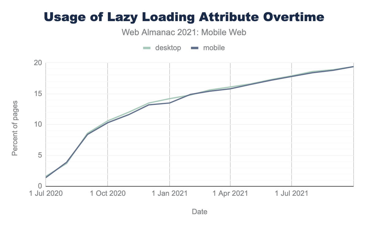
loading='lazy' attribute over time. The lines follow the upward trajectory, starting with 1.4% in July 2020 and climbing in tandem to 19.4% in October 2021.A driving factor in this growth can be attributed to the prevalence of WordPress (source: Rick Viscomi on Twitter). WordPress added support for native lazy-loading in version 5.5 which rolled out to the public on August 11th, 2020.
It’s also worth mentioning that incorrectly used, Lazy Loading LCP Candidates can harm performance. Making sure to apply loading="lazy" only to images below the fold is best practice.
Image conclusions
It’s disappointing to see that more mobile page loads this year had images that were not correctly sized. <picture> uptake remains low too, perhaps based on the complexity compared to the <img> element.
But great strides have been made in adoption of the loading="lazy" attribute, a huge jump in just one year.
Images remain a vital part of the web, and that doesn’t change for mobile users. If your site doesn’t take advantage of some of the available approaches to serve mobile appropriate images, it’s time to investigate this.
Layout stability
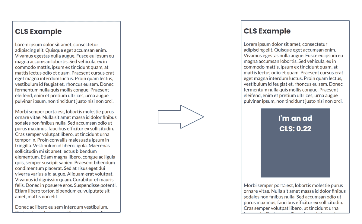
With a generally smaller form factor, and limited screen real estate, unexpected shifting content can be particularly jarring on mobile devices.
Reading an article, only to have the paragraph you are on jump down the screen as an ad loads in above, or shift around as a font loads in and changes before your eyes, is an uncomfortable and negative experience.
Cumulative Layout Shift
One of the Core Web Vitals, Cumulative Layout Shift (CLS) is a metric designed to capture the impact of this kind of shifting of elements.
The metric is a calculation of impact fraction multiplied by distance fraction. The impact fraction is how much of the area of the screen is shifted and the distance fraction is how much of the screen it moved by.
A CLS score of 0.1 or under is considered good, under 0.25 considered indeed of improvement, and over that it’s considered a poor experience
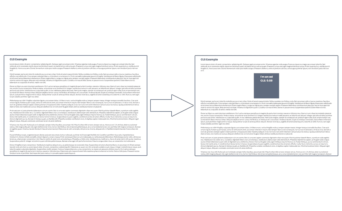
Smaller screen sizes are susceptible to greater shifts, at 360 x 640px, this example block causes a CLS score of 0.22

At desktop screen sizes, the same element appearing leads to a CLS score of just 0.07.

The CrUX dataset shows that 62% of mobile page loads had a CLS of 0.1 or under:
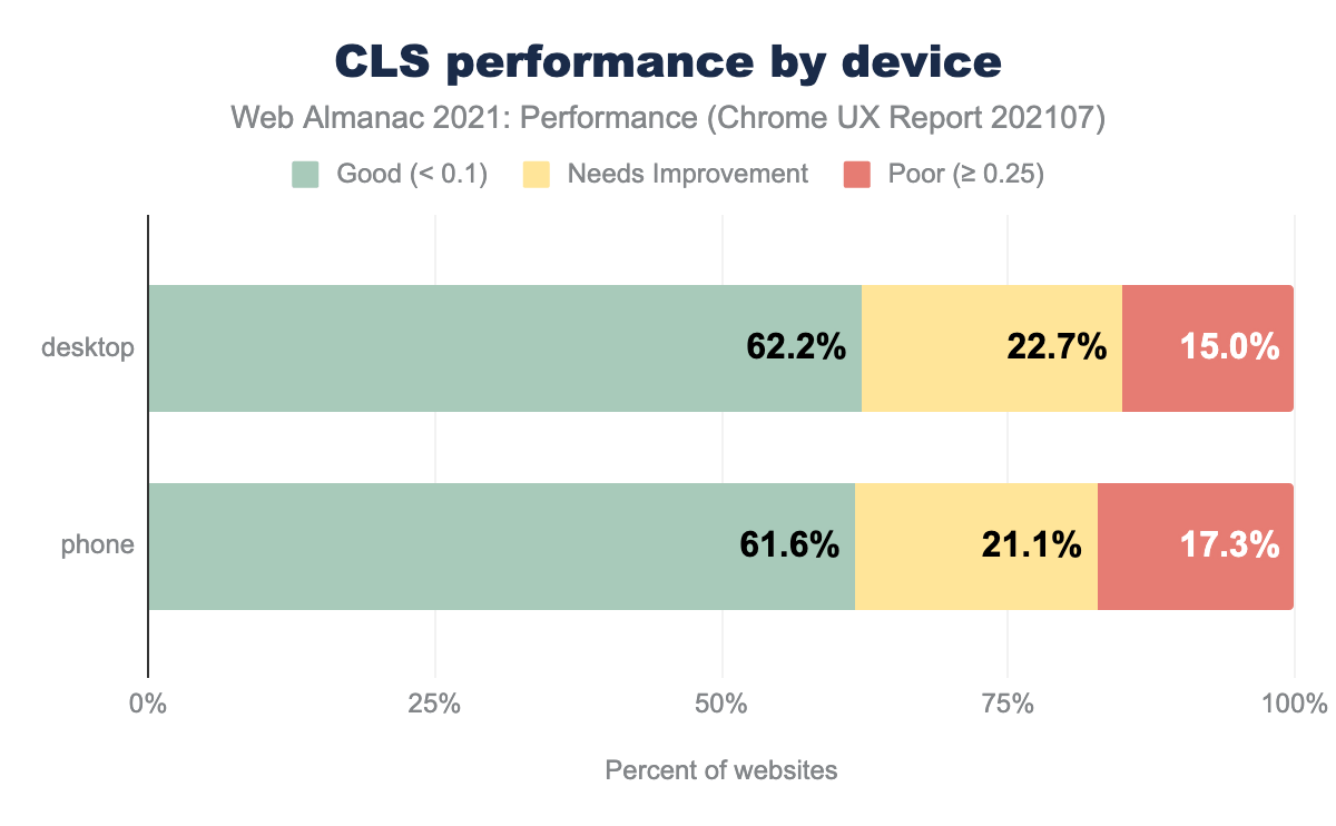
This is a big step over the 43% achieved last year, but direct comparison is hard, as the metric changed on the 1st of June 2021to better capture the experience on long-lived pages, so some of this jump could be attributable to this.
Response to user interaction
When a user interacts with a site, long delays from clicking on something, to something actually happening make a website or app feel sluggish and slow. This lag between input and the action happening is often down to heavy JavaScript processes blocking the main thread, leaving the browser unable to process the command the user issued until it had completed those processes.
Mobile devices are generally much lower powered than desktop and laptops, so the effect of this can be amplified.
First Input Delay
First input delay (FID) is the third Core Web Vital metric designed to capture this. It measures the time between the first interaction (a tap or a click on an element) until the browser can start processing that it has happened. It doesn’t measure how long the process that tap may have triggered takes.
A good FID score is 100 ms or under, a poor FID score is over 300 ms.
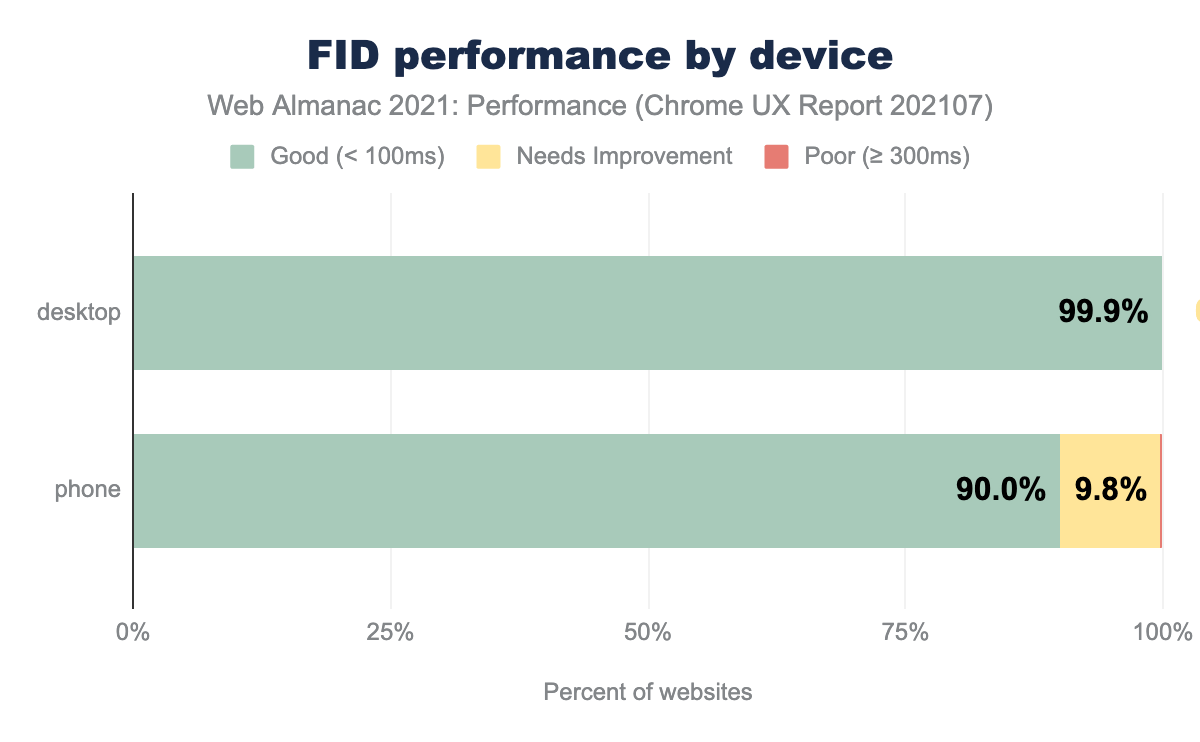
Encouragingly, 90% of mobile page loads in the CrUX dataset had a good FID score, up from 80% from 2020.
Efforts are being made to better capture responsiveness, with the Chrome Speed Metrics team sharing some plans and inviting feedback on a new responsiveness metric.
If you are looking to learn more about Core Web Vitals in general, the Performance chapter has plenty of details about the Core Web Vitals.
Service workers
Service workers while not only applying to mobile devices do become uniquely useful in their ability to add offline capabilities, and better control of loading from caches to web apps, both features which are often more relevant to mobile users, who are more likely to encounter poor or total loss of connectivity.
14.8% of sites register a service worker, a sizeable uptake since 2020’s 0.9%
To learn more about service workers and PWA (progressive web apps), visit the PWA chapter.
Mobile performance conclusions
Overall, performance has taken a step forward over 2020, with a particularly strong improvement in layout stability.
There are some good, positive signs too in impressive usage growth in loading="lazy" and the uptake of service workers. The fact developers are embracing these is a positive sign that performance is being taken seriously.
It does however seem that improving Large Contentful Paint, and handing images are areas developers are struggling with more than other areas. Hopefully tooling and libraries like next/image for the Next.js framework, and adoption by popular CMSs like WordPress will help developers overcome these pain points.
Conclusion
In 2021, the perception of a distinct “mobile web” is outdated.
Across multiple data sources, it seems that the mobile is one of many ways a user can interact with digital content—and in fact comprises the majority of digital interactions.
For many users, mobile devices are their primary or only means of interacting with the web. Despite this, adoption of methodologies, performance strategies, accessibility principles and adoption of browser-supported features is low.
There has been great progress in some areas, most performance metrics are an improvement over 2020’s data. There do remain areas where there’s lots of room for growth too.
Accessibility remains an area where it would be great to see more effort and time spent, and image best practices still have some way to go.
With the continuing growth and size of the mobile user sector, for many industries it’s no longer a case of having to make a business case to support the mobile web, it is a case of fully embracing it and making use of the many tools and techniques available to a developer in 2021.


